Final Project II: Streets of Taiwan
Artist Statement:
During recess week I went to Taiwan for 10 days to travel around the island and get to know country and people. Taiwan really fascinated me and I took a lot of photos of places and people that I found interesting. Besides the fascination the second strong feeling I had was that I was really foreign and alien in this country, everything was so different to the culture I normally live in. I decided to use these two feelings and the photos I took to combine them for my final project. So I tried to use expressive images and edit them in a way that a mood of fascination and also foreignness emerges.
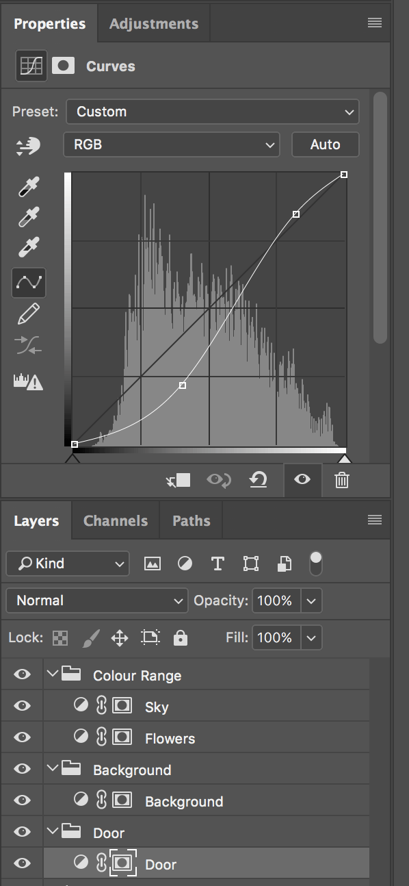
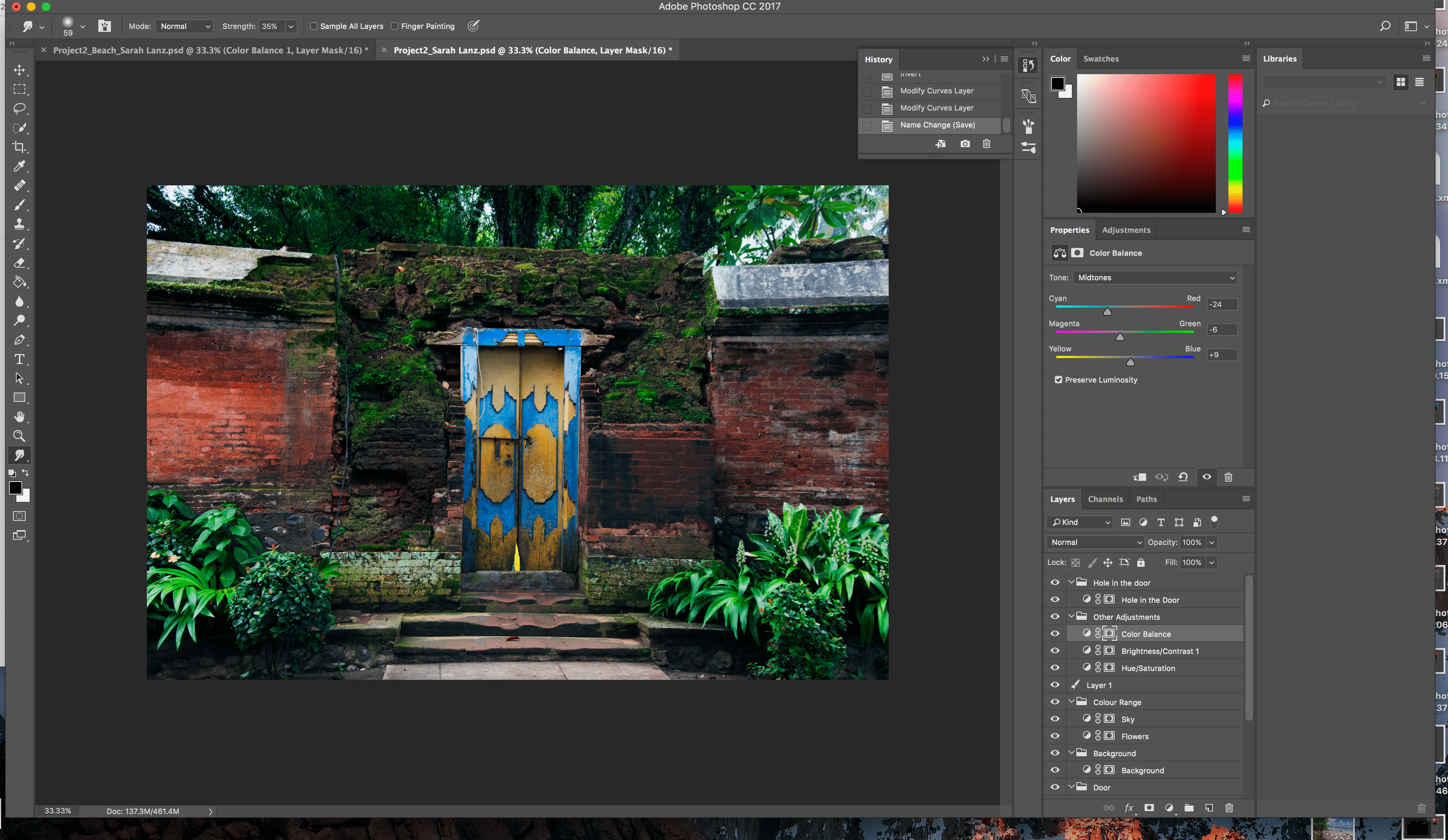
In my further work flow I tried out different topics and styles, showing just emotions of people on the street or using just places without any human beeings in it… It all didn`t really showed what I wanted to show so I ended up combining the both. I builded pairs, each having on photo of an abandoned place and a photo with people in it. Then I tried to edit them in a way (mostly on colour and brightness basis) that the two photos as different as they might be still evoke the same feeling and impression. In the following you can see the 14 images that resulted in that work flow.
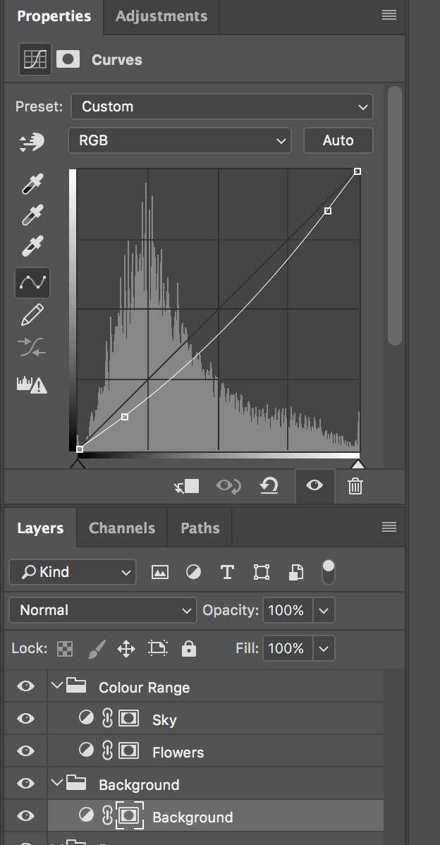
Technical decisions:
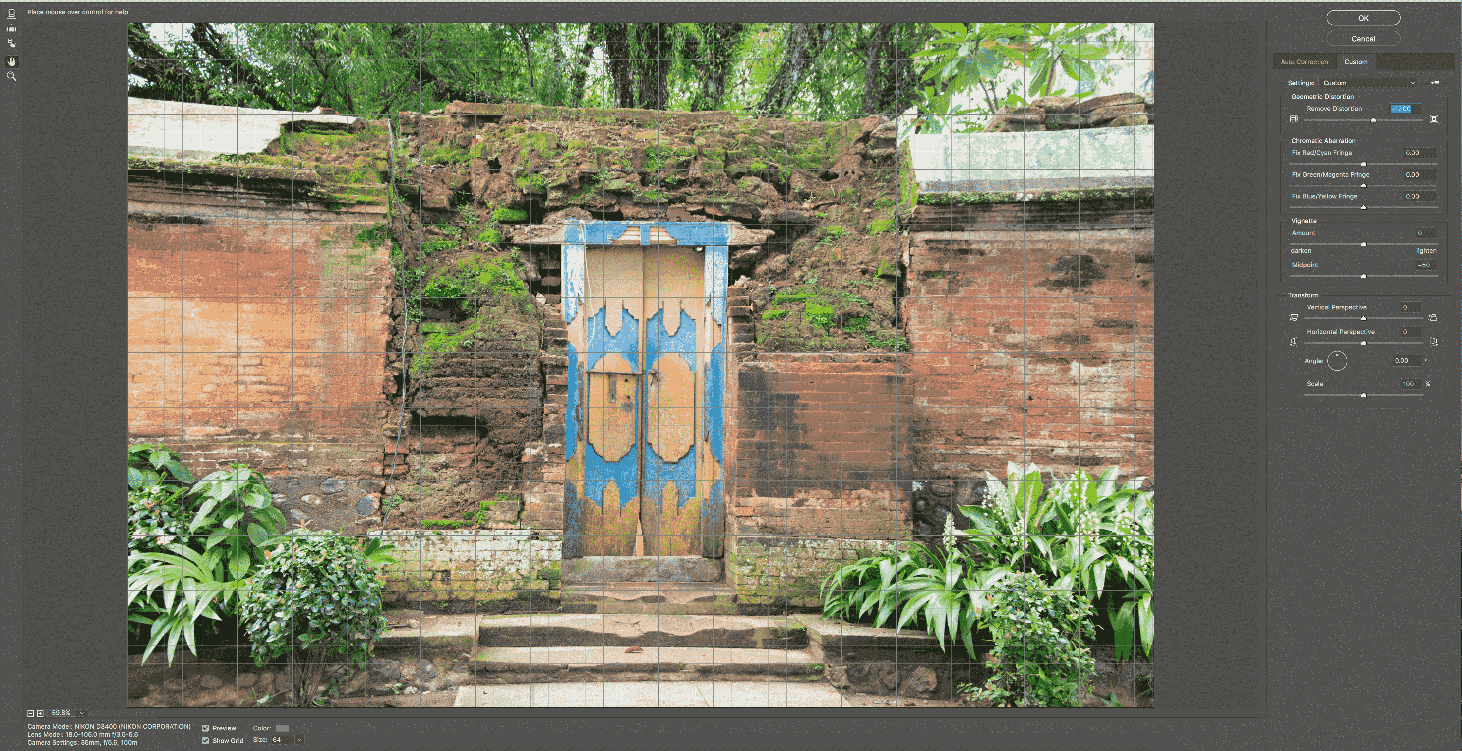
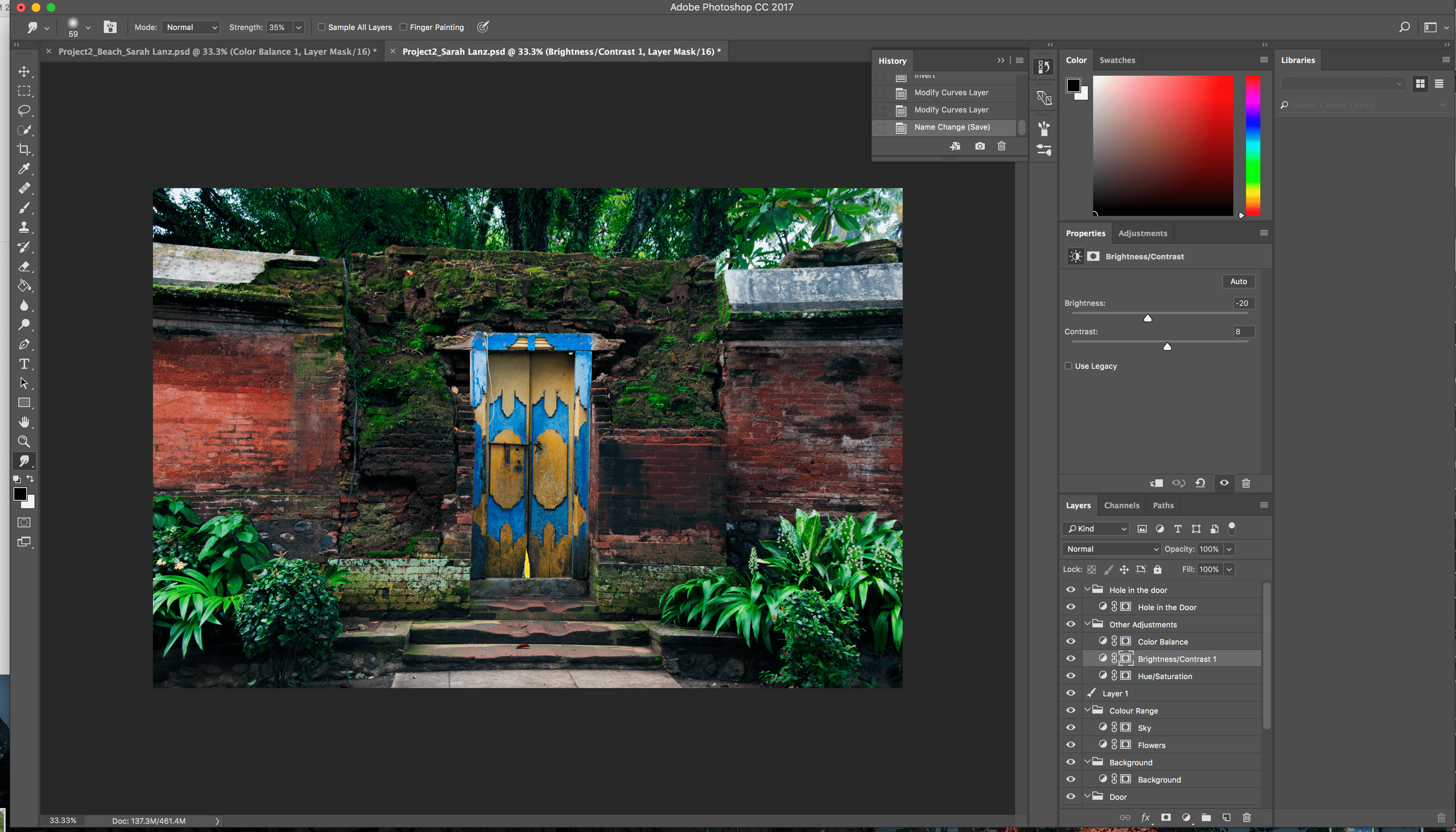
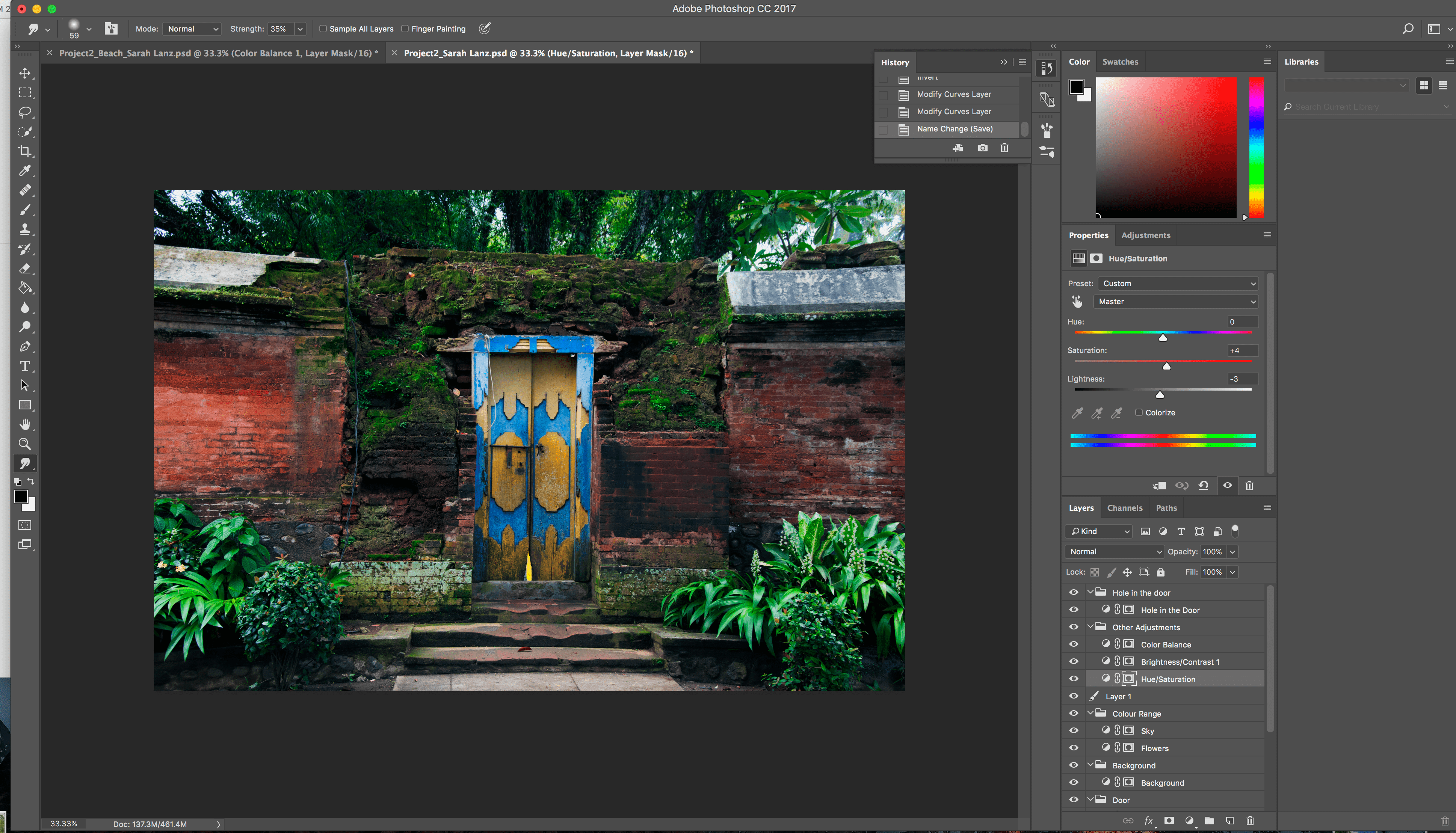
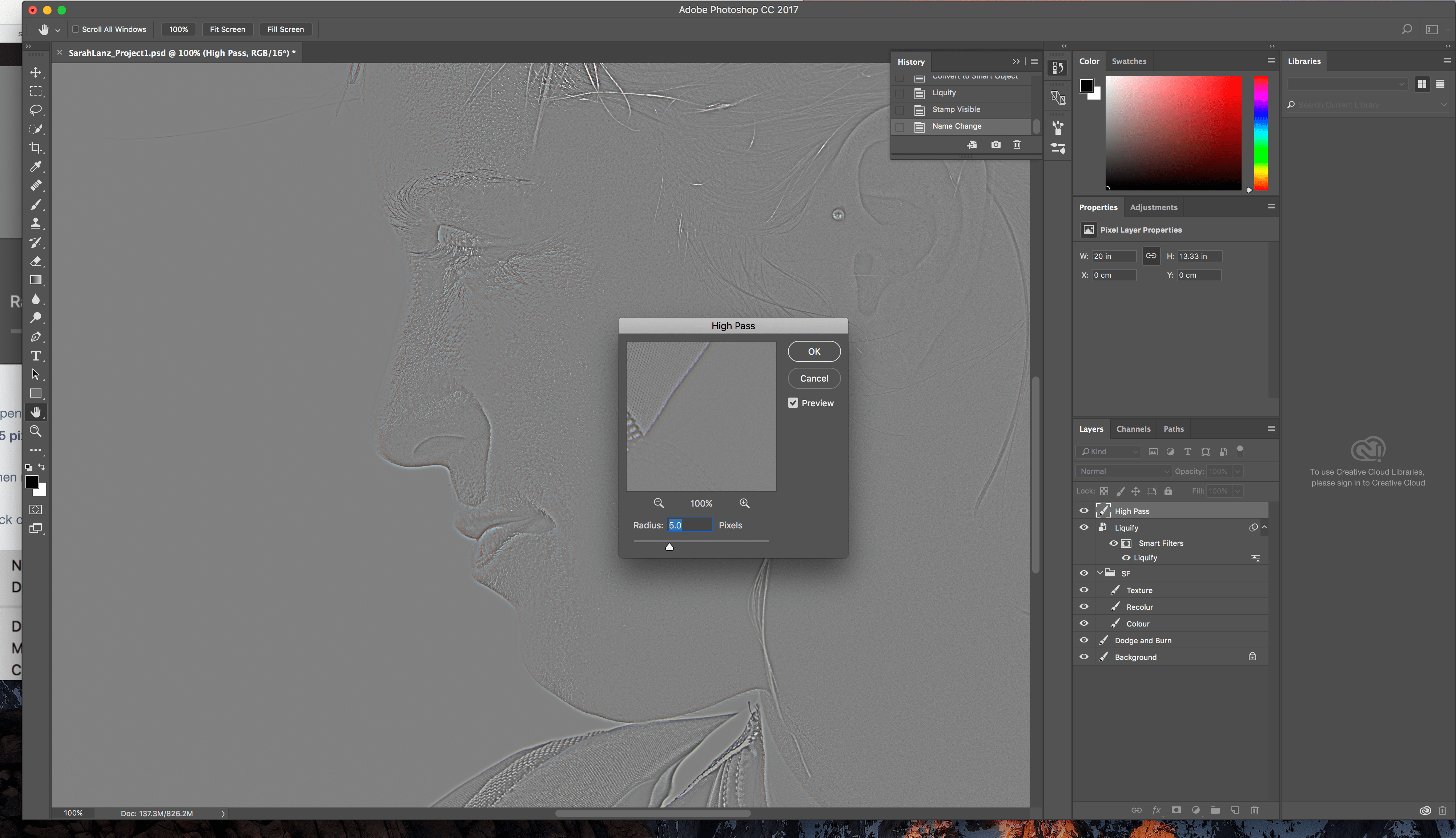
I took the photo with my own camera, a Nikon D3400 and my lens Nikon DX 18-105mm, because I am used to take a lot of photos with this camera and I love the lens.
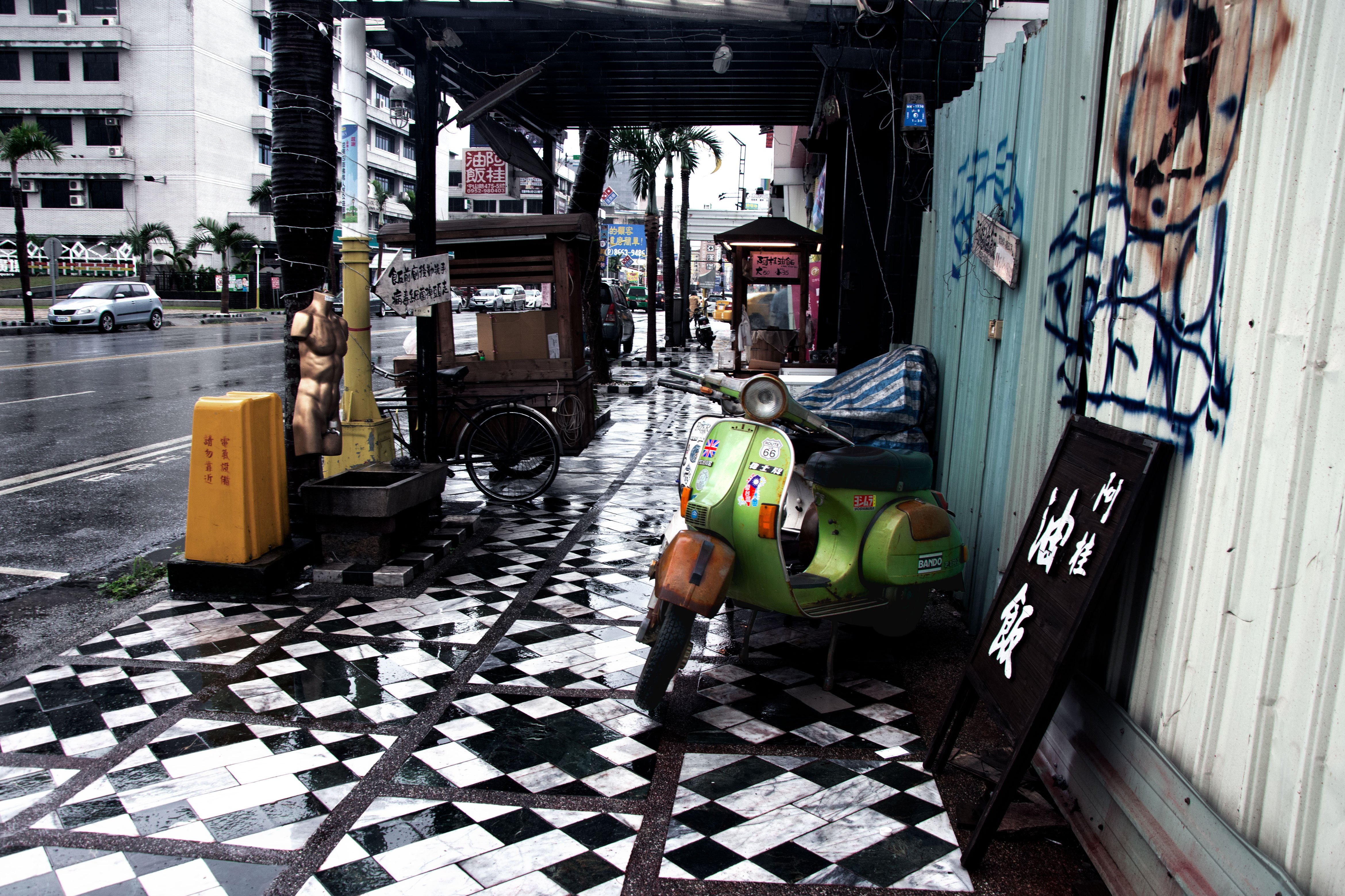
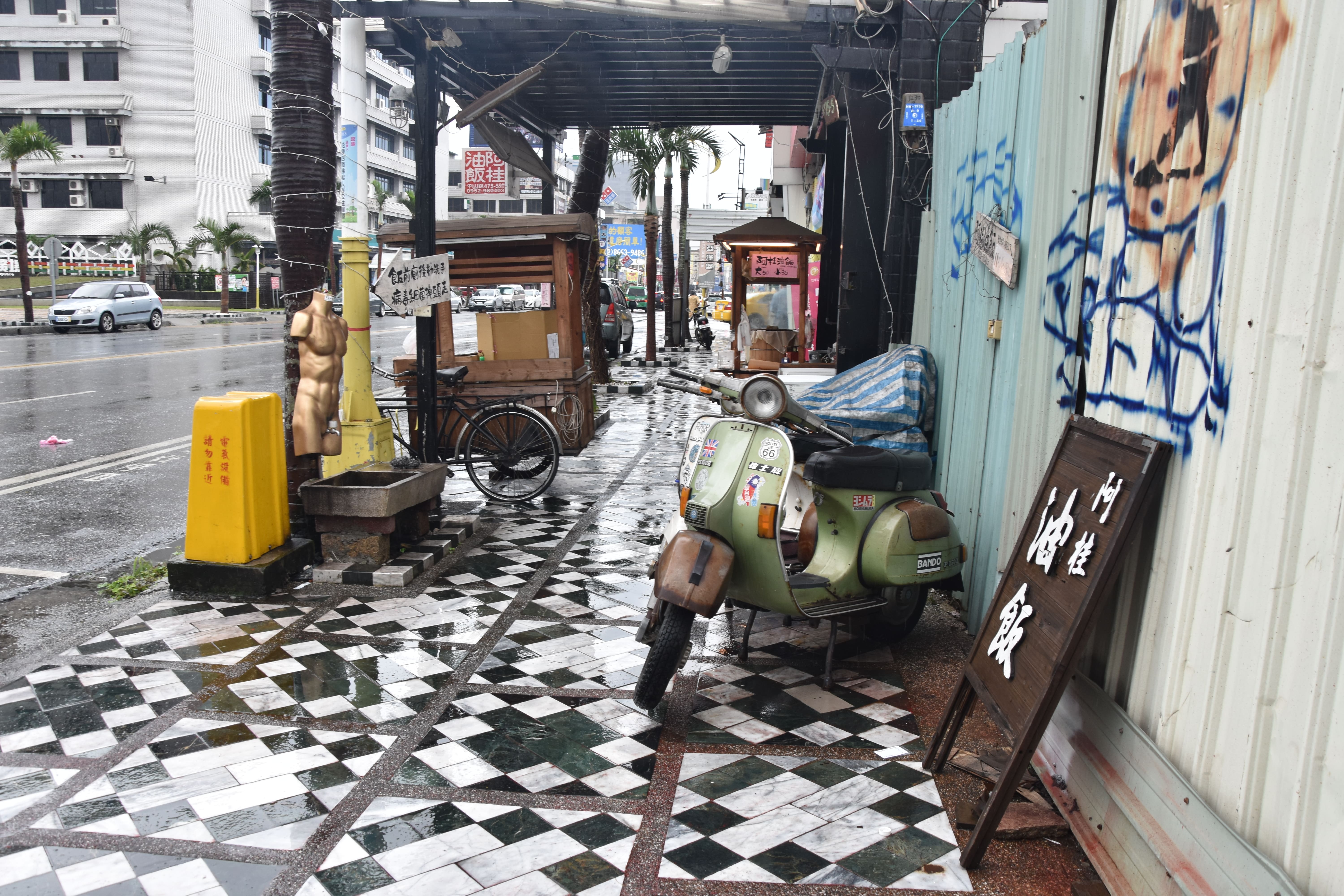
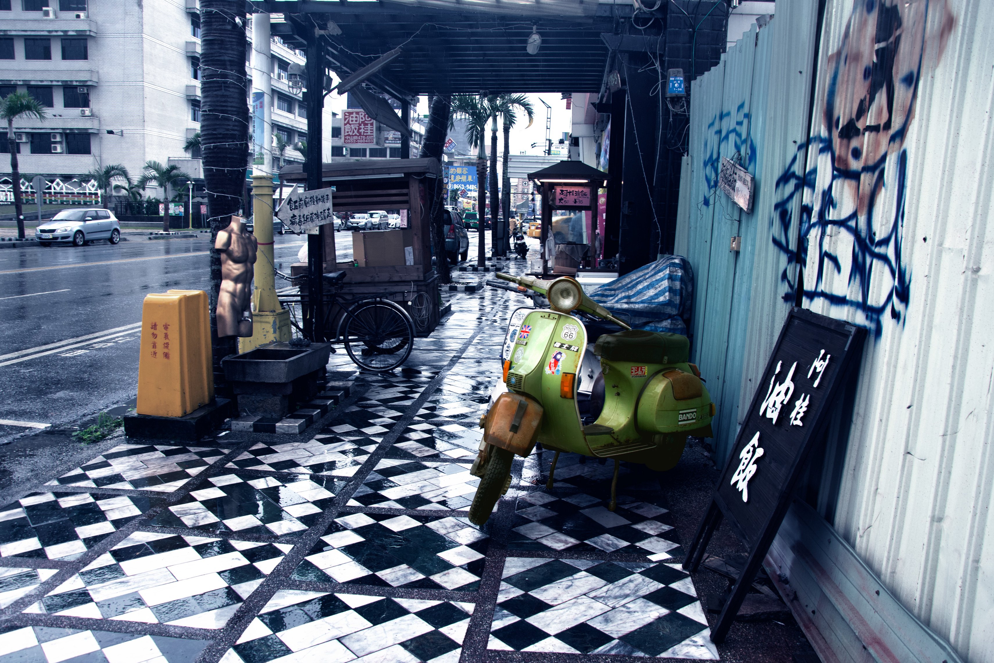
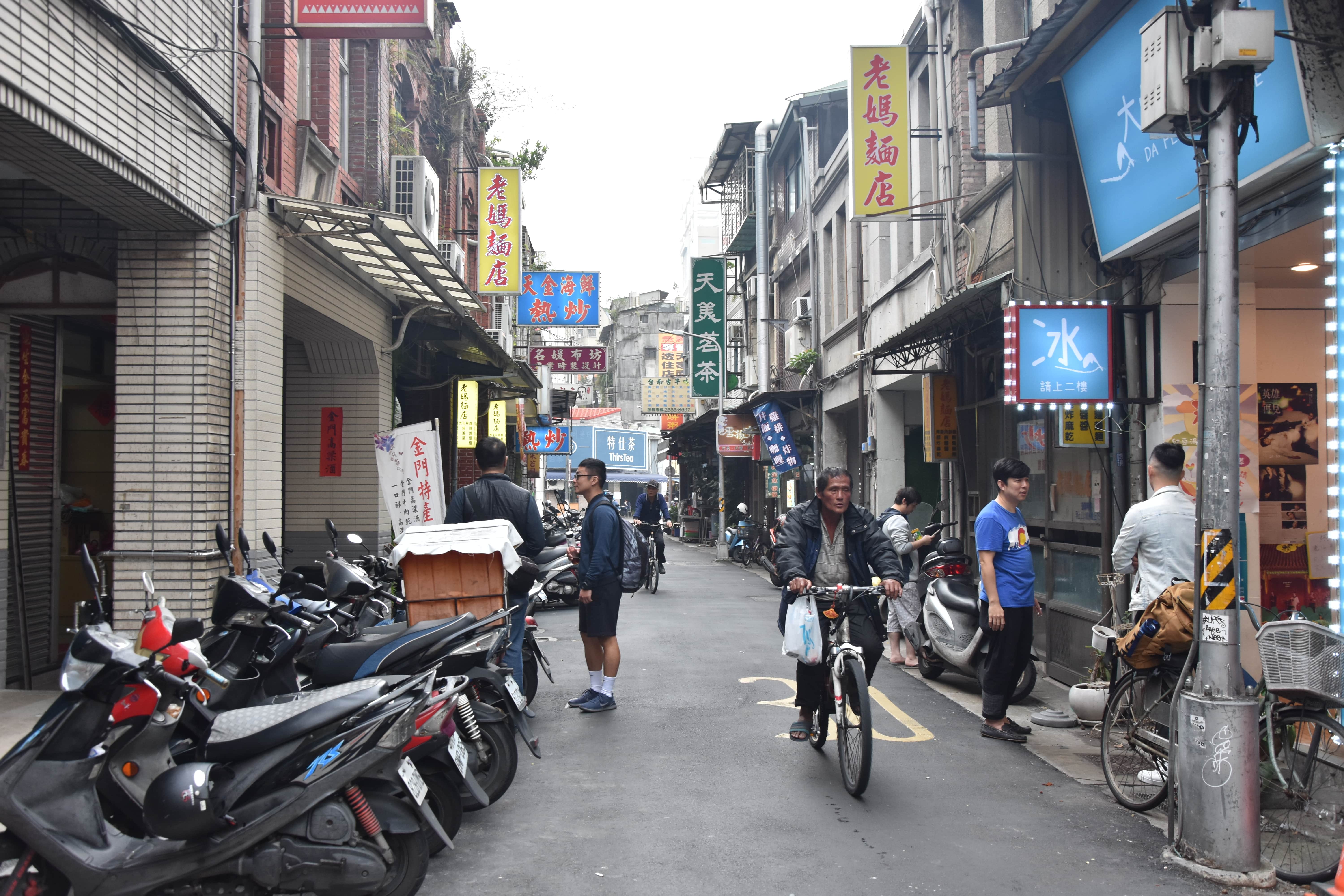
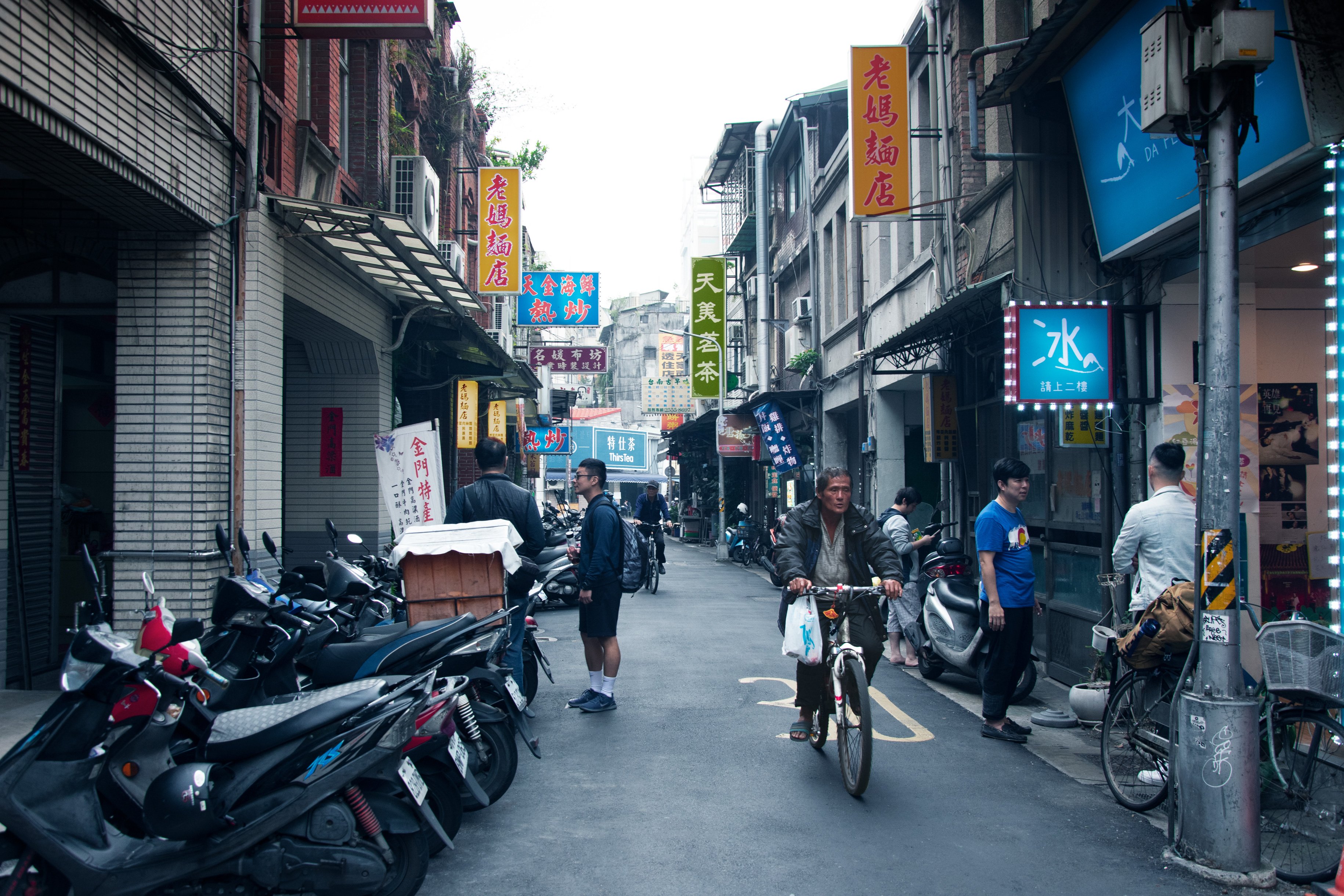
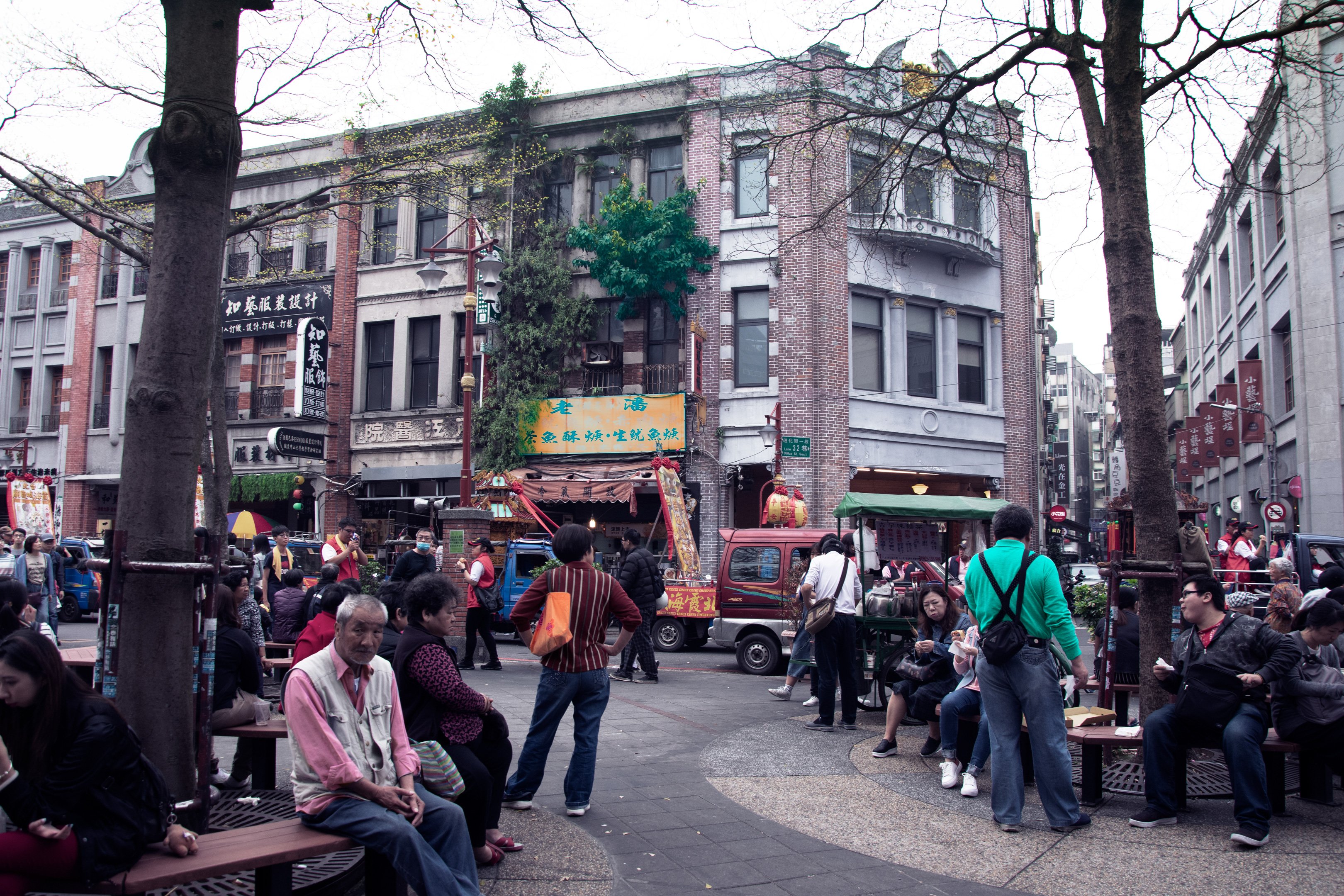
First Pair: The Scooter and The Biker
Both images show straight streets on a crowdy, even rainy day. I mainly used the colours blue, green and yellow to adjust the photos to each other.
 |
 |
 |
 |
 |
 |
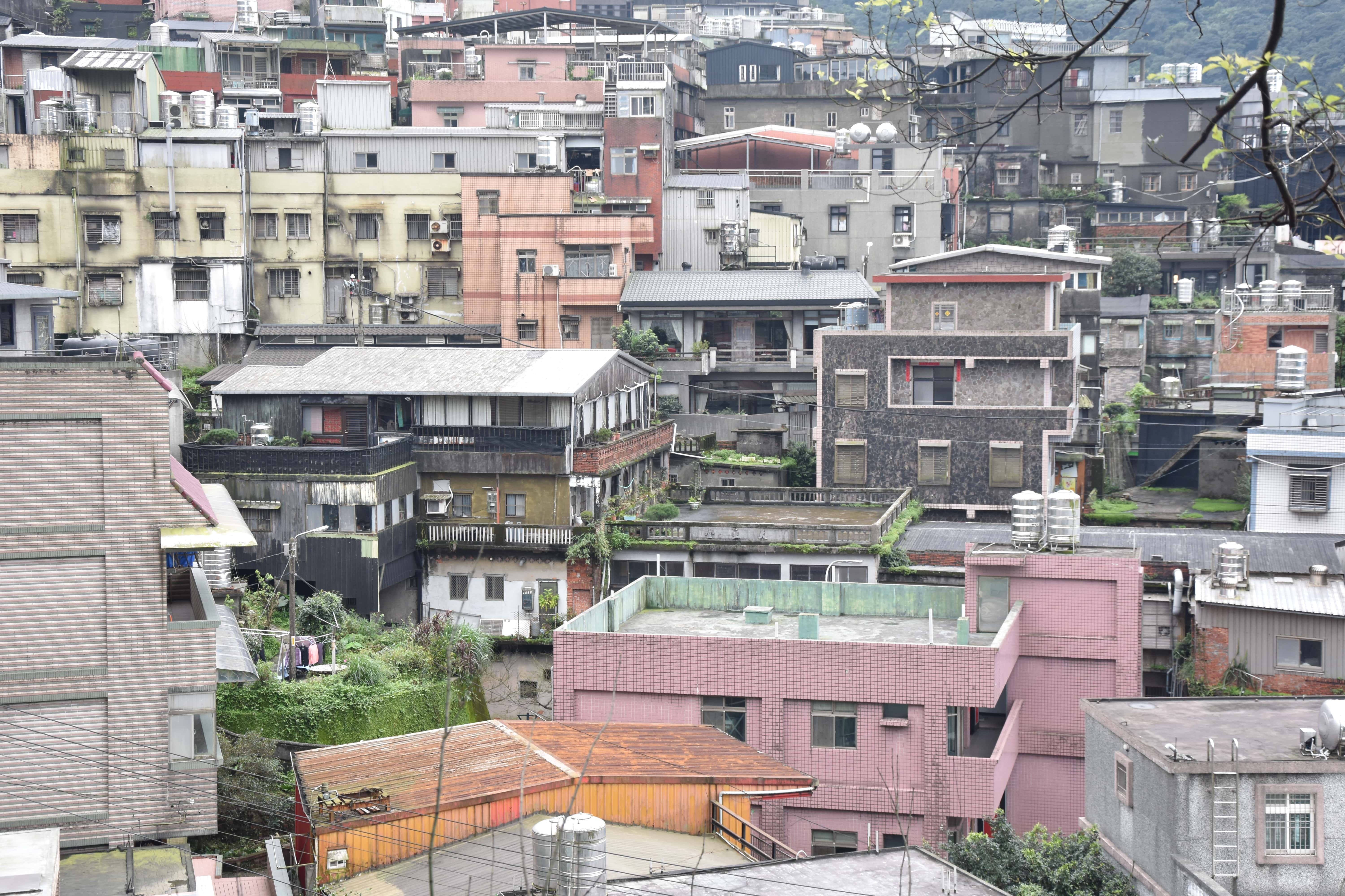
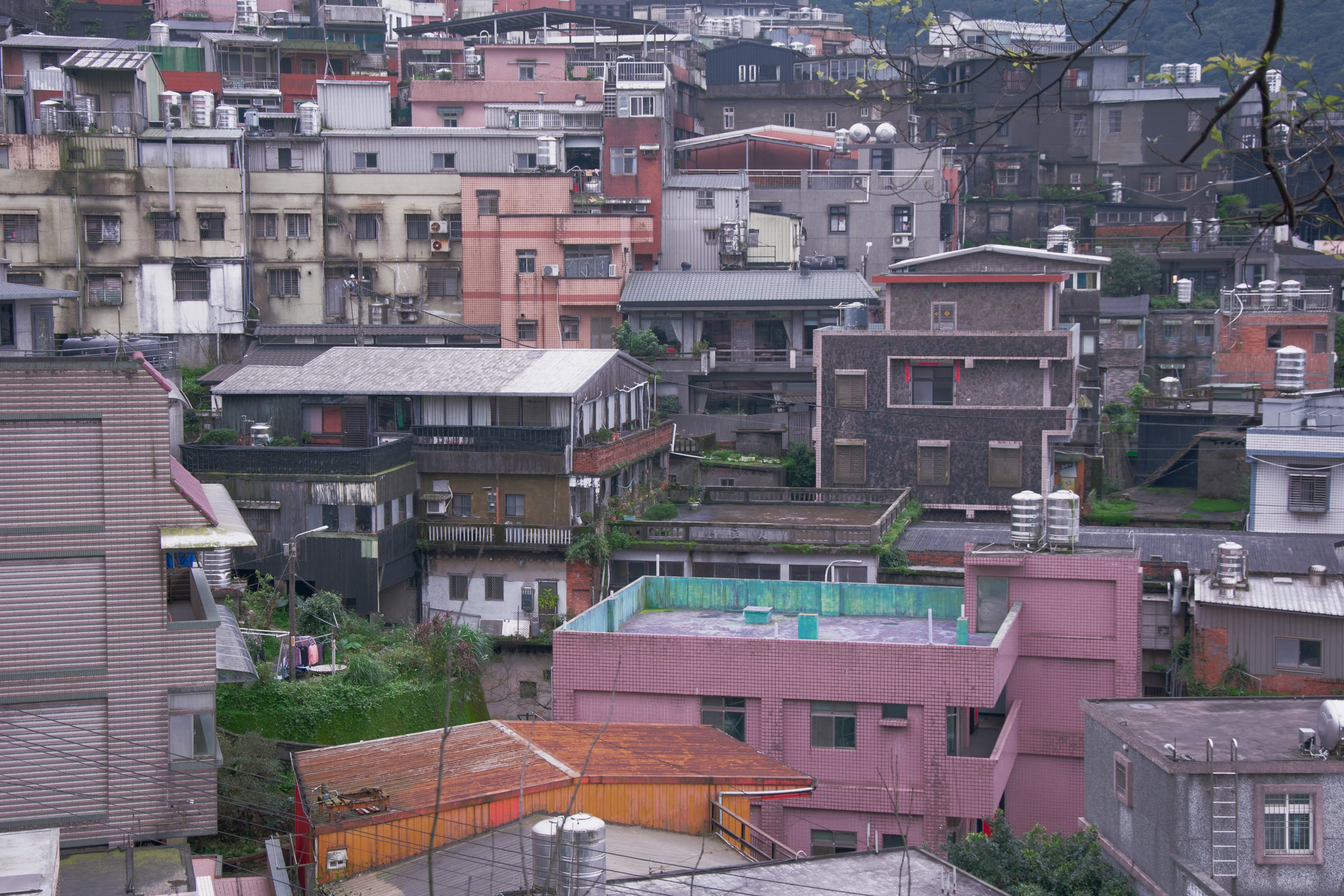
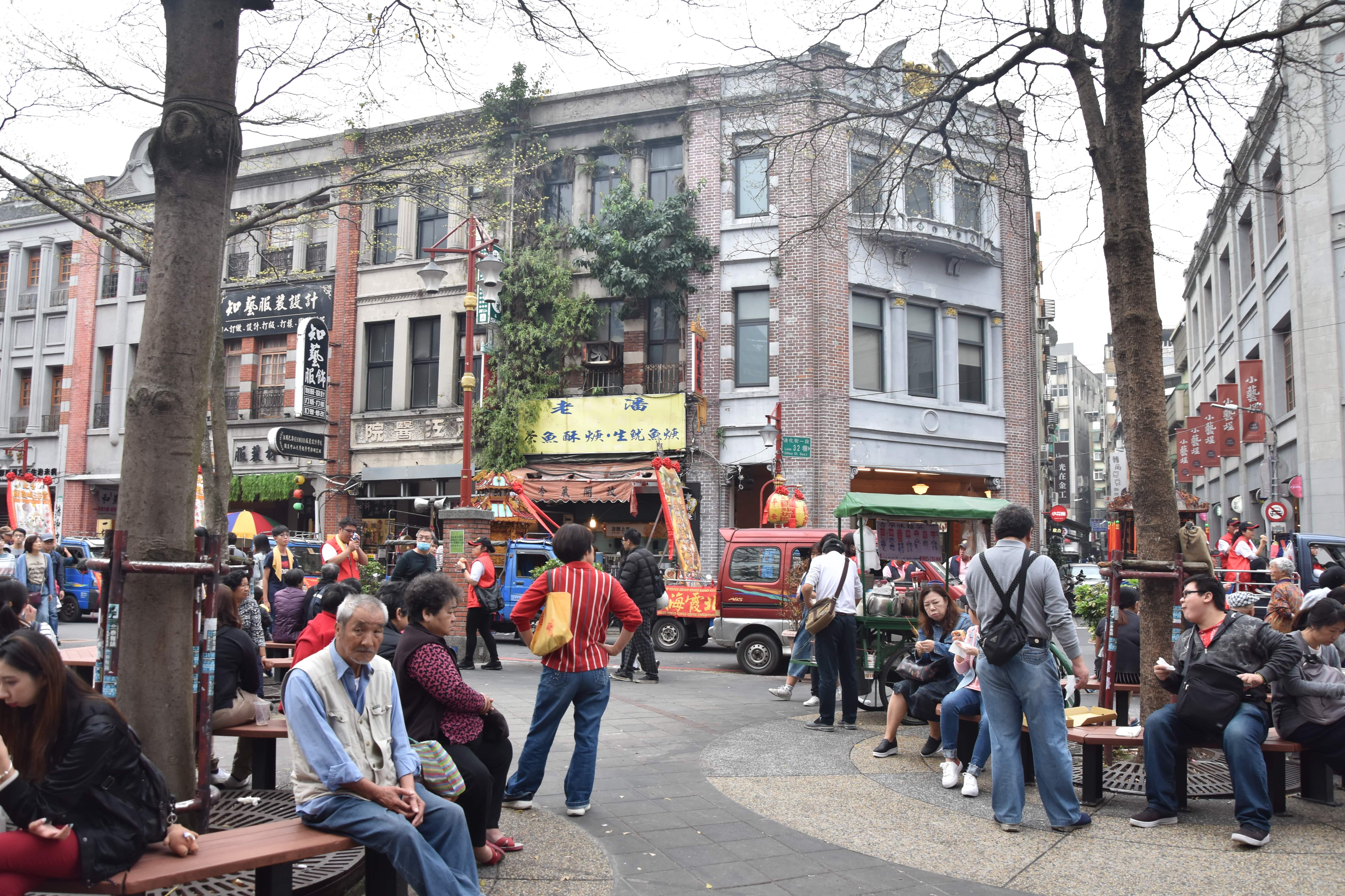
Second Pair: The View and The Plaza
This pair shows a view of different coloured houses and a view of different coloured humans. I manly used pastel colours to adjust the pictures to each other and get a softer feeling out of it.
 |
 |
 |
 |
 |
 |
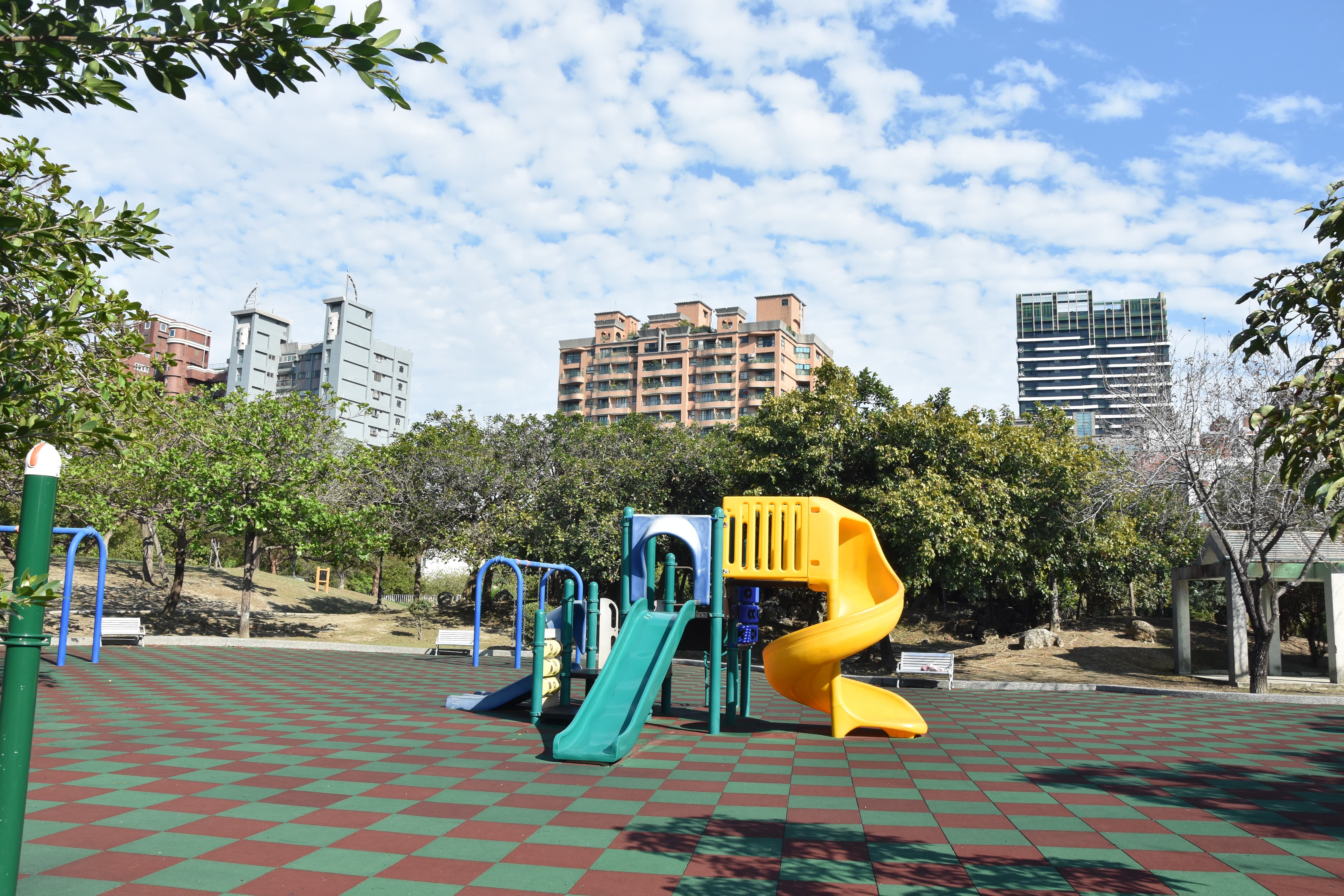
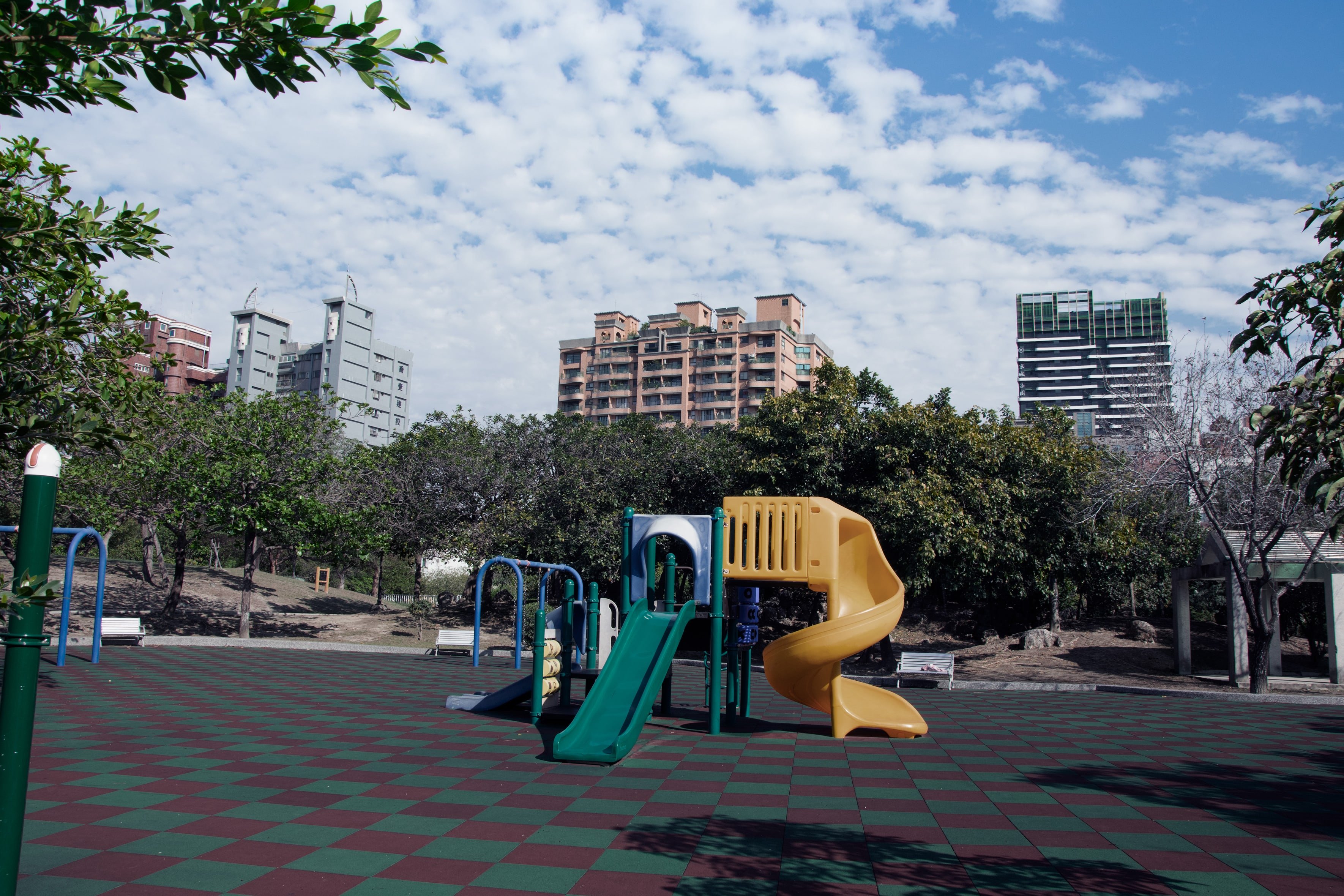
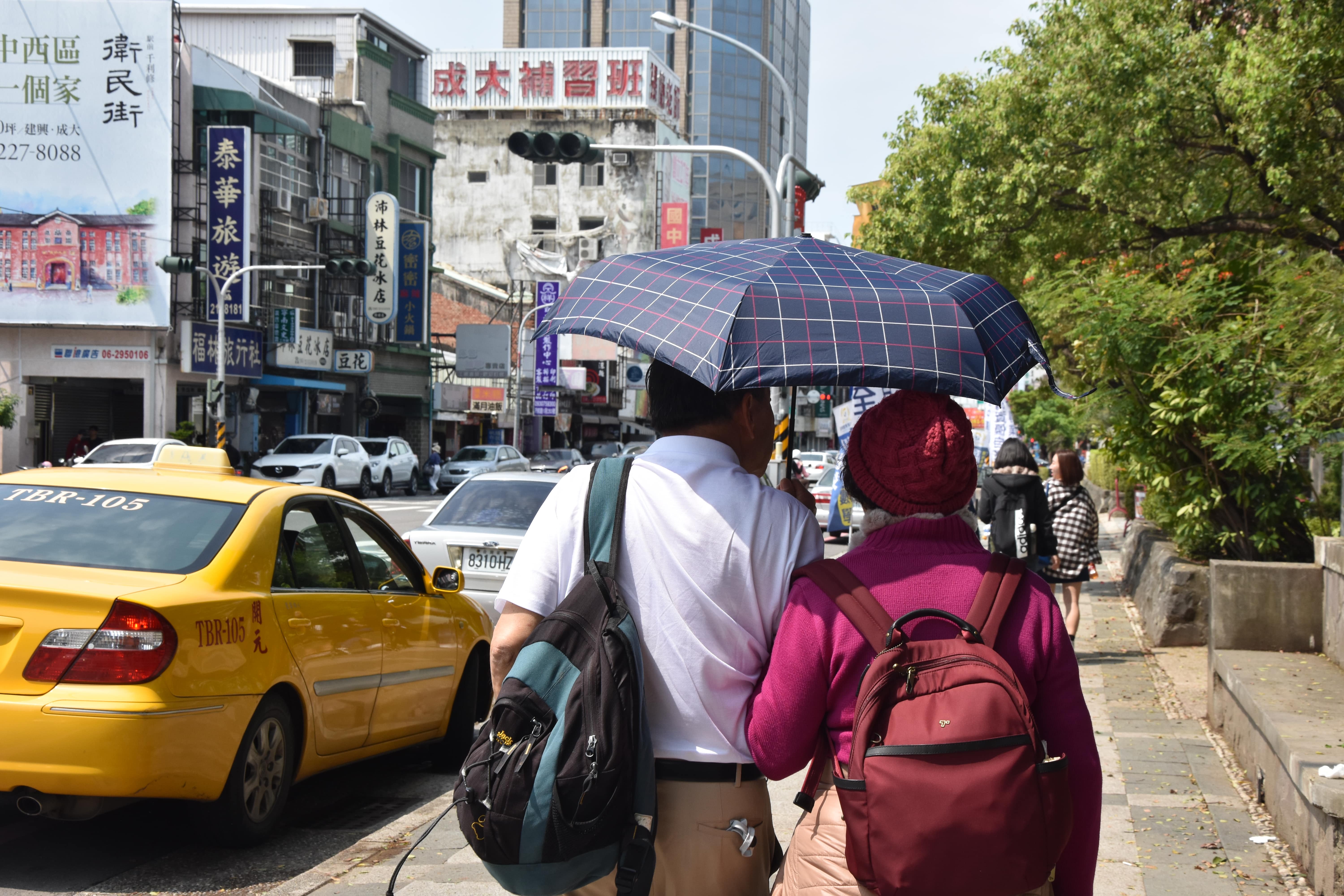
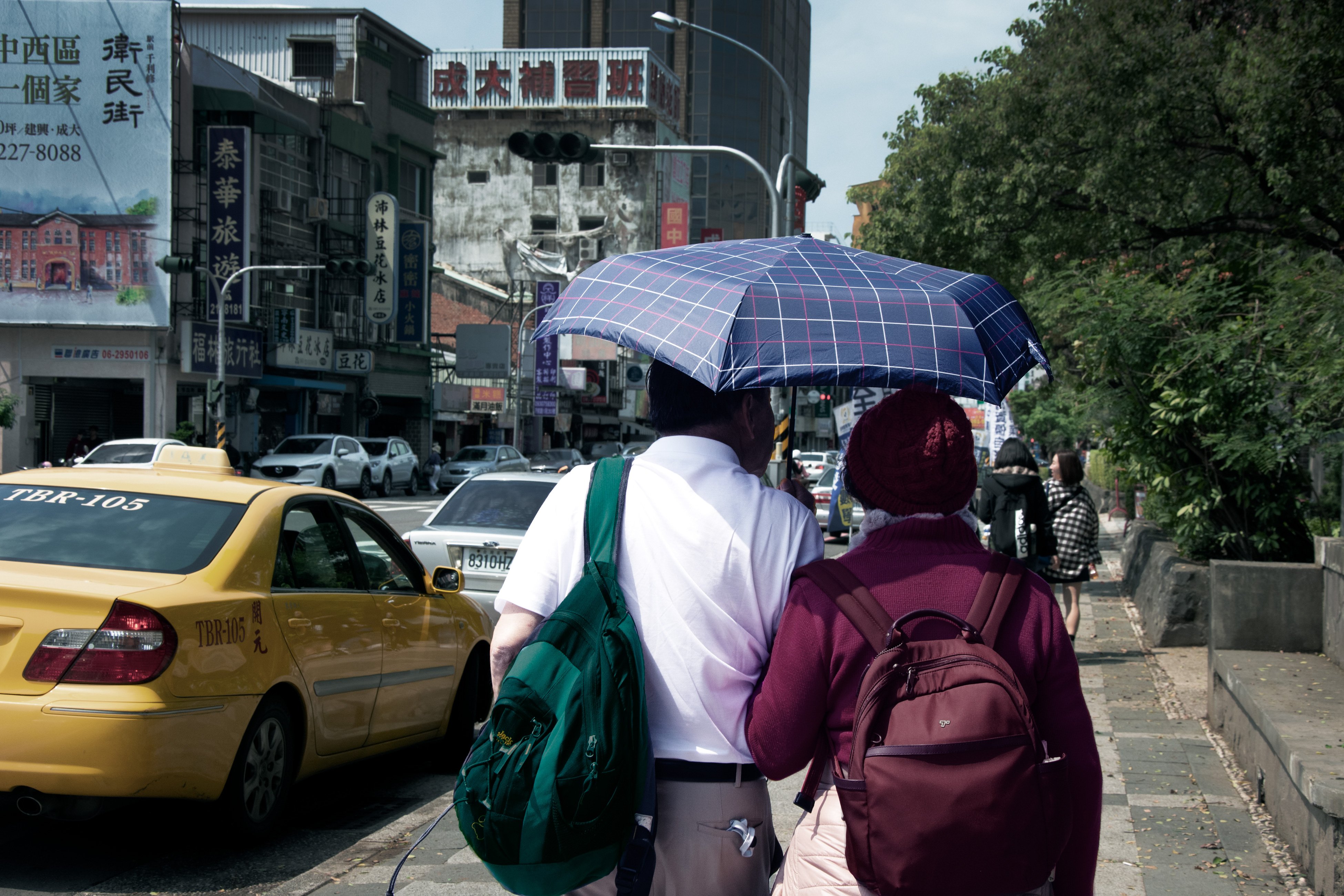
Third Pair: The Playground and The Couple
A playground without any children just looks sad, even with the brightest coloures. The couple with their warm clothes and umbrella at a really warm day also looked wrong in their enviroment. I also liked the contrast of the young and the old. So I combined both images and mainly changed the saturation and brightness, concentrating on the colours yellow, blue and green.
 |
 |
 |
 |
 |
 |
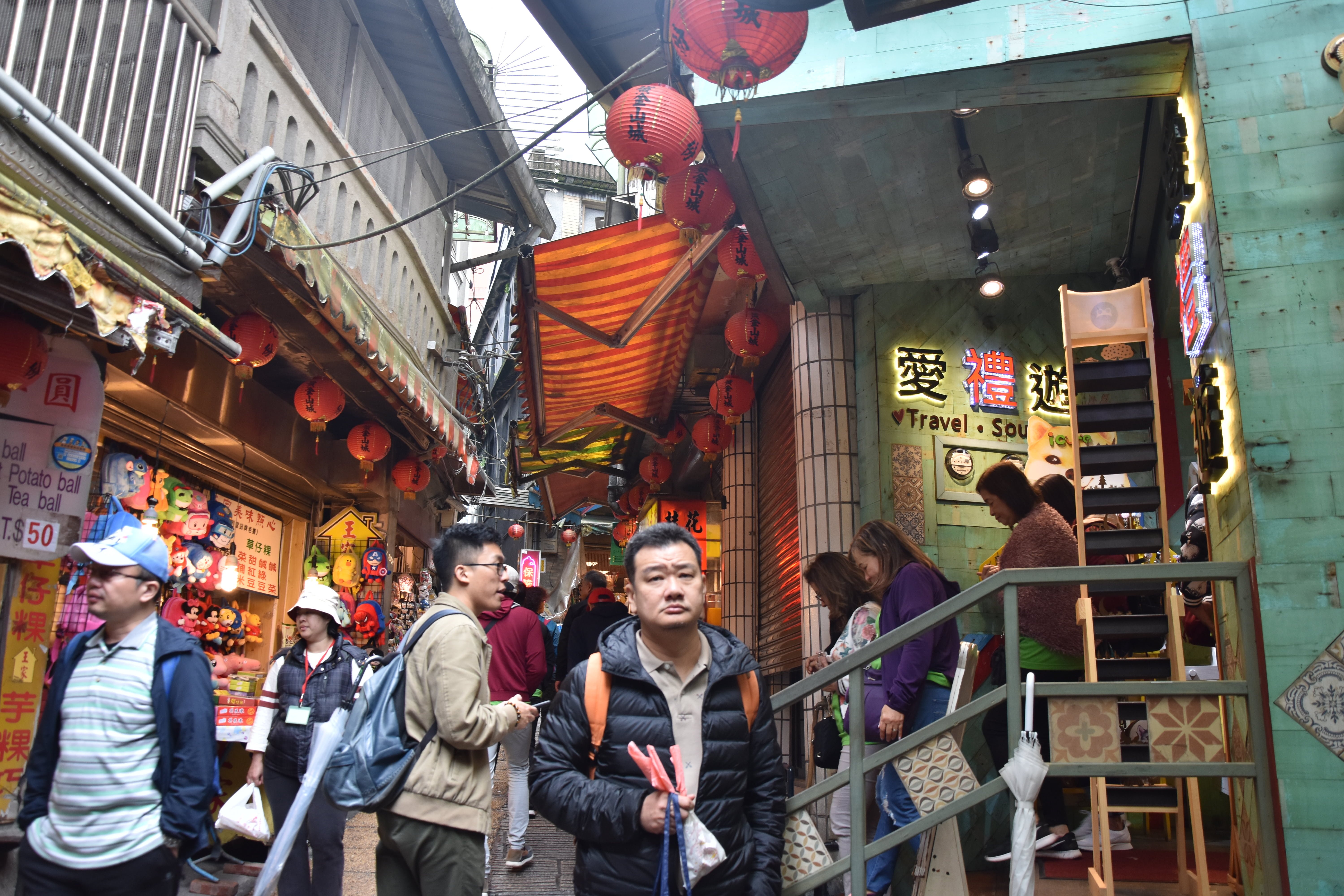
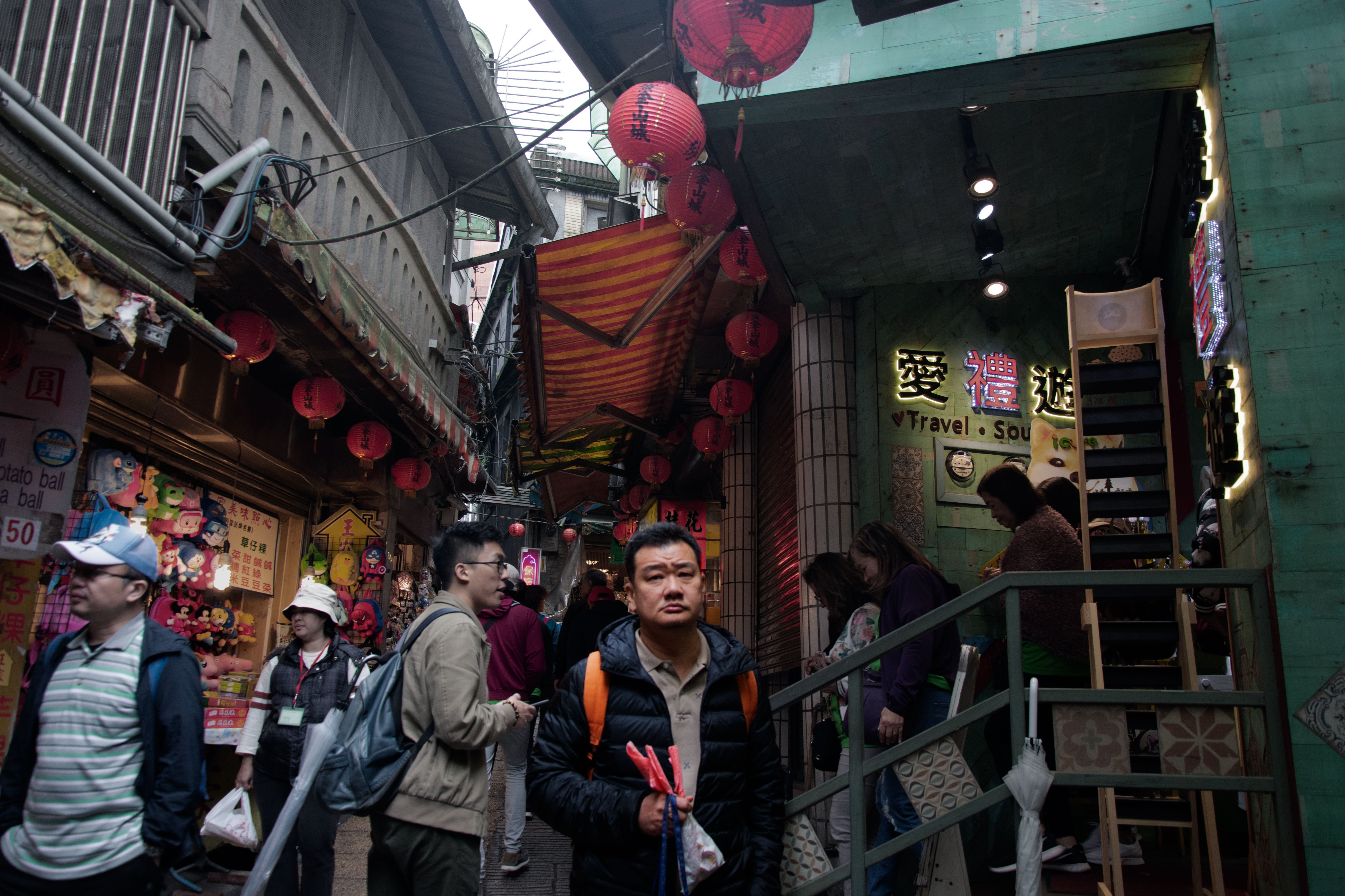
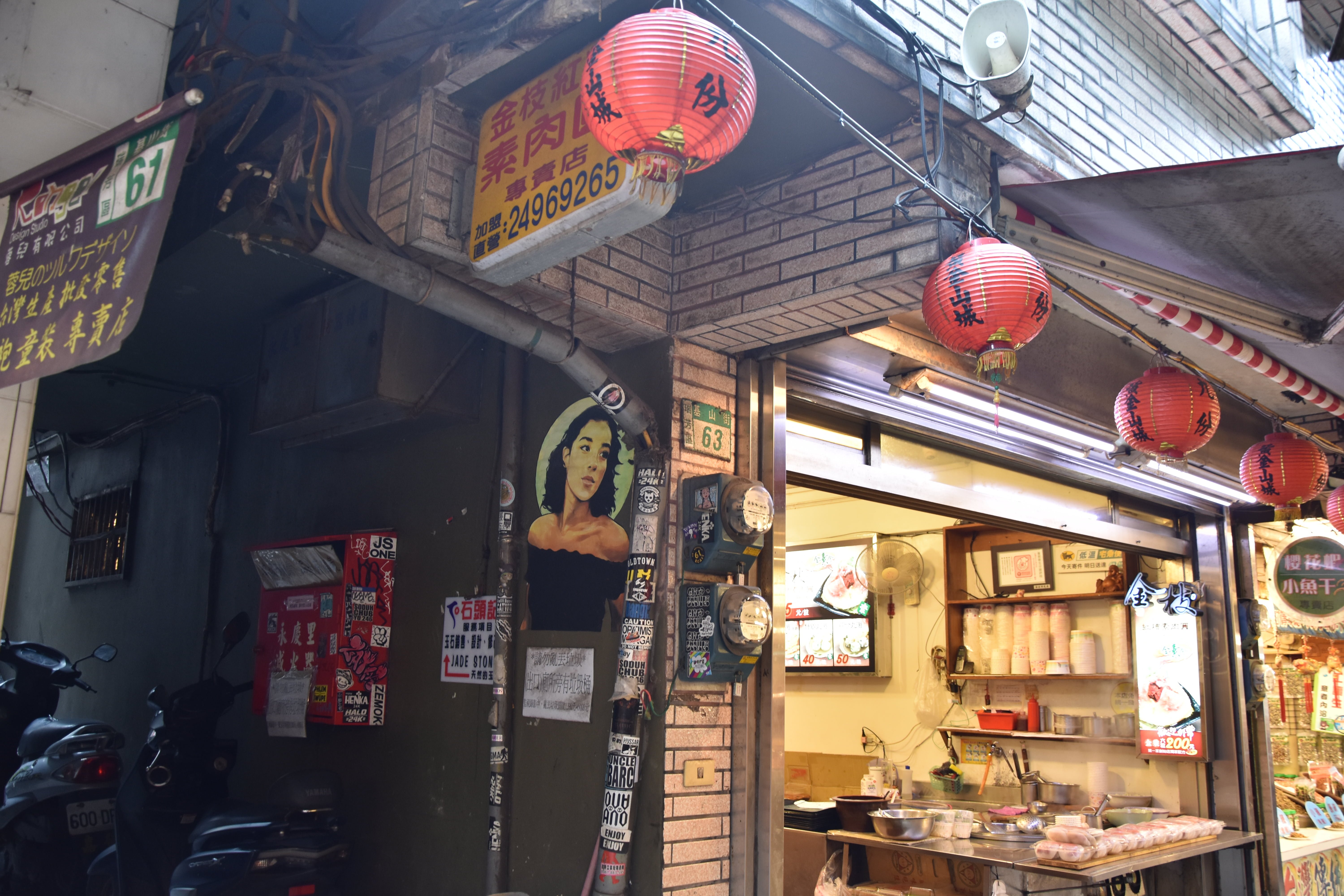
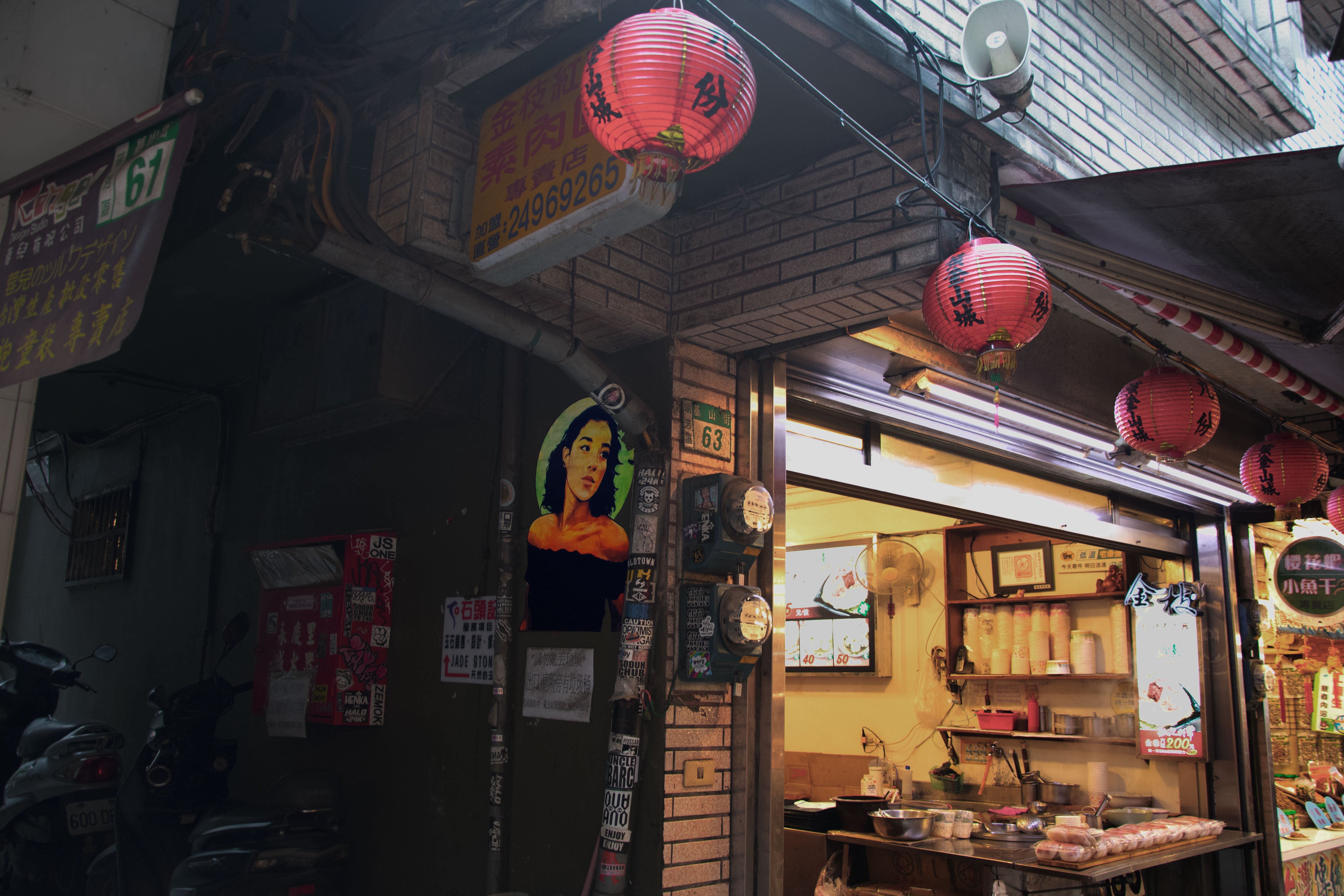
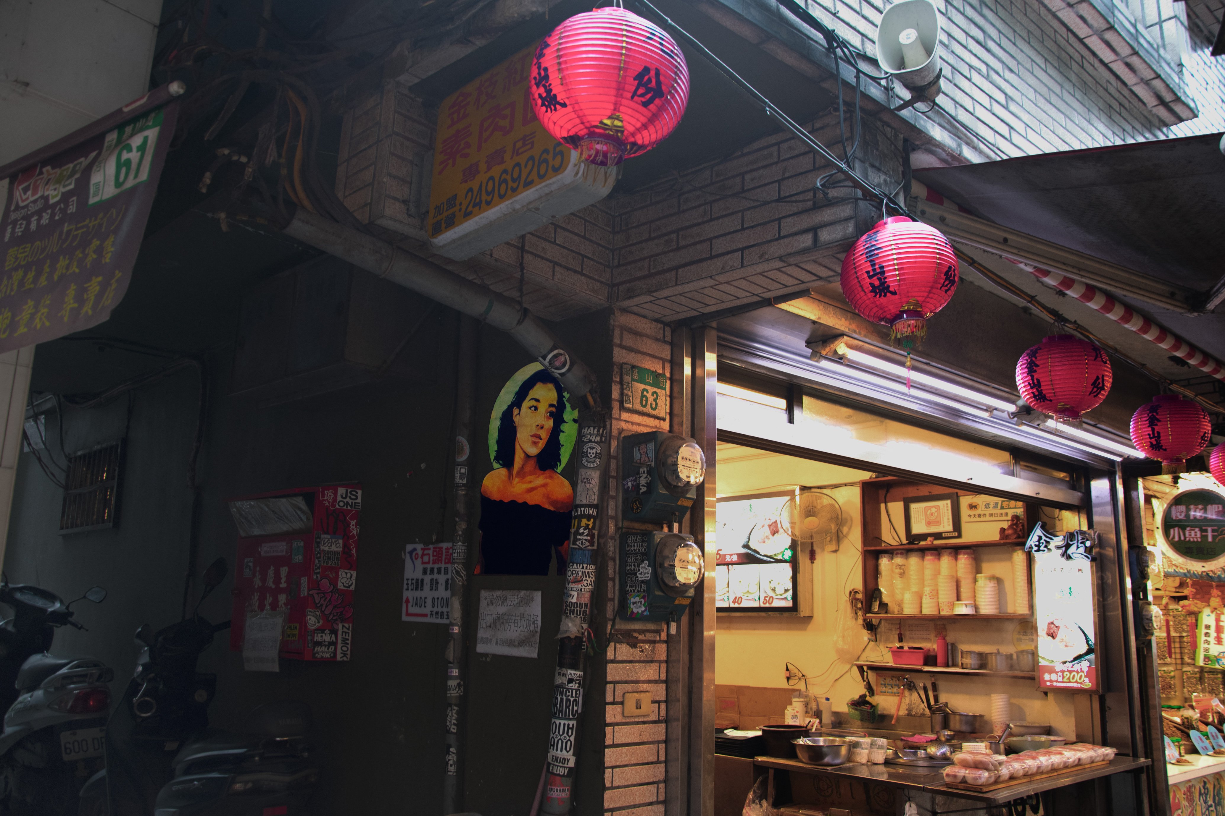
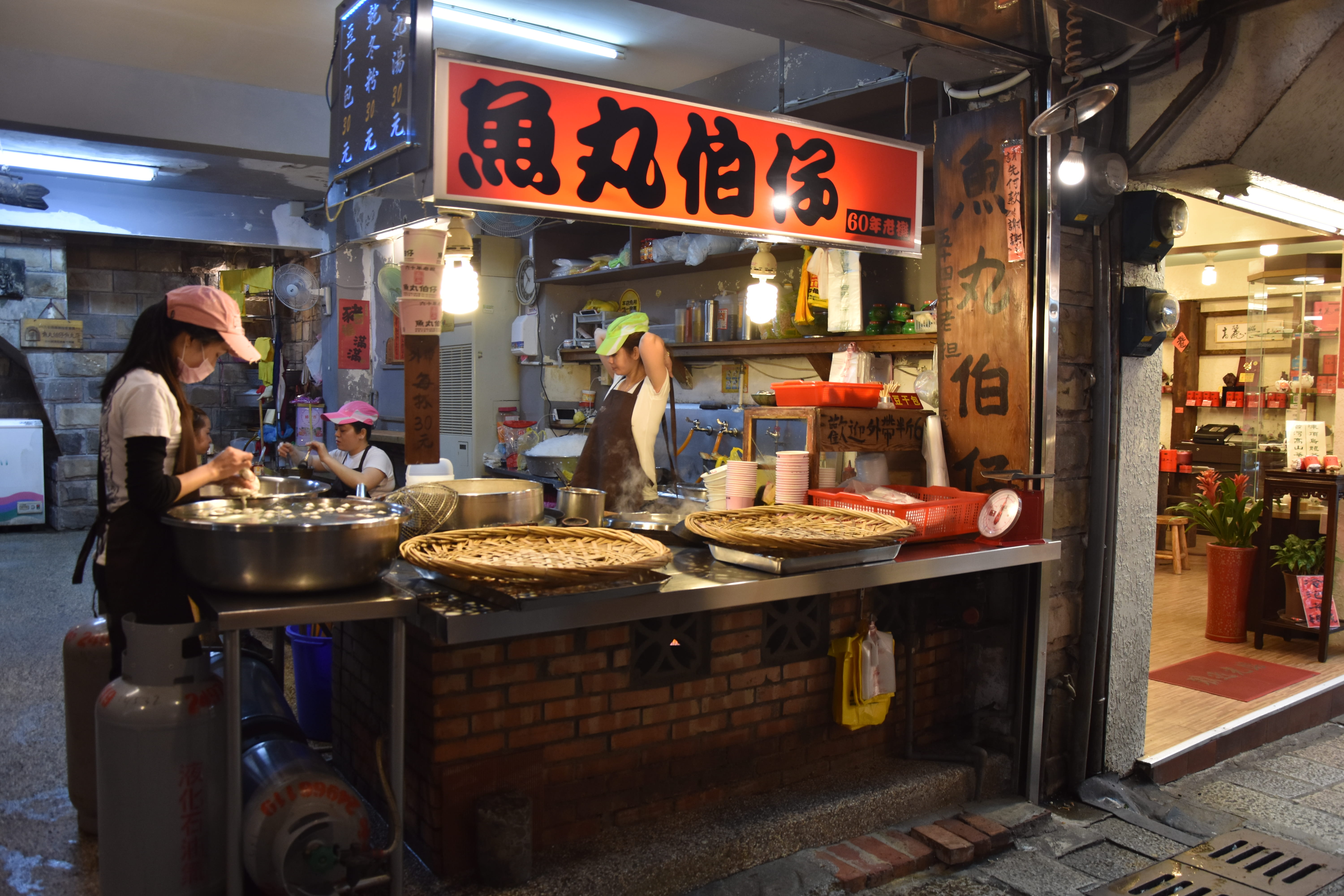
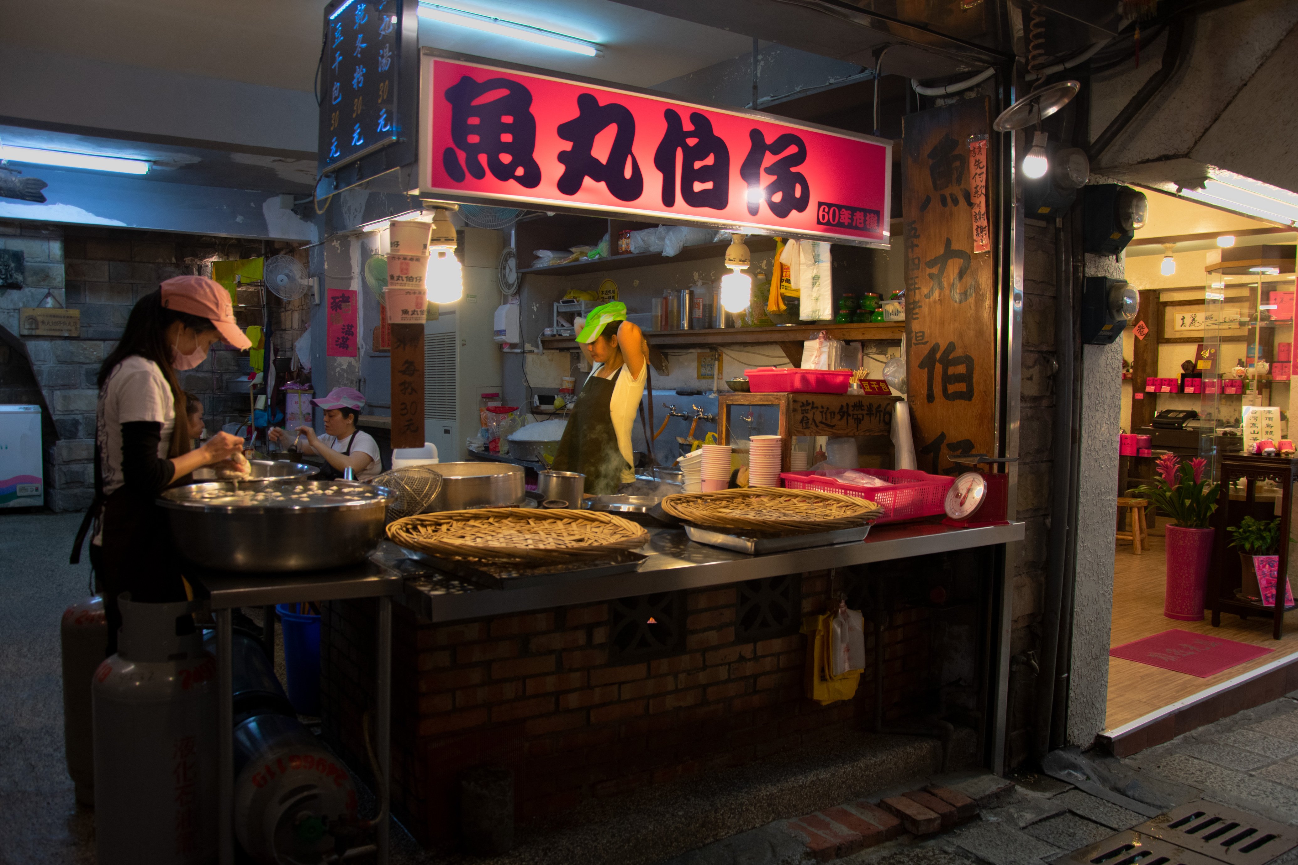
Fourth Pair: The Picture on the Wall and The Food Stand
Both photos were taken in the same area in the town Jiufen, which is a real tourist magnet. But in the morning, when the tourists are not there yet, it has a real special atmosphere, when the town is getting ready for the people that are coming. Here I mainy worked with red, yellow and green.
 |
 |
 |
 |
 |
 |
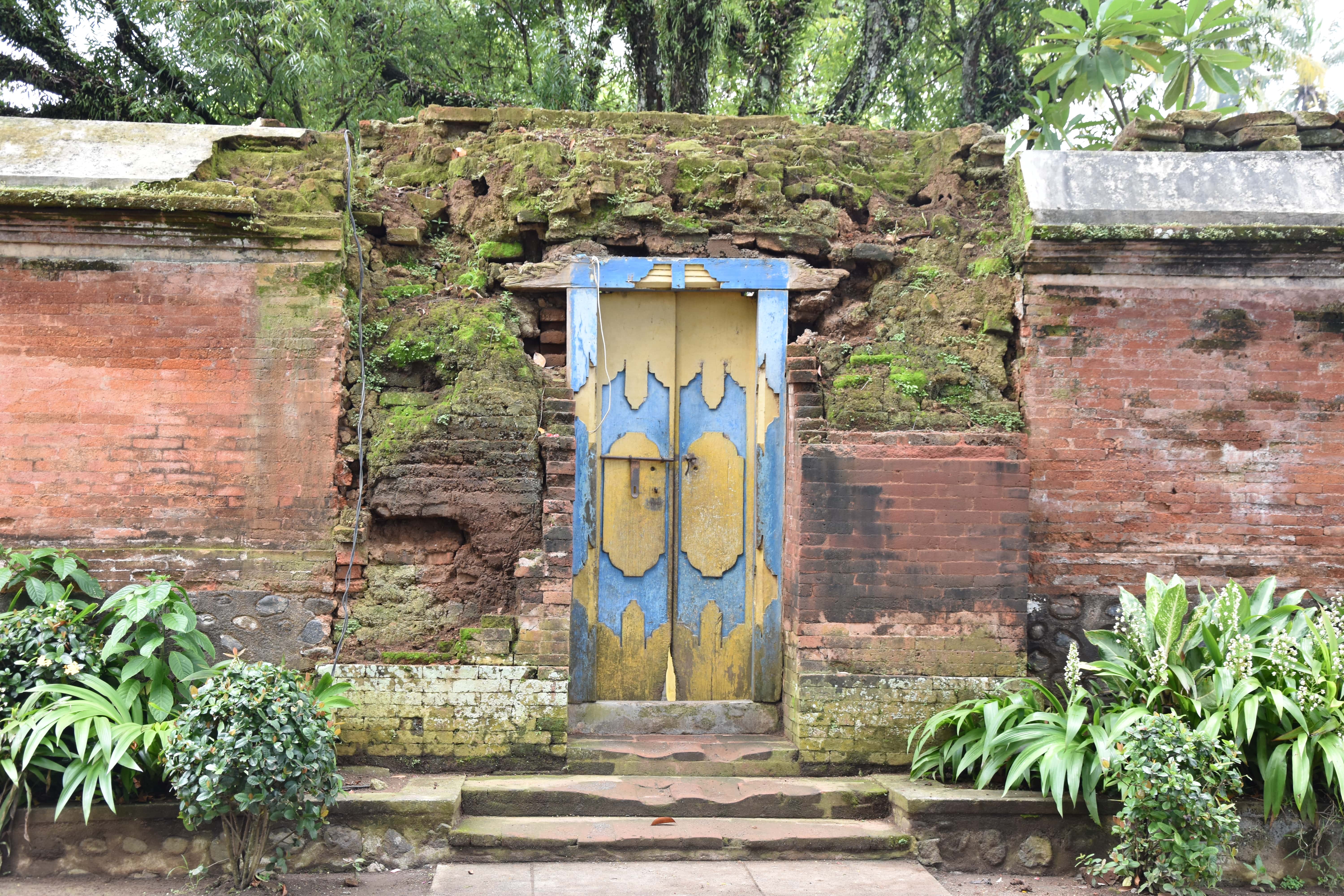
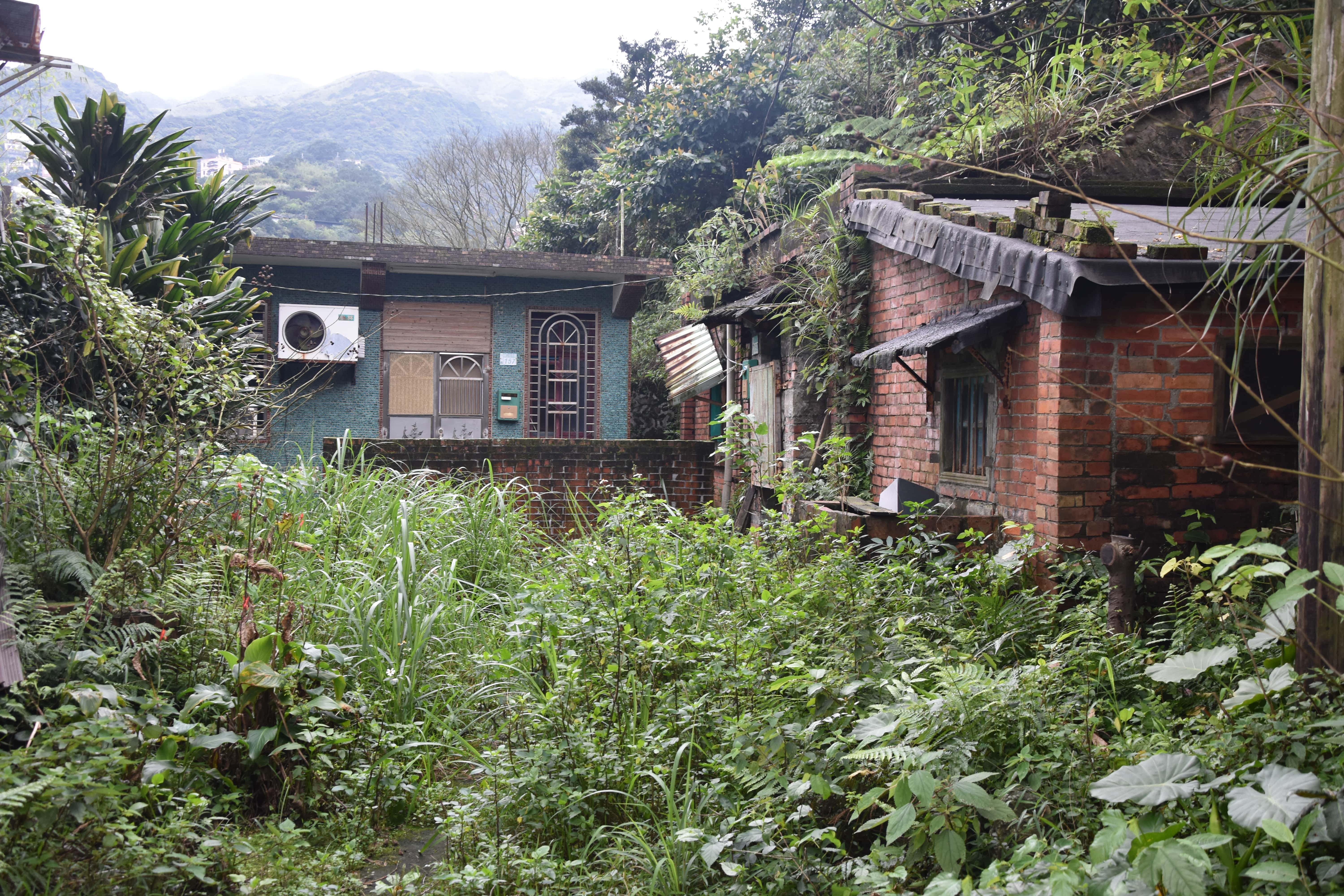
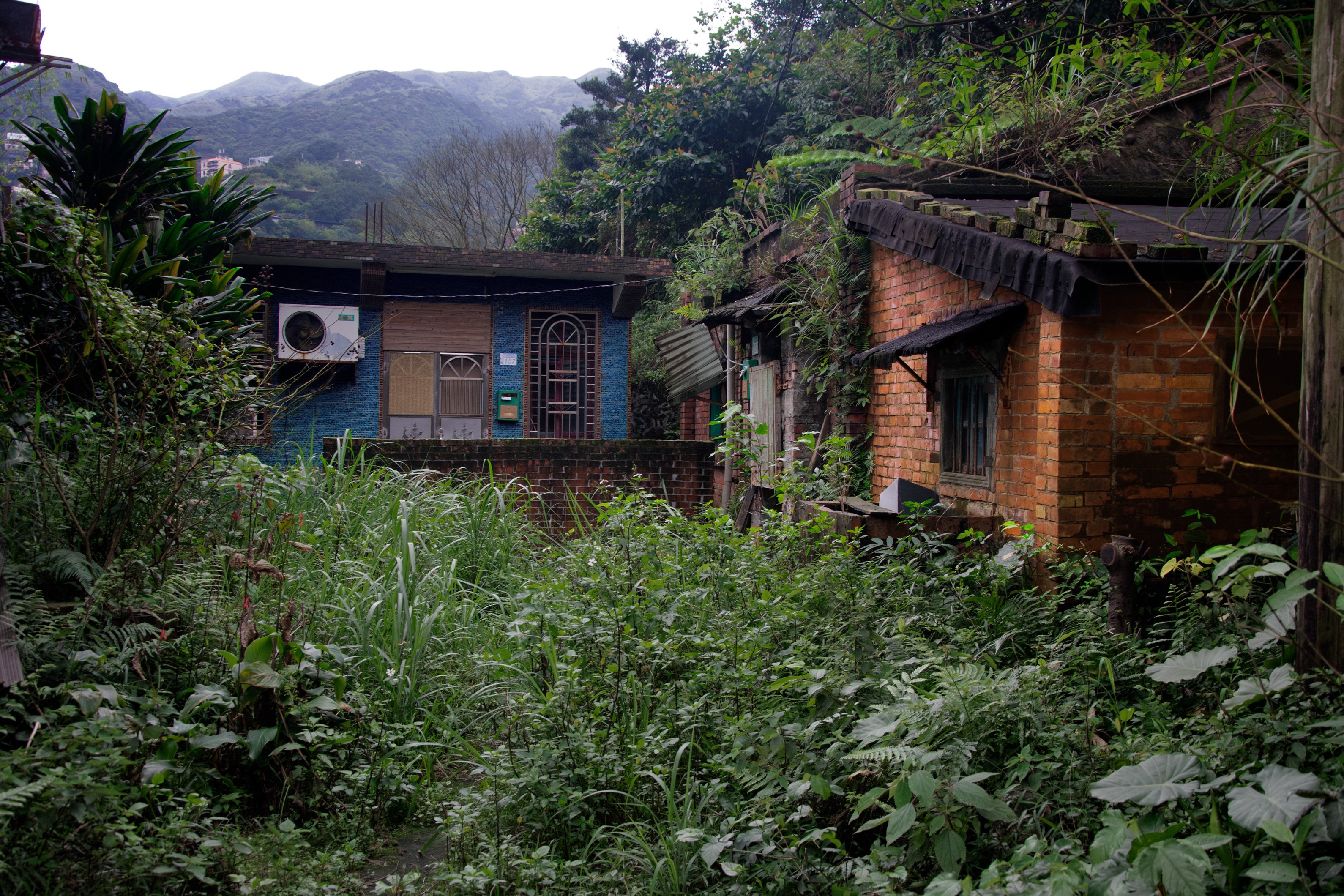
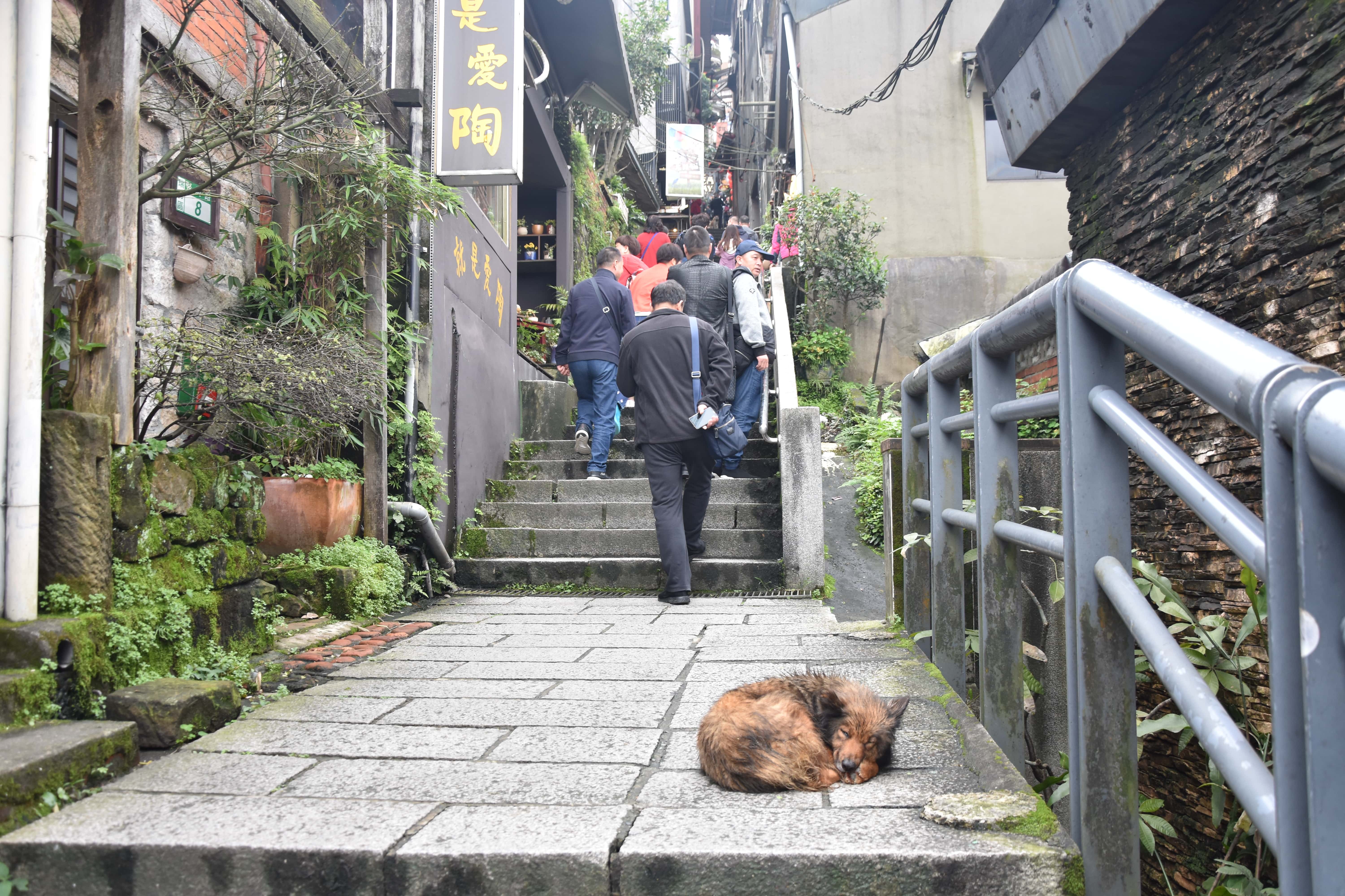
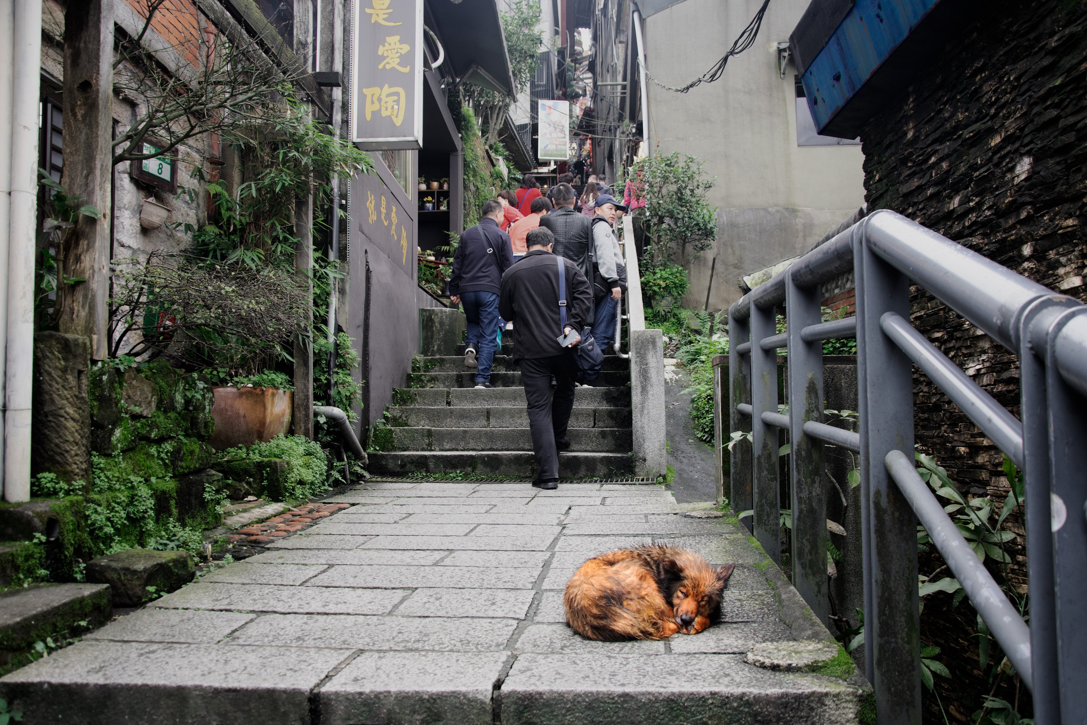
Fifth Pair: The left Place and The Dog
Both these houses as well as the dog on the street a bit sad and abandoned and kind of being in their own world. Therefore I combined them and adjusted the colours orange, green and blue.
 |
 |
 |
 |
 |
 |
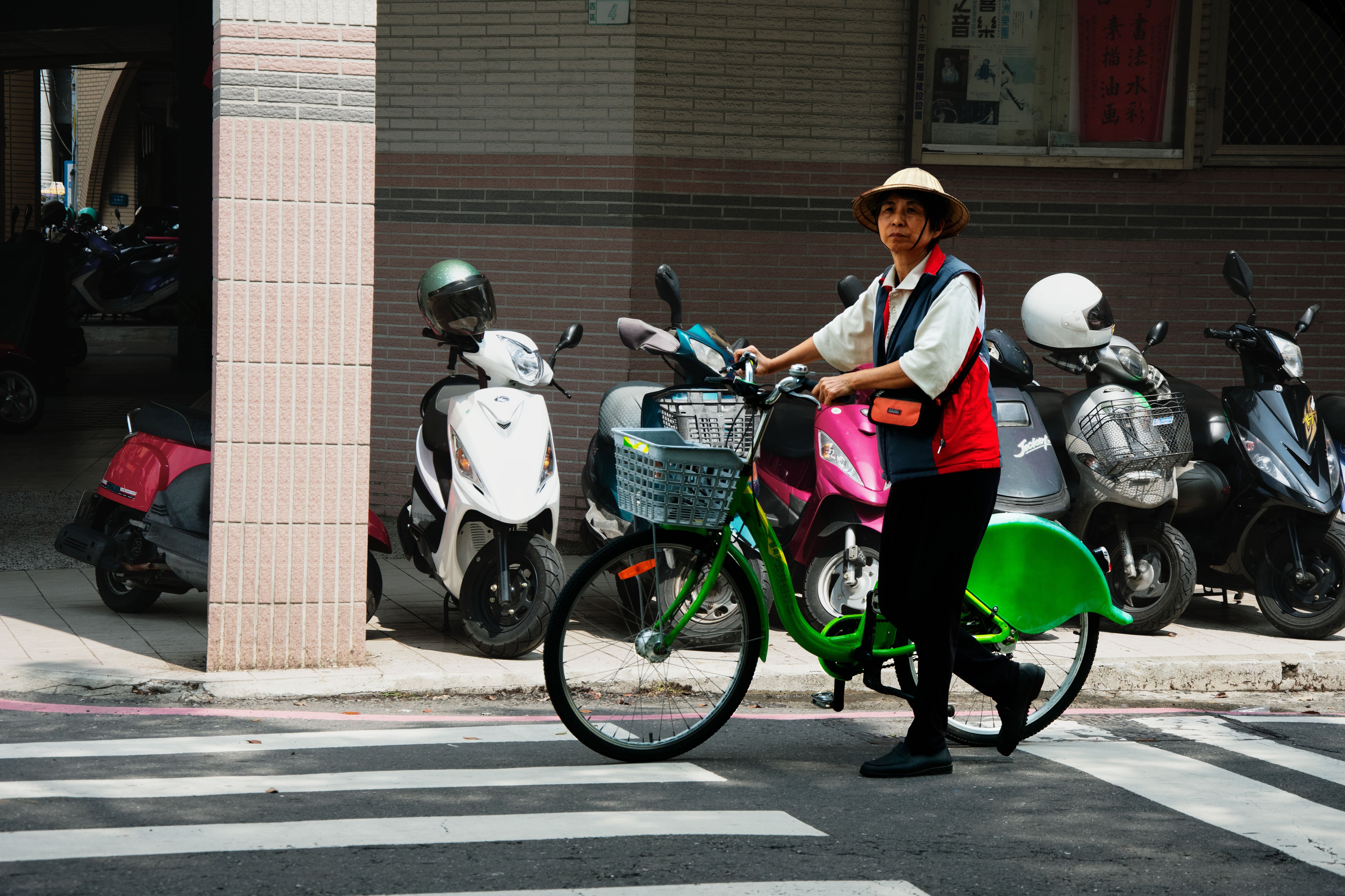
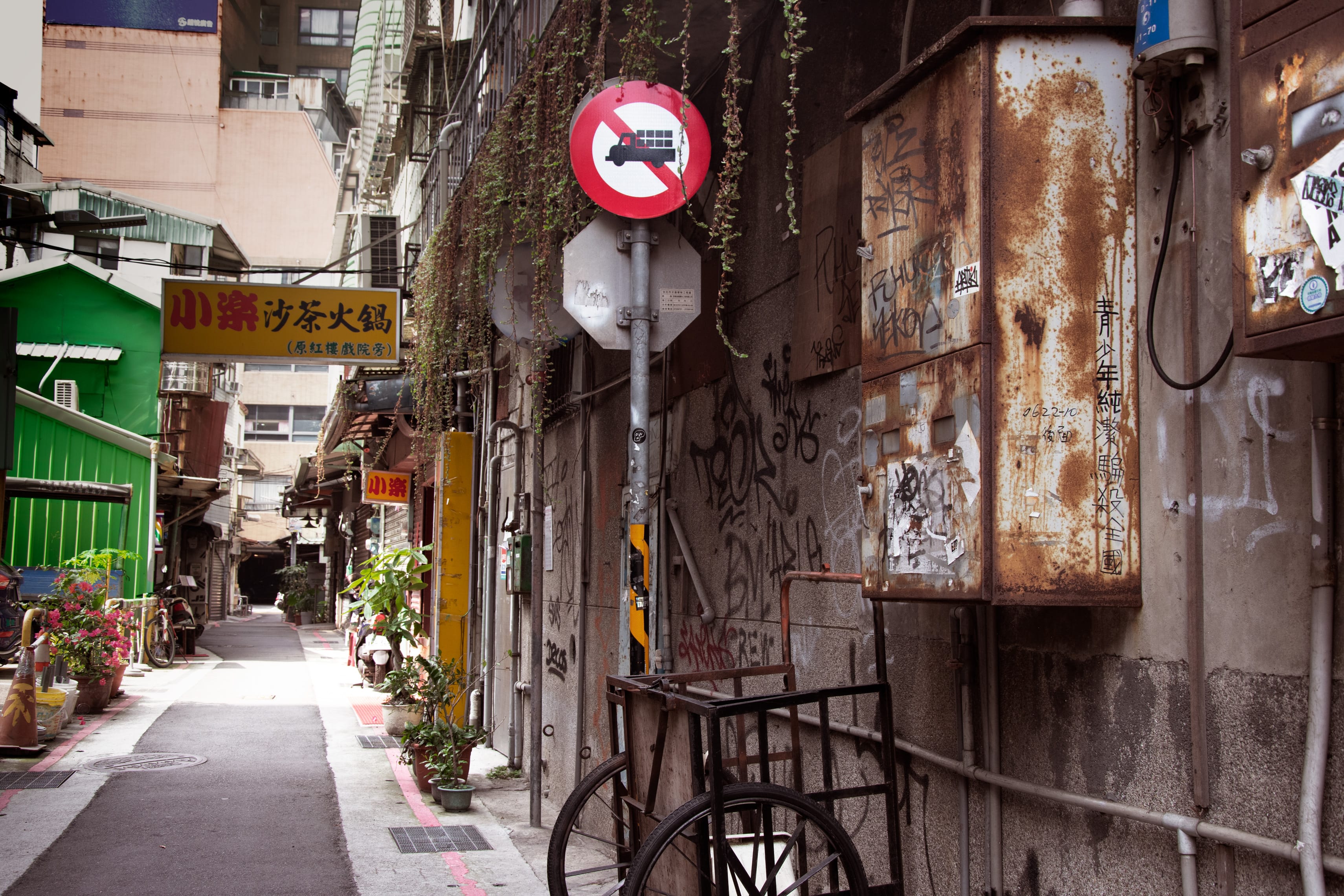
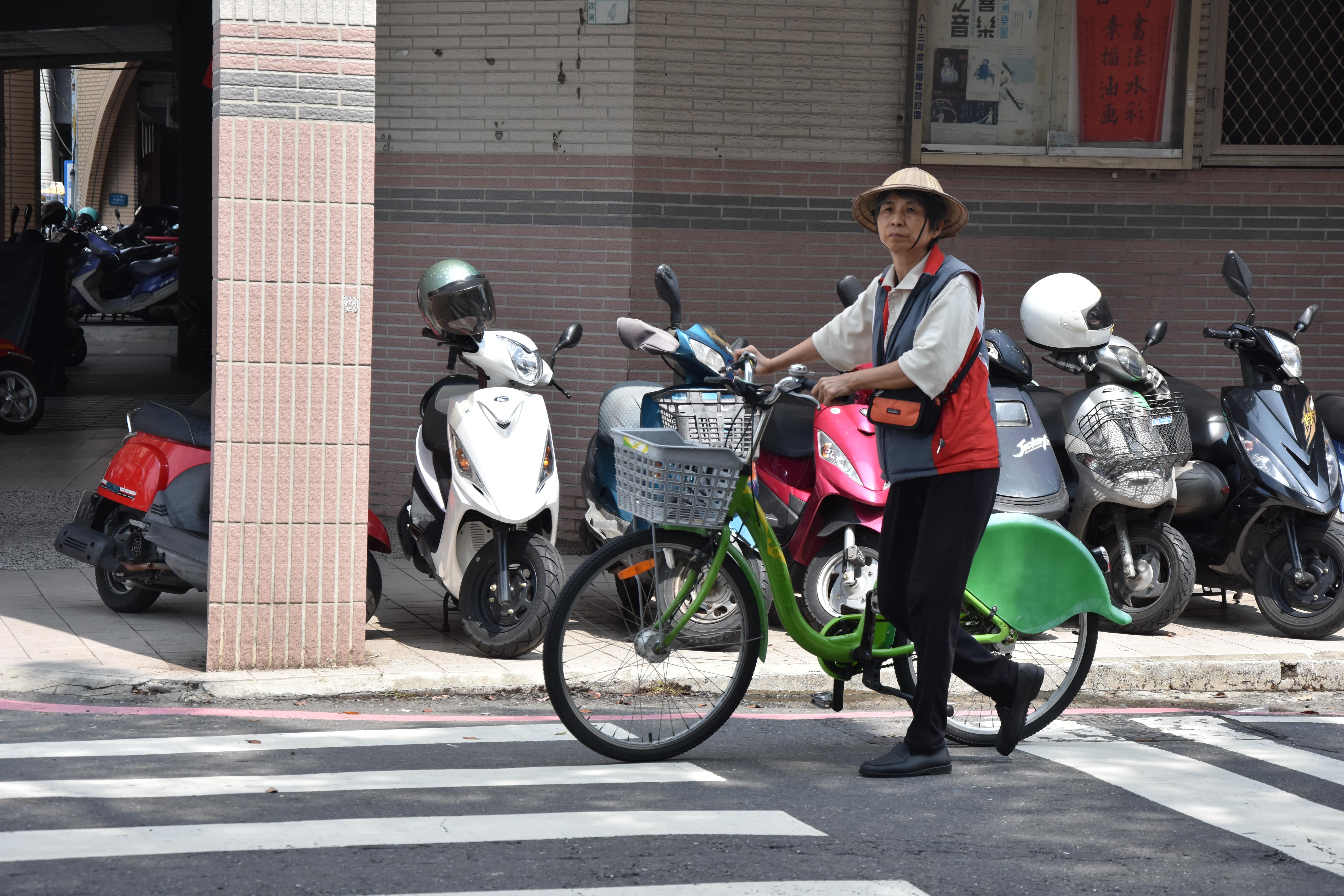
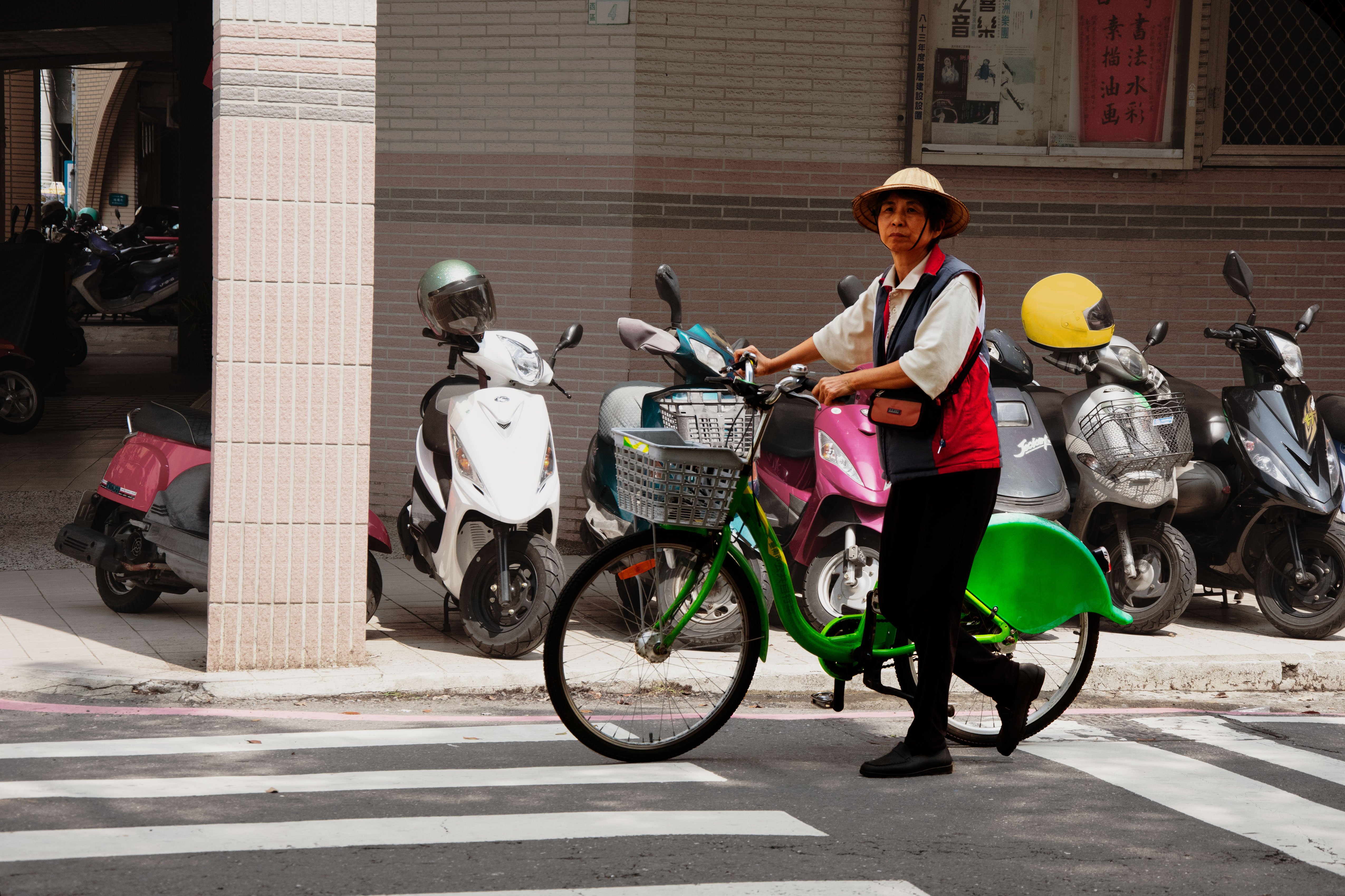
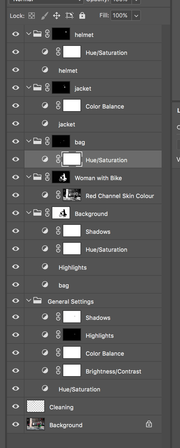
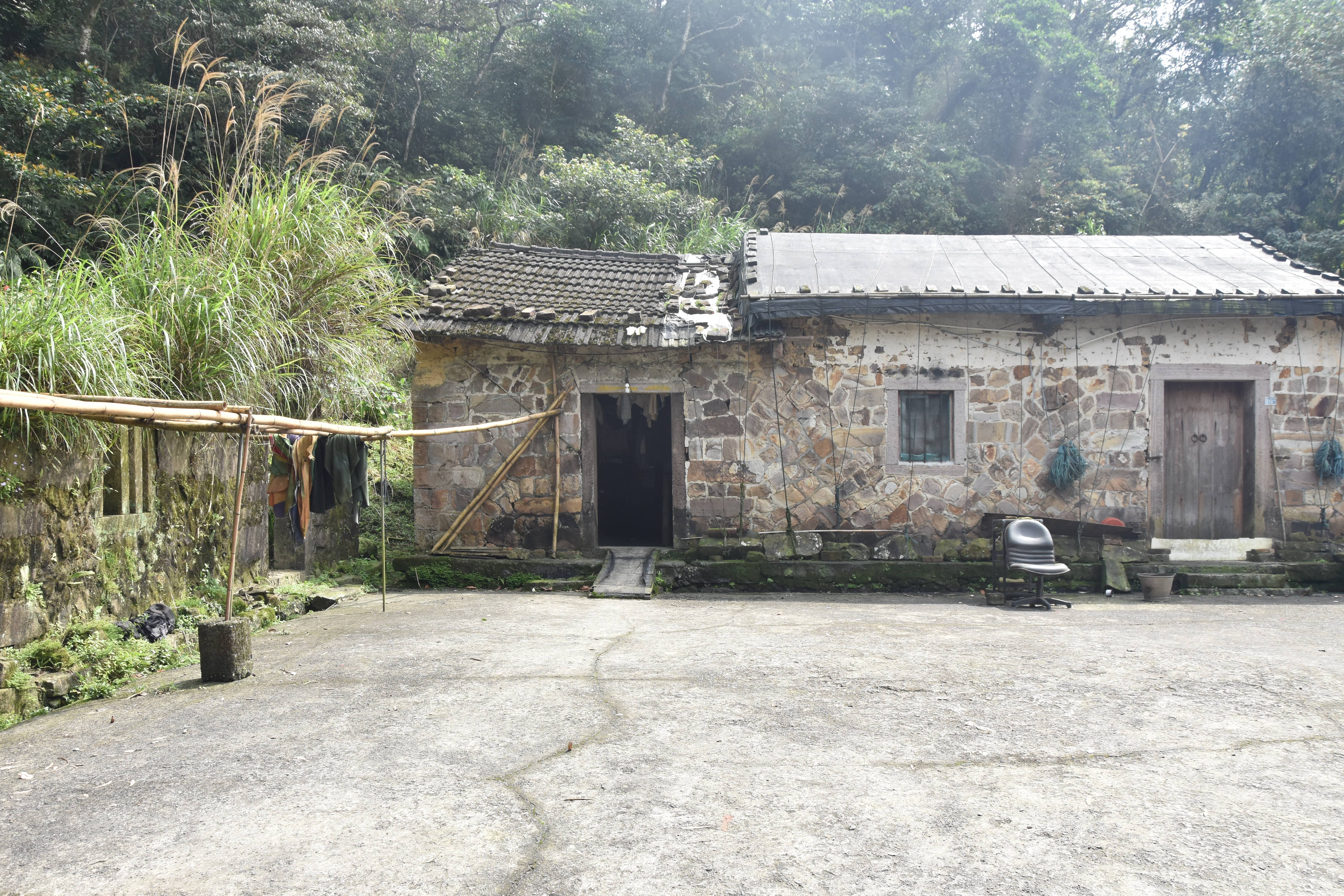
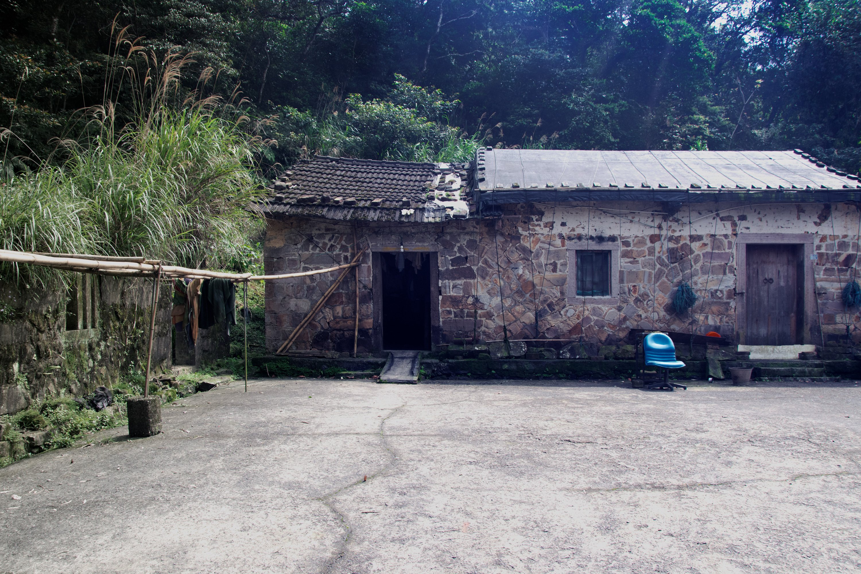
Sixth Pair: The green House and The Woman with the Bike
In both of these pictures I liked the bright colours and the calmness that the images expressed to me. So I adjusted the bright colours red, green and yellow in both images and lowered the saturation in the other areas.
 |
 |
 |
 |
 |
 |
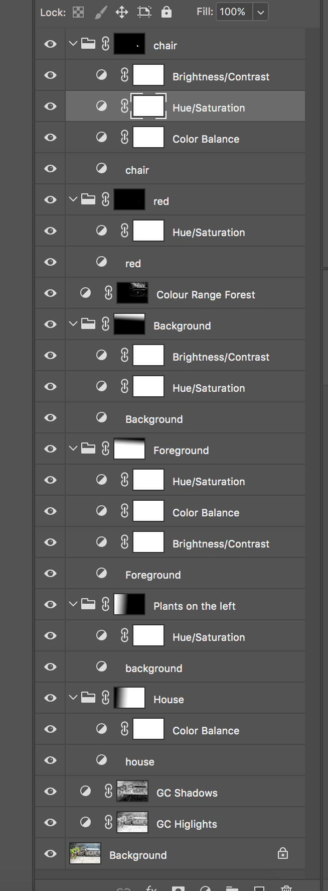
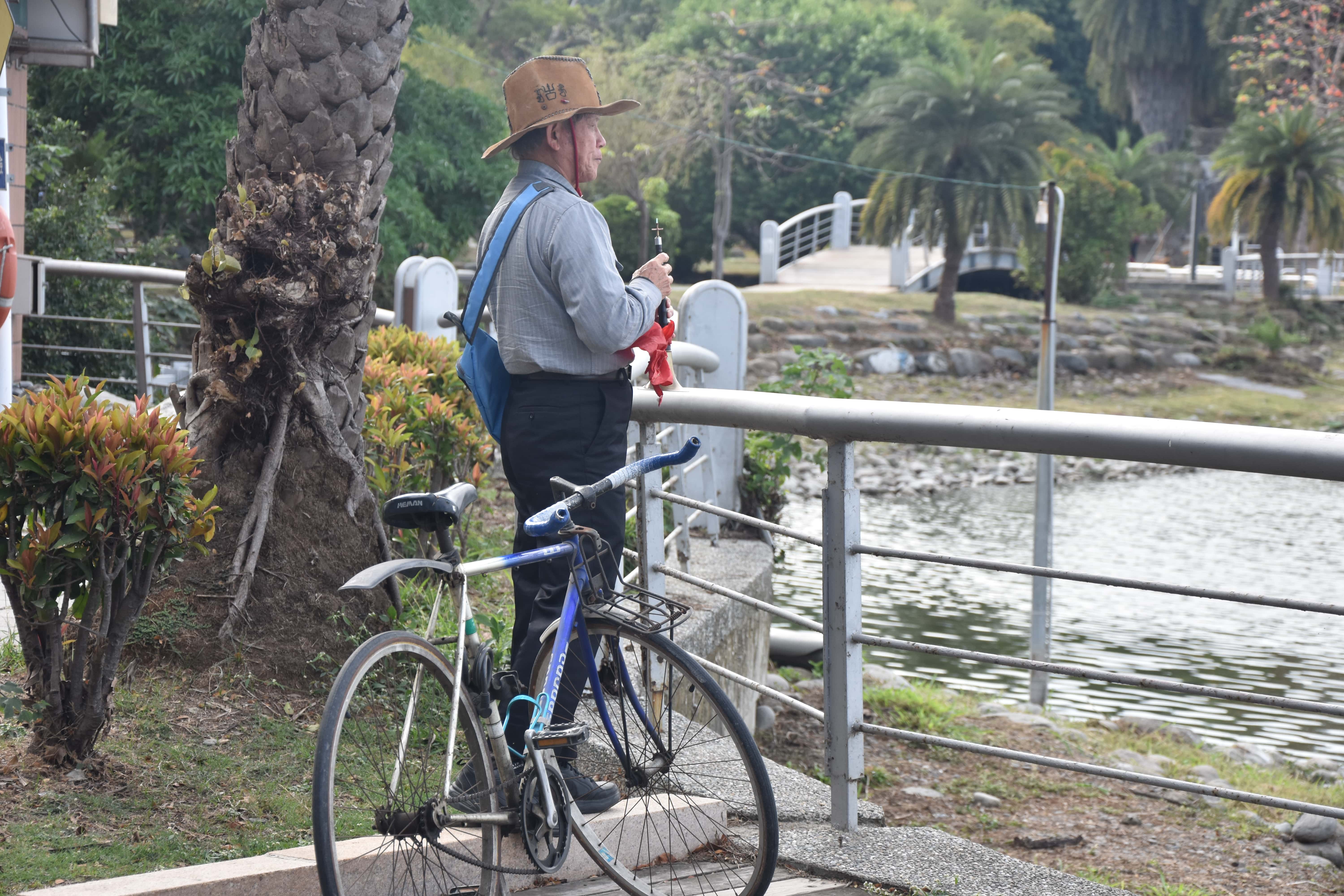
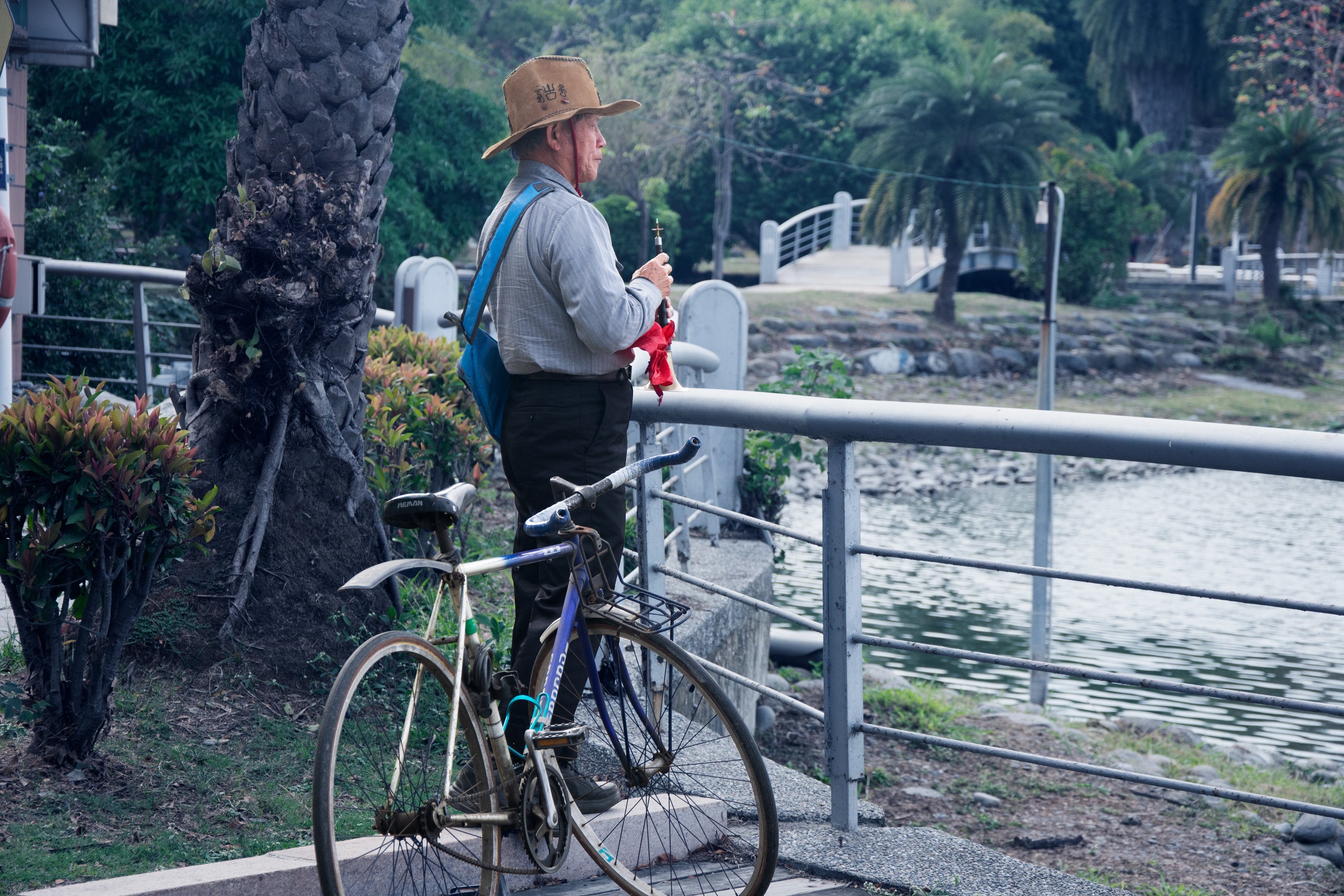
Seventh Pair: The Cottage and The Trumpet
Also in these both images I found two “objects” beeing on their own in a vivid enviroment. The cottage was next to a walking treck close to a national park and seemed to be only occpied by cats. The man was playing his trumpet like instrument in a city park in Kaohsiung. I darkened the enviroment to strenghten the separation of the object and the surroundings and adjusted the colours red, and different shades of blue and green.
 |
 |
 |
 |
 |
 |
Google drive link:
https://drive.google.com/open?id=11L5l2RV53iXZJr9vpKh4dKpJLyPOphFZ