Our class trip to the Art Science Museum was definitely a worthwhile experience. I’ve actually been planning on going for quite a while now, so I’m glad I got to cross it off my bucket list at only a fraction of the cost. We got to explore Future World, a series of interactive installations curated by Team Lab, and also learned about how UX can be applied to every discipline/study. In terms of aesthetics, I loved Crystal Universe, but the most thought-provoking exhibit was the wall of butterflies. Essentially every time we touched the butterflies they would fall, and this was a symbolic representation of the negative impact humans have on nature when we interfere with its natural rhythm. I thought it was cool how Team Lab integrated art and science while incorporating lessons about human impacts on the environment. 

Something I would suggest for the exhibit designers is to add more directional signs. Even though the exhibit was quite short, it was also very dark so I often saw people entering Crystal Universe through what was supposed to be the exit, simply because the path that led to the entrance wasn’t made evident. I also sat outside the exit for a while and saw that people would leave, look up at the posters outside and realize they missed something (especially Impermanent Life). 

During an interview with InVision, the renowned exhibit consultant, Beverly Serrell, once said: “Good exhibit writing actually flips the rules: Start with the specific and work to the general; start with the present and work to the past. Often that means literally and figuratively taking out the scissors, cutting out the last paragraph, and putting it at the top… What visitors learn at one “station” is going to resonate with something they learn at another one, so that as they move throughout the exhibit, it’s building that gestalt as opposed to presenting a totally independent idea one after another—because after 25 new ideas, you’re just ready to quit.” Thinking back at the descriptions for each artwork I think they really did consider the user’s experience because each one was informative but yet concise. 

I did some more research on Team Lab’s work and I found out about the architecture they do as well, here’s a link to my favourite structures built by them: https://architects.team-lab.com/projects/planets_bench

In this article, the authors discuss how defining “good design” is quite difficult and can be argued from many different perspectives. Nonetheless, the basis and foundation that good design is built on is the same in the sense that it has to be inclusive (an awareness of disabilities and marginalized identities), be fairly intuitive, and has to satisfy the user’s needs. One of the points they raise towards the end that I really like is that making a client happy is not sufficient and all-encompassing. I’ve never really thought about it in this perspective because as a UX designer I’m so focused on the user/customer that I failed to see the cultural, social, economic implications of my designs. We have to take a step back and look at how the user branches off and is connected to a greater network of people. Moreover, they state that design is just as much aesthetics as it is psychological. In my second year of university, I learned about Gestalt Principles and it helped me understand what they were saying in this article more thoroughly. There is a specific way that our brain processes design on a device, environment, and/or service and we have to understand how people think in order to create a design that is effective (provides affordances, tackles pain points) and appealing to the user. I only truly understood what IxD was this year and as a result of my fascination, I joined the Interaction Design Foundation (side note: I highly recommend their lessons because of how enjoyable/fun they make them https://www.interaction-design.org/invite?r=rebecca-yilma). The picture I posted above gives a visual representation of how IxD is a part of UX and is actually an interdisciplinary field. Here’s a post I shared with IDF back in July (my own words) : “The potential benefits of taking a user-centered approach to design is that it allows the designer to go in the shoes of the user (who will hopefully become a customer) and enhance the efficiency and enjoyability through their eyes. Moreover, most of the problems that are associated with user-satisfaction could be eliminated right at the core with this kind of mindset. When a user likes a device or service they are more likely to use it, purchase more items from the same company, and even recommend it to family and friends. When we design in a way that almost revolves around the user this, in turn, helps with the business’s profitability. With everything that we curate, we are not just doing it so it can sit there and be forgotten, the end goal is so that someone can use it. Taking this into consideration, it would only benefit us to take a user-centered approach in every step of the product life cycle to ensure that we make things intuitive. In my first year of university, I took a UX class and my prof. taught us to make “user personas” to think of the potential users, designing around my target markets needs made it easier for me to retain the attention of users and helped me make their lives easier. Lastly, making designs off of assumptions will increase the chances of you going back to the drawing boards, the user-centered design will give you insights into the desirability of a product/service/device.” 

Group Members: Natasya A., Jessie Z., Rebecca Y., Joslyn T.

  1. What is the experience that you are going to map?
  • Game/scavenger hunt split between North Spine and South Spine hunt (uphill and downhill)
  1. What challenges or problems have you identified that your map will address?
  • Size of map is too large →  section it off into zones (North spine and South Spine) 
  • Help students envision their future at NTU →  focus on student/faculty art work
  • Eliminate minor details 
  • Simpler phrases (less complex language)
  • Need to indicate public bus stop (not familiar with NTU and NTU Shuttle Bus)
  • Navigating the hills of NTU through the heat 
  • Include other activities to keep the attention of the students (e.g. dessert shop, selfie spots, etc)
  • Prioritize artworks that can be visited during day time
  1. Who is your primary audience?
  • Our primary audience consists of students from age 14 to 17 (Secondary School)
  • How we came up with this idea: Many secondary students come to NTU for class field trips and campus tours prior to uni applications. With that in mind, we thought it would be interesting to make the compulsory visits into something more interactive and incentive based. That way the students can have an entertaining/enjoyable experience rather than strictly educational.
  1. What are the survey questions that you’ll need to ask in order to identify and verify the problems/challenges?
  • What is the average size of the classes?
  • What is the min/maximum duration of the trip?
  • Are there any disabled students in the class?
  • What core lessons/curriculums does the district want to emphasize? (ex. Sustainable Architecture – we could ask fun questions on how the exhibit was made and how it gets energy) 


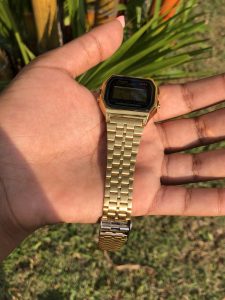
In this reading, Jan Chipchase illustrates how the things we carry around with us and our digital presence says something about who we are as people. Personally, I always have 3 essentials on me at all times. To help me remember before I leave my door in the morning I number each one off and I’ll quickly say to myself do I have “1,2,3” every morning. This just lets me know that there are three things and I may not remember what they are for that day, but I remember the number 3 and say to myself “do I have these items” ( I may add a number the night before depending on the day planned). My environment/location is a leading factor for what determines “my 3”. For instance, back home in Toronto, it would be my phone (calls/text, apple pay, applications), Blistex, and Presto bus card (at least one member of my family is always home so keys are not critical). Whereas here in Singapore, I need my phone, charger + international adapter, camera gimbal( I vlog), a watch, residence key fob, hand sanitizer, and cash. The reason I need so many more things in Singapore is usually because of how inconvenient it is to return to my hall to get something. I live 11 flights of stairs up in a building with no elevator, so it’s easier to carry a backpack and just stuff all the “maybe’s” in. 

He also explains the notion of “range of distribution” which to me simply means how clung onto your assets you are. The story of Meili from Shanghai made me realize that I am quite opposite to her. I often leave laptop, wallet, keys out on a public table and I’ll get up and go get something elsewhere without worrying too much about it. In fact, all four years of my high school career I never locked my locker, it was more convenient that way and I had a lot of trust for everybody. With that being said, I acknowledge that this is not the best thing to do in let’s say a mall but something like a school, hospital, church… I usually don’t overthink it. 

Furthermore, he mentions how storing everything on our digital devices has made things a lot easier for us. The things on our iCloud, external hardrirves and memory cards are a part of us and tell apart of our story. I’ve had my hard drive for 3 years now and on it, I have stored 5 years worth of memories and they mean everything to me. On it, I carry photos of my friends and family, videos from weddings, concerts, the first day of school and many more. “Snapchat Memories” is something that I truly appreciate because you can take a 10sec video of your day and store it in the app to save space on your phone. About a year ago my mother lost her phone and she was very sad not because of the physical phone but because that meant she lost years of photos. Luckily, I had set up a google drive/photos account when she purchased her phone so all the photos she had been taking on her Samsung she retrieved on her iPad upon downloading the app. Things like this make me realize how much these technological advancements have helped make our lives so much easier. 

I also agree with his last statement on how fortunate we are to travel and constantly teach ourselves about life lessons this world has to offer through immersing yourself into different cultures. I came to Singapore because I knew little to nothing about Asia and I knew I didn’t want to live my life missing out on the whole eastern side of the world. Technology has helped me with this process because it allowed me to research about what life here is like so I can prepare, it has also given me a platform to share my experience via YouTube. Not to mention, I can communicate with my family that live in over 10 cities around the world through 1 Viber group-chat. 

Youtube video by Adobe Creative Cloud this reminded me of: https://www.youtube.com/watch?v=4ryqgevnIN4

There’s a famous saying in UX/UI design and usability engineering that goes “don’t listen to what people say, watch what they do” and my prof at UW used to always repeat this to us. I am now starting to understand the implications of this after pairing it with the work of Jan Chipchase. In chapter 5 he outlines a variety of concepts such as community trust, social norms, and even cross-cultural similarities/differences. When designing applications or interactive environments I often do exactly what Chipchase was denoting to throughout the article — that is to do field studies and take into consideration unique factors that apply to a group of people. Some of the places that he observes and extracts information from is chain restaurants/companies, hairdressers, the airport, and the inner streets of cities. I like how he mentioned the importance of sensory exploration. Sometimes we as designers forget that all 5 senses are important for good design ideation, not only what you see.

When I first arrived in Singapore I was overwhelmed by the number of regulatory signs that are at every corner of the country. I’m originally from Toronto, Canada, and we have restrictive laws but definitely not as many as I’ve seen here. For instance, while traveling on the MRT I’ve seen “no eating, and drinking” signs… which spacial designers then have to take into consideration so that they don’t place vending machines on-site near the trains. Whereas in Toronto this law does not apply so adding a vending machine wouldn’t be a bad idea, people would actually really appreciate it. Another example would be Wrigley’s Excel Gum, which is very well known in Canada but since there are laws around gum here in Singapore it wouldn’t be profitable nor legal for companies like them to expand to Singapore. Furthermore, we can even see a lot about Singapore’s culture through their bathroom system. In Toronto, you can find gender-neutral bathrooms in public malls and universities. In the span of 4 months, I have not seen one gender-neutral bathroom (not any that I can recall). In Toronto, they are constantly aiming to be an inclusive city — whether it be religion, disabilities, or sexual orientations. The same goes for Singapore but not at the level of seriousness of inclusion that I see in Toronto. Last but not least, Chipchase got me thinking about the level of trust in Singapore and I have to say it is quite high. I absolutely love the feeling of walking home at night or even crossing the street in broad daylight and not feeling like I’m going to die. I get the sense that this level of trust starts with respect, people here just respect all walks of life and are more mindful about preserving life.

While reading this article I was constantly reminded of my experience in Addis Abeba, Ethiopia which is home to Africa’s largest outdoor market. The renowned “Addis Mercato” (meaning “new market” – first half in Amharic, second in Italian) is a melting pot of culture/traditions from all over the Middle East and North-East Africa. Addis Mercato is comprised of over 7000 privately owned businesses that stretch over Kenya St. It was very chaotic but I loved learning about its rich history and shopping around. Near the end of page 17 of the article, it reads “what is crowded to some people may be cozy to others. How could perceptions of space be natural or anything but as socially constructed as the built environment? Not only is there a socio-political story behind the built environment, but its meaning and use keep evolving. And as cities become increasingly heterogeneous or democratic, understandings and ideas of space may clash.” This got my attention because it accurately describes the conflict happening right now in regards to Mercato’s future. The government along with many big real-estate companies are aspiring for a more “modern” Addis Abeba but fail to see the beauty of Mercato in all its mayhem. Every inch of the sidewalk is occupied with goods and services that attract thousands of customers daily, which intern help keep the families well off financially. It is very hard for these sidewalk vendors to stand their ground against those in authority, but there’s power in numbers so they are still negotiating. While I was there I saw many coffee shops — one of the major selling points is because coffee beans originated in Ethiopia so many tourists want to taste Ethiopian coffee, the first of its kind. Taking this into consideration it has now become more than just a market but a staple for Ethiopian tourism.

“Our shorthand definition for critical cartography is to “map the unmapped,” which included the physical sidewalks, the people on the sidewalks, and the social negotiation of this space .” I completely agree with this statement. Something I noticed while walking along those sidewalks is that there isn’t any sort of mapping established. Unless you have been coming there for years familiarizing yourself with the layout and on top of that trying to find a specific item is very difficult. The vendors themselves have verbally agreed to organize their shops in a specific way and since there are no written contracts it is subject to change quite frequently. Even google maps doesn’t show you a clear street view, but instead, a 360 camera shot taken in one location by a tourist is linked to the street. One thing that I would think would help is some sort of system that actually accounts for the amount of consumerism that occurs here. In addition, those in power can work together with the vendors to try to find a feasible and fair solution. At the end of the day, closing down the entire or even sections of Mercato would affect both the street vendors and the people that rely on vendors as their main source of food, clothing, fuel, and many more.

One thing I always have on me and somehow seem to remember more than my keys or phone is my Casio watch (model: A159WGEA-1EF). I used to have one similar to this one back in 2013 but it broke during my baseball practice. I found it so useful that I just recently purchased it again this past winter. In terms of aesthetics, the colors are black and gold and it has a very chic/modern look to it. Like any device, there are certain aspects that I love about it and there are also some that I don’t. First and foremost, I love how lightweight it is to wear and convenient it is to store away. The strap is also adjustable and has a fold-over-clasp that is very secure. Another thing I like about it is that the date and time are written in a font size that is legible from far. Something that a lot of tech gear doesn’t have is a water-resistant layer meaning you can not go swimming with it. Whereas with this watch I am free to wash the dishes or swim, worry-free. I appreciate the fact that Casio has incorporated an LED light button for low light settings – I find myself using this quite often. Basic functions of this watch are the alarm, timer, and stopwatch. Furthermore, the dial window material is made out of mineral crystal, which reduces scratches. The band is comprised of smaller metal parts that are woven together and can easily be stretched. Thus, if you have any sort of hair on your arms or wear it while tying up a ponytail, it hurts! The dials on the side are not intuitive, instead, they are quite confusing. I feel like I’m always referring back to the instruction manual or watching a YouTube tutorial every time I travel and change time zones. According to Norman, discovery and understanding are two of the most important parts of good design. I would say that discovery, in this case, is intricate because it’s difficult two figure out what combinations of buttons on the watch to click, and in what order, to perform specific tasks. The same thing goes for understanding, unless you have thoroughly read all the parts of the manual it’s going to take many trial and errors before you get it right.

Some of my favorite works of art are chairs. I love going to furniture stores or even looking at books on chairs by famous architects. One of my favorite chairs is the “Womb Chair” by Eero Saarinen (1948) because of its biomorphic design principles and contemporary style. Almost every day after my classes I sit on the bar stools, located in the ADM library, to do my homework. In terms of design, this chair is padded, has a back and footrest, and is covered in black synthetic leather. Moreover, regarding affordance, this object affords sitting and is very intuitive. On the other hand, it is evident that this chair was not designed for prolonged seating times. Hence why the sofas towards the back of the library are used more. Students can be seen sitting on those all day, and some even sleep there. But that is exactly why I choose to sit on the bar stools, because of its lack of comfort it is less likely for me to fall asleep from getting too relaxed. I find that I am not able to study or take notes on things like bean bag chairs for instance. Take the renowned ‘watchman’s chair’ or the MTA benches in New York City into consideration, these chairs were both purposely made uncomfortable, so users don’t abuse them or get too cozy. I’ve studied human ergonomics before and based on my research I would say that the design of this chair might cause back pain because of where the backrest cuts off. Not to mention, it is quite high up so my guess is that they took less then the 50th percentile of anthropetric data in Singapore to design this – or perhaps these were imported from elsewhere.
Side note – if you also like chairs check out The Design Museums “A Century of Chairs: touring exhibition” (available autumn 2019)