One thing I always have on me and somehow seem to remember more than my keys or phone is my Casio watch (model: A159WGEA-1EF). I used to have one similar to this one back in 2013 but it broke during my baseball practice. I found it so useful that I just recently purchased it again this past winter. In terms of aesthetics, the colors are black and gold and it has a very chic/modern look to it. Like any device, there are certain aspects that I love about it and there are also some that I don’t. First and foremost, I love how lightweight it is to wear and convenient it is to store away. The strap is also adjustable and has a fold-over-clasp that is very secure. Another thing I like about it is that the date and time are written in a font size that is legible from far. Something that a lot of tech gear doesn’t have is a water-resistant layer meaning you can not go swimming with it. Whereas with this watch I am free to wash the dishes or swim, worry-free. I appreciate the fact that Casio has incorporated an LED light button for low light settings – I find myself using this quite often. Basic functions of this watch are the alarm, timer, and stopwatch. Furthermore, the dial window material is made out of mineral crystal, which reduces scratches. The band is comprised of smaller metal parts that are woven together and can easily be stretched. Thus, if you have any sort of hair on your arms or wear it while tying up a ponytail, it hurts! The dials on the side are not intuitive, instead, they are quite confusing. I feel like I’m always referring back to the instruction manual or watching a YouTube tutorial every time I travel and change time zones. According to Norman, discovery and understanding are two of the most important parts of good design. I would say that discovery, in this case, is intricate because it’s difficult two figure out what combinations of buttons on the watch to click, and in what order, to perform specific tasks. The same thing goes for understanding, unless you have thoroughly read all the parts of the manual it’s going to take many trial and errors before you get it right.

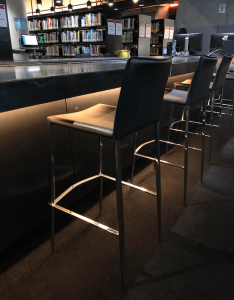
Some of my favorite works of art are chairs. I love going to furniture stores or even looking at books on chairs by famous architects. One of my favorite chairs is the “Womb Chair” by Eero Saarinen (1948) because of its biomorphic design principles and contemporary style. Almost every day after my classes I sit on the bar stools, located in the ADM library, to do my homework. In terms of design, this chair is padded, has a back and footrest, and is covered in black synthetic leather. Moreover, regarding affordance, this object affords sitting and is very intuitive. On the other hand, it is evident that this chair was not designed for prolonged seating times. Hence why the sofas towards the back of the library are used more. Students can be seen sitting on those all day, and some even sleep there. But that is exactly why I choose to sit on the bar stools, because of its lack of comfort it is less likely for me to fall asleep from getting too relaxed. I find that I am not able to study or take notes on things like bean bag chairs for instance. Take the renowned ‘watchman’s chair’ or the MTA benches in New York City into consideration, these chairs were both purposely made uncomfortable, so users don’t abuse them or get too cozy. I’ve studied human ergonomics before and based on my research I would say that the design of this chair might cause back pain because of where the backrest cuts off. Not to mention, it is quite high up so my guess is that they took less then the 50th percentile of anthropetric data in Singapore to design this – or perhaps these were imported from elsewhere.
Side note – if you also like chairs check out The Design Museums “A Century of Chairs: touring exhibition” (available autumn 2019)