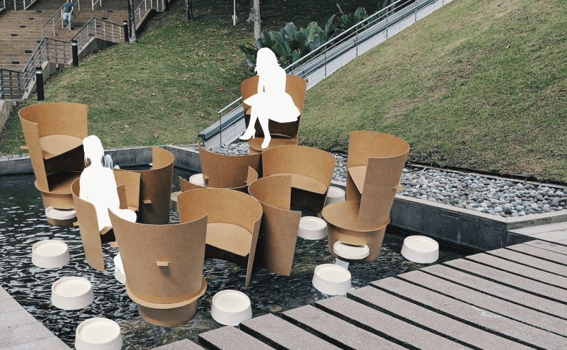
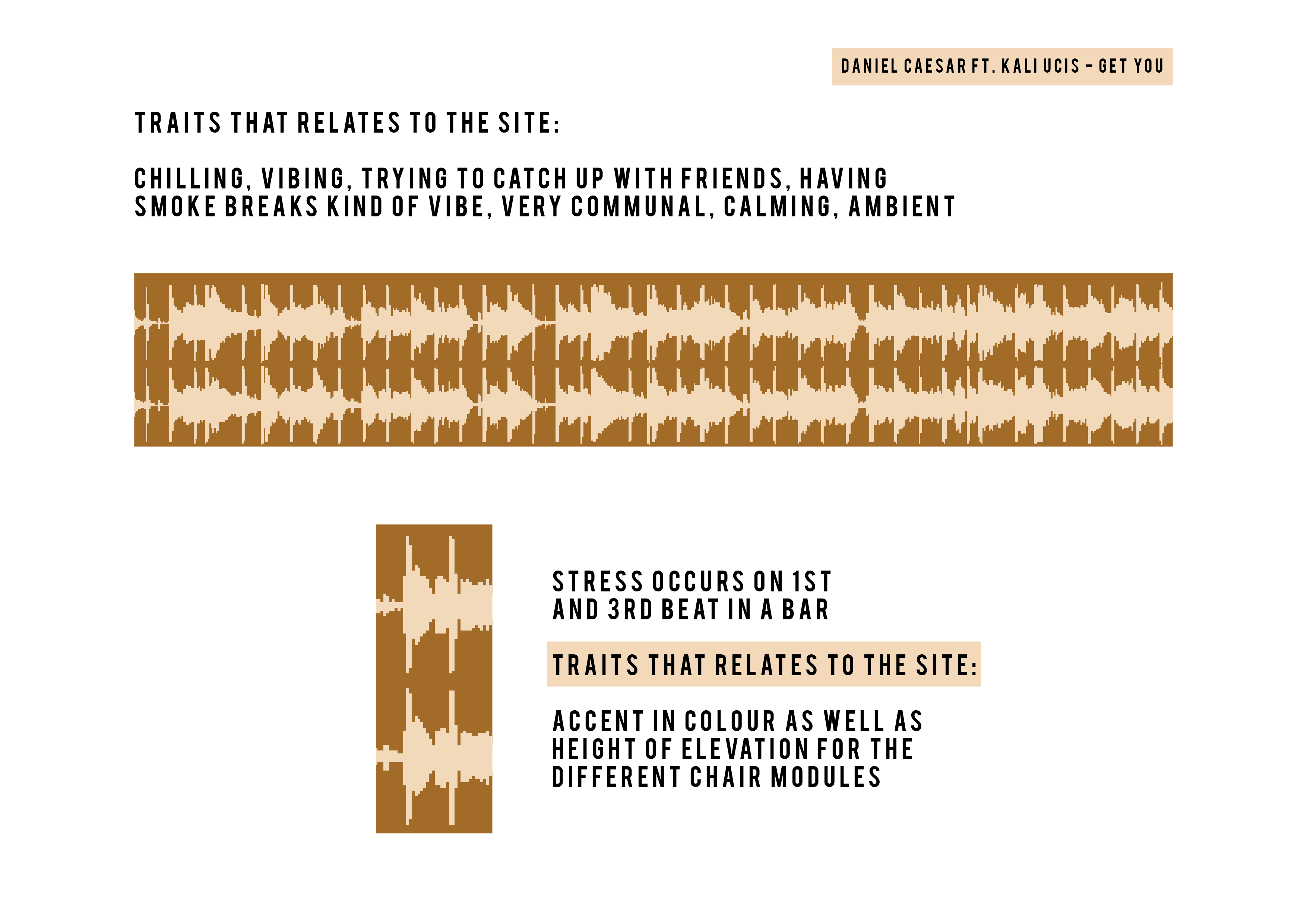
I was very inspired by Daniel Caesar’s track, “Get You” because it really gives off a very calming and relaxing vibe that reminds me of the site that I got. The music would also be a perfect ambient music that accompanies the crashing waterfall sounds right below the bridge.
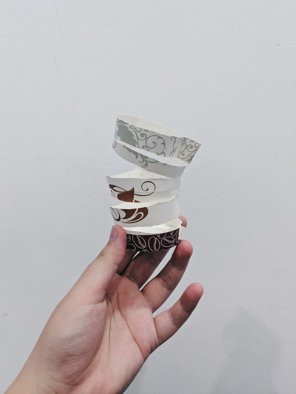
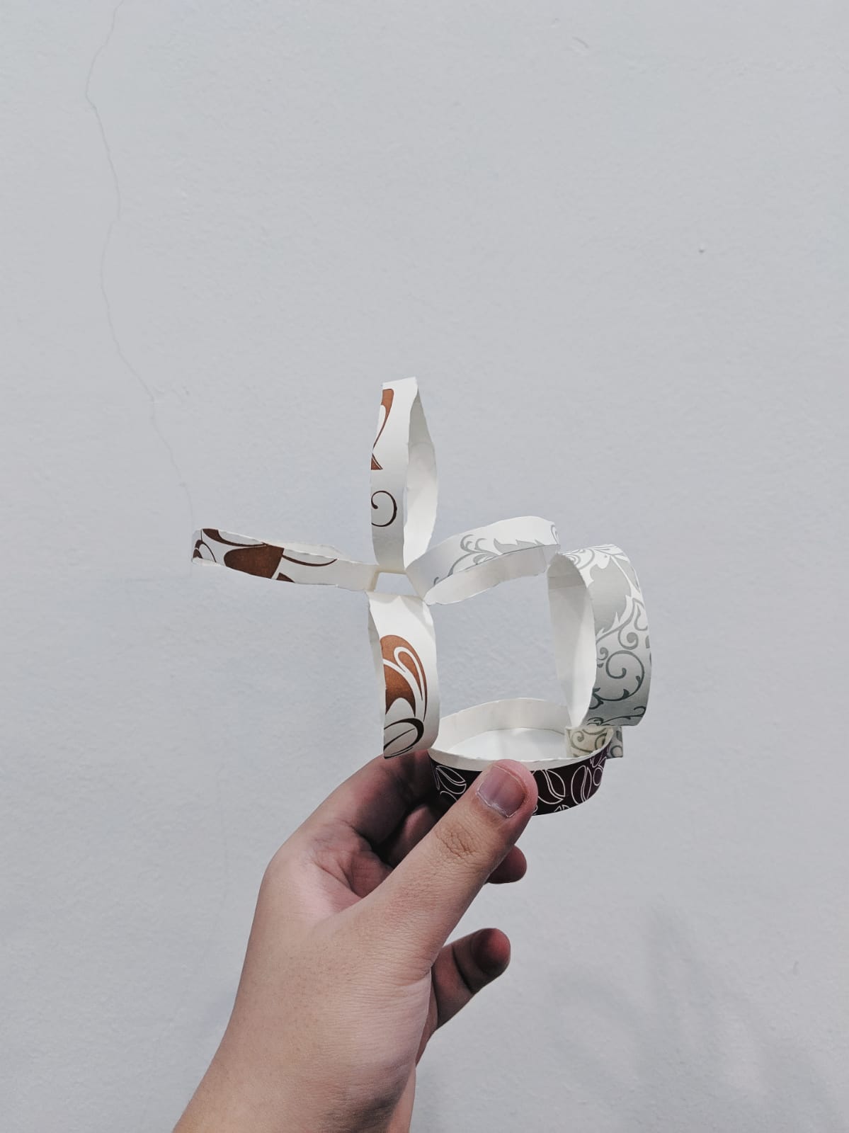
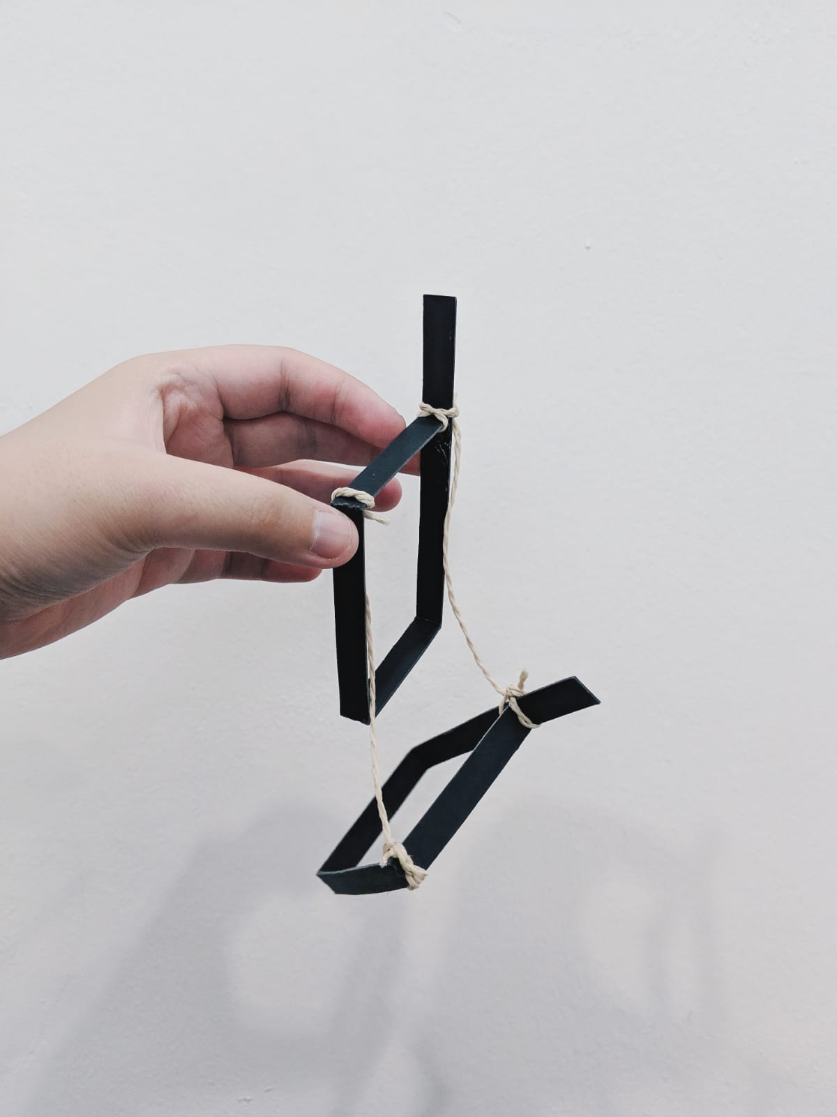
Apart from implementing the elements from the song, I also wanted to do a communal seating yet the chairs are retractable and is able to save some space. Here are some of the sketch models:
Retracted
In Place
Retracted
In Place
However, from this I realized how it would be very difficult to create a proper form out of the retractable concept and decided to work more on the chairs being communal and modular. Here is my final presentation:
‘Hush Little Baby’ is a morbid take on the coping method for mothers who experienced a miscarriage. This interactive installation is an immersive experience that is comforting yet harrowing, allowing the audience to freely touch, feel and hear everything that has been carefully curated on set.
The installation is motivated by the concept of the lack of a tangible memorial for a baby that is lost through miscarriage as there isn’t a body present. In a way, this installation is a ‘grave’, ‘shrine’ or ‘memorial space’ for a baby lost through miscarriage.
The installation calls for a single person experience at any point of time so as to allow the audience to fully immerse themselves. Audiences would need to go under the canopy and lie down as they have a touch and look at all the items that have been placed including the climax of the interaction – the baby bolster.
Observational documentation for user tests
Tester 1: Charm
Approaches space , “so confused”
Starts sleeping and lying down in space.
Shocked when audio of baby crying starts to play when bolster is squeezed and hugged.
Squeezes and further interacts with bolster.
Starts continuously pressing bolster until music and audio ends.
Thoughts:
“Clear it was a dark object”
“Visceral set up”
“Associate with being a mother and holding a child.”
Tester 2: Sherneese
Slowly enters under the canopy, tries to lie down.
Holds the bolster, waits for baby crying to play.
Places bolster at different positions and trying to get audio to play
Tries to understand the differences in audio when different pressures are applied.
Leaves set up before music ends.
Thoughts:
“Agree with charm, context was very clear”
“Blood made it v clear it was a miscarriage”
Design process documentation
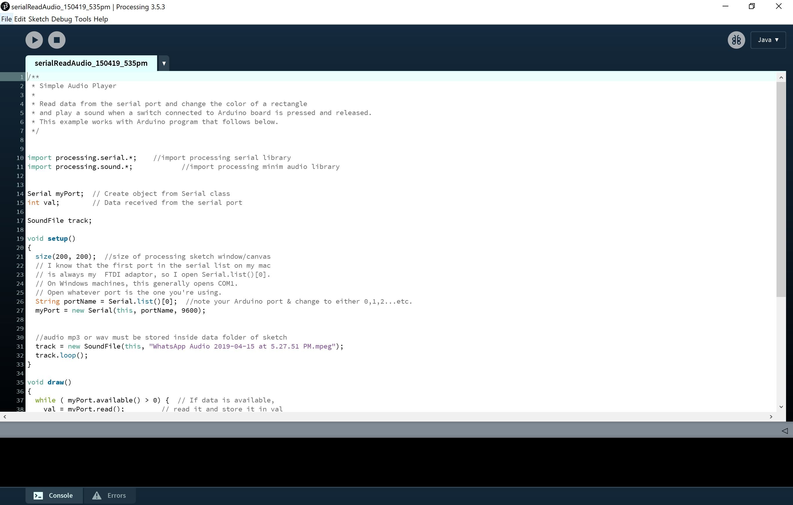
We first started off by testing out the pressure sensor with a piezzo buzzer just to get the feel of how we want varied volume at varied pressure. We tried out the circuit and got ourselves familiarised before making a move to processing.
Feeling very sure that we wanted the increasing volume for increasing pressure, we then tried to bring it over to processing where we embedded the baby sound into the circuit and tried to test how the volume intensity would turn out now that we have the baby’s voice instead.
However, we realized that the audio was very choppy and felt very unsatisfied with the lack of progression the audio had. There were sudden cuts from the cooing made by the baby so we felt that we needed a much more consistent and progressive recording of the baby sound.
As for the object that would trigger this sound, we were considering between a baby bolster and a baby head pillow, taking into consideration which pillow would be a much more reactive and suitable fit for the pressure sensor.
We decided to go with the bolster as it was much more firmer and more reactive with the pressure sensor when being used as compared to the head pillow as it was much softer and had a lesser reaction to the pressure sensor.
Here is also a test to see the natural ergonomics of holding or hugging a baby bolster.
The Video
Instructables style process
Step 1: Get Materials
1x Baby Bolster
1x Arduino
1x Breadboard
5x Wires
1x 10k ohm Resistor
1x Acrylic Board
2x Wireless Speaker
1x Mattress
1x Mini Blanket Throw
5x White Towels
1x Adult Head Pillow
4x Sonograms
4x Soft Toys
4x Baby Clothes
1x Positive Pregnancy Kit
1x Fake Blood
1x Mood Light
Step 2: Solder Pressure Sensor
A long wire extension is needed for the pressure sensor as it will be embedded into the bolster that would be lifted by the audience so to make it safe, soldering a long wire extension would prevent from any pulling of the sensor that would disrupt your circuit.
Step 3: Assemble Circuit and Embed Sensor into Bolster
When assembling the circuit, it will be extremely helpful to tape the components of the circuit onto a board, in this case we have used an acrylic board that would be able to be hidden in out installation.
One the circuit have been assembled, place the pressure sensor on a hard surface such as an art card or a mounting board that has been trimmed to fit the pressure sensor better.
Step 4: Connect Wireless Speaker into Processing
Processing’s audio will be played from the computer so to further amplify the sound and embed it into the set-up better, connect a wireless speaker to the computer and processing’s audio from the pressure will play from the speaker.
Step 5: Set Up Baby Shrine
Start off by placing the mattress in a squared manner so you definitely need a really soft mattress that is foldable. Once done, place over a throw blanket that is subtlely stained with blood. Place the circuit board at the head of the set-up and start to place the soft toys against it.
Place the adult head pillow in front of the soft toys and place the baby bolster above it. To amplify the set-up further, place the baby clothes on the right side of the adult pillow and place the positive pregnancy kit on the right side of the adult pillow. Place the wireless speaker behind any one of the soft toys and place the night light on the left of the soft toys.
Once done, place the white towels in the middle of the mattress and arrange them well.
Step 6: Carefully Add in Fake Blood
Once arranged chaotically, use your finger and start to create a concentrated blood spot in the middle of the towels and great a gradient from dark to a brighter red to make it less fake. Add in other smaller specks of blood to further elevate the main big blotch. To finish it off, add more blotches of blood on the blanket throw itself.
CodeS + Circuit design
Code for piezzo buzzer’s increasing sound:
Code for processing using old audio clip with increasing sound:
Code for processing using final audio clip with increasing sound:
Circuit set-up for processing (omitting piezzo buzzer):
Photos of Installation in Detail
Set-Up with no one in it.
Closer view at the set-up with baby clothes, blood, bolster, head pillow, soft toys and positive pregnancy kit.
Close-Up of bloodied bolster
Close-Up of liquified baby.
Reflection + Thoughts
Personally, the issue that I felt we face would be the coding of the processing as we really wanted a smooth and obvious change in the audio of the baby cooing as the pressure gets more intense but it was not as apparent as we wanted it to be. However, we managed to find another option which was to really curate and edit the baby’s sound in the audio itself and have a longer sound made when the pressure is intensified.
Nonetheless, apart from the interactive object itself, I personally do feel that the whole experience and vibe of the set-up matters as it would either do the item justice or otherwise. I specifically paid a close attention to detail for our set-up as I really wanted to portray how a simple object such as the bolster could make such an impact when placed in such a set-up with all the items present for context.
After being exposed to the different kinds of interactions and its methods for the past 13 / 14 weeks through either the micro-projects, research critiques and final submission, I can really vouch that having an interactive piece of design is way more intriguing and satisfying as compared to having a non-interactive design.
Through the final project specifically, I observed how interaction plays a pivotal role especially in conveying a piece of work that is commenting on a societal issue or a personal issue. Through interaction, it really allows the user to be fully immersed and have a better experience at comprehending the message the design has to convey.
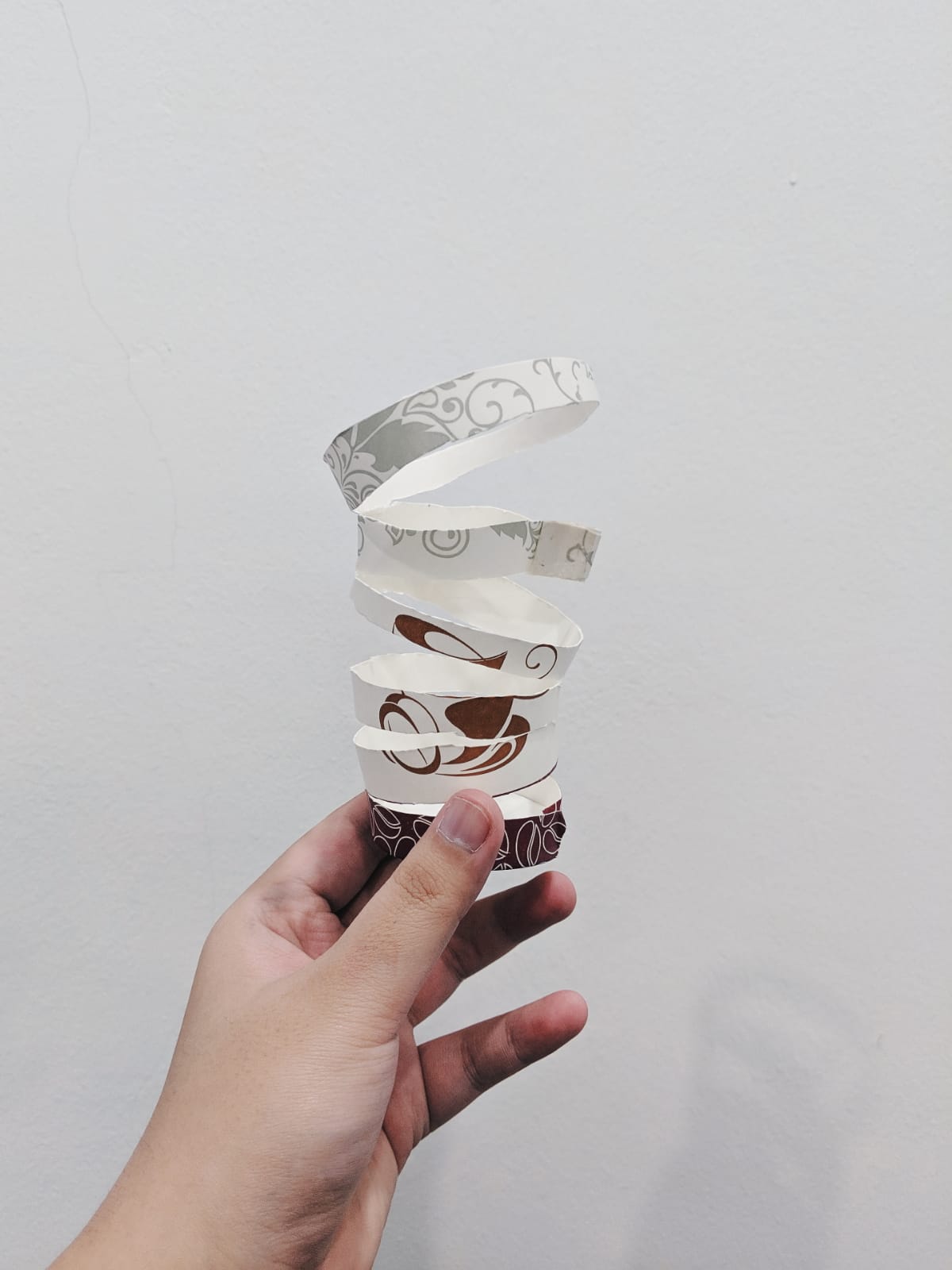
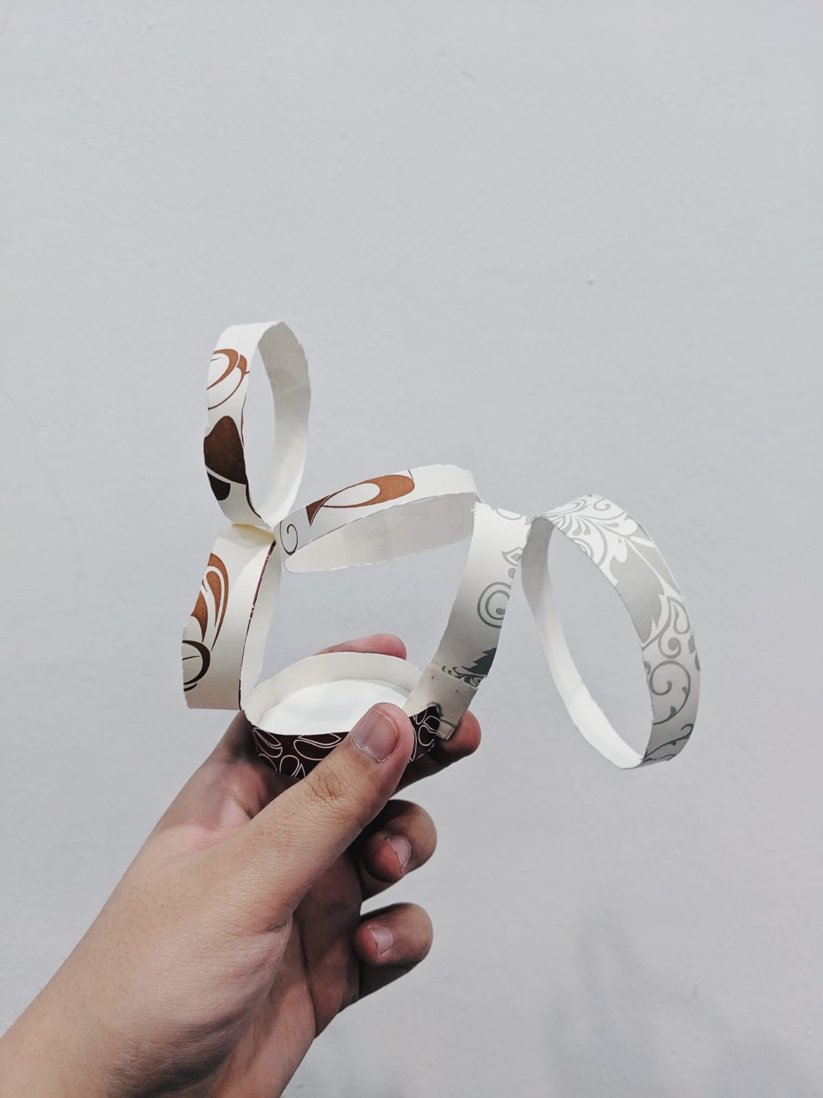
From the video, I decided to look up some neat layouts of editorial pieces to gain inspiration on how I could present the elements in my zine.
Layout Ideas
My purpose of having the layout be clean is that I am intending to put in a lot of other elements that are much more “messier” such as a handful of images as well as illustrated stamps.
Moving on to the stamps, I wanted to include an “olden” feel to the contemporary zine by including a modernised version of the stamps and I was also hoping to include other elements such as a luggage tag or even stickers to further accompany the zine.
Stamp / Stickers Ideas
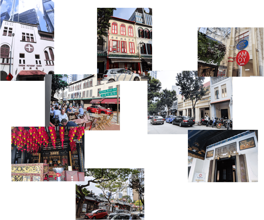
Seeing that I have captured a lot of photos of Telok Ayer Street, I decided to put together a mini gallery of a few of the images that really captures the places of worship as well as the life in the bars and restaurant.
Brief Gallery
Explaining each spread
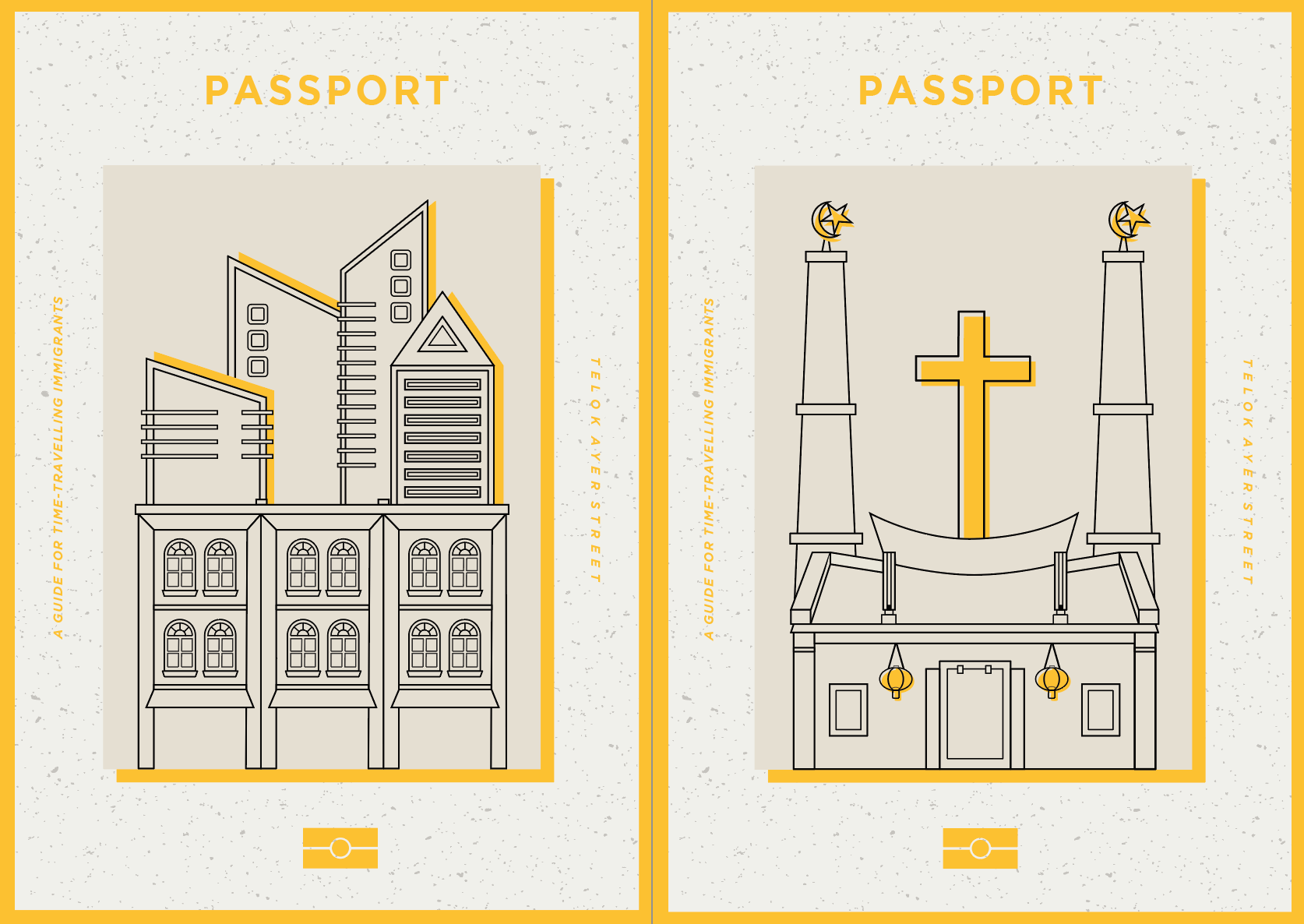
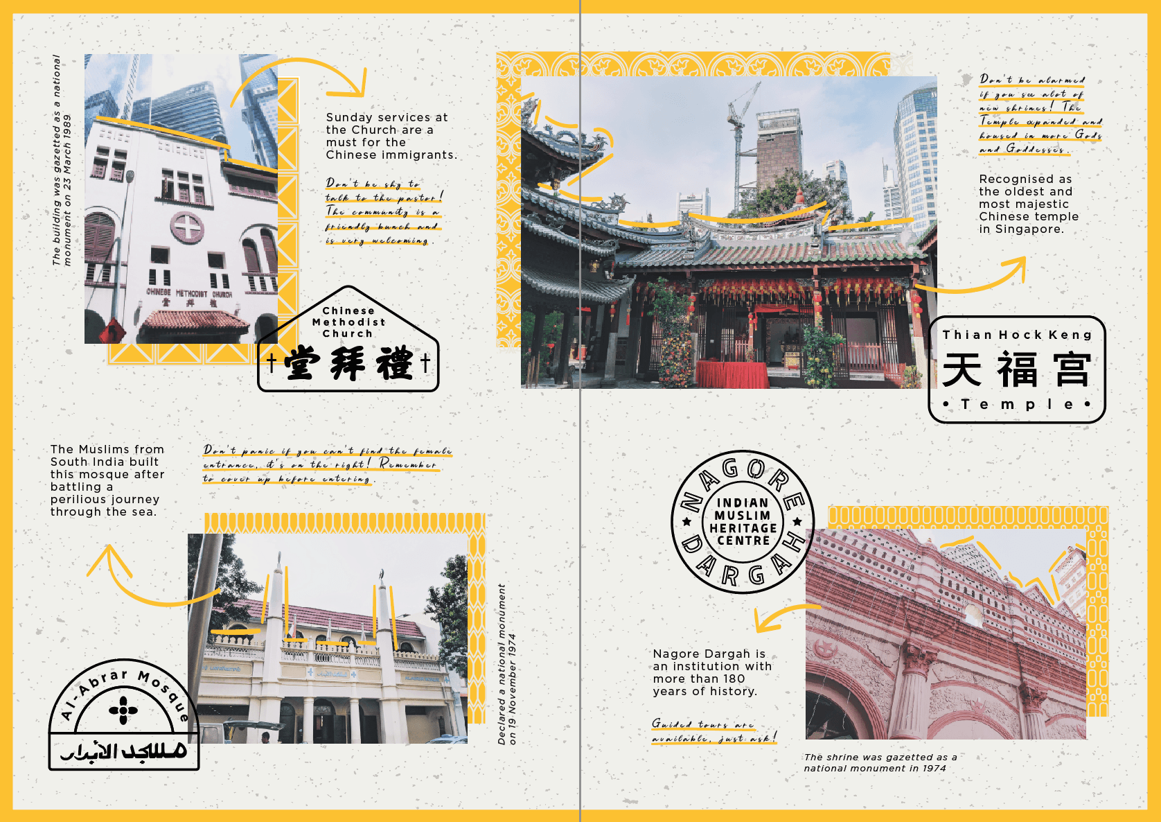
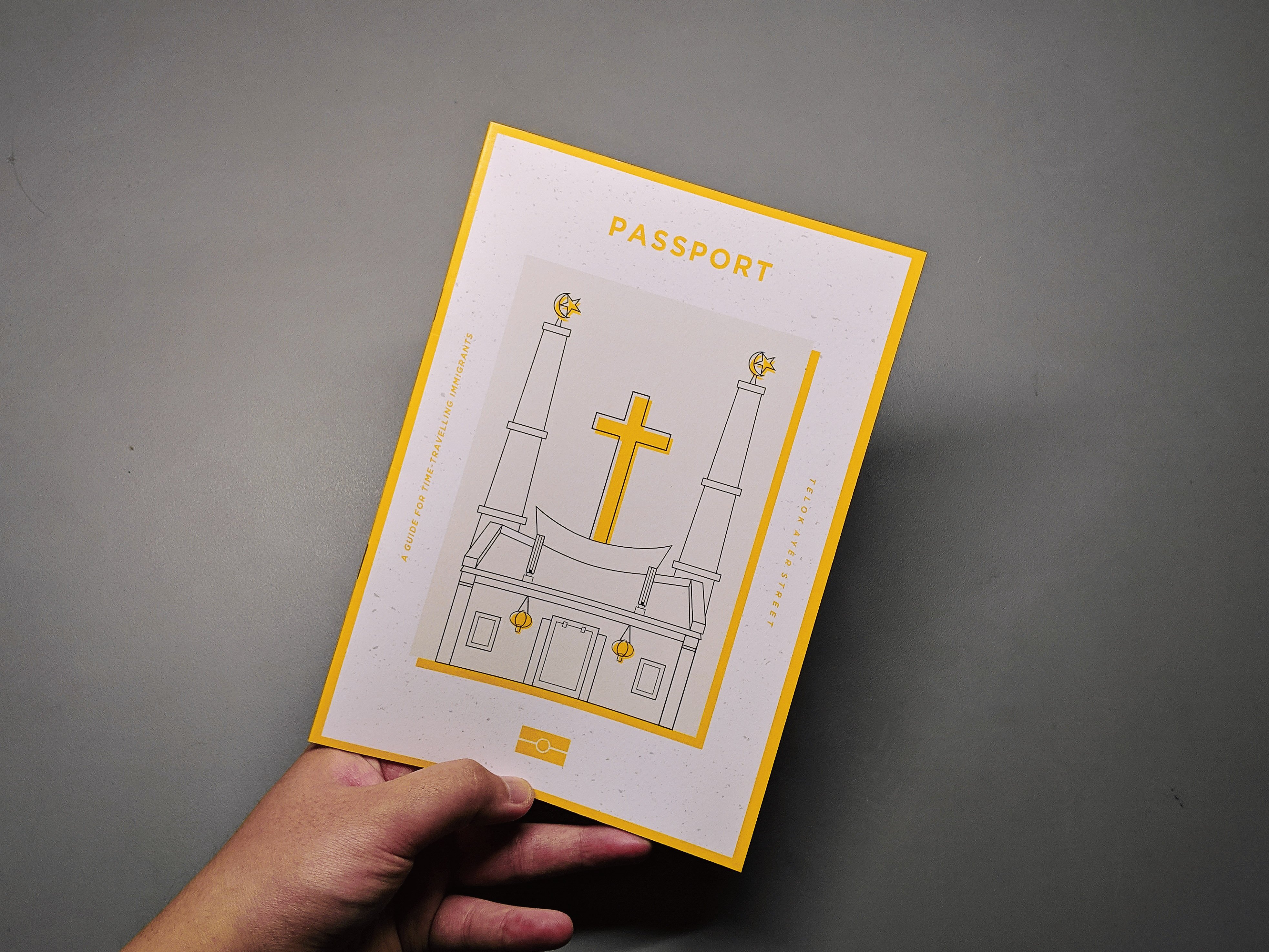
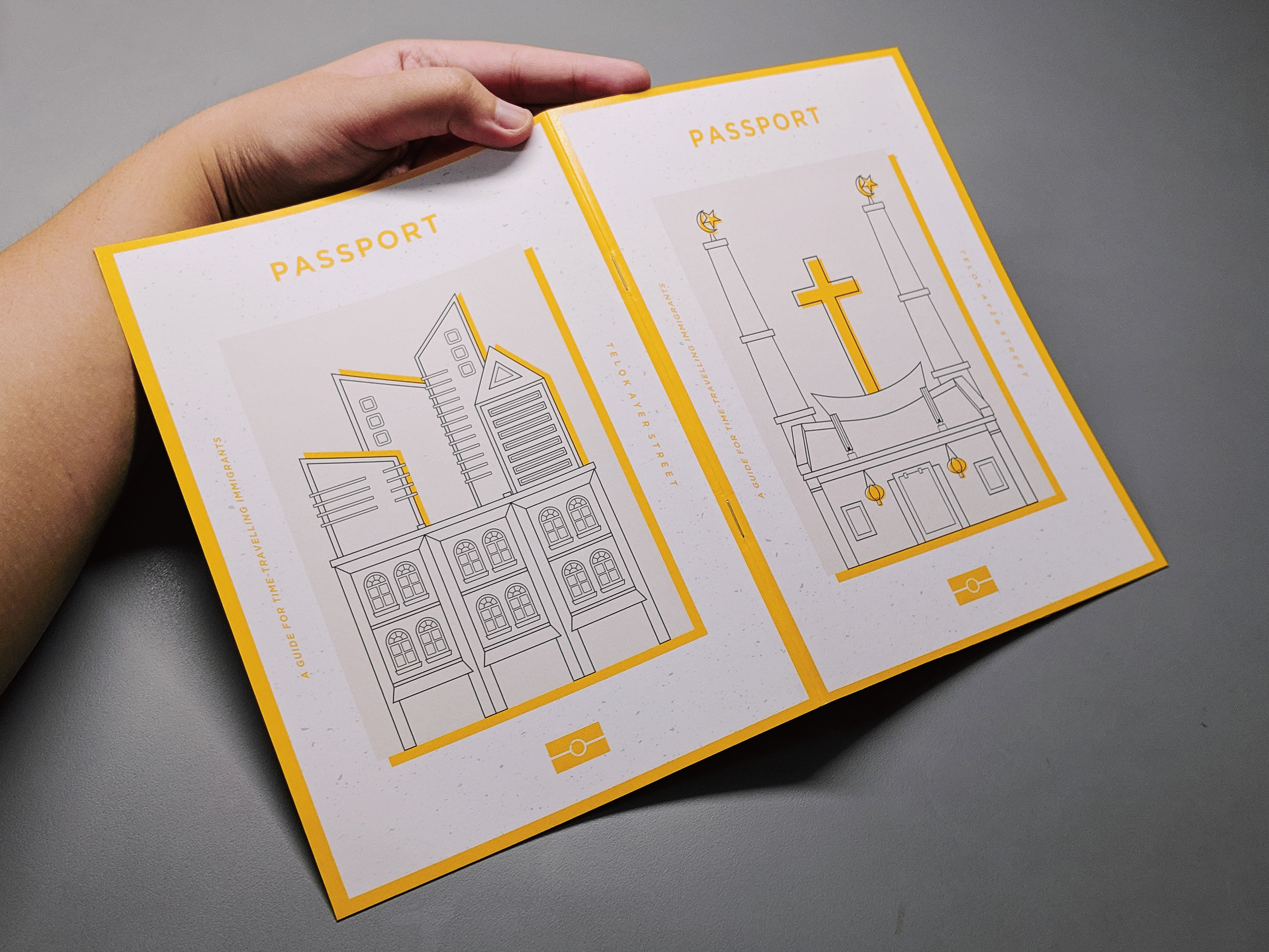
Cover Page:
The front cover page is a depiction of the places where people gather in the olden times which were at places of worships such as the church, mosque and temples. As seen on the right side of the image, I have combined the three places of worship to show how these places mesh together.
The back cover page is a depiction of how the architecture of Telok Ayer Street has drastically changed as it is not about the places of worship anymore but rather about the shophouses which houses the restaurants and bars and especially the high skyscrapers right behind the shophouses.
I based the zine on a guidebook for immigrants of the past time-travelling forward in time sort of like to guide them through the new and old establishments. It is to highlight how the old buildings and places still exist yet it might have a new life or purpose to it.
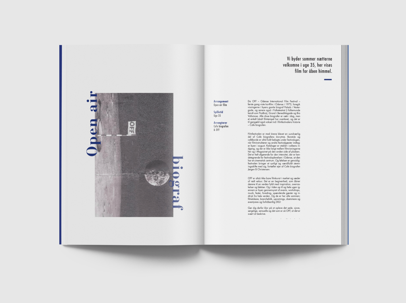
First Spread:
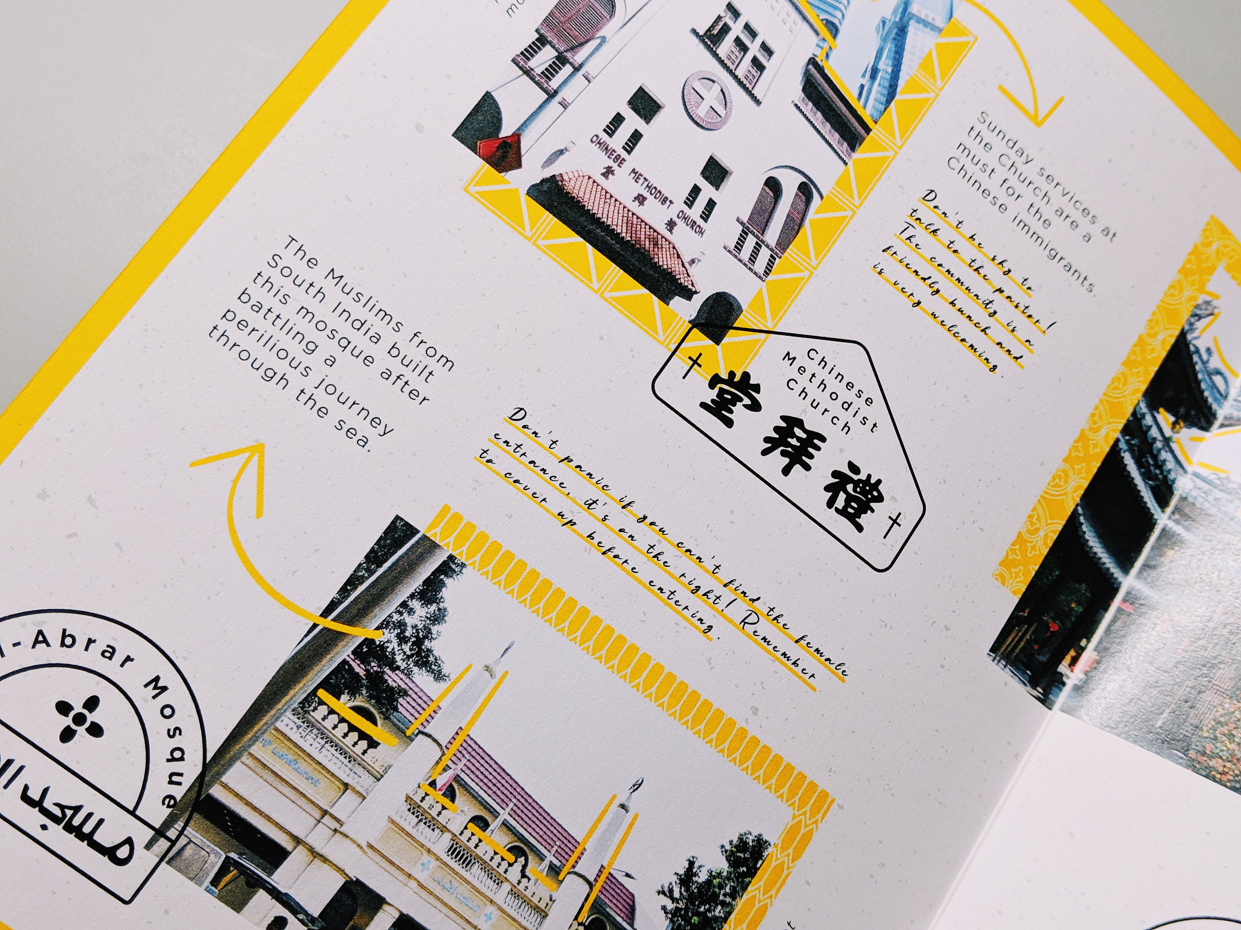
The first spread highlights how and where the people of the olden times gathered when they first came and are at Telok Ayer street. In the san serif font, I have put in facts of the places that I took from the site’s information whereas for the handwritten font, I included my own guide to serve as a tip for the immigrant reading the guide.
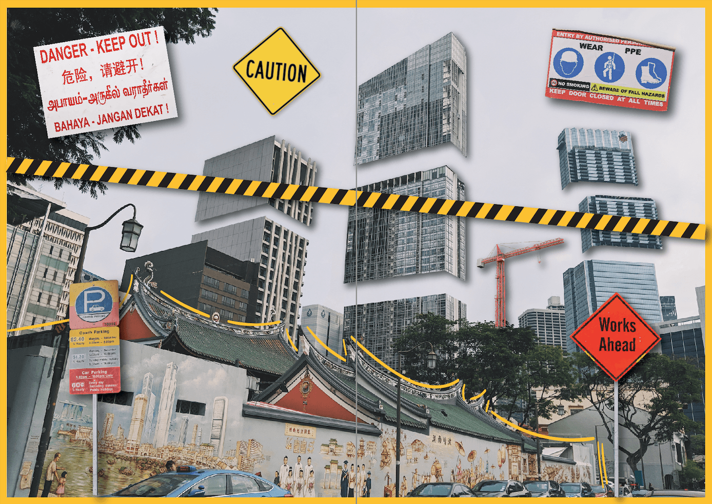
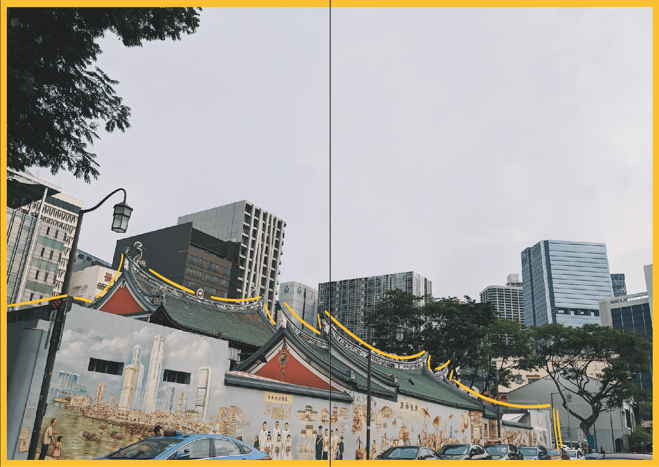
Middle Spread:
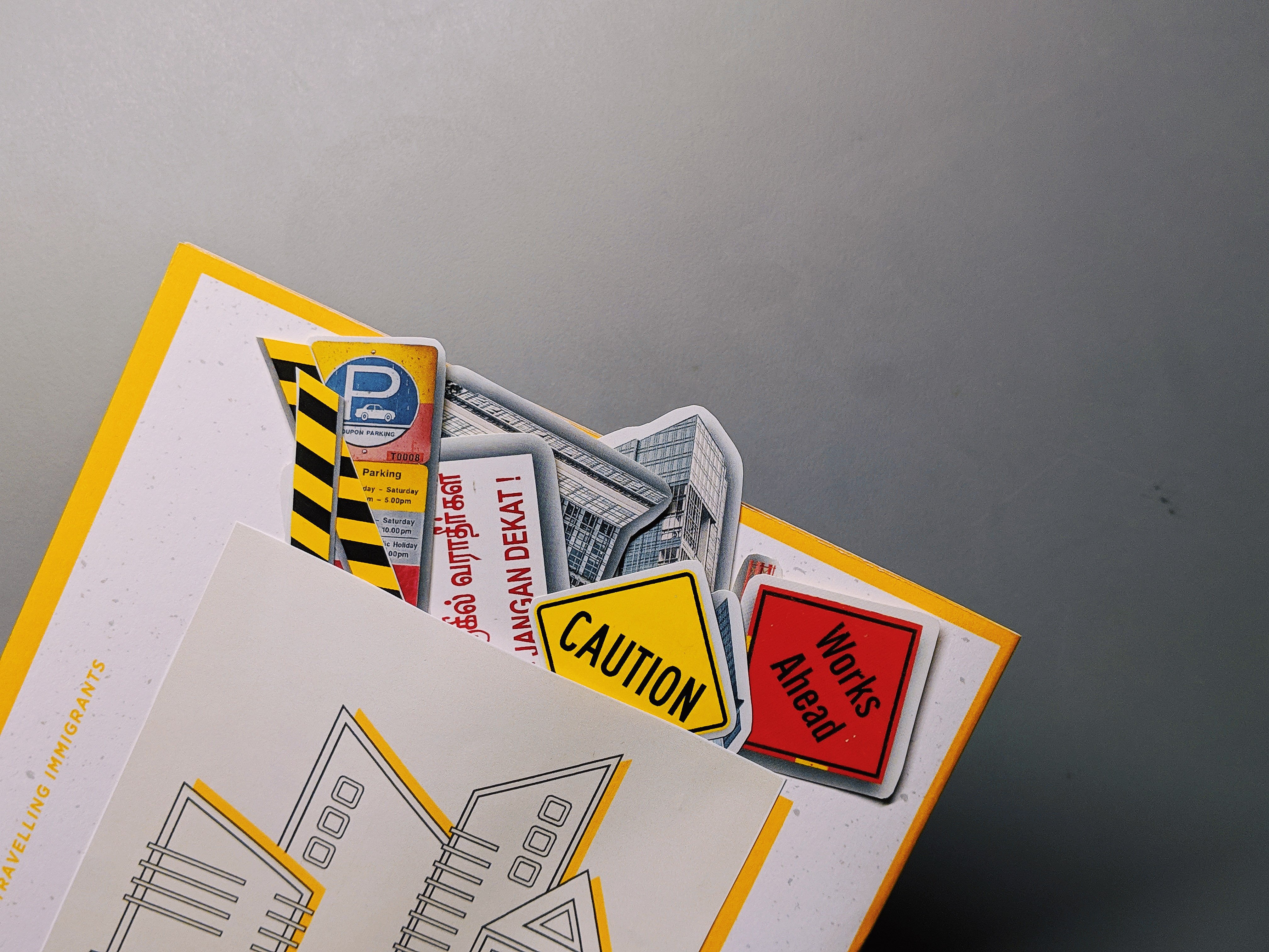
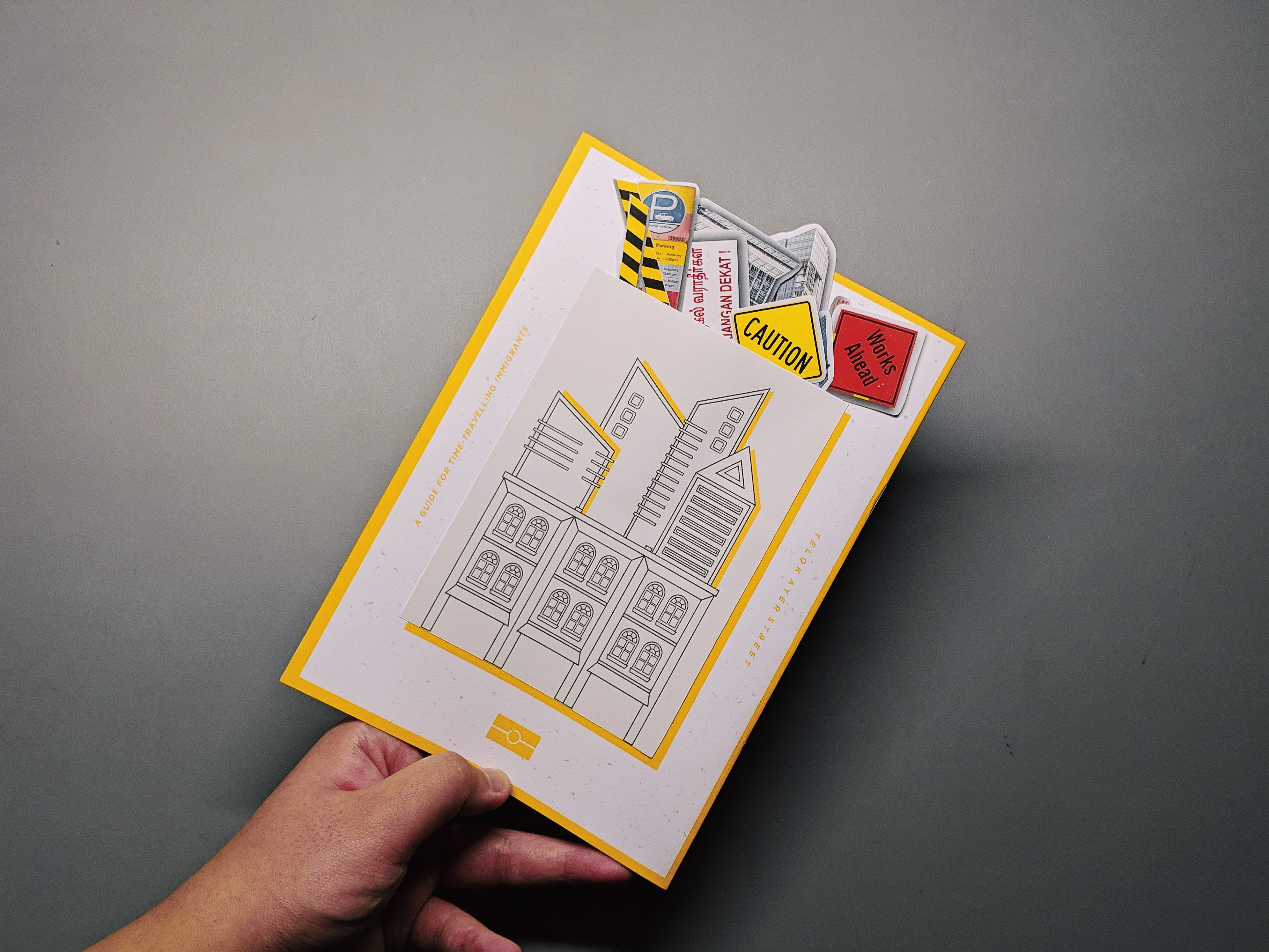
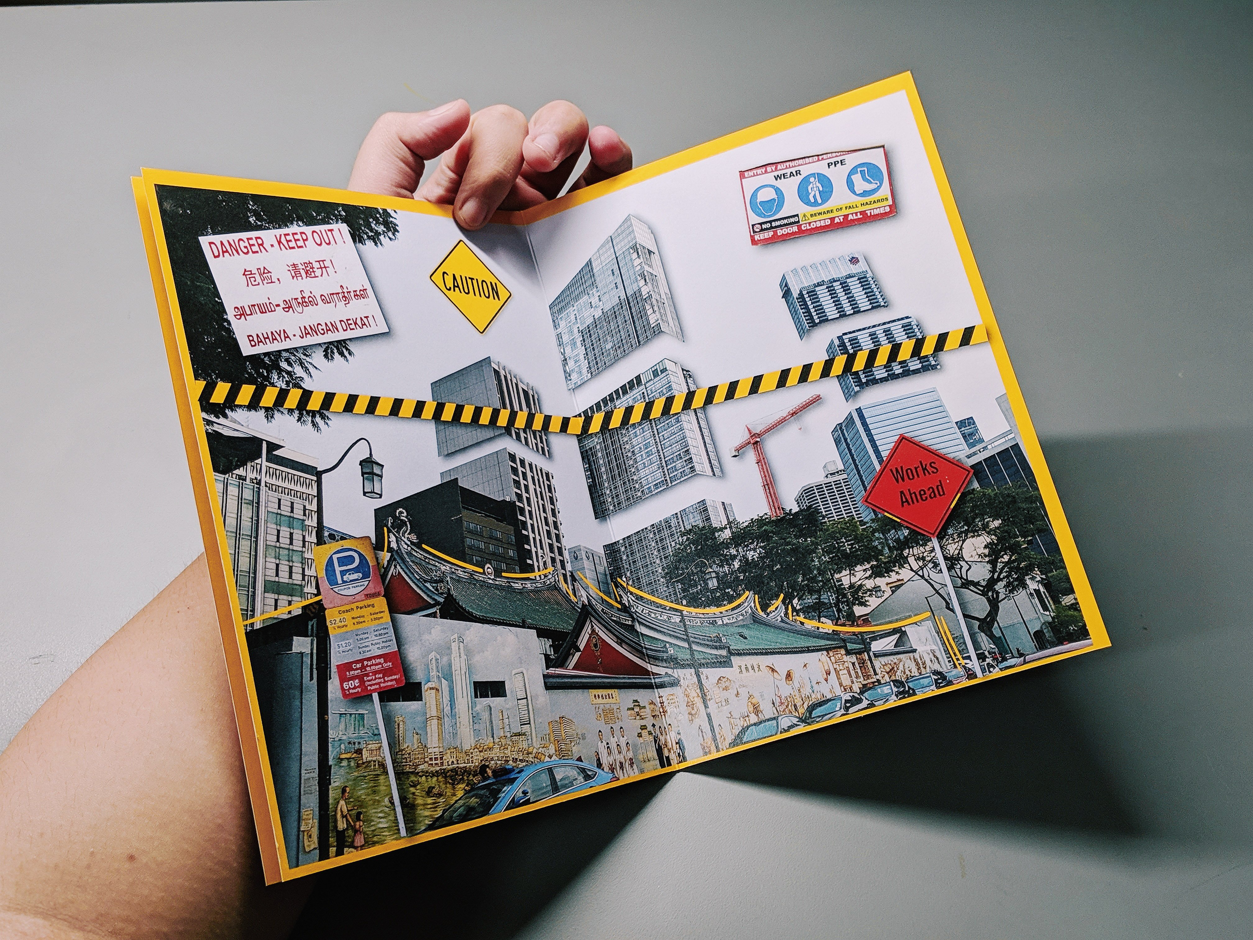
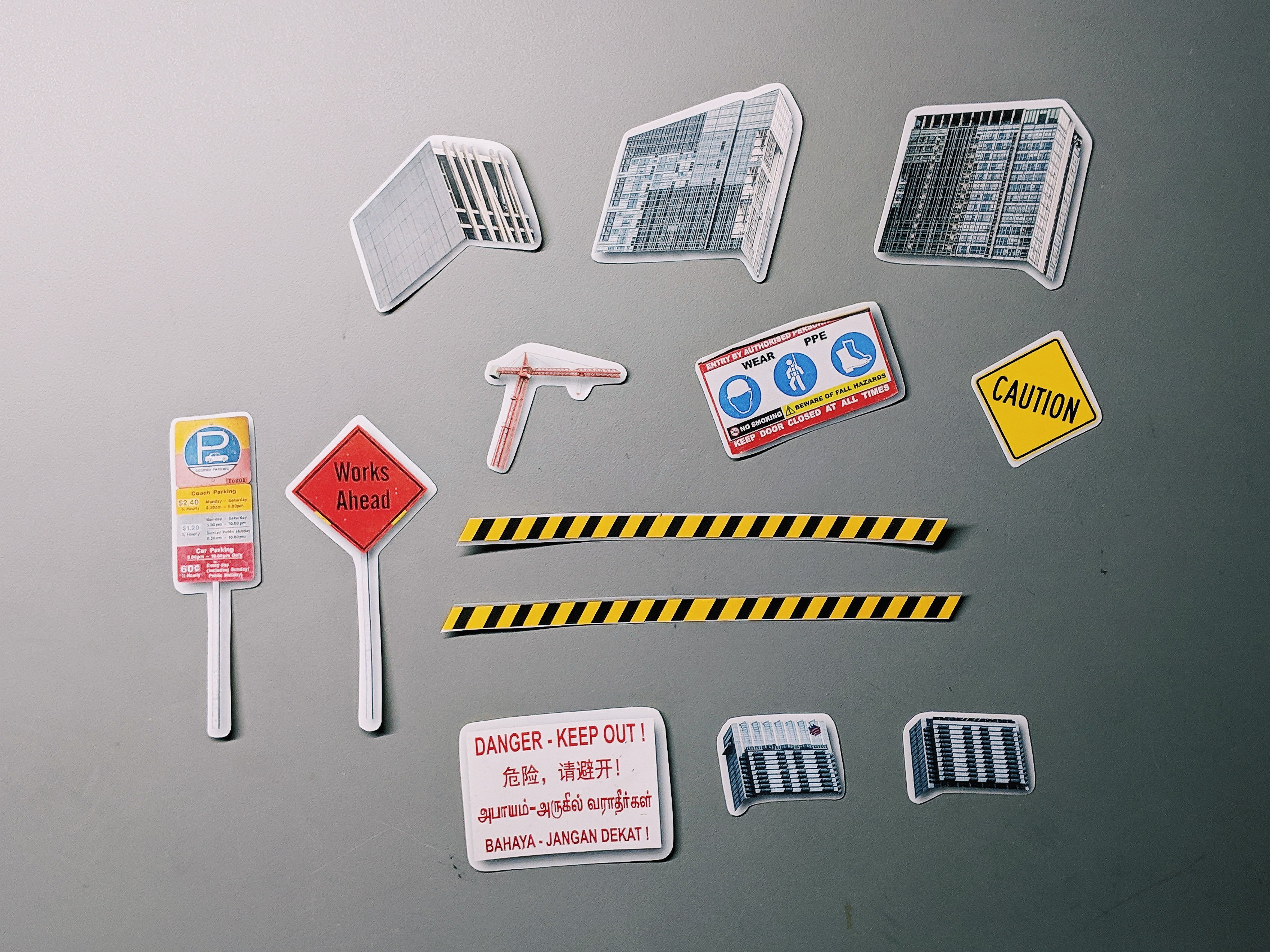
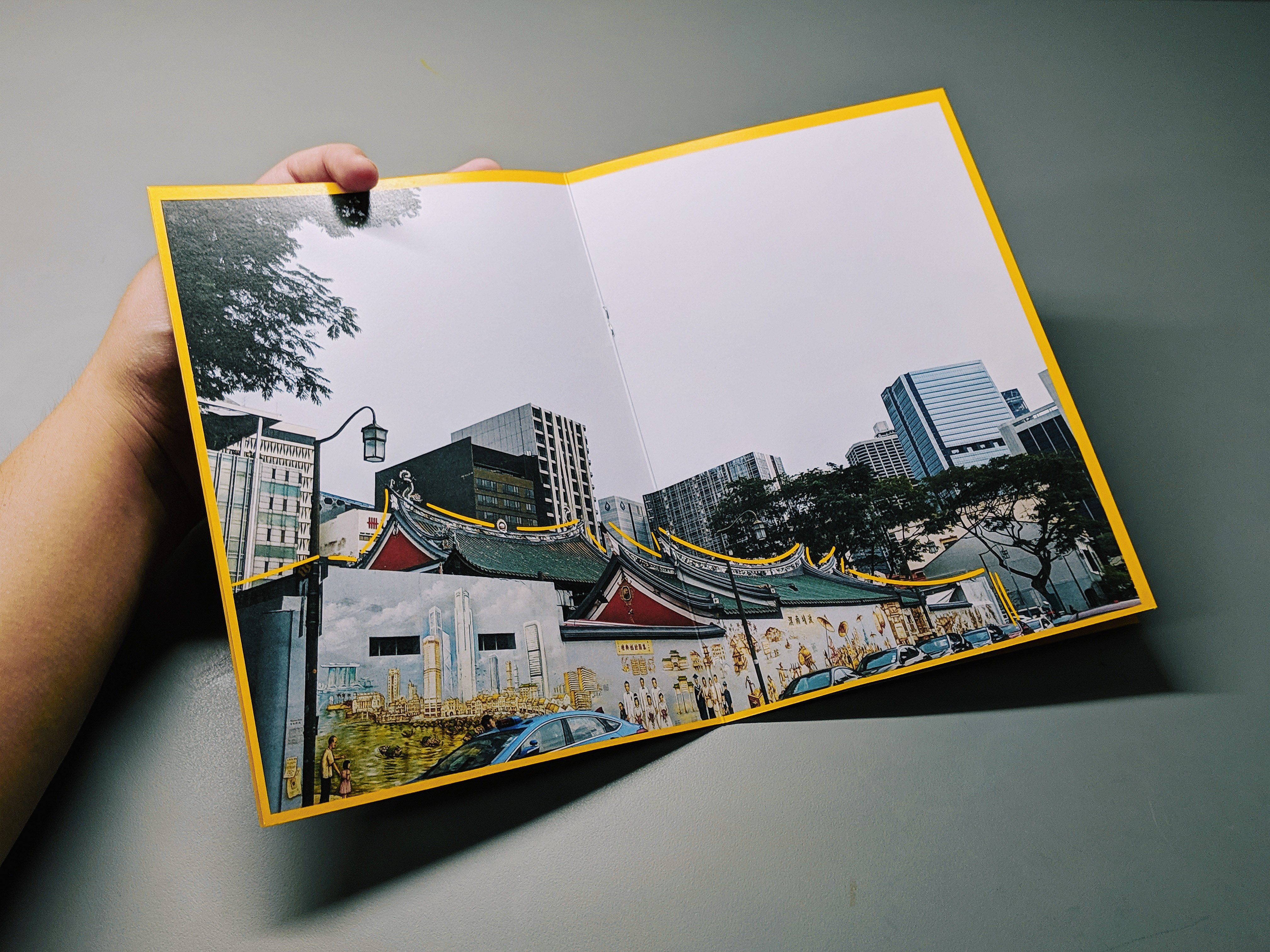
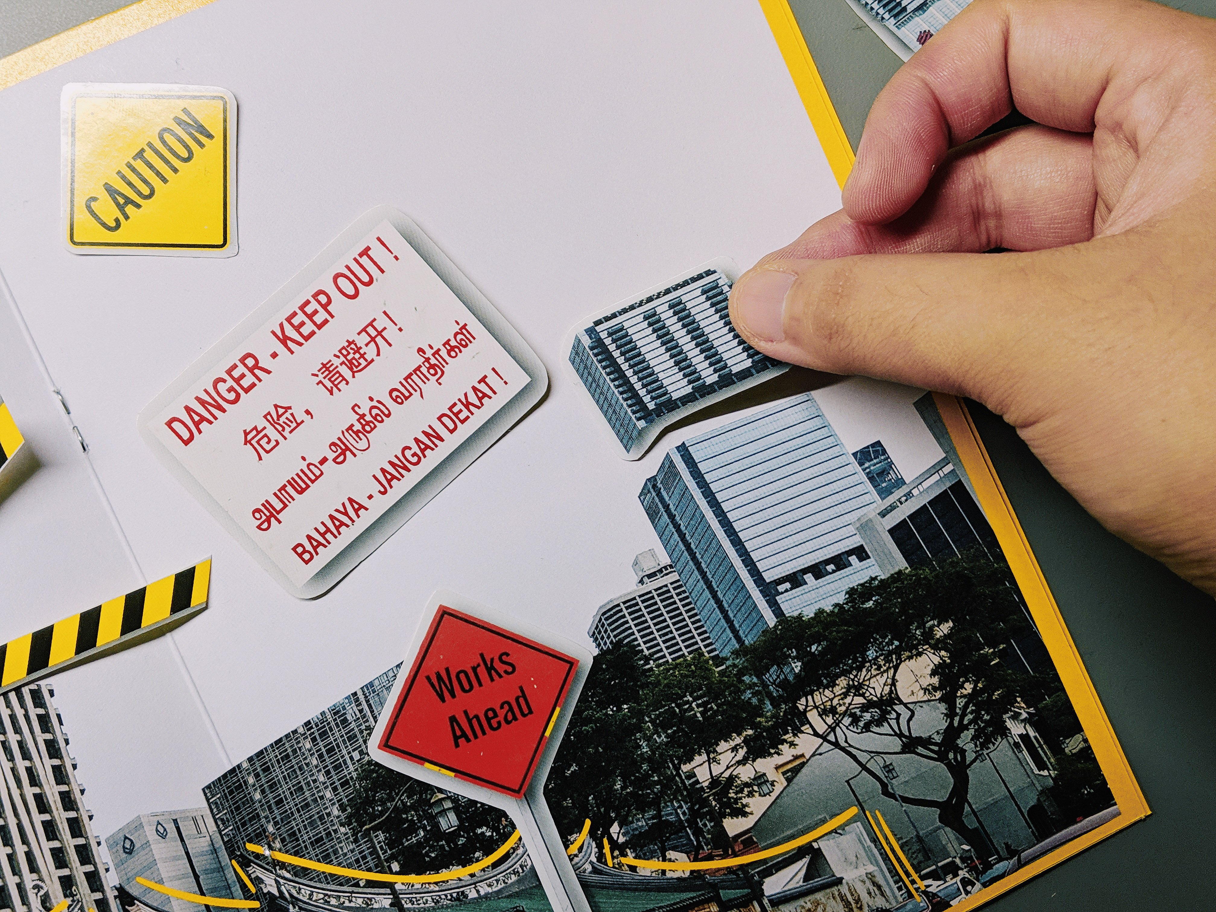
In this spread, I decided to do an interactive spread whereby the readers are able to paste stickers onto the page and build on the street for themselves. The rationale behind the spread would be to depict how the shophouses and places of worship are a constant or permanent establishment that have existed for a very long time but the skyscrapers at the back are not permanent as they are constantly changing and being build on.
I have cut up the chunks of the skyscrapers to show further exaggeration and contrast of the tall buildings to the humble temple. I have also included elements to portray construction as seen on the signboards and the yellow construction tape. When the stickers are taken out, this would be the look of the spread.
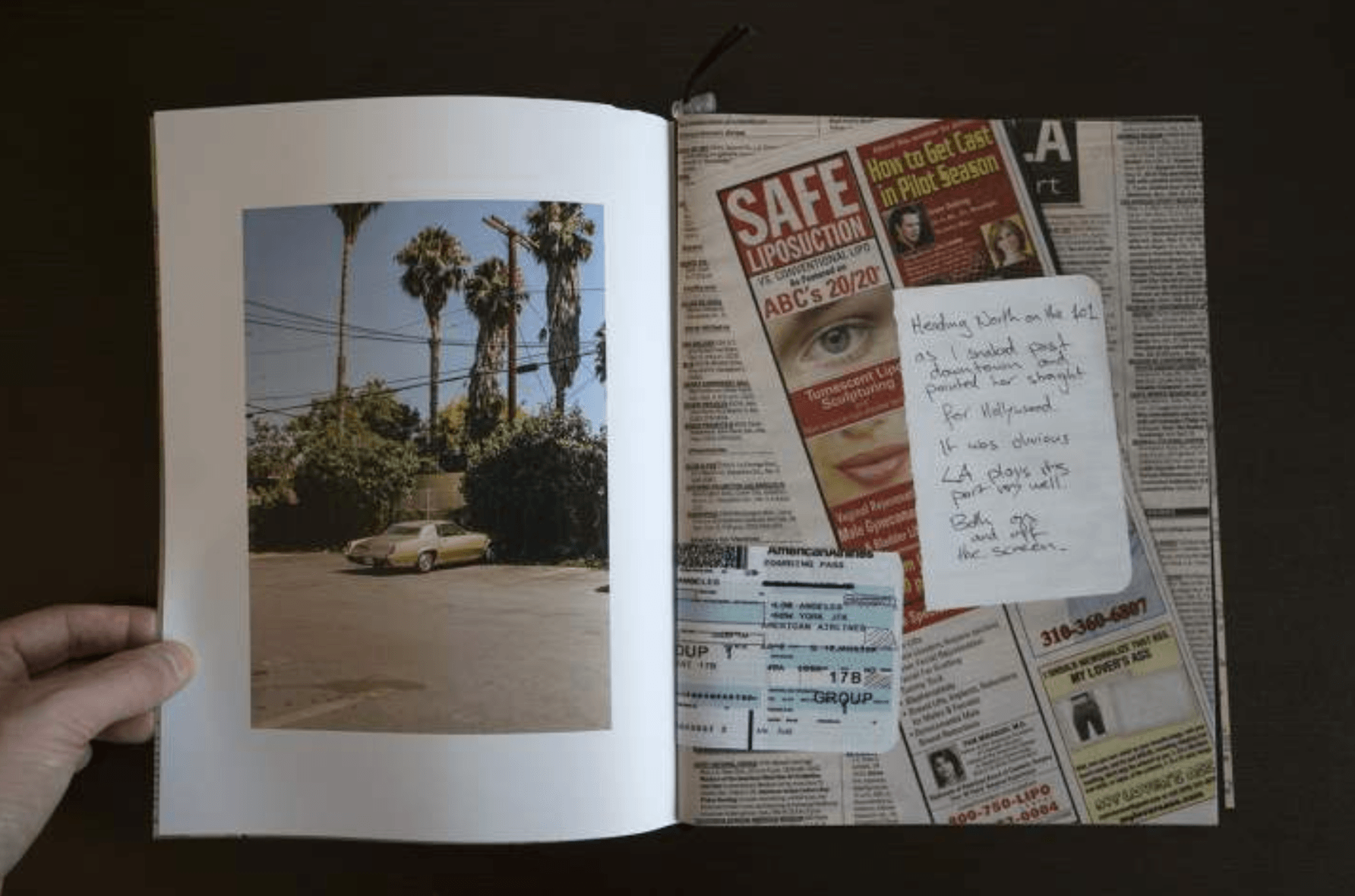
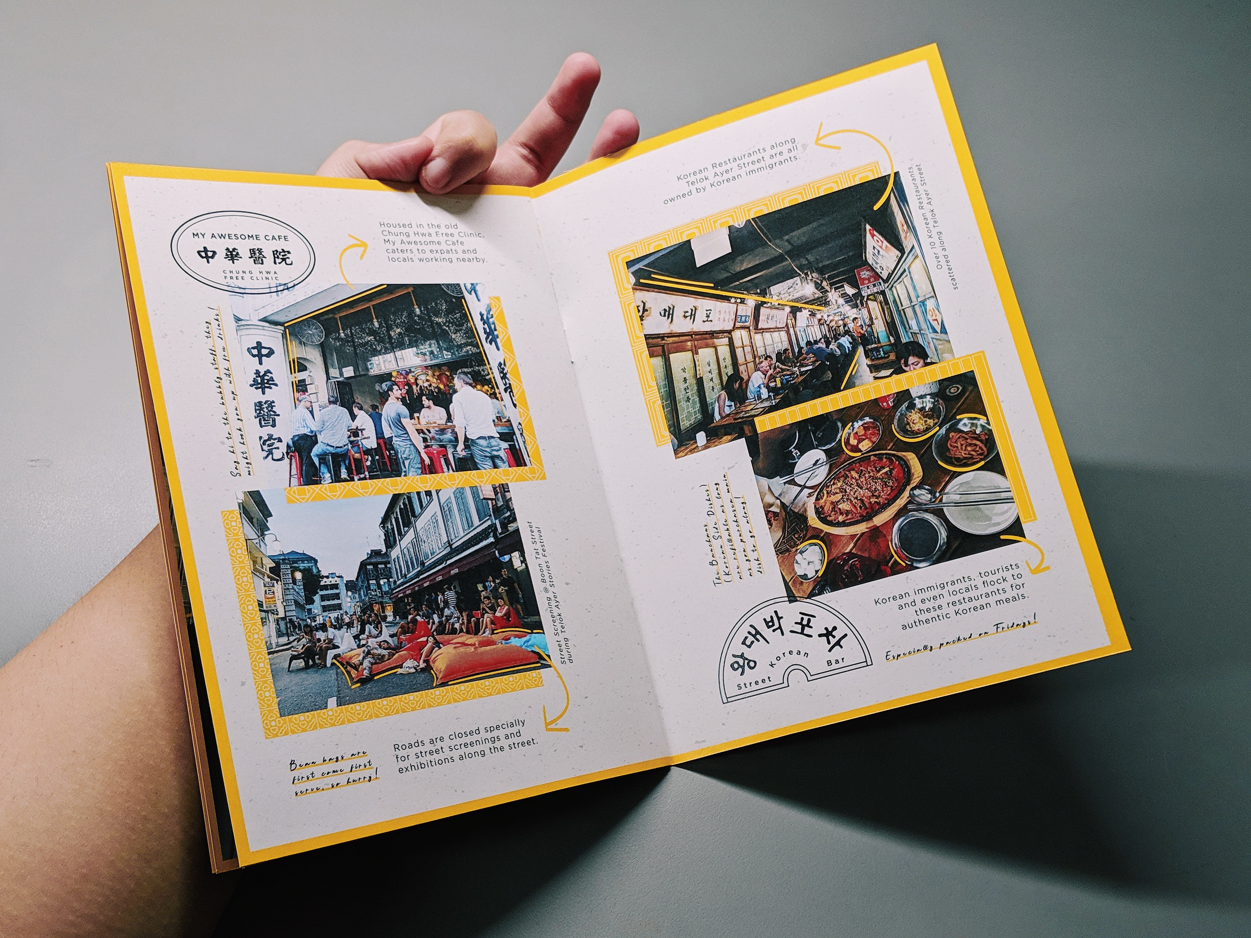
Final Spread:
In this spread, I wanted to add in “human”elements by putting in images that shows a lot of people in it as compared to solely architectural images in the previous spreads. I wanted to portray how people in the present day gather in Telok Ayer now for the bars and pubs, art festivals, street movie screenings and Korean restaurants.
similarly to the first spread, I have included facts of the sites as well as given my own tips to enjoy the place to its fullest.
Photographed Zine
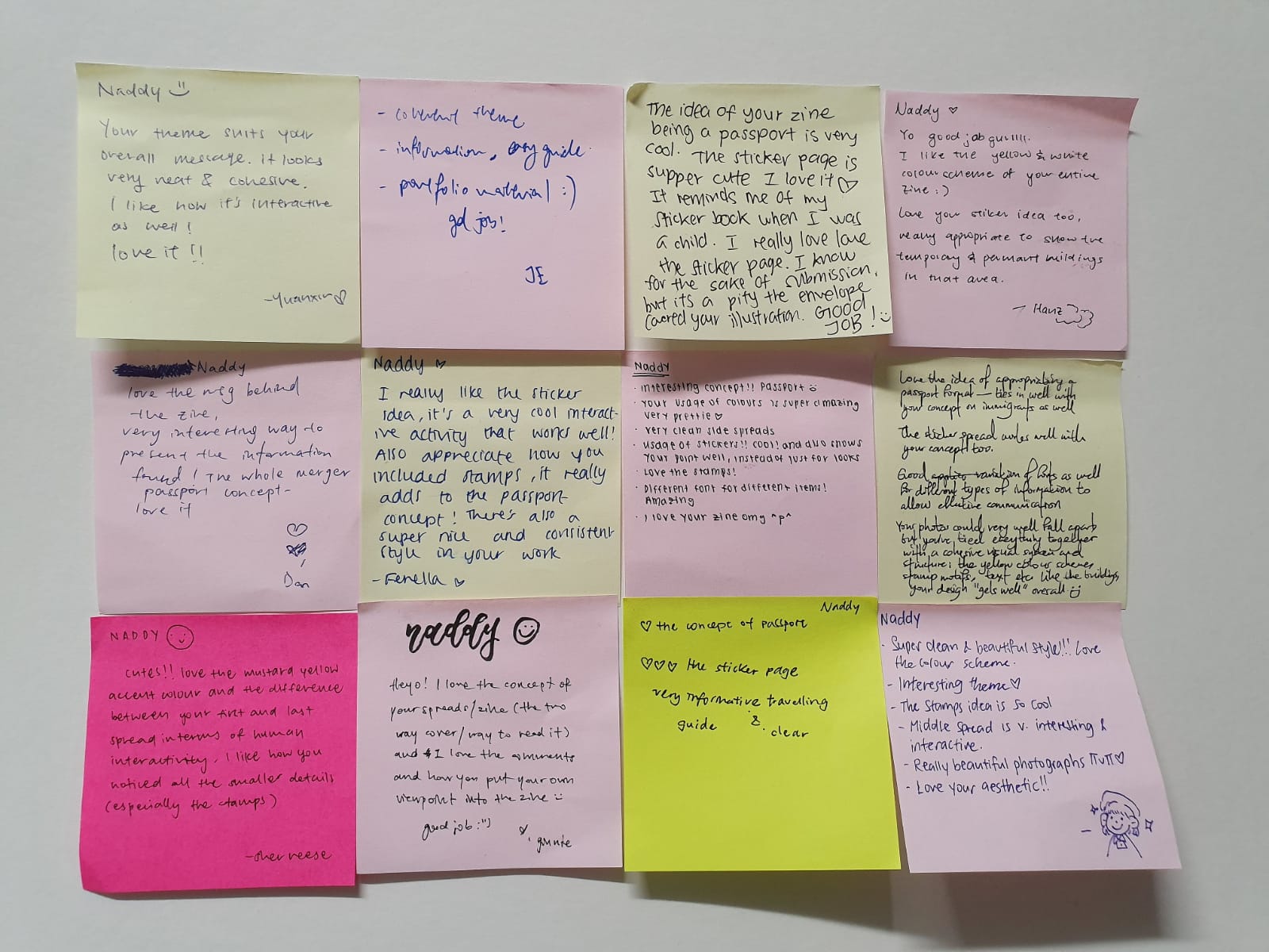
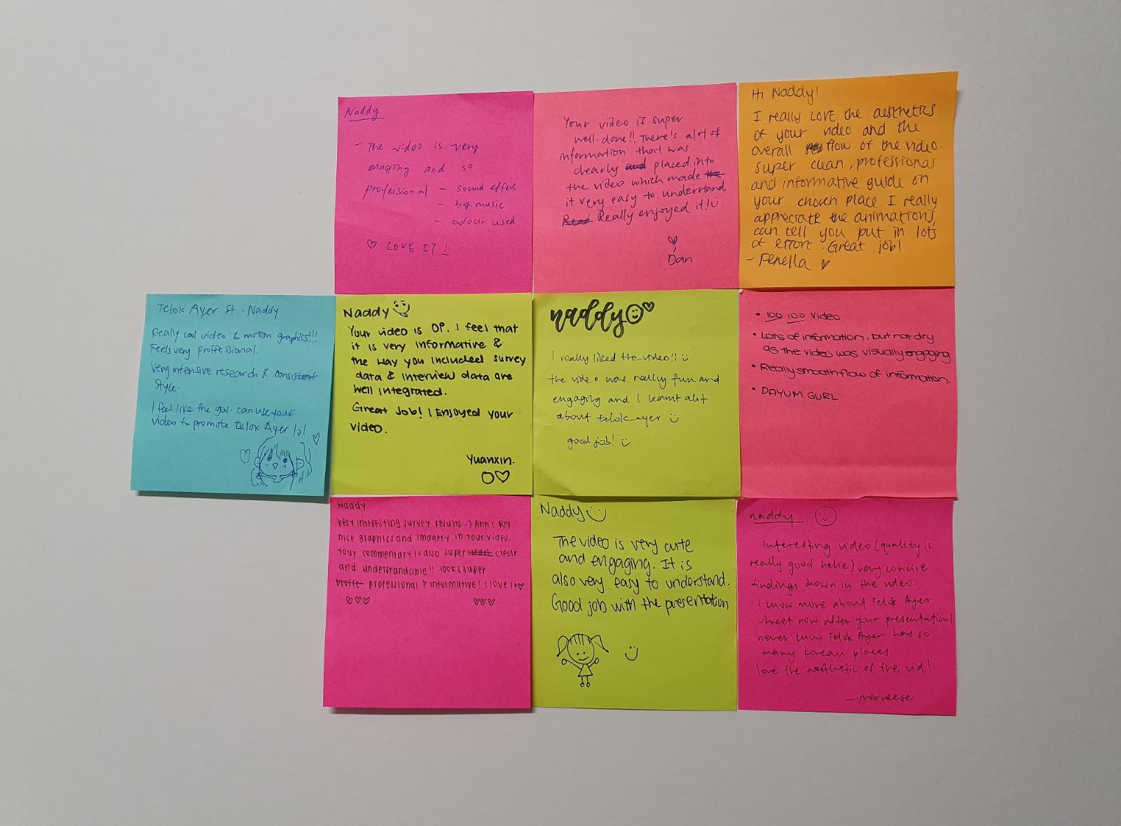
Feedbacks + Comments from the class
Reflections
I find this project very creatively liberating as I absolutely love editorial design. It has provided me with such a different perspective as to how I approach a location and translate into unique ways that people might not have known about.
In addition, I also feel like it is a great practice for learning about printing, colour and layout as printing is such a vital portion in a zine production thus it has provided me with a great learning point which is to package my work well as well as knowing how the colours would actually translate onto the print as well as selecting the appropriate paper quality.
For this project, I really wanted to pick a location that is very rich in texture. I categorize texture as sound, sight, smell, taste and touch. All these layers of texture are what I hope to have in the location that pick. As best as possible, I would also want this place to have a history and perhaps have a place of worship or a cultural establishment in the vicinity.
As such, I shortlisted these locations based on the following merits.
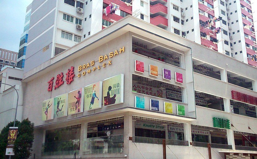
#1) Bras Basah
Bras Basah as an area is very well known for its Bras Basah complex and how that place is definitely not a stranger to many of the students in ADM. However, apart from the bookstores, printer shops, antique shops, restaurants, and residential apartments above, I felt that Bras Basah lacked the texture and cultural note I wanted.
#2) Geylang
I wanted to approach Geylang in a contradicting way whereby I wanted to feature the presence of the Malay Muslim community with the market, shopping malls, heritage centre and mosque yet also uncover how the red light district is very much thriving just a stone’s throw away from the community.
However, although there is a texture and cultural to the location, I felt that I might face certain security constraints and might not achieve the outcome that I wanted.
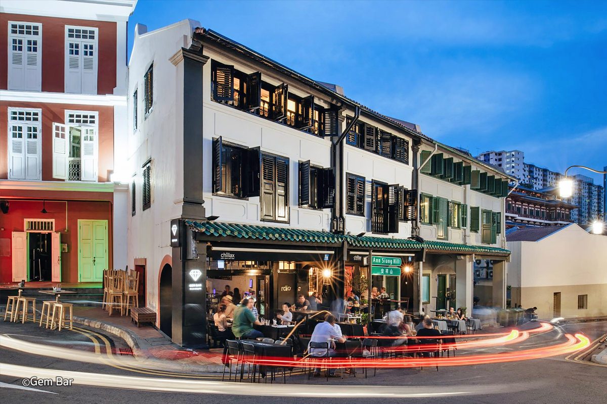
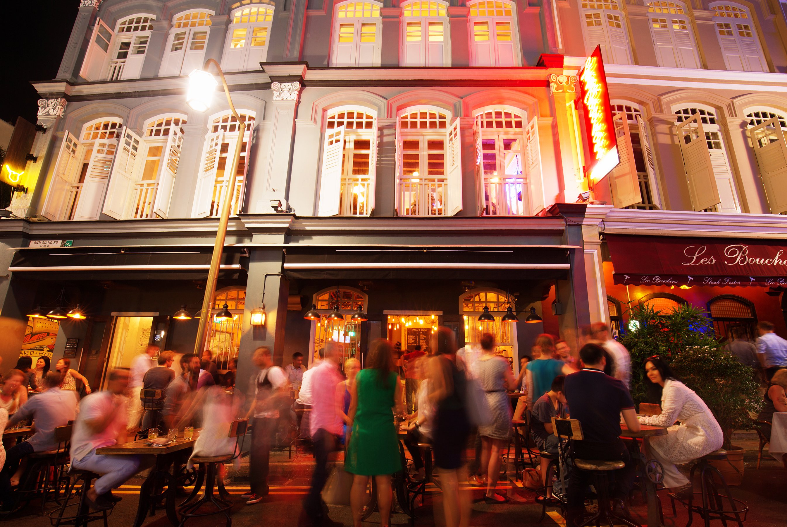
#3) Ann Siang Hill
I considered Ann Siang Hill as one of my location as it is a depiction of my love for pubs and bars. As I often patronise the area, I fell in love with the beautiful nightlife as well as the shophouses that really brings out the nostalgic feel to a contemporary bar.
However, I realised how doing a zine based on just nightlife, bars and pubs seem to be very shallow and doesn’t really bring out the best in a locality. As such, I decided to go a little further down the street to Telok Ayer Street where I uncovered so much texture in just one whole street.
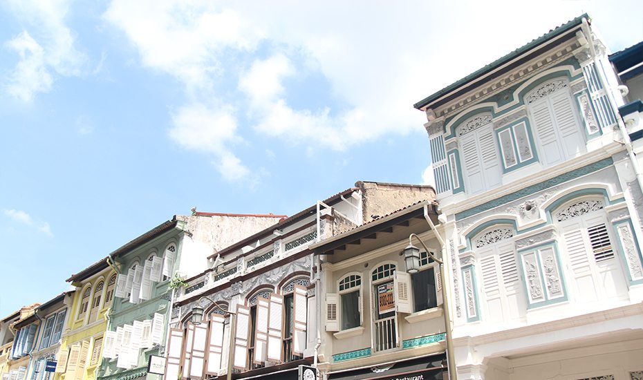
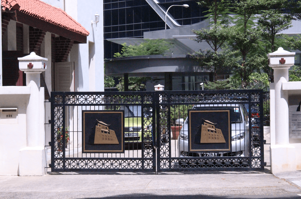
#4) Telok Ayer Street
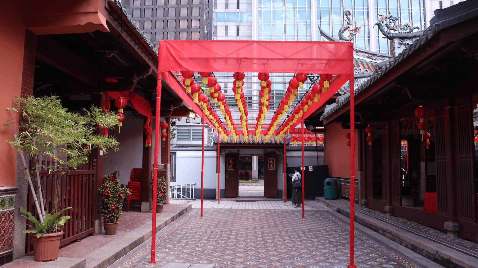
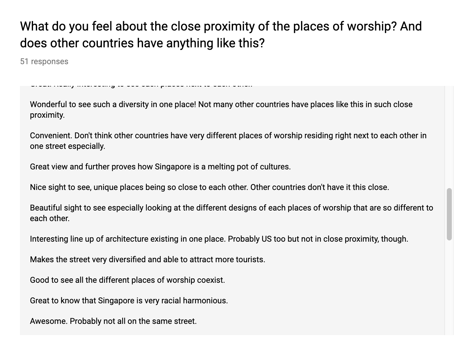
I decided to go with Telok Ayer Street as I felt that it has the most texture out of all the other locations that I have shortlisted. I discovered that Telok Ayer Street has three different places of worship of three different religions and these places really co-exist really well with each other.
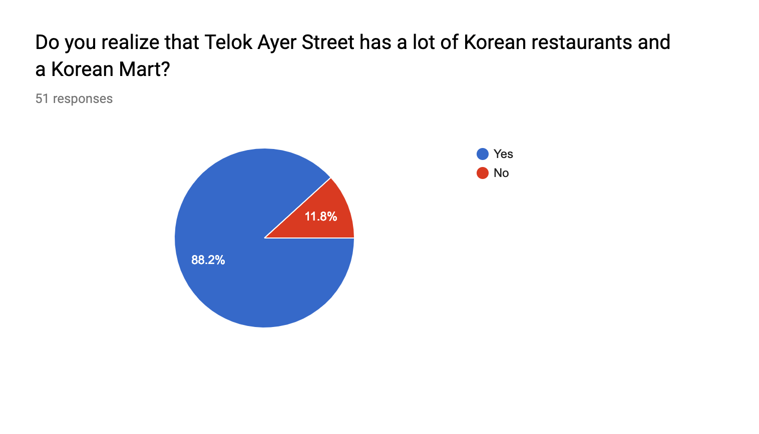
Apart from that, I also noticed how there is also nice combination of bars, local restaurants as well as a handful of Korean restaurants along the same street. What is more interesting to me is that the area is sandwiched between two business district areas.
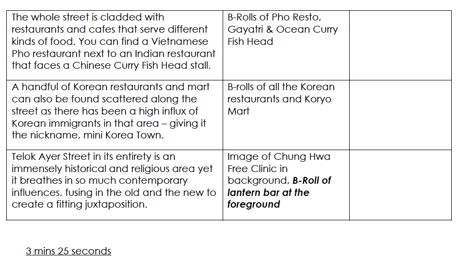
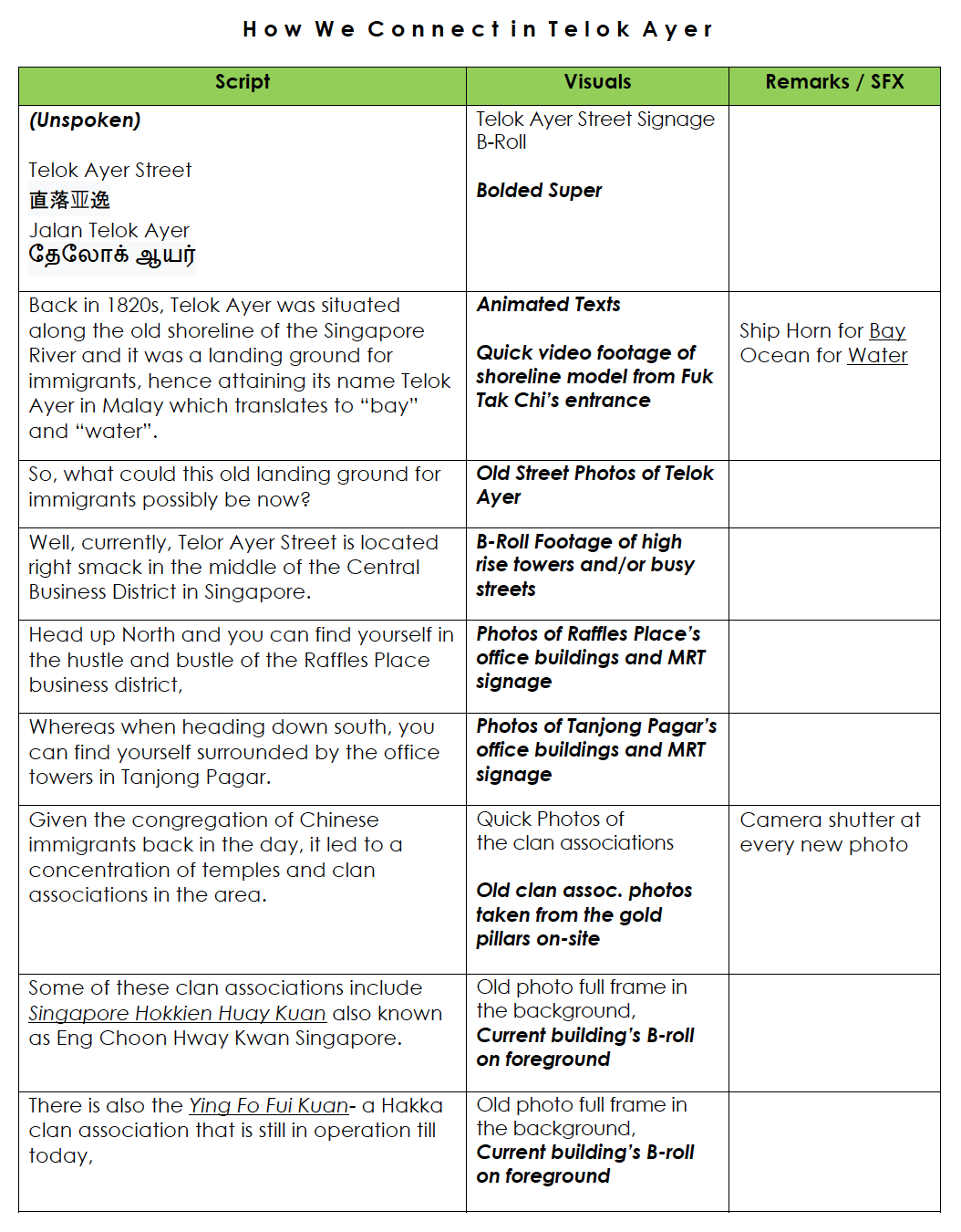
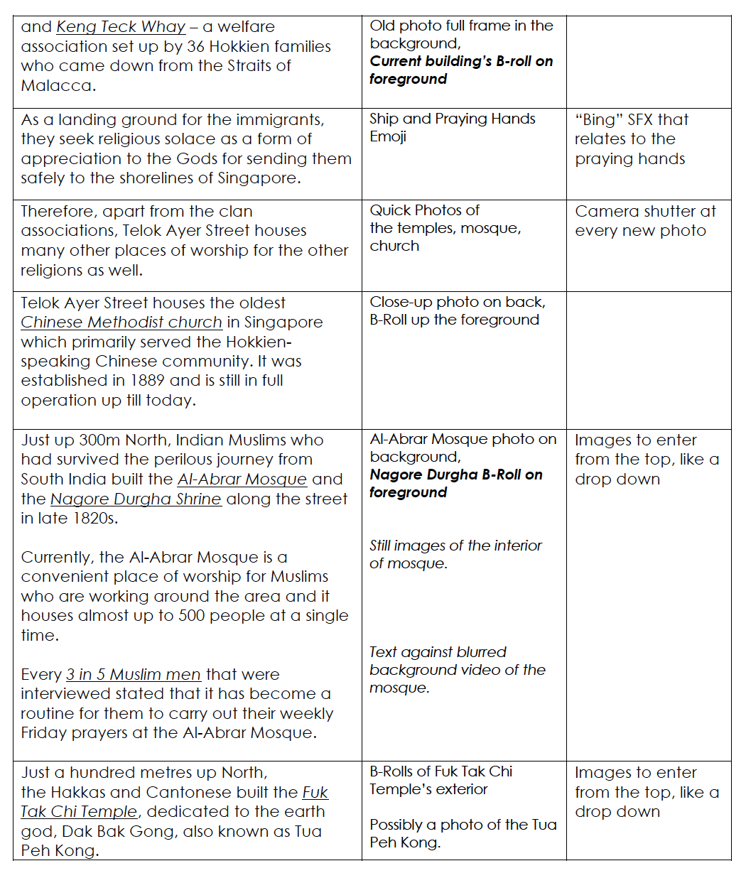
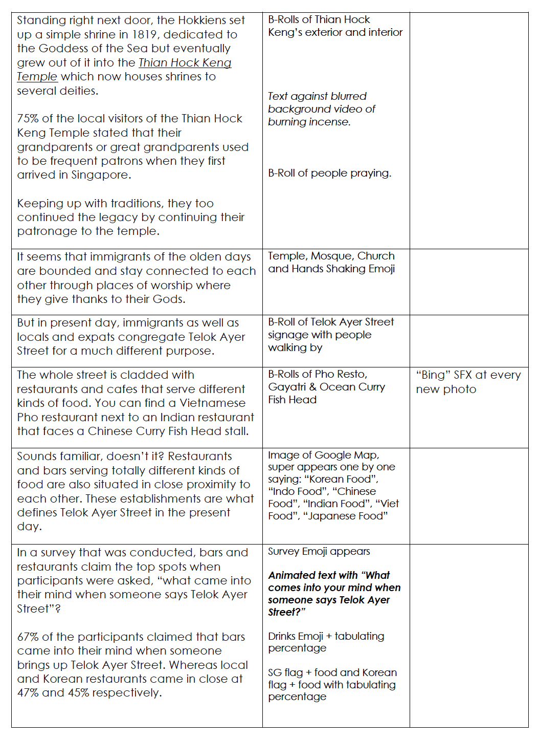
From this, I developed the script to start filming the video of Telok Ayer Street. The three pages below are my first draft of the script to present to Joy for consultation.
From the consultation, I gathered from Joy that I needed to include more numbers, interviews and statistics. From that, I decided to add in more facts and also lengthen the duration in order to make my presentation close to 8 minutes.
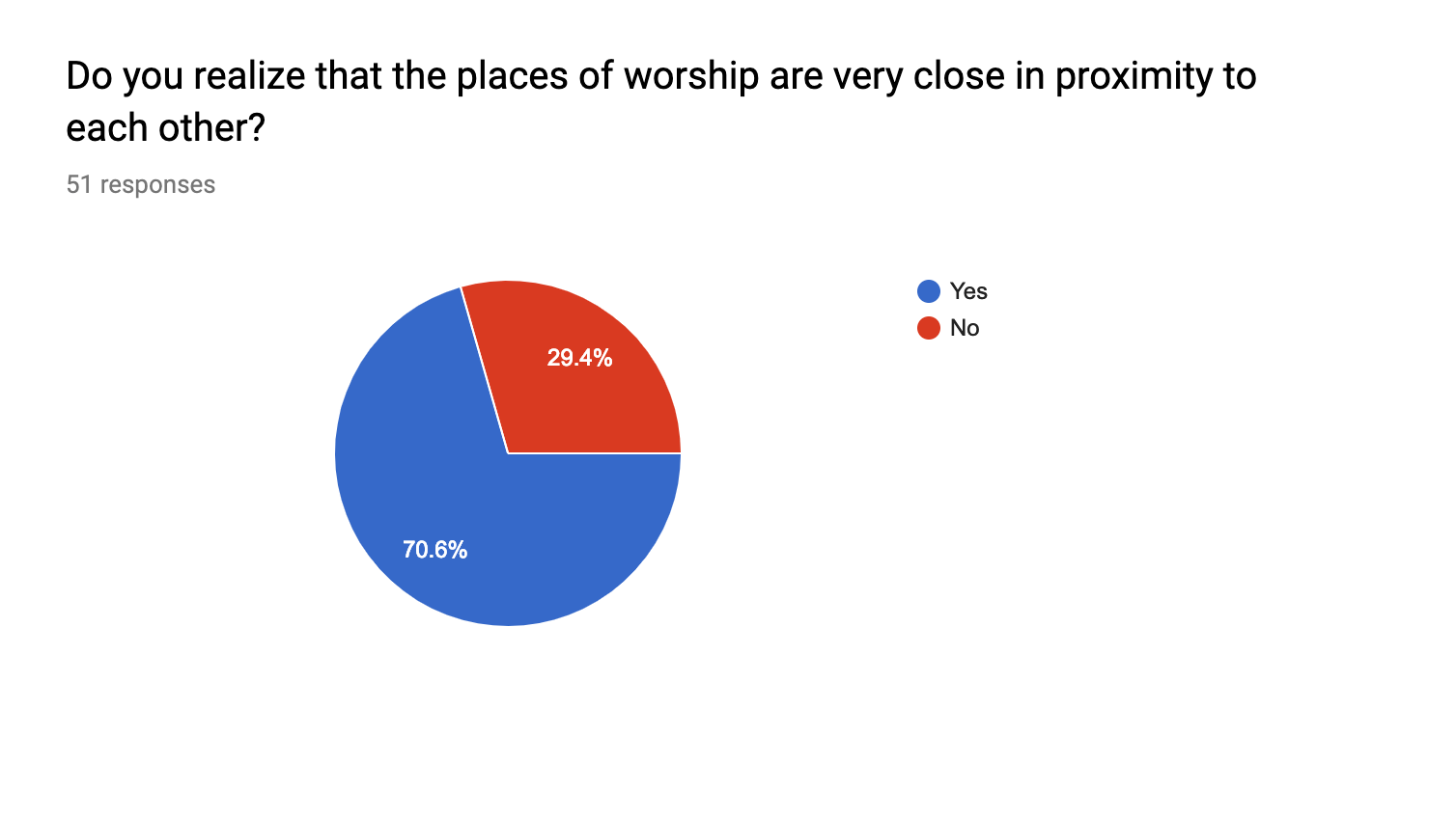
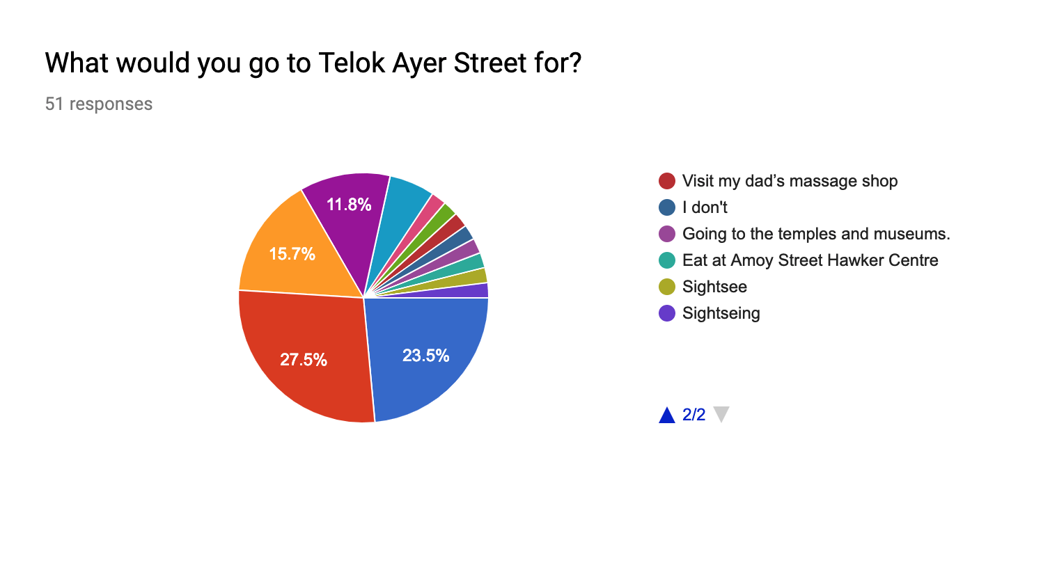
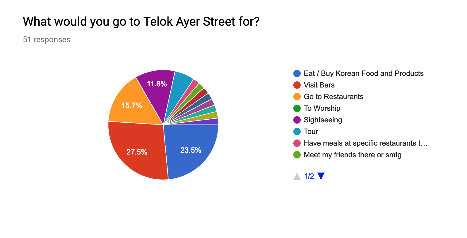
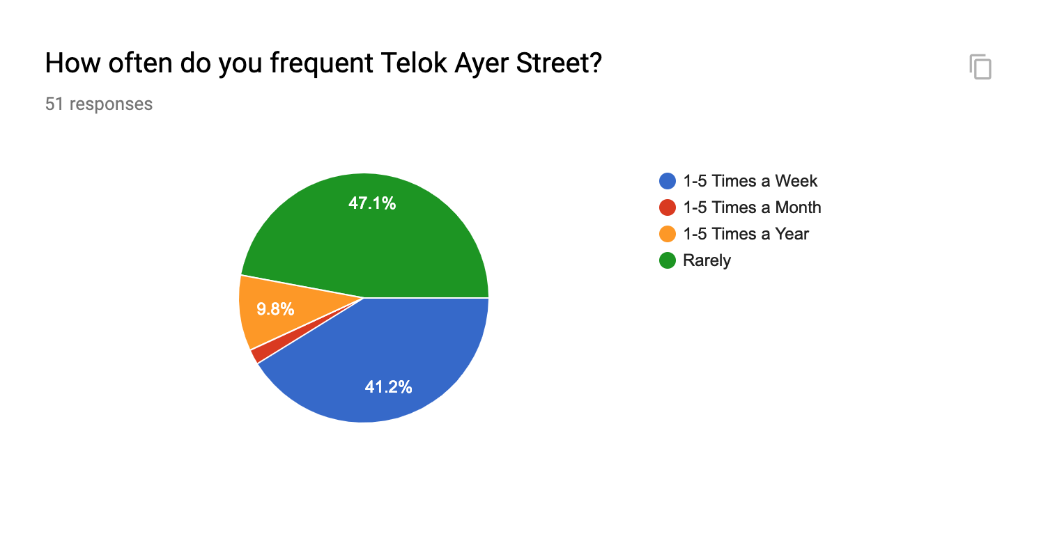
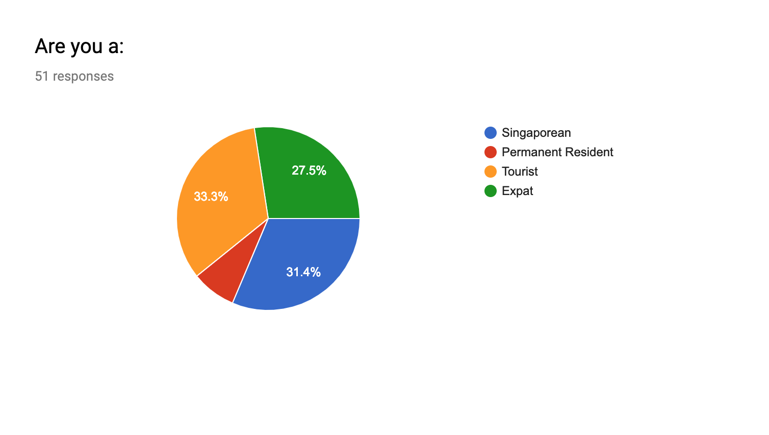
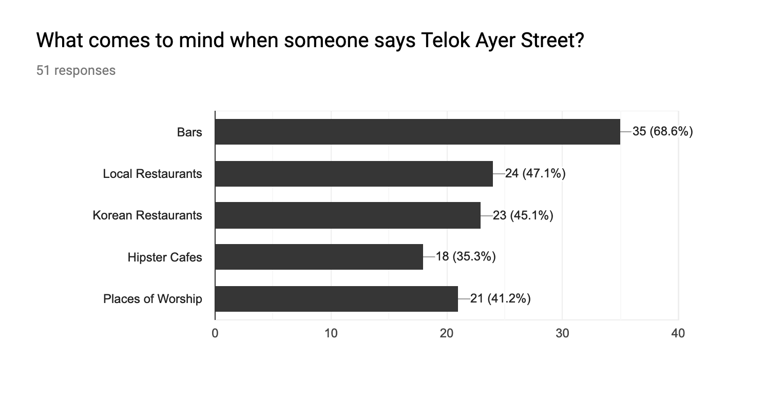
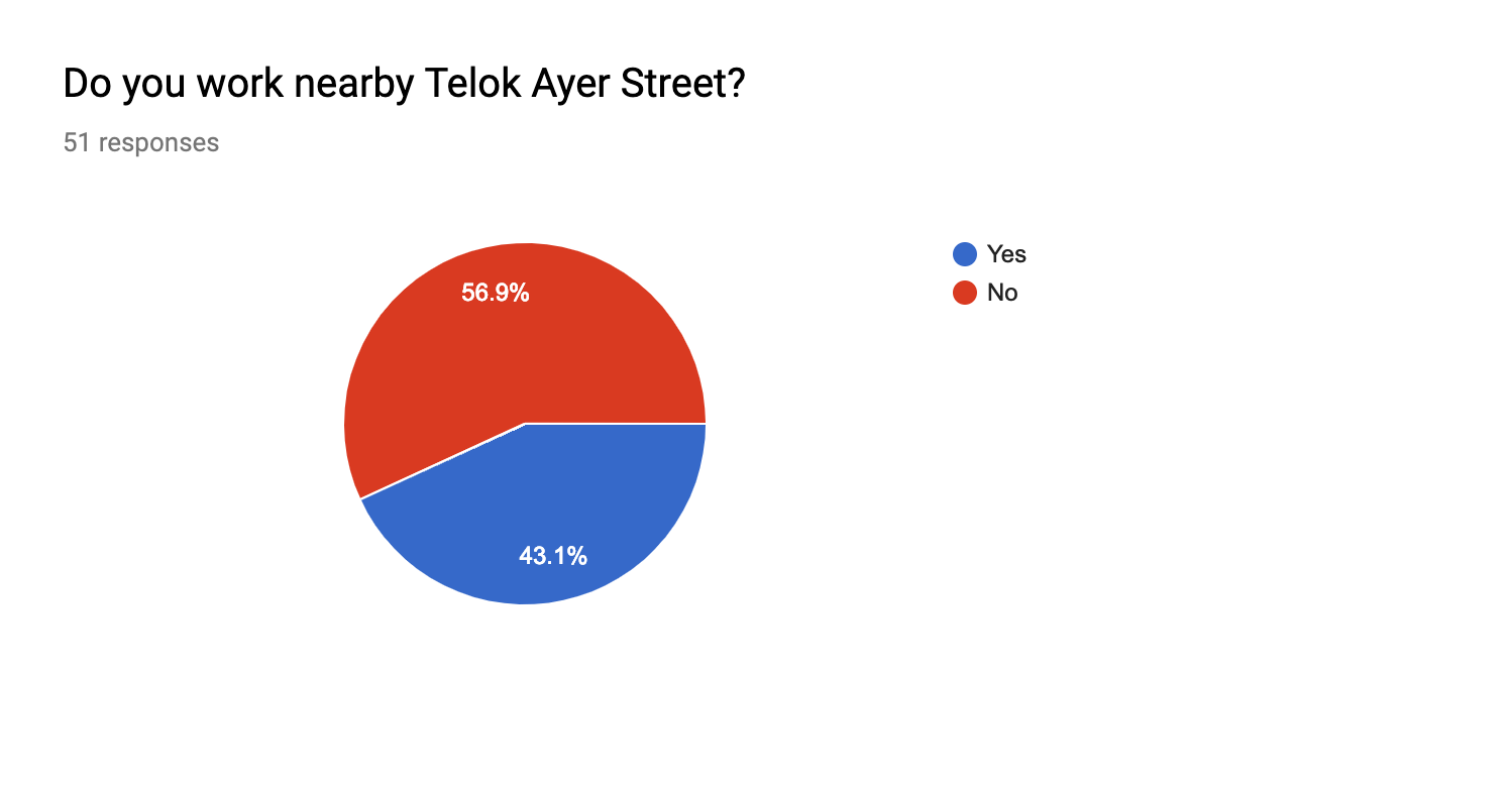
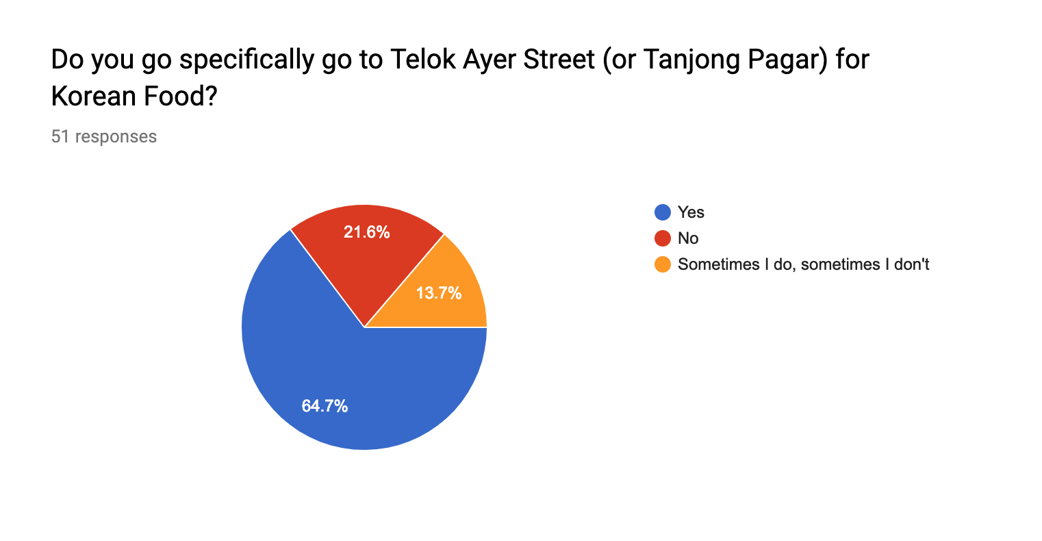
I have also included a couple of survey questions to the public such as people from ADM, tourists, CBD workers as well as other patrons of Telok Ayer Street. Here are some of the results.
From this list of questions, I then put together a final video for this locality.
Feedbacks + Comments from the class
Reflections
Moving forward, I will be adopting the visuals and aesthetic feel of the video into my zine. I felt that the mustard yellow is a great accent colour for the rustic cream feel of the shophouses and paper that I am going for.
I had two different concepts in the beginning of the ideation process.
Concept 1 was about about jobs that were male-centric and had a minority or even no women at all. I had jobs such as military personal, politician, surgeon and athlete.
Concept 2 was about fictional jobs that I idealise about which included some of my favourite mobile apps or mobile apps I frequently use in a day such as Tinder, Deliveroo, Netflix and Google Assistant.
After having consultations with Joy, I came to the conclusion of fusing these two concepts of which I will incorporate visuals of the idealised jobs but the context of the male-centric jobs.
As for the tone of the work, I decided to go for a comical and sarcastic approach as I exaggerate the different features of the work.
Inspirations
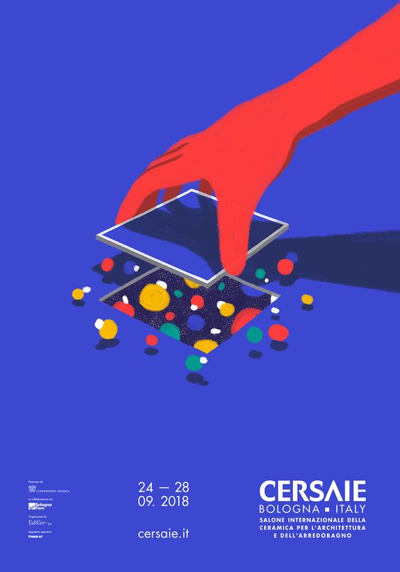
Cersaie Italy Poster
I was inspired by this design mainly because of the arm coming in interact with objects that were much smaller in scale. I intend to adopt this idea of arms coming in most of my compositions so as to show the “God”-like quality that I have in the jobs.
Prun’s Prun and Friends Poster
Korea Foundation 25th Anniversary Poster
As for these two examples, I was very fascinated by the use of isometric view to really showcase not just the letterforms but also the little elements in the work like the people. I planned to include this in one or two of my works which would support the idea of the larger-scaled arms coming into the picture.
Jane Fonda ABC by Jessica Das
I also thought about using the body to create the letterforms as I was really interested at exploring how the body language are able to distort themselves to translate into letterforms. I plan to adopt this in the composition where I use an exaggeration in the body movement of my characters to really capture the essence of the letterforms.
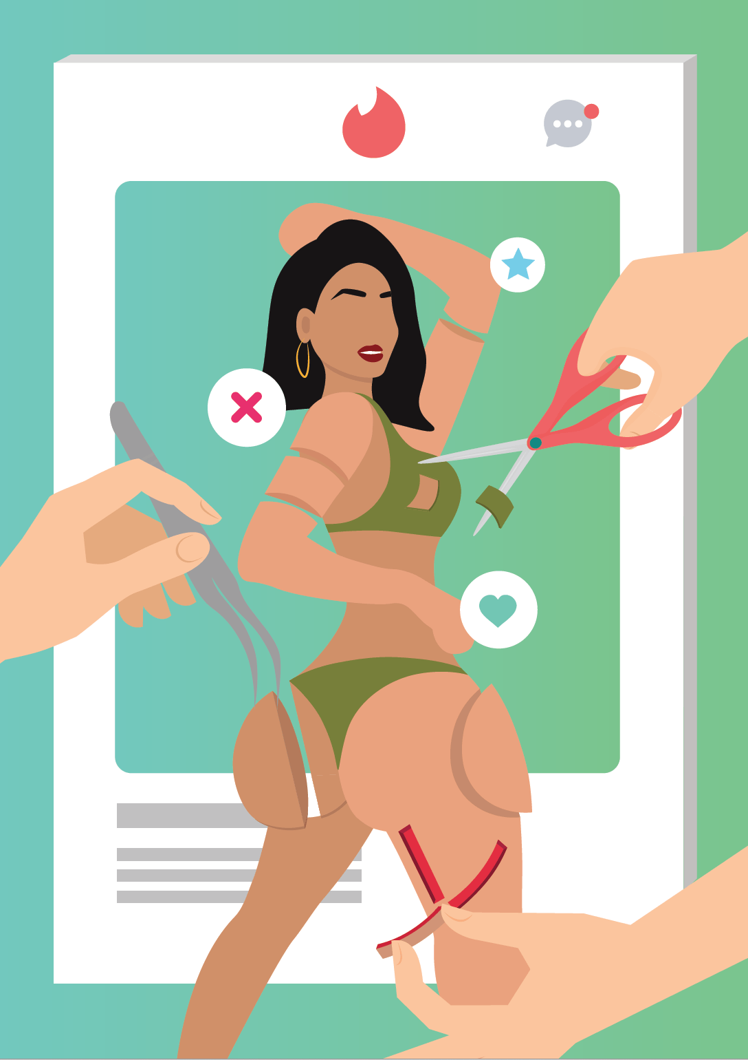
Occupation #1: Tinder Bio Specialist
The ideation for this was that I really wanted to show how people are very superficial online and they only seek to put out the best versions of themselves online both in their images and in their bio.
I decided to use Tinder as a prime example as I felt that it was the most relatable social media application and also because I’ve had experiences with it too.
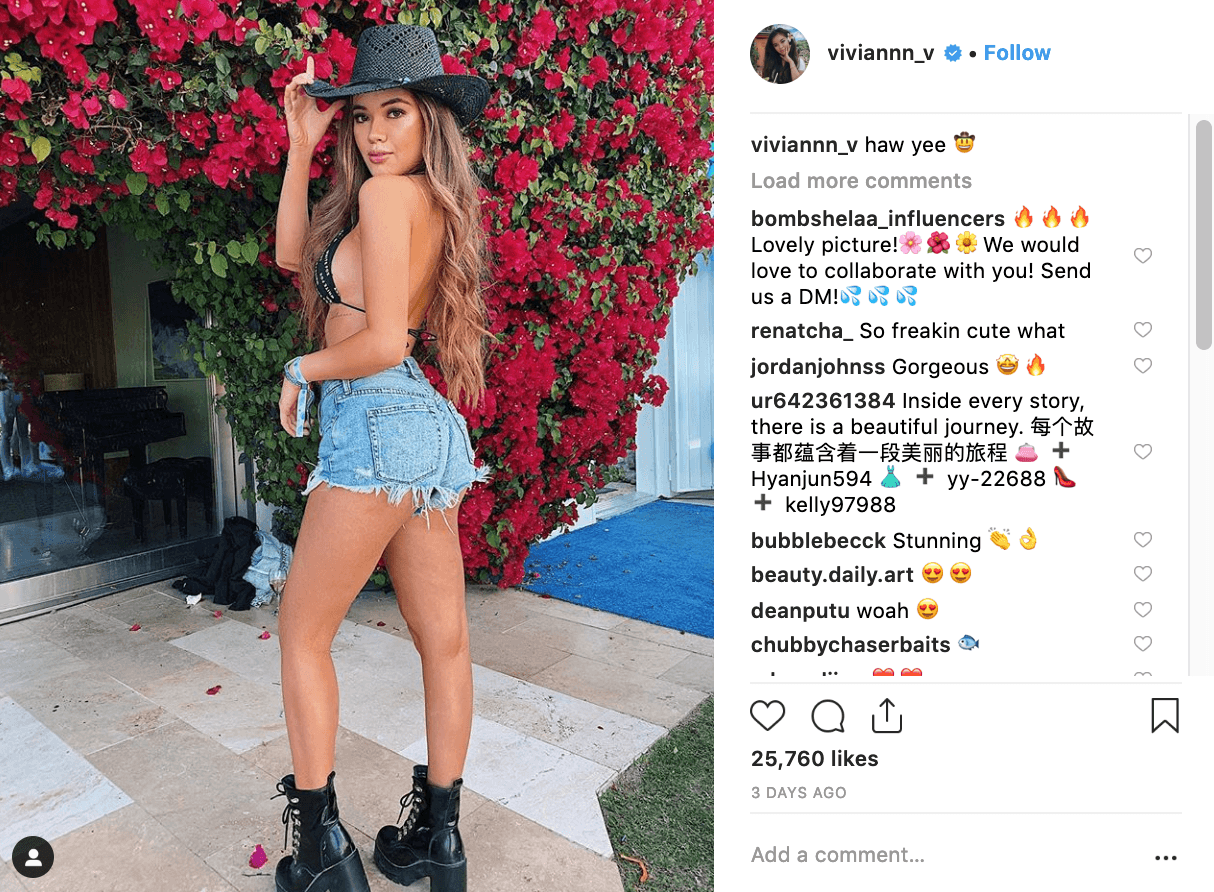
The idea also derived from me scrolling through Instagram and seeing how curated the posts of these influencers are as they only post the best shots and best angles of themselves.
To put into perspective, the job of a Tinder Bio Specialist would mimic that of a plastic surgeon that is fixing the physical attributes of the users and only curating on the best parts to go onto the body in order to create the best bio on Tinder. Here are some of the sketches to get me going.
From the sketches, I derived to my final composition.
The letterforms are seen as such:
N – The two chopped up arms
A – The cut out bra
D – Inverted left butt cheek
D – Inverted right butt cheek
Y – Torn skin on the thigh
Occupation #2: Deliveroo Employees Trainer
For this occupation, I really wanted to show the exaggeration of how Deliveroo riders are very much similar to military personnels such as the soldiers as they too are tasked to serve the people – the hangry customers.
I planned to depict the people in my compositions as Deliveroo employees cladded in army gears and are doing very battle-like actions such as going through the battlefield.
I also got more ideas after looking at soldiers in various different situations and really understand their body language so it will be easier for me to visualise how I can manipulate their body language into making out the letterforms.
To put into perspective, the hands in this composition would come in as a trainer that is trying to test the employees by putting them into challenges but at the same time try to help them out as well. Here are some sketches.
From the sketches, I derived to my final composition.
The letterforms are seen as such:
N – The telephone wire
A – Deliveroo employee being thrown from the top
D – 2nd Level Ground
D – 1st Level Ground
Y – Telephone wire dangling around and down the employee
Occupation #3: Professional Netflix Watcher
This occupation was the most difficult for me to crack and really put together a good combination of the two jobs that make up this occupation. I decided to go with the politician as the professional Netflix watcher as it derived from the idea of how Singaporean politicians are simply known for their “eye-power”.
I wanted to approach this in a very sarcastic manner whereby I used the Parliament House to set the setting for this work. The stands at the front of the Parliament House was something that I wanted to change and incorporate a conveyor belt of food and projection screening of Netflix.
To put into perspective, the politicians in the work would be illustrated in pajamas to further emphasise that they are just in leisure mode while in the Parliament House. The will also be taking an oath to promise to watch Netflix and eat as many junk food as they like. Here are some sketches.
From the sketches, I derived to my final composition.
For this work, I decided to use my initials. The letterforms are seen as such:
N – The sofas and people taking the oath
M – The conveyor belt of food and large LCD screen
Occupation #4: Google Assistant’s Assistant
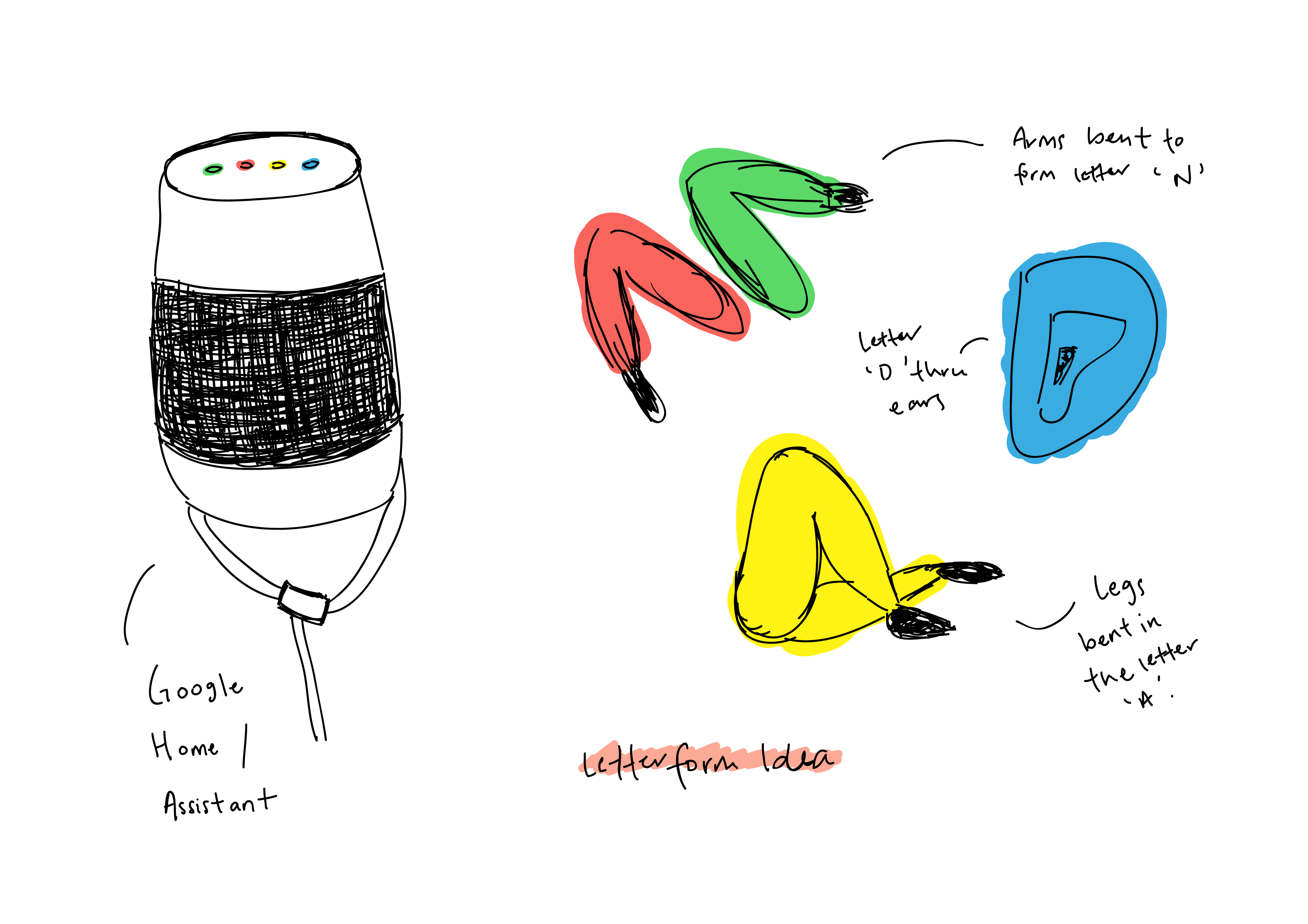
For this occupation, I thought of really humanising the inanimate Google Home device which is the most popular embodiment of the Google Assistant. What I wanted to do with this was really to show how there is actually a human inside the Google Assistant and that she really actually needs alot of help and maintenance as the default voice of the Assistant is in fact a woman, which is where me or my hands come in to help.
These are some of the chunked up body parts such as the arms, legs and ears that I have come across that I planned to incorporate into the Google Home device.
Here are some of the sketches to help me better understand the letter forms to incorporate.
From the sketches, I derived to my final composition.
The letterforms are seen as such:
N – The arms coming out and reaching for a book
A – The legs coming out to receive a pedicure
D – Inverted ear
D – Ear listening to music
Y – Wire with veins
Feedbacks + Comments from the class
Reflections
I find this project to be challenging yet it allows for me to really learn about the creation of letter forms and how easily it can be manipulated into anything that we want it to be. The challenge that I faced in this project would definitely be the forcing of the letter forms onto the elements of my work as I did think that it could have been done less forcefully
I felt that I definitely took away a lot of learning points from this as creating letter forms through image is a great tool to have when doing other works as well as it is a really great visual tool to incorporate considering how flexible it is to manipulate and how it is a much more visually simulating and interesting.


 Code for processing using old audio clip with increasing sound: