


The Substation visit was very insightful and showcased how a place can mean so much to different types of people in the country. It also has many different impact to to not only the human beings around but also to the environment, animals as well as other beings that are inhabiting in it.
According to Wikipedia, Psychogeography is an exploration of urban environments that emphasises playfulness and “drifting”. Another meaning of it would be”a whole toy box full of playful, inventive strategies for exploring cities… just about anything that takes pedestrians off their predictable paths and jolts them into a new awareness of the urban landscape.”
Some Government Funded Art Spaces in Singapore:

2. Arts House

3. Goodman Arts Centre

Some Independent Art Spaces in Singapore:

2. The Star Performing Arts Centre
3. Objectifs Centre for Photography & Filmmaking

4. Gillman Barracks

Conservation & Heritage in Singapore

The Historic Districts of Boat Quay, Chinatown, Kampong Glam and Little India are the four more “known” heritage districts in Singapore with great architecture as well as art. These districts enrich our built environment with their diverse facades, rich ornamentation and unique architectural styles.
To maintain the ambience and physical character of these historic districts, strict conservation guidelines have been put in place.
For example, the entire building envelope, including the rear service blocks and rear courts are to be retained and restored, to maintain the overall low-rise scale and fine grain of the urban texture.

The Residential Historic Districts of Emerald Hill, Cairnhill and Blair Plain were first developed as residences for the well-to-do. They have traditionally been in continuous use as residences for individual families. One example is Blair Plain, which lies at the South-Western edge of Chinatown.
What is “Right to the City”?
According to Wikipedia, “Right to the City” is an idea and a slogan that was first proposed by Henri Lefebvre in his 1968 book Le Droit à la ville and that has been reclaimed in the last decades by social movements, thinkers and several progressive local authorities alike as a call to action to reclaim the city as a co-created space—a place for life detached from the growing effects that commodification and capitalism has had over social interaction and the rise of spatial inequalities in worldwide cities throughout the last two centuries.
In his first inception of the concept, Lefevbre paid specific emphasis on the effects that capitalism had over “the city”, whereas urban life was downgraded into a commodity, social interaction became increasingly uprooted and urban space and governance were turned into exclusive goods.
Bukit Brown Things:
The Bukit Brown Municipal Cemetery was established to serve the burial needs of the Chinese community. It officially opened on 1 January 1922 and operated for more than half a century before its closure in 1973. The cemetery was previously a section of a 211-acre plot of land, belonging to the Hokkien Ong clan, that the municipal government had acquired between 1918 and 1919.
Cemetery for the wider Chinese community
Bukit Brown was initially unpopular with the Chinese because of its small plot sizes. However, it then slowly gained acceptance after improvements were made to the layout. It was reported that by 1929, 40 percent of all officially registered Chinese burials within the municipality took place there.
The commissioners also sought to improve the conditions of the cemetery. Two rest houses were then allocated for funeral visitors. A regular water supply was provided through the construction of water pipes and wells, and gardeners were hired to maintain the site.
Problems arise at the cemetery
Aside from murders, robberies and faction fights were also known occurrences. One of the earliest murders at the cemetery took place in 1927. A fight between two groups led to the fatal stabbing of two Chinese men
Future developments
In 2011, the Land Transport Authority (LTA) announced that a new dual four-lane road linking MacRitchie Viaduct and Adam Flyover would be built over parts of Bukit Brown Cemetery. The road would cater to increased traffic demand and help to ease the peak-hour congestion along Lornie Road and the PIE. It is expected to be completed by the end of 2017. Details of the graves affected by the construction were published in March 2012, and exhumation of the first batch of graves began in December 2013.
The remaining parts of the cemetery and its surrounding land, totally 200 ha, are slated for redevelopment into a new housing estate in the future.
In October 2013, Bukit Brown Cemetery was placed on the 2014 World Monuments Watch, which records global heritage sites which are at risk of being destroyed.
Citation:
http://eresources.nlb.gov.sg/infopedia/articles/SIP_1358_2009-07-13.html
https://www.ura.gov.sg/Corporate/Get-Involved/Conserve-Built-Heritage/Explore-Our-Built-Heritage/Conservation-Areas
https://en.wikipedia.org/wiki/Right_to_the_city
After playing around with the three different sketch models, I came to this final one which I think could be really interesting. For my previous refined sketch models, I’ve had two of them with the sub-ordinate being in discordance whereas only one model had the sub-dominant being in discordance. Out of the three models, I realised that the model with the sub-dominant being in discordance turn out to be the most interesting model out of all the three. As such, I with my final model, I decided to make my sub-dominant the discordant one.


Some things to address:
Why I did not wedge the Sub-Ordinate to the right side – The reason was that I wanted the Sub-Dominant to feel a little more balanced since it is suspended 2/3 and only 1/3 of the piece is wedged onto the Dominant piece. The second would be that there are light in the Dominant piece that can only be seen if the Sub-Ordinate piece is pierced right at the spot I chose to pierce it at. If I had wedged the Sub-Ordinate on the side of the Dominant piece, I would then not be able to achieve the “kaleidoscope” effect.
Why I didn’t pierce the Sub-Ordinate through the back of the Dominant piece – The reason would be that I would then again, not been able to showcase the green and purple light as I have wanted as I would only be able to see what’s on the other side of the dominant piece. In addition, the lights were not small enough to fit directly into the Sub-Ordinate piece thus, it has to be mounted on the inside of the Dominant piece.
Materials Used:
In this final model, I have used the wedging piercing techniques. I have cut the Dominant 1cm deep such that I can fit the Sub-Dominant into it. The challenge that I faced with this would be that the cardboard box is really difficult to cut through as it is tougher and harder to cut as compared to foam. The wedging is also strategically placed such that it is 1/3 wedged onto the Dominant while the 2/3 is left hanging. To create a cantilever effect, the Sub-Ordinate has been placed on the 1/3 portion of the Sub-Dominant.
The Sub-Ordinate has been placed by piercing through the Sub-Dominant. As mentioned, the Sub-Ordinate is strategically placed in the middle of the 1/3 potion of the Sub-Dominant. When looking through the Sub-Ordinate, viewers are able to see a purple and green light, to contribute further to the idea of a Pandora Box as well as discordance as these colours are complimentary to each other.
Applications

2. Geometric Earring

3. Lighter

4. Observatory Tower

Sketch Model 1


I have further worked to improve and make this sketch model such that the wedging of the Sub-Dominant is that it is more prominent now. The Sub-Dominant is placed right halfway through the Dominant piece and is elevated from the ground by an inch. The Sub-Ordinate is wedged onto the Sub-Dominant exactly parallel to the Dominant piece.
Sketch Model 2


In this model, the Dominant and Sub-Dominant piece are wedged parallel to each other. As for the Sun-Ordinate, it is pierced diagonally through the Sub-Dominant piece exactly from the 1/4 of the and right out the 1/2 mark. I have chosen a toothpick as the Sub-Ordinate as it is rather fine yet visible to the eye.
Sketch Model 3


In this model, the Dominant piece and the Sub-Dominant piece are perpendicularly wedged to each other. The Sub-Dominant piece is wedged 1cm or 1/2 into the Dominant piece and from the front view, it is wedged 2/3 onto the Dominant piece while 1/3 of the piece is hanging out. I have used a Satay stick as the Sub-Ordinate piece and also the piece that is discordant.
Out of the five images that I have shortlisted to be considered for the final submission, I have further eliminated two images to create this:

Title: Obsessed
Artist Statement:
I have always felt the need of having to hide parts of myself to the rest of the world. To show only bits and pieces of what and who I truly am. Have I been honest to myself? Yes. Have I been honest to people? Maybe not. I am constantly in doubt and am always ever so cautious with my surroundings that faking has become a relatively huge part of my personality. To be specific, faking my confidence. It led me to an obsession with high end make-up products, branded goods and shiny jewellery as these material possessions slowly integrated into becoming a part of myself. Over time, I am consumed with with vanity and looking “perfect” and rigid and continued to stray away from being honest with who I truly am.
My Literal Message:
The constant use of the red colour is to immediately catch the eye of the viewers as it is a bold colour and it looks absolutely flattering on myself. The red head piece is used to compliment the outfit and balance out the whole red aesthetic of the photograph.
The shiny necklace, earrings and rings that I cladded myself with is to further compliment the outfit that I am wearing as the shiny pieces really brings forth the vibrancy in the red colour.
My Symbolic Message:
The use of red that I have constantly placed an emphasis throughout the series would be to showcase confidence and how I feel beautiful and empowered. Red is also a colour used by women to appear attractive and somewhat alluring, drawing a sense of sex appeal.
The shiny necklace, earrings and rings is to symbolise how I need all these material possessions to appear confident and to somewhat brag that I am of class and have a high spending power. This relates to how women on social media perceive each other’s worth based on the amount of expensive goods they own.
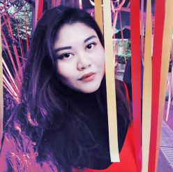
Image 1

This image focuses on the excessive amount of jewellery and also the neckline. I chose this image so as to portray how I am vulnerable to these material possessions and it has become part of me, part of the things that make up the idea of perfection. The image is particularly cropped from the lips to the collarbone area as I personally feel that this is one of the sexier region of the female body and the gesture of my fingers grazing my face as such is to show how I am really obsessed with vanity.
Image 2

This image is to slowly introduce my personality through my eyes, yet not having to show my whole face just yet. I chose this shot as it exudes the “mysterious” feel that would somehow make viewers curious and would want to click on my profile to see more of my face.
Image 3

I selected this image as to me, this is the ideal of how I would portray myself to my followers on social media. This was how I wanted them to perceive me as. In this image, I have over-exaggerated some elements such as the lipstick and excessive rings worn. The over-lining of the lipstick has been in trend with so many social media beauty influencers as it now an “ideal” to have really plump and luscious lips. The expression that I made was a typical “I’m confident” pose with my chin tilted lightly up and my head tilted to the left slightly, sort of subtly looking down to the viewers.
In conclusion, I really do believe that expensive material goods and portraying oneself in a proper and most idealistic way through make-up or dressing up is a form of self-expression on how they want to be be accepted and well-liked by the society or the “online-society” they are in. As I grew up and with a social circle of friends who are constantly obsessed about posted the most picture-perfect posts at the right timing with the right caption, I somehow too have developed that trait unwillingly became obsessed with that lifestyle.
Here are some of my own examples to show how when posting at different timings or when I post something that is not conventionally what my followers like, which are picture-perfect posts of myself, I tend to receive different amount of likes and comments.

Posted at 8pm on a Wednesday, where most of my followers are having dinner or at home. I consider this to be the “prime time” on Instagram where posts posted at this timing will get the most exposure. Image is a selection from 30 images that were shot, filtered and colour corrected to make the colours “pop”.

Posted at 6pm on a Sunday, I consider this to be the “prime time” for weekends where most of my followers will be at home resting and getting ready for a Monday work day / school day. Again, this image was a selection from over 20 images, filtered and colour corrected to make the aesthetic fitting of that a “Sunday Brunch”.

Posted on a Friday evening at 5pm, this was honestly one of my favourite shots on my Instagram page yet it has the least likes because my face is clearly not seen and it is apparent that my followers don’t care for my silhouette or the beautiful neon sign behind me. This was also filtered and colour corrected.
Crit Sesh Comments
From the three different artist references that I have gathered, I started an elimination process and started to think on what was possible to execute with the time, budget and resources that I have.
I decided to not go further with the first and second artist reference as firstly, the first reference needed a bath tub and that required me to book a hotel room which was way over my budget for a shoot. Furthermore, the rooms that I wanted weren’t available during the dates when I wanted to conduct the shoot on. As for the second idea, it is achievable but due to time constraints and unfortunate weather forecast, I decided to not risk the time being wasted and proceeded with a concept that I am able to have full control over.

In my series, I would like to portray how I am obsessed with looking pretty and perfect especially when posting on social media platforms. Using Kitty Ca$h as my main inspiration, I proceeded to create a moodboard that would help me with visualising the aesthetic of the series.
I proceeded to choose my location, which was in my previous school. Republic Polytechnic was my choice of location as it has big glass windows which allowed for natural sunlight to enter, allowing me to have minimal lighting set-up.

I then began to start on my make-up which was to highlight the point that I am trying to relay. The make up look that I went for was to have warm tones of orange, red and gold on my eyelids as well as making my face as contoured as it can naturally get. To create the desired look, I smoked the corner of my eyes and made the center of the eyelids as shiny as possible. As for the lips, I used a bright red colour to further compliment my outfit.


I also had on many accessories suck as a brick red flower head piece, a shiny necklace, a whole set of rings and also long dangly ear pieces. The purpose of these accessories were to make the photo as shiny as possible as well as exude a “classy” front.


I also had to use a brown paper backdrop using 2-metre long art paper as the backdrop as I felt that a white background would feel too flat.

After dressing myself up, I then started to do some test shots and setting adjustments by having my friend stand in to where I will be standing at and start to frame up. As he will be the one shooting me, I just wanted him to get the shots that I wanted and be familiar with the vibe I’m going for. Throughout the shoot, I constantly referenced back to the Kitty Ca$h series so as to have a rough guide on the variety of shots I should get.
At the end of the shoot, out of the million shots we took, I narrowed them down to these ones before choosing my final three shots for submissions.


According to wikipedia, a self-portrait is a representation of an artist that is drawn, painted, photographed, or sculpted by that artist. In this particular assignment, we were assigned to create self-portraits in the form of photography. As a photography enthusiast, I love to capture things that are aesthetically pleasing and would go to lengths just to have the shots perfected.
I played around with different ideas and things that made me who I am. I put together keywords such as body, close-up, ideal, perfection, class, spontaneous, funny, high-maintenance, candid and beautiful and went to search for artist references with keywords that spoke to me.
Artist Reference #1: Maisie Cousins


In her series titled “grass, peonie, bum”, I was immediately attracted to the saturated plethora of colours she chose to incorporate in her shots and how she included in elements of nature such as grass and flower bits, to a full fledge stalk of flower. She also had extreme close-ups of her body parts and face that really drew me to the details of how she added a “human” touch to her shots. All in all, this series felt very raw yet beautiful at the same time to me.
If I were to take this concept and to develop it to my own, I would:
Artist Reference #2: Sage Sohier


In Sage Sohier’s “Witness to Beauty”, she created something very real, candid and a reflection of what a day in her life would look like. It shows a very distinct depiction of how she is living an affluent life as seen in her dressing in a robe and enjoying the breeze of the ocean from her private yacht, her chilling in bed with a family member while cladded in a possibly exorbitant dress and lastly her enjoying a sand spa treatment which is again, not cheap either.
If I were to take this concept and to develop it to my own, I would:
Artist Reference #3: Adrienne Raquel


In Adrienne Raquel’s series, “Kitty Ca$h”, she showcases a very dreamy, shiny and glam vibe to all the photographs as there would always be an element in each of the photograph that shines be it the eye make-up, sunglasses to even her nail jewellery. Her series focused on the glitz and glam of the modern black NYC women. It shows confidence and exudes a pretty clear self-love to the message.
If I were to take this concept and to develop it to my own, I would:
The word that I drew was discordance. According to merriam-webster.com, the word means lack of agreement or harmony : the state or an instance of being discordant. In my understanding of the exercise, the Dominant, Sub-Dominant and Sub-Ordinate has to be in line with each other so with my word, I get the idea that I am able to break that rule so as to achieve the discordance between the three elements of the model.
Sketch Model 1 (Pre-refined):


Some feedbacks that I have received was that the Sub-Dominant could be lesser in width (probably 2/3 of its current width) as currently, the width is almost similar in length to the width of the Dominant.
Sketch Model 2 (Pre-refined):


Some feedbacks that I received for this would be that the intended Sub-Dominant, which is the toothpaste box, has become the Dominant instead as the length is longer that the actual Dominant. The Sub-Ordinate’s width is also a similar length to the Sub-Dominant’s width.
Sketch Model 3 (Pre-refined):


Similar to Sketch Model 2, the issue with Sketch Model 3 also lies with the Sub-Dominant passing off to be the Dominant one instead due to it being longer in length. In addition, the width of the Sub-Ordinate and the width of the Sub-Dominant also appears to be the same in length with needs to be changed as the Sub-Ordinate should appear finer that the Sub-Dominant.

