DESIGN OUTCOME 1: THE SPECTRUM GAME

Moving forward from the infographic poster, I decided to keep the colours, illustrations and basically the whole look and feel to incorporate it in both of my final deliverables.

DESIGN OUTCOME 1

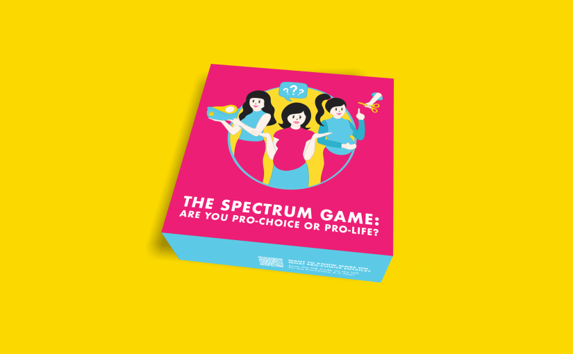
Pro-Choice Game: Are You Pro-Choice or Pro-life?

Starting this deliverable out, I spent some time thinking and collating information from both the survey responses as well as videos, websites, forums and articles online that could aid me in the content of my game. My aim of this game would be to spark conversations among young women, encouraging them to speak up and/or ask questions that they are shy to ask with all things revolving around abortions, adoptions and unwanted pregnancies.

Initially, I just wanted to come out with prompt cards that will be drawn by each players and getting them to talk about what they feel but after consultations and revisiting the cards and its concept, I felt that the prompt cards doesn’t fully engage the players as much as I wanted it to be.

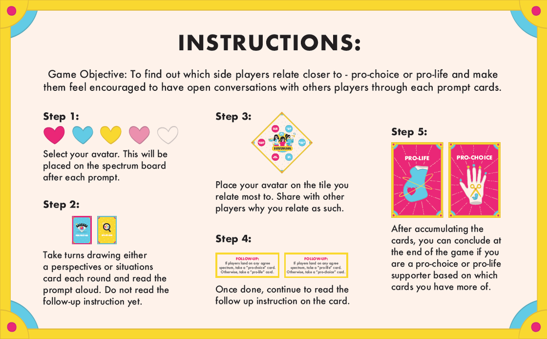
As such, I went to think of stronger game objectives that allow players to come to a conclusion once they are done with the game thus, the gameplay of the board game allows players to find out if they are pro-choice supporters or if they are pro-life supporters all while allowing conversations to flow throughout the different prompt cards.
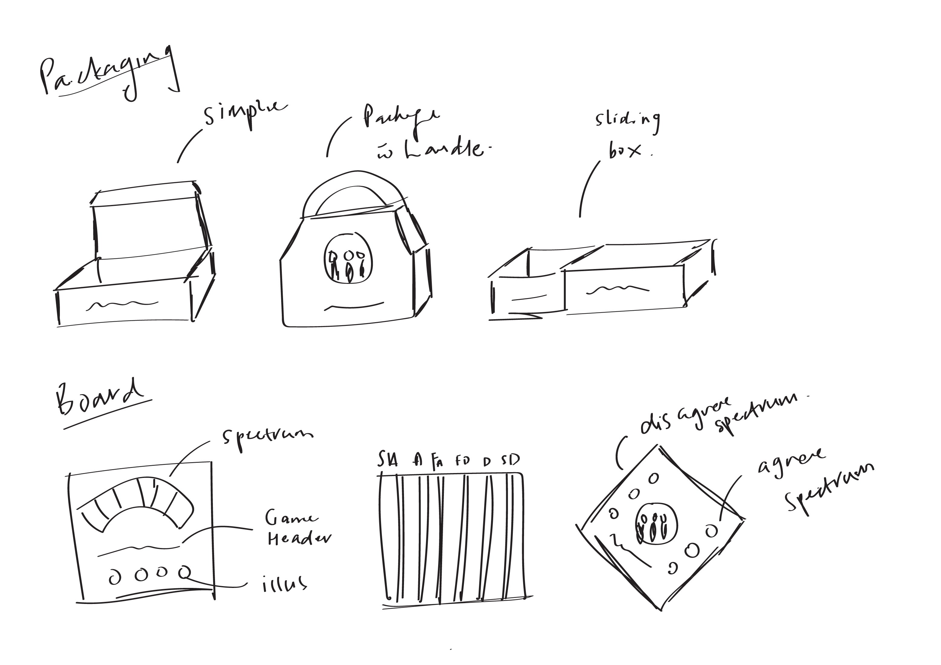
Early Sketches:

Gameplay:

Packaging:

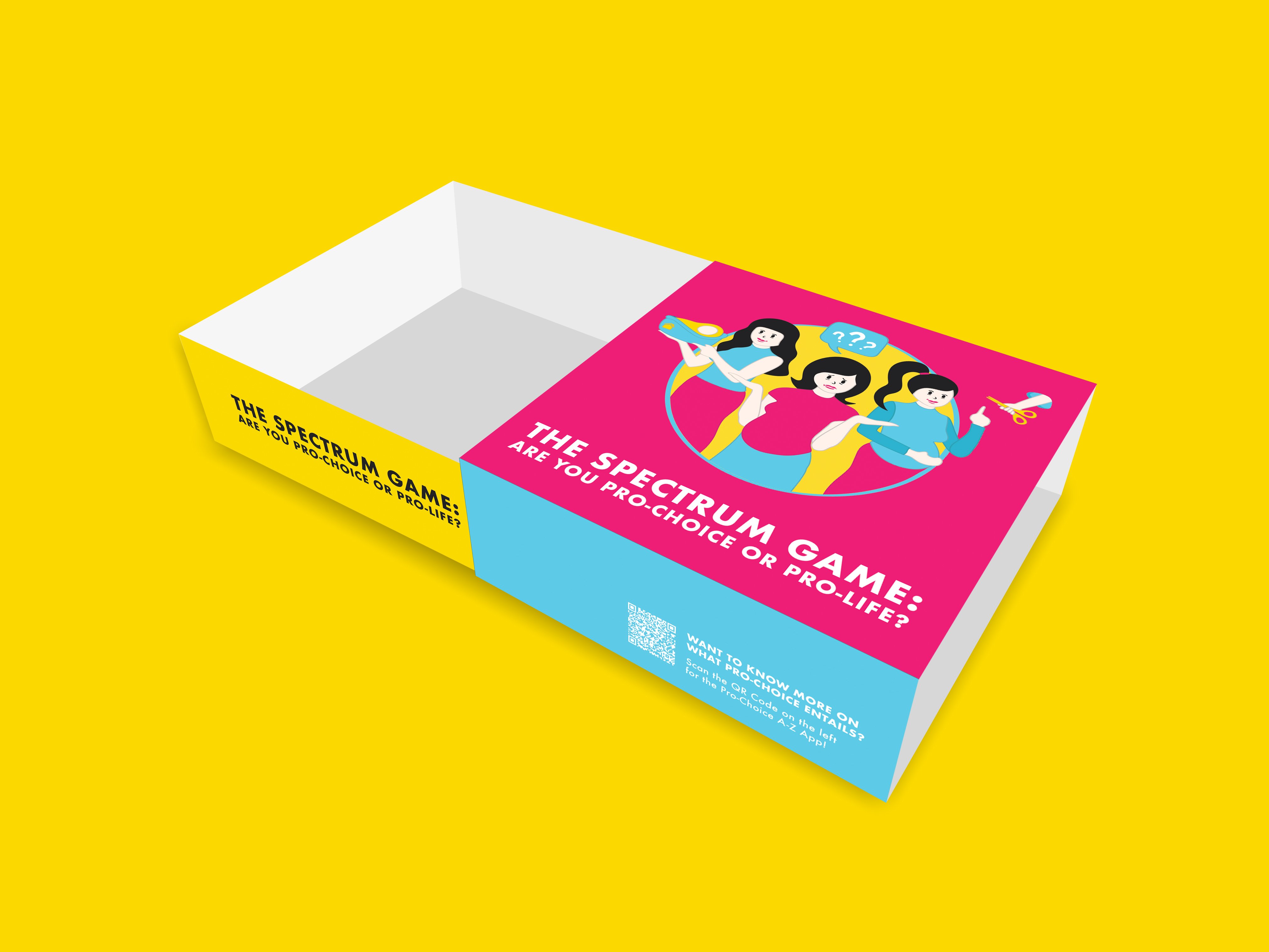
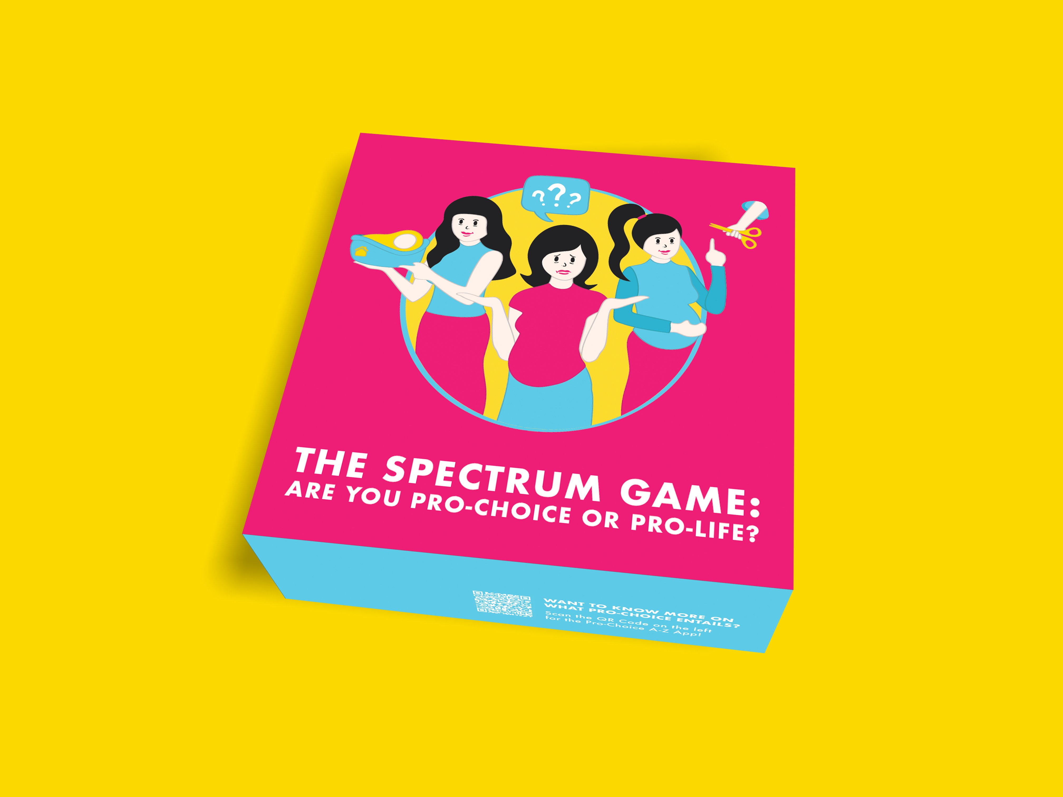
I decided to go with the sliding box as the final packaging as I thought it would be simple yet a little different from the usual open up boxes. The different faces of the box are in pink, blue and yellow respectively so as to really make it interesting and vibrant and look very attractive as a game cover.

Board (+icons):

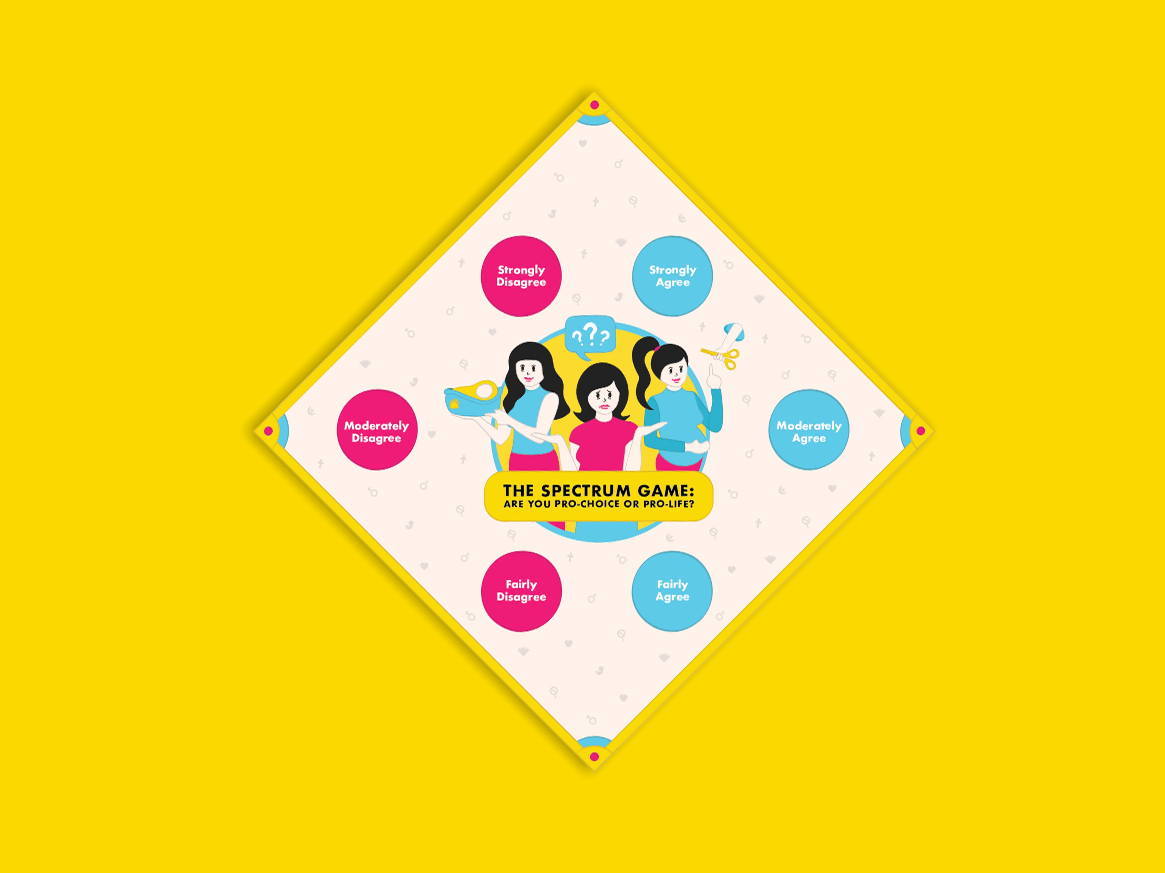
I have created the board such that it allows for players to place their icons within a spectrum as I felt that it would allow them to better visualise where they stand among the other players and allows for a better conversation starter after each prompt.

Prompt Cards:

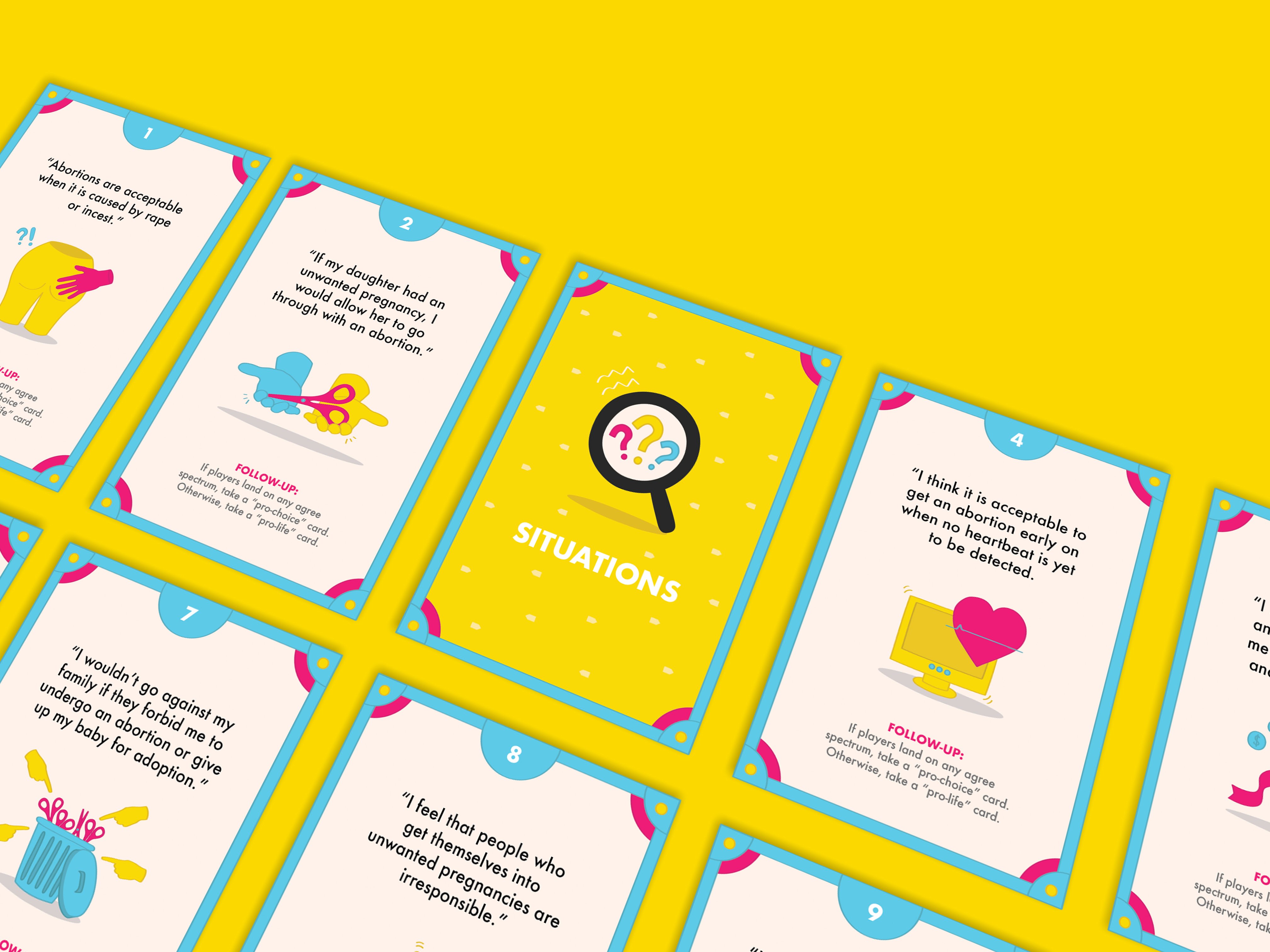
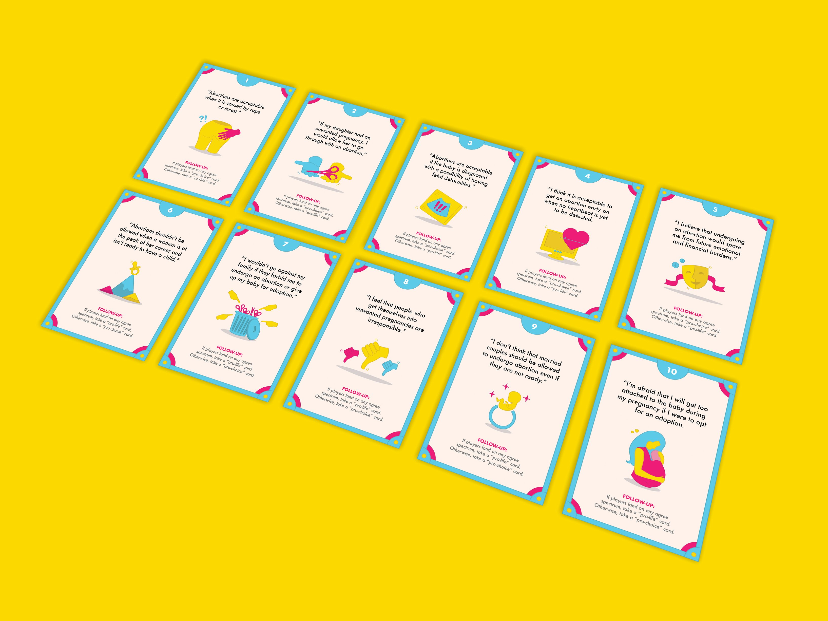
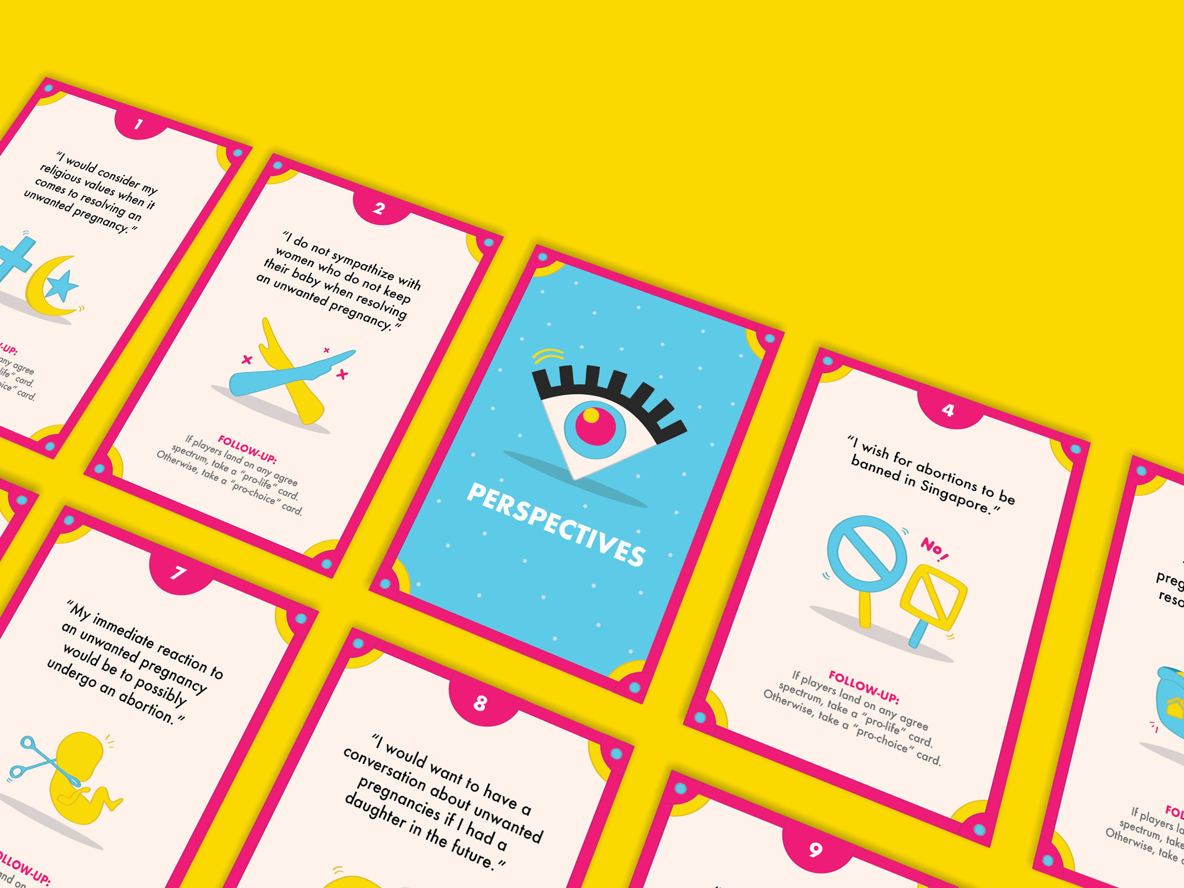
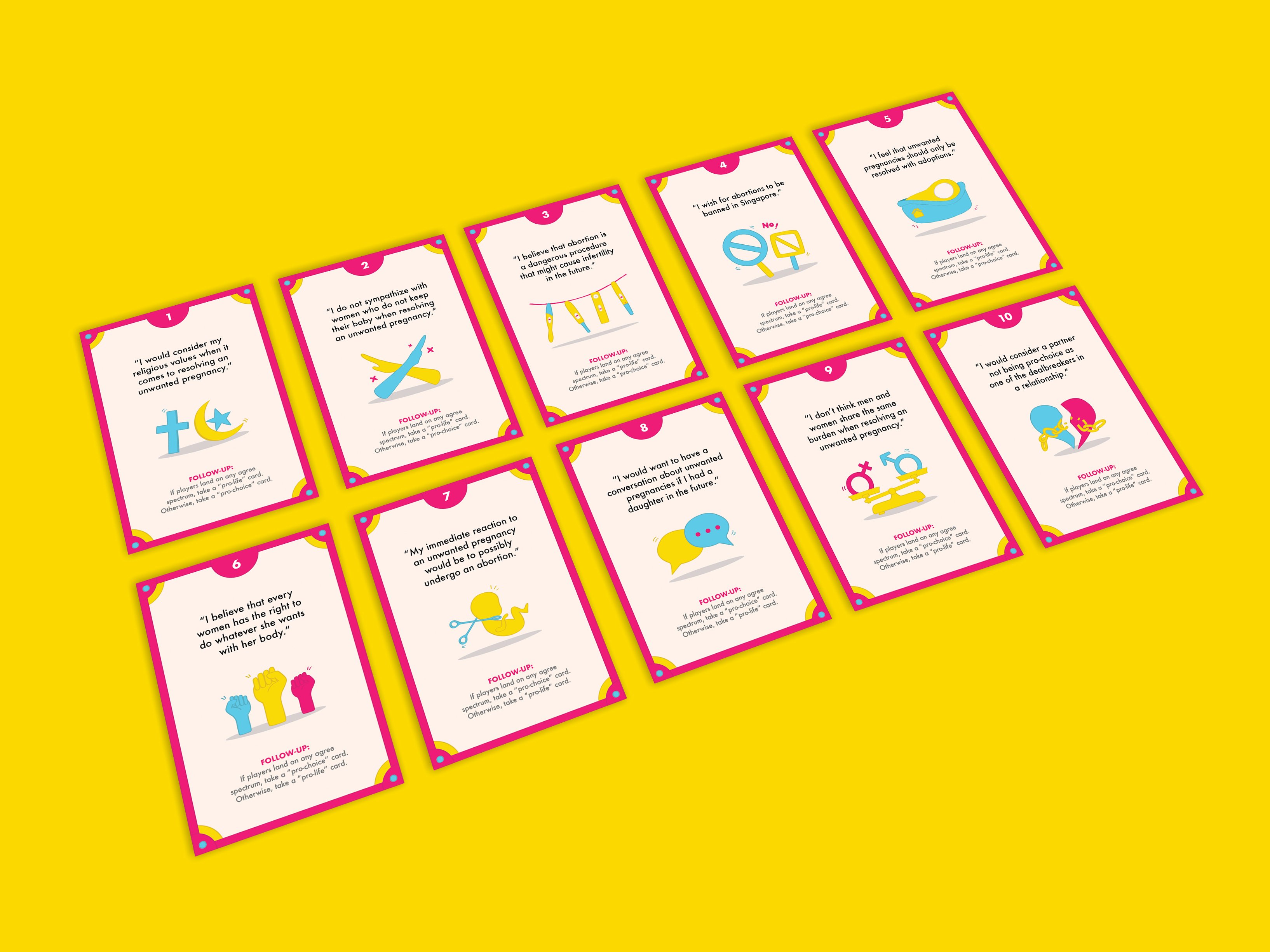
I have divided the prompt cards into pro-choice and pro-life cards where 5 cards from each category would have a follow-up of having the players collect either pro-choice or pro-life cards if they were to land on any agree spectrum. After 20 rounds of drawing, players would then be able to determine if they are pro-choice supporters or pro-life supporters.

Token Cards:

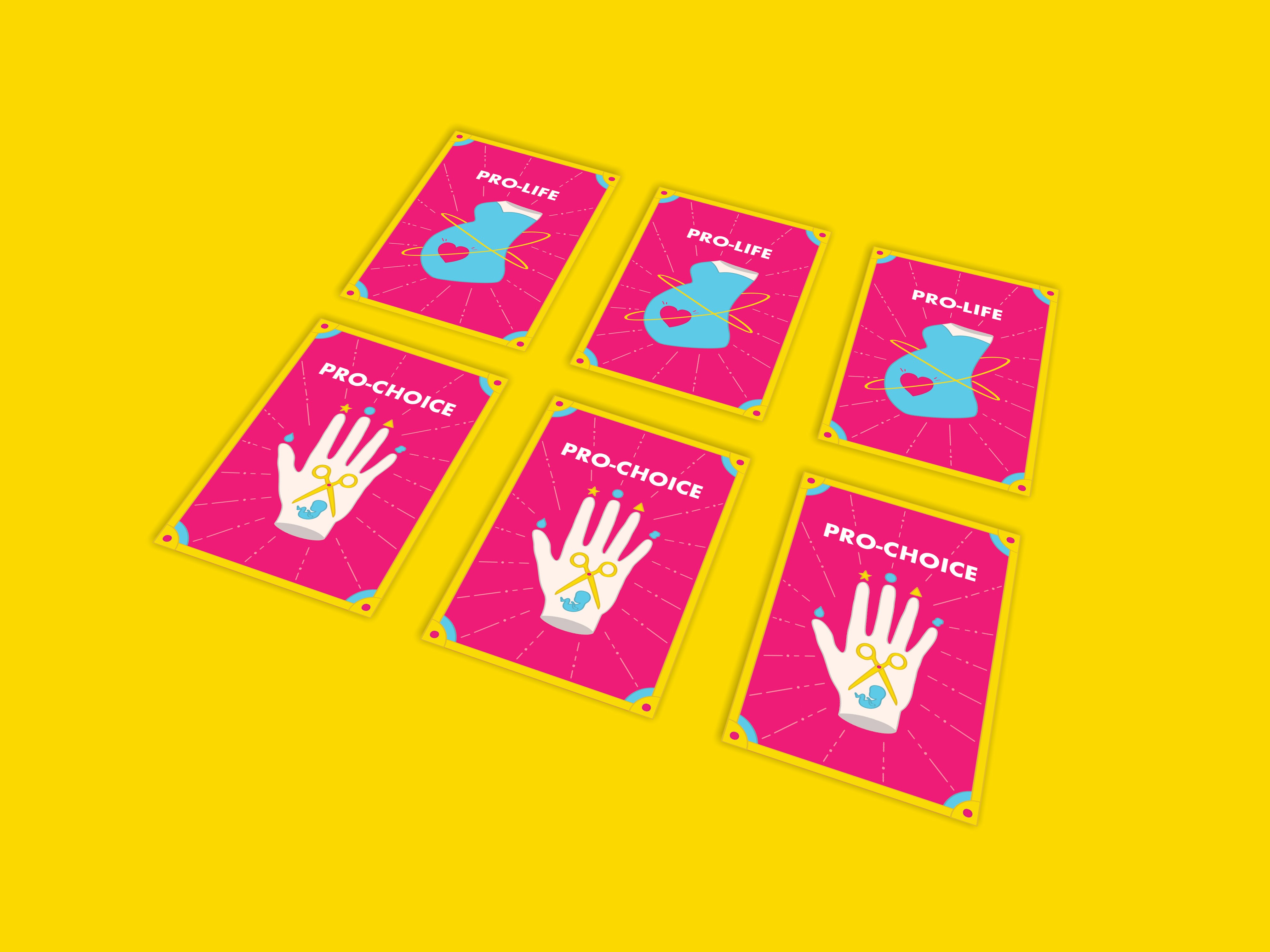
Players are to collect these cards and accumulate them at the end of the game.

Application:

I really hope that this game could be a great conversation starter for young women especially those who have been raised by parents who are not open with discussing topics revolving around unwanted pregnancies. This game could be part of a workshop done by organisations that aid women in unwanted pregnancies or even local Youtube channels that highlight social issues in Singapore where they gather young women of different walks of life to come together to have a genuine conversation and also gaining insight from each other.

PROJECT 2: ZINE LOCALE PART 2

From the video, I decided to look up some neat layouts of editorial pieces to gain inspiration on how I could present the elements in my zine.

Layout Ideas

My purpose of having the layout be clean is that I am intending to put in a lot of other elements that are much more “messier” such as a handful of images as well as illustrated stamps.

Moving on to the stamps, I wanted to include an “olden” feel to the contemporary zine by including a modernised version of the stamps and I was also hoping to include other elements such as a luggage tag or even stickers to further accompany the zine.

Stamp / Stickers Ideas

Seeing that I have captured a lot of photos of Telok Ayer Street, I decided to put together a mini gallery of a few of the images that really captures the places of worship as well as the life in the bars and restaurant.

Brief Gallery
Explaining each spread

Cover Page:

The front cover page is a depiction of the places where people gather in the olden times which were at places of worships such as the church, mosque and temples. As seen on the right side of the image, I have combined the three places of worship to show how these places mesh together.

The back cover page is a depiction of how the architecture of Telok Ayer Street has drastically changed as it is not about the places of worship anymore but rather about the shophouses which houses the restaurants and bars and especially the high skyscrapers right behind the shophouses.

I based the zine on a guidebook for immigrants of the past time-travelling forward in time sort of like to guide them through the new and old establishments. It is to highlight how the old buildings and places still exist yet it might have a new life or purpose to it.

First Spread:

The first spread highlights how and where the people of the olden times gathered when they first came and are at Telok Ayer street. In the san serif font, I have put in facts of the places that I took from the site’s information whereas for the handwritten font, I included my own guide to serve as a tip for the immigrant reading the guide.

Middle Spread:

In this spread, I decided to do an interactive spread whereby the readers are able to paste stickers onto the page and build on the street for themselves. The rationale behind the spread would be to depict how the shophouses and places of worship are a constant or permanent establishment that have existed for a very long time but the skyscrapers at the back are not permanent as they are constantly changing and being build on.

I have cut up the chunks of the skyscrapers to show further exaggeration and contrast of the tall buildings to the humble temple. I have also included elements to portray construction as seen on the signboards and the yellow construction tape. When the stickers are taken out, this would be the look of the spread.

Final Spread:

In this spread, I wanted to add in “human”elements by putting in images that shows a lot of people in it as compared to solely architectural images in the previous spreads. I wanted to portray how people in the present day gather in Telok Ayer now for the bars and pubs, art festivals, street movie screenings and Korean restaurants.

similarly to the first spread, I have included facts of the sites as well as given my own tips to enjoy the place to its fullest.

Photographed Zine
Feedbacks + Comments from the class

Reflections

I find this project very creatively liberating as I absolutely love editorial design. It has provided me with such a different perspective as to how I approach a location and translate into unique ways that people might not have known about.

In addition, I also feel like it is a great practice for learning about printing, colour and layout as printing is such a vital portion in a zine production thus it has provided me with a great learning point which is to package my work well as well as knowing how the colours would actually translate onto the print as well as selecting the appropriate paper quality.

PROJECT 2: ZINE LOCALE PART 1

For this project, I really wanted to pick a location that is very rich in texture. I categorize texture as sound, sight, smell, taste and touch. All these layers of texture are what I hope to have in the location that pick. As best as possible, I would also want this place to have a history and perhaps have a place of worship or a cultural establishment in the vicinity.

As such, I shortlisted these locations based on the following merits.

#1) Bras Basah

Bras Basah as an area is very well known for its Bras Basah complex and how that place is definitely not a stranger to many of the students in ADM. However, apart from the bookstores, printer shops, antique shops, restaurants, and residential apartments above, I felt that Bras Basah lacked the texture and cultural note I wanted.

#2) Geylang

I wanted to approach Geylang in a contradicting way whereby I wanted to feature the presence of the Malay Muslim community with the market, shopping malls, heritage centre and mosque yet also uncover how the red light district is very much thriving just a stone’s throw away from the community.

However, although there is a texture and cultural to the location, I felt that I might face certain security constraints and might not achieve the outcome that I wanted.

#3) Ann Siang Hill

I considered Ann Siang Hill as one of my location as it is a depiction of my love for pubs and bars. As I often patronise the area, I fell in love with the beautiful nightlife as well as the shophouses that really brings out the nostalgic feel to a contemporary bar.

However, I realised how doing a zine based on just nightlife, bars and pubs seem to be very shallow and doesn’t really bring out the best in a locality. As such, I decided to go a little further down the street to Telok Ayer Street where I uncovered so much texture in just one whole street.

#4) Telok Ayer Street

I decided to go with Telok Ayer Street as I felt that it has the most texture out of all the other locations that I have shortlisted. I discovered that Telok Ayer Street has three different places of worship of three different religions and these places really co-exist really well with each other.

Apart from that, I also noticed how there is also nice combination of bars, local restaurants as well as a handful of Korean restaurants along the same street. What is more interesting to me is that the area is sandwiched between two business district areas.

From this, I developed the script to start filming the video of Telok Ayer Street. The three pages below are my first draft of the script to present to Joy for consultation.

From the consultation, I gathered from Joy that I needed to include more numbers, interviews and statistics. From that, I decided to add in more facts and also lengthen the duration in order to make my presentation close to 8 minutes.

I have also included a couple of survey questions to the public such as people from ADM, tourists, CBD workers as well as other patrons of Telok Ayer Street. Here are some of the results.

From this list of questions, I then put together a final video for this locality.

Feedbacks + Comments from the class

Reflections

Moving forward, I will be adopting the visuals and aesthetic feel of the video into my zine. I felt that the mustard yellow is a great accent colour for the rustic cream feel of the shophouses and paper that I am going for.