PROJECT 2: ZINE LOCALE PART 2

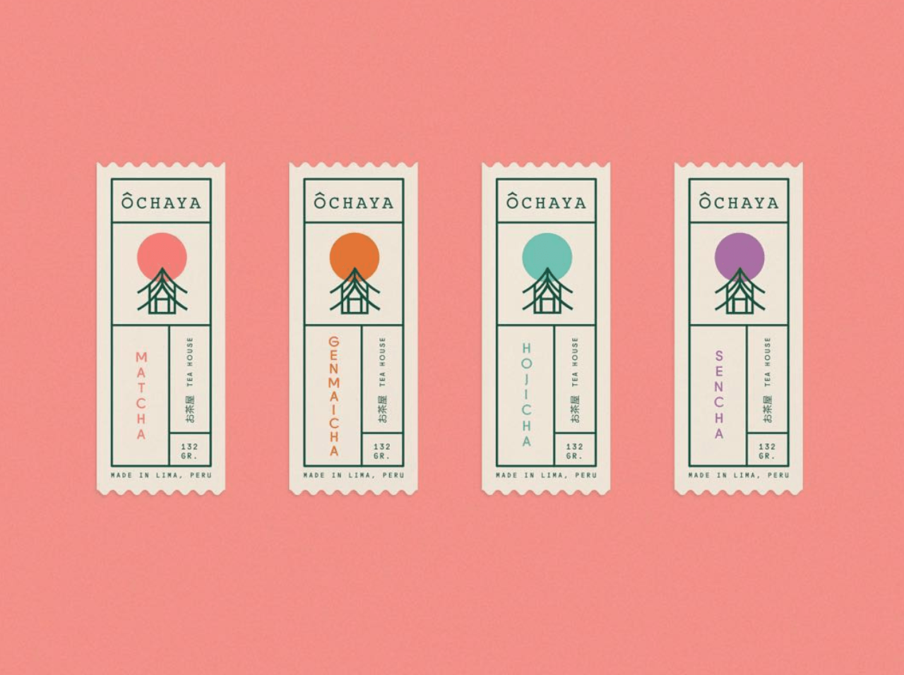
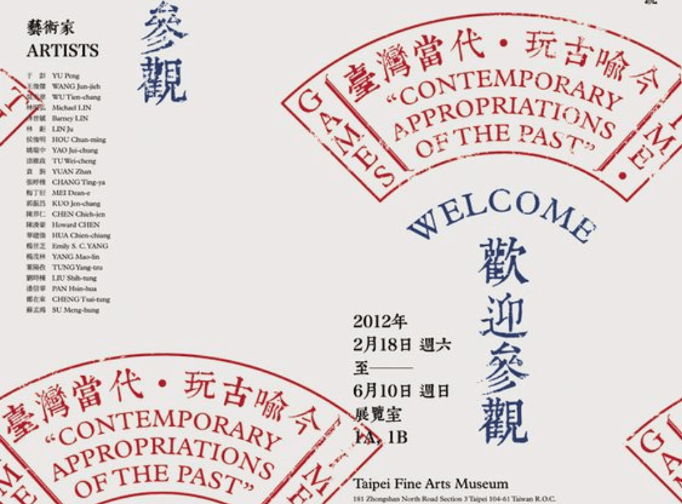
From the video, I decided to look up some neat layouts of editorial pieces to gain inspiration on how I could present the elements in my zine.

Layout Ideas

My purpose of having the layout be clean is that I am intending to put in a lot of other elements that are much more “messier” such as a handful of images as well as illustrated stamps.

Moving on to the stamps, I wanted to include an “olden” feel to the contemporary zine by including a modernised version of the stamps and I was also hoping to include other elements such as a luggage tag or even stickers to further accompany the zine.

Stamp / Stickers Ideas

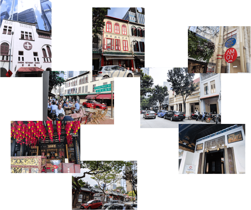
Seeing that I have captured a lot of photos of Telok Ayer Street, I decided to put together a mini gallery of a few of the images that really captures the places of worship as well as the life in the bars and restaurant.

Brief Gallery
Explaining each spread
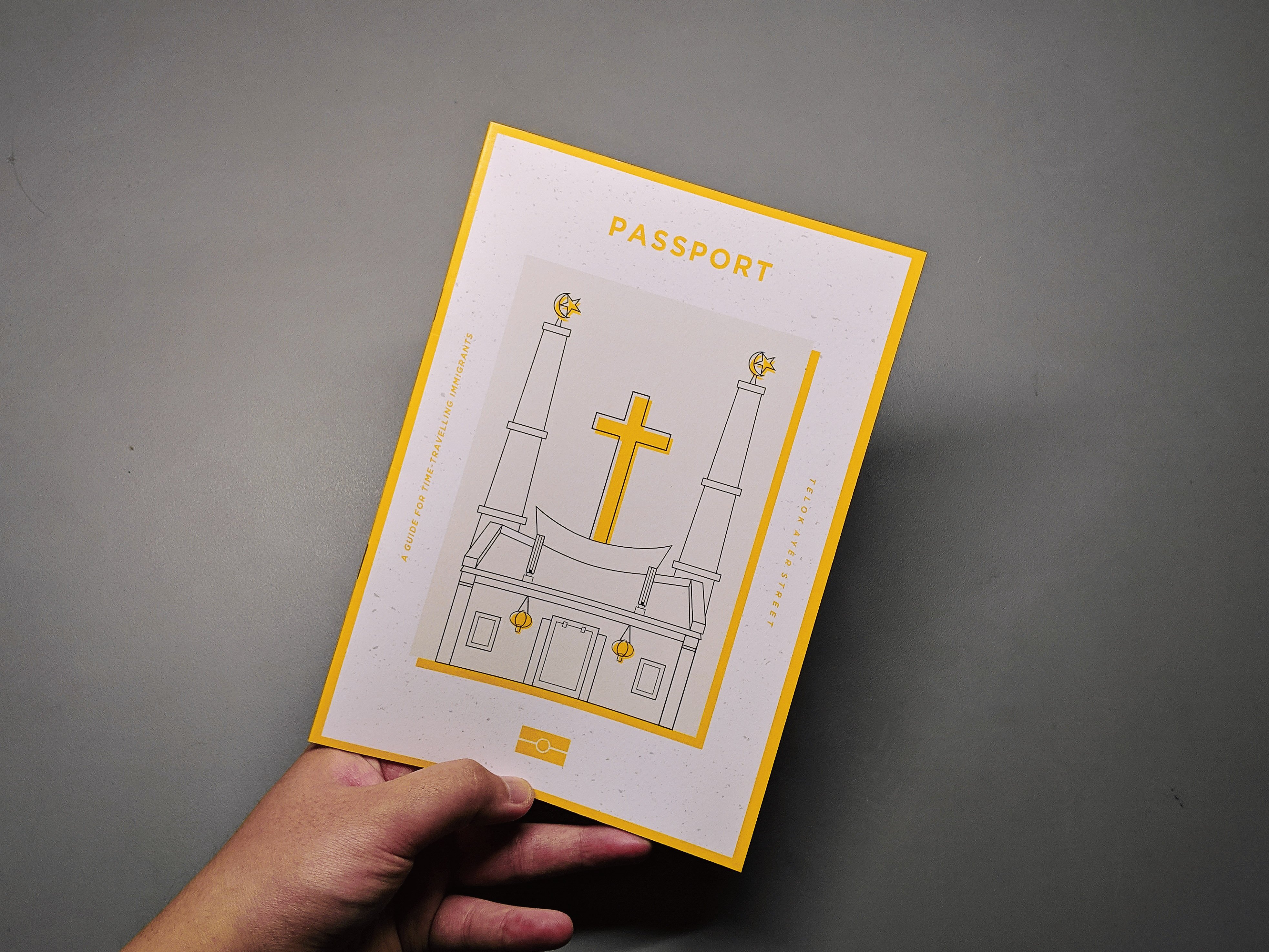
Cover Page:

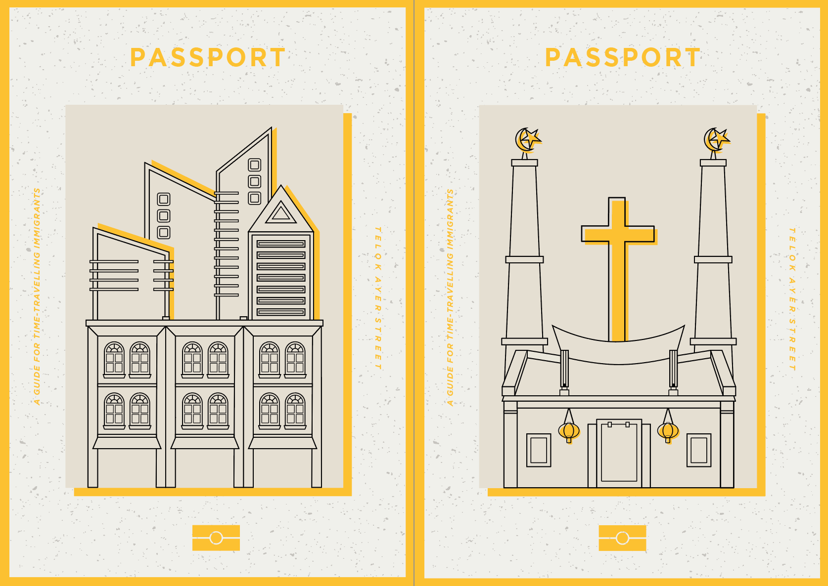
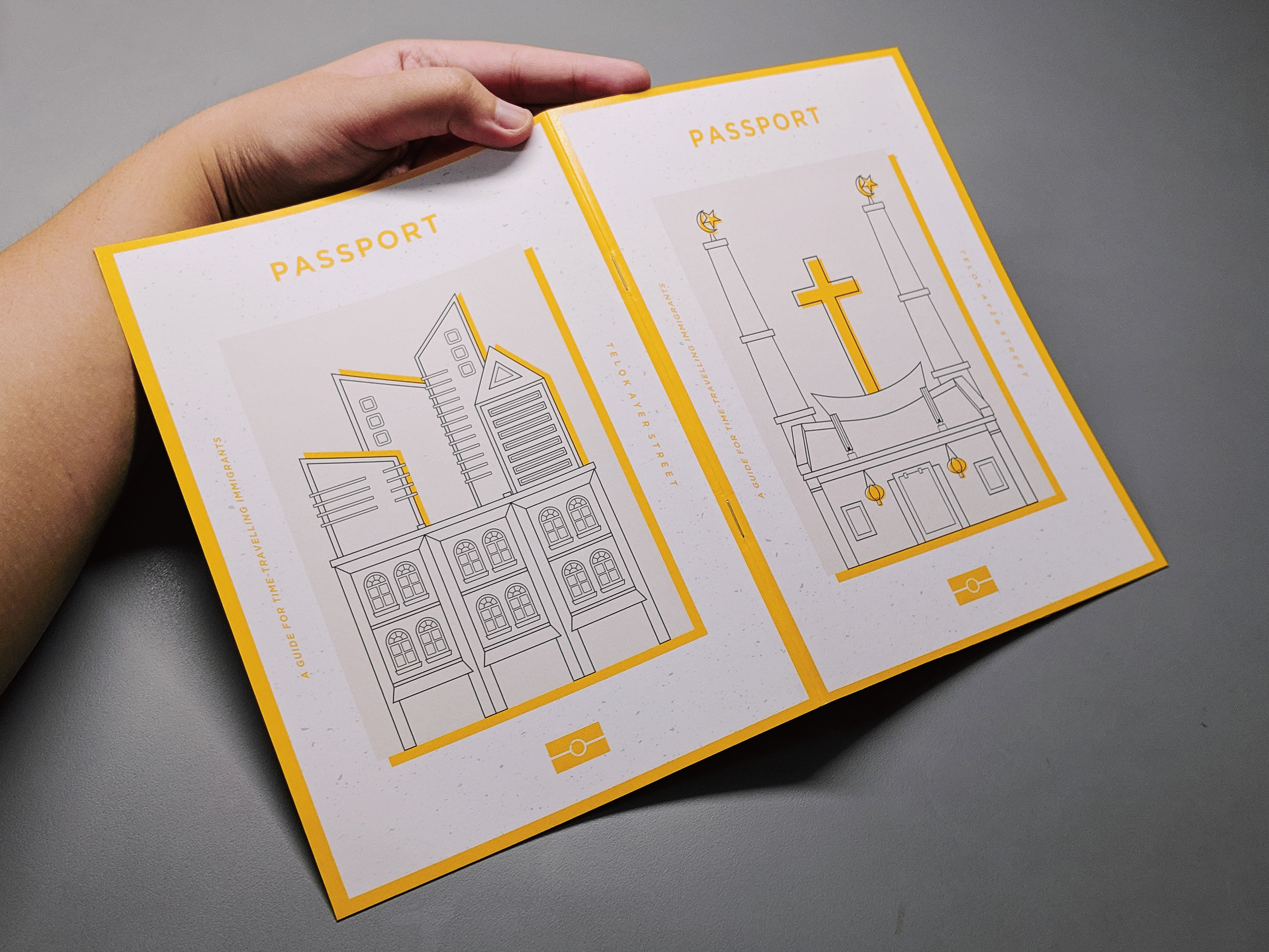
The front cover page is a depiction of the places where people gather in the olden times which were at places of worships such as the church, mosque and temples. As seen on the right side of the image, I have combined the three places of worship to show how these places mesh together.

The back cover page is a depiction of how the architecture of Telok Ayer Street has drastically changed as it is not about the places of worship anymore but rather about the shophouses which houses the restaurants and bars and especially the high skyscrapers right behind the shophouses.

I based the zine on a guidebook for immigrants of the past time-travelling forward in time sort of like to guide them through the new and old establishments. It is to highlight how the old buildings and places still exist yet it might have a new life or purpose to it.

First Spread:

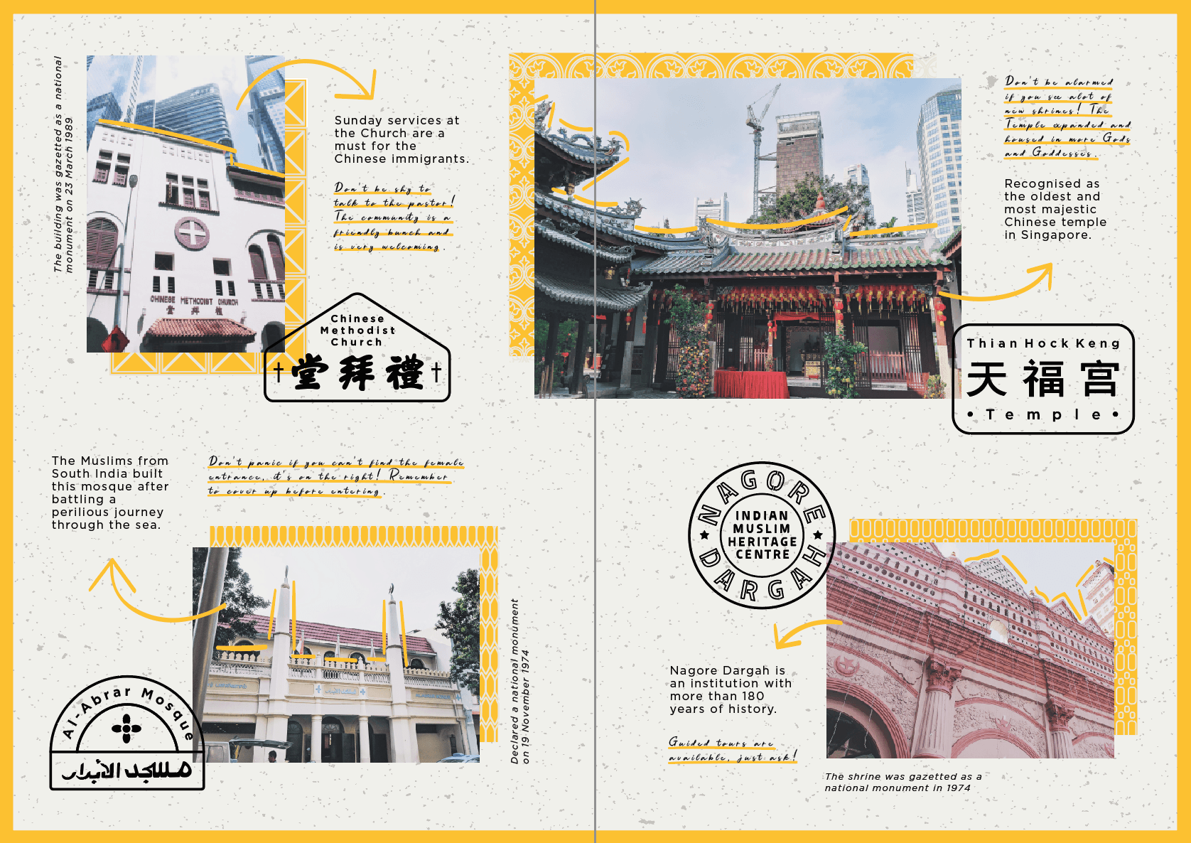
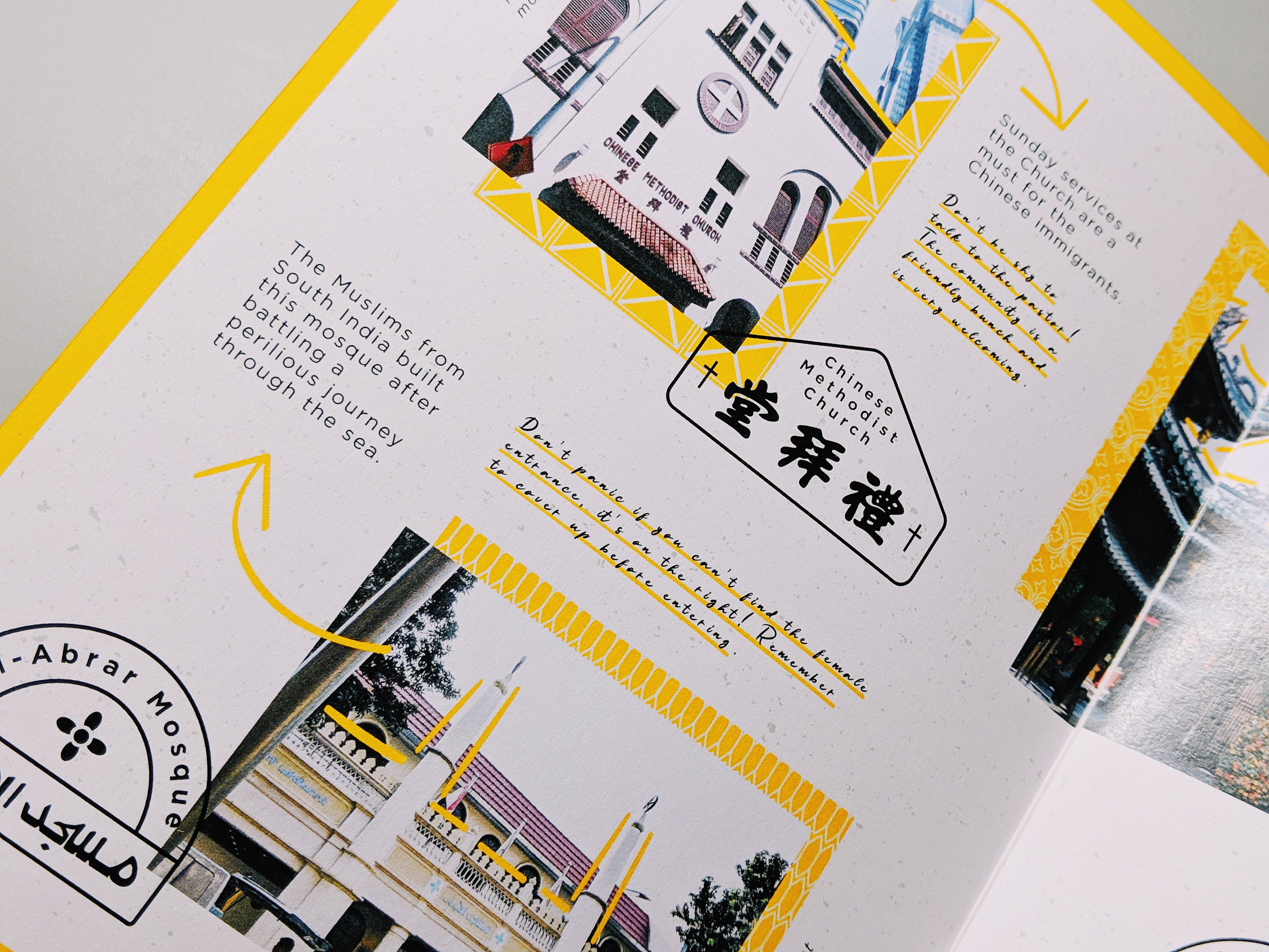
The first spread highlights how and where the people of the olden times gathered when they first came and are at Telok Ayer street. In the san serif font, I have put in facts of the places that I took from the site’s information whereas for the handwritten font, I included my own guide to serve as a tip for the immigrant reading the guide.
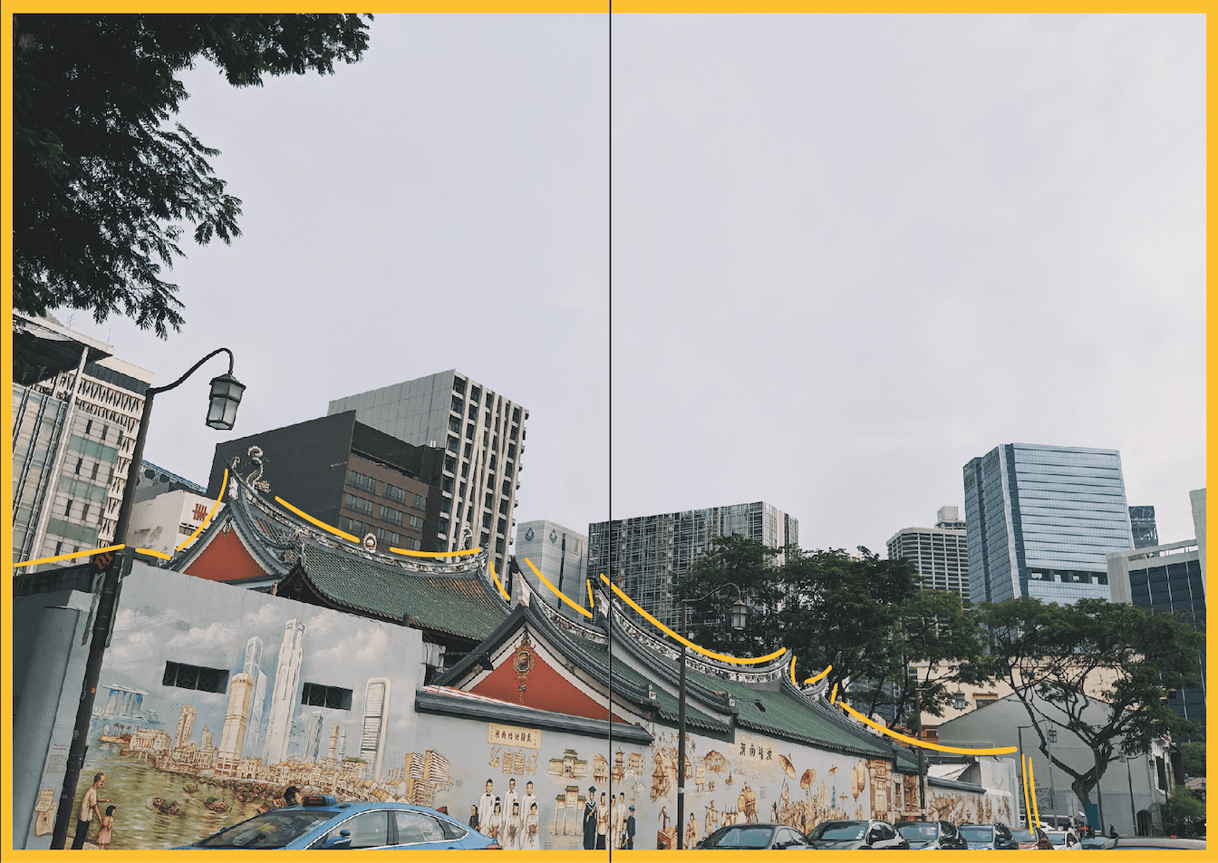
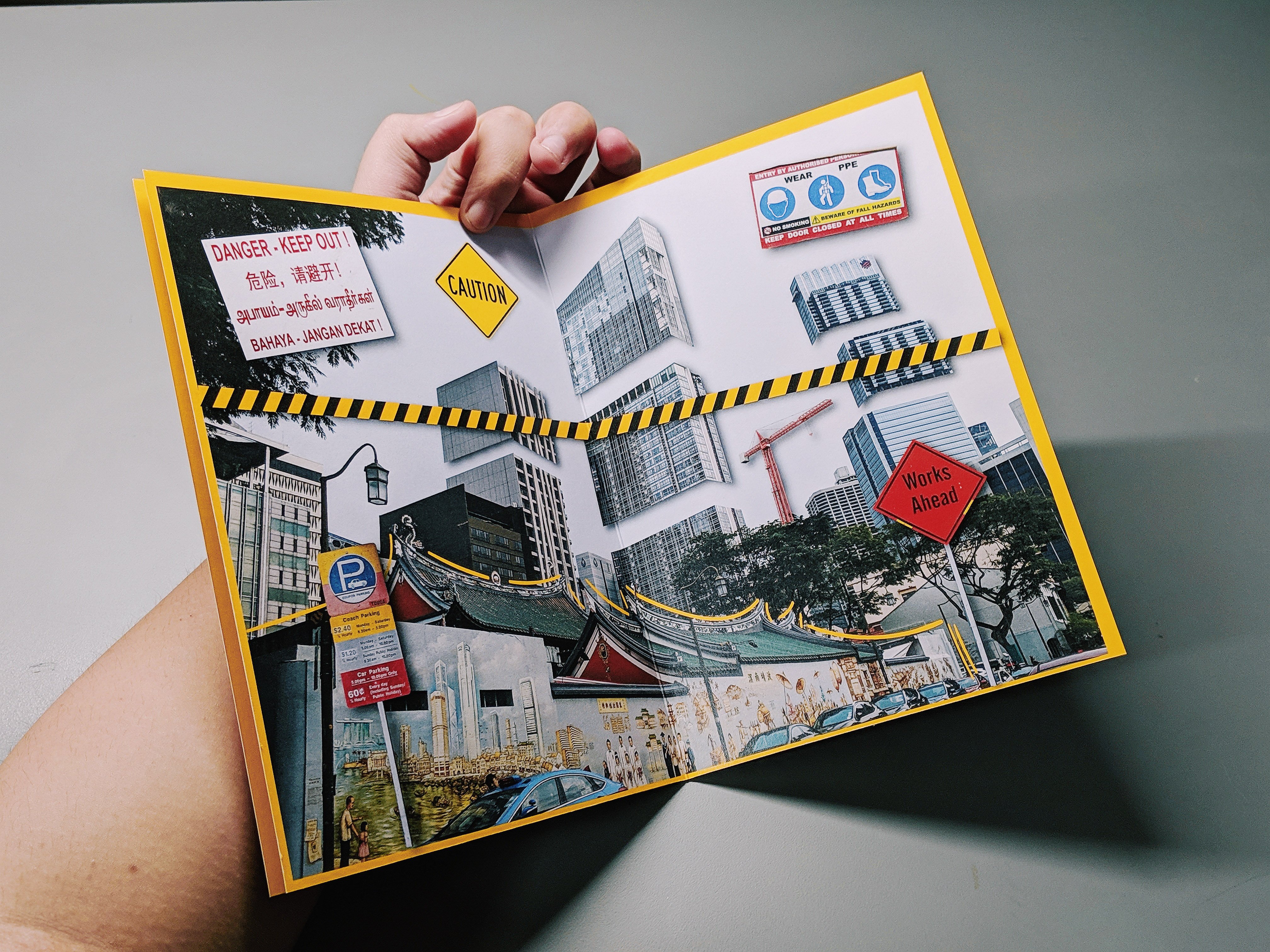
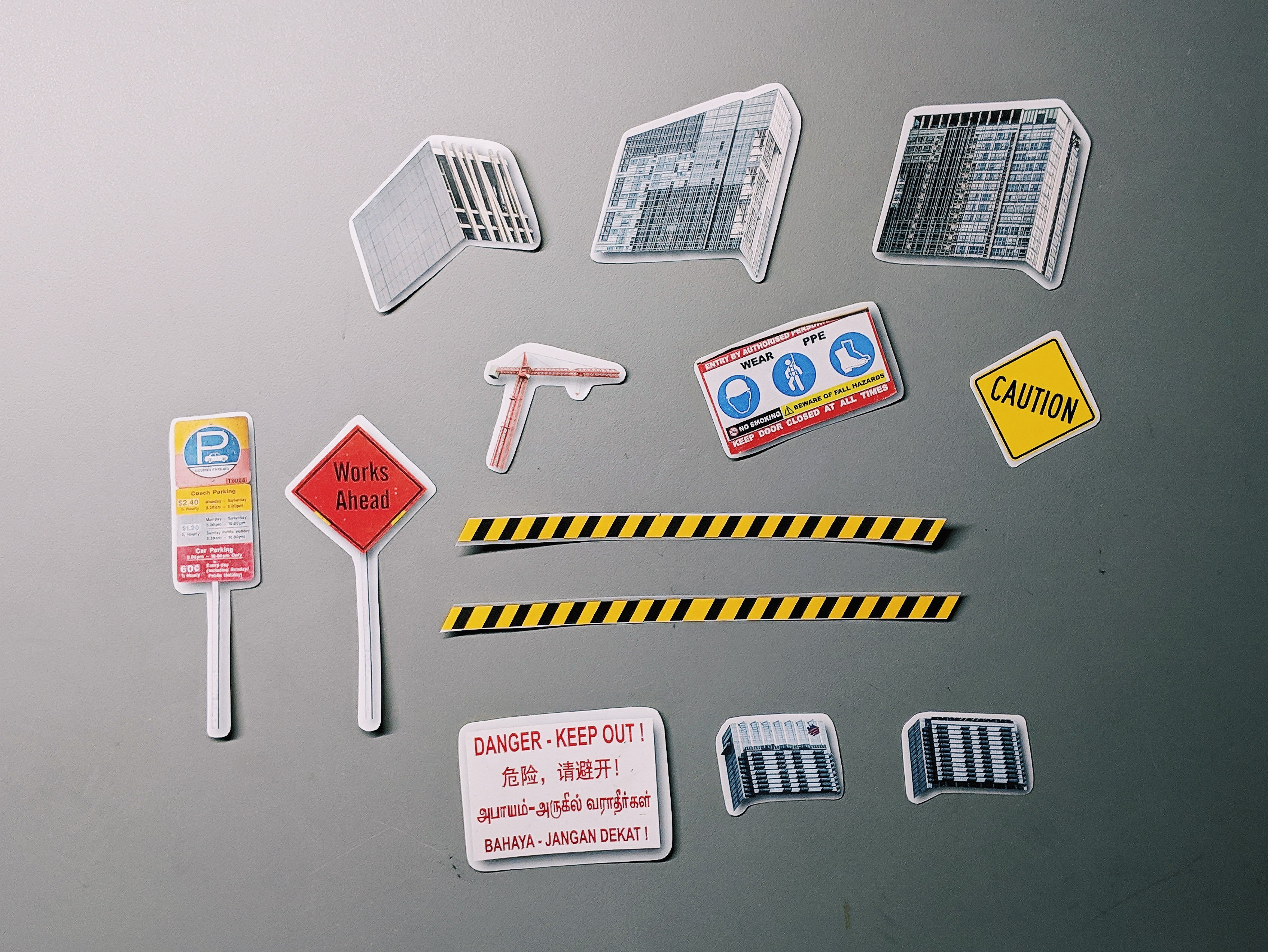
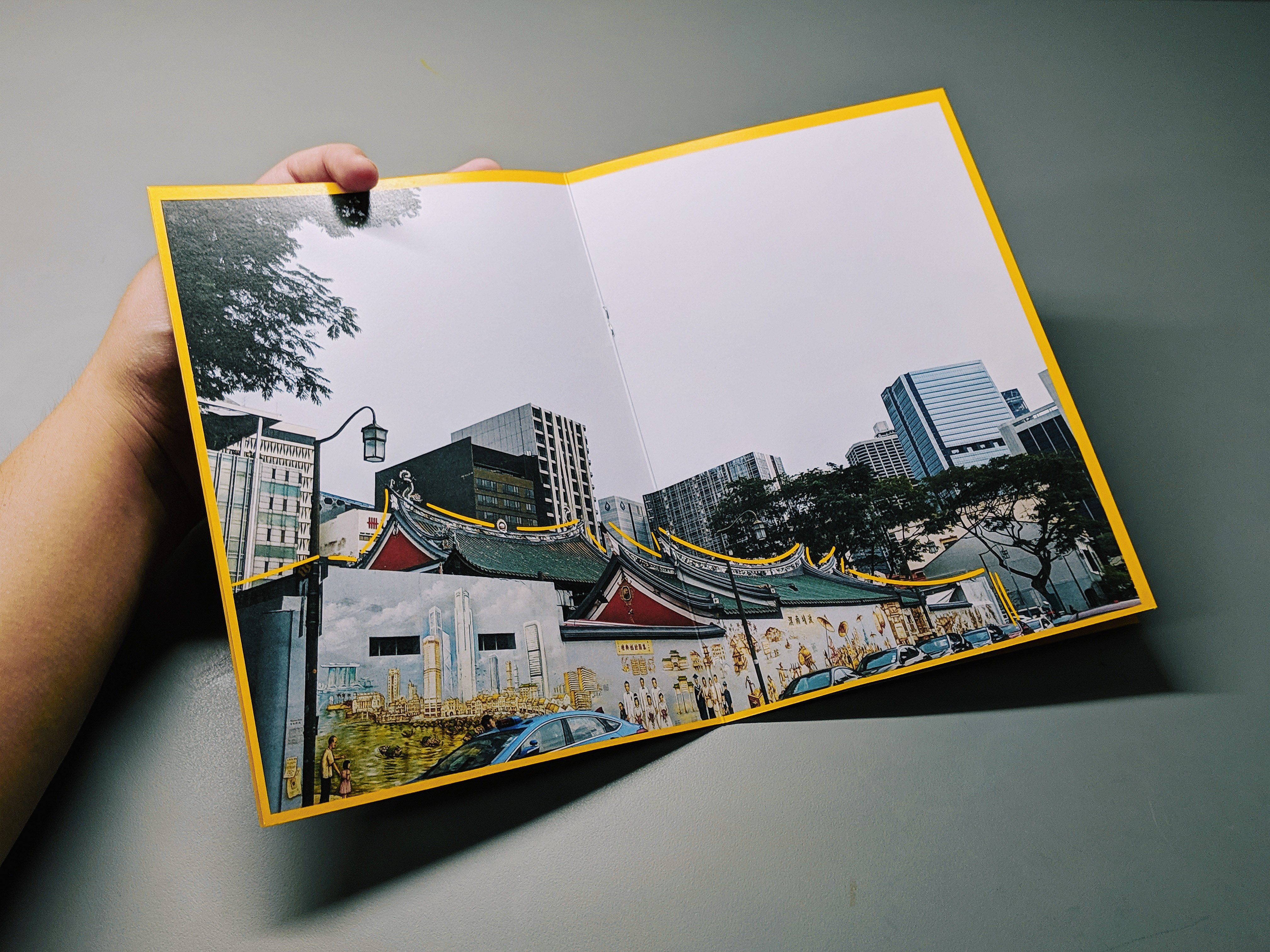
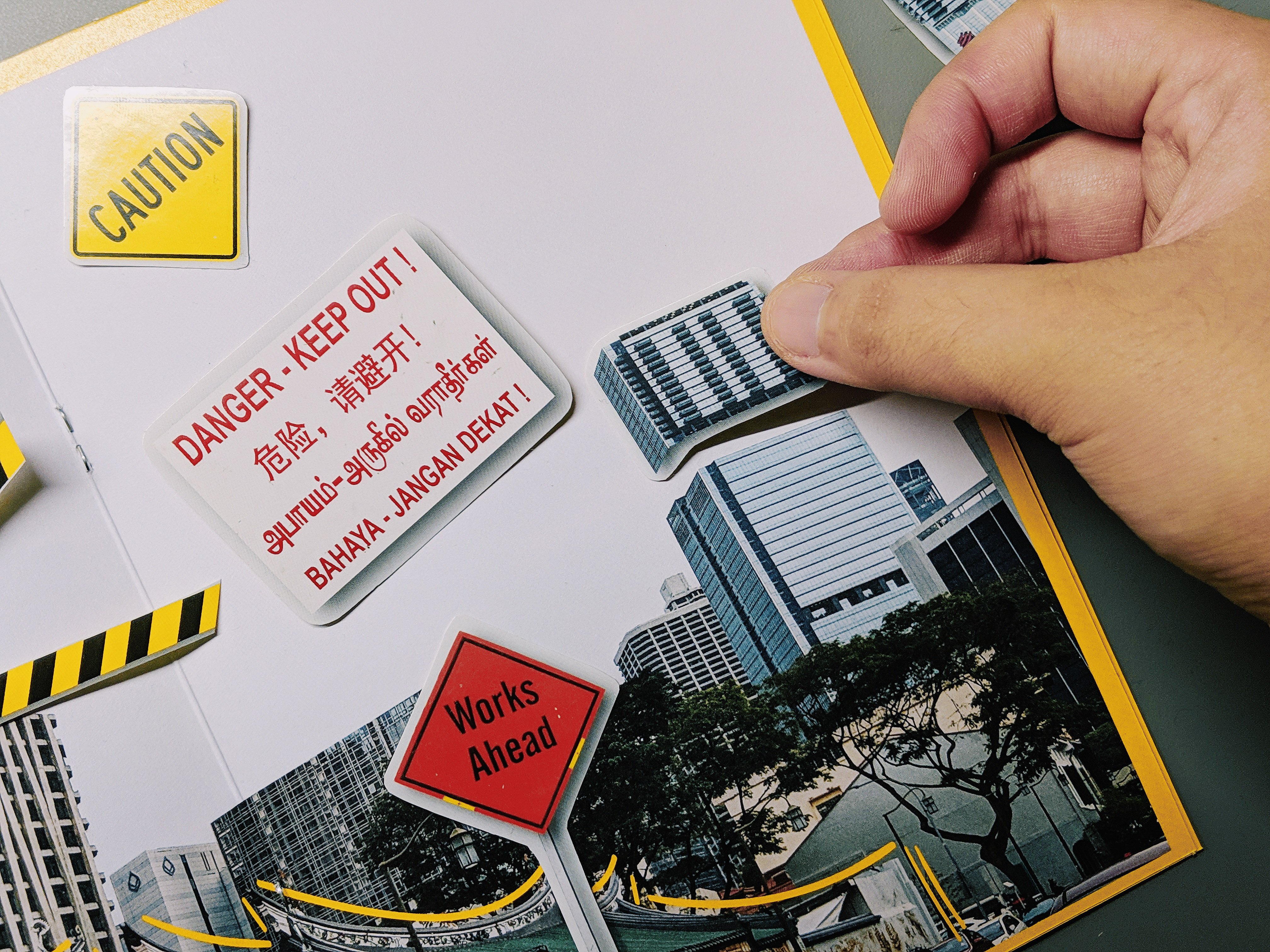
Middle Spread:

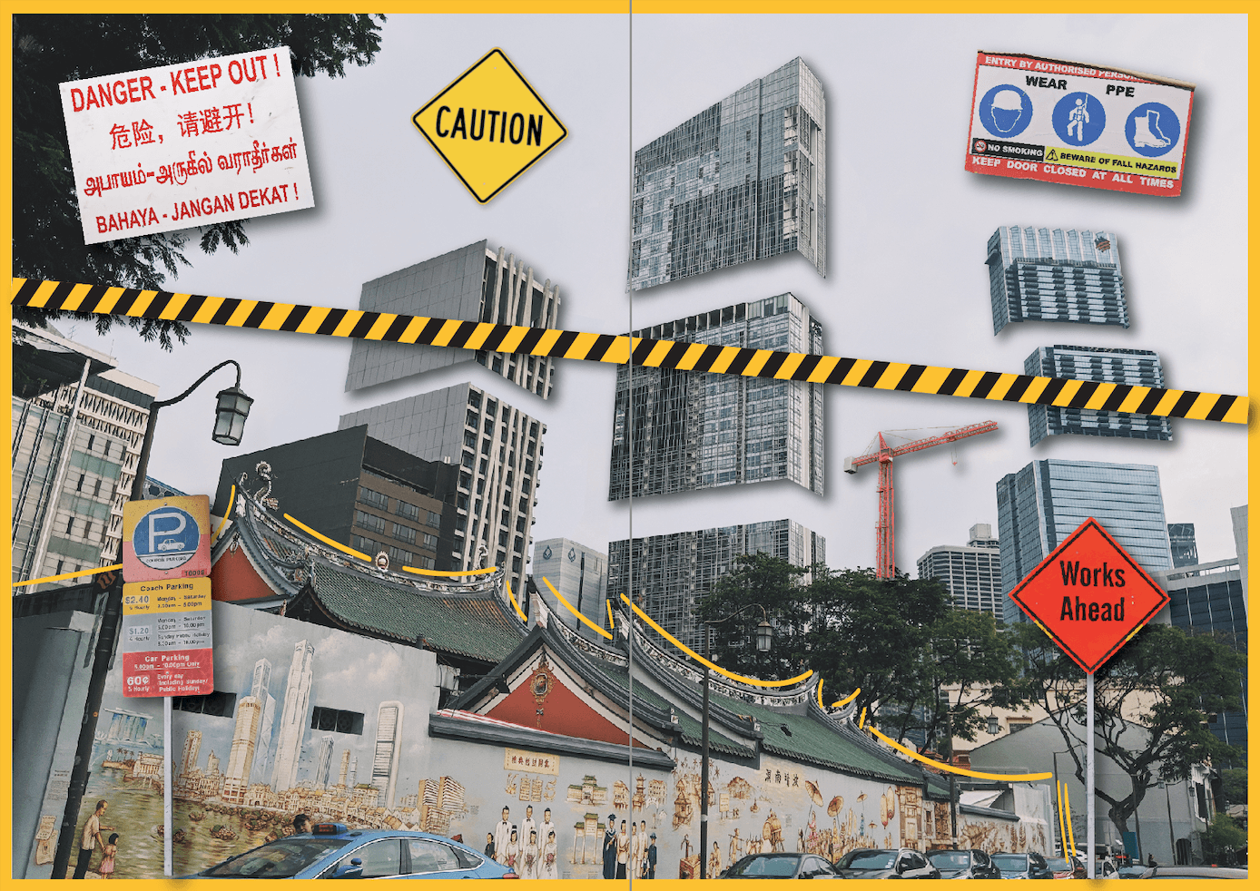
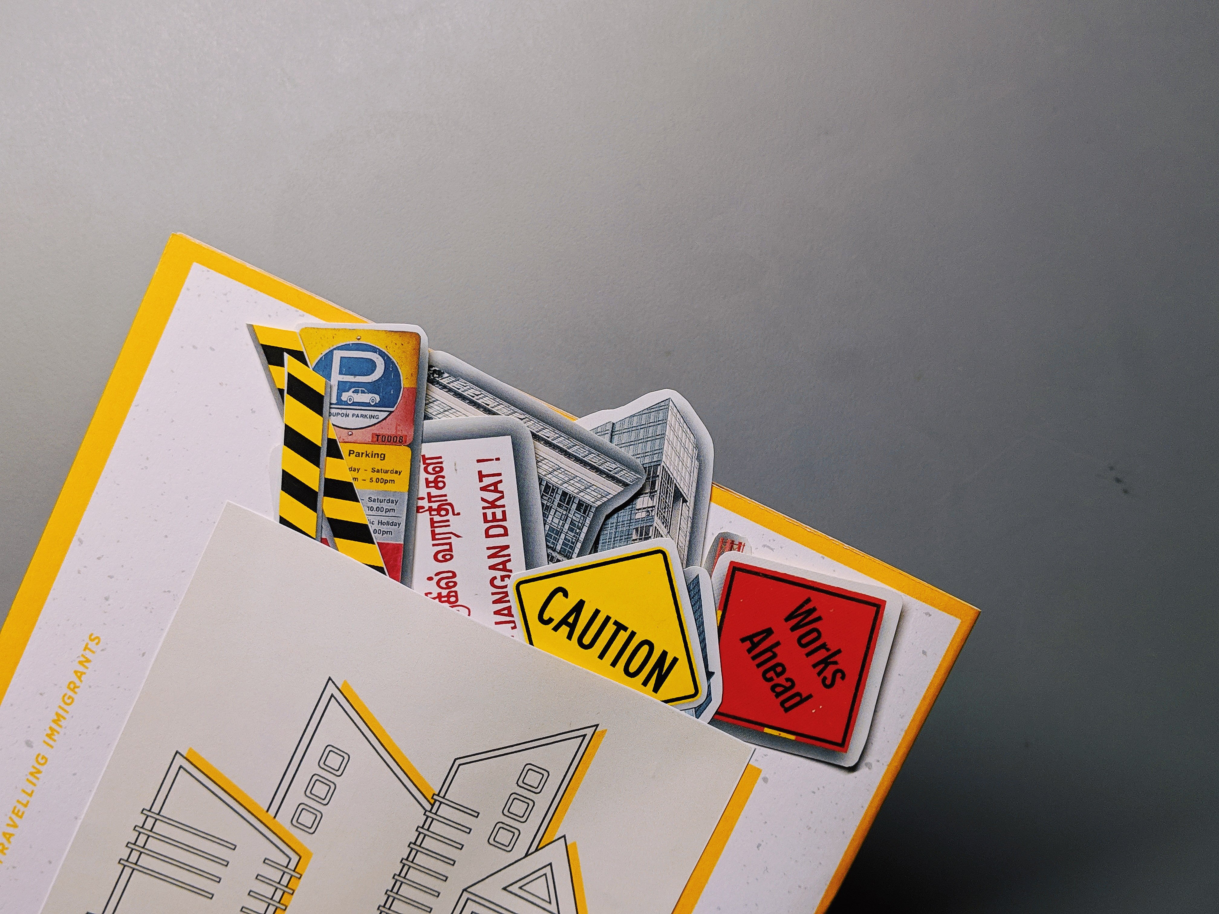
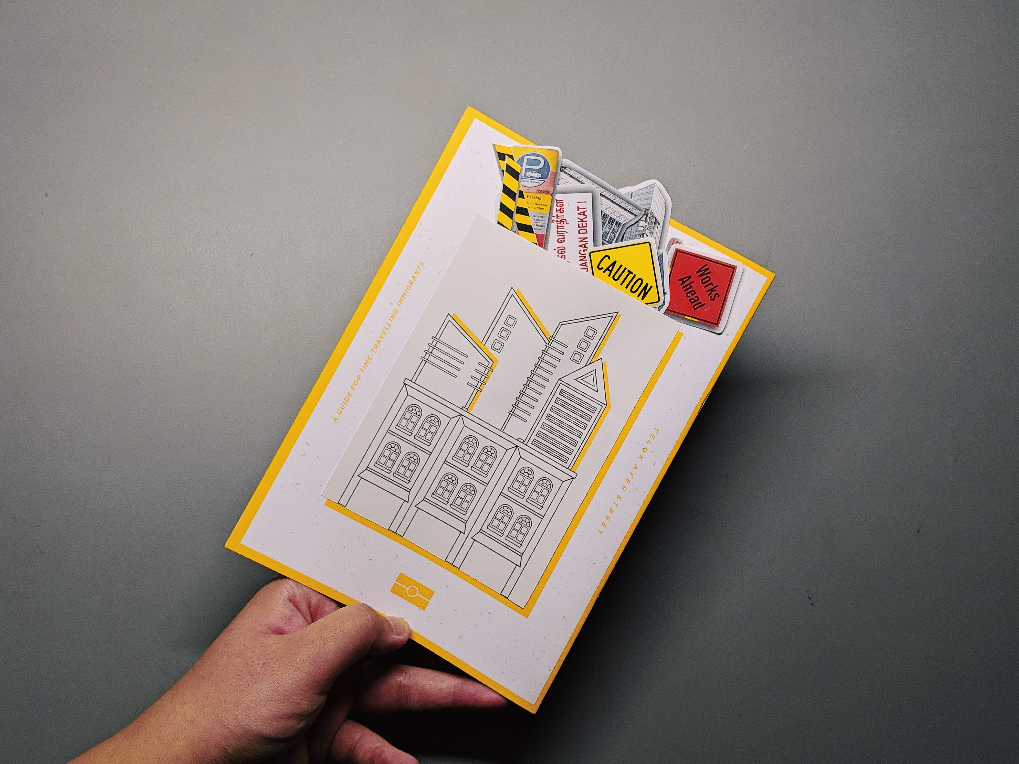
In this spread, I decided to do an interactive spread whereby the readers are able to paste stickers onto the page and build on the street for themselves. The rationale behind the spread would be to depict how the shophouses and places of worship are a constant or permanent establishment that have existed for a very long time but the skyscrapers at the back are not permanent as they are constantly changing and being build on.

I have cut up the chunks of the skyscrapers to show further exaggeration and contrast of the tall buildings to the humble temple. I have also included elements to portray construction as seen on the signboards and the yellow construction tape. When the stickers are taken out, this would be the look of the spread.
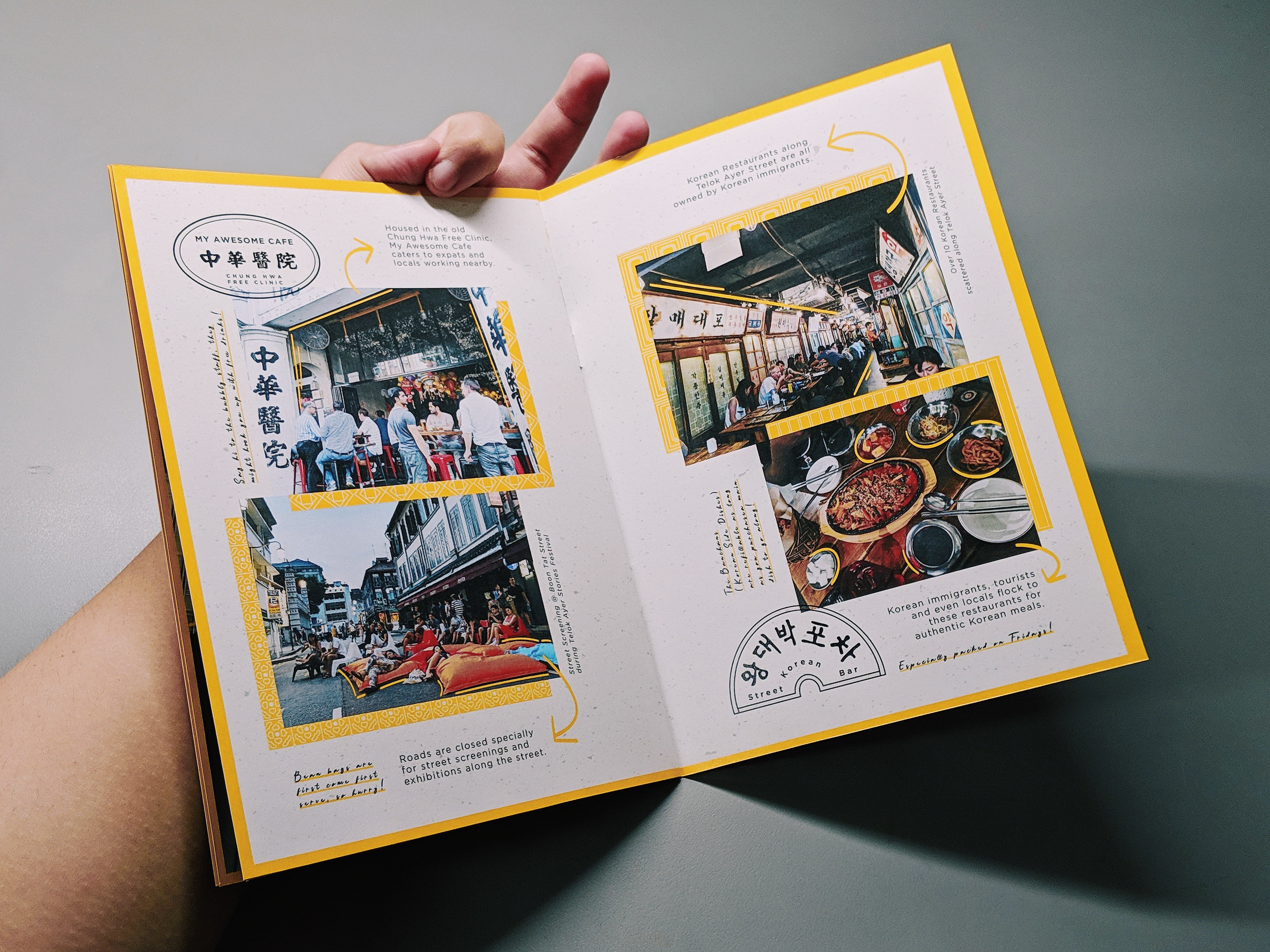
Final Spread:

In this spread, I wanted to add in “human”elements by putting in images that shows a lot of people in it as compared to solely architectural images in the previous spreads. I wanted to portray how people in the present day gather in Telok Ayer now for the bars and pubs, art festivals, street movie screenings and Korean restaurants.

similarly to the first spread, I have included facts of the sites as well as given my own tips to enjoy the place to its fullest.

Photographed Zine
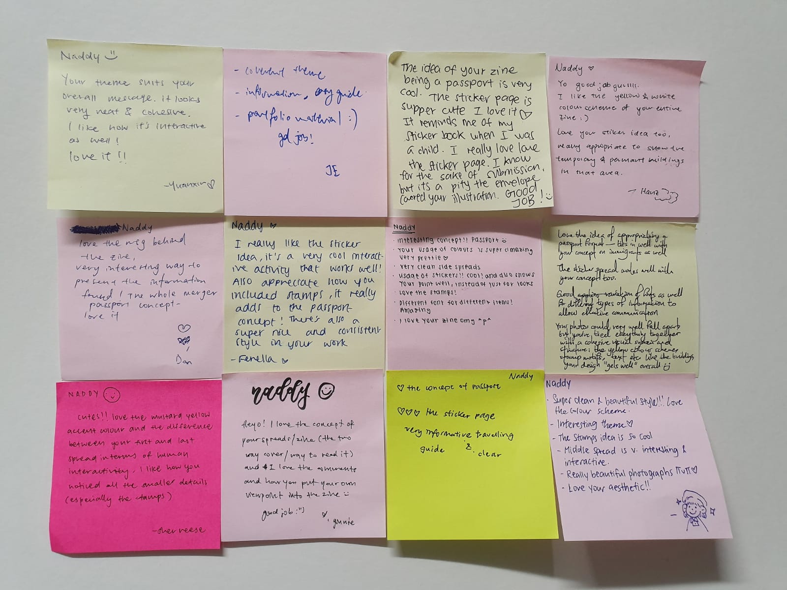
Feedbacks + Comments from the class

Reflections

I find this project very creatively liberating as I absolutely love editorial design. It has provided me with such a different perspective as to how I approach a location and translate into unique ways that people might not have known about.

In addition, I also feel like it is a great practice for learning about printing, colour and layout as printing is such a vital portion in a zine production thus it has provided me with a great learning point which is to package my work well as well as knowing how the colours would actually translate onto the print as well as selecting the appropriate paper quality.

INTER- : HUMAN CANVAS

concept

I am curious to find out how people would react when presented with a human face as a canvas and having beauty tools and make-up as their art materials instead of the usual paint and paint brushes.

In addition, I would also like to see how the audience interact with the canvas and tools: will they erase anything on my face or continue on from the previous person’s work.

inspirations

Yayoi Kusama // Obliteration Room (2017)

Allowing audience interaction, Kusama’s work allowed for the audience to stick colourful stickers all over the furniture and walls of the white room. The white room acts as a canvas in which the audience are able to experience being an “artist” by placing their own “mark” onto the canvas.

As such, the free interaction from the audience was what I took from and implemented in my own work.

Marina Abramović // Rhythm 0 (1974)

Also allowing audience interaction, Abramović stands still while the audience was invited to do to her whatever they wished. They had the option of using one of 72 objects she had placed on a table. These included a rose, feather, perfume, honey, bread, grapes, wine, scissors, a scalpel, nails, a metal bar, and a gun loaded with one bullet.

Similar to Abramović, I will be laying out an abundance of materials for the audience to pick and play with on a table and will not allow myself to talk and let them experience the canvas freely.

pre-submission testing

In this experiment before the actual submission, I have allowed for multiple people to come at me and do my make-up as they please. I realised that with more people working on my face, they tend to ask each other if they are doing the right thing, which is something I didn’t want them to care about. However, I did get some interesting response on the canvas as people are more willing to be creative when there are many people doing at a go.

actual submission – the human canvas

Instructions:

Having the audience coming and working on the human canvas one at a time, it felt much more personal than previously where everyone ambushed at the same time. It also allowed me to interact and react to the audience more intimately in which they can take their time to scout the different tools before testing it out on me. In addition, it was also interesting to see how many of the audience chose to add on and not erase the previous person’s work as if they are afraid to ruin it.


間 MA’S OBSCURE CITY OF VOIDS: PART 2

Welcome to the City of Astoid!

Get ready for an awesome tour of our underground utopia. The city has three queens – Naddy, Trevor and Bai. Today, Queen Naddy will be your guide.

Just a quick background info:

The Astoidians are a scientifically-advanced race of humans who were born from the depths and flourished living underground. The city is powered by the Astoid stone, comes in both black and silver colours which they harvested and mined from the depths.

They created a megastructure hub for its citizens to gather known as the Arch, which is a massive spiral structure made up of many repeating molecular looking units of energy-storing spheres and energy-absorbing solar panel.

Constructed strategically under a system of crevices, the solar panels absorb the rays of light seeping through the crevices from the ground above (gaps between stairs) in the morning, and radiates it out through the complex highway system at night to provide luminance and warmth to the whole city.

In a quest for efficiency and perfection, the Astodians realised that they could expand this energy-harvesting systems, thus renovating all their homes (habitats) into extensions of the Arch, allowing for more light to be absorbed and gaining more energy to use for science.

our location

We have specifically picked the space below ADM level 2’s staircase as it conceals/hide our city very well and people can only see it if they come underneath. We also wanted to give sort of a spider’s cobweb feel where the city has been there for a long time and the highway (strings) and habitats (silver modules) keeps on increasing as time goes by and more citizens move in/are born.

Hub

The hub in the City of Astoid, called the Arch is made up of 2 curved planes each made up of expanded molecule structures. Each module in the Hub is spray painted black individually then connected by attaching the aluminium twirls together. The aluminium pieces of each module when placed together accented the metal motif which is the dominant motif of our soundtrack.

The black painted spherical part of the module allows for the plane to be more cohesive with the space we have chosen while also providing contrast from the habitat that is metallically layered. The two planes of the hub forms a symbolic loop where the tapered end of one plane flows seamlessly into the non-tapered end of the other plane, this creates a void contained within the two planes.

A closed feedback loop provides symbolisms of life and energy, which is what the hub provides for the entire city: In context, the black spheres are the energy-storage devices while the metallic twirls are the energy-capturing solar panels, and the Arch functions as a massive reservoir that absorbs sunlight seeping in from the crevice above and stores it for the city’s use.

habitat 

Made to be extensions of the hub, the habitats are made using the same molecular modules but a smaller size. The habitats are located at varying distances expanding the city to the entire obscure space. Each module was individually painted metallic silver which represents our bells from out soundtrack.

The habitats are constructed in a pyramid format which provides two layers of symbolism: firstly with regards to our track, it symbolises the progression of the notes made by the xylophone, which is of three harmonious notes. Secondly, with regards to the context of the city, the pyramidal shape is thought to be a symbolism of the descending rays of sunlight by the Ancient Egyptians.

As such, it ties in with our concept of our city being sunlight-absorbing structures, pyramids are also believed to have the ability to channel energy from above due to its reverse funnel shape. The habitats allowed for the voids within the space to be filled with a little spark. The reflective surface allows for the backlight to be cast onto the highway made out of translucent threads.

highway

Spanning across both ends of the obscure space,  the highway serves as the bridge for all the modules in the city. Constructed strategically under a system of crevices, the reflective highway reflects the rays of light seeping through the crevices from the ground above(gaps between stairs) in the morning, and radiates it out through the entire highway system at night to provide luminance and warmth to the whole city.

nighttime

In the night, the City of Astoid illuminates from the light it has absorbed during the day enough to provide warmth and light for its citizens. The city officials have also equipped its citizens and visitor with a special ray that allows for them to light up the city and find navigate their way through. Blue lights are used for Astoid citizens whereas white lights are for visitors. This is important as the visitors would need extra brightness in order to not get lost in the city’s complex highway system.

We hope you had fun with us at the City of Astoid, till next time!

MNEMOSYNE’S SCENT: FINAL SUBMISSION

The four scents that my partner and I had were lemongrass aromatherapy, my mother’s perfume, star anise and seawater. While brainstorming, all these scents have a common ground to it which is something that is beach-y and have the possibility of being something traditional as well. As a fan of the island Bali and a fan of massages, I could link all these four scents to a Balinese spa and massage spot that is right next to Kuta Beach in Bali.

This then inspired our choice of materials and the accessories that we were going to make. We decided to create a cape as a representation of how someone would feel after getting a massage – invincible, just like a superhero. We also made a forearm accessory which is our modern take on the Balinese dancers’ bangles.

Our Full Material List

Cape:

Batik Cloth

Complimentary Light Grey Cloth

Aluminium Plate

Wire Mesh

Mounting Board

Arm Piece:

Balsa Wood

20 Gauge Wire

Twines

Candle Wax

Star Anise

Starting with the shoulder pads first, we drew out the shape or planar that we desire before cutting it out. The right shoulder pad is shaped with a very pointed tip and is hammered to give it a bumpy texture, just like how my trip to attain my mother’s perfume is. The left shoulder pad is a simple curve that was sanded all over to give it a smooth texture. The sides of the right shoulder pad was sanded too so as to not injure and poke the model as well as anyone who touches it.

I have inserted a wire mesh as well as a bended mounting board so as to create a “suspended” planar for the cape. The mounting board and mesh were inserted and heated up so that the mesh and board could bend and be slightly more malleable. The entire cape is done by hand-stitch for better accuracy and it can also yield the cloth from any open holes. I also sewed a few strands into the board and mesh to ensure that it doesn’t shift about.

The complimentary grey cloth is pleated in the middle to give sort of a drape-y feeling as compared to the batik which is stiff, rigid and sharp as it is pointing upwards. Once both pieces of cloth are done being sewn, I then started to piece them both together with the shoulder pads.

The arm piece is made out off 20 gauge wires, twines and balsa wood. The balsa wood is the main or dominant piece and it is a broken plane. The twines were braided so it had more support and would be able to tie the pieces securely. Once we have pieced together the balsa wood and twines, we then burnt candle wax and star anise, to create my partner’s unpleasant scent.

Final Model

The final cape model clearly showed the pleasant and unpleasant elements in both the fabric portion and also the shoulder pad portion. The batik fabric is suspended in the air, feels very stiff and has a sharp pointy edge representing the unpleasant scents. Whereas the grey complimentary fabric is very flowy, drape-y and has a lot of curves, representing how calming and relaxing the pleasant scents were.

My final thoughts

This project really thought me how to handle different materials and using it to have a particular outcome. It also taught me how to troubleshoot problems or glitches almost immediately especially when working in a tight deadline. I faced with problems such as not being able to have my fabric suspend in the air with just the wire mesh so I instantly thought of using a mounting board which proves to be able to support the heavy fabric.

In addition, I realized how for every portion of both the accessories we made, I tend to always have the conscious effort and thought to include planars the best that I can and it kinda have been ingrained in the designer part me now so I in the future I think I’ll always include planars HAHA.

PANDORA BOX: FINAL MODEL

After playing around with the three different sketch models, I came to this final one which I think could be really interesting. For my previous refined sketch models, I’ve had two of them with the sub-ordinate being in discordance whereas  only one model had the sub-dominant being in discordance. Out of the three models, I realised that the model with the sub-dominant being in discordance turn out to be the most interesting model out of all the three. As such, I with my final model, I decided to make my sub-dominant the discordant one.

Some things to address:

Why I did not wedge the Sub-Ordinate to the right side – The reason was that I wanted the Sub-Dominant to feel a little more balanced since it is suspended 2/3 and only 1/3 of the piece is wedged onto the Dominant piece. The second would be that there are light in the Dominant piece that can only be seen if the Sub-Ordinate piece is pierced right at the spot I chose to pierce it at. If I had wedged the Sub-Ordinate on the side of the Dominant piece, I would then not be able to achieve the “kaleidoscope” effect.

Why I didn’t pierce the Sub-Ordinate through the back of the Dominant piece The reason would be that I would then again, not been able to showcase the green and purple light as I have wanted as I would only be able to see what’s on the other side of the dominant piece. In addition, the lights were not small enough to fit directly into the Sub-Ordinate piece thus, it has to be mounted on the inside of the Dominant piece.

Materials Used:

  • White Cardboard Box
  • Metallic Red Card
  • Matte Black Card
  • Transparent Tape
  • Purple and Green Glow Stick

In this final model, I have used the wedging piercing techniques. I have cut the Dominant 1cm deep such that I can fit the Sub-Dominant into it. The challenge that I faced with this would be that the cardboard box is really difficult to cut through as it is tougher and harder to cut as compared to foam. The wedging is also strategically placed such that it is 1/3 wedged onto the Dominant while the 2/3 is left hanging. To create a cantilever effect, the Sub-Ordinate has been placed on the 1/3 portion of the Sub-Dominant.

The Sub-Ordinate has been placed by piercing through the Sub-Dominant. As mentioned, the Sub-Ordinate is strategically placed in the middle of the 1/3 potion of the Sub-Dominant. When looking through the Sub-Ordinate, viewers are able to see a purple and green light, to contribute further to the idea of a Pandora Box as well as discordance as these colours are complimentary to each other.

Applications

  1. Watering Can

2. Geometric Earring

3. Lighter

4. Observatory Tower