My final designs and layout deviate from my previous layouts a little. I decided to omit the photography part of it, and work with 100% illustrations.
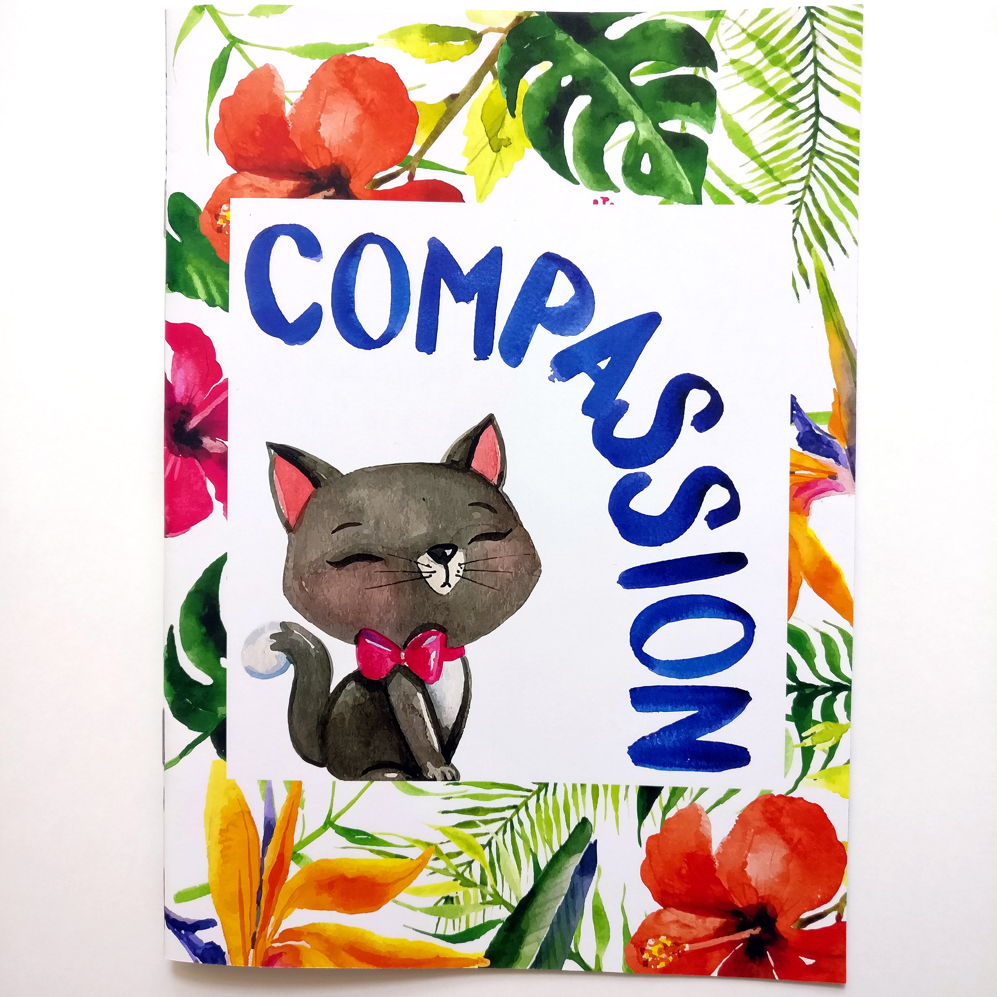
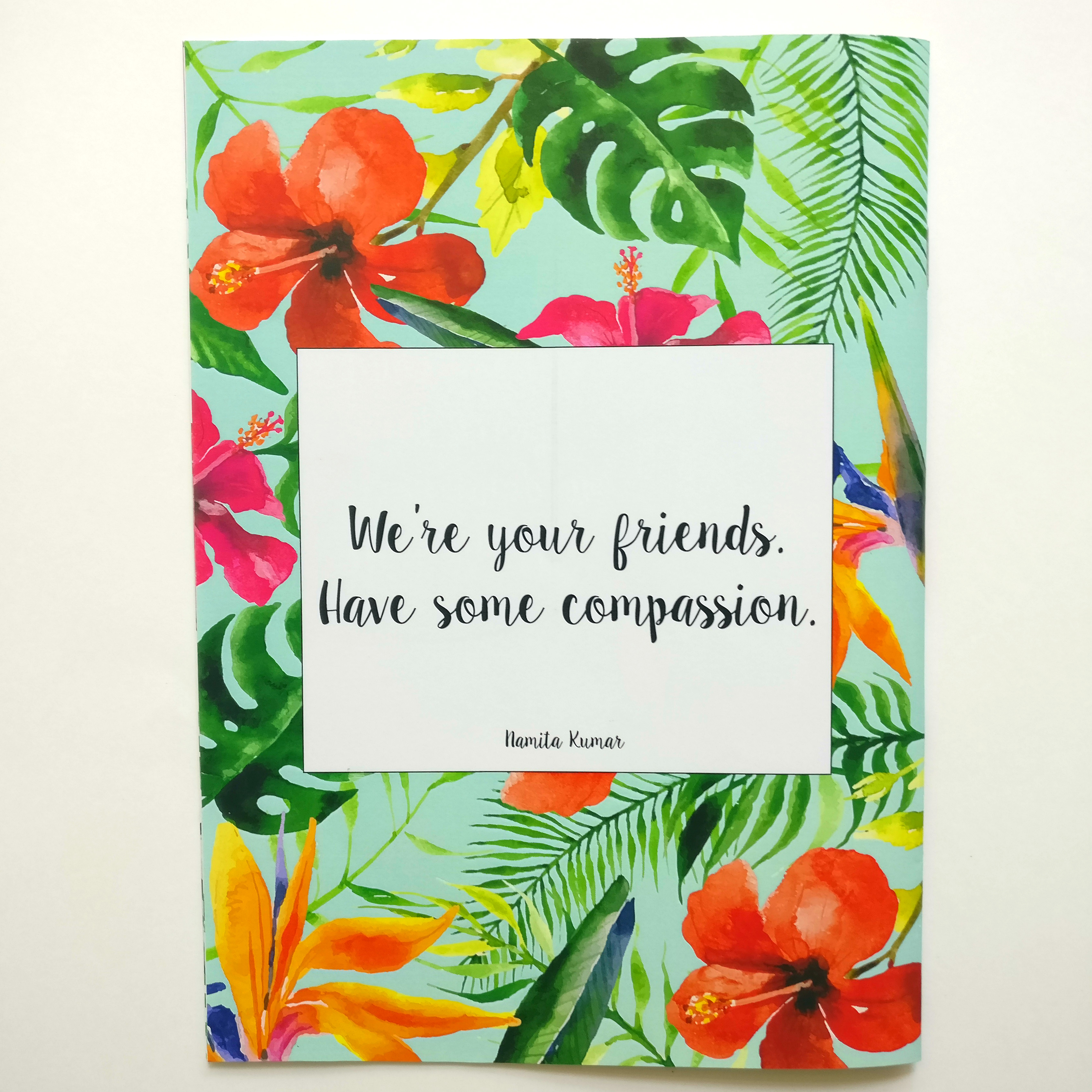
Title: Compassion
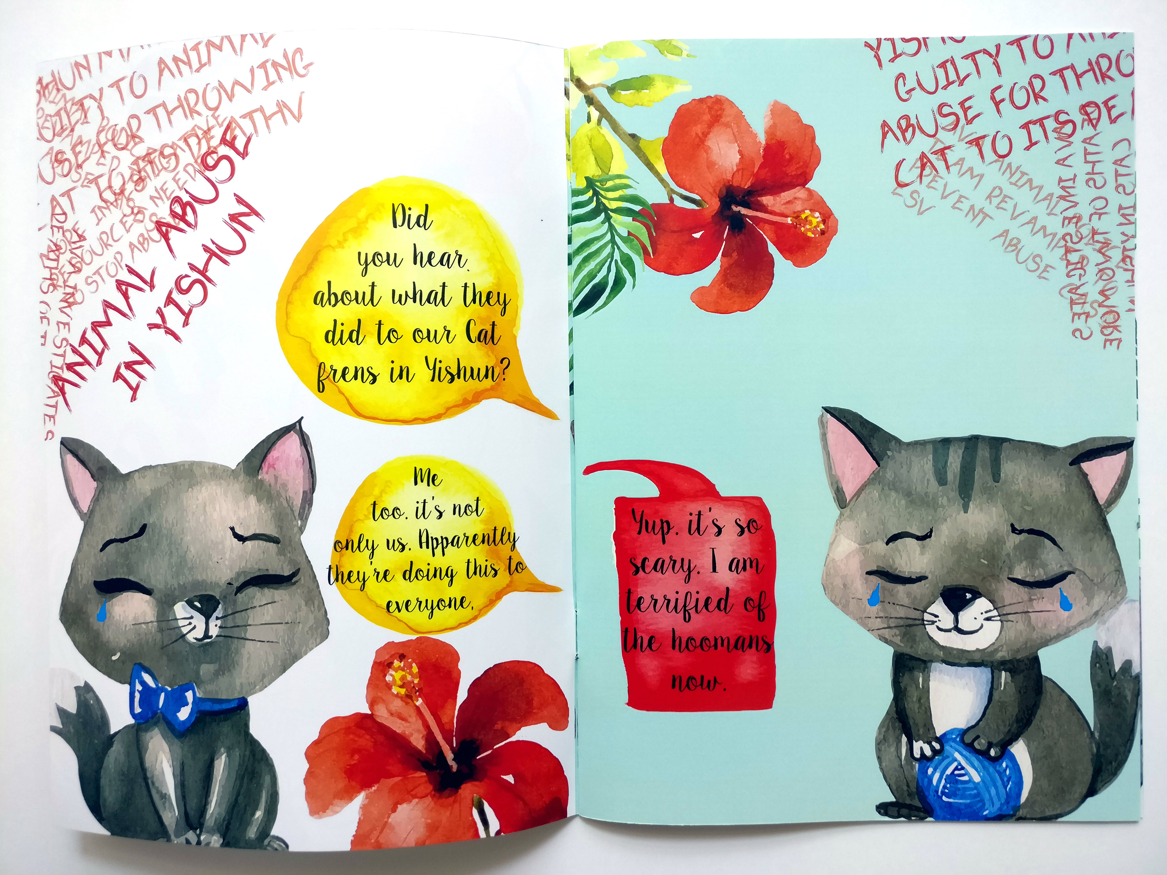
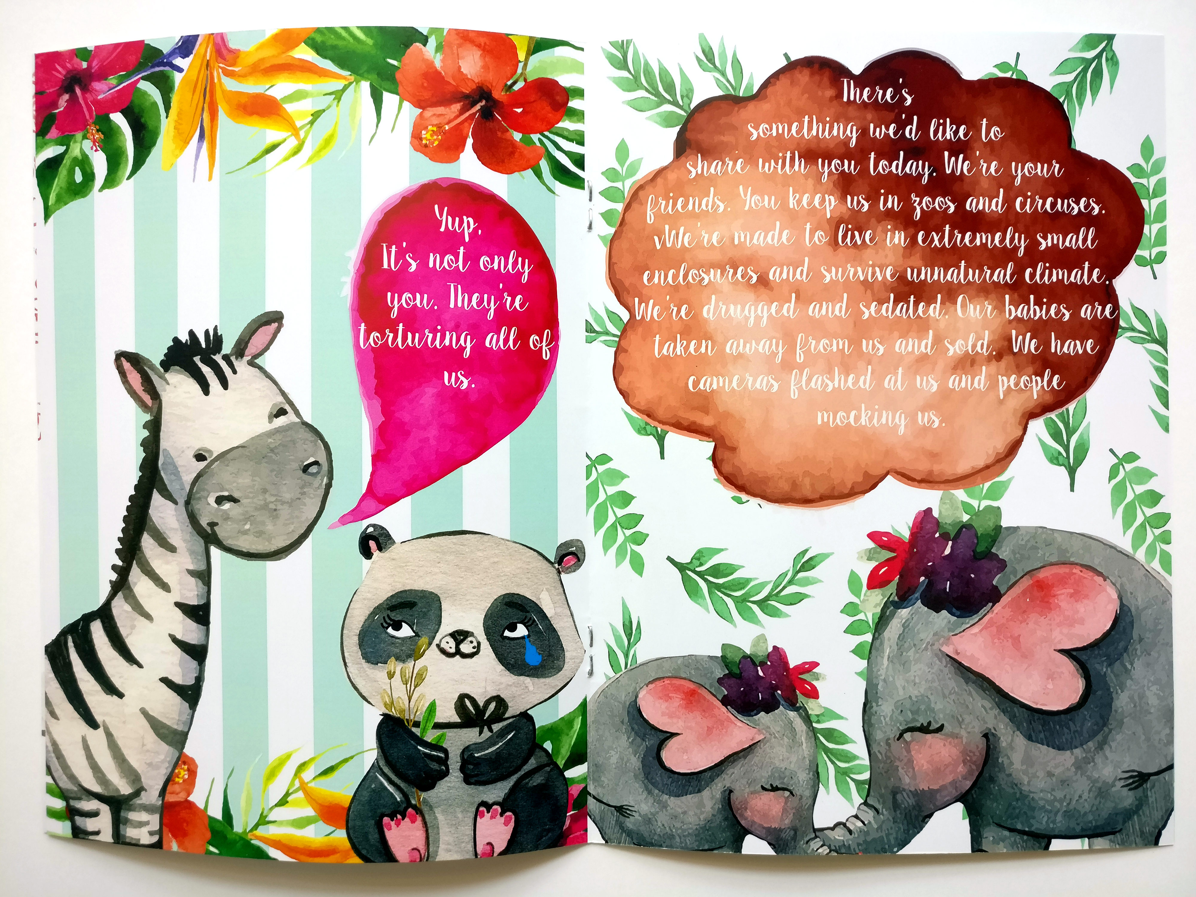
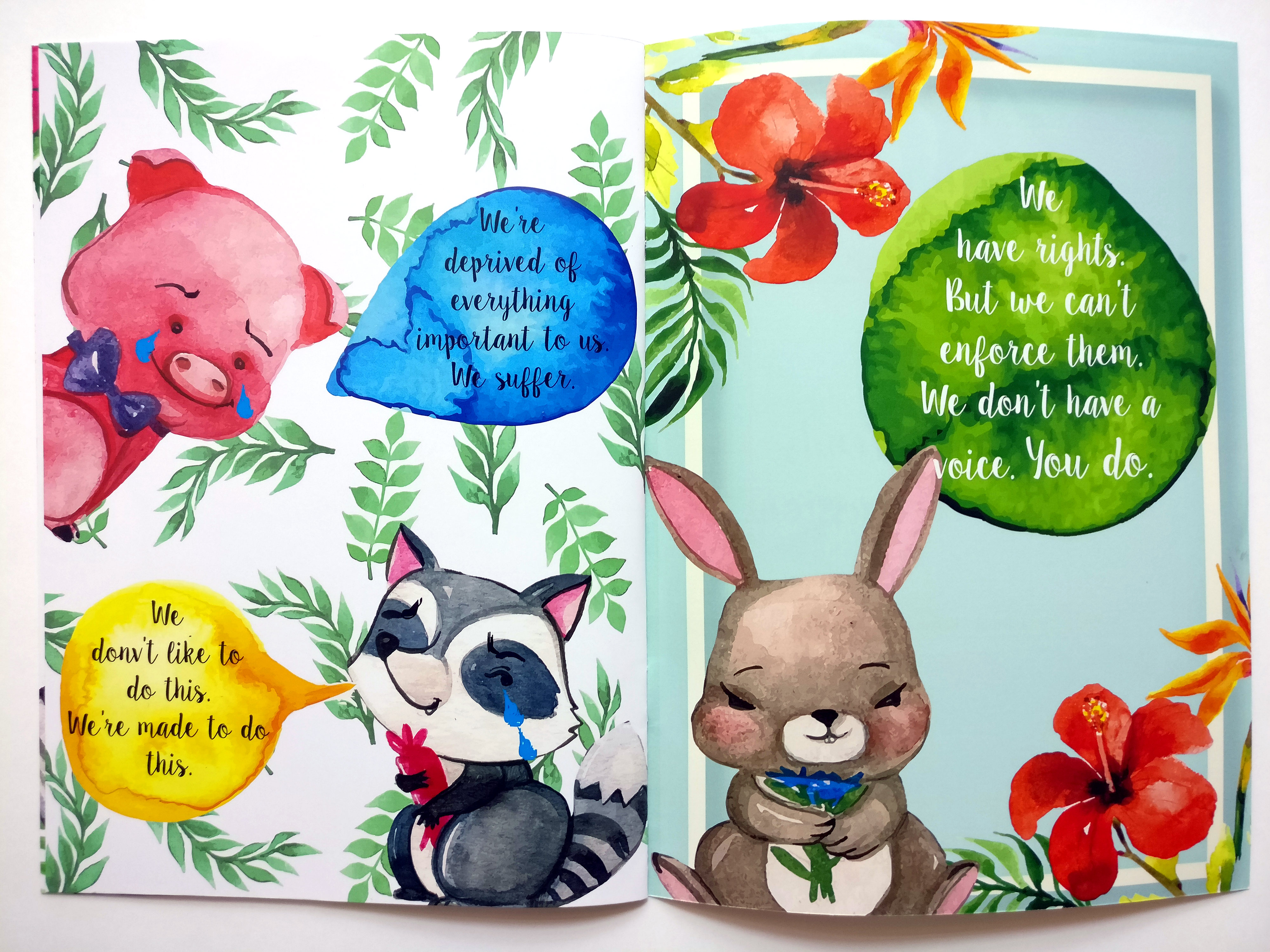
Content: The highlight of my visits to Yishun was the flora and fauna I saw there, and I thought it was very different from many other places in Singapore which are full of concrete jungles. The Zine starts off with illustrations about the recent incidents of Cat murders in Yishun, and broadens into how cruelly animals in general are treated by people, and that they deserve compassion.
Theme: Illustrative, quirky, reflective. More often than not, the audience for my projects is always the school children. I believe that it helps instill good values in the kids. Hence my zine is, too, comical and colorful, yet delivering a strong message.
I used ‘Sweet Pea‘ as my main font, which I thought blended well with the theme. And for pages 2 and 3, I used ‘Goblins‘ for portraying horror.
For printing, I used 128 gsm Matt finished paper, since the non coated papers were too thin, and there was a risk of damage. Plus, the color stood out better.
I thoroughly enjoyed doing this project. I ticked off another place in Singapore which I had not previously visited, made a few friends in the course of talking to strangers, learnt to use another Adobe software and… saw a three meter long monitor lizard. I would like to take this opportunity to thank Prof Mimi, it was a pleasure working under her guidance in this past year.