
For this project, it was really fun because we got to play with colours! And I love colours!!!
But before diving into my research on colours, I first of all wanted to research on illustration styles so that I could then determine the kind of colours I would be looking at!
I’ve never used Adobe Illustrator before, but was determined to pick it up! As opposed to just drawing on paper, I felt that the illustrations one creates through Ai were more quirky and cute!! Completely fitting with my school-fish theme.
ILLUSTRATION STYLES
Flat line illustrations

(images sourced from Pinterest, collaged by me)
Initially, I was looking into doing flat line illustrations (can be seen in Process). However, I found the lines too jarring for my kind of design that I wanted to portray – fish with scales! Thus, I started on the search for more styles.
Flat illustrations

(images sourced from Pinterest, collaged by me)
Then… I found something!!! Flat illustrations. Kinda just like the above, but without the lines! Flat illustrations I realised, work with scenery better than flat line illustration because of the added depth that changing colours can create. I personally find that flat line illustrations whereas are more suitable for designs that only have one focal point/ main character.
As my design was going to merge both scenery with characters and not just a main character against a plain background, I chose to go with flat illustrations instead!
COLOURS
Jon McNaught
(images sourced from Google, collaged by me)
Jon McNaught is a printmaker and freelance illustrator. He uses screen printing and lithography to create miniature images and silent narratives, capturing quiet moments in small inky panels.
I was hugely inspired by Jon McNaught’s tasteful colour palettes! His colour schemes are so beautiful! They all blend in perfectly with one another. This led me to explore the use of muted colours.
I love his style so much that I went to buy his books almost immediately after finding out about him HAHAHA
Risography/ Neon

(images sourced from Google, collaged by me)
I stumbled across a book at an art fair not long ago. It’s called Beautiful Birds. I initially consulted Mimi about this idea – I wanted to use muted colours for my background and then use neon to pop the up certain parts of my design that I wanted to emphasise (like my main fish for example). But Mimi told me that this requires a different method of printing to pop up the colours – Risograph printing. And as I am a little short of cash… I decided to instead explore this method the next time!!!
COLOUR THEORY
Monochromes Harmony
The colours of a monochromatic palette all share a single hue, but vary in brightness and saturation.
You get a monochrome colour scheme by picking 1 colour with different variations in lightness and darkness. This colour scheme is very simple, calm, and creates a feeling of a clean design. Moreover, when working with monochrome colours it is easy to match them correctly.
Use this scheme when your design has many elements. These calm colours will take away the feeling of clutter.
Analogous Harmony
Analogous colour palettes consist of different, but neighbouring hues. The constant property can be either the saturation or the brightness level or both. Usually one of the three colours predominates.
If you take 3 colours which are just NEXT to each other on the colour wheel, and you will get the analogous colour scheme. These colours are often found in nature. This combination is calm and creates a pleasant feeling. This is because these colours are characteristically close to one another and the transition from one colour to another is smooth and natural.
It is a good idea to use this scheme when you want to add some colours to your design. This scheme helps to keep the design colourful, but at the same time the colours blend together well and maintain harmony. However, the cons of this scheme are lack of contrasting colours.
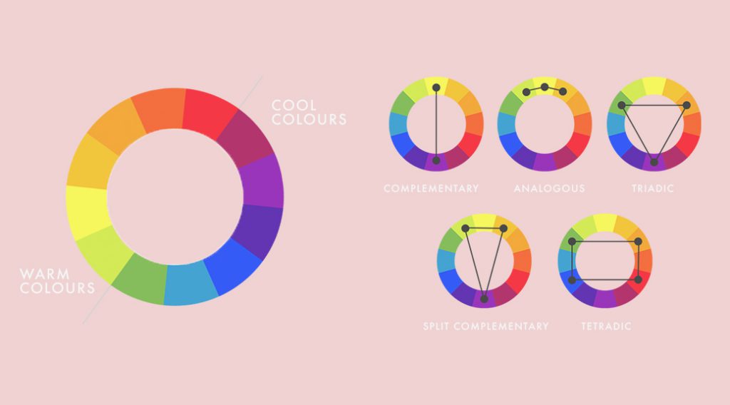
Analogous Harmony Warm and Cool
Warm colours are vivid and energetic, and tend to advance in space.
Cool colours give an impression of calm, and create a soothing impression.
Complementary Hues
Complementary colours are any two colours which are directly opposite each other. These opposing colours create maximum contrast and maximum stability.
Split Complementary
The split complementary colour scheme is a variation of the complementary colour scheme. In addition to the base colour, it uses the two colours adjacent to its complement.