X Avoid occupations with limited visual representations (e.g. florist, wedding planner)
X Avoid common occupations (Barista, Chemist)
X Avoid forming shapes with letters
X Avoid messy and distracting backgrounds
X Role of background is secondary
✔ Use textures associated with jobs as background
Second Draft
Learning points after consultation:
X Avoid using entirely different fonts between letters
X Avoid using objects to form letters
X Avoid using letters to form objects
✔ Incorporate key features of occupation tools into letter itself to create a unique typeface
✔ Simplify key features used
Third Draft
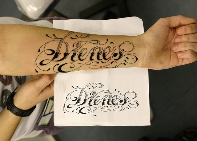
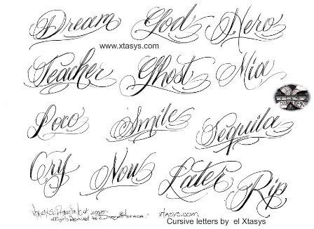
Tattoo Artist
Arrange letters into triangular formation
Hand draw fonts to make it more cohesive and legible
Add shadow and highlight to emphasis perceptive
Potter
Letters too centralised and static
Occupation may not be clear to those unfamiliar to clay tools
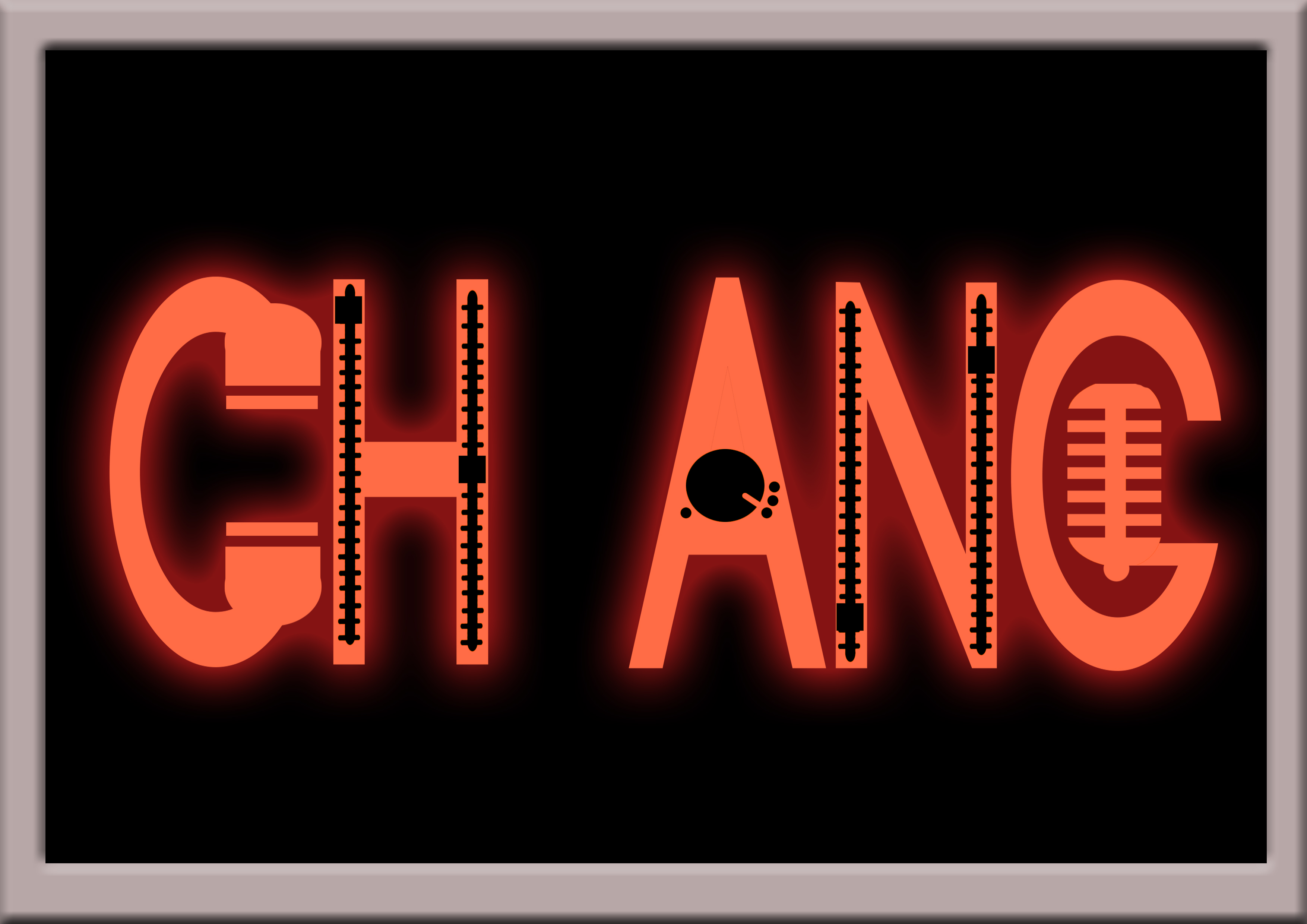
Radio Host
Microphone texture can be made clearer
Final Edits
Tattoo Artist (Hand-drawn and scanned)Tattoo Artist (Digitally Illustrated)
Exaggerated perspective
Added shadow and highlight
Added reddish glow to simulate swollen skin
Varied sizes and depth of letters
Curved baseline and letters to make it more dynamic
Radio Host
Added box border and space between letters, and elongated letters to simulate ‘ON AIR’ sign
Changed microphone to a more recognisable icon
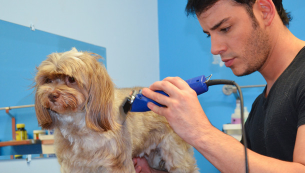
Pet Groomer 1Pet Groomer 2
Decided to switch occupations from Potter to Pet Groomer
More dynamic and playful placement of letters
Used bubble fonts to accompany ‘cute’ aspect of pets
Added varying texture
Overall Learning Points
Text take up 70% of the space for emphasis
Avoid horizontal baselines and placement of letters
Minor cropping of letters can add to dynamism
Textures give strong visual clues
Research up on reference images beforehand!!!!!
How to add new Photoshop brushes
How to add drop shadow/bezel/glowing effects
How to use the clipping mask
How to use perspective/warp transformation to give depth and spice up the composition
If the job does not have tools obvious enough, switch jobs; Don’t be afraid to drop the current idea and try out new ones (especially after discarding 13 job ideas wow)