
First Idea Sketches

Learning points after consultation:
x Avoid Logos
X Avoid occupations with limited visual representations (e.g. florist, wedding planner)
X Avoid common occupations (Barista, Chemist)
X Avoid forming shapes with letters
X Avoid messy and distracting backgrounds
X Role of background is secondary
✔ Use textures associated with jobs as background
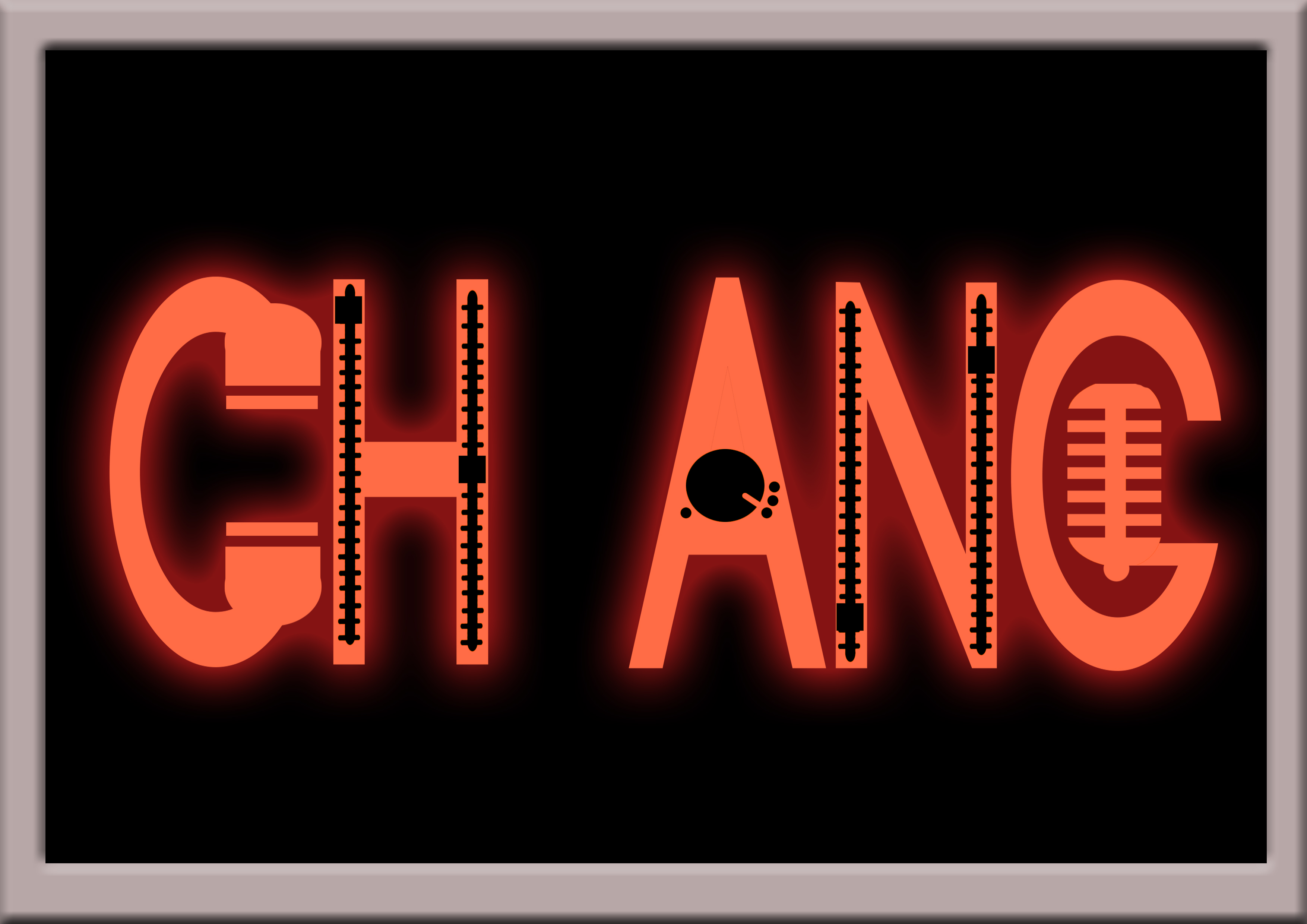
Second Draft

Learning points after consultation:
X Avoid using entirely different fonts between letters
X Avoid using objects to form letters
X Avoid using letters to form objects
✔ Incorporate key features of occupation tools into letter itself to create a unique typeface
✔ Simplify key features used
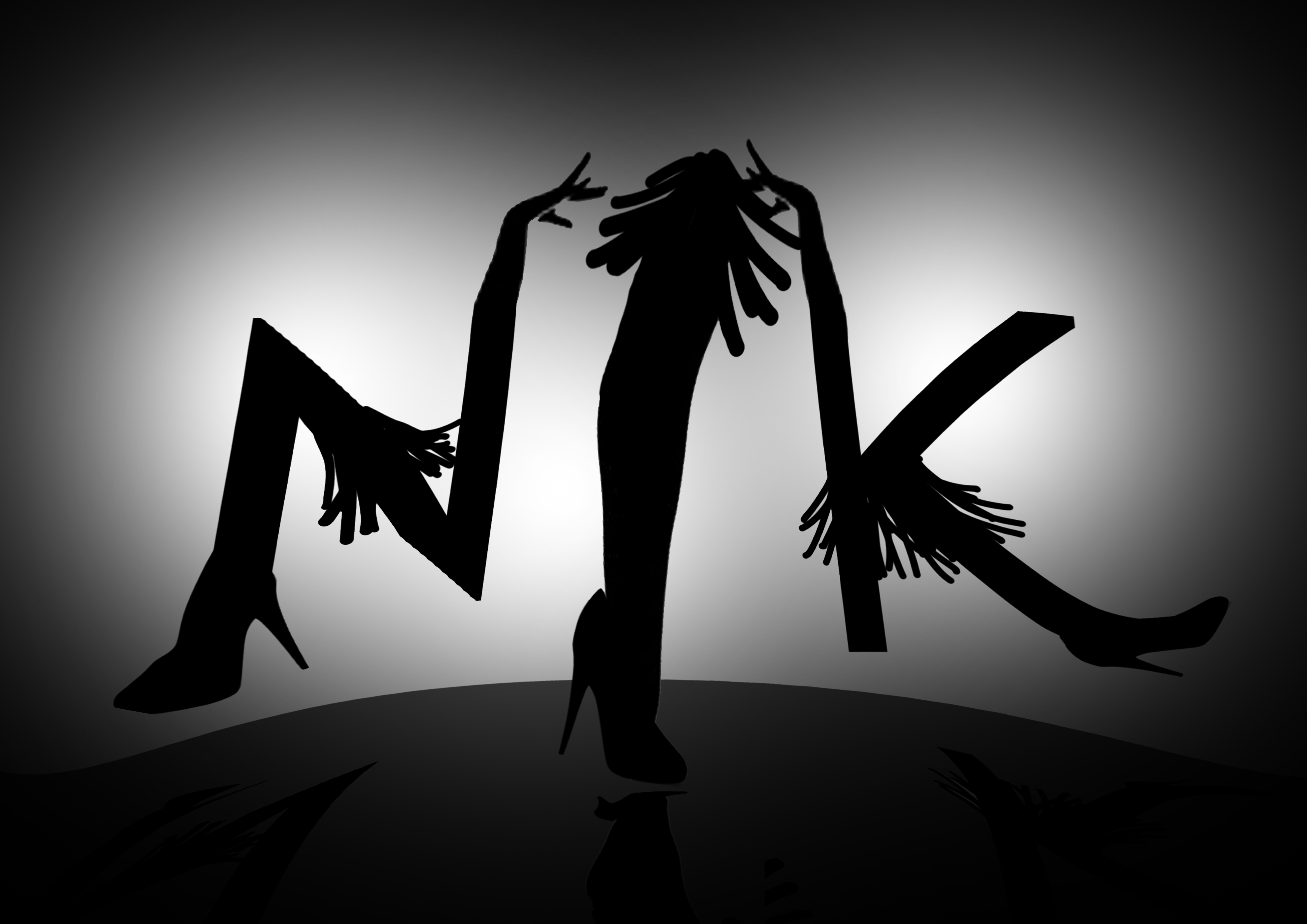
Third Draft

- Arrange letters into triangular formation
- Hand draw fonts to make it more cohesive and legible
- Add shadow and highlight to emphasis perceptive

- Letters too centralised and static
- Occupation may not be clear to those unfamiliar to clay tools

- Microphone texture can be made clearer

Final Edits
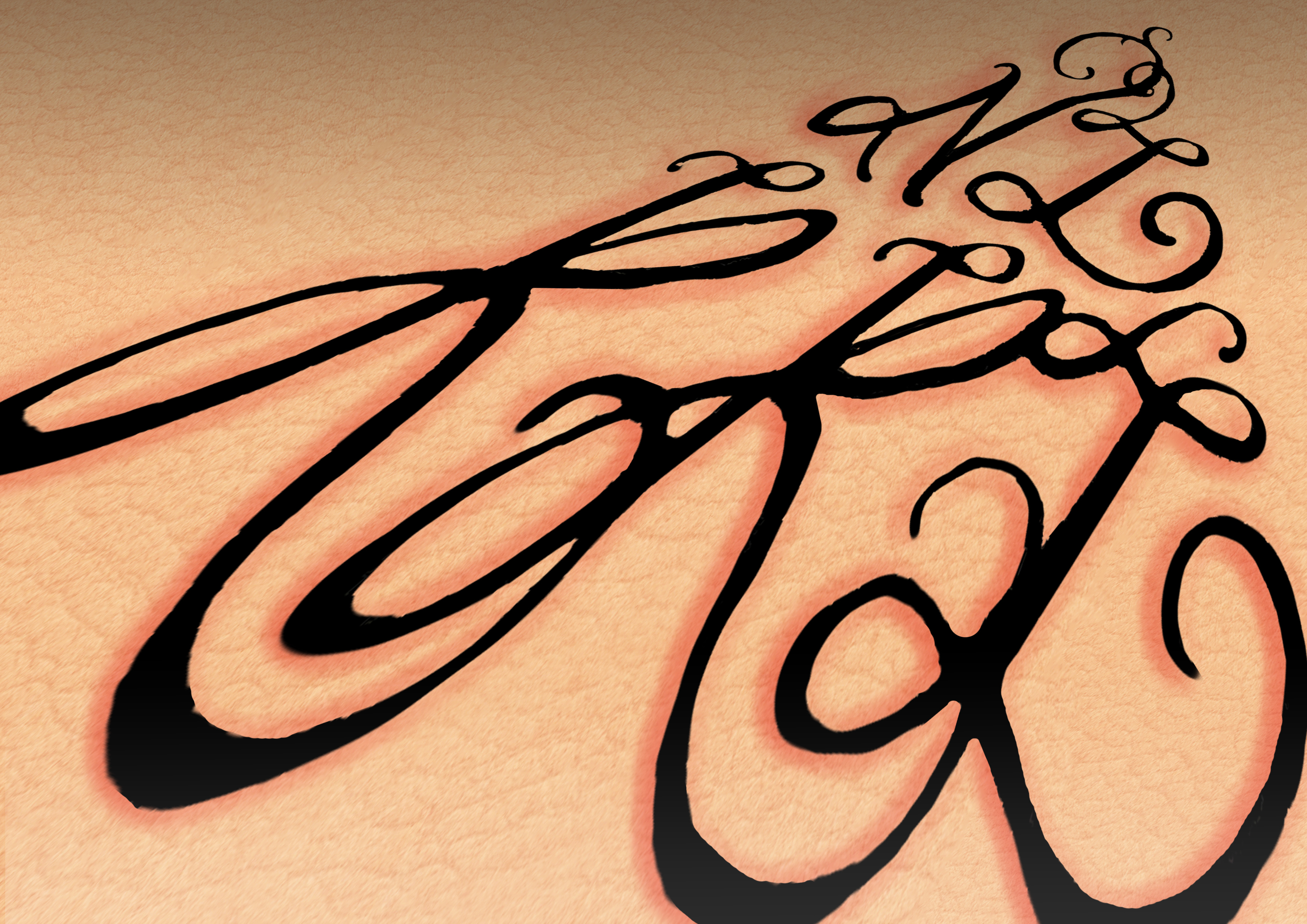
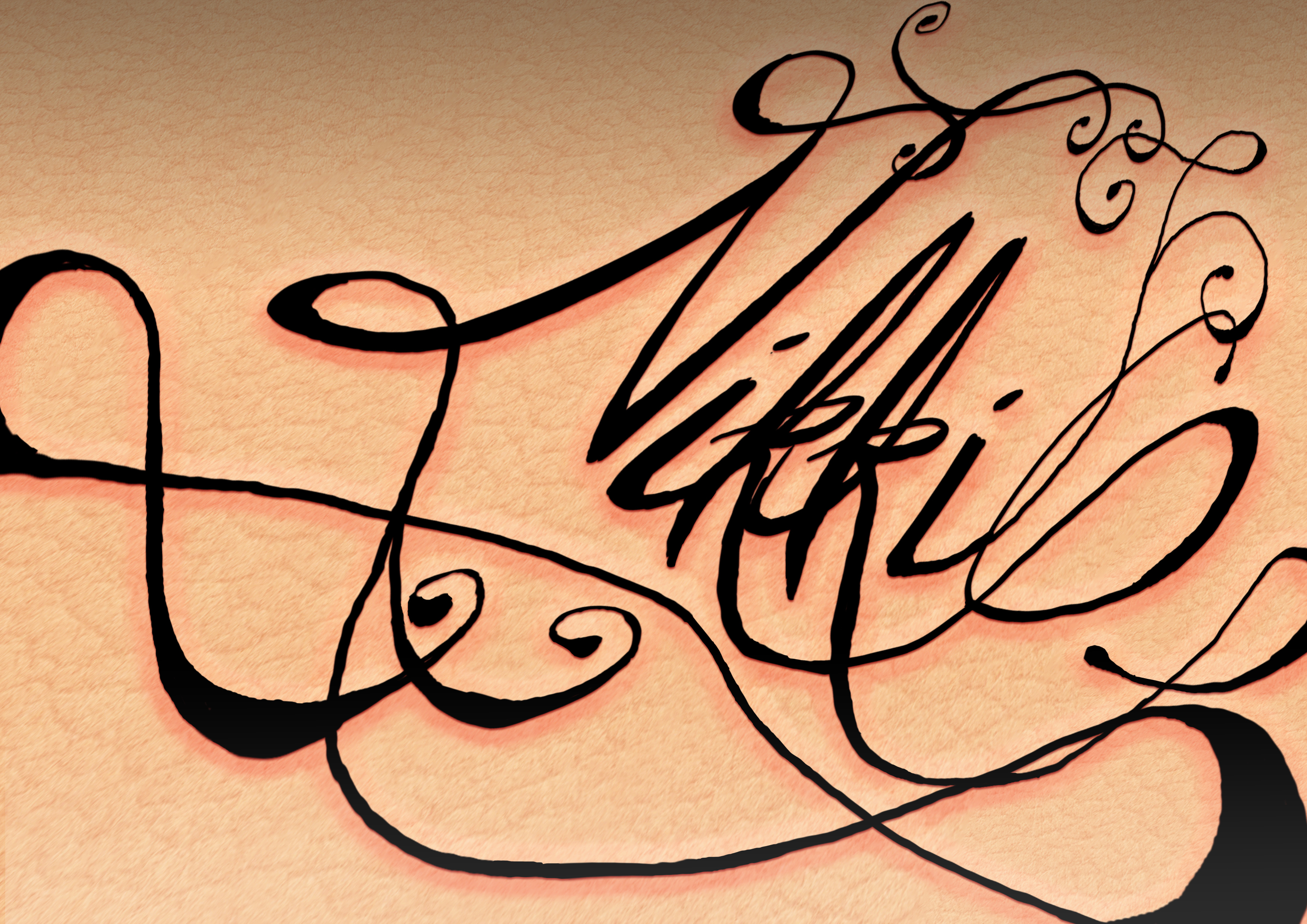
- Exaggerated perspective
- Added shadow and highlight
- Added reddish glow to simulate swollen skin
- Varied sizes and depth of letters
- Curved baseline and letters to make it more dynamic
- Added box border and space between letters, and elongated letters to simulate ‘ON AIR’ sign
- Changed microphone to a more recognisable icon


- Decided to switch occupations from Potter to Pet Groomer
- More dynamic and playful placement of letters
- Used bubble fonts to accompany ‘cute’ aspect of pets
- Added varying texture
Overall Learning Points
- Text take up 70% of the space for emphasis
- Avoid horizontal baselines and placement of letters
- Minor cropping of letters can add to dynamism
- Textures give strong visual clues
- Research up on reference images beforehand!!!!!
- How to add new Photoshop brushes
- How to add drop shadow/bezel/glowing effects
- How to use the clipping mask
- How to use perspective/warp transformation to give depth and spice up the composition
- If the job does not have tools obvious enough, switch jobs; Don’t be afraid to drop the current idea and try out new ones (especially after discarding 13 job ideas wow)
- Take note of colour harmony/schemes