Week 1 & 2: Transfer Printing

Transfer Printing

The transfer of image from paper to fabric/other materials through the use of heat & pressure.

Heat melts the pigment of image and is hence transferred from one medium to another through physical contact with the aid of pressure.

TYPES:

  • Dry
  • Wet – Direct/Indirect

Materials

  • Dry: Fabric Crayons, Paper, Fabric
  • Wet: Fabric Ink, Paper, Fabric, Imprint Materials

Instructions

  1. Using fabric crayons or fabric ink, draw or paint desired image on paper.
  2. For Direct Printing, sandwich the paper between 2 sheets of baking paper and the fabric to be transferred to. Iron firmly at high heat, ensuring the paper doesn’t move in the process.
  3. For Indirect Printing, do the same but place imprint material (i.e. leaf) in between the paper and fabric. Use the heat press and leave for 1 minute before removing.
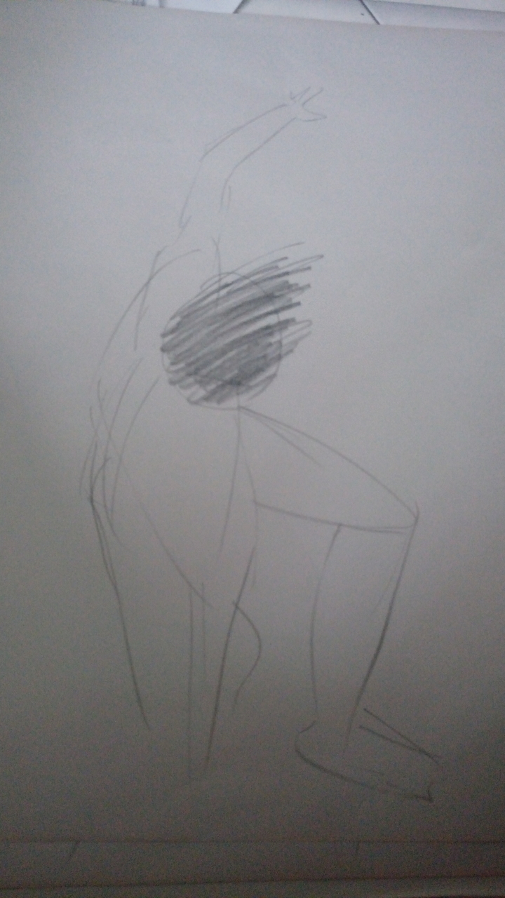
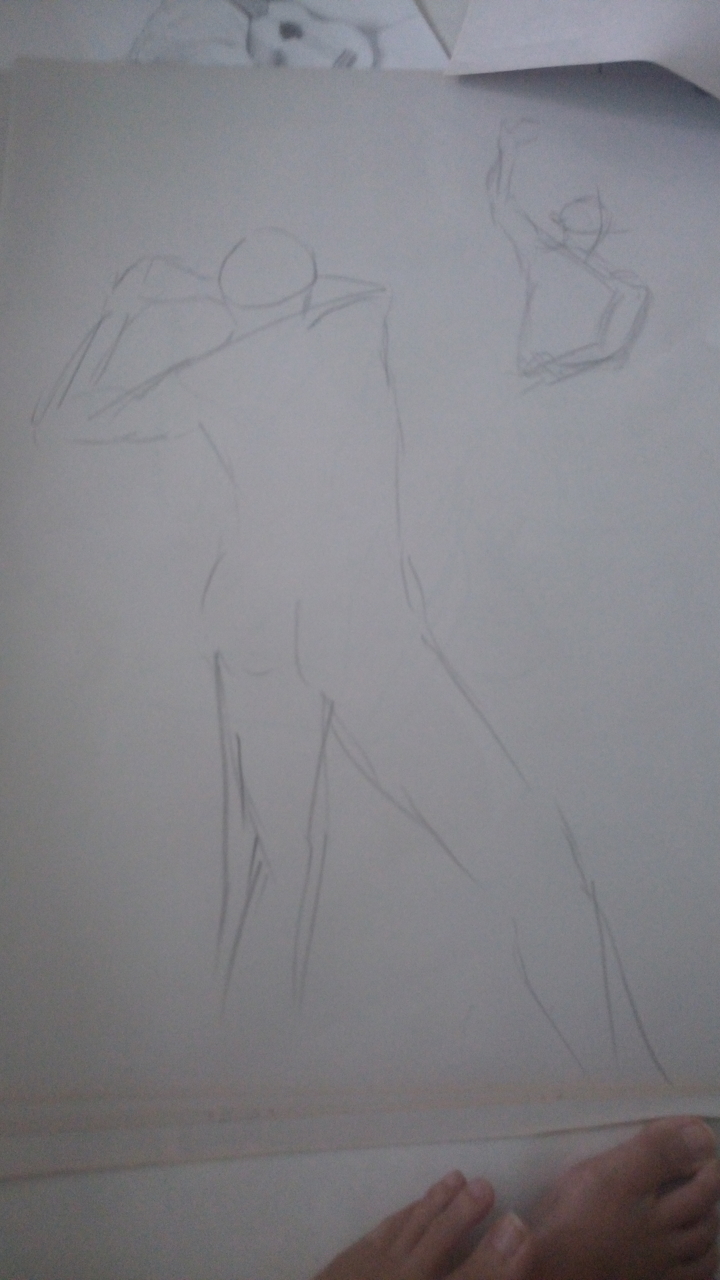
My Explorations

P R E P A R A T I O N ( D R Y   T R A N S F E R )

Firstly, we realised that the fabric crayons, when coloured over textured surfaces can produced interesting patterns. With that, we went out of the ADM building to experiment with different surfaces.

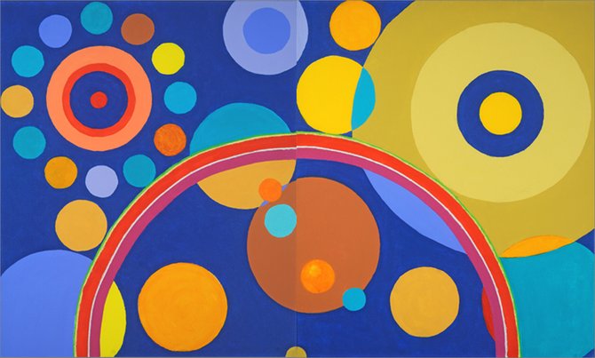
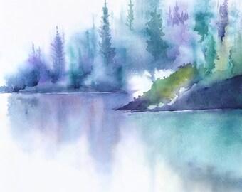
As I have decided on the theme of Outer Space, I explored the blue/purple/pink/black of galaxies.

I also tried to keep the shapes circular to emulate planets and their textures.

And so we coloured on different surfaces including tree barks and tables with holes.

In conclusion, the tree barks resulted in more organic and smaller holey textures compared to the tables which has more symmetric patterns.

I also overlapped colours together to see if it would blend after transfer.

T R A N S F E R   P R O C C E S S

For the iron, I realised that the heat must be sufficiently high (close to the max) for the process to work, or else it seems to require a long wait. However, putting the iron at max kinds of brown/burn the baking paper so it should be moderated.

T R A N S F E R   R E S U L T S

  1. The transferred crayon colours are more vibrant than the initial one.
  2. It is very easy for the paper to move, which resulted in a double print on my fabric, but I kind of like the holographic/trippy effect
  3. The patterns made by tree barks resulted in very obvious spottings, a distinct pattern.
  4. The overlapping colours do kind of appear blended as they get lighter.


P R E P A R A T I O N ( W E T   T R A N S F E R )

Next, I explored different ways of using the fabric ink.

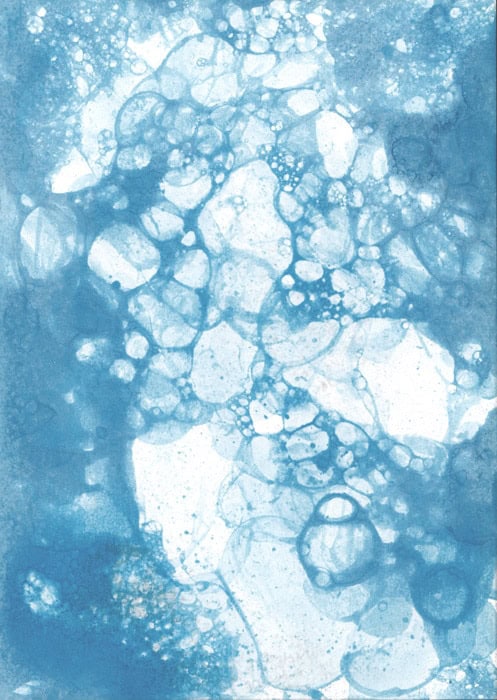
I first tried wetting the paper and then dipping one end into it (like paper chromatography) to watch the ink seep and create an ombre effect. However, the spread of colours is uneven so ultimately I found that painting it directly with more and more dilution is more effective.

I was also curious about the effect of alcohol on ink so I tried dabbing it with some wet tissue which resulted in some colours being lifted in a cloudy effect.

Next, I tried wetting the paper and then dripping small drops of ink of blue and red into it and let it bleed out.

I also used a card as a squeegee to spread the ink and made abstract lines.

T R A N S F E R   P R O C C E S S   &   R E S U L T S

I ironed some of the wet transfer pieces onto the fabric as I think ironing is more efficient than the heat press and I think the colours came out pretty well. I think the different textures made gives depth and makes the image more dynamic.

For the heat press, I first tried using frayed threads to imprint and I think it came out pretty nice with a slight fuzzy white outline, almost as if it is glowing.

We found that waiting for 1 minute is a good time as 30 seconds is too short and the colour will not show.

I then tried again with cotton pads slightly pulled apart, together with a sprinkle of tea leaves powder. I was hoping that the cotton can emulate the wisps found in the space galaxies while the sprinkles will simulate stars.

It didn’t turn out exactly like I was hoping for against the ombre background but I would say it does look the sky instead.

C O N C L U S I O N

Overall, I think I am quite happy with my prints and I actually prefer the dry transfer over the wet one because I think for the direct transfer, it can actually be achieved by painting directly on the fabric. Unless, of course, the transfer is done multiple times to build up layers.

On the other hand, the fabric crayon gives a very different result from the initial ones, especially for those which are textured, and can probably be only achieved via transfer.

Nonetheless, the indirect printing is a very novel concept but I think overlapping several times of indirect print will then make it more dynamic than just a a single one.

A P P L I C A T I O N S

Pretty much anything made out of fabric can be decorated with these prints.

fabric painted shorts

Would also be useful to personalise belongings or gifts.

DIY painted baby blanketpersonalized soccer bags

It’s a great way for kid to wear their own creations as well!

kids drawing transfered to t-shirt


2D Zine Process

Draft 1

Initially, my secondary research about Yishun revealed contrasting information: It is very eco-centric, as well as dementia friendly BUT it is also infamous for eccentric crimes and cat murders. And then there’s the useless bicycle structure that shoots water and underwhelming hot springs.

I didn’t know what to do about so I did everything, although I organised them into 3 categories: The Good, The Bad & The Weird.

Draft 2

Then, I decided to focus on the cat murders, but I really really did not want to put Yishun in a bad light because the responses to them by the local community is heartwarming.

Hence, I resolved to make a zine for the cats instead, including traces of efforts by the community here and there.

I created the draft in photoshop.


Draft 3

Then, through the InDesign course and several presentaions, I recognised the importance of asymmetry and texture. Hence, while transferring graphics over to InDesign, I added textures to the silhouettes & map and changed the balanced format of the Accomodations.


Upon consultation, I’ve learnt several problems which I will address in my next draft:

  • Front and back page have plain backgrounds
  • The style between pages differ too much
  • Last spread have too many elements

Draft 4

  • Added texture of Yishun signature twisted house playground as background, fitting text and name into the window.
  • Cat has a more playful posture

  • Change fonts to similar type for more cohesion
  • Added swirly texture to increase the dynamism of the houses
  • A darker background on the right 1/3 of the spread(Rule of thirds) to separate the topics

  • Removed distracting wood and plate background
  • Increased size of map
  • Standardised font and icon size for a neater look

  • Title font changed to the same as previous page to reduce style difference
  • Reduced number of elements
  • Circular background with size hierarchy to guide the eyes and separate them cleanly

  • Replicated texture of house from front page
  • Added social media link
  • Added visually intriguing cat silhouette to enforce the cat focus of zine

Draft 5

Finishing touches!

  • Used complementary colours Blue and Yellow for this spread


  • Made used of the idea of circular background to add texture
  • Used analogous colours of the warm spectrum to incite hunger
  • Fixed the visible white background of the icons

  • To avoid repetition of previous circular background, used the same brush texture as the first spread for background instead
  • Used the  primary colours scheme

  • Isolated the cat silhouette from window so they would not look joined when printed with colour similarities


Overall Learning Points

  • How to use InDesign
  • Why InDesign is better than Photoshop in terms of resolution resizing
  • Odd number columns will aid in neater presentation
  • Asymmetrical designs and texture add dynamism
  • The use of circular/colour blocked background to separate information
  • The use of visual hierarchy to guide the eye
  • Standardising of fonts to improve cohesion of the entire zine
  • Stick to a colour scheme for a stylistic design

2D Que Sera Sera Process

First Idea Sketches

scan0014-page-001

Learning points after consultation:

x Avoid Logos

X Avoid occupations with limited visual representations (e.g. florist, wedding planner)

X Avoid common occupations (Barista, Chemist)

X Avoid forming shapes with letters

X Avoid messy and distracting backgrounds

X Role of background is secondary

✔ Use textures associated with jobs as background

Second Draft

pdfresizer-com_2017-02-03_17-59-page-001

Learning points after consultation:

X Avoid using entirely different fonts between letters

X Avoid using objects to form letters

X Avoid using letters to form objects

✔ Incorporate key features of occupation tools into letter itself to create a unique typeface

✔ Simplify key features used

Third Draft

tattooartist2c
Tattoo Artist
  • Arrange letters into triangular formation
  • Hand draw fonts to make it more cohesive and legible
  • Add shadow and highlight to emphasis perceptive
potter1c
Potter
  • Letters too centralised and static
  • Occupation may not be clear to those unfamiliar to clay tools
radio1c
Radio Host
  • Microphone texture can be made clearer

salsadancer2c

Final Edits

tattoo4c
Tattoo Artist (Hand-drawn and scanned)
tattoo5c
Tattoo Artist (Digitally Illustrated)
  • Exaggerated perspective
  • Added shadow and highlight
  • Added reddish glow to simulate swollen skin

salsadancer4c


  • Varied sizes and depth of letters
  • Curved baseline and letters to make it more dynamic
radio3c
Radio Host
  • Added box border and space between letters, and elongated letters to simulate ‘ON AIR’ sign
  • Changed microphone to a more recognisable icon
petgroomer2c
Pet Groomer 1
petgroomer3
Pet Groomer 2
  • Decided to switch occupations from Potter to Pet Groomer
  • More dynamic and playful placement of letters
  • Used bubble fonts to accompany ‘cute’ aspect of pets
  • Added varying texture


Overall Learning Points

  • Text take up 70% of the space for emphasis
  • Avoid horizontal baselines and placement of letters
  • Minor cropping of letters can add to dynamism
  • Textures give strong visual clues
  • Research up on reference images beforehand!!!!!
  • How to add new Photoshop brushes
  • How to add drop shadow/bezel/glowing effects
  • How to use the clipping mask
  • How to use perspective/warp transformation to give depth and spice up the composition
  • If the job does not have tools obvious enough, switch jobs; Don’t be afraid to drop the current idea and try out new ones (especially after discarding 13 job ideas wow)
  • Take note of colour harmony/schemes

Acidentally Family (Narrative Writing Homework)

Accidentally Family

Hayley did not ask for any of this. She did not ask to witness a man in a trench coat being struck by lightning, perform CPR on him, drag him onto the car and drive him to the nearest hospital 50km away. She most certainly did not asked to be responsible for him when he wakes up 3 hours later without a single memory of his past.

“I’m telling you, for the last time, I don’t know if he had left anything at the scene because I was busy, oh I don’t know, saving his life!” Hayley gritted out.

“Yes, I understand, mam,” The nurse-in-charge replied patiently, “It’s just that there’s no wallet nor phone on him for identification, so we are unable to contact his family to bring him home. This hospital is too small to house patients for too long, so if you would be so kind to..”

“NO!” Hayley shouted. Upon realising that she has everyone’s attention in the hospital’s waiting lounge, she resumed, embarrassed, in a normal volume, “I.. I can’t.”

“I see.. then we will have to contact the Homeless Association for help, then.” The nurse complied. “Would you like to see him before you leave?”

She doesn’t have to.

She nodded.

***

“Hi.” Hayley greeted awkwardly.

“Hello. The nurses told me you saved me. Thank you very much, you are a very kind person.” The patient said earnestly.

He is sitting up on the bed halfway, dark hair mussed and blue eyes curiously observing her. He’s most likely in his mid forties, with his beard growing out and permanent five-o-clock shadow.

“Just doing my civic duty.” She murmured, uncomfortable with compliments.

“I would repay you, but I’m afraid I don’t know how.” He continued meekly.

“It’s alright. Just.. wait for your family to come get you.”

He nodded, looking down at his hands, decorated with medical tubes, then out of the window.

He looked lost, lonely and sad.

Hayley takes a deep breath.

***

“Hey, Hayley.”

“Hey, kiddo.” She ruffled Sam’s hair as she passed by him doing his homework to put her bags down.

He eyed the man in a trench coat tailing behind her cautiously.

“Yeah, about that.. Sam, this is the guy I was telling you about on the phone.”

Sam nodded, and held his hand out to the stranger.

“Hi, I’m Sam. What’s your name?”

“Hello, Sam,” He took his hand apprehensively and added, “I’m sorry.. I can’t remember my name.”

“It’s okay. Can I call you Nat?” Sam asked with wide green eyes.

“Sam -” Hayley chided. “Nat is fine.” The newcomer agreed with a small smile.

“Cool!” Sam beamed at him.

***

“You can’t do this, I’ve signed a contract.” Hayley whispered harshly into the phone.

“Come on, you know I need this job! What was I supposed to do, leave him to die!”

In the next room, Nat is teaching Sam maths because apparently you can forget your name but still remember maths.

“Please, sir, give me one last chance, I promise-” *click*

She closed her eyes and gulped.

***

Sam waved solemnly from the back of the car with Social Service on it as it drove away.

“I’ll get you back soon, be good, Sammy!” She hollered as she waved, a weak smile plastered on her face.

The moment he was gone from sight, Hayley closed her eyes and wipe a trembling hand down her face.

Her past memories flashed in front of her – Dad picks up a call while she was propped on his hip, the rush to the hospital, Dad leaving flowers for a stone called Mum, empty bottles scattered around a sleeping Dad, angry and drunk Dad, pain, scars, protect Sam, pain, hide Sam, pain, Sam with scars, escape –

“Are you okay?” A gentle touch to her shoulder dragged her to the present with a gasp.

“You.” Hayley spat as she jabbed a finger at him, eyes hard and red, “This is all your fault!”

Nat looked like a puppy that got kicked.

“If you hadn’t been struck, I hadn’t have to skip my job to save your life, get fired by my stupid boss and let Child Services take away my brother!”

Nat flinched.

“It’s not fair! I’m already 24! There’s only one year left before I can adopt him legally!” She yelled desperately.

“What am I going to do? I can’t-” Her voice broke. “I can’t protect him anymore.” She whispered hopelessly, sitting down onto the steps.

Nat was conflicted. He wanted to lend a comforting hand on her shoulder but he’s not sure if it was welcomed.

He settled for a soft, “It’s a bad day, not a bad life.” quote instead.

“I beg to differ.” Hayley snorted.

“If you get a new job, can you get Samuel back?”

“Yes, but who else will hire a black high school graduate whose only experience is in bartending?”

Nat frowned as he contemplated her situation. He brightened as his gaze fell upon her car.

“You can drive. Fast. The nurse told me you got me to the hospital in 5 minutes flat – any longer and I’ve been dead.”

“The traffic was working in my favour..” She argued weakly.

“And you know first aid, right?”

She nodded. He did not ask how.

“Then you can be an ambulance driver!” He concluded simply.

She sees the hope in his eyes despite the dire situation.

“I’m sorry.” For blaming you for my uselessness, she doesn’t say.

“If you give a call to the hospital, you are forgiven.” Nat beamed.

***

“We have several applicants for this job, but since you did the hospital a favor and we have witness your skills first-hand, you can start next Monday.” The nurse-in-charge informed her.

“Thank you. Truly.”

***

Although Hayley had erratic work hours, Nat was there to look after Sam. Her salary was also significantly higher than ever, she noted, pleased, as she thanked the person behind the counter.

“Oh hey, Mr. Wilson! Haven’t seen you in awhile!” the bank clerk chirped upon seeing Nat.

“You.. you know me?”

“Uh, yes? You only left this job three months ago, you know?” She replied, a little unsure.

“Sorry, what’s my name again?”

“Erm, Simon J. Wilson? Mr. Wilson, are you alright.. ?”

Nat looked like he had an epiphany.

“Yes, I think I will be.” He mumbled vaguely with pale lips.

***

“So, Simon J. Wilson huh?” Hayley ventured in faux casualness as she steered the car.

“James. Simon James Wilson. I was a bank accountant who got retrenched in the bad economy. Have been finding a job ever since, but I got mugged on the road the day you found me.”

“No wallet, no phone.” Hayley nodded in understanding.

“My landlord probably threw out my stuff, I already was behind rent payment anyway. My husband.. he passed a few years ago.” He gave a self-depreciating chuckle. “So that’s me, Simon J. Wilson, with no family and home to my name.”

“Well then,” Hayley decides with a warm smile as she parked outside her house, “Welcome home.”

(1,186 words)

My Line Is Emo Research!

LOVE

  1. Affection 

a feeling of fondness or tenderness for a person or thing; attachment.

Note: Soft lines that merges two being

2. Lust

a strong and intense desire or drive; often sexual.

Notes:

  • Use nets for ink marking
  • Lip print?
  • Thing stringy lines

3. Longing

to have an earnest or strong desire or craving; yearn.

Note:

  • Large empty space (sense of isolation)
  • Use ink to bleed?
  • Funnel-like shape depicting reaching out/ yearning via squeegee? 

JOY

4. Cheerfulness

hearty; pleasant; bright.

Note: Circles: bubble painting

5. Zest

liveliness or energy; animating spirit.

Note: Firework-like lines to represent motion & liveliness

6. Contentment

satisfaction; ease of mind.

Note:

  • Horizontal lines to represent calm waters + bowl shape lines to represent smiles
  • Water reflections

7. Enthrallment

to captivate or charm.

Note:

  • Swirly shape to capture attention to centre point
  • Smoke painting

SURPRISE

8. Surprise

to strike or occur to with a sudden feeling of wonder or astonishment, as through unexpectedness.

Note: Various circle sizes to represent fireworks/heartbeat

ANGER

9. Irritation

to impatience or anger; annoy.

Note: Etch vertical lines (imitate nails scratching) + light watercolour overlay

10. Exasperation

to irritate or provoke to a high degree; annoy extremely:

Note:

  •  Thick, straight lines bent at an angle
  • Print by broken twigs?

11. Rage

violence of feeling, angry fury.

Note:

  • Harsh lines that gather together at a spot
  • Imitate cracked glass via eggshells?

12. Disgust

a strong distaste; nausea; loathing.

Note: Imitate goob; probably thick, gooey drip art

13. Torment

to afflict with great bodily or mental suffering; pain.

Notes: Thin, sharp knife slices on linoleum print

SADNESS

14. Sadness

affected by unhappiness or grief; sorrowful or mournful.

Note: Watery drip art + water reflection

15. Shame

the painful feeling arising from the consciousness of something dishonorable, improper, ridiculous, etc., done by oneself or another.

Note: Jarring lines bending downward lifted out of wet ink

16. Neglect

to pay no attention or too little attention to; disregard or slight.

Note: Large empty space to portray isloation

17. Horror

an overwhelming and painful feeling caused by something frightfully shocking, terrifying, or revolting; a shuddering fear.

Note: Replicate film scratches + vignette edges via sponge & ink

18. Nervousness

highly excitable; unnaturally or acutely uneasy or apprehensive.

Image result for nervous

Note: Fingerprints from tapping lightly


Foundation Drawing Life Model Lesson 1

Really quick sketches within the 1 min the model posed!

DSC_0031_Easy-Resize.com DSC_0032_Easy-Resize.com

Figured out 1 sketch per page is killing the Earth.

DSC_0033_Easy-Resize.com DSC_0034_Easy-Resize.com

Butt cheeks a little too long here oops!

DSC_0035_Easy-Resize.com

DSC_0036_Easy-Resize.com DSC_0037_Easy-Resize.com DSC_0038_Easy-Resize.com DSC_0039_Easy-Resize.com DSC_0040_Easy-Resize.com DSC_0041_Easy-Resize.com

Very intense. Good thing we slowed down. Longer 2 min posing sketches:

DSC_0042_Easy-Resize.com

10 min poses each!

DSC_0043_Easy-Resize.com

Tried out facial features with the extra time.


DSC_0044_Easy-Resize.com

Probably need to work more on my hands and feet… yeah.

DSC_0045_Easy-Resize.com

Ended off with a 20 min pose(which I was uninformed of), but I drew it really small so it was done pretty much in 10 min oops! Added fabric details instead.

All in all, it was a really interesting experience! I think I’m more familiar with the body form after this exercise, although smaller details like fingers and toes still need more work. Hope to try a female model next time to practice different gender built.