Draft 1
Initially, my secondary research about Yishun revealed contrasting information: It is very eco-centric, as well as dementia friendly BUT it is also infamous for eccentric crimes and cat murders. And then there’s the useless bicycle structure that shoots water and underwhelming hot springs.
I didn’t know what to do about so I did everything, although I organised them into 3 categories: The Good, The Bad & The Weird.


Draft 2
Then, I decided to focus on the cat murders, but I really really did not want to put Yishun in a bad light because the responses to them by the local community is heartwarming.
Hence, I resolved to make a zine for the cats instead, including traces of efforts by the community here and there.
I created the draft in photoshop.


Draft 3
Then, through the InDesign course and several presentaions, I recognised the importance of asymmetry and texture. Hence, while transferring graphics over to InDesign, I added textures to the silhouettes & map and changed the balanced format of the Accomodations.


Upon consultation, I’ve learnt several problems which I will address in my next draft:
- Front and back page have plain backgrounds
- The style between pages differ too much
- Last spread have too many elements
Draft 4

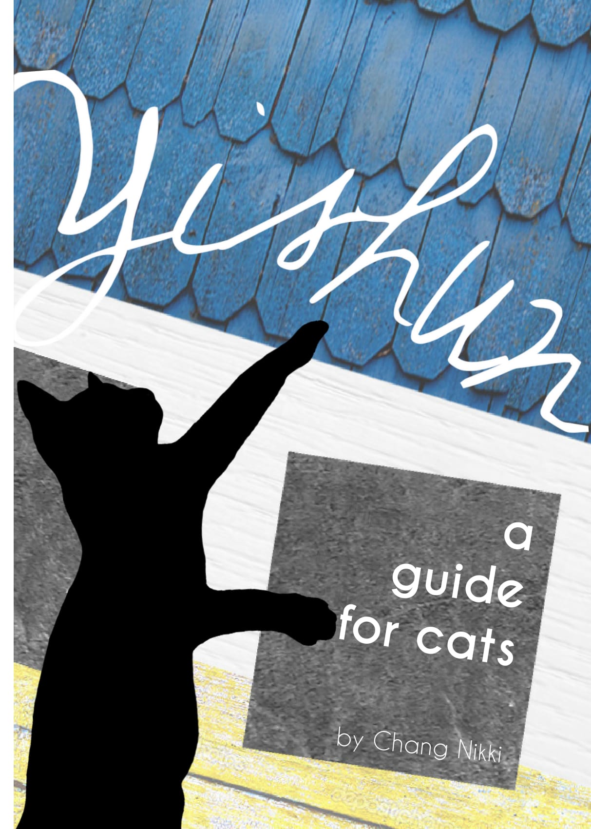
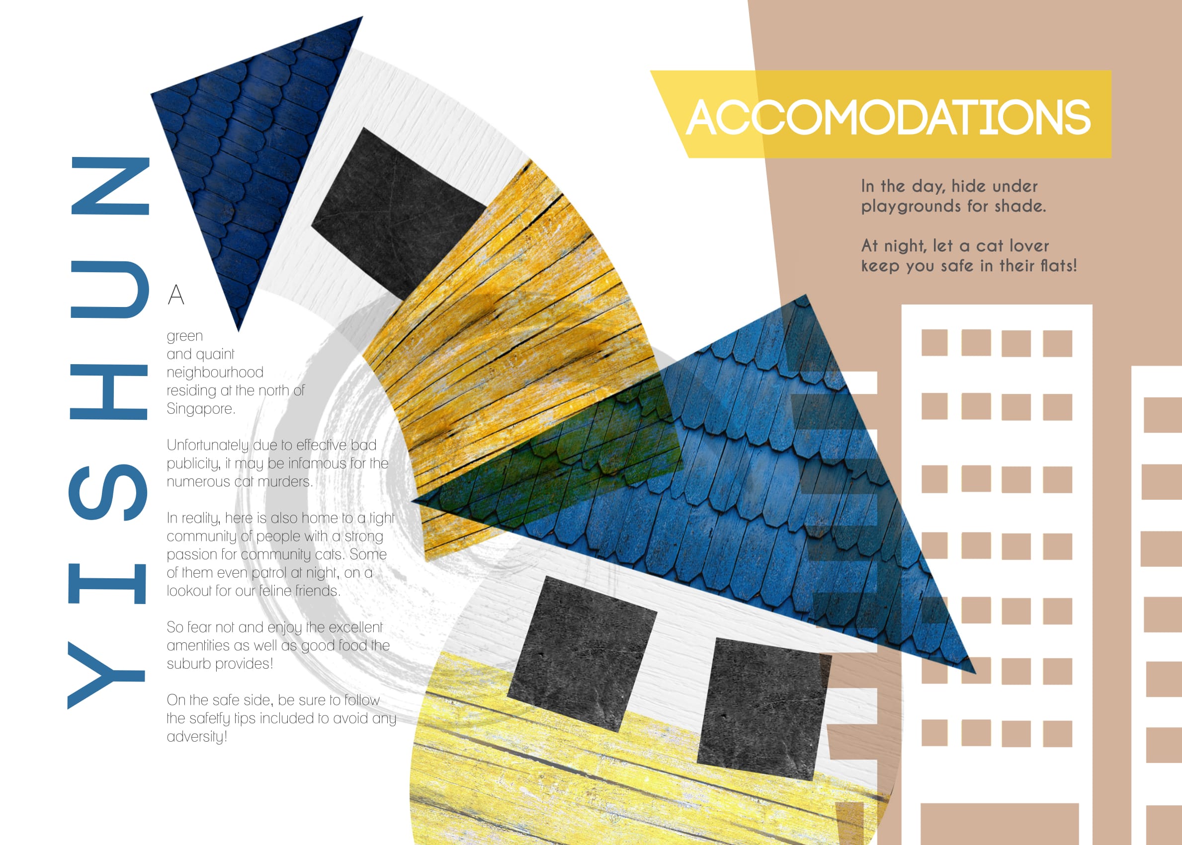
- Added texture of Yishun signature twisted house playground as background, fitting text and name into the window.
- Cat has a more playful posture

- Change fonts to similar type for more cohesion
- Added swirly texture to increase the dynamism of the houses
- A darker background on the right 1/3 of the spread(Rule of thirds) to separate the topics

- Removed distracting wood and plate background
- Increased size of map
- Standardised font and icon size for a neater look

- Title font changed to the same as previous page to reduce style difference
- Reduced number of elements
- Circular background with size hierarchy to guide the eyes and separate them cleanly

- Replicated texture of house from front page
- Added social media link
- Added visually intriguing cat silhouette to enforce the cat focus of zine
Draft 5
Finishing touches!
- Used complementary colours Blue and Yellow for this spread
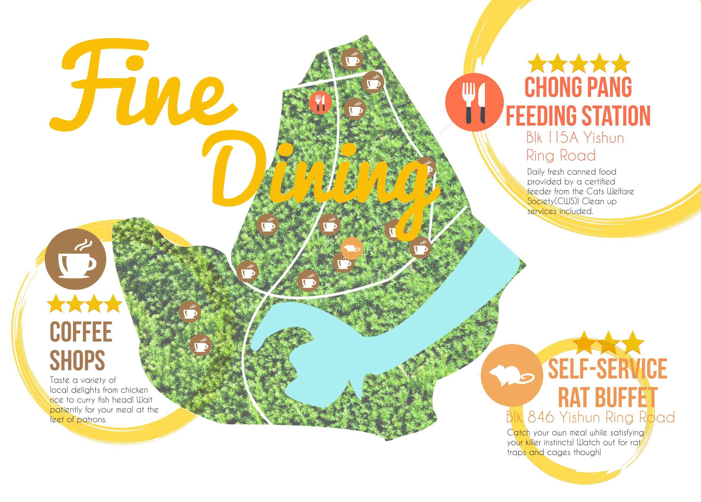
- Made used of the idea of circular background to add texture
- Used analogous colours of the warm spectrum to incite hunger
- Fixed the visible white background of the icons
- To avoid repetition of previous circular background, used the same brush texture as the first spread for background instead
- Used the primary colours scheme
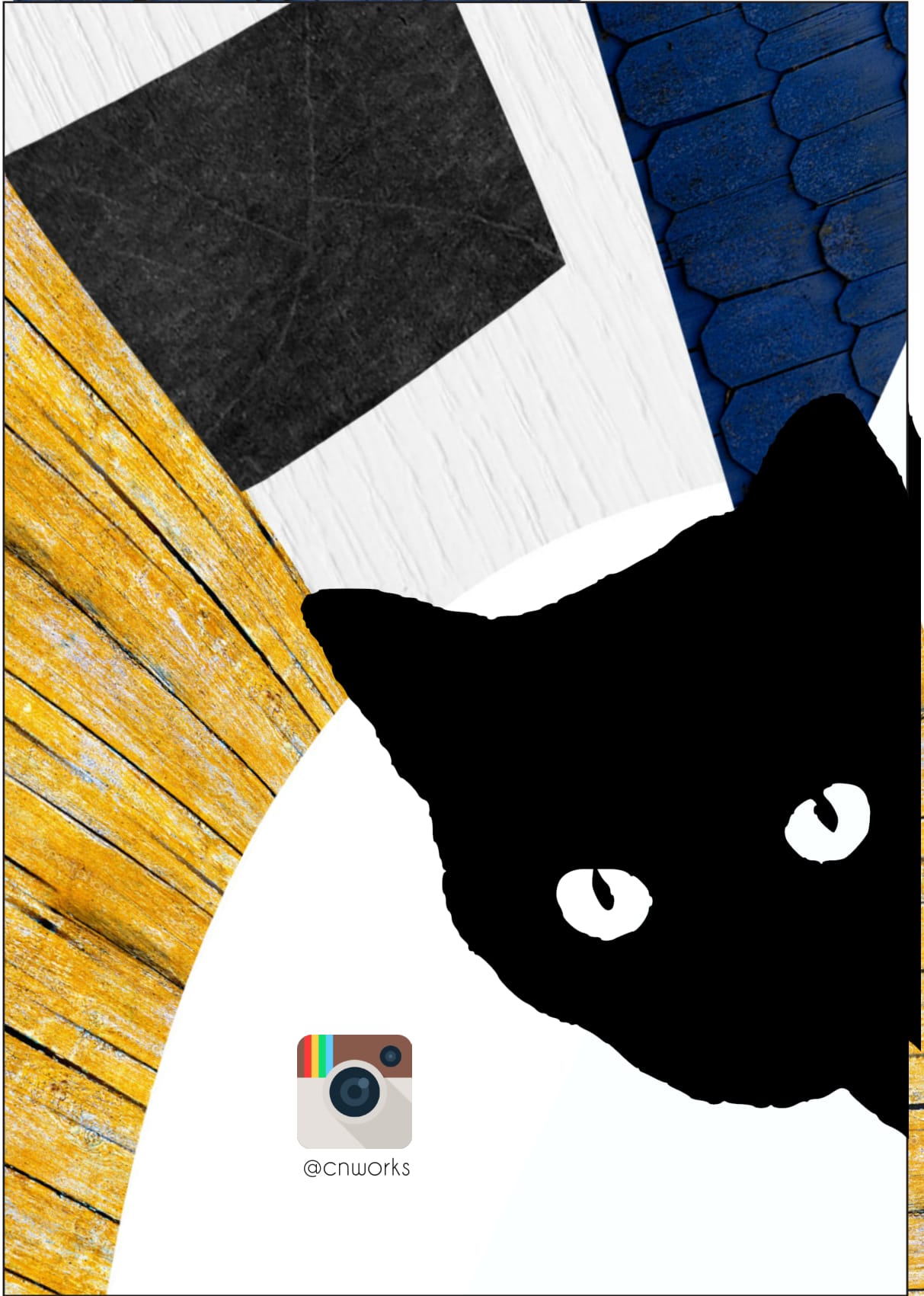
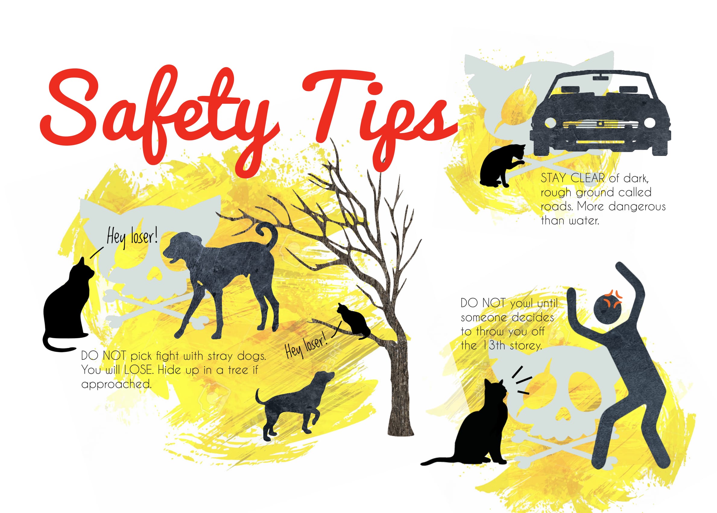
- Isolated the cat silhouette from window so they would not look joined when printed with colour similarities
Overall Learning Points
- How to use InDesign
- Why InDesign is better than Photoshop in terms of resolution resizing
- Odd number columns will aid in neater presentation
- Asymmetrical designs and texture add dynamism
- The use of circular/colour blocked background to separate information
- The use of visual hierarchy to guide the eye
- Standardising of fonts to improve cohesion of the entire zine
- Stick to a colour scheme for a stylistic design