E G O
“Me, Myself and I”
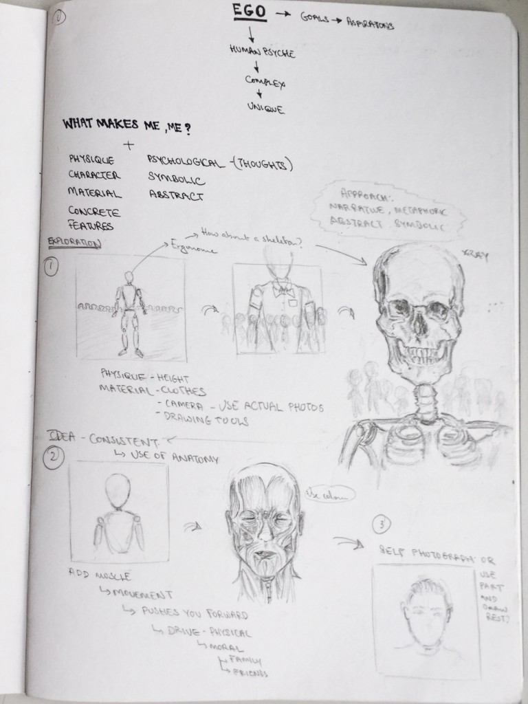
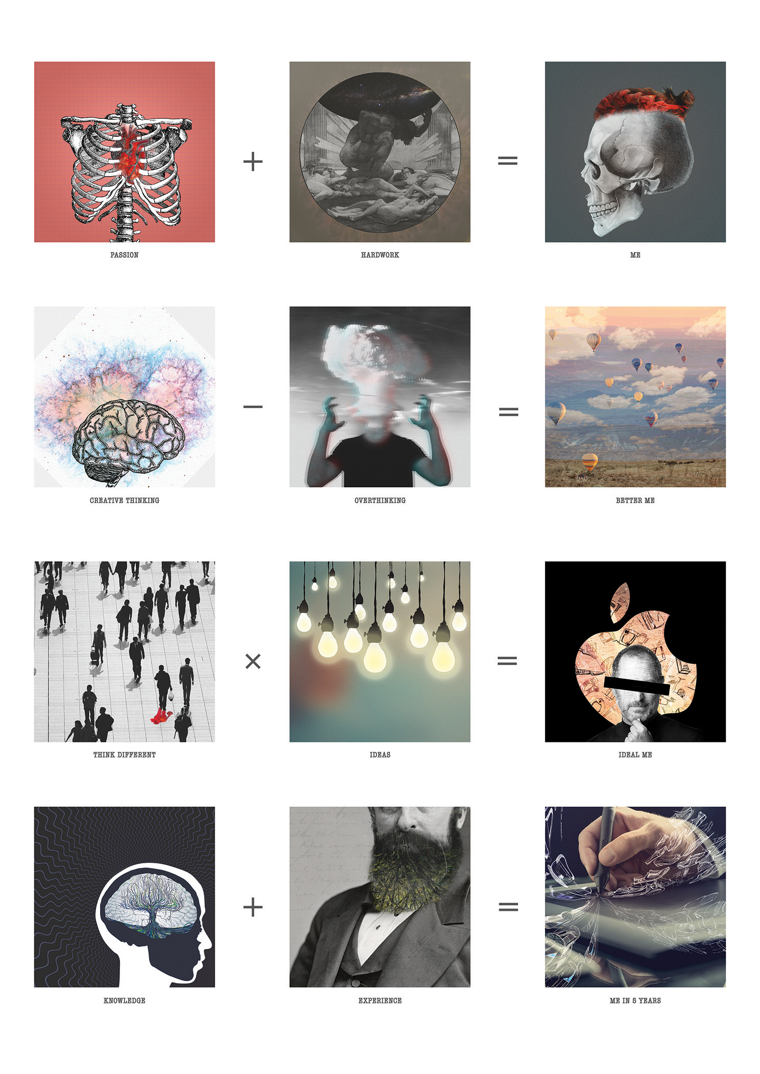
The final project for the 1st semester was rather challenging because it made you think who you really are: what makes you, you and how you express it in a visual way. One of the difficulties i encountered during this assignment was my approach to the equation; what i wanted to show: qualities? appearance? habits? But at the end i manage to tackle the assignment using lots of symbolical elements and representations that really describe who i am.
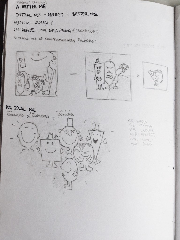
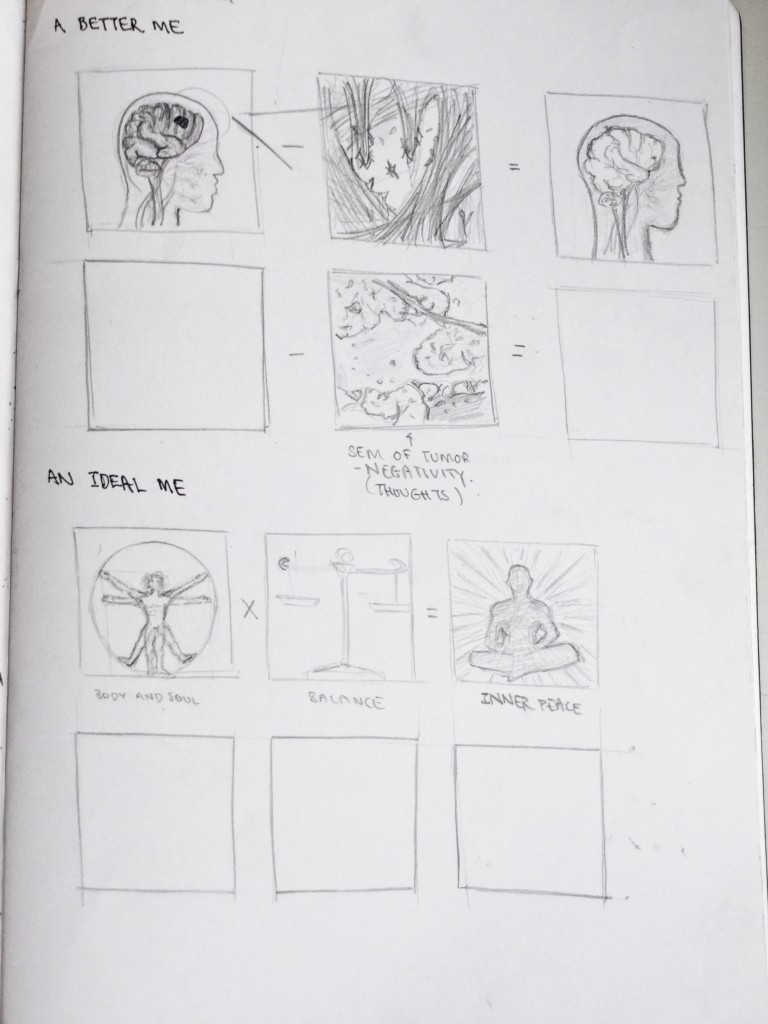
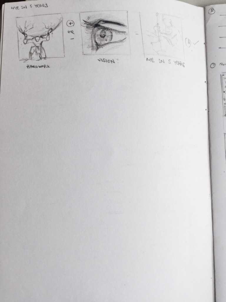
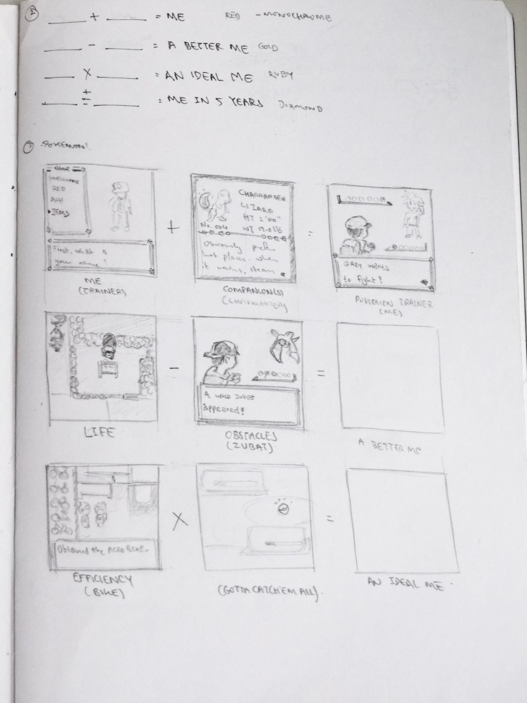
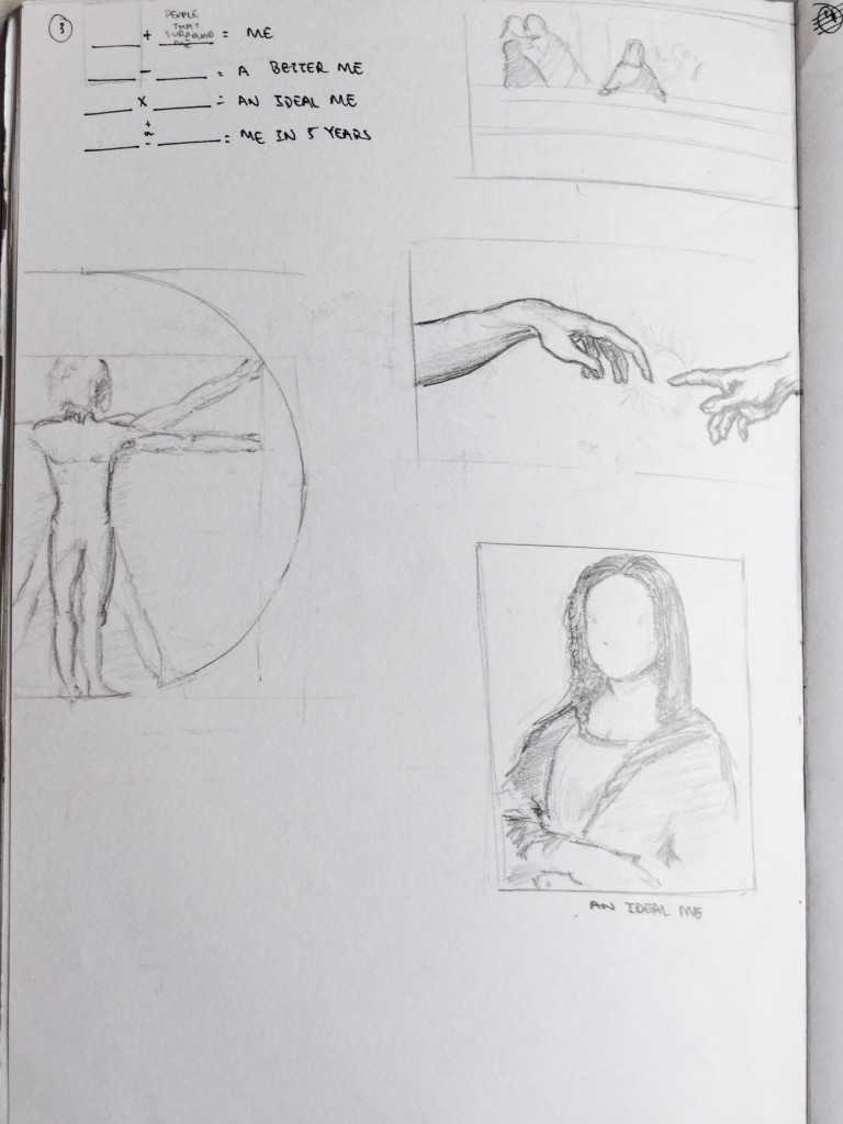
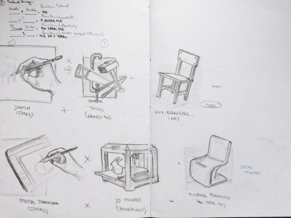
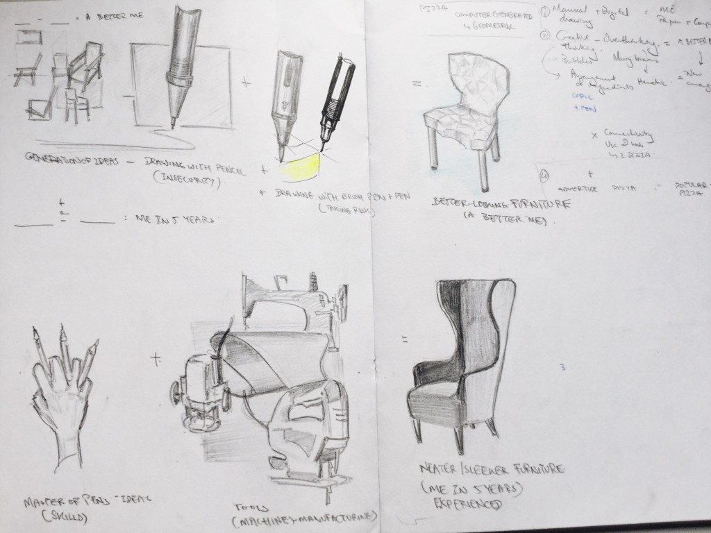
My ideation process was very tedious and mind tiring because i could not get the right elements into the equation but ultimately it lead me to a solution which i am satisfied with. Below are my ideas and some parts of the equations might feel a bit off because i interpreted some of them abstractly.
The final draft is my final solution for this project. The incorporation of some of my initial ideas to the new ones really mixed and matched well into the equation, that is why decided to go for the last one.
I used a lot of double exposure in my work because i believe it can show 2 different aspects of a same ‘object’. My approach is primarily symbolical, whereby pictures/illustrations convey meanings which are already known to us.
Medium: Digital (Photoshop)
How did i address the colour schemes in my composition?
I used different filters; overlays; gradients and played with the hues; vibrance; values to obtain a desired colour harmony.
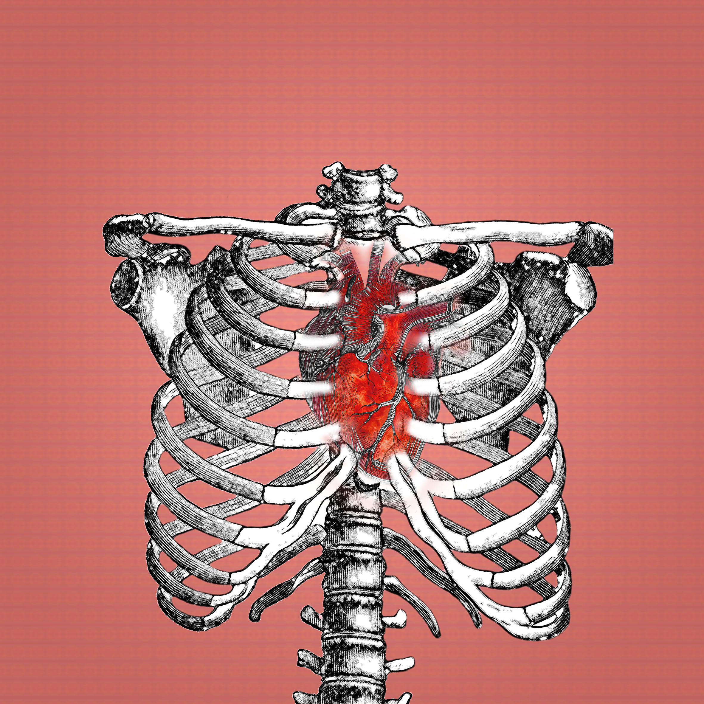
1. Passion
I depicted passion using a heart double exposed with a burning flame because passion is this intense feeling of desire or drive that pushes you forward. And the most prominent colour that associates with passion is red symbolizes energy, ambition, passion.
Colour: Coquelicot red
Scheme: Analogous
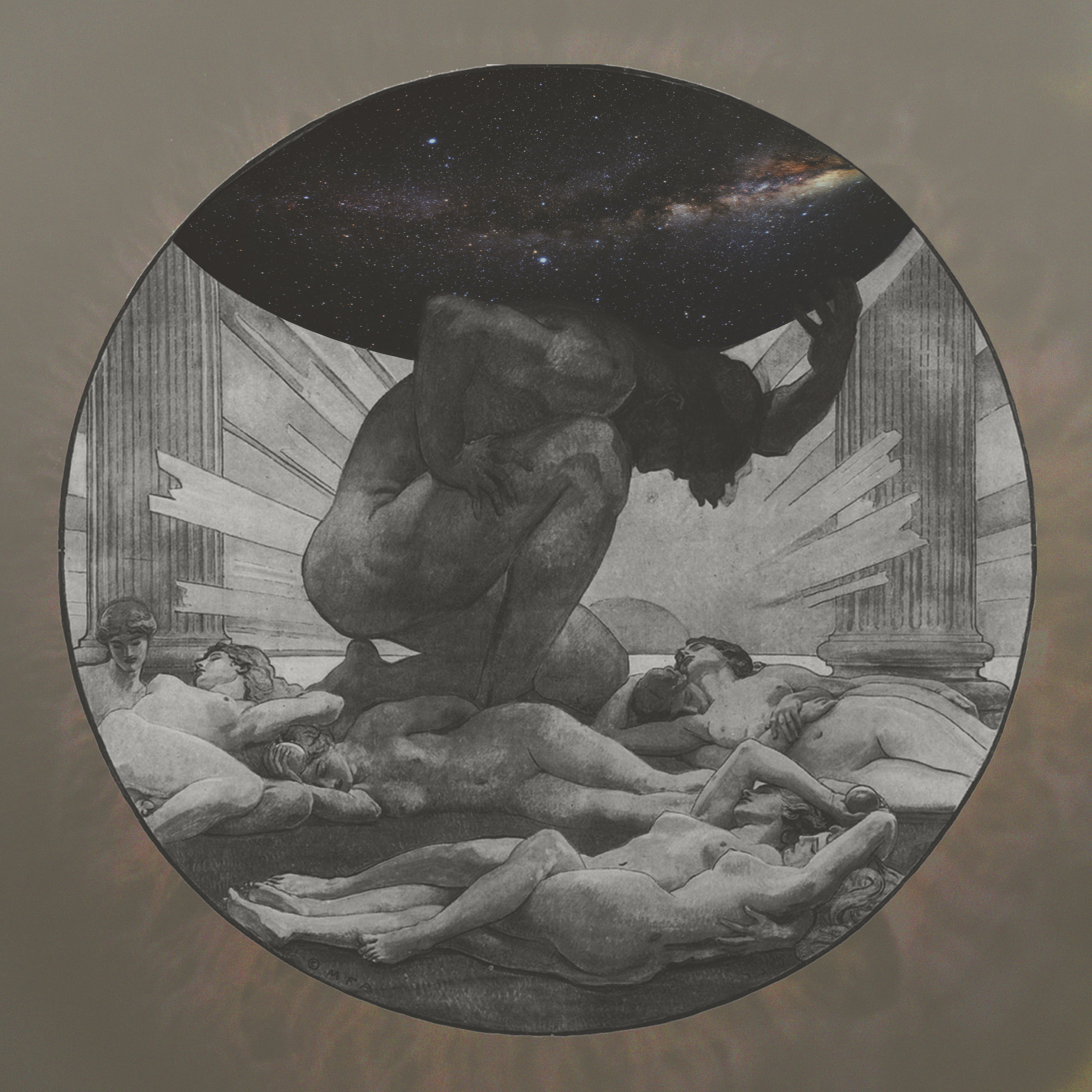
2. Hardwork
In this composition, i used a symbolic figure, which is the titan Atlas from the Greek mythology because according to the myth he was the one to hold up the sky. Atlas being me and the sky being my workload. The colour brown is generally associated with support, responsibility and hence hardwork, that is why i implemented it into my artwork. The sky (milkyway) which is mostly seen to have a purple tint balances the Russet Brown to give this harmonised composition.
Colour: Russet Brown
Scheme: Diad
3. ME
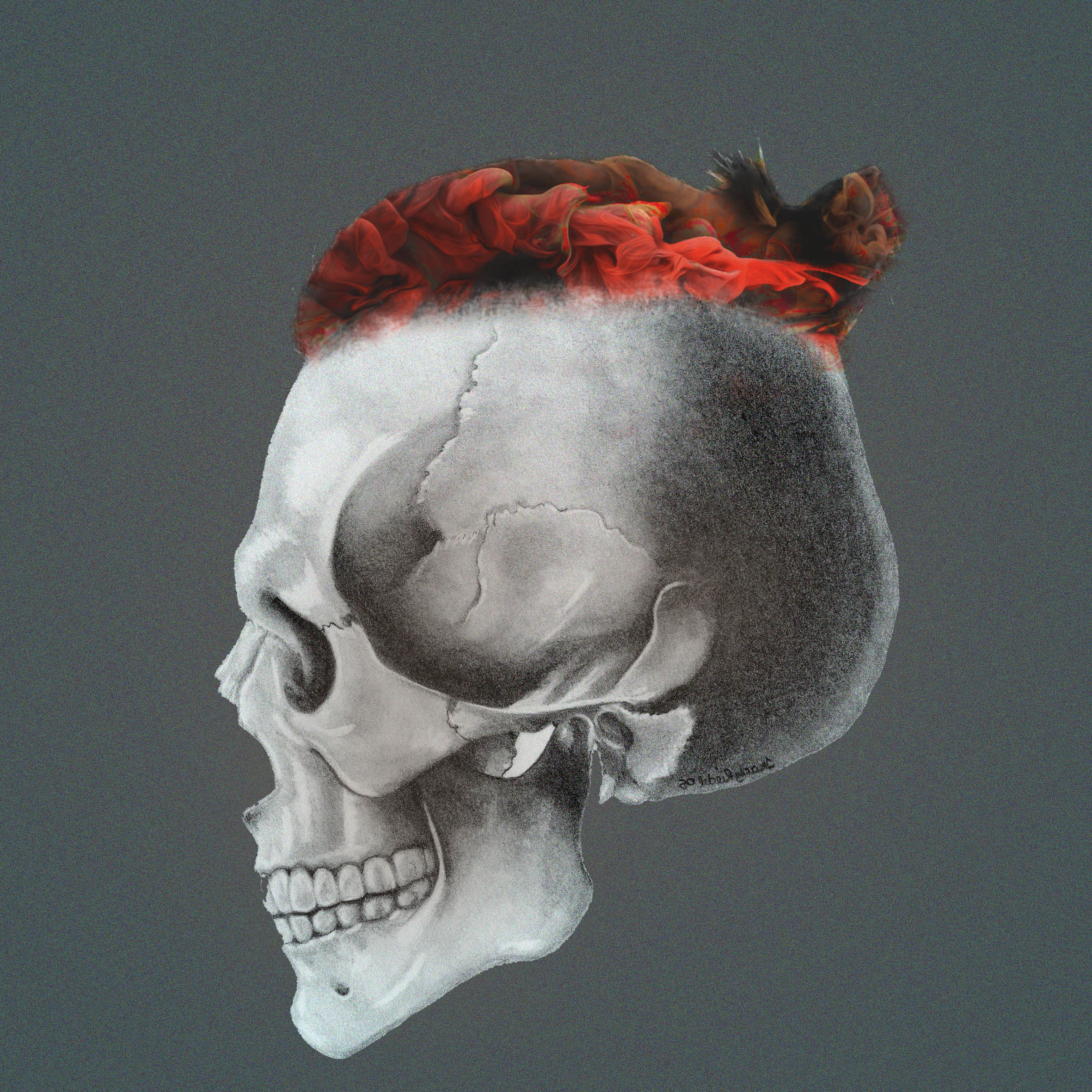
One definitive feature about me is my hairstyle. I portrayed a skull with a man bun on which i applied a reddish brown texture to show the mixture between the 2 colours used in the previous compositions
Scheme: Analogous
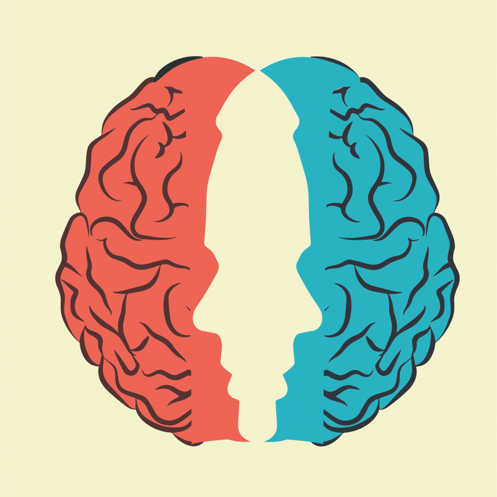
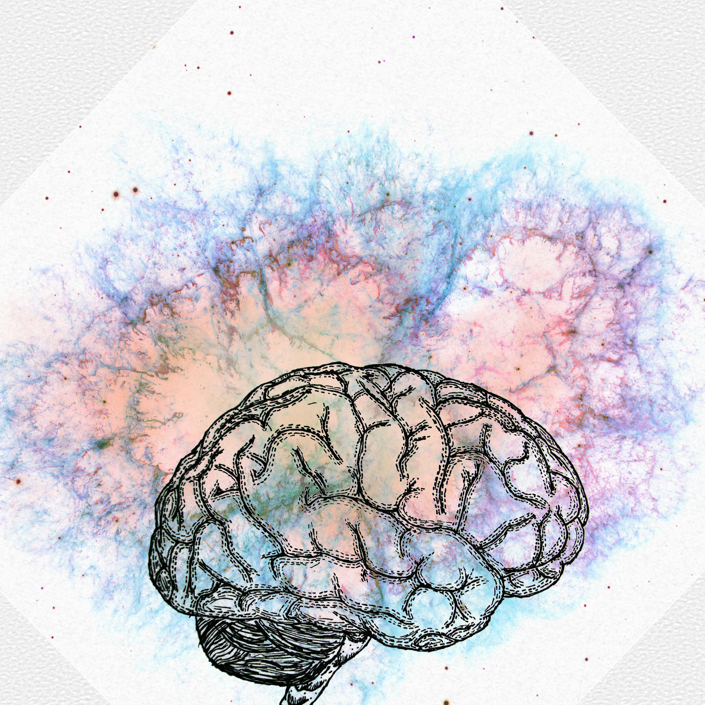
For me, creativity is the explosion of ideas and there is no boundary to limit that. This is why the explosion is going out of the brain showing that you cannot stop this energetic flow/explosion of ideas. Creativity for me can be related to any colours because of its infiniteness, that is why i used different colours.
Colour: Electric Blue, Coral Orange and Purple (+different hues)
Scheme: Analogous
5. Overthinking
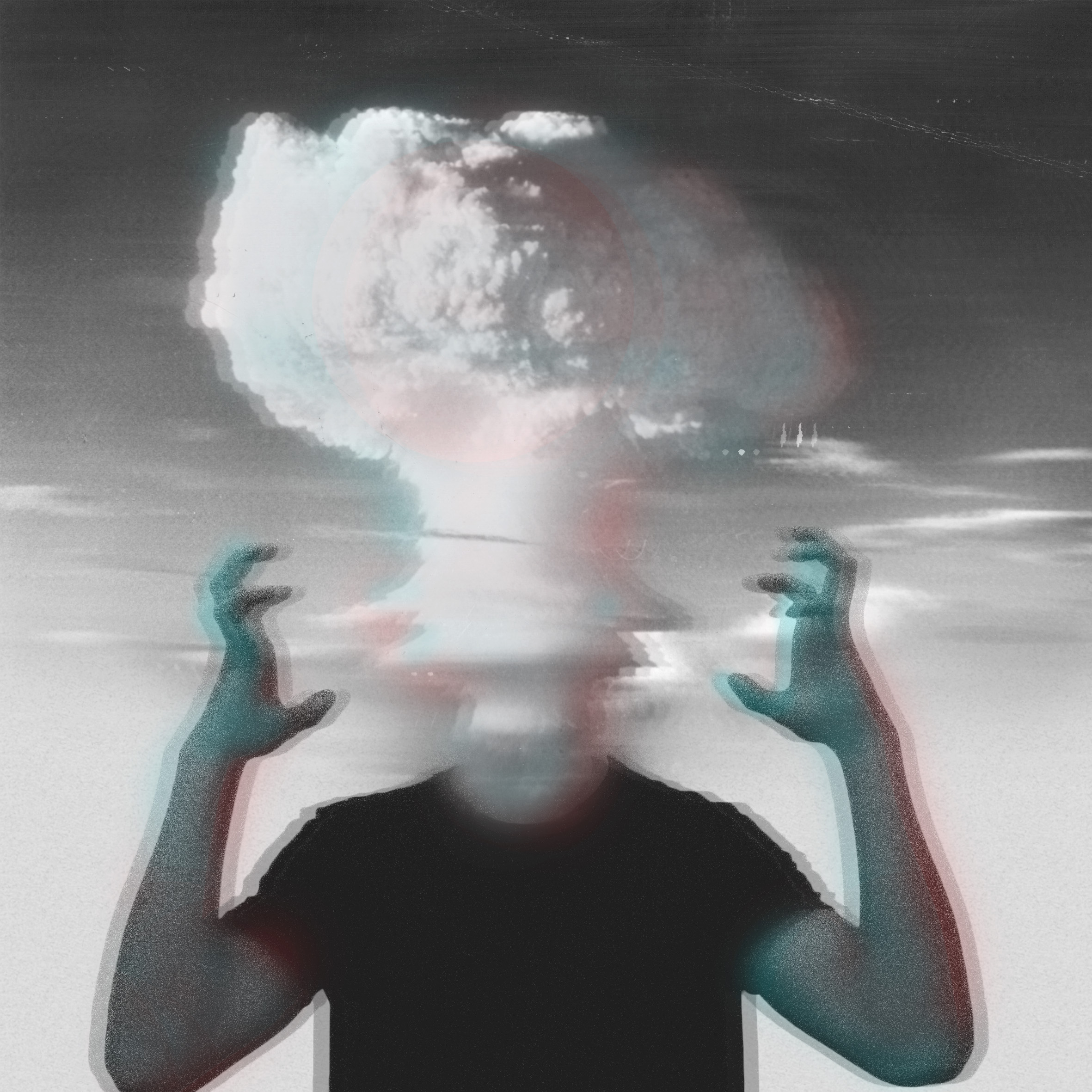
This composition is rather straight forward because people who tend to overthink, feel that their head is exploding. The use of colours here is mainly to show unstability, disoriented and this flickering effect. The meaning behind the 2 colours are very contrasting because red which symbolizes passion, energy and even aggressivity and blue indicate calm, serenity and seriousness. This clash between colours really creates this blurry, unbalanced feeling to the composition.
Colour: Turquoise Blue, Red
Scheme: Compound
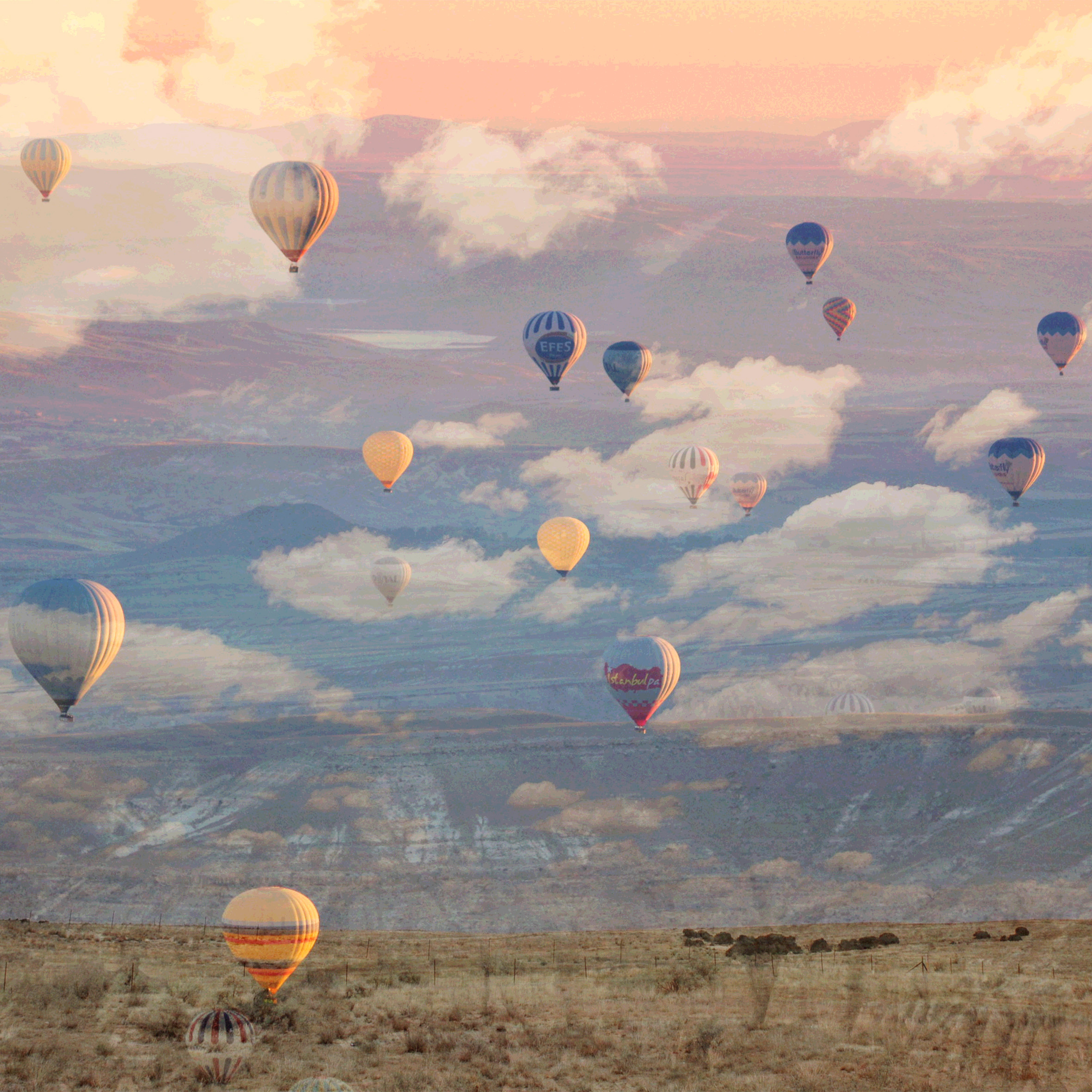
A better me is whereby my mind is at peace and when your mind is at peace you feel like floating which is why the use of hot air balloon. This composition was achieved by adjusting the blending mode between the layers and the colours naturally blended to give this subtle harmonious transition of colour. The pastel effect smoothes out the composition and soothes the one viewing it.
Colour: Coral Orange transit to Blue then to yellow
Scheme: Analogous
7. Think Different
The technique used behind this composition is known as colour splash whereby your subject is separated by a colour, especially red, whilst everything else is black and white (monochromatic). I applied this technique to demarcate the focus subject from the background and to define the latter. Physical appearance does not show your way of thinking, it’s only by discovering the person you can have an idea about his thoughts and this is what i wanted to demonstrate here.
Colour: Red, Black and White
Scheme:
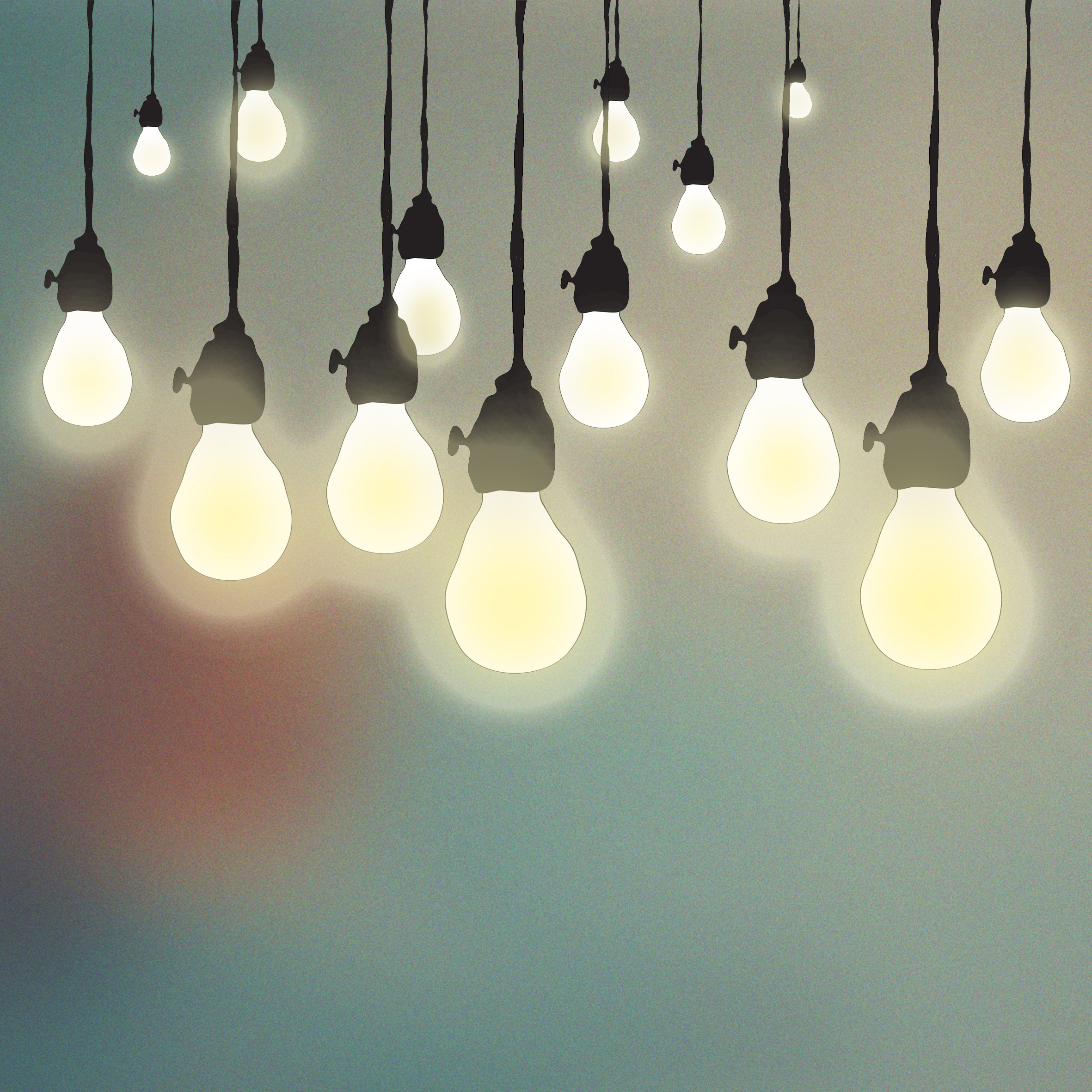
The portrayal of ‘ideas’ is always communicated by the illustrations of light bulbs. (Often used in cartoons). The colour used is yellow because it signifies clarity, intellect, optimism and enlightenment. The combination of colour and bulb illustration are very self-complimentary and in addition to this, the harmony of the creamy yellow is nicely balanced by the bluish background which also contains tints of orange and indigo.
Colour: Creamy yellow, Orange red, Teal-Steel blue
Scheme: Tetrad
9. Ideal ME
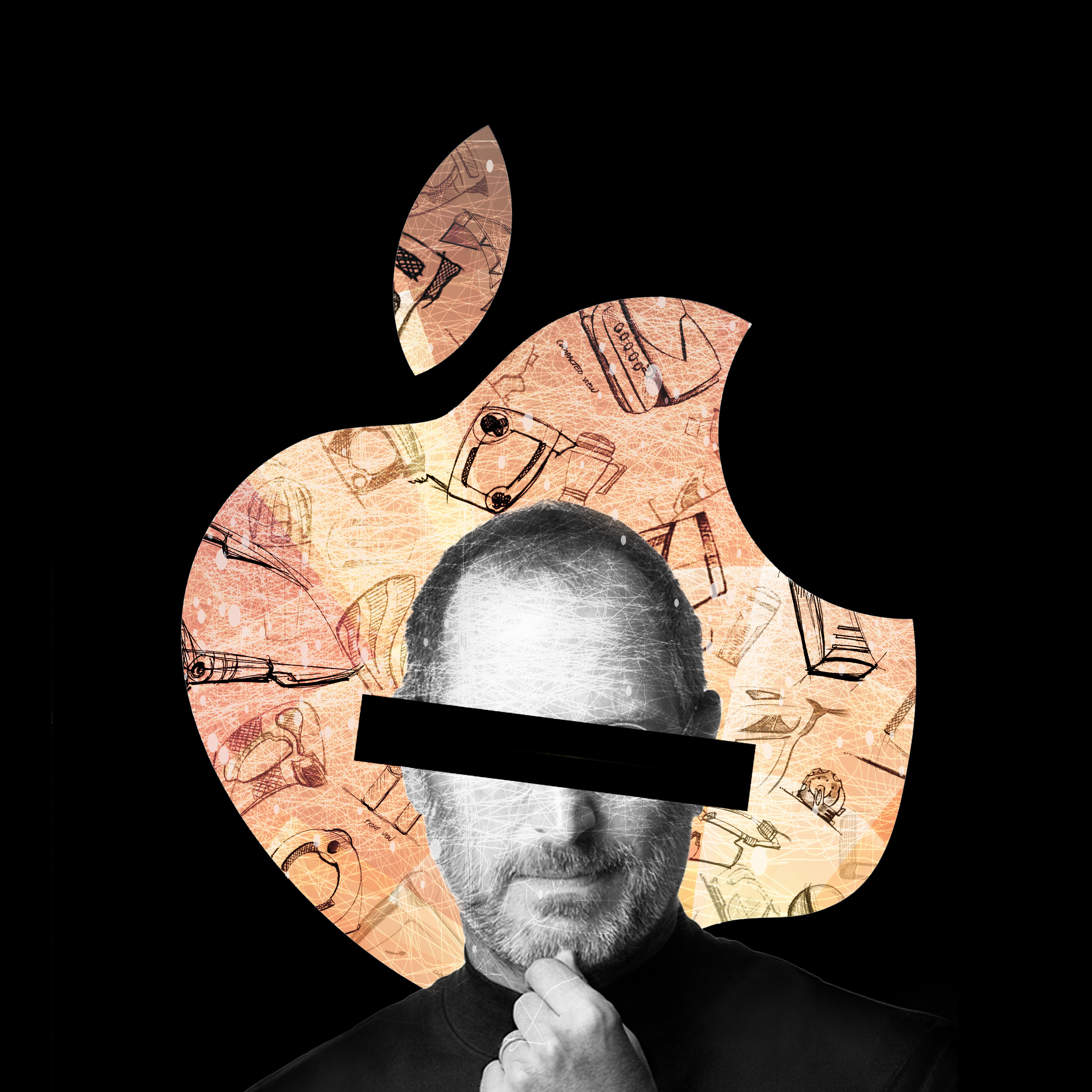
My aspiration is to become someone like Steve Jobs who was a visionary. The reason why i censored the eyes is because the eyes is the most definitive characteristic of an individual’s face and ideal me does not what to be exactly the same as Steve Jobs but someone similar and even better in the field of design (backed by the sketches in the background). Yellow (optimism)+ Red(passion)= Orange which signifies success.
Colour: Shades of Orange
Scheme: Analogous
10. Knowledge
The following montage adds the elements learnt from assignment 1 (lines) to the current one. Knowledge is represented by dark blue of different shades. Another good allegorical depiction of knowledge is a tree whereby when you grow up you acquire more knowledge and more wisdom. This concept of growth is also backed by the use of a harlequin green on the tree. Nonetheless wavy lines in the background can be interpreted as radiating from the brain but can also be interpreted as lines directed towards the brain which means that knowledge is a 2 way process.
Colour: Shades of Blues, Green
Scheme: Analogous
11. Experience
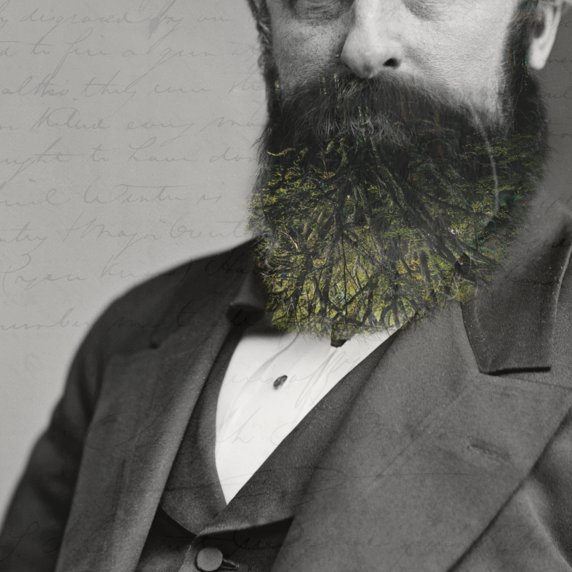
When we all grow older, we physically and mentally mature and that’s what experience is about. The main elements that conveys this ideology in the composition is the double exposed tree and beard. Similarly to above, trees are significance of growth but also of maturity whereby the trees’ leaves turn yellow. (ripening)
Colour: Yellowish green
Scheme: Analogous
12. ME in 5 years
Me in 5 years. It’s hard to tell what you are going to be in 5 years, but i envision myself working full-time as a product designer whereby my skills matches my desire to excel in this domain. Last but not least, in the composition i used a blue filter to show the seriouness but also the serenity,stability to do the things i like to and also the use of a light orange circular gradient (on the hands) to show that in some way i succeeded to become who i want to be. (orange-success)
Colour: Indigo-Blue, Orange
Scheme: Complementary
Through out this semester i have learnt many ways to express oneself visually and project 3 was the epitome among the 3 projects because it made me discover more about myself and at the same time depict the invisible onto the visible using different medium.
