Diary of Behaviour

DAY 1

I woke up to the sound of my phone alarm. Immediately after, I went through all my notifications: emails, social media. Any important or urgent messages, I responded immediately, if not I waited until I have some free time.

Waiting at the bus stops affords, reading the news, going through different social media, checking the bus timing, reading unread messages, and answering them. At the bus stop, I could observe other people doing the same thing or playing games on their phone. I also listened to music whilst on the go.

I usually go to the library because it feels more conducive to work there. I worked on files which are synchronized to my cloud account (Google Drive…) and listen to music. Working on a cloud account allows me to access my files at any time and any place, on any devices. Hence, I can be productive anytime. Every now and then, I would sidetrack from my work and scroll through my Facebook feed: Watch some videos…

Throughout the day, I randomly checked my phone for notifications, to see if I got any new notifications. My daily phone usage is mainly social media, messaging, web browsing/web search, calendar, reminder, file managers (Google Drive…). And if I go off campus, I always make sure that I have a full battery and my mobile data running in case I need to use the GPS to find my way. Of all the applications I have on my mobile phone I would say that I use 30% of them on a daily basis. The remaining apps are more situational: like UBER; GRAB, Photo editing application…

Generally during lunch/dinner, I would abstain or limit my phone usage if have company. But if I am by myself, I would use my phone to entertain myself.

Before going to sleep, I have this ritual whereby I go through all the different social media to make sure I am up to date and check if my alarm is properly set for the next day. Since I was not going to use my phone the following day: I turned off my alarm and opened my curtains so that the sunlight could shine in my room and prompt me to wake up. In addition to that I asked my roommate to wake me up in case it did not work.


DAY 2

The day before I looked up Google maps for the direction to NUS and roughly memorized the route. Given the new boundary conditions, I brought a book with me to keep myself entertained during commuting, but I ended up sleeping. Once I reached Kent Ridge, I did not know how to reach to my destination. I asked my way to the people waiting at the bus stop and double checked the routes on the bus guide panels. Fortunately, on the shuttle bus, there was a screen that indicated the bus stop and a voice over of the location. I was already familiar with the campus, so it was not hard for me to know where to alight and navigate.

Because I was busy with activities that did not require any phone, computer, or electronic device throughout the day, I was not bothered at all. At lunch time, I was a in a group of friends, I did not feel the need of using any devices. Even with my mobile phone, I would barely use it if I had company. I generally use my phone to make contactless payment but this time I made sure I had cash on me, retrieved at an ATM the old-fashioned way

At the end of the day, I was so tired that my only concern was to catch up on my sleep, on the public transport and back to my hall of residence. Back


I realized that without my mobile phone I was more aware of my environment: looking for clues to navigate; attentive to what was happening around me… I also felt relieved because sometime when people send me messages, I feel pressured to answer because there is an expectation from someone. It is a psychological burden off my mind and I can better focus on the tasks that I have to do. But i always have the lingering paranoia of ‘What if something happens?’.
Response to: Interactive Environments & Experience Design by Timothy Nohe

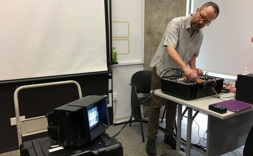
Timothy Nohe gave an insightful presentation on Interactive Environments and Experience Design and shared some of his personal experiences and processes he went through for creating his interactive installation.

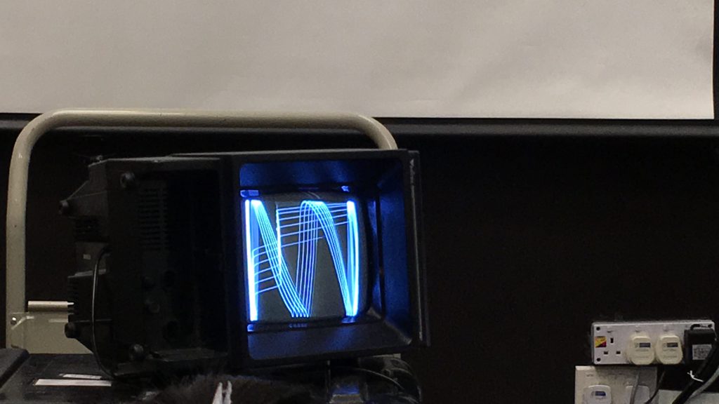
Timothy’ s interactive installation can be broken down into 3 steps: input, processing unit, output. The input is the users’ interaction with a touch sensitive box, which will then feed into the synthesizer which processes the data and outputs Visual Music (Electron Drawing), through speakers and a screen respectively. We were lucky to have an in-class demonstration. The 3 steps are condensed forms of a complex network of connections and wirings. I was confused when Timothy demonstrated how it ‘worked’. However, the actual installation is simplified in such a way that anyone can interact with it. This reminded me of the early computer system, which displayed only codes 0,1 or programming languages. But nowadays we have highly curated and crafted user interface that is understandable; comprehensible by everyone.

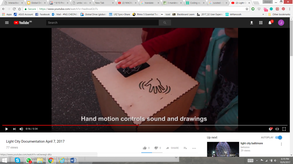
For his actual installation, Timothy made use of signifiers to indicate the affordances of the touch sensitive box. (Feedback: Visual Music- Electron drawing)

Timothy also highlighted the safety issues when operating those open-air installations and what are the important measures to be taken beforehand. Public liability, insurance should be established; equipment should be weather sealed so that it does not get damaged or poses any danger to the public; sound pollution to the surrounding should be assessed to see whether it is affecting the people or also the animals around.

Responding to Thoughtful Interaction Design: Examples of Product with Thoughtfully Designed User Experience

Responding to the reading, find 2 examples of a product/project that you think are good examples of thoughtfully designed user experience.

I think one of the most common user experience oriented product we use daily, is our phone. Let us take the iPhone for example, its operating system (iOS) and features. Pinch to zoom, swipe to unlock are classic examples of thoughtful designed user experience. The nature of the ‘pinch to zoom’ action is so obvious; effortless and understandable by everyone, it satisfies both the intention of the action and the expectation of the user. The ‘home button’, as the name suggests, is a self-explanatory feature that brings us to the main page of the iPhone, by a simple press. In the same line of thought, when the home button is pressed, the transition animation from an app to the home-screen, zooms out and vice versa. The transitions ease the user in and out an application and help to connect different nodes in the phone.

Even naming a feature in a product should be as intelligible as the feature so that the user can easily comprehend without going through a manual guide (tell-tale features). I think that Apple seamlessly bridges the iPhone’s digital interface with its physical features with design that is unobtrusive and human centered.

Image Source: http://www.idownloadblog.com/2013/11/12/how-steve-jobs-pushed-for-changes-in-android/


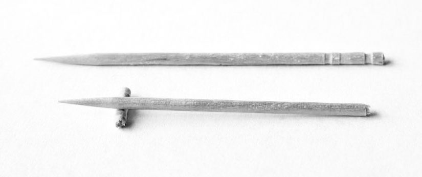
Another classic example of a good and thoughtfully designed user experience is the Japanese toothpick. As mundane as it can look, the function of a toothpick is very well thought. Serrated at one end, the toothpick can be broken at its tail. Doing so afford 2 additional purposes: the broken tail serves as a resting support for the used side of the toothpick (for hygienic purposes) and it can also signify that the it has been used. The experience extends beyond what the object can afford after a small alteration. Similarly, the user’s expectation about ‘what to do next’, after using the toothpick is justified by the intention of the serrated end. The design is simple yet thorough down to the details of the user’s experience.