Response to: Chapter 4 of Hidden in Plain Sight: “You Are What You Carry” by Jan Chipchase

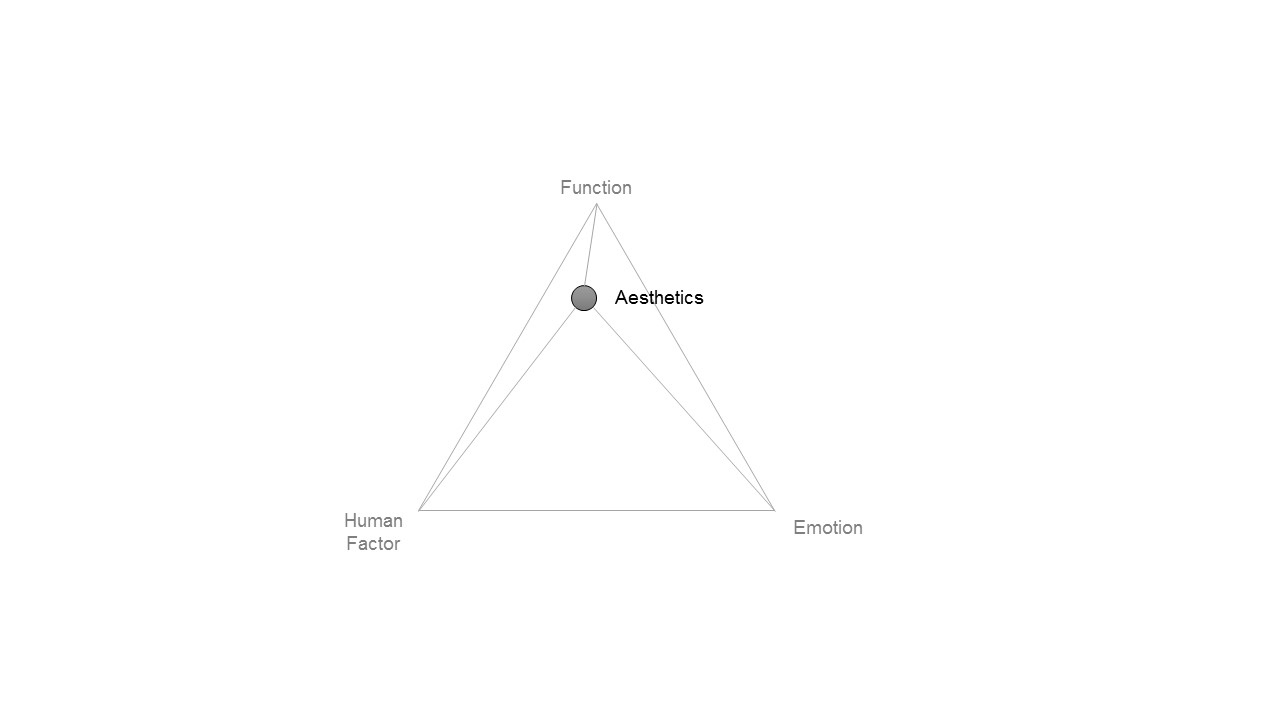
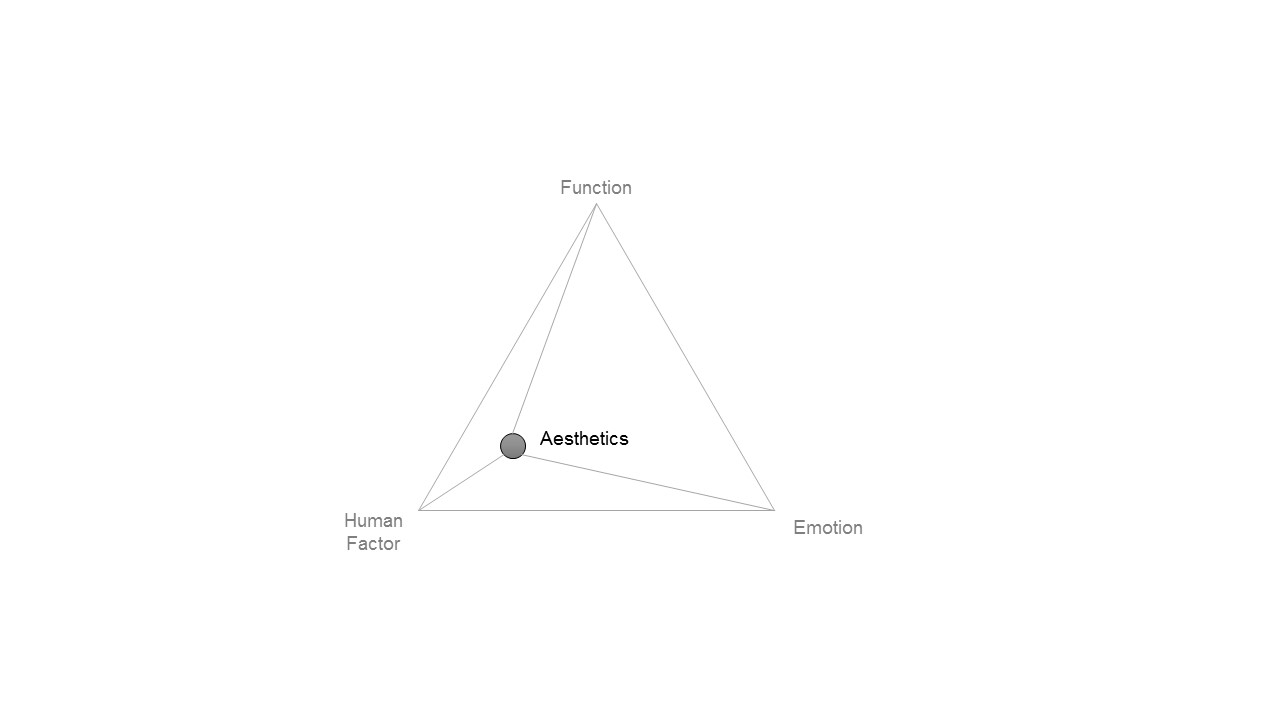
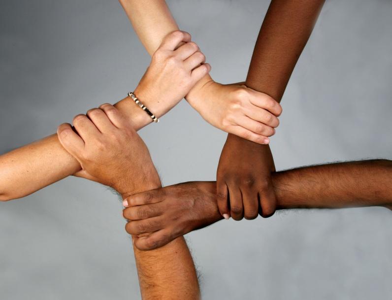
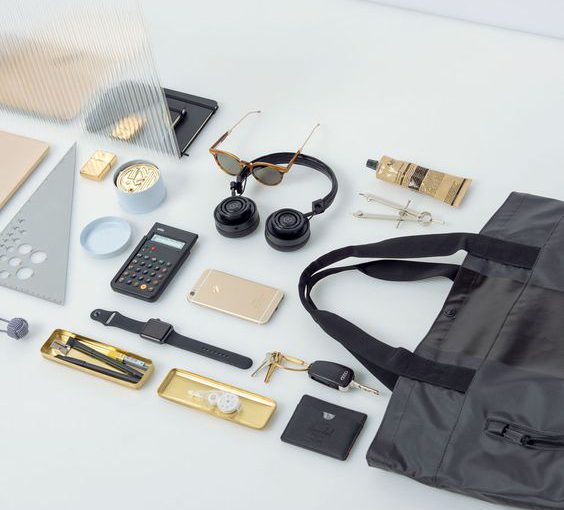
“You are what you carry”, was a comprehensive and thorough chapter, where we recall the idea of the phone, the key and the wallet as essentialities when venturing into the world. Strangely but interestingly, we tend to bring more things than the just essentials because of our providence nature for security, convenience, peace of mind… Especially when visiting a foreign country, I would make sure that I am ‘fully’ geared, in terms of technology and connectivity, so that I can be efficiently autonomous. Chipchase also brings up the concept of ‘range of distribution’ and how it differs between each country. I was shocked how Singaporeans comfortably leave their valuables unattended for prolong time period in public spaces, as a result of tough security measures of the country which gives a perception of low risk. Such things would not be happening in a different country. The good thing about low perception of risk is that it removes this subconscious paranoia of losing something, which can be liberating I must say. The Great Unburdening of digitization and cloud storage definitely reaffirms the ‘range of distribution’ by the omnipresence of facilities that shatters space time continuum or ‘yo-yo string’. With Amazon recently acquiring Whole foods, the prediction of Chipchase is becoming a reality: Supplies of groceries would be shipped to us by Amazon directly.

I believe that it is only a matter of time before everything gets connected and unified, especially with the growing trend of the Internet of Things. Space time continuum will change and things we carry and interact with, will constantly adapt to it.


Featured Image Source: https://herschel.com/

Response to: Anthropology of Mobile Phones by Jan Chipchase.

There was an immense leap in technology from back then and now, in terms of connectivity, services, and products but it always summed up to what Jan Chipchase said in his Ted talk. People still carry with them their phone, wallet and key. However, those 3 items are slowly converging into one form, which is the phone. E-banking, apple pay and other services are redefining the way we pay for stuff. We can see this combination too happening between the mobile phone and the ‘keys’. Smart lock that only requires your mobile phone ID to unlock, is gradually making its way into the market. The dynamics are changing with the advance of technology and like Chipchase said, we adapt, delegate to it. Likewise, our centre of gravity is ultimately shifting towards the mobile phone which is increasingly versatile nowadays. With everything becoming digitalized and mobile, we expose ourselves to new threats like cybercrimes. I believe that street will always innovate in a way we cannot expect. Such things can be seen with the mobile phone itself, even though companies are trying hard to make the latter beyond repair, people still find ways to tear it down and correct this. I once bought a repair kit for my own phone and repaired it myself.

Response on ‘The Psychopathology of Everyday Things’ from The Design of Everyday Things

Three teapots: as works of art in the window above the kitchen sink. (Author’s collection. Photo by Ayman Shamma.) Source: http://www.jnd.org/dn.mss/emotion_design_at.html


‘The Psychopathology of Everyday things’ gave a more profound approach to design considerations which I usually abide to. As a design student, discoverability and understanding, unconsciously form part of the design thinking and process that I follow to conceptualize and design. Those terms were not properly defined prior to the reading but were internalized and naturally occurring. I had this misconception that ‘good design’ only applied to tangible objects that were intelligible and intelligent in form and function. But I came to realize that design itself extends far more than just the physicality of an objects, like the book indicates. And as I go further into the reading, I can see how human centered design plays a bigger role in ‘good design’.

One cannot deny the fact that human-centered design or user experience design has drastically grown in demand, because it has become a norm, people nowadays expect things to be well designed. “People are frustrated with everyday things. From the ever-increasing complexity of the automobile dashboard…”, this statement is now fairly obsolete as per the new standards. For instance, the brand-new Tesla model 3 car offers no instrument cluster, a clean dashboard, a refined digital interface to control the car and maximized space efficiency, everything to cater for the needs of the user. But then again, as human beings, we are never satisfied fully.

The affirmation of products having too many functions and controls is/was a reality, one example I can remember was the TV remote control. Many buttons and many functions but nobody ever understood how it all worked. However, this was the past, nowadays we see remote controls, clean as a pebble, sleek, sophisticated, and minimal. Like Dieter Rams would say, good design is, as little design as possible. Digitization made analogous product more user-friendly and more functional at the same time. Ultimately, an increase in functionality will also increase the design challenges which are now in a digital form.

We shall not wait long before Artificial Intelligence gets implemented into machines and takes over the digital platform. Even the complexity of human nature could somewhat be paralleled by this new technology. Human-machine interaction would be more seamless and designs more efficient and effective. I believe that AI may replace us designers one day.

Finally, I can say that, given the complexity of human nature and how we keep on evolving, human-centered design is ever-changing too and so will the benchmark of what defines ‘good design’.

Field Trip: Harvey Norman

Objective of the field trip: To gain an insight on existing products; identify trends and products of interest

  1. Down memory lane

The products lining up the front space of the store were retro inspired. Pastel coloured and boxy forms, we were down memory lane. Those products are emotion biased because they instill in people a feeling of nostalgia.

2. Organic forms

In contrast to the retro inspired product, what can also be seen as trendy are organic/ smooth forms.

3. Products of interest

A range of products that caught my attention are the shavers from Braun. What i like particularly about Braun is their consistency in design. They improve their design but keep the same language. By doing so, they build on they brand identity. Braun products are generally function dominant.


Marshall speakers are often identified because they look like traditional vintage speakers made out of wood and brass analog buttons.

The new speakers are more organic in form and generally vibrant in colour.

Contemporary reinterpretation of the classics. Form reminds us of vintage speakers which looks boxy but the colour screams modernity.


Aesthetics in Form- Function Human Emotion

In the last lecture, we were introduced to the 3 nodes of aesthetics, namely Function; Human factor; Emotion dominant. It is often quoted that the form of a product describe its aesthetic, which is generally biased towards one of the 3 nodes.


FUNCTION DOMINANT

Designed by Dieter Rams and made by Vitsoe, the 606 Universal Shelving offers a modular and functional shelving system, that can be adapted to any environment. Unobtrusive in design, the product main focus is its functionality.

606 Universal Shelving


HUMAN DOMINANT

Nike or any other sports brands deal mostly with human centered products to deliver performance and comfort to the user. There is a constant need to analyse the different physical attributes of the human body (how it reacts to the environment) and develop new technology that would boost the human capabilities while offering good ergonomics.

For decades Nike has been working on how to create a footwear that would act as ‘a second skin for the foot’ and with their latest Nike Free; Nike Hyper Adapt, their goals just seem to be within reach.

Morphing Sole Nike Free RN
Self Lacing shoes Nike HyperAdapt


EMOTION DOMINANT

“A tool for the heart”  Quoted from Jobs (2013)

When Steve Jobs first introduced the Ipod(2001), it moved millions. A revolutionary product that packed ‘1000’ songs in one tiny device. The ability to access an entire music library at your finger tip was groundbreaking at that time. Music is often cited as being food the soul, and the ability to scroll through an encyclopedia of songs, select and play any of them, made the Ipod(2001) an emotion biased product but at the same time well balanced.

Ipod (2001)

FINAL THOUGHTS

The 3 nodes of aesthetics are very important factors to consider and as a designer, we should know how to identify those various products more clearly. I  believe striking the right balanced  is the most rational approach but i shall not let that be the determining factor of my designs.

Design Philosophy of Simplicity

The purified designs of Naoto Fukasawa, invite the user to be more attentive to the details and more intimate in interaction with the product.

“GOD IS IN THE DETAILS”

Hiroshima Chair by Naoto Fukasawa for Maruni, for Interiors and Charmaine Chan


“As little design as possible”

Dieter Ram

The Principles of D E S I G N

DSC_8396

What is ‘principles of design’?

From my point of view, the principles of design is the use of the elements of design in such a way that an artwork feels coherent and convey the information its supposed to give.  I believe that the proper application of the principles of design  determines how successful we are at creating a work of art and how good or bad it is.

What are the principles of design?

Through out my research i came across these:

  1. BALANCE
  2. DOMINANCE/EMPHASIS/CONTRAST
  3. UNITY
  4. SCALE/PROPORTION

1. BALANCE

rocks_on_balance_0

It is the distribution of the visual weight of objects, colors, texture, and space. If the design was a scale, these elements should be balanced to make a design feel stable. In symmetrical balance, the elements used on one side of the design are similar to those on the other side; in asymmetrical balance, the sides are different but still look balanced. In radial balance, the elements are arranged around a central point and may be similar.

2. DOMINANCE/EMPHASIS/CONTRAST

dominance-size

It is the part of the design that catches the viewer’s attention. Usually the artist will make one area stand out by contrasting it with other areas. The area could be different in size, color, texture, shape, etc.

3. UNITY

unity-hands

It is the feeling of harmony between all parts of the work of art, which creates a sense of completeness.

4. SCALE/PROPORTION

x-ray-shell

Using the relative size of elements against each other can attract attention to a focal point. When elements are designed larger than life, scale is being used to show drama.

Sources:

https://www.getty.edu/education/teachers/building_lessons/principles_design.pdf

https://en.wikipedia.org/wiki/Design_elements_and_principles