

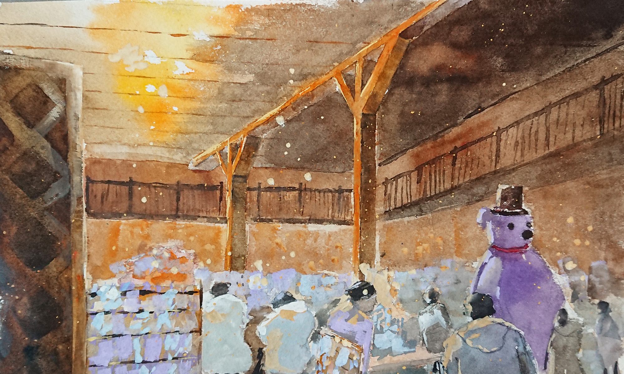
@shiqianx3


I wanted to portray myself as a potato because I am a short and stubby person who has a round face. I just sat down in class to think about 2 settings/ scenarios that I like and dislike.


Buffets are the best creation in the world, and I get really excited especially while eating food. I tend to take an overflowing amount of food such that I end up becoming fat which is a really awful habit. The background colours chosen were mainly to represent my feelings. Thus for the first box, I wanted to express a calm me, where as in the 2nd box the yellow shows my excitement when I see a feast in front of my eyes. For the 3rd box, the pinkish colour scheme shows a sweet, yet energetic kind of happiness as I gobble up all of the food.


The layout starts off with a resting potato as I tend laze around and sleep. I used green as the background as it shows serenity and growth as the days in life pass by. As the deadline approaches, I tend to do my homework last minute such that it adds on to the unnecessary stress and gloominess that I already have which explains the usage of blues. As the stress keeps adding on, I would start to fall sick and feel frustrated with myself for not starting on my work earlier, hence I used red to express my anger.


The reason for using a green box is the same as the one I used above where it gives a more serene feeling. As for the next box, I used purple as it has a luxurious connotation to it which suits my wealthy and well-groomed relatives and then there is me, at the other corner, being an anti-social and country plain potato, being overshadowed by my relatives. Thus, I used the purple from the other box to loom over the calming blue.


Another hobby that I like is playing video games, and I used to like to go to arcades to play games. At arcades they have zombie shooting and rhythmic games which was why the potato is wearing a headset and carrying a gun. In addition, that gun, the AK47, is my favourite weapon in a first-person shooting game called Left 4 Dead 2.
The light blue background for the first box evokes a calm and peaceful feeling with the playful upside down potato. Bright, saturated colours were used for the arcade machines like in actual arcade because of its extremely dark setting. Lastly, a pinkish-purple background is used for the last box because it gives a sci-fi mood, which matches the arcade and gaming mood.
This project was very enjoyable to it allowed me to explore digital painting and this is one of my first few attempts to so which I am very interested in, since I am aiming to go into animation. However, I faced difficulties in trying to pick the right colour combination and trying to apply the colour theory.
Dishonour on you! Dishonour on your cow! – Mulan 1998
The small thumbnails are older versions of the composition before developing to the final one.


These are the compositions that are not good. The first few compositions were too static and I did not work with just the sentence alone. The dragon was actually a character from the movie but I’m not supposed to think of a composition with visuals based on the movie but plainly from the sentence instead. There was also too many subjects which makes the whole composition messy, thus I tried to reduce the number of images and texture as well as vary the sizes.
After looking through other references, design principles and choosing the appropriate found images, I’ve finally done a design that I was satisfied with.
Symbols
Cow – From the “cow” in quote.
Dishonour – Sword because during the ancient times when someone does something dishonourable, they would be executed.
– Cone of shame.
Human – From “you” in quote. She’s in a squatting position to show vulnerability.
I used a white background so that the mood is lighter and not so serious. The cow is placed at the 1/3 position and off-center of the composition and I made it the biggest to show emphasis on the cow as it is the main subject. Repetition and movement was used for the human and swords and they are moving in the opposite direction of each other. This movement also causes the eyes to shift and lead them to the cow, bringing in more emphasis to the cow.
Here’s another curse, may all your bacon burn! – Howls’ Moving Castle 2005


The first few compositions were very messy and were filled up with too many images, hence I thought of using more depth and removed the unnecessary images such as the castle.
Symbols
Magic circle – Curse
Bacon – From quote “bacon”
Fire – From quote “Burn”
I placed the magic circle at the corner so that the edges ends at 1/3 of the layout while placing the bacon and used repetition and movement to show that the bacon is going in the direction of where the circle is. The white flame draws the eye’s attention to itself instead of the bacon to emphasis more on the burning of the bacon, which was the main focus.
They say that the best blaze burns brightest when circumstances are at their worst – Howls’ Moving Castle 2005


I was playing around with the position of the skulls but felt that the layout below was more interesting because it had more depth.
Symbols
Skulls – To describe/ show “circumstances are at their worst”
Fire – Blaze
Radiating light background – To show “burns brightest”
The flame was placed at the top 1/3 position while the skulls occupy 2/3 of the layout. I lowered the opacity of the skulls to bring in more attention to the flame which is the main subject. The background and the skulls converges towards the flame and enhances the effect as to where the eyes look at first.
Thanks for the adventure. Now go have a new one. – Up 2009


Experimenting with different found bird pictures but felt that the one below was the most effective to show what I wanted to express from my quote.
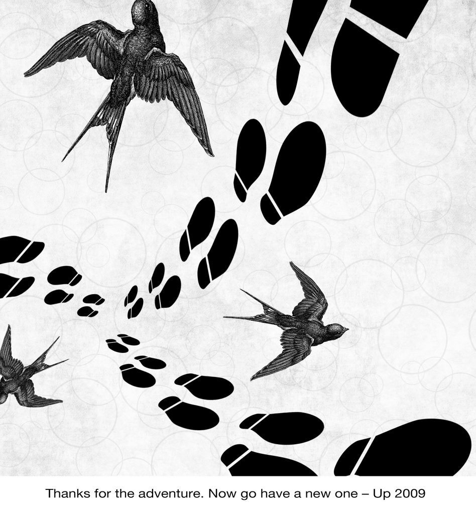
Symbols
Birds – New adventure and freedom
Footsteps – Adventure
Bubble background – To show thanks and happiness as bubbles brings joy to people. (or at least to me)
Textured background – To give a nostalgic/ memory/ book feeling.
The footsteps starts off at 1/3 of the layout and together with the birds, they are all going outwards. The repetition and variation of size of the footsteps going from small to big shows movement. Wanting to add in even more depth,
Initially, it was difficult for me to use symbols from just the quote itself and I kept on thinking of visuals from the actual movie itself. Another problem I faced was trying the usage of halftones. It was also hard for me to use halftones to match with the composition. As for the production of the tote bags, I had difficulties printing on the actual tote bag even though I had already test printed on newsprint paper many times. I needed to use more pressure in order for the ink to get transferred over to the canvas.
From project 2, I learnt the usefulness of the layer mask as well as about experimenting with a variety of compositions and layout until you’ve found the most satisfied piece. It takes patience to come up with one as well. Another additional factor was learning how to use a silk screen and coming up with your own design. Although it was quite tedious, the process was really fun with and an extremely enjoyable rare experience. I hope that we will be able to have more hands on workshops like this too 😀


I chose this quote as it was the most memorable and funny one that I remembered from Mulan.

I love Hayao Miyazaki’s films and Howl’s Moving Castle was one of my favourite movies from him. This was another funny moment from the movie when Calcifer (the fire) was angry and stubborn to let Sophie cook.

Another quote from Howl’s Moving Castle, which I found very inspiring.
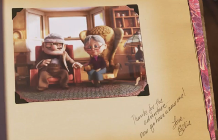
This scene was extremely touching to me, especially since it lightens up Carl’s sadness over Ellie’s death.


Definition: feeling of worry, nervousness, or unease about something with an uncertain outcome.
Thin criss cross lines with rough edges, the paint starts light, becomes heavier towards the center and become lighter again. This tells the feelings of being hesitant to do something because of the uneasiness present in the individual.
I used a fake pine tree leaf loaded with lots of thick pain and varied the pressure used to create these marks.

Definition: the feeling of being upset or annoyed as a result of being unable to change or achieve something
Vertical, horizontal and diagonal strokes with varied thick and thin lines shows the energy released from the individual especially when he/she lashes out on something.

I tried this method a few times to see which one will turn out better.

Definition: thoughts and feelings of insecurity, fear, concern, and anxiety over an anticipated loss of status or something of great personal value
I had an imagery in my mind from cliche dramas/ anime where the 3rd party will want to kill the other women out of jealousy, over a man. Hence, I use the sharp edges of a palette knife to create sharp and intense criss cross lines, which mimics someone slashing a knife around.

I tried with a roller as well, but the effect was not as intense as what I had imagined because of the blurry edges.

Definition: The process of someone remaining alone or being left out from others.
I took a piece of paper and tried to arrange it in a circle and placed it on a rubber mat for mono printing. For the right side, I used the fake pine tree leaf to make markings to suggest the “others” that the ball is being left out from.


These are other attempts that I tried out.

Definition: a feeling of deep distress caused by loss, disappointment, or other misfortune suffered by oneself or others
I had an imagery of people crying, hence the did vertical strokes downwards on a rubber mat with a palette knife. This caused a wiping effect which suggests wiping of tears, and the outcome of the print looks like it is sinking, as it being pulled down by gravity.

Definition: a feeling of deep satisfaction derived from one’s own achievements, and being proud.
Using a roller dabbed with paint, I created a variation of thick black squares. This was to represent a firm, confident, and bold individual. The shape also suggests a form of protection over something important that someone takes pride in.

Definition: extreme physical or mental suffering.
Using a roller again, a created a extremely thick line. The texture created looks very fuzzy and there is a gradual change to the right. The change from light to dark shows unity and contrast, which suggest what happens when a person dwells too much on something sad.

Definition: no friends or company
When people have no friends, they travel to places alone, hence I used footsteps to represent that using pen. The jagged lines for each foot step suggests the disturbed mental emotion in the person’s mind of not having any company. Towards the end, the foot steps start to deviate away from a straight line. This is because sometimes when an individual started to think too much they start to sway to the side a little.

Originally I wanted to use a ratan ball and roll the paint in a straight line, but it didn’t work out and Ms Shirley said that it does not show loneliness.

Definition: Lacking a sense of security; anxious or apprehensive.
The imagery in my mind were strong vicious waves in a stormy sea. People will feel tensed and insecure about their safety during a storm especially out in the sea. Using the rough side of a sponge I borrowed from my classmate, I twisted and turned the sponge without letting it go from the paper. The dark black parts gives the eyes a main subject line to follow.

I also tried with both the soft and hard edges but it did not work out as well as the one above.

Definition: the state of undergoing pain, distress, or hardship.
When someone is suffering it is as if the person is dying slowly hence I suggest that with a fading white subject.

I tried it 2 times but I prefer the one above.

Definition: a feeling of great enthusiasm and eagerness
When I think about happiness, I think about fireworks, because watching them explode in the sky beautifully make me excited.

Definition: the quality or state of being nervous.

Using ink for calligraphy, I used a crumpled paper to dab on the surface. I was thinking that when a person is nervous, the individual will start to shake, and this effect suggests some sort of shivering. The blacker parts suggests that the person is shivery more vigorously.


Originally I tried with the ones above but Ms Shirley said that these show uneasiness instead because of the thin wavy broken lines.

Definition: feeling, expressing, or causing great pleasure and happiness.

Using ink again, I painted the cap of the ink bottle, such that I can stamp it as circles which imitates the visuals of bubbles. Looking at bubbles makes me satisfied and happy as well but in a more calm manner. There is a constant shape and size, and the spacing gives harmony.


Other stamping that I tried out.

Definition: free from disturbance; tranquil.
I was thinking about ripples in puddles/ ponds which gives a peaceful feeling. The blacks suggests chaos but because it’s in a circle, it shows controlled madness. It can also suggest the calm after a storm.

Define: performed or occurring as a result of a sudden impulse or inclination and without premeditation or external stimulus.
Inspired by Jackson Pollock, I used this to suggest spontaneous. When I was a child, I loved to splash paint this way as well, but of course it was way messier.

Before the final effect, Ms Shirley suggested to add more bigger splashes to the center

Definition: a strong feeling of affection.
Using a brush with poster colours, I applied it without leaving the paper in a manner that represent the heart beat. When people are in love, their heartbeat will increase intensely. The curves suggests a more positive feeling.

This was experimented using mono print, but I wanted to try using other mediums hence, I did not use it.

Definition: of or prompted by feelings of tenderness, sadness, or nostalgia
When people think about their past and memories, it is all faded and vivid.However it comes back to you the more you think about it, which explains why the grids are more firm with sharp edges at the right side. I used scrap paper that was cut out while trimming and arranged it neatly on the rubber mat. After which, I sent it for printing.

Definition: a feeling of reassurance and relaxation following release from anxiety or distress
The soft blurry edges of the curves suggests a sense of calmness. The lines are very “flowy” which enhances the feeling further. I used dark and thick charcoal pencil to create this effect.

Aluminium foil

Toothbrush


