PDF Link : DA9013_Ng Shi Qian
Final Pieces:
For theme 3: Landscape Format, Atmospheric Mood

For theme 4: Portrait format, Effect of light and shadows of a sunshine day

Theme 2: Space Design with Overlapping Patterns / Portrait or Landscape format

@shiqianx3
PDF Link : DA9013_Ng Shi Qian
For theme 3: Landscape Format, Atmospheric Mood
For theme 4: Portrait format, Effect of light and shadows of a sunshine day
Theme 2: Space Design with Overlapping Patterns / Portrait or Landscape format

Sorry Professor, I only have sketches for 2 themes
For theme 3: Landscape Format, Atmospheric Mood


Here is my artist reference, and a sketch of it for the first theme, Arthur Melville’s Baghdad, 1883. The sketch is for me to study the tonal values of Melville’s artwork.
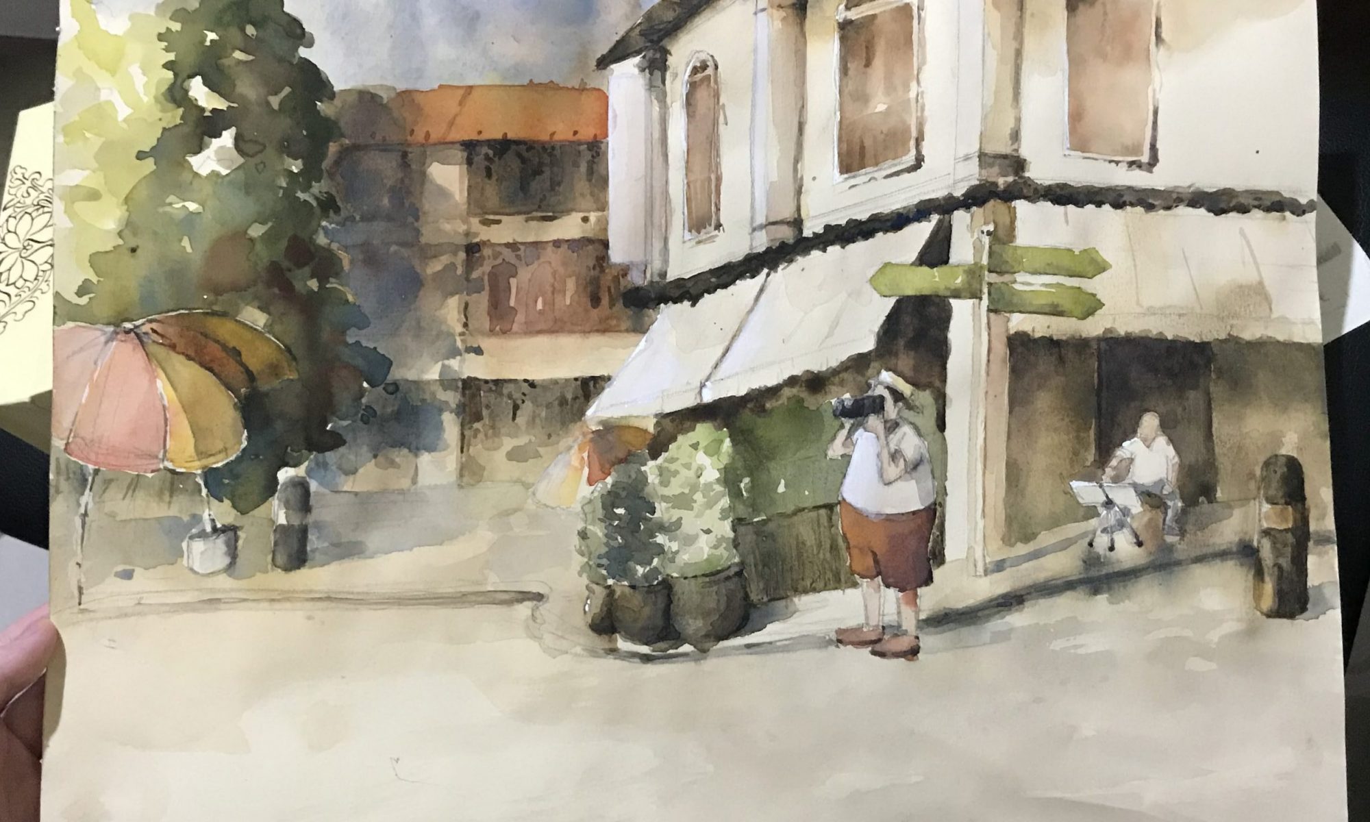
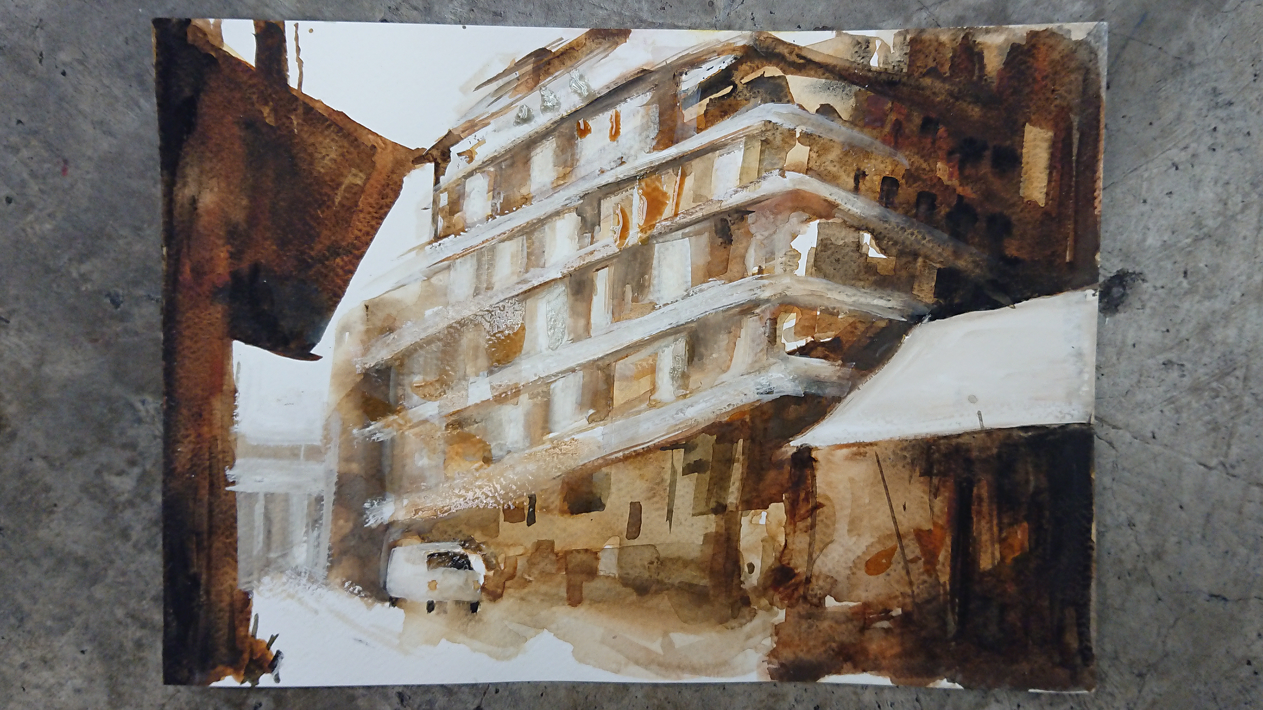
Using his artwork as a reference, I wanted to draw some Singapore landscape. Hence I googled for some online reference of shophouses in Chinatown.


Here’s my 1st sketch of the final composition.

For theme 4: Portrait format, Effect of light and shadows of a sunshine day


For this theme, I used Dong Kingman’s South Street Bridge as a reference. Changing the landscape into Clark Quey.


Here’s a draft of the composition


A metal water bottle


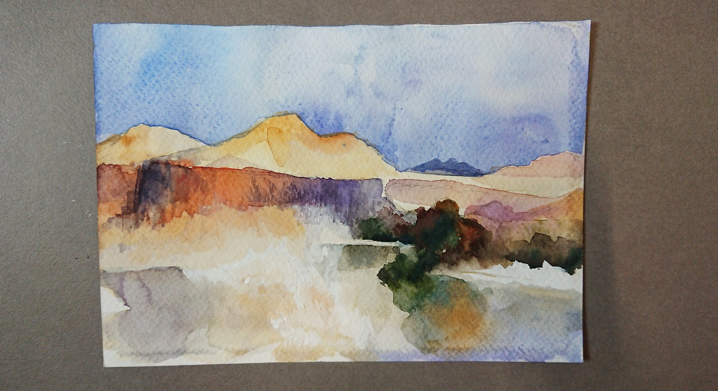
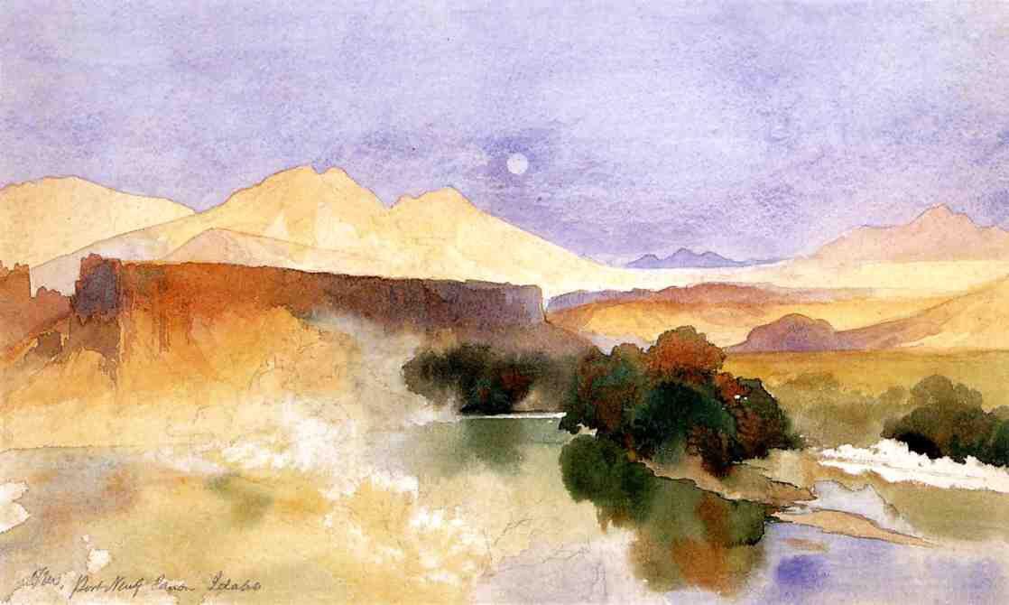
Practicing the colours used for Thomas Moran’s works.
Placing the paintings side by side, it looks like I needed more purple in the sky
I was not able to blend the soft and the hard edges well, wanted to redo the paintings but didn’t had the time to do so 🙁
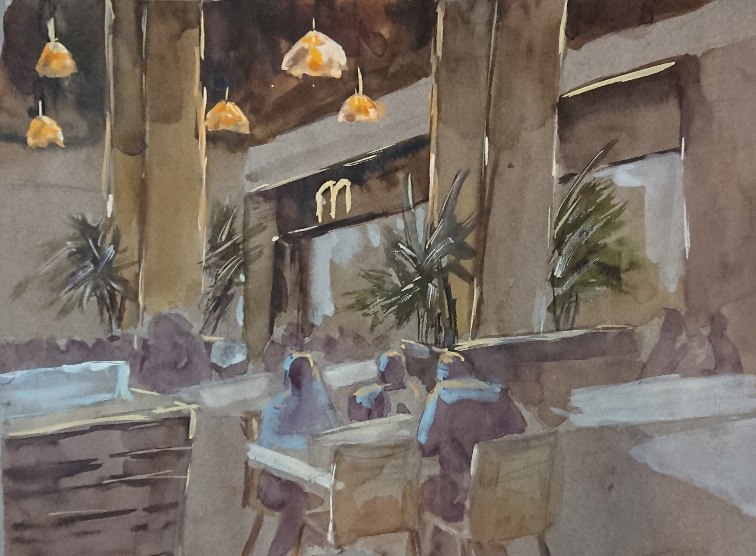
I found this assignment to be the toughest because of how much understanding is required of the entire space in relation to one another. There are so many objects hidden and clustered together in an enclosed space. Also not used to working with a coloured background, but it was a good exercise!!
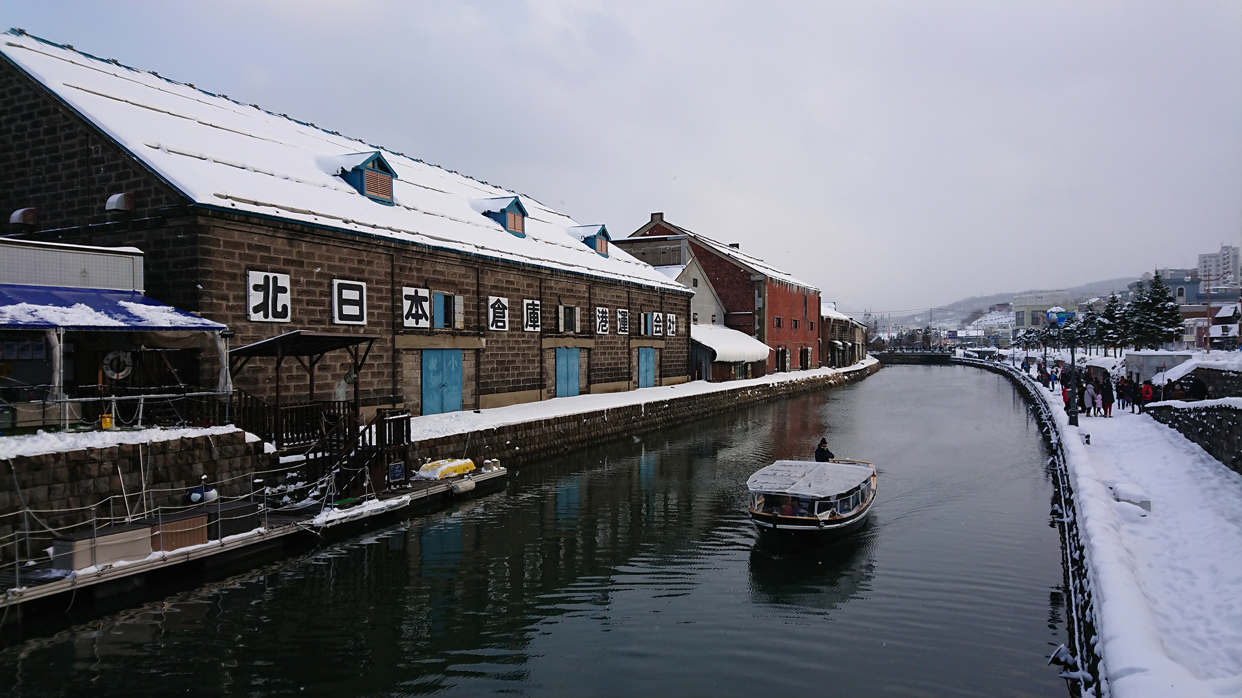
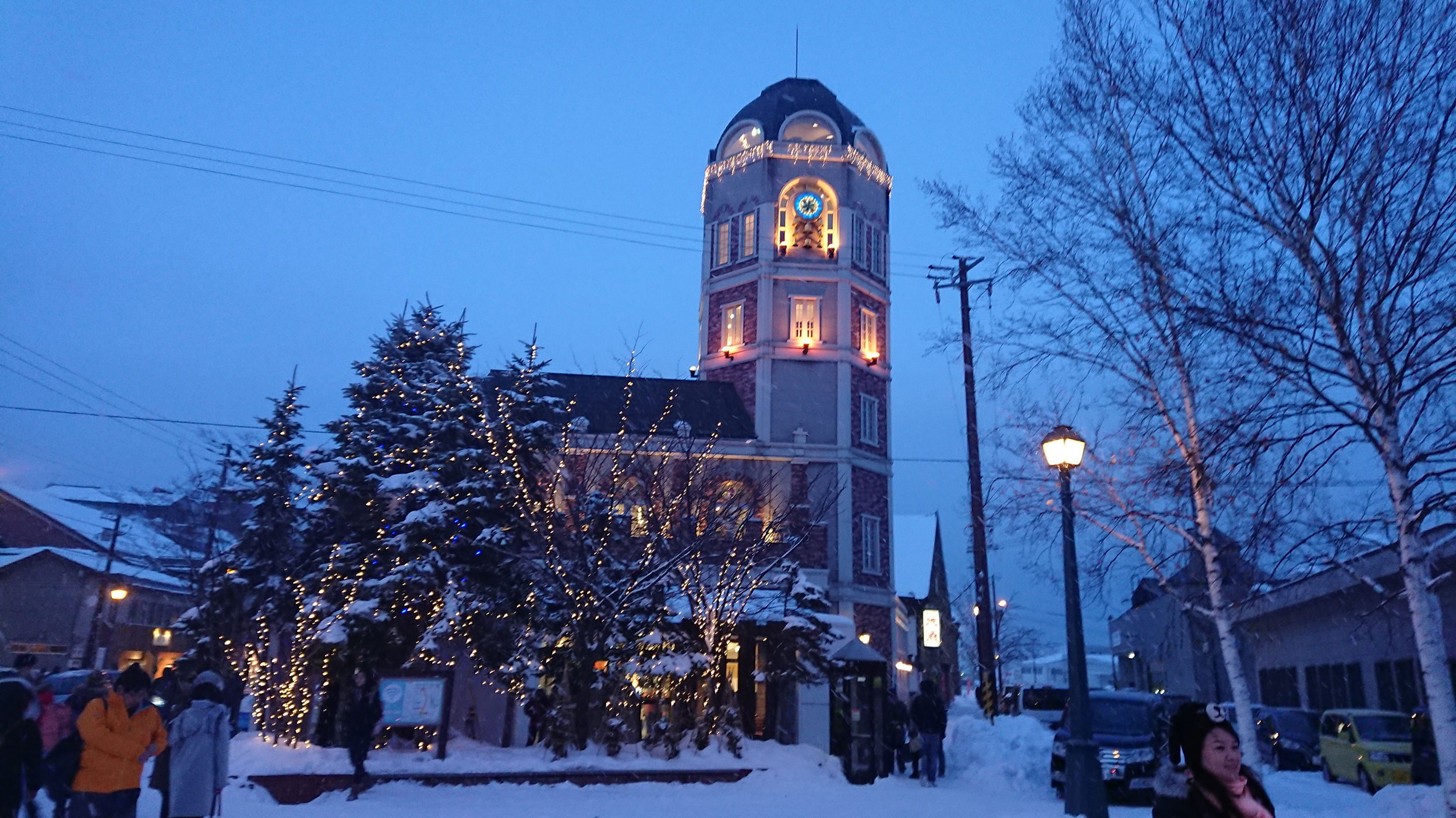
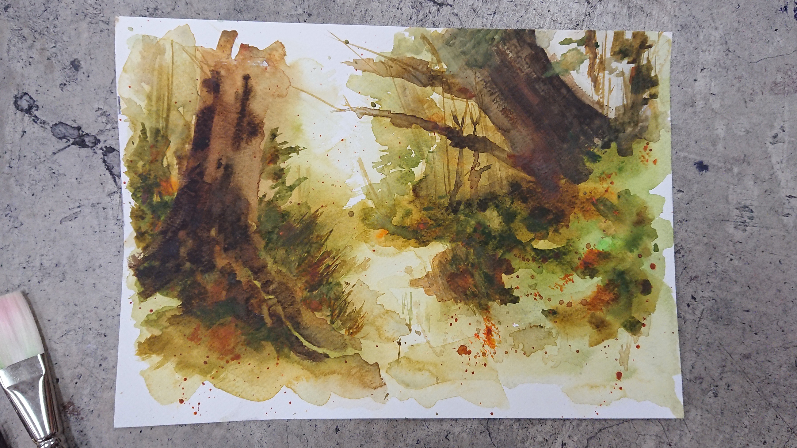
The references I used were all pictures that I took personally in Hokkaido, back in December 2017.
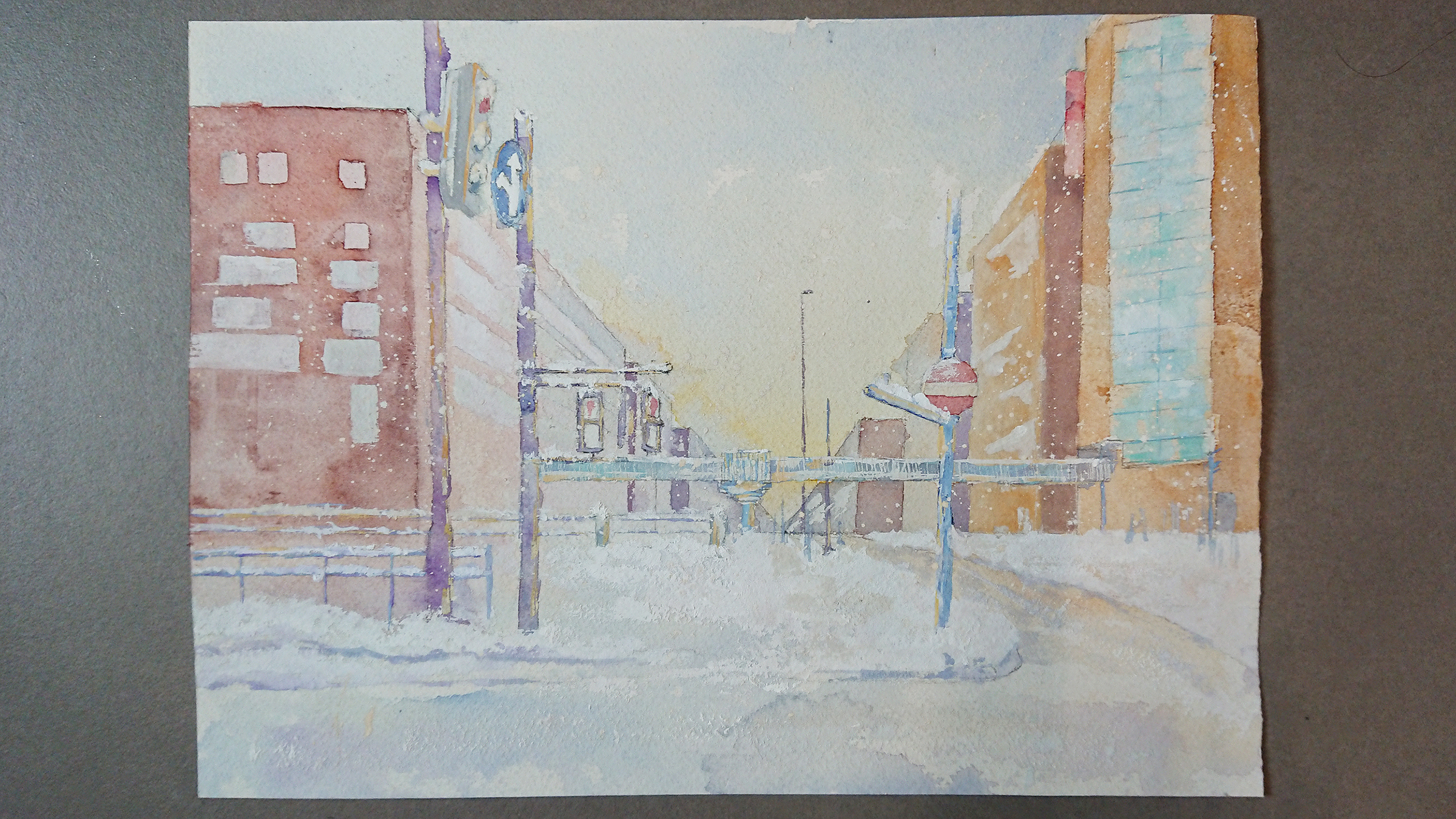
Landscape painting
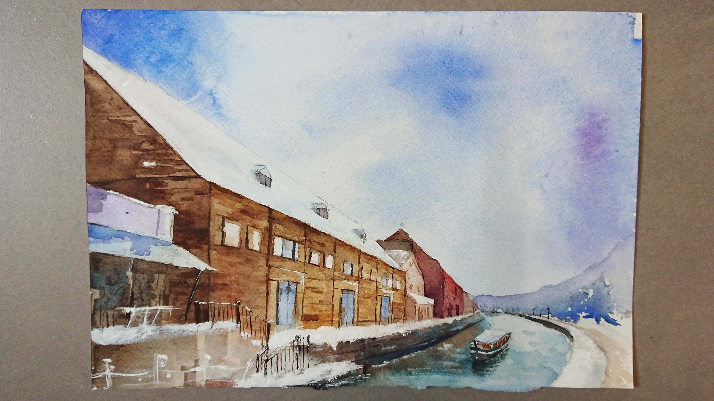
Prof Woon Lam advised me to lower the perspective/ eye level so that there is more depth because the front will look bigger compared to the back 😀
Atmospheric Condition

I wanted to achieve a night look but the sky that I painted wasn’t dark enough in the center, I was afraid of adding another layer as too much pigment might ruin the soft look I was looking for.
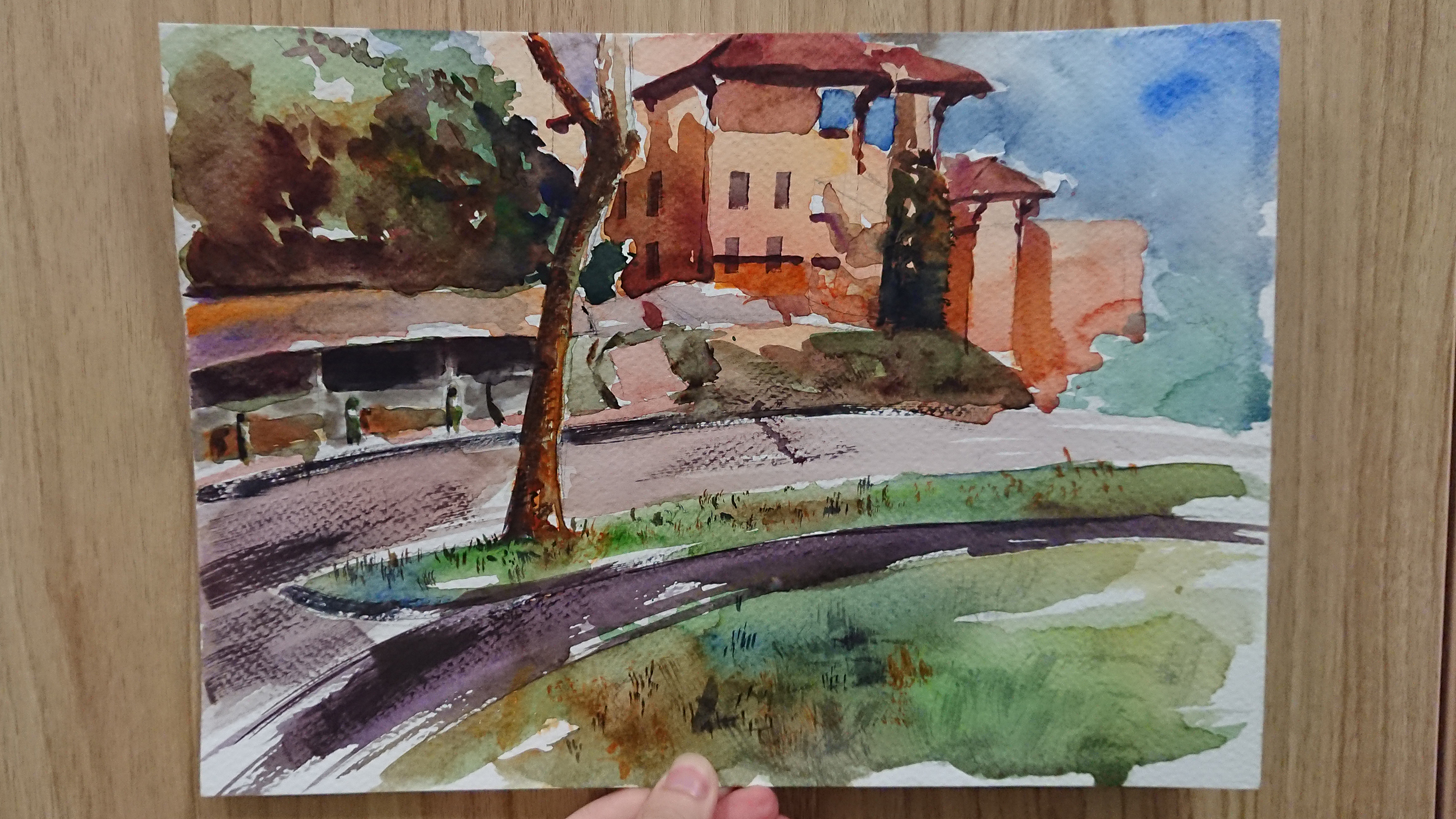
Tinted Painting

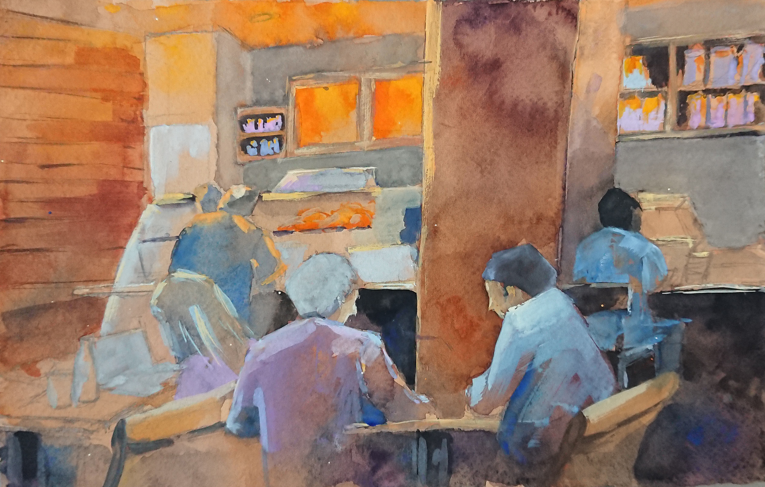
Interior Space Painting

Thumbnail sketches
![]()

Week 3 painting
Day
Night
Tree picture study
Outdoor Painting

During another trip to Gillman, Robert took us to various exhibitions 😀
The first place we stopped by was “The Making of an Institution”, Ntu CCA, done by different artists in residence. The artwork that I like the most is the one below, which is Ho Rui An’s “2020×3”. I like how An used a really old project that used slides to project things on to the screen. This artwork, collected a set of images as a research for the historical foresight of Singapore. The artist extracted from a CD-rom, and realised on the occastion of an exhibition organised in Public Service 21. It shows illustrations of three national scenarios in 2020.
The pacing of each slide might be a little slow, but I felt that it suited the mood of the illustrations which were done with bright and vivid colours.


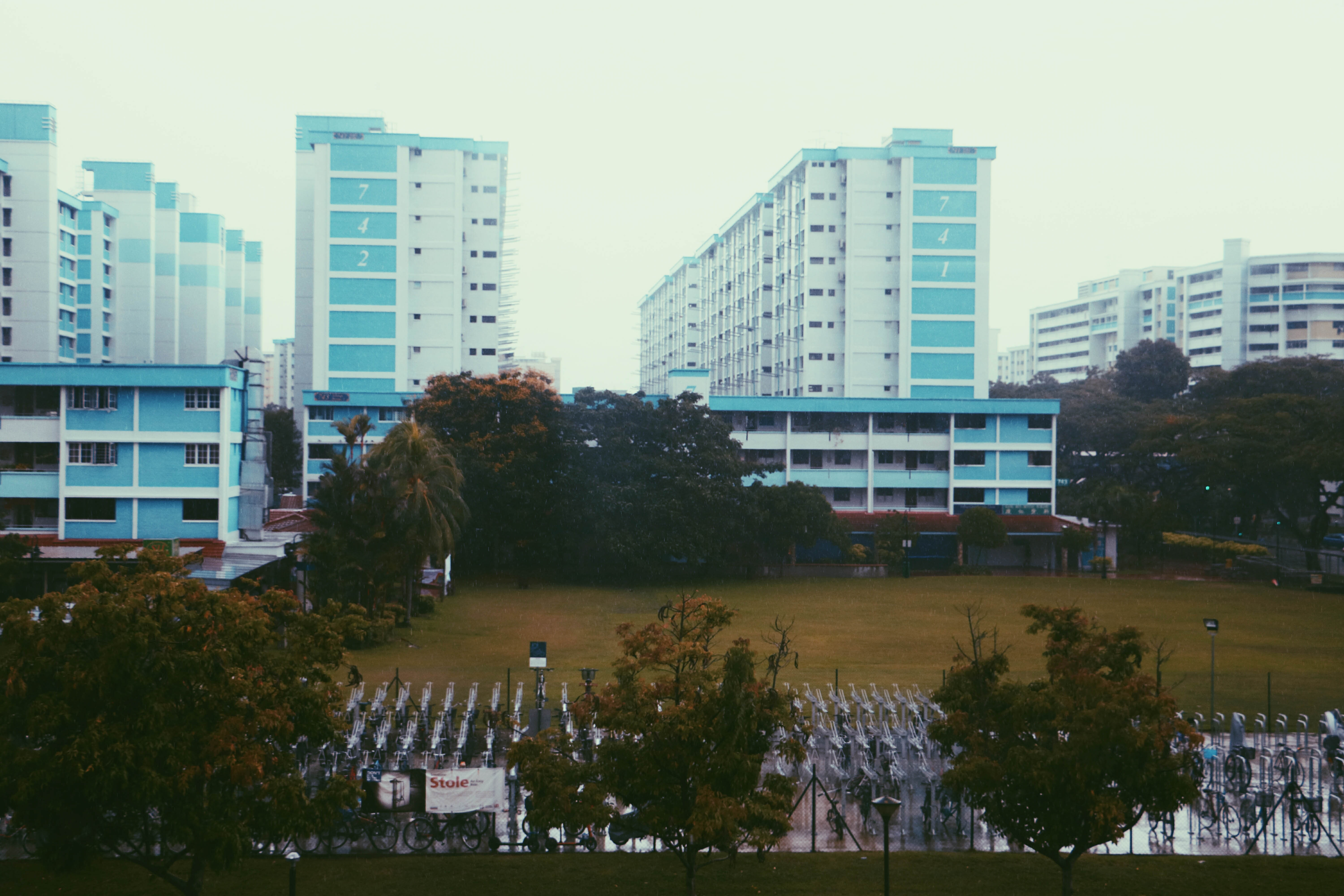
When I was first assigned to Yishun, the very first thing that came to my mind was cat murderers. Immediately I thought of doing a zine about the cats but I thought that I should look around the area first to see whether I will be able to find other inspirations.
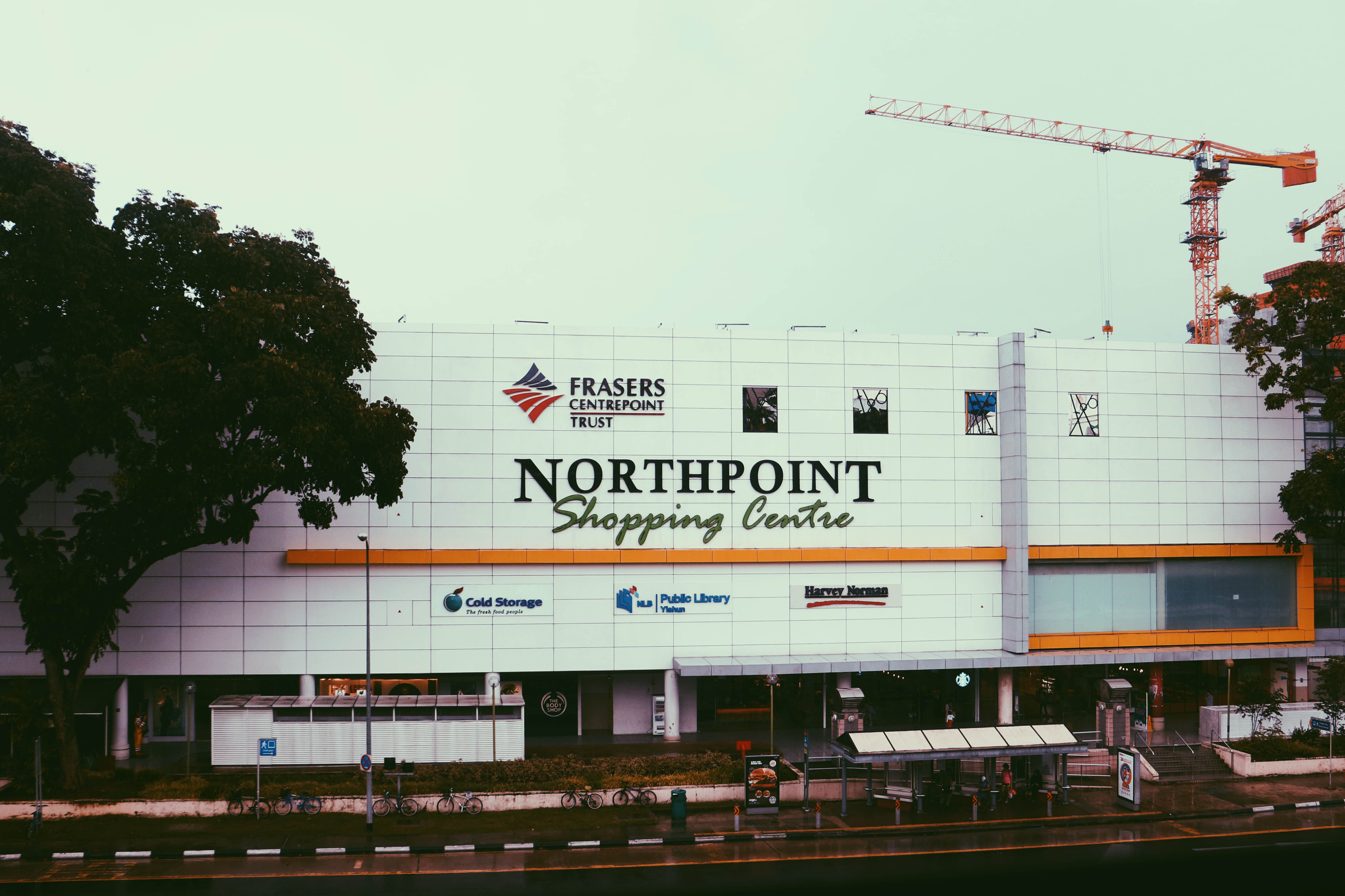
During my first trip down to Yishun, I wanted to familiar myself with the surroundings and explore for ideas. Other than to look out for interesting subjects, I did not really had an absolute plan as to what to focus on. Sadly, it was raining that day and I was restricted to sheltered areas, but I tried my best to take pictures of everything and anything.
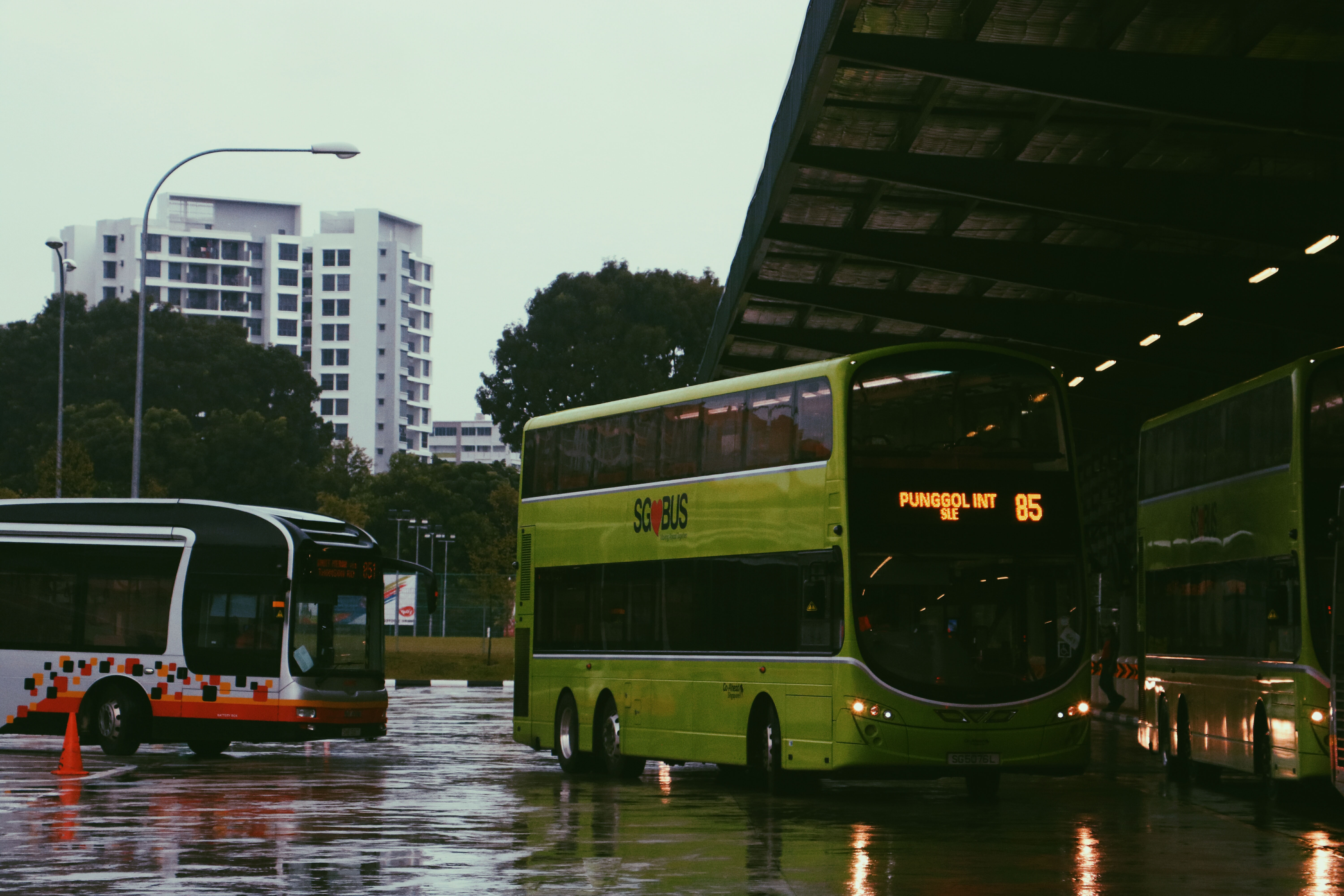
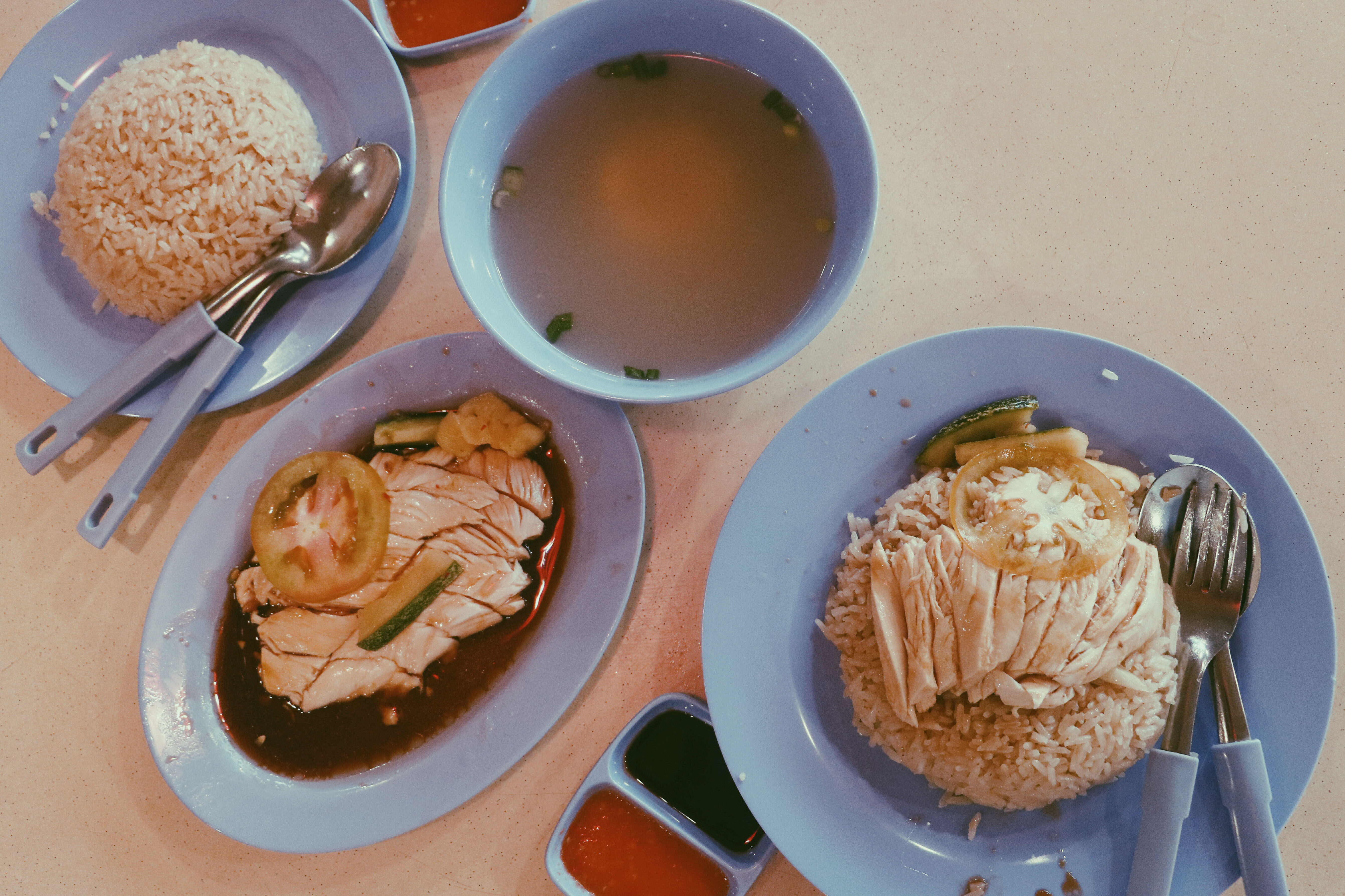
A friend of mine that stays in Yishun brought me around the place and let me try a well known chicken rice there.
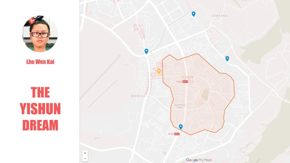
He also told me about a website where I could look out for news that happened in Yishun, which was: https://yishun.town/
The website was created by a guy named Lhu Wen Kai.
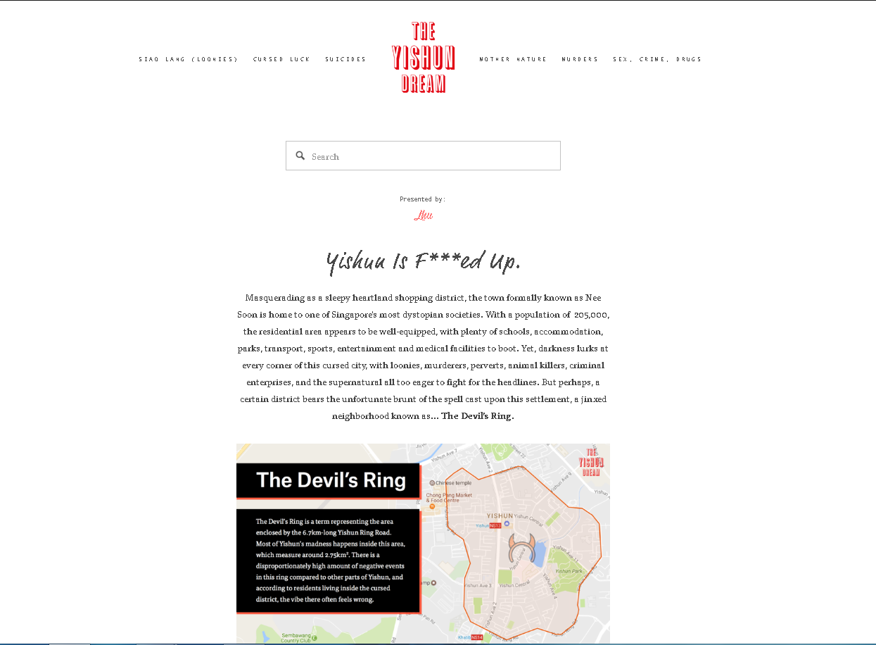
As you can see he placed quite an amount of effort to design the page.
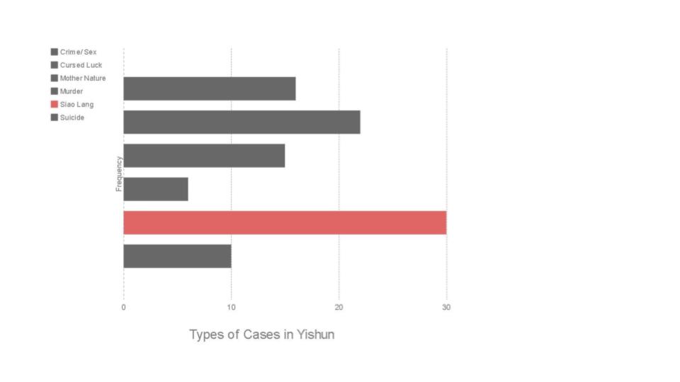
Here are all of the news that happened in Yishun, ranging from accidents, murders, robbery, suicides, etc.
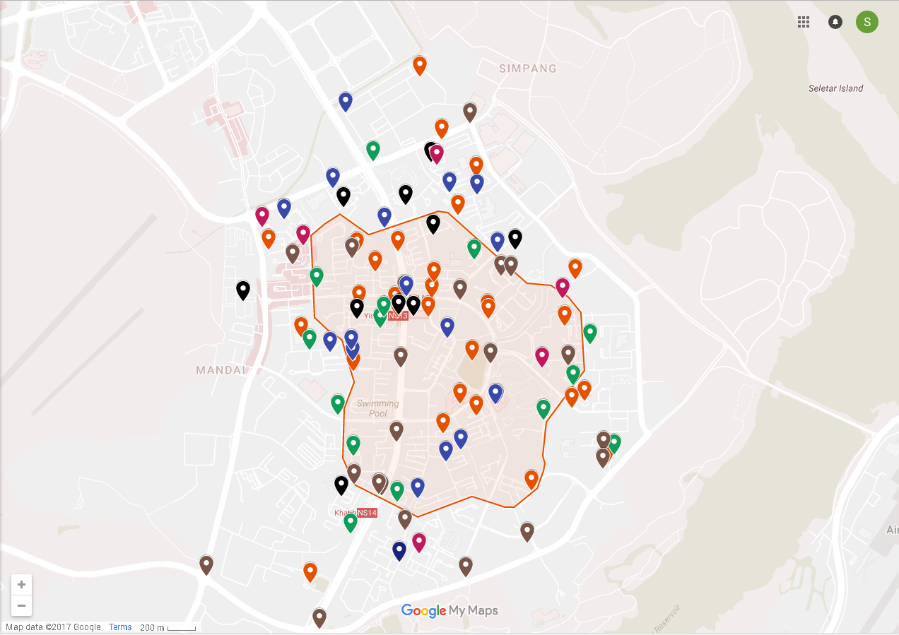
With the mindset of revisiting certain crime scenes I took pictures that matched (or at least attempted to) the angle of the original photograph. The 2nd comparison photo are the original photographs taken from the article, while the one above it was taken by me.

http://www.zaobao.com.sg/znews/singapore/story20161117-691470

http://www2.tnp.sg/content/yishun-1-junction-2-accidents-15-minutes

http://www.sammyboy.com/showthread.php?96926-Another-couple-slashed-in-Yishun-on-Thursday-SG-is-now-Parang-Hub
http://www.channelnewsasia.com/news/singapore/dead-cat-found-at-foot-of/2463898.html
https://yishun.town/cursed/busfire
I did not manage to take the scenes for the photographs below but I thought I could just take the location from outside.
http://www.stomp.com.sg/singapore-seen/caught-act/man-rages-yishun-cheers-cashier-after-they-ran-out-spoons-challenges-him
https://yishun.town/crime/bankrobbery
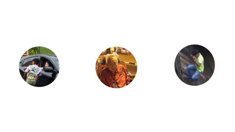
Even after taking the photographs, I did not feel much emotions from what I discovered. Hence I started thinking and brainstorming again. Then it occurred to me why don’t I highlight the positive stories that happened in Yishun instead of the usual hate on Yishun.
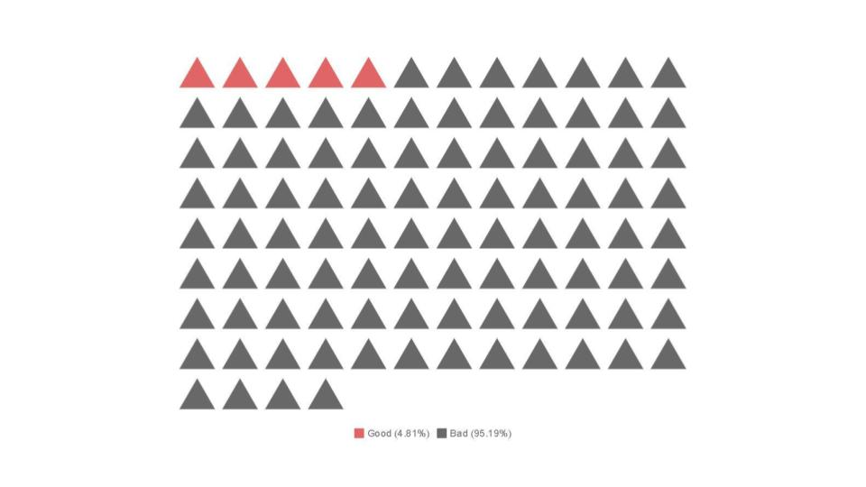
Although there were so much more accidents and murders, people remember the bad news more clearly as compared to good ones. Which was why I wanted to paint Yishun in a positive light instead, to remind people that there are good stories from Yishun as well.
Articles:

http://www.straitstimes.com/singapore/12-year-old-boy-rushes-to-aid-of-car-accident-victims-in-yishun

http://www.straitstimes.com/singapore/courts-crime/off-duty-cop-out-on-a-date-catches-rioting-suspects-with-help-from-scdf

http://mothership.sg/2015/11/foreign-worker-uses-indiana-jones-move-to-rescue-drowning-cat-from-monsoon-drain/

http://www.tnp.sg/news/mystery-man-rescues-trapped-bus-driver
Originally I thought that the reason why Yishun has so many accidents was because of it’s huge population within the area. However, Yishun isn’t the only place with a huge population density.
Yishun: 9,442.2 inh./km²
Tampines: 12,578.2 inh./km²
Woodlands: 18,366.2 inh./km²
Jurong West: 18,391.2 inh./km²
https://www.citypopulation.de/Singapore-Regions.html
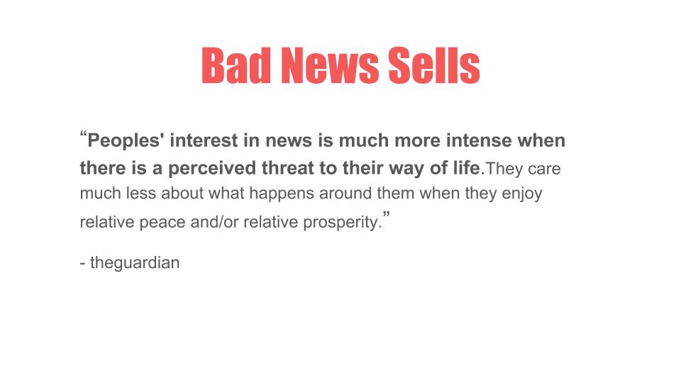
Looking at some news articles as to why Yishun is so infamous I found that it was simply because bad news sells.
People prefer to read gossips, negative news and here are 2 quotes from the guardian as to why,
http://www.straitstimes.com/singapore/why-do-some-people-make-fun-of-yishunhttps://www.theguardian.com/media/greenslade/2007/sep/04/thegoodnewsaboutbadnewsi


I’m Waiting II
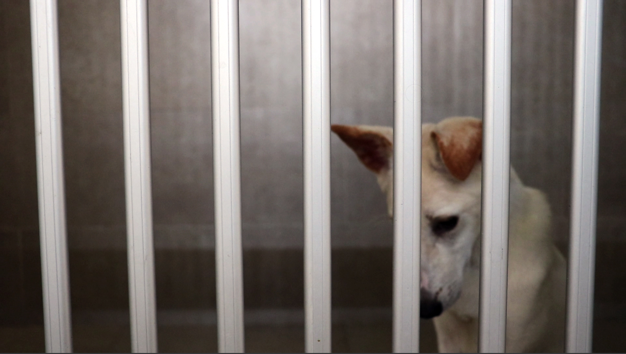
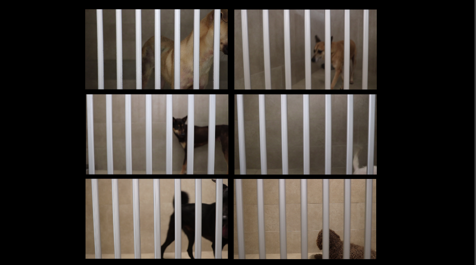
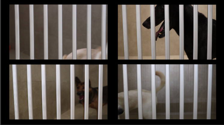
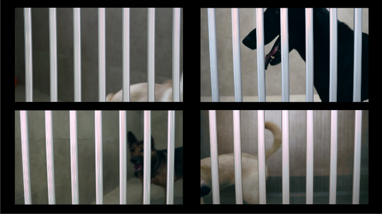
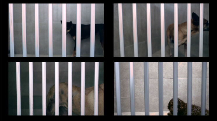
Continuing on the subject of sheltered animals, I wish to further explore the loneliness dogs feel in SPCA, especially since the dogs are isolated.
I’ve separated the video into 2 parts, to show 2 contrasting expressions from the dogs, where the first half was filmed with the presence of a particular human while the other half was the opposite.
Through this video, I wish to convey the importance for the dogs to have a personal owner in order for them to feel less lonely.
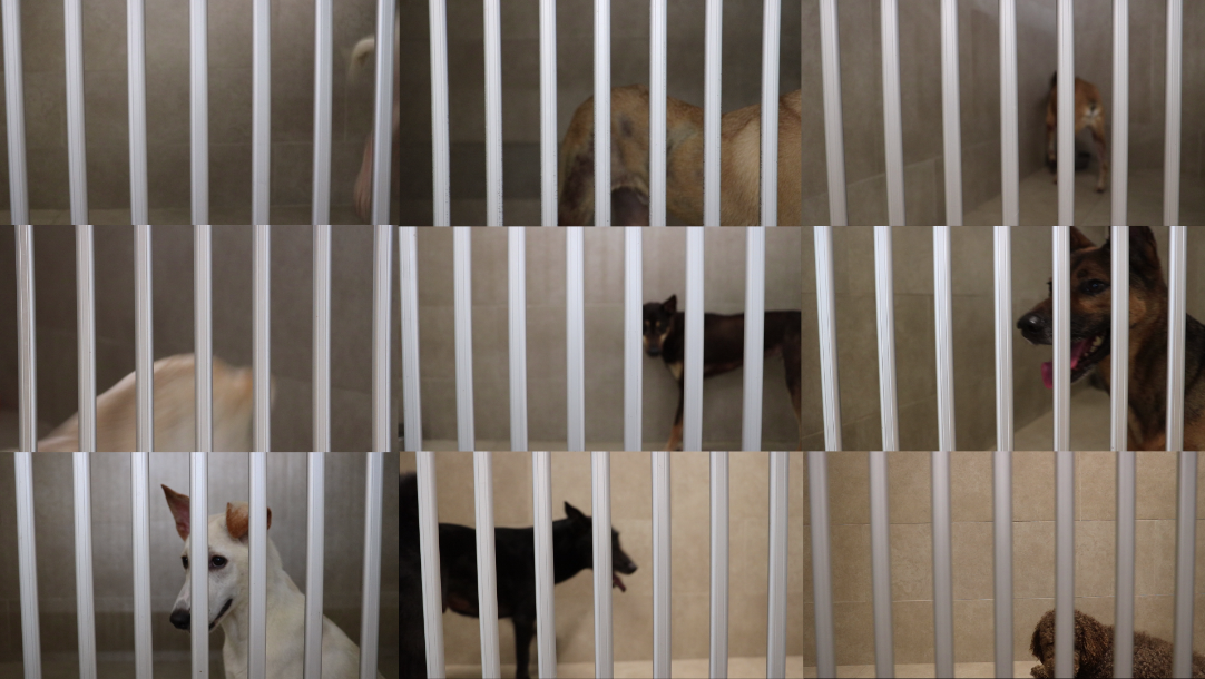
From the video itself, you can see that the first half of the dogs kept jumping/ standing/ moving around in circles, as if they really wanted to go outside.
They were doing so because there was a particular volunteer that would take the dogs out for short walks once in a while. However, she can only take one dog out at a time, hence the dogs could only helplessly wait in the enclosed area.
The other half seemed bored/ staring outside/ sitting on the floor doing nothing. So in a sense, I wanted to let the audience see what the dogs do with and without a human owner.
Initially, I wanted to just split the video into 9 screens, where each box will show 1 dog in one enclosed space in SPCA. However, my laptop was not powerful with enough RAM to handle the process. 🙁 I could not even preview the video properly without lagging even after tweaking the video preview settings. 🙁 So, because the video preview kept lagging and caused me to not edit properly, I needed to change the number of split screens. 🙁
Since it was my first time trying out split screens, I had to google for YouTube tutorials 😀
So under the effects controls tab at the top left corner, under motions, you can scale down the size of the video. I did some try and error before arriving at the right ratio/ size I wanted.

For 9 split screens I used the scale of 3o. I tried out with borders and no borders and realised the borders actually looks more aesthetically pleasing.
For a vertical layout of 6 screens I also used the 30 for the scale. However, even with 6 split screens, it was still too laggy to edit properly. >:(
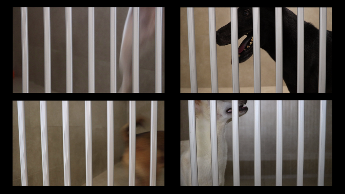
Final layout with 4 split screens 🙂 The video preview was still lagging but muchhhhhhhhhhh better than the previous 2 >:(

The sound was not just an unedited overlay of each other. If I did not edit the arrangement it would have been extremely noisy which was not the intended effect.
So it starts out with a bit of barking and then gradually I added more barks/ whines and it dies down again before moving on to the other set of dogs.
For the second half, I just used one audio clip from one of the videos. Unintentionally, there was classical music playing in the background which somehow suited the mood of bored dogs being shown.
Part I
Part II

The list below are some jobs which I was interested in when I was a kid, or at least I tried to remember.
Final Choices: Architect, Video Gamer, Archaeologist and Birdkeeper
While trying to brainstorm some ideas I tried to sketch out the layouts in my tiny sketch book while googling for some references.
Here are the sketch developments:
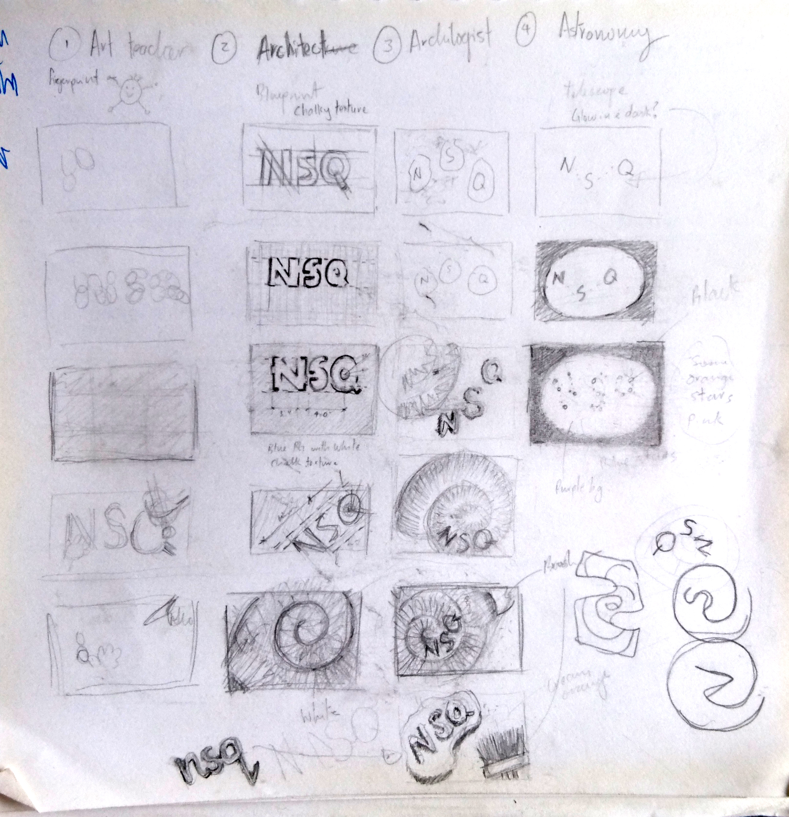

After consulting Ms Shirley, she mentioned that many people are doing on astronomers hence I should choose another job, which was a bird keeper.
The first tryout I tried was for the job, video gamer.
I’ve played lots of video games before such as Far Cry 4, Overwatch, Left 4 Dead 2, etc, but I am not a professional player ??. Even after watching tons of YouTubers playing video games I’m still bad at it but one day I wish I can be as good as them as a hobby. 😀
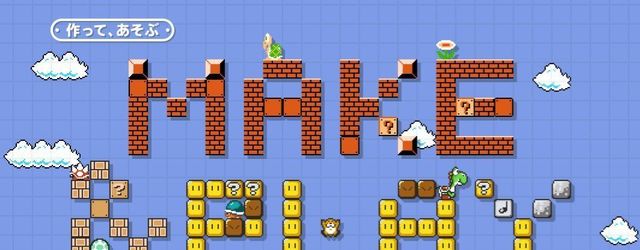
I decided to choose Mario as the main theme as Mario was my favourite childhood game and it is extremely popular too. Although I only started out from the DS version, I felt that 8-bit Mario looks aesthetically more pleasing for this design project due to its plain yet saturated retro colours.
Process:

Inspired by the recent “Mario Maker”, I wanted to use icons from Mario to create my name and background. However I felt that just the coins were not working well in contrast with the background 🙁
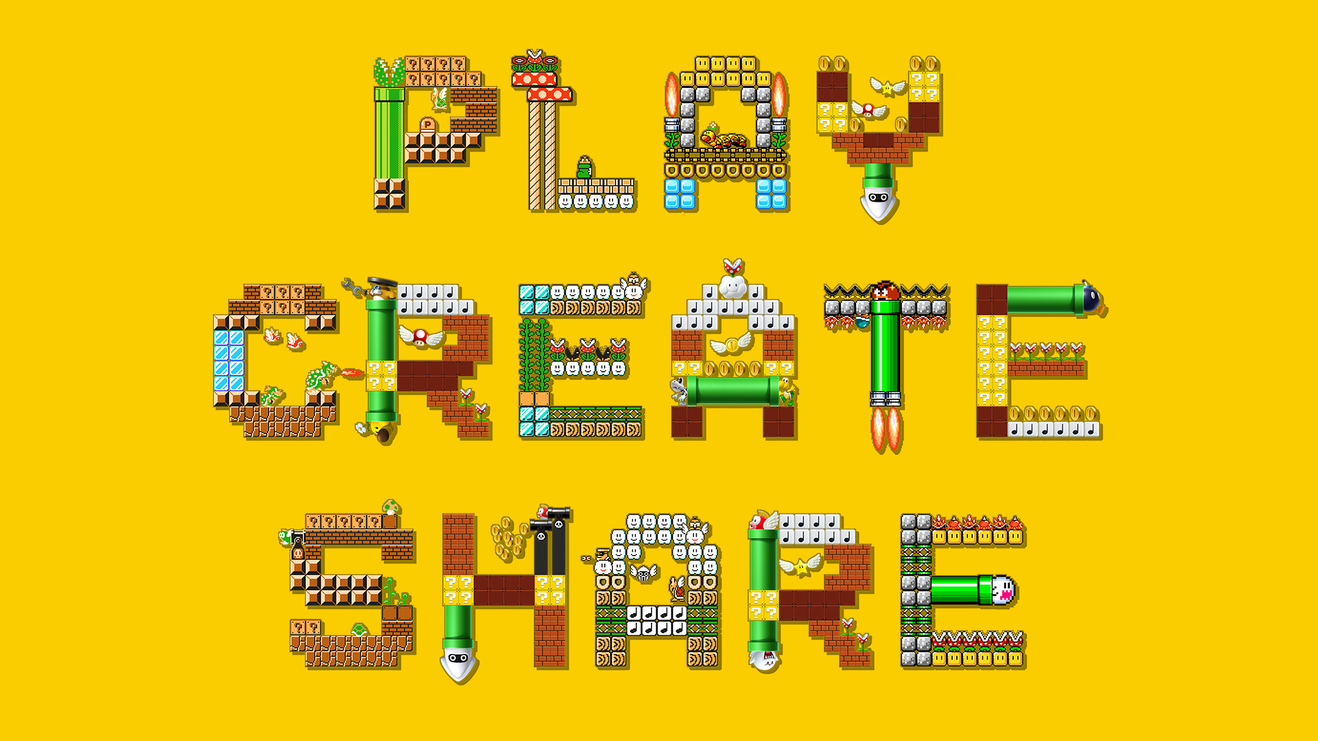

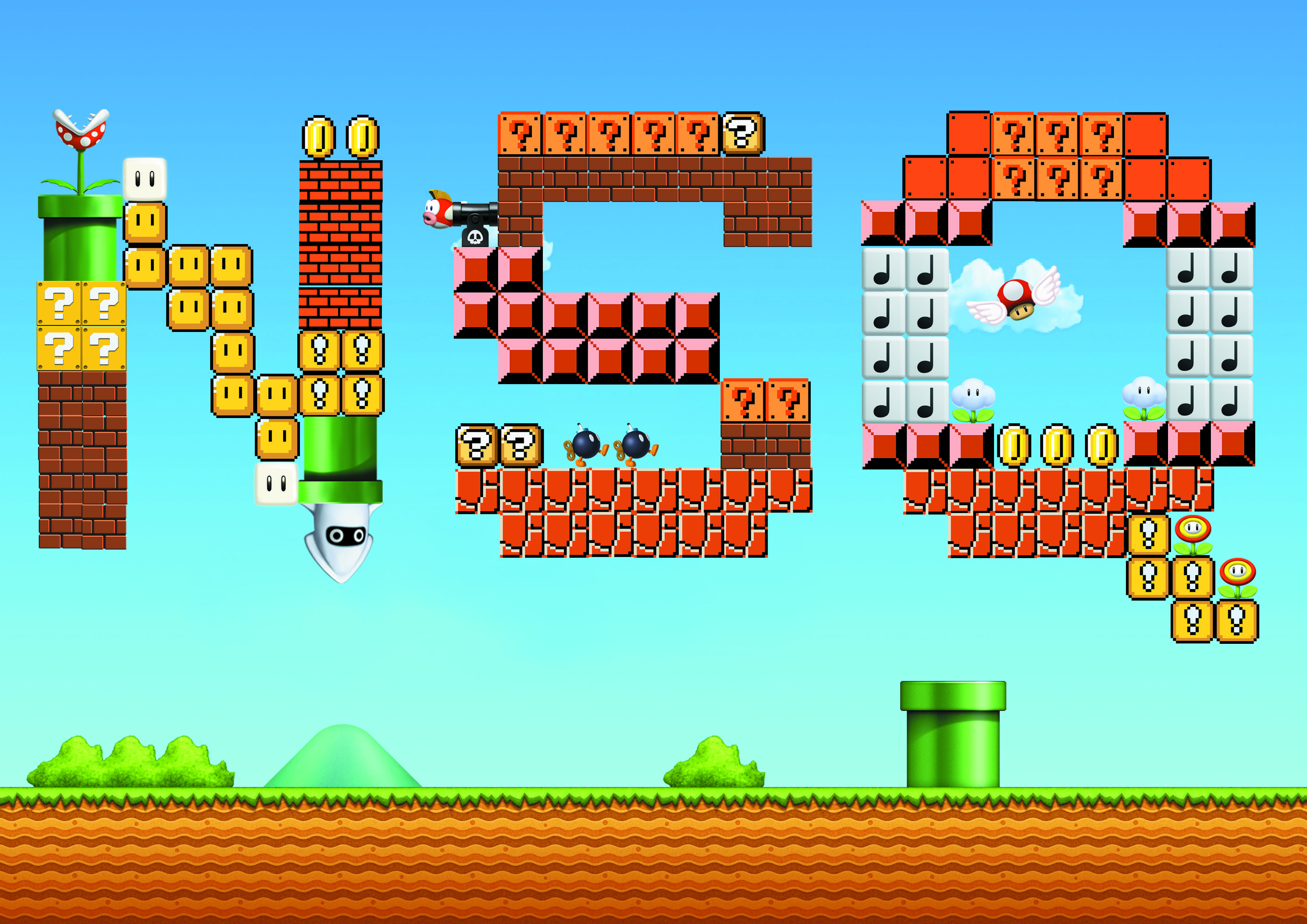
Next, inspired by Mario Maker’s advertisement on the top left, I tried making my own name with the same style too. This style really brings out the fun of Mario to the viewers due to the usage of yellow which represents excitement and playful layout of the other characters and blocks from the game. However, I felt that I wasn’t thinking enough and just copying the advert hence I scraped this idea too.
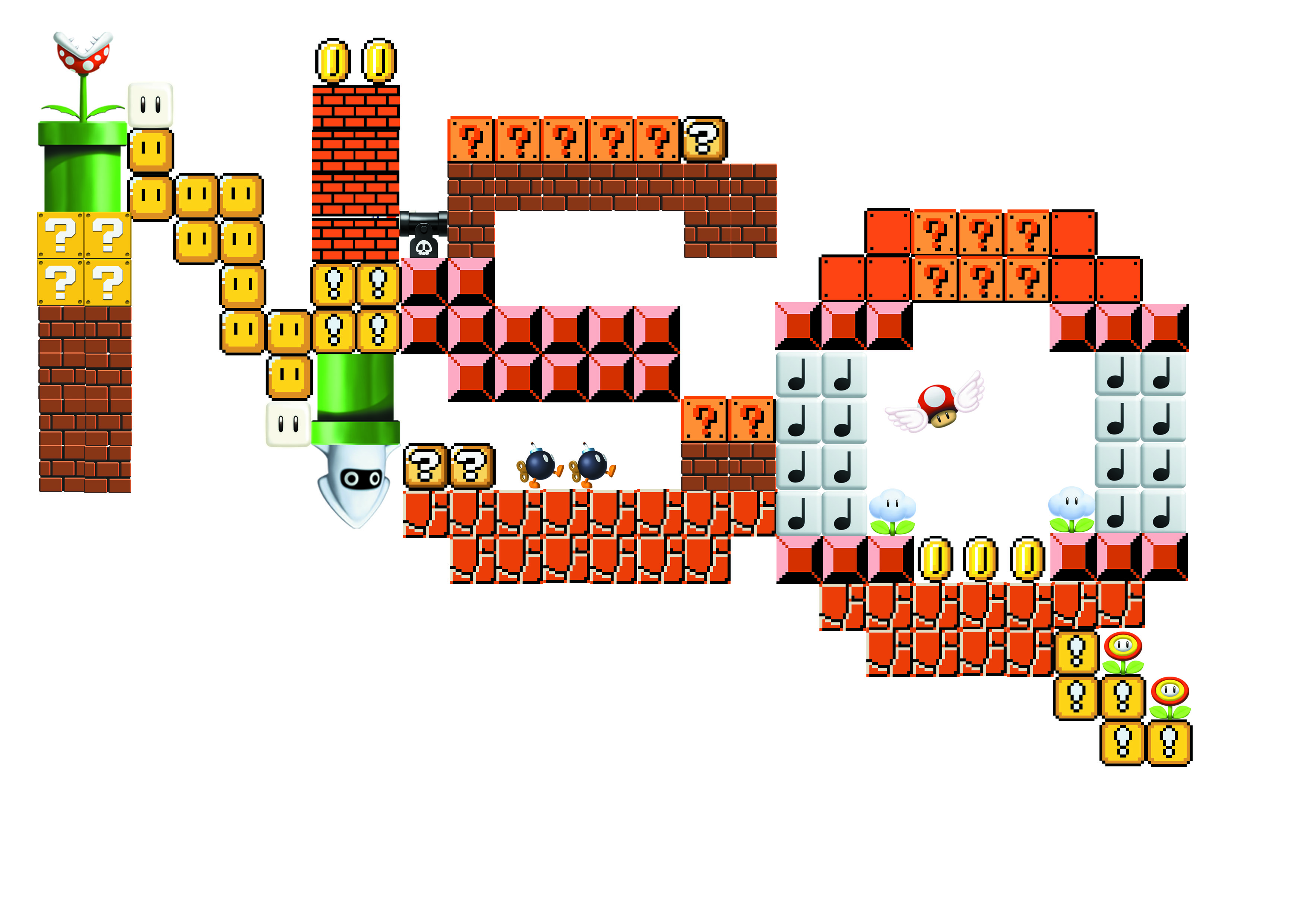
Trying out again to make use of the colourful icons, I did the above layout. However, the icons were too distracting, and directs the attention away from my name, and hence I decided to make it a plain design instead like the design below.
Final:

The complementary colours between the orange and blue Goombas makes the overall design less boring. Due to the huge size of the name, the viewers see it first before the other characters at the side which further enhances the theme of the layout.
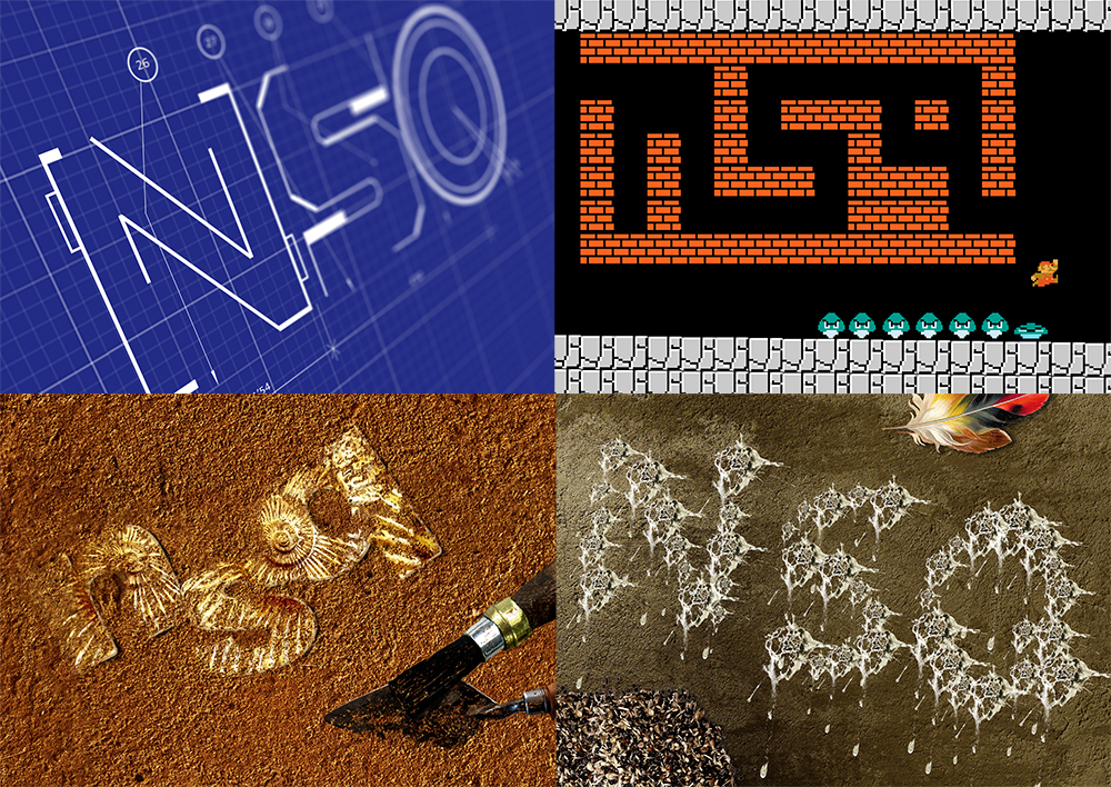
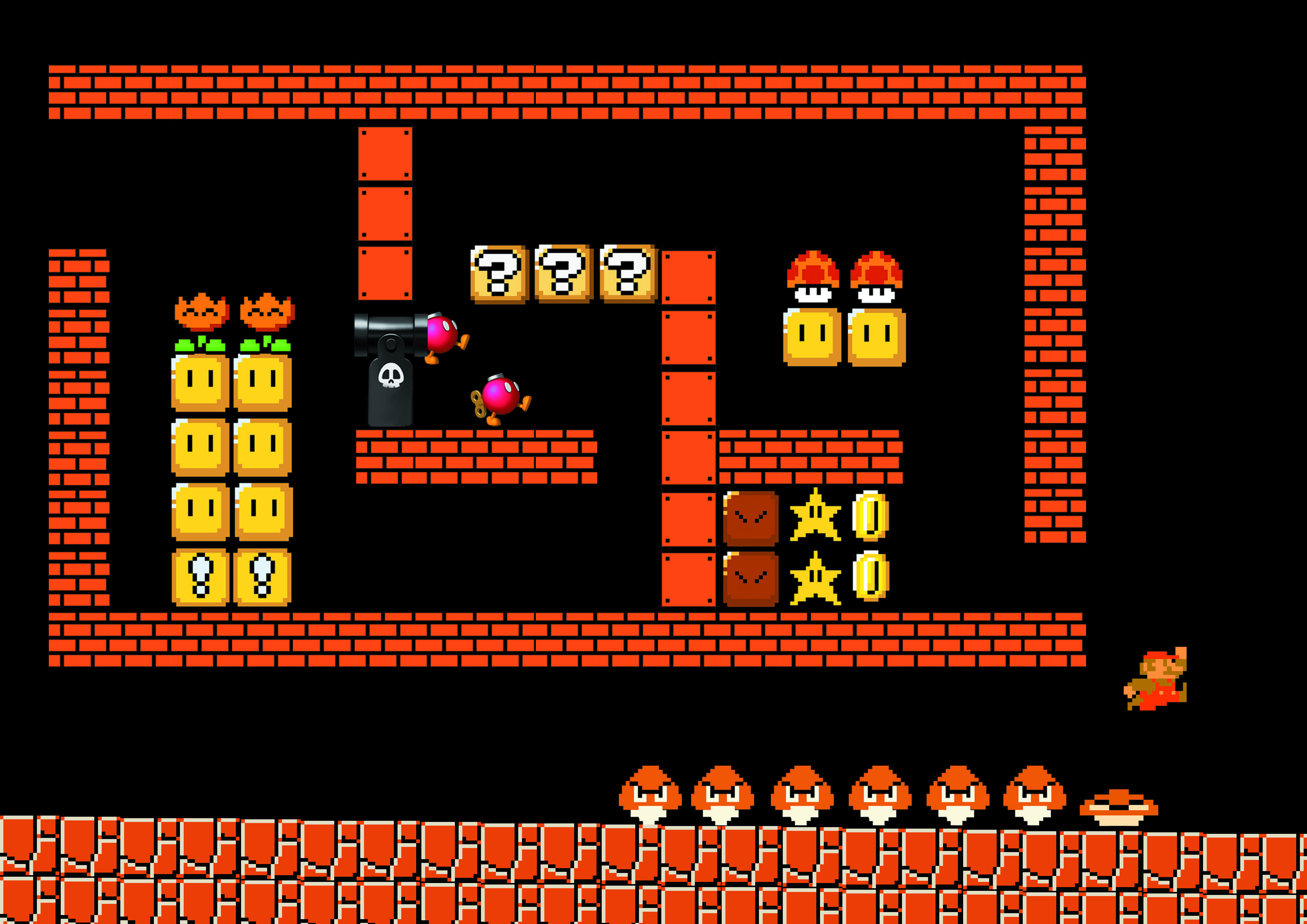
To be honest, when I was a teenager, I wanted to be an architect because I heard they earn a pretty good amount of money, hahahaha. I had the desire to design and build my own dream house as well, where you get to choose how big you want the bedroom to be, etc. However, my mathematics and sciences were pretty bad in Junior College, hence I did not apply to architecture school. ??
Process:
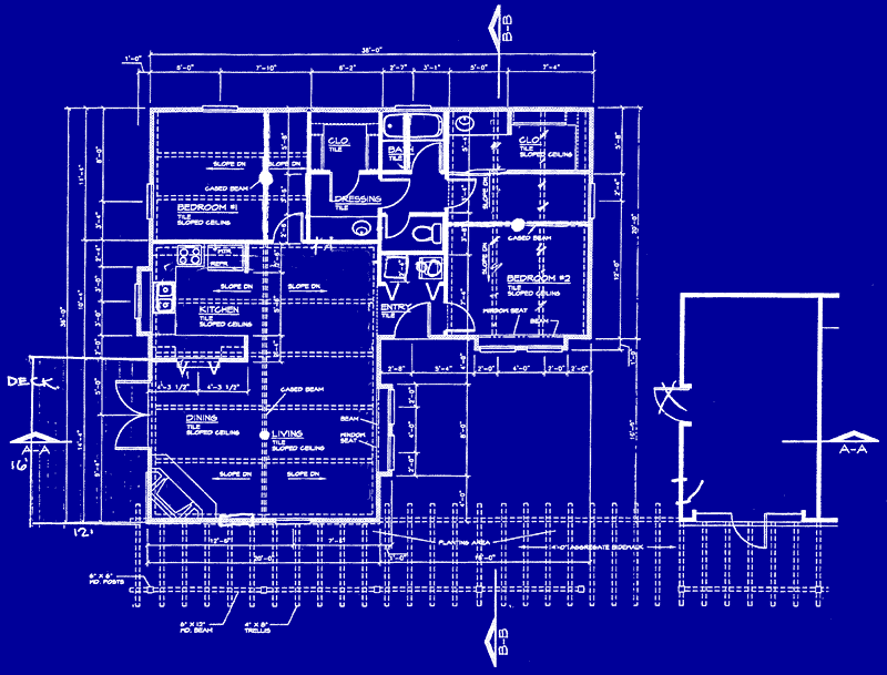

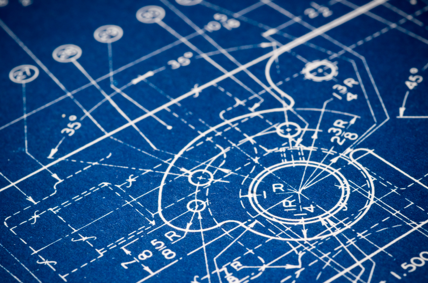
The first graphic element that came to my mind when I thought about an architect was blueprints. Hence, I went to google for these images as references. I realised that the blueprints have tons of white markings, arrows, numbers and lines against a deep blue background, which I later applied to my design.
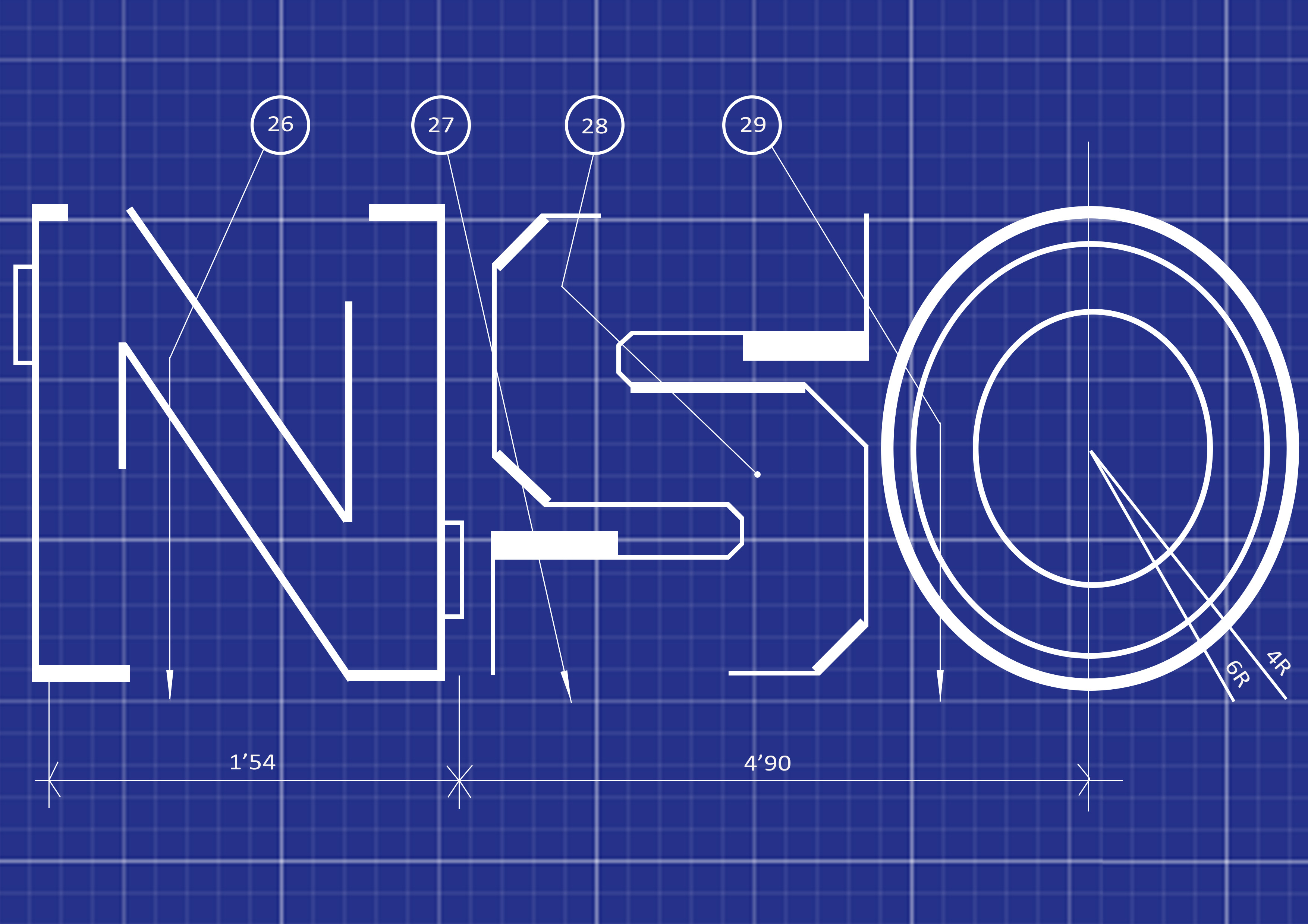

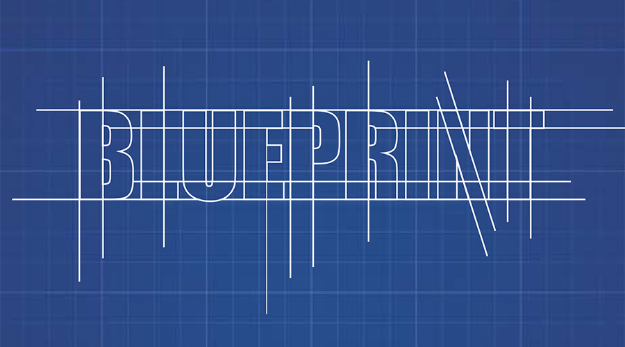
Firstly, I tried creating the static version of my name first like the one of the left, and afterwards the arrows, circles and numbers. Next, I tried shifting and tilting the layout such that the design is not as boring and still.


After having a consultation with Ms Shirley, she mentioned that I should try using the “perspective” tool in free transform to make the layout more 3 Dimensional with more depth. The one on the left was the first attempt followed by the one on the right. The right picture is better due to the deeper perspective that it appears to have.
Final:

Ms Shirley also mentioned to me that I could use the “field blur” filter to create an even greater illusion of dept. Hence resulting to the image above. This is probably my favourite composition among the 4 due to it looking like it’s 3D. ??
I was pretty inspired by our school’s semester 1 Art History Lecturer’s research in Northern Cyprus. Professor Michael Walsh shared with us his experience in trying to get the United Nations to notice Northern Cyprus’s historic artworks. Due to the fact that Northern Cyprus is an unrecognised country, its historical artifacts are not protected too. Michael Walsh and his team of professionals went down to one of the churches in Famagusta to restore some of the murals on the walls which were covered in paint/ cement. This project made me curious about historical artifacts and the meaning behind them. Being able to discover them first hand will be an extremely enriching and cool experience which was why I chose Archaeologist as one of my dream jobs.
Process:

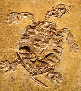

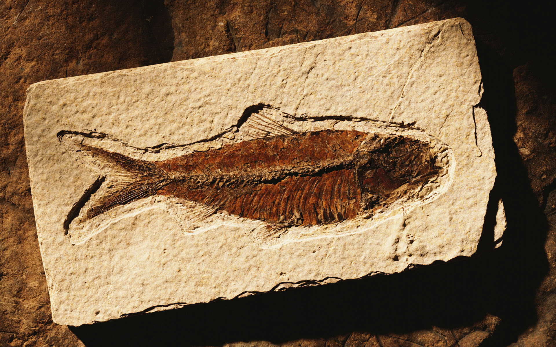
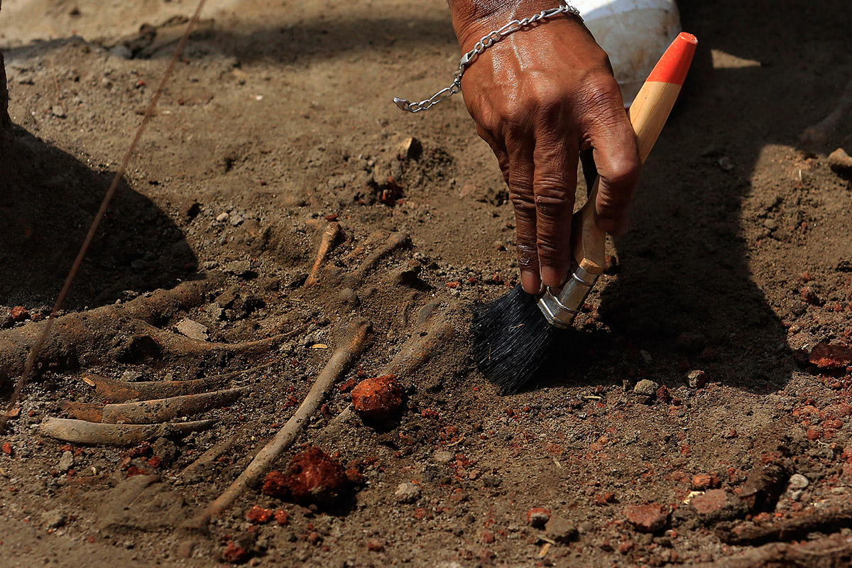

Fossils, brushes and soil were the first things that came to my mind when I thought of Archaeologist.


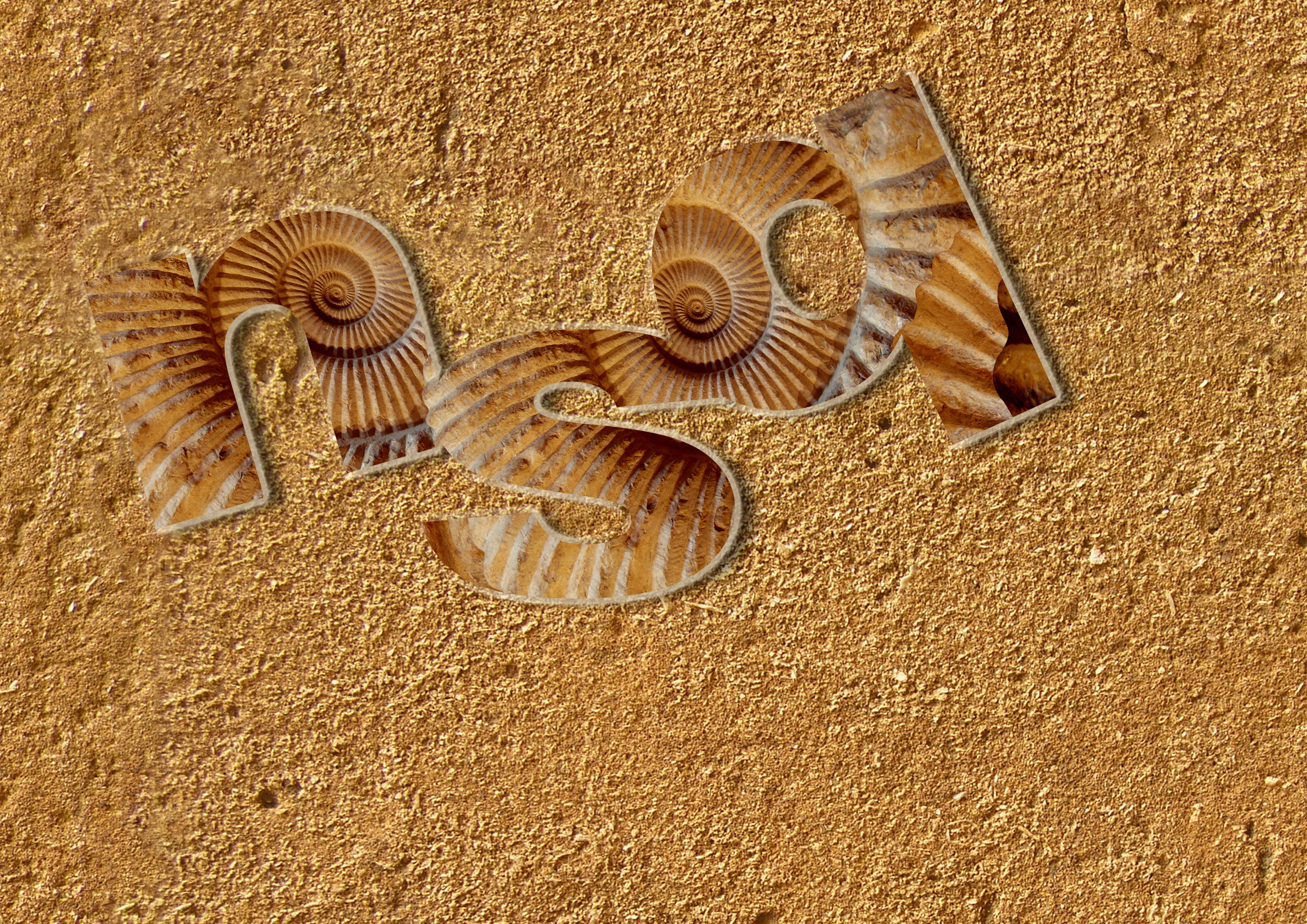
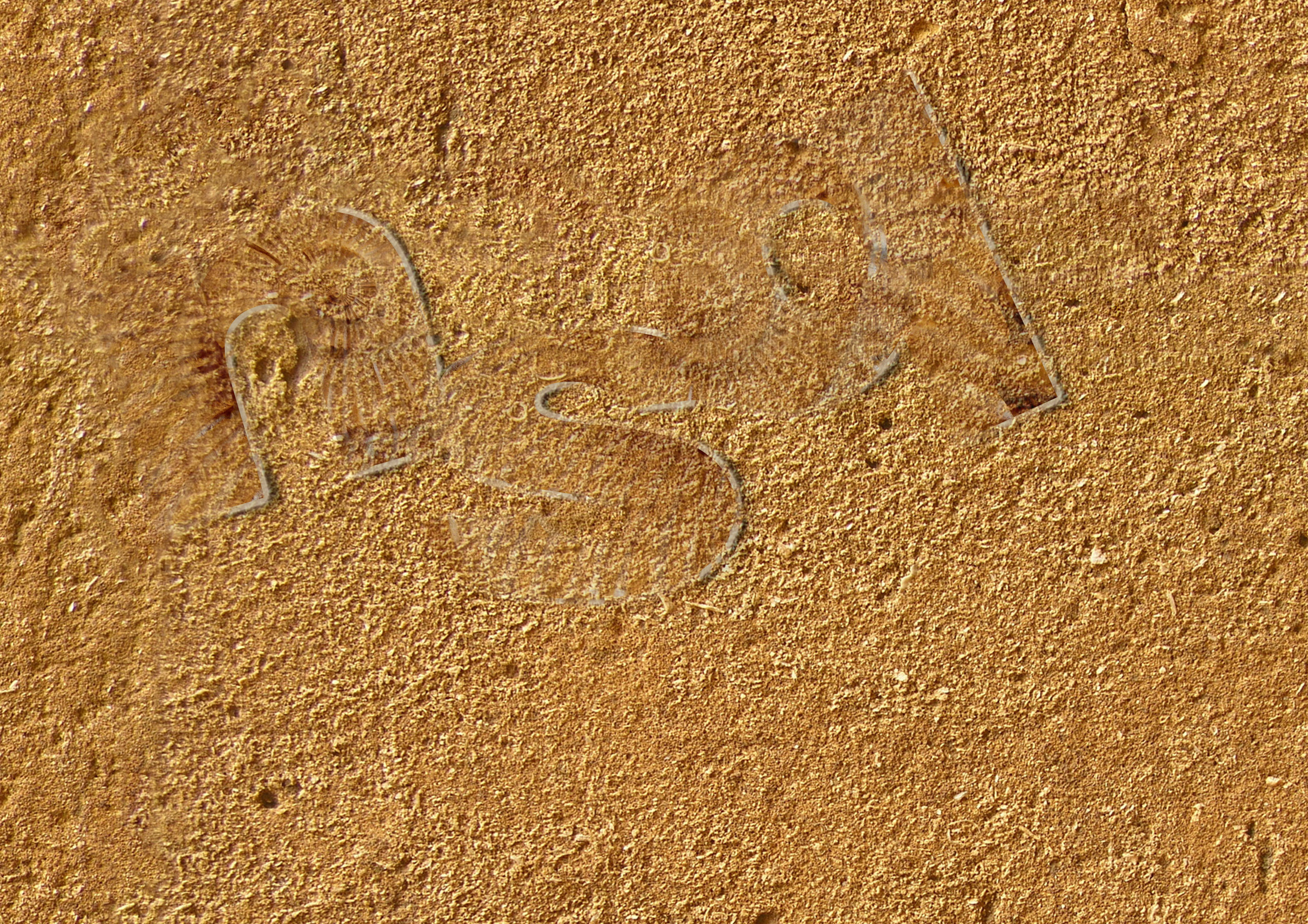
Firstly I typed out my initials first using a thick font, in this case I just used Arial Black, since its a clean font which clear cut edges. Next I took an image of a fossil and placed the layer on top of the letter, and create a clipping mask as shown in the top left image. Afterwards I added the soil background and added bevel, embossing, and drop shadows to make the characters more 3D. In the bottom left image, I realised non-capitalised letters looks more aesthetically pleasing and adjusted the arrangement of the letters to make the fonts less boring. In order to make the letters look like it is buried, I duplicated the background with reduced opacity and placed it as the upper layer.
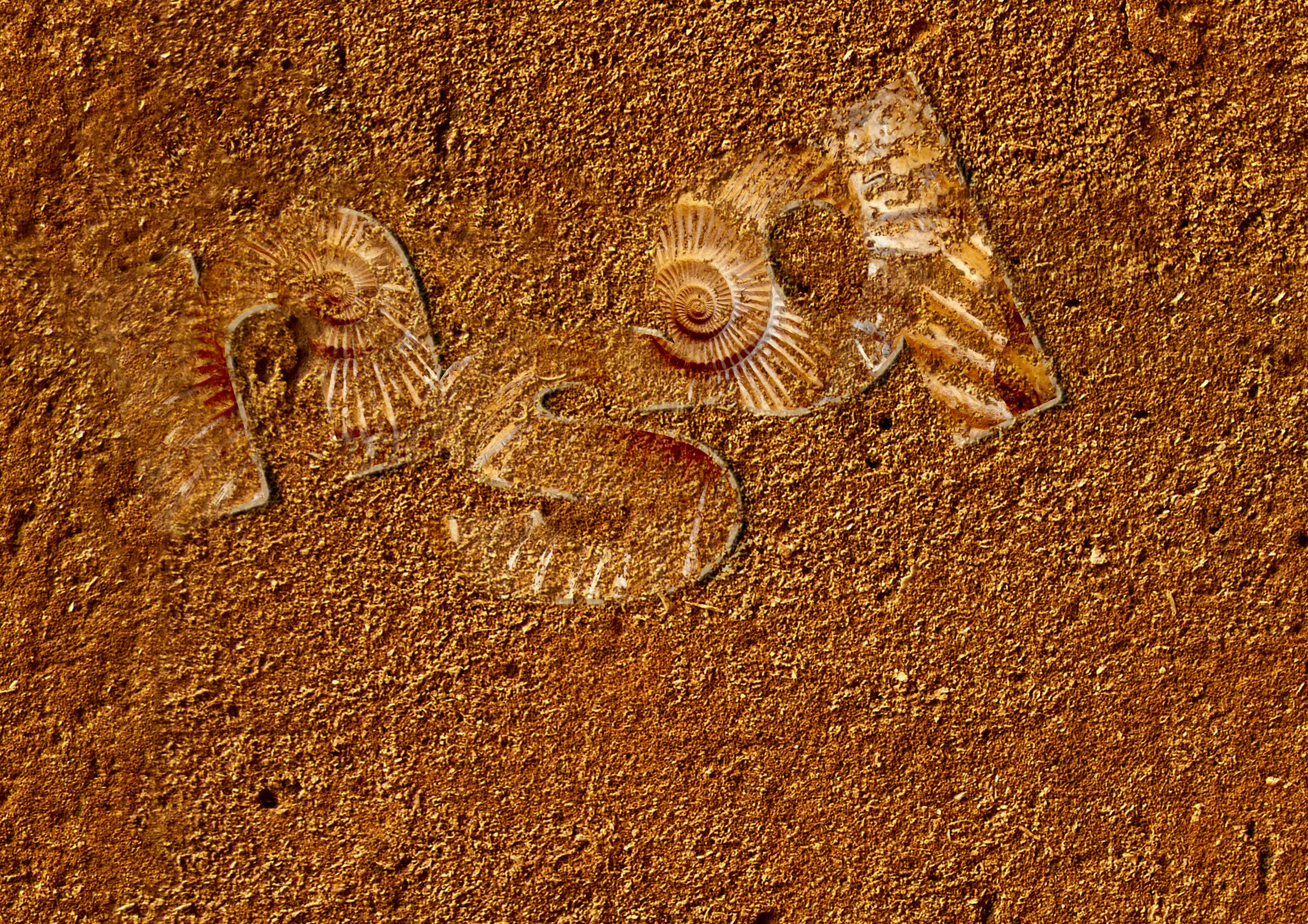
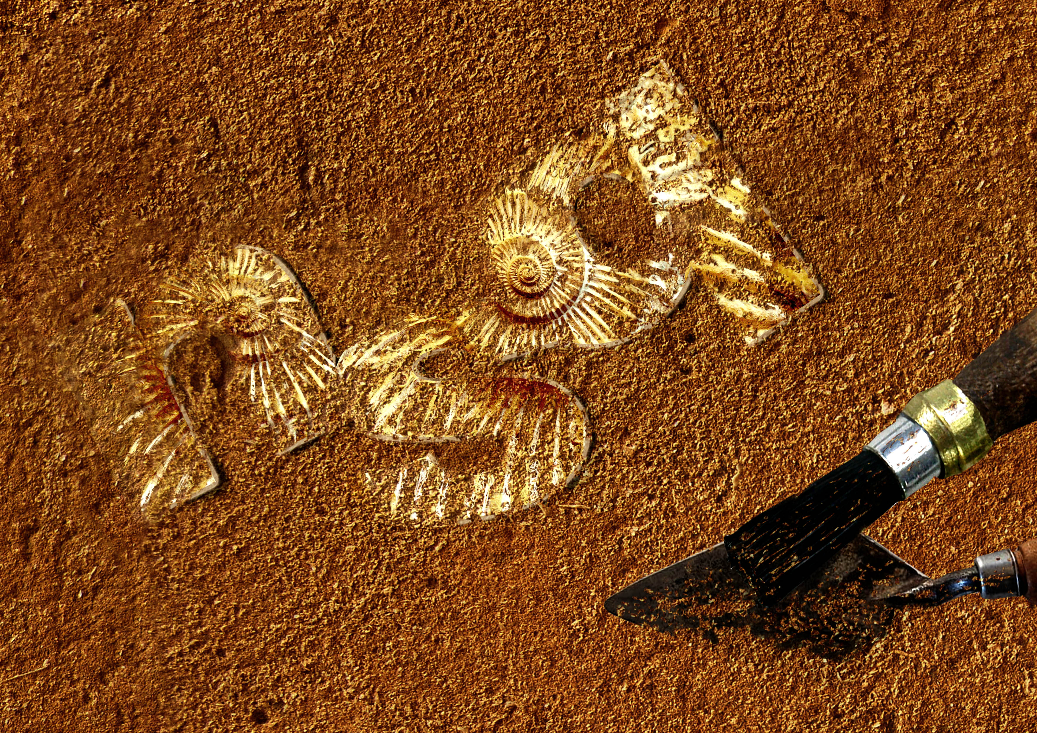
Together with the black/white brush tool and the masking layer, I erased parts where I do not want sand to be. The reason why I used the masking layer is so that I will be able to add and remove sand whenever I want to without being afraid of making a mistake. After I was satisfied, I made the overall image more saturated and brightened up the letters to make them stand out against the sand and added the tools afterwards.
Final:

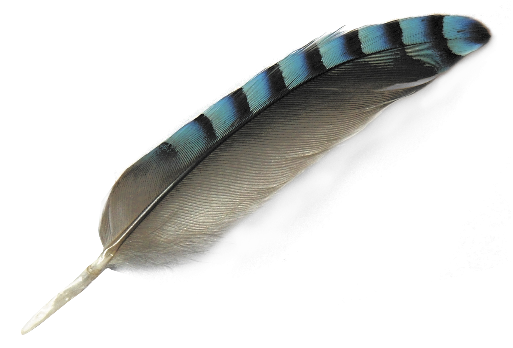
I love observing birds and I enjoy listening to the different kinds of chirps they make.

It just so happen that I came across this image on the internet too which reminded me of bird keepers at the Jurong Bird Park. Thus I decided to use this as my final dream job. This characters comes from an old Game Boy Colour video game called Pokemon Gold/ Sliver. The opponent is just well known to have a full team of bird type Pokemons.
Process:
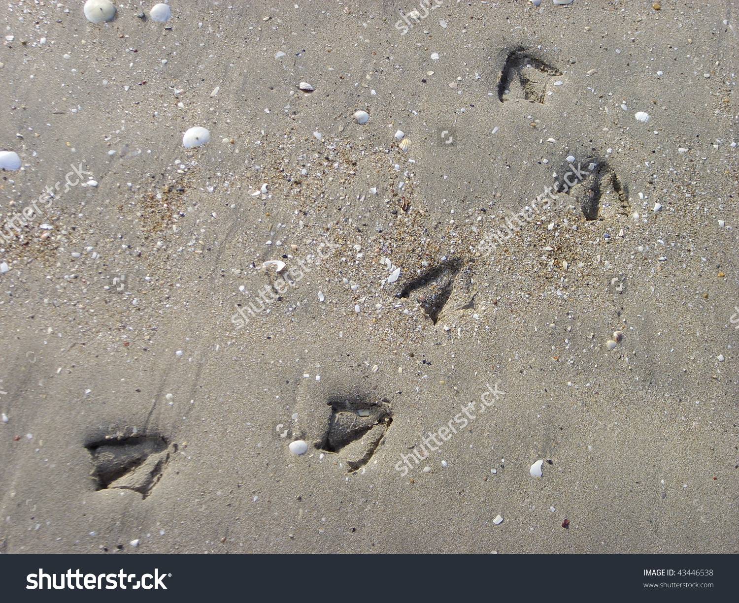


These are the “events” that bird keepers have to surely face while doing their jobs.


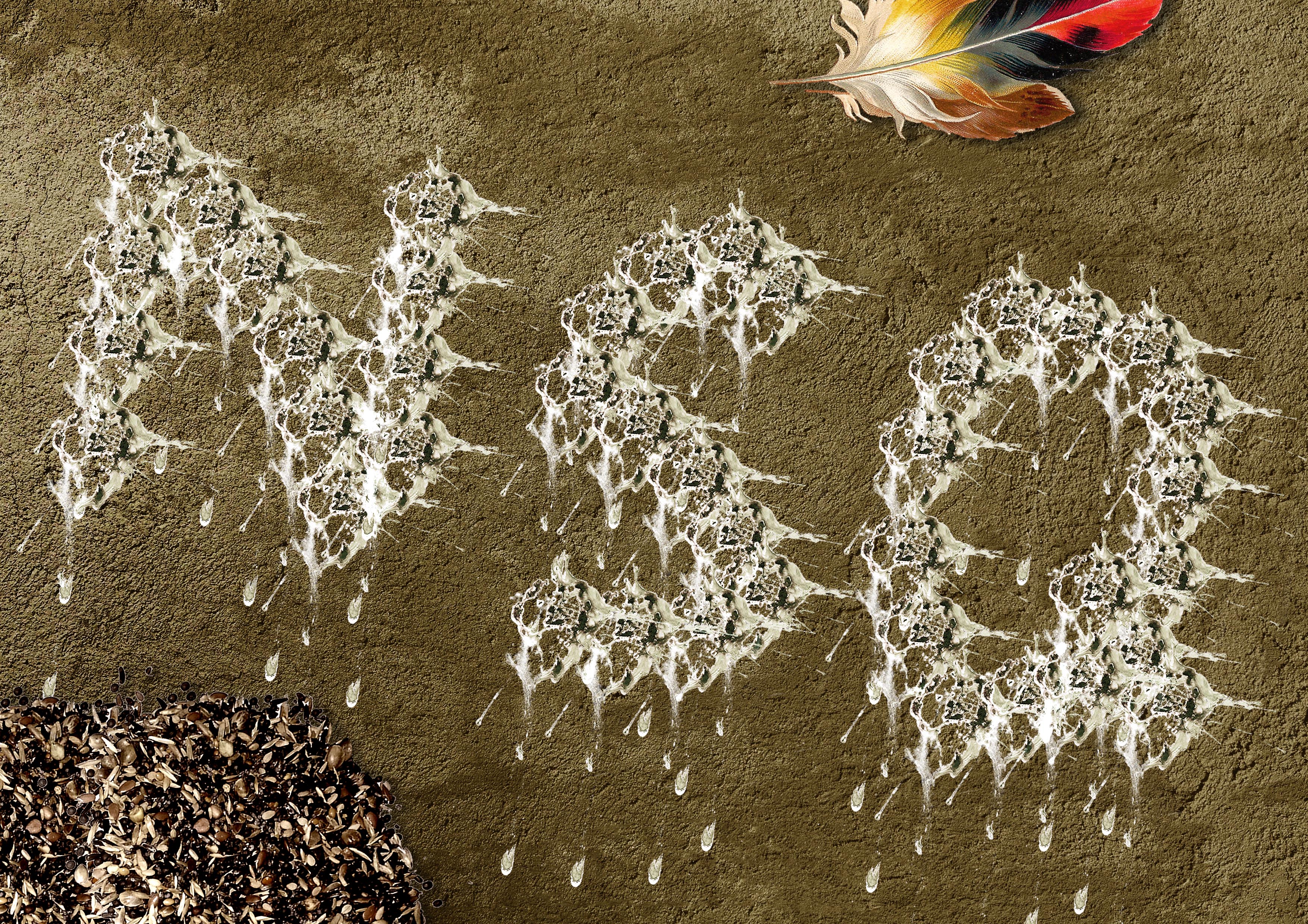
Using a PNG file of a bird poop, I used it to form the initials of my name and afterwards added the small details of a bird keeper’s environment.

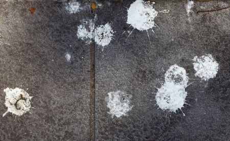
Lowering the saturation of the large pile of food turns the attention away from it and more on to the words. Ms Shirley mentioned that the dirty poop looks better due to the darker values it has to portray more details in the poop. The white ones looked too clean, systematic and robotic.
Final:

Lastly, Ms Shirley also commented that the poop size should vary in order to make the shape more inorganic ??
The End ??