Que Sara


@shiqianx3
With so many negative news about Yishun recently, many people have been looking at Yishun in a bad way. Therefore, in my zine, I wish to highlight to the viewers that Yishun had good and inspiring stories too, so that Yishun will be painted in a positive light.

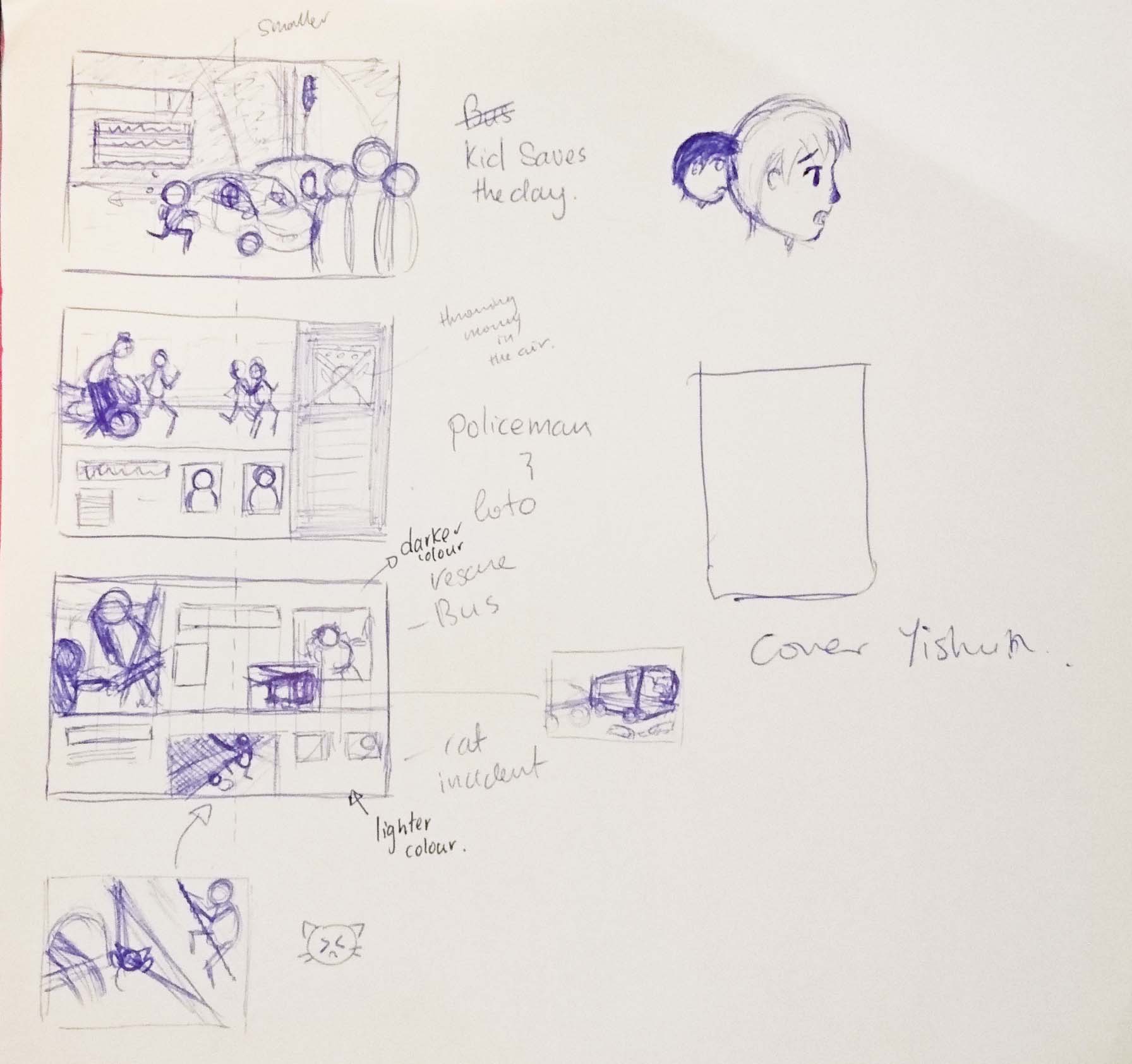
I did some planning for the stories that I had chosen just to see how I could arrange them.
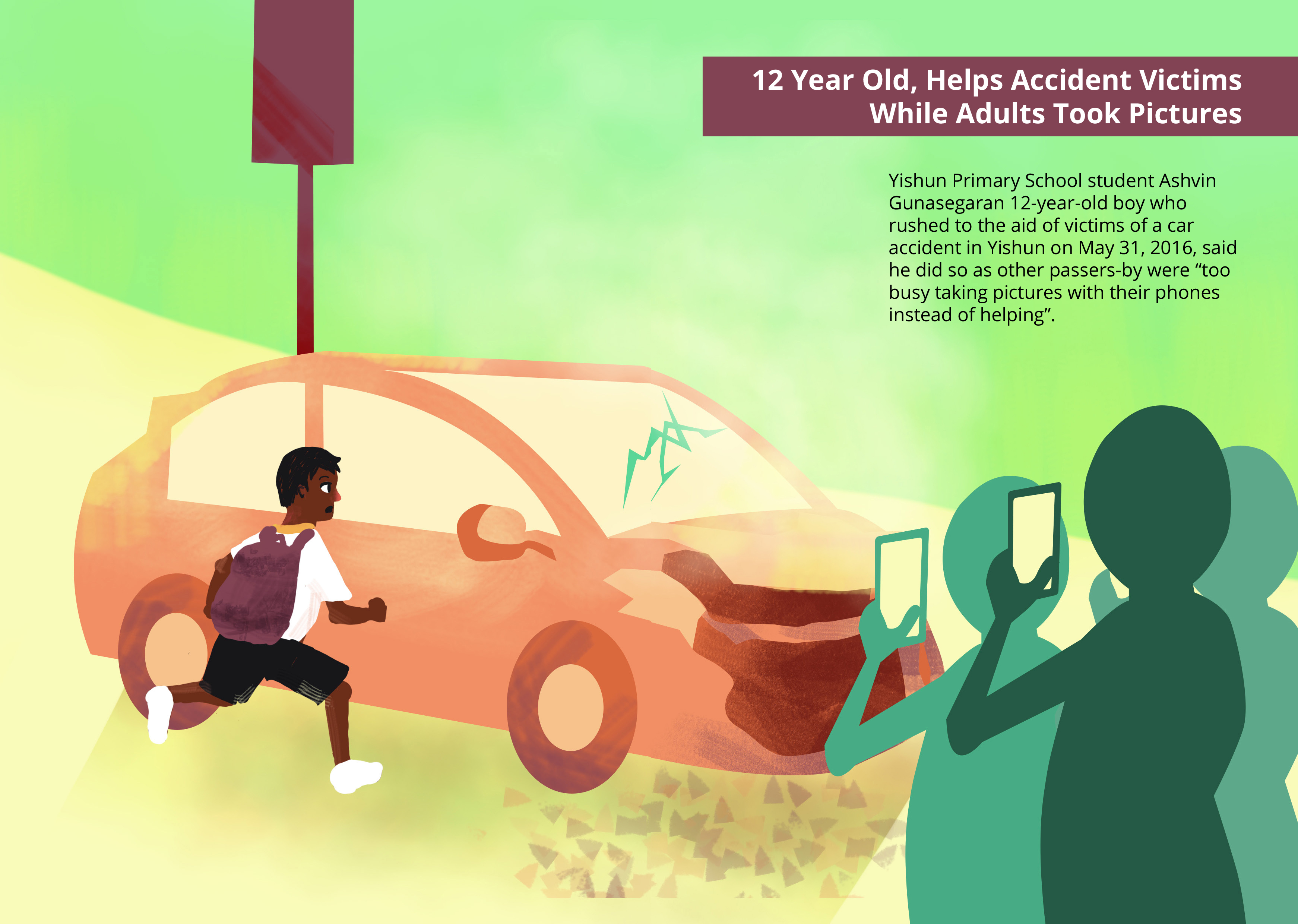
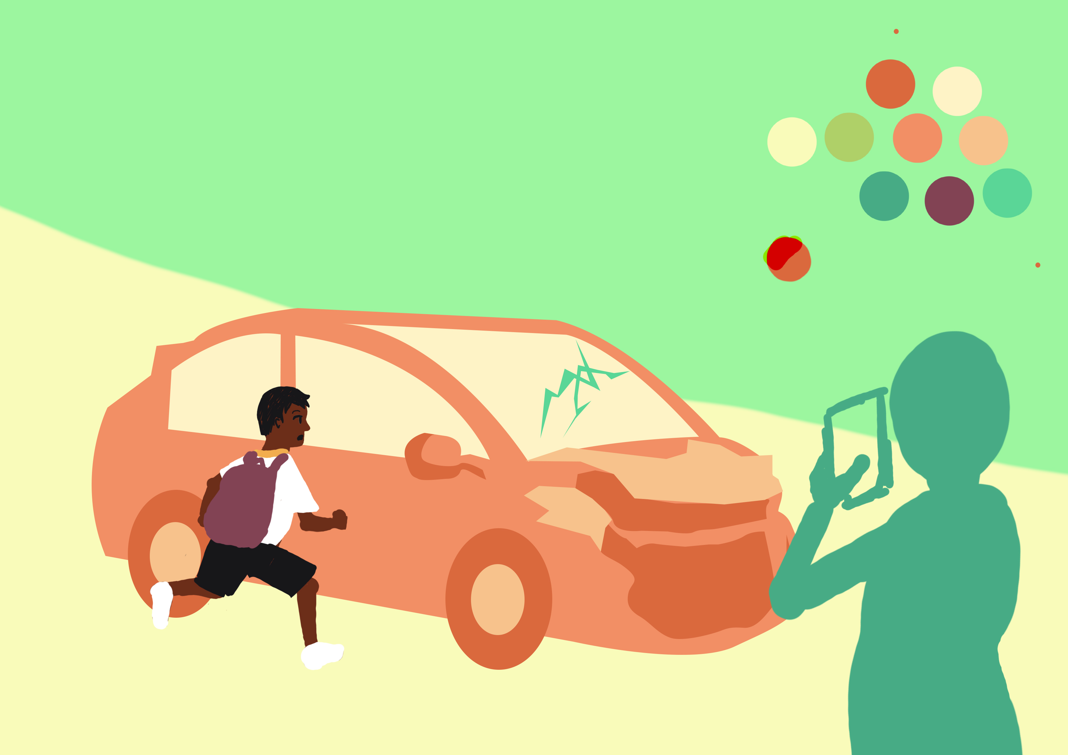
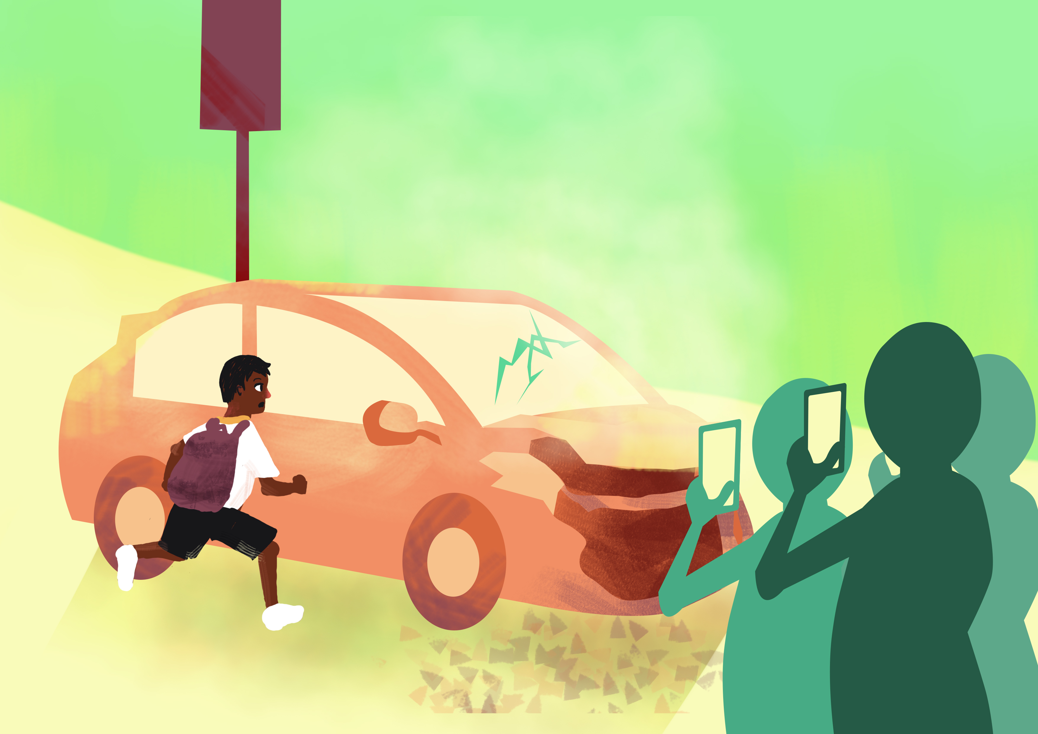
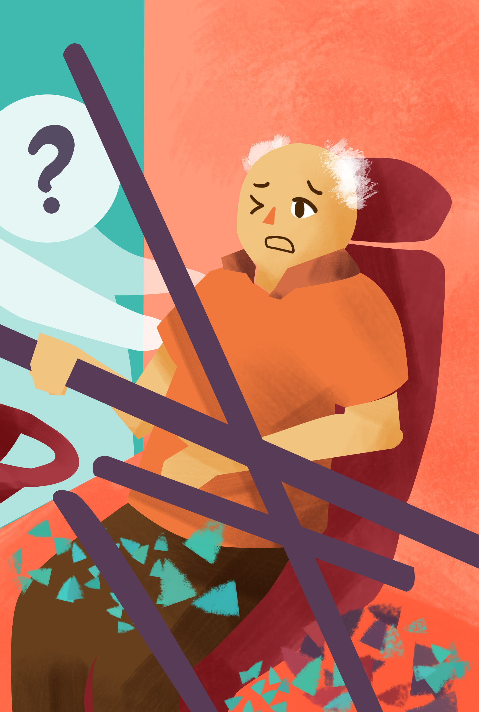
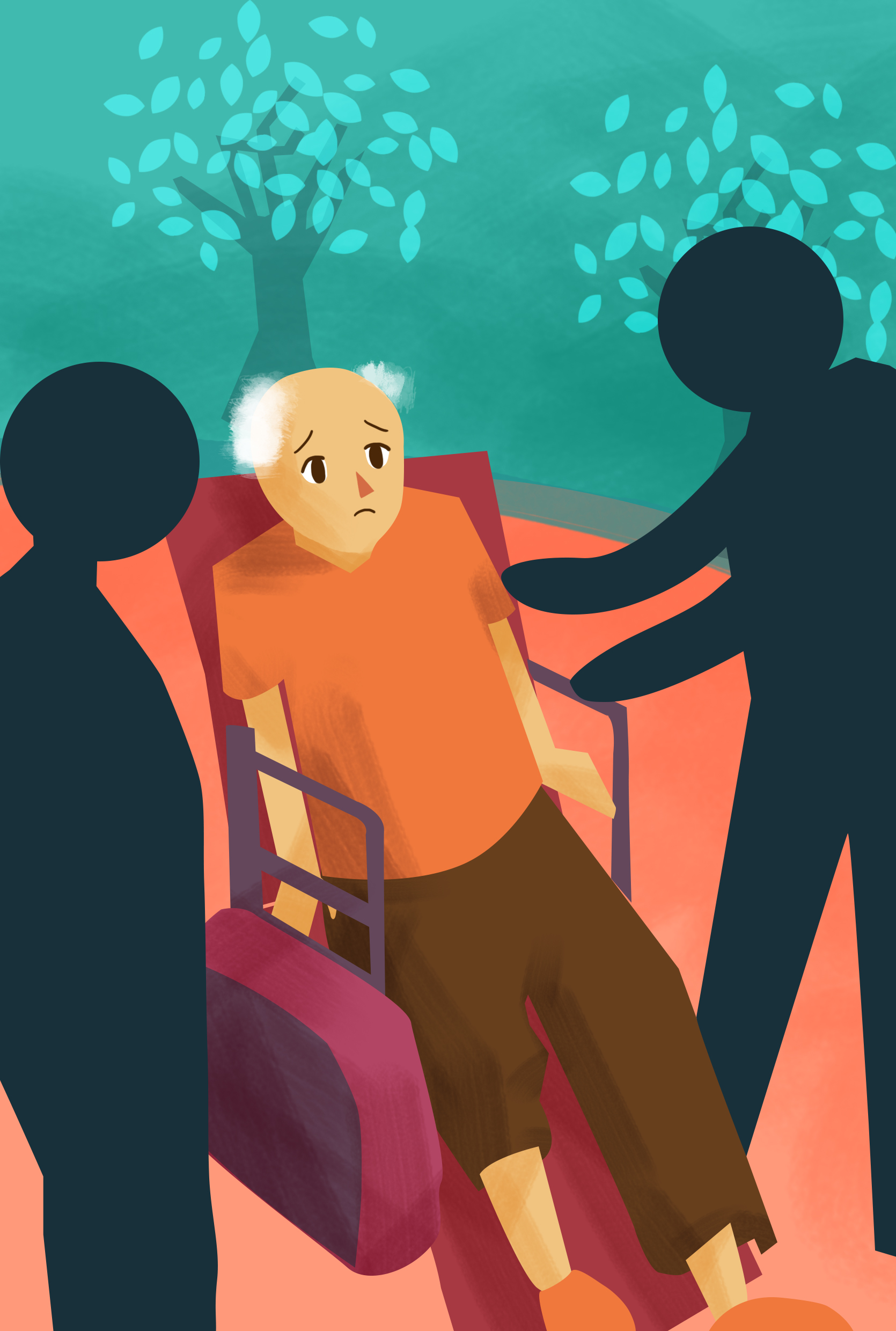
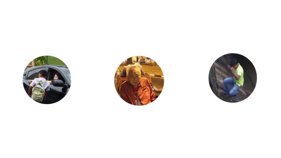
I decided to have the 12 year old Boy aiding the victims as the first spread as it is the most valuable positive news out of them 5 stories.
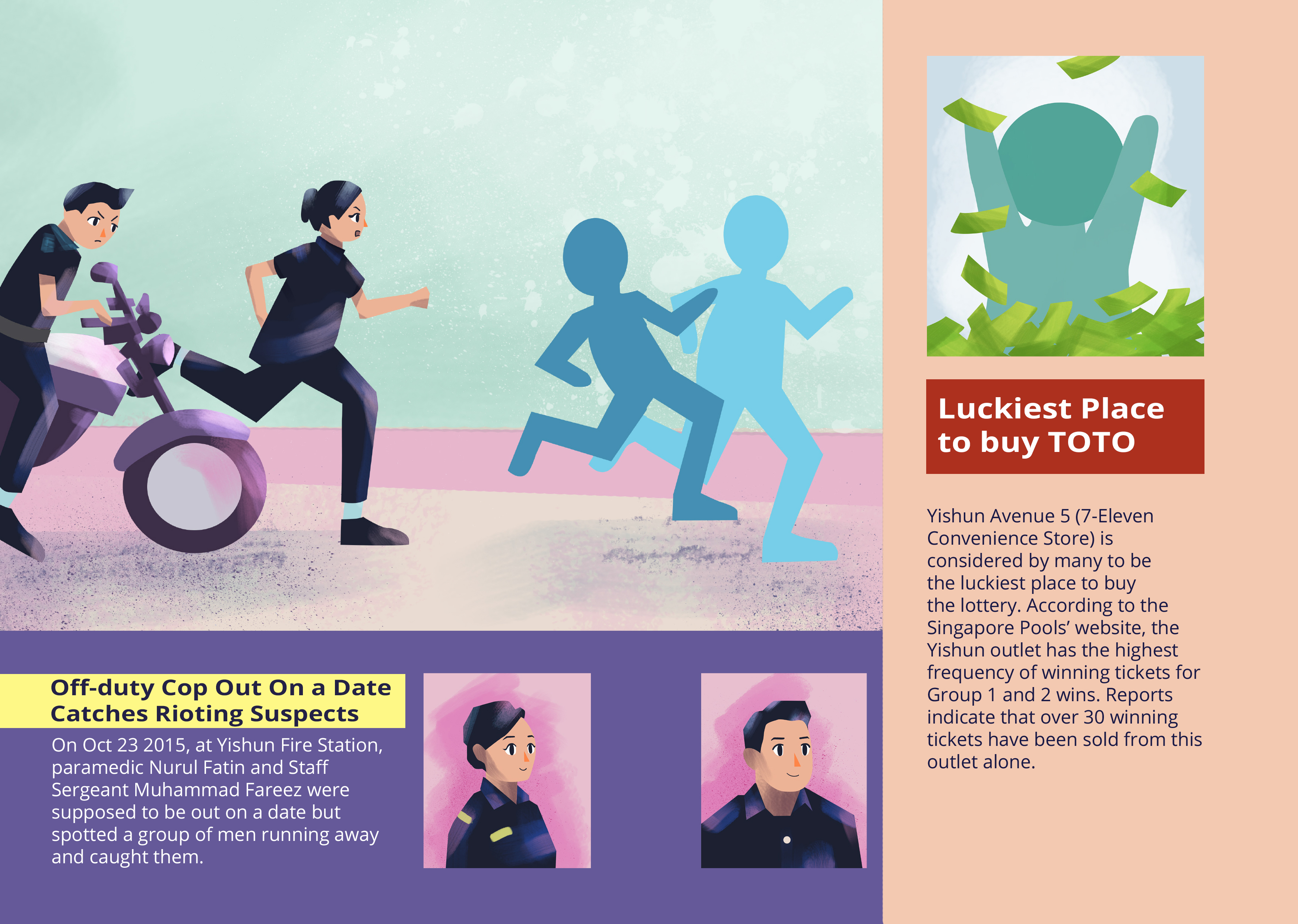
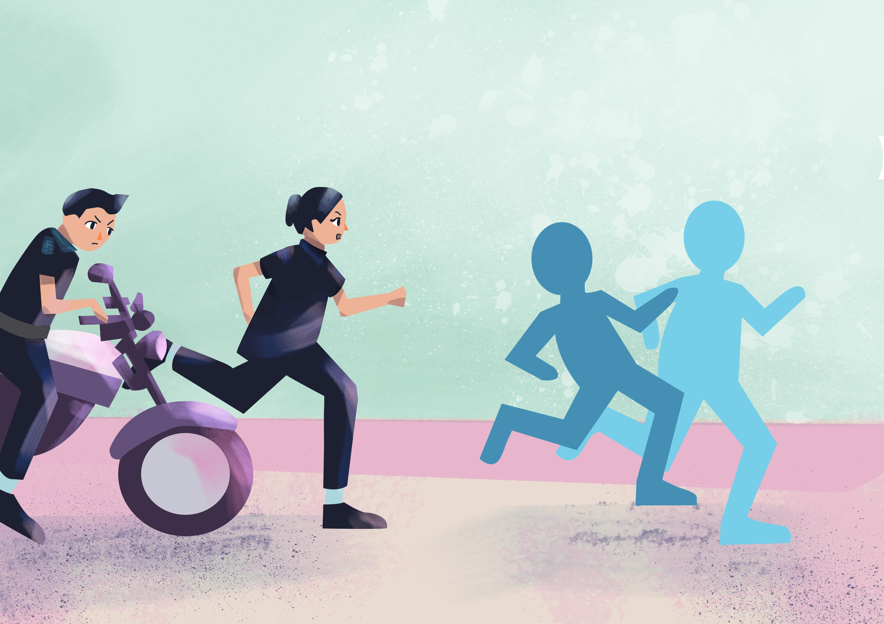
For the 2nd spread, I decided to divide it into 2 sections where the smaller column is for the less important news which I decided was the TOTO article, while the other is about the Cops.
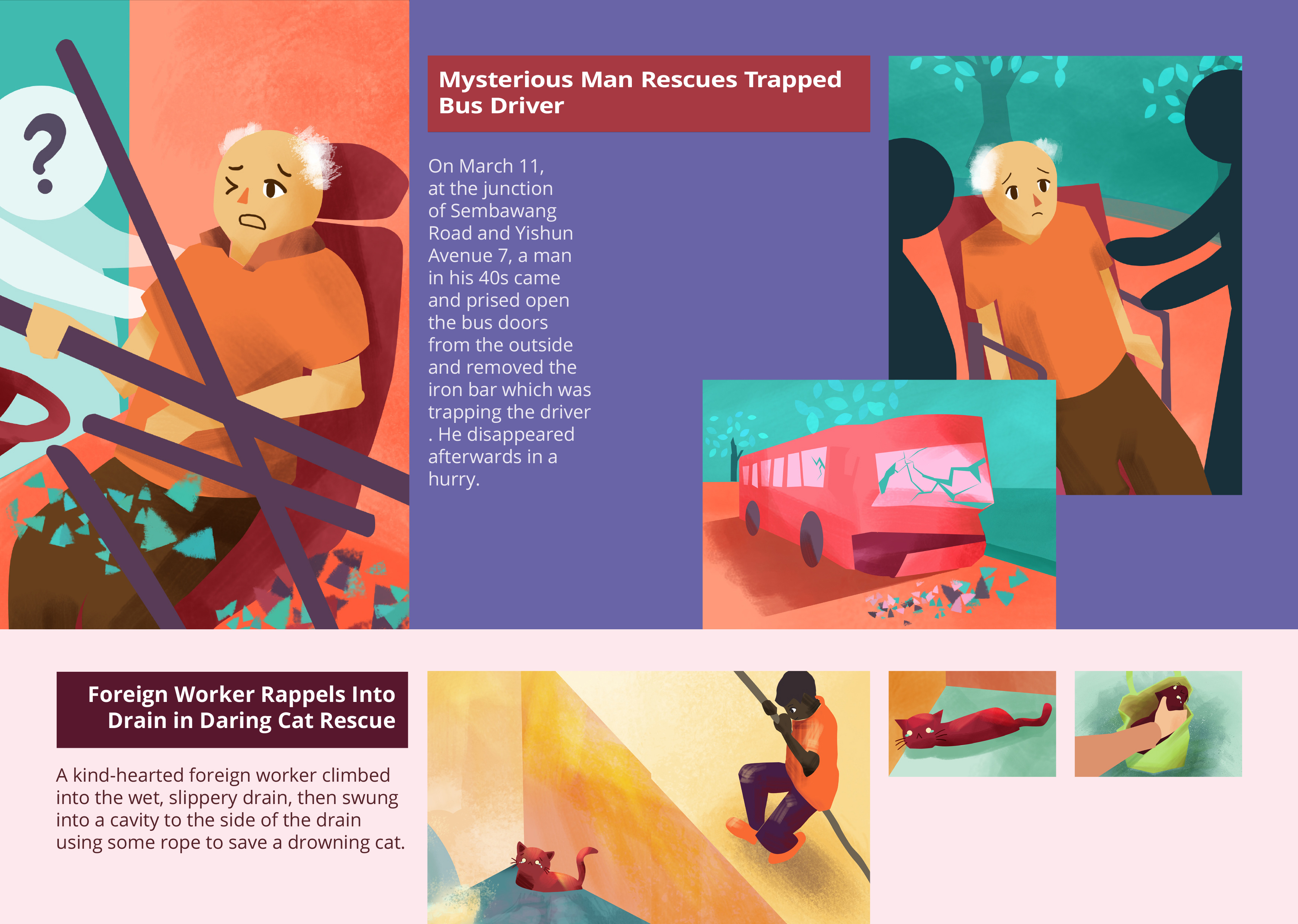
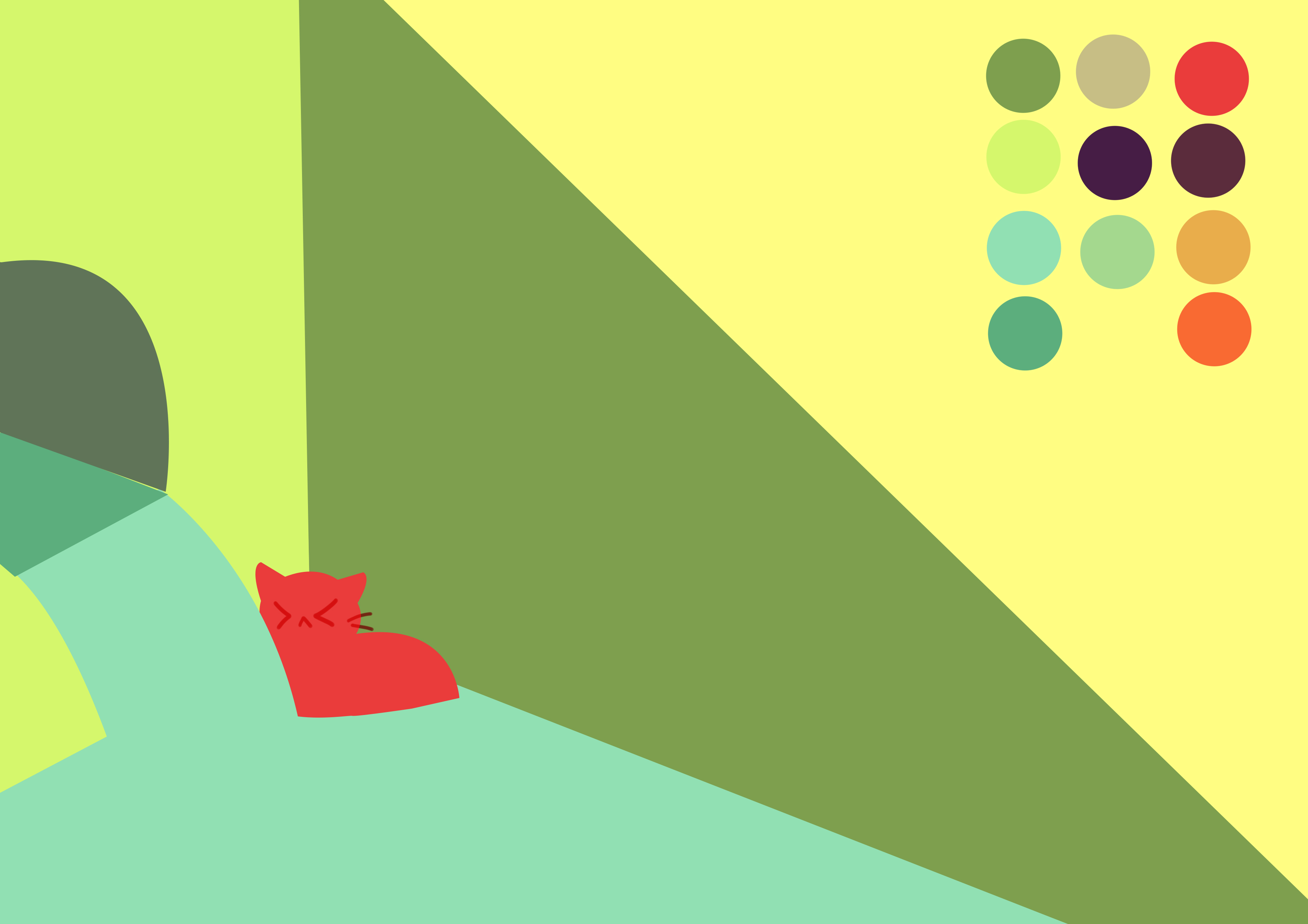
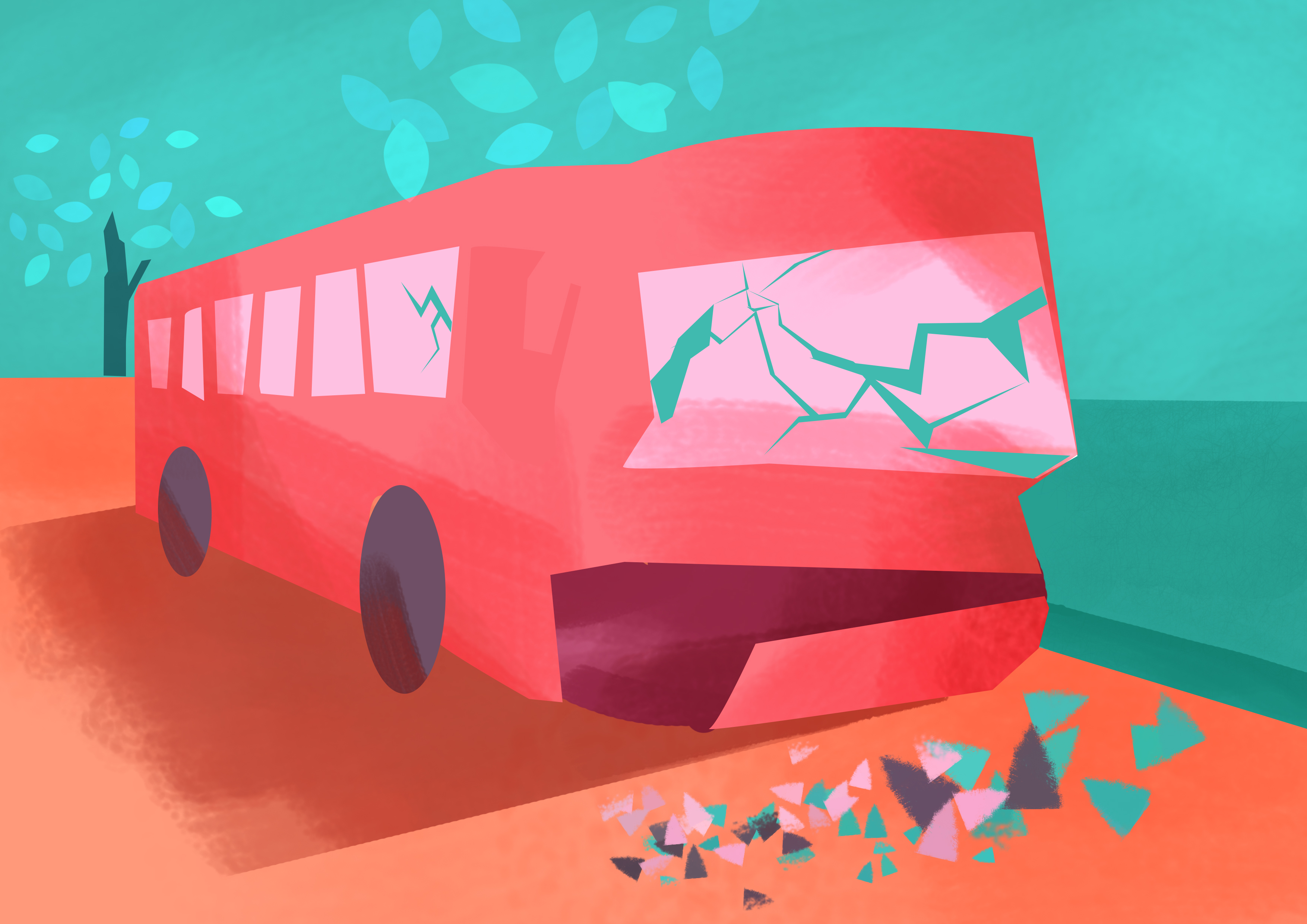
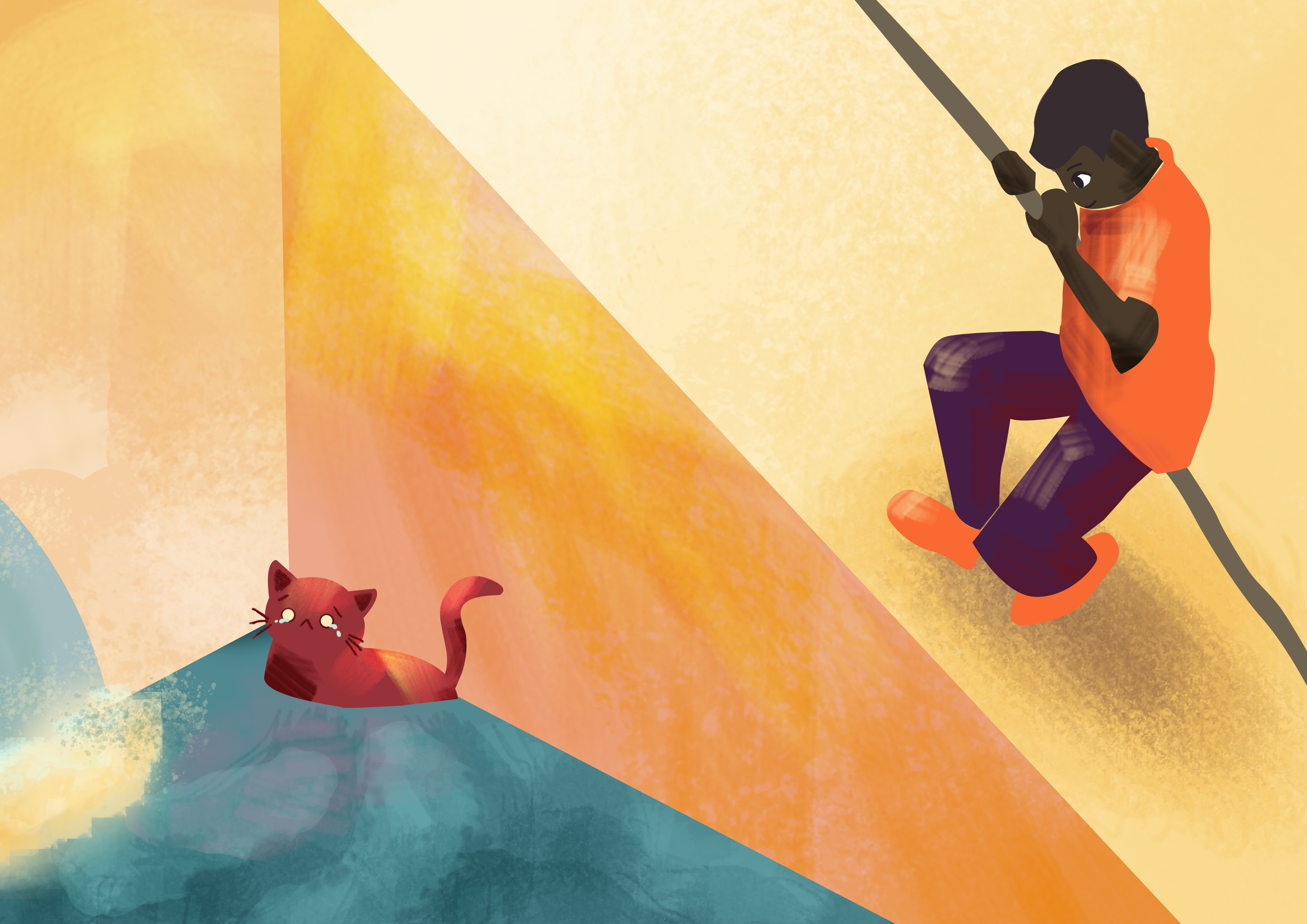
As for the last spread, I decided to place the bus article on top while the Indiana Jones foreign worker helping the cat at the bottom.
I was just looking through Facebook and DeviantArt’s Facebook page shared these 2 artworks which made me want to try out this kind of style 😀
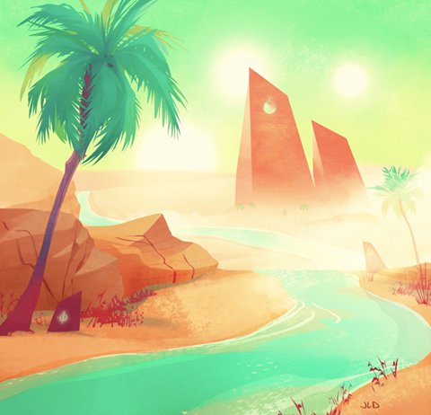
http://jilllenad.deviantart.com/art/105-desert-523596410
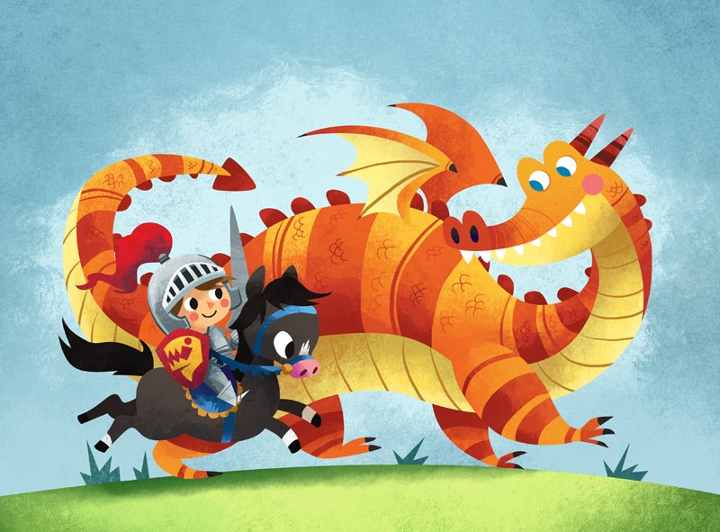
http://meldraws.deviantart.com/art/Dragon-Knight-160860604
http://marcobucci.deviantart.com/
Brushes that I used: https://digitalpaintingtools.blogspot.sg/2009/11/marcos-brushes.html
Before using the pen tool to create/ trace out the vectors, I created some sketches using the brush tool first to make life easier 🙂
I wanted to use rich and vibrant colours which helps set a positive tone to the entire zine. In addition the colours, especially on the front cover would be able to attract people’s attention from afar due to it’s saturation and also the usage of more reds which is striking to the viewer’s eyes.

The textures can really make a vast difference 😀
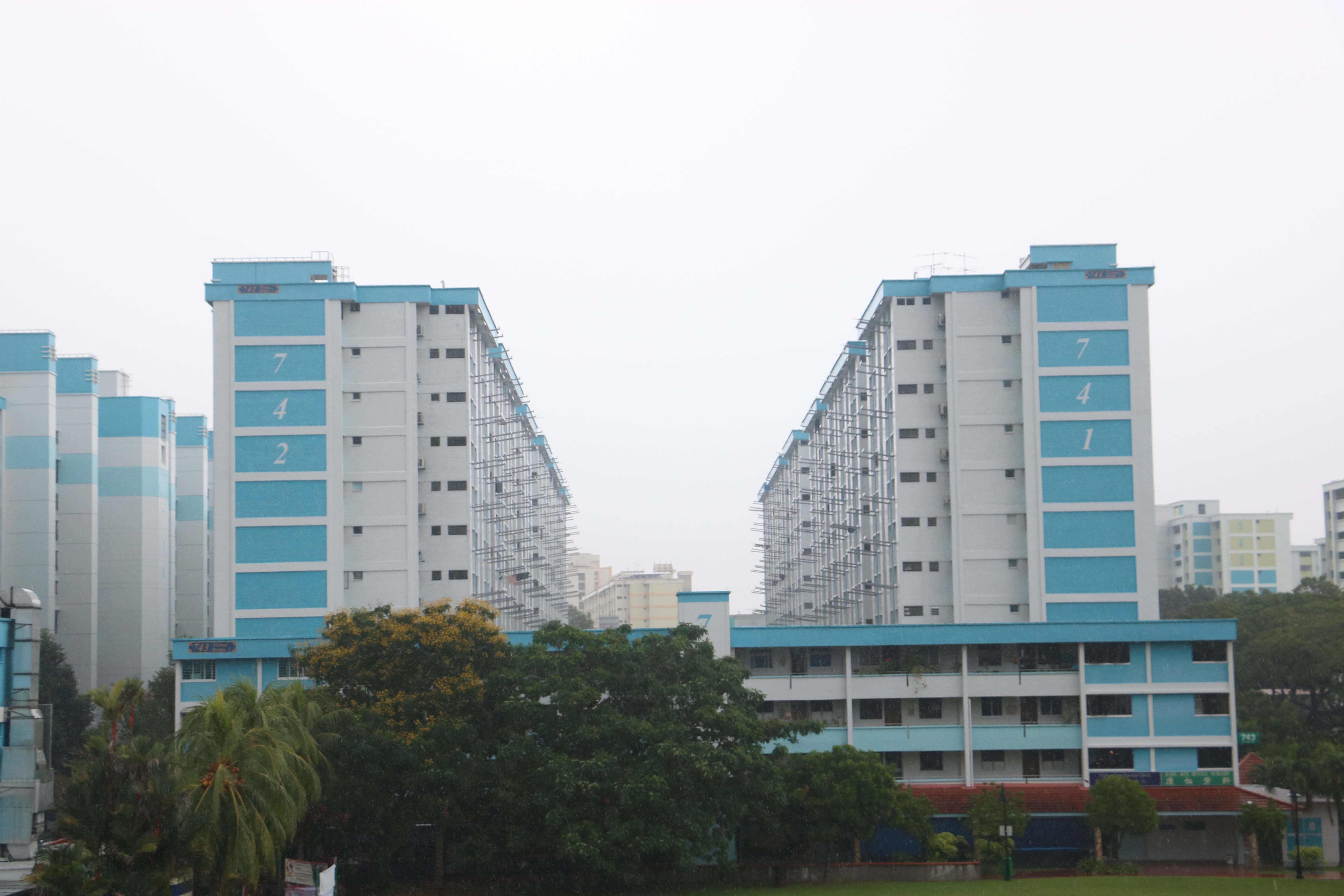
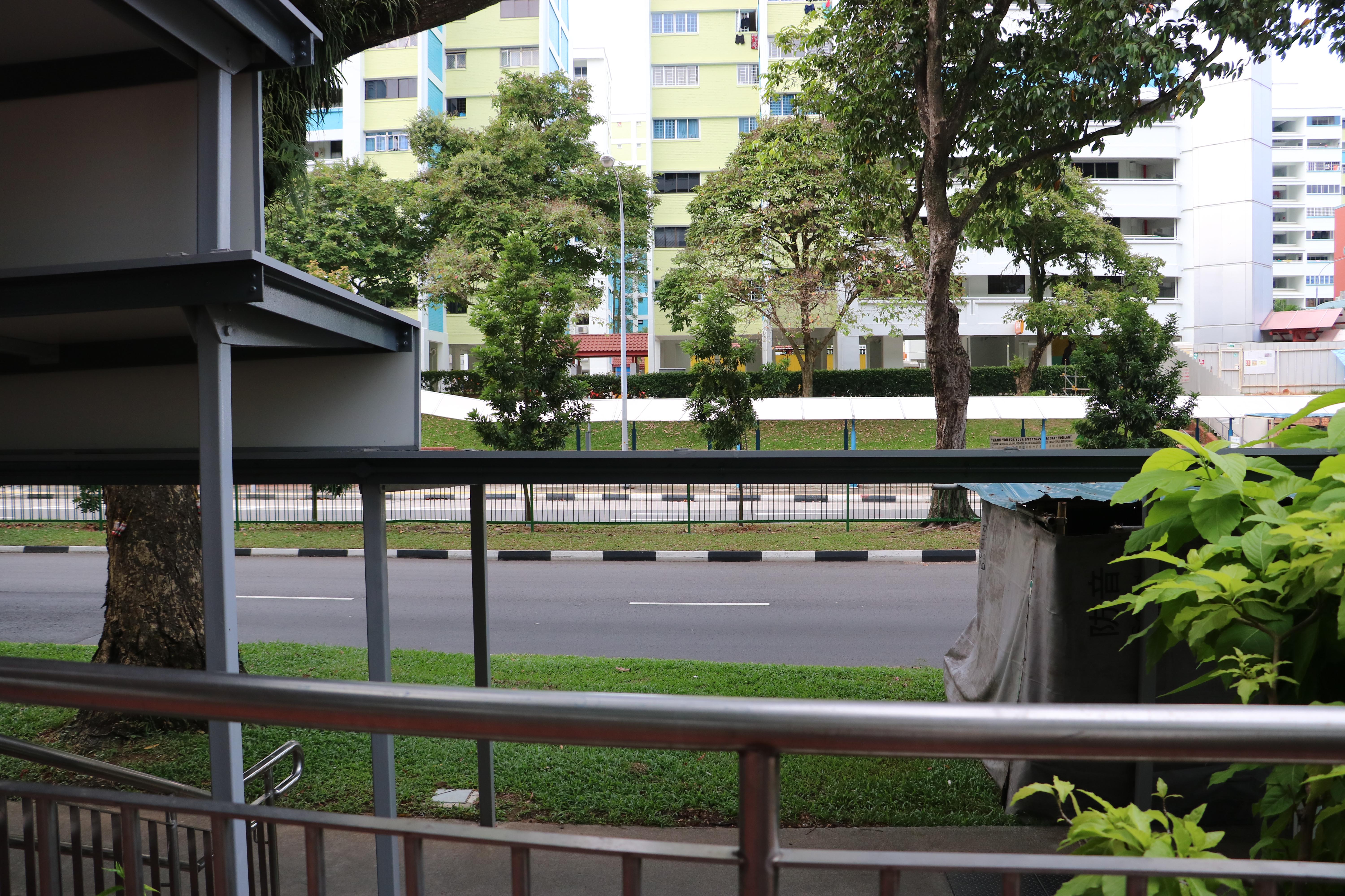
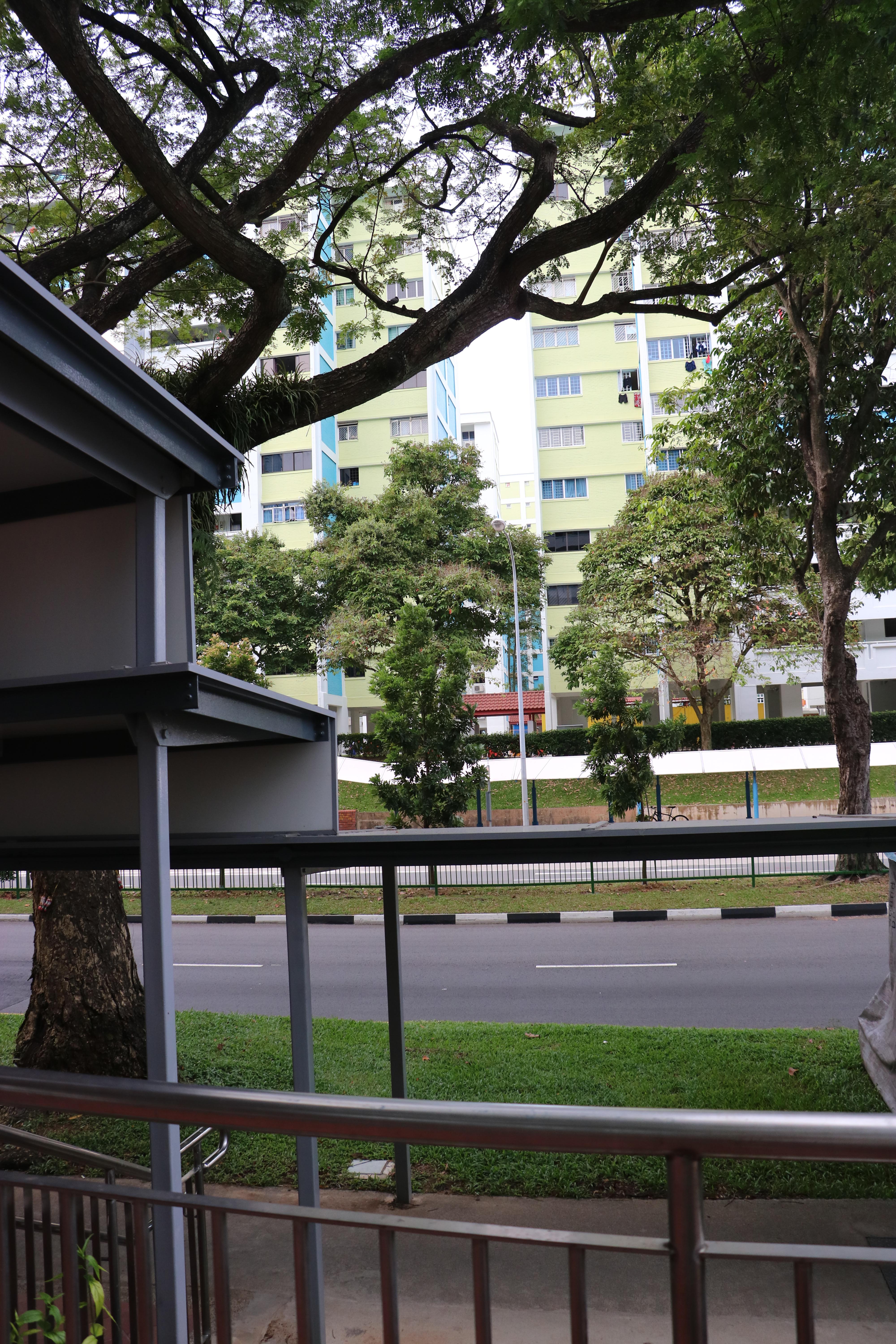
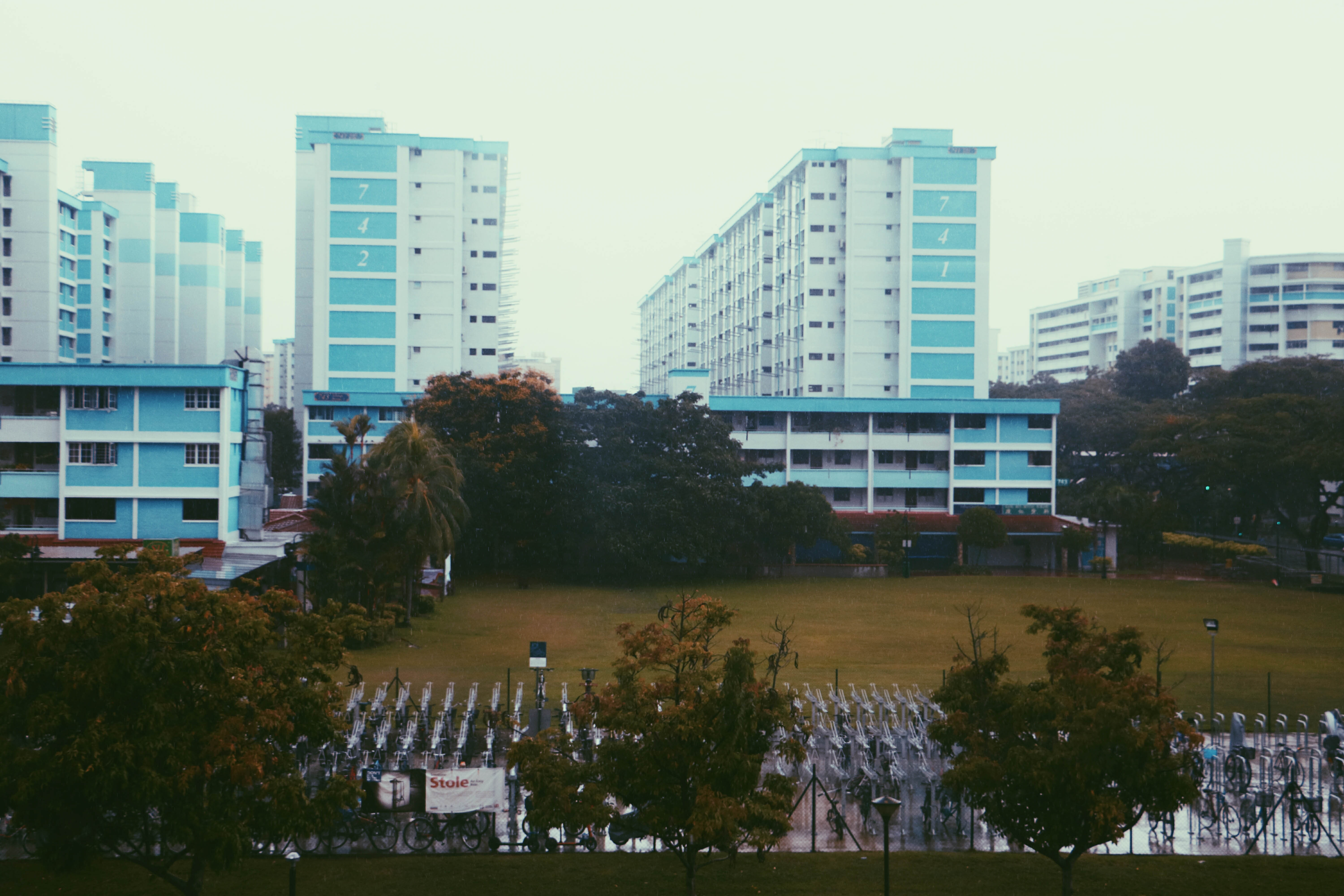
The cover page is a view of Yishun that I took from the MRT station.


When I was first assigned to Yishun, the very first thing that came to my mind was cat murderers. Immediately I thought of doing a zine about the cats but I thought that I should look around the area first to see whether I will be able to find other inspirations.
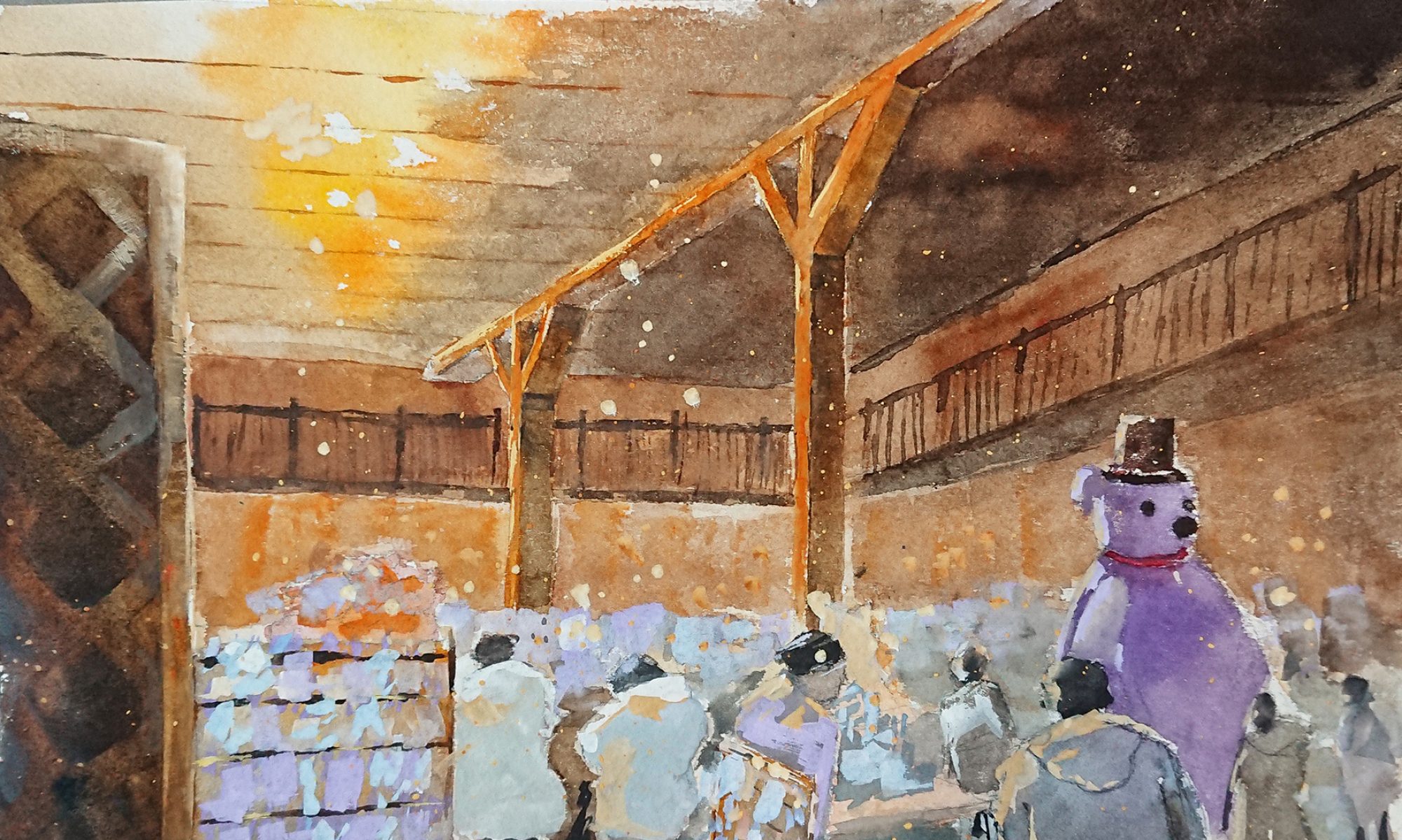
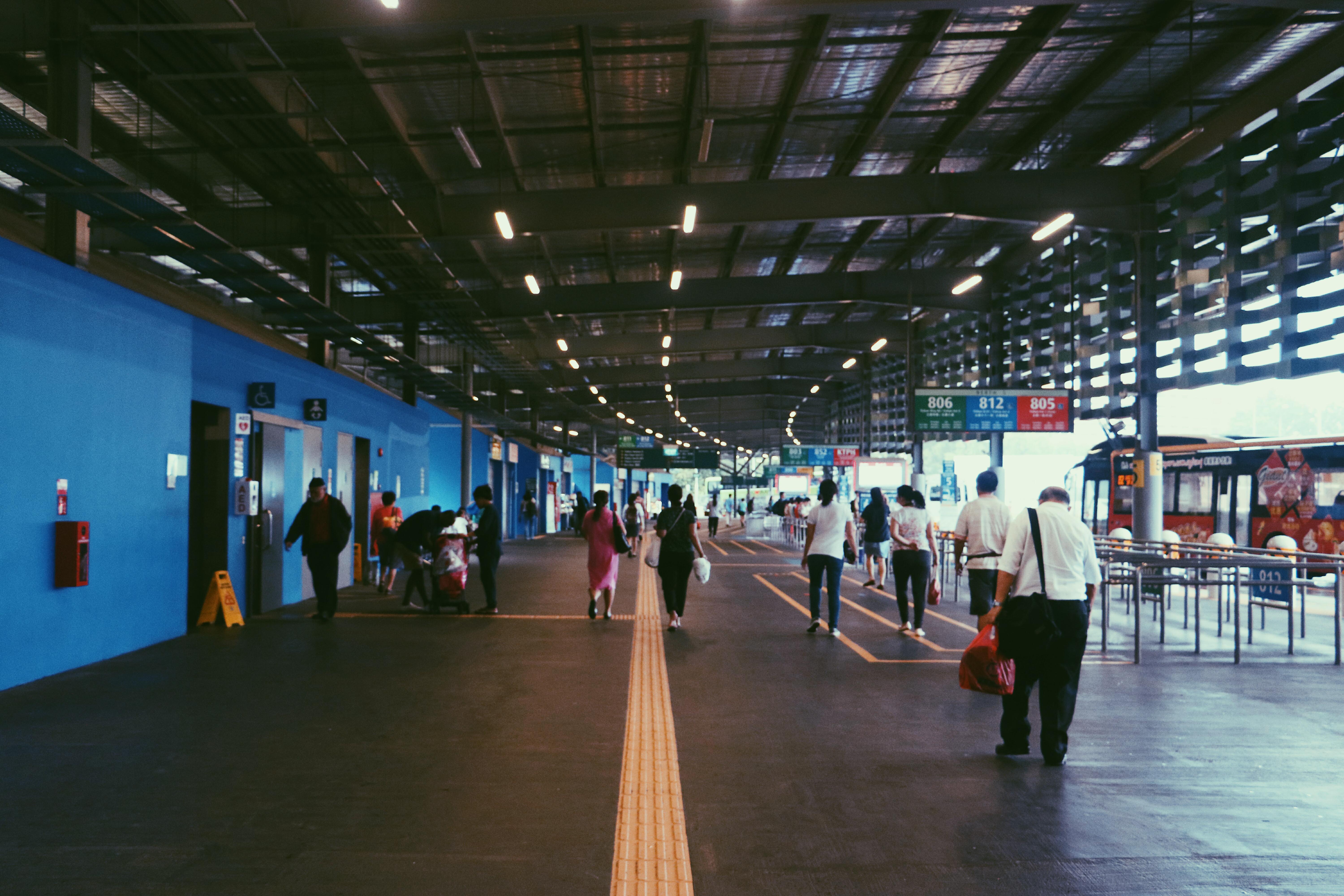
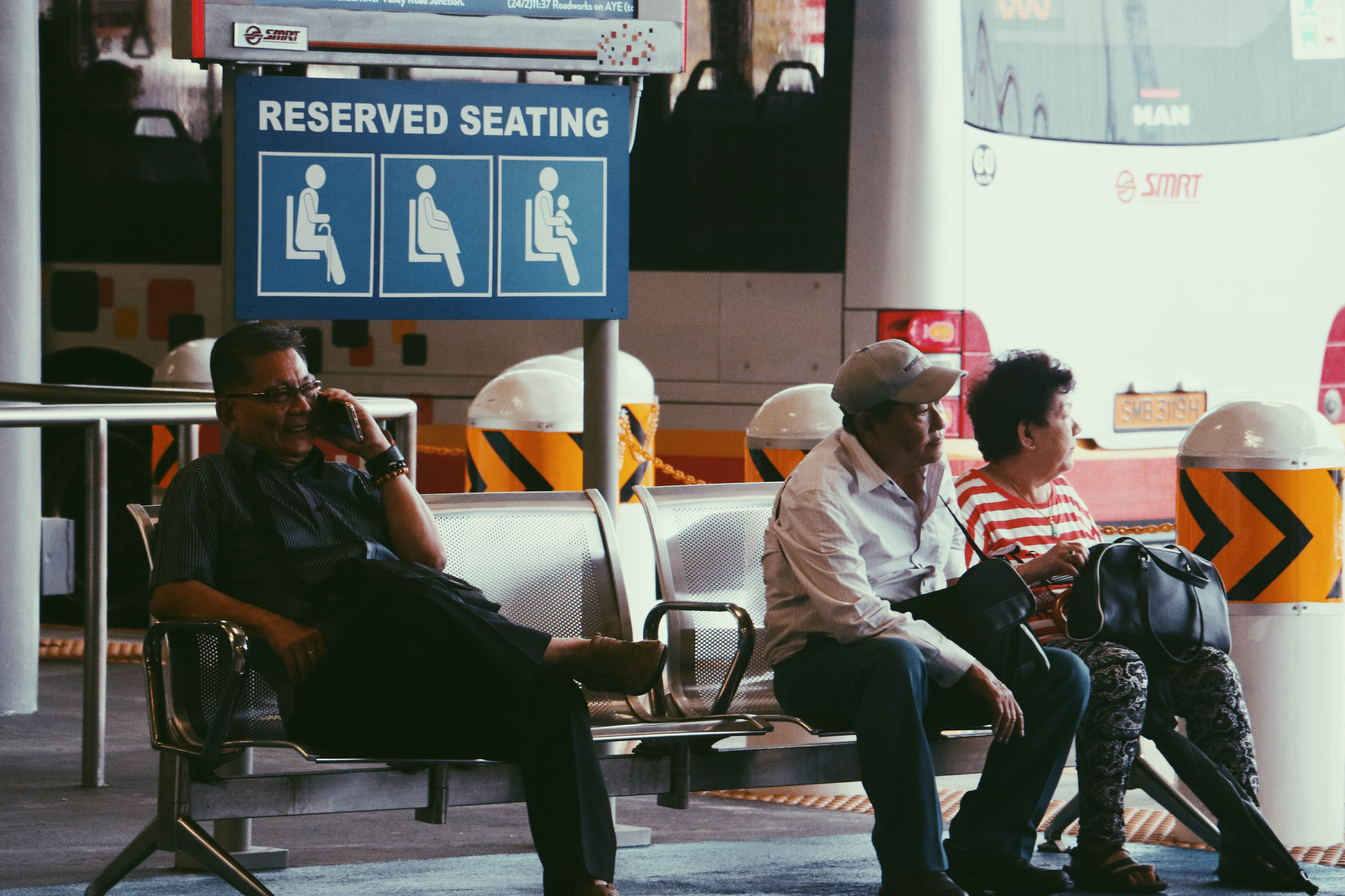
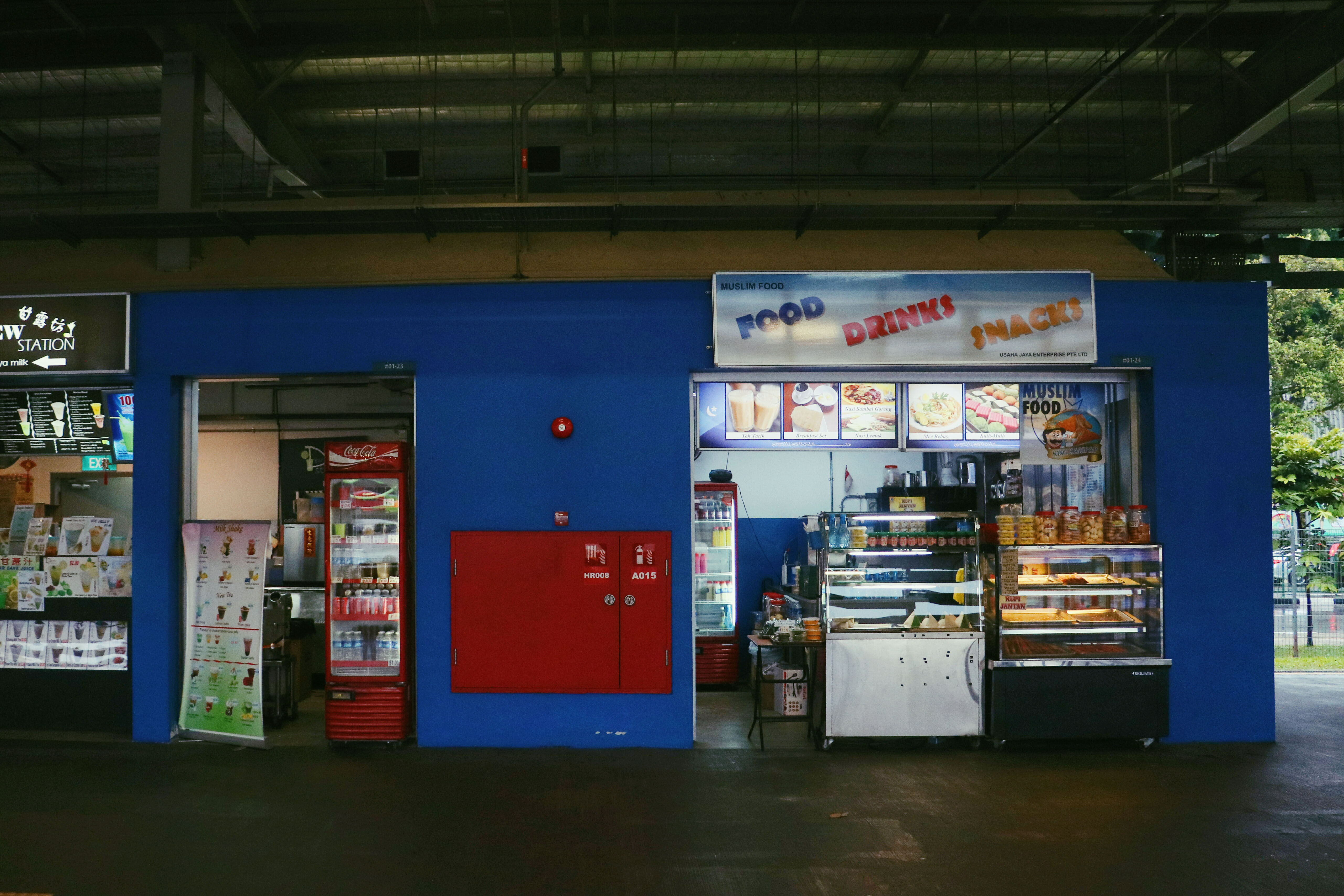
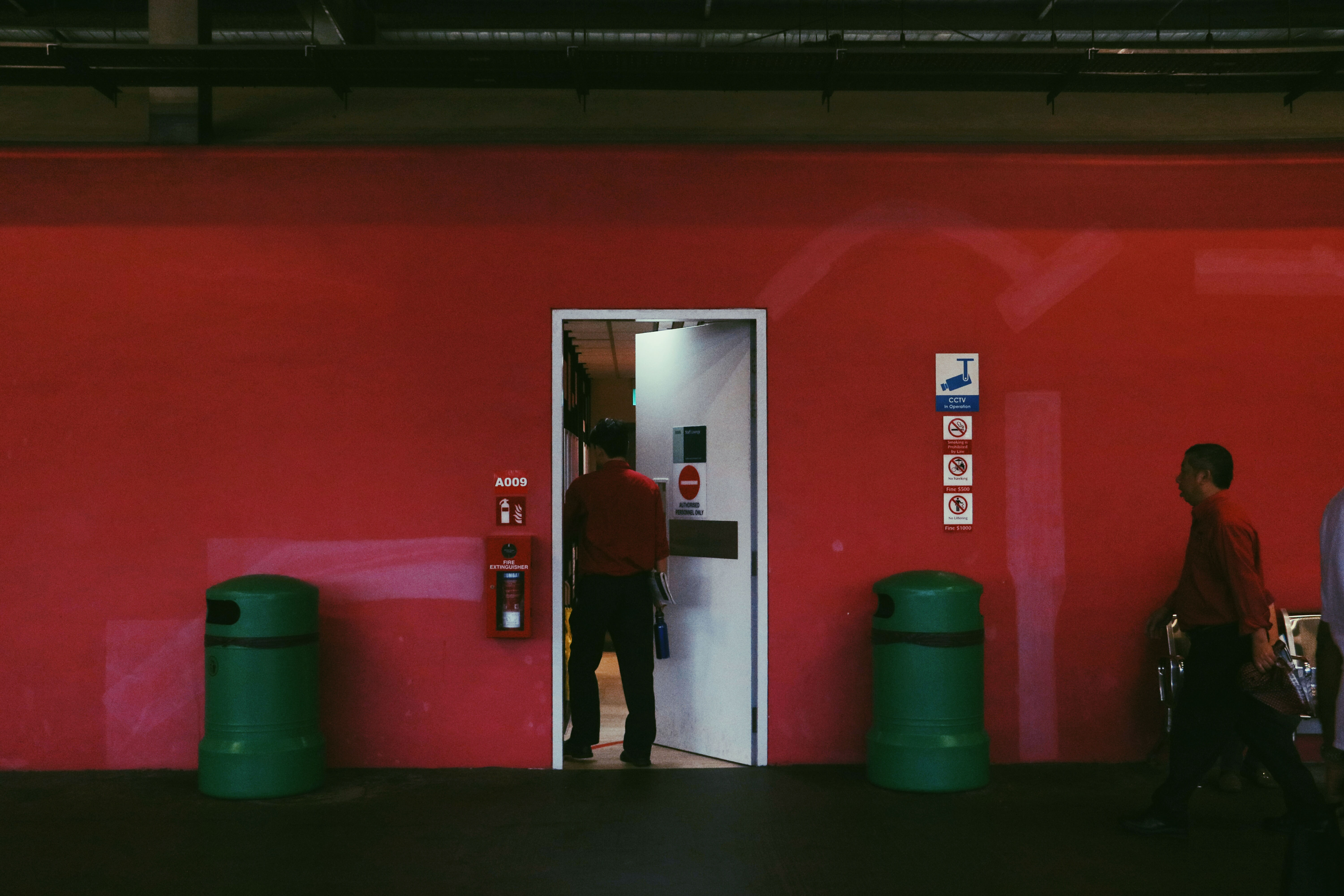
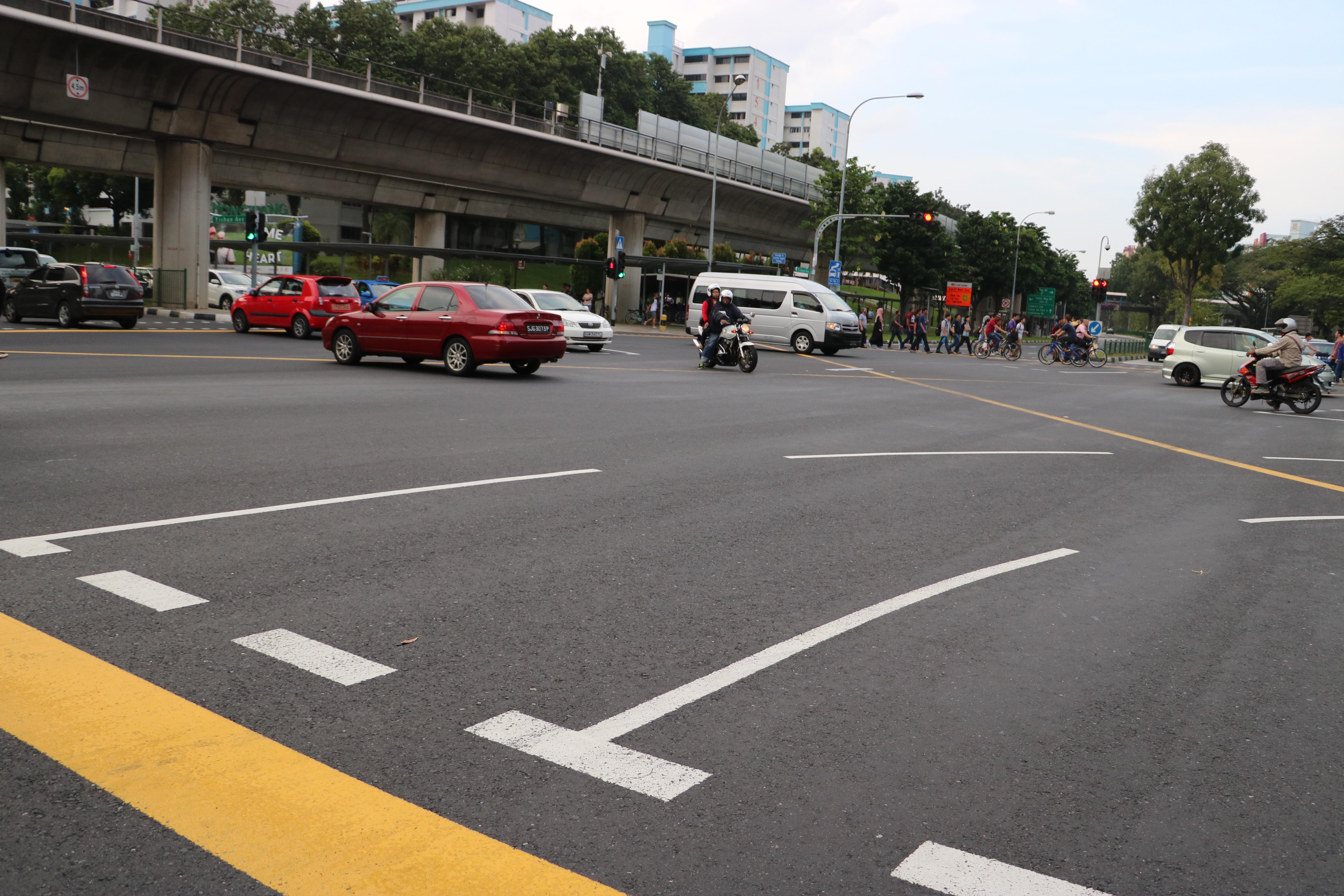
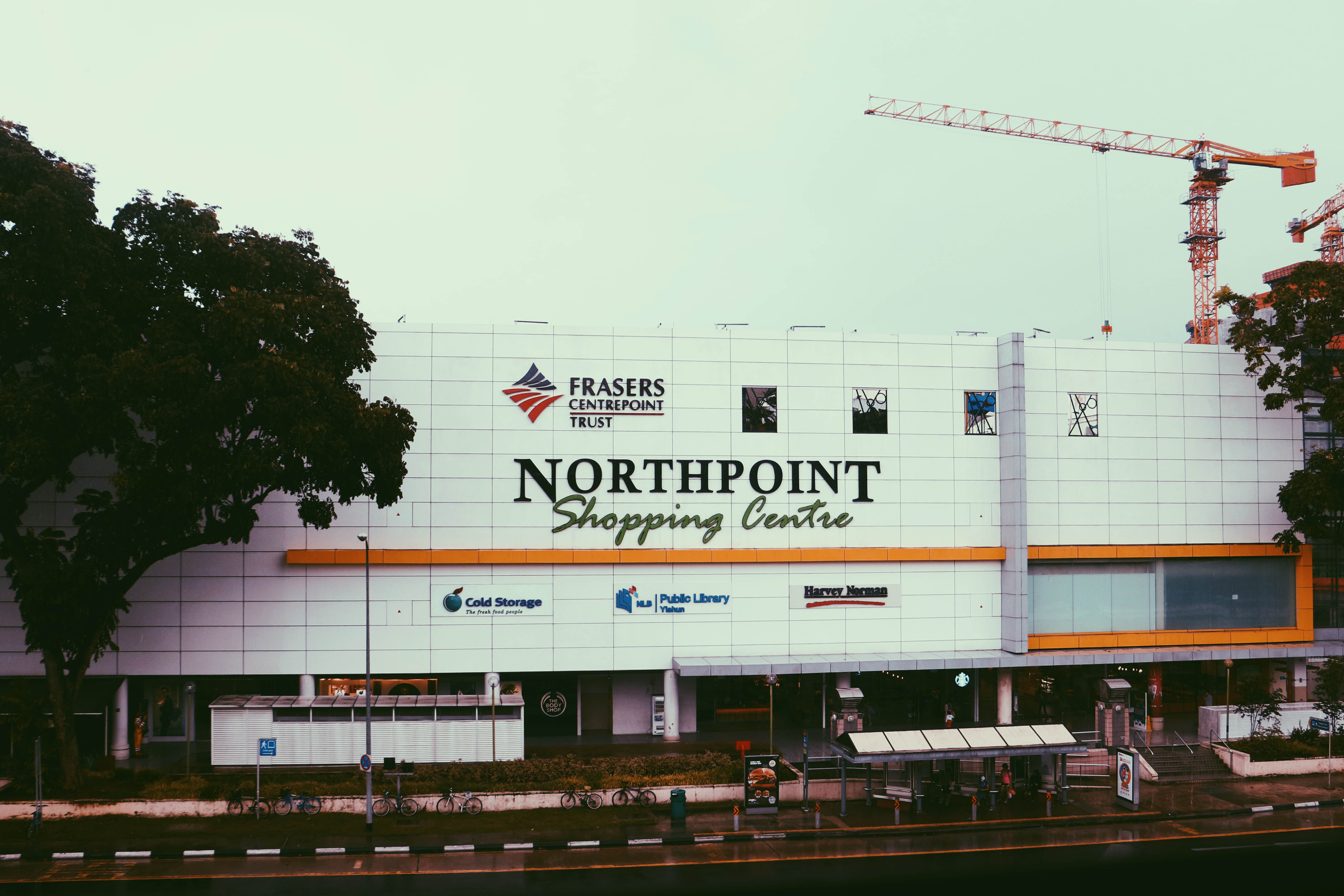
During my first trip down to Yishun, I wanted to familiar myself with the surroundings and explore for ideas. Other than to look out for interesting subjects, I did not really had an absolute plan as to what to focus on. Sadly, it was raining that day and I was restricted to sheltered areas, but I tried my best to take pictures of everything and anything.
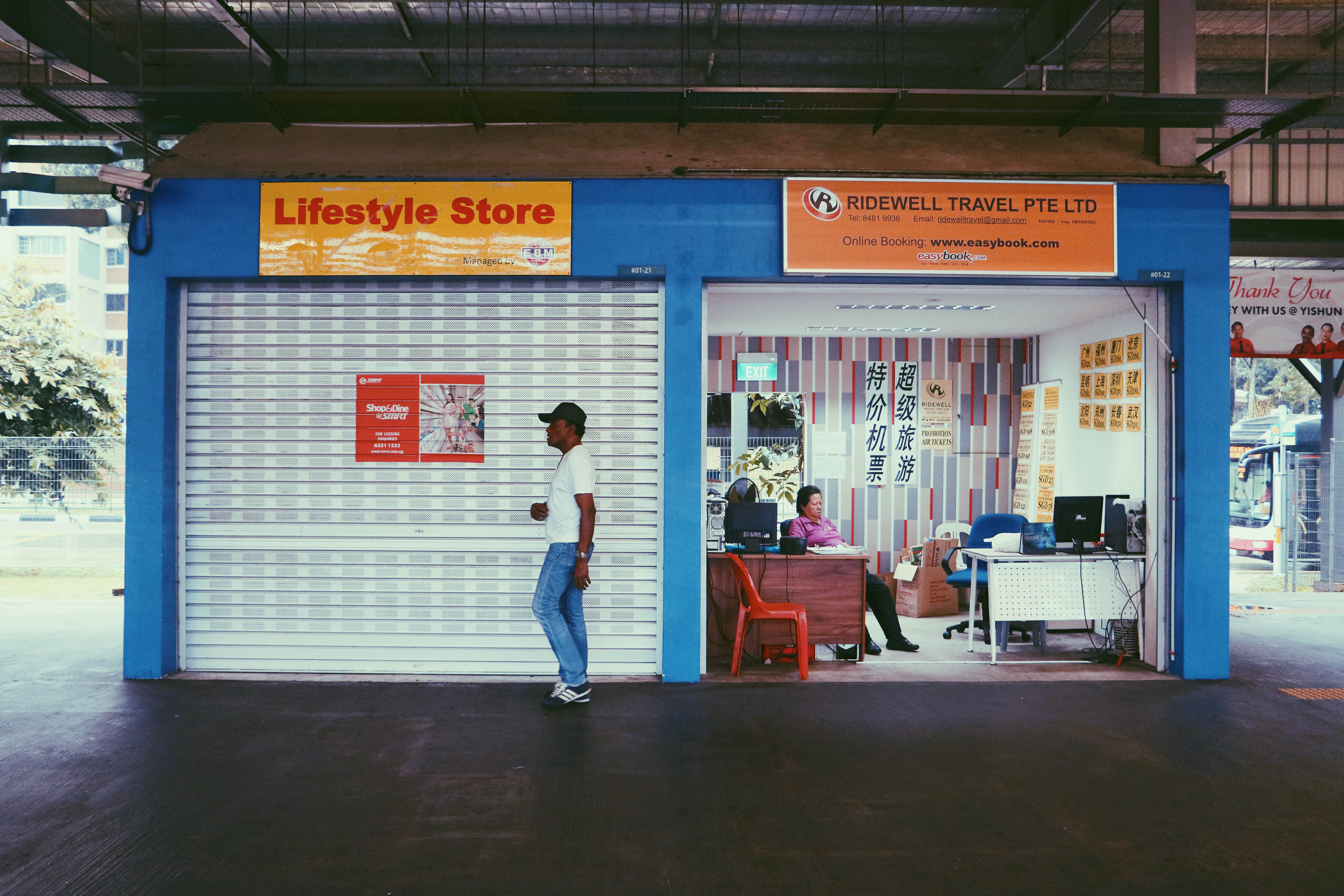
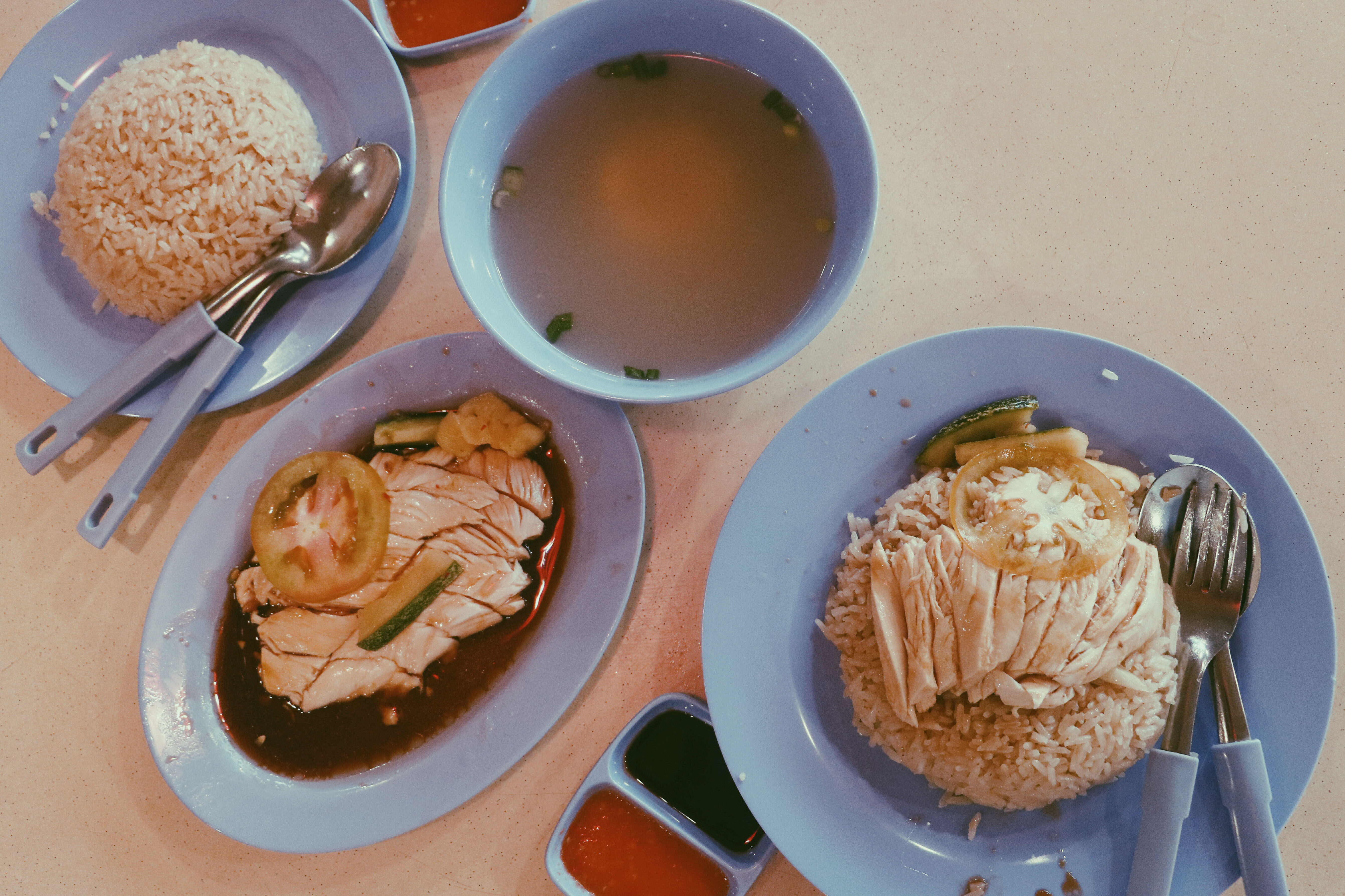
A friend of mine that stays in Yishun brought me around the place and let me try a well known chicken rice there.
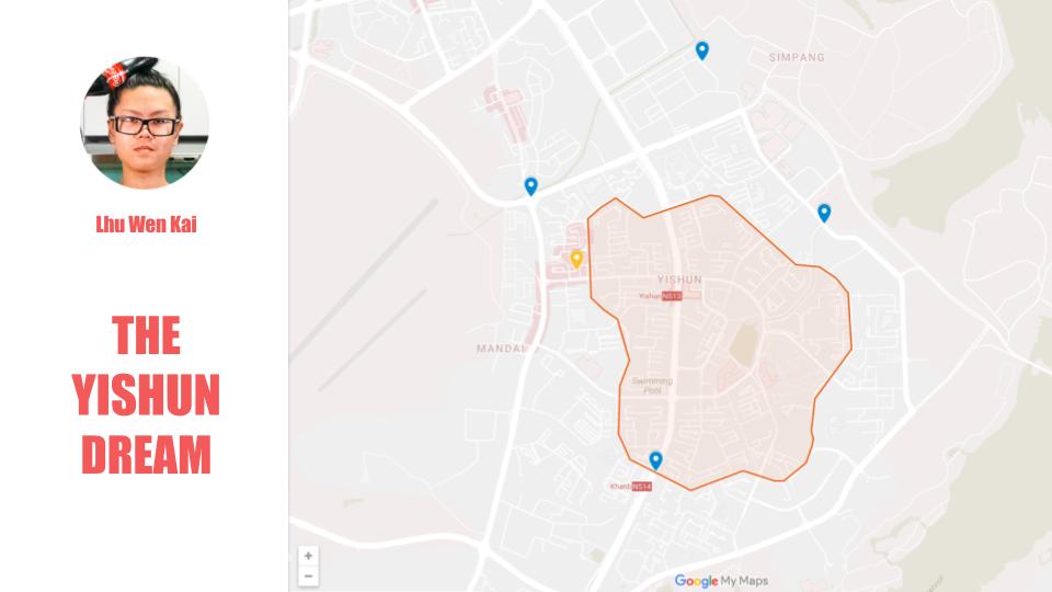
He also told me about a website where I could look out for news that happened in Yishun, which was: https://yishun.town/
The website was created by a guy named Lhu Wen Kai.
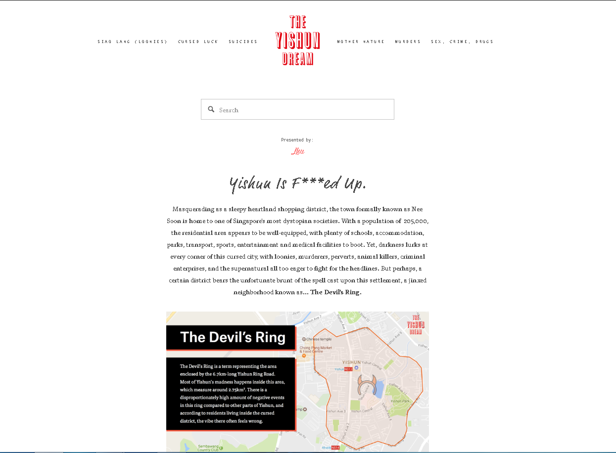
As you can see he placed quite an amount of effort to design the page.
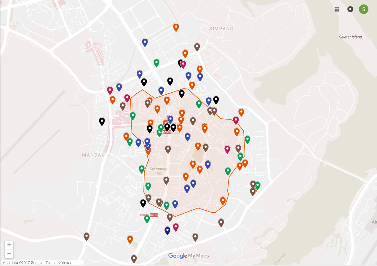
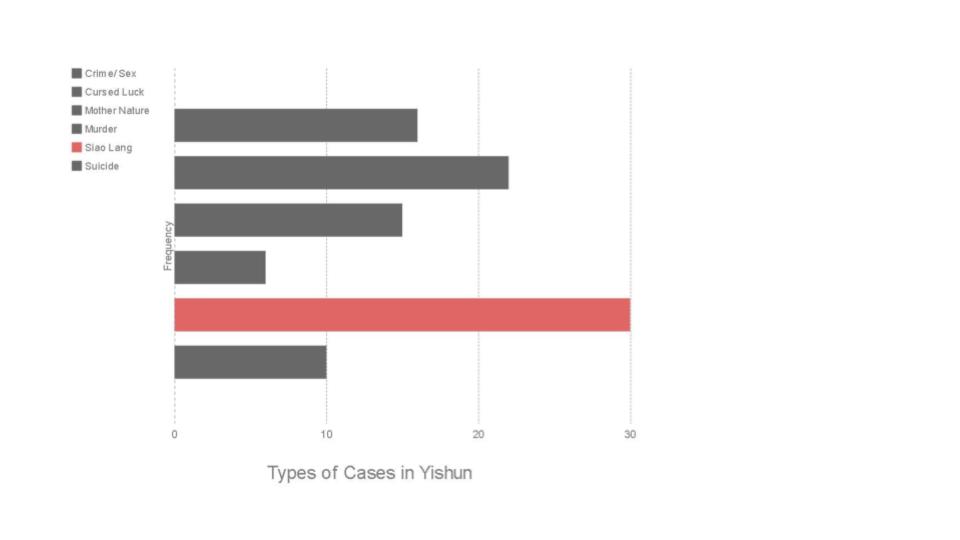
Here are all of the news that happened in Yishun, ranging from accidents, murders, robbery, suicides, etc.
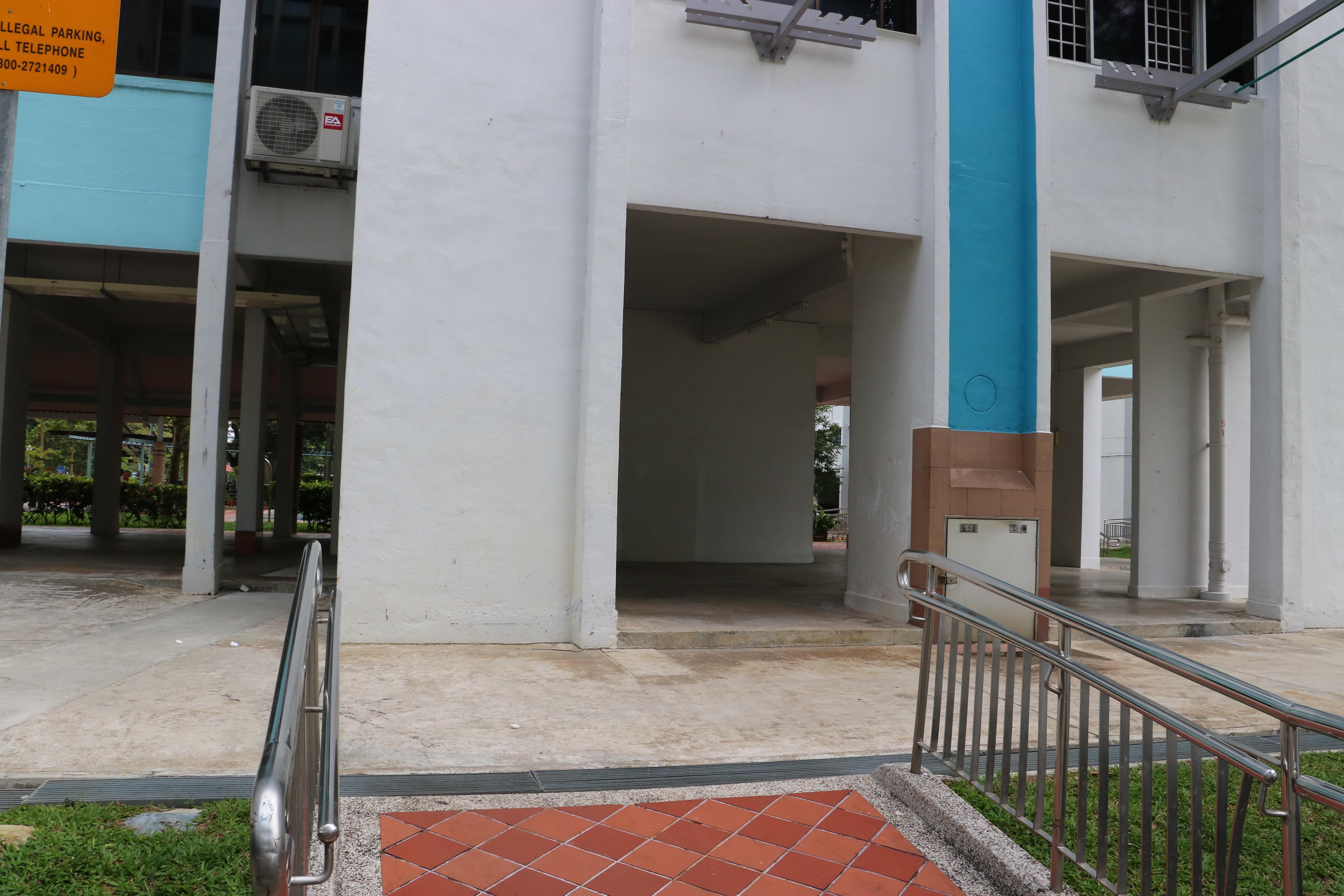
With the mindset of revisiting certain crime scenes I took pictures that matched (or at least attempted to) the angle of the original photograph. The 2nd comparison photo are the original photographs taken from the article, while the one above it was taken by me.

http://www.zaobao.com.sg/znews/singapore/story20161117-691470

http://www2.tnp.sg/content/yishun-1-junction-2-accidents-15-minutes

http://www.sammyboy.com/showthread.php?96926-Another-couple-slashed-in-Yishun-on-Thursday-SG-is-now-Parang-Hub
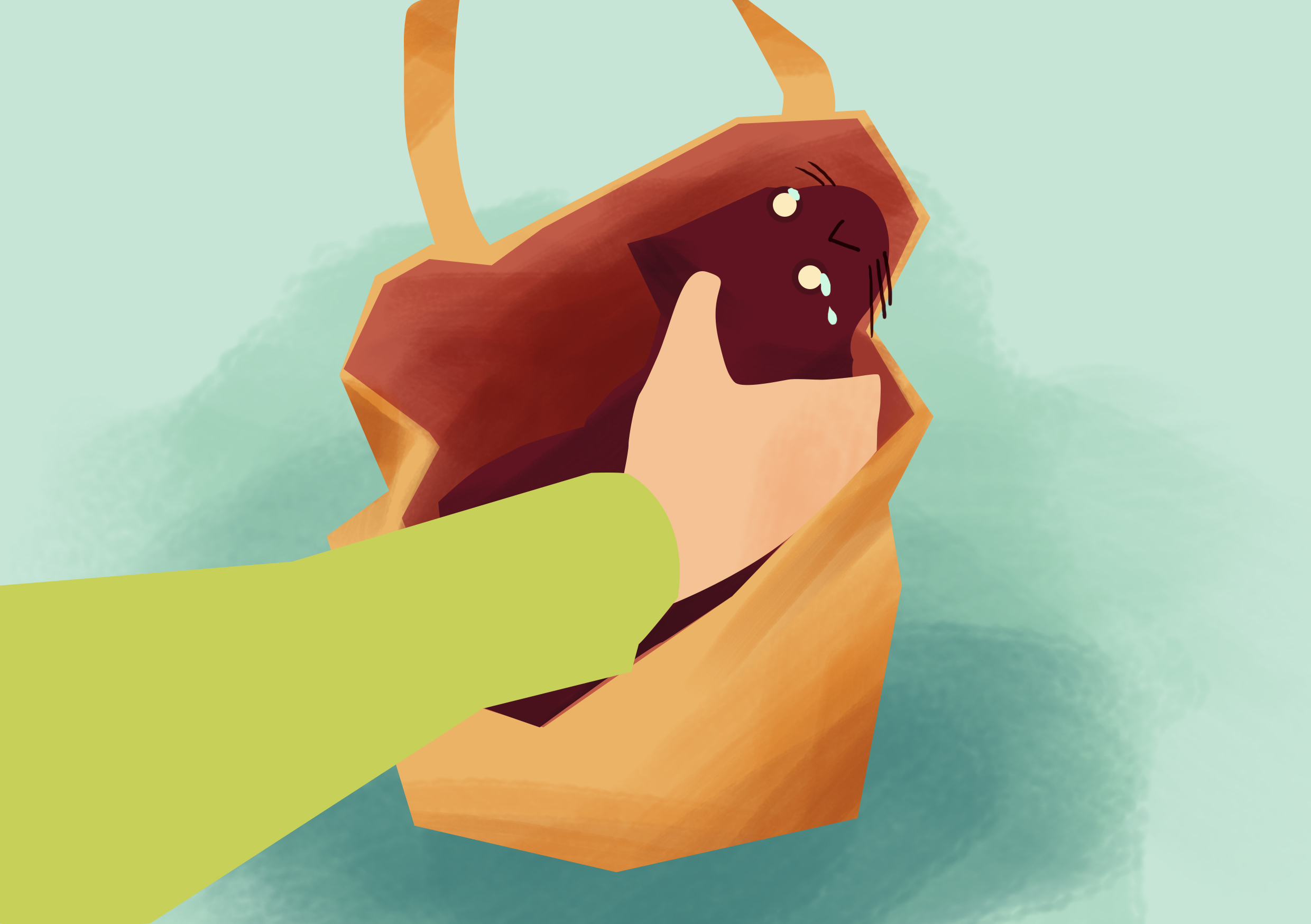
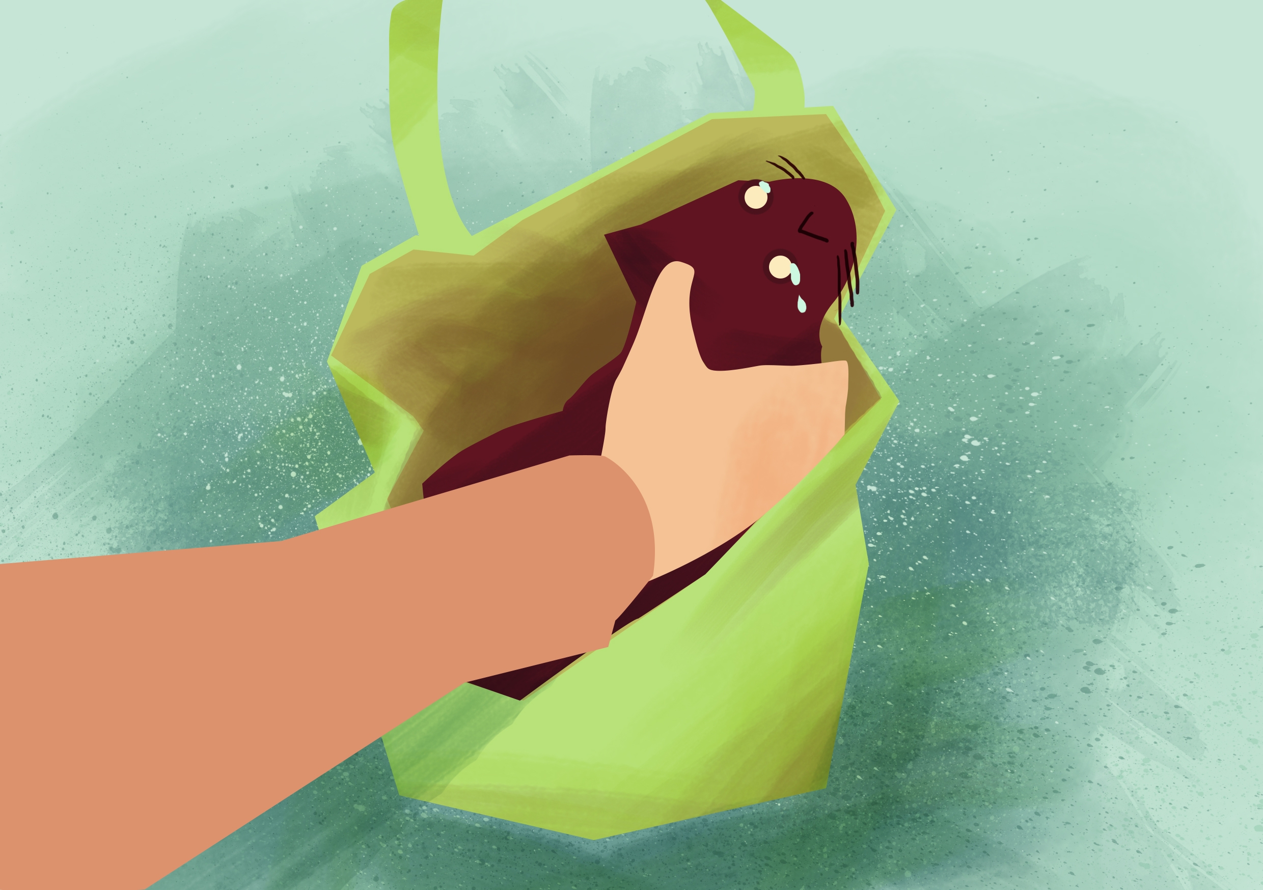
http://www.channelnewsasia.com/news/singapore/dead-cat-found-at-foot-of/2463898.html
https://yishun.town/cursed/busfire
I did not manage to take the scenes for the photographs below but I thought I could just take the location from outside.
http://www.stomp.com.sg/singapore-seen/caught-act/man-rages-yishun-cheers-cashier-after-they-ran-out-spoons-challenges-him
https://yishun.town/crime/bankrobbery
Even after taking the photographs, I did not feel much emotions from what I discovered. Hence I started thinking and brainstorming again. Then it occurred to me why don’t I highlight the positive stories that happened in Yishun instead of the usual hate on Yishun.
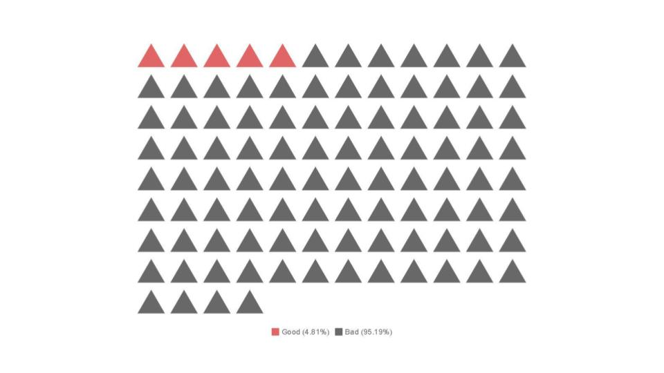
Although there were so much more accidents and murders, people remember the bad news more clearly as compared to good ones. Which was why I wanted to paint Yishun in a positive light instead, to remind people that there are good stories from Yishun as well.
Articles:

http://www.straitstimes.com/singapore/12-year-old-boy-rushes-to-aid-of-car-accident-victims-in-yishun

http://www.straitstimes.com/singapore/courts-crime/off-duty-cop-out-on-a-date-catches-rioting-suspects-with-help-from-scdf

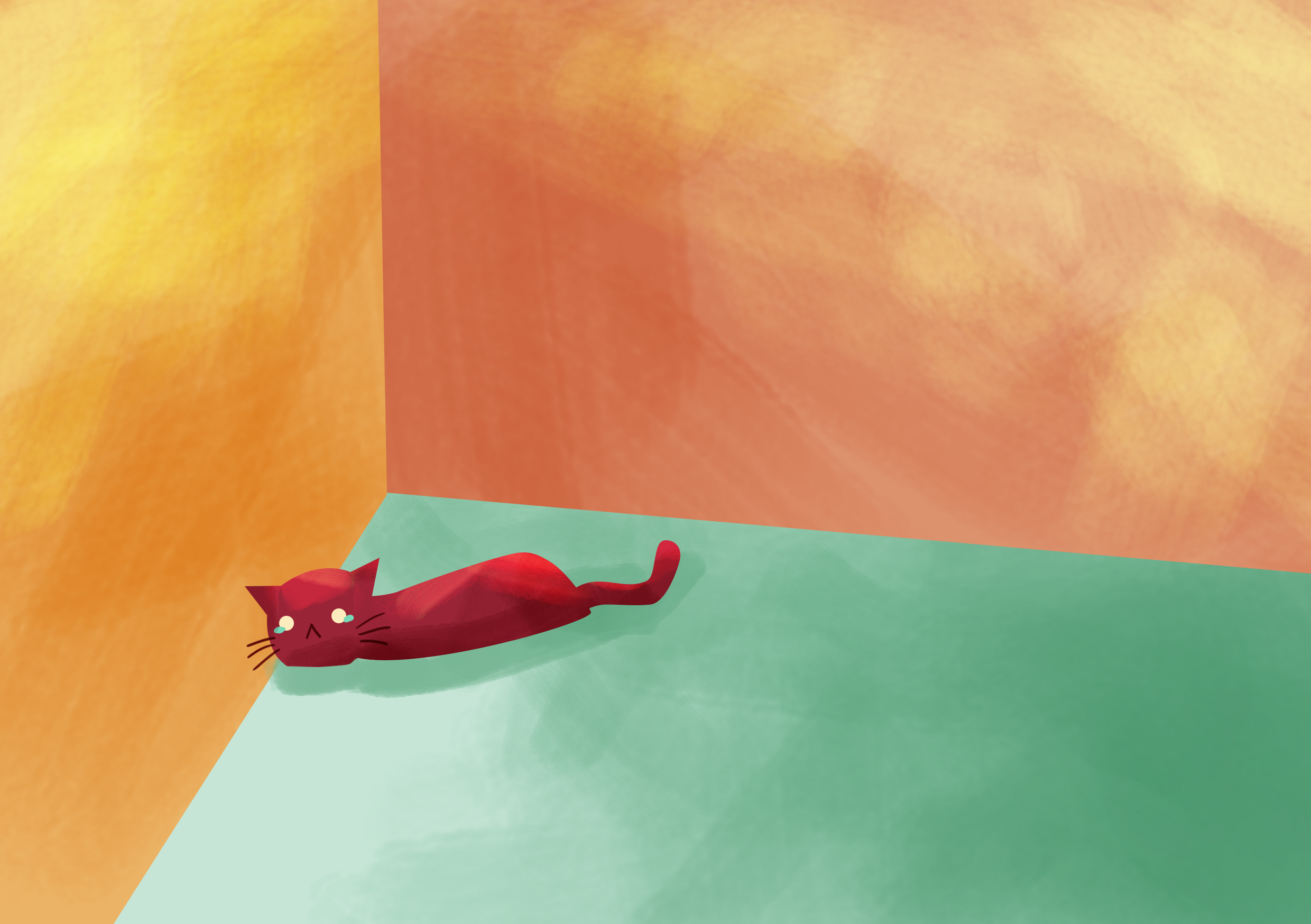
http://mothership.sg/2015/11/foreign-worker-uses-indiana-jones-move-to-rescue-drowning-cat-from-monsoon-drain/

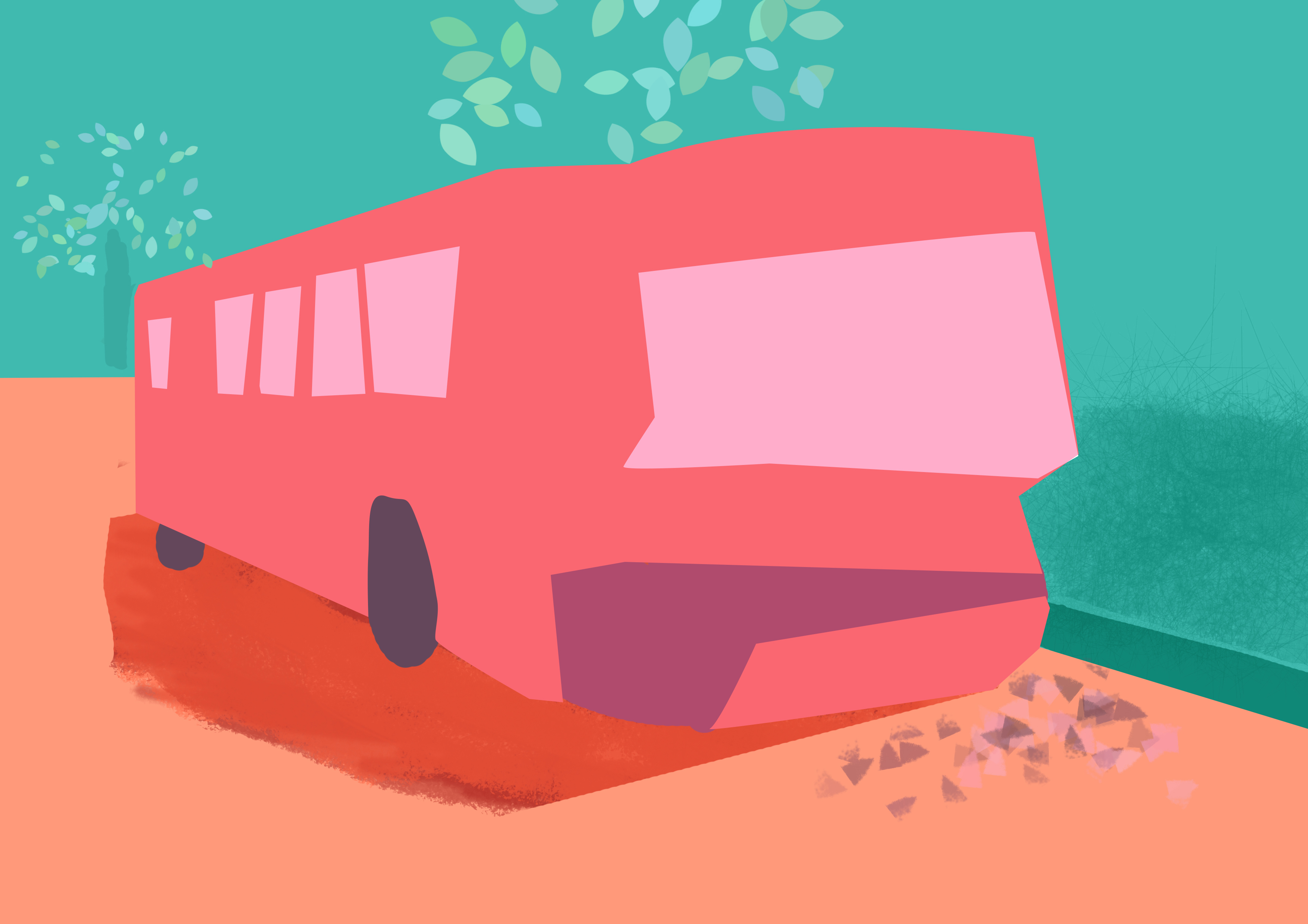
http://www.tnp.sg/news/mystery-man-rescues-trapped-bus-driver
Originally I thought that the reason why Yishun has so many accidents was because of it’s huge population within the area. However, Yishun isn’t the only place with a huge population density.
Yishun: 9,442.2 inh./km²
Tampines: 12,578.2 inh./km²
Woodlands: 18,366.2 inh./km²
Jurong West: 18,391.2 inh./km²
https://www.citypopulation.de/Singapore-Regions.html
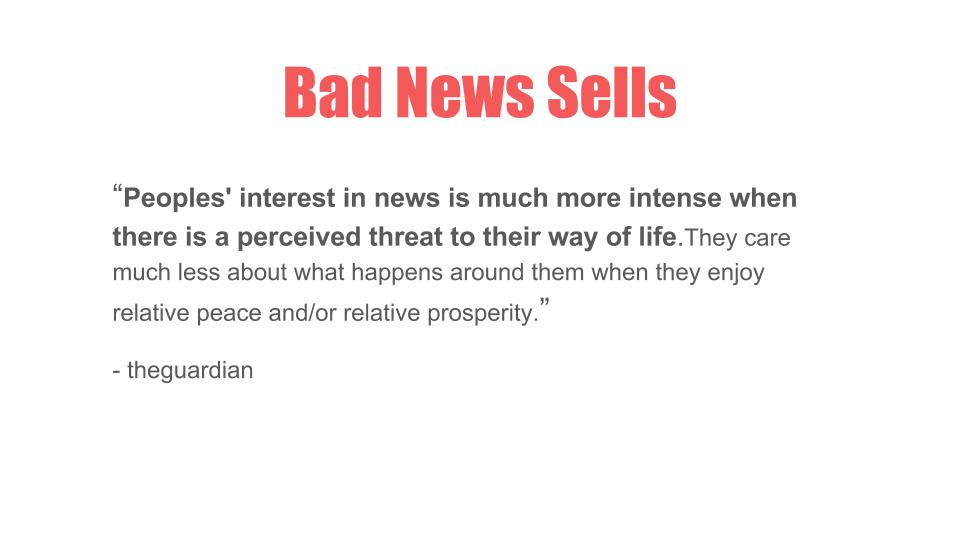
Looking at some news articles as to why Yishun is so infamous I found that it was simply because bad news sells.
People prefer to read gossips, negative news and here are 2 quotes from the guardian as to why,
http://www.straitstimes.com/singapore/why-do-some-people-make-fun-of-yishunhttps://www.theguardian.com/media/greenslade/2007/sep/04/thegoodnewsaboutbadnewsi


The list below are some jobs which I was interested in when I was a kid, or at least I tried to remember.
Final Choices: Architect, Video Gamer, Archaeologist and Birdkeeper
While trying to brainstorm some ideas I tried to sketch out the layouts in my tiny sketch book while googling for some references.
Here are the sketch developments:
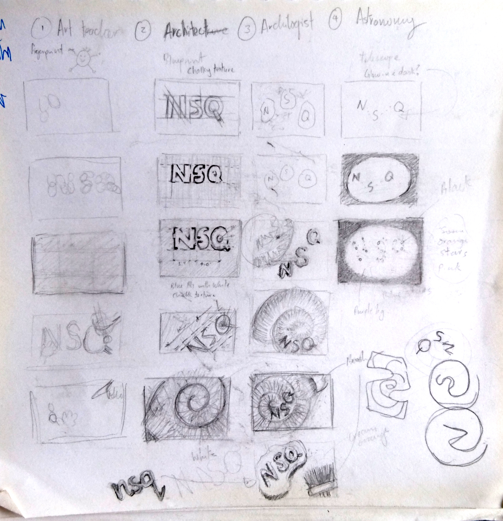

After consulting Ms Shirley, she mentioned that many people are doing on astronomers hence I should choose another job, which was a bird keeper.
The first tryout I tried was for the job, video gamer.
I’ve played lots of video games before such as Far Cry 4, Overwatch, Left 4 Dead 2, etc, but I am not a professional player ??. Even after watching tons of YouTubers playing video games I’m still bad at it but one day I wish I can be as good as them as a hobby. 😀
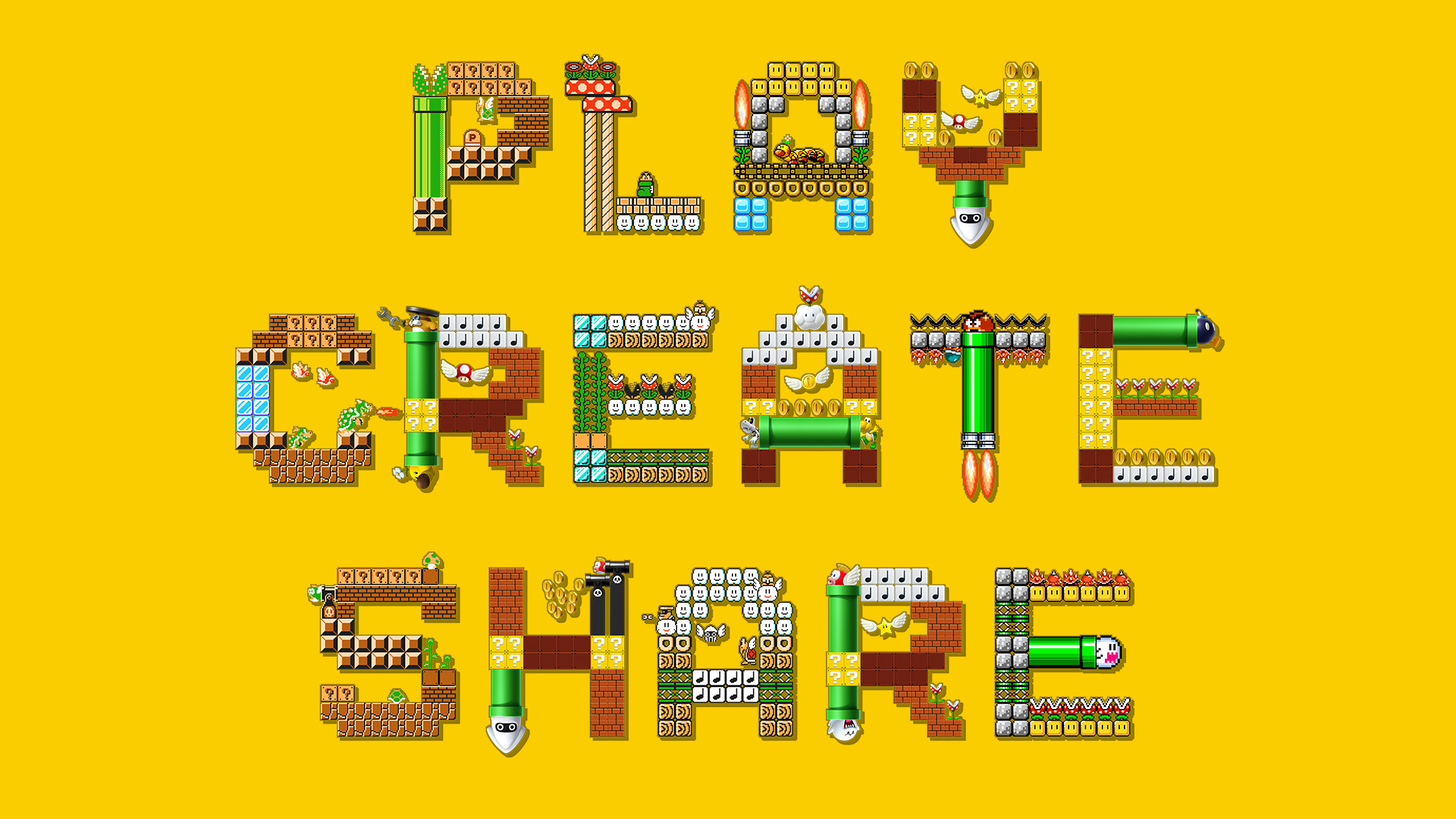
I decided to choose Mario as the main theme as Mario was my favourite childhood game and it is extremely popular too. Although I only started out from the DS version, I felt that 8-bit Mario looks aesthetically more pleasing for this design project due to its plain yet saturated retro colours.
Process:
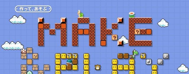
Inspired by the recent “Mario Maker”, I wanted to use icons from Mario to create my name and background. However I felt that just the coins were not working well in contrast with the background 🙁

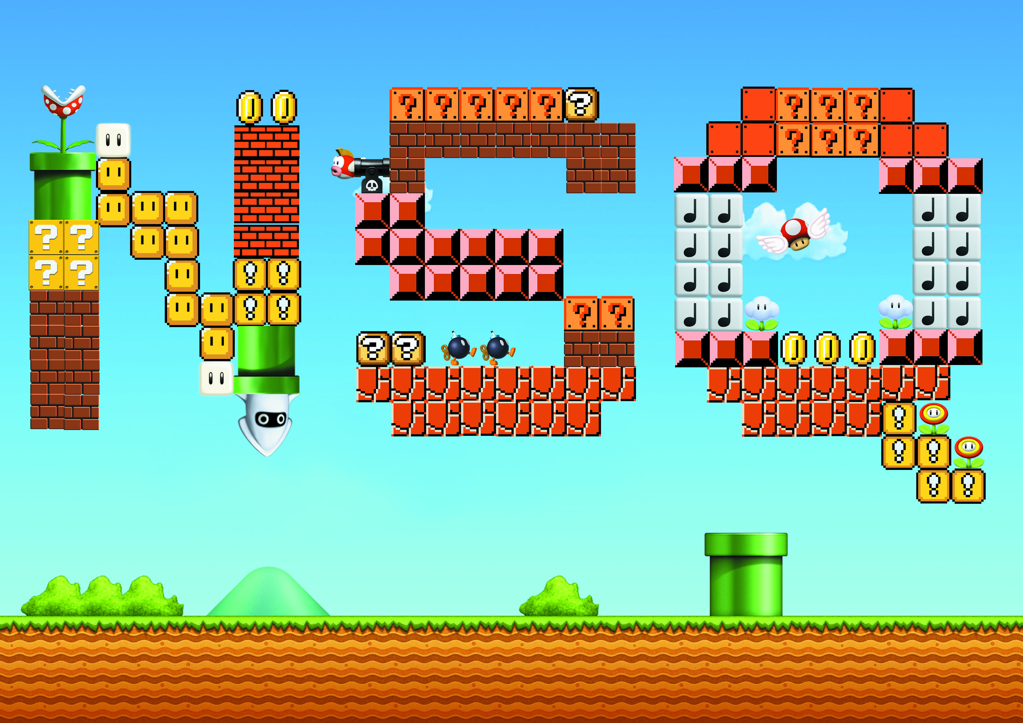
Next, inspired by Mario Maker’s advertisement on the top left, I tried making my own name with the same style too. This style really brings out the fun of Mario to the viewers due to the usage of yellow which represents excitement and playful layout of the other characters and blocks from the game. However, I felt that I wasn’t thinking enough and just copying the advert hence I scraped this idea too.
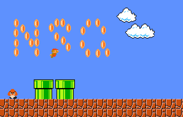
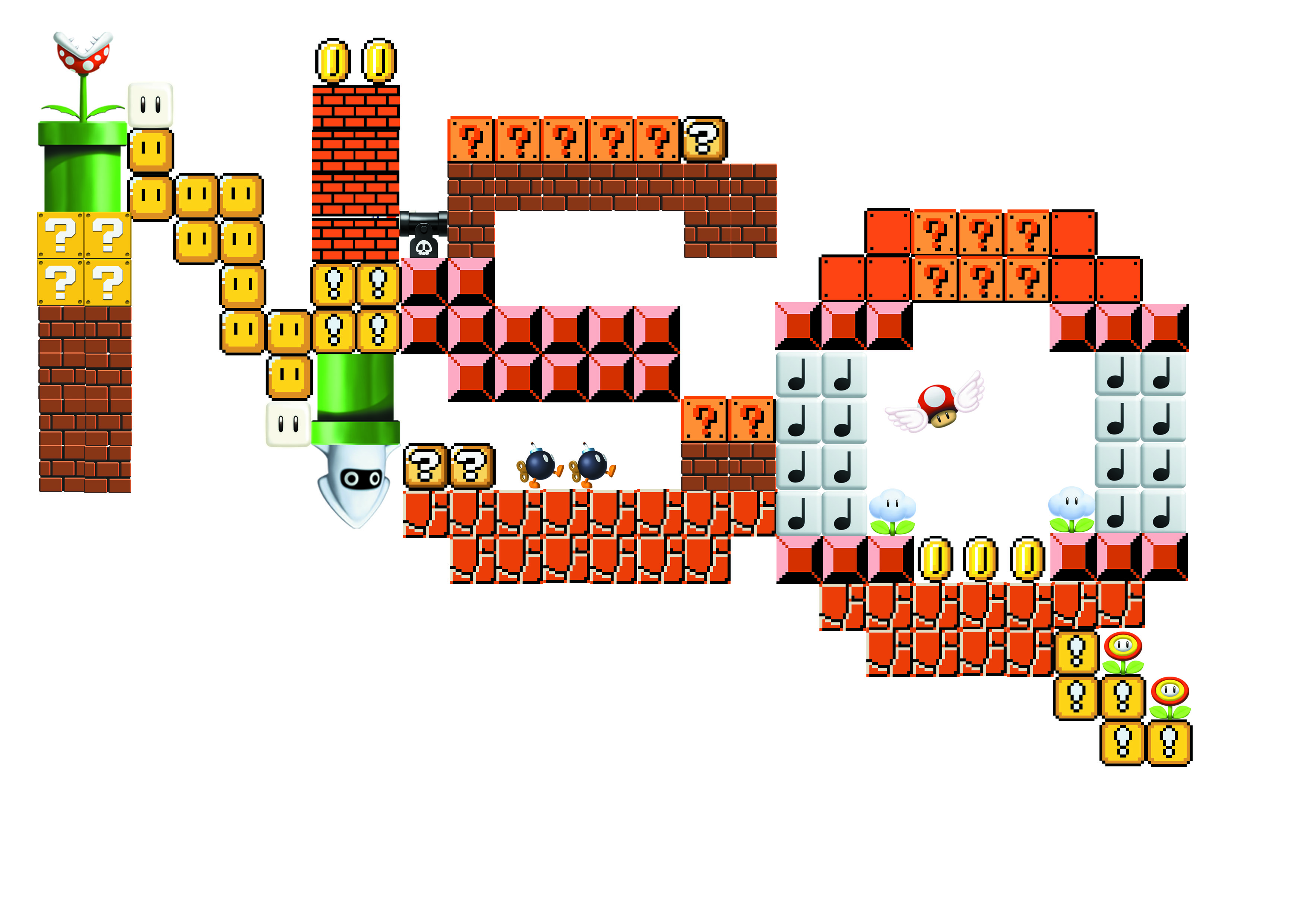
Trying out again to make use of the colourful icons, I did the above layout. However, the icons were too distracting, and directs the attention away from my name, and hence I decided to make it a plain design instead like the design below.
Final:

The complementary colours between the orange and blue Goombas makes the overall design less boring. Due to the huge size of the name, the viewers see it first before the other characters at the side which further enhances the theme of the layout.
To be honest, when I was a teenager, I wanted to be an architect because I heard they earn a pretty good amount of money, hahahaha. I had the desire to design and build my own dream house as well, where you get to choose how big you want the bedroom to be, etc. However, my mathematics and sciences were pretty bad in Junior College, hence I did not apply to architecture school. ??
Process:
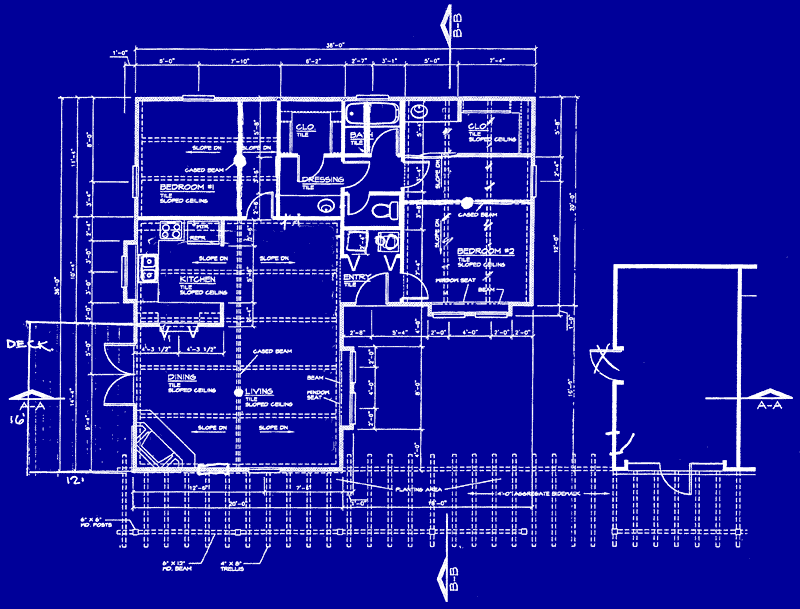

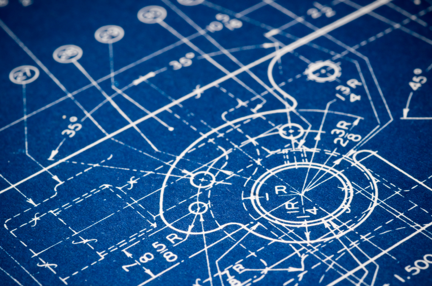
The first graphic element that came to my mind when I thought about an architect was blueprints. Hence, I went to google for these images as references. I realised that the blueprints have tons of white markings, arrows, numbers and lines against a deep blue background, which I later applied to my design.
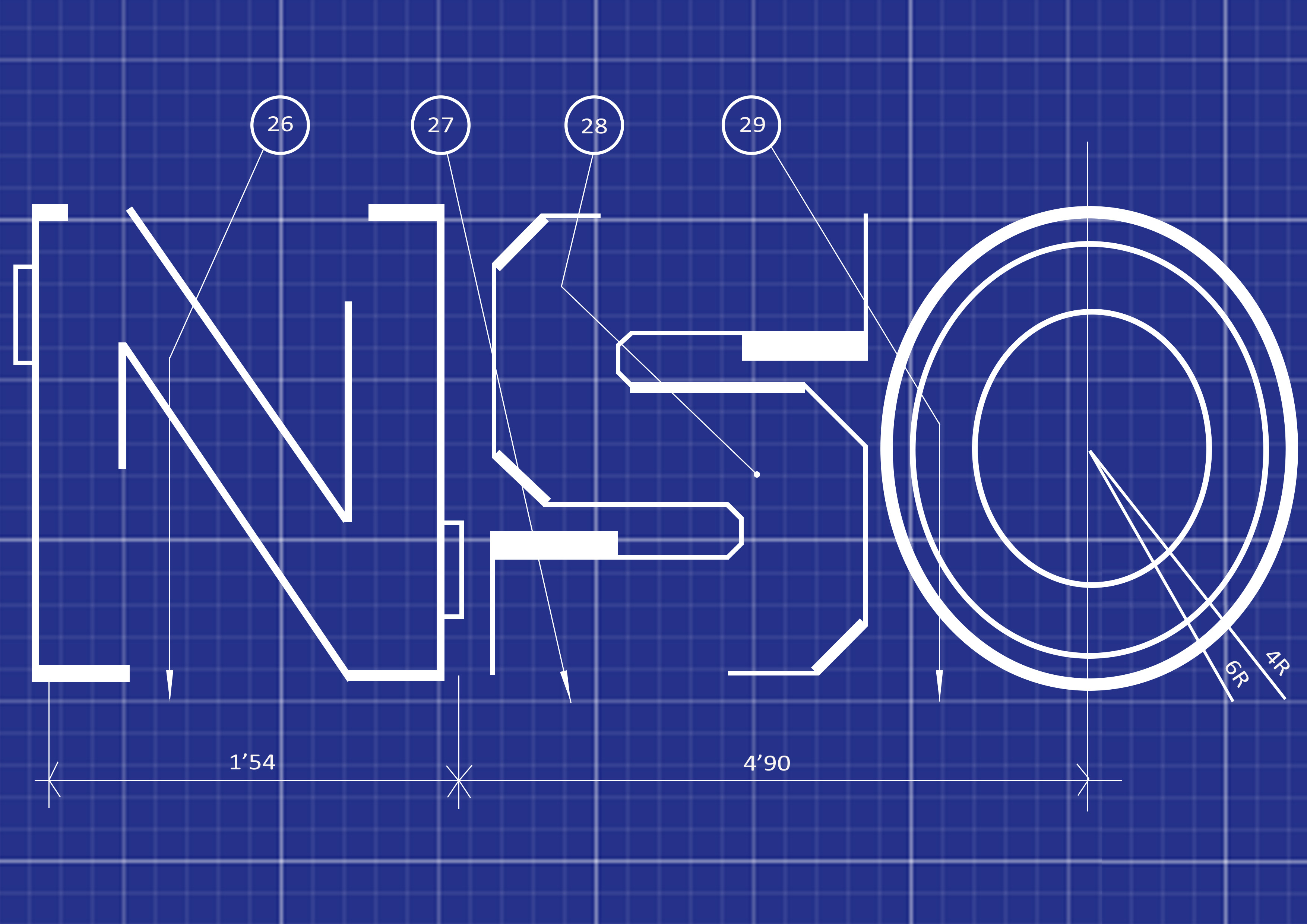

Firstly, I tried creating the static version of my name first like the one of the left, and afterwards the arrows, circles and numbers. Next, I tried shifting and tilting the layout such that the design is not as boring and still.


After having a consultation with Ms Shirley, she mentioned that I should try using the “perspective” tool in free transform to make the layout more 3 Dimensional with more depth. The one on the left was the first attempt followed by the one on the right. The right picture is better due to the deeper perspective that it appears to have.
Final:

Ms Shirley also mentioned to me that I could use the “field blur” filter to create an even greater illusion of dept. Hence resulting to the image above. This is probably my favourite composition among the 4 due to it looking like it’s 3D. ??
I was pretty inspired by our school’s semester 1 Art History Lecturer’s research in Northern Cyprus. Professor Michael Walsh shared with us his experience in trying to get the United Nations to notice Northern Cyprus’s historic artworks. Due to the fact that Northern Cyprus is an unrecognised country, its historical artifacts are not protected too. Michael Walsh and his team of professionals went down to one of the churches in Famagusta to restore some of the murals on the walls which were covered in paint/ cement. This project made me curious about historical artifacts and the meaning behind them. Being able to discover them first hand will be an extremely enriching and cool experience which was why I chose Archaeologist as one of my dream jobs.
Process:

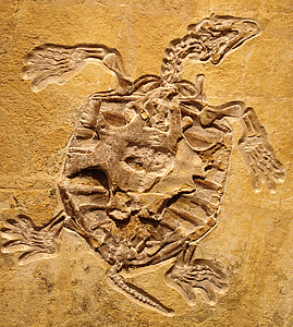

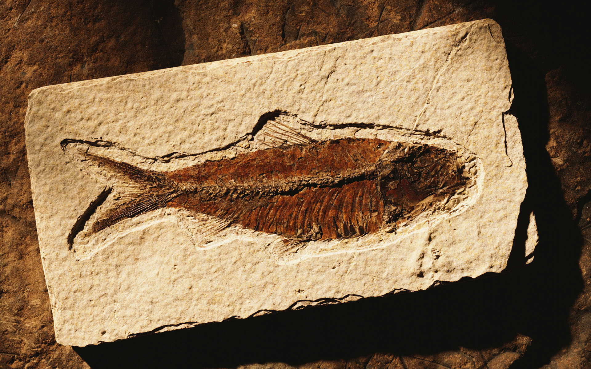
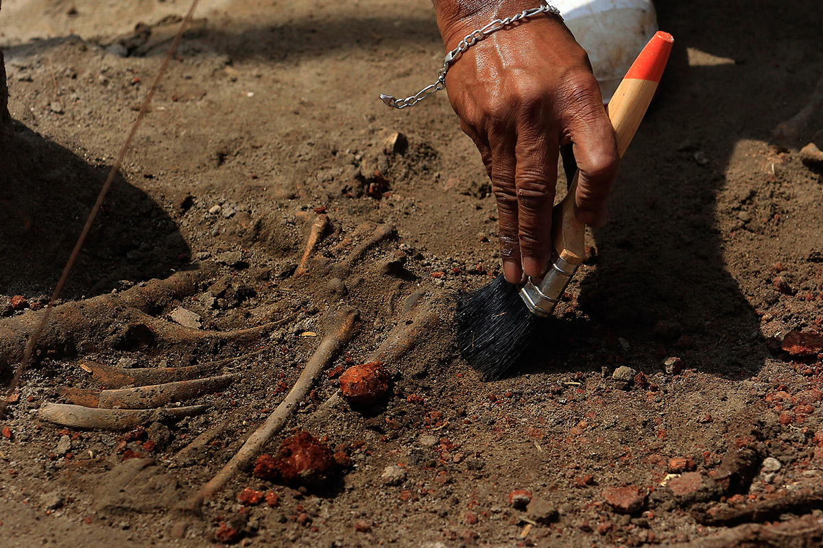

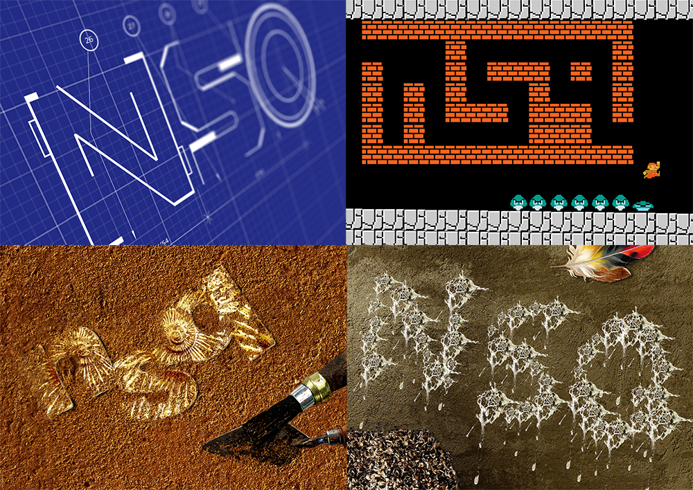
Fossils, brushes and soil were the first things that came to my mind when I thought of Archaeologist.
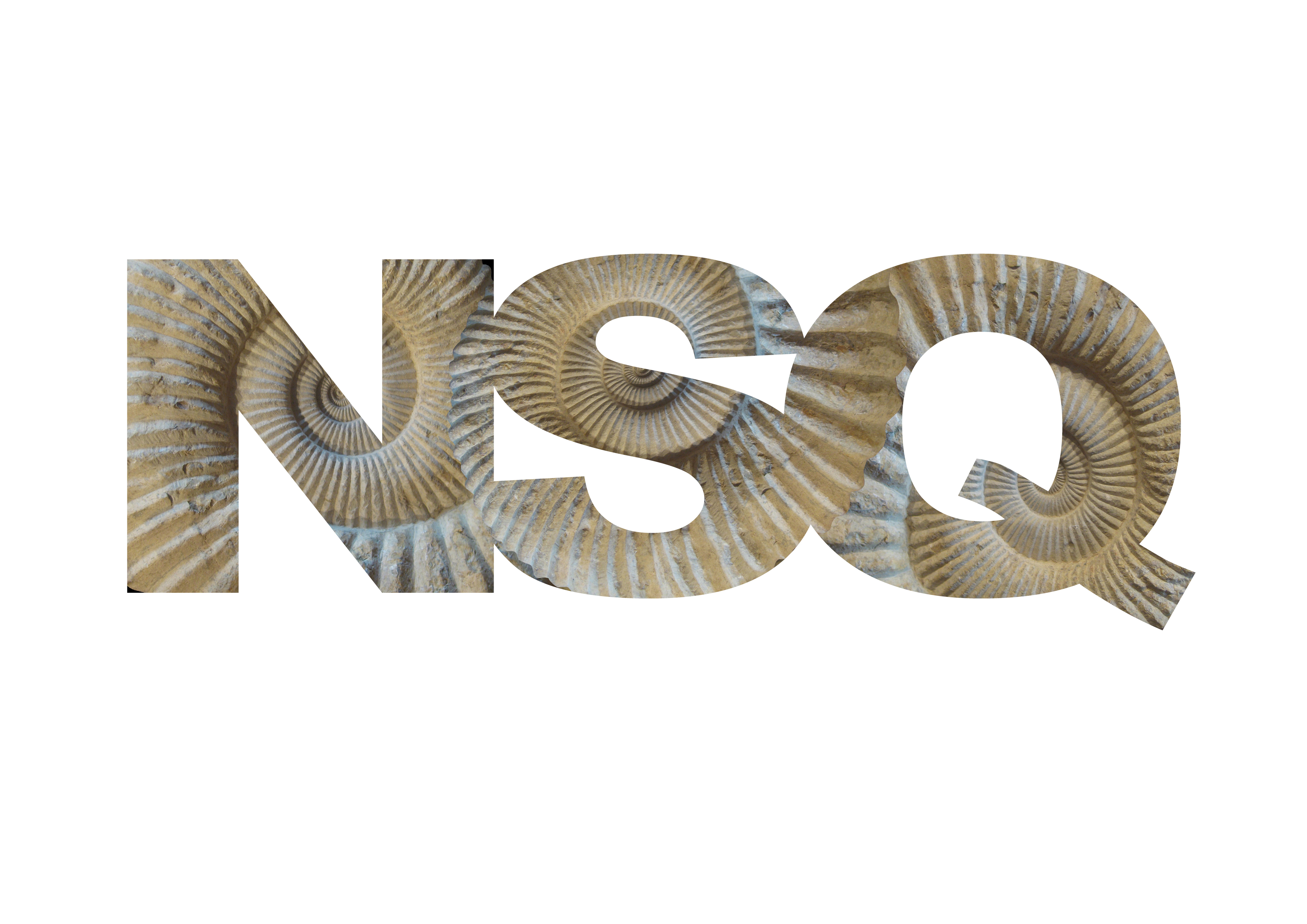
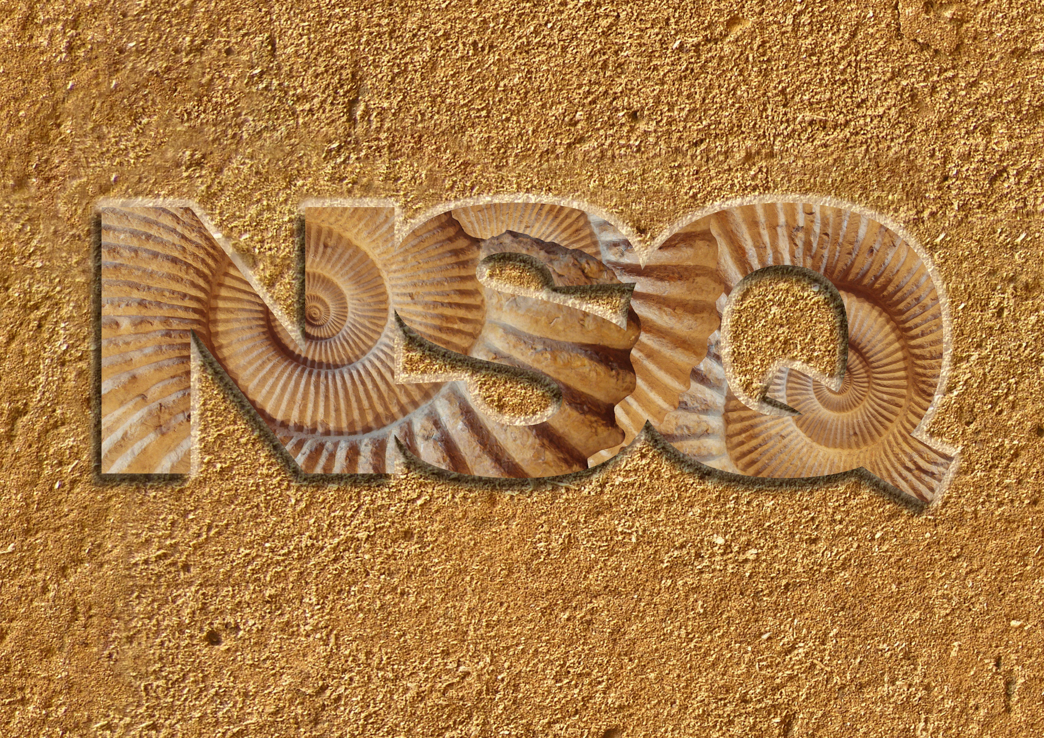
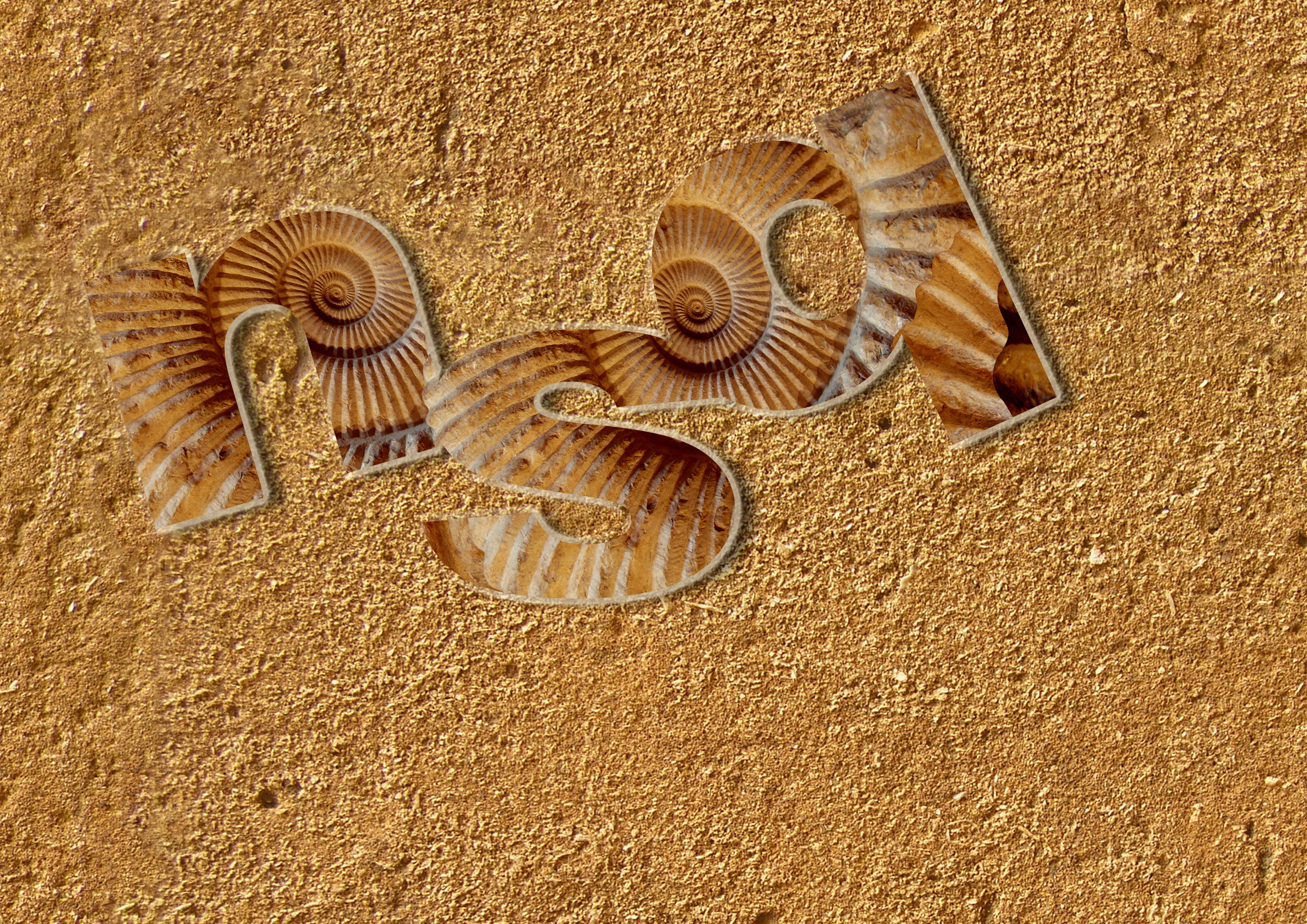
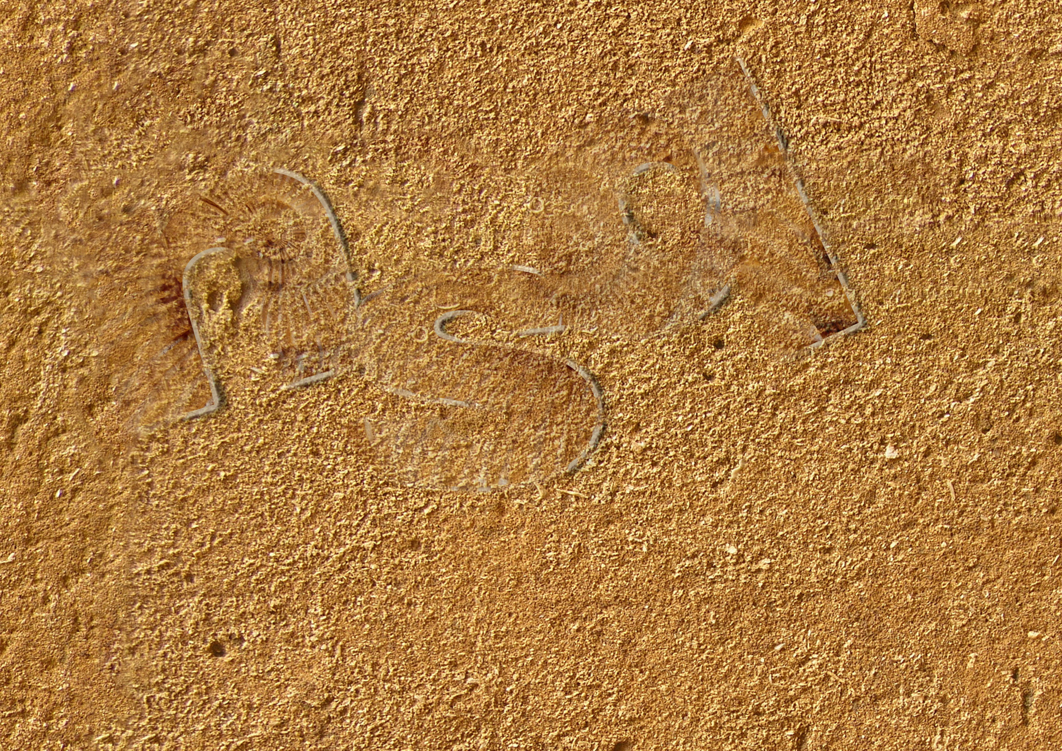
Firstly I typed out my initials first using a thick font, in this case I just used Arial Black, since its a clean font which clear cut edges. Next I took an image of a fossil and placed the layer on top of the letter, and create a clipping mask as shown in the top left image. Afterwards I added the soil background and added bevel, embossing, and drop shadows to make the characters more 3D. In the bottom left image, I realised non-capitalised letters looks more aesthetically pleasing and adjusted the arrangement of the letters to make the fonts less boring. In order to make the letters look like it is buried, I duplicated the background with reduced opacity and placed it as the upper layer.
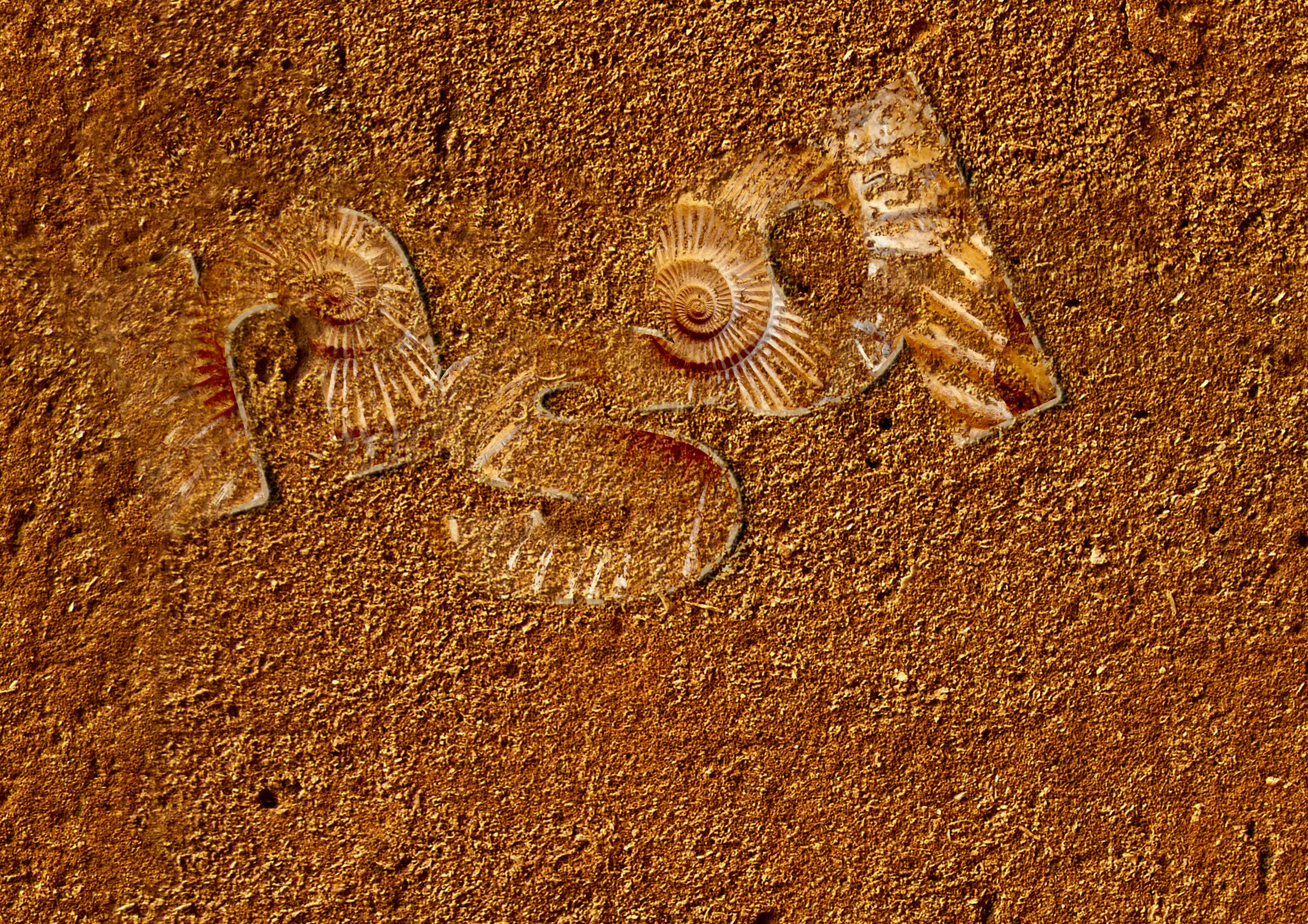
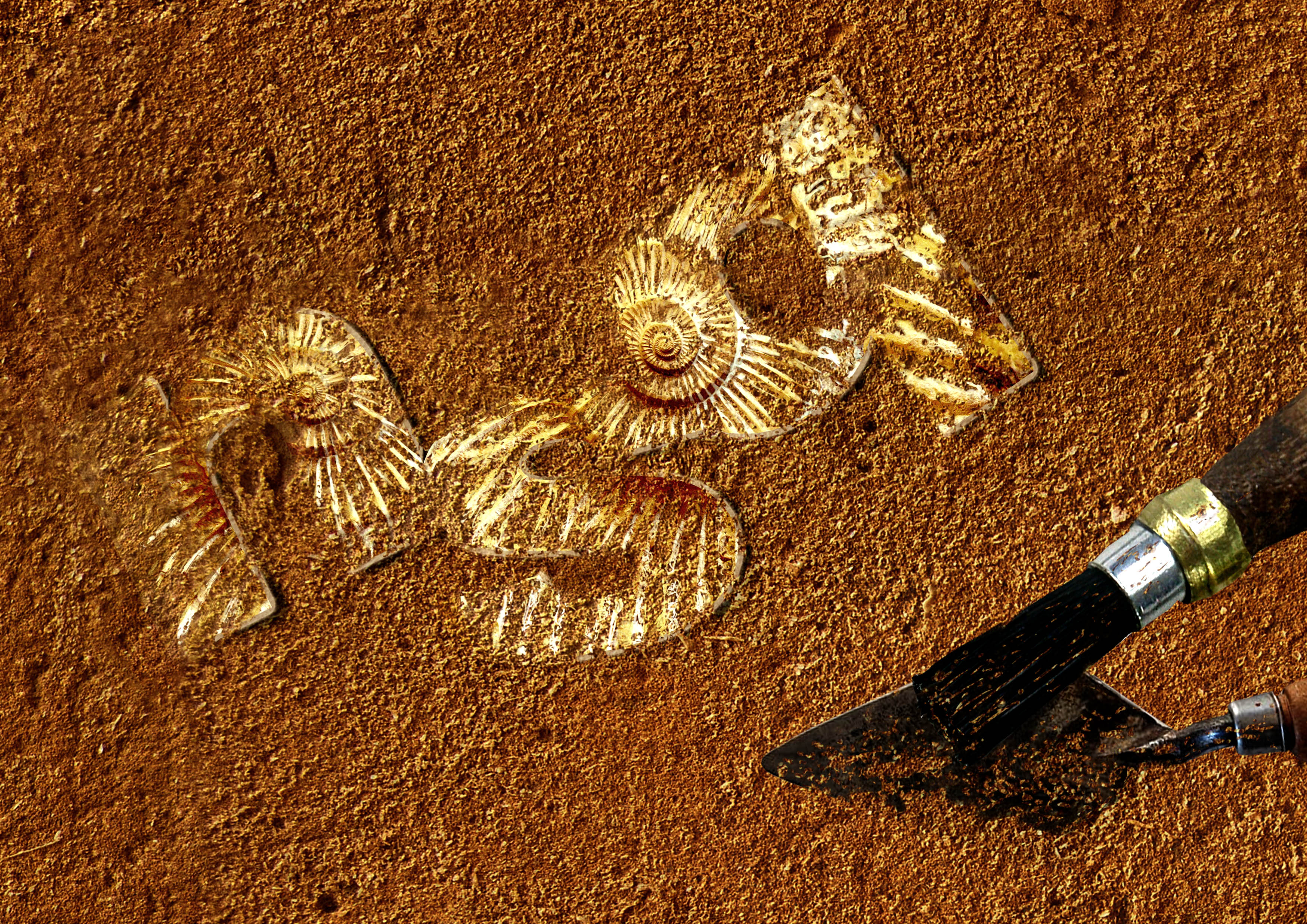
Together with the black/white brush tool and the masking layer, I erased parts where I do not want sand to be. The reason why I used the masking layer is so that I will be able to add and remove sand whenever I want to without being afraid of making a mistake. After I was satisfied, I made the overall image more saturated and brightened up the letters to make them stand out against the sand and added the tools afterwards.
Final:

I love observing birds and I enjoy listening to the different kinds of chirps they make.

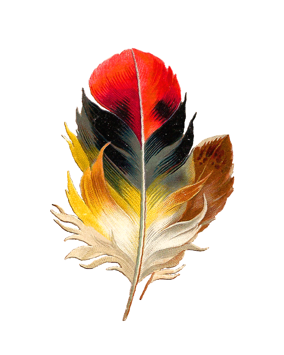
It just so happen that I came across this image on the internet too which reminded me of bird keepers at the Jurong Bird Park. Thus I decided to use this as my final dream job. This characters comes from an old Game Boy Colour video game called Pokemon Gold/ Sliver. The opponent is just well known to have a full team of bird type Pokemons.
Process:

These are the “events” that bird keepers have to surely face while doing their jobs.
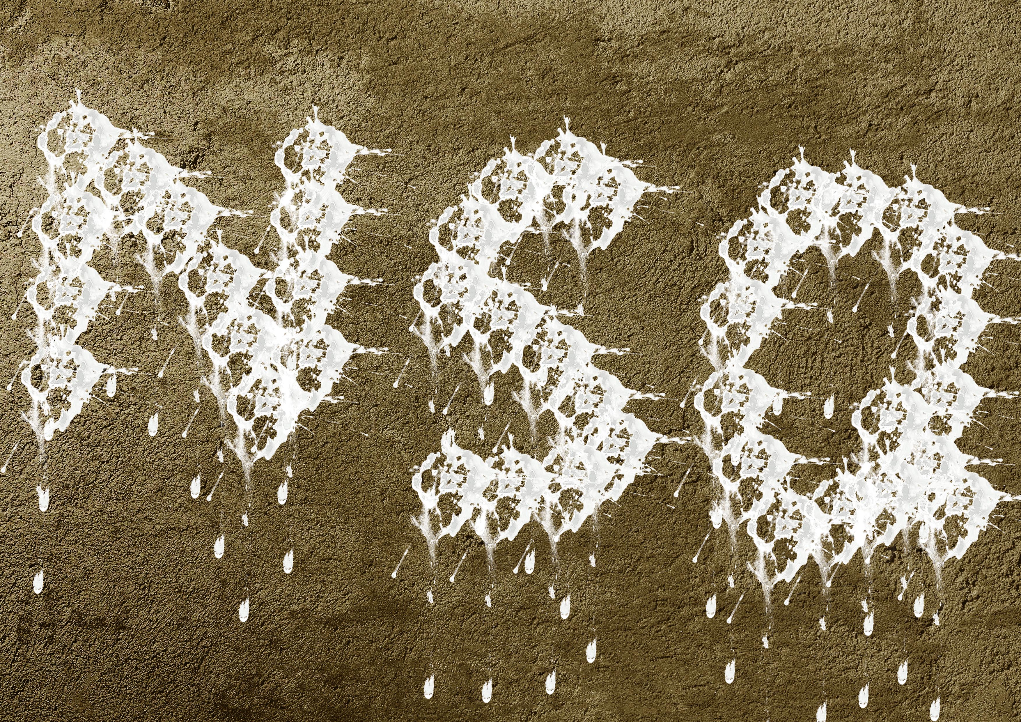
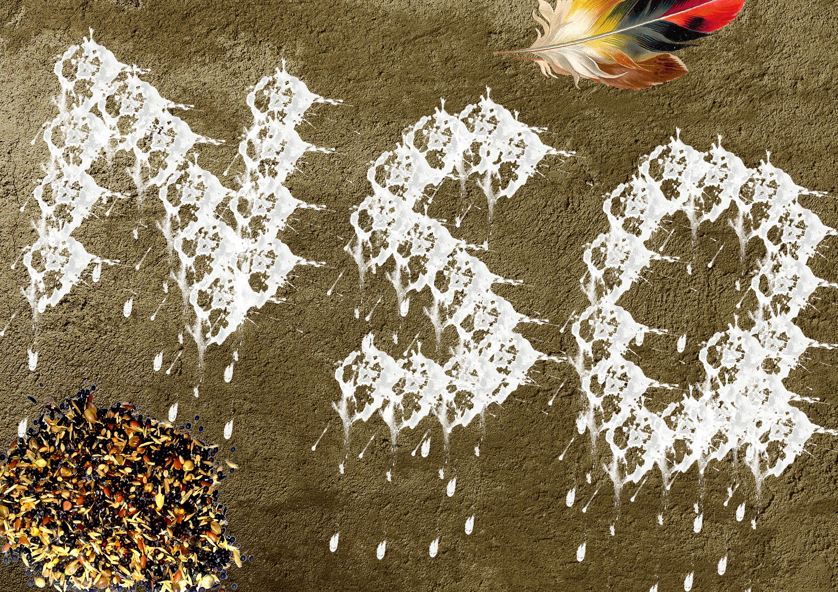
Using a PNG file of a bird poop, I used it to form the initials of my name and afterwards added the small details of a bird keeper’s environment.
Lowering the saturation of the large pile of food turns the attention away from it and more on to the words. Ms Shirley mentioned that the dirty poop looks better due to the darker values it has to portray more details in the poop. The white ones looked too clean, systematic and robotic.
Final:

Lastly, Ms Shirley also commented that the poop size should vary in order to make the shape more inorganic ??
The End ??

image
ˈɪmɪdʒ
noun
Characteristics
Volatile image
An image of the New Royal Palace at Prague Castle projected onto an attic wall by a hole in the tile roofing.
Fixed image

Der Rhein II by Andreas Gursky
Medium:Chromogenic print, on paper
“A photograph made by German visual artist Andreas Gursky in 1999. In 2011, a print was auctioned for $4.3 million, making it the most expensive photograph ever sold.
This large colour photograph depicts a stretch of the river Rhine. The image is immediately legible as a view of a straight stretch of water, but it is also an abstract configuration of horizontal bands of colour of varying widths.With contemporary twist on Germany’s famed genre and favourite theme: the romantic landscape, and man’s relationship with nature, the simplicity of this image shows a great deal of confidence in its effectiveness and potential for creating atmospheric, hyper-real scenarios that in turn teach us to see and read the world around us anew. The scale, attention to colour and form of his photography can be read as a deliberate challenge to painting’s status as a higher art form. On top of that, Gursky’s images are extraordinary technical accomplishments, which take months to set up in advance, and require a lot of digital doctoring to get just right.”

The Scream (1893) by Edvard Munch
The collective name of four similar expressionist paintings painted by Edvard Munch in which an agonized figure is depicted against a blood red sky.
The imagery is haunting and lingering. It has immediate sense of despair. In a way, the painting imprints his style and personality onto the canvas and reflects the mood of 20th century, the age of the anxiety and uncertainty. His style is quite crude, often executed in muted colors, but expressive in conveying psychic reality
Mental image

Interactive Sonic & Light Sculptures by Peter Vogel
text
tɛkst
noun


Josh Mirman

Craig Ward


Ji Lee
https://www.youtube.com/watch?v=J59n8FsoRLE


Solomon Tsitsuashvili


![]()


![]()
![]()


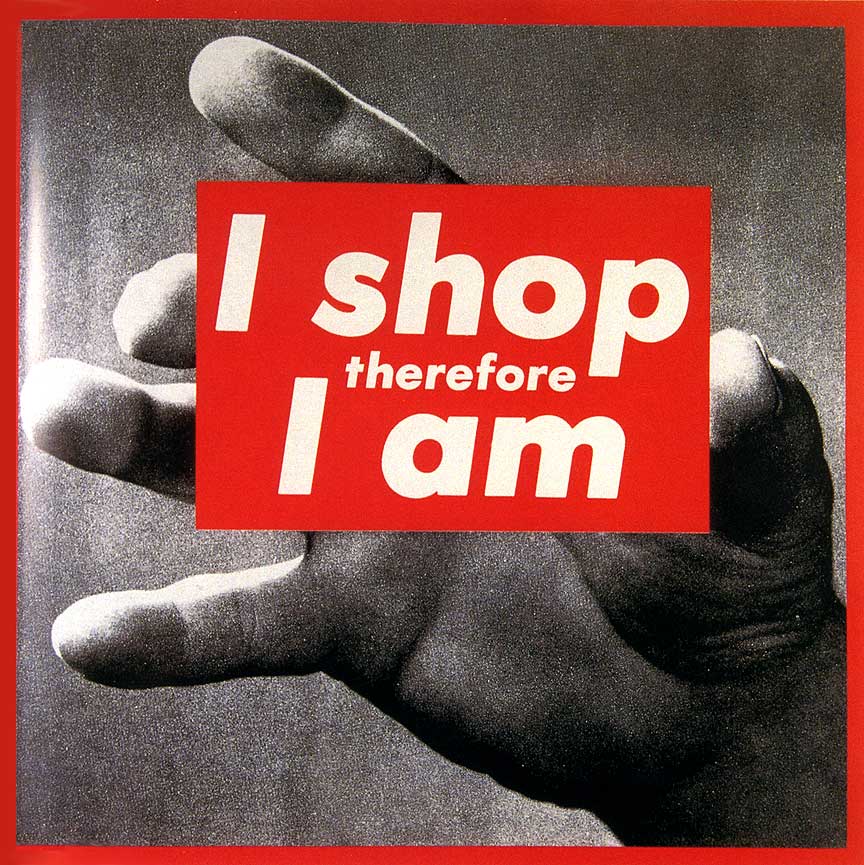
Barbara Kruger


Wang Guangyi


The end
Sources:

Dishonour on you! Dishonour on your cow! – Mulan 1998
The small thumbnails are older versions of the composition before developing to the final one.


These are the compositions that are not good. The first few compositions were too static and I did not work with just the sentence alone. The dragon was actually a character from the movie but I’m not supposed to think of a composition with visuals based on the movie but plainly from the sentence instead. There was also too many subjects which makes the whole composition messy, thus I tried to reduce the number of images and texture as well as vary the sizes.

After looking through other references, design principles and choosing the appropriate found images, I’ve finally done a design that I was satisfied with.
Symbols
Cow – From the “cow” in quote.
Dishonour – Sword because during the ancient times when someone does something dishonourable, they would be executed.
– Cone of shame.
Human – From “you” in quote. She’s in a squatting position to show vulnerability.
I used a white background so that the mood is lighter and not so serious. The cow is placed at the 1/3 position and off-center of the composition and I made it the biggest to show emphasis on the cow as it is the main subject. Repetition and movement was used for the human and swords and they are moving in the opposite direction of each other. This movement also causes the eyes to shift and lead them to the cow, bringing in more emphasis to the cow.
Here’s another curse, may all your bacon burn! – Howls’ Moving Castle 2005


The first few compositions were very messy and were filled up with too many images, hence I thought of using more depth and removed the unnecessary images such as the castle.

Symbols
Magic circle – Curse
Bacon – From quote “bacon”
Fire – From quote “Burn”
I placed the magic circle at the corner so that the edges ends at 1/3 of the layout while placing the bacon and used repetition and movement to show that the bacon is going in the direction of where the circle is. The white flame draws the eye’s attention to itself instead of the bacon to emphasis more on the burning of the bacon, which was the main focus.
They say that the best blaze burns brightest when circumstances are at their worst – Howls’ Moving Castle 2005


I was playing around with the position of the skulls but felt that the layout below was more interesting because it had more depth.

Symbols
Skulls – To describe/ show “circumstances are at their worst”
Fire – Blaze
Radiating light background – To show “burns brightest”
The flame was placed at the top 1/3 position while the skulls occupy 2/3 of the layout. I lowered the opacity of the skulls to bring in more attention to the flame which is the main subject. The background and the skulls converges towards the flame and enhances the effect as to where the eyes look at first.
Thanks for the adventure. Now go have a new one. – Up 2009


Experimenting with different found bird pictures but felt that the one below was the most effective to show what I wanted to express from my quote.
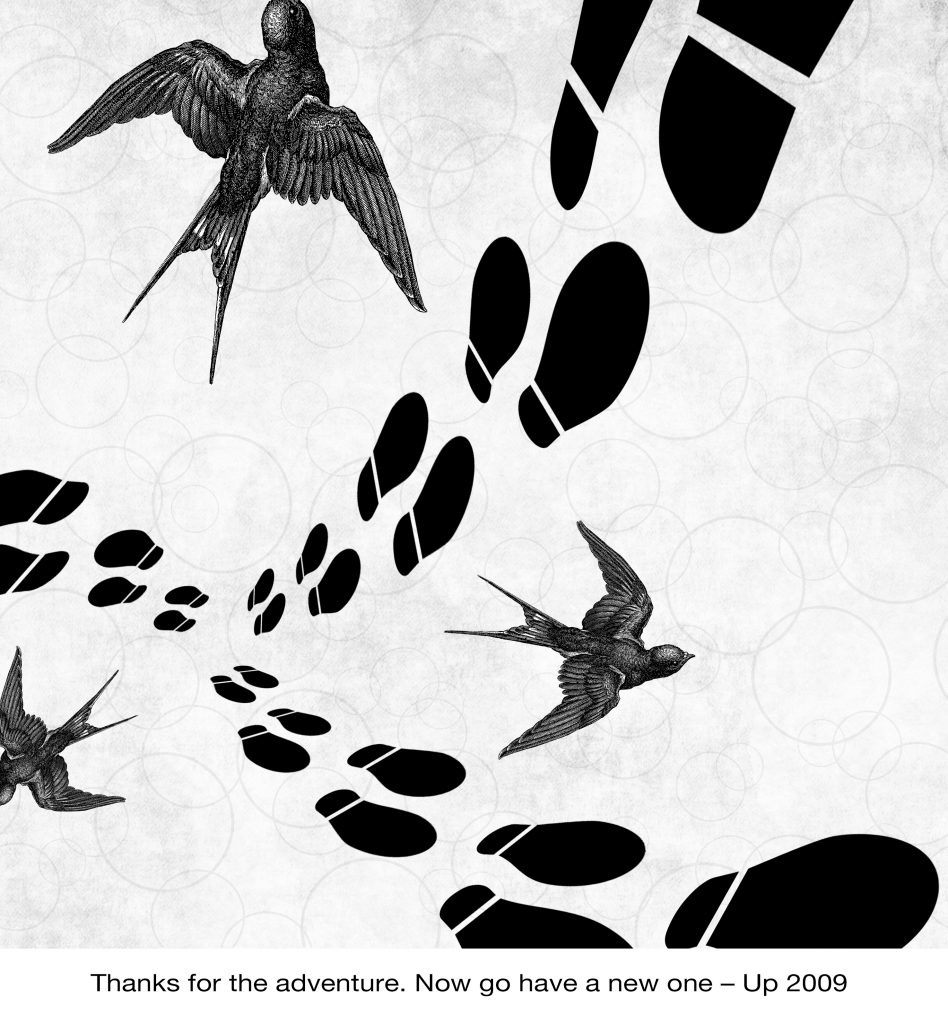
Symbols
Birds – New adventure and freedom
Footsteps – Adventure
Bubble background – To show thanks and happiness as bubbles brings joy to people. (or at least to me)
Textured background – To give a nostalgic/ memory/ book feeling.
The footsteps starts off at 1/3 of the layout and together with the birds, they are all going outwards. The repetition and variation of size of the footsteps going from small to big shows movement. Wanting to add in even more depth,
Initially, it was difficult for me to use symbols from just the quote itself and I kept on thinking of visuals from the actual movie itself. Another problem I faced was trying the usage of halftones. It was also hard for me to use halftones to match with the composition. As for the production of the tote bags, I had difficulties printing on the actual tote bag even though I had already test printed on newsprint paper many times. I needed to use more pressure in order for the ink to get transferred over to the canvas.
From project 2, I learnt the usefulness of the layer mask as well as about experimenting with a variety of compositions and layout until you’ve found the most satisfied piece. It takes patience to come up with one as well. Another additional factor was learning how to use a silk screen and coming up with your own design. Although it was quite tedious, the process was really fun with and an extremely enjoyable rare experience. I hope that we will be able to have more hands on workshops like this too 😀


I chose this quote as it was the most memorable and funny one that I remembered from Mulan.

I love Hayao Miyazaki’s films and Howl’s Moving Castle was one of my favourite movies from him. This was another funny moment from the movie when Calcifer (the fire) was angry and stubborn to let Sophie cook.

Another quote from Howl’s Moving Castle, which I found very inspiring.
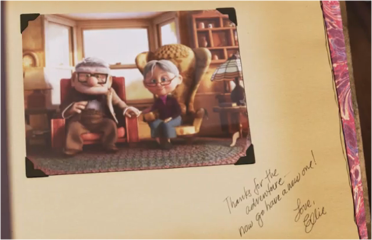
This scene was extremely touching to me, especially since it lightens up Carl’s sadness over Ellie’s death.


Definition: feeling of worry, nervousness, or unease about something with an uncertain outcome.
Thin criss cross lines with rough edges, the paint starts light, becomes heavier towards the center and become lighter again. This tells the feelings of being hesitant to do something because of the uneasiness present in the individual.
I used a fake pine tree leaf loaded with lots of thick pain and varied the pressure used to create these marks.

Definition: the feeling of being upset or annoyed as a result of being unable to change or achieve something
Vertical, horizontal and diagonal strokes with varied thick and thin lines shows the energy released from the individual especially when he/she lashes out on something.

I tried this method a few times to see which one will turn out better.

Definition: thoughts and feelings of insecurity, fear, concern, and anxiety over an anticipated loss of status or something of great personal value
I had an imagery in my mind from cliche dramas/ anime where the 3rd party will want to kill the other women out of jealousy, over a man. Hence, I use the sharp edges of a palette knife to create sharp and intense criss cross lines, which mimics someone slashing a knife around.

I tried with a roller as well, but the effect was not as intense as what I had imagined because of the blurry edges.

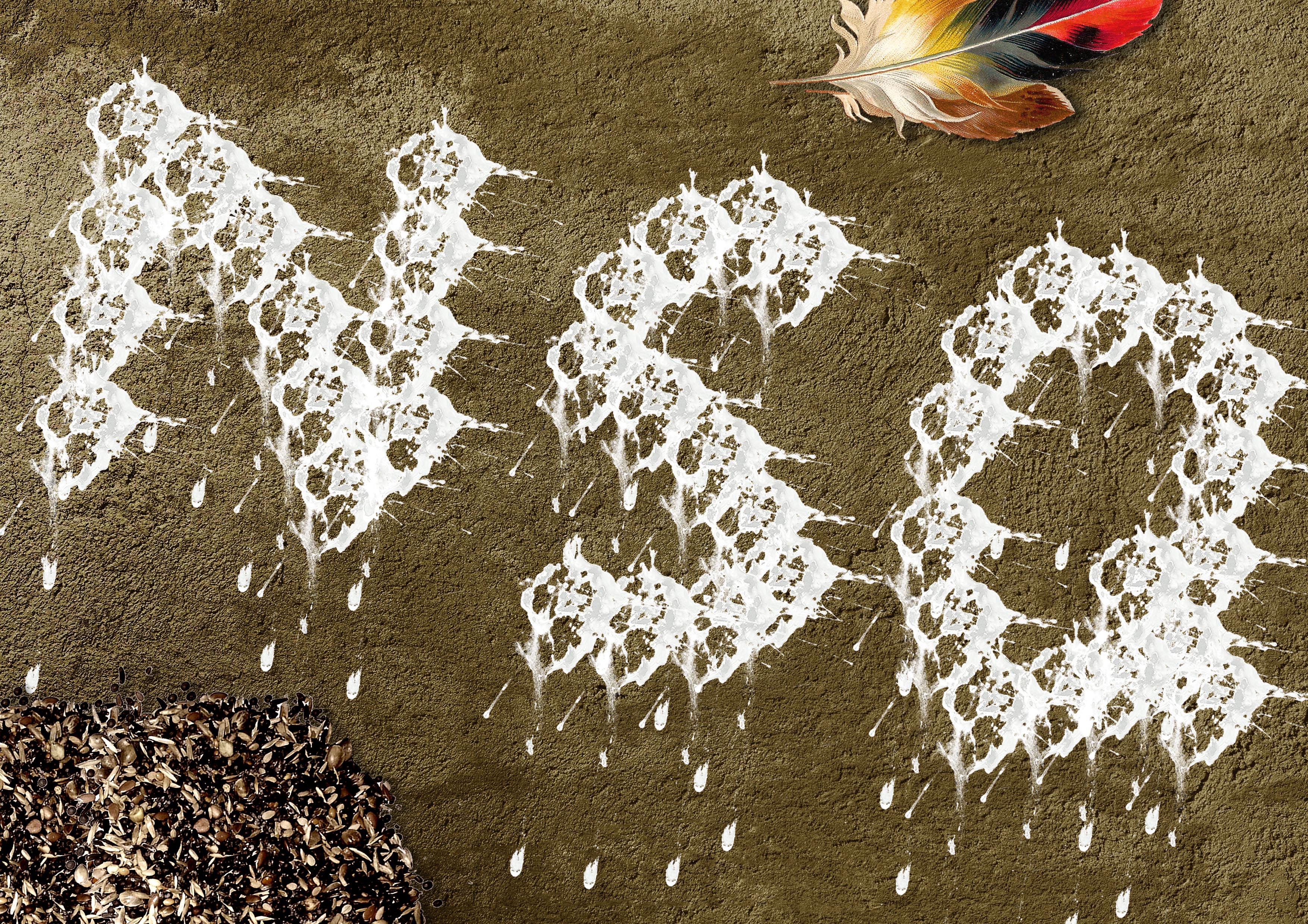
Definition: The process of someone remaining alone or being left out from others.
I took a piece of paper and tried to arrange it in a circle and placed it on a rubber mat for mono printing. For the right side, I used the fake pine tree leaf to make markings to suggest the “others” that the ball is being left out from.


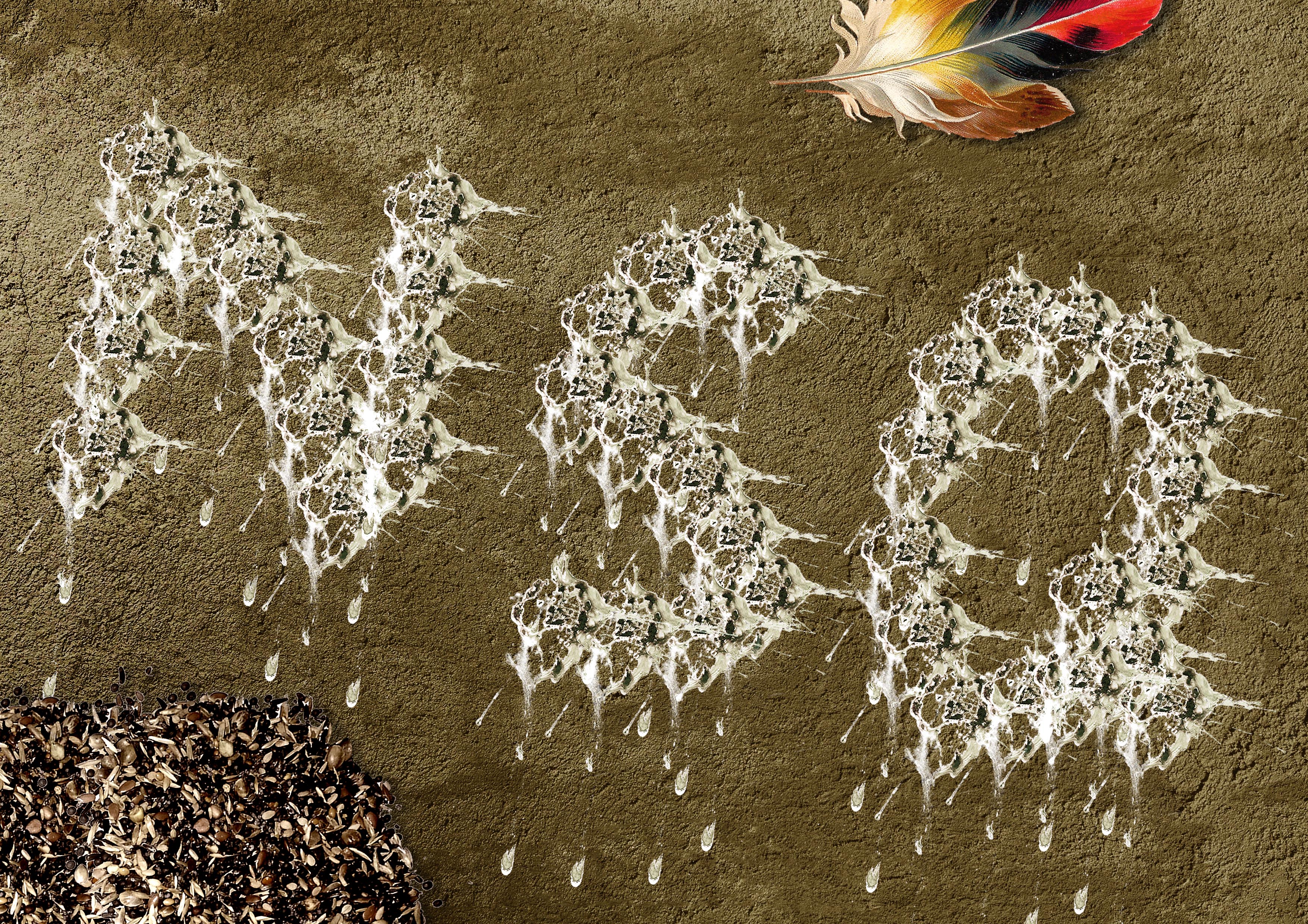
These are other attempts that I tried out.

Definition: a feeling of deep distress caused by loss, disappointment, or other misfortune suffered by oneself or others
I had an imagery of people crying, hence the did vertical strokes downwards on a rubber mat with a palette knife. This caused a wiping effect which suggests wiping of tears, and the outcome of the print looks like it is sinking, as it being pulled down by gravity.

Definition: a feeling of deep satisfaction derived from one’s own achievements, and being proud.
Using a roller dabbed with paint, I created a variation of thick black squares. This was to represent a firm, confident, and bold individual. The shape also suggests a form of protection over something important that someone takes pride in.

Definition: extreme physical or mental suffering.
Using a roller again, a created a extremely thick line. The texture created looks very fuzzy and there is a gradual change to the right. The change from light to dark shows unity and contrast, which suggest what happens when a person dwells too much on something sad.

Definition: no friends or company
When people have no friends, they travel to places alone, hence I used footsteps to represent that using pen. The jagged lines for each foot step suggests the disturbed mental emotion in the person’s mind of not having any company. Towards the end, the foot steps start to deviate away from a straight line. This is because sometimes when an individual started to think too much they start to sway to the side a little.

Originally I wanted to use a ratan ball and roll the paint in a straight line, but it didn’t work out and Ms Shirley said that it does not show loneliness.

Definition: Lacking a sense of security; anxious or apprehensive.
The imagery in my mind were strong vicious waves in a stormy sea. People will feel tensed and insecure about their safety during a storm especially out in the sea. Using the rough side of a sponge I borrowed from my classmate, I twisted and turned the sponge without letting it go from the paper. The dark black parts gives the eyes a main subject line to follow.

I also tried with both the soft and hard edges but it did not work out as well as the one above.

Definition: the state of undergoing pain, distress, or hardship.
When someone is suffering it is as if the person is dying slowly hence I suggest that with a fading white subject.

I tried it 2 times but I prefer the one above.

Definition: a feeling of great enthusiasm and eagerness
When I think about happiness, I think about fireworks, because watching them explode in the sky beautifully make me excited.

Definition: the quality or state of being nervous.

Using ink for calligraphy, I used a crumpled paper to dab on the surface. I was thinking that when a person is nervous, the individual will start to shake, and this effect suggests some sort of shivering. The blacker parts suggests that the person is shivery more vigorously.


Originally I tried with the ones above but Ms Shirley said that these show uneasiness instead because of the thin wavy broken lines.

Definition: feeling, expressing, or causing great pleasure and happiness.

Using ink again, I painted the cap of the ink bottle, such that I can stamp it as circles which imitates the visuals of bubbles. Looking at bubbles makes me satisfied and happy as well but in a more calm manner. There is a constant shape and size, and the spacing gives harmony.


Other stamping that I tried out.

Definition: free from disturbance; tranquil.
I was thinking about ripples in puddles/ ponds which gives a peaceful feeling. The blacks suggests chaos but because it’s in a circle, it shows controlled madness. It can also suggest the calm after a storm.

Define: performed or occurring as a result of a sudden impulse or inclination and without premeditation or external stimulus.
Inspired by Jackson Pollock, I used this to suggest spontaneous. When I was a child, I loved to splash paint this way as well, but of course it was way messier.

Before the final effect, Ms Shirley suggested to add more bigger splashes to the center

Definition: a strong feeling of affection.
Using a brush with poster colours, I applied it without leaving the paper in a manner that represent the heart beat. When people are in love, their heartbeat will increase intensely. The curves suggests a more positive feeling.

This was experimented using mono print, but I wanted to try using other mediums hence, I did not use it.

Definition: of or prompted by feelings of tenderness, sadness, or nostalgia
When people think about their past and memories, it is all faded and vivid.However it comes back to you the more you think about it, which explains why the grids are more firm with sharp edges at the right side. I used scrap paper that was cut out while trimming and arranged it neatly on the rubber mat. After which, I sent it for printing.

Definition: a feeling of reassurance and relaxation following release from anxiety or distress
The soft blurry edges of the curves suggests a sense of calmness. The lines are very “flowy” which enhances the feeling further. I used dark and thick charcoal pencil to create this effect.


