
Developments
Dishonour on you! Dishonour on your cow! – Mulan 1998
The small thumbnails are older versions of the composition before developing to the final one.


These are the compositions that are not good. The first few compositions were too static and I did not work with just the sentence alone. The dragon was actually a character from the movie but I’m not supposed to think of a composition with visuals based on the movie but plainly from the sentence instead. There was also too many subjects which makes the whole composition messy, thus I tried to reduce the number of images and texture as well as vary the sizes.

After looking through other references, design principles and choosing the appropriate found images, I’ve finally done a design that I was satisfied with.
Symbols
Cow – From the “cow” in quote.
Dishonour – Sword because during the ancient times when someone does something dishonourable, they would be executed.
– Cone of shame.
Human – From “you” in quote. She’s in a squatting position to show vulnerability.
I used a white background so that the mood is lighter and not so serious. The cow is placed at the 1/3 position and off-center of the composition and I made it the biggest to show emphasis on the cow as it is the main subject. Repetition and movement was used for the human and swords and they are moving in the opposite direction of each other. This movement also causes the eyes to shift and lead them to the cow, bringing in more emphasis to the cow.
Here’s another curse, may all your bacon burn! – Howls’ Moving Castle 2005


The first few compositions were very messy and were filled up with too many images, hence I thought of using more depth and removed the unnecessary images such as the castle.

Symbols
Magic circle – Curse
Bacon – From quote “bacon”
Fire – From quote “Burn”
I placed the magic circle at the corner so that the edges ends at 1/3 of the layout while placing the bacon and used repetition and movement to show that the bacon is going in the direction of where the circle is. The white flame draws the eye’s attention to itself instead of the bacon to emphasis more on the burning of the bacon, which was the main focus.
They say that the best blaze burns brightest when circumstances are at their worst – Howls’ Moving Castle 2005


I was playing around with the position of the skulls but felt that the layout below was more interesting because it had more depth.

Symbols
Skulls – To describe/ show “circumstances are at their worst”
Fire – Blaze
Radiating light background – To show “burns brightest”
The flame was placed at the top 1/3 position while the skulls occupy 2/3 of the layout. I lowered the opacity of the skulls to bring in more attention to the flame which is the main subject. The background and the skulls converges towards the flame and enhances the effect as to where the eyes look at first.
Thanks for the adventure. Now go have a new one. – Up 2009


Experimenting with different found bird pictures but felt that the one below was the most effective to show what I wanted to express from my quote.
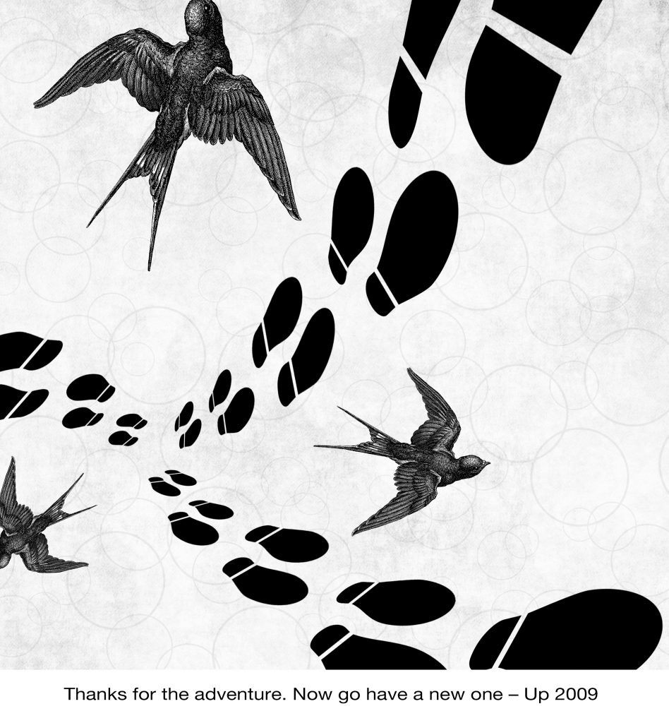
Symbols
Birds – New adventure and freedom
Footsteps – Adventure
Bubble background – To show thanks and happiness as bubbles brings joy to people. (or at least to me)
Textured background – To give a nostalgic/ memory/ book feeling.
The footsteps starts off at 1/3 of the layout and together with the birds, they are all going outwards. The repetition and variation of size of the footsteps going from small to big shows movement. Wanting to add in even more depth,
Initially, it was difficult for me to use symbols from just the quote itself and I kept on thinking of visuals from the actual movie itself. Another problem I faced was trying the usage of halftones. It was also hard for me to use halftones to match with the composition. As for the production of the tote bags, I had difficulties printing on the actual tote bag even though I had already test printed on newsprint paper many times. I needed to use more pressure in order for the ink to get transferred over to the canvas.
From project 2, I learnt the usefulness of the layer mask as well as about experimenting with a variety of compositions and layout until you’ve found the most satisfied piece. It takes patience to come up with one as well. Another additional factor was learning how to use a silk screen and coming up with your own design. Although it was quite tedious, the process was really fun with and an extremely enjoyable rare experience. I hope that we will be able to have more hands on workshops like this too 😀