
image
ˈɪmɪdʒ
noun
- a representation of the external form of a person or thing in art.
Characteristics
- Two–dimensional, such as a photograph or screen display
- Three-dimensional, such as a statue or hologram captured by optical devices or natural objects and phenomena.
- Images can also be rendered manually such as by drawing, the art of painting, carving.
- rendered automatically by printing or computer graphics technology or developed by a combination of methods.
Volatile image
- exists only for a short period of time.
- May be Reflection of an object by a mirror
- Projection of a camera obscura, or a scene displayed on a cathode ray tube.
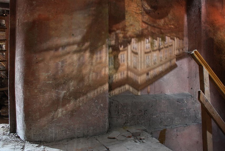
An image of the New Royal Palace at Prague Castle projected onto an attic wall by a hole in the tile roofing.
Fixed image
- is one that has been recorded on a material object, such as paper or textile by photography or any other digital process.

Der Rhein II by Andreas Gursky
Medium:Chromogenic print, on paper
“A photograph made by German visual artist Andreas Gursky in 1999. In 2011, a print was auctioned for $4.3 million, making it the most expensive photograph ever sold.
This large colour photograph depicts a stretch of the river Rhine. The image is immediately legible as a view of a straight stretch of water, but it is also an abstract configuration of horizontal bands of colour of varying widths.With contemporary twist on Germany’s famed genre and favourite theme: the romantic landscape, and man’s relationship with nature, the simplicity of this image shows a great deal of confidence in its effectiveness and potential for creating atmospheric, hyper-real scenarios that in turn teach us to see and read the world around us anew. The scale, attention to colour and form of his photography can be read as a deliberate challenge to painting’s status as a higher art form. On top of that, Gursky’s images are extraordinary technical accomplishments, which take months to set up in advance, and require a lot of digital doctoring to get just right.”

The Scream (1893) by Edvard Munch
The collective name of four similar expressionist paintings painted by Edvard Munch in which an agonized figure is depicted against a blood red sky.
The imagery is haunting and lingering. It has immediate sense of despair. In a way, the painting imprints his style and personality onto the canvas and reflects the mood of 20th century, the age of the anxiety and uncertainty. His style is quite crude, often executed in muted colors, but expressive in conveying psychic reality
Mental image
- exists in an individual’s mind, as something one remembers or imagines. The subject of an image need not be real; it may be an abstract concept, such as a graph, function, or “imaginary” entity.

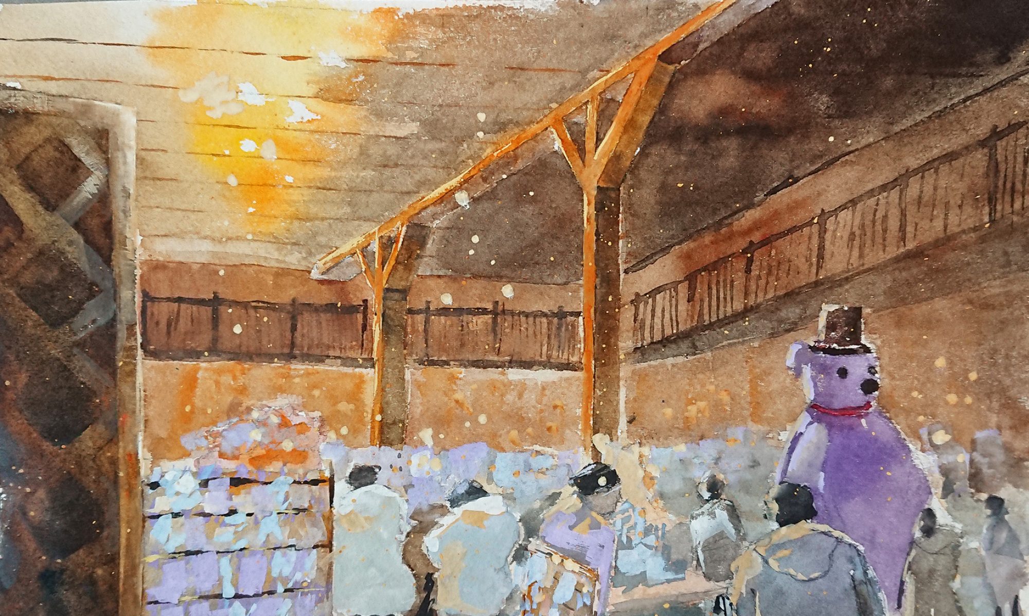
Interactive Sonic & Light Sculptures by Peter Vogel
text
tɛkst
noun
- a book or other written or printed work, regarded in terms of its content rather than its physical form.
- Written work, book, work, printed work, narrative
Typography and Text as a basis in the digital world
-
Font
-
Size
- All typefaces are created differently
- Different spaces used for different font type
- Each character’s height is known as x-height.
- based on the letter ‘x’

- When combining different typefaces, best to use with similar x-height.
- based on the letter ‘x’
- The width of each character in the typeface is known as the ‘set width’
- Type sizes can be measured inPoint system
- Inches
- millimeters
- pixels.
-
Leading
- Leading is the vertical space between each line of type.
- Strips of lead were originally used to separate lines of type.
- For legible body text that’s comfortable to read, a general rule is that your leading value should be greater than the font size; anywhere from 1.25 to 1.5 times.
-
Tracking and kerning
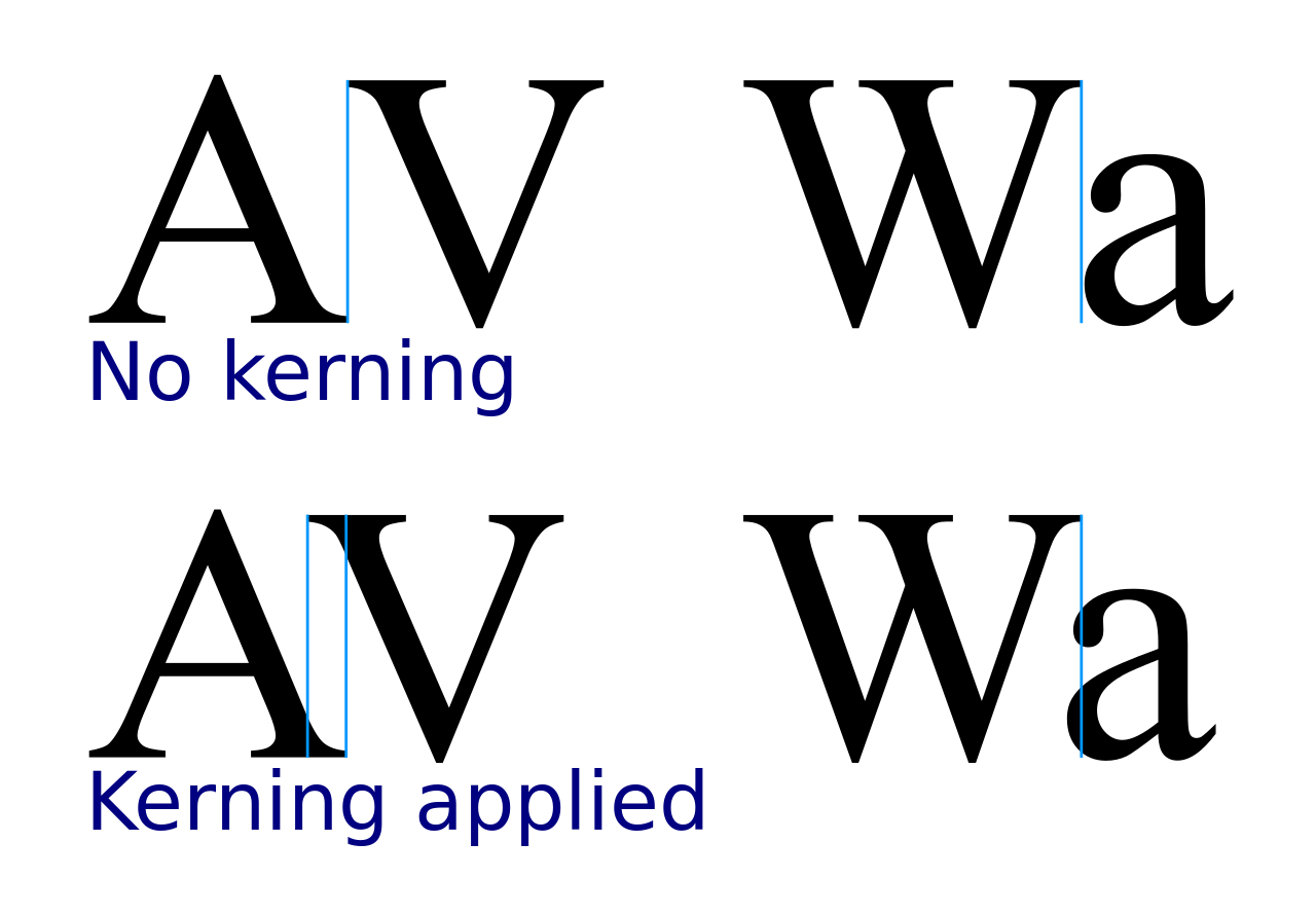
- kerning is the process of adjusting the spacing between characters in a proportional font, in order to achieve an aesthetically pleasing result. For example, where an uppercase ‘A’ meets an
 uppercase ‘V’, the tip of the diagonal strokes are kerned so that the top left of the ‘V’ sits above the bottom right of the ‘A’.
 - Tracking is similar to kerning; but the spacing of all characters is applied evenly.
-
Hierarchy and scale

- Hierarchy and scale
refers to the type sizes for ease of reading. - It is used to guide the reader on which information is important
- Headings and titles are usually large, sub-headings are smaller, and body type is smaller still.
- Size is not the only way to define hierarchy
- Achievable with colour, spacing and weight.
-
Dingbats (Imagery in the form of texts)
- For decorative purposes.

Ways to combine the two together
- Calligrams
- Typography
- Poster Designs/ Advertisements
- Logos
- Illustrated books/ Children’s books
- Agitprop style
- Graffiti
-
Calligrams
- “A word or piece of text in which the design and layout of the letters creates a visual image related to the meaning of the words themselves”
- Beginners start out with basic shapes with guides before moving on to complicated ones or have a photograph as the background.


Josh Mirman

Craig Ward
-
Typography
- “the art or procedure of arranging type or processing data and printing from it.”


- Word as image
- Interpreting and forming a mental image of the word
- Uses only the graphic elements of the letter forming a word
- Use one of the letter of the word to pick out the main graphic elements


Ji Lee
https://www.youtube.com/watch?v=J59n8FsoRLE
-
Poster Design/ Advertising
- Minimal style


Solomon Tsitsuashvili
- Event Posters


-
Logos
- “A symbol or other small design adopted by an organization to identify its products, uniform, vehicles, etc.”

- Some logos were designed with creative thoughts and hidden messages by combining image and text
![]()


![]()
![]()
-
Illustrated books
- Visualisation
- Plays an important role to help children understand and be entertained


-
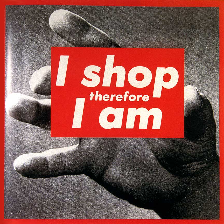
Agitprop style
- “Definition: Propaganda; especially : political propaganda promulgated chiefly in literature, drama, music, or art.”
- 2 words: agitated and propaganda
- Highlights and reacts to crucial problems


Barbara Kruger


Wang Guangyi
-
Graffiti
- “Writing or drawings scribbled, scratched, or sprayed illicitly on a wall or other surface in a public place.”
- 8 styles
- Tag
- Throw up
- Blockbuster
- Windstyle
- Heaven
- Stencil
- Poster
- Sticker


The end
Sources:
- http://d2jv9003bew7ag.cloudfront.net/uploads/An-image-of-the-New-Royal-Palace-at-Prague-Castle-projected-onto-an-attic-wall-by-a-hole-in-the-tile-roofing-source-Wikipedia.jpg
- http://cdn.mos.cms.futurecdn.net/658f3f4b2ff9cd6b84a4e2e028072505-650-80.jpg
- http://typecast.com/images/uploads/typographic-scale.png
- https://upload.wikimedia.org/wikipedia/commons/thumb/4/4f/Metal_types_called_bastard_types.svg/220px-Metal_types_called_bastard_types.svg.png
- https://dailypost.files.wordpress.com/2015/10/text-scale1.png
- https://upload.wikimedia.org/wikipedia/commons/thumb/d/da/Kerning_EN.svg/1280px-Kerning_EN.svg.png
- https://upload.wikimedia.org/wikipedia/commons/thumb/d/d3/Tracking_vs_Kerning.svg/375px-Tracking_vs_Kerning.svg.png
- http://www.creativebloq.com/typography/what-is-typography-123652
- http://joshmirman.com/wp-content/uploads/2015/01/buzz-lightyear-575px.jpg
- http://www.creativebloq.com/typography/what-is-typography-123652
- https://s-media-cache-ak0.pinimg.com/736x/d8/ff/28/d8ff285d929f832ddaebb61c8d5cee38.jpg
- https://digitalsynopsis.com/design/hidden-meaning-logos-word-as-image-calligrams/
- http://joshmirman.com/wp-content/uploads/2015/01/doctors-orders-baymax-print-16×20-resize-575.jpg
- http://joshmirman.com/wp-content/uploads/2015/01/buzz-lightyear-575px.jpg
- http://blogs.iac.gatech.edu/1101adulting/files/2016/11/sunday-again.png
- http://theultralinx.com/2017/01/this-guy-challenged-himself-to-create-a-new-print-ad-every-day-for-a-year-and-the-results-are-brilliant/
- http://scholarworks.wmich.edu/cgi/viewcontent.cgi?article=1280&context=reading_horizons
- https://www.brooklynmuseum.org/exhibitions/agitprop
- http://www.arthistoryarchive.com/arthistory/feminist/Barbara-Kruger.html
- http://www.saatchigallery.com/artists/wang_guangyi.htm
- https://www.buzzfeed.com/lorynbrantz/17-of-the-most-beautifully-illustrated-childrens?utm_term=.ys9BO30EP#.le30XRLMl
- http://graphicdesignjunction.com/wp-content/uploads/2011/08/advertising-posters-23.jpg
- https://s-media-cache-ak0.pinimg.com/564x/57/1e/24/571e245fb36855a113e311876a92401b.jpg
- http://www.arthistoryarchive.com/arthistory/feminist/images/BarbaraKruger-I-Shop-Therefore-I-Am-I-1987.jpg
- https://s-media-cache-ak0.pinimg.com/originals/ed/cc/e1/edcce1b290400481f86f9072975447b7.jpg
- http://en.cafa.com.cn/wp-content/uploads/2011/05/Mass-Critism-GUCCI-by-Wang-Guangyi-2005.jpg
- http://ikonltd.com/images/lg/wang-guangyi_pepsi.jpg
- https://graffitocanberra.wordpress.com/styles-of-graffiti/


