Creative Industry Report: OIMU Studio

OIMU (Oneday I Met You)

OIMU is a design studio established in 2015, based in Seoul. They are known for their cultural projects, aim to rediscover the value of history. They believe that design takes on the role of a bridge that connects the value of the past with the present.

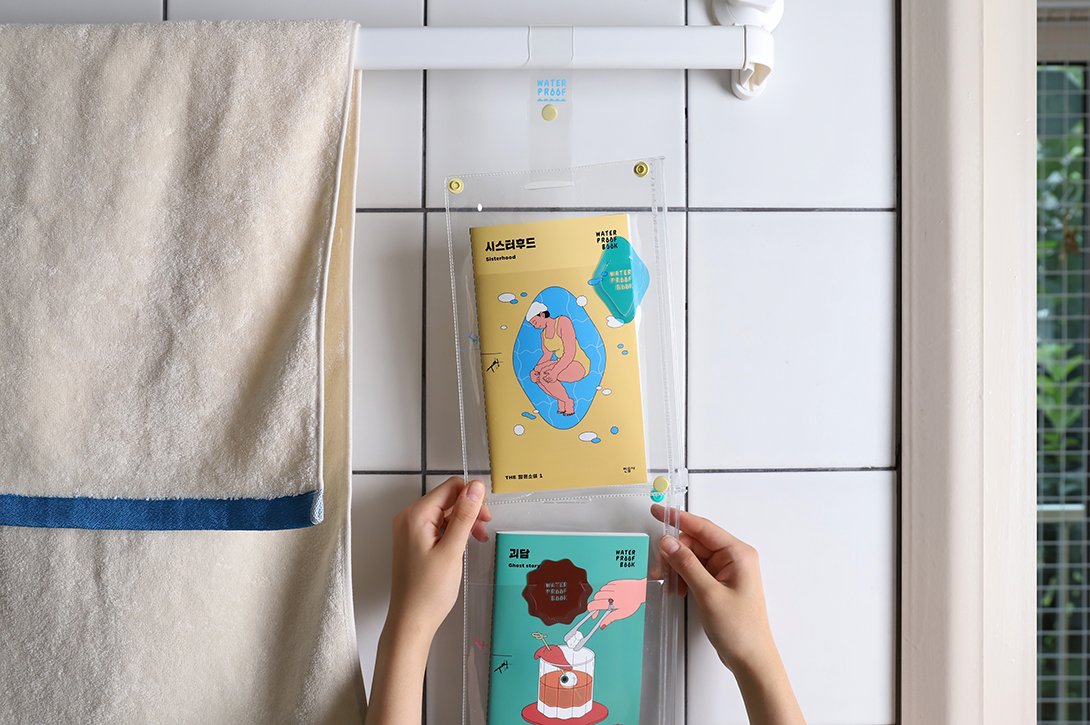
OIMU was also selected as a winner in the communication category of ‘IF Design Awards 2020’ the world’s top three design awards for their ‘Waterproof Book’. This book was printed on mineral paper, made of stones thrown away from the quarries. The result is an eco-friendly and practically indestructible book, unaffected by moisture. OIMU reinvented our perception of books by changing the properties of conventionally used paper.


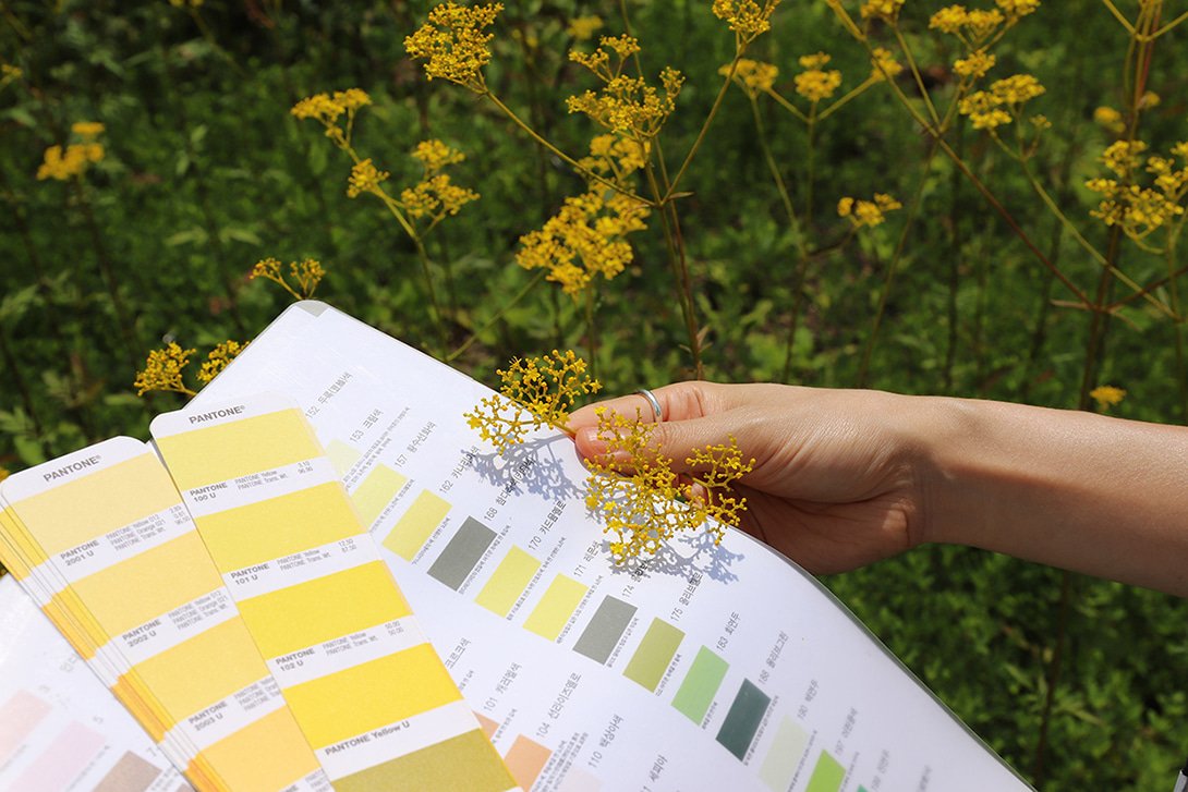
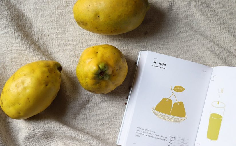
‘The Colour Project’ initiated by OIMU is my personal favourite. In this project, they reinterpreted the ‘Concise Manual of Colour Names’ a book of colours adopted by Korean Industrial Standards and created a new colour language that is unique to Koreans. The idea was to redefine the colours in the book with names related to objects Koreans encounter everyday. This allows Koreans to better express and communicate colours in their everyday life.

I appreciate that the studio is taking so much pride in glorifying the forgotten Korean culture.

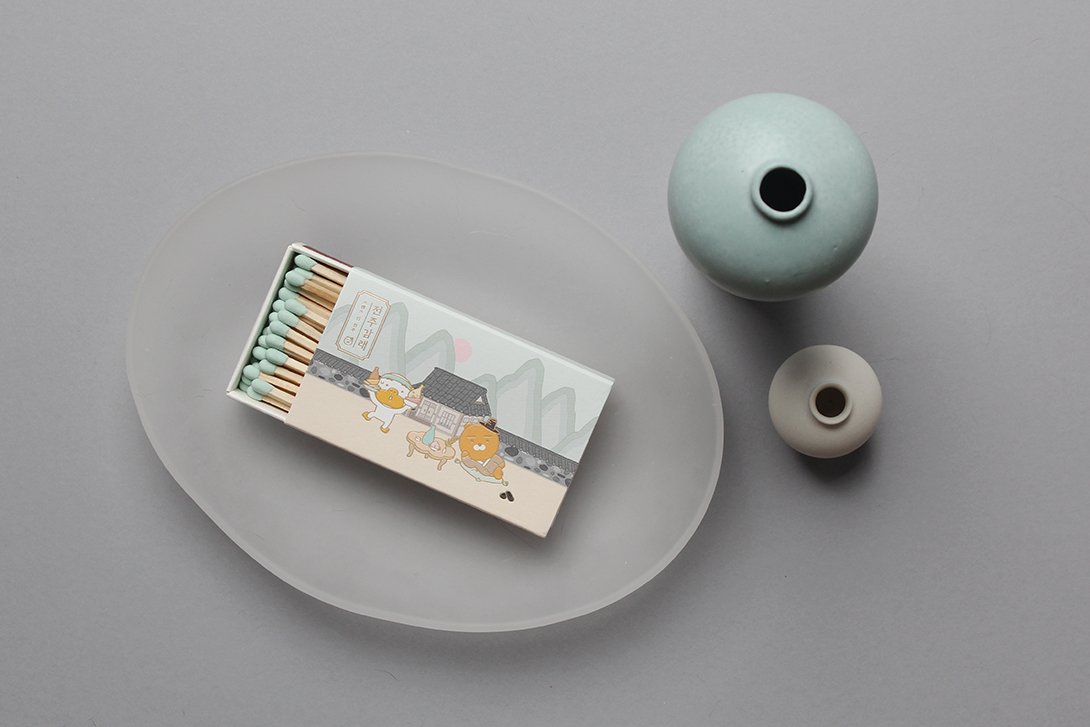
OIMU, unlike many other design studio, has a very consistent design style. Their unique philosophy combined with their sleek and quirky illustrations, enabled them to partner with many renowned Korean brands such as the National Theater of Korea, Kakao Friends and MINUMSA.

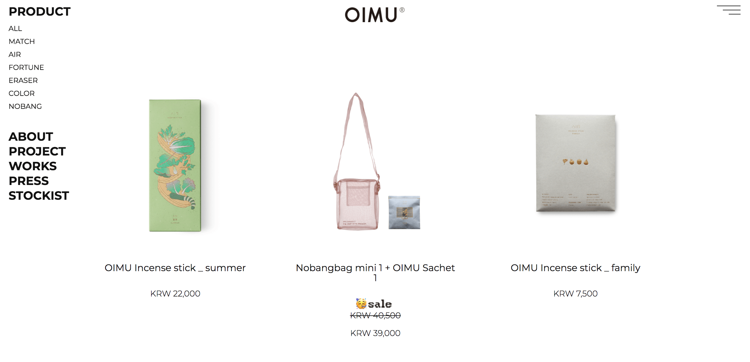
What sets OIMU apart from other design studio is its function as both a design studio and a lifestyle store. As many of their projects are self-initiated, they are able to sell their designs as everyday products on their website and other e-commerce platforms. This provides more touch-points for people to experience and interact with the brand.

Word Count 304

Final | Beneath The Blue

https://vimeo.com/332547342

‘Beneath The Blue’ is a garment that aims to raise awareness for the ‘Dolphin Drive Hunt’. The Dolphin Drive Hunt is an event that happens each year around the month of September, where fishermen drive the dolphins into a bay or onto a beach where they could be slaughtered for their meat or hand-picked to live out their lives in a Dolphinarium. Dolphins are hunted this way in several places around the world, including the Solomon Islands, the Faroe Islands, Peru, and Japan, the most well-known practitioner of this method. However, it was the 2009 documentary film ‘The Cove’ that drew international attention to the issue.

The film was directed by Louie Psihoyos who analyses and questions dolphin hunting practices in Japan. It was a call to action to halt mass dolphin kills, change Japanese fishing practices, and to inform and educate the public about the risks, and increasing hazard, of mercury poisoning from dolphin meat. The film argues that dolphin hunting as practiced in Japan is unnecessary and cruel as the hunters would herd the migrating dolphins into a cove where they are netted and killed by means of spears and knives. There was a horrifying scene in the film, where the killing of the dolphins tainted the water of the cove bright red. The scene was devastating, but it conveyed a very strong message to the audiences.

Inspired by ‘The Cove’, I wanted to reenact the devastating scene — where the water in the bay turns red from the blood of the dolphins killed — in a garment. This was done by incorporating LED lights into the garment, so that it would turn from blue to red; a peaceful sea to a violent bloodshed. The colour change would be triggered by a tilt sensor at the neck area, so that when the wearer bends her/his head to express discomfort or anxiety, the technology would be activated.

The base layer of the garment was made of translucent material to symbolise vulnerability and the innocence of the dolphins. This was followed by a layer of netting, woven with cotton ropes to show the dolphins being trapped and bounded, awaiting slaughter. The third layer was made out of heavy flounce arranged to look like the waves of the ocean. The LED lights were incorporated into the waves to make it seem as though the ocean has turned red. I wanted to make the garment look uncomfortable for the audiences and so that they are more likely to empathise with the dolphins and aid the cause.


Research | Biomimicry

Bird Safe Glass

It is estimated that 100 million birds die every year as a result of flying into glass, and the reason is obvious – they simply do not recognise the transparent structure as a physical barrier. To address this problem, a company developed biomimetic Ornilux Bird Safe Glass, drawing inspiration from the UV reflective strands in spider webs, which birds see and therefore avoid. This is a clear mutual benefit for both species, and so Ornilux sought to replicate this with their criss-crossing UV glass.

Lotus Inspired Hydrophobia

The lotus effect, otherwise known as superhydrophobicity, is the effect seen on the leaves of the Lotus flower, where water is not able to wet the surface and simply rolls off. This high repellence is due to the nanostructure of the plane, where micro-protrusions coated in waxy hydrophobic materials repel the water. This is also a self-cleaning mechanism as dirt particles also stick to the water molecule. Copying this process, CeNano developed nanotol – a hydrophobic (water-repelling), lipophobic (fat-repelling), and oleophobic (oil-repelling) sealant that can be sprayed to substances to create their own superhydrophobicity. The applications of these are huge, and amazingly satisfying to watch.

Artist Research | Hussein Chalayan

In the Chalayan’s autumn/winter 2000 show, he transformed chair covers and a coffee table into four dresses and a wooden skirt – and all in front of a live audience. The show was inspired by refugees of war, people forced to flee their homes, carrying their worldly possessions on their backs. Futurism and minimalism are tropes that have marked Chalayan’s approach to fashion design, and this collection was no exception. In order to explore the definition of home, the collection included garments made from household items: armchair covers, the armchair itself and coffee table.

Where most designers may take one era as inspiration for a collection, Chalayan subsumes them all. In fact, the metamorphosis of fashion over the last century was the subject of his Spring / Summer collection 2007 consisting of 6 pieces that magically evolve through two decades from 1900 to 2007.

Despite the dramatic time span covered in a just a few minutes, the transformation of each piece is incredibly subtle. They twitch, ravel or unravel, zip up or split open with fluid movements, enhancing the sensation that one is watching magic happen. Each piece seems alive, gently unfolding like the petals of a flower: a high necked Victorian gown reconfigures itself of its own accord, the top splitting open and the hemline retreating until, as if by miracle, she is left wearing a crystal embellished flapper dress.