Drawing on the Water Surface Created by the Dance of Koi and People – Infinity | Design Collaborative TeamLab

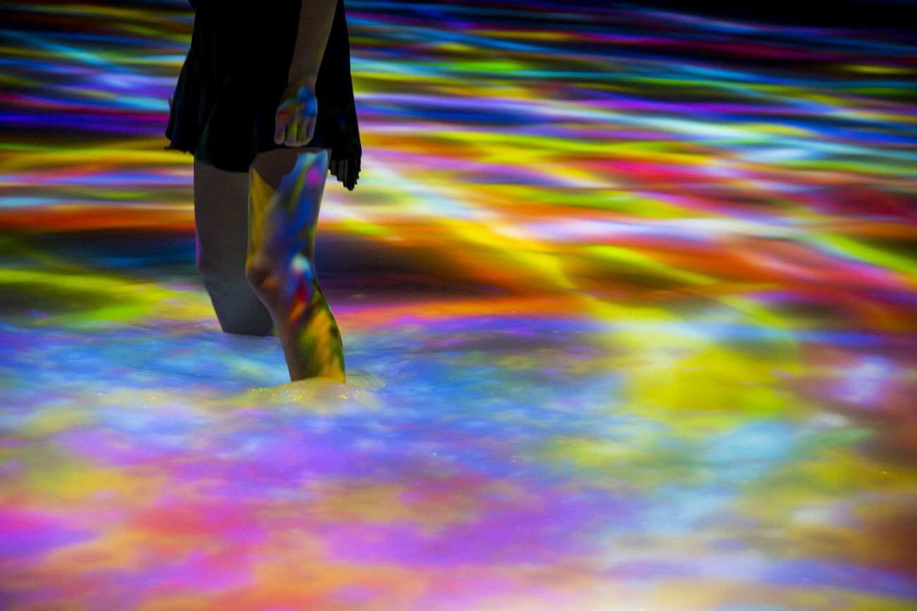
Drawing on the Water Surface Created by the Dance of Koi and People – Infinity | Design Collaborative TeamLab
A B O U T
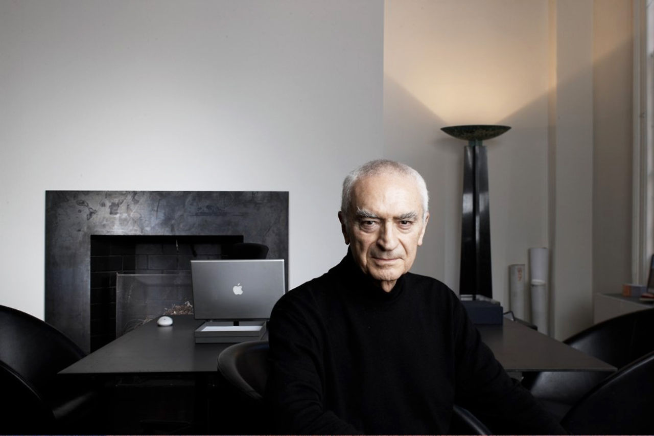
Neville Brody is an English typographer, graphic designer and art director. He has been at the forefront of graphic design for over two decades. Brody started his career in a record company designing for artists such as Cabaret Voltaire and Depeche Mode. Later, he was recognised for his contributions to The Face and Arena magazines.
Cabaret Voltaire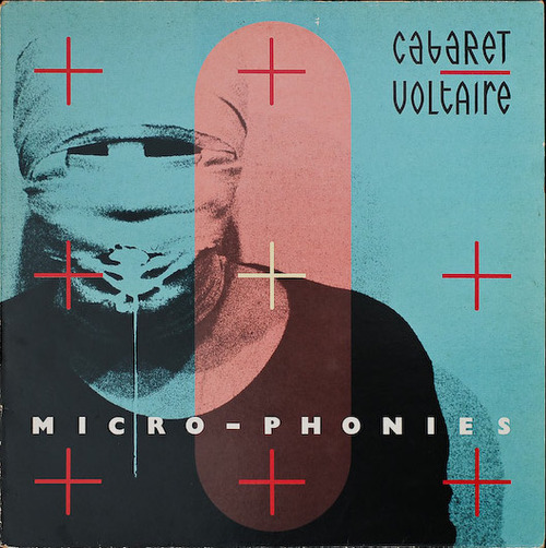
Depeche Mode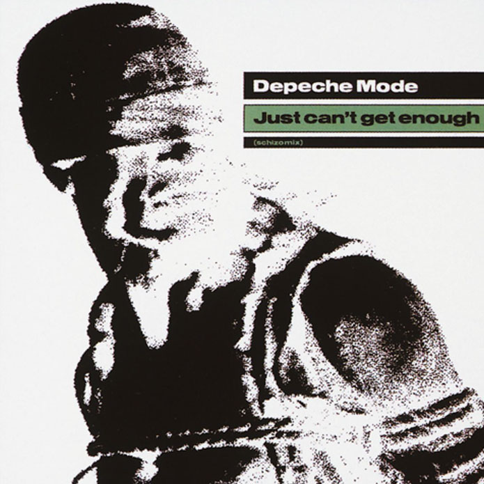
W O R K S
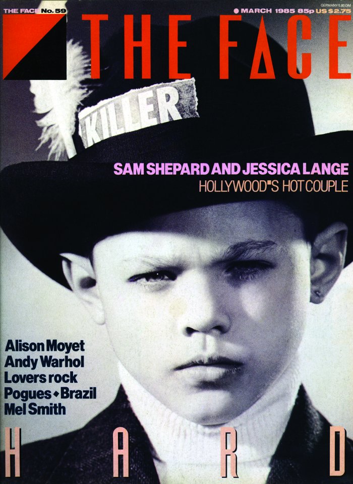
Brody’s most recognised works were for The Face magazine and Arena magazine. Subsequently, he then started Research Company Studio and founded Fontworks with a few others. His company is best known for its ability to create new visual languages. Some of their works include innovative packaging and website design for clients such as Kenzo, corporate identity for clients such as Homechoice, and on-screen graphics for clients such as Paramount Studios, makers of the Mission Impossible films. The more recent projects required him to redesign BBC and The Times with the creation of a new font Times Modern.
The Face Magazine
Arena Magazine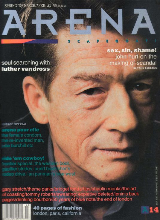
The Times
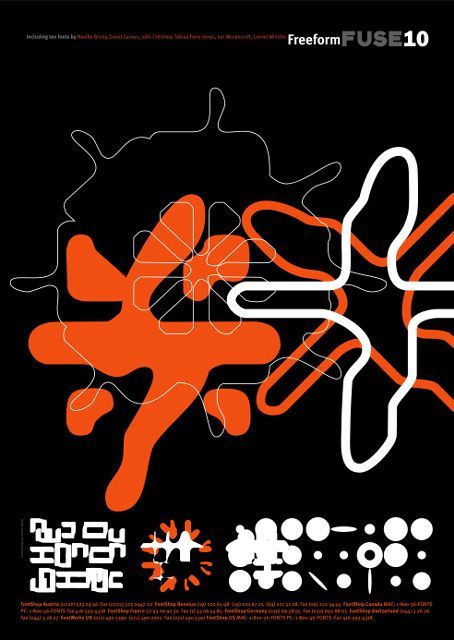
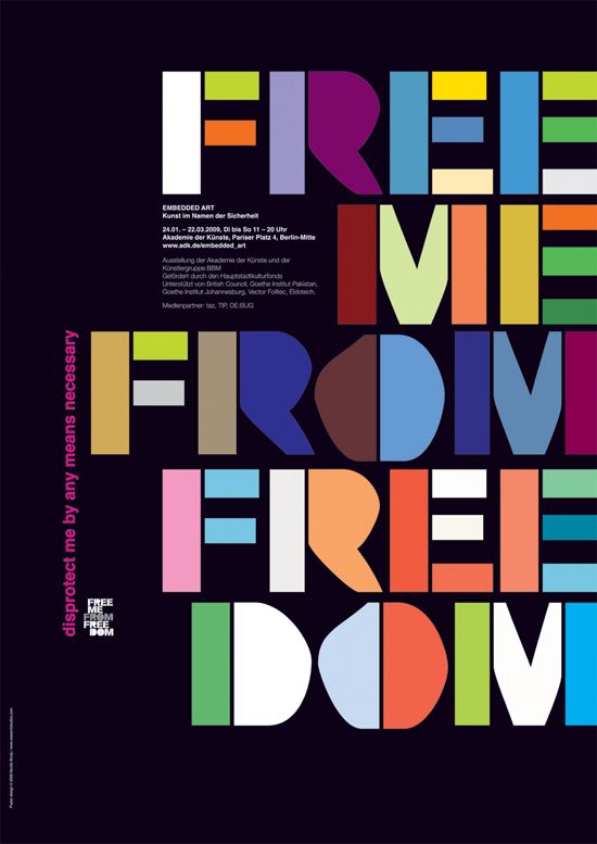
He also created the FUSE project, an experimental and influential typography publication. The publication is approaching its 20th issue over a publishing period of over ten years. The project also brings speakers from design, architecture, sound, film and interactive design and web together through conferences.
FUSE Publication

T H O U G H T S
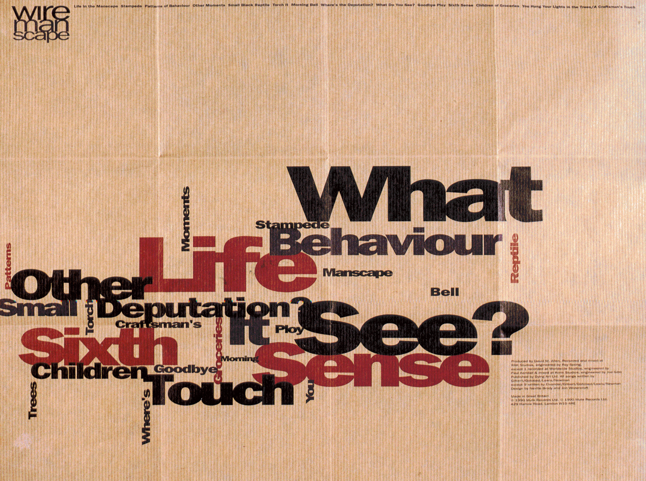
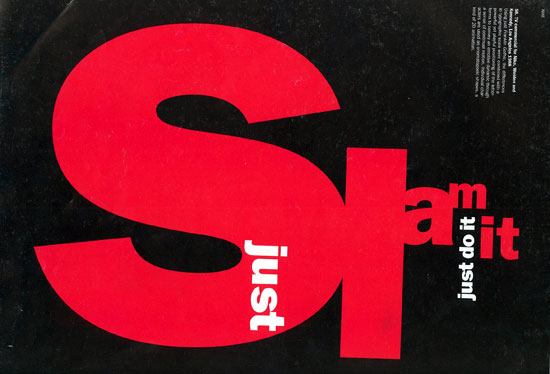
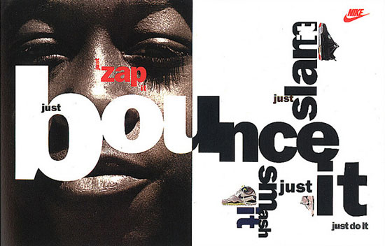
Brody’s design style is very bold and unconventional. He plays with the form, colours, weight and the arrangement of the type to create loud and interesting visuals. Brody pushes the boundaries of design as he explores and challenge conventional aesthetic through his creative expression in design. He is also a versatile designer, excelling in many art forms ranging from publishing to film. I think that his layout compositions are very dynamic and refreshing, differing from the previous typographers that we have examined. His works are very radical and captivating, but not necessarily the most easy to read and understand.
T H O U G H T S
The art of typography has evolved greatly in the past centuries. It started from painstakingly written types to movable type system and now digitalised types created using computers. Through this video, I got to have a better understanding on how types were made and used for mass printing in the 1950s, also known as the printing revolution period.
Back then, the process of creating a type was very lengthy and tedious. It required many machineries, resources and craftsmanship, unlike today where type can be easily created using commercial graphic design software. There is so much hard work and skills behind the typefaces we see and use today. Yet, so often we neglect or use them with little consideration or regards.
“Massimo Vignelli conceived design as a form of pureness. He fought against who worked without any professional dignity generating visual pollution,” — Italo Lupi
A B O U T
Massimo Vignelli was one of the most important designers of the 20th century. He was born in Italy but subsequently moved to New York, where he practiced design for nearly 50 years. Throughout Vignelli’s career, he has experimented with many forms of design, from graphic to furniture to packaging. His modernist approach to his work, brought discipline and purpose to design.
W O R K S
In 1966, Vignelli started Unimark International Corporation in New York with five others. The company quickly became one of the largest design firms in the world. During Vignelli’s time in Unimark, he created many iconic works for corporate brands such as American Airlines, Ford and Knoll. He also designed the signage for the New York City Subway System and its Graphic Standards Manual. Additionally, Vignelli’s work contributed greatly to the success and widespread use of Helvetica.
American Airlines|Logotype
1967

Knoll | Logotype
1966
Knoll International | Poster
1967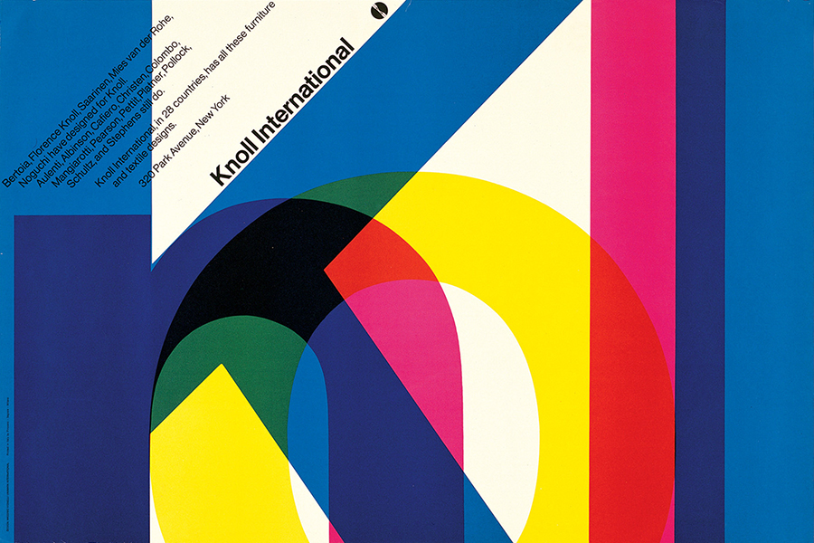
New York City Subway | Foldable Map
1970
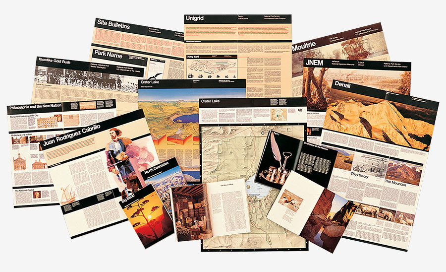
Vignelli left Unimark in 1971, as he felt that the company’s design vision was no longer in sync with his. Subsequently, he established Vignelli Associates with his wife, Lella Vignelli. Works done during this period includes Knoll, Bloomingdale’s, the U.S. National Parks Service and many others.
Bloomingdale’s | Logotype
1972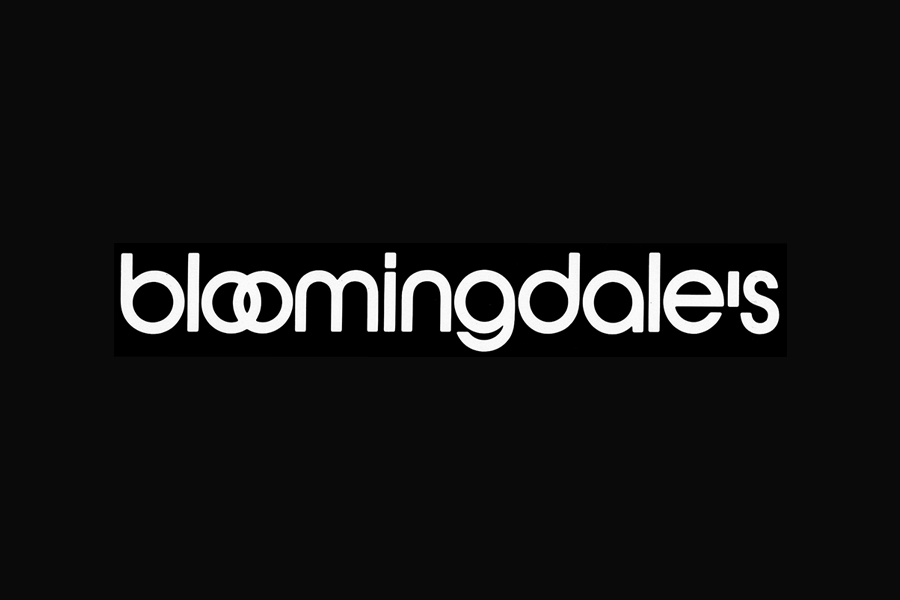
National Park Service | Publication Program
1977
T H O U G H T S
Vignelli has impacted the world of design in so many ways. His works were truly a work of art, with their clean and elegant appearance. I really liked the logotypes that he has created for the various companies, especially the one for Bloomingdale’s. It’s fascinating to see how he can create such strong image and identity for the companies with the use of type and its arrangement.
Even though many of his iconic designs were done approximately 40 years ago, they still remain relevant and impressive up till this day. Vignelli was a forward looking man and his designs anticipate the future and withstand the test of time.
“There is no essential difference between the artist and the craftsman” – Walter Gropius
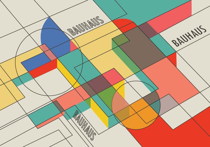
1 T h e B e g i n n i n g o f B a u h a u s
Post WW1, people were anxious about art losing its meaning in society due to the changes brought about by the industrial revolution. This resulted in the start of the Bauhaus school in 1919, Germany, Weimar. The school was founded by Walter Gropius and his intentions was to bridge the gap between art and industrial design (“Walter Gropius | German-American architect”, 2018). Gropius envisioned the Bauhaus to encompass all art forms, reuniting fine and applied arts (“Bauhaus Movement, Artists and Major Works”, 2018).
2 K e y C h a r a c t e r i s t i c s
Bauhaus prioritise the functionality of a design over its elaborateness (Wilk, 2008). Therefore, the designs were usually composed of linear and geometric forms, while the colours were kept to a bare minimal. Bauhaus also favours asymmetrical forms as opposite to regular and symmetrical ones. Additionally, the form of products and architectures were closely related to its function rather than aesthetic purposes. Materials such as steel and concrete were used frequently in buildings as they were deemed as durable and practical.
3 K e y I n f l u e n c e s
There were various art movements that influenced the Bauhaus. They include Modernism (1880), Aesthetic Movement (1870), Art Nouveau (1890), Deutsche Werkbund (1907), Wiener Werkstatte (1903), De Stijl (1917) and Constructivism (1913). Products made in the style of these art movements share similar characteristics as those made in the Bauhaus. Their designs were simplified and stylised for mass production.
4 I m p o r t a n t F i g u r e s
Besides Walter Gropius, there were other significant figures in the history of the Bauhaus school. From 1919 to 1922, the school was shaped by the avant-garde ideas of Johannes Itten, who directed the foundation course (Vorkurs). He taught the student materials, drawing techniques and forms, before they progressed into their specialisation in the Bauhaus workshops. Itten had background in Expressionism, therefore his ideas placed more importance on craft and its medievalism (“Bauhaus Movement, Artists and Major Works”, 2018).
Itten’s mysticism was at odds with Gropius’ vision of the school and therefore he was later replaced by László Moholy-Nagy in 1923. László Moholy-Nagy repurposed the foundation course and introduced Bauhaus of its more industrial focus. He committed the school to the new material technology and mass production, reducing the importance of craft specialization and traditional workshop training (Wilk, 2008). He also emphasised greatly on industrially functionalist designs that uses technologically produced modern materials such as steel tubing, glass and plywood (Wilk, 2008).
5 C l o s u r e o f T h e B a u h a u s
Due to lack of funding after the new government was elected in 1924. The Bauhaus school in Weimar was forced to relocate to Dessau. In 1928, Gropius left the school to resume his career as an architect. Hannes Meyer took on the role as the new director and the school continue to rise in strength (Cook, 2018).
Meanwhile, the Nazis were growing more powerful in Germany. In the 1931, the Bauhaus school was forced to move again to Berlin as the Nazis got elected. The Nazis were not fond of the Bauhaus because its teachings were the complete opposite of National Socialism (Cook, 2018). Despite all efforts, the school did not escape the hands of the Nazis and was forced to close down in 1933.
6 B a u h a u s S i g n i f i c a n c e i n P r o d u c t D e s i g n
The Bauhaus produced an incredible array of products that were distinguished by their functional and good design (Cook, 2018). Not only were they practical, they were a sight to behold with their simple and elegant forms. Bauhaus was a new age of design and resulted in many designs that could be mass-produced and be available to general. Most importantly, the use of enduring materials such as wood, metal and glass allowed Bauhaus designs to look sleek and lightweight while retaining its functionality (“Timeless Examples of Bauhaus Design Still Relevant and Popular”, 2016).

Marianne Brandt, 1924, Ashtray with Cigarette Holder.
The ashtray uses a combination of geometric shapes to create a minimal look. It has an asymmetrical lid and a crossbar embedded in its body for stability (“Design Classics : Bauhaus100”, 2018).

Wilhelm Wagenfeld, 1924, Bauhaus Lamp.
The famous Bauhaus Lamp is an all purpose lamp constructed of precisely cut glass and metal. It is composed of simple geometrical shapes and a balanced proportion (“Design Classics : Bauhaus100”, 2018).

Gerhard Marcks, 1925, Sintrax, 3/4-Liter Coffee Maker.
This coffee maker looks like a laboratory equipment. It displays the versatility of Bauhaus designs. Its simple lines, shapes and colour convey practicality. The transparent glass allows the process of coffee making to be displayed (“Design Classics : Bauhaus100”, 2018).

Marcel Breuer, 1926, Club Chair B 3, 2nd Version.
This chair was created by the head of Dessau furniture workshop, Marcel Breuer. It uses tubular steel as it was strong and lightweight, and lent itself to mass-production. The canvas seat, back, and arms seem to float in space Additionally, the chair is lightweight, easily moved and easily mass produced. (“Marcel Breuer. Club chair (model B3). 1927–1928 | MoMA”, 2018).
7 C o n c l u s i o n
Bauhaus has impacted modern design in many great ways and even till this day we can still observe them in our everyday life. Some might argue that the Bauhaus was too stripped down to a point that it lacked of cultural identity and humanistic elements. But I think that its functionalist design was what withstand time.
R e f e r e n c e s
Bauhaus Movement, Artists and Major Works. (2018). Retrieved from https://www.theartstory.org/movement-bauhaus.htm
Cook, W. (2018). The endless influence of the Bauhaus. Retrieved from http://www.bbc.com/culture/story/20171109-the-endless-influence-of-the-bauhaus
Design Classics : Bauhaus100. (2018). Retrieved from https://www.bauhaus100.de/en/past/works/design-classics/index.html
Marcel Breuer. Club chair (model B3). 1927–1928 | MoMA. (2018). Retrieved from https://www.moma.org/collection/works/2851
Timeless Examples of Bauhaus Design Still Relevant and Popular. (2016). Retrieved from https://www.widewalls.ch/bauhaus-design/
Walter Gropius | German-American architect. (2018). Retrieved from https://www.britannica.com/biography/Walter-Gropius
Wilk, C. (2008). Modernism. London: V & A Pub.
T Y P E T Y P E T Y P E T Y P E T Y P E T Y P E
These are some types found within NTU. They will be split into fonts that are used in signages and fonts that are used for branding & marketing purposes. It’s very interesting to see that there are preferred fonts used for different purposes.

For signages, they generally use san serif fonts, in particular to geometric san serif types. Geometric san serif fonts are constructed of straight, mono-linear lines and circular or square shapes. This can make them very cold and clinical, but also easy to read and digest.
I think that sans serif fonts used in signages are very appropriate as the type prioritise readability and practically. This allows intended message to be conveyed fast and direct. Even though sans serif fonts look very modern, they are certainly not the most aesthetically pleasing fonts in my opinion.

As for branding and marketing, there are more variation to the fonts used. In the examples above, we can observe neo-grotesque sans serif fonts, handwritten fonts and modern serif font. This shows that there are more versatility in branding and marketing. They can afford to play with more font types as their priority is to attract potential customers. Therefore, they have to make the fonts look more elaborate and interesting so that it catches people’s eye.
I think that the last image (Qingdao Laote Premium Light Beer) is a bad example of handwritten fonts being used. The handwritten font looks very cheap and also hard to read. As a consumer, I would prefer if such small words were put in simpler fonts (sans serif) so that I can have a clear idea of what they are selling immediately. In my opinion, it is very tricky to use handwritten fonts because each alphabet have their own character and might look very inconsistent and unprofessional in commercial usage.
A B O U T
Jan Tschichold was a passionate and talent typographer who advocated for modernistic type (san-serif fonts) and design in the early years of his career. Tschichold was influenced by the Bauhaus movement and experimented many ways to break out of the rigid schemes of convention typography.
Subsequently, he published a book titled Die neue Typographie, in which he condemned all typefaces, but sans-serif fonts. The book was a manifesto of modern design. However, toward the end of his 30’s, Tschichold began to rediscover type that were more classic than modern.

W O R K S
Jan Tschichold was also known for his contribution in modern book design. He popularized the Van de Graaf page construction canon, and established a set of rules to be used across all books to be published by Penguin. This resulted in the classic Penguin books that we are so familiar with. Later, he then published a book titled Arbitrary Measurement Relations of the Book Page.

![]()
Tschichold also designed typeface Sabon in 1967. Sabon is an old style serif typeface, and it is frequently described as a Garamond revival. One of its earliest use was by Bradbury Thompson for the Washburn College Bible (1973). Sabon was also used in the Book of Common Prayer (1979) by the Episcopal Church (US), and the church’s secondary liturgical texts.

T H O U G H T S
Jan Tschichold was indeed a prominent and respectable figure in the world of modern typography. Not only did he design beautiful types like Sabon, he also contributed greatly to layout design in books. It was very fascinating to read about his preference change in type throughout his career. It made me more conscience about the type i’m using in my work.