Author: Ng Si Qi

Play Nice
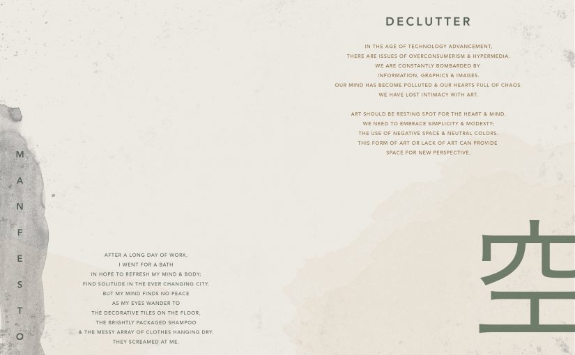
Manifesto | Declutter

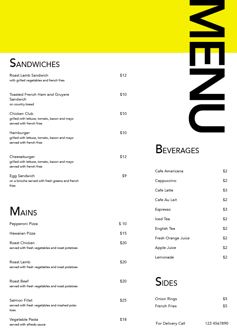
Menu

Hyperessay | Drawing On The Water Surface Created By The Dance Of Koi & People

INTRODUCTION
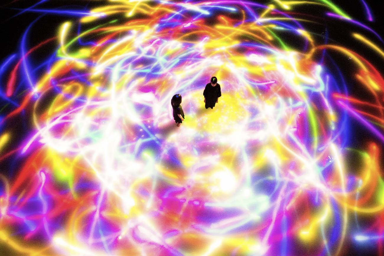
Drawing On The Water Surface Created By The Dance Of Koi & People is an installation created by design collaborative Team Lab.
The viewers are invited into a spacious room that is filled with water up to their calves. Swimming on the surface of the water is digital projections of Koi, rendered in real time by a computer programme. The movement of the Koi is influenced by the presence of people in the water and also other Koi. In the case where the Koi collides with people in the water, the projection of the Koi would dissipate into a bloom of flowers. The movement of the Koi also creates beautiful trajectory lines on the surface of the water as they react to the presence of people moving around them. The interaction between the viewer and the installation causes continuous changes in the artwork. Previous visual states can never be replicated, and will never reoccur
INTERACTIVITY
The installation incorporates the concept of interactivity as mentioned in Roy Ascott’s Behavioural Art and the Cybernetic Vision. He described the concept of interactivity as a feedback loop that “is established so that the evolution of the artwork/experience is governed by the intimate involvement of the spectator. As the process is open-ended the spectator now engages in decision-making play.“
Similarity in the Drawing On The Water Surface Created By The Dance Of Koi & People installation, there is a constant feedback loop between the artwork and the viewer to create a unique visual scape. The projection of the Koi in the water provokes a response from the viewer and the viewer’s presence in turn affects the movement of the Koi and its trajectory lines. The process of this constant feedback loop draws the viewer into active participation and in the act of creation, the viewer becomes part of the artwork.
IMMERSION
The installation also incorporates the concept of immersion as mentioned in Scott Fisher’s Virtual Environments. Fisher states that the “Evaluation of image realism should also be based on how closely the presentation medium can simulate dynamic, multimodal perception in the real world… The image would move beyond simple photo-realism to immerse the viewer in an interactive, multi-sensory display environment.”
Drawing On The Water Surface Created By The Dance Of Koi & People installation attempts to immerse its viewers by letting them walk in the water where the Koi are projected on. This helps to stimulate the viewer’s senses as they can now feel the temperature of the water and hear the slosh of water as they move. This immersive element of the installation replicates the viewer’s perception of the real world and blurs the boundary between self and the artwork.
Fisher also mentioned that to simulate the first person experience, the viewer’s movement should not be programmed “… they are free to choose their own path through available information rather than remain restricted to passively watching a ‘guided-tour’.”
Similarly, Team Lab attempts to simulate the first person’s experience by utilising ultra-subjective space that allows viewers to move freely and experience multiple perspectives. There is no fixed vanishing points or barrier between the viewer and the projection surface, making it possible for viewers to shift their positions and points of view. Each viewer can interact with the artwork from his or her own individual position, without any priority over anybody else, appreciating the influences that they themselves and others around them exert on the work.
CONCLUSION
As oppose to traditional art where the presence of the viewer does not change the artwork. Digital art blurs the boundary between the artwork and the viewer as the behaviour of the viewer causes direct changes to the artwork. This is a step up from the static relationship observed between traditional artwork and its audience. Digital art also has the ability to change relationships among people who are present within the same space. If the interaction of other people with an artwork create change that is beautiful, then the presence of others can in itself become a positive element. This could potentially creating new relationships between individuals and also them with technology.
With that, I conclude with a quote from Roy Ascott “The vision of art has shifted from the field of objects to the field of behaviour and its function has become less descriptive and more purposive.”
REFERENCES
Ascott, R. (1966). Behavioral Art and the Cybernetic Vision. Retrieved from https://oss.adm.ntu.edu.sg/17s2-ap9044-sem-1/wp-content/uploads/sites/2276/2018/01/ascott-behavioral-art.pdf
Drawing on the Water Surface Created by the Dance of Koi and People – Infinity | teamLab / チームラボ. Retrieved from https://www.teamlab.art/w/koi_and_people
Fisher, S. (1989). Virtual Environments. Retrieved from http://www.w2vr.com/archives/Fisher/Environment.html

Type As Pattern

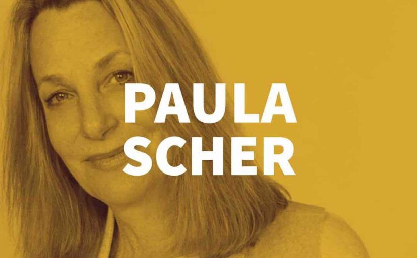
Paula Scher
A B O U T
Paula Scher is an American graphic designer, painter and art educator in design. She started her career as a layout artist for Random House’s children’s book division and subsequently joined CBS Records as an art director for the cover department. In 1984, she co-founded Koppel & Scher with Terry Koppel. During the seven years of their partnership, she produced identities, packaging, book jackets, and advertising. In 1991, after the studio suffered from recession, Scher joined Pentagram as a partner in the New York office. Since then, she has been a principal at the New York office of the Pentagram design consultancy.
W O R K S
Scher has developed identity and branding systems, promotional materials, environmental graphics, packaging and publication designs for a broad range of clients that includes, among others, Bloomberg, Microsoft, Bausch + Lomb, Coca-Cola, Shake Shack, Perry Ellis, the Museum of Modern Art, the Sundance Institute, the High Line, Jazz at Lincoln Center, the Metropolitan Opera, the New York City Ballet, the New York Philharmonic, the New Jersey Performing Arts Center, the New 42nd Street, the New York Botanical Garden, the United States Holocaust Memorial Museum, the Philadelphia Museum of Art, the Robin Hood Foundation, and the New York City Department of Parks and Recreation.
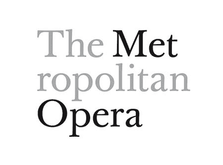
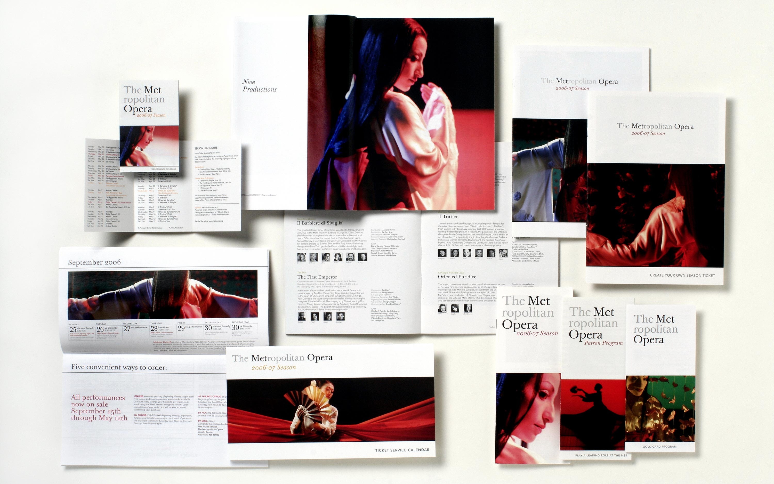 The Metropolitan Opera, Brand Identity
![]()
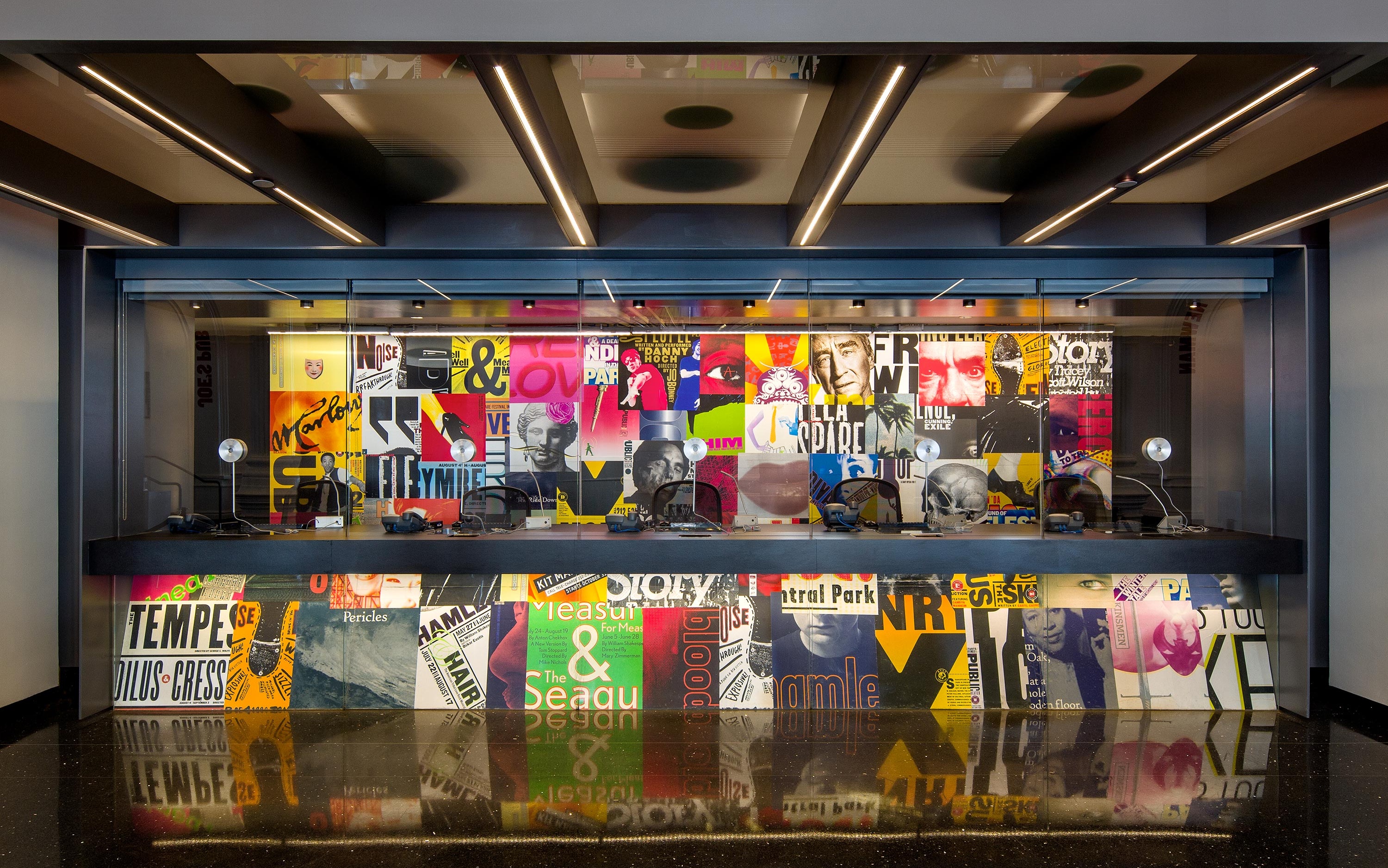
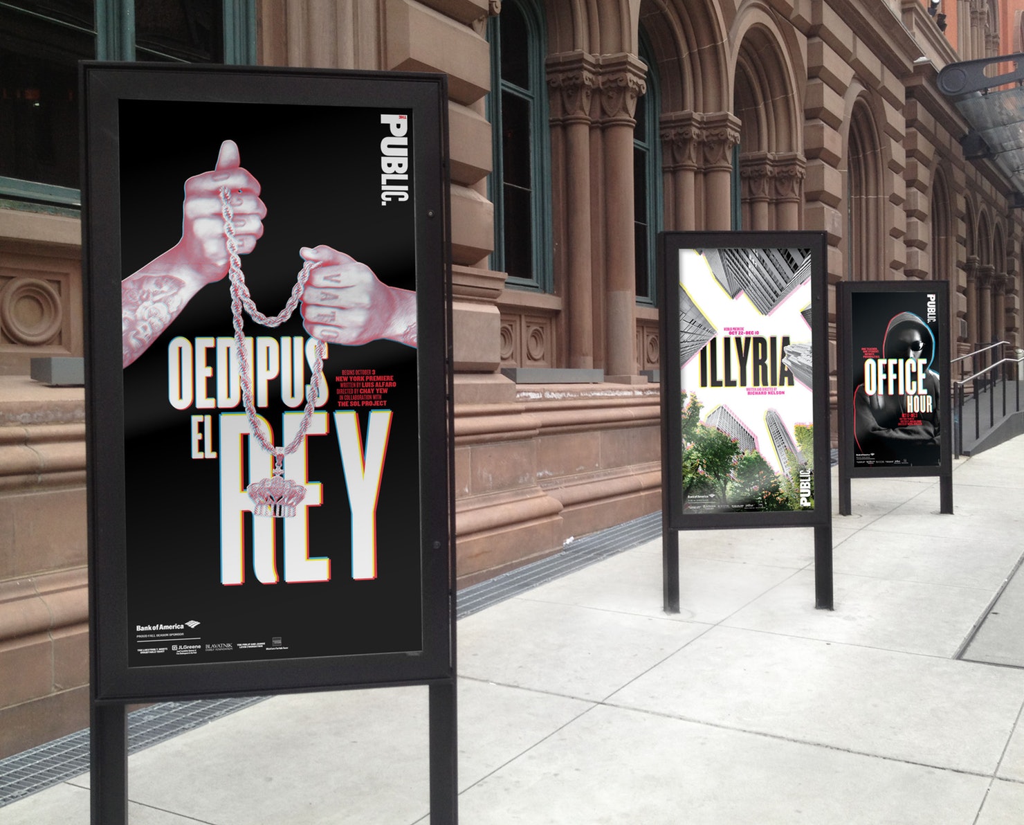
The Public Theater, Brand Identity

Dr. Jart+ Packaging, Product Design


Planned Parenthood, Environmental Graphics
T H O U G H T S
Scher is a multi-talented and versatile designer. She is well versed in many areas of design, from branding to packaging to environmental graphics. Her style evokes bold imagery as she uses typography in an almost illustrative way rather than print style. She believes that designing for vanguard local arts organisations is as valuable as designing for multinational corporations. Therefore, even though she did many corporate branding projects, she is most recognised for her work in the arts. Unlike her polished designs for major corporate brands, her works for arts are loud and expressive. I really enjoy her work because there is a mix of two styles, one for the commercial and one for the artistic.

The Crystal Goblet
In The Crystal Goblet, Beatrice Warde mentioned that typography should function like a crystal-clear glass, acting as a vessel to reveal rather than hide the beautiful thing which it was meant to contain.
She also mentioned that typography used in print should be invisible for a clear transmission of ideas. It should not be eye-catching because that would imply that its first purpose was to exist as an expression of beauty for its own sake and for the delectation of the senses.
I think that what Beatrice Warde talked about in her article was relatable, but only to a certain extent. I do agree that the primary function of typography should be to convey thought, ideas, images, from one mind to other minds and sometimes that can only be achieved with a ‘transparent’ type. For instance, books mainly use “transparent’ types that are highly readable and legible so that the reader can go through the lengthy content with ease and speed.
BUT,
Typography is more than just a transparent vessel. In many cases, designers or artists create beautiful and elaborate types that communicates ideas as efficiently, or even more so than ‘transparent’ types. In the case of posters, bold and beautiful types are used to draw attention and evoke reaction from the viewers. The essence of an idea can be enhanced using an appropriate and beautiful typeface.
Following the thoughts of Matthew Butterick, who wrote an opposing article Drowning the Crystal Goblet, I feel that a text would have no visual characteristic without typography. Beatrice Warde’s metaphor and concept for typography is extremely flawed. By using the word ‘transparent’ to describe typography, she indirectly suggested that typography devoid any meaning, which really isn’t the case.

Haiku
everyday’s struggle
should I stop or should I snooze
just a little long…
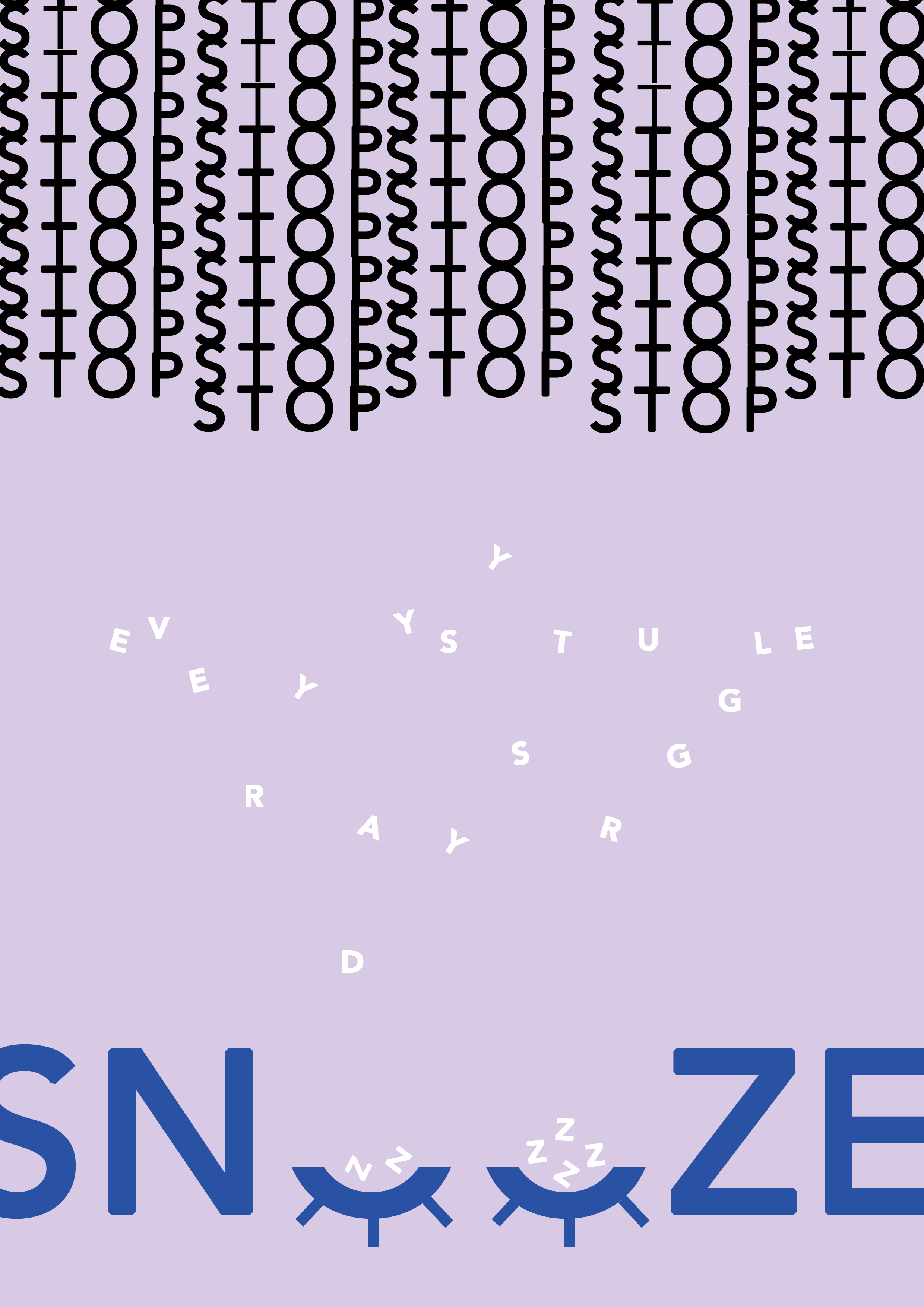

Expressive Words | Opposing Pairs