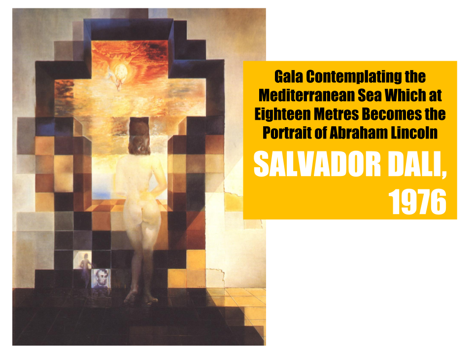
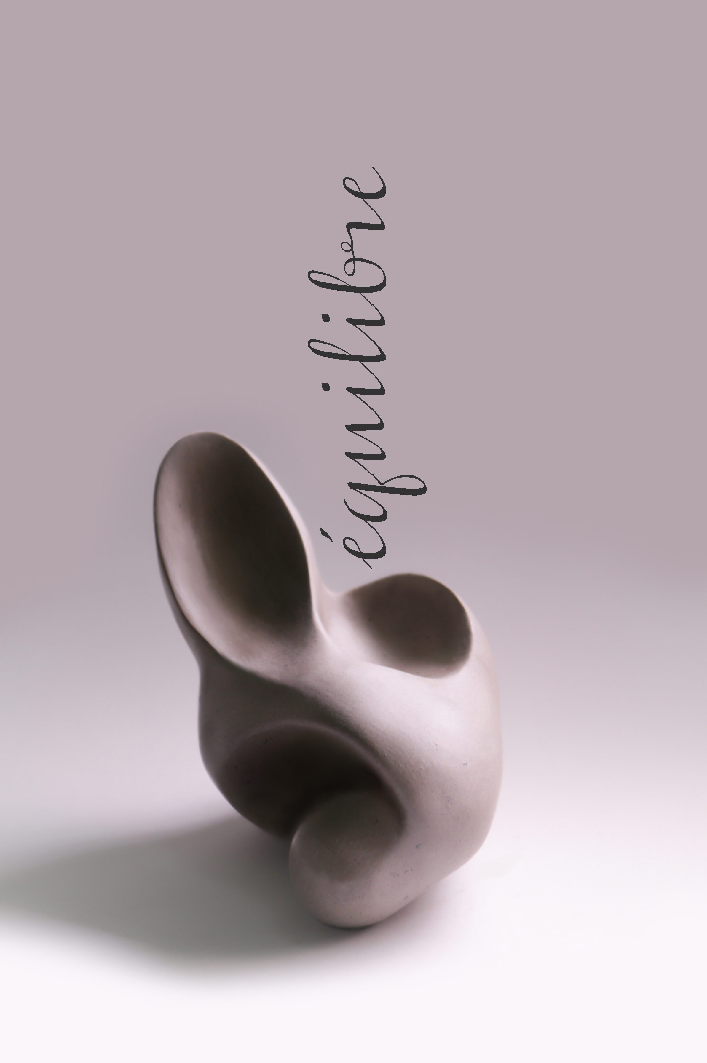
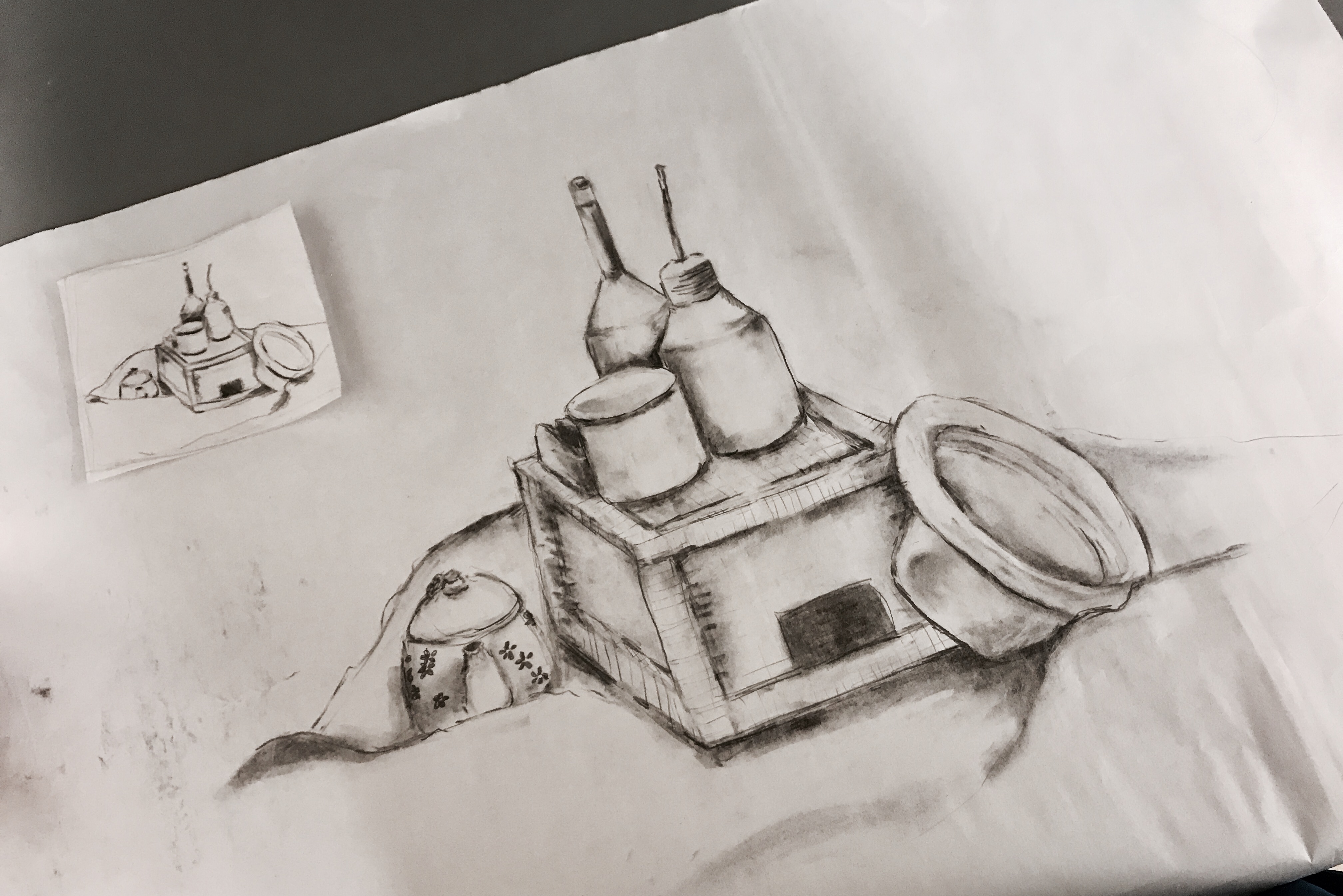
Research Critique 2: The Third Space

Posted by Reuben Tay on Wednesday, 31 January 2018

Click the link above to watch a magic show!!!!!

The third space is a place where people from different locations connect in real-time. It is not a physical place, but it exists through communication links and networking. In ‘The Third Space’ article, Randall Packer’s mentioned that in the third space “We are distributed across space and time.”, because it gives us the possibility to experience an alternate reality that is simultaneously happening in another location.

There are no boundaries constricting the third space. It allows people from the opposite side of the world to interact and create experiences that are sometimes impossible to create in the first or second space.

To experience the possibilities of the third space, my classmate Reuben and I staged a performance using Facebook live broadcast. Through this platform, we created a third space where both of us interacted, even though we were in different parts of the school. We attempted to create a third body by coordinating Reuben’s right hand and my left hand using the split screen function so that our hands look like they were from one person.

Both of us were holding a paper ball that we have to hide and show at coordinated timings to make it seemed like we were shuffling the ball. The audience were to guess which hand was holding the paper ball at the end. We were able to virtually hold objects and create a third body using similar looking objects, coordinating our hands and reacting to what we see and hear.


In the article, Randall also mentioned that in a third space “We can no longer separate the real and the virtual” However, I felt that my experience in the third space lacked intimacy that characterises interaction in the first space as it only engages my sight and sound.

In order to create intimacy, I think that the setting of the third space shared between people should be similar, so that their brain will be hoaxed to think that they are in the same space. Intimacy can also be enhanced when the projected image of the third space are of relative scale to one another and the setting is a private place such as the bedroom or toilet. Most importantly, the third space has to be in real time, so that the interactions are live and engaging.

Research Critique 1: Crowdsourcing

For our crowdsourced project, my group mates and I decided to use the help of our fellow ADM students to design a hand-drawn tattoo sleeve. The students were asked to draw on our arms in response to a specified picture that we have chosen earlier. The final artwork was an interesting mix of colours and style as shown below. These drawings were a direct representation of our audience’s reaction and imagination. Thus, there are an endless possibilities to its outcome.

Our project was slightly inspired by Aaron Koblin’s crowdsourced project “The Sheep Market” as both our projects required our audience to contribute a drawing as a part of an artwork. However, the other aspects of the project were entirely different. One of which being the methods employed for crowdsourcing. Aaron Koblin had utilised an online platform while we had chosen physical networking. Unlike our project, “The Sheep Market” also has a better focus and an intended outcome as Aaron Koblin specified only sheep to be drawn.

I think what our group could have done better in this project was to be more specific in terms of what we wanted our the audience to experience and incorporate more instructions. This would allow us to have a better control over the outcome of the artwork.

This crowdsourced project was a fine example of “Do It With Others” (DIWO) as it involved a collaboration between different groups of people through physical networking. This project blurred the line between the role of an artist (us) and a curator/audience (the students), as both parties contributed ideas to the artwork. In Marc Garett’s article, he mentioned that DIWO, “brings all actors to the fore, artists become co-curators alongside the curators, and the curators themselves can also be co-creators.”

The blurring of roles between artists and audiences can be observed in Yoko Ono’s Cut Piece. In her performance, Yoko Ono sat motionless on the stage while the audiences were instructed to snip off a piece of her clothing with a pair of scissors. In this case, the audiences became the agents contributing to the creation of the art, helping the curator achieve their ideal outcome.

DIWO is an upgrade from traditional artwork as it challenges the conventional definition of art made by a single artist to create an integrative experience. It utilises not one, but many ideas to overcome mainstream cultural ideals. There are also more creative space in a DIWO project as compared to traditional artistic creations, because it is not restricted by the authorities. This breathes life into the art.

2D Foundation Project: Ego In Different Settings

Style Inspiration

1. Minimalist Design

I am very drawn to the simplicity of these designs. The subject of the design is uninterrupted by the background and this makes it visually impactful. The bold and contrasting colours used in the illustration compensates for the simplicity of the design. This style can be executed by vector illustration or photography.    

2.  Sketch Design

This style is based on capturing what we see from direct observation and can be executed best using traditional medium or digital painting. Generally, this design style gives off a more organic look with its uneven lines and values. It can also capture many details of the subject.

3.   Collage Design

This style uses existing images on the internet to create a stylistic design. It gives off a modern and dynamic appearance. However, this style would be similar to the previous project and will be limited by images.

Ideal Colour Scheme

I would like to go for a lighter/pastel colours in my designs as I want to portray  a more light hearted theme.


Design 1

Me: A disciplined and well-behaved basketball.

Situation: My parents go overseas and there is no supervision.

Outcome: The disciplined and well-behaved basketball let loose and party all night. The basketball peels open to reveal that actually it’s core is made out of a disco ball.

Colour Theory: Triadic and Complementary

Design 2: Triadic and Complementary

Me: An anxious Jello that gets jitters.

Situation: Jello goes for a swim (a comfortable and relaxed environment).

Outcome: The anxious Jello calms down and grows some tentacles. It becomes a jellyfish that swims gracefully in the water, no longer anxious.

Colour Theory: Split Complementary and Complementary

Design 3

Me: An ordinary and boring pack of fries.

Situation: Fries goes to a salon.

Outcome: The ordinary pack of fries gets a transformation and upgrade into twister fries.

Colour Theory: Triadic, Complementary and Analogous

Design 4

Me: A bowl of inconsiderable Froot Loops.

Situation: Froot Loops goes for a sushi (opportunity) buffet.

Outcome: The inconsiderable Froot Loops actually has a big appetite (ambition). The petite sized Froot Loops gain weight by grabbing all the opportunities and transform into plus size donut.

Colour Theory: Split Complementary  and Triadic

Process and Challenges

Initially, I wanted to do two strips in vector art and another two in photography. However, after trying out photography, I found that the results were not as desirable. I think that was because I didn’t take the photos from the same angle and in the same lighting. Therefore, the resulting images were not very consistent. It is also very difficult to play around with colours because usually the object itself already have a fixed colour.

Final Composition


4D Foundation Project 2: Sequential Images

Initial Composition
Final Composition

The story depicts a girl receiving post-it notes from her sister. The post-it notes encourages her as she goes about her daily routine. It was later revealed that there was actually on one writing to her and that she have been writing those post-it notes to herself. She curated the whole event as she was not able move on from her sister’s death.

The pictures were arranged in a circular manner so that the story has a loop. They were also arranged to surround the pictures of two kids playing with each other. These pictures are flashbacks of the main character and her sister’s childhood days.


2D Foundation Project 2: Forest Gump

Quote 1: “Sorry, Love. Gotta save the world.” – Kingsman: The Secret Service (2014)

Research

For this quote I want to express the idea of how heroes have no time for romance. I visualize a  scene whereby the hero is busy saving the world while his/her lover is left feeling neglected. I wanted to express this quote in a comical style because I felt like the movie itself was actually very quirky and lighthearted.

Composition Experimentation

I positioned the city in between two hands. These hand’s symbolize the lovers reaching out for each other while the city gets in the way. The center of the composition shows the city overlapping the face of the girl slightly, this shows us that the hero might prioritize saving the city a little more than his relationship. The city is threatened by an impending explosion as seen in the picture through the text “BOOM” and a countdown timer in the city’s silhouette. The city can also be seen crumbling through the jagged edges along its base.

Principles of Design

  1. Asymmetry in the arrangement
  2. Continuity: The hands reaching out for each other creates a leading line that directs  viewer’s attention
  3. Gestalt Theory: The use of many simple and contrasting elements. The law of closure is applied in the word “BOOM” and the number “28:08”
  4. Repetition: Dotted background
  5. Balance: Elements evenly spread

Quote 2: “Ready your breakfast and eat hearty for tonight WE DINE IN HELL!” – 300 (2006)

Research

Composition Experimentation

To me, this quote symbolize an oncoming bloodshed and war that will result in countless deaths. Therefore, I want to stylize my designs to express gruesomeness and darkness through death.

Initial Version

The picture shows several morbid skulls and splashes of blood revealing the aftermath of war. The picture also spots several flying bats which represent darkness. There is a gravestone in the center of the picture placed above a tomb which is a human organ. This re-emphasizes death and the gruesomeness of war.

Final Version

As the first composition was too messy and possibly overwhelming to its viewer, I have recreated a more focused composition.

This picture works along a similar idea of violence and death, this can be seen from the cross tombstones erected around the earth. The earth has become a giant cemetery as a result of bloodshed and even it’s trees can be seen as barren and withered. The bats fluttering around once again represents the darkness. The center of the picture focuses on a dead man, with a gaping mouth and fangs behind him. This means the man has been consumed by death and evil.

Principles of Design

  1. Asymmetry in the arrangement
  2. 3D effect in 2D space: Separation of foreground and background
  3. Variety of elements
  4. Balance in composition

Quote 3:  “One Last Ride.” – Furious 7 (2015)

Research

For this quote I wanted to show a final epic journey and its finish line. I also wish to  express the idea of to moving on and liberation in death.

Composition Experimentation

Initial Version

The composition consists of a roller coaster with many ups and downs, this symbolizes the journey.  There is also a finishing line flag to show that the journey have reached the end. Many birds can be seen flying along the picture, they represent freedom in the final journey and even in death. The island symbolizes paradise and comfort upon death.

Final Version

For the initial composition, there was no flow in the elements. Therefore, in the final composition I retained most of the elements (Roller coaster, Birds, Finishing Flag) but changed their arrangement.

I added a White Chrysanthemum flower that is known to be used for the passing of loved ones .  The elements flow in sequence to tell a story of an epic journey. The journey finally reaches an end and death ensues. 


Principles of Design

  1. Asymmetry in the arrangement
  2. Contrasting scale of the elements
  3. Visual hierarchy
  4. Visual tension created using the flying birds
  5. Balance in composition

Quote 4: “It’s the honest ones you can’t trust.” – Pirates of the Caribbean: The Curse of the Black Pearl (2003)

Research

For this quote I wanted to express the concept of deception and hidden agenda.

Composition Experimentation

Initial Version

Contrasting elements such as a bouquet of flowers and a dagger were used in the composition. The dagger was hidden behind the flowers, seemingly innocent and a hand was holding out the flowers as if offering it to someone as a gift.

I also decided to depict the flower vase as a light bulb and show a few moths surging towards it. This was inspired by the phrase “like a moth to a flame” which meant that one was irresistibly attracted to something or someone dangerous.  This phrase came about from a well known fact that moths are attracted to bright lights and sometimes they get burned from the heat. This symbolizes that what seems to be harmless and good might not necessary be.

Final Version

I decided that the initial design is a bit right-heavy.  Therefore i shifted the whole composition to the left to create more balance between various elements.

Principles of Design

  1. Symmetry in the arrangement
  2. Contrast between the background and foreground
  3. Variety of elements and values
  4. Balance in composition
  5. Visual tension creating from the flying moth and the falling confetti

Choosing a Design for Silk Screen Priniting

After much consideration, I have decided on the design that depicts the quote “Sorry, Love. Gotta save the world.” because I felt like there is more dynamics in this composition as compared to the others. It also has a very clean cut design that is suitable for silkscreen printing.

Silk Screen Printing Process

  1. Lay the transparency on top of the screen
  2. Coat the screen with a photosensitive emulsion
  3. Wait for the screen to dry and placed it on the vacuum light table and exposed with a 3000 watt metal halide light
  4. Washed out with a pressure washer at around 1300 psi.
  5. The image will now appear on the screen
  6. Place the screen onto the surface you want your “reproduced” image to appear
  7. Apply ink

Silk Screen Printing Result

Design on screen

Design on newsprint

Design on tote bag (YAYYYYYYY!)

Overall, I had a lot of fun doing this project! I got to learn more about Photoshop, silk screen printing and the principles of design. For me, the hardest part was to find my own interpretation of the quote and breaking it down into visual elements, because I tend to get influenced by the story of the whole movie. I also faced many challenges in the technical aspect of this project as I am not very proficient in Photoshop. But I think that all these challenges are what made us learn and progress. Looking forward to the next project!

4D Foundation Project 1: A Day Without Me

Exploration Shots

Final Shot Exploration

My shot was inspired by the Narnia/Harry Potter film whereby the main character disappears into another dimension. The character would normally step through a door that separates the two dimensions and that is what I am trying to achieve.

My chosen location is a laundry shop, where the void of the washing machine looks like the door to an alternate dimension. The clothes were scattered on the laundry basket showing that i was in the midst of taking out my washed laundry. I also used other props like a Harry Potter story book, a pocket watch, vines and bubbles to create an otherworldly effect.

2D Foundation Project 1: My Line Is Emo

WEEK 2 ADVENTURE

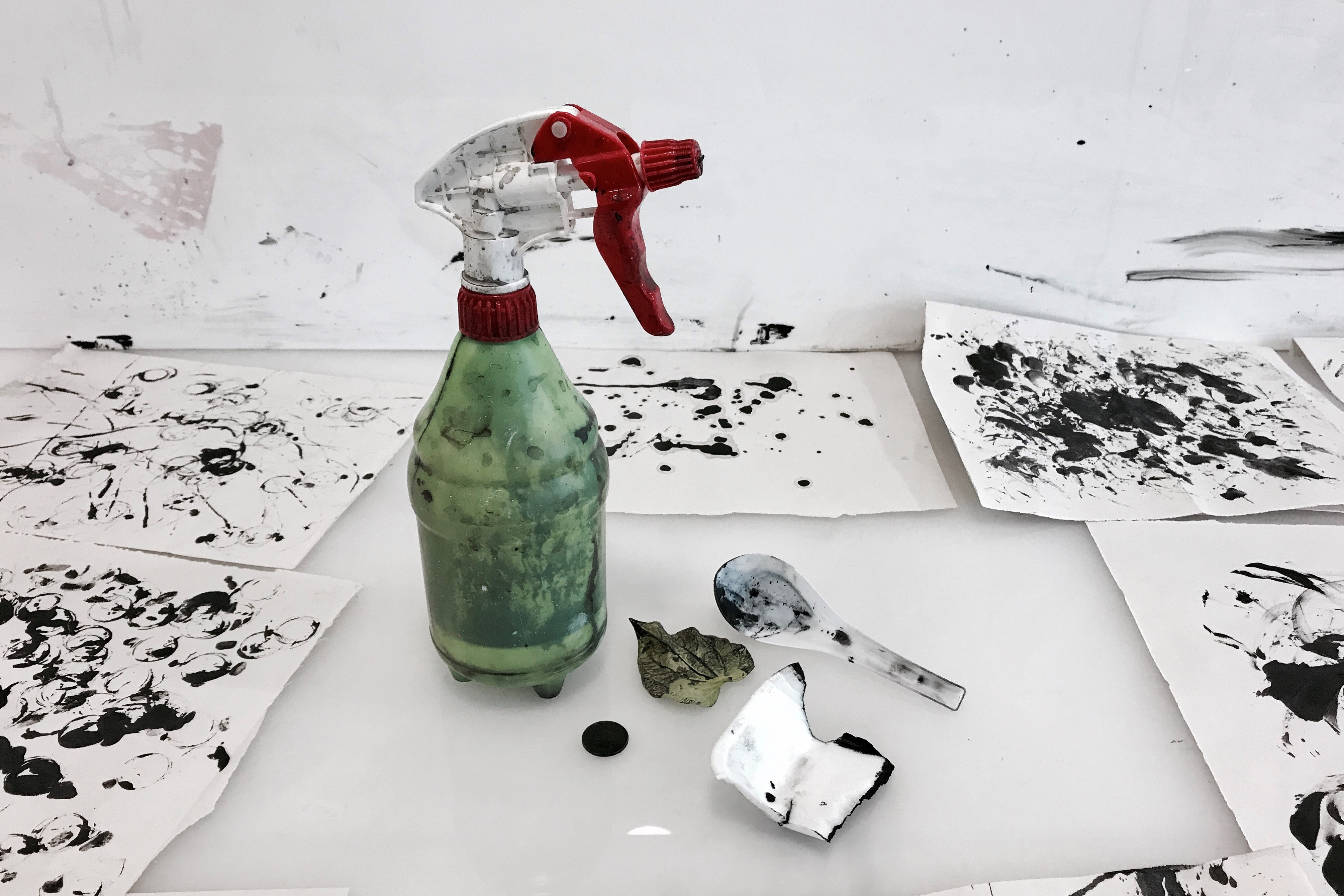
Last week, I was instructed to bring along a few mark making tools to class and i decided on the several items shown below, which includes a spray bottle, a 20 cents coin, a leaf, a styrofoam box and a plastic spoon.

We were provided with newspaper and black blocking ink to play around with and the first item i explored was the styrofoam box. I tore the box into random pieces to create more texture and these were the resulting effect.

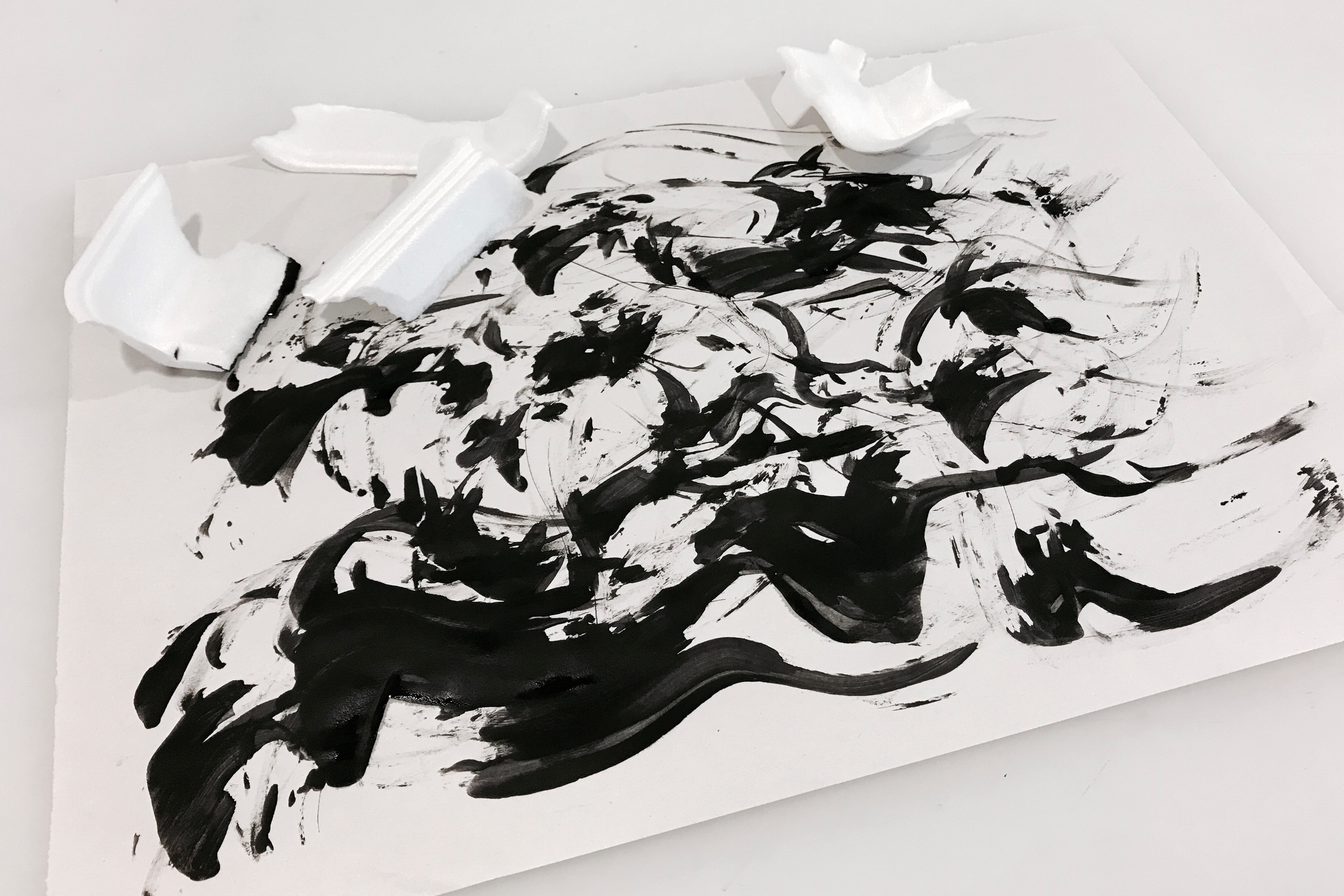
The top piece was done using the flatter surface of the styrofoam to create thick and wavy marks that taper off at the end. However, the marks created were inconsistent due to the varying  pressure applied and varying amount of ink. The bottom piece was done more systematically with the rigged edge of the styrofoam to form diagonal strokes. The strokes are spaced out quite evenly and can appear sparse as a large component of the paper peaked through.

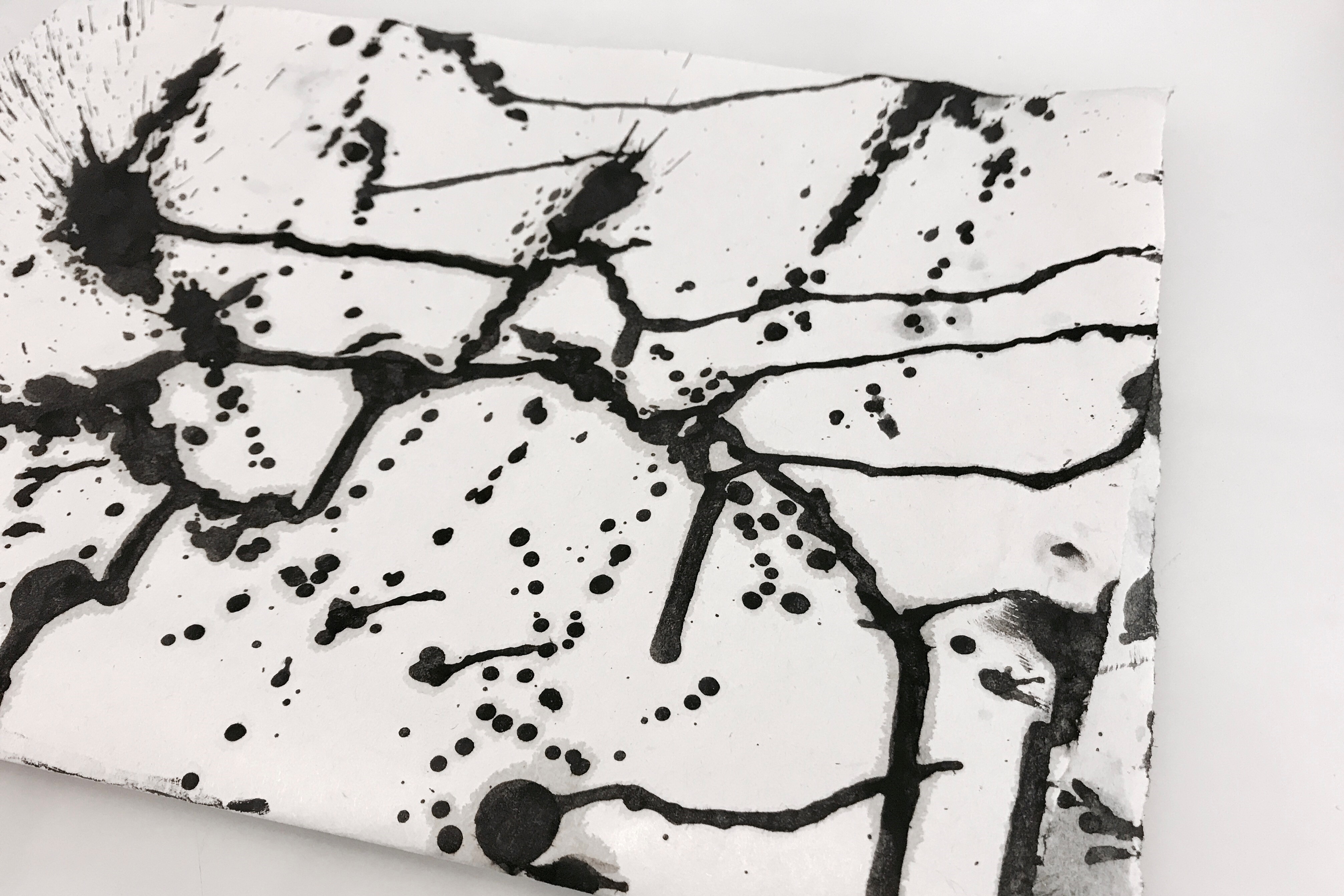
After experimenting with the styrofoam, i picked up the ordinary looking plastic spoon. The end result is a mess as the plastic spoon was rigid and hard to manipulate. The flat side of the spoon resulted in messy blops of ink. While the rigged side made harsh and short lines. I also tried using the spoon to scope up the ink and splatter them randomly onto the paper which resulted in a paint spattering effect.

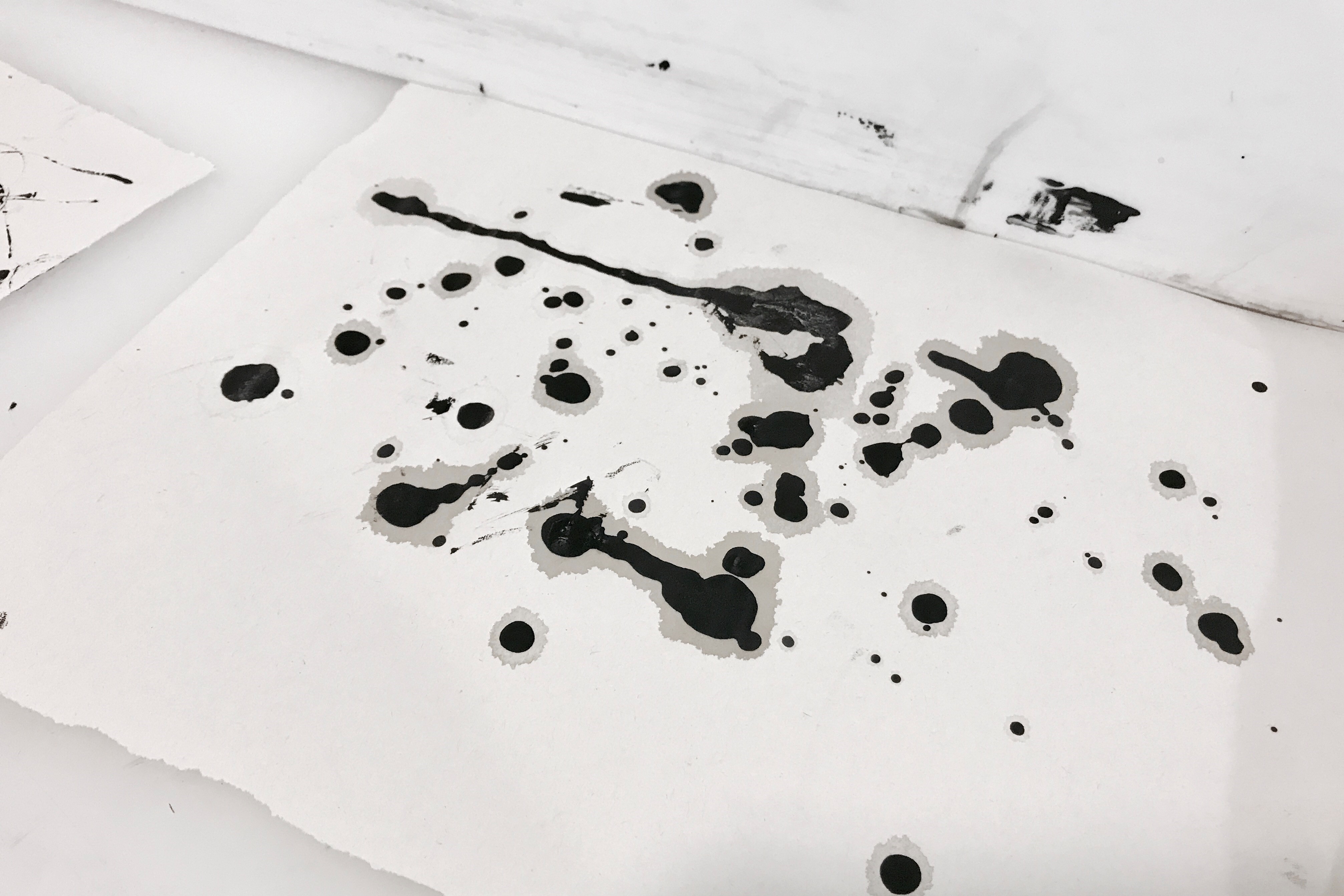
The experimentation with the 20 cents coin was far more interesting.  My initial idea was just to dip the coin into the ink and slap it onto the paper. That resulted in the bubble-like shapes shown below. Then i decided to roll the coin around the paper and let it leave it’s own trail. Most of the time, the coin will roll spirally before it comes to a stop and flop down onto the paper. Therefore, thin spiral lines were observed.

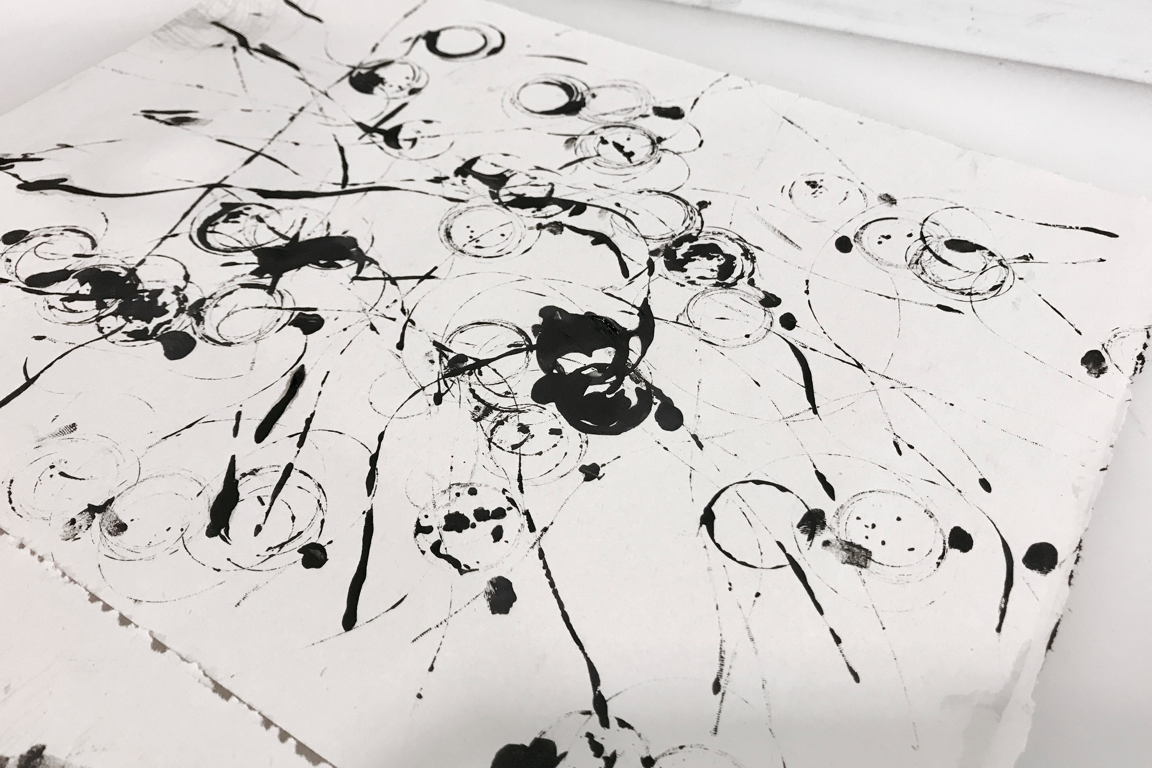
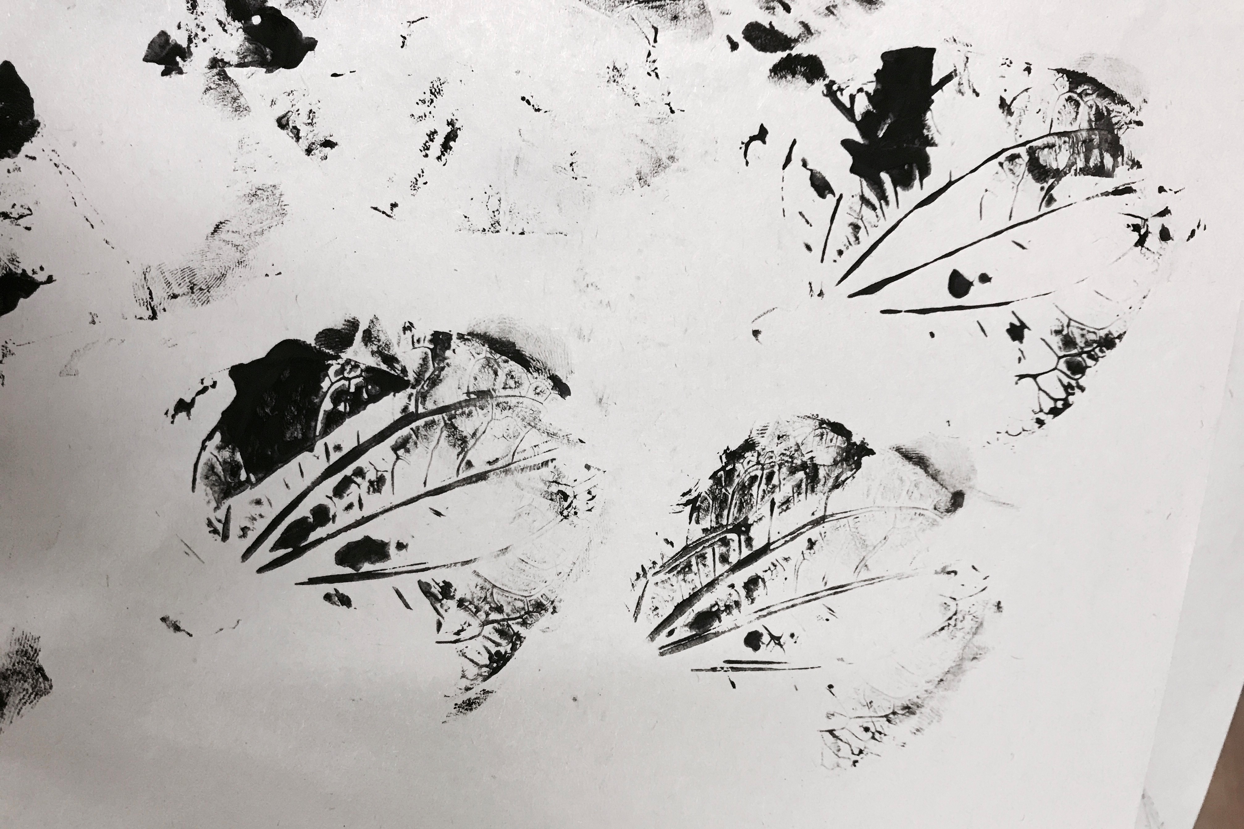
Additionally, I also played with a  spray bottle and a leaf.  I think that the effect resulted from the bottle spray was similar to the spoon. However, using a spray bottle gave me more control than the spoon and the dots formed were considerably smaller and more refined. Streaks of ink can be created by tilting the paper in all directions. The leaf was different from the rest of the mark making tools as it has a pattern of its own. After stamping the leaf on the paper, the shape and structure of the leaf was observed.

Overall, i had a lot of fun doing this even though the process was super messy!

WEEK 3 ADVENTURE

This week i wanted to explore more on the texture by using different medium and objects. I brought out several items to experiment with and they are a bottle of white glue, pouring medium, black & white acrylic paint, watercolor paint, charcoal, clay, fish line, masking tape and some weeds. I also bought white, black and silver paper for variety.
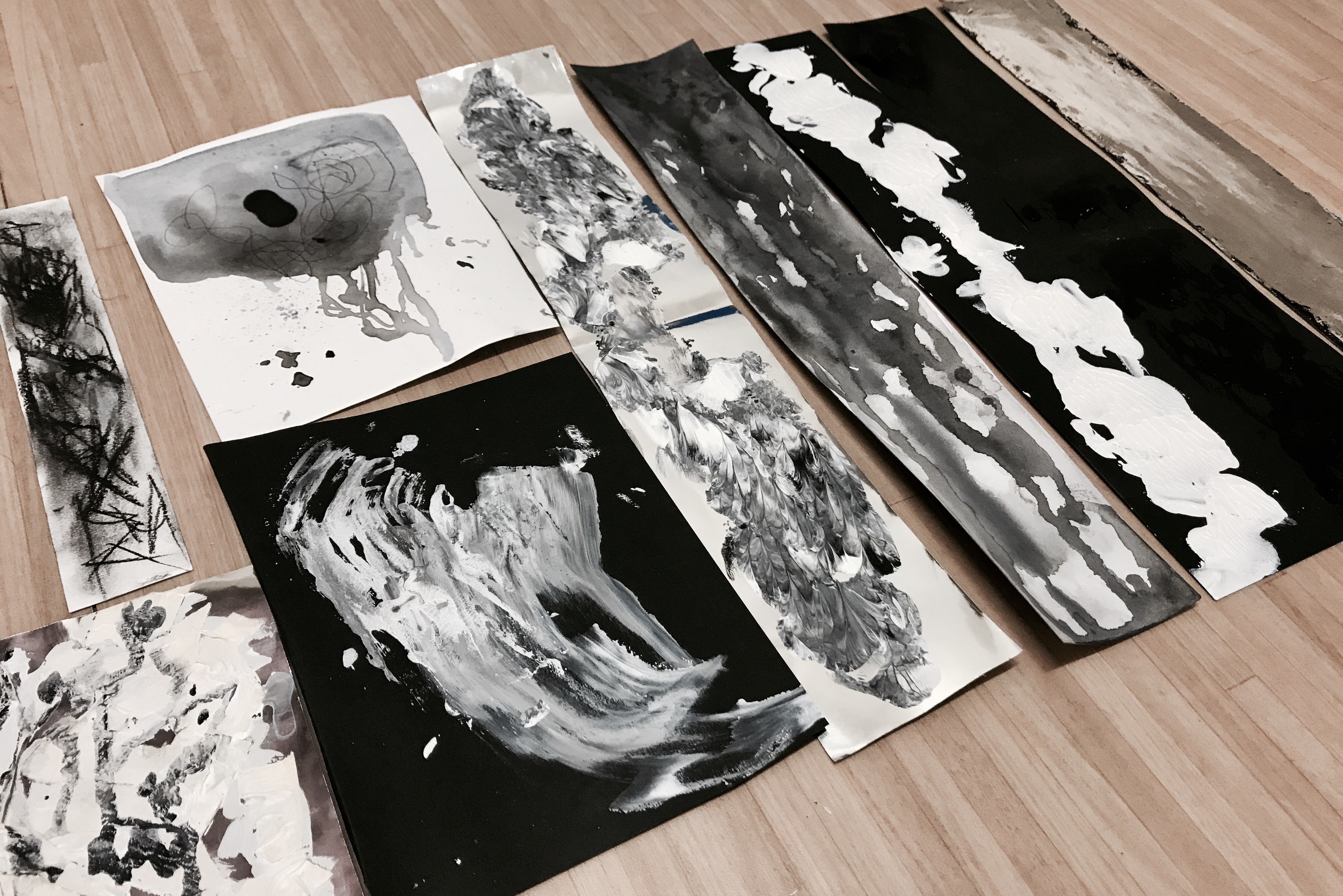
LEFT to RIGHT

1. Using charcoal (top) I was able to create a hazy background after smudging it with my fingers and also dark precised lines.

2. I pasted masking tapes on silver paper (bottom) but it did not give me the effect i was expecting. The surface look rather flat so i splatter some ink on it to see if it will do any good. Apparently it didn’t.

3. Watercolor with black pen (top) has a very contrasting effect. I think that the flatness of the watercolor paint compliments well with the precision strokes of the pen.

4. White acrylic painted on black paper using a fat brush (bottom) was not very interesting.

5. I used black and white acrylic on silver paper then folded the paper into half to play with symmetry. I think this technique works better with colors.

6. Watercolor was being drizzled onto white paper from top down to create dripping effect.

7. I used white acrylic on black paper then folded the paper into half to play with symmetry. I think this technique works better with colors.

8. I used white glue and drizzled it onto black paper then folded the paper into half to play with symmetry. I think the effect was pretty interesting but cannot be seen at certain angle (refer to next picture).

9. Clay smeared on black paper.

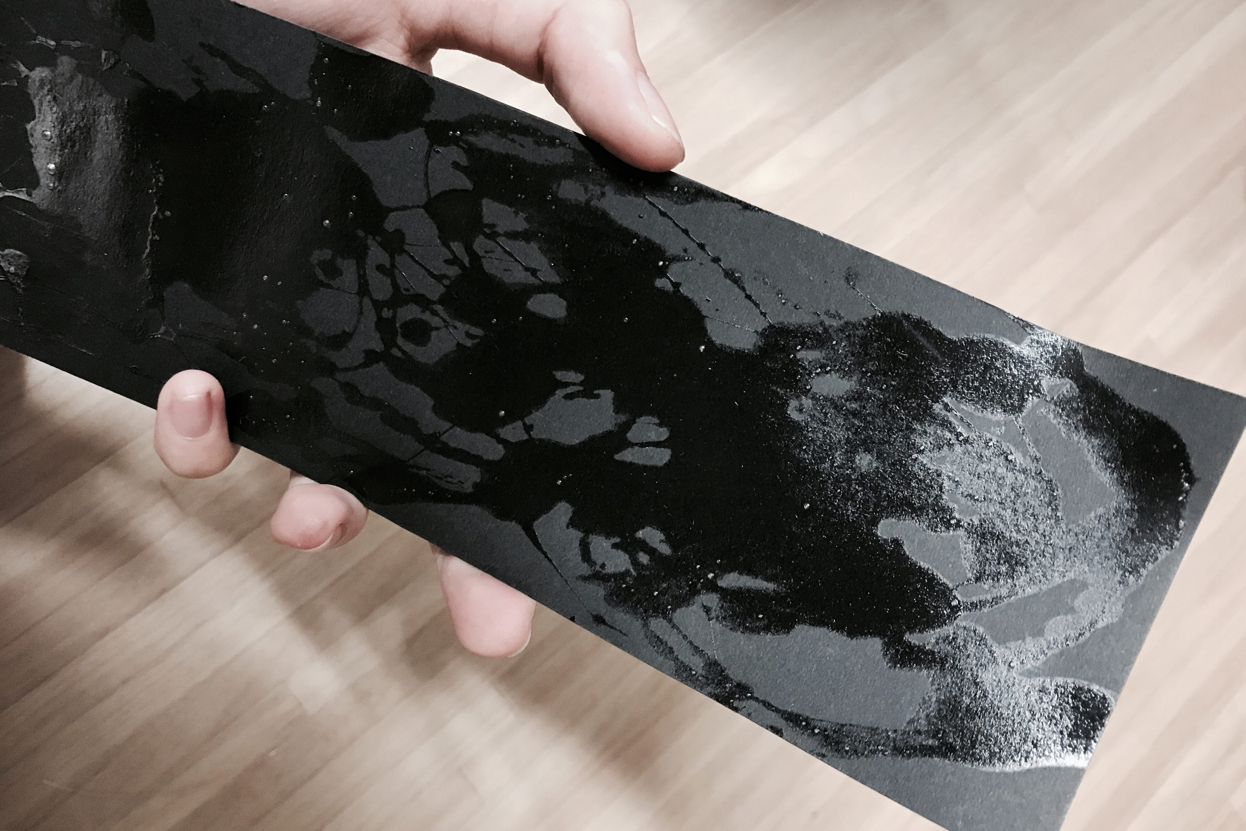
Close up of 8. White glue on black paper.

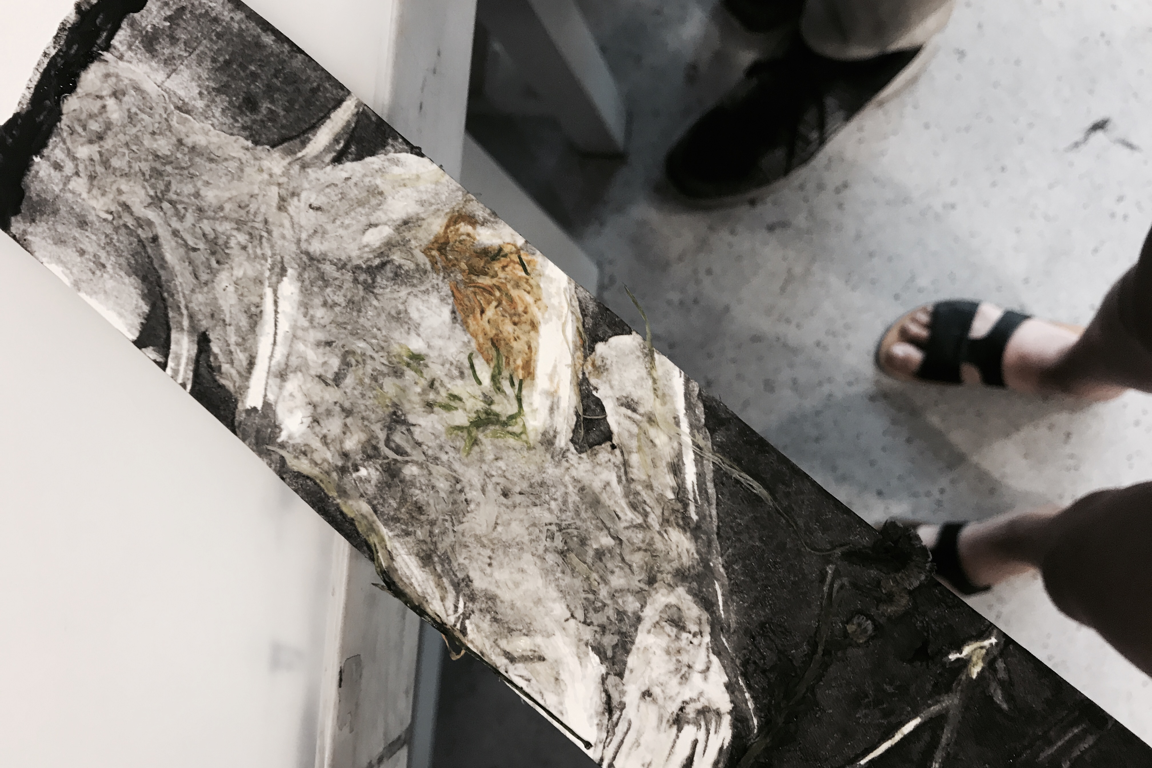
10. Squashed weeds with black ink using mono-print technique.

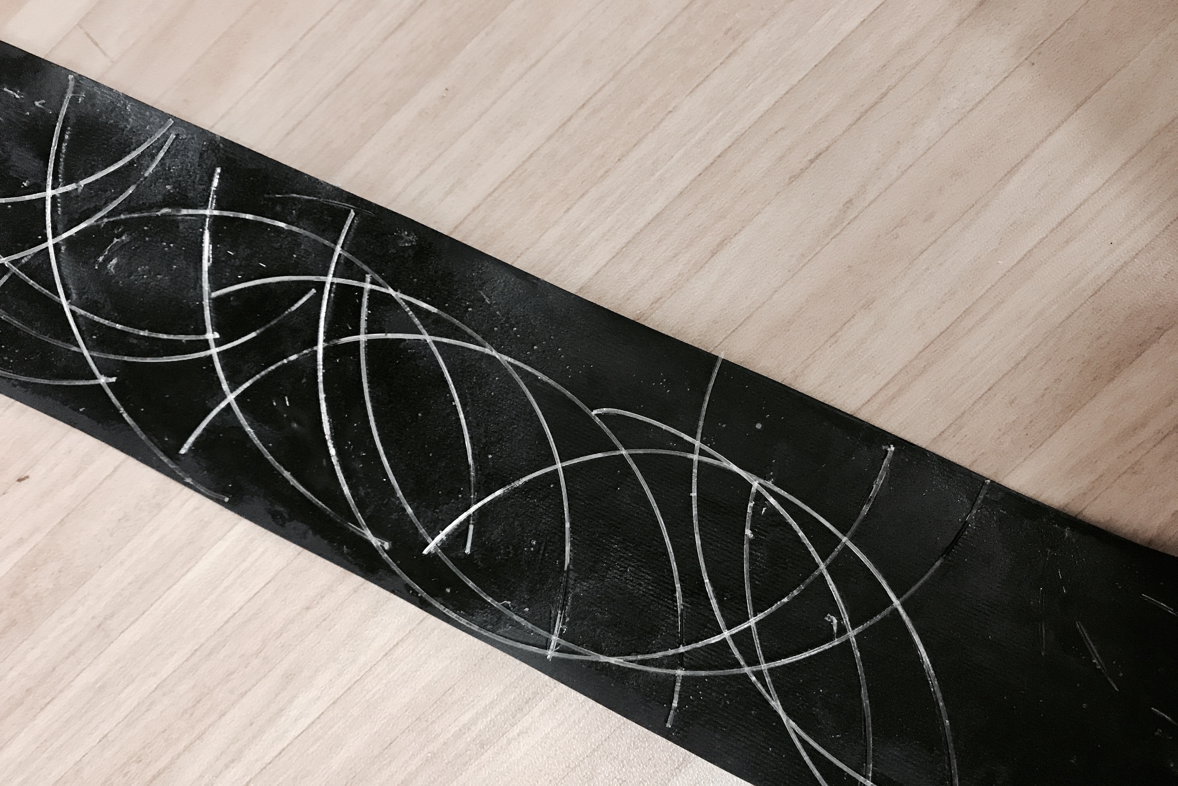
11. Fish line pasted onto black paper using white glue.

12. Pouring medium mix with black and white acrylic paint to create marbling effect.

WEEK 4 ADVENTURE

After much exploration, I have finally finalize on my 6 emotions. Some marking making ideas employed here are new while some were previously explored.

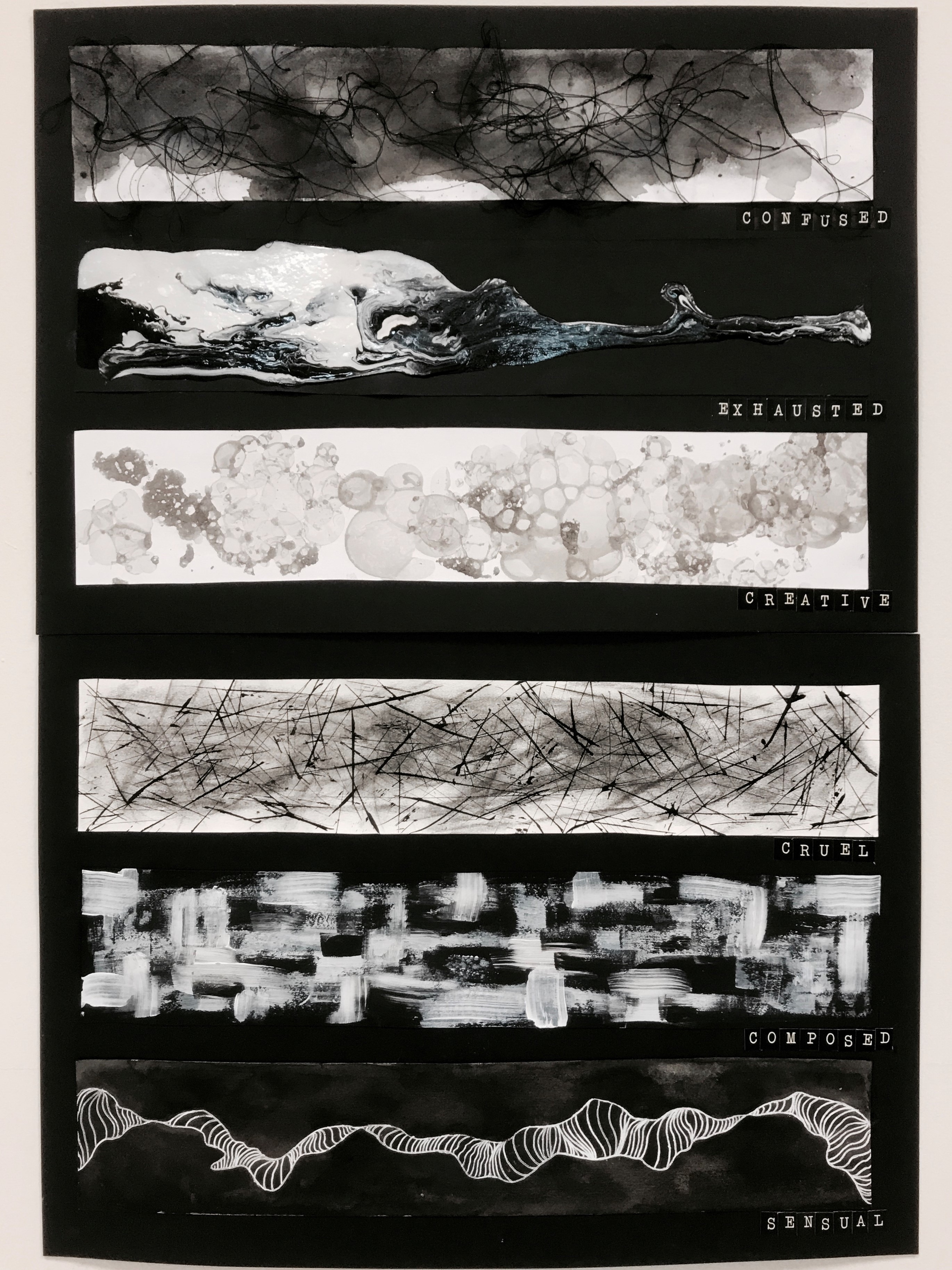
DEFINE, DESCRIBE & INTERPRET

1. Confused
• Confused is being uncertain of what to do in a situation where there are a lot of activities going on
• It is a sense of being overwhelmed
• I used black threads to create messy and swirling patterns that has no clear directions
• The threads are also tangled together to show confusion

2. Exhausted
• Exhaustion is a depletion of positive energy and feeling restless
• I used pouring medium to create the marbling effect
• The picture is very top heavy and thus looks as though it is going to collapse
• The general flow of the paint is downwards
• The amount of paint was depleted slowly as it reaches the bottom of the paper to show depletion of energy

3. Creative
• Creative is a continuous flow of ideas that pops up randomly
• I used bubbles to create these circular patterns
• The bubbles were overlapping one another showing that ideas are interconnected
• The bubbles are present in different sizes and values
• It looks like ideas being developed as the circles grow in size

4. Cruel
• Cruel is a more refined and controlled anger, there is more purpose and intention in cruelty
• I used charcoal to create a smudgy and dark background that represent uncontrolled anger
• In contrast, the foreground I created more precise short harsh lines that are going in all direction
• The lines are deliberate, going in all directions in a controlled manner to show cruelty

5. Composed
• Composure is being calm and stable and in control
• Not affected by the surroundings
• I used a fat paint brush to create thick and precise strokes lines
• The lines are constructed vertically and horizontally to represent calmness
• They are overlapping each other, the repetition further shoes a sense of stability

6. Sensual
• Sensual is the feeling of pleasure and excitement that are aroused by physical sensation
•  I choose to use white pen to draw one continuous, undulating line
•  It looks like its flowing and dancing to a physical stimulus

CONCLUSION

This project is a great eye opening experience for me as it allowed me to venture more into abstract art. It also allowed me to see things in different perspective and utilize objects I have at hand.

The most important thing I have learned during the course of this project is that art is a very deliberate notion. When doing any form of art, it is crucial for us to analyse all the elements and components that we want to include in our illustrations.