


These are the links to see my work process!
These are the links to see my work process!
EXPERIMENTAL PROCESS:
I decided to go with the collage/scrapbooking style in the end because I felt like it is something I have very little experience with and I’m interested to see how I can make use of existing imageries to create type. I think this art style might be useful in bringing across my message through its use of different textures, tones and juxtaposition of images.
AT ATTEMPT 1,
I started on one composition, portraying both a pilot and a bus driver. Both occupations needed to transport a large number of passengers around, so I incorporated that element in but kept the vehicle used for transport ambiguous to the viewers.
THEREFORE, there are a lot of random elements (basket, balloons, wheels) in the composition. The letterform Q (uppercase) is haphazardly incorporated at the sky + washi tape area and the i (lowercase) at the steering wheel + washi tape area.

As you can tell, it was a mess.
PROBLEMS:
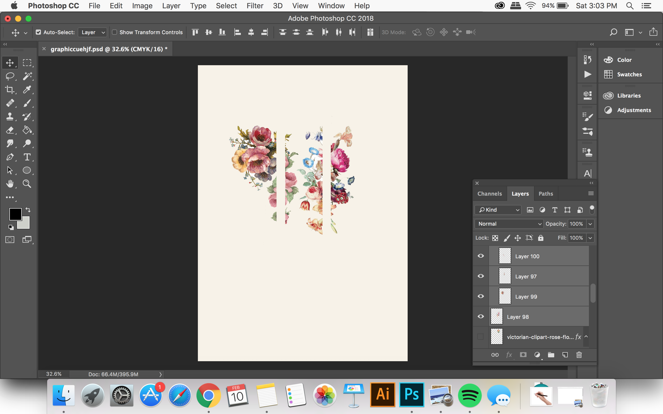
AT ATTEMPT 50,
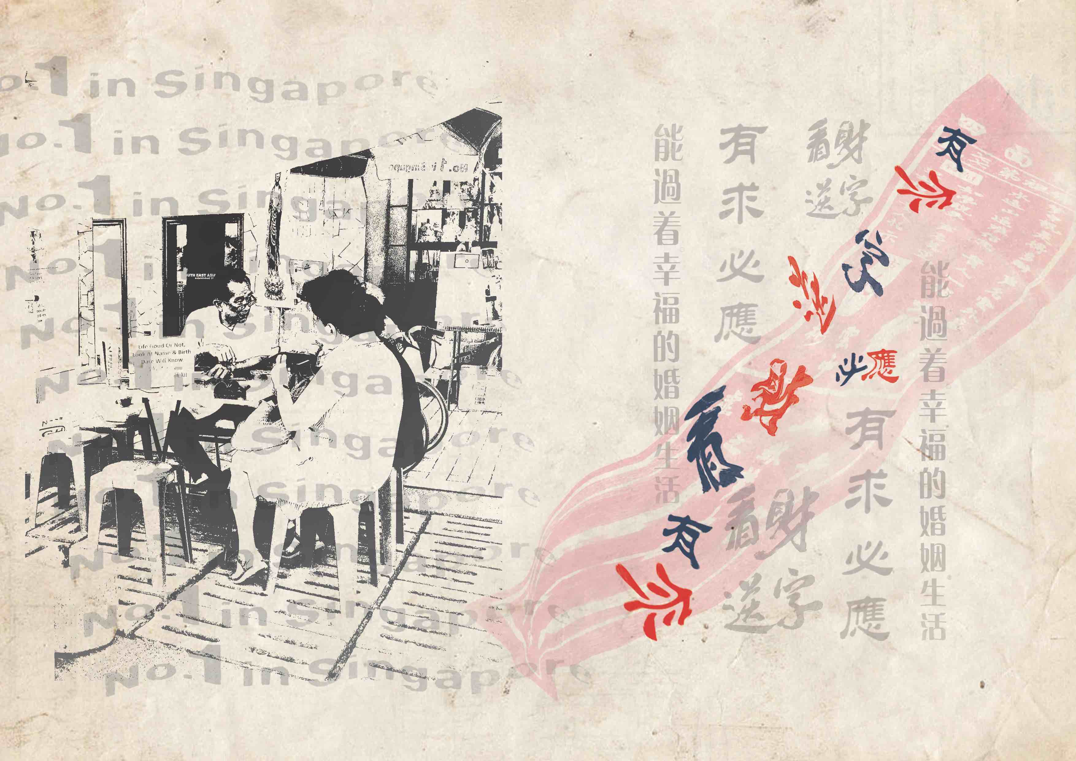
I decided that I should focus more on one occupation and add subtle elements to hint at the other. Therefore, in the composition below, most of the imageries used were to portray a pilot with only a small steering wheel to indicate a bus driver.
I also adjusted the scale and lessen the imageries used in the composition so that there was more emphasis on the letterform. The letterform is now incorporated in the flock of birds. The arrangement of birds forms my name qi (lowercase).

PROBLEMS:
OH NOOOOOOO!
I realised that my method was not working out, because the message I was trying to convey was too big for this project and I could not express it properly in my artwork. So I took my teacher’s advice and aborted the mission.
I took on a different approach to address the issue of society’s preconception on various occupations. I refined my idea and looked into individual occupation instead of two. In my latter artworks, I would discuss the preconceived ideas that people tend to have when they think of jobs, such as, Makeup Artist, Pilot, Wedding Planner and Bookstore Owner; and the flip side of which that they often fail to see.
CONSIDERATION MADE FOR LETTERFORMS: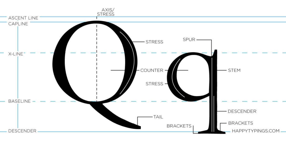
It is undeniable that the uppercase Q has more distinguished characteristics as compared to the lowercase q because of its unique tail that is held perpendicularly to the circle. Therefore, my initial plans were to use uppercase Q in my work. Unfortunately, after experimenting with it, I felt like it looked too rounded and its tail looked too abrupt in the composition.
The lowercase q is more asymmetrical in nature because it has a combination of curves and straight lines. When incorporated in a composition, it looked cohesive.
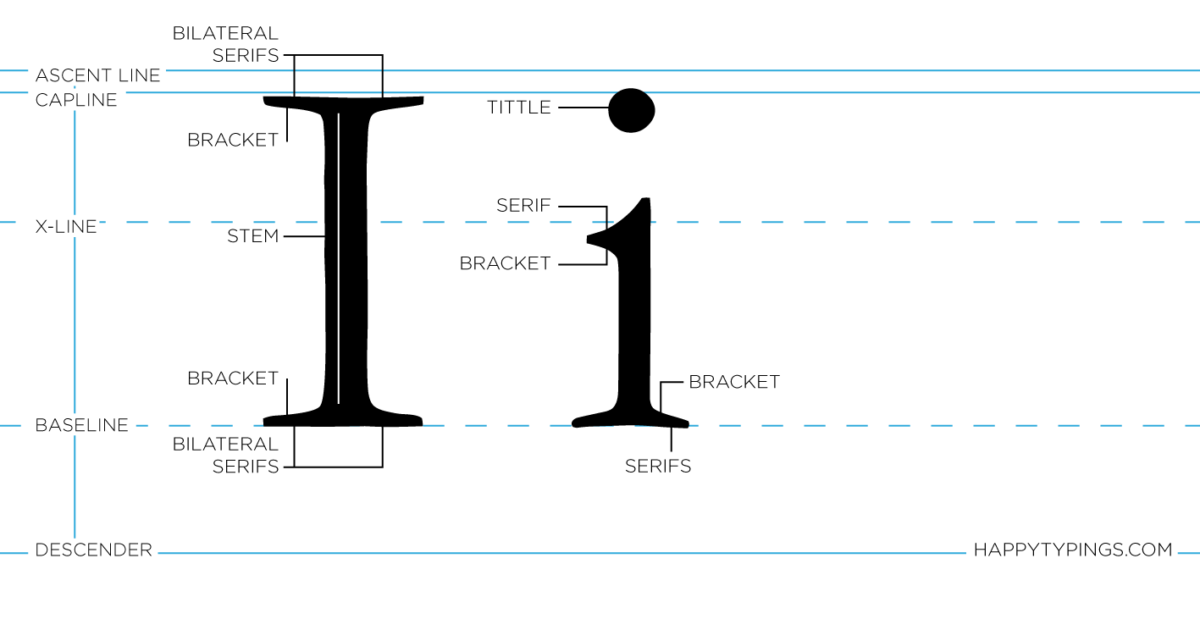
Uppercase I and lowercase i looks pretty similar in terms of its linearity and rectangular form. The only difference between the two is that the lowercase i have a gap and a circle at its top.
EXPERIMENTING…
Geometric Sans Serif: Wedding Planner
Geometric Sans Serif does not fit the vibe of the occupation, it looks too rigid and boring. The qi looks like number 91.
Script type: Wedding Planner
I created a cursive letterform to imitate the script type often seen in wedding.
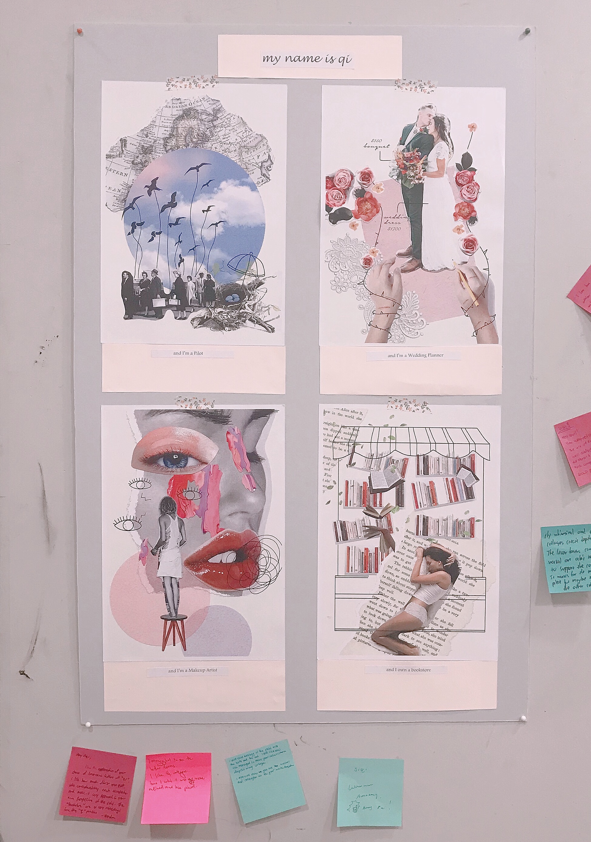
FINAL WORK
In my final work, I decided to add in doodles to my collage compositions because I thought that them will give my artwork more dimension and energy.
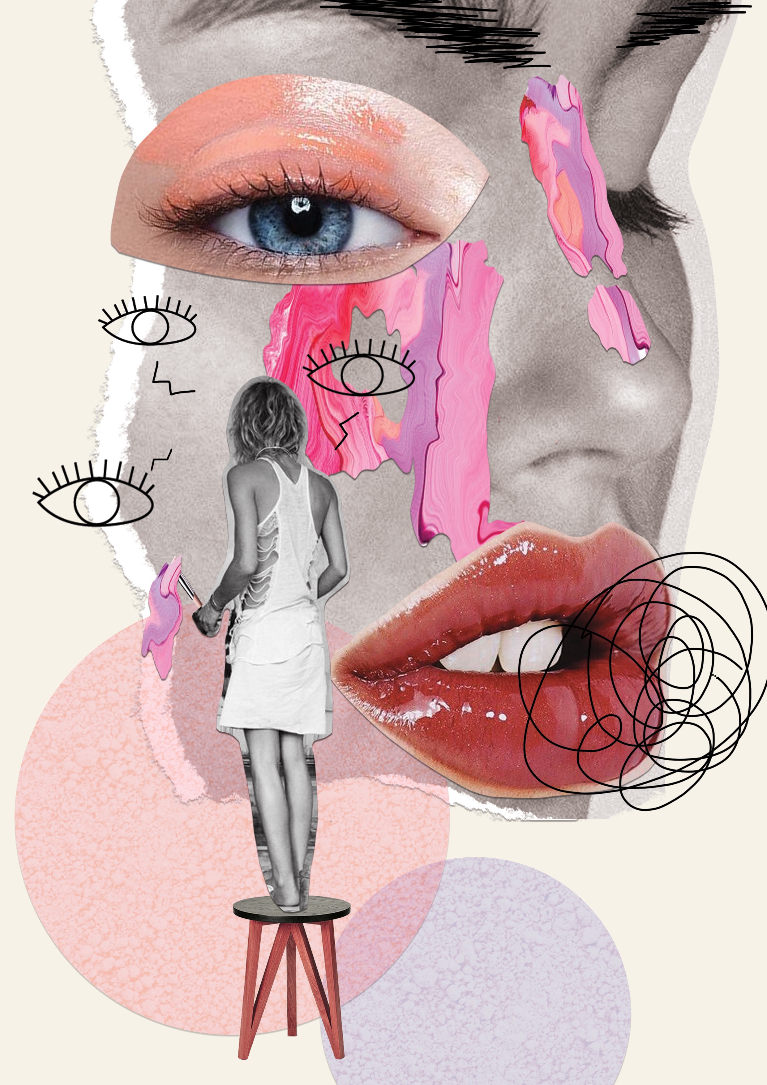
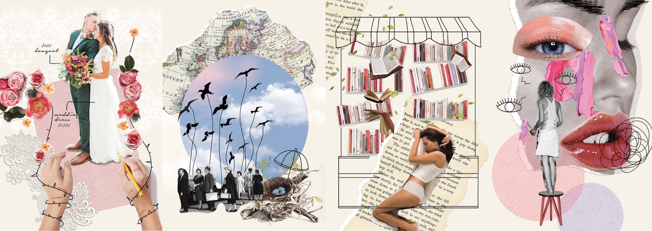
MAKEUP ARTIST
I incorporated my letterform in the smear of paint because I felt like makeup artists add colours to people’s life (LITERALLY). They make people look beautiful and feel more confident about themselves. In this case, the client’s face is the artist’s canvas where she can compose her masterpiece.
WHAT PEOPLE DO NOT SEE,
Makeup artists often have to work with models and celebrities and these clients can be difficult to deal with. To depict that, I illustrated a pair of angry eyebrows on the client’s face and an angry speech bubble. I also drew eyes around the artist to show that the makeup artists are always working under a lot of pressure and also to depict how the clients are always checking the artist’s work even before the artist is done with the whole makeup.
The curvature of the letter q was greatly reduced in this composition to mimic the flow of the paint as it drips downwards. The letter i was also inverted to mimic the top-heavy nature of dripping paint.
PILOT
For this occupation, I incorporated my letterform in the flock of birds because I felt that birds are rather similar to a pilot. They get a lot of freedom, they are not restrained by boundaries and they get to travel a lot.
WHAT PEOPLE DO NOT SEE,
Pilots are always very far from home. Their job is very dangerous as they have to spend long hours in flight and high altitude. In the composition, the birds are depicted as pilots. They are flying away from their nest to transport passengers across borders. In the letterform q, where the left rounded side curve inwards, there are birds trying to fly back to their nest but their wings are severed. This shows that no matter how much the pilots want to go home, they can’t due to their job obligations.
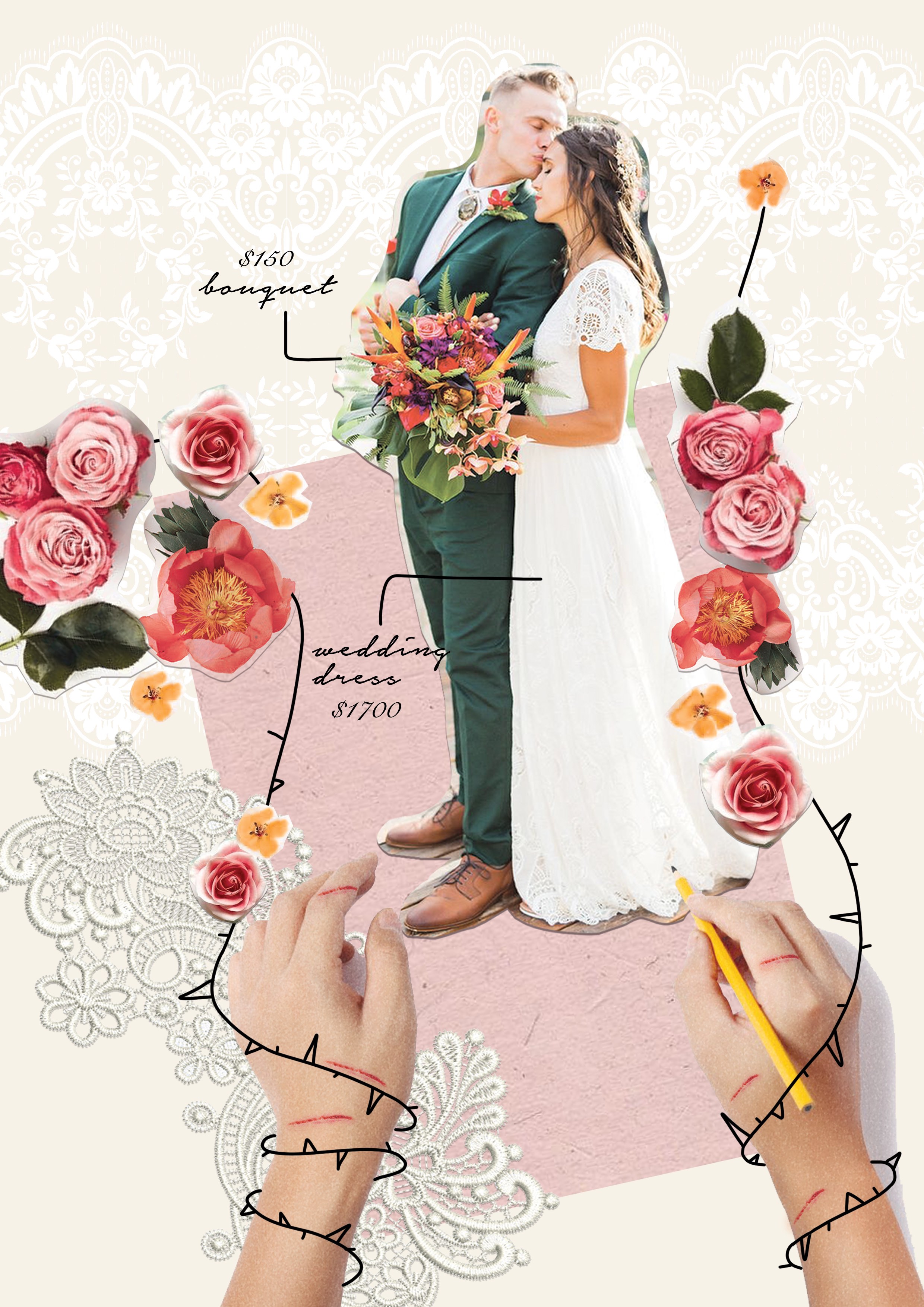
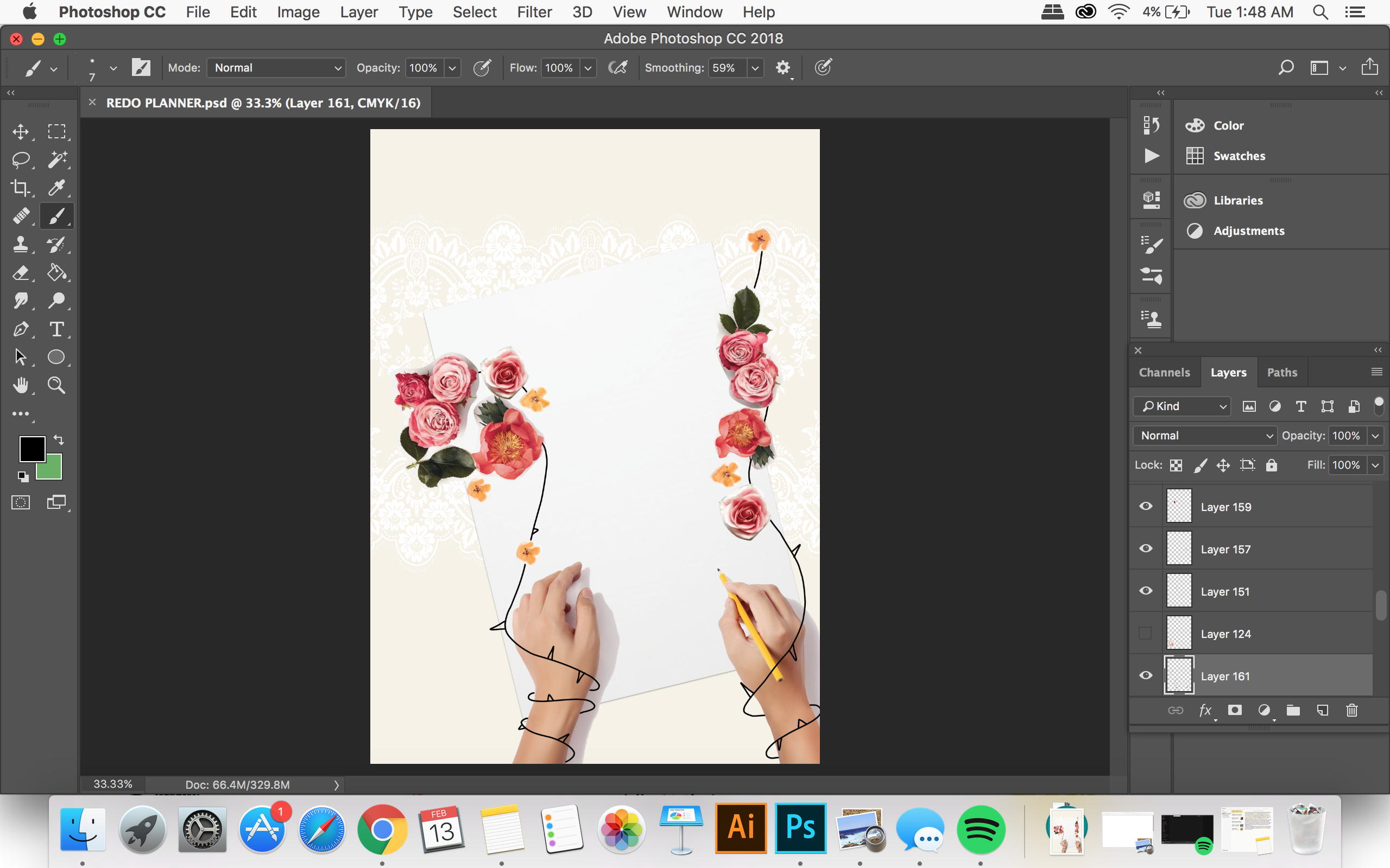
WEDDING PLANNER
For this occupation, I incorporated my letterform in the arrangement of flowers because I felt that a wedding planner is all about arranging and organising all aspects of the wedding. Through their efforts, they are able to fulfil a couple’s dream wedding.
WHAT PEOPLE DO NOT SEE,
In the composition, there are flower vines wrapping around the wedding planner’s arm, restricting her movements. The thorns on the vines are giving her cuts. This shows that a wedding planner does not have much creative freedom when it comes to the actual planning of the wedding, many decisions are made based on the client’s preference, no matter how absurd.
For the letterform, I arranged the flowers so that it forms a more cursive type to imitate the script lettering often seen in weddings.
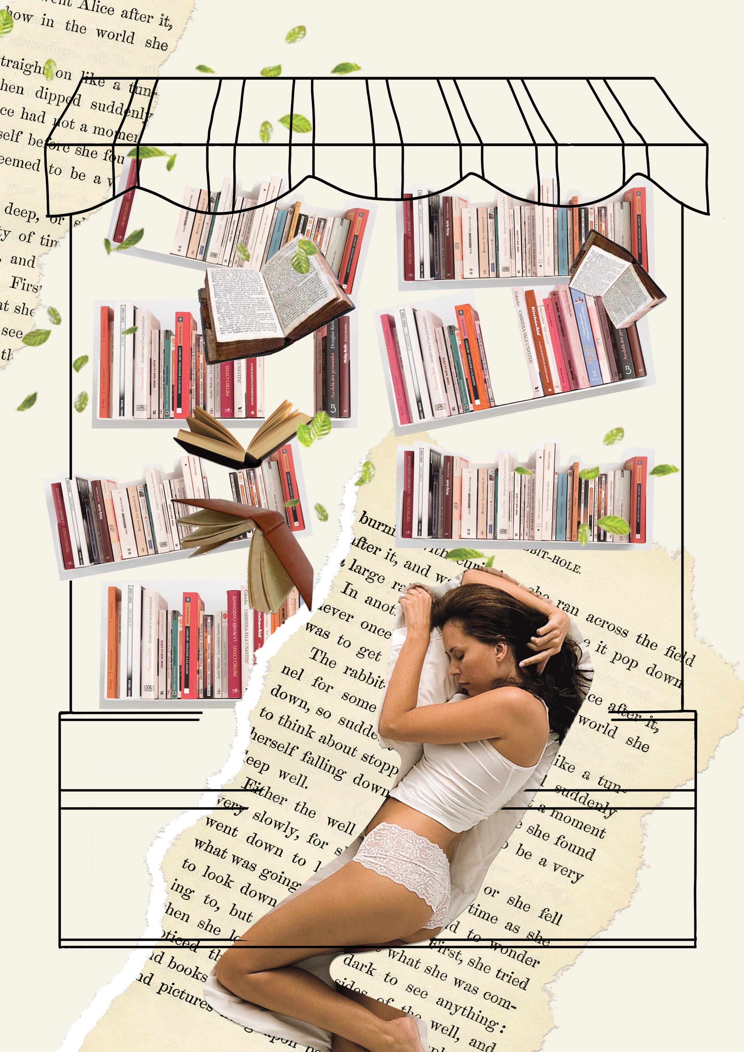
BOOKSTORE OWNER
Opening a bookstore is a dream for avid readers and collectors. I wanted to depict a bookstore owner that feels very comforted by the presence of books. Therefore, I depicted a girl sleeping peacefully in a bookstore, the position in which the girl is sleeping forms the letter q.
WHAT PEOPLE DO NOT SEE,
Sadly, there had been an increase trend in reading e-books instead of physical books, leading to a drop in book sales. In the composition, it depicts the bookstore in a state of destruction. The bookshelves are collapsing and in the fall of books, forms letter i.
CHALLENGES AND LEARNING POINT
I think one of the main challenges I faced in this project was to deliver my message clearly to the audience. Sometimes, I get too caught up with the images and the composition that I neglected the intended message. I also struggled to incorporate the letterform because I didn’t know where to fit it in the arrays of images. My concept and message could have been better executed in my letterform.
BUT WELL, I LEARNT MY LESSON. I’M GLAD ITS OVER!
CONCEPTUALISING PROCESS:
When I was a younger I had many aspirations, but I remember feeling so upset when the adults tell me with certainty that my dream jobs were not ideal and I could do so much better.
But what made them think that certain jobs are more ideal than the others?
HENCE,
I felt like I have to somewhat address the society’s narrow-mindedness and their preconception on various occupations. I hope that through my artwork people would gain more insights on the occupations itself instead of what they seem to be.
BUT HOW?
My initial plan was to incorporate two jobs into one composition. These two jobs will have very similar functions to each other but one is viewed as better as compared to the other. This way it will make the viewers question how is one job better than the other if both of them are essentially serving the same purpose.
THESE ARE SOME EXAMPLES I HAVE CAME UP WITH
Wedding planner + Funeral planner = A planner that organises important events.
Pilot + Bus driver = A driver that transports huge numbers of passenger.
Makeup Artist + Mortician = A person who does makeup.
Banker + Cashier = A person who handles money.
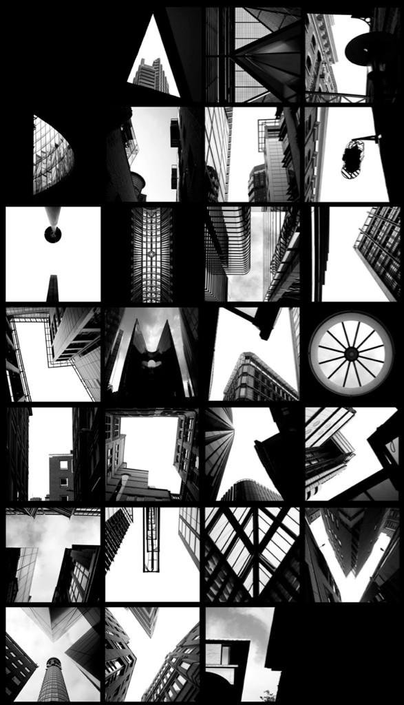
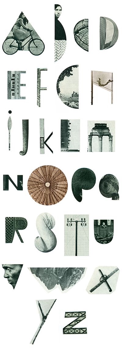
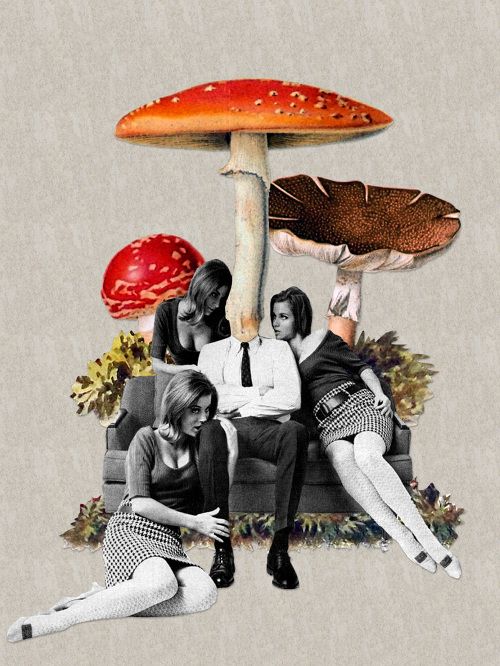
STYLE INSPIRATION:
Collage/Scrapbooking


Paper Cut
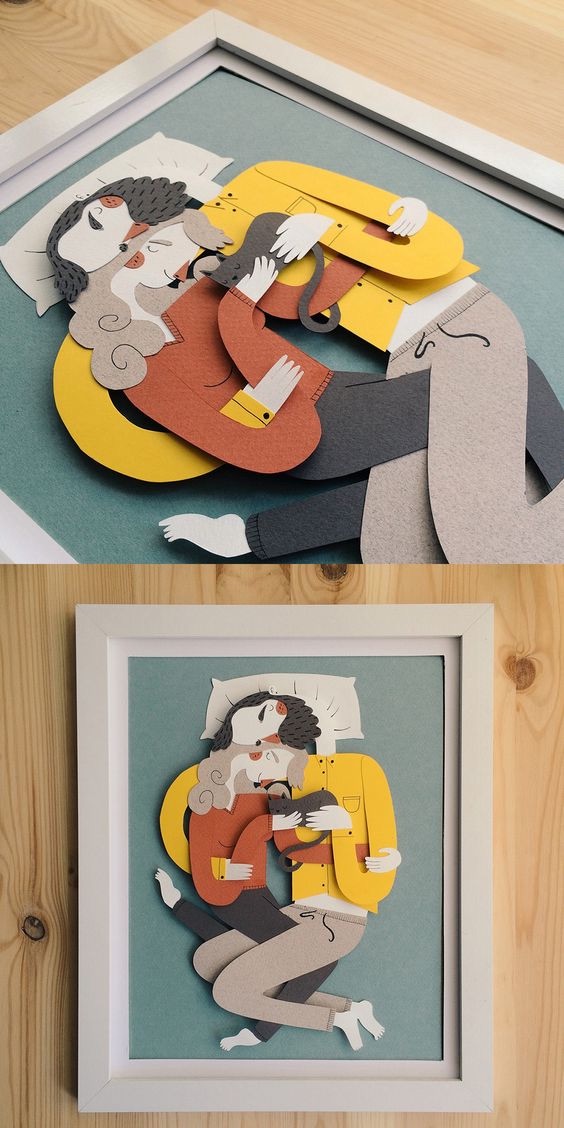

Photo Alphabet