


These are the links to see my work process!
These are the links to see my work process!
Ideation
Waterloo Street is unique as a place of convergence between the Hinduism and Buddhism. I wanted to represent this unique aspect of Waterloo Street using the arrangement of the spreads. Since this project requires an eight page zine, I’ll have three spreads to work with (excluding the cover and back page). This gave me the idea of splitting the street into three parts. The first spread will represent the Buddhist area, the middle spread representing the convergence and the last spread representing the Hindu area. This way it’s almost like I’m bringing my viewers along the physical street of Waterloo.
Content
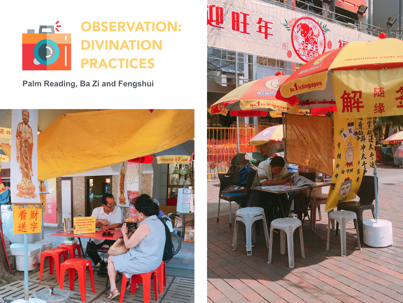
First spread- Significance of divination in the Buddhist culture & the competition between the many divination booths in that area
Middle spread- Convergence of the Buddhist and Hindu cultures through similar means of worship
Last spread- Hidden Hindu aspects of that area that are obscured by renovation works
Style Reference: Tanabu Hiroshi


Struggling with Abstraction
Version 1
First page- I illustrated some of the talismans that I have observed from that area. These talismans incoporated the play of typography to explore some of the reasons why people buy these items, including: fortune, peace, health and luck.
Second page- I extracted some of the signs I have found from the divination booths over there and illustrated them into vectors.
Middle spread- I used the play of typography again to illustrate some common methods of worship between the two religion.
Feedback
1. To be more site specific by extracting elements that are unique from that area (consider mark making)
2. Avoid figurative representation of that area & find alternative solution to convey intended message
3. Consider how the arrangement of elements can help to convey intended message

Exploring Scannography & Mark marking
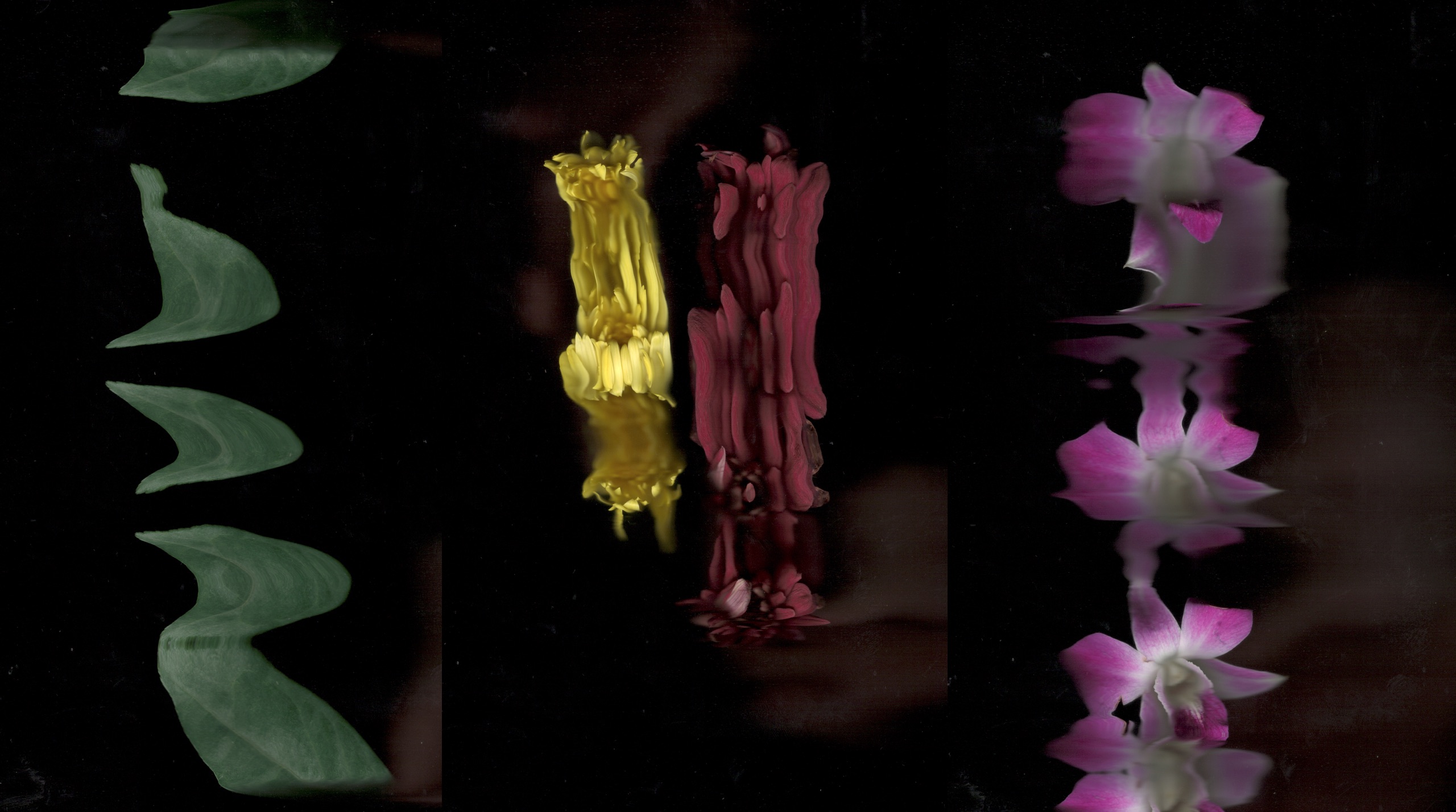
Divination Slip, Talismans, Joss Sticks and Flowers obtained from Waterloo Street.
Process
Version 2
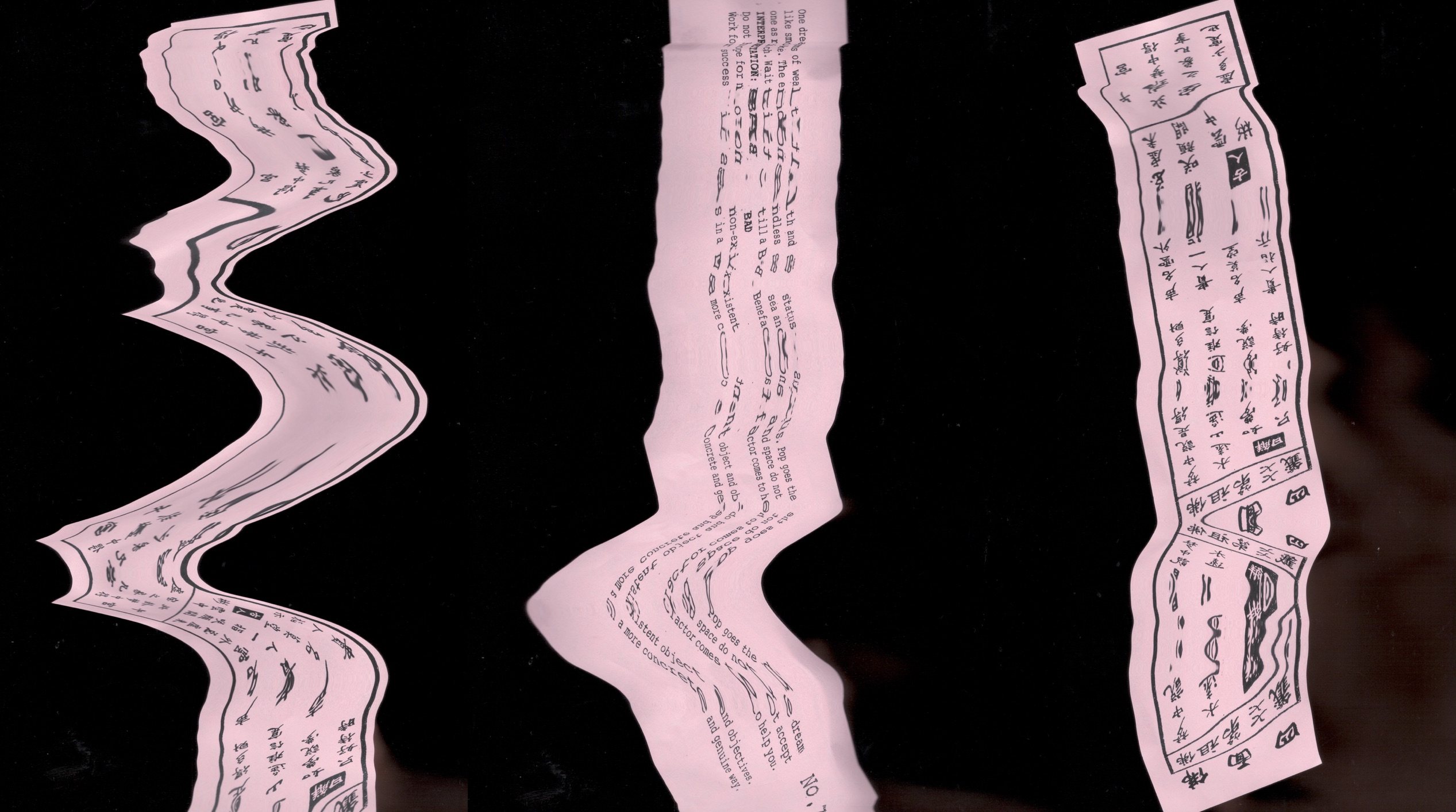
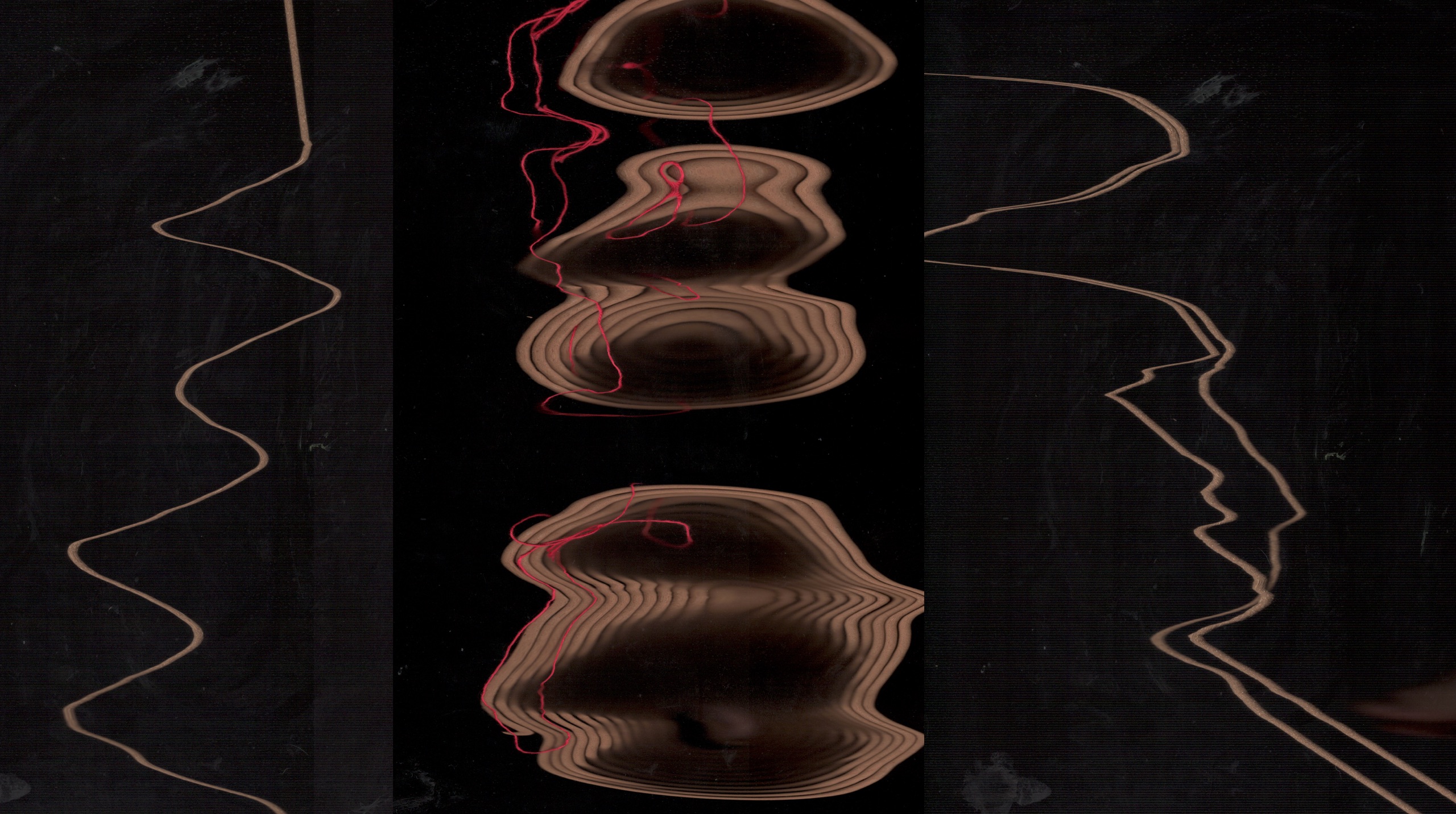
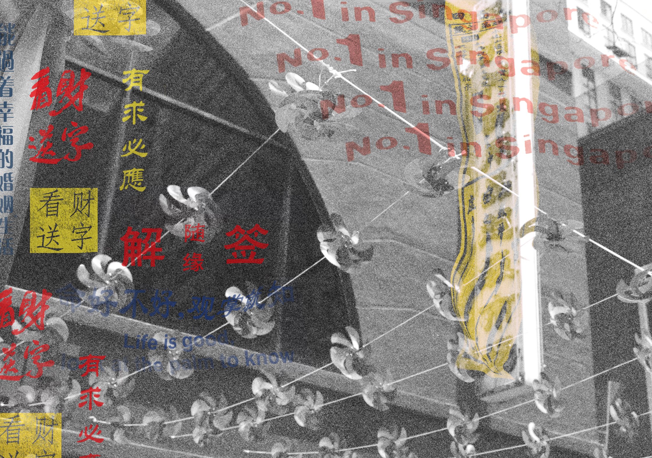
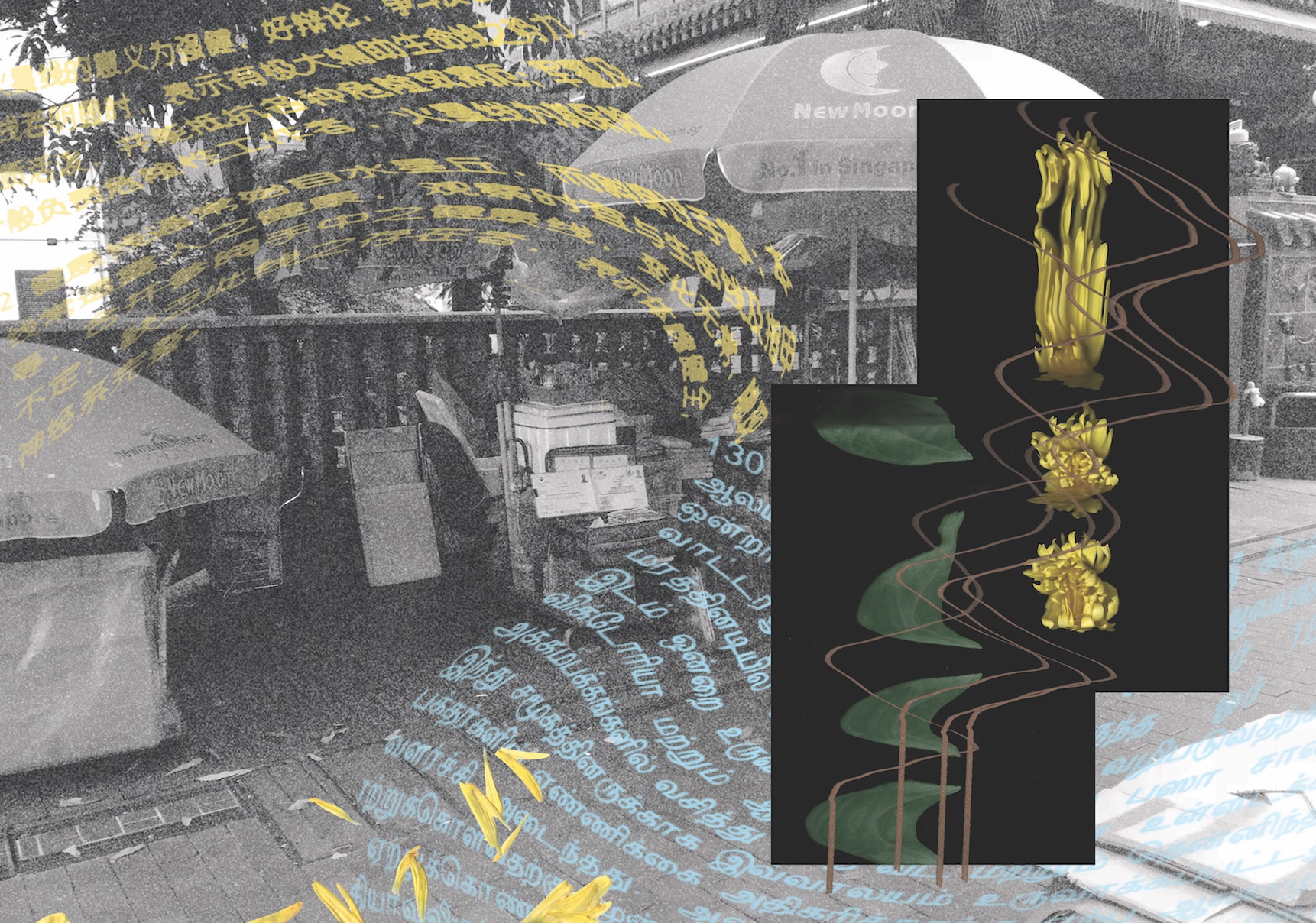
First spread- I used signages extracted from the divination booths to show the cluster of them at the street and included the text no.1 in Singapore to show competition between the stalls. I used Scannography to distort the image of a divination slip to represent how divination is a distortion of truth.
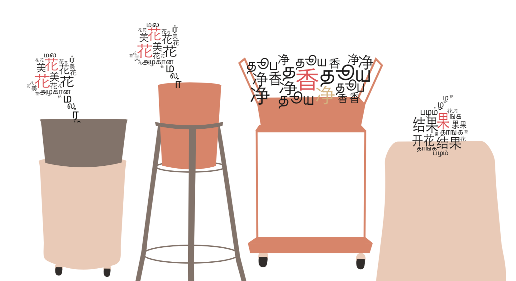
Middle Spread- I extracted Chinese and Hindu words and distorted them to make it seem like they are merging into one. Again, I used Scannography images of flowers and joss sticks to show how the two religion intersect through similar methods of worship.
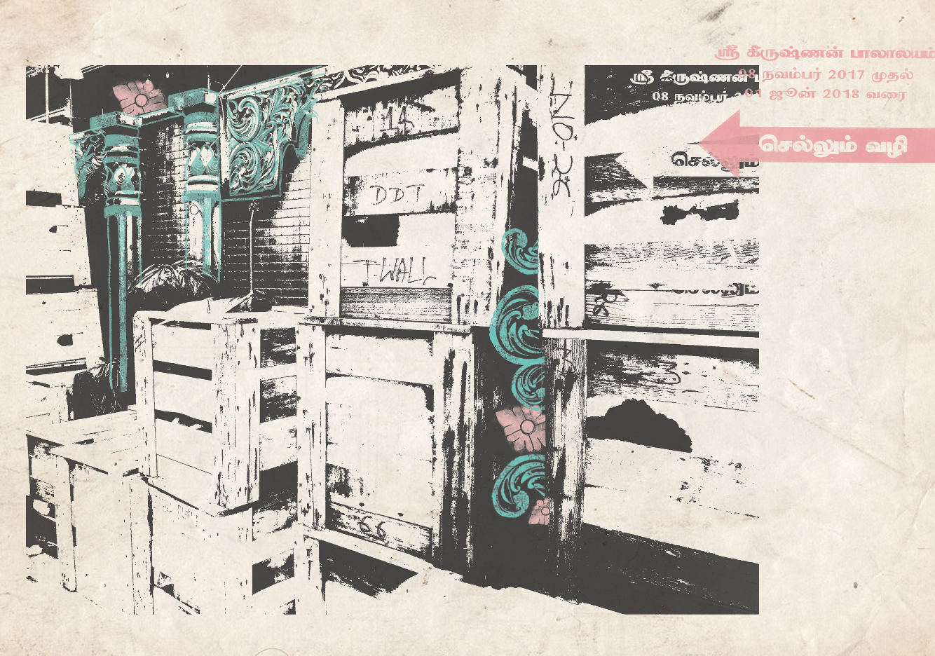
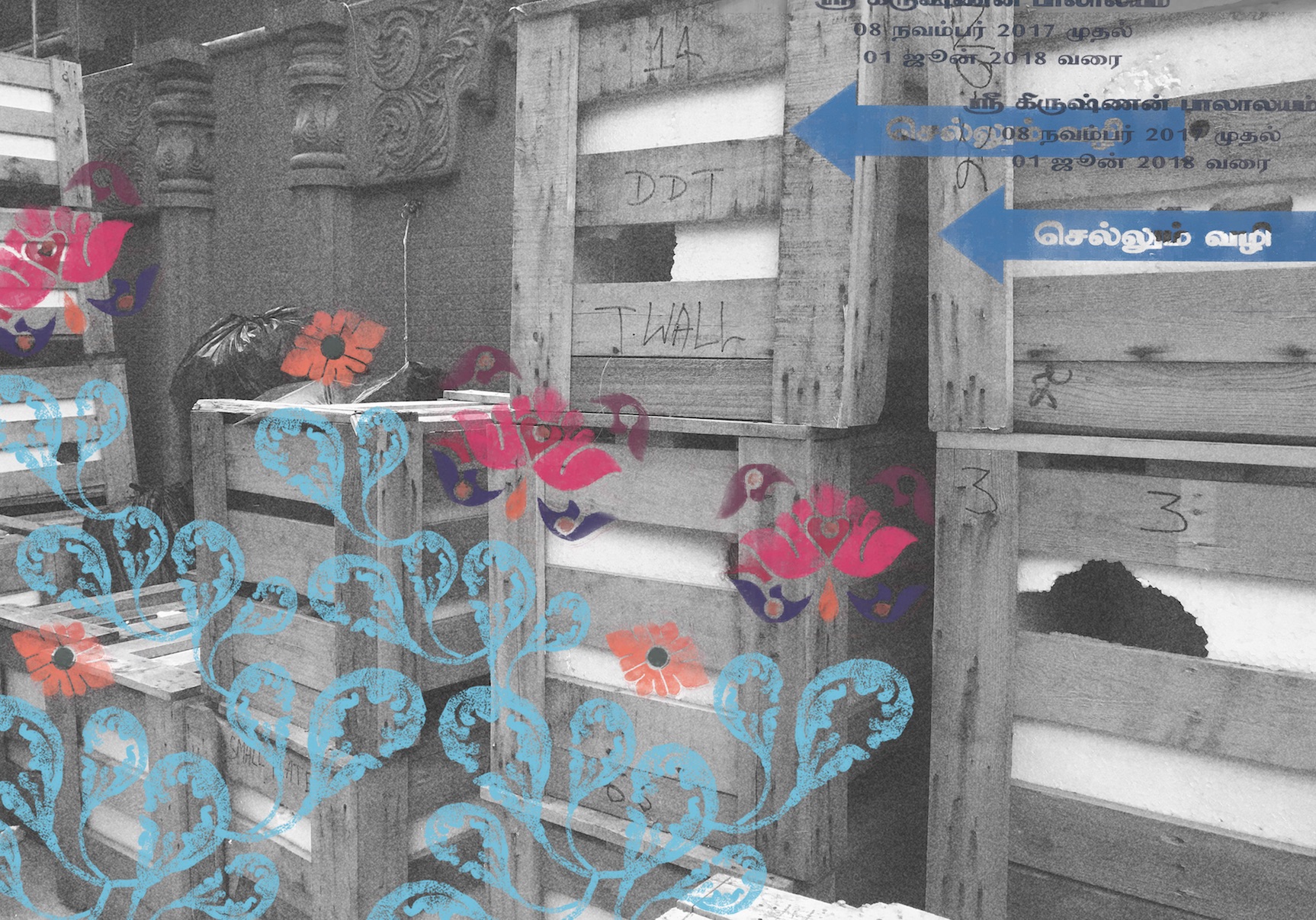
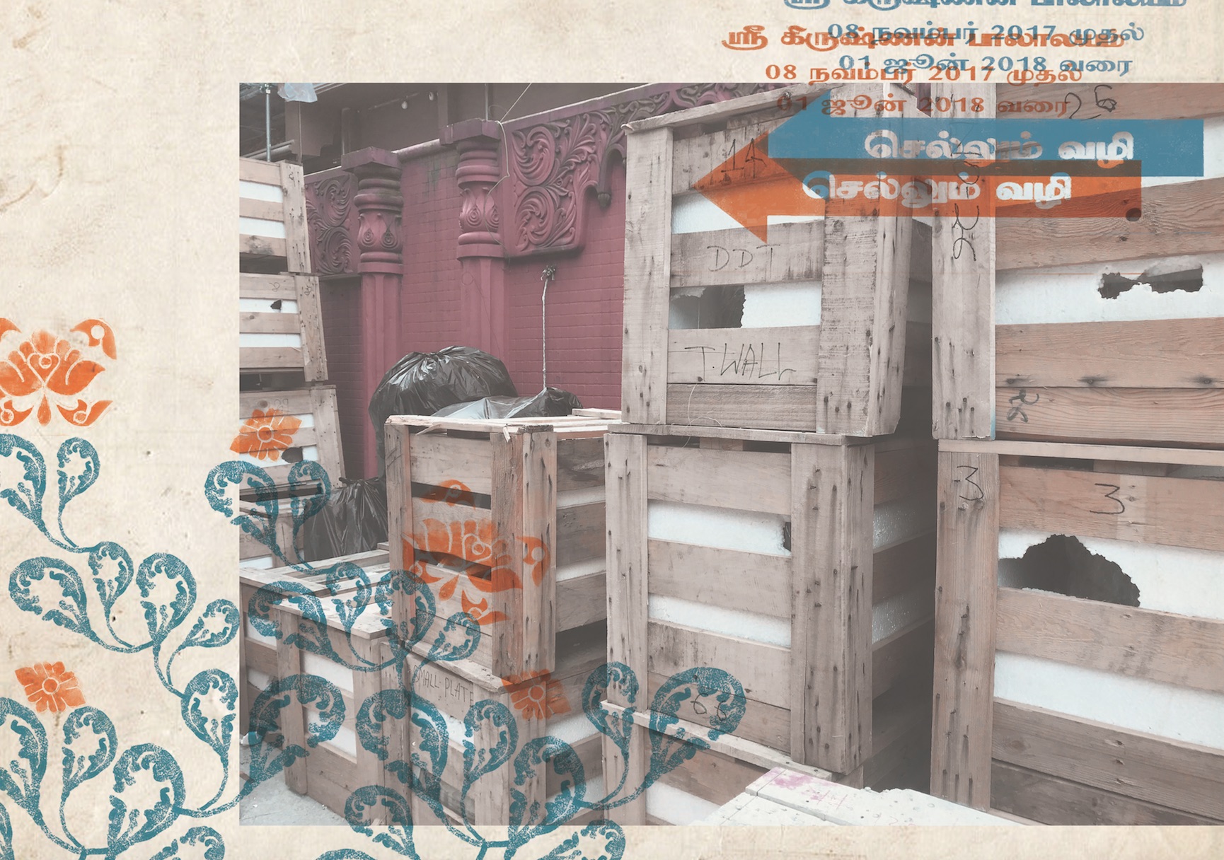
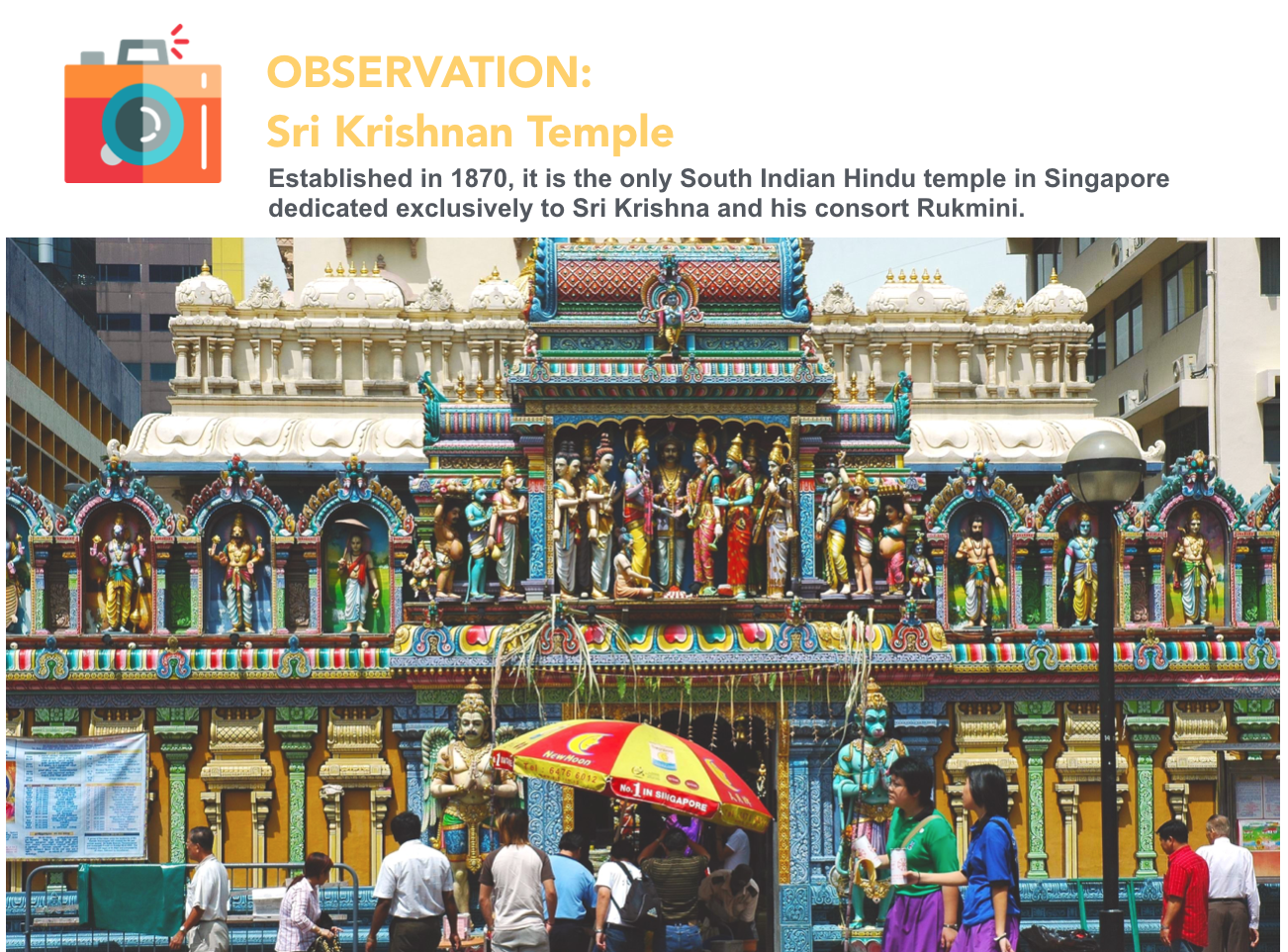
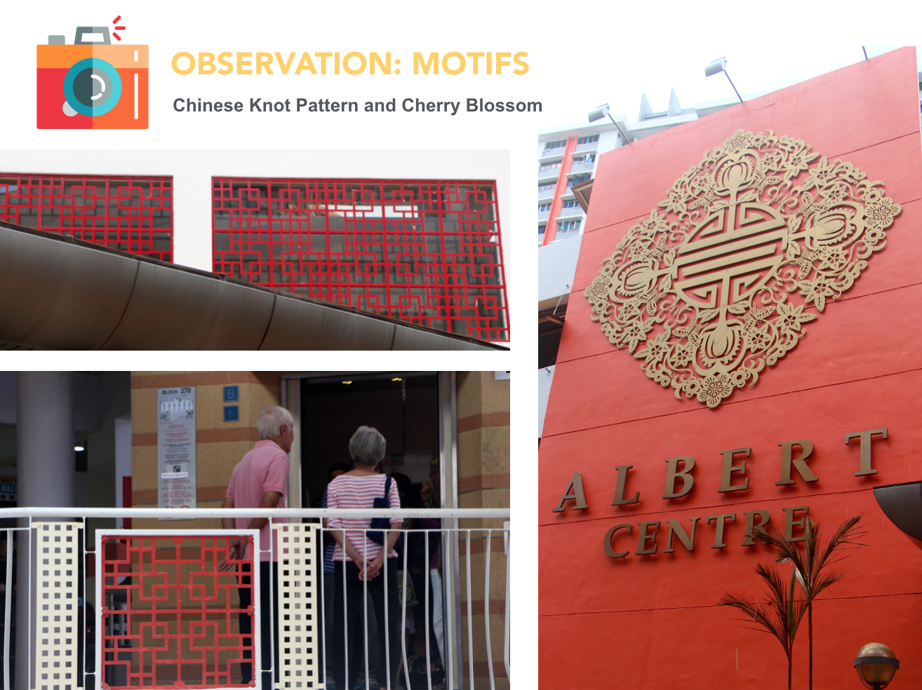
Last Spread- I extracted different Hindu motifs from that area and arranged them into a foliage. I also included a signage which tells us that the Hindu temple is currently under construction.
Version 3
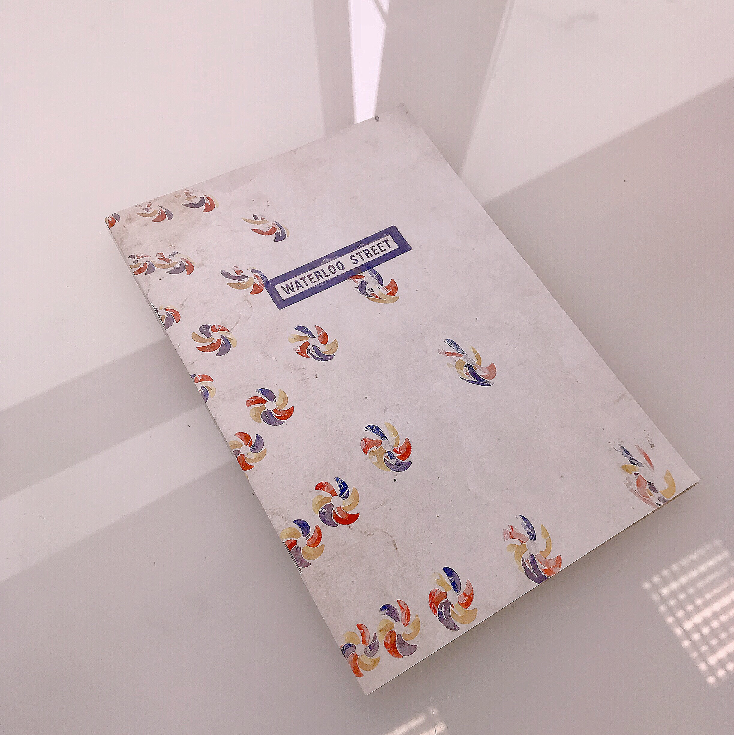
I rearranged the elements from version 2 so that the spreads do not look so messy. I also used vintage paper as the background to create a retro look to the zine.
Feedback
1. Look into elements/principles of design
2. Consider how the arrangement of elements can help to convey intended message
3. Find a focal point (one idea for each spread)
Final
I added some images that I have extracted from Waterloo street to add more depth to the visuals. I also wanted it to look a bit like a newsprint.
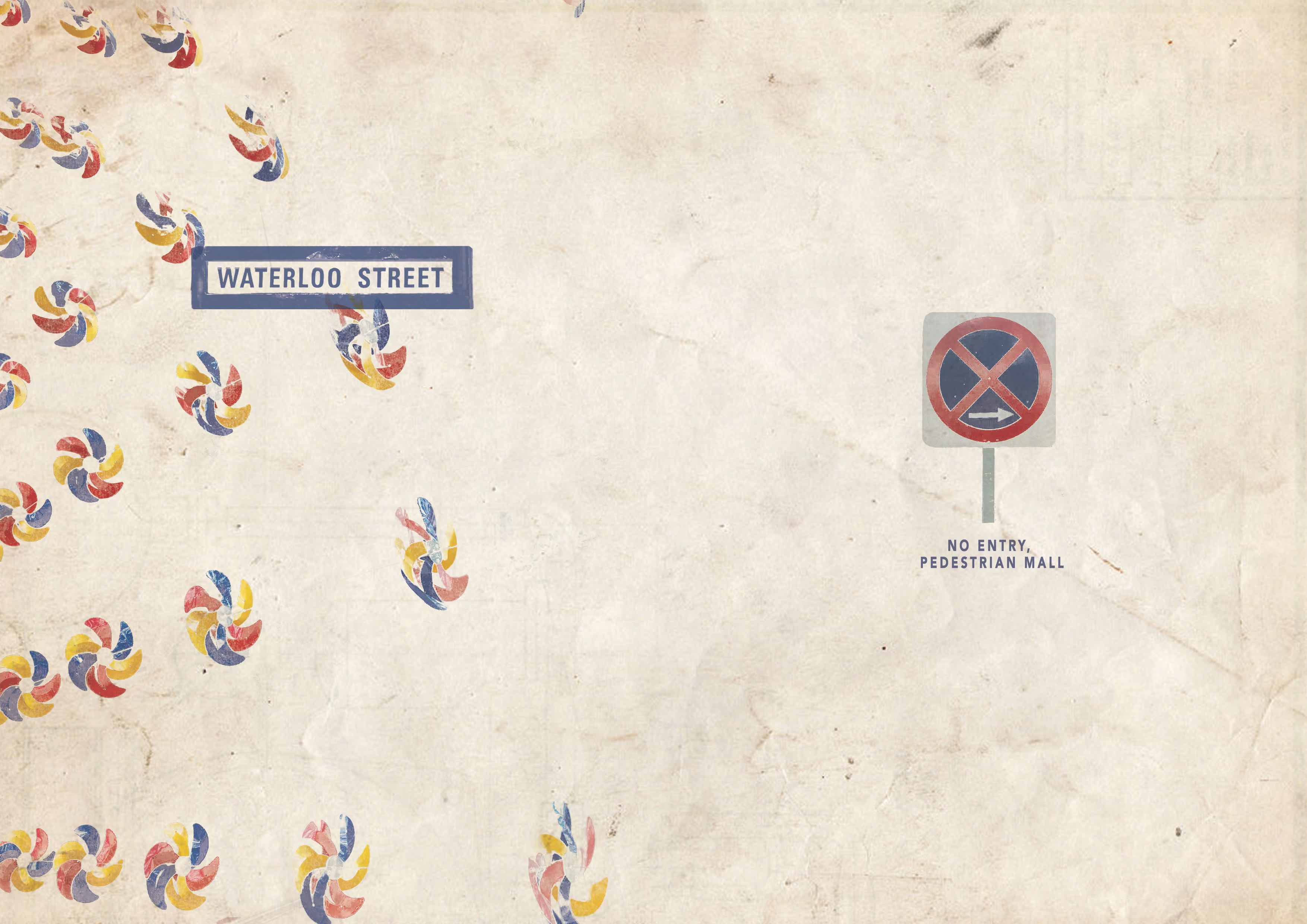
Cover spread- I used signages found at the start and the end of Waterloo Street.
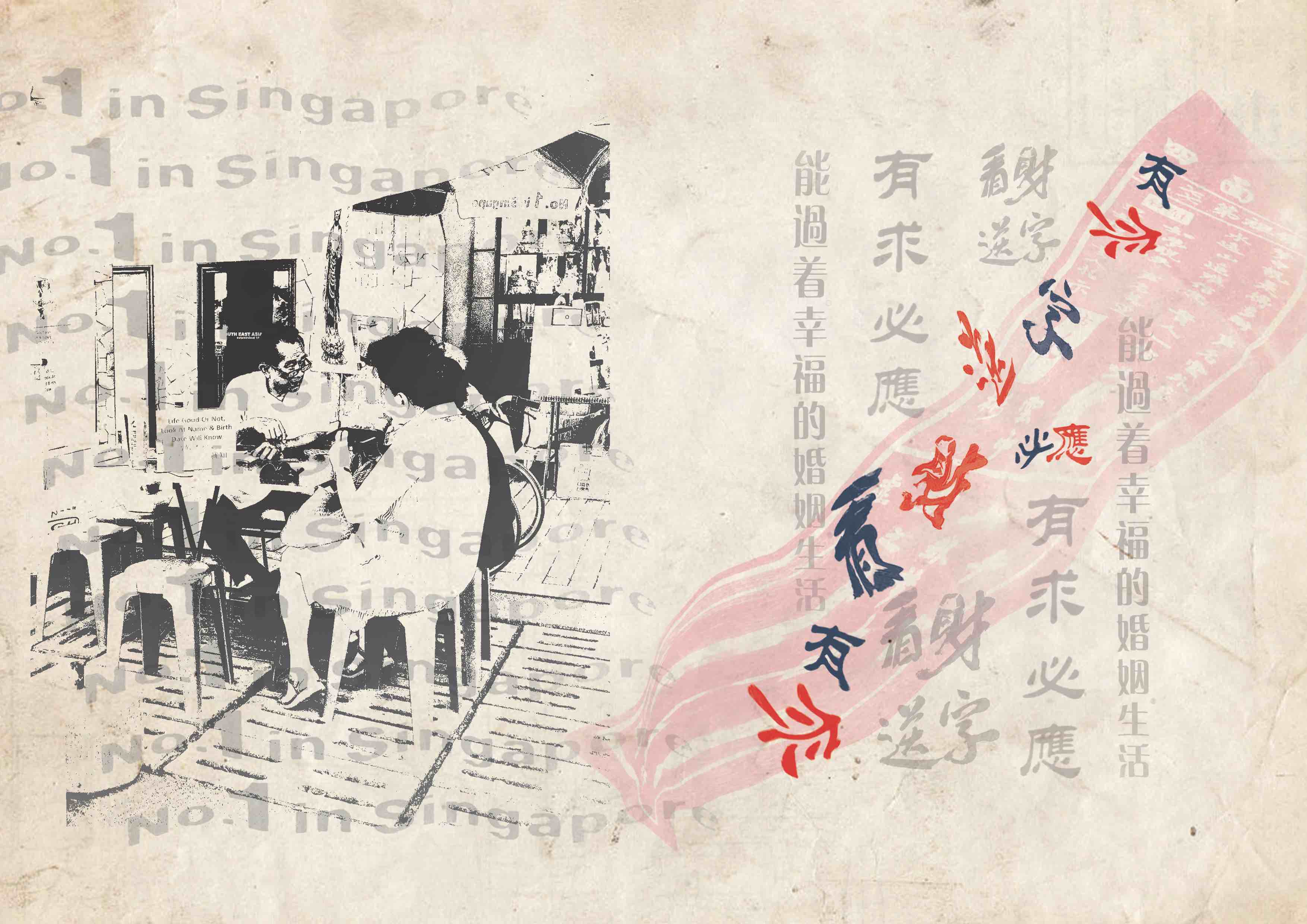
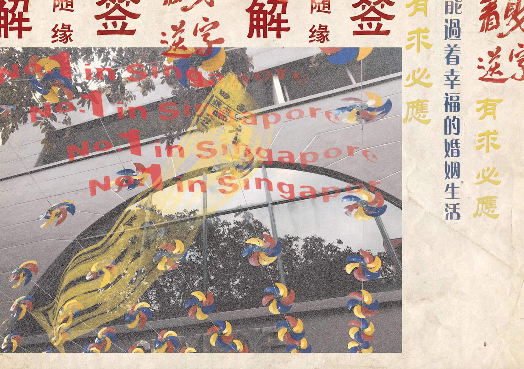
First spread- I made the no.1 in Singapore flow into the divination slip to bring the viewer’s eyes across the whole spread. The text was reduced in its opacity to show like a subtle competition between the many divination booths found in that area. Along the distorted divination slip, one can see that the words are fighting with each other to further emphasise the competition.
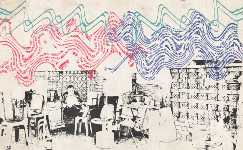
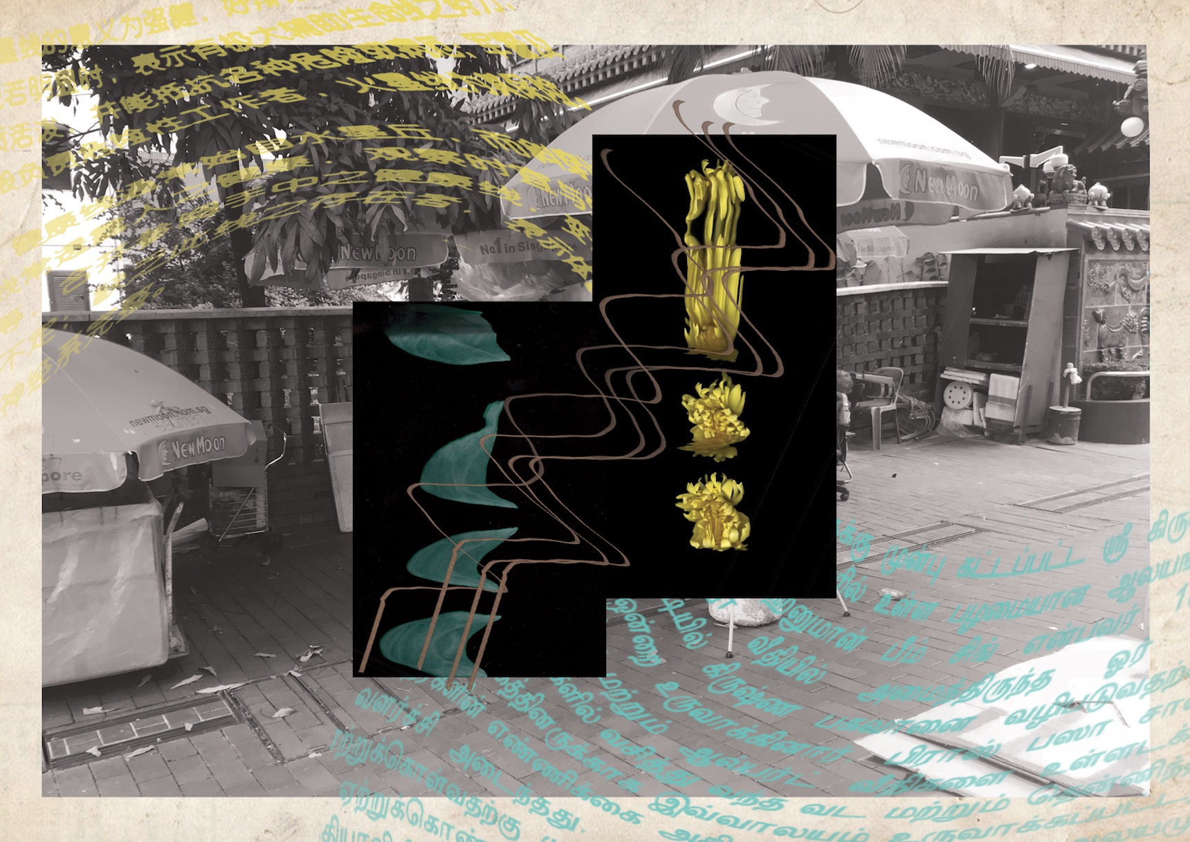
Middle spread- The convergence between the Buddhist and Hindu cultures can be seen through the flow of Hindu and Chinese text flowing in from both sides. I also used a Scannography image of the joss stick to mimic the movement of smoke drifting in from the two sides.
Last spread- I wanted to emphasise on the partially obscured motifs of the Hindu temple, by making them peek out from behind the crates.
Thoughts
I think that this zine project really pushed my abilities to conceptualise and refine my idea. When it comes to ideation, I often find myself trying to include too many ideas. Given that this project only requires a 8 page zine, it is very hard to fit so many ideas into one visual without diluting the message. I am glad that after many attempts, I have managed to filter out some unnecessary elements to achieve a better focus in my zine. However, I think that this zine can be further improved in terms of its design. For example, the minimalist style of my cover page can be more cohesive with my messy spreads so that the viewers would not get a shock when reading my zine.
LOCATION RESEARCH: BUGIS
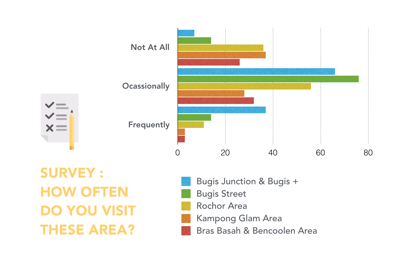
For this zine project, I wanted to explore Bugis as it is one of my go-to places for food, shopping and entertainments. Although I visit this area quite frequently, most of my time spent were at the shopping malls (Bugis Junction & Bugis+). Therefore, I conducted an online survey to gain a deeper insight on the location and to see what else it has to offer.
SURVEY RESULTS
According to the survey results, people frequent Bugis Junction & Bugis + the most. But when I asked the participants for their favourite location in Bugis, I was heartened to see some interesting answers.
1. HAJI LANE: Cafe and Boutiques
2. NATIONAL LIBRARY: Study
3. SUNSHINE PLAZA: Good Printing
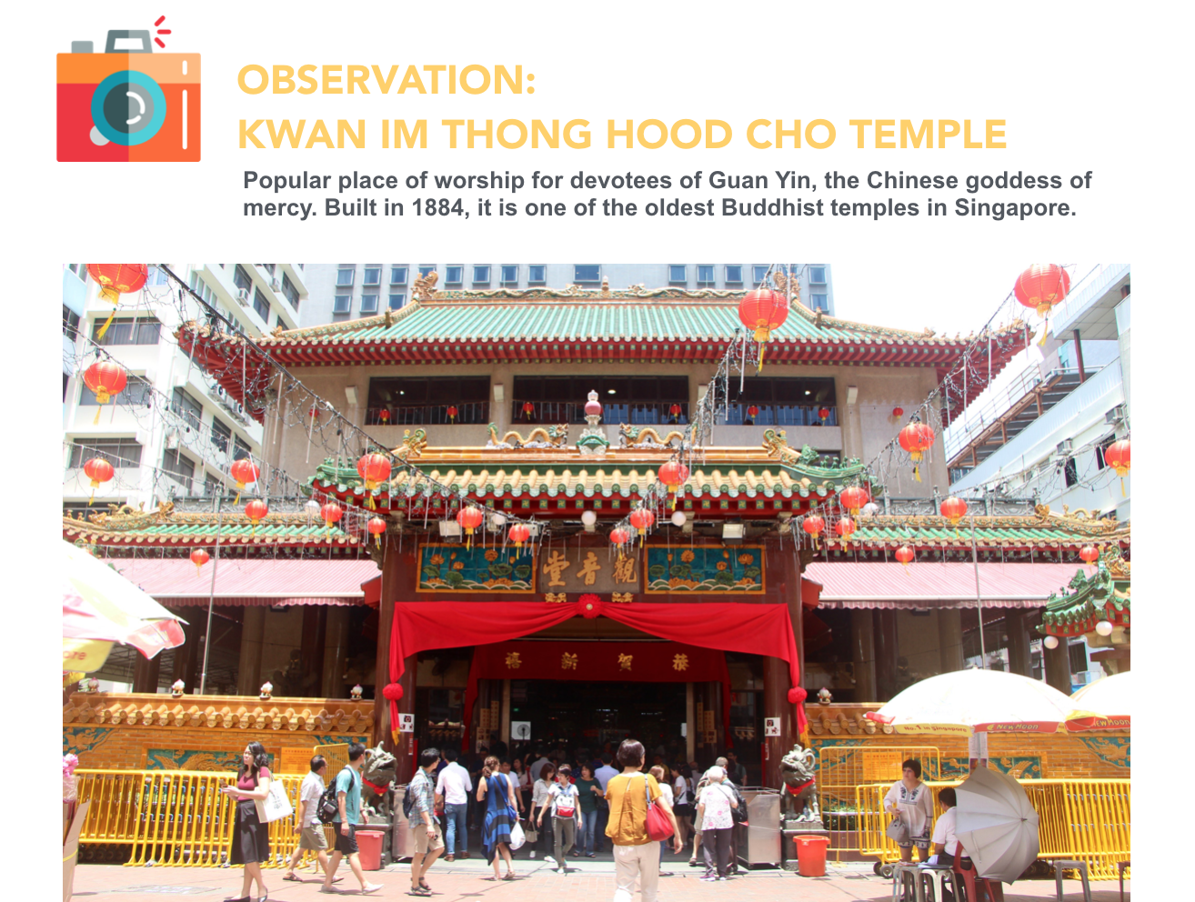
4. WATERLOO ST: Buddhist Temple, Fortune Centre and Fu Lu Shou Complex


LOCATION RESEARCH: WATERLOO STREET
After researching on all the places as mentioned above, I decided to focus on Waterloo Street. I remember my mom would to bring me to the Buddhist temple at Waterloo Street when I was a kid. In my memory, I didn’t like this place very much because it was very hot and crowded. But upon visiting it today, I find the location very unconventional.
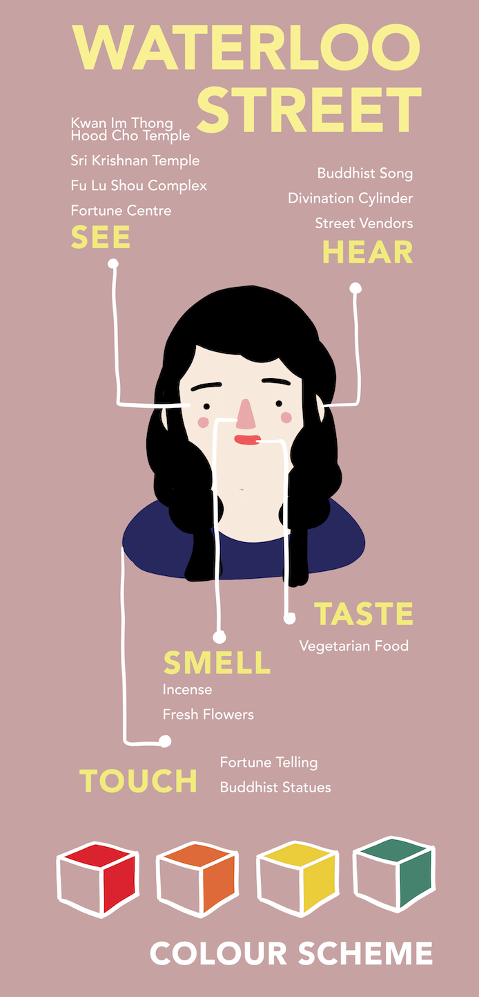
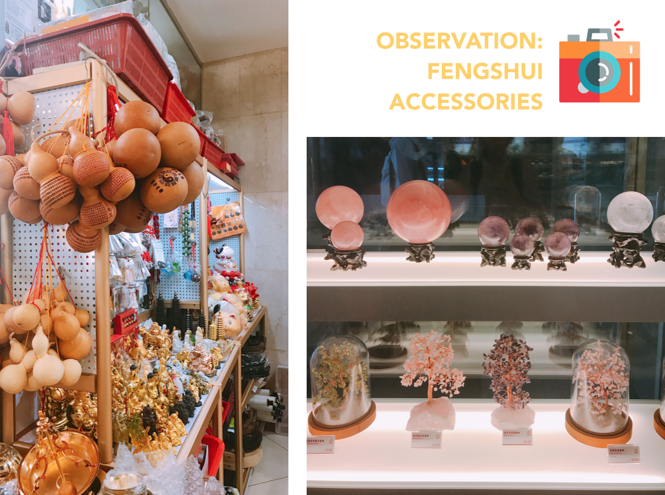
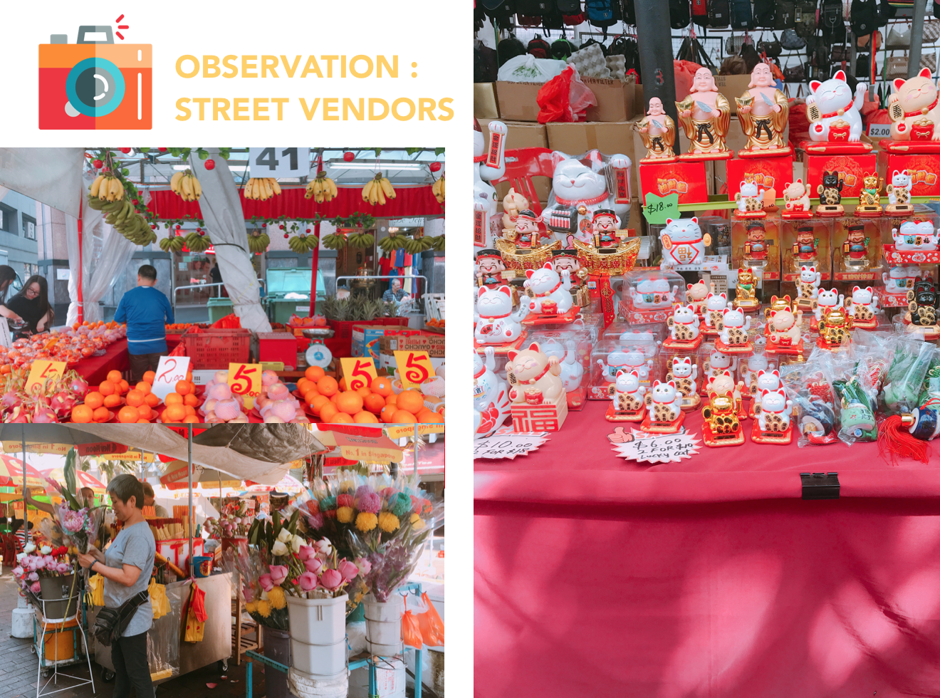
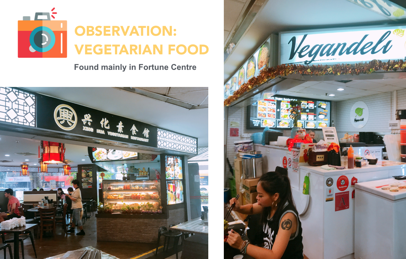
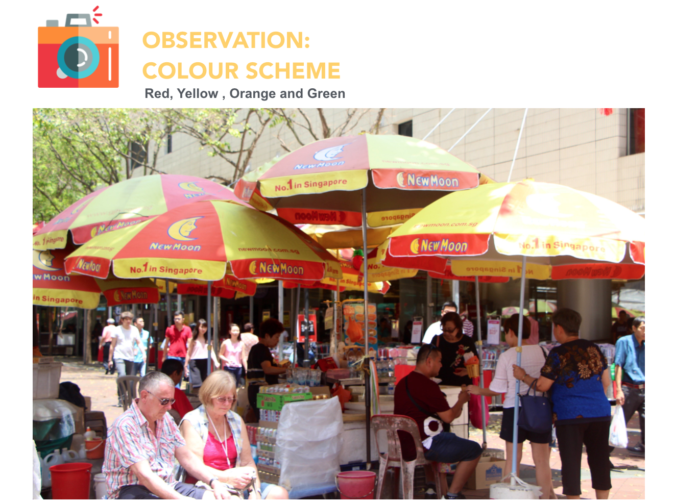
OBSERVATIONS
INTERVIEWS
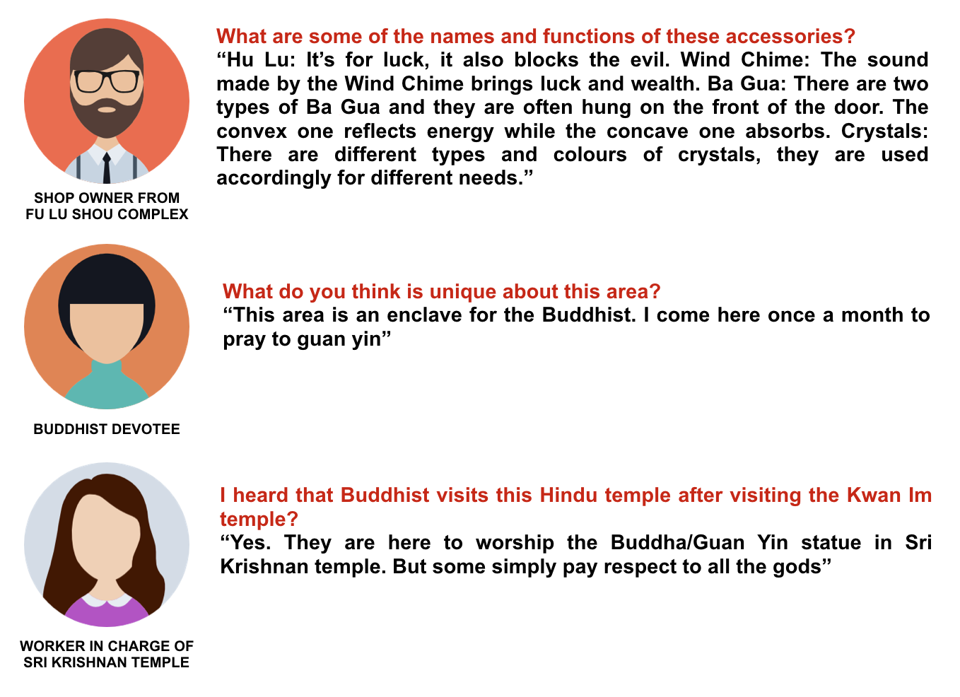
I wasn’t able to get much interview over there due to the demographic. The people there were very careful about strangers and therefore reluctant to participate. SOBS
SECONDARY RESEARCH

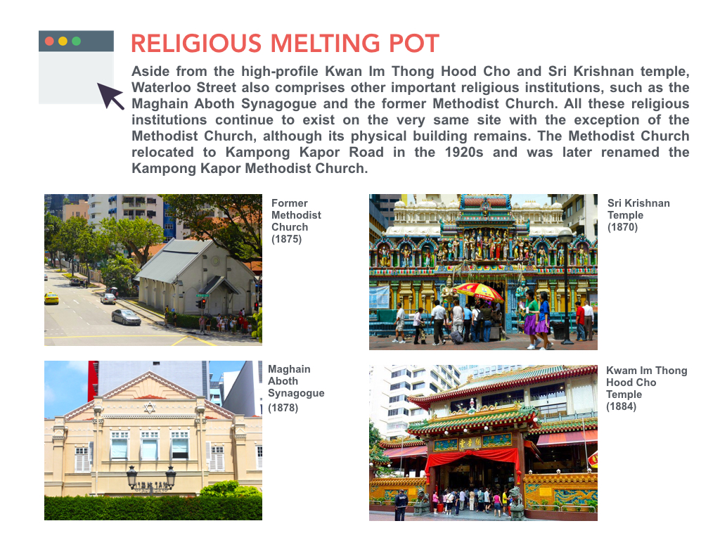

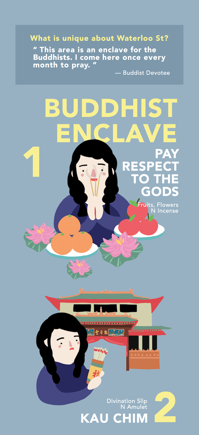
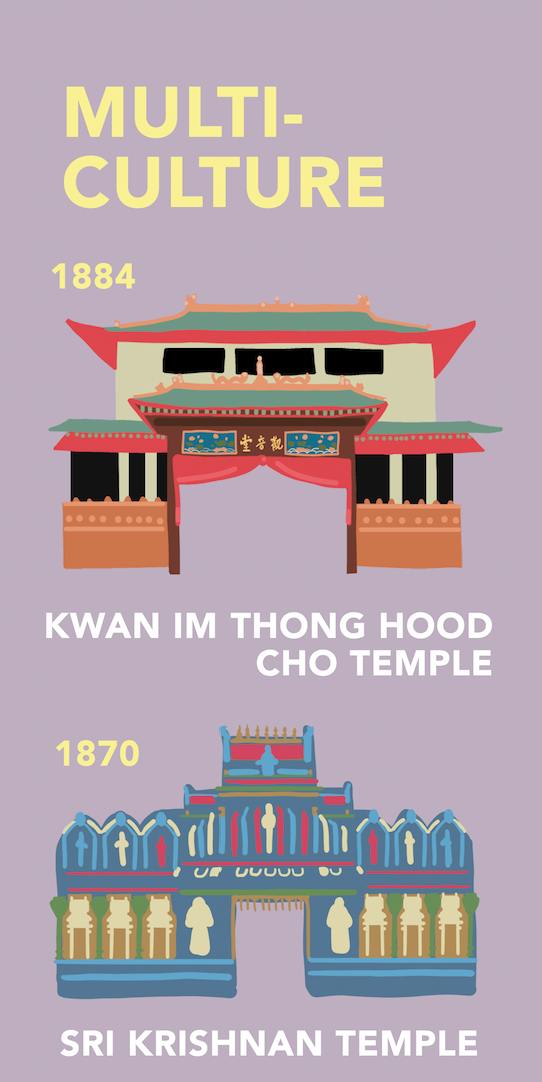
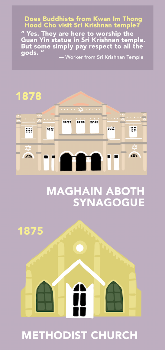
 While it is easy to refer to the Waterloo Street area as a Chinatown of sorts, owing to its high concentration of Chinese, Buddhist-centric festivals and service vendors, it is important to note the other communities who have existed here right from its beginning.
INFOGRAPHIC FOR PRESENTATION