

Category: My Work
Final | Beneath The Blue
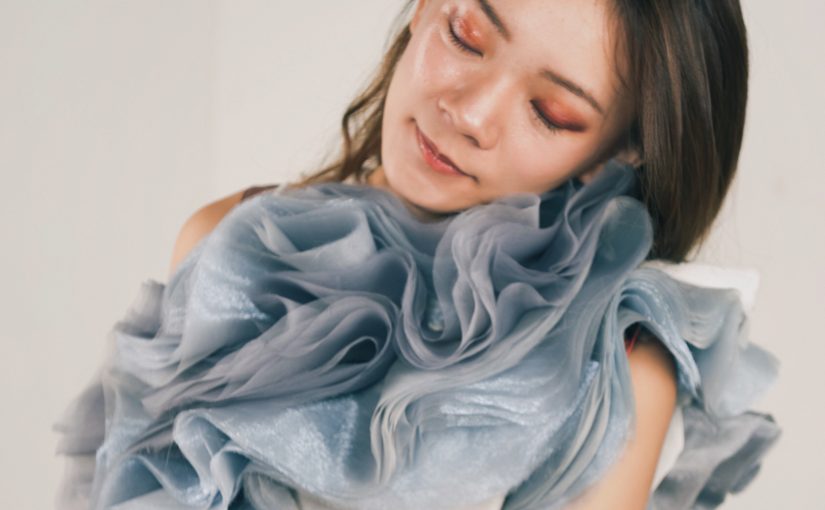
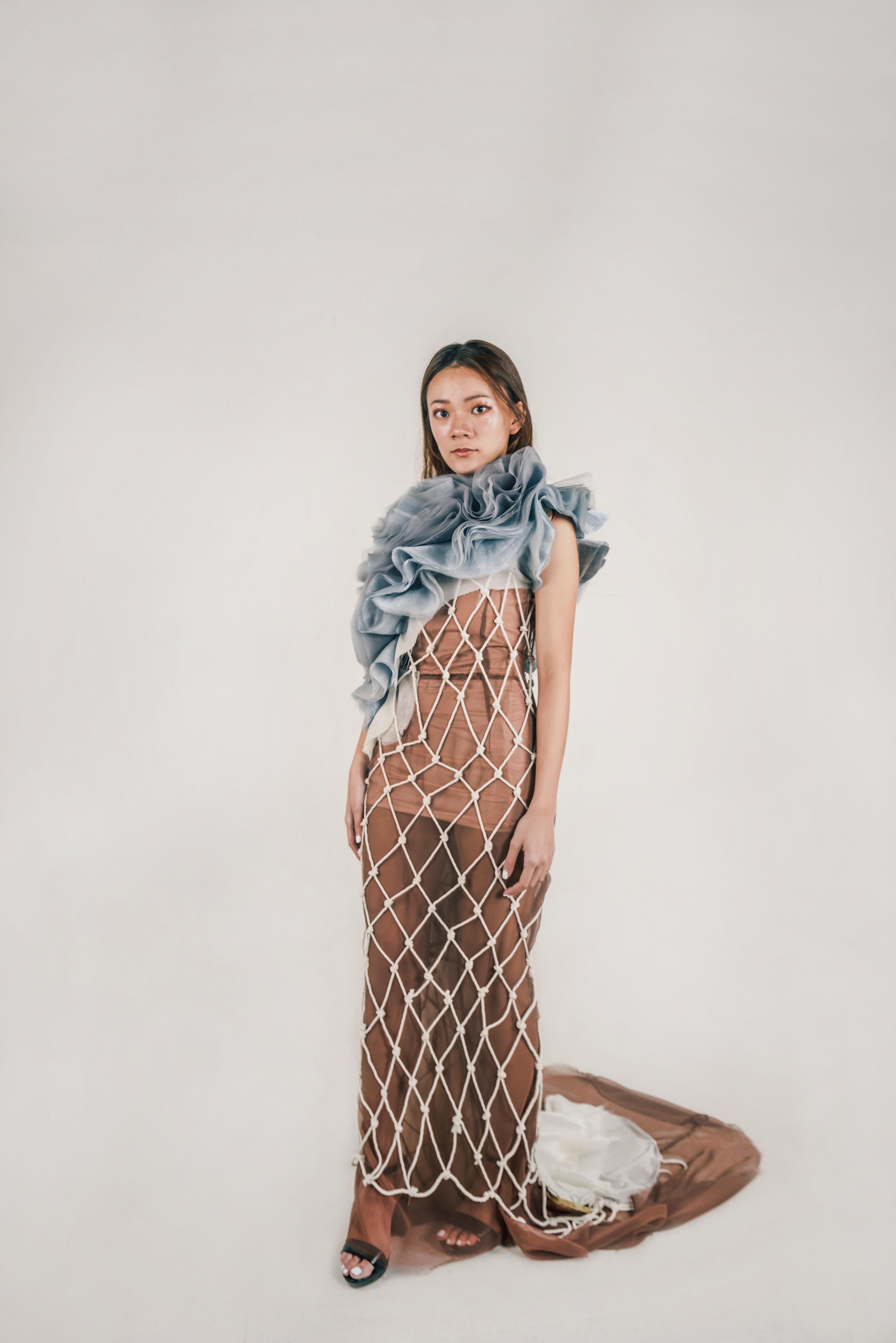
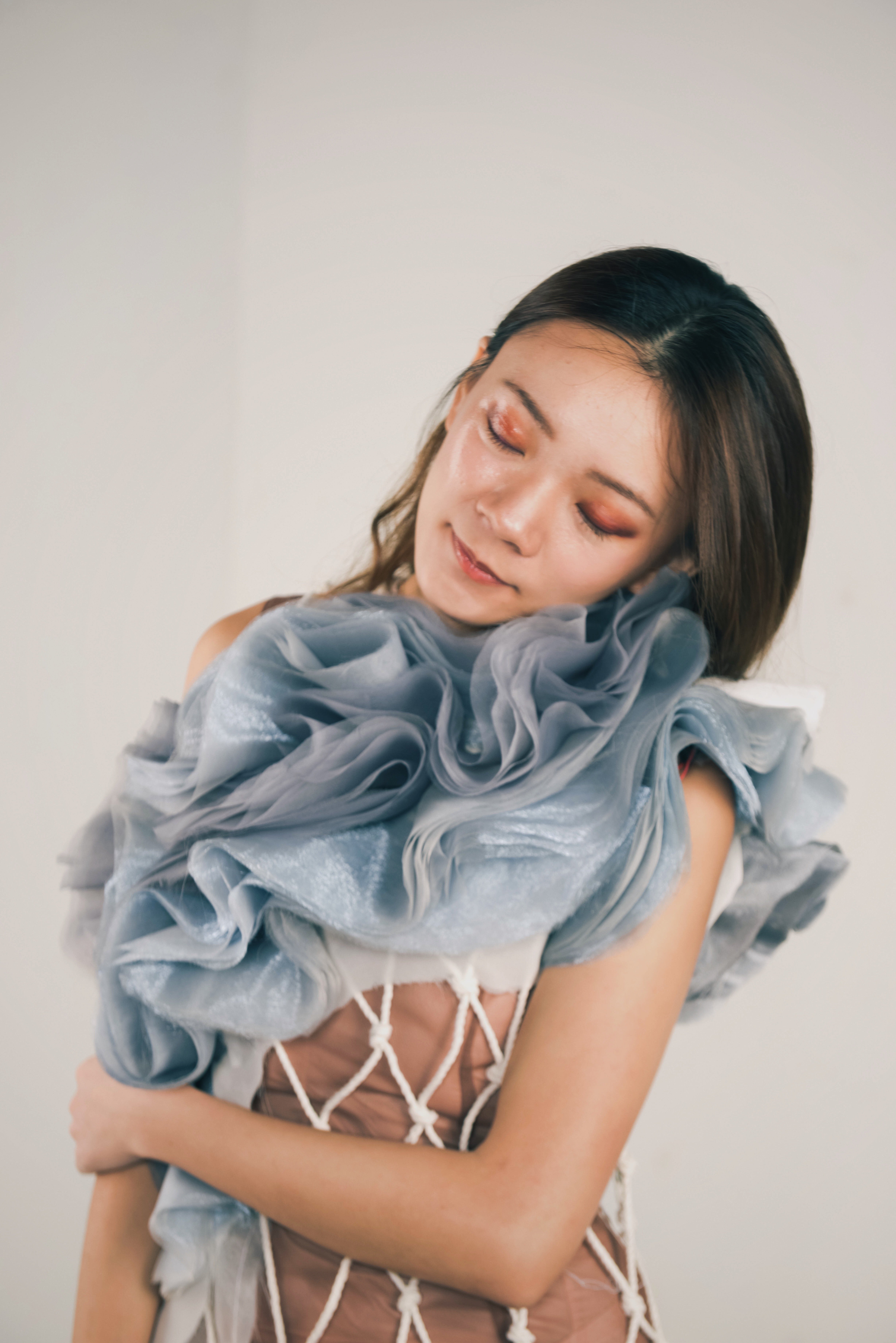
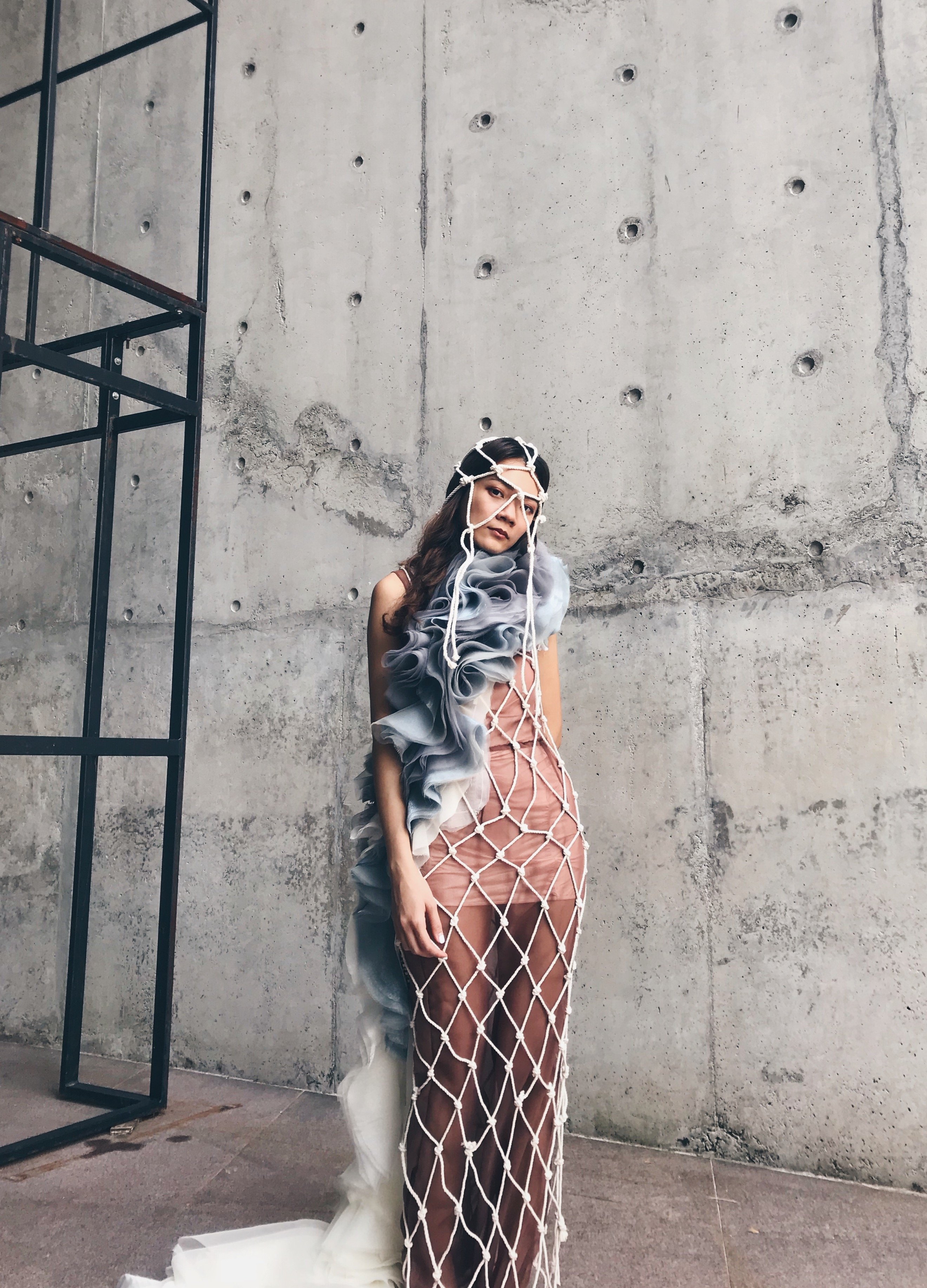
‘Beneath The Blue’ is a garment that aims to raise awareness for the ‘Dolphin Drive Hunt’. The Dolphin Drive Hunt is an event that happens each year around the month of September, where fishermen drive the dolphins into a bay or onto a beach where they could be slaughtered for their meat or hand-picked to live out their lives in a Dolphinarium. Dolphins are hunted this way in several places around the world, including the Solomon Islands, the Faroe Islands, Peru, and Japan, the most well-known practitioner of this method. However, it was the 2009 documentary film ‘The Cove’ that drew international attention to the issue.
The film was directed by Louie Psihoyos who analyses and questions dolphin hunting practices in Japan. It was a call to action to halt mass dolphin kills, change Japanese fishing practices, and to inform and educate the public about the risks, and increasing hazard, of mercury poisoning from dolphin meat. The film argues that dolphin hunting as practiced in Japan is unnecessary and cruel as the hunters would herd the migrating dolphins into a cove where they are netted and killed by means of spears and knives. There was a horrifying scene in the film, where the killing of the dolphins tainted the water of the cove bright red. The scene was devastating, but it conveyed a very strong message to the audiences.
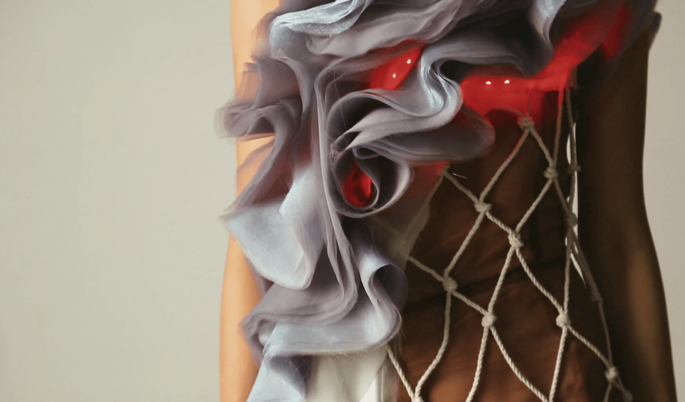
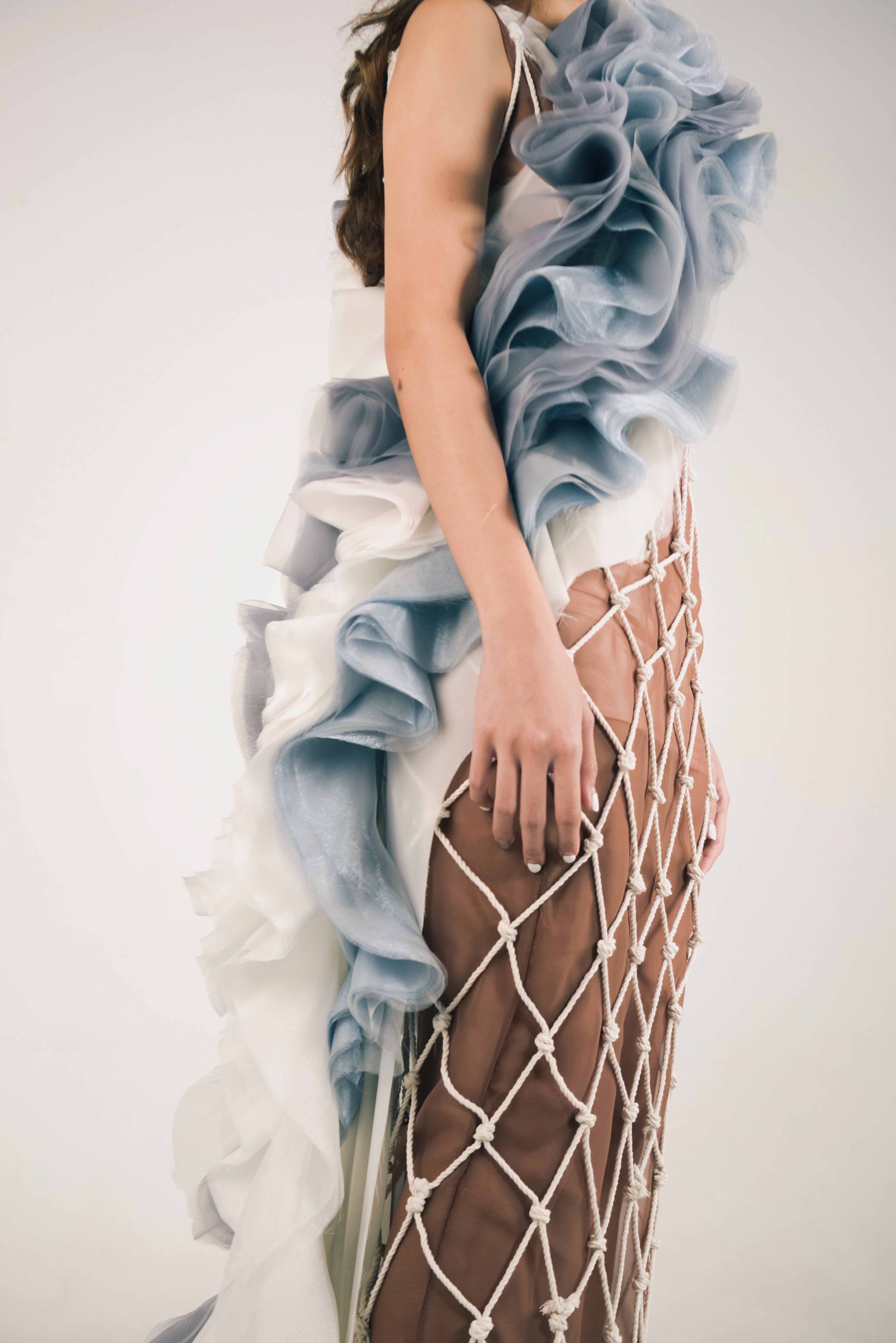
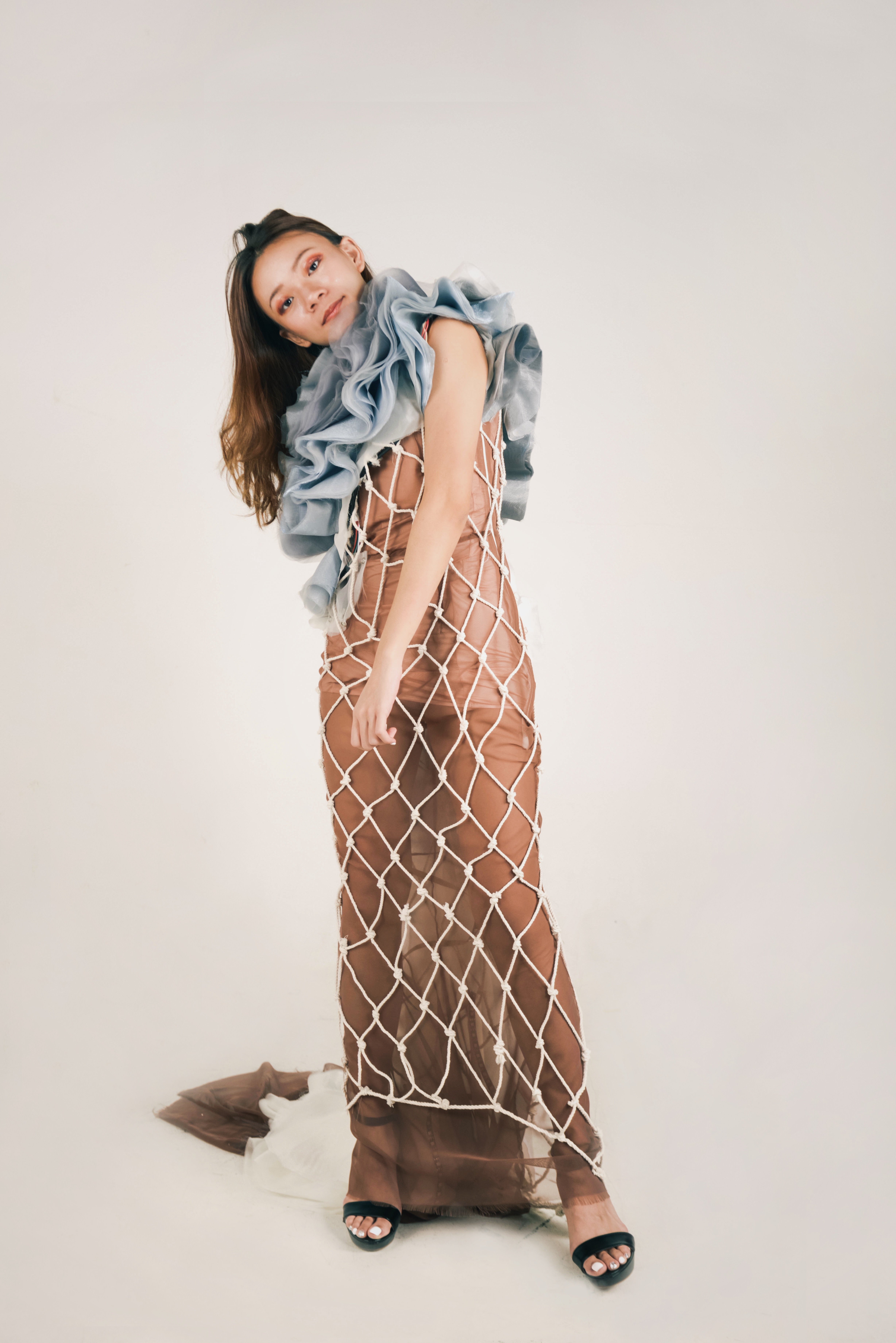
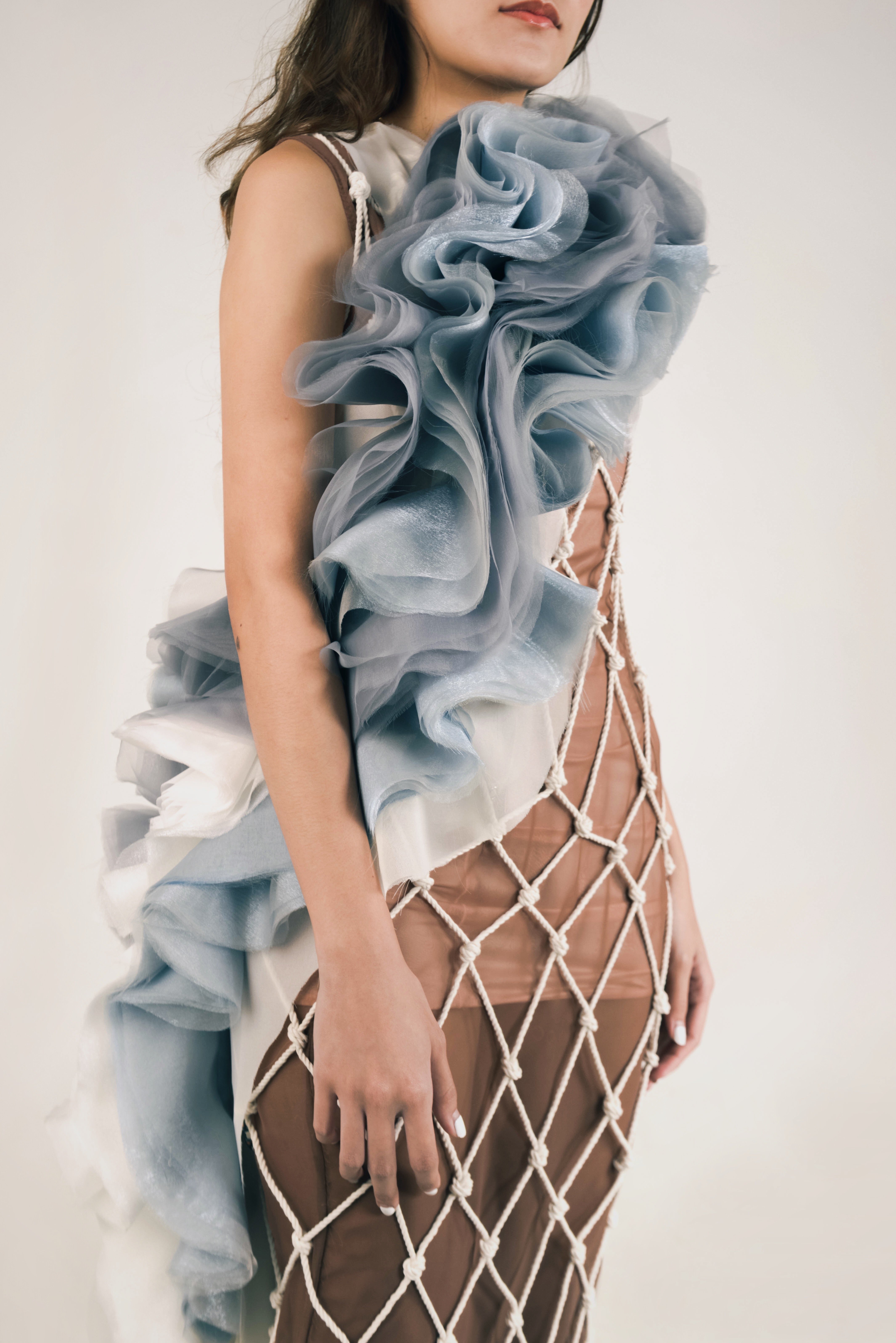
Inspired by ‘The Cove’, I wanted to reenact the devastating scene — where the water in the bay turns red from the blood of the dolphins killed — in a garment. This was done by incorporating LED lights into the garment, so that it would turn from blue to red; a peaceful sea to a violent bloodshed. The colour change would be triggered by a tilt sensor at the neck area, so that when the wearer bends her/his head to express discomfort or anxiety, the technology would be activated.
The base layer of the garment was made of translucent material to symbolise vulnerability and the innocence of the dolphins. This was followed by a layer of netting, woven with cotton ropes to show the dolphins being trapped and bounded, awaiting slaughter. The third layer was made out of heavy flounce arranged to look like the waves of the ocean. The LED lights were incorporated into the waves to make it seem as though the ocean has turned red. I wanted to make the garment look uncomfortable for the audiences and so that they are more likely to empathise with the dolphins and aid the cause.
Menu
Type As Pattern
Haiku
Expressive Words | Opposing Pairs
Graphic Form: Gallery
These are the links to see my work process!
Zine Part 2: Waterloo Street
Ideation
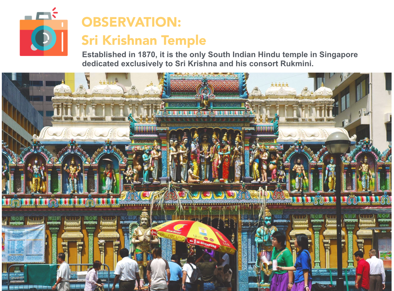
Waterloo Street is unique as a place of convergence between the Hinduism and Buddhism. I wanted to represent this unique aspect of Waterloo Street using the arrangement of the spreads. Since this project requires an eight page zine, I’ll have three spreads to work with (excluding the cover and back page). This gave me the idea of splitting the street into three parts. The first spread will represent the Buddhist area, the middle spread representing the convergence and the last spread representing the Hindu area. This way it’s almost like I’m bringing my viewers along the physical street of Waterloo.
Content
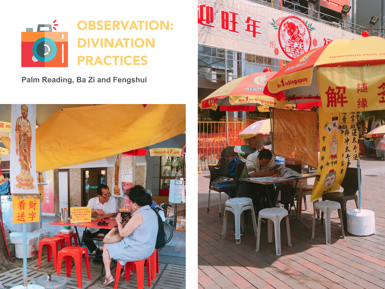
First spread- Significance of divination in the Buddhist culture & the competition between the many divination booths in that area
Middle spread- Convergence of the Buddhist and Hindu cultures through similar means of worship
Last spread- Hidden Hindu aspects of that area that are obscured by renovation works
Style Reference: Tanabu Hiroshi


Struggling with Abstraction
Version 1
First page- I illustrated some of the talismans that I have observed from that area. These talismans incoporated the play of typography to explore some of the reasons why people buy these items, including: fortune, peace, health and luck.
Second page- I extracted some of the signs I have found from the divination booths over there and illustrated them into vectors.
Middle spread- I used the play of typography again to illustrate some common methods of worship between the two religion.
Feedback
1. To be more site specific by extracting elements that are unique from that area (consider mark making)
2. Avoid figurative representation of that area & find alternative solution to convey intended message
3. Consider how the arrangement of elements can help to convey intended message
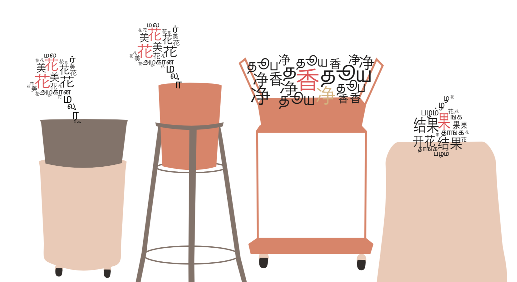
Exploring Scannography & Mark marking
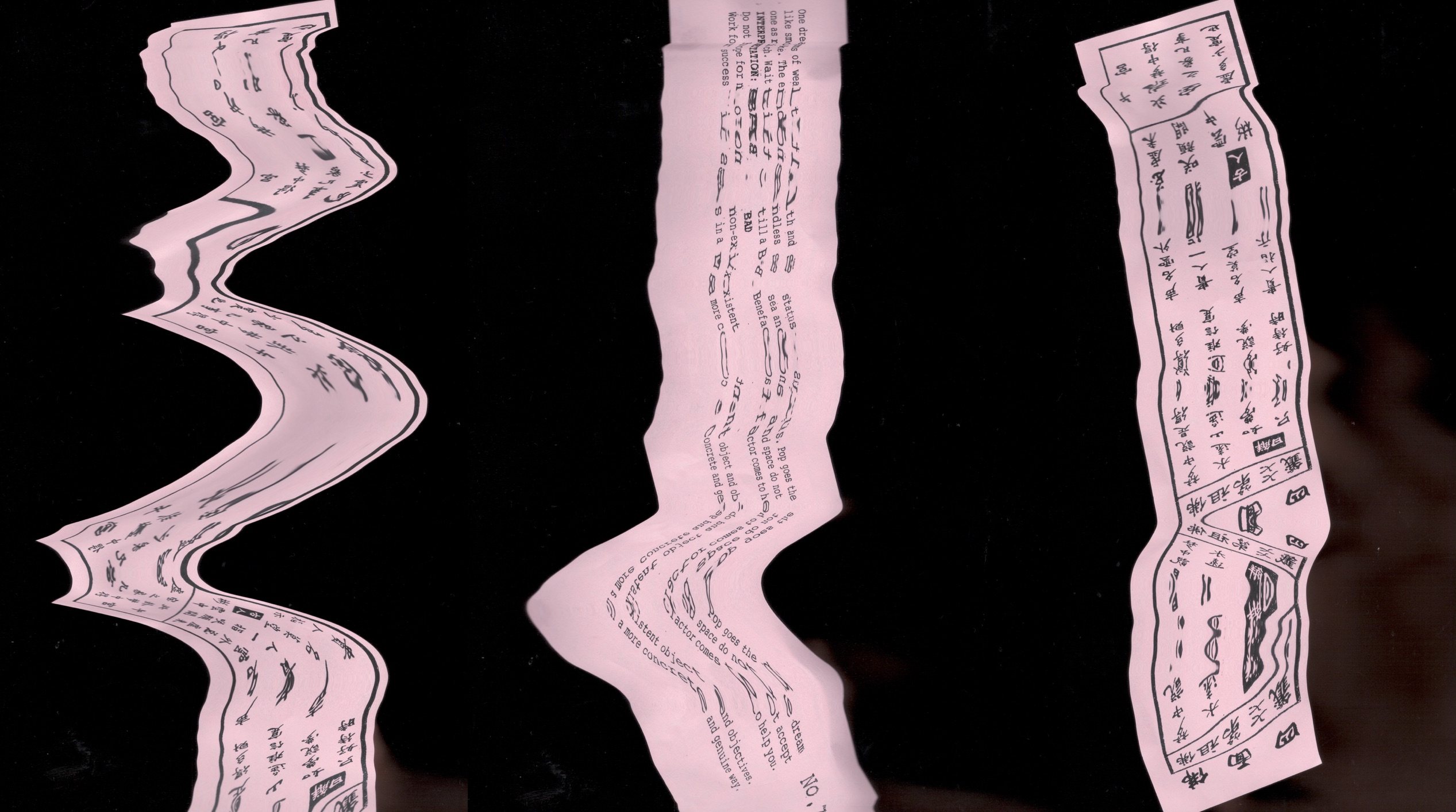
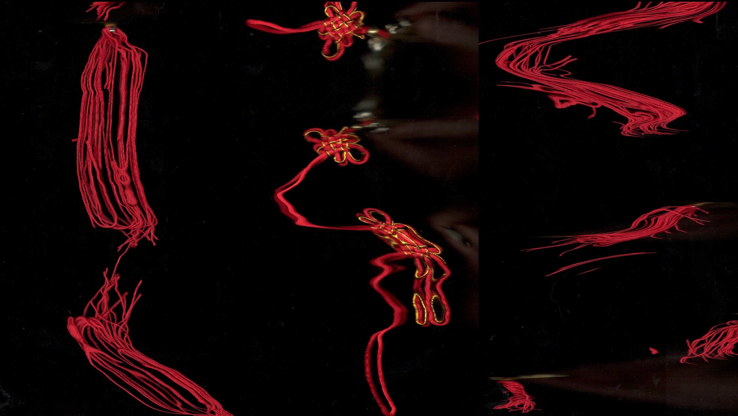
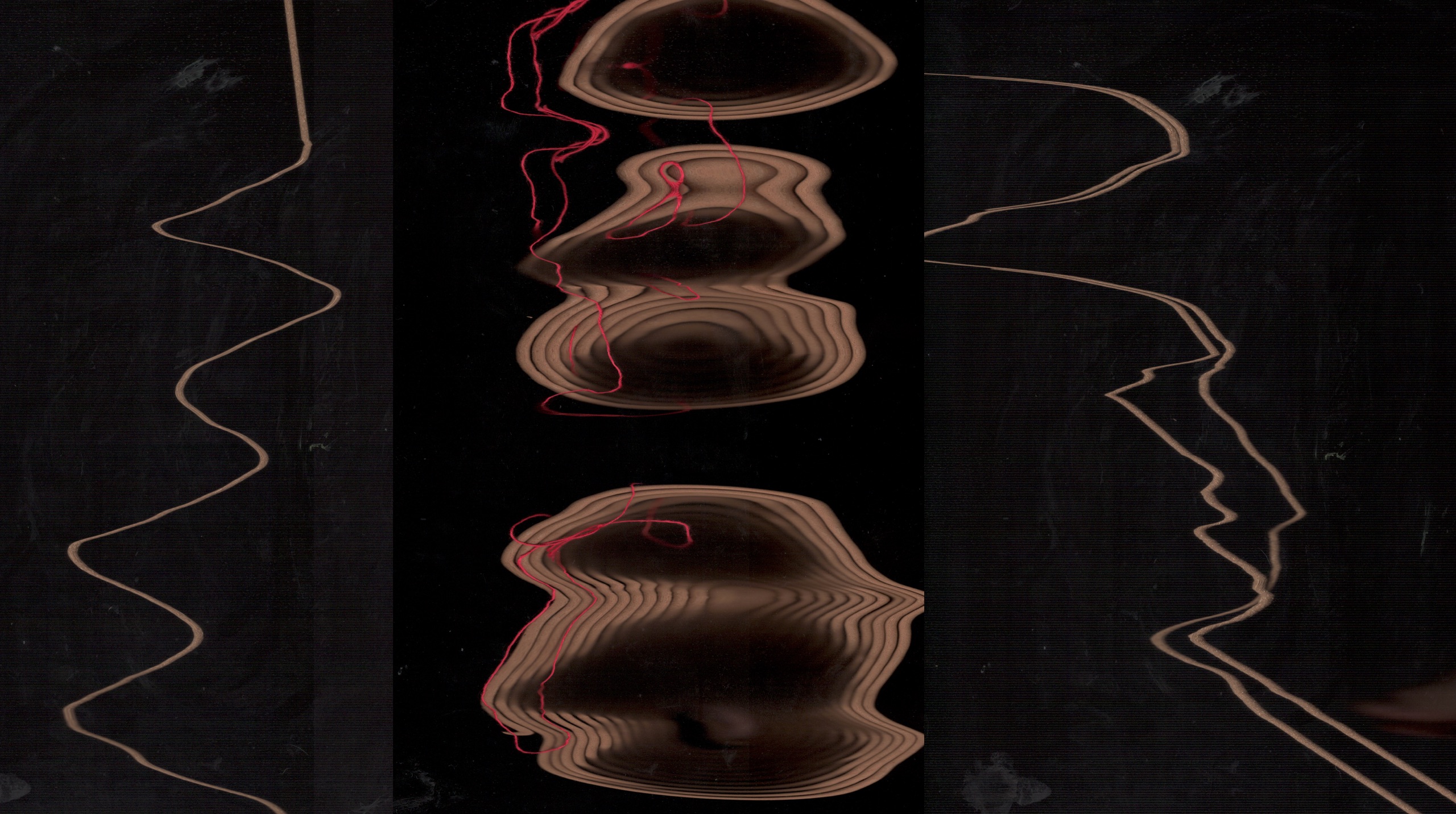
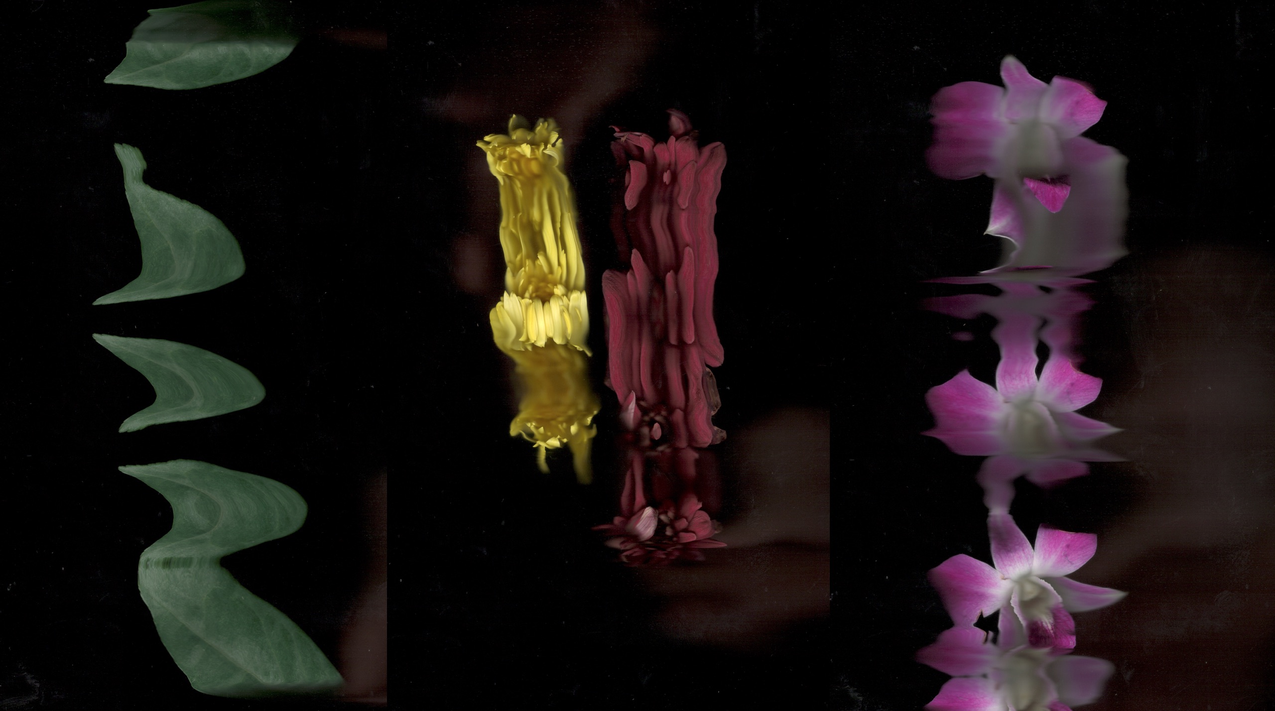
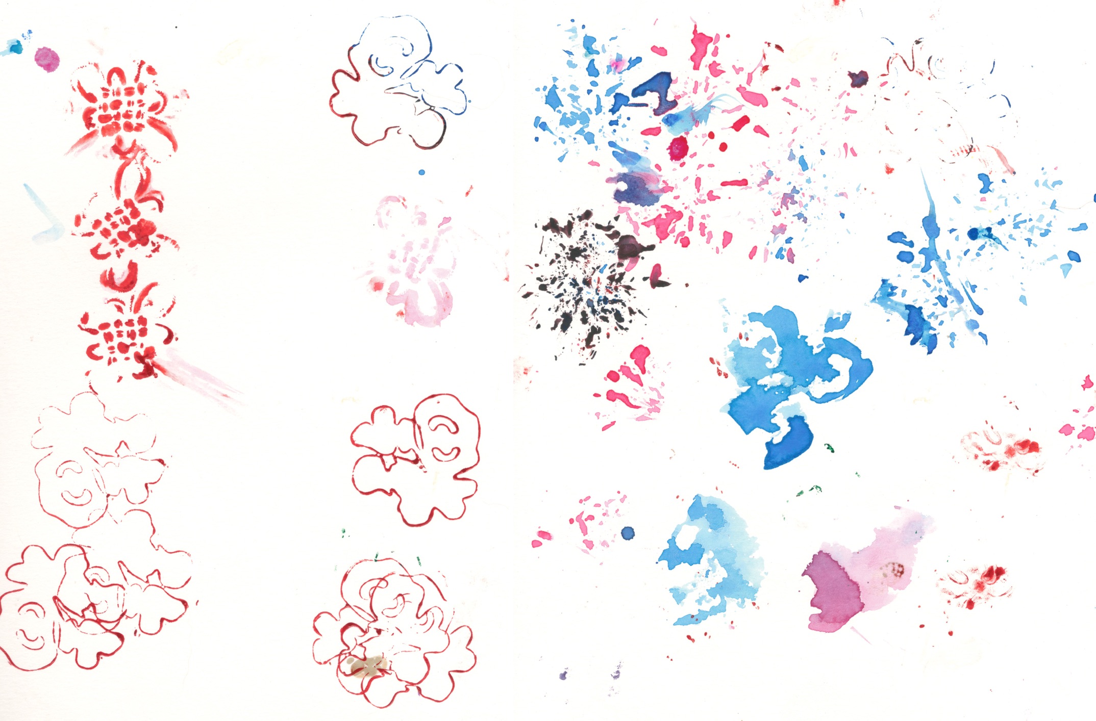
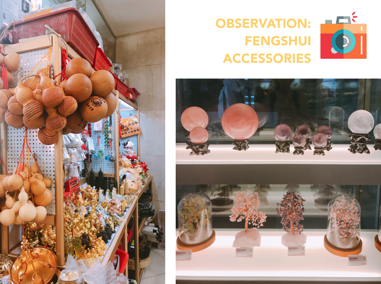
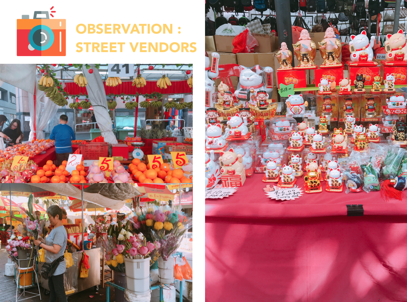
Divination Slip, Talismans, Joss Sticks and Flowers obtained from Waterloo Street.
Process
Version 2
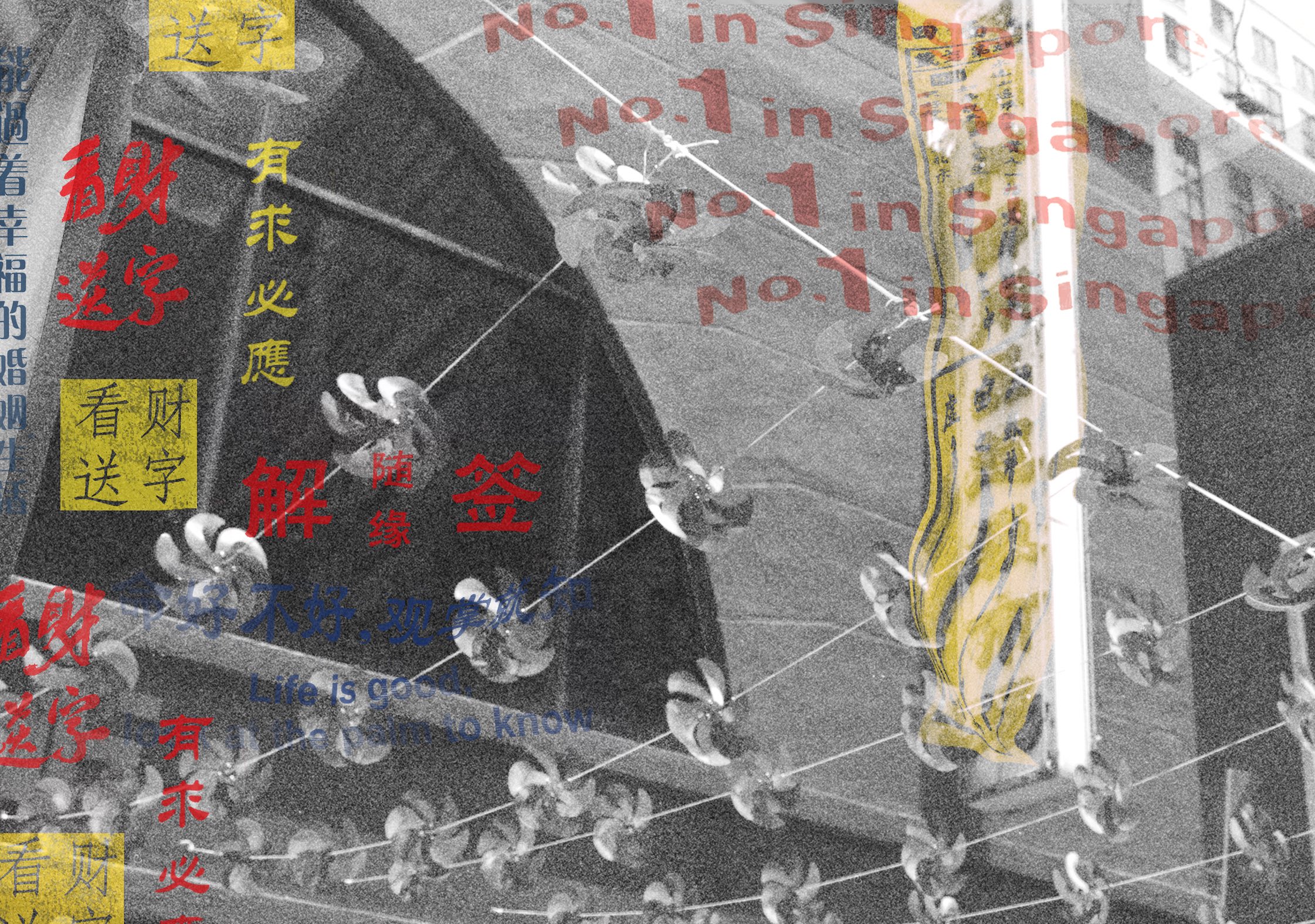
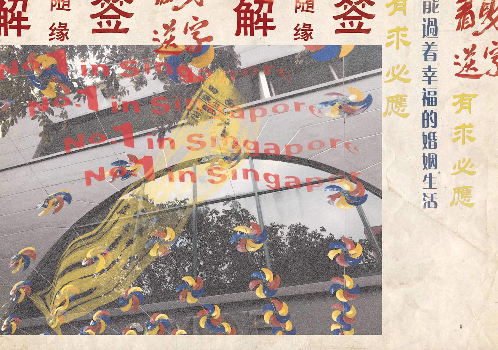
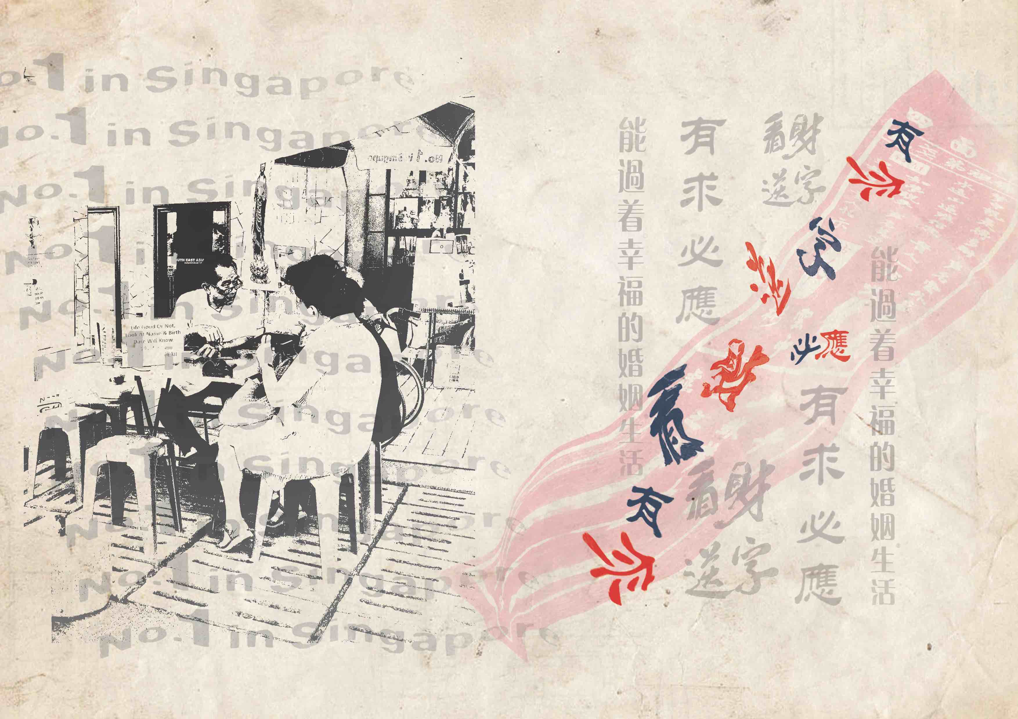
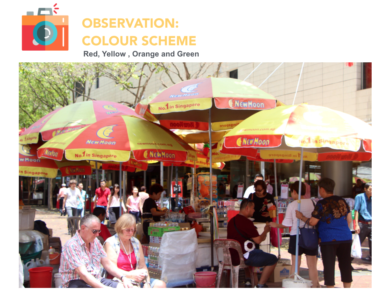
First spread- I used signages extracted from the divination booths to show the cluster of them at the street and included the text no.1 in Singapore to show competition between the stalls. I used Scannography to distort the image of a divination slip to represent how divination is a distortion of truth.
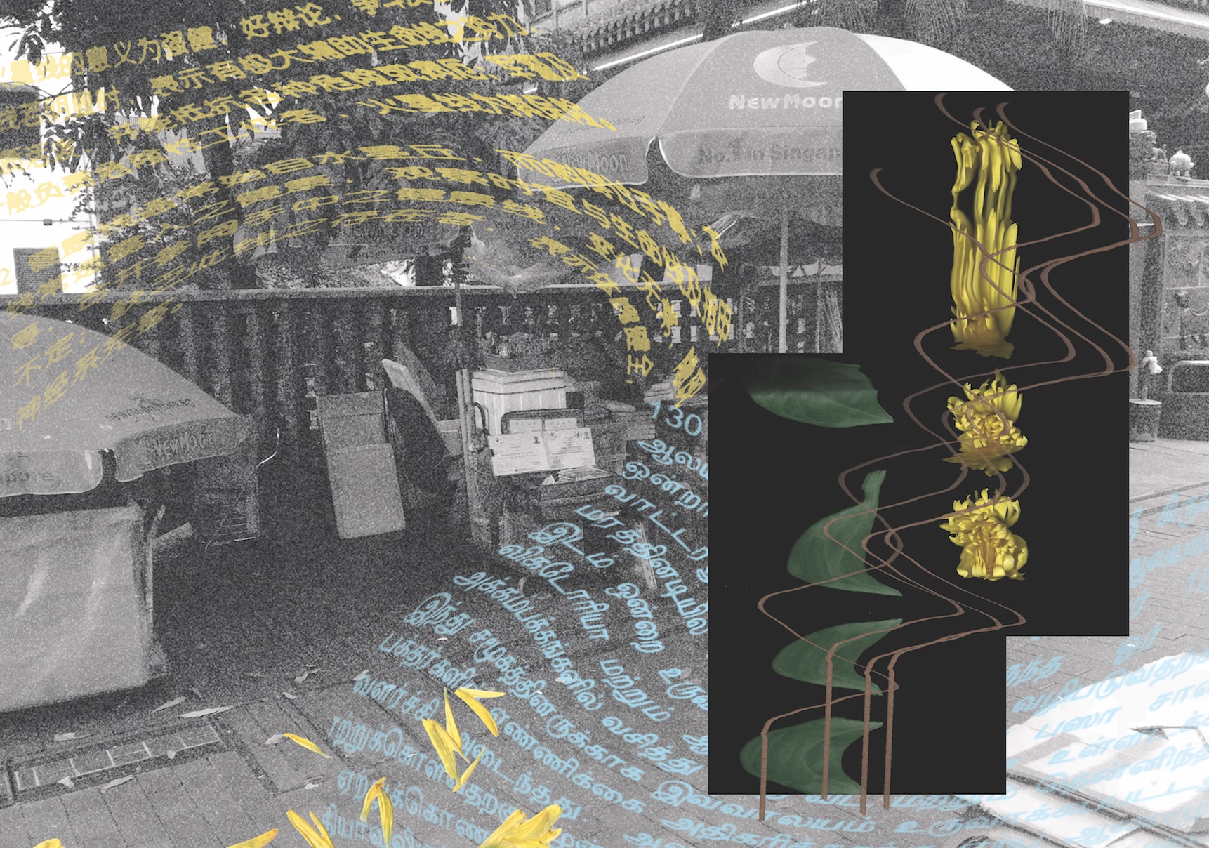
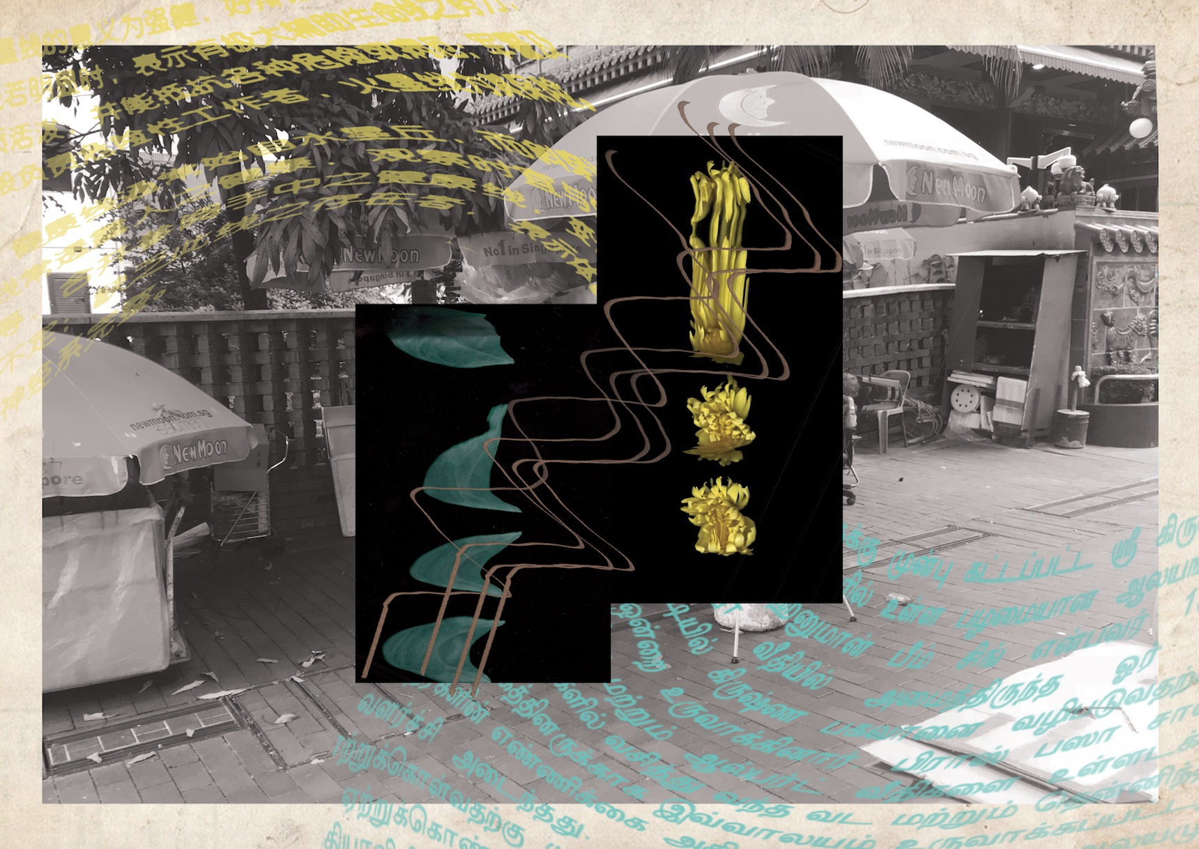
Middle Spread- I extracted Chinese and Hindu words and distorted them to make it seem like they are merging into one. Again, I used Scannography images of flowers and joss sticks to show how the two religion intersect through similar methods of worship.
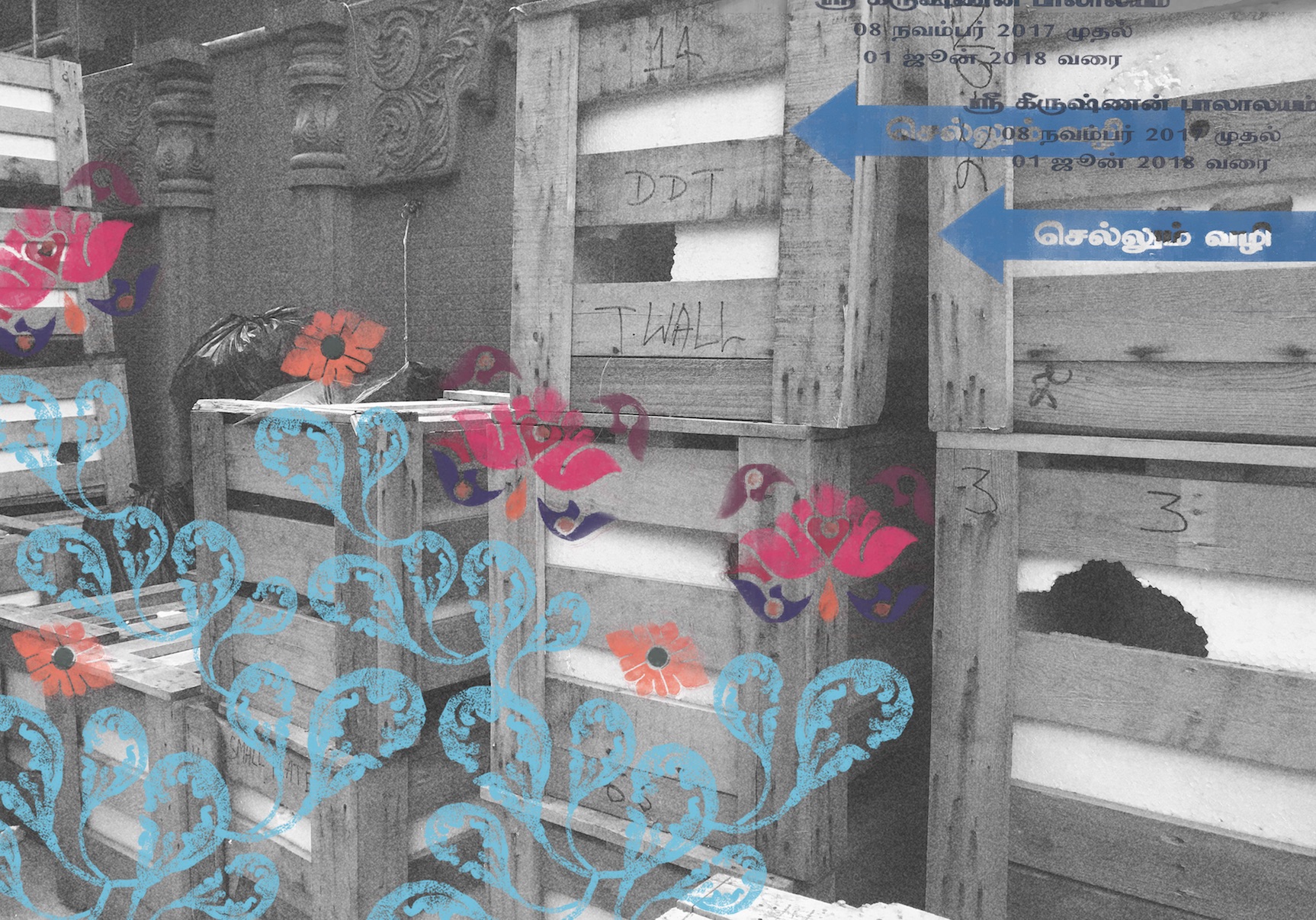
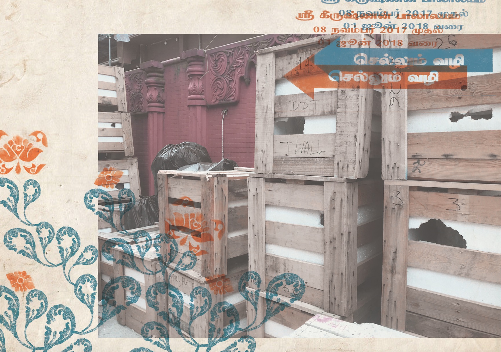
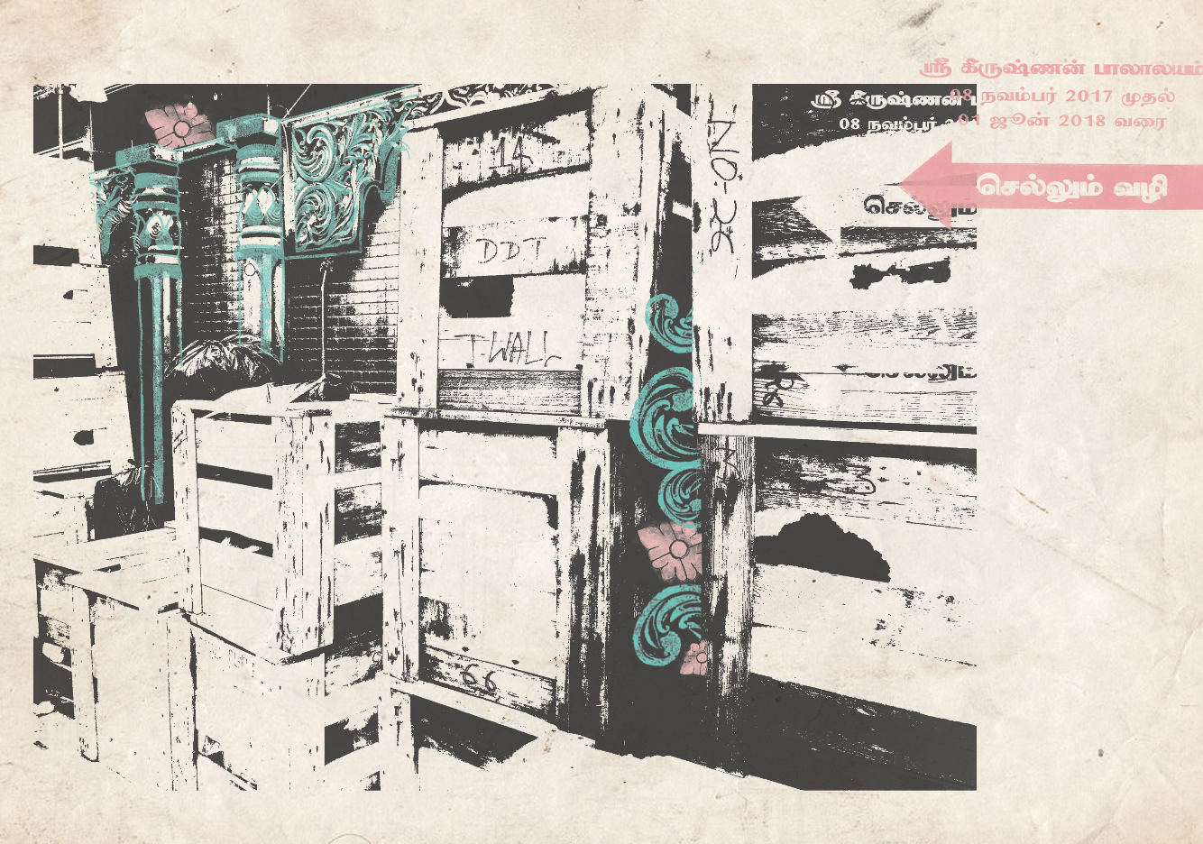
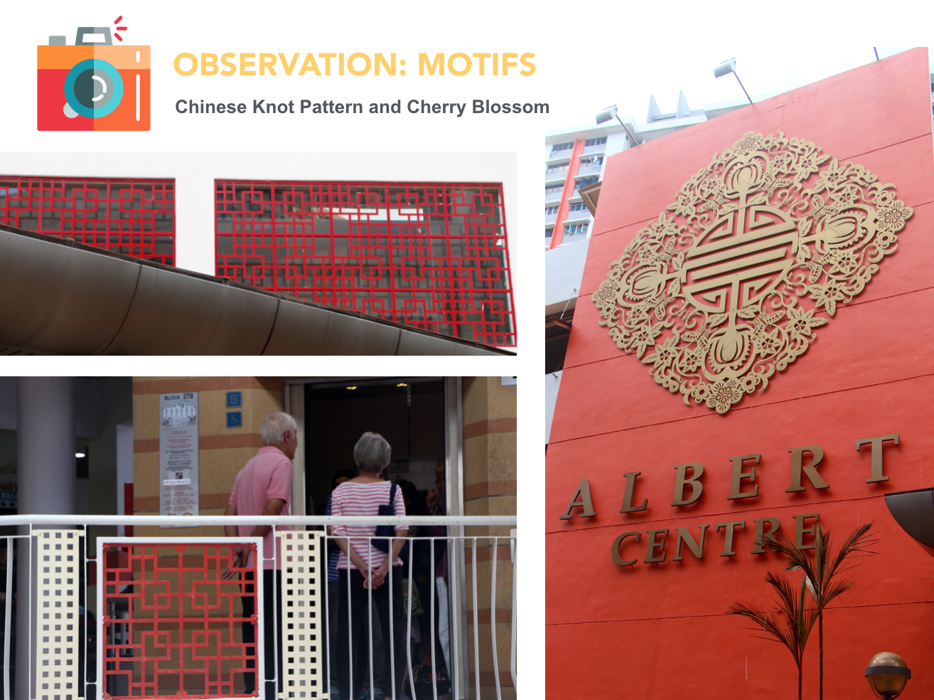
Last Spread- I extracted different Hindu motifs from that area and arranged them into a foliage. I also included a signage which tells us that the Hindu temple is currently under construction.
Version 3
I rearranged the elements from version 2 so that the spreads do not look so messy. I also used vintage paper as the background to create a retro look to the zine.
Feedback
1. Look into elements/principles of design
2. Consider how the arrangement of elements can help to convey intended message
3. Find a focal point (one idea for each spread)
Final
I added some images that I have extracted from Waterloo street to add more depth to the visuals. I also wanted it to look a bit like a newsprint.
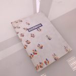
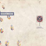
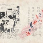
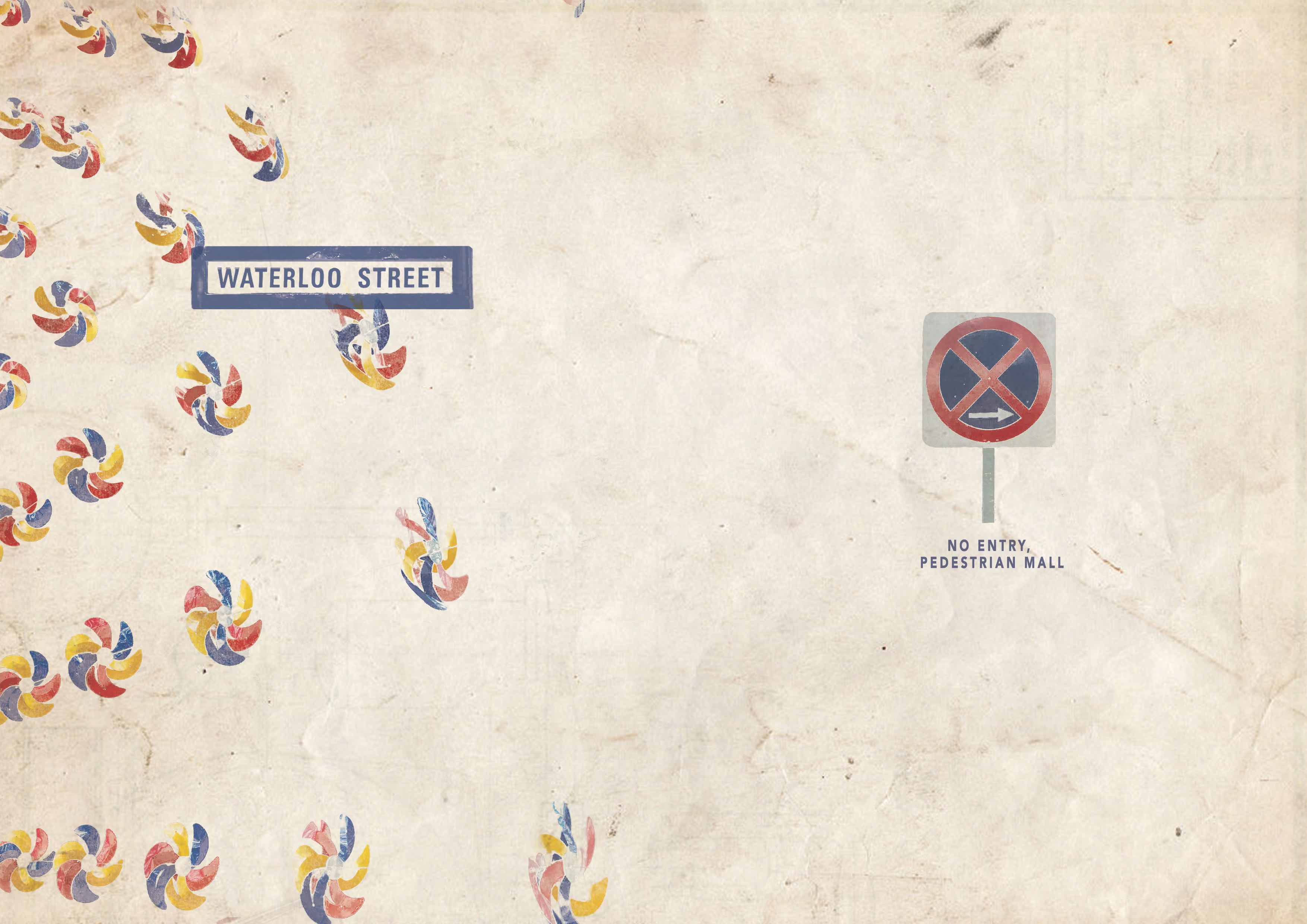
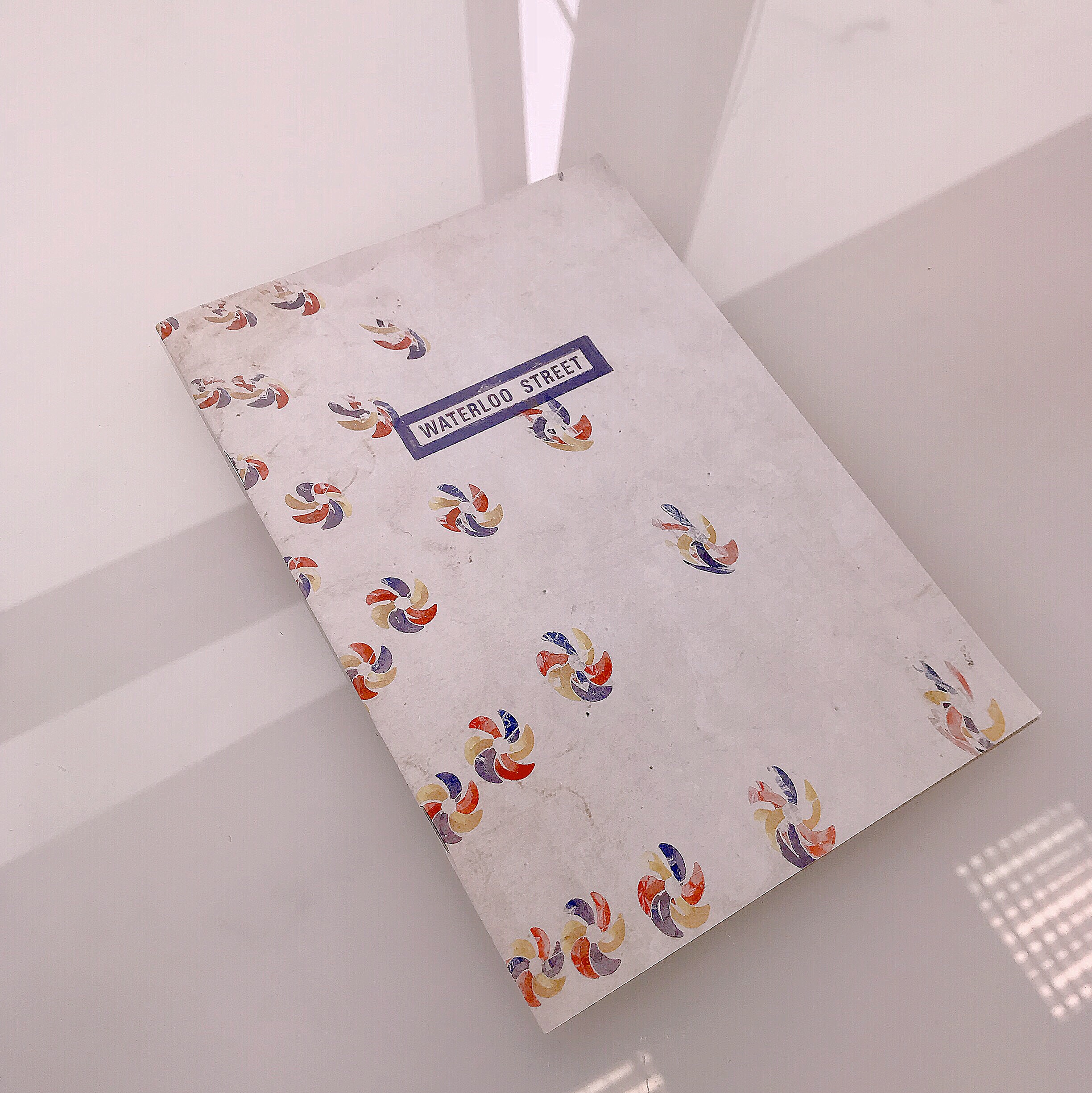
Cover spread- I used signages found at the start and the end of Waterloo Street.
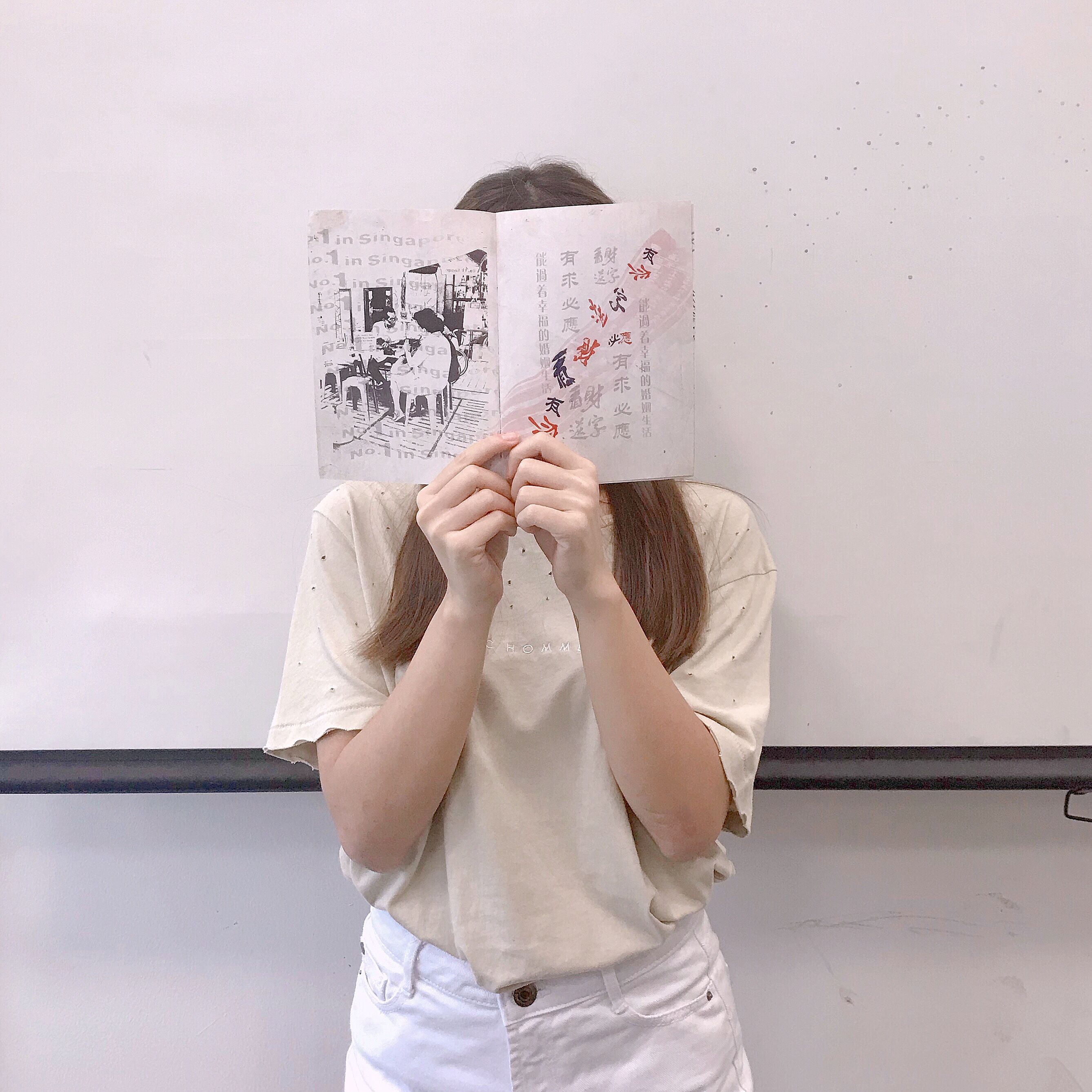
First spread- I made the no.1 in Singapore flow into the divination slip to bring the viewer’s eyes across the whole spread. The text was reduced in its opacity to show like a subtle competition between the many divination booths found in that area. Along the distorted divination slip, one can see that the words are fighting with each other to further emphasise the competition.
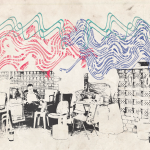
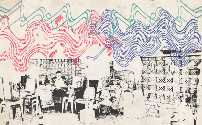
Middle spread- The convergence between the Buddhist and Hindu cultures can be seen through the flow of Hindu and Chinese text flowing in from both sides. I also used a Scannography image of the joss stick to mimic the movement of smoke drifting in from the two sides.
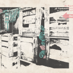
Last spread- I wanted to emphasise on the partially obscured motifs of the Hindu temple, by making them peek out from behind the crates.
Thoughts
I think that this zine project really pushed my abilities to conceptualise and refine my idea. When it comes to ideation, I often find myself trying to include too many ideas. Given that this project only requires a 8 page zine, it is very hard to fit so many ideas into one visual without diluting the message. I am glad that after many attempts, I have managed to filter out some unnecessary elements to achieve a better focus in my zine. However, I think that this zine can be further improved in terms of its design. For example, the minimalist style of my cover page can be more cohesive with my messy spreads so that the viewers would not get a shock when reading my zine.
Zine Part 1: Location Research
LOCATION RESEARCH: BUGIS
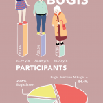
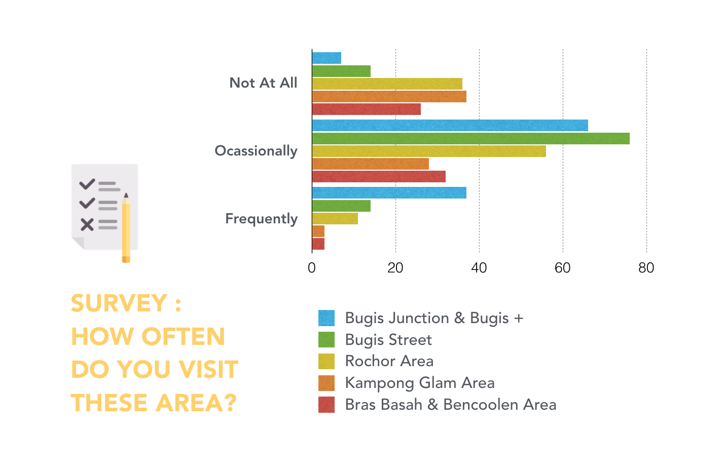
For this zine project, I wanted to explore Bugis as it is one of my go-to places for food, shopping and entertainments. Although I visit this area quite frequently, most of my time spent were at the shopping malls (Bugis Junction & Bugis+). Therefore, I conducted an online survey to gain a deeper insight on the location and to see what else it has to offer.
SURVEY RESULTS
According to the survey results, people frequent Bugis Junction & Bugis + the most. But when I asked the participants for their favourite location in Bugis, I was heartened to see some interesting answers.
1. HAJI LANE: Cafe and Boutiques
2. NATIONAL LIBRARY: Study
3. SUNSHINE PLAZA: Good Printing
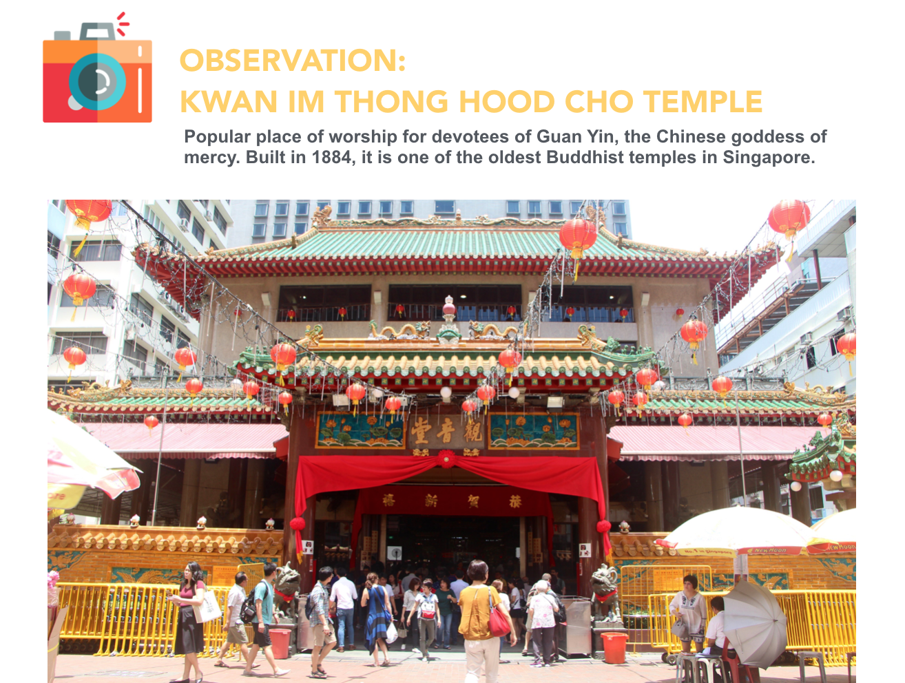
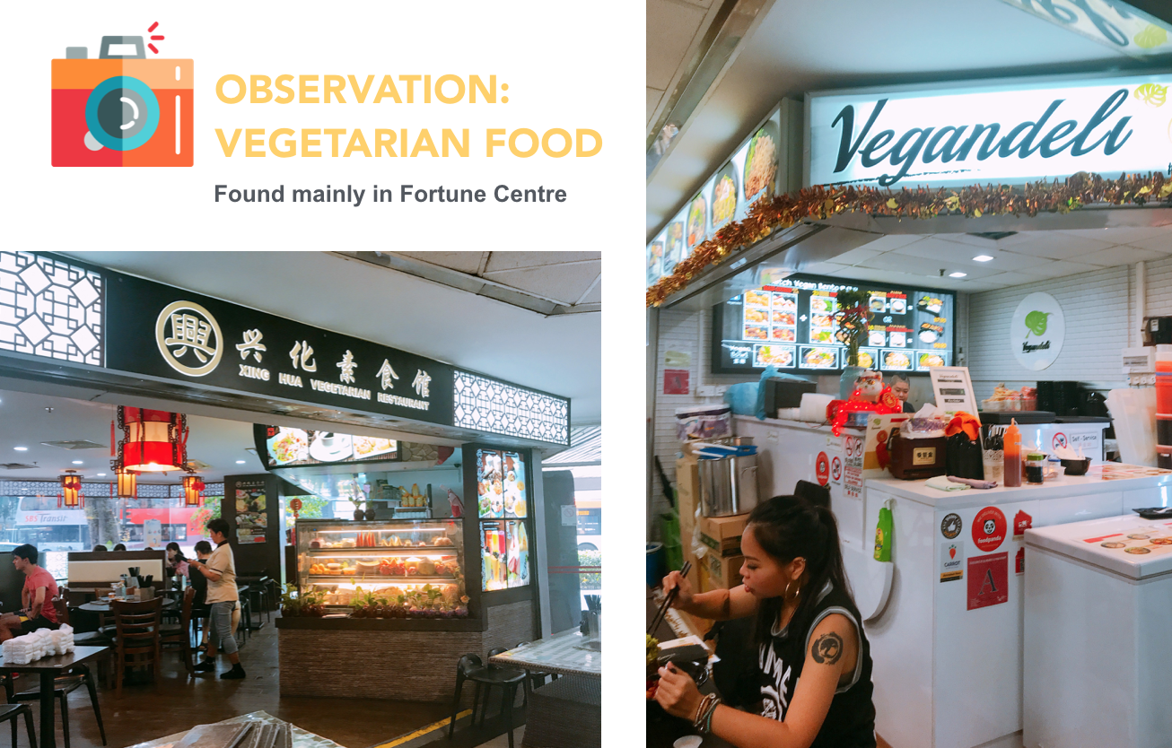
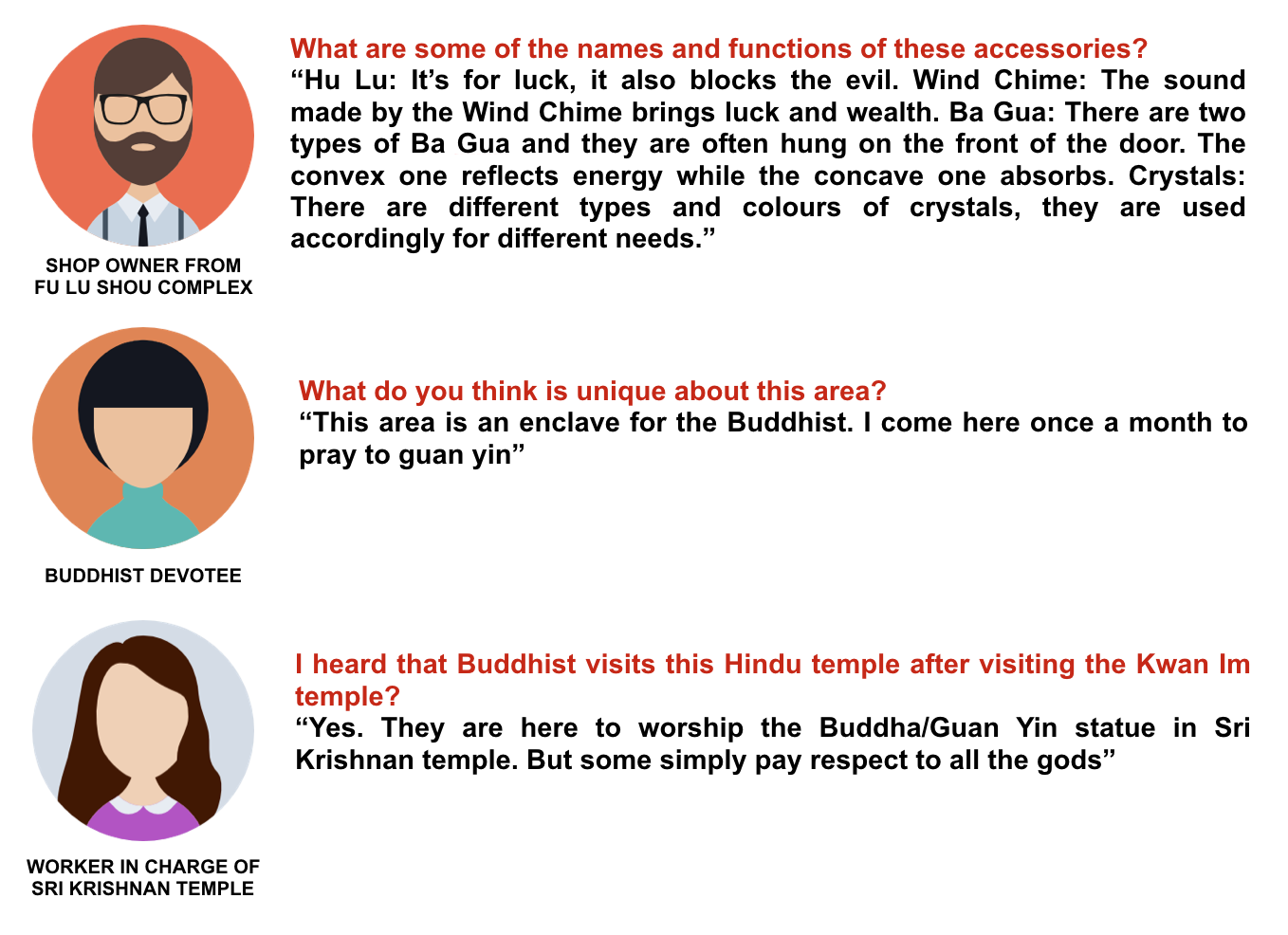
4. WATERLOO ST: Buddhist Temple, Fortune Centre and Fu Lu Shou Complex


LOCATION RESEARCH: WATERLOO STREET
After researching on all the places as mentioned above, I decided to focus on Waterloo Street. I remember my mom would to bring me to the Buddhist temple at Waterloo Street when I was a kid. In my memory, I didn’t like this place very much because it was very hot and crowded. But upon visiting it today, I find the location very unconventional.
INTERVIEWS
I wasn’t able to get much interview over there due to the demographic. The people there were very careful about strangers and therefore reluctant to participate. SOBS
SECONDARY RESEARCH

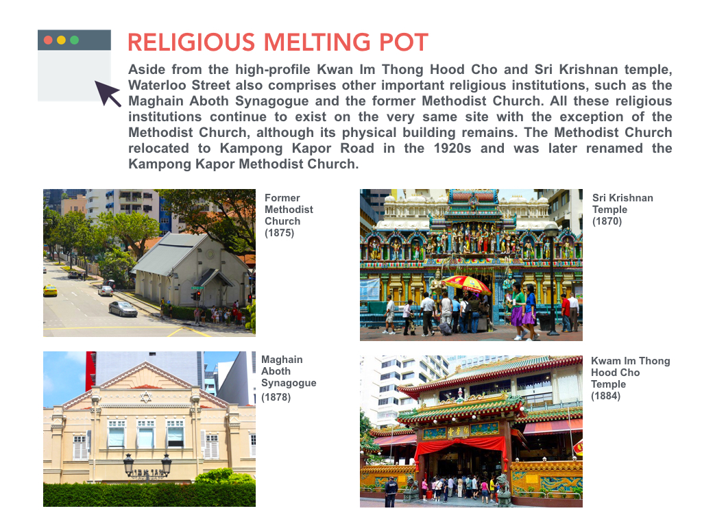

 While it is easy to refer to the Waterloo Street area as a Chinatown of sorts, owing to its high concentration of Chinese, Buddhist-centric festivals and service vendors, it is important to note the other communities who have existed here right from its beginning.
Image Through Type: Process & Final
EXPERIMENTAL PROCESS:
I decided to go with the collage/scrapbooking style in the end because I felt like it is something I have very little experience with and I’m interested to see how I can make use of existing imageries to create type. I think this art style might be useful in bringing across my message through its use of different textures, tones and juxtaposition of images.
AT ATTEMPT 1,
I started on one composition, portraying both a pilot and a bus driver. Both occupations needed to transport a large number of passengers around, so I incorporated that element in but kept the vehicle used for transport ambiguous to the viewers.
THEREFORE, there are a lot of random elements (basket, balloons, wheels) in the composition. The letterform Q (uppercase) is haphazardly incorporated at the sky + washi tape area and the i (lowercase) at the steering wheel + washi tape area.
As you can tell, it was a mess.
PROBLEMS:
- Very very confusing, too many irrelevant images
- Letterform does not help to convey my concept, it is merely decorative
- No focal point
AT ATTEMPT 50,
I decided that I should focus more on one occupation and add subtle elements to hint at the other. Therefore, in the composition below, most of the imageries used were to portray a pilot with only a small steering wheel to indicate a bus driver.
I also adjusted the scale and lessen the imageries used in the composition so that there was more emphasis on the letterform. The letterform is now incorporated in the flock of birds. The arrangement of birds forms my name qi (lowercase).
PROBLEMS:
- Letterform is too small
- Letterform should be incorporated in the most important element of the composition
- Letterform should convey my concept and message
- Message intended is very dilute
OH NOOOOOOO!
I realised that my method was not working out, because the message I was trying to convey was too big for this project and I could not express it properly in my artwork. So I took my teacher’s advice and aborted the mission.
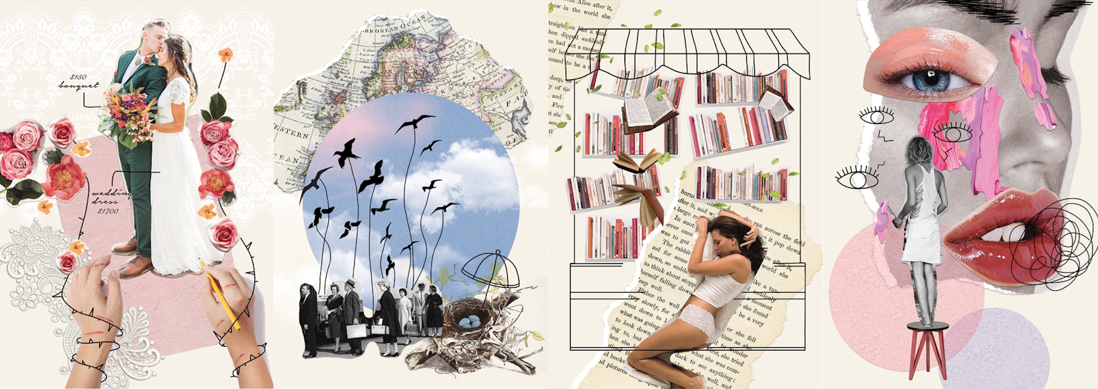
I took on a different approach to address the issue of society’s preconception on various occupations. I refined my idea and looked into individual occupation instead of two. In my latter artworks, I would discuss the preconceived ideas that people tend to have when they think of jobs, such as, Makeup Artist, Pilot, Wedding Planner and Bookstore Owner; and the flip side of which that they often fail to see.
CONSIDERATION MADE FOR LETTERFORMS: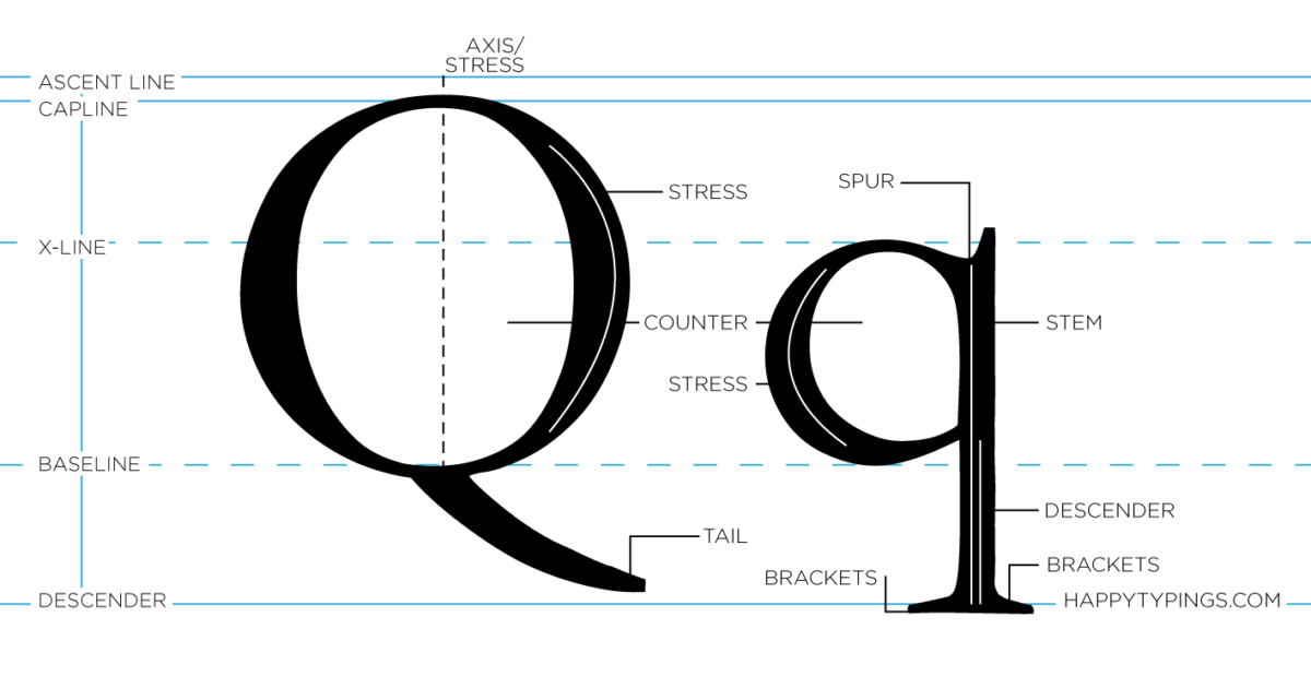
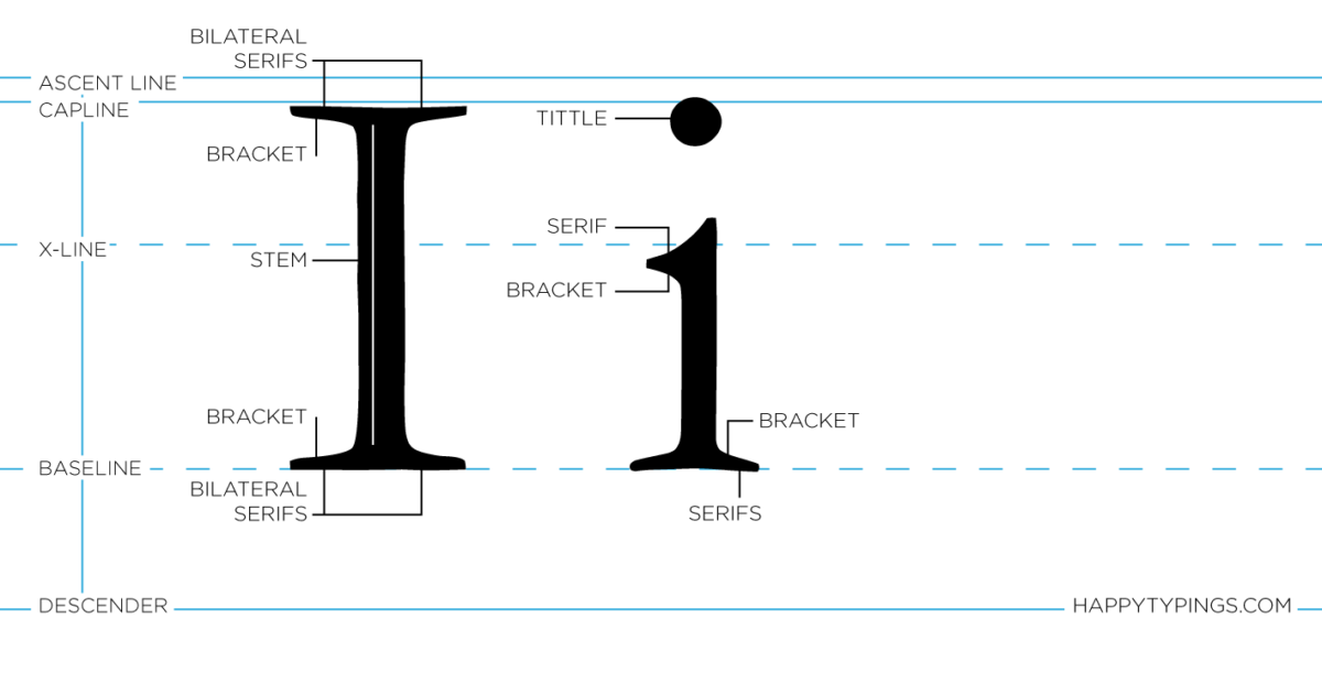
It is undeniable that the uppercase Q has more distinguished characteristics as compared to the lowercase q because of its unique tail that is held perpendicularly to the circle. Therefore, my initial plans were to use uppercase Q in my work. Unfortunately, after experimenting with it, I felt like it looked too rounded and its tail looked too abrupt in the composition.
The lowercase q is more asymmetrical in nature because it has a combination of curves and straight lines. When incorporated in a composition, it looked cohesive.
Uppercase I and lowercase i looks pretty similar in terms of its linearity and rectangular form. The only difference between the two is that the lowercase i have a gap and a circle at its top.
EXPERIMENTING…
Geometric Sans Serif: Wedding Planner
Geometric Sans Serif does not fit the vibe of the occupation, it looks too rigid and boring. The qi looks like number 91.

Script type: Wedding Planner
I created a cursive letterform to imitate the script type often seen in wedding.
FINAL WORK
In my final work, I decided to add in doodles to my collage compositions because I thought that them will give my artwork more dimension and energy.
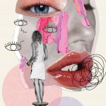
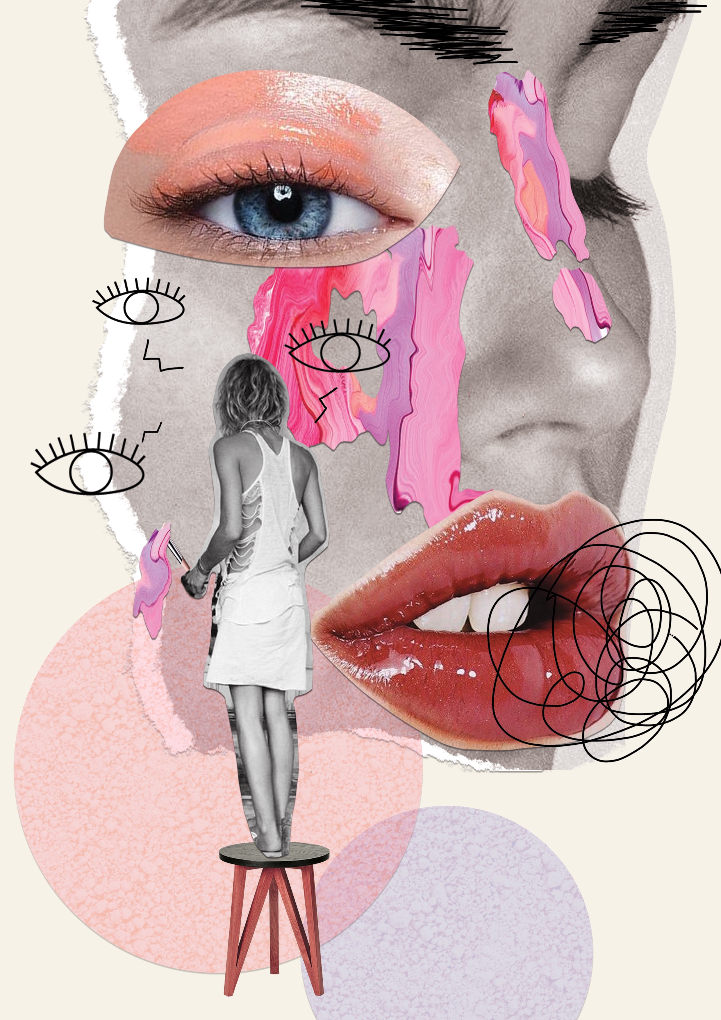
I incorporated my letterform in the smear of paint because I felt like makeup artists add colours to people’s life (LITERALLY). They make people look beautiful and feel more confident about themselves. In this case, the client’s face is the artist’s canvas where she can compose her masterpiece.
WHAT PEOPLE DO NOT SEE,
Makeup artists often have to work with models and celebrities and these clients can be difficult to deal with. To depict that, I illustrated a pair of angry eyebrows on the client’s face and an angry speech bubble. I also drew eyes around the artist to show that the makeup artists are always working under a lot of pressure and also to depict how the clients are always checking the artist’s work even before the artist is done with the whole makeup.
The curvature of the letter q was greatly reduced in this composition to mimic the flow of the paint as it drips downwards. The letter i was also inverted to mimic the top-heavy nature of dripping paint.
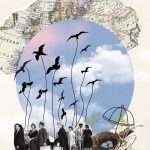
For this occupation, I incorporated my letterform in the flock of birds because I felt that birds are rather similar to a pilot. They get a lot of freedom, they are not restrained by boundaries and they get to travel a lot.
WHAT PEOPLE DO NOT SEE,
Pilots are always very far from home. Their job is very dangerous as they have to spend long hours in flight and high altitude. In the composition, the birds are depicted as pilots. They are flying away from their nest to transport passengers across borders. In the letterform q, where the left rounded side curve inwards, there are birds trying to fly back to their nest but their wings are severed. This shows that no matter how much the pilots want to go home, they can’t due to their job obligations.
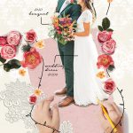
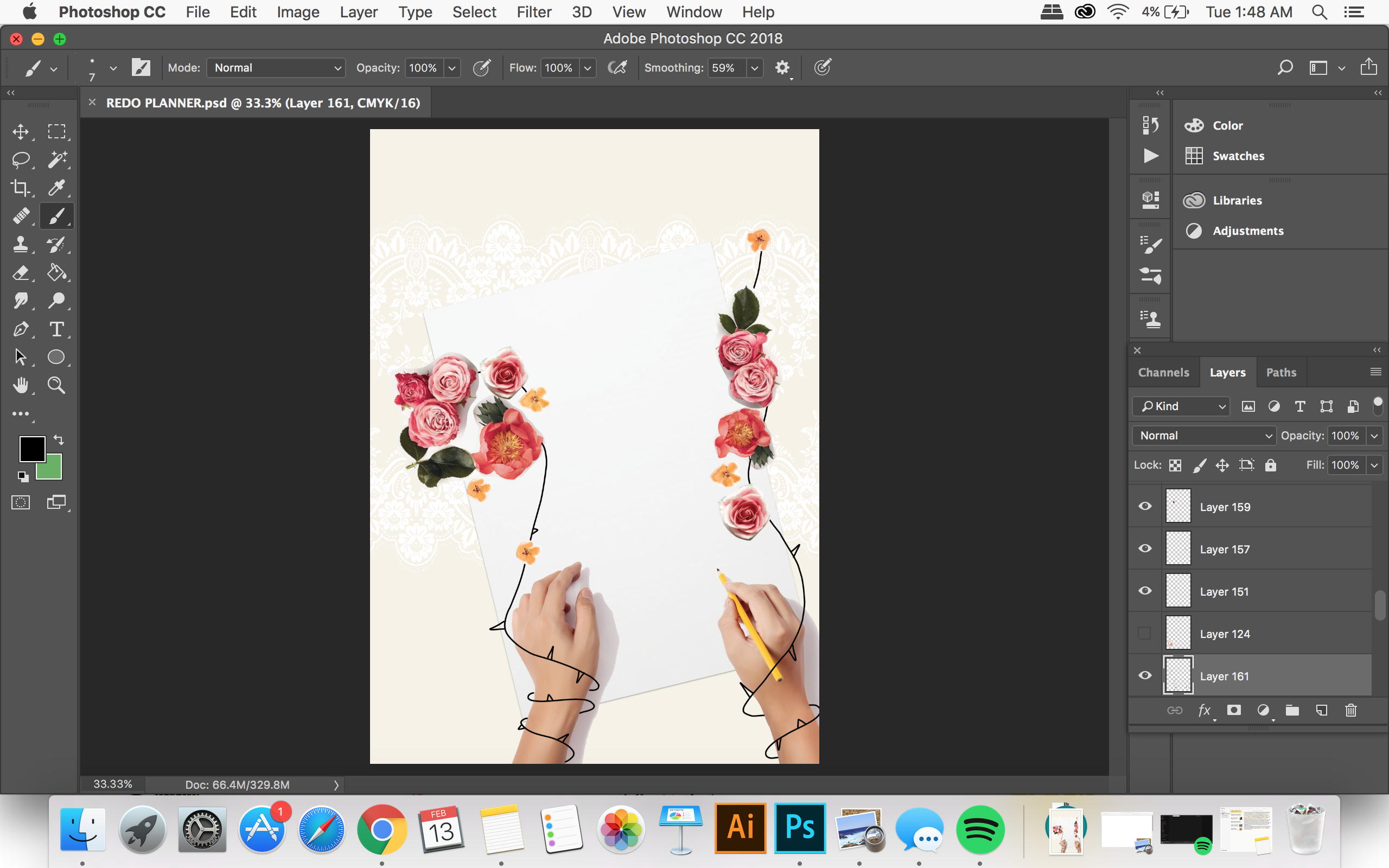
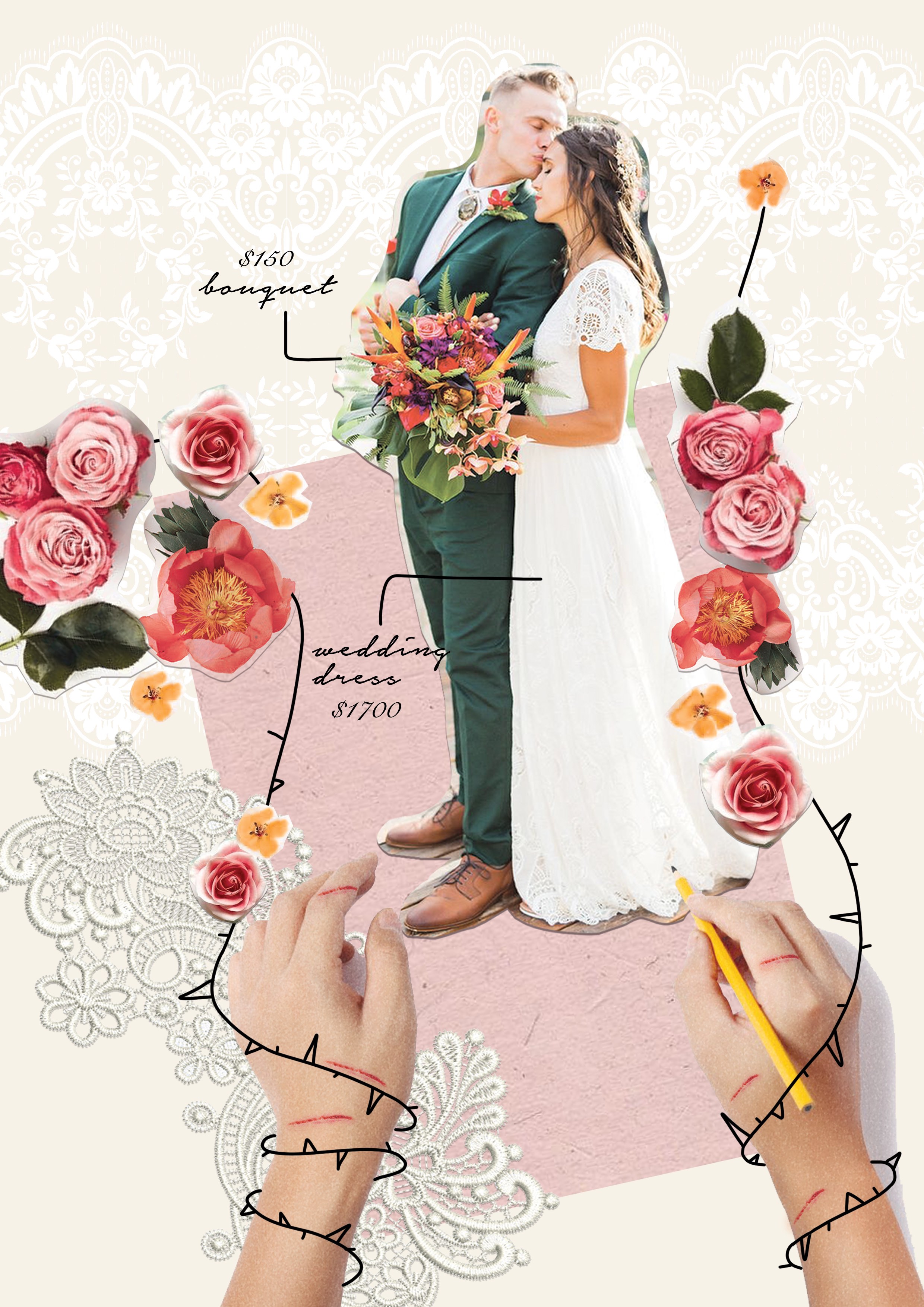
For this occupation, I incorporated my letterform in the arrangement of flowers because I felt that a wedding planner is all about arranging and organising all aspects of the wedding. Through their efforts, they are able to fulfil a couple’s dream wedding.
WHAT PEOPLE DO NOT SEE,
In the composition, there are flower vines wrapping around the wedding planner’s arm, restricting her movements. The thorns on the vines are giving her cuts. This shows that a wedding planner does not have much creative freedom when it comes to the actual planning of the wedding, many decisions are made based on the client’s preference, no matter how absurd.
For the letterform, I arranged the flowers so that it forms a more cursive type to imitate the script lettering often seen in weddings.
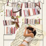
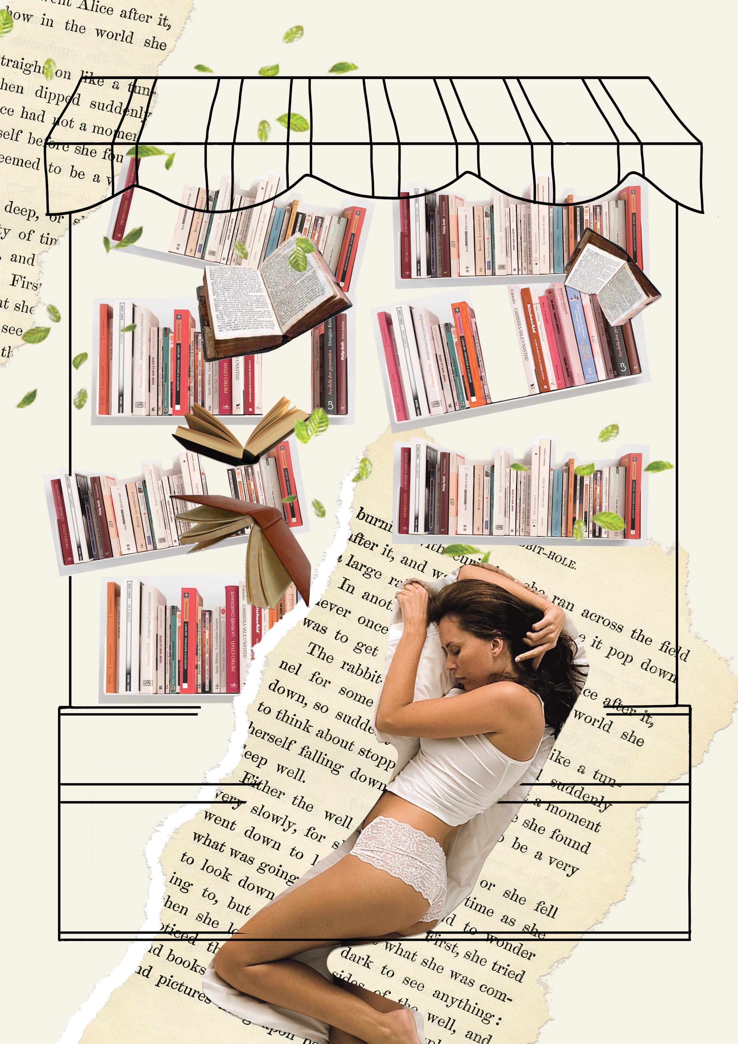
Opening a bookstore is a dream for avid readers and collectors. I wanted to depict a bookstore owner that feels very comforted by the presence of books. Therefore, I depicted a girl sleeping peacefully in a bookstore, the position in which the girl is sleeping forms the letter q.
WHAT PEOPLE DO NOT SEE,
Sadly, there had been an increase trend in reading e-books instead of physical books, leading to a drop in book sales. In the composition, it depicts the bookstore in a state of destruction. The bookshelves are collapsing and in the fall of books, forms letter i.
CHALLENGES AND LEARNING POINT
I think one of the main challenges I faced in this project was to deliver my message clearly to the audience. Sometimes, I get too caught up with the images and the composition that I neglected the intended message. I also struggled to incorporate the letterform because I didn’t know where to fit it in the arrays of images. My concept and message could have been better executed in my letterform.
BUT WELL, I LEARNT MY LESSON. I’M GLAD ITS OVER!
