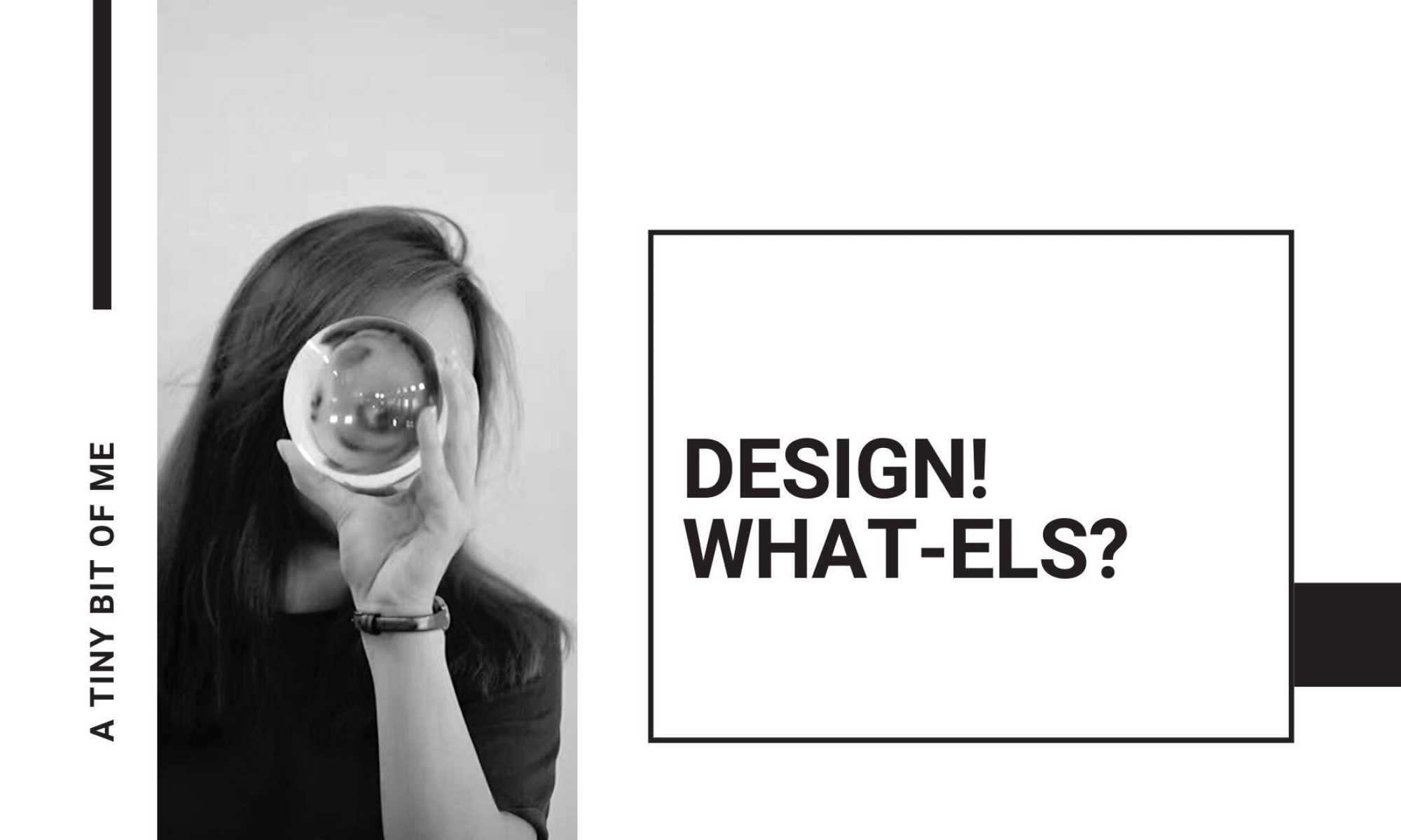
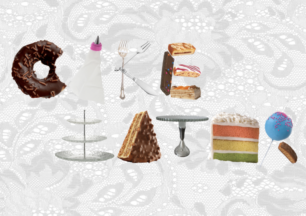
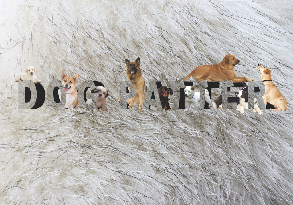
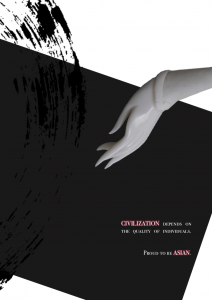
Image making through type.

This is a project on typography. To convey 4 ideal jobs using type's shape and characteristics, specifically, type related to name only.

Click HERE to view.
LOCALE l:
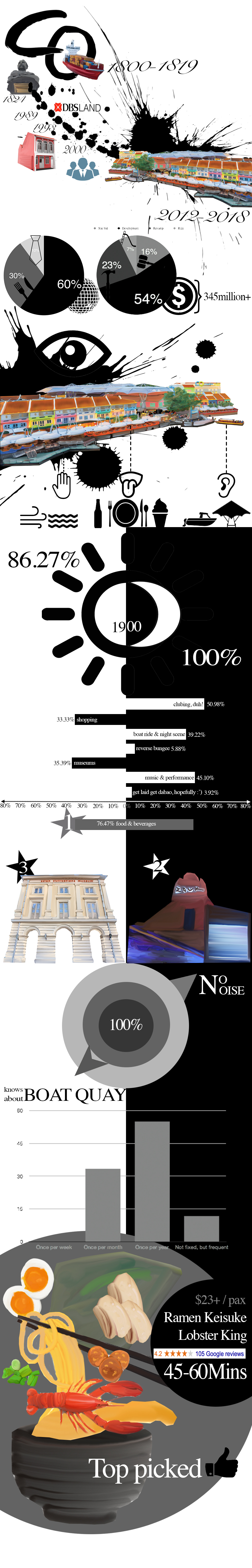
This is my infographic design on Clark Quay which includes the research, primary/secondary datas, as well as quantitative / qualitative datas.
Click HERE to view.
LOCALE ll:
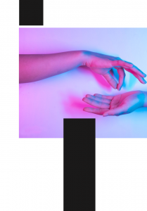
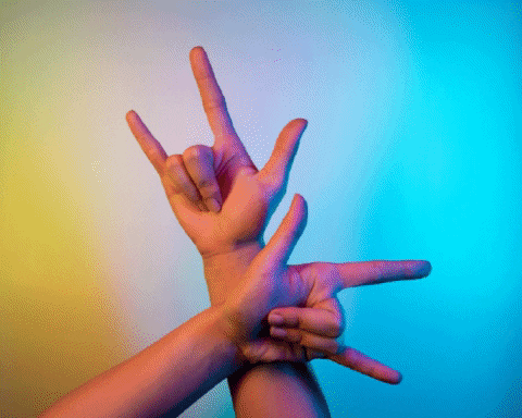
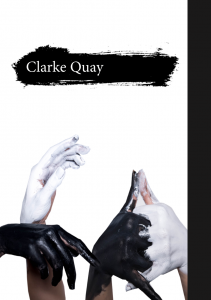
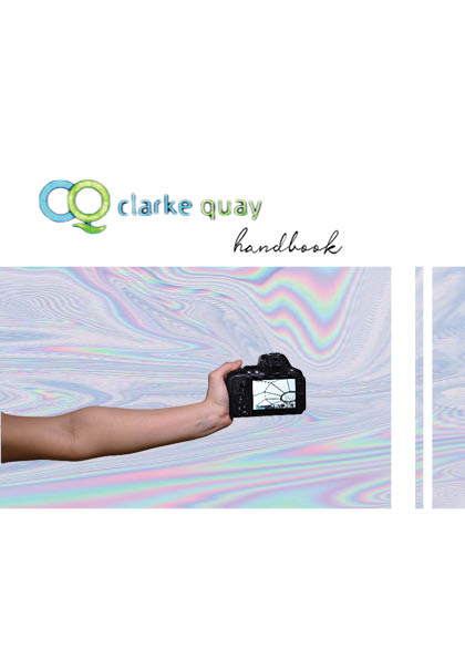
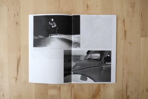
This is my 8 page zine on Clarke quay.
Minimalistic, using hand as the central theme; utilising negative spaces and blocks of image to portray clark quay in a different light.
Click HERE to view.
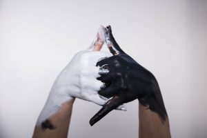
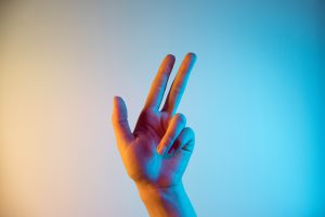
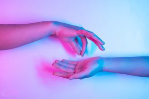
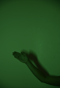
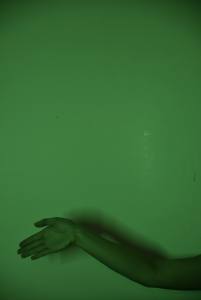
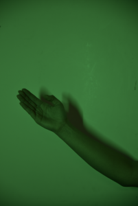
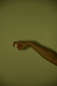
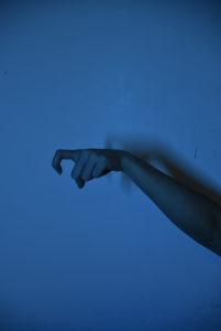
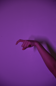
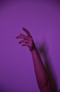
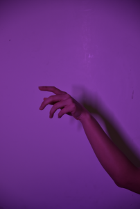
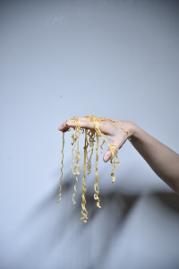
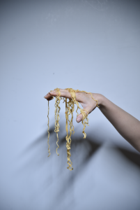
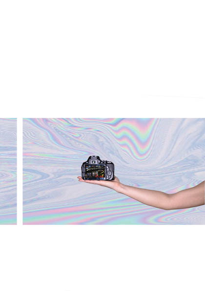
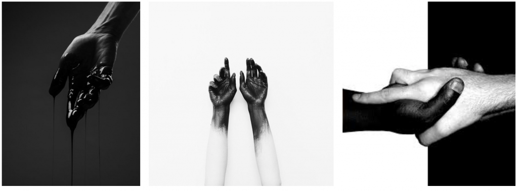
These are the raw images of my hands before manipulation. (For more photos on Clarke Quay,refer to LOCALE I.)
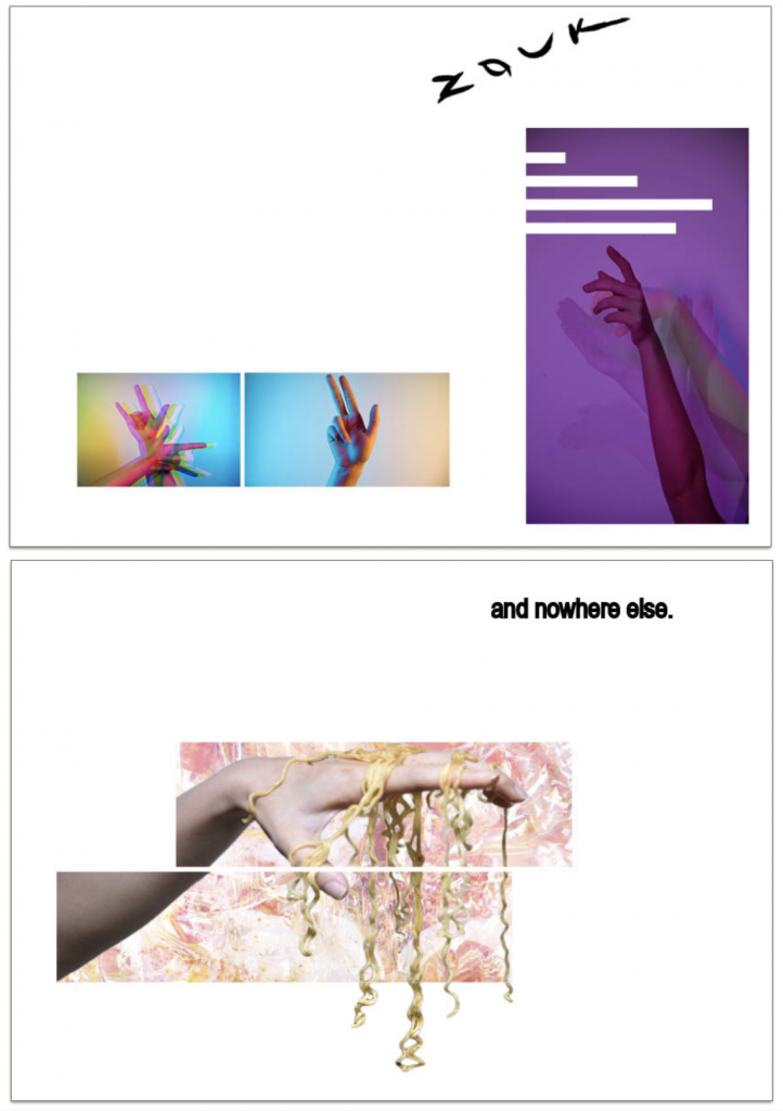
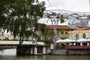
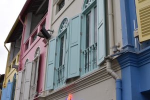
The location for my zine is Clarke Quay.
In this zine I will portray the uniqueness of CQ through the theme of hands, with my interpretations of the activities I experienced there. The entire zine will take on a minimalistic style, utilising negative spaces and photographs in bold squares as the design language. Many features of CQ included squares, such as shophouses, ZOUK, mall front and logos designs. According to my research for LOCALE I, the top 3 activities I should try out at CQ are:
1. Clubbing (nighttime)
2.Food – Lobster Ramen (all-day)
3. Museum (daytime)
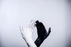
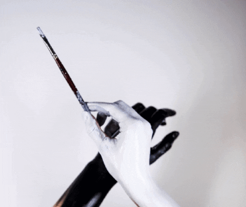
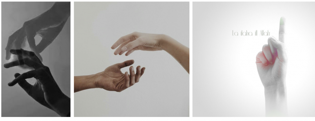
First spread:
initial
Final
Concept:
First spread shall be on museum. I painted my hands black and white because monochrome best portray the day vs. night aspect of CQ. Monochrome also depicts the stark distinction between the traditional and the contemporary art installations I observed in CQ. Hence, I wanted the 2 pages to look oddly different.
Outcome:
For the left page I blended the sharp corners of Asian Civilisation Museum with my painted hands and Buddha’s mudra. Orange tint gives a vintage feel to the museum page, while blending the holographic art installations at CQ produce a vibrant page. The overlapping border is not blended to show clashing.
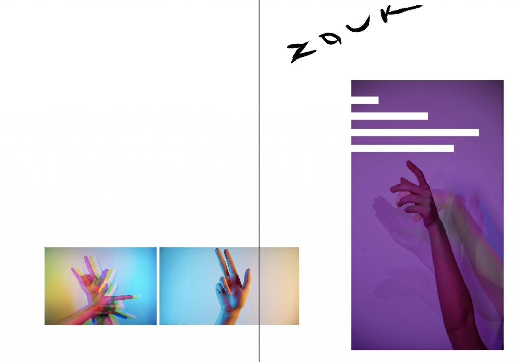
Second spread:
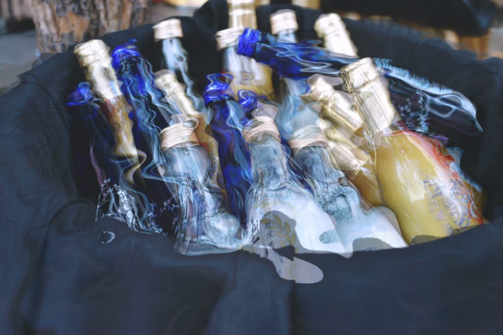
Tutorial on split colour glitch that has helped me in creating this drunk effect with Photoshop.
Tutorial on motion blur that has helped me in creating the false multiple exposure effect.
Final
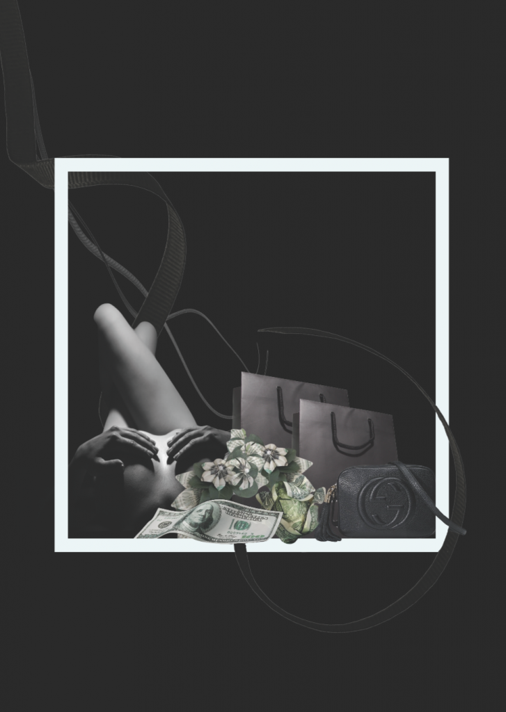
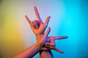
Concept:
I use neon lights and hand gestures to depict the entertainment aspect of CQ, including clubbing, music and consumer expenditure. Neon lights were in the play because of the vibrant lights I observed in CQ during nighttime, and dynamic colours best portray those kind of activities youngsters and myself enjoyed there.
However, I feel that my previous set of photos cannot fully bring out my own take. After considering the uniqueness of the location from my point of view and suggestions given by the people around me, clubs at CQ are popular because most of their friends “jio” them there. Since youngsters seldom club alone, CQ became the most common place to club as more people join and get to know about this location.
Outcome:
Glitch effect to show drunkness on left page because cheap alcohol is a unique feature of CQ. Motion blur allow me to show the hand movements when I was clubbing. The hand gestures used literally translates to ‘friend’, ‘go’, ‘there’. The 4 negative spaces depicts my experience there with 3 other fiends as each of us were at different levels of ‘high’.
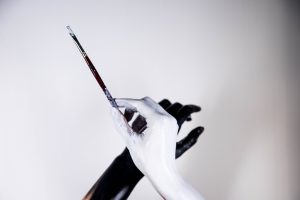
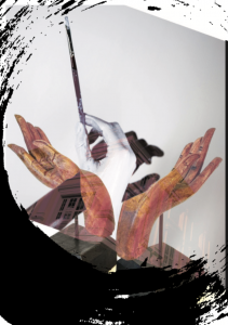
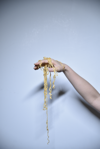
Third spread:
Final
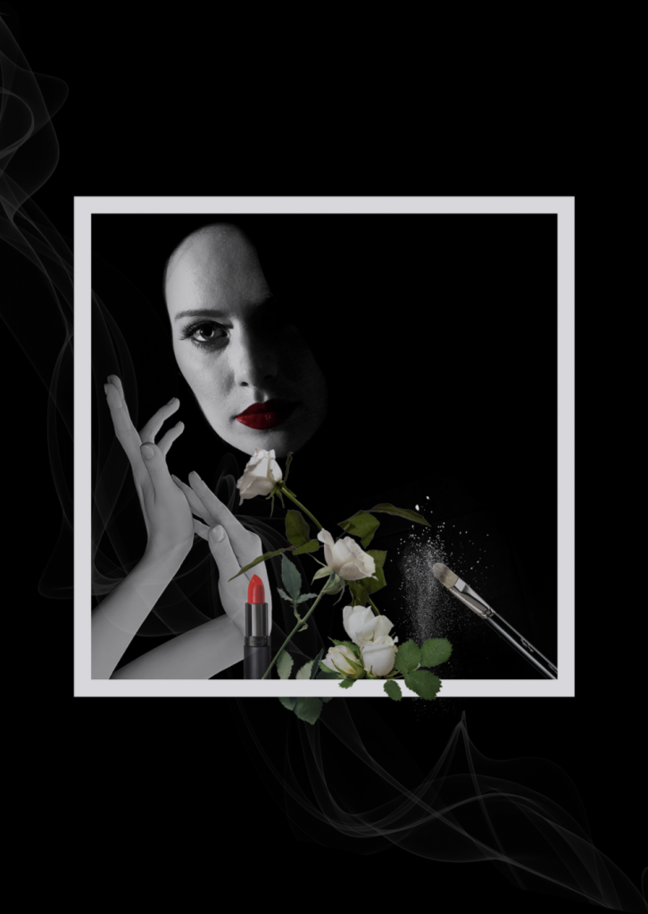
Concept:
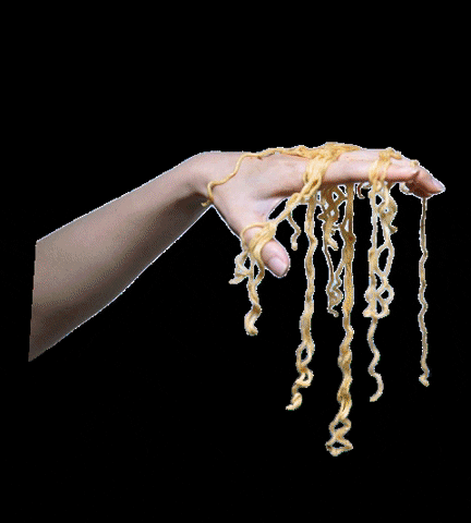
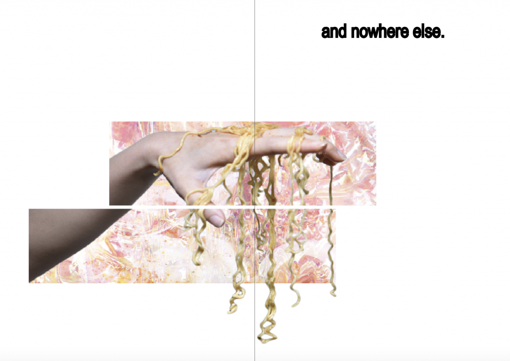
Favourite food enjoyed at CQ is Keisuke lobster ramen. It is indeed popular as the queue was long. After trying it with my friends, all of us felt that the taste was overrated. Hence I position my hand with ramen like a puppeteer to depict that the shop owner might have manipulated the consumer to lure in business with the fact that this is the ONLY lobster ramen in Singapore, and as an unique selling point at CQ, it is suppose to be really good?
Outcome:
The ramen on hand was really difficult to extract into png due to the noodle strands but this turn out to be my favourite spread. I blended the lobster ramen with holographic texture as for the background. Then I cropped the image into 3 sections. The font ‘and nowhere else’ shows that this ramen is unique to CQ because this is the only one in Singapore.
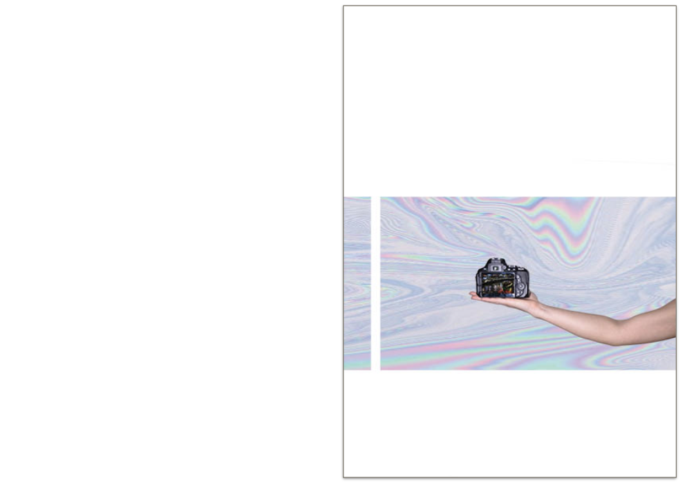
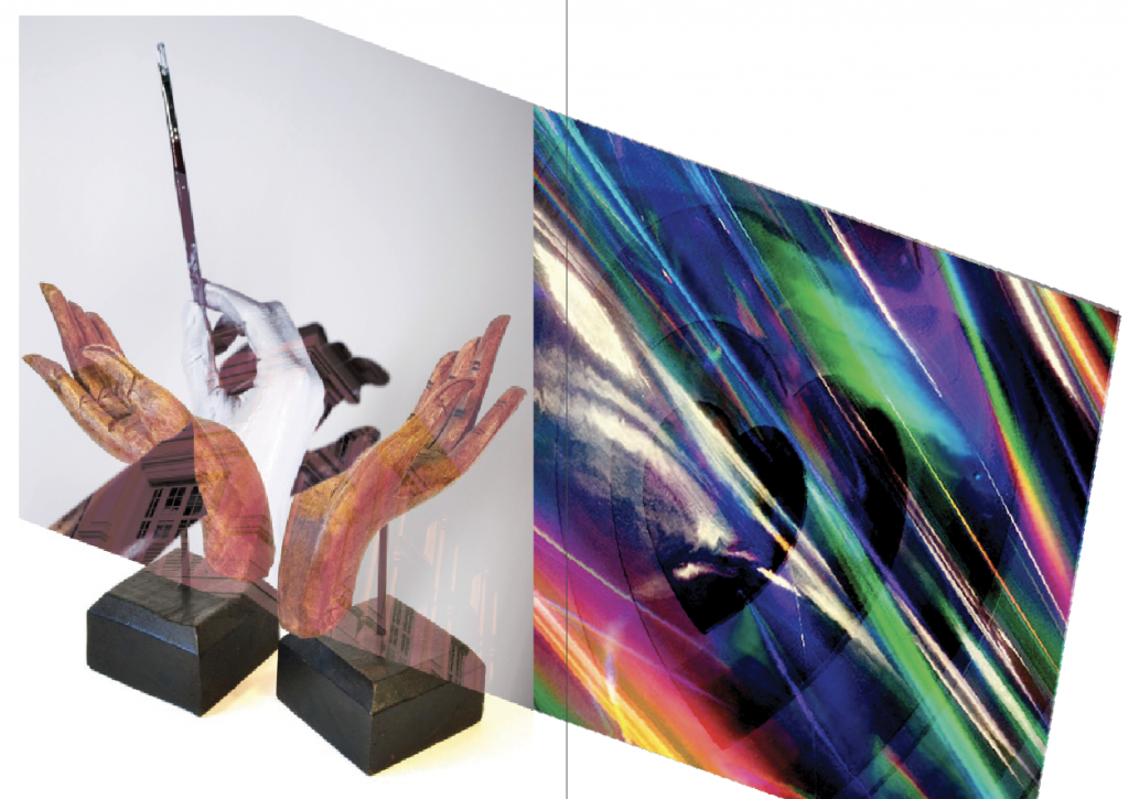
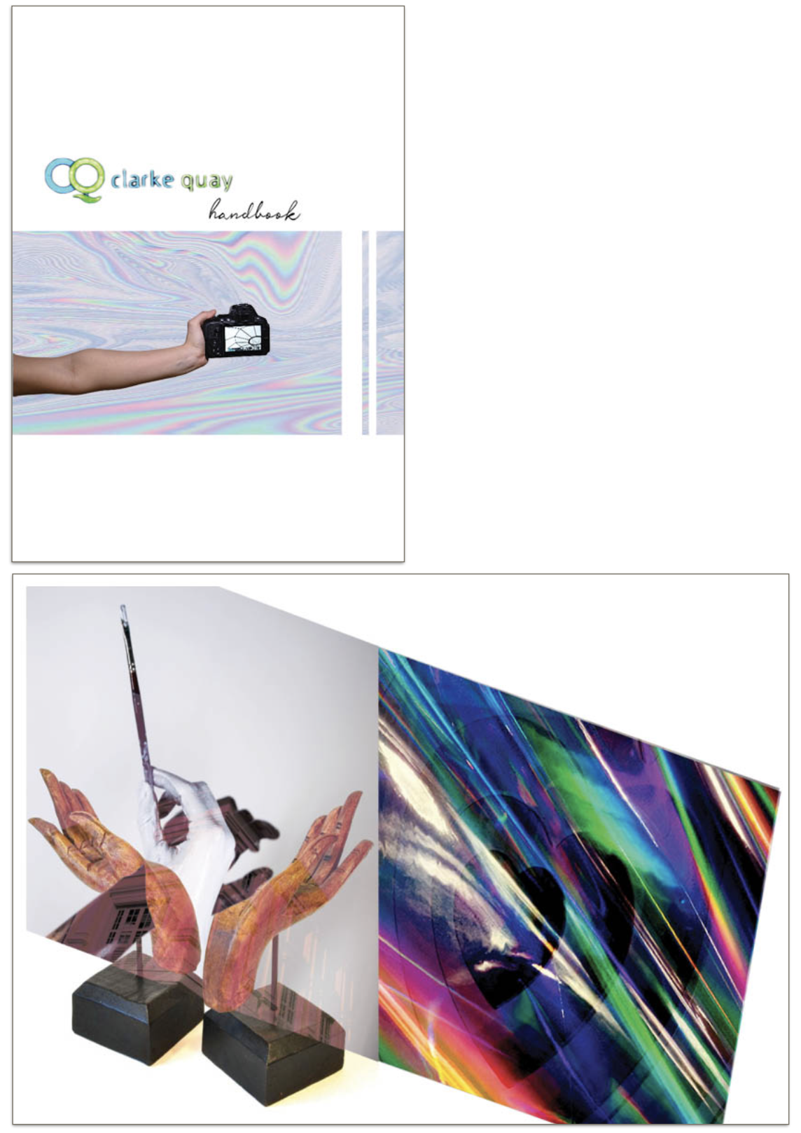
Coverpage & backpage
initial
Final coverpage
Final backpage
Concept:
Initially I wanted the covers to be funky and look like jotter book because handbook = guidebook? I really like the title because ‘Handbook‘ is a pun, it’s suppose to be a guide to what to enjoy in CQ but also literally a book of hands. However it does not blend well with the rest of the pages, so I changed the style completely.
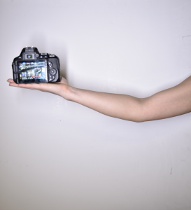
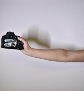
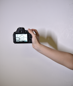
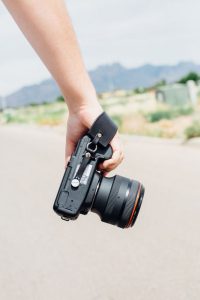
I explored CQ with my camera, and the bulk of the contend is photography. Hence I thought it would be interesting to include me actually taking the camera. The photos in camera shows unique features of CQ, one taken during daytime and one taken during nighttime. ‘Clarke Quay‘ font was taken from the site’s mall because I thought neon green and blue colour actually fits into the holographic colour scheme. Showing partial identity of the curator perhaps also arouse reader’s interest to find out more about what I have to say about CQ.
Outcome:
Sophisticated covers will not fit into my minimalistic outlook for this zine. Even though the covers are simple, a lot of thoughts were put into them.
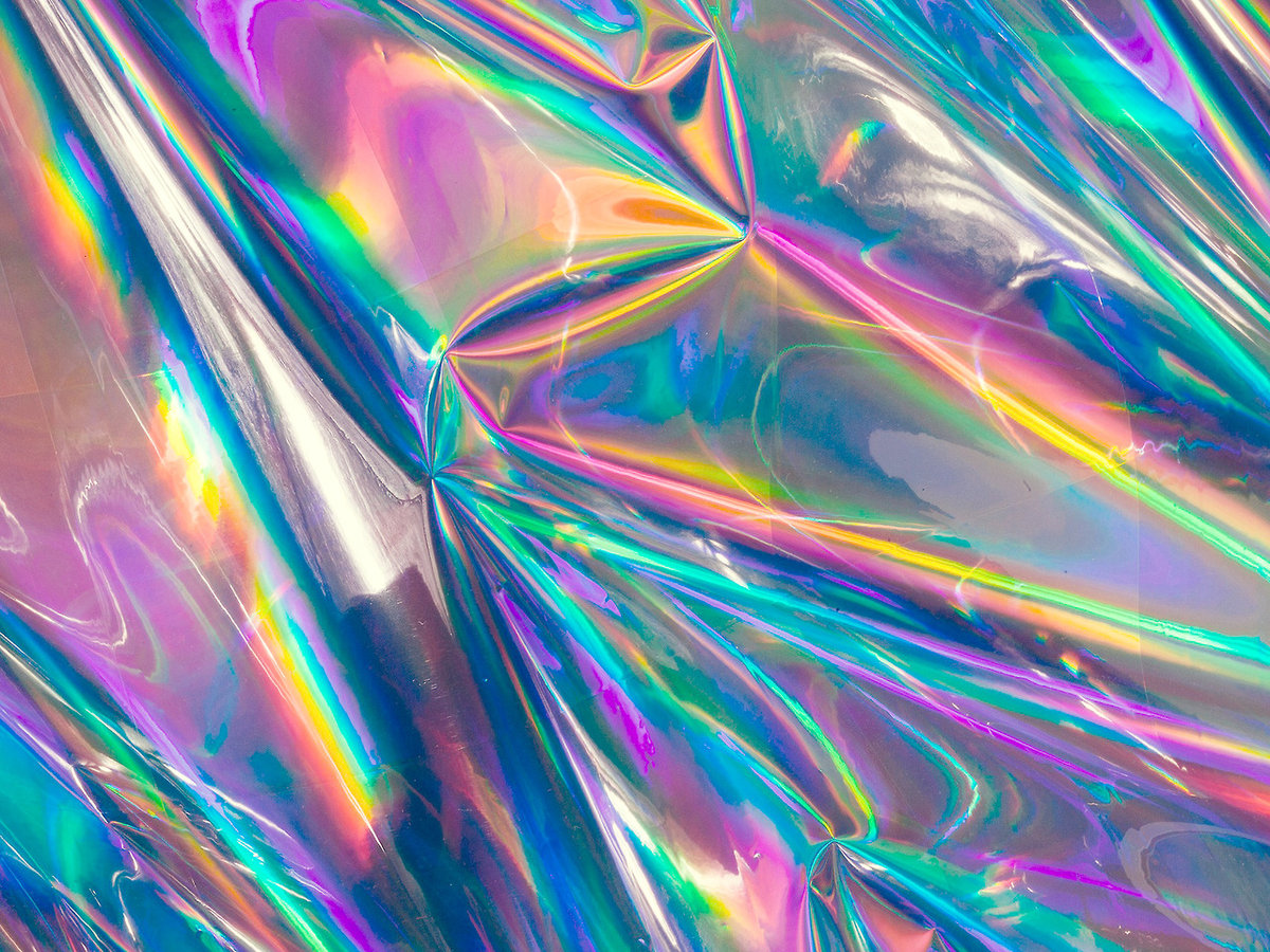
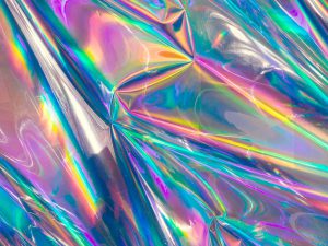
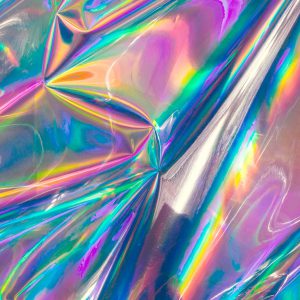
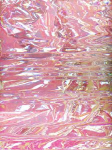
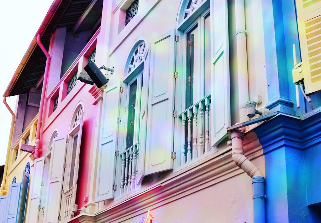
These holographic textures are inspired by the art installation I saw at CQ, on top of the kind of dynamic, lit, vibrant, overall feeling I want to portray.
Equipement
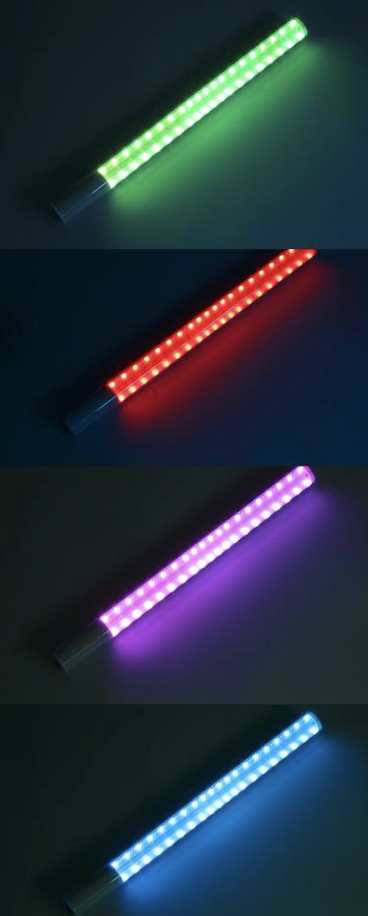
YongNuo YN360
‘Lightsaber‘ that I’ve used to produce the neon lights. Just a single stick, with RGB colour control system to give me any colour I want. (colour theory in practice omg). Sometime I place 2 sticks side by side to give a remix of colours.
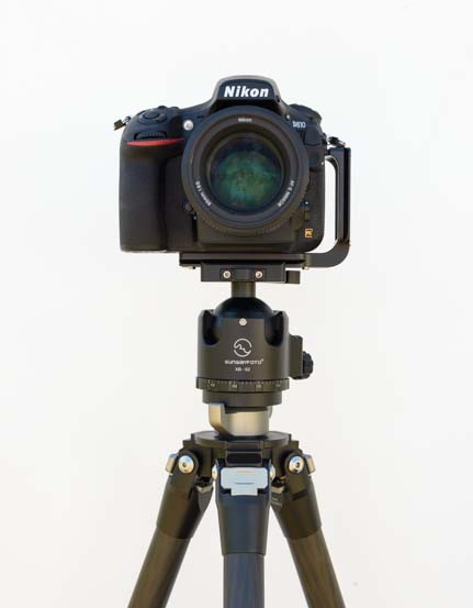
Nikon D870
Nikon D870 with tripod to stabilise and DIY white backdrop; a large white board against the wall.
FINAL zine
Video of the printed zine:
The printing and stitching went really well for first try. :’) The colours came out vibrant and almost 1 to 1 as my screen.
Tutorial on basic document set up and techniques for Indesign.
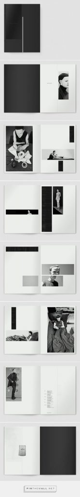
I really like minimalistic designs. Many features in these zine were used in my own zine such as ‘crossing pages’ and blocks of image with minimal words.
Primary: original, first hand data collected by myself
Secondary: data collected for research purpose, can be by self or others
Qualitative: data which cannot be quantified or measure eg. descriptions, five senses
Quantitative: data which can be quantified or measured eg. statistics, number, charts
Categorising my data
Primary research
Mindmapping my research formats
Photo record (sees):
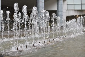
Asian civilisation museumRiverside pointModern settingCQ centralWall decorationWater foundationWater foundationStairs along Singapore riverShophouses over viewStairsBoatBar tableRoadside WALL’s ice-creamWall decorationFrontline shophouseChinese restaurant in CQLandmark shelterArt installationArt installationWall decorationRestaurant logoCQ landmark logoHistorical photographsTurkish ice-creamBar chairsAlcohol displayBarTable graffitiShophousesAlcohol displayRoof decorationBar wall decorationClub informationBar wall decorationFast food restaurantJapanese restaurant interiorReverse BungeeBoat and Singapore river at nightBridgeWineries along the riverLights along the bridgeLights along the bridgeChinese hotpot restaurant exteriorBarTurkish ice-cream at nightRiver cruise information and ticketing counterReverse bungee close upReverse bungeeZoukRoof decorationRiver cruise at nightCQ centralStreet/ bridgeYoungsters exchanging numbersHootersBlurry lightPlant decorationTurkish ice-cream maker
Row of restaurants
Descriptions(feels / taste / smells):
Turkish ice-cream
Tried the prominent Turkish ice-cream. I ordered durian flavour which tasted pretty average for $6.80, and the smell of durian is too mild for my liking, but the process is fun! The maker will play tricks with you, and she’s really fast. Quite embarrassing as passer-by pause to watch and tourist started taking pictures of me…
Hokkaido Ice-cream
I think Singaporeans generally love Matcha-anything! Tried their single cone matcha flavour for $4.30, and I would say it is as delicious and authentic as any other matcha soft serve in Singapore like Maccha House and Sunday Folks. My favourite is still Tsujiri Tea House because they add interesting toppings such as rice ball and red bean.
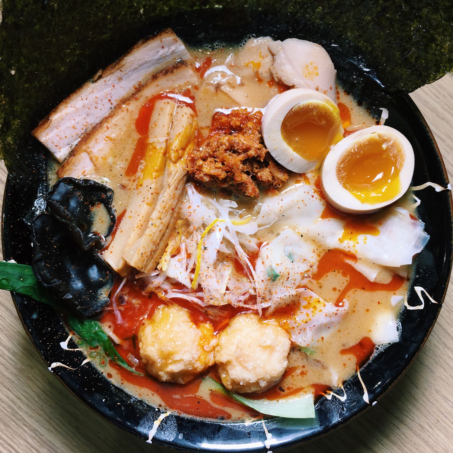
Keisuke Lobster ramen
This is so popular! Waited for almost an hour before I got seats for 3 and it was during non-peak/meal hours. Imagine the queue if we head there during dinner time. Like other Keisuke outlets they offer complementary hard-boiled eggs and seasoned bean sprout for starving customers like us to munch on before our food is ready, which is really thoughtful. The portion is huge and I could not finish mine. Cost me around $23 after GST and service charge, the highest among all the ramen outlets I have tried (which is a lot). I guess it was because of the ingredients that goes into the rich lobster broth. Was quite disappointed to find out their toppings consist of common ingredients such as egg, shoots, spring onion, pork slice, and nothing-lobster. Nonetheless, the meat ball was a interesting twist and it taste great!
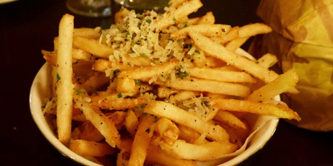
Truffle fries from Shuffle
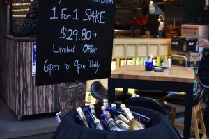
I like Shuffle, especially the ambience. Not too rigid for a chill night, and definitely a rare pub which perform Chinese songs. I heard Jay and JJ Lin’s songs mostly. Tried their truffle fries ($12), red velvet cake ($6.80) and Signature house drink, black currant something-i-cannot-remember. Honestly the food is average, probably because I have high expectation for truffle fries at $12, and the cake was clearly left overnight (or maybe more than one night idk) because it turned hard. The ambient light was too dark for my camera hence this picture is taken from the internet.
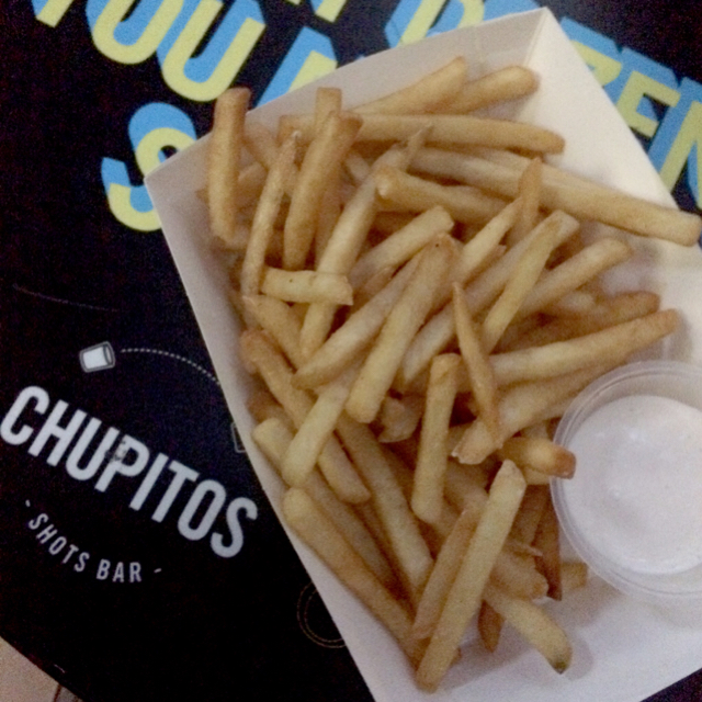
Truffle fries from Chupitos
One of my favourite! I have to say, their truffle fries is by far the most delicious I’ve tried in Singapore because they fry it IN truffle oil instead of sprinkle on top, it tastes and smells divine, even though they’re known for the shots instead. They offer interesting shots such as Milo, Blowjob, and other items on their menu. $1 shots also attracts a crowd of youngsters. I would like my OSS content to be alcohol-free, so I shall not post any pictures for that.
I use edited photos to deliver my thoughts and general feeling towards CQ. It is colourful, vibrant, and romantic. Offer beautiful sceneries at night. Filled with alcohol, cheap love, and activities to enrich Singaporean youngster’s nightlife. Meanwhile, many activities are also available during the daytime such as museum and cafe hopping.
Buildings, courtyards, statues, accosted with Buddhism
Award of Excellence in the 2010 UNESCO Asia-Pacific Heritage Awards for Cultural Heritage
10.The Arts house screening room
75 seats
Daily screening
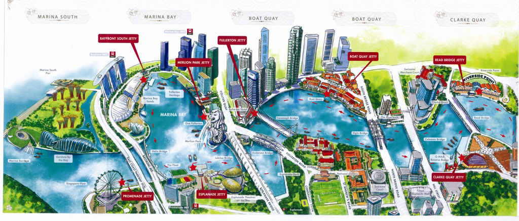
Location map
Difference between CQ and Boat Quay
1.Price at Boat Quay is slightly cheaper than CQ
2.Boat Quay has more restaurants and less clubs compared to CQ
3.Boat Quay is less loud and dynamic
4.Location and history
I was quite surprise to find out from my survey result that 100% of them actually knows about Boat Quay. Okay it is just me being ignorant, I’ve never heard of Boat Quay opps. I was surprise by the fact that residents and tourists who stay in nearby hotel reflected that the noise does not bother them at night.
Final outcome
Concept:
Black and white backdrop to highlight the day and night quality of CQ
Digital painting as medium, using vibrant colour schemes to portray a dynamic CQ
Single sheet infographic format allow me to link all the activities back to CQ as the location
Included both primary and secondary research
Pie charts / bar charts / numbers and percentages for quantitative datas
Images / icons / typography for qualitative datas
Digitally painted icons gallery:
Sir Andrew
I wanted to paint a portrait of him but unfortunately only manage to find b/w photos of him which is ominous to paint. Hence I looked at his statue for reference.
Cargo
I took reference from the photo of a real cargo ship at CQ back during the days. The boxes are painfully difficult to paint.
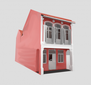
Shophouse
I love the colour scheme of this shophouse. <3
Ramen bowlOnion in ramenSeaweed texture ( Had no idea how to paint seaweed that looks realistic :/ )Bamboo shoot in ramenPork slices
MeatballLobster
Had fun tracing and painting all the ingredients in the lobster ramen. 😀 My favourite is the bamboo shoot because initially it just looks like a brown rectangle block without the details I added in later. I also love eating bamboo shoots, so must make it nice.
CQ scene
This took me whole day to paint. I love the outcome because I was kinda particular about the details, like numerous shophouses and railing along the river because all of these are important elements that help to portray the complete image of CQ.
RESEAERCH & references
For research on Ethnography & Infographics:
Brian A hoey, A simple Introduction to the Practice of Ethnography and Guide to Ethnographic Fieldnotes, June 2014, retrieved from website
Insitu, What is Design Ethography, 2016, retrieved from website
karen O’ Reilly, Key concepts in Ethnography, February 2018, retrieved from website
Unknown author, Why Infographics are Dominating the World, retrieved from website
Randy Krum, Cool Infographics Excerpt, retrieved from website