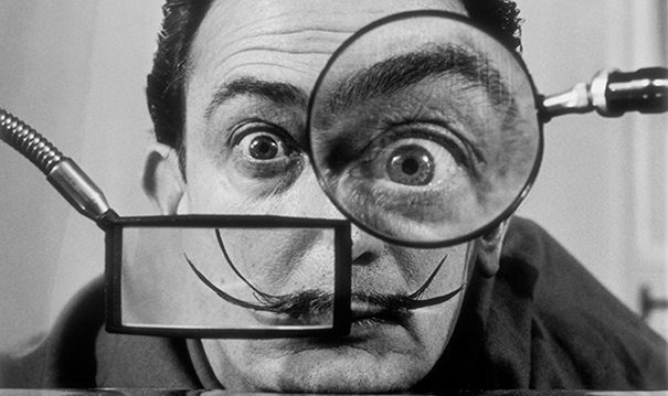
An insane man with gravity-defying whiskers had decided to go public with his artistic nonsense. Definitely not the first, and the best is yet to come.
Nothing stays the same when…
As bold as my name.
An insane man with gravity-defying whiskers had decided to go public with his artistic nonsense. Definitely not the first, and the best is yet to come.
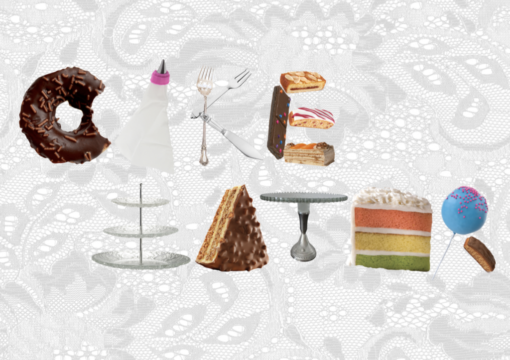
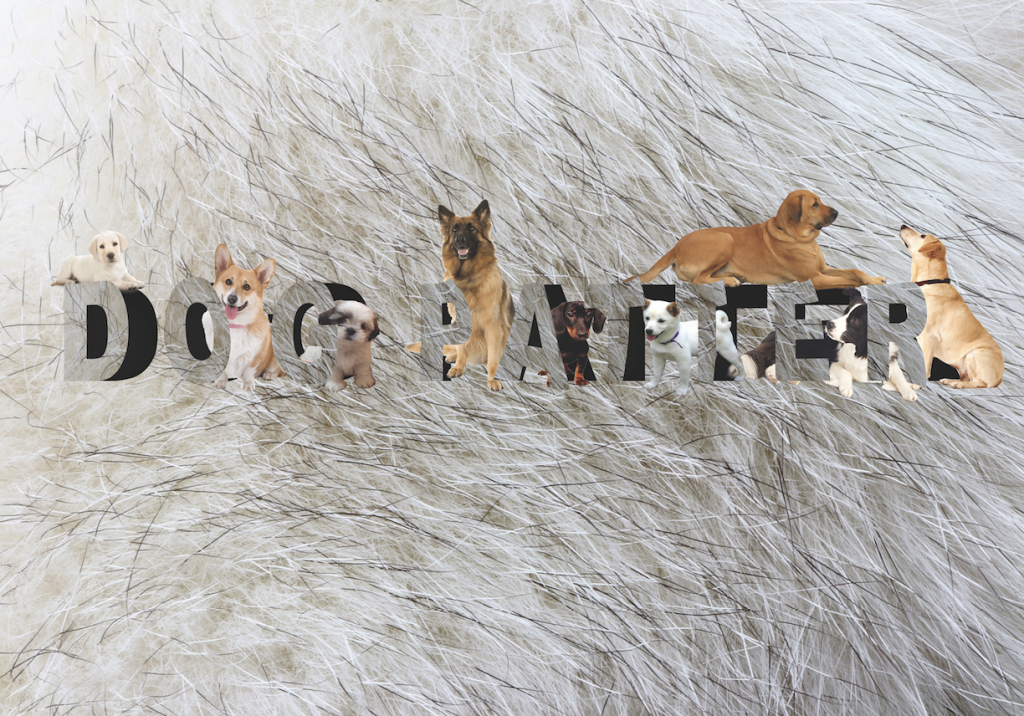
Image making through type.

This is a project on typography. To convey 4 ideal jobs using type's shape and characteristics, specifically, type related to name only.

Click HERE to view.
Click HERE to view.
LOCALE l:

This is my infographic design on Clark Quay which includes the research, primary/secondary datas, as well as quantitative / qualitative datas.

Click HERE to view.
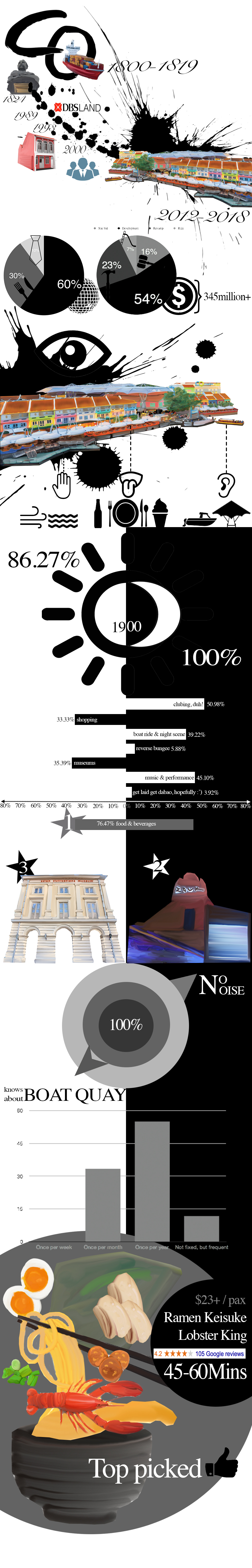
Click HERE to view LOCALE l.
LOCALE ll:

This is my 8 page zine on Clarke quay.

Minimalistic, using hand as the central theme; utilising negative spaces and blocks of image to portray clark quay in a different light.

Click HERE to view.
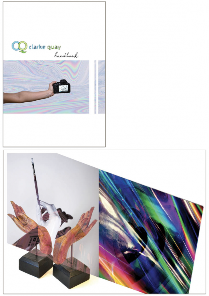
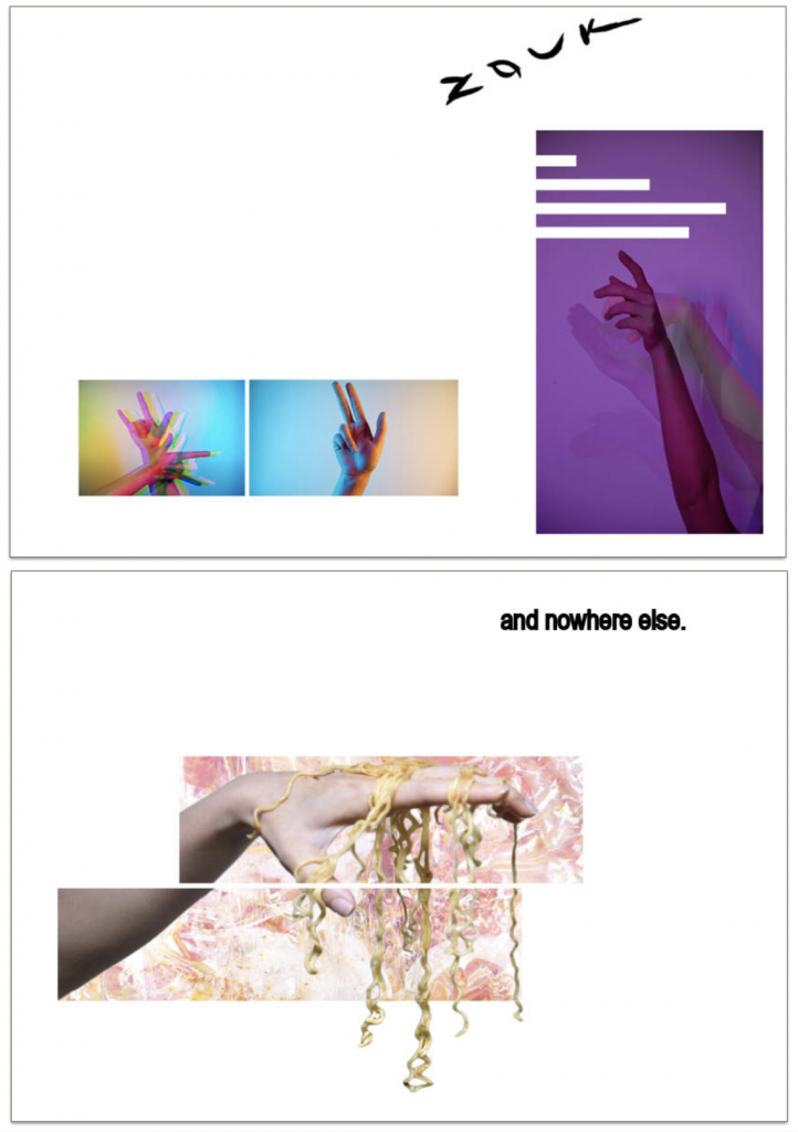
Click HERE to view LOCALE ll.

 Colour scheme: Analogous
properties: serenity, harmony, naturalism, stability, calm, surreal
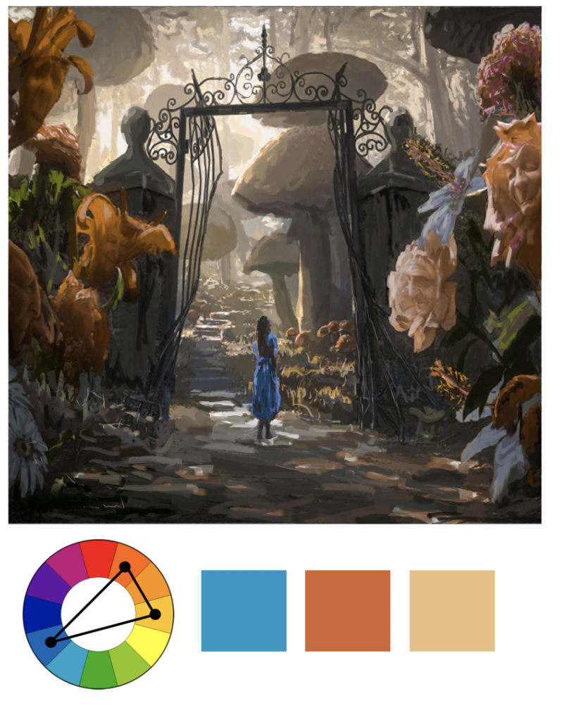
 Colour scheme: Split complementary
properties: visual interest, contrasting, variety, modern
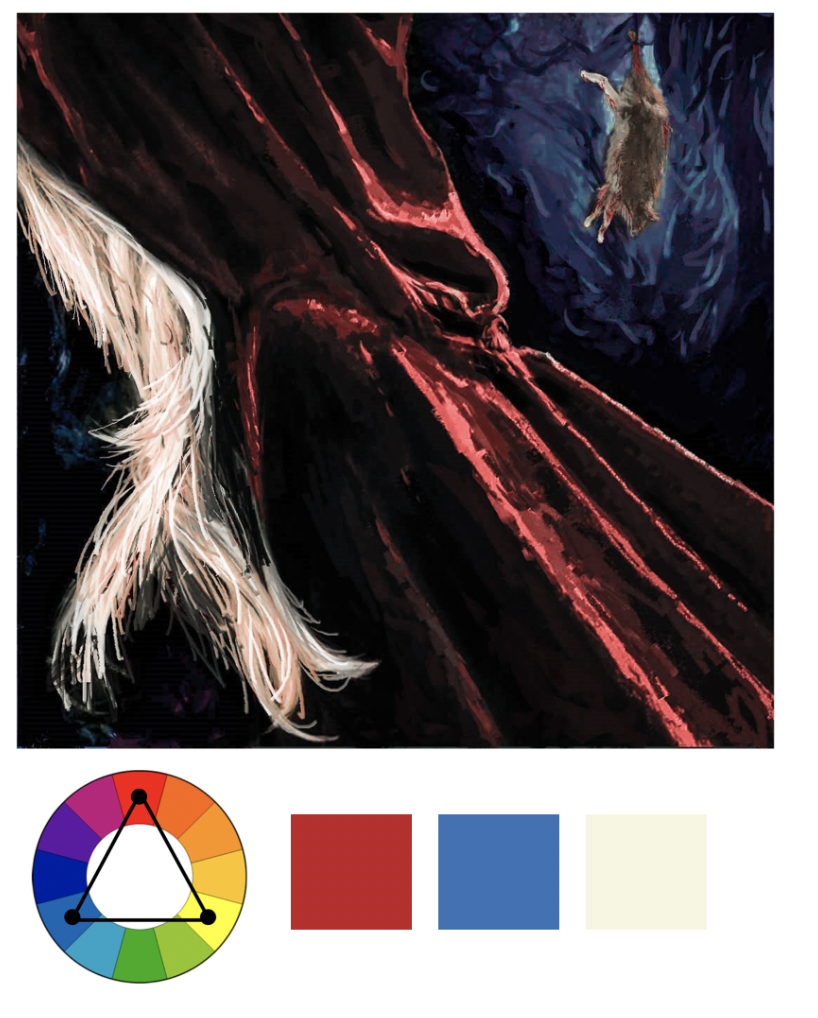
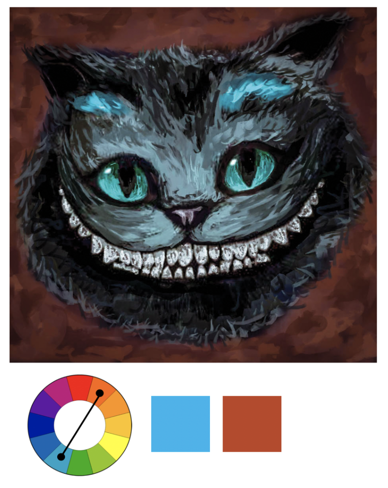
Colour scheme: Triadic
Properties: vivacious, interesting, dynamic, vibrant
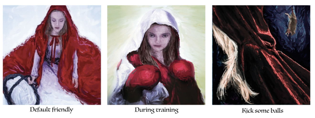
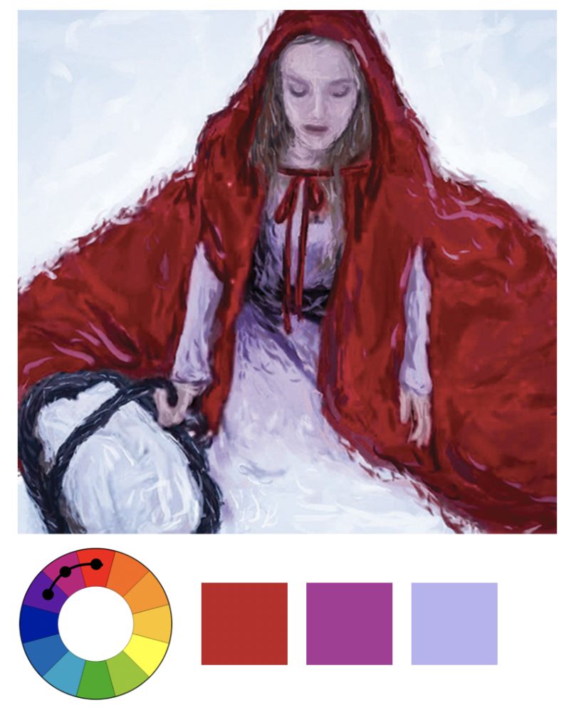
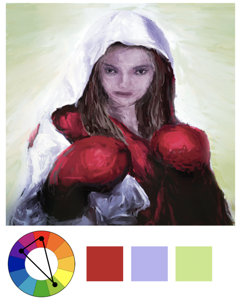
Red runs throughout this row because it is a prefix for Little Red Riding Hood, hence limiting the colour scheme that I can work with. From left to right, the contrast of shade is steep because of the drastic change in personality (friendly vs ferocious). I also like how red can be joyful and dangerous at the same time depending on the context and shades used.
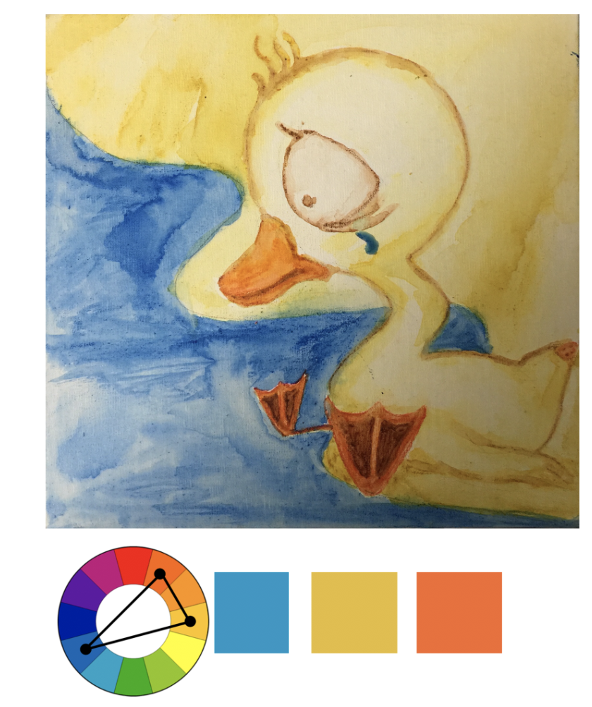
Colour scheme: Split complementary
Properties: visual interest, contrasting, variety, modern
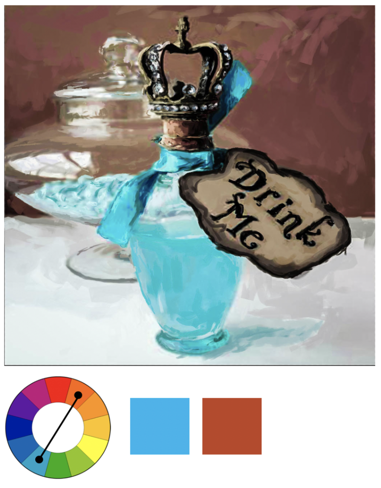
Colour scheme: Complementary
Properties: fully saturated, vibrant, opposing, tension, disturbance, distinction, outstanding
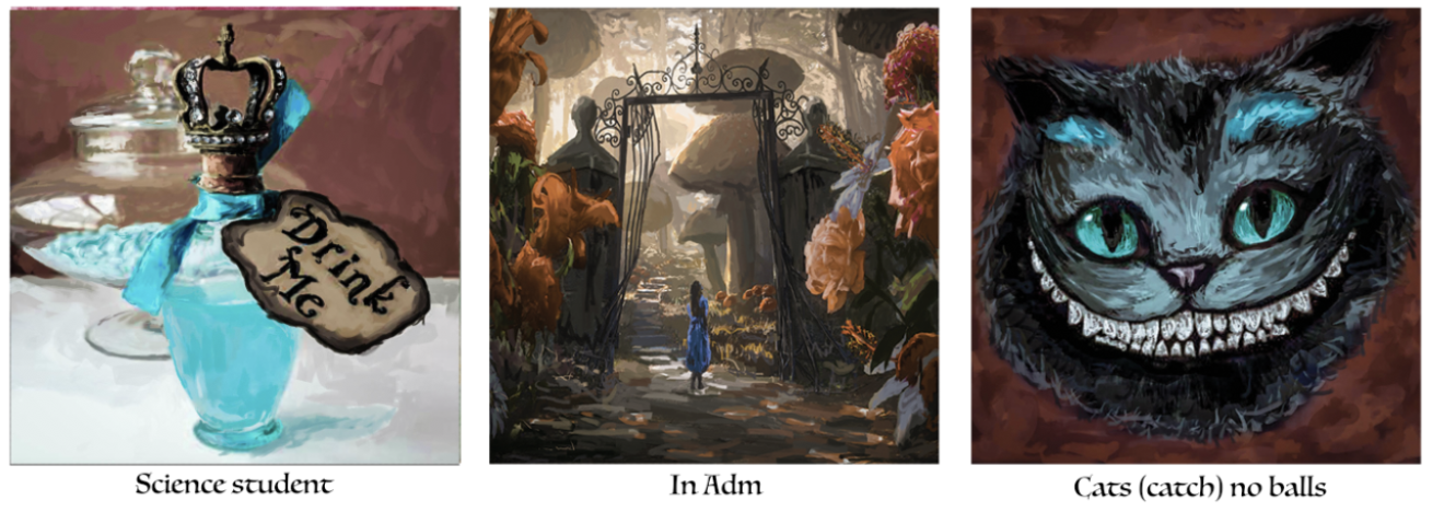
Primary colour scheme in this row would be complementary colours of blue and orange. I use complementary to show the distinct difference between the environment (science vs art school). Also to make objects stand out against the background evidently shown in all 3 compositions. Perhaps also the disturbance when I “catch no balls” in class.
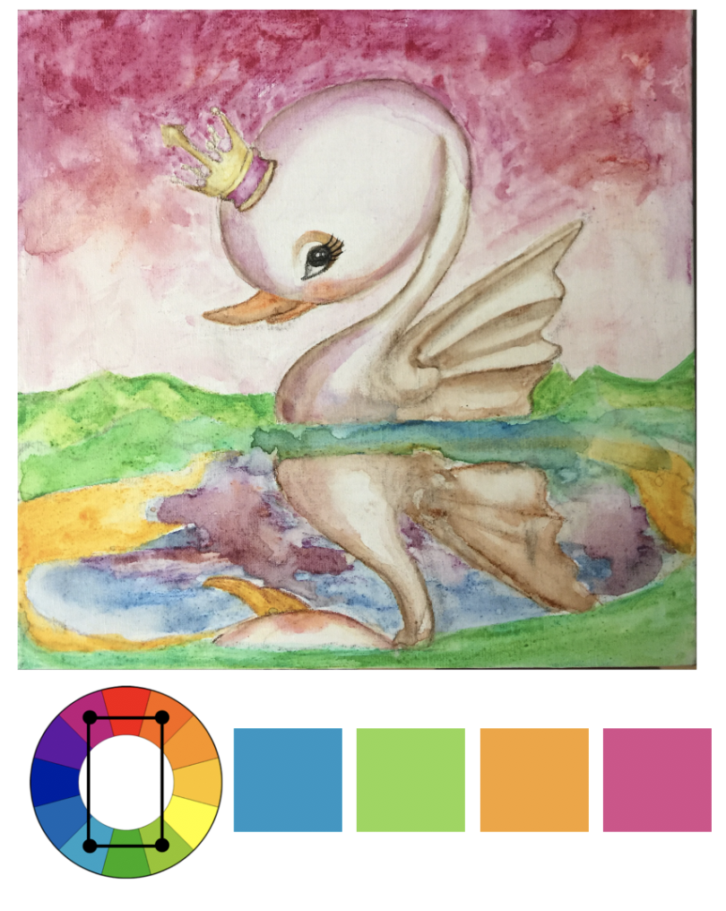
Colour scheme: Tetradic
Properties: balance, possibilities, variety, representational, distinct
Colour scheme: Analogous
properties: serenity, harmony, naturalism, stability, calm, surreal
Colour scheme: Split Complementary
Properties: visual interest, contrasting, variety, modern
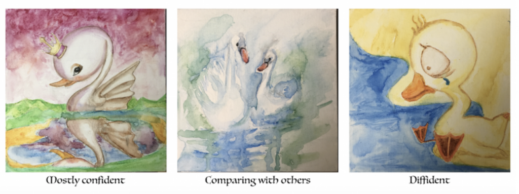
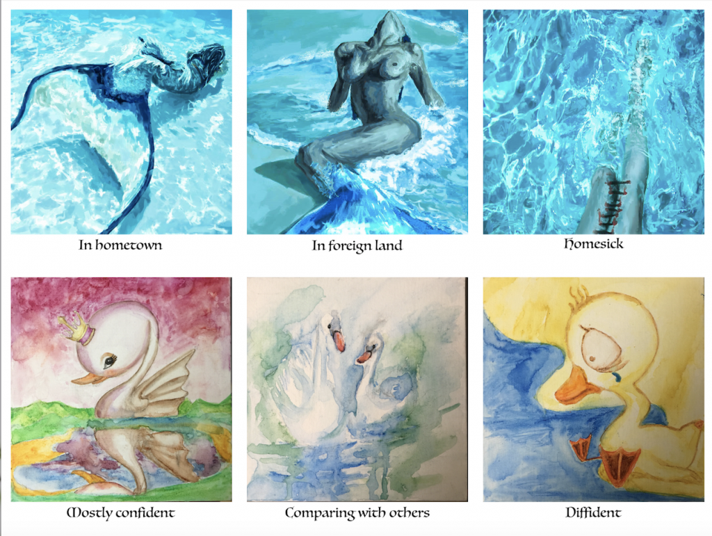
Probably the row with most number of colour schemes adopted. 1st and 3rd composition is vibrant and contrasting, while 2nd world is really light in shades to portray a idealised, perfect “other people”.
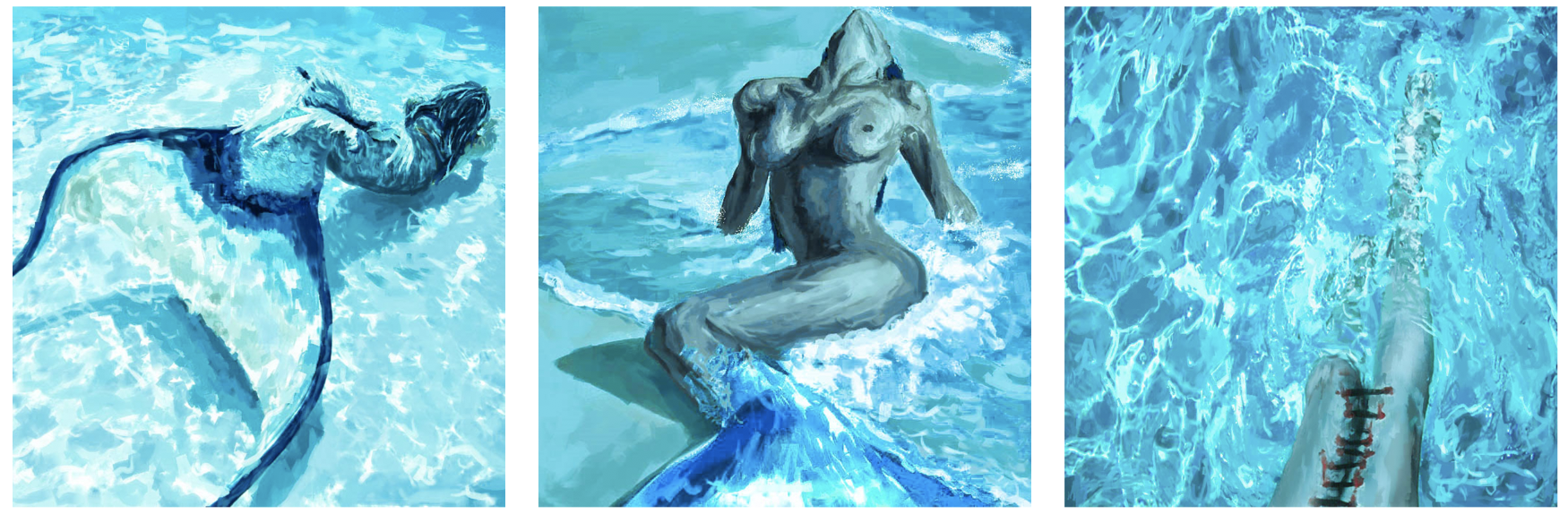

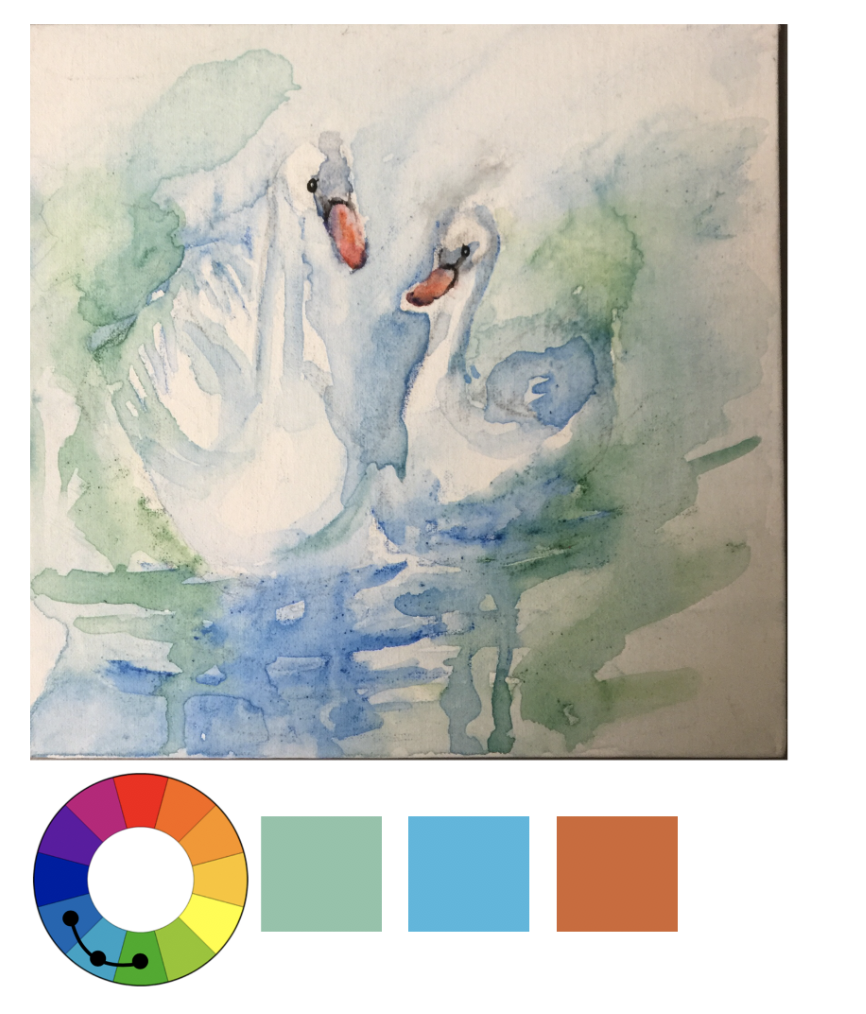
Colour scheme: monochromatic blue
Properties: cohesive, attracts attention, boring, emotional, representational, lack focal point
My favourite row because working with monochromatic colour is always a bold try. I like how blue is both the main colour depicting ocean and depression, relating the composition back to the idea of being “homesick.” It is a negative emotion hence I feel blue is a feasible.

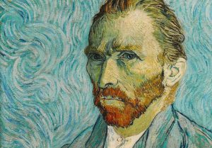
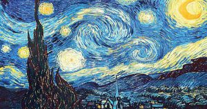
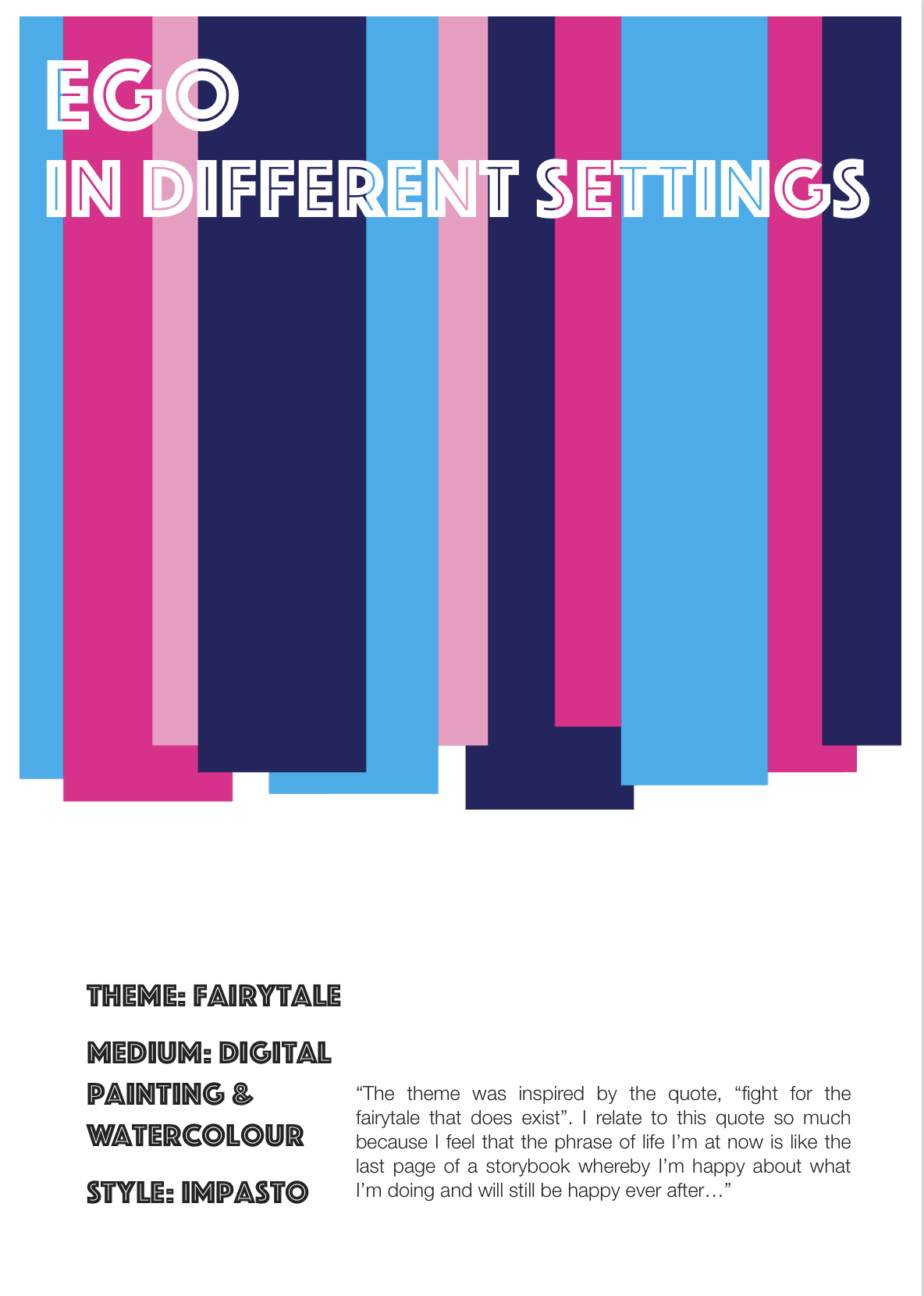
The artist that has inspired my style in this project is Vincent Van Gogh. Impasto technique is widely adopted in his paintings, for example The Starry Night and most of his self portraits.
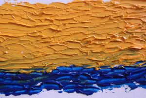
Impasto is a technique where paint is laid on an area of the surface in very thick layers, usually thick enough that the brush or painting-knife strokes are visible. Paint can also be mixed right on the canvas. When dry, impasto provides texture; the paint appears to be coming out of the canvas.
I really like this technique because the direction and the layer of brushwork is made distinct, as well as the colour. The fact that this type of style can be both detailed and bold when finished is truly amazing.
Because I’ve decided to do digital painting in traditional brushwork; impasto, means I have to complete the image bit by bit instead of section by section like other contemporary digital art forms. Hence when I need to adjust or alter the colour completely, I can only paint over the older layer because “undo” function is no longer pragmatic.
I also have to decide on the colour scheme carefully because certain colours were already fixed due to recognisable characters.