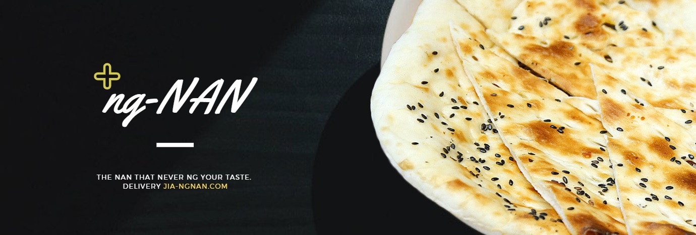
Plus sign is pronounced as ‘jia’ in Chinese. My name ‘Nan‘ is a prominent dish in Indian cuisine (sometimes Naan), which I personally really like.
Hence, I combined the two into a pun and incorporate it into a design which resembles an advertisement banner. (mostly because I refuse to deal with equations. :’] )
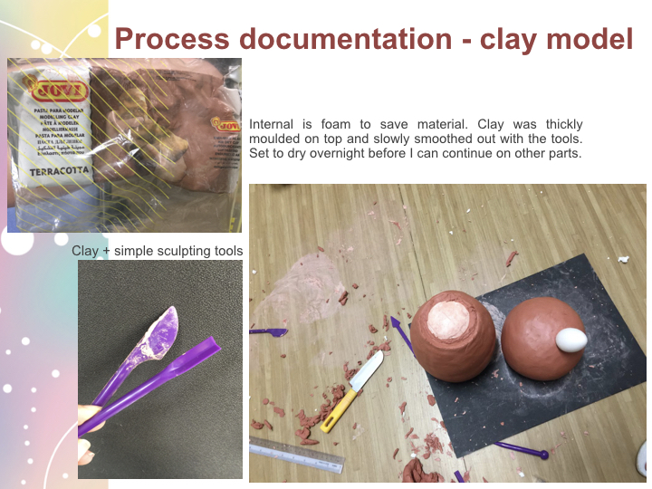
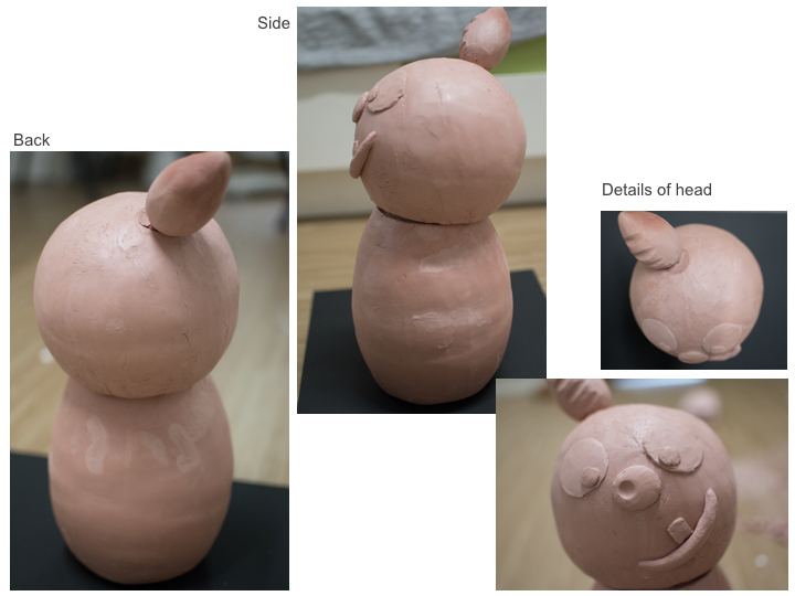
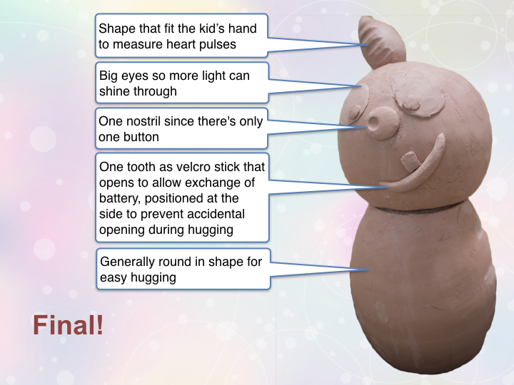
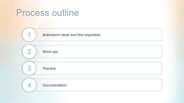
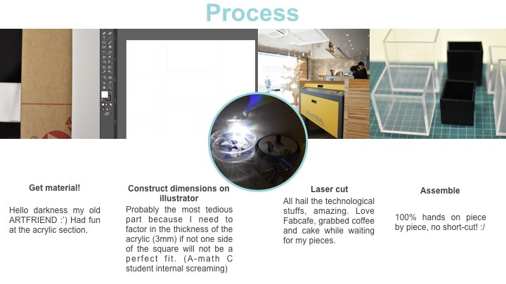
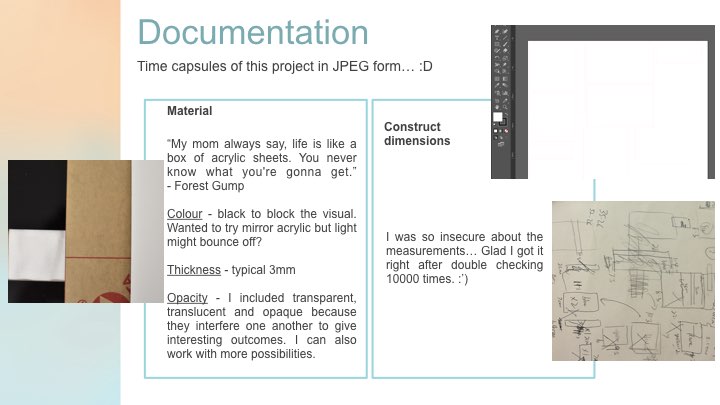
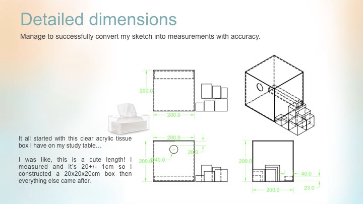
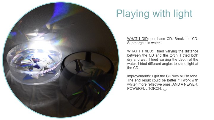
In-class exercise
Looks like a grumpy bird caged in a confined space. That is depressingly accurate for a long-term hall resident.
I think this is for ‘JN’. Yeah, pretty sure that is what they do with unpopular alphabets. 12 toilet plungers arranged in an undisciplined yet solemn manner, beautiful.
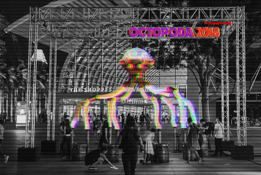
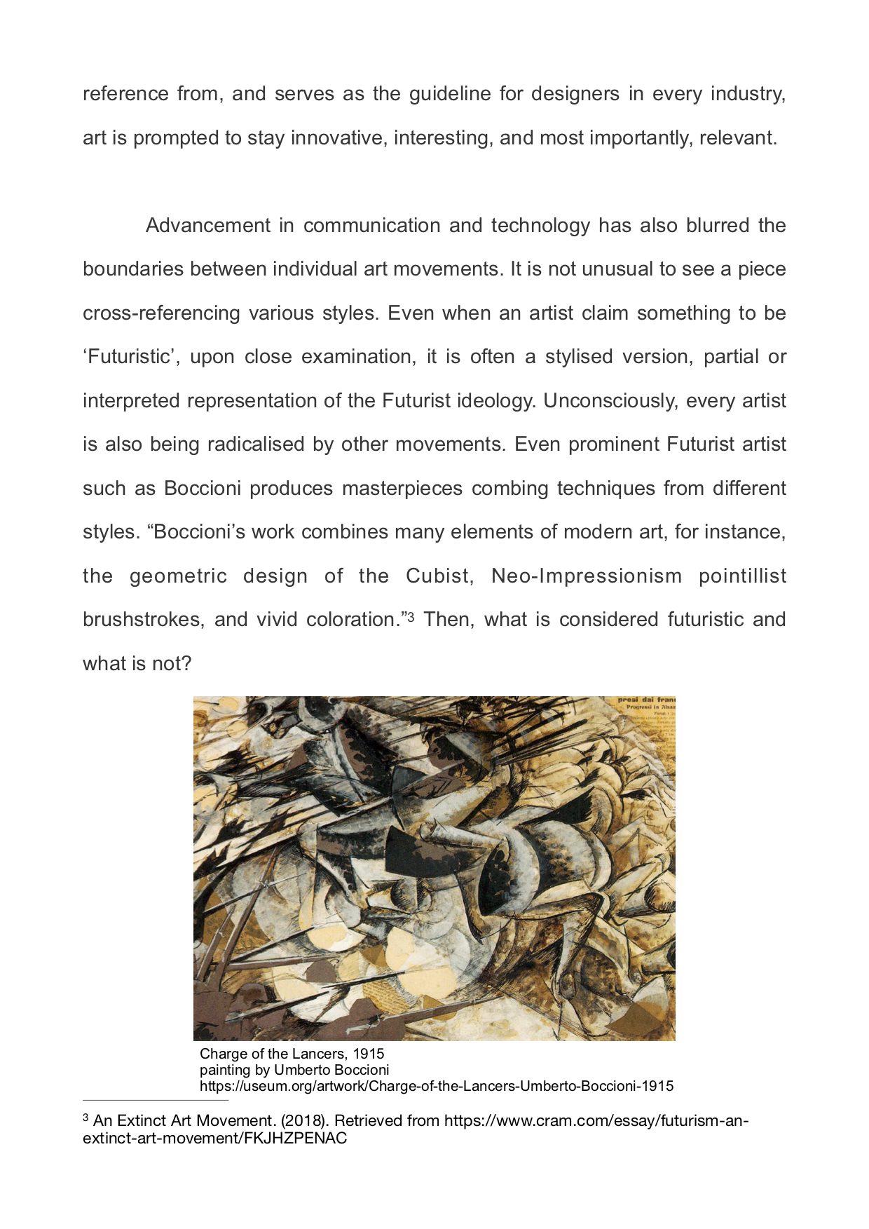
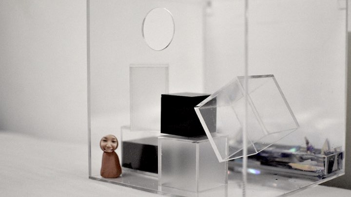
This prominent steampunk octopus-shaped installation was designed by Amigo & amigo as a kickoff to iLight Marina Bay Sands, 2018. Amigo & amigo is a Sydney-based artist studio with Industrial Design background. A team of artists, together with co-founder Simone Chua and Renzo B. Larriviere, are passionate about lighting and experimental forms. The body of work showcases their ability to use primarily LED, and other materials to transform spaces and engage the public. Their projects are predominantly large-scale and technical. Their works are wittily playful, with the intention to transform environments into memorable experiences by inviting audiences to interact with the work. Octopoda is an epitome of their team’s vision and effort to inculcate the beauty of modern art. For which I believe includes three characteristics; first, catering user experience; second, triggering behavioural response via interaction, and lastly, an intended outcome backed by underlying philosophy.
User experience
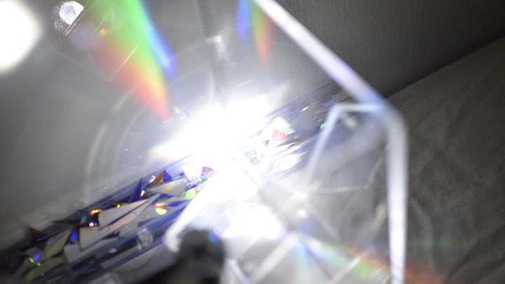
When its tentacle drums are being played, Octopoda will dazzle audiences with its mechanical moves and rhythmic light display. The interactivity seeks to engage audience’s senses. Firstly, the sense of touch, audience can hit on any of the eight drums. They hear the rhythms of their own beat, as well as those from other drums. Then, observe Octopada dancing in the colourful light it emits. The process wasn’t just enjoyable for the participants, it was also captivating for other spectators.
The fun element had fascinated many visitors, especially family with kids. I was reminded that during one of the class discussion, someone mentioned that creativity is constantly asking oneself, “how will a child respond?” Octapoda got me thinking, “why not be the childyourself.” To embrace the freedom of creation; be playful, be happy, just like what Octopoda has provided for its audience. Adult and kids alike. Octopoda wasn’t meant to be literal. To the contrary, it manipulates on exaggeration (huge pair of eyes and over-simplified legs) and surrealism from the body design to the kind of effect it produces. Even though this creature does not appear to be realistic, the light-hearted ambience it produced was definitely engaging.
Behavioural response via interaction
Art has no meaning without an observer. As installations strive to engage its audience, we are no long a mere observer, we participate, and in Octopoda’s case, exert direct impact on the outcome. A more complex level of communication was being established via the process as information became multi-directional, and less predictable. Not to mention that our inputs were in turn shaped by myriads of factor, for example; memories and personality.
Indeterminacy manifest itself into Octopoda due to the nature of interactive mediums. Where input will be at random, and depends entirely on the audience. “Chance” was used in Octopada as a creative component to avoid stagnant, habitual creation. Physically, Octopoda is no doubt an enticing piece of art on its own, standing tall and bright, but indeterminacy has brought about a sense of beauty in the chaos. “What will happen if i…” was perhaps the primary drive that had prompted audience to try. The rhythm and changing lights were monotonous at times, and went completely tumultuous the next moment, arousing curiosity and awakening the playful child in us. Despite the output being disorganised most of the time, smooth running of the installation was govern by a stabilising control that was pre-determined by the team.
What differentiates Octopoda from other installations which interacts with a single audience at one point of time is the degree of “disorder” we called entropy. Entropy multiplies as eight input source channels “disorder” into the output. Input occur, when an audience decides to come forward to play the drum and disseminate the information to Octopoda. Or simultaneously, when more people decides to join in the fun. Note that interaction is no longer limited to audiences and Octopoda, but also within audiences. Human interaction is another indeterminate factor to the output. For example, seeing someone play might encourage more people to join, when all the eight tentacles were occupied, Octopoda might lose some input when people casually walk away. Another indeterminate factor occur when the each of the “tentacles” interfere with one another in terms of how the beat is being played. Participants can choose to collaborate, or insist to have it their way. The interesting thing is, you can never determine what is going to happen next. Numerous combination of input results in a variety of outcome. Minimising the chance of repeat.
Philosophical
Octopoda highlights an alternative point of view to what music is. Creating music used to be the privilege of the elites, whom has developed excelling musical sensitivity to an instrument and have the scores at their fingertips. Common men were given the chance to participate and reap the joy of creating music just as much when they engage with Octopoda. With the sole purpose to create a delightful experience for its audience, Octopoda seem rather precious. In this day and age where citizens are overwhelmed by the fast-paced lifestyle and burdensome societal issues, Singaporeans definitely need more of such installations to relax a little. To play.
Conclusion
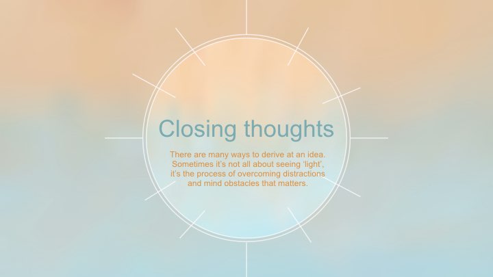
Art is no longer the self-contained entity, says Nam June Paik. Indeed, modern art has became less literal, and no longer confined within the tangible material used. Like Octopoda, the three characteristics of modern installation were observed in many. As it is a fairly new concept, I look forward to discover the endless possibilities of this prevalence.
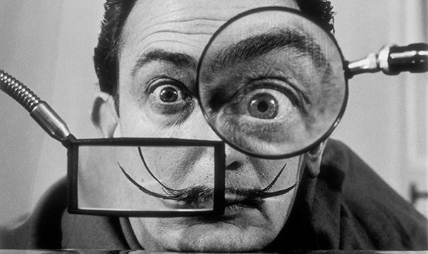
An insane man with gravity-defying whiskers had decided to go public with his artistic nonsense. Definitely not the first, and the best is yet to come.
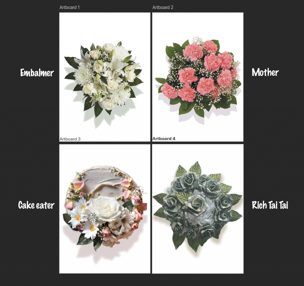
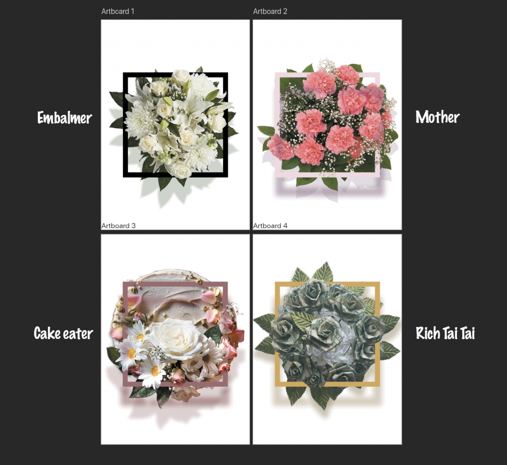
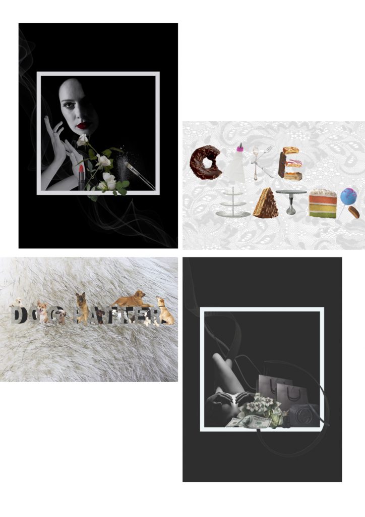
To convey 4 ideal jobs via typography. Initially, I wanted to use flower as the central theme but I did not manage to carry it throughout because the bouquets were too distracting for the type to be visible. Hence I split the 4 compositions into 2 styles x 2 styles, 2 of which portrayed a darker message while the other 2 portrayed the light-hearted jobs.
My ideal jobs:
1.Rich Taitai
2.Embalmer
3.Dog patter
4.Cake eater
Process
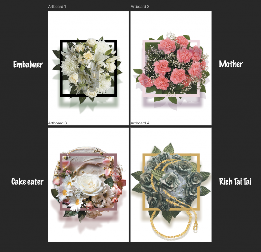
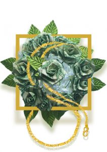
I first brainstormed on the type of flower used to represent each job. ‘Cake eater’ will be edible flower decorations for cakes. ‘Embalmer’ will be white flowers used during funerals. Carnation best represents motherhood. ‘Rich Taitai’ will be fake flowers folded out of money, since this job is pretty unrealistic.
Then I search for suitable images to manipulate; which includes selecting to png, layering, re-sizing and adding drop shadows to create the 3 dimensional, round bouquet look.
Add in square frames strengthened the emphasis on bouquet. Had fun picking the colours. The frames needed a shadow layer, also, need to erase some parts of the frame so the flowers can show and the 2 layers will appear to be more integrated.
Add typographic elements into the compositions.
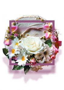
Tutorial which has helped me in creating the initial compositions with flowers.
Embalmer
Initial compositionEmbalmer
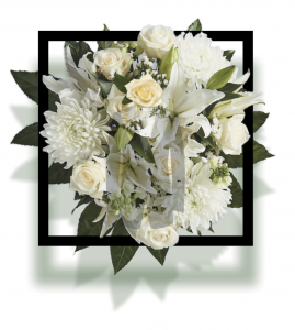
White flowers, frame, and monochrome colour scheme was kept consistent. Other elements i included in the position were make-up items since this job is ultimately making the dead pretty. General feeling is eerie and solemn.
J – J has a straight stem and a steep curve at the end. I thought the shape is really similar to our arm, where the hands bent at the wrist to create this curve. The arm is slightly tilted to the left to give a directional guide to the eyes.
I – small letter i was represented by a lipstick. The break between the dot and the stem was highlighted by the hint of red instead of having a physical break.
A – A was form using stalks of white flowers. The positioning of stalks also provided a directional guide to the eyes.
N – N was form utilising the shape of a dusting makeup brush and the frame, since both items are straight, angular and with sharp edges.
G – small letter g is form by the round face and the gentle curves of the smoke. Face with red lip to depict the process of putting makeup. Smoke again provided a directional guide to the eyes.
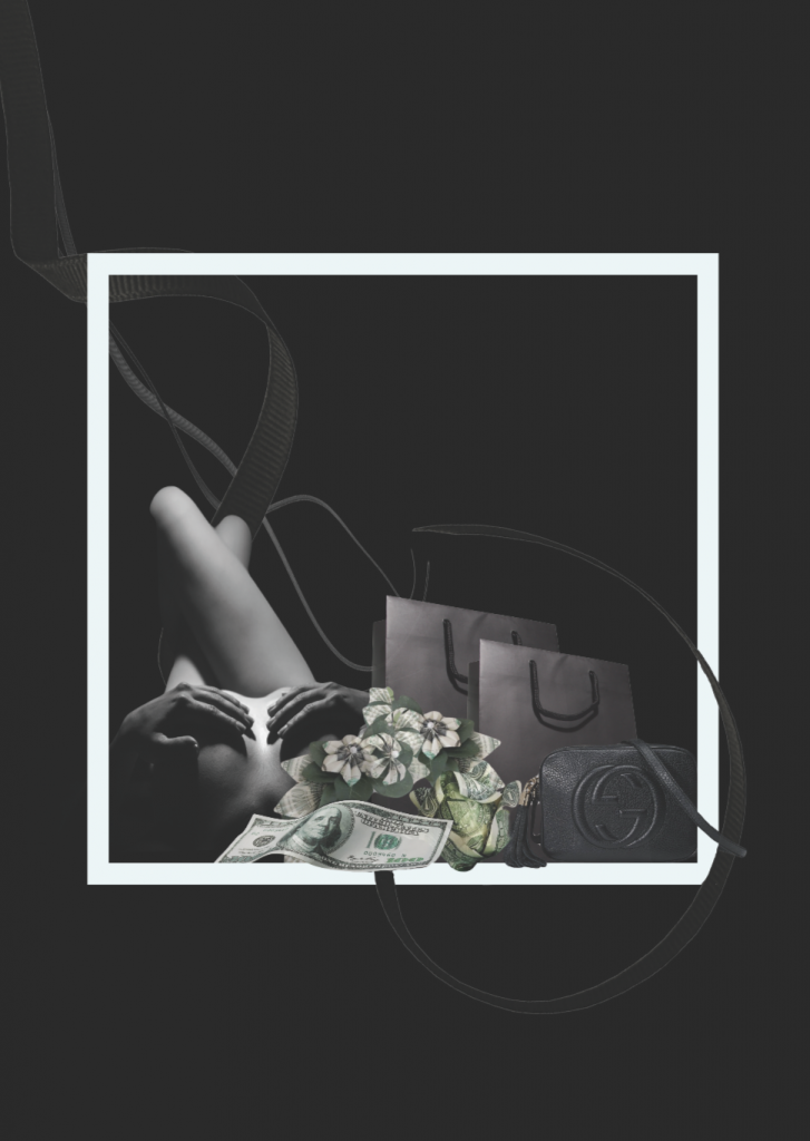
Rich Taitai
Initial compositionRich Taitai
Money flowers and frame were kept consistent. Rich taitai is usually dependent on man, hence the intertwined ribbons. Nudity, money and and luxury goods were common words associated with rich tai tai. General feeling is ‘expensive’ and elegant.
J – J is formed by the nude body. Leg is straight like the stem, and the upper body is curvy to depict the curve of J.
I – I is presented by the long money note.
A – A was formed by money flowers and intersection of the long I as the middle strike.
N – small letter was form utilising the shape of carrier bags and the soft curve of the string handle.
G – G was formed using the logo of the luxury brand ‘GUCCI’.
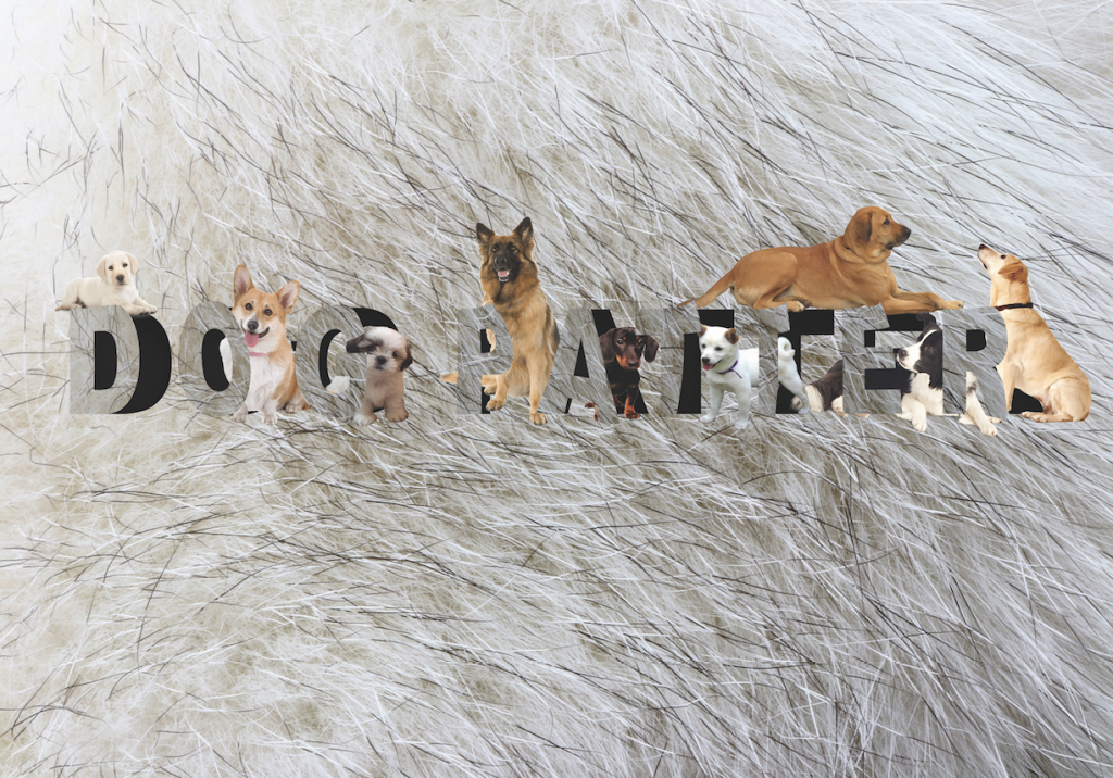
Dog petter
Dog patter
Tutorial that has helped me in creating ‘Dog patter’.
This composition is formed by a fur background because fur is the first thing that comes into contact when I pet a dog. Types were manipulated like demonstrated in the video as hideout for dogs because i would love to have a place filled with dogs.
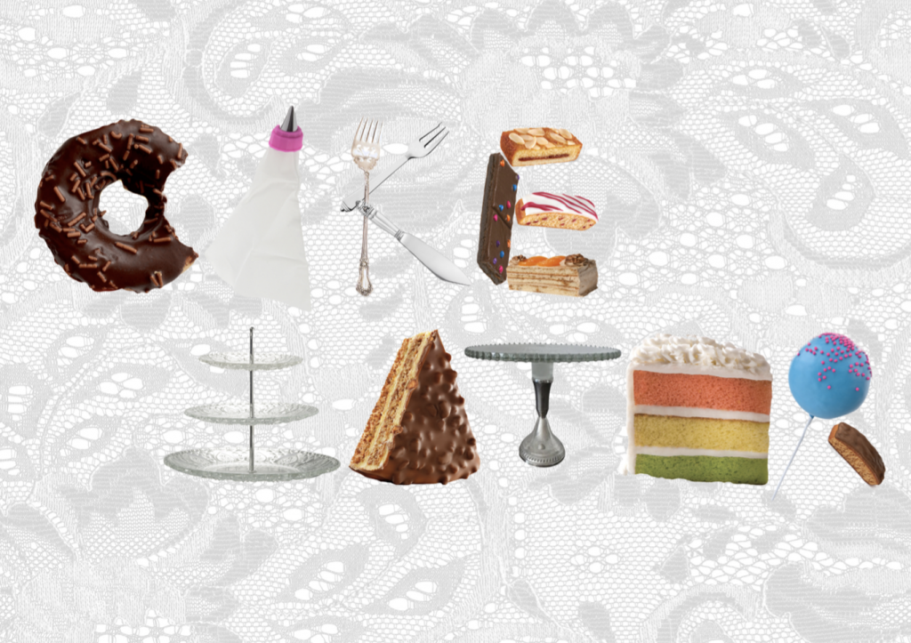
Cake eater
Initial compositionCake eater
Background is lace tablecloth. Type was formed by multiple items cropped into png. Items are all related to cake, such as tools, decorations, and actual cakes.
Final outcome
Glad that the directional guide worked well when I place the compositions diagonally.
I like the black compositions more than the white ones. Kinda regret my decision to separate the jobs into 2 very distinct styles :'( but it’s a lesson for me to learn that unifying the style throughout makes the final outcome much more comprehensive. Still, I manage to try out really distinct styles so it is a good learning experience for myself.
One thing that I want to improve on is to include more aspects of typography, such as size, position, and transformation of types instead of just the form.
Image making through type.

This is a project on typography. To convey 4 ideal jobs using type's shape and characteristics, specifically, type related to name only.

Click HERE to view.
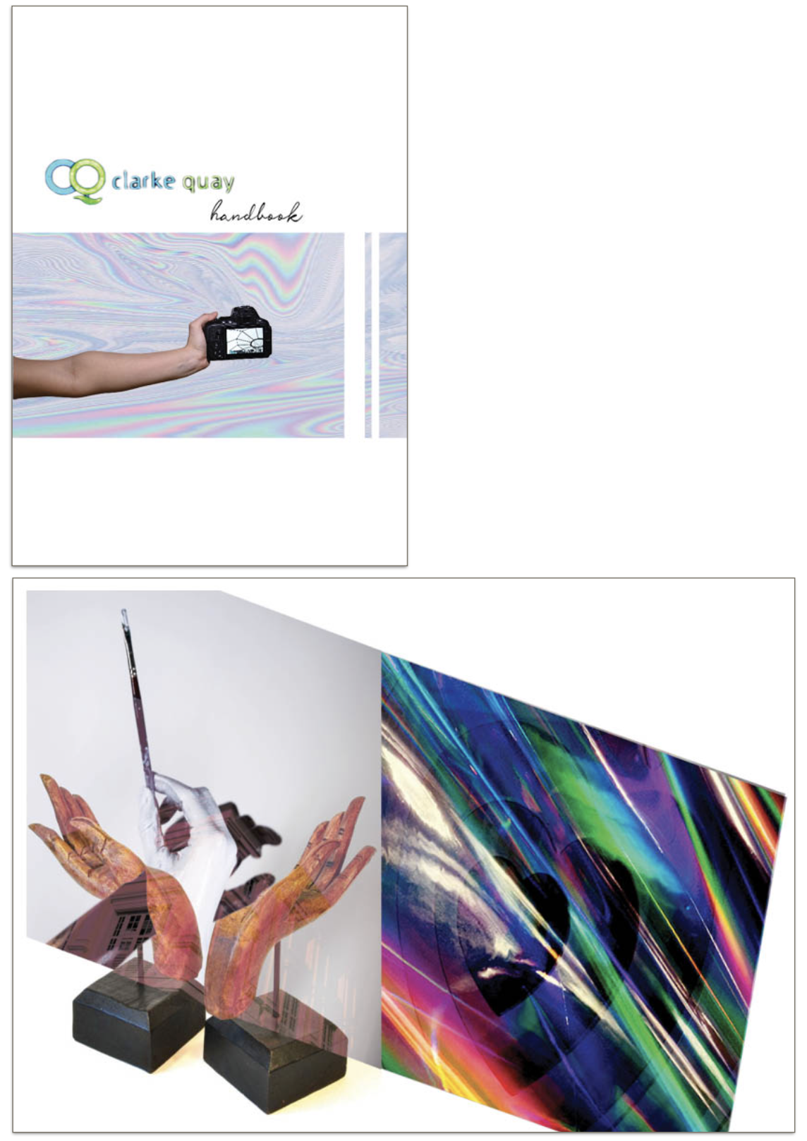
LOCALE l:
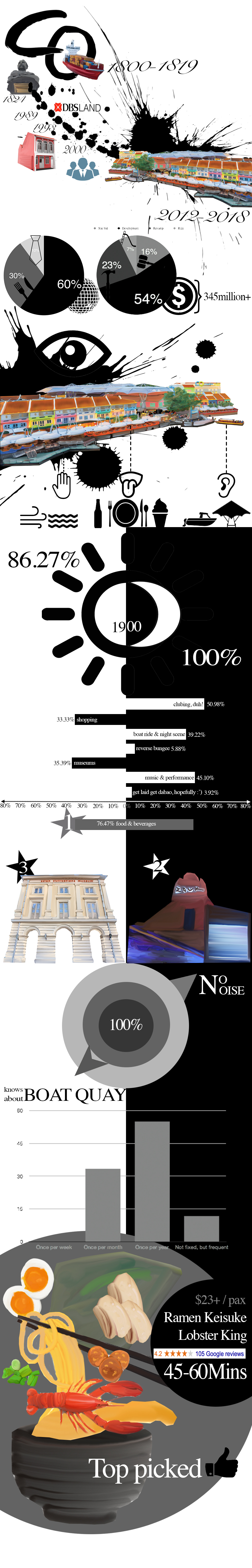
This is my infographic design on Clark Quay which includes the research, primary/secondary datas, as well as quantitative / qualitative datas.
Click HERE to view.
LOCALE ll:
This is my 8 page zine on Clarke quay.
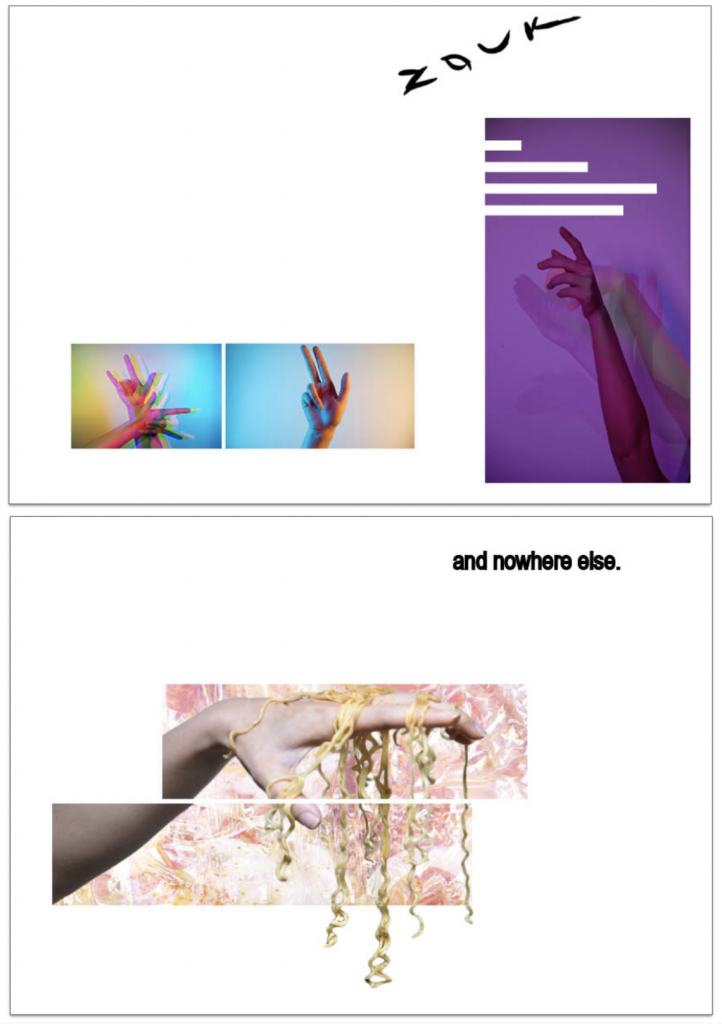
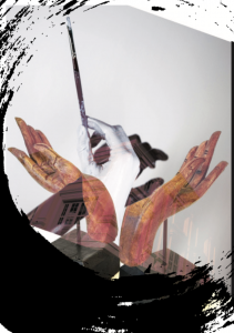
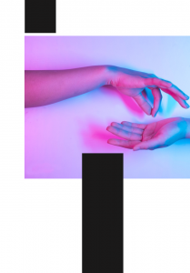
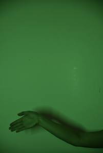
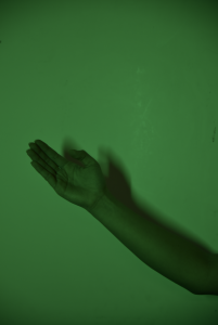
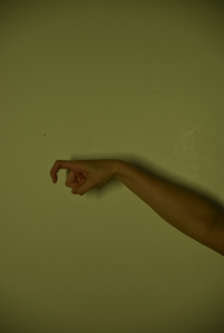
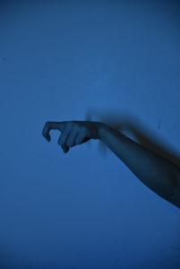
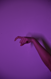
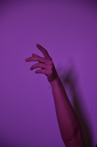
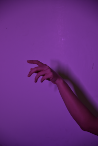
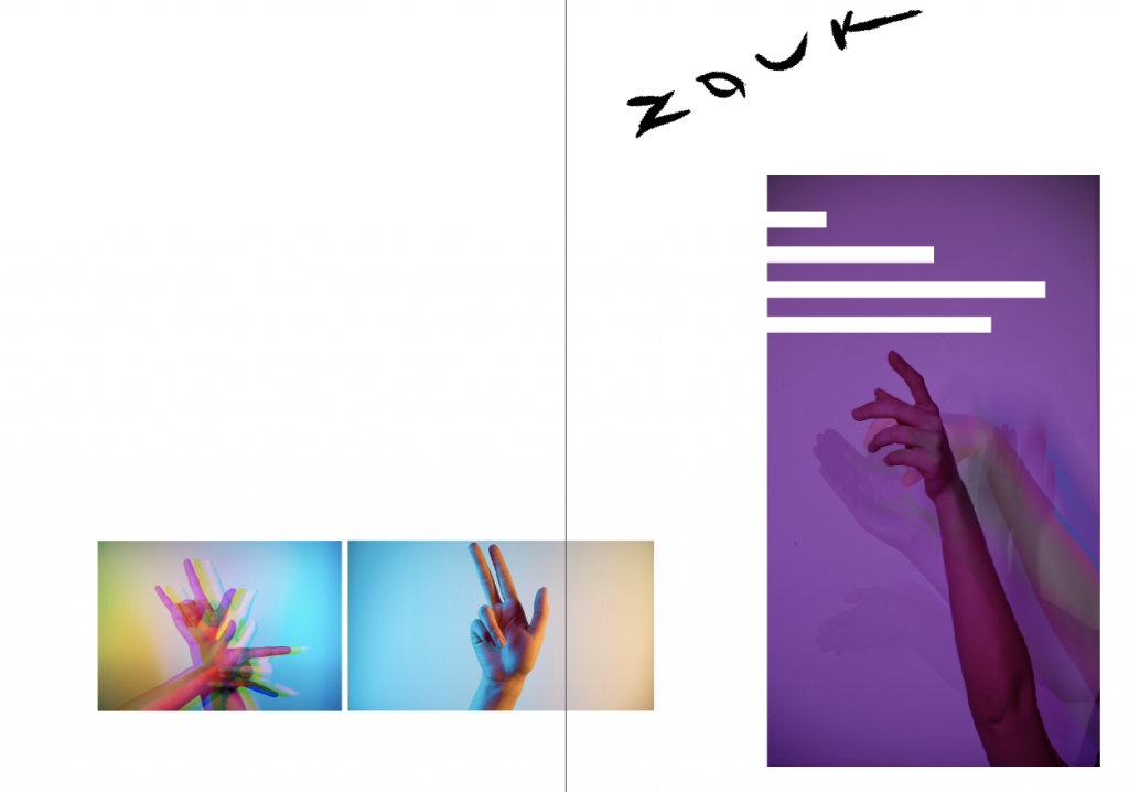
Minimalistic, using hand as the central theme; utilising negative spaces and blocks of image to portray clark quay in a different light.
Click HERE to view.
These are the raw images of my hands before manipulation. (For more photos on Clarke Quay,refer to LOCALE I.)
The location for my zine is Clarke Quay.
In this zine I will portray the uniqueness of CQ through the theme of hands, with my interpretations of the activities I experienced there. The entire zine will take on a minimalistic style, utilising negative spaces and photographs in bold squares as the design language. Many features of CQ included squares, such as shophouses, ZOUK, mall front and logos designs. According to my research for LOCALE I, the top 3 activities I should try out at CQ are:
1. Clubbing (nighttime)
2.Food – Lobster Ramen (all-day)
3. Museum (daytime)
First spread:
initial
Final
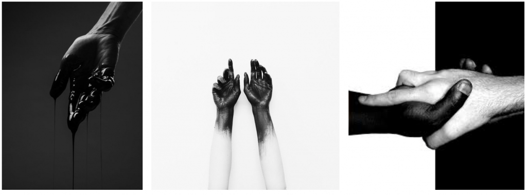
Concept:
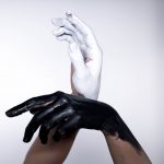
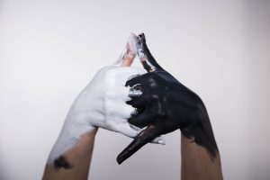
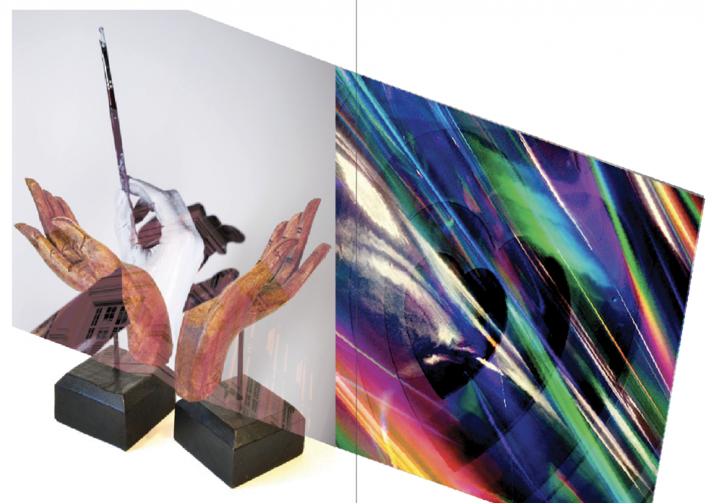
First spread shall be on museum. I painted my hands black and white because monochrome best portray the day vs. night aspect of CQ. Monochrome also depicts the stark distinction between the traditional and the contemporary art installations I observed in CQ. Hence, I wanted the 2 pages to look oddly different.
Outcome:
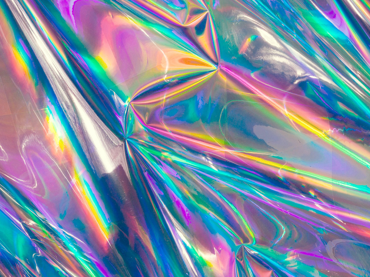
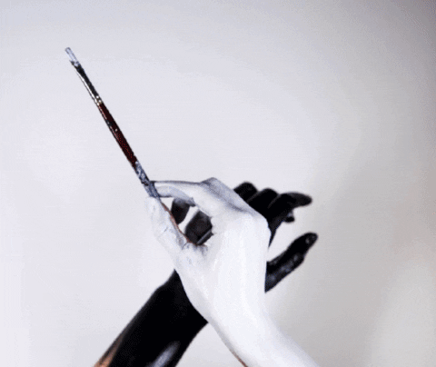
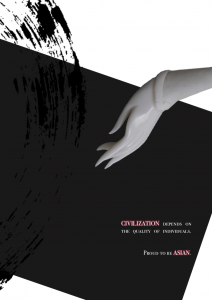
For the left page I blended the sharp corners of Asian Civilisation Museum with my painted hands and Buddha’s mudra. Orange tint gives a vintage feel to the museum page, while blending the holographic art installations at CQ produce a vibrant page. The overlapping border is not blended to show clashing.
Second spread:
Tutorial on split colour glitch that has helped me in creating this drunk effect with Photoshop.
Tutorial on motion blur that has helped me in creating the false multiple exposure effect.
Final
Concept:
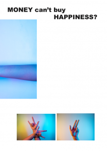
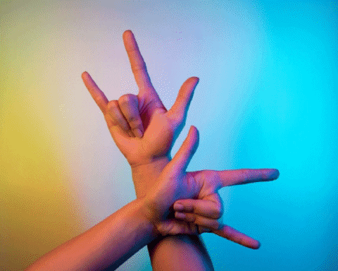
I use neon lights and hand gestures to depict the entertainment aspect of CQ, including clubbing, music and consumer expenditure. Neon lights were in the play because of the vibrant lights I observed in CQ during nighttime, and dynamic colours best portray those kind of activities youngsters and myself enjoyed there.
However, I feel that my previous set of photos cannot fully bring out my own take. After considering the uniqueness of the location from my point of view and suggestions given by the people around me, clubs at CQ are popular because most of their friends “jio” them there. Since youngsters seldom club alone, CQ became the most common place to club as more people join and get to know about this location.
Outcome:
Glitch effect to show drunkness on left page because cheap alcohol is a unique feature of CQ. Motion blur allow me to show the hand movements when I was clubbing. The hand gestures used literally translates to ‘friend’, ‘go’, ‘there’. The 4 negative spaces depicts my experience there with 3 other fiends as each of us were at different levels of ‘high’.
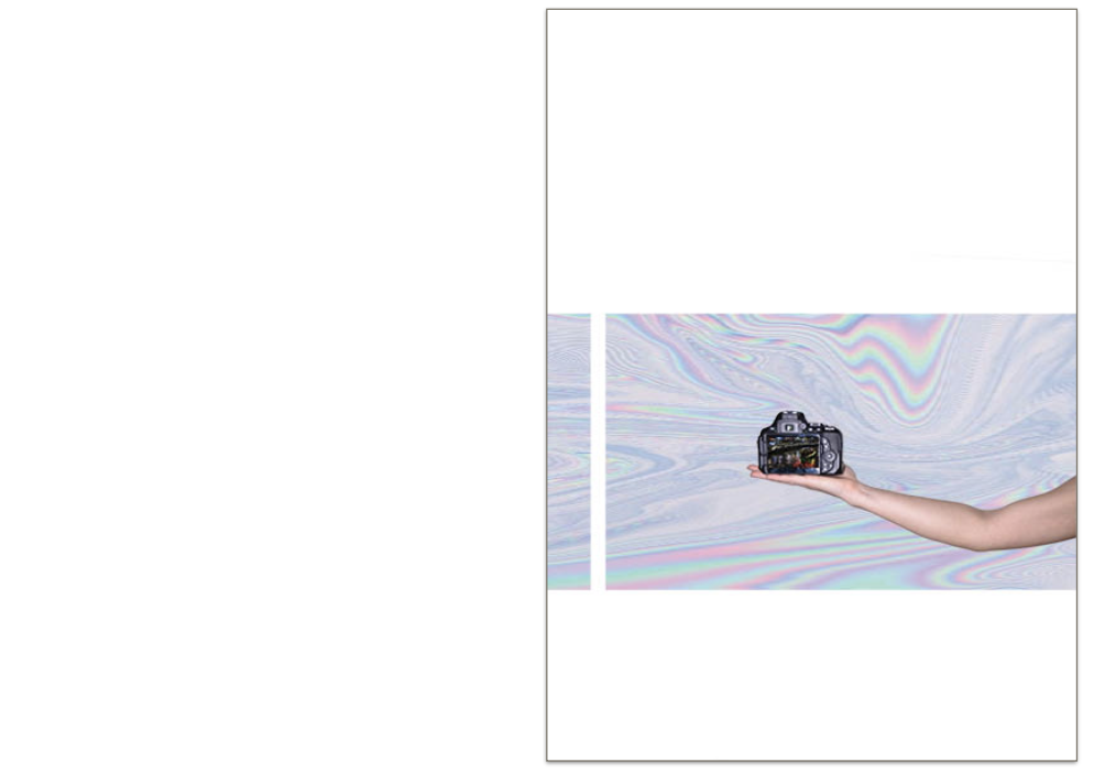
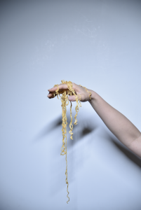
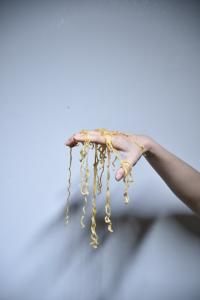
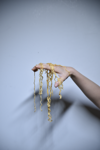
Third spread:
Final
Concept:
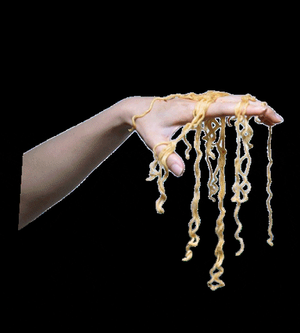
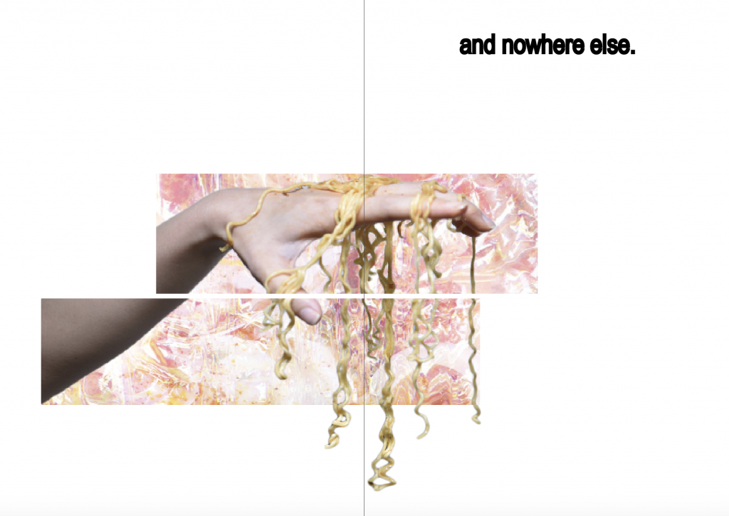
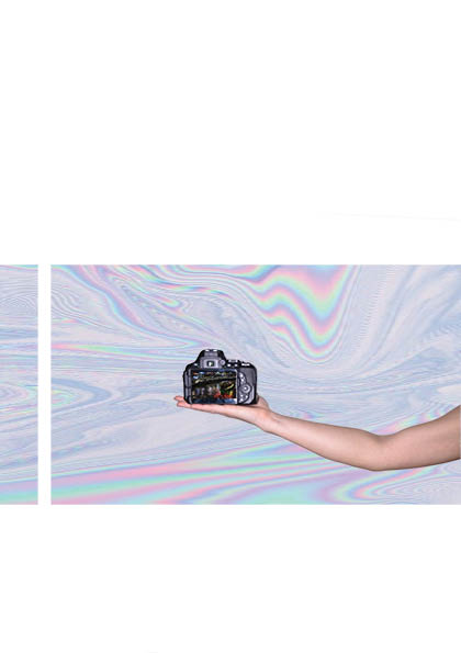
Favourite food enjoyed at CQ is Keisuke lobster ramen. It is indeed popular as the queue was long. After trying it with my friends, all of us felt that the taste was overrated. Hence I position my hand with ramen like a puppeteer to depict that the shop owner might have manipulated the consumer to lure in business with the fact that this is the ONLY lobster ramen in Singapore, and as an unique selling point at CQ, it is suppose to be really good?
Outcome:
The ramen on hand was really difficult to extract into png due to the noodle strands but this turn out to be my favourite spread. I blended the lobster ramen with holographic texture as for the background. Then I cropped the image into 3 sections. The font ‘and nowhere else’ shows that this ramen is unique to CQ because this is the only one in Singapore.
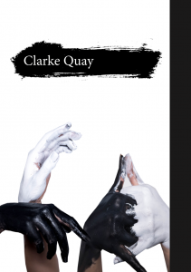
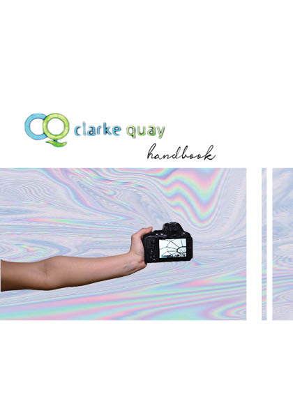
Coverpage & backpage
initial
Final coverpage
Final backpage
Concept:
Initially I wanted the covers to be funky and look like jotter book because handbook = guidebook? I really like the title because ‘Handbook‘ is a pun, it’s suppose to be a guide to what to enjoy in CQ but also literally a book of hands. However it does not blend well with the rest of the pages, so I changed the style completely.
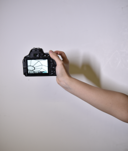
I explored CQ with my camera, and the bulk of the contend is photography. Hence I thought it would be interesting to include me actually taking the camera. The photos in camera shows unique features of CQ, one taken during daytime and one taken during nighttime. ‘Clarke Quay‘ font was taken from the site’s mall because I thought neon green and blue colour actually fits into the holographic colour scheme. Showing partial identity of the curator perhaps also arouse reader’s interest to find out more about what I have to say about CQ.
Outcome:
Sophisticated covers will not fit into my minimalistic outlook for this zine. Even though the covers are simple, a lot of thoughts were put into them.
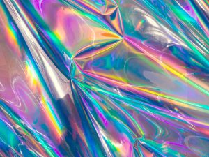
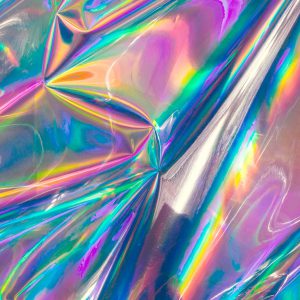
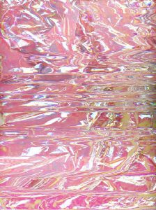
These holographic textures are inspired by the art installation I saw at CQ, on top of the kind of dynamic, lit, vibrant, overall feeling I want to portray.
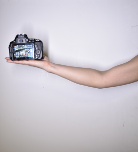
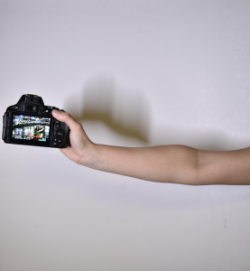
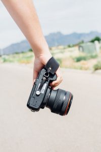
Equipement
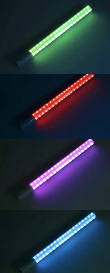
YongNuo YN360
‘Lightsaber‘ that I’ve used to produce the neon lights. Just a single stick, with RGB colour control system to give me any colour I want. (colour theory in practice omg). Sometime I place 2 sticks side by side to give a remix of colours.
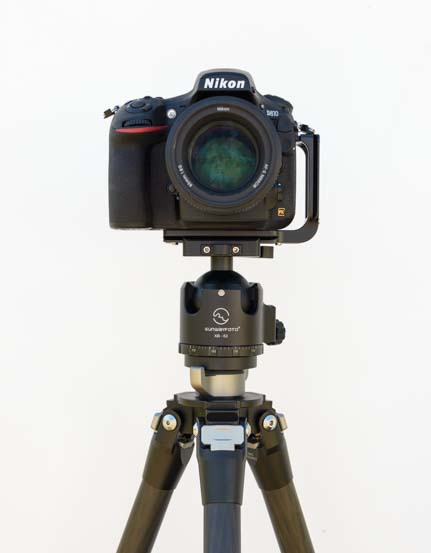
Nikon D870
Nikon D870 with tripod to stabilise and DIY white backdrop; a large white board against the wall.
FINAL zine
Video of the printed zine:
The printing and stitching went really well for first try. :’) The colours came out vibrant and almost 1 to 1 as my screen.
Tutorial on basic document set up and techniques for Indesign.
I really like minimalistic designs. Many features in these zine were used in my own zine such as ‘crossing pages’ and blocks of image with minimal words.
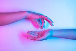
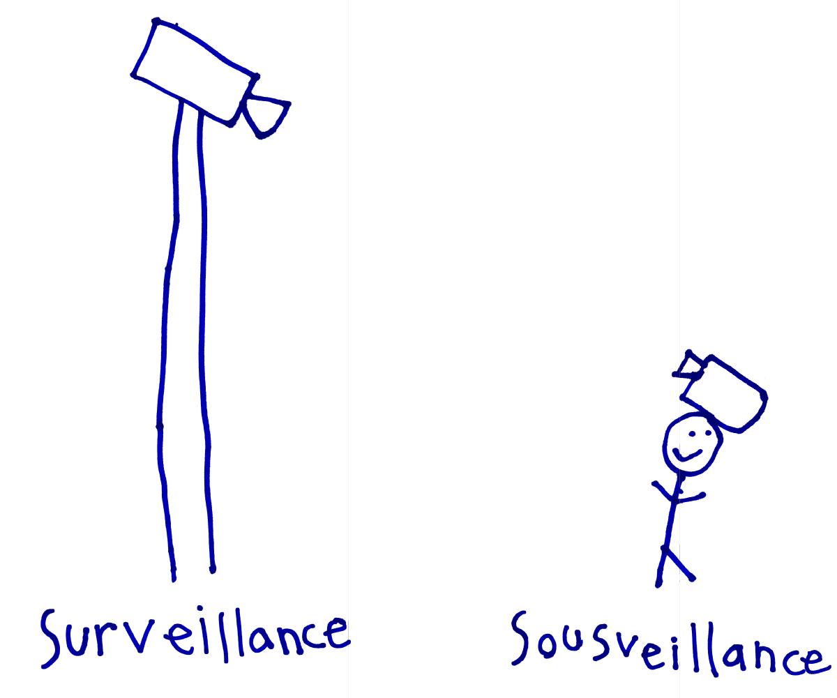
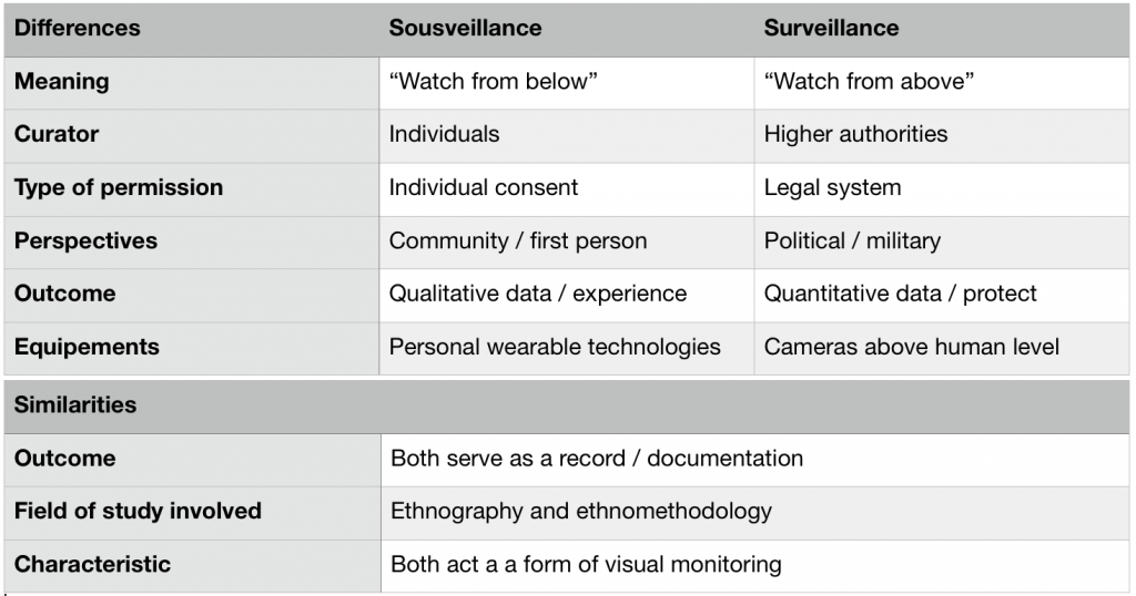
Based on the articles provided by my prof and some further readings, I was able to better grasp this new concept of ‘Sousveillance’. Above is my summary on the similarities and differences between ‘Sousveillance’ vs. ‘Surveillance’.
In my opinion, the primary difference between sousveillance and surveillance is the direction of watch. It is also the main reason for the disparity in their function and other areas subsequently.
Even though surveillance comes with many negative connotations such as the lost of freedom and privacy, personal information leakage and identity thief, I hold firmly to its necessity. I see surveillance and sousveillance as the most powerful weapon to ensure social order and security in general. It deters the malicious from committing a crime because of the severe consequences they need to face if a footage is used against them as concrete evidence. In countless situations, results of ‘watch’ have helped in enforcing rules and regulations. Be it for investigation purpose, tracking records or even as proof of absence.
I cannot imagine how chaotic the wolrld can become if not for surveillance.
Sousveillance is a fairly new concept, developed without a clear intention or direction. Perhaps I can attribute it to the rise of individualism. In modern society, source of power is slowly shifting from minor elites to the mass. The idea of democracy has never been so prevalent. We want the world to see what we’ve got to express, be it through the channel of art or personal discoveries. When individuals attain power, they are also more defiant when their rights are violated. We were quiet before, but we refused to remain silenced. We became more confident to stand up for ourselves and question the authority. We demand transparency as one the principal of governance. We are curious about what we don’t know and we are not hesitant to find out. Perhaps this is the primary reason for this act of ‘watching from below’.