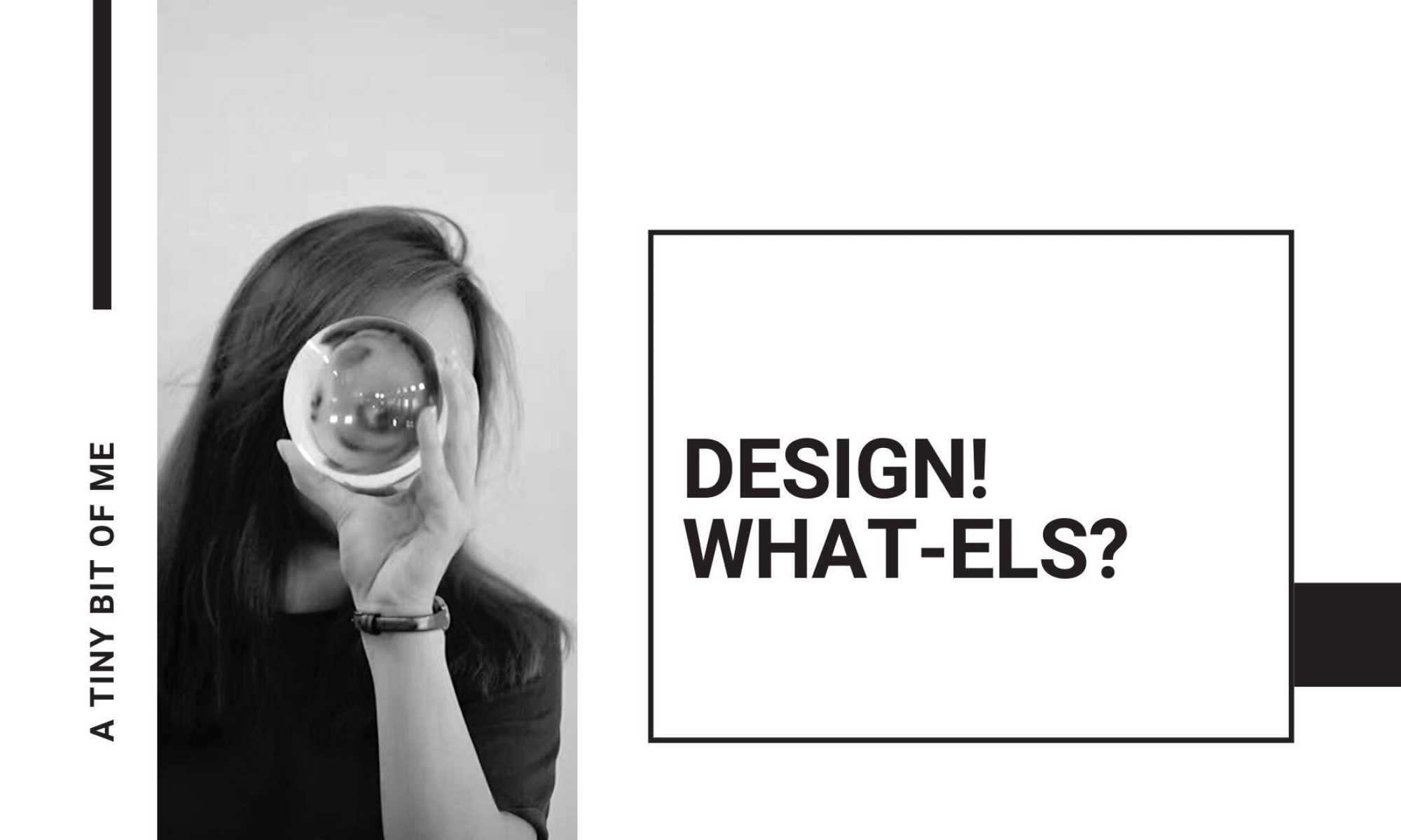
concept
To convey 4 ideal jobs via typography. Initially, I wanted to use flower as the central theme but I did not manage to carry it throughout because the bouquets were too distracting for the type to be visible. Hence I split the 4 compositions into 2 styles x 2 styles, 2 of which portrayed a darker message while the other 2 portrayed the light-hearted jobs.
My ideal jobs:
1.Rich Taitai
2.Embalmer
3.Dog patter
4.Cake eater
Process
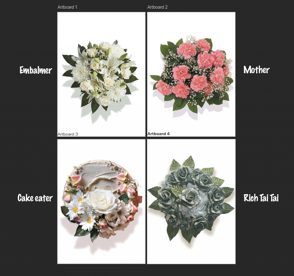
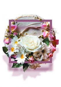
I first brainstormed on the type of flower used to represent each job. ‘Cake eater’ will be edible flower decorations for cakes. ‘Embalmer’ will be white flowers used during funerals. Carnation best represents motherhood. ‘Rich Taitai’ will be fake flowers folded out of money, since this job is pretty unrealistic.
Then I search for suitable images to manipulate; which includes selecting to png, layering, re-sizing and adding drop shadows to create the 3 dimensional, round bouquet look.
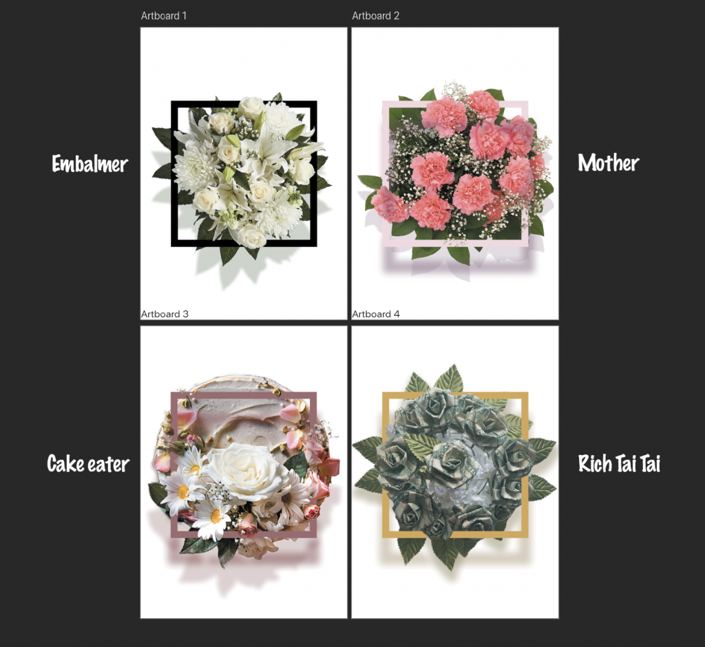
Add in square frames strengthened the emphasis on bouquet. Had fun picking the colours. The frames needed a shadow layer, also, need to erase some parts of the frame so the flowers can show and the 2 layers will appear to be more integrated.
Add typographic elements into the compositions.
Tutorial which has helped me in creating the initial compositions with flowers.
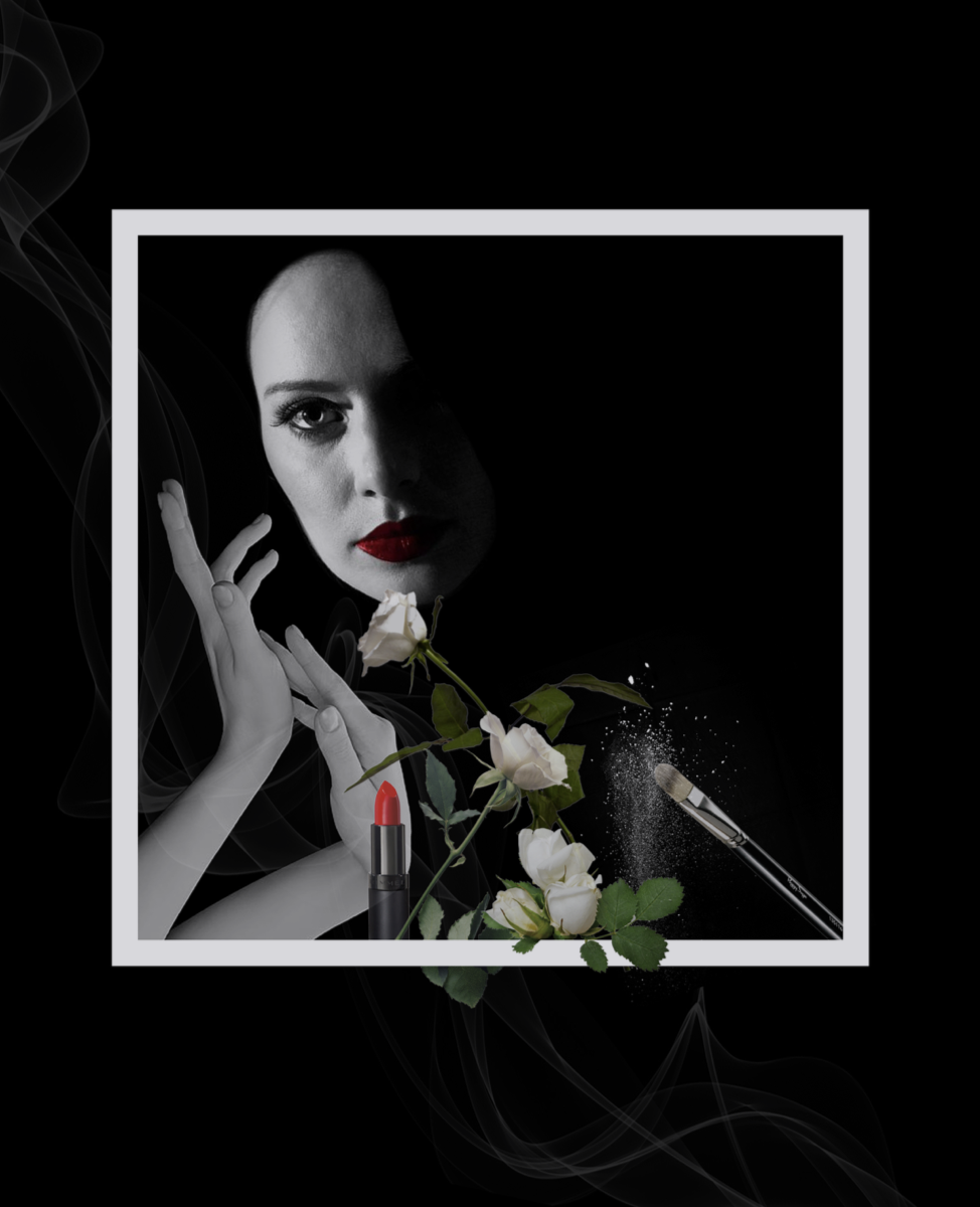
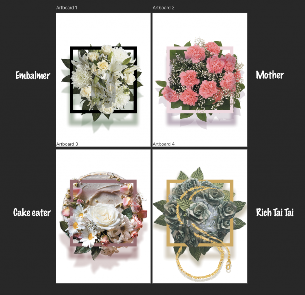
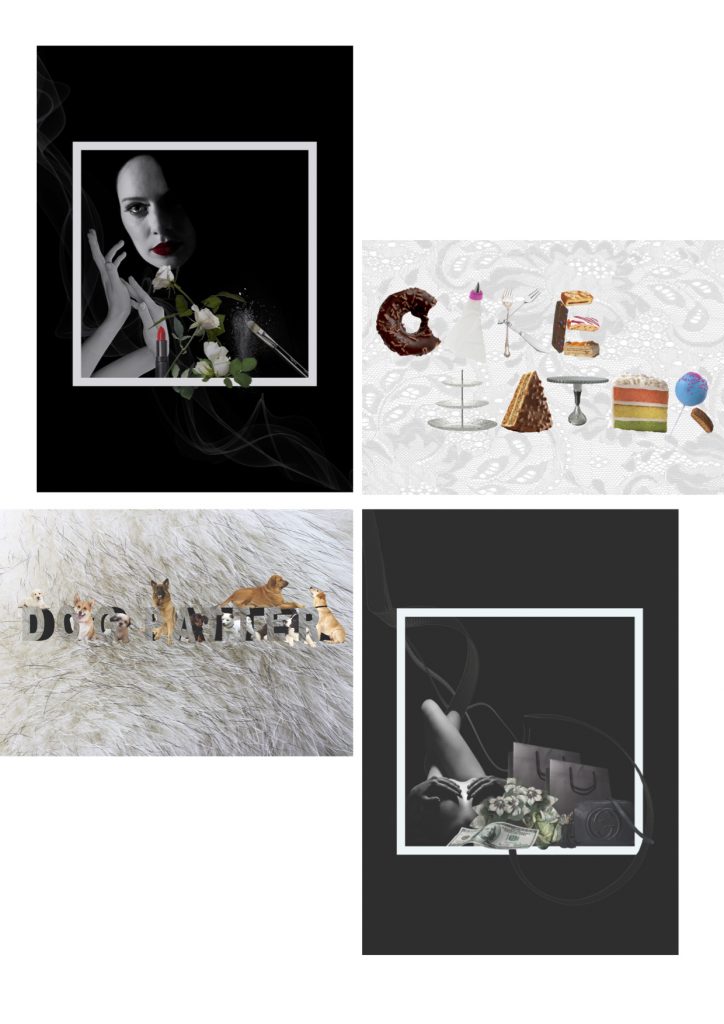
Embalmer
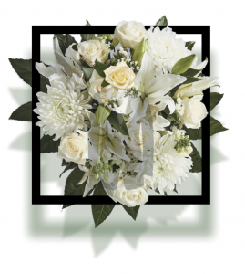
White flowers, frame, and monochrome colour scheme was kept consistent. Other elements i included in the position were make-up items since this job is ultimately making the dead pretty. General feeling is eerie and solemn.
J – J has a straight stem and a steep curve at the end. I thought the shape is really similar to our arm, where the hands bent at the wrist to create this curve. The arm is slightly tilted to the left to give a directional guide to the eyes.
I – small letter i was represented by a lipstick. The break between the dot and the stem was highlighted by the hint of red instead of having a physical break.
A – A was form using stalks of white flowers. The positioning of stalks also provided a directional guide to the eyes.
N – N was form utilising the shape of a dusting makeup brush and the frame, since both items are straight, angular and with sharp edges.
G – small letter g is form by the round face and the gentle curves of the smoke. Face with red lip to depict the process of putting makeup. Smoke again provided a directional guide to the eyes.
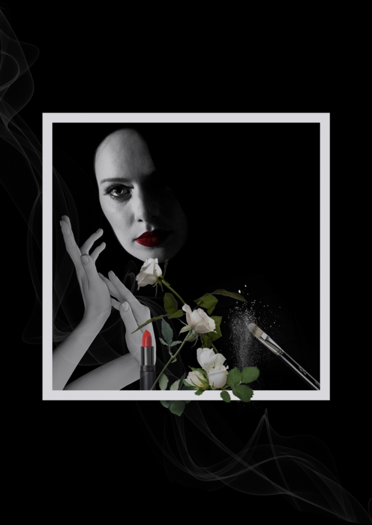
Rich Taitai
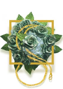
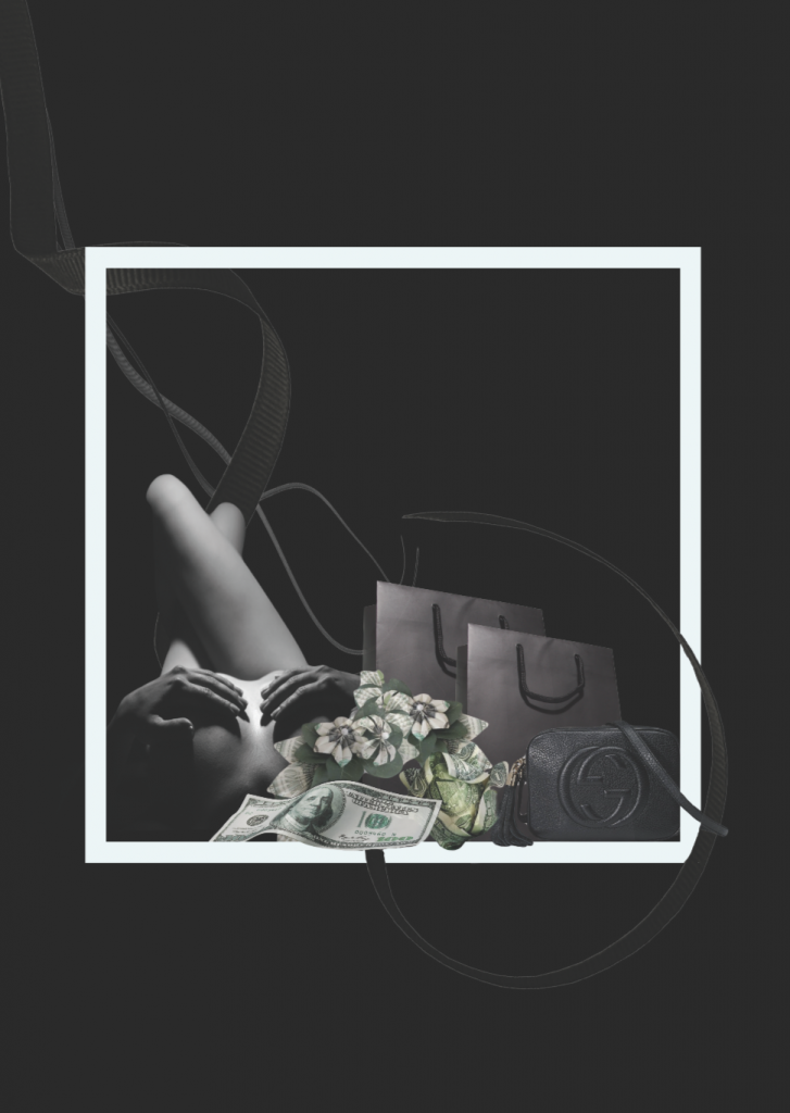
Money flowers and frame were kept consistent. Rich taitai is usually dependent on man, hence the intertwined ribbons. Nudity, money and and luxury goods were common words associated with rich tai tai. General feeling is ‘expensive’ and elegant.
J – J is formed by the nude body. Leg is straight like the stem, and the upper body is curvy to depict the curve of J.
I – I is presented by the long money note.
A – A was formed by money flowers and intersection of the long I as the middle strike.
N – small letter was form utilising the shape of carrier bags and the soft curve of the string handle.
G – G was formed using the logo of the luxury brand ‘GUCCI’.
Dog petter
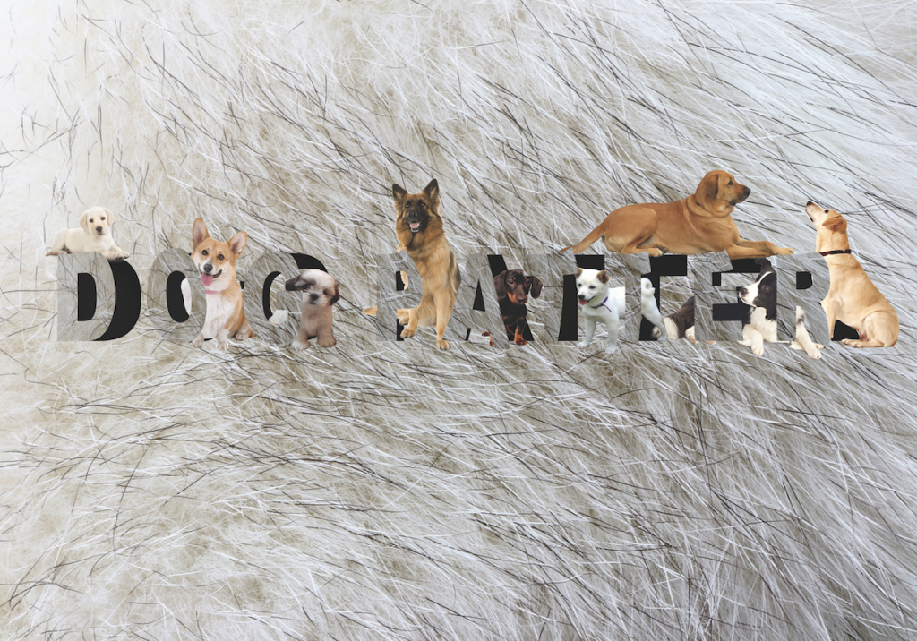
Tutorial that has helped me in creating ‘Dog patter’.
This composition is formed by a fur background because fur is the first thing that comes into contact when I pet a dog. Types were manipulated like demonstrated in the video as hideout for dogs because i would love to have a place filled with dogs.
Cake eater
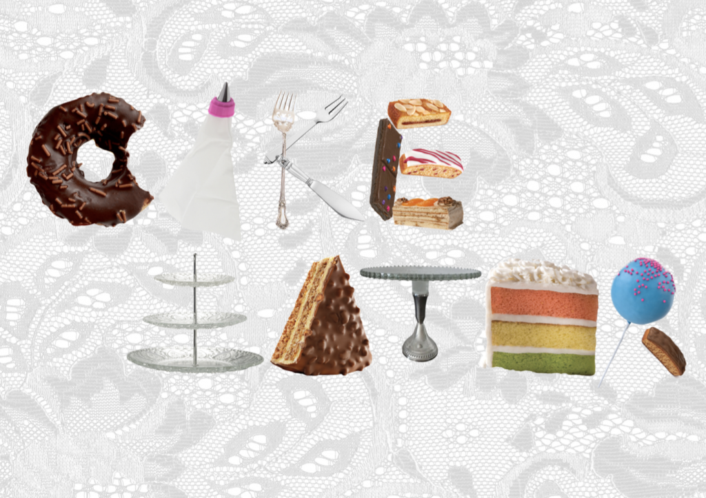
Background is lace tablecloth. Type was formed by multiple items cropped into png. Items are all related to cake, such as tools, decorations, and actual cakes.
Final outcome
Glad that the directional guide worked well when I place the compositions diagonally.
I like the black compositions more than the white ones. Kinda regret my decision to separate the jobs into 2 very distinct styles :'( but it’s a lesson for me to learn that unifying the style throughout makes the final outcome much more comprehensive. Still, I manage to try out really distinct styles so it is a good learning experience for myself.
One thing that I want to improve on is to include more aspects of typography, such as size, position, and transformation of types instead of just the form.
Reference & Research
Readings on typography:
https://ntulearn.ntu.edu.sg/bbcswebdav/pid-1309954-dt-content-rid-4869873_1/courses/17S2-DN1009-TUT-G02/Ina%20Saltz%20-%20Typography%20Essentials.pdf?target=blank
https://ntulearn.ntu.edu.sg/bbcswebdav/pid-1328702-dt-content-rid-4933163_1/courses/17S2-DN1009-TUT-G02/Gavin%20Ambrose%20-%20The-Fundamentals%20of%20Typography%20-%20Excerpts.pdf?target=blank
https://ntulearn.ntu.edu.sg/bbcswebdav/pid-1309949-dt-content-rid-4869869_1/courses/17S2-DN1009-TUT-G02/Martin%20Solomon%20-%20The%20Art%20of%20Typography.pdf?target=blank
Stock images:
http://www.thepinsta.com/carnation-arrangements_UuvqsRfYfvJaFe*myhWIOMs2feeE4s6noJV9lUhYerc/
https://www.sweetheatheranne.com/shop/signature-buttercream-flower-cake
https://www.shiels.com.au/gold-necklaces
https://www.kisspng.com/png-brush-face-powder-cosmetics-makeup-powder-307228/
http://www.freepngimg.com/animals/dog
https://maky-orel.deviantart.com/art/PNG-STOCK-Golden-dog-355947534
http://www.pngmart.com/image/2321http://www.pngpix.com/download/dog-png-imag
https://www.pinterest.com/pin/442267625888333813/?lp=true
http://www.stickpng.com/img/objects/shopping-bag/plain-black-shopping-bag
https://www.independent.co.uk/extras/indybest/fashion-beauty/make-up/best-red-lipsticks-mac-topshop-dior-9821512.html
https://www.pinterest.com/pin/261068109632526044/?lp=true
https://www.pinterest.com.au/pin/661747738969447638/?lp=true
http://www.fluidr.com/photos/nzpix/2566631721
http://ericaobrien.com/shop/
https://pngtree.com/freepng/serving-tray-rack_1558321.html