
pHOTOGRAPH&Process
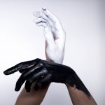
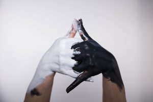
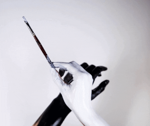
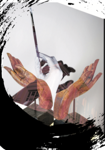
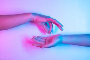
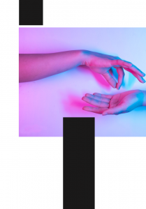
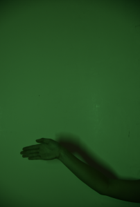
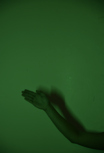
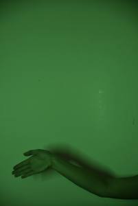
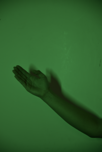
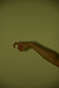
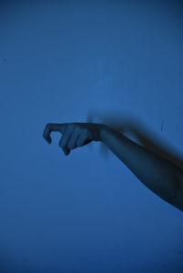
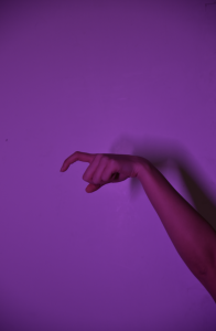
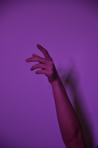
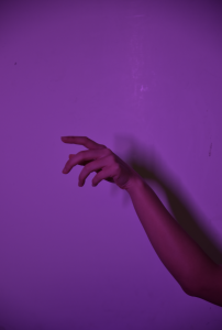
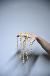
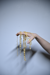
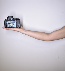
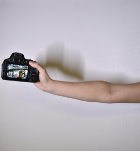
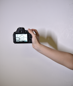
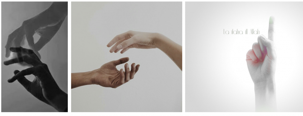
These are the raw images of my hands before manipulation. (For more photos on Clarke Quay,refer to LOCALE I.)
The location for my zine is Clarke Quay.
In this zine I will portray the uniqueness of CQ through the theme of hands, with my interpretations of the activities I experienced there. The entire zine will take on a minimalistic style, utilising negative spaces and photographs in bold squares as the design language. Many features of CQ included squares, such as shophouses, ZOUK, mall front and logos designs. According to my research for LOCALE I, the top 3 activities I should try out at CQ are:
1. Clubbing (nighttime)
2.Food – Lobster Ramen (all-day)
3. Museum (daytime)
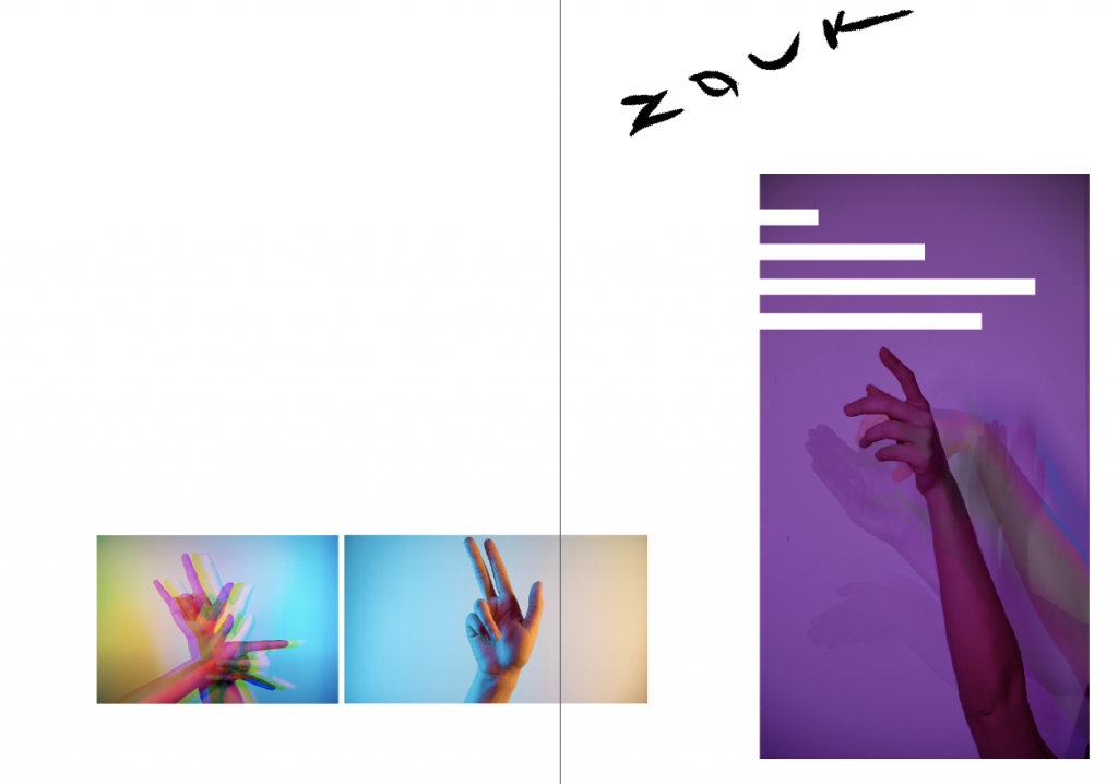
First spread:
Concept:
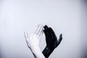
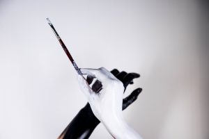
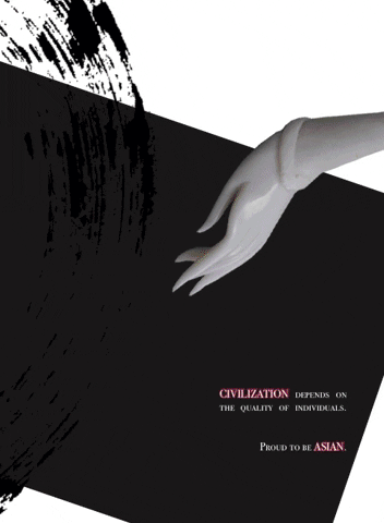
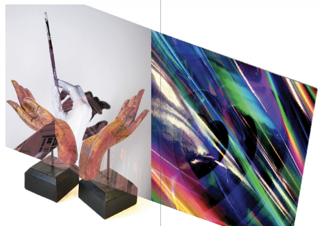
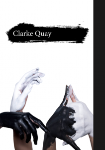
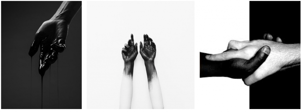
First spread shall be on museum. I painted my hands black and white because monochrome best portray the day vs. night aspect of CQ. Monochrome also depicts the stark distinction between the traditional and the contemporary art installations I observed in CQ. Hence, I wanted the 2 pages to look oddly different.
Outcome:
For the left page I blended the sharp corners of Asian Civilisation Museum with my painted hands and Buddha’s mudra. Orange tint gives a vintage feel to the museum page, while blending the holographic art installations at CQ produce a vibrant page. The overlapping border is not blended to show clashing.
Second spread:

Tutorial on split colour glitch that has helped me in creating this drunk effect with Photoshop.
Tutorial on motion blur that has helped me in creating the false multiple exposure effect.
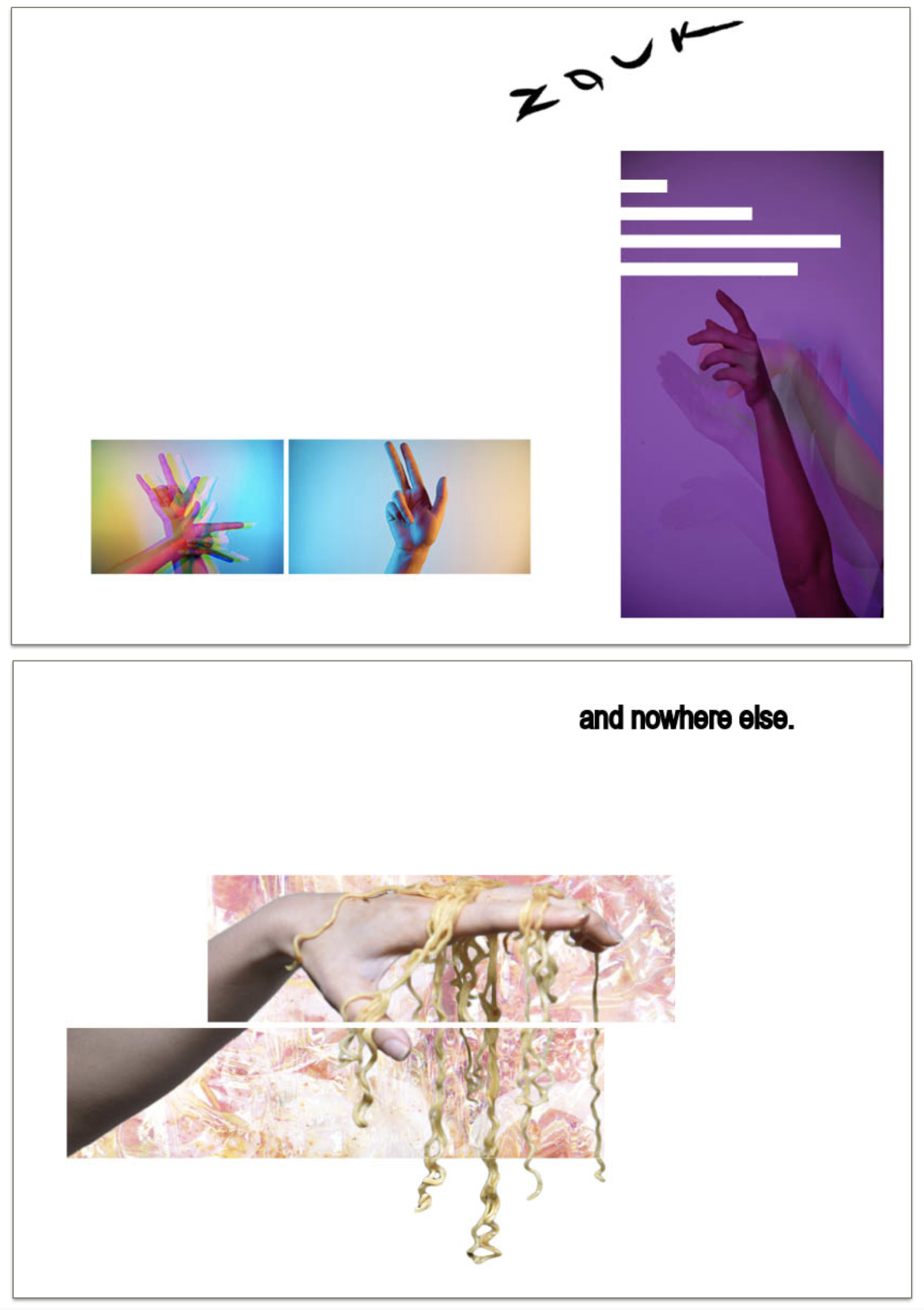
Concept:
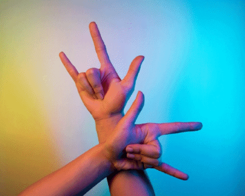
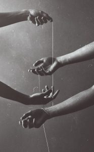
I use neon lights and hand gestures to depict the entertainment aspect of CQ, including clubbing, music and consumer expenditure. Neon lights were in the play because of the vibrant lights I observed in CQ during nighttime, and dynamic colours best portray those kind of activities youngsters and myself enjoyed there.
However, I feel that my previous set of photos cannot fully bring out my own take. After considering the uniqueness of the location from my point of view and suggestions given by the people around me, clubs at CQ are popular because most of their friends “jio” them there. Since youngsters seldom club alone, CQ became the most common place to club as more people join and get to know about this location.
Outcome:
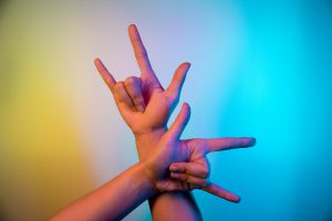
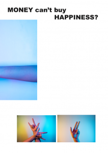
Glitch effect to show drunkness on left page because cheap alcohol is a unique feature of CQ. Motion blur allow me to show the hand movements when I was clubbing. The hand gestures used literally translates to ‘friend’, ‘go’, ‘there’. The 4 negative spaces depicts my experience there with 3 other fiends as each of us were at different levels of ‘high’.
Third spread:
Concept:
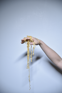
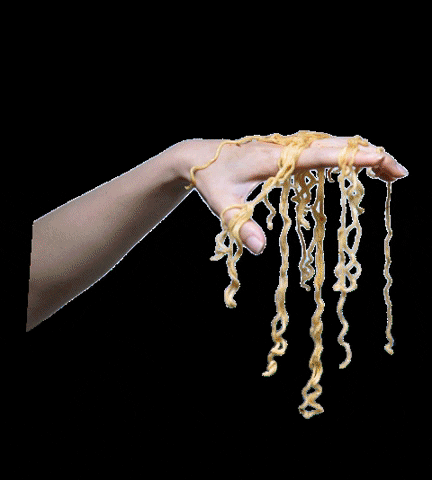
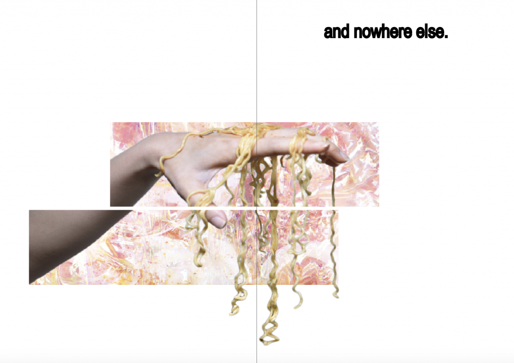
Favourite food enjoyed at CQ is Keisuke lobster ramen. It is indeed popular as the queue was long. After trying it with my friends, all of us felt that the taste was overrated. Hence I position my hand with ramen like a puppeteer to depict that the shop owner might have manipulated the consumer to lure in business with the fact that this is the ONLY lobster ramen in Singapore, and as an unique selling point at CQ, it is suppose to be really good?
Outcome:
The ramen on hand was really difficult to extract into png due to the noodle strands but this turn out to be my favourite spread. I blended the lobster ramen with holographic texture as for the background. Then I cropped the image into 3 sections. The font ‘and nowhere else’ shows that this ramen is unique to CQ because this is the only one in Singapore.
Coverpage & backpage

Final backpage
Concept:
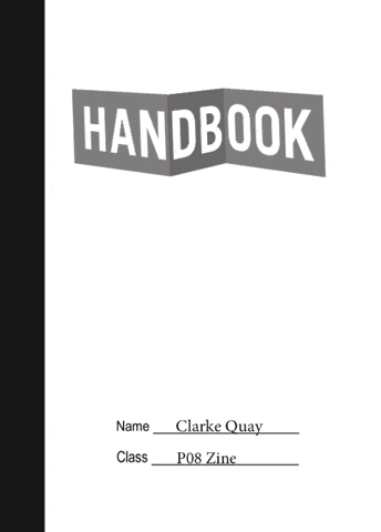
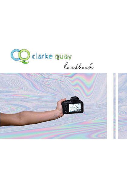
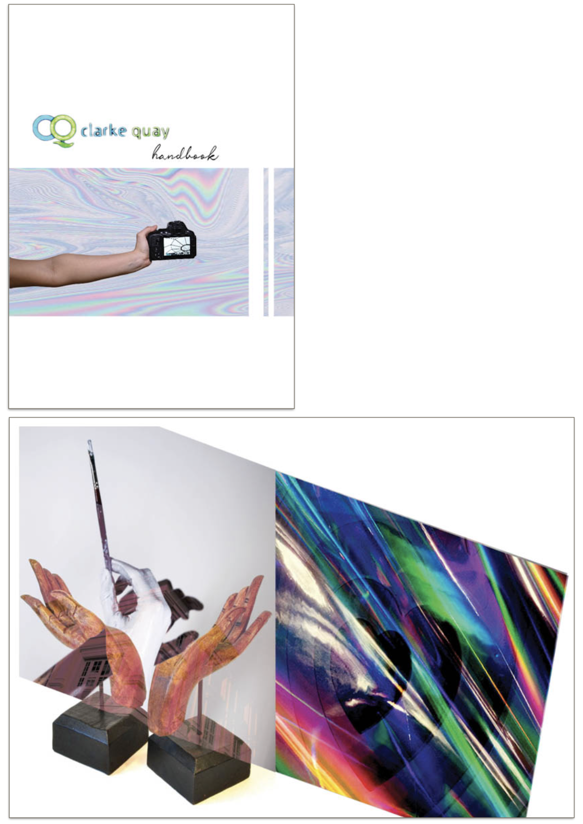
Initially I wanted the covers to be funky and look like jotter book because handbook = guidebook? I really like the title because ‘Handbook‘ is a pun, it’s suppose to be a guide to what to enjoy in CQ but also literally a book of hands. However it does not blend well with the rest of the pages, so I changed the style completely.
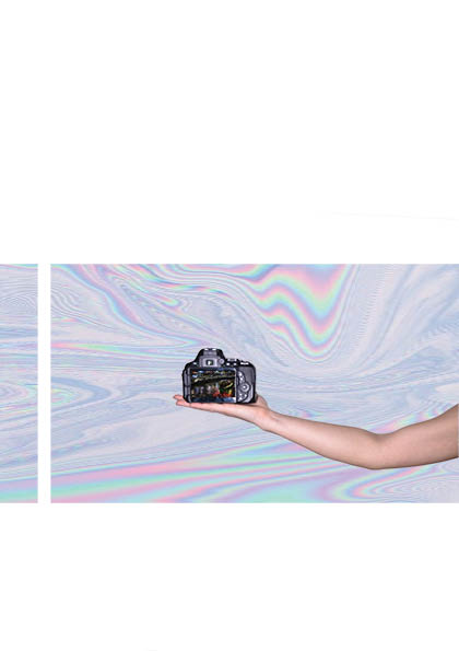
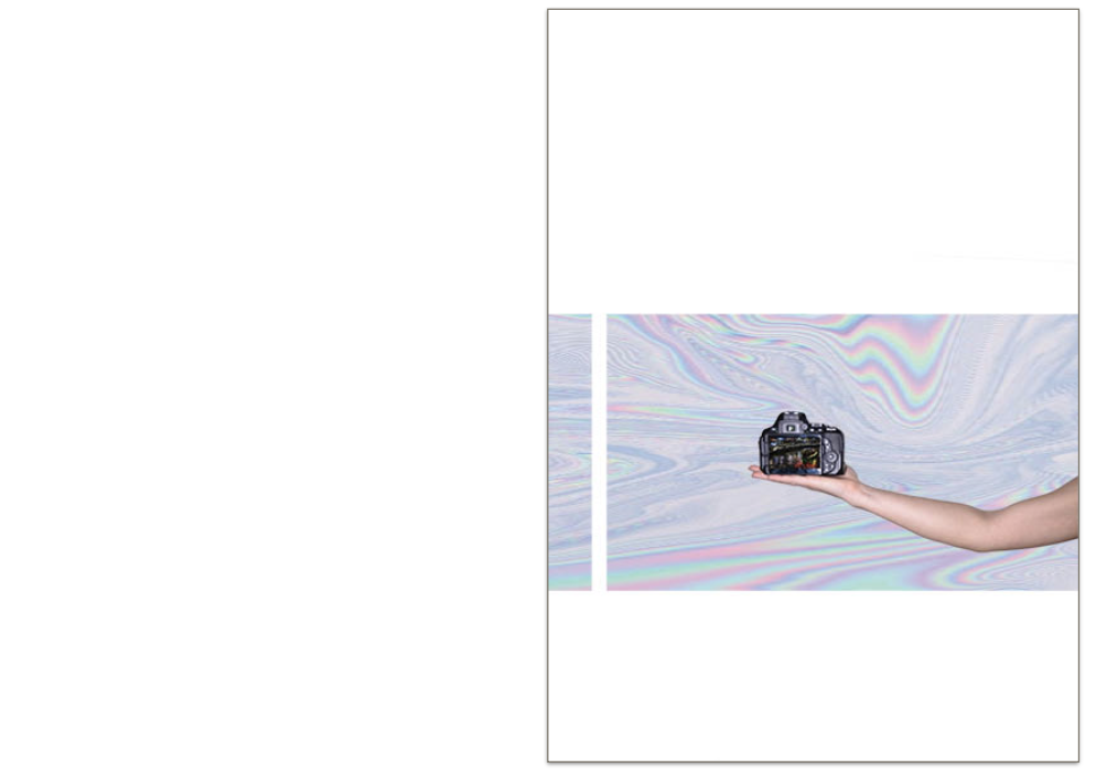
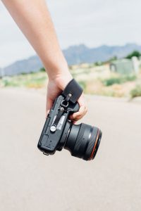
I explored CQ with my camera, and the bulk of the contend is photography. Hence I thought it would be interesting to include me actually taking the camera. The photos in camera shows unique features of CQ, one taken during daytime and one taken during nighttime. ‘Clarke Quay‘ font was taken from the site’s mall because I thought neon green and blue colour actually fits into the holographic colour scheme. Showing partial identity of the curator perhaps also arouse reader’s interest to find out more about what I have to say about CQ.
Outcome:
Sophisticated covers will not fit into my minimalistic outlook for this zine. Even though the covers are simple, a lot of thoughts were put into them.
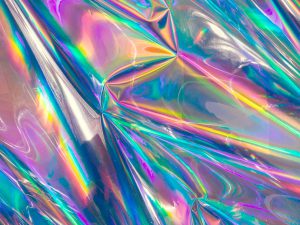
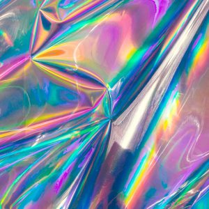
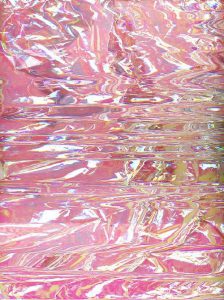

These holographic textures are inspired by the art installation I saw at CQ, on top of the kind of dynamic, lit, vibrant, overall feeling I want to portray.
Equipement
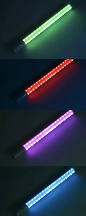
‘Lightsaber‘ that I’ve used to produce the neon lights. Just a single stick, with RGB colour control system to give me any colour I want. (colour theory in practice omg). Sometime I place 2 sticks side by side to give a remix of colours.
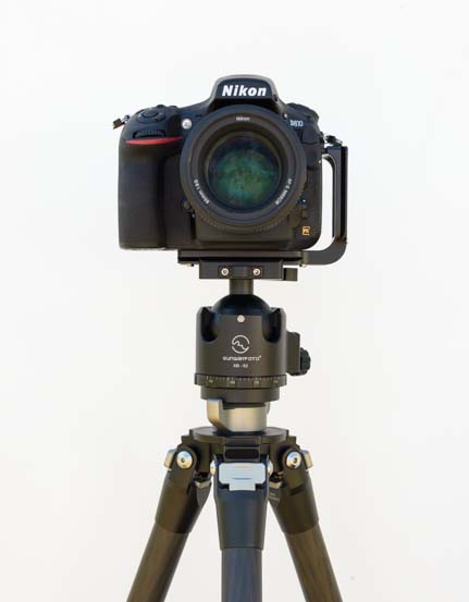
Nikon D870 with tripod to stabilise and DIY white backdrop; a large white board against the wall.
FINAL zine
Video of the printed zine:
The printing and stitching went really well for first try. :’) The colours came out vibrant and almost 1 to 1 as my screen.
Research&Reference
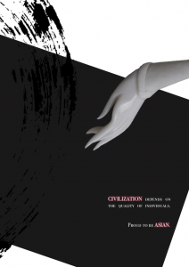
Inspiration for hand gestures from pintrest
My inspiration for the b/w painted hands.
My inspiration for the entertainment aspect of CQ, with clubbing, music and bills.
My inspiration for the noodles on hand photo.
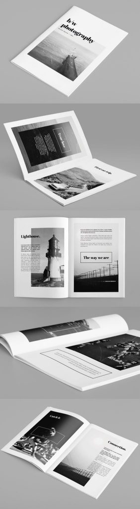
My inspiration for the covers.
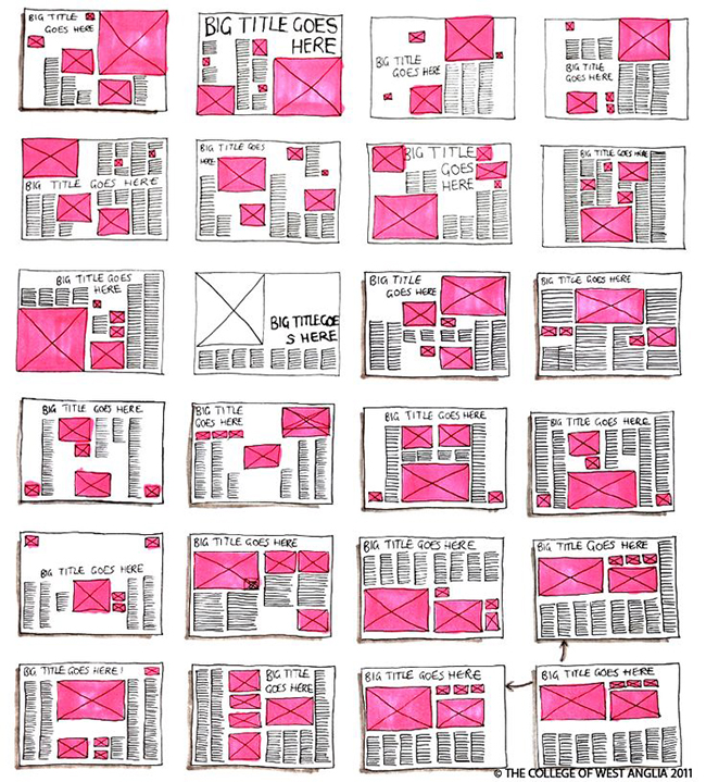
Research on format and style
Readings:
https://ntulearn.ntu.edu.sg/bbcswebdav/pid-1344132-dt-content-rid-5001154_1/courses/17S2-DN1009-TUT-G02/Project_2_Zine_Graphic%20Form%20AY1718%20Sem%202_Techniques.pdf
https://ntulearn.ntu.edu.sg/bbcswebdav/pid-1344133-dt-content-rid-5001155_1/courses/17S2-DN1009-TUT-G02/Grace%20Fussell%20-%20InDesign%20Tutorial%20Contents.pdf?target=blank
How to saddle – stitch.
Tutorial on basic document set up and techniques for Indesign.
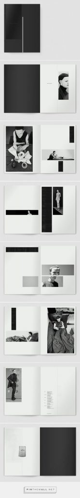
I really like minimalistic designs. Many features in these zine were used in my own zine such as ‘crossing pages’ and blocks of image with minimal words.
Research on sign languages and hand gestures
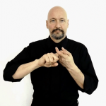
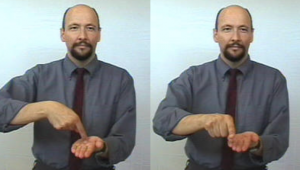
“Friend”

“Go”

“There”