Hey guys!! Here’s my final write up on my final work for Foundation 2D Project 2: Forrest Gump. So far this was the longest project we’ve had and I think it really shows haha. Here’s the earlier post that detailed my research and brainstorming for quotes:
Anyway no more rambling, let’s get straight into it!!
[ T H E M E : S C I E N C E F I C T I O N F I L M S ]
dunzi dunzi dunzi dunzi
In my previous post I did mention that I had like a sci-fi theme in mind, so I just went with that because the sci-fi genre is the genre that I’m the most fascinated (and confused) by and I just really love them. I actually was also considering doing a series starring quotes from Quentin Tarantino films instead because I’m a really big fan of his film direction and aesthetic, but in the end that was more limiting so I decided on the sci-fi theme instead.
I decided to go with a more serious and sullen vibe for the pieces, and wanted to bring in the reoccurring theme across many sci-fi movies of human nature, and ‘what does it mean to be human’. (I suddenly thought of Ex Machina and now I’m sad I didn’t research on it help) I also wanted to involve the design principle of unity and variety, so I decided to use hands as a motif across all my pieces. My general approach for formulating the visual interpretation of the quotes was to draw upon the themes of the movies and at the same time, look at the literal aspects of the quote.
was not supposed to put this in but i legit love LOVE harrison ford yall
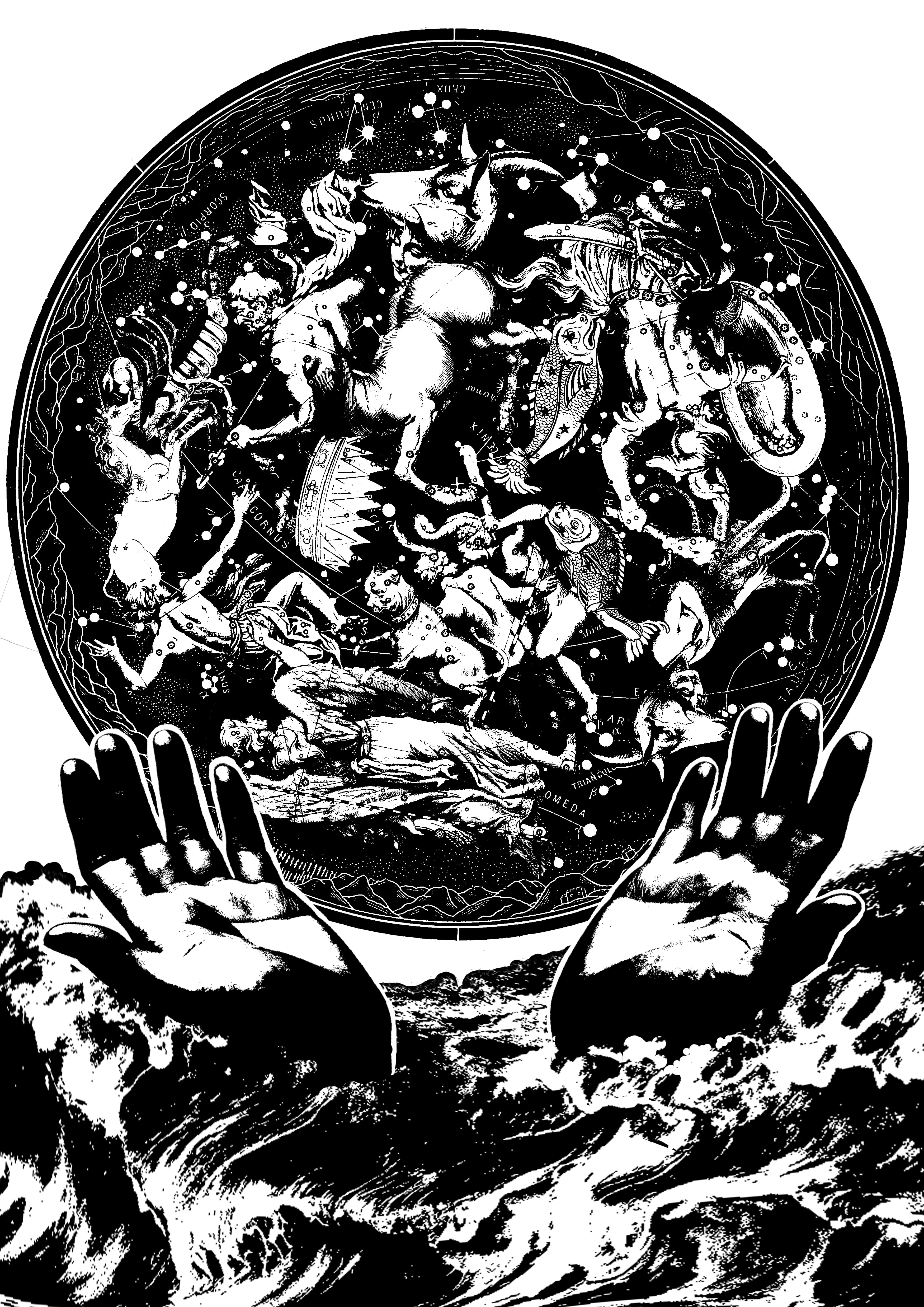
[ G A T T A C A ]
“You want to know how I did it? This is how I did it Anton; I never saved anything for the swim back.” – Vincent Freeman, Gattaca (1997)
Forrest Gump: Gattaca print, Niki Koh
This was the first print that I did for the project. To be honest I spent way too much time on it – almost 7 hours?? After that I decided to reduce the intensity in the designs for my subsequent compositions cos I honestly didn’t (and still don’t) have a lot of time HAHAA.
Plan for Gattaca print
The literal aspect of the quote that was in the final print was the usage of water as a nod to the word ‘swim’, in the form of a stormy, dark sea. The original hands were supposed to be cupped, but none of the cupped hands I found online looked good when in threshold, so I substituted them for a pair that looked like they were praying or giving something up, as a reference to the phrase ‘I never saved anything’. The themes I drew from the film to put into the print was the theme of intergalactic travel, as the film’s plot is about a man who is genetically disabled, but still dreams of pursuing a career in space due to his extreme passion for it. Hence, the numerous mythical representation of constellations located within the circle of stars in the print.
Gattaca (1997). Image taken from www.joshldavis.com
Initially I also wanted to place a rocket within the cupped hands but I figured that would result in too many elements within the print.
Initially, the print was like this:
First draft of Gattaca print
The feedback that I had gotten was that there were too many cluttered figures in the circle and it was hard to figure out what they were. (Also I forgot about following the dimensions and it was really big LOL) However because I didn’t have time to edit the print before silkscreening, I decided to just silk screen this original print on the bag, which I will go into detail about later!!
Yup but for the final presentation I decided to put less figures into the circle and increased their scale so they would be more obvious. The difference isn’t very big though so maybe my efforts were futile?? :’)
Nevertheless, this print is the one which I liked a lot as well as a bunch of other classmates too so I’m glad about that!! (A friend told me it looked very bengz though lmao she’s not my friend anymore humph)
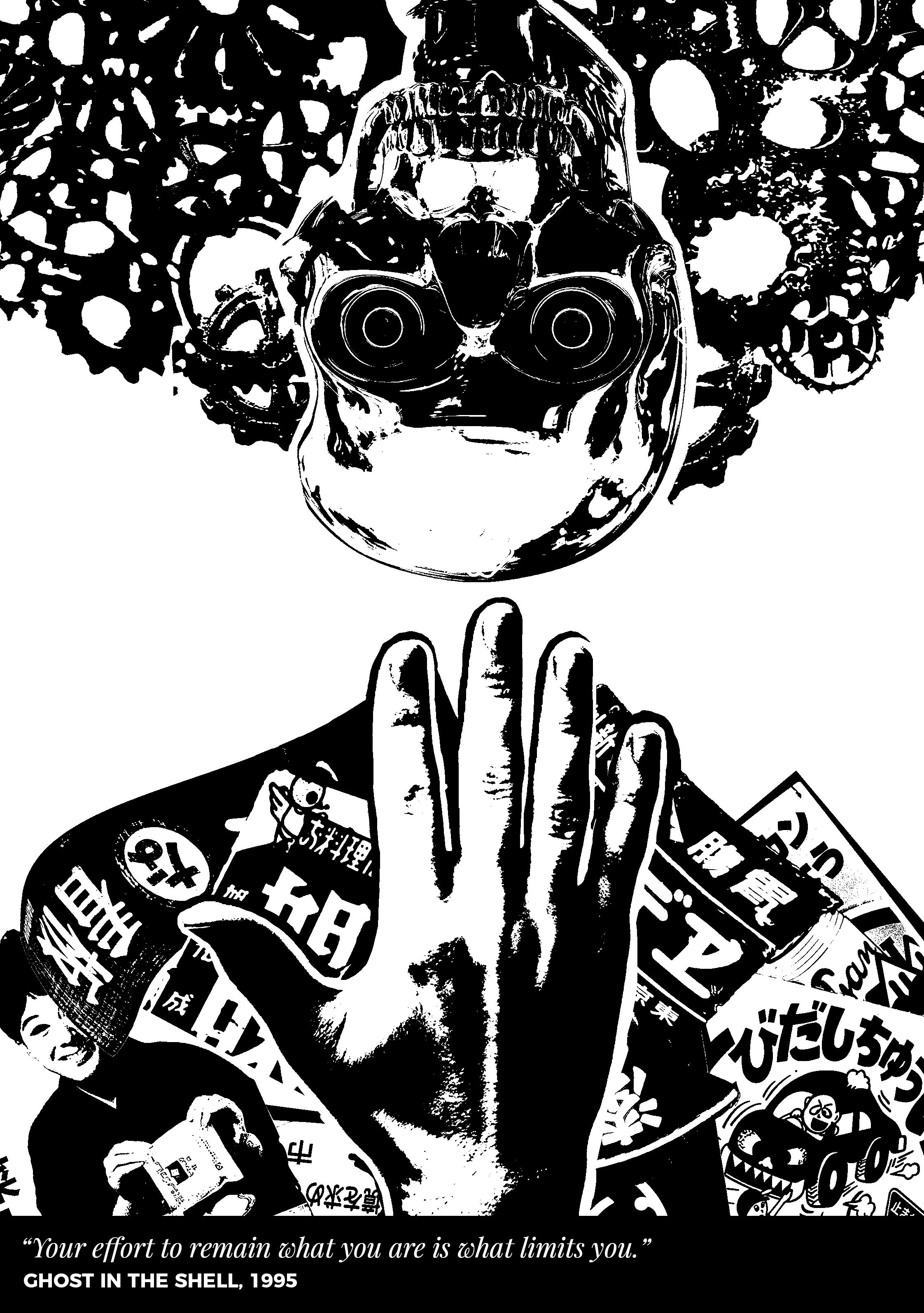
[ G H O S T I N T H E S H E L L ]
“Your effort to remain what you are is what limits you.” – Puppet Master, Ghost in the Shell (1997)
Forrest Gump: Ghost in the Shell print, Niki Koh
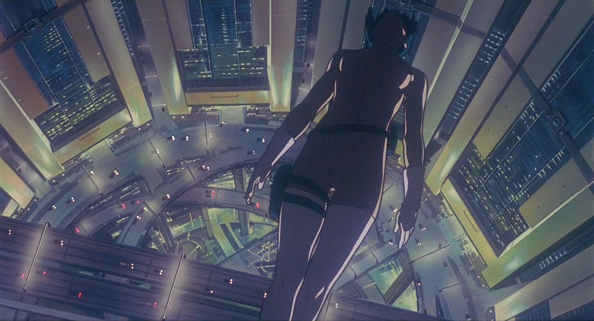
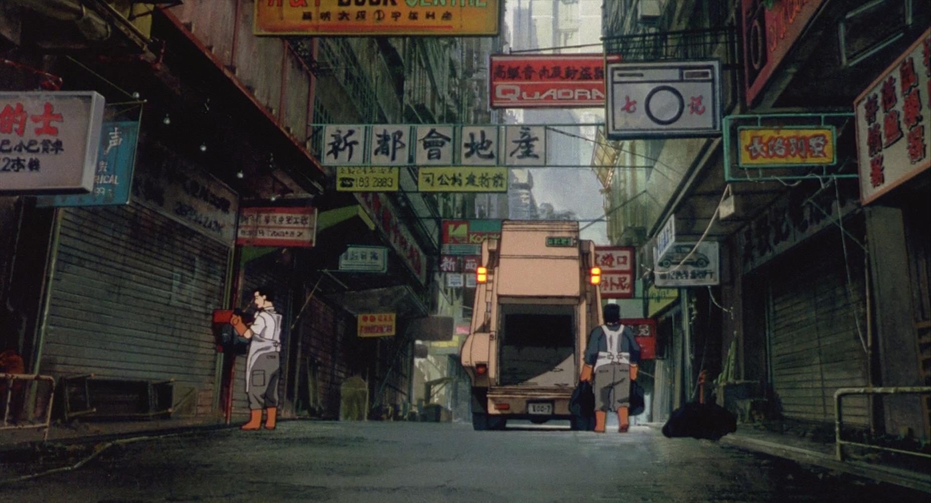
This print was the second print that I embarked on. As hands were a motif to be used, I decided to position this one to be reaching out for something, as the quote alludes to the idea of progress, so I wanted the print to have a forward/upwards moving motion. Progress would be a nod to the futuristic landscape that was in a lot of sci-fi movies, like artificial intelligence (AI) or steampunk gears. Furthermore, I wanted to pay homage to Japanese animation by using traditional vintage Japanese signs to show a loss of culture from progress, as the film also featured a lot of these signs as well:
Ghost in the Shell (1997). Image taken from www.discountanimereviews.wordpress.com
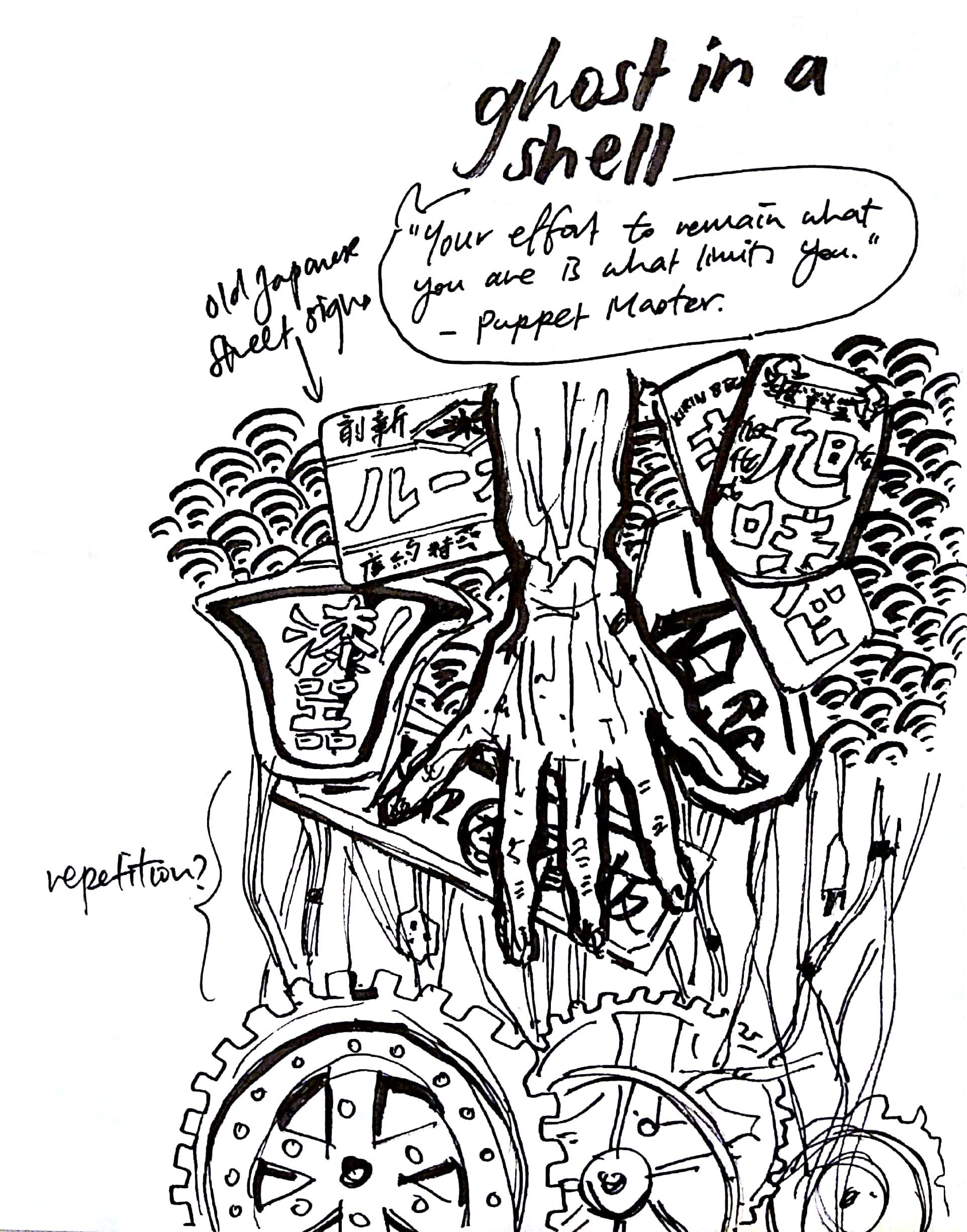
Initially the idea was for the whole print to be reversed, like in my plan:
Plan for Ghost in the Shell print
Plus the hand was supposed to be an elderly person’s hand, but I couldn’t find a good enough picture (to threshold because I just refused to use halftone at that point because I felt that the effect was just SO UGLY like why would people even) so I had to use a normal hand instead. Daphne suggested the idea of flipping the thing around and it made a lot of sense to me, so creds @daphnepotata!!! :)) The wave pattern and wires were also tried out, but it seemed to make everything more complicated so I took it out.
The first draft of the print looked like this:
First draft of Ghost in the Shell print
The feedback from the others was that although there was supposed to be a sort of symmetry between the skull and hand, the hand was still taking up most of the space, so the idea was a bit lost. Furthermore, the signs seemed a bit cluttered, and the gears did not reflect the cluttered nature as they didn’t reach the end of the page. Joy suggested bringing in a triangular nature, so I followed her suggestion and found that it created a leading element to bring the viewer’s eye to the center of the page! However Joy did say in the final review that the woman at the corner was really creepy which I didn’t notice at all probably cos I was used to seeing her face and I also thought it was funny HAHAHA
Although the print felt kinda simple to me, in the end it really helped to bring breathing space to the rest of my series, which is generally really heavy on the eyes.
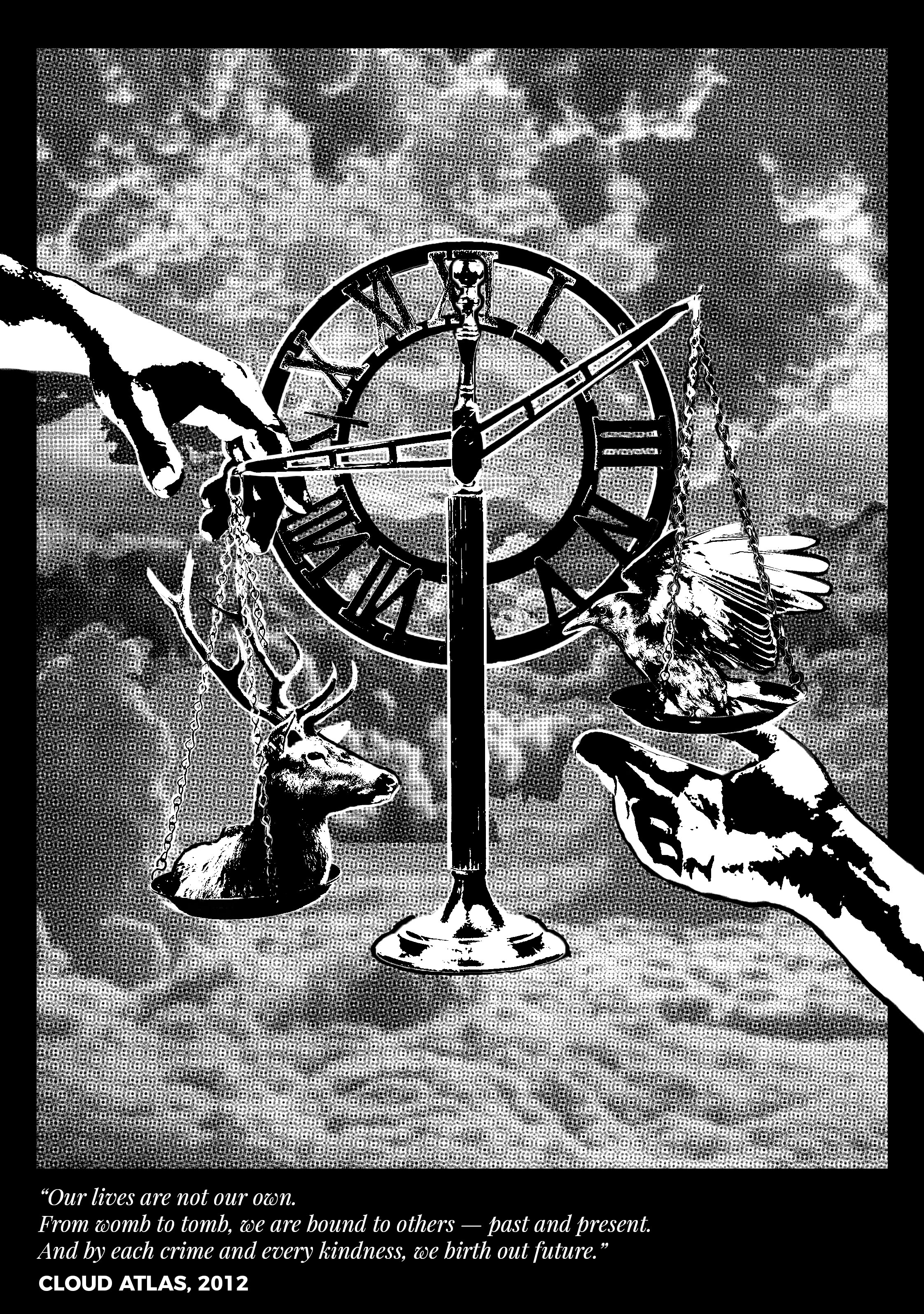
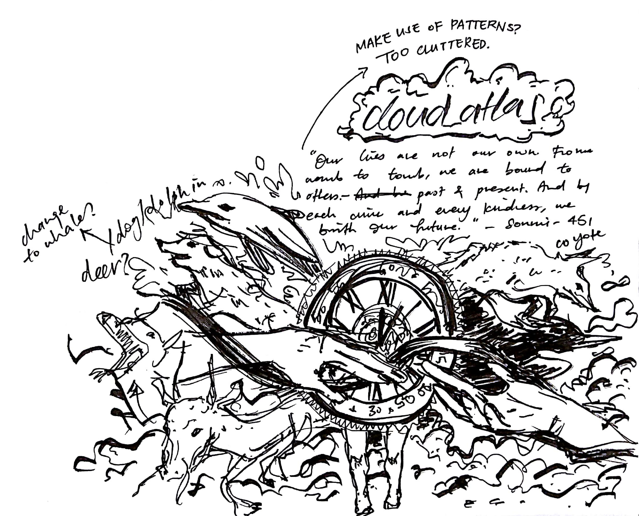
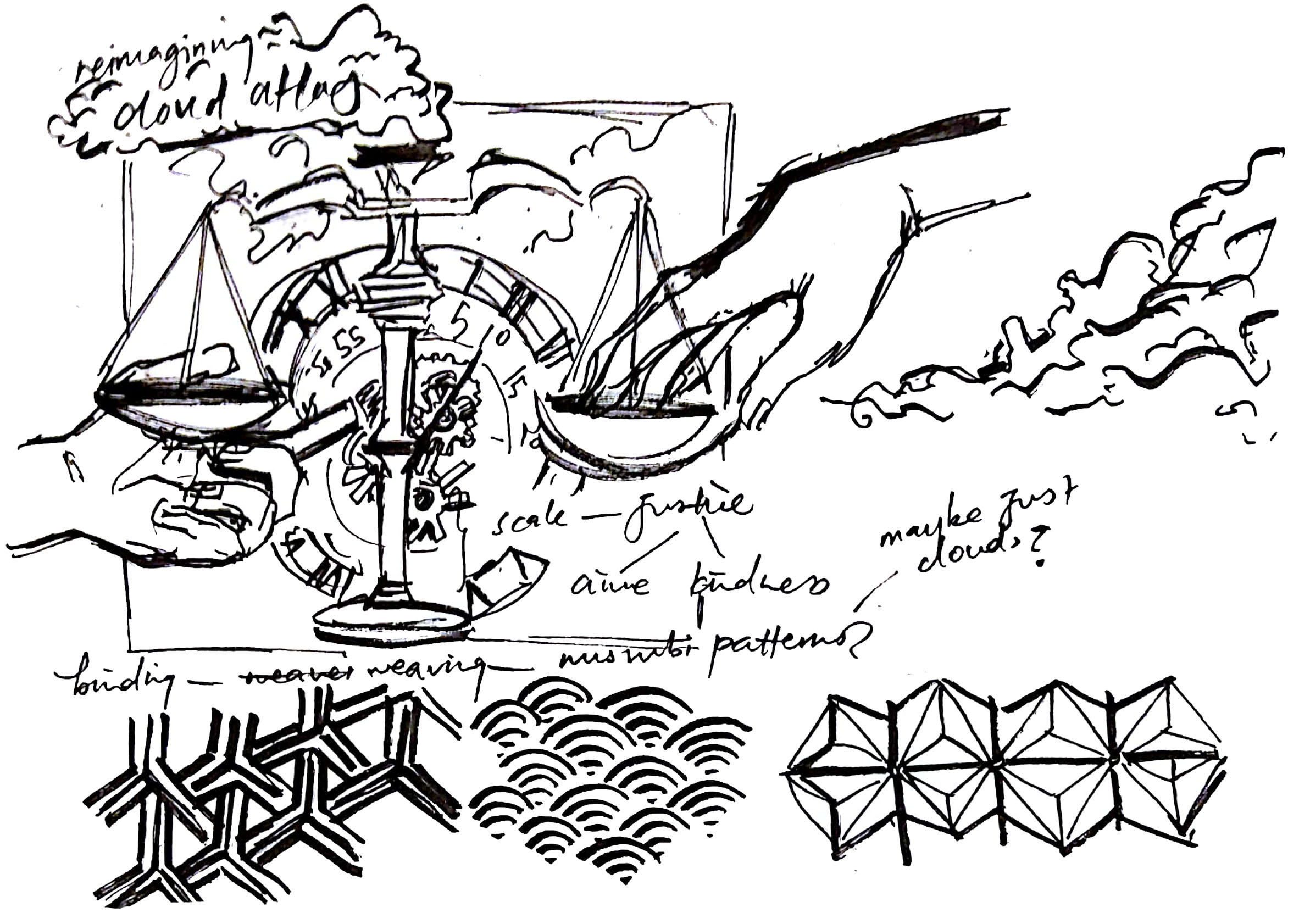
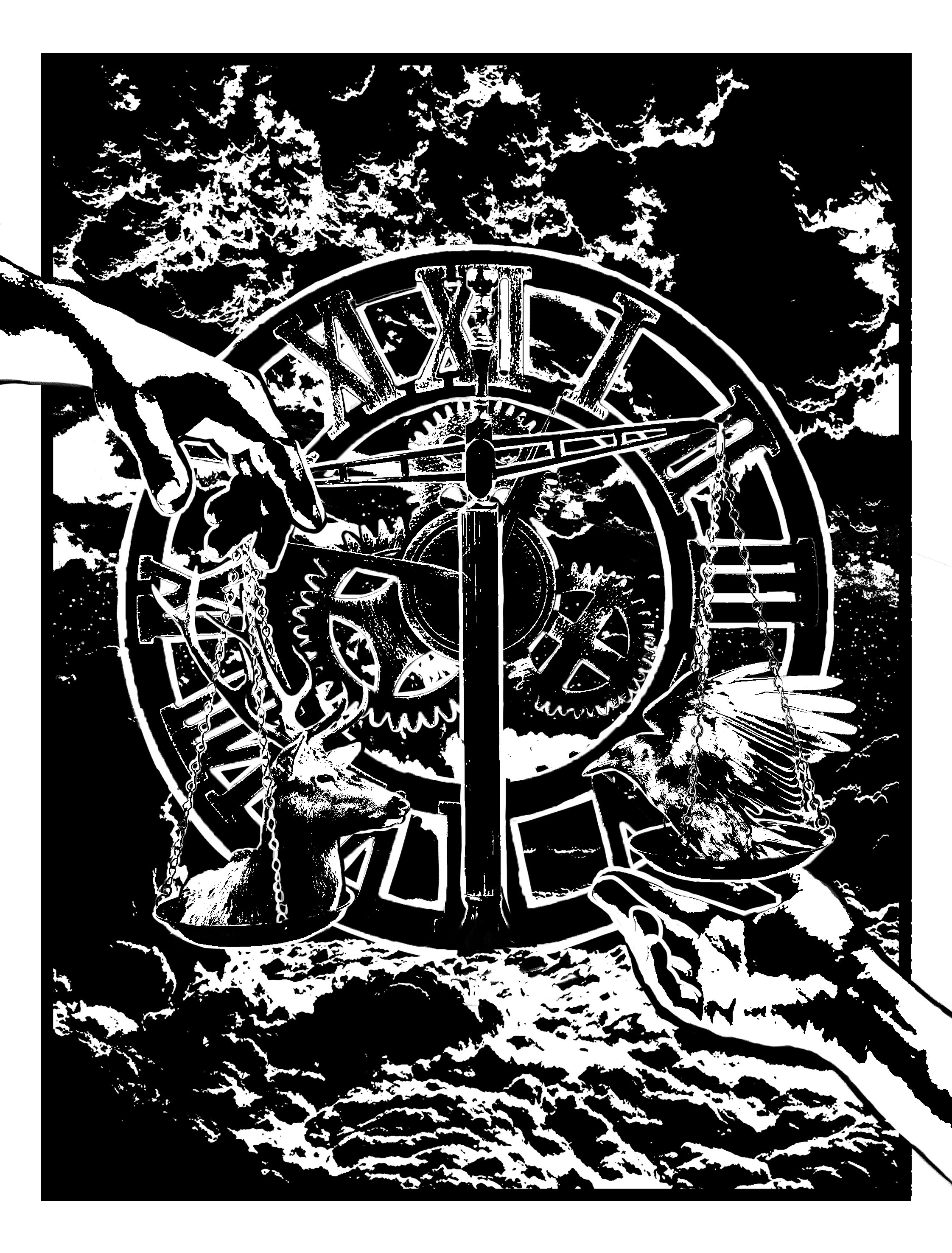
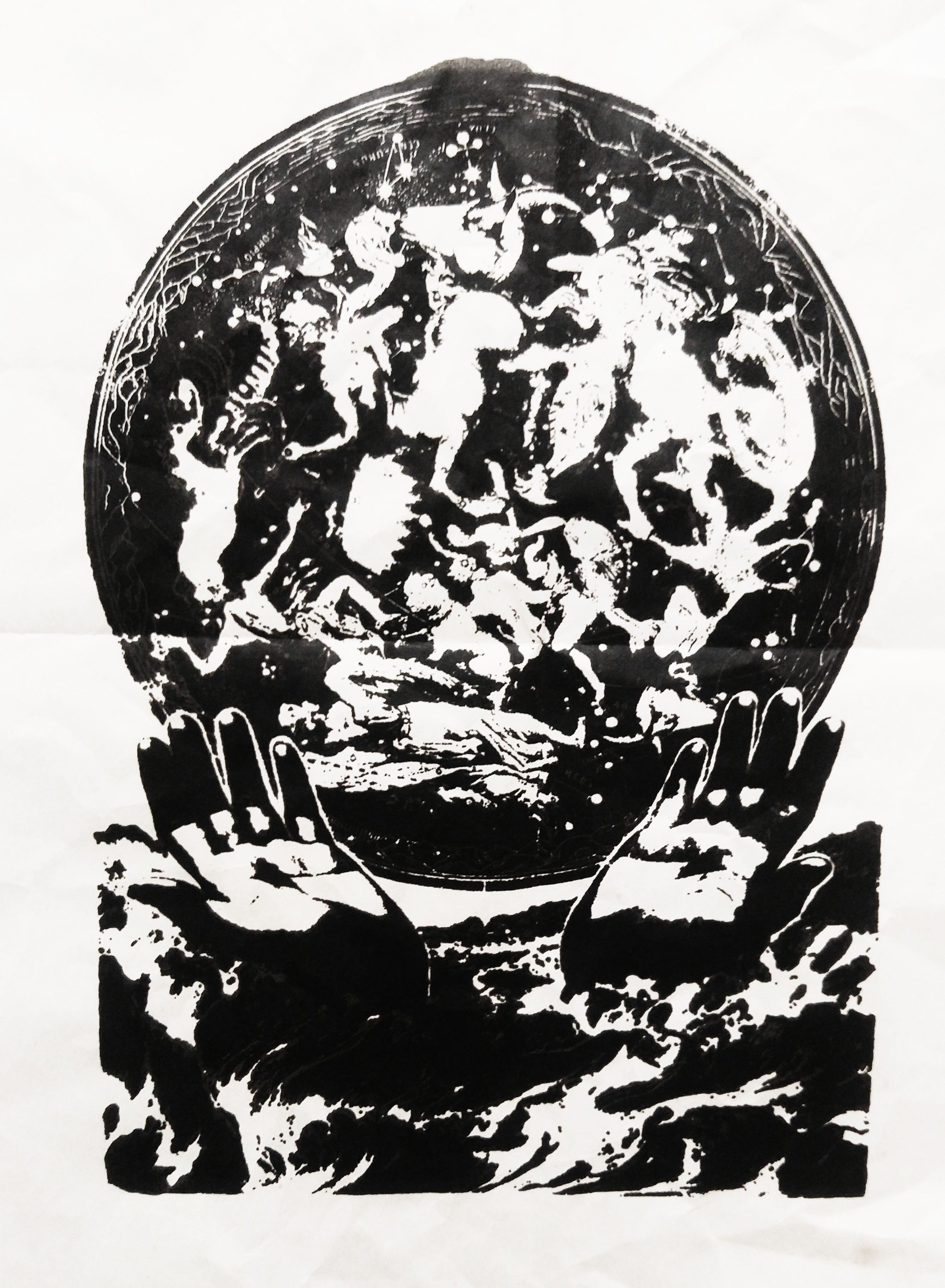
[ C L O U D A T L A S ]
“Our lives are not our own. From womb to tomb, we are bound to others — past and present. And by each crime and every kindness, we birth our future.” – Sonmi-451, Cloud Atlas (2012)
Forrest Gump: Cloud Atlas print, Niki Koh
What a long quote hahaha. There were a lot of elements to break down so lemme do this more systematically:
“Our lives are not are own. From womb to tomb, we are bound to others.”: For this part, I decided to use the hands to symbolise a form of connection to others, which is why they are both reaching out to one another.
“[P]ast and present.”: This part is reflected also in the theme of the film itself, which centers on the idea of reincarnation and how our souls transcend time. I wanted to bring in the idea of reincarnation by providing an almost heaven-like backdrop above the clouds, and also in the weighing scale, an item used when weighing sins versus good deeds when a person dies in Egyptian or Greek mythology. The idea of time is also present in here, hence the usage of the clock behind the scale. I also made the idea of time and moral deeds connect by making the scales the hands of the clock (as per Joy’s suggestion, thanks Joy!!).
“And by each crime, and every kindness, we birth our future.”: The stag and crow are representations of loyalty and bravery against cunning and evil, representatively. There is also the element of a black frame for the whole picture as a way of bringing about a feeling of one life being simply one frame in the entire process of the lives you encounter over being reincarnated.
The plan was initially like this:
Initial Plan for Cloud Atlas print
But I figured it looked way too complicated so I scrapped the animals and did this:
Final plan for Cloud Atlas print
However, I brought in the idea of animals again for deciding on what to place in the weighing scales. The words on binding initially reminded me of Japanese pattern weaving, but I realised that it would probably work better for Ghost in the Shell so I left those ideas out.
Here was the initial draft that I showed for the consult:
First draft of Cloud Atlas print
As you can see the number of elements I took away and tweaked from this composition was quite a few. I removed the gears which were essentially meaningless and cleaned up the deer (SOMEONE SAID IT WAS A PIG i cry). In fact, the original composition was even more black because as I said earlier I had refused to use halftone cos it was just ew to me:
Initial composition before consult, Cloud Atlas
But after a friend said it was too complicated I decided to relent and used half tone which turned out quite nicely, so I changed my view on using half tone huehuehueh. :’) In hindsight it looks hilariously black.
Overall, the feedback was that the cloud background still was kind of complicating the whole design and I could’ve removed it and the original meaning would still have been intact. I really wanted all my prints to have an element of immersiveness so I used up all the space in the print, but I guess it backfires sometimes. :’)
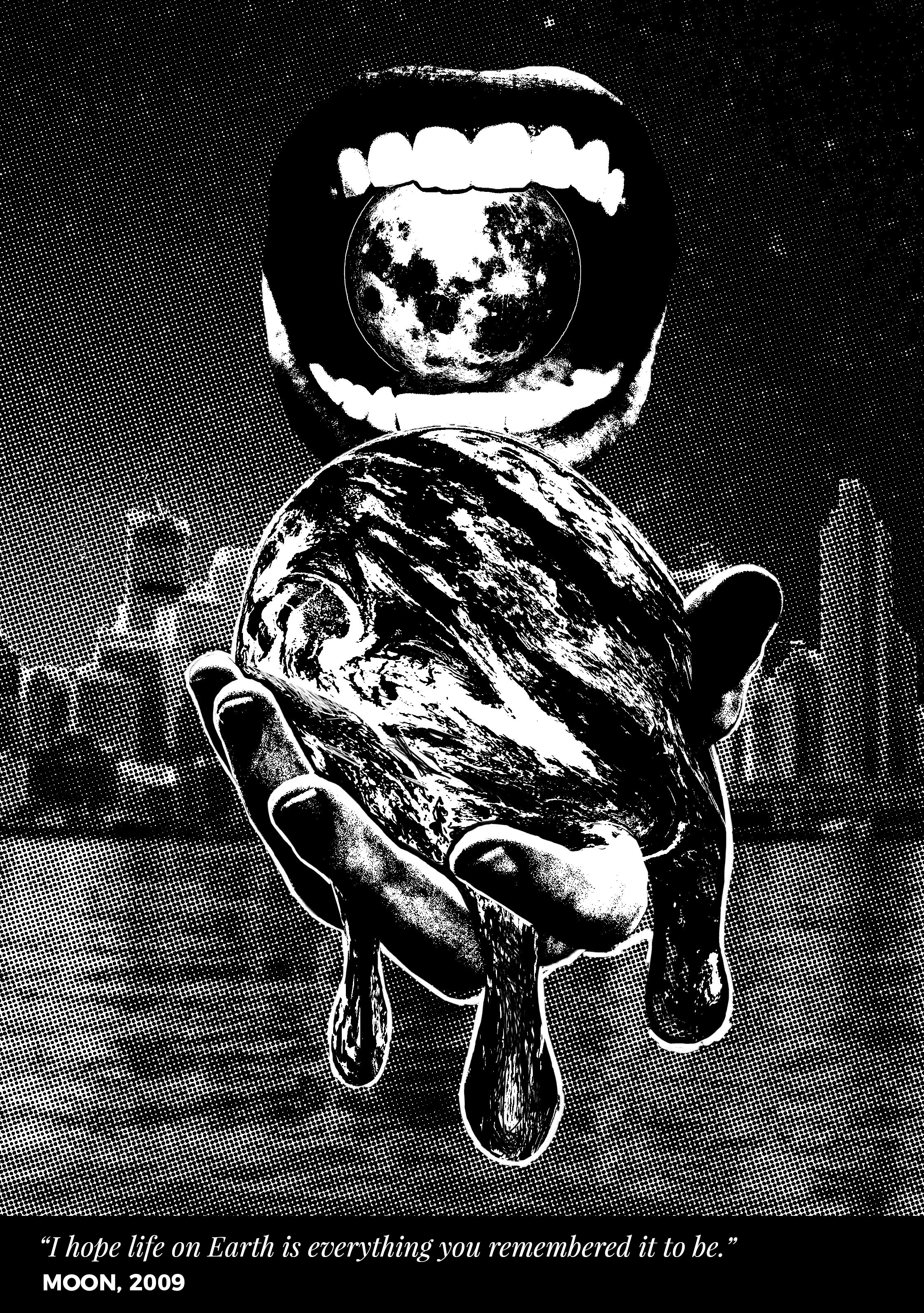
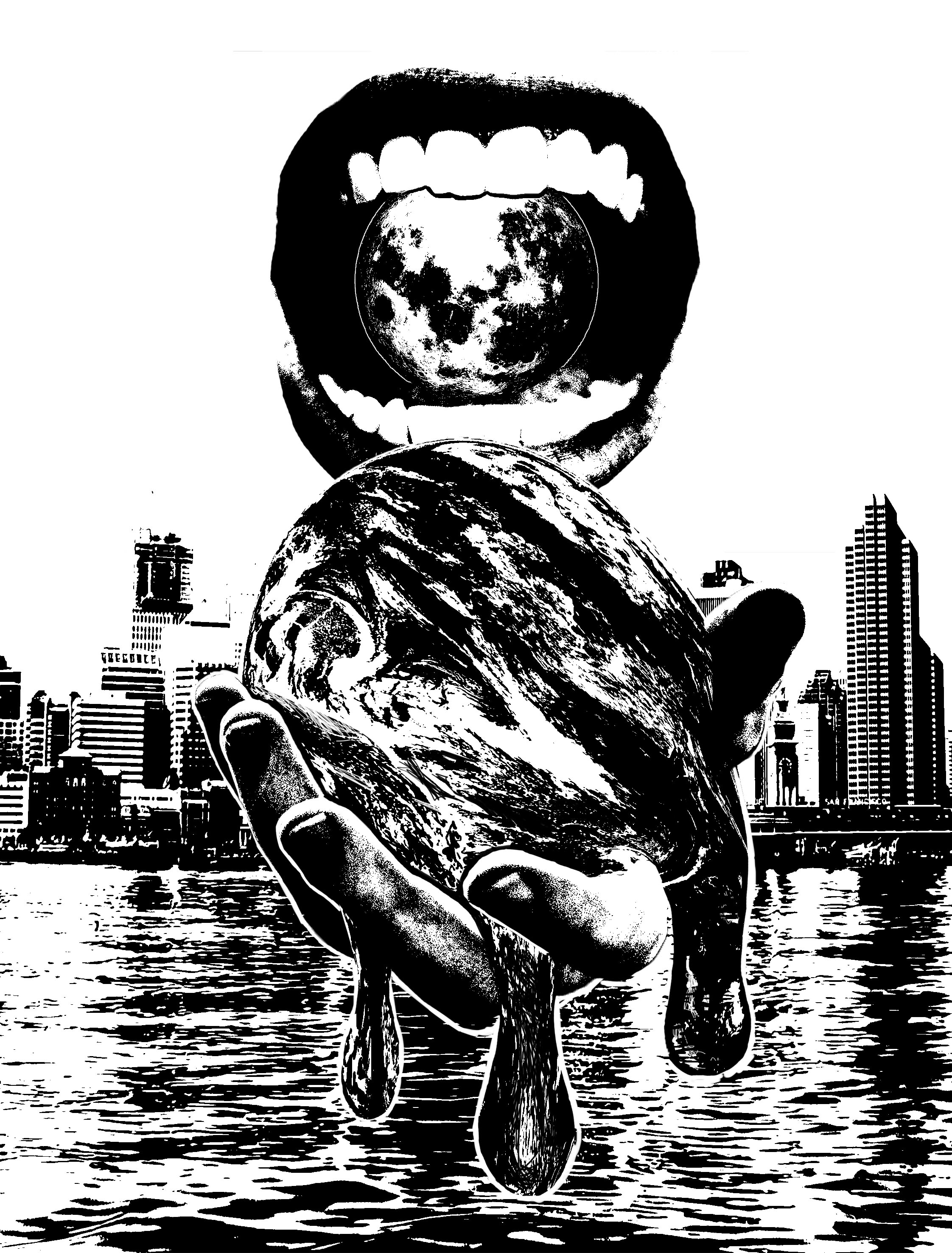
[ M O O N ]
“I hope life on Earth is everything you remembered it to be.” – Gerty, Moon (2009)
Forrest Gump: Moon print, Niki Koh
To be really honest, this print was rushed out the day before printing because I just in general don’t have a lot of time to work so I don’t have any plans for it. I’m not even that clear on how to present this piece, but I will try to break down my thought process as thoroughly as possible!!! :’)
I picked this phrase because I thought it had a very reminiscent and sentimental tone to it and it was just so sweet. But when I thought about it, the quote in the context of the film was really ironic, so I decided to make the print a little sad and grotesque. The motif of hands was included by holding a melting Earth, as a representation of the idea that Earth can never really stay the same as change is inevitable.
The melting Earth made me think of ice cream, so I made it kinda food based by including a mouth behind Earth, as if to swallow it whole in spite. The main character in the film stays on the Moon instead of Earth, so I included a Moon in the mouth to symbolise the mouth mockingly providing/offering it as a replacement of the Earth. The city landscape is to provide a insight into the character’s memories of what Earth was like for him.
I also had a non-halftone version of the print but I felt that the halftone was more immersive.
Draft for Moon print
Joy said she couldn’t really understand the meaning behind the print and at the time it was also very hard to collect my thoughts on it so I hope this makes it a little clearer. :’) Feedback was also that the melting Earth image was very compelling so I was happy about that because that took a lot of warping and cleaning on Ps.
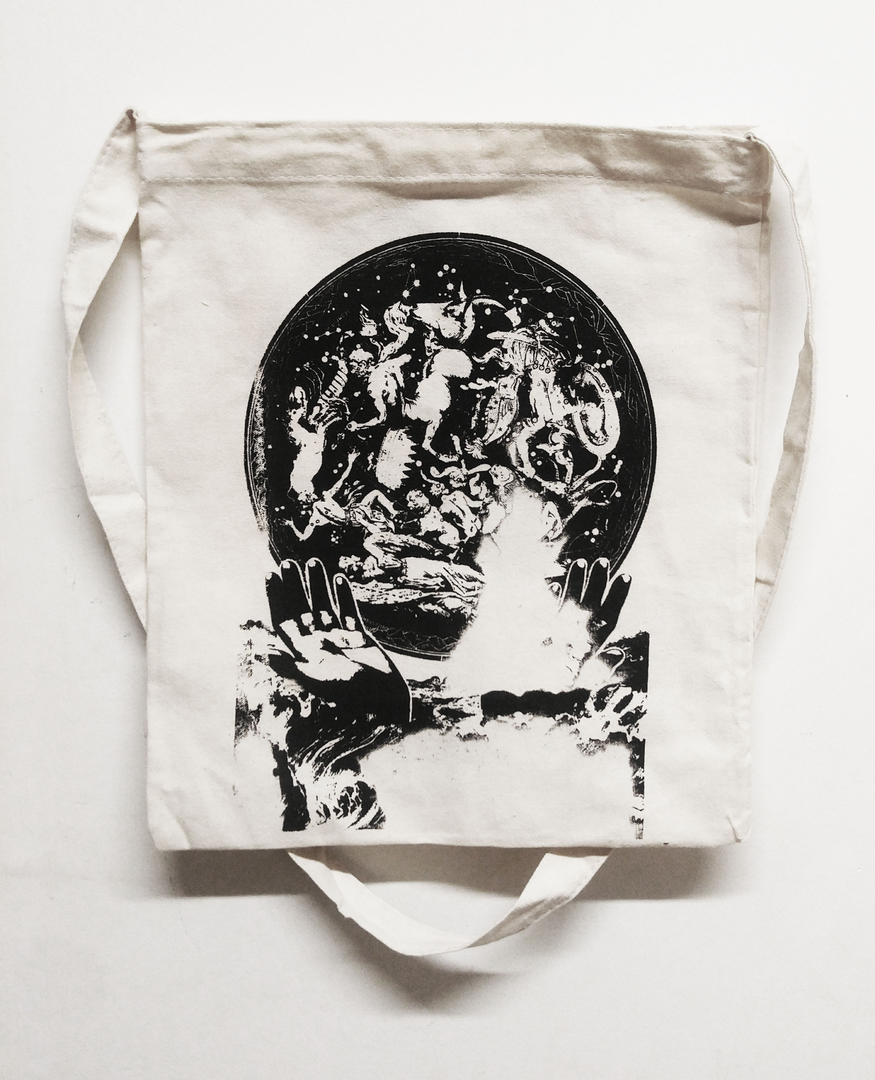
[ S I L K S C R E E N I N G ! ]
While this was supposed to be the fun part of the whole thing it was actually like the most tedious part omg. But it was also partially due to my design which was really complicated and had a lot of tiny details but these things didn’t really register in my head when I was going to silkscreen.
I forgot to take a picture of my silkscreen, but I will do so tomorrow when we print on other things/beta-strip them. Essentially a lot of the times when I applied my silkscreening ink and dragged downwards, there would be a lot of missing patches and I would have to go over it another time and all the tiny details would be lost haisz.
I test printed on a LOT of paper (around 12 or more lol) before each print. Most of them turned out to be failures but there were a few that did look ok!
An absolute failure of a test print, like ME
The first time I silkscreened on my tote, the missing patches thing happened again and I dragged over 5 times out of annoyance and it turned into a big black blob HAHAHAHA literally almost all the details were lost. Lookie here it’s pretty funny actually??
First try on the inside of the tote bag, HAHAHAHAHAHA
Using the other side wasn’t much better as like half of the print didn’t manage to come out and I didn’t want to go through the whole ink blob thing again.
Second try on the outside of the tote bag, I cry :’)
So I bought a bag off Tricia (bless her soul) and finally after a lot of prep it turned out well! (Except for the black blob in the corner from spilling a bit of ink on the corner whoops I could’ve flipped it around but I was too frazzled to think about that hehe). It was a lot of hard working but the craft of silkscreening is so cool and fun that I’m thinking of going to art events/silkscreening shops next time (like I follow a local silkscreening business on Instagram called Fictive Fingers and their stuff is really nice!!).
Final tote bag!!!
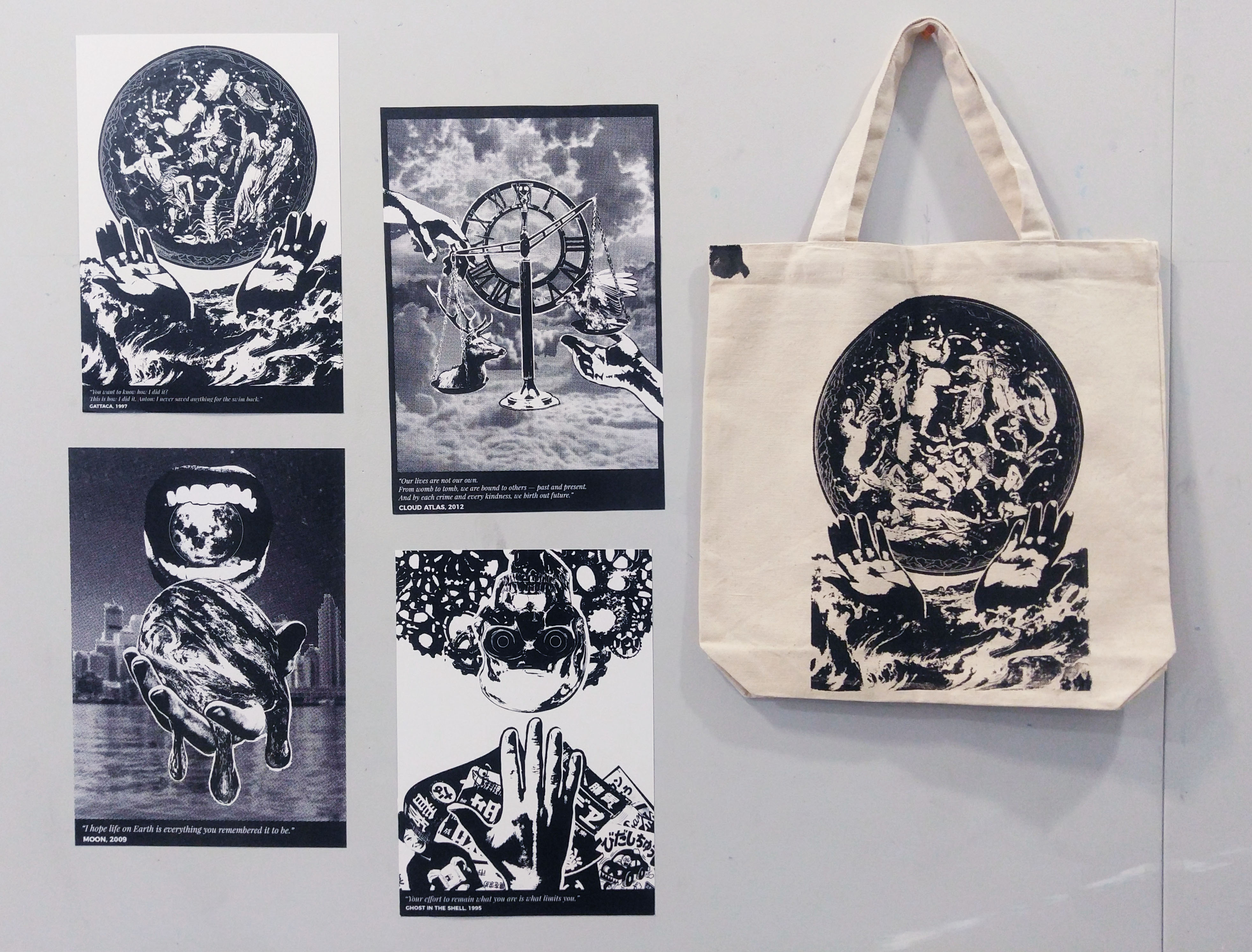
[ FINAL PRESENTATION ]
The only thing I have to say is that I set the prints up so they were diagonally balanced? Like the prints that used halftone are diagonally set across each other, so that the feel of the series wouldn’t be too intense or heavy like people are prone to telling me when they see the work. :’)
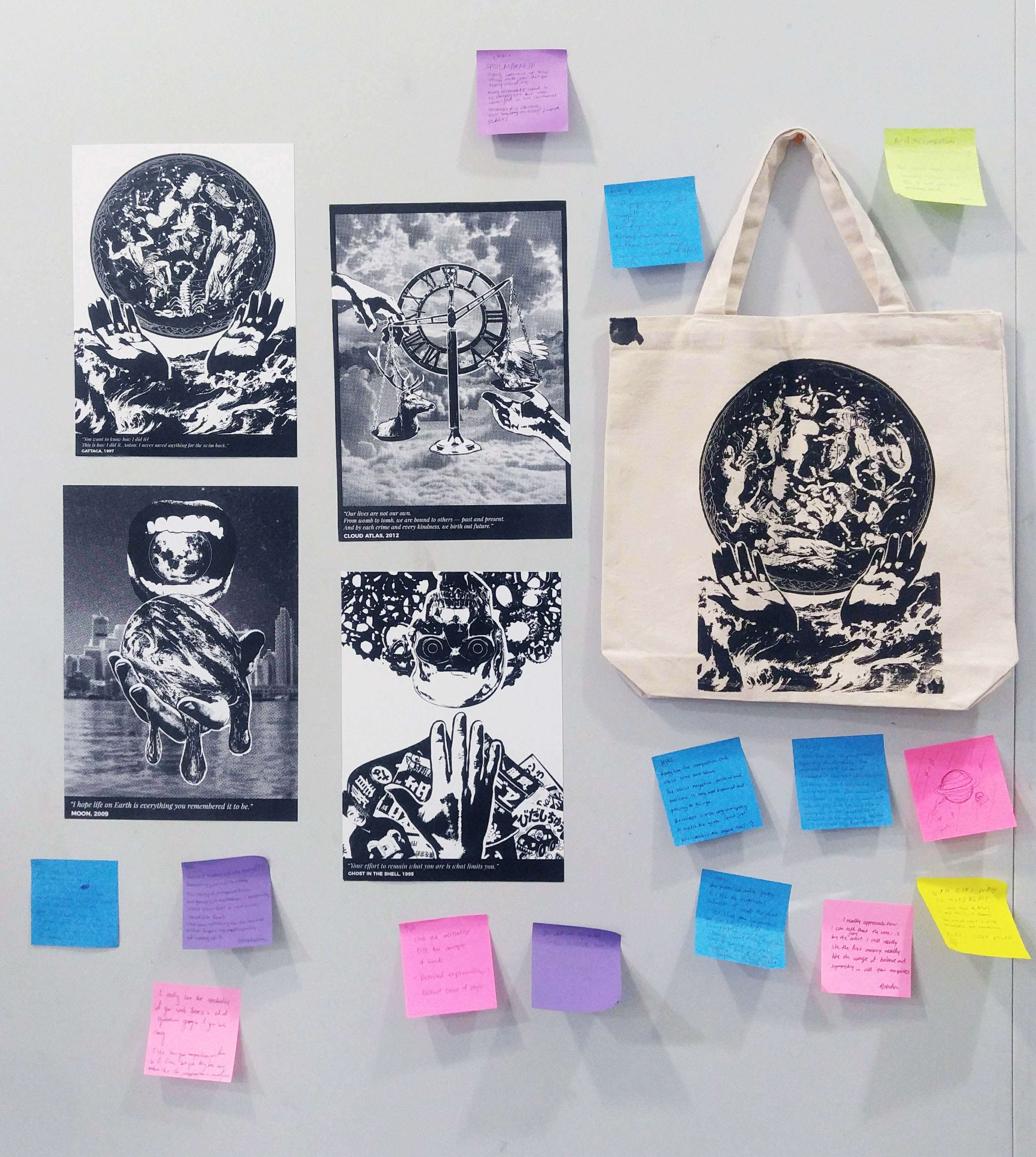
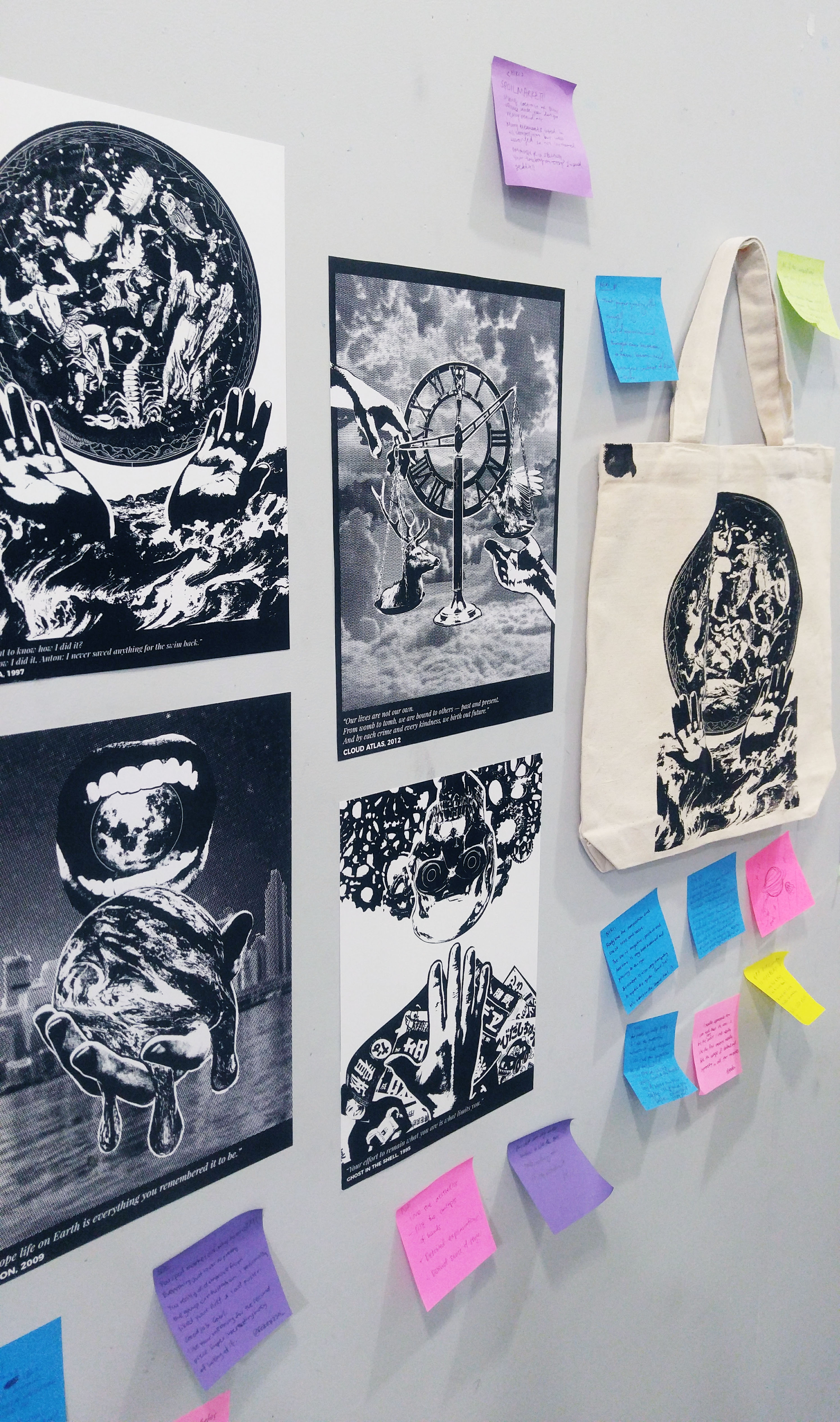
Front view of final presentation wall
Side view of final presentation wallFinal presentation wall with commentsSide view of final presentation wall with commentsComments from the classmates :))))
Final presentation was fun!! As usual I think it’s really cool to look at everyone’s prints and get to know more about their process and thinking and aesthetic. Generally a lot of feedback was about the cohesive theme and motifs and usage of threshold. I’m glad people like the prints. :’)
This project was super time consuming and tiring wow but it was really fruitful!!! Plus I now have an extra set of cool prints to put up on my wall hehe. (Apparently I’m not supposed to?? I decorated someone’s door and they got a warning from hall office >:((( inserts angry blobby sticker) But anyways, thanks for paying attention. I’m aware I write a lot lol. Congrats for sticking to the end!!! See yall next post!