part ii: zine
Not gonna lie for the zine I was pretty lost?? Initially I had ideas but like I didn’t know it had to be..ABSTRACT….so when I heard that I was like Oh No how??
But eventually the plan of action was to have the spreads follow a chronological order of changes within the cemetery, with a focus on unique Japanese visual cues:
- First spread: Pre-war period
- Origins of the Cemetery: Karayuki-san
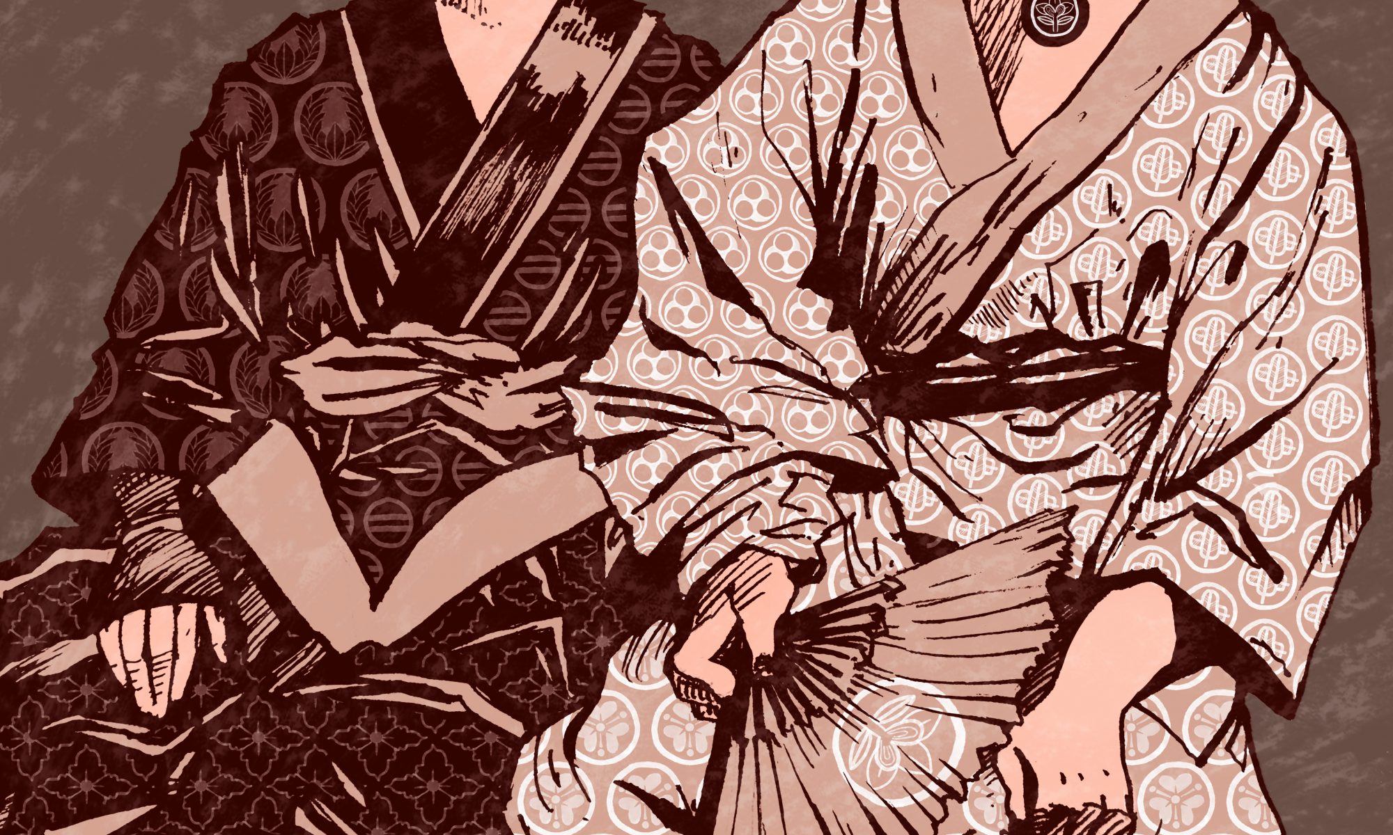
- Family tombs: Kamon family crests
- Second spread: Wartime
- War memorials
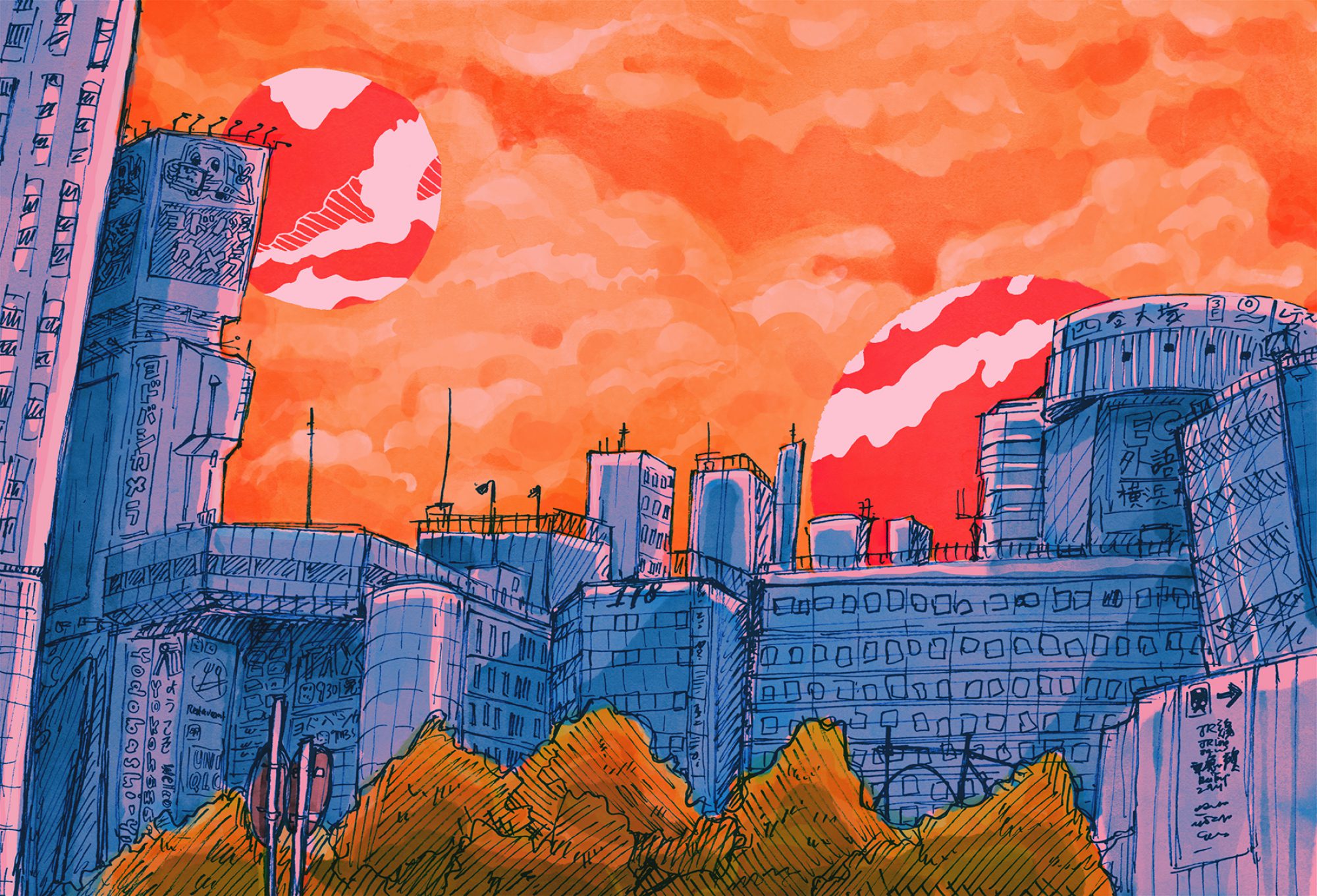
- Third: Post-war period
- What do we see in the park now? Joggers, students…
first spread: pre war spread
Since I wanted to incorporate the karayuki-san, who were the first to be buried in the cemetery, as well as the interesting motifs in the kamon family crests found on some of the graves, I thought I could combine the two into one spread.

In total I found seven different crests (Some of them might not be crests like the non-circle one??? I can’t be certain.) and tried my best to reproduce them even though a lot of them were very faded.
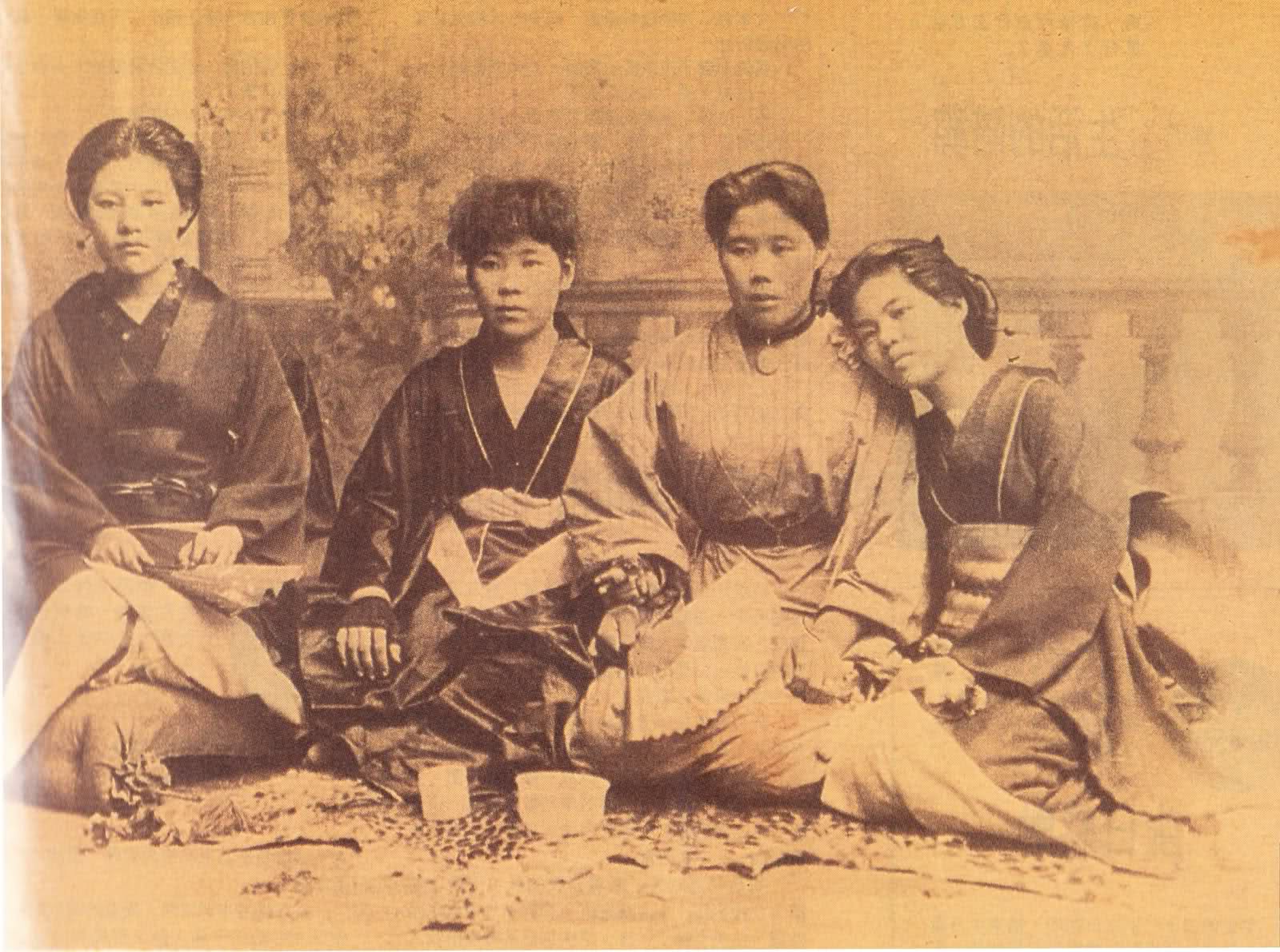
I sketched out karayuki-san from a photo, purposely leaving out their faces (apart from not wanting to burden myself with facial features) to drive home the point about the forgotten souls that rest in the place, as a lot of them died in the conditions they were under, with diseases like cholera and dysentery spreading. 🙁
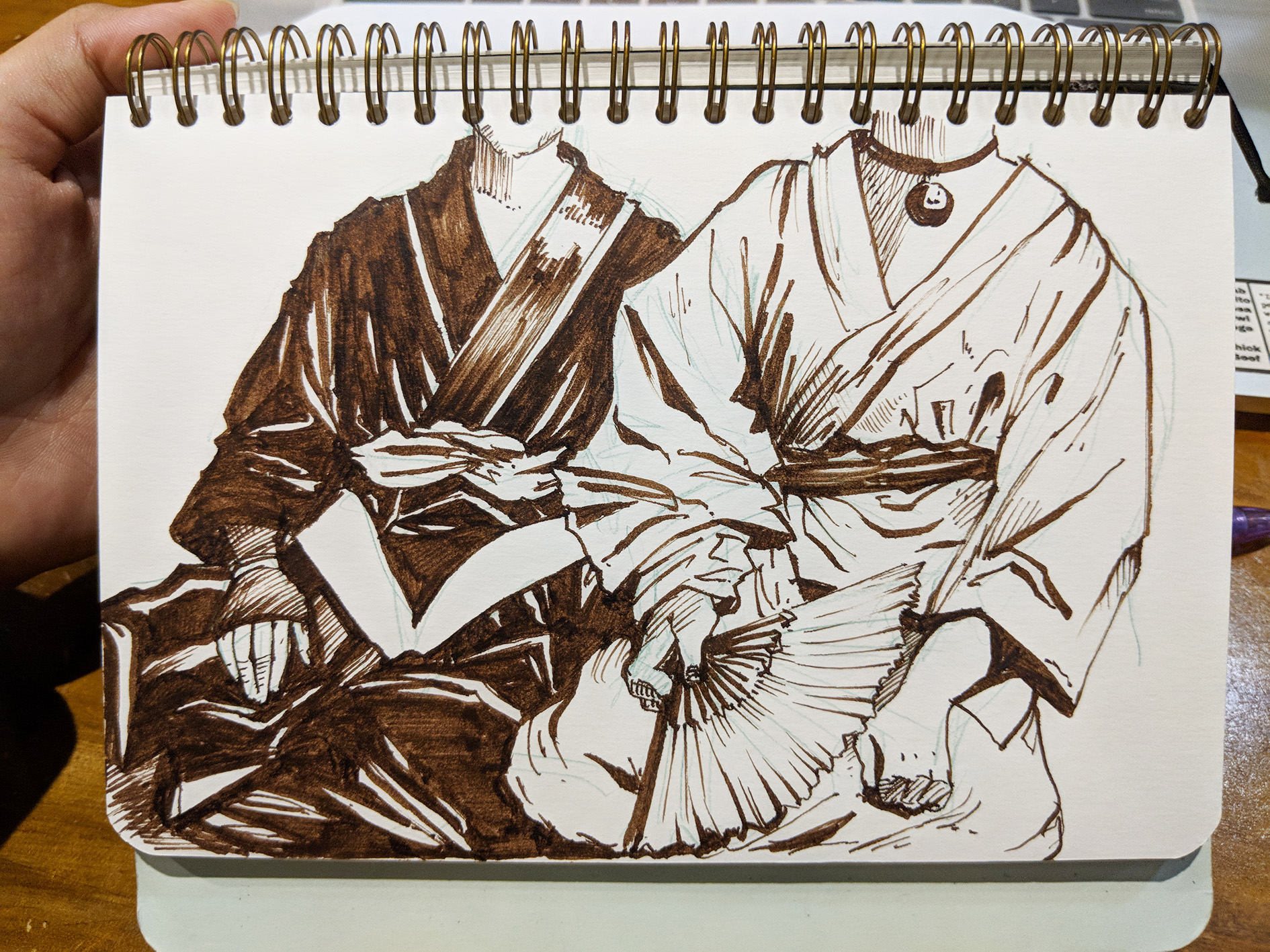

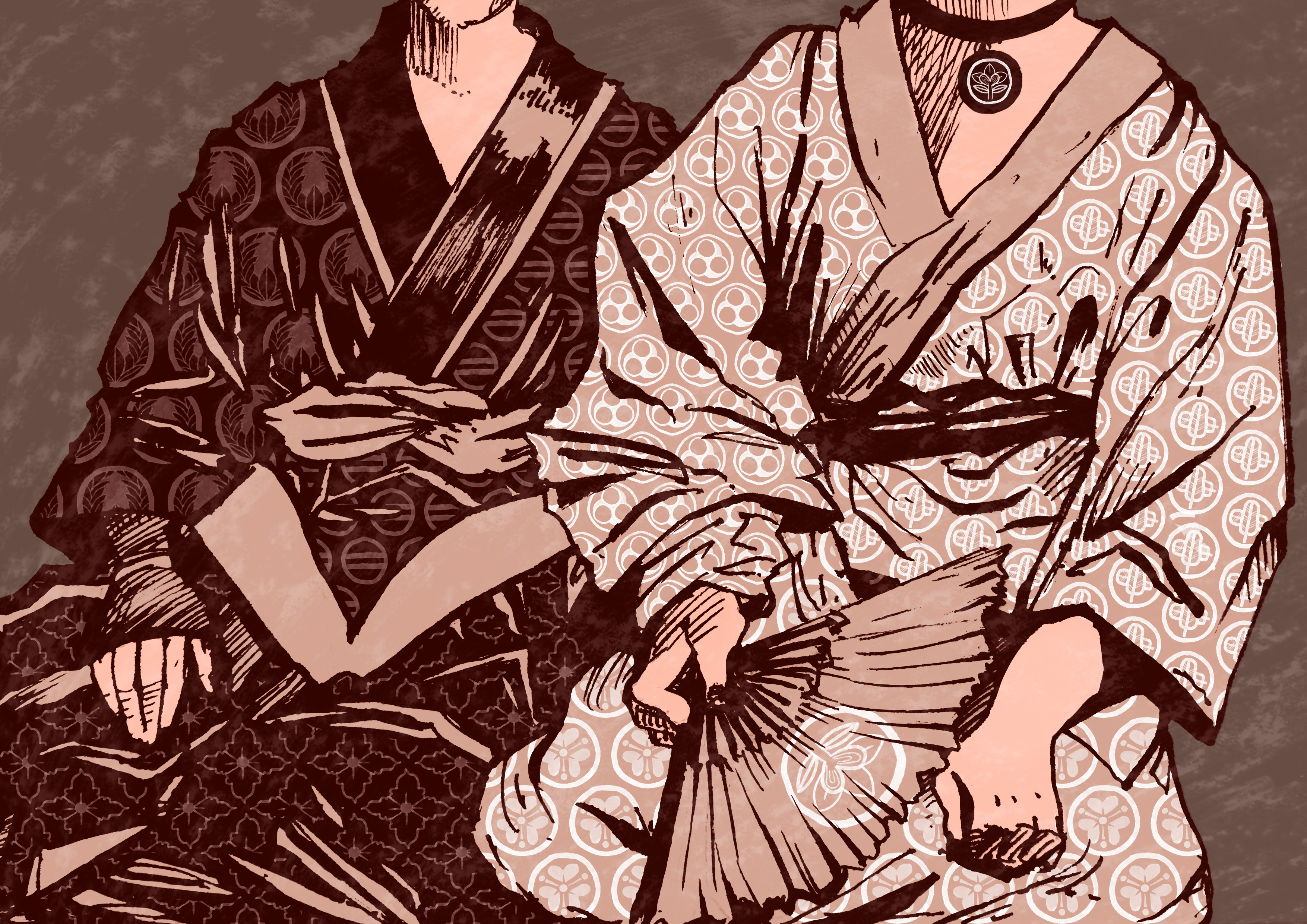
I then created patterns out the kamon and overlaid them on the sketch, changing the line colours and lightening different areas for different tonal values. I also added some texture but overlaying an etching of the floor. Yes I did quite a few etchings!! Here are some of them.
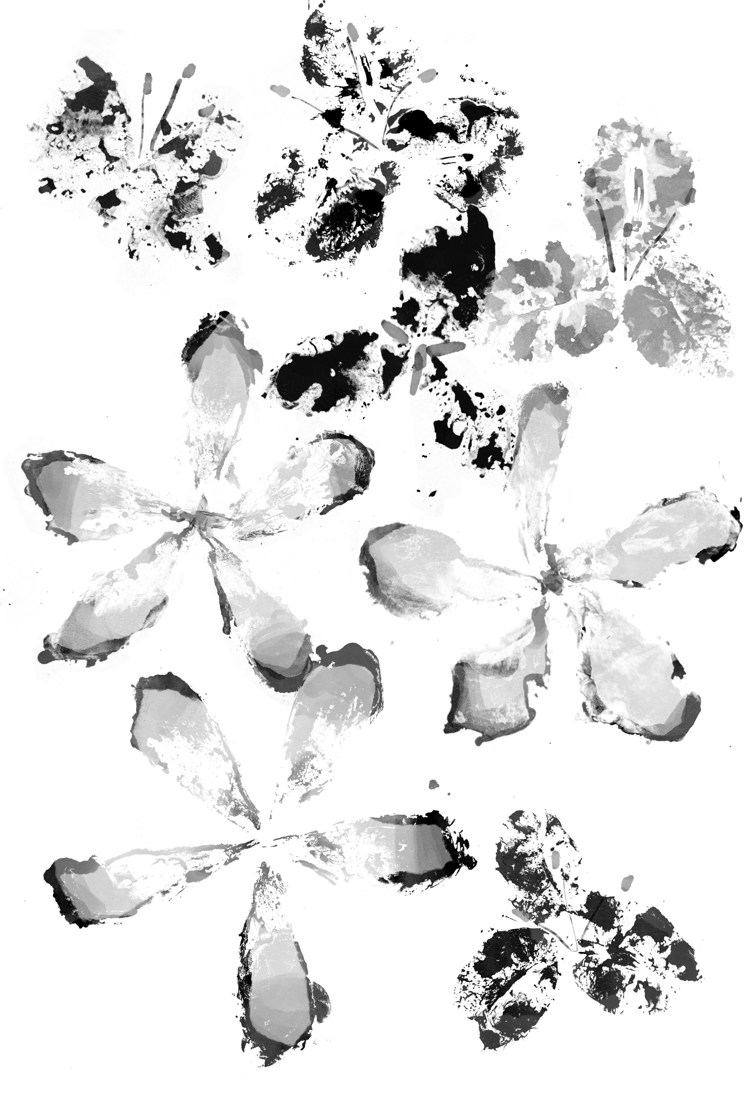
second spread: war-time
The middle page was war so…..it was kind of inevitable that I wanted to portray as a more violent/shocking/melancholic spread.
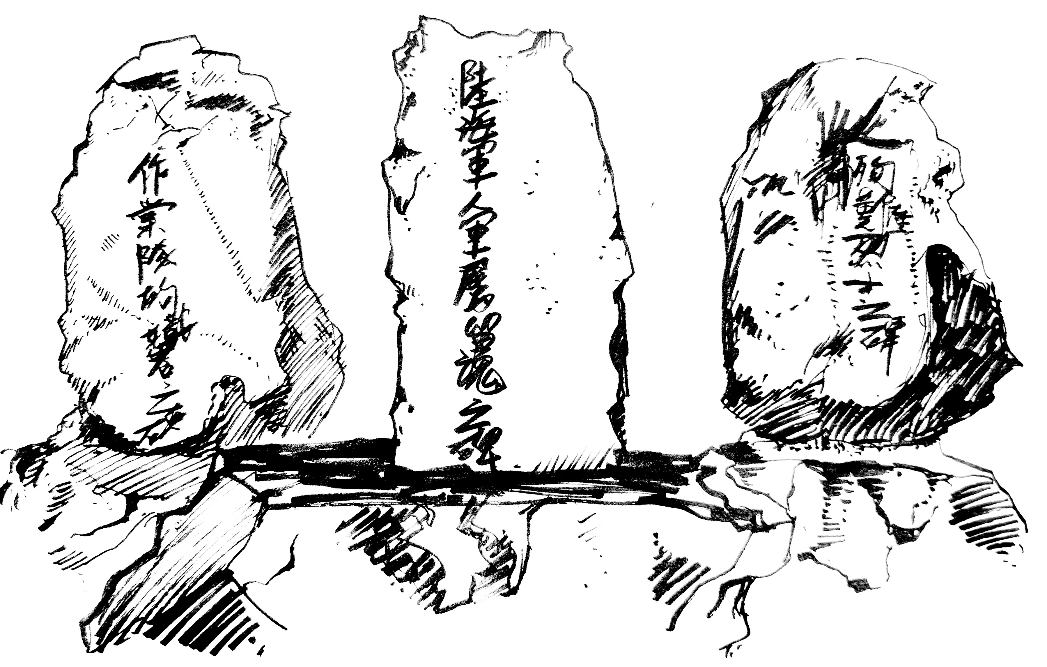
I had sketched the war memorials at the site for this purpose!! But I thought the words lent a more literal meaning to the piece so I took them out. Initially my spread looked like this:
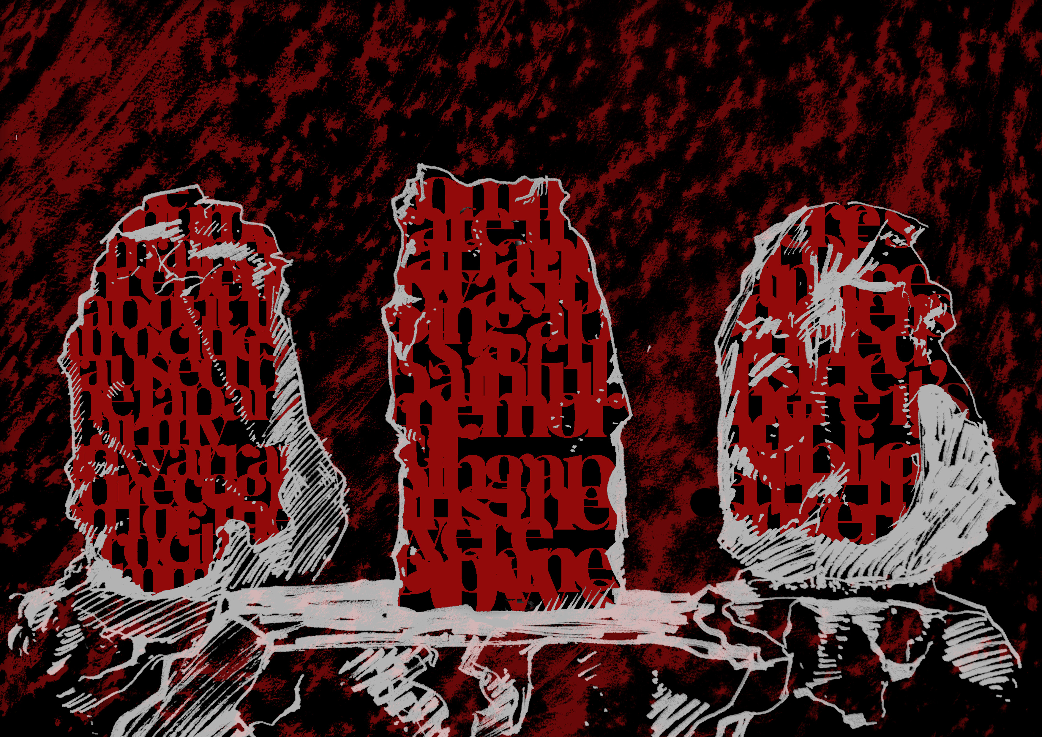
The words were basically negative impressions and portrayals of the association of the cemetery with the war from my interviews, surveys and research. But I was like :// ugh. Like the words can’t be seen at all………..so I decided to switch the textures and words around.

I lost the draft for the first draft of the second’s spread draft as I didn’t save it 🙁 But initially the words were all red. But my classmates suggested that I turn some of the more controversial words white to make it easier to figure out the meaning of the spread, which I think worked well as an idea. Basically the idea was to make the middle spread a shocking one when they flipped the page. Some of my classmates said it looked scary :’)
third spread: post-war period
For the third spread I wanted to portray a calmer and more serene side of the site as that’s normally the way I feel when I visit the area?? Like an area tucked away from the noise of the city and suburbs. I also wanted to introduce the local flowers that grew all over the place like frangipani and bougainvillea. :3
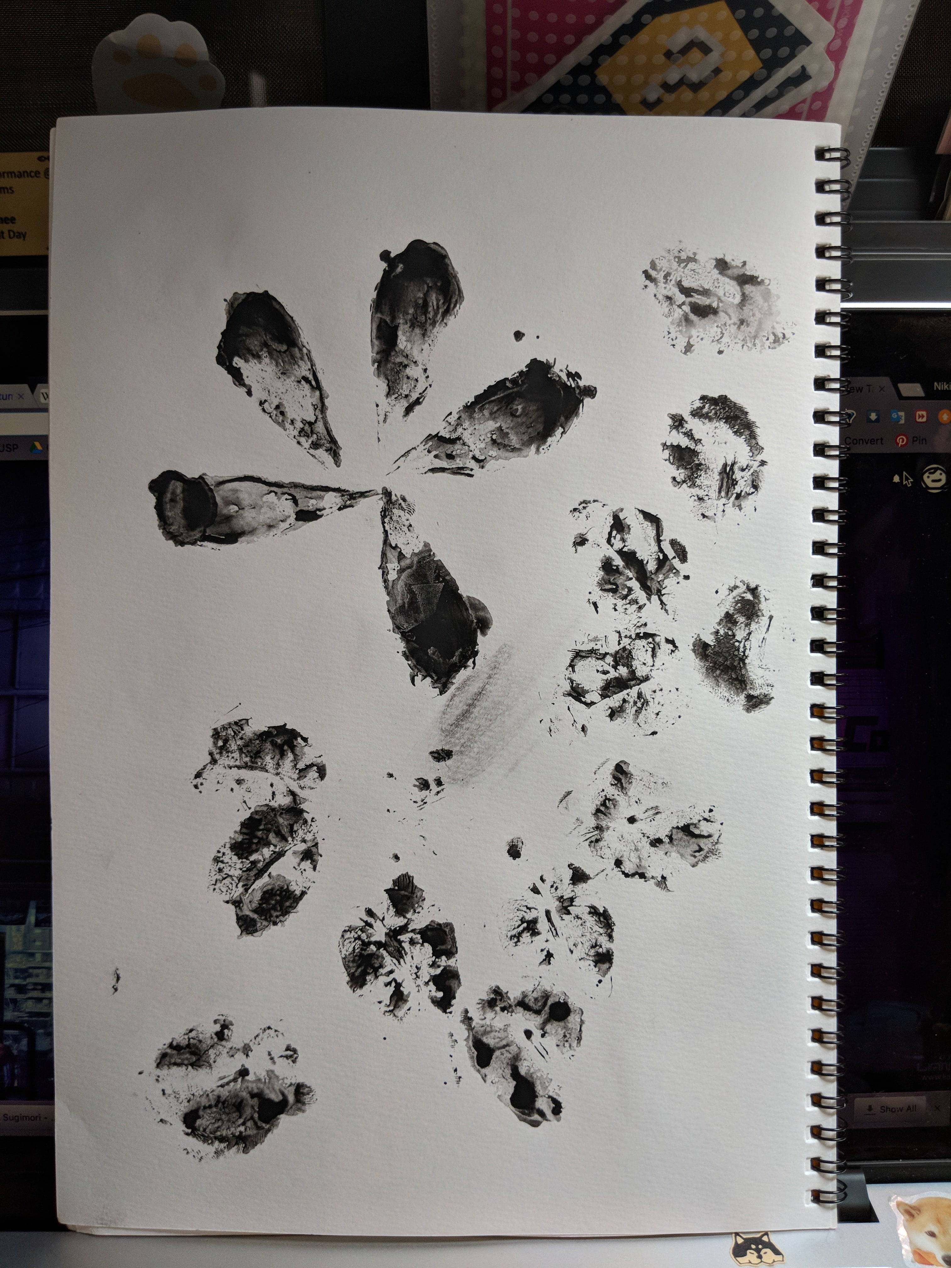
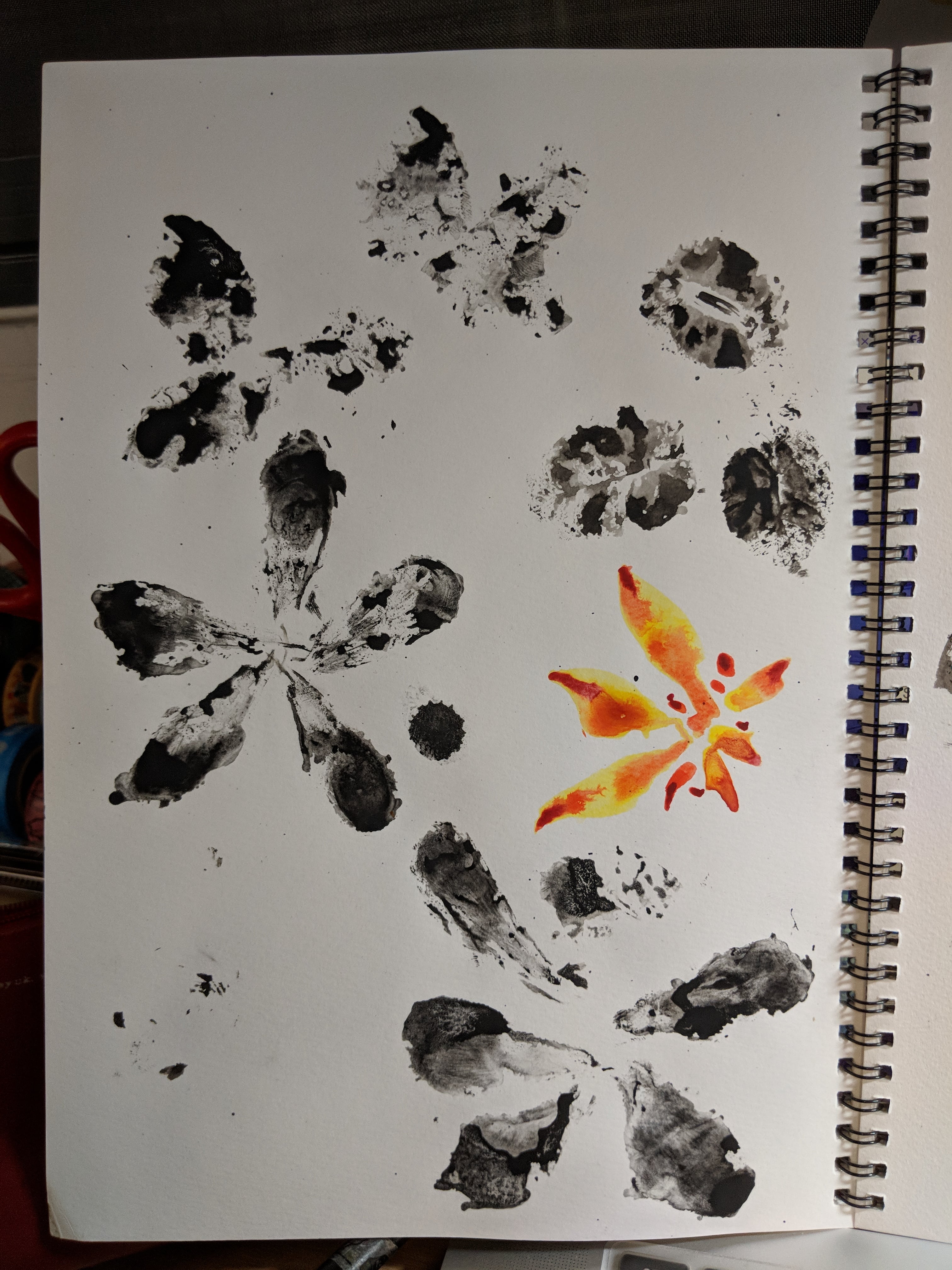
So I picked flowers OFF THE GROUND ok and brought them home to do mark making with watercolour and india ink. At first I just used the loose petals to create marks, then rearranged them in Photoshop. agh so messy

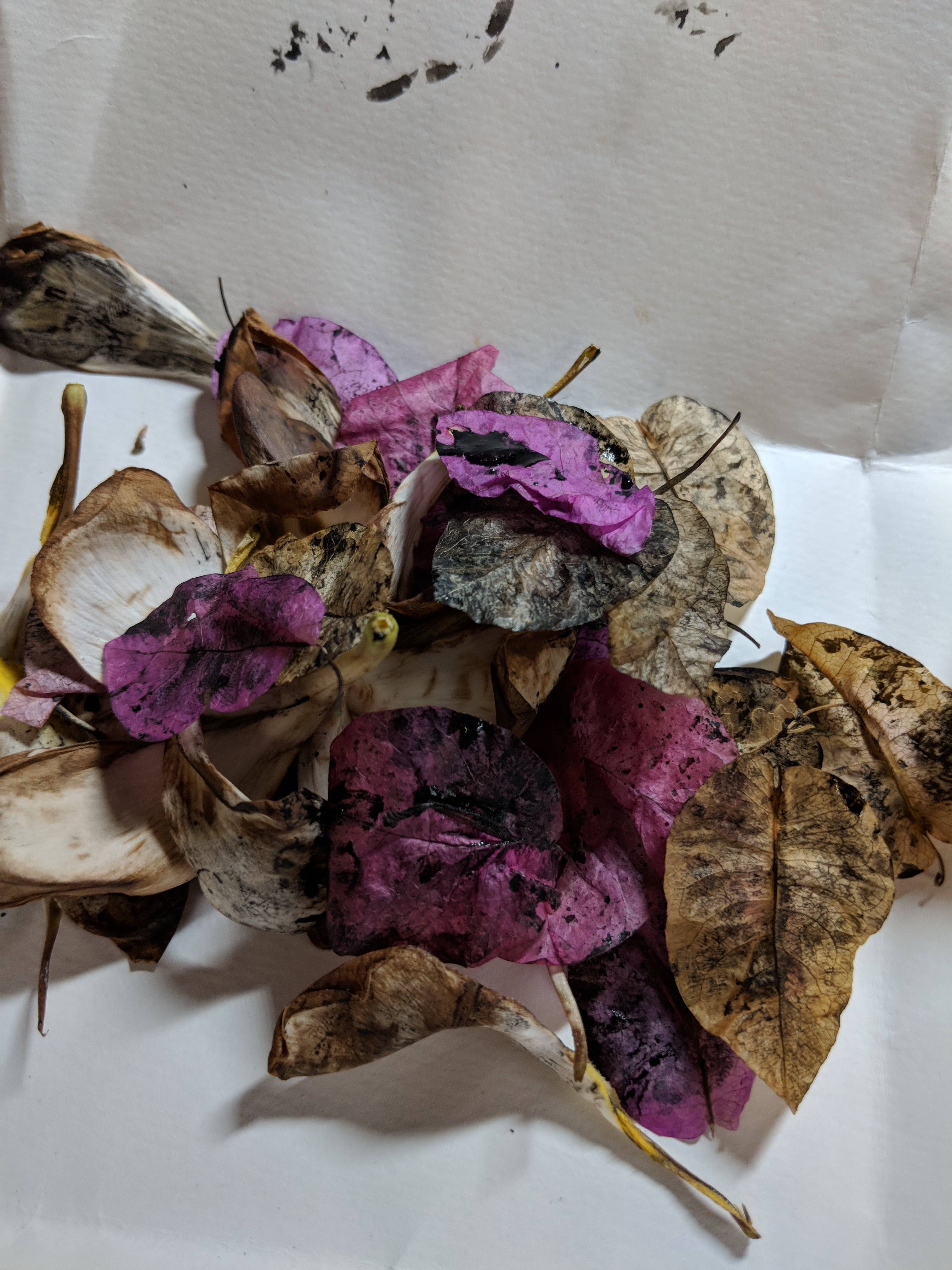

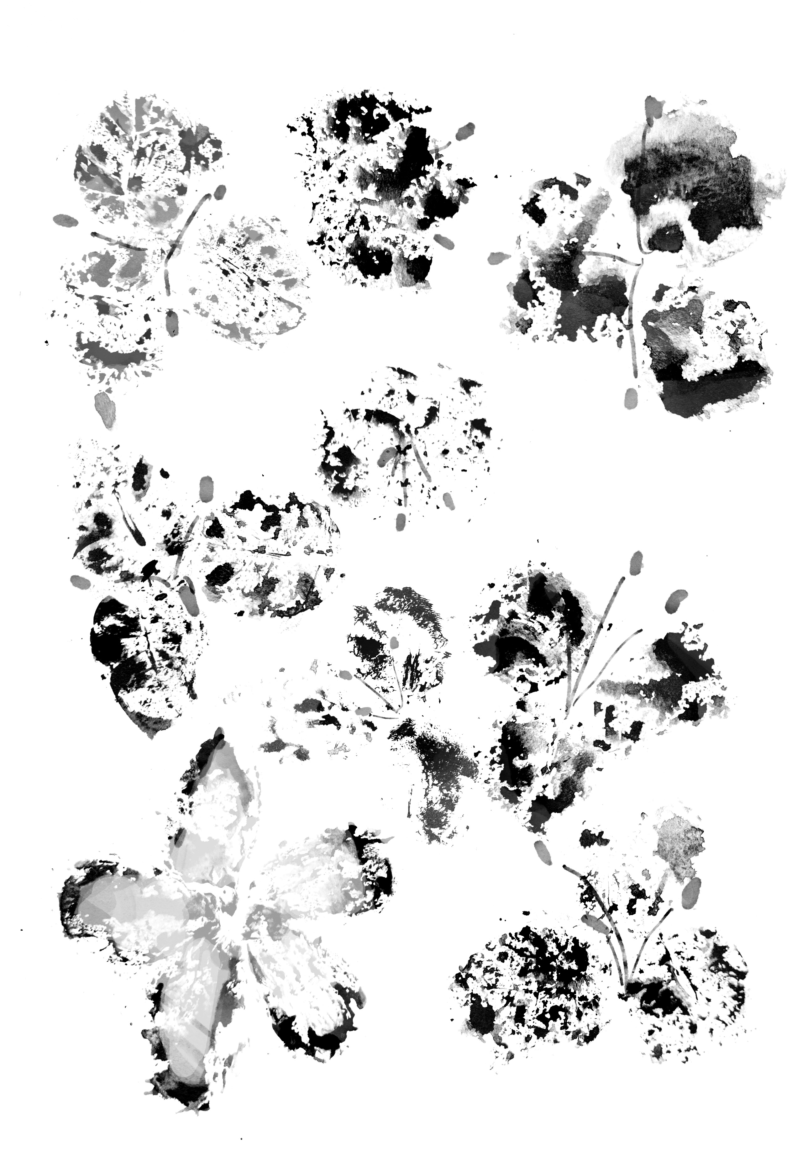
After that I started rearranging the flowers in bunches like in the cemetery. For the first draft just imagine the spread without anything but the flowers and blue background ahaha. Sorry I didn’t save it :’)
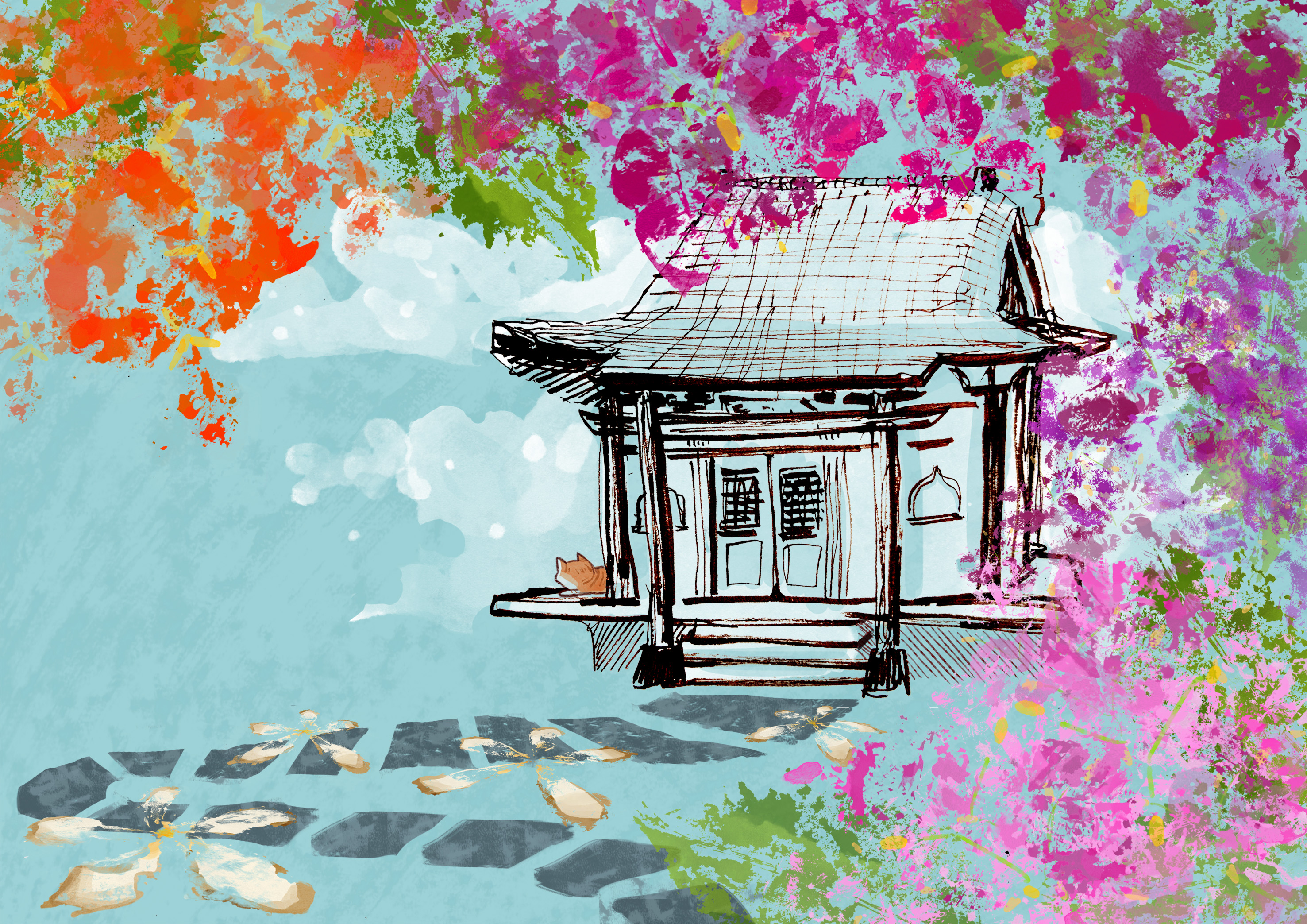
After feedback from my classmates and Joy, I incorporated a more Japanese element of a sketch of the prayer hall which I had to warp to make Not Wonky agh. I also wanted to give more of a sense of direction, so I added the pathway with the texture of the pathway itself. The clouds were just for a more gentle feeling, and I like..cats…yup. Idk the image of a cat just chilling makes me so relaxed aa
cover
For the cover initally I had taken inspo from my presentation slides and just plonked my text from it onto the cover with the map overlaid on it. But Joy suggested to give it more of a Japanese flavour so I thought about Muji notebooks and a more vintage feel. So I wrote out the names of the Park in both kanji and English
At first I was struggling with the colour of the cover. Like after a while I just gave up and had fun with the colours like

but obviously it didn’t really go with the theme of the book so I changed back it to brown. But I added a middle ‘binder’ thing with one of the kamon patterns inlaid:
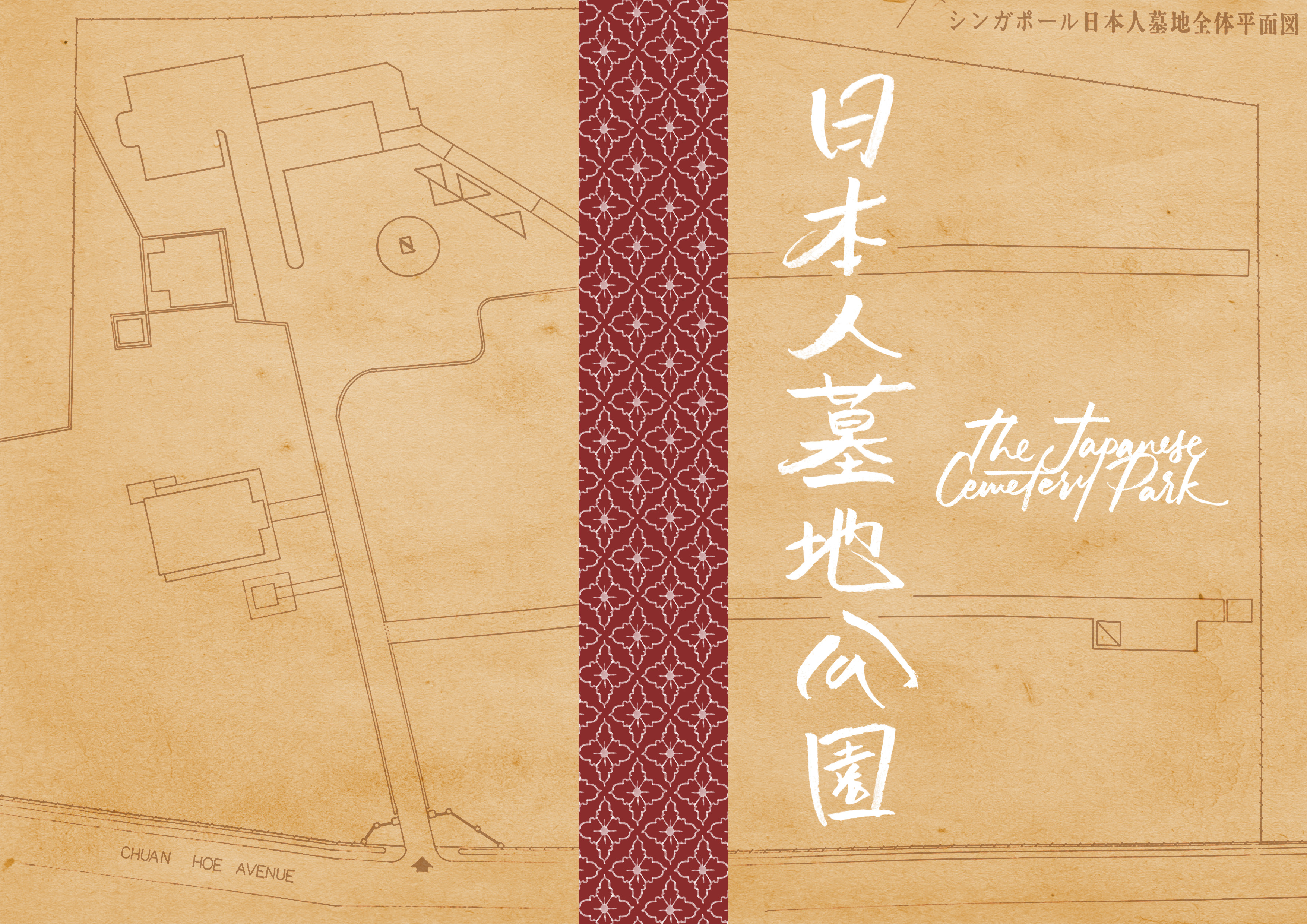
So it looks kinda Muji-ish :)))))))
Feedback from Joy: Could have had more connection with the theme of the book’s timeline, like perhaps having maps of the Park over time overlaid on top of one another to show transition.
printing
Actually not much problems with printing!! When we went to print on Sunday my favourite printing shop (Danlim Unity!!!) was open when it usually wasn’t bless the printing gods. So my zine came out nice with good colours. But I wish I had used thicker paper like 100gsm cos my zine (80gsm) felt so flimsy after a while :(((
Check out my weird edit here wew:
feedback
- JOY
- Good use of contrast in spreads as it achieved the shock effect
- Good use of mark-making, textures and illustration
- Could have had more connection with the theme of the book’s timeline, like perhaps having maps of the Park over time overlaid on top of one another to show transition.
- CLASSMATES
- Gud illustrations
- First spread naisu
- Looks like three different spread, could have been more cohesive
- Third spread: Flowers a bit too bunch up, could have been spread out
- Dion: Is literal and abstract at the same time??
final thoughts
Agh actually to be very honest I wasn’t super pleased with my zine. I only had a clear idea for what I wanted the final result to look like for my first spread, but for the other two spreads it was more of an exploratory way of getting to where it was? The first one was the only one I really liked. And I just wasn’t convinced by the last two because I felt so disconnected from them. I think I connect more with illustration rather than textures and mark-making even though I did so much of it?? Idk……..but I think the abstract part of the brief really made me do a double take. Like, if I were given the chance to make the zine whatever way I wanted it to look like, it honestly wouldn’t look like this? And the other’s zines were so naisu aa 🙁 I think mine was different bc of the different method I undertook compared to the arranging of different elements to create a layout on the page. Like I didn’t comprehend how I would work around that sia my brain isn’t engineered to create abstract arrangements ley :/ But there’s a first time for everything right?? Maybe I’ll create another zine in my free time during the hols. I just hope the final result looked polished. :’)
bye graphic form!! :O
ANYWAY hey Joy!!! Thank you so much for guiding my perpetually-lost self and the rest of us from G02 also for two semesters. I feel like we really warmed up and connected to you more in Sem 2 (is it the food???) and I hope I’ll still see you around ADM next Sem!!! 😀
- Niki