[ INDIVIDUAL STRIPS ]
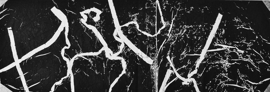
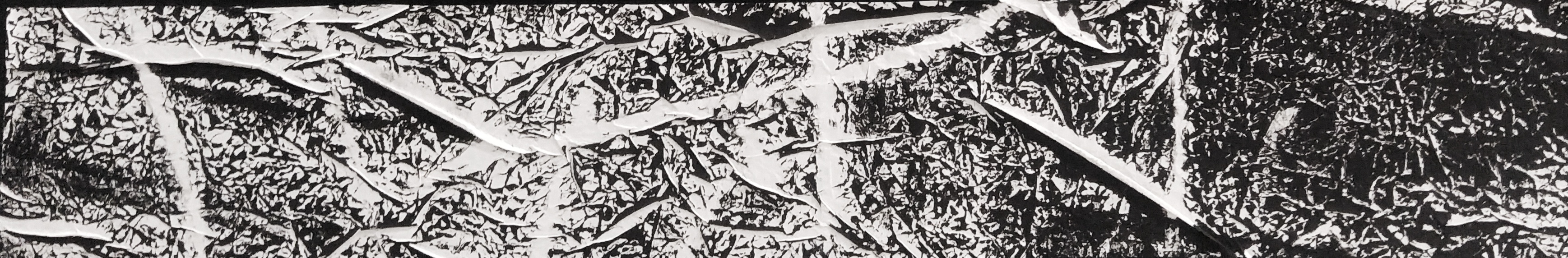
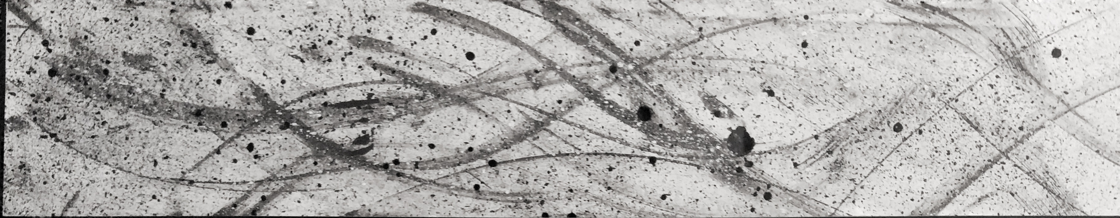
IRRITATION.
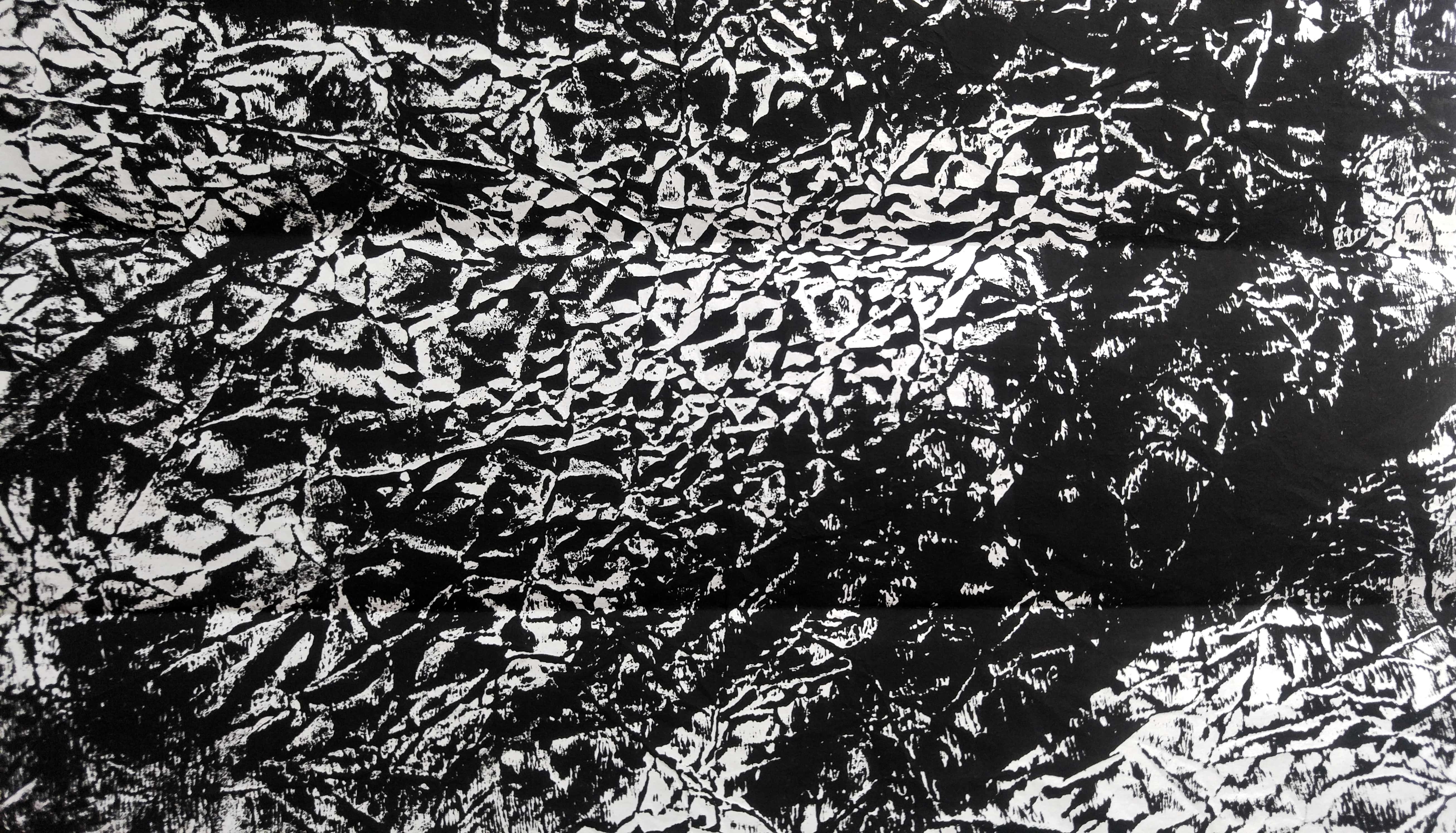
[What] The strip depicts harsh and thick black marks layered against many smaller scribbles and lines, with an incomplete grid-like pattern further layered on top of these lines, with a lot of contrast between the darks and lights of the strip. This helps to convey an unnatural sense of jaggedness that embodies the feeling of irritation and agitation.
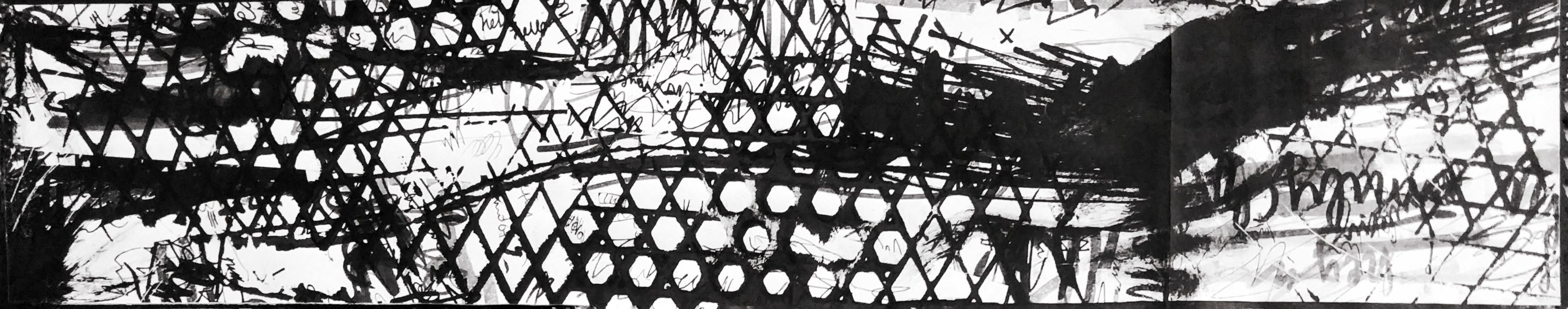
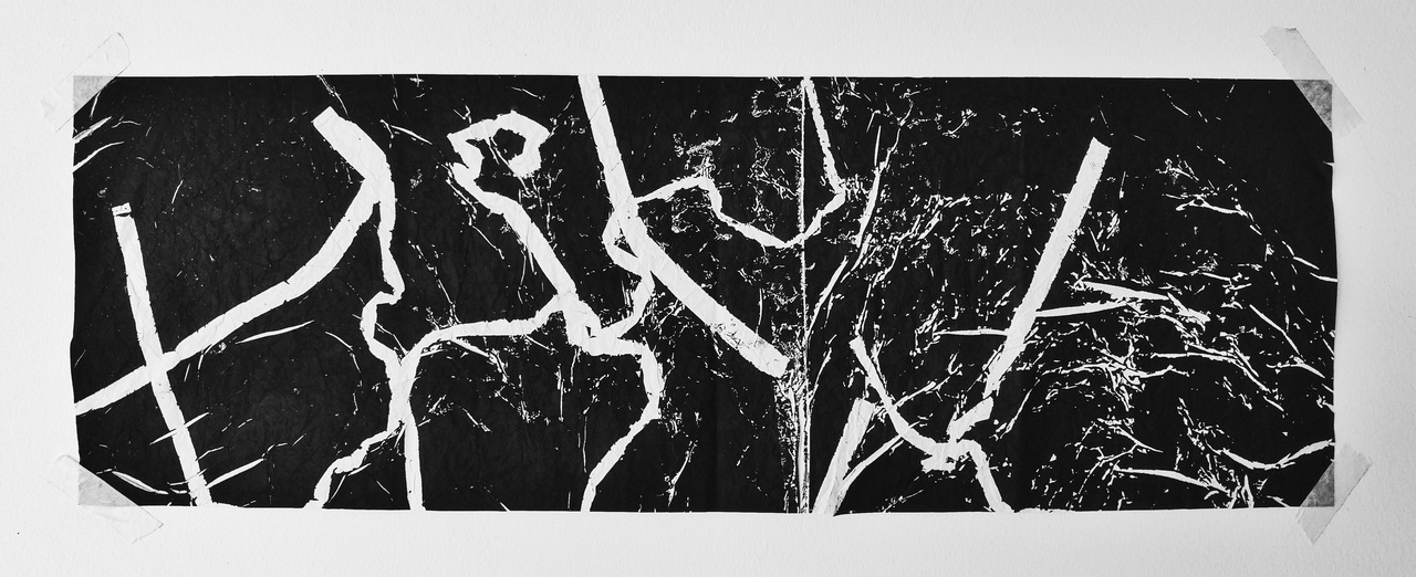
[How] For this, I had to layer the many strips of sample paper that I had collected, which looked like this,

on the school photocopier, with the more interesting and messy parts of the paper showing more prominently, and made several variations of the copies, like this one.
After that, I cut them according to size and stuck the papers together. The best part was rolling Chinese ink onto my Vans (which I wore to every day of work for 5 months straight) and stomping all over the paper to create the grid like marks HEHE although I was a bit concerned about the ink staining them..lucky they were black. :)))
[Why] I wanted the sample paper to be a representation of the customers that gave me stress and frustration at work with their repeated demands/scoldings/just their general stupidity, and the shoe part I thought was fairly obvious in showing that I was taking my revenge against them by stepping all over their grubby little hands. >:)
SADNESS.

[What] The strip’s lower layer consists of an uneven dark texture, with rough and sudden breaks of white in some parts of the strip, with varying shapes. It is then overlapped with darker drips of ink that stand out against the negative spaces in the strip. The negative spaces illustrate the shadowed, hollow feeling of having something important leave you, while the dark drips are representative of the misery that fills you after some time of contemplation of what you have lost.
[How] I used a laminated signcard from my workplace, which looks like this:
As you can see, no matter how much I tried to protect it, the block printing ink still got into the edges of the card. :'( But anyway, I put this signcard on a piece of linoleum and used it to create inverse monoprints of the card, rolling the same piece of paper over the same linoleum several times to get the multiple hollowed out parts. I then used a brush to paint on the drips with Chinese ink.
[Why] The signcard was something that I constantly used when I was working in Tokyu Hands to make signs for products and customers (the above is a very very random example) and it was one of my favourite parts of working there. Not being able to regularly design signs with all the materials available there made me really sad like legit LOL. My sadness also comes from the fact that leaving my workplace was like another indicator of losing the life from before university, and I loved the holidays. 🙁 I wanted to represent a sense of hollowness and depression, but it wasn’t exactly a void, so I filled in black drip marks to create droopy and forlorn feelings.
ANXIETY.
[What] The piece depicts a coarse and harsh background with tiny contrasts in the whites and blacks. There is also a juxtaposition in the way the the blacks seem to be individually geometrical, but are positioned in a way that is flowing and organic. The background goes from lighter to darker from left to right, depicting a person sinking further into their feelings of helplessness and panic. There are also jagged white lines overlaid on the background, which represent the more serious and intermittent thoughts of panic against the constant buzzing of anxiety.
[How] I cut the sample paper from earlier into smaller strips then laid them over inked linoleum squares in a random pattern, then thoroughly (lol) crushed up a piece of newsprint. I put the newsprint over the linoleum then rolled over everything with a brayer! I wish I had more pictures of my process but I’m afraid I didn’t have enough battery on my phone to sustain the day. :'((( And to be honest I made this print quite a number of times to get the right effect, but in the end I had to go around asking other which one they felt embodied anxiety better, as I really liked the other print as well. This one was darker as I used the machine to press down the linoleum, resulting in a more even background even when I was using crumpled paper.
But ultimately I chose to go with the one with a less even texture as I thought the crumpled and distressed texture stood out more with more negative space.
[Why] I had an earlier piece that was done using the same method, and looking at it make me feel really antsy and itchy and overall super nervous. I thought it was a disgusting print but like in a good way, and I wanted to create that disturbing feeling, but incorporate my retail job experience into it by using the sample paper again, as a representation of the customers who induced feelings of not knowing how to deal with a situation.
AFFECTION.
[What] The piece’s most obvious feature would be the smooth and subtle flowing lines that extend from one end of the piece to the other, starting strongest from the left to then fading a bit when reaching the right. They are overlaid by black and white splatters of paint. These lines convey a feeling of warmth and comfort, and the grouping of the lines signify that they come from a group akin to family. The splatters and dots are representative of the feelings of happiness and familiarity that do not come in torrents, but gently wash over you in a constant flow of emotion.
[How] I used a sponge from a box that contained a gift that my coworkers bought for me on my last day of work. Since I didn’t take a picture before I threw away the dirty sponge, here’s a picture from Gourmet Pens:
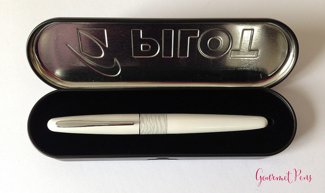
It’s not very clear but there’s a black sponge with a cut out in the middle for the pen. I dipped the top part of the sponge in Chinese ink and swiped it across the paper to create the flowing lines, then flicked a toothbrush to get the black and white splatters. At this point I’m really regretting not taking pictures of my process work because all this describing is exhausting WHEW
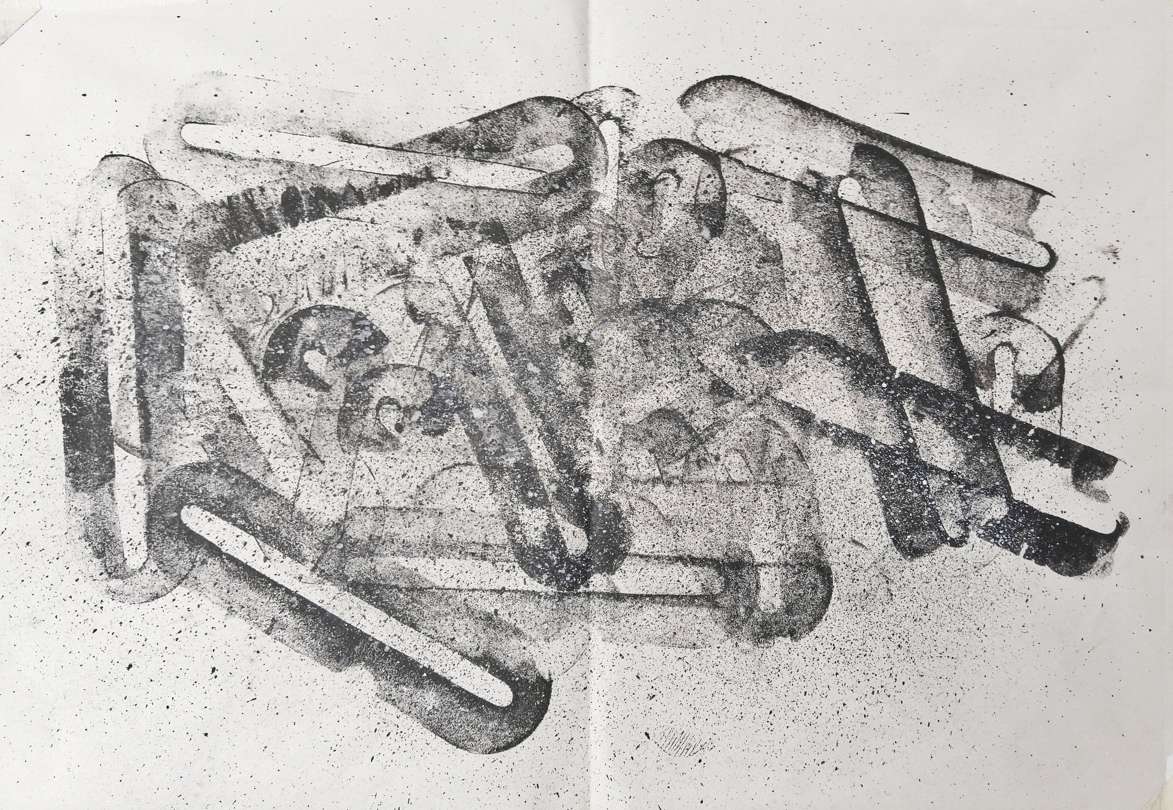
[Why] I wanted to use something that represented my affection for my coworkers, but I obviously couldn’t use the pen they gave me (scarli spoil like omg no way) so I decided to use the packaging instead. At first I made stamping motions with the sponge that looked like this:
But I felt like the piece didn’t really represent anything akin to happiness or affection. So I played around with the sponge until I chanced upon the flowing motion, and decided to focus the motions on the right side of the paper to bring about the sense of being ‘together’ and ‘unified’. 🙂
SURPRISE!

[What] The background is a bunch of receipts overlapping in different directions, and layered on top of the receipts is a harsh and thick black line that ends up in a splatter of ink that shows a lot of force behind it. The overlapping receipts signifies a sense of confusion and disorientation, and the straight line gives off a sense of stability and normality. The subsequent twists and rough ‘explosion’ disrupt the stability and give off a feeling of shock! The bottom half of the explosion is flush with the bottom of the piece to give off a feeling of collapse, while there are additional smaller marks around the explosion to signify the residual shocks from a surprise.
[How] I used the receipt that I got from buying stuff at my store and photocopied it like 20 times?? Here’s one of them:
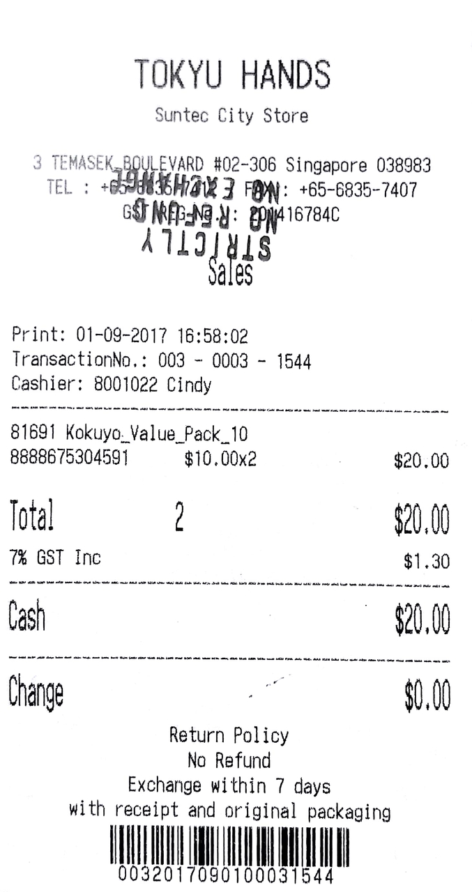
I then pasted the receipts onto a piece of newsprint and then painted on the line and explosion using Chinese ink and a brush. The smaller marks were made using a hardened brush tip dipped in ink as well.
[Why] I wanted to incorporate the feeling of time as a factor in the surprise itself, rather than just portraying surprise by itself, as the calm followed by shock, to me, is what exemplifies the feeling far better. The concept behind it was the shock I felt when I saw how close to my spending limit I was (because of my staff discount) in my first month at Tokyu Hands HAH, which is why I used the receipts as a backdrop and a ‘context’ to my surprise. After that I became notorious for buying a lot of stuff (mostly stationery) among my coworkers, especially closer to uni. :p To be frank, the cutting off of the bottom part of the explosion was because this was cropped out from a bigger piece (all of them are) and there was just not enough space to contain the whole explosion. 🙁 Also I didn’t have enough receipts to make a new one so…should probably plan out my pieces better next time haha.
HAPPINESS.
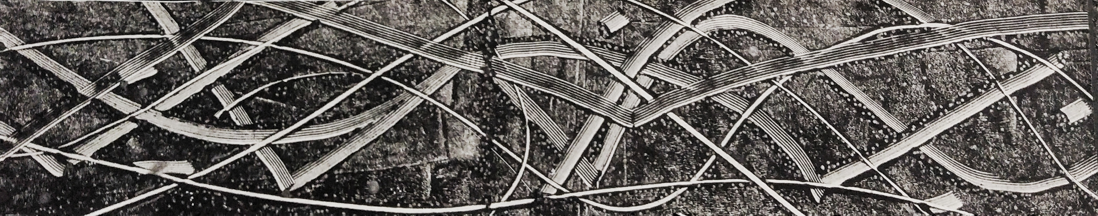
[What] Against a hazy gradient background, there are 2 kinds of lines that stretch across the piece – ones which are sweeping and flowing, and ones that are simple bold lines that extend from the top to the bottom of the piece, and the lines vary in thickness and texture. The thinner lines are blank, whereas if you look closely, the thicker lines are made up of smaller lines.. The thick and thin lines are representative of the rushes of joy and ecstasy that flow when you experience happiness. There are little dots clustered around the lines that illustrate the constant feeling of ‘twinkling’ or ‘shimmering’ when you glow with pride. 🙂
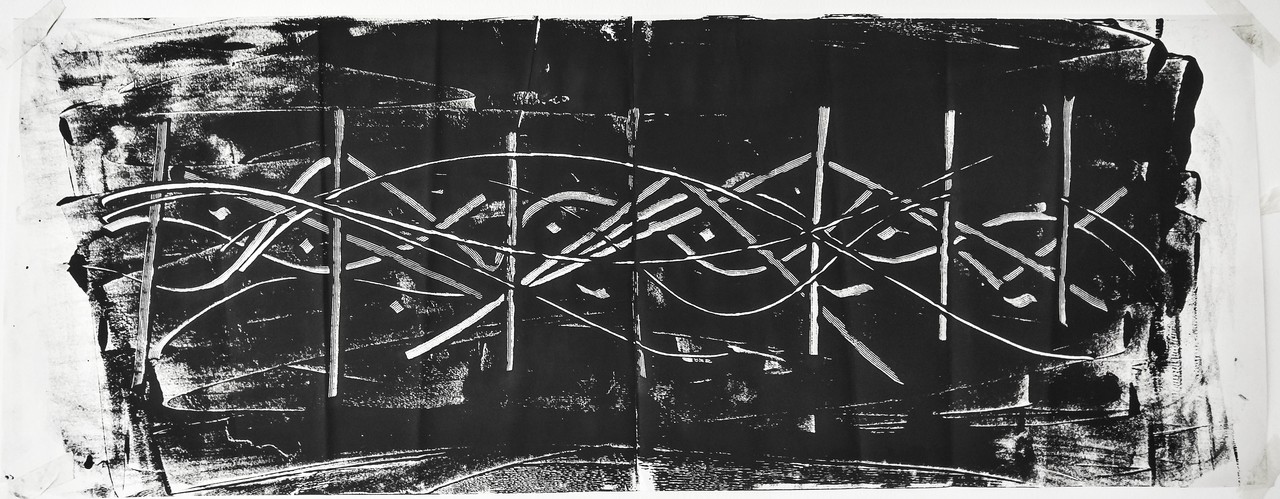
[How] I inked linoleum squares and used the nib (the flat tip) of my Pilot Parallel Pen (which I had to clean out before using 🙁 mafan) to scrape off the ink and make the thicker lines, and used the back of the pen body to make the thinner lines. It looks like this:

After that I put a piece of newsprint on top of the whole thing and used the smoother thing (Idk what you call it haha) to make the print. I had tried making the same print with a roller (with a bit too much ink I admit) and the rest was much too dark and awful:
After the print had dried I cut it out, then I used a silver glitter pen to painstakingly dot around the lines to make the print more visually interesting.
[Why] The parallel pen was a instrument that I had been introduced to during my time in Tokyu Hands! In fact my exploration of calligraphy with flat italic nibs started in my workplace and became a horrible obsession haha but calligraphy makes me really happy, and learning and mastering new styles makes me even more happy!! :))) I brought a lot of other pens with me but it made the most sense to use my parallel pen as it could make thicker and more noticeable lines.