Weird title but that was my object for this project! So basically Lei’s assignment was for us to received an object and take photos of the object displaying its physical attributes or practical uses. After that, we had to take the object and subvert its meaning by changing or celebrating or critiquing the object’s meaning, or showing it’s cultural significance. Finally, we had to pick a picture and include text that would anchor or relay the message of the photo. I think everyone was stumped when they got their object and yah that included me too. :’)
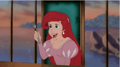
The first task was okay, but the second task was killer. Subverting a fork?? At first I kept thinking along the lines of Poseidon’s trident, the Devil’s pitchfork, a fork in the road, blablabla. I even thought about how Ariel used a fork to comb her hair in The Little Mermaid??
But my previous project about me suffered from a lack of a cohesive theme, and I really really wanted to avoid that dissatisfaction in this project.
My initial idea was to have the fork as a murder weapon throughout all three subverted images. The non-subverted images would be the ‘before the murder’ photos whereas the subverted images would be the aftermath of the crime, with a fork sticking out from their heads or backs or whatever. It sounded super ambitious tbh. And I had other clearer ideas that didn’t fit into the murder plan. And the first week I was just so swamped with work that I didn’t manage to take even a single test shot and I just became uber stressed ohmygad.
So the second lesson where we had consultations with Lei, she let us do this exercise thing where we would practice subverting our objects by drawing them in different scenarios which was super fun hehe! I would show my drawings but they’re back in hall and I’m at home. :’) Upload later! Anyway, when I proposed my murder idea to Lei, as well as the other ideas, she proposed that I could just do matching sets of pictures with a theme for each set, like ‘eating’ or ‘killing’. The idea was SOLID MAN so I went ahead and did it.
[ FINAL PRESENTATION ]
The Subverted Object, Final Presentation by Niki
So here’s my final wall!! Ultimately my initial ambitions were too lofty, and because I had only five days left to capture all the images I needed (I fell sick the week before and was out of commission for two days SUCKS TO BE ME) I had to simplify my ideas and presentations while still capturing the meaning of the pictures. Here’s a chronological breakdown of my three image series and poster.
[ E A T . ]
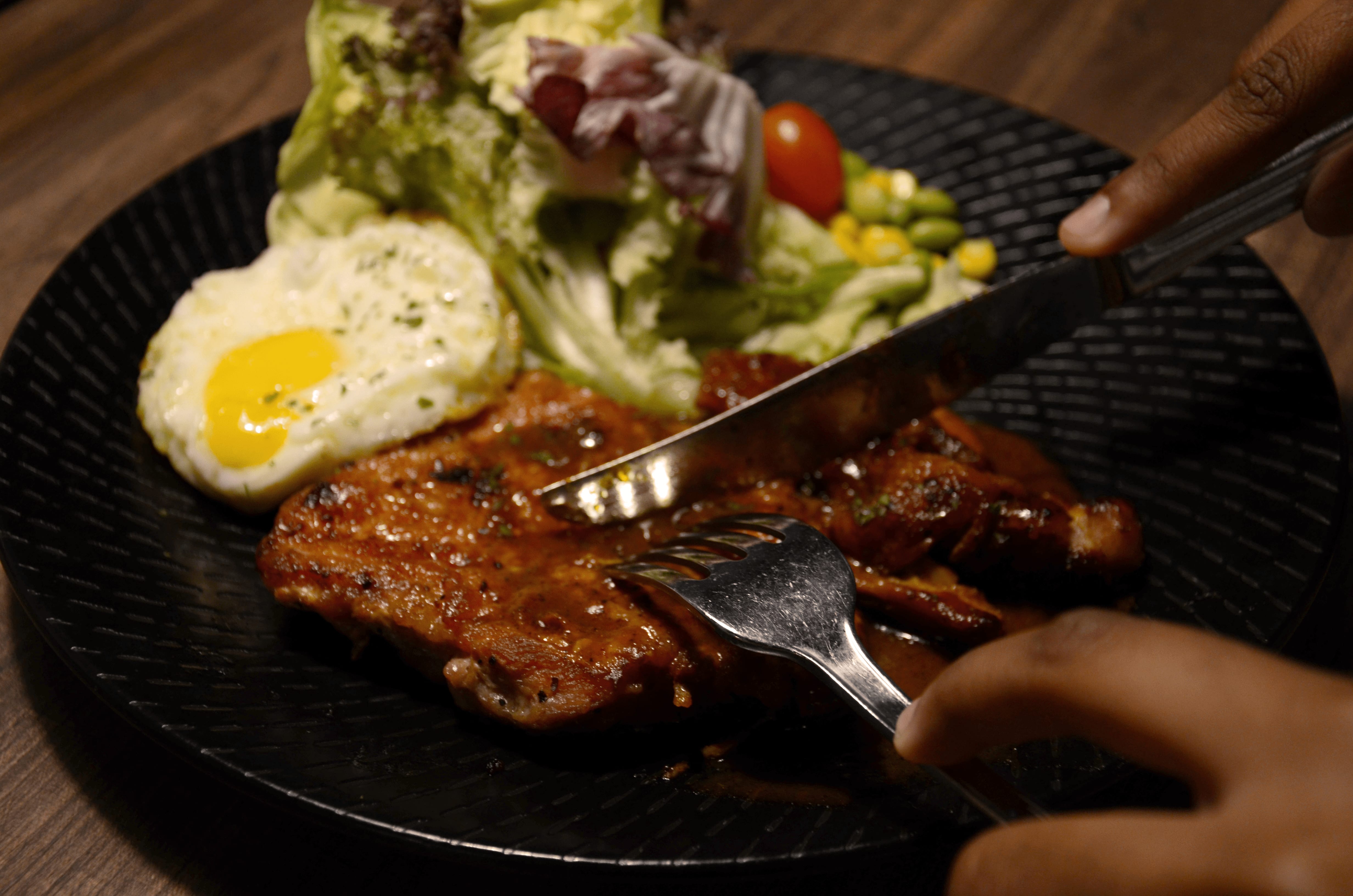
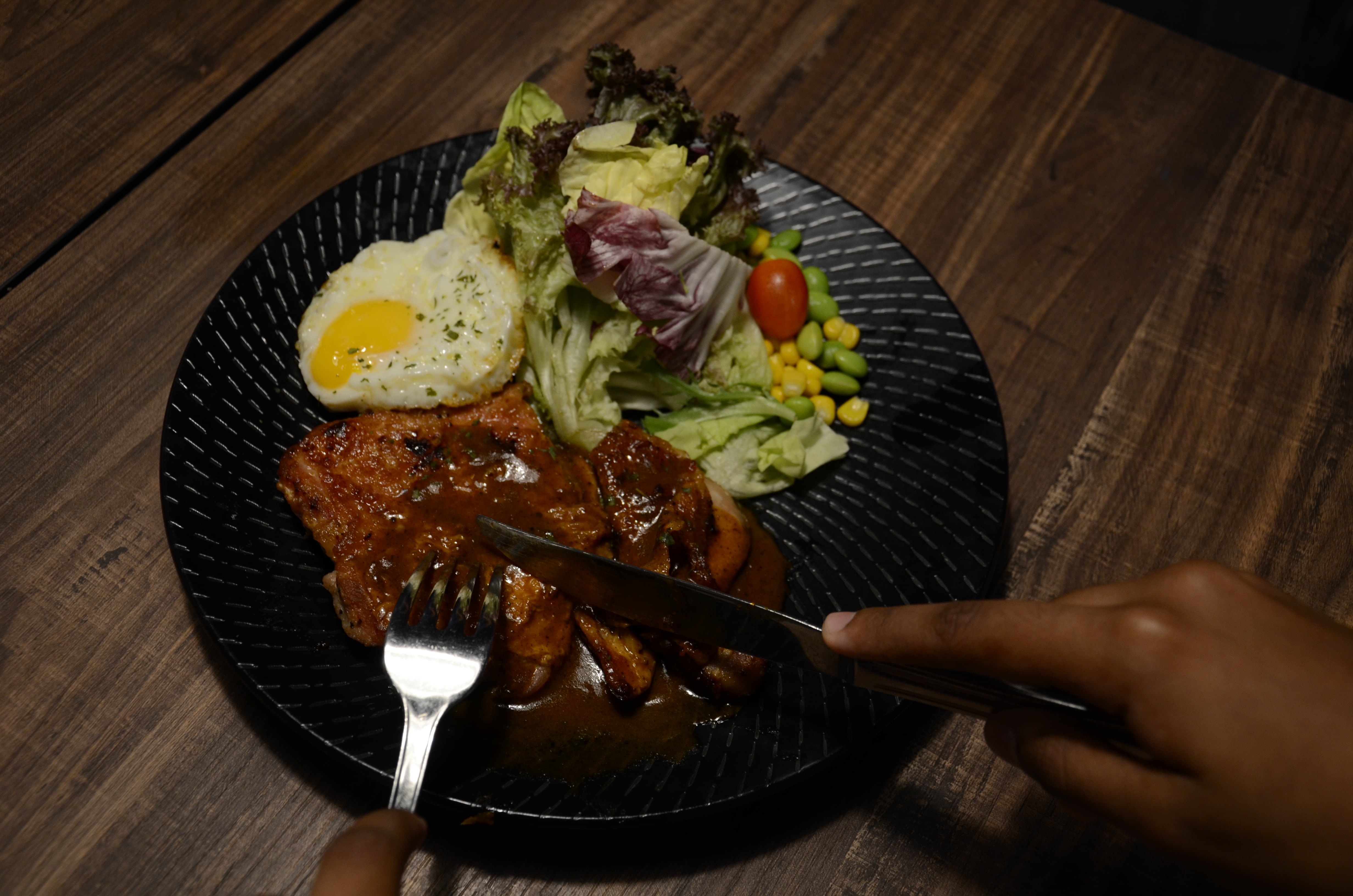
Project 2 EAT., ‘Chicken Chop’
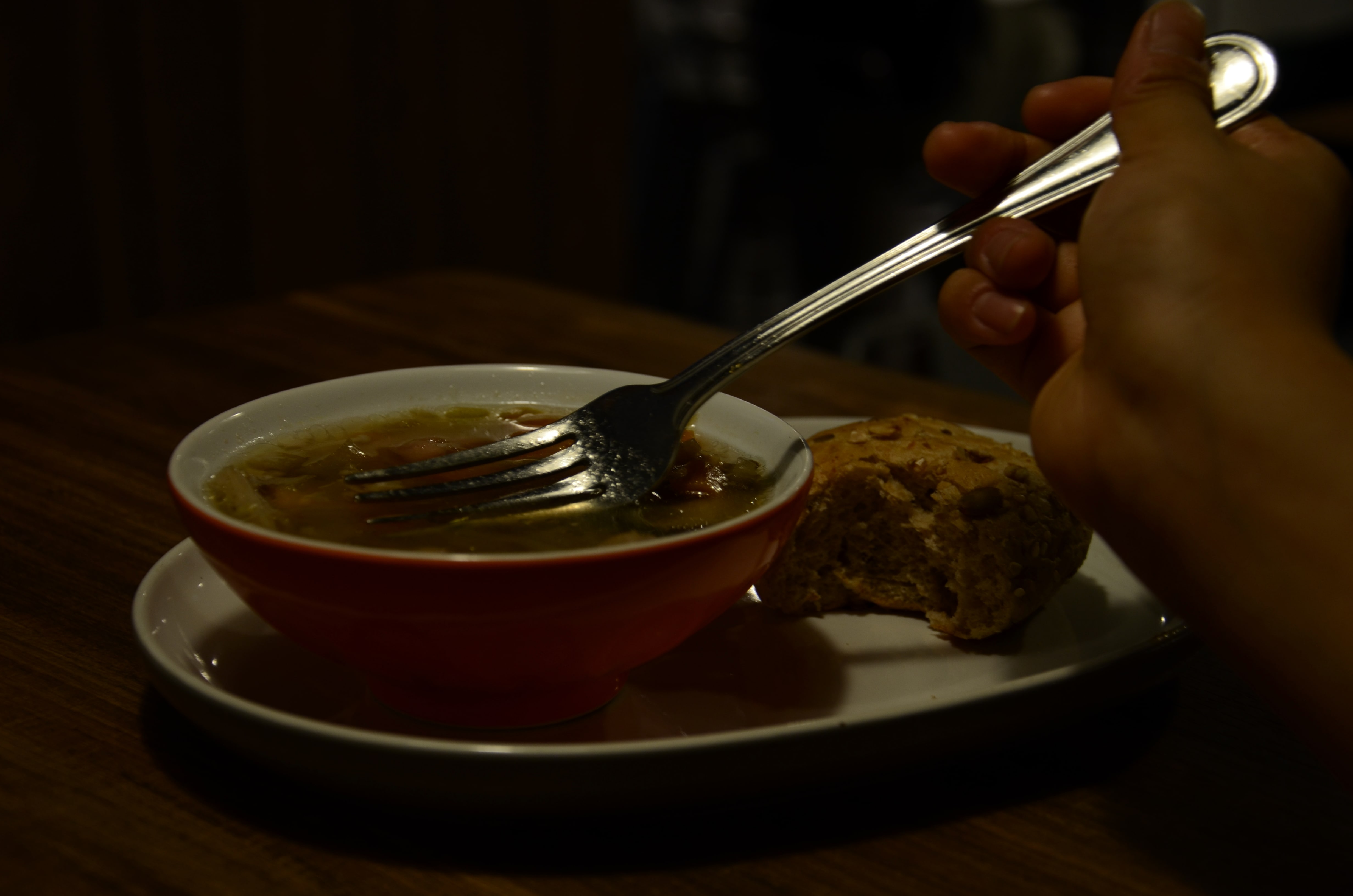
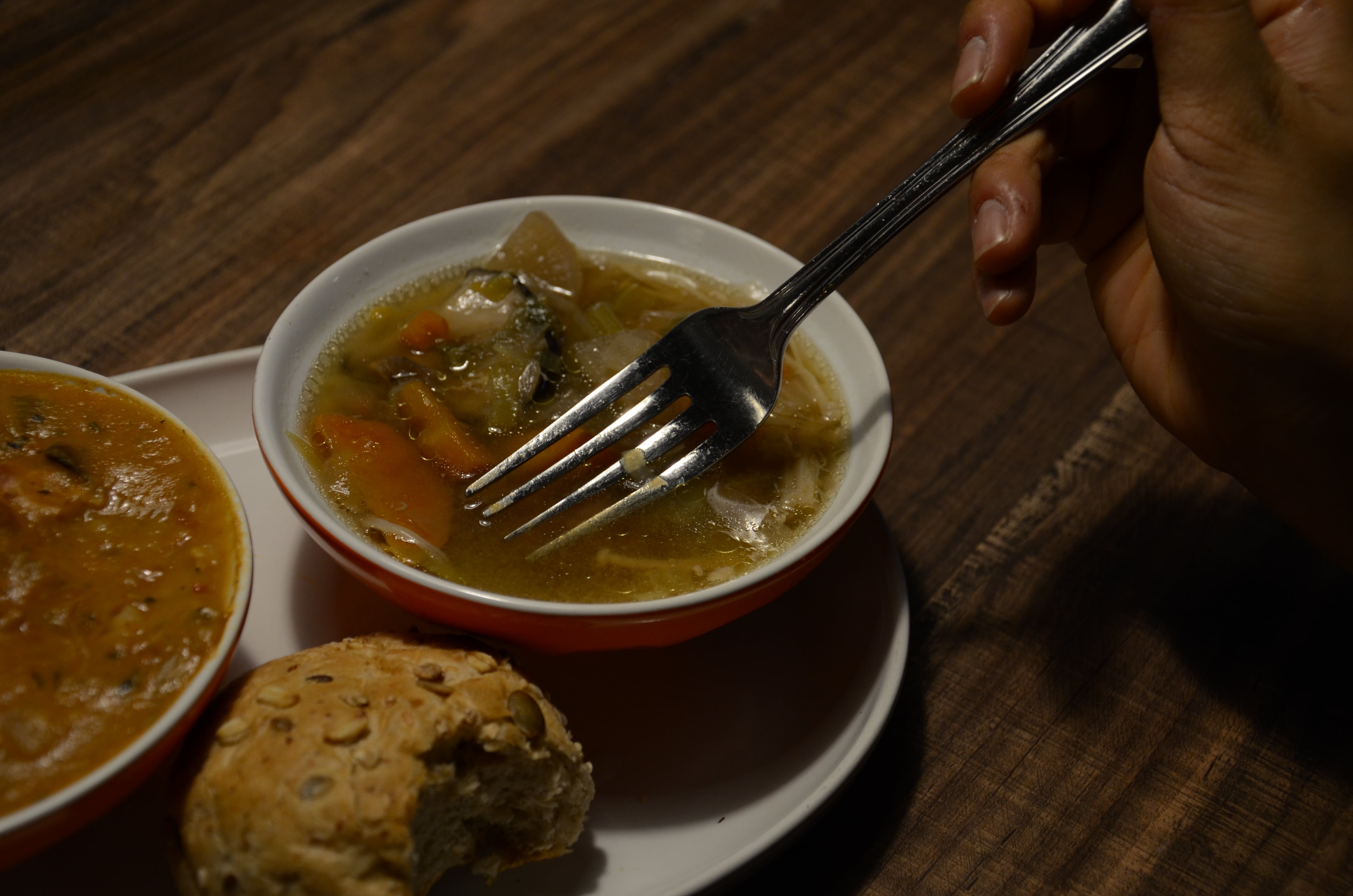
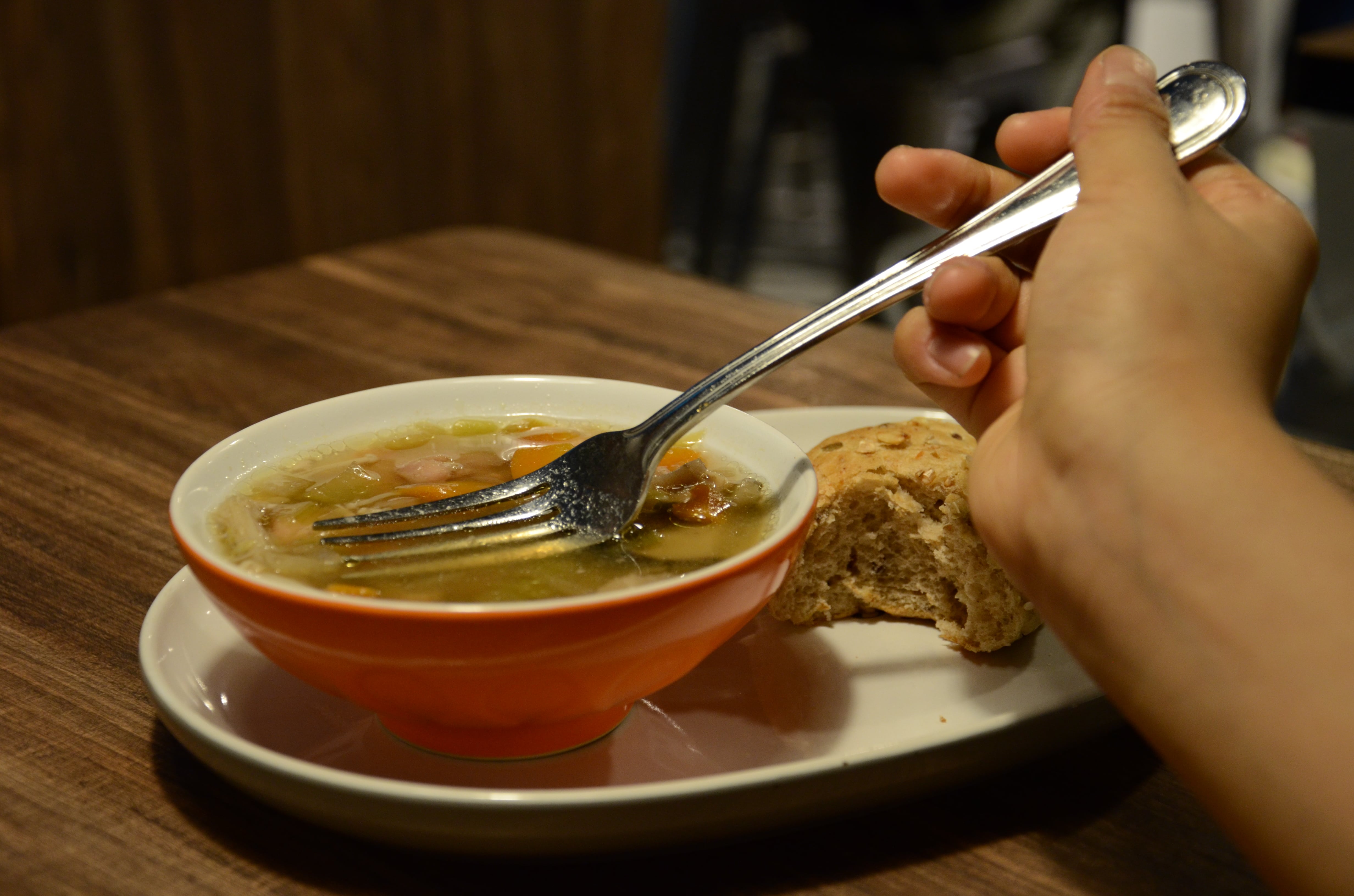
Project 2 EAT., ‘A Slice Of Soup’
These images were the first ones I took after I renewed my DSLR loan! After class ended at 12.30pm on Monday, I asked two of my close friends to accompany me to The Soup Spoon because I liked the warm lighting of the shop hehe. And also it was more aesthetically pleasing than the kopitiam of course.
The idea of having someone first use a fork to eat normally, then subvert it by using the fork to eat something you wouldn’t normally use a fork for, was the clearest idea I had at that point, as ‘eating’ was the first thing you would associate with cutlery.
Note: I had to order a sort of clear soup because those chunky Western soups wouldn’t have brought out the bewildering idea of eating soup with a fork as well. :’) The soup was good though lol.
Taking these pictures was actually fairly challenging! At first I had wanted to do a sort of overhead, flatlay concept of just the hand and the food and the cutlery, but it didn’t work out because the shop’s lamps were super close to your head once you stood on the chairs and there were shadows and it was basically a mess (A lot of people were staring at us because I was climbing all over the chairs with a huge-ass camera help lah :/). In the end, my friend who has much much more photography experience than I do, showed me some good angles which I eventually decided to follow with.
We experimented with different angles and also taking the hands out of the picture, but since I wanted the two pictures to mirror, I ultimately chose the pictures with the hands, taken at a lower angle, as the higher angles just didn’t feel natural to me.
I had to toggle a lot with the exposure and ISO on Manual mode for these shots, as the lighting in The Soup Spoon was pretty dark, and the Auto mode on the camera came up with really overexposed shots!! 🙁 I think I’ll stick to Manual mode next time as it seems to be more effective in letting me adjust the shots to my liking. Again I picked a lower angle shot for the final image. Maybe I wanted the audience to feel as if they were watching the scene from a seat next to this idiot eating soup with a fork HAHAHAHA. Also I needed the fork to be clear in both shots.
After everything I adjusted the colouration of the photos to reduce the darkness in the photos (It didn’t look as dark on the camera….) and make the warmth and contrast more even across both the photos.
P.S I may or not may not have stolen a fork from The Soup Spoon during this photoshoot because I forgot to bring a fork from home.
[ M U R D E R . ]
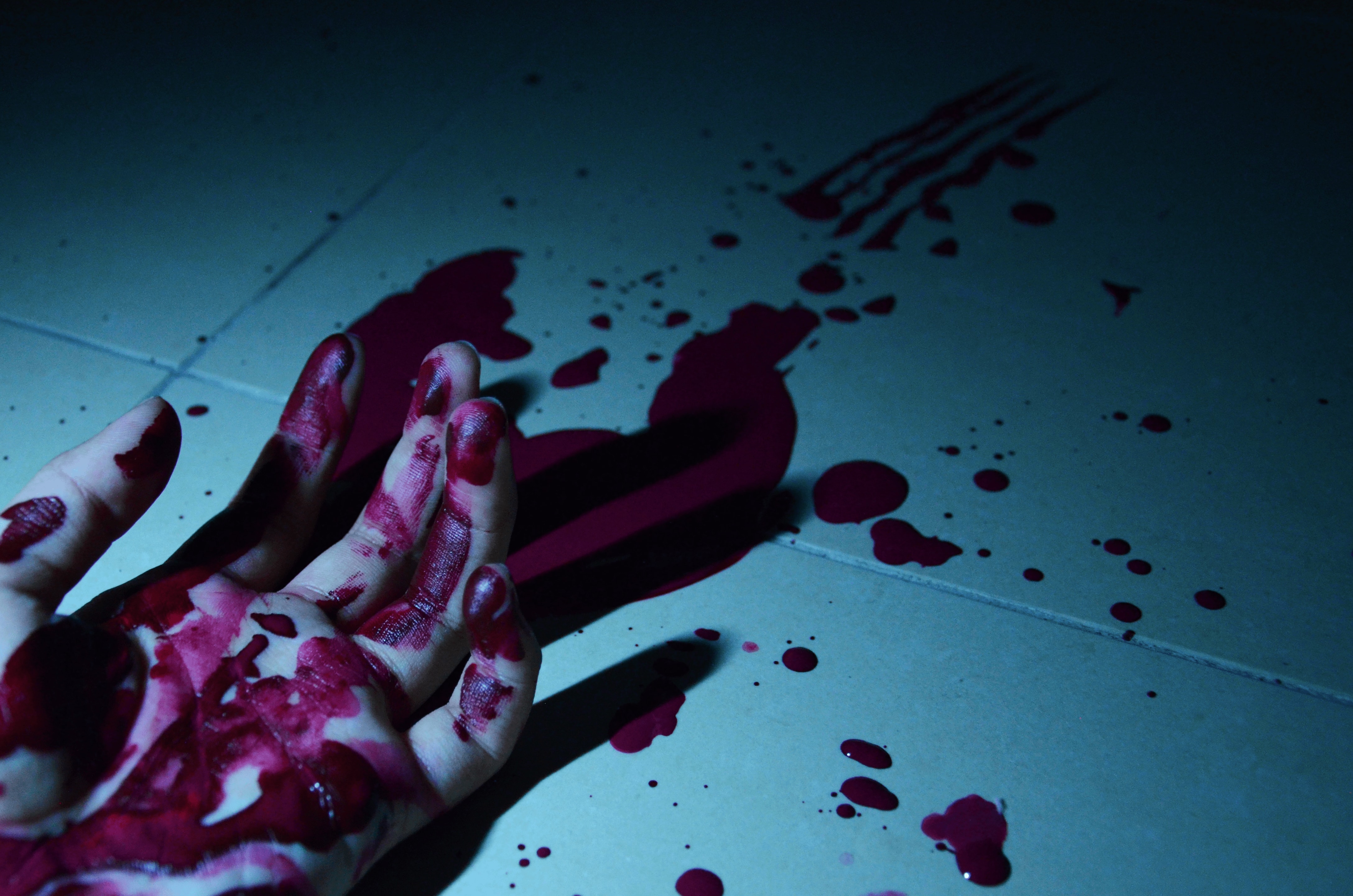
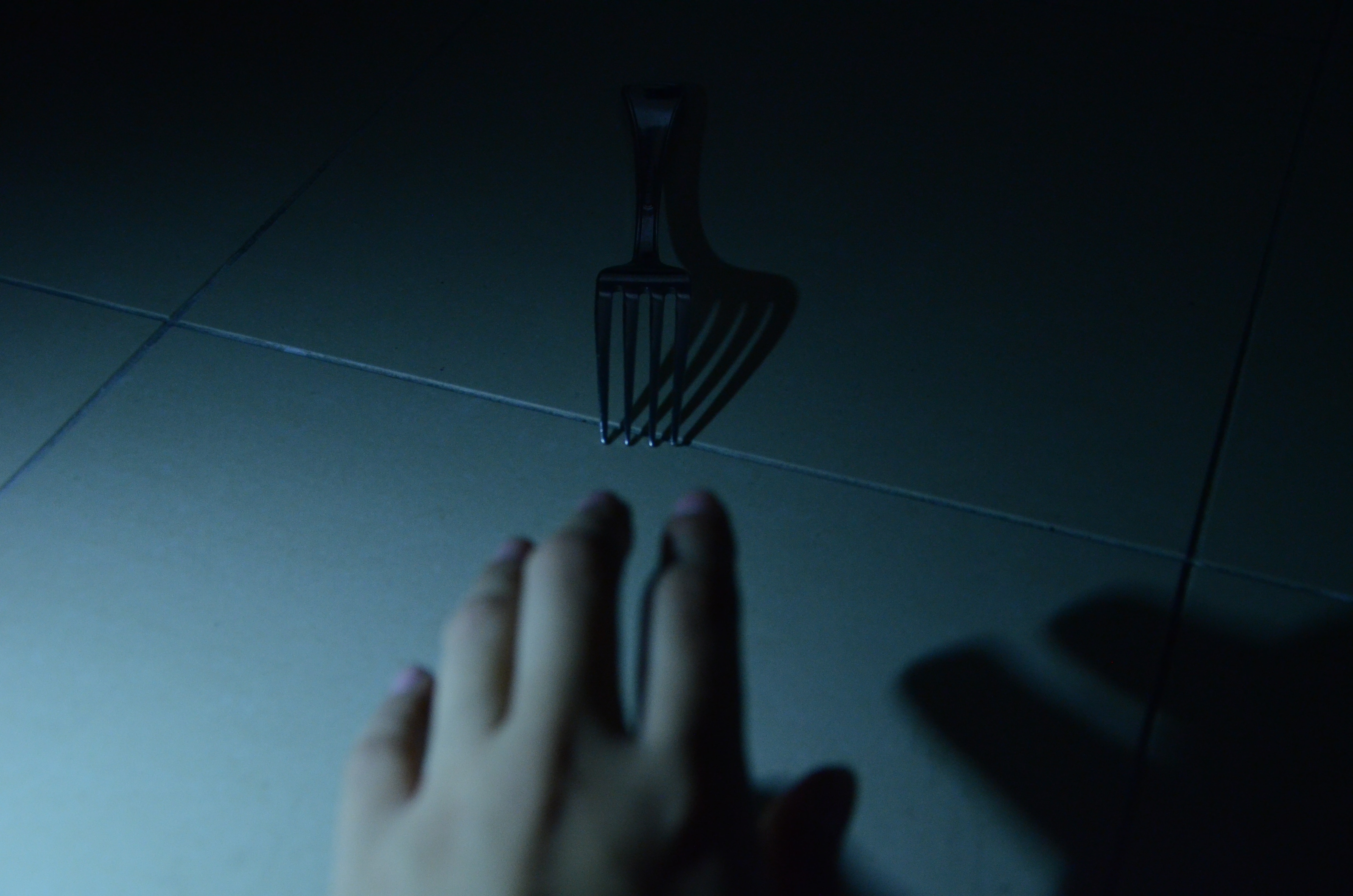
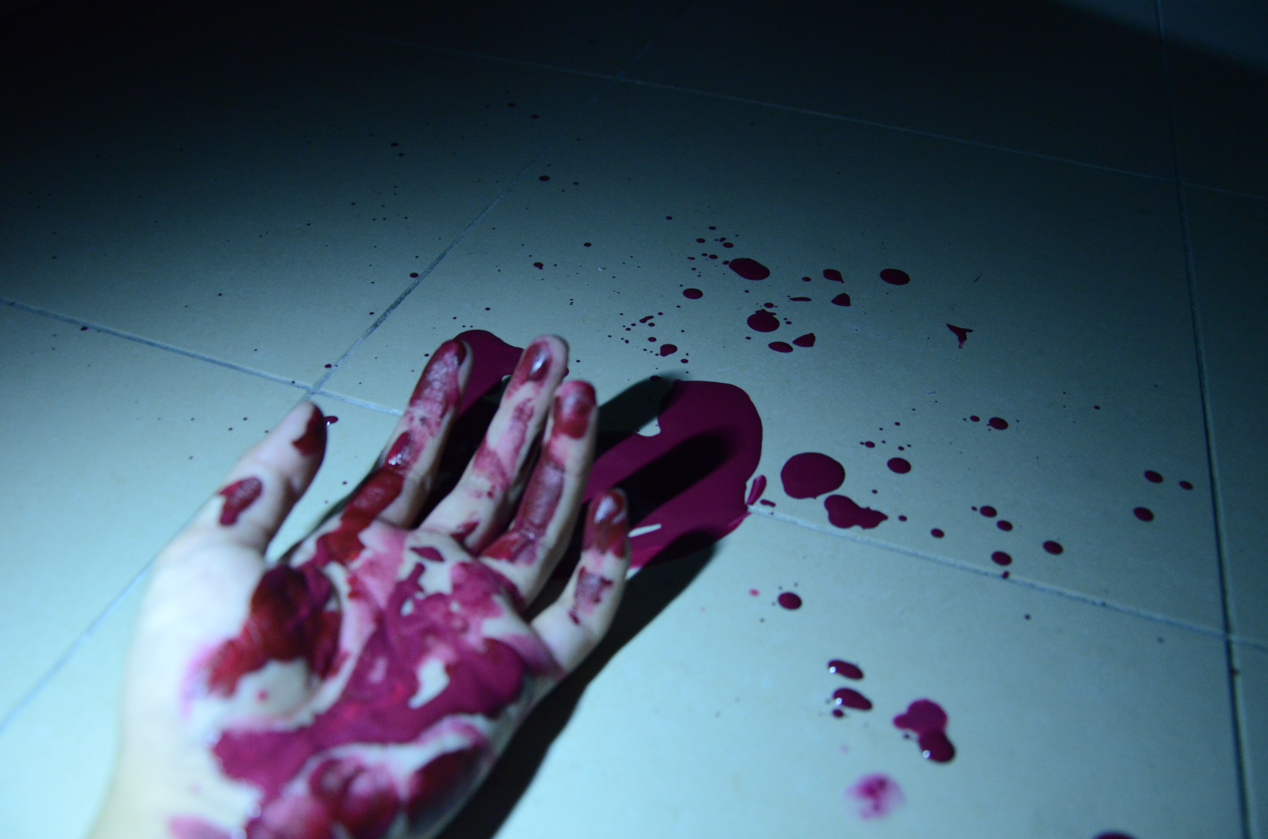
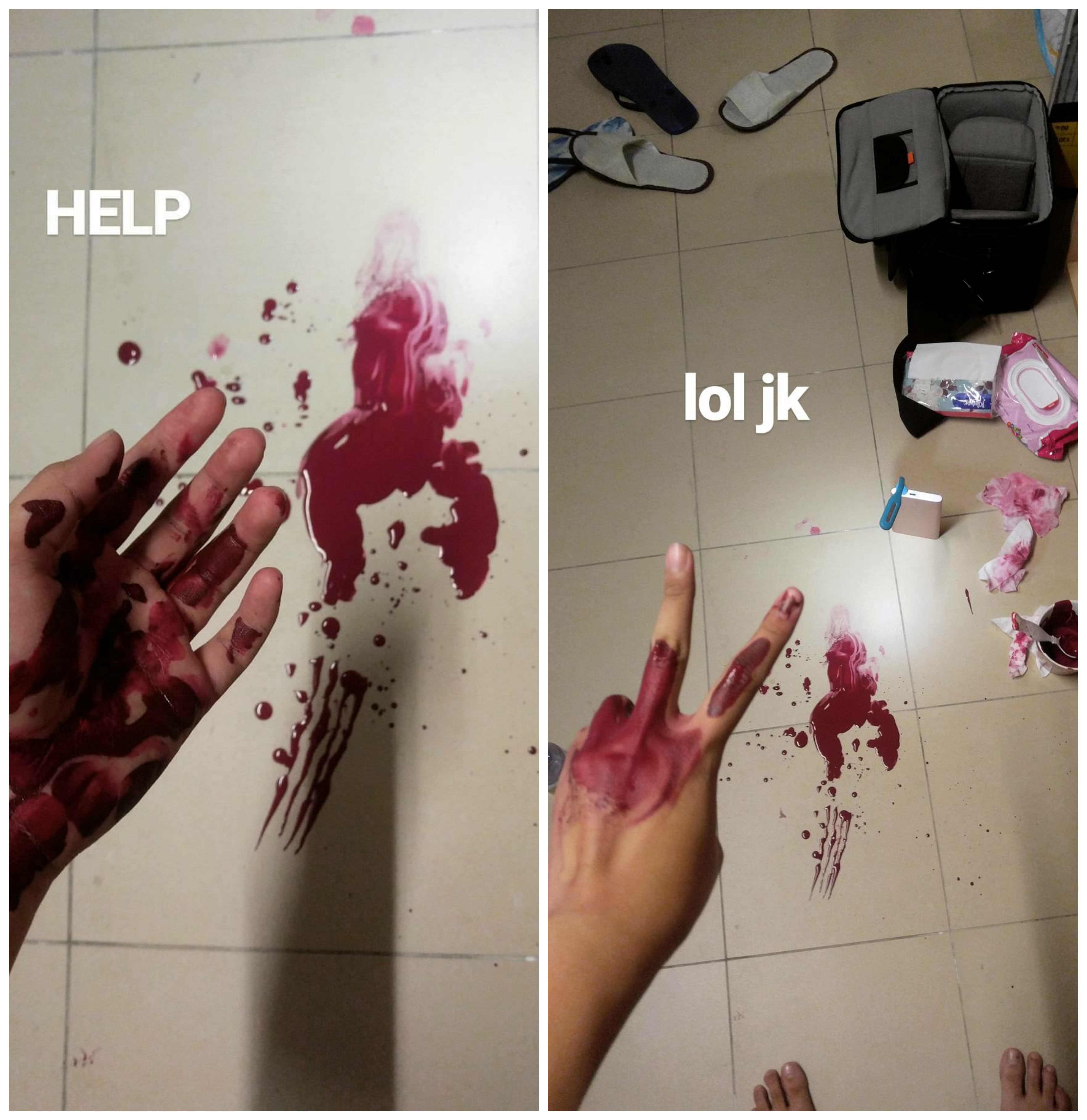
Project 2 MURDER., ‘Curiousity’Project 2 MURDER., ‘Stick A Fork In It!’
These shots were born from my initial idea of the murder theme’. However, as I said, I didn’t have a lot of time left to find someone to lie down and let me jab a fork into and splash red paint all over them. So I had to make do by using the only available and willing party: M E !!!
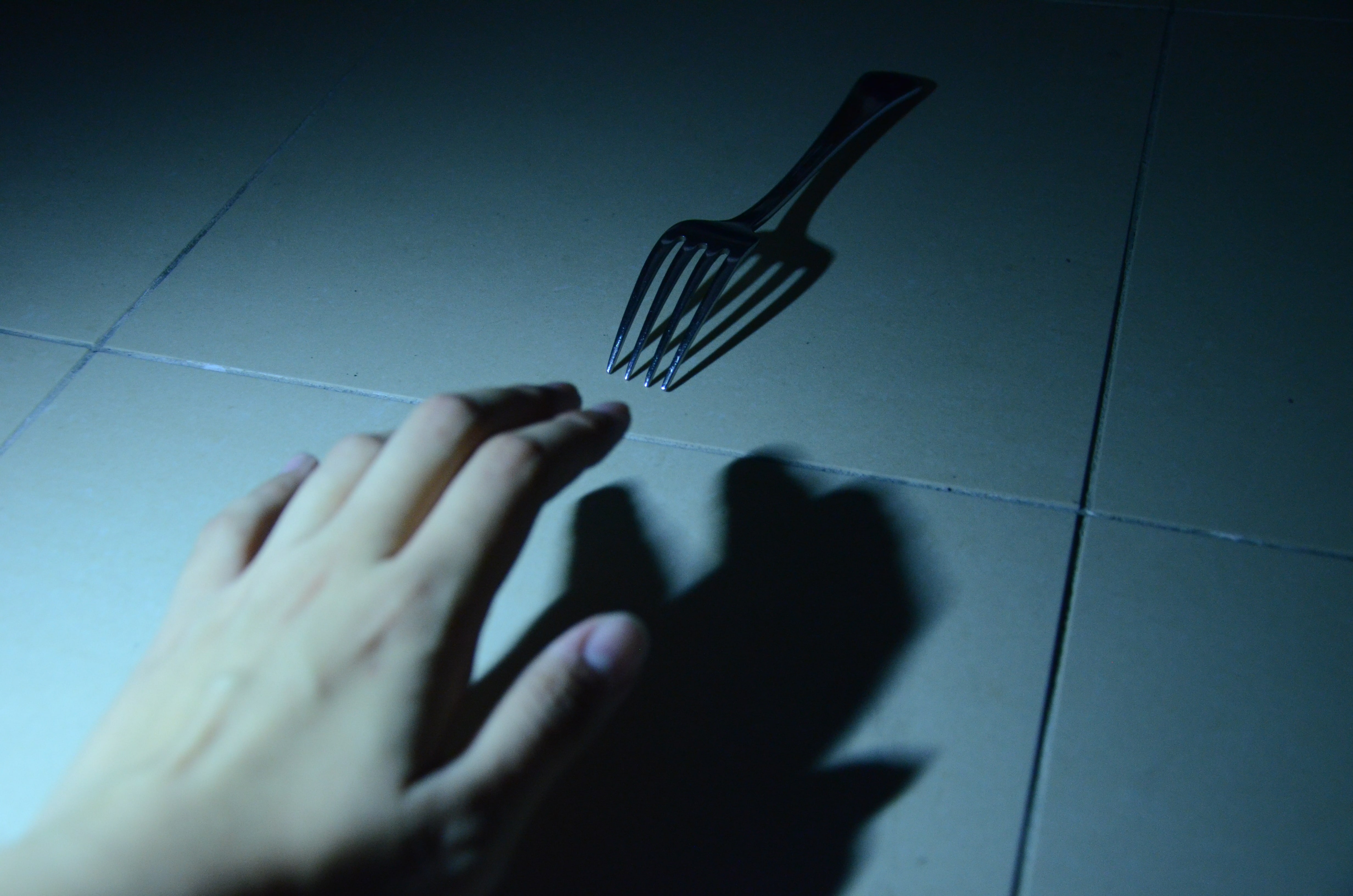
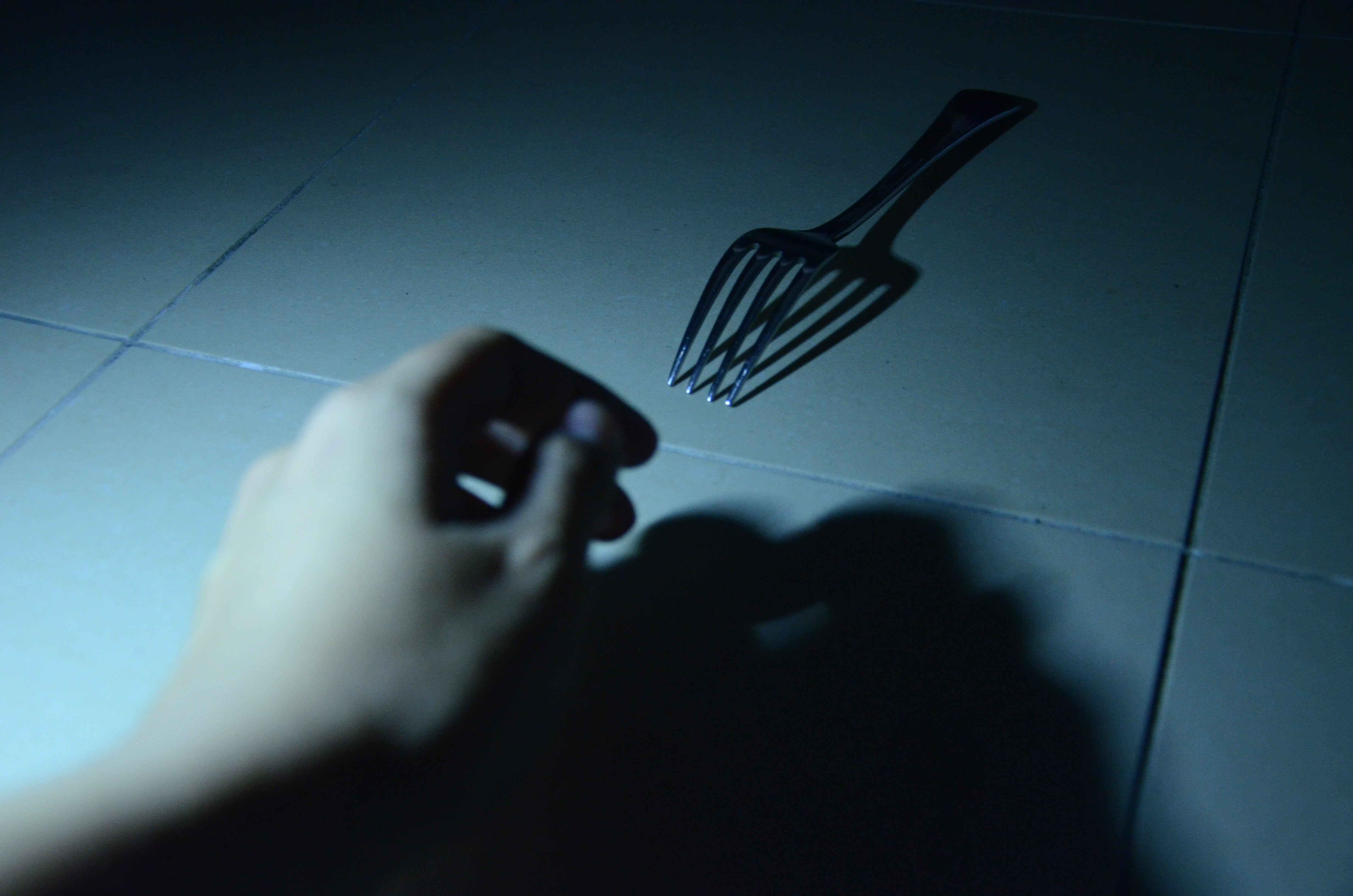
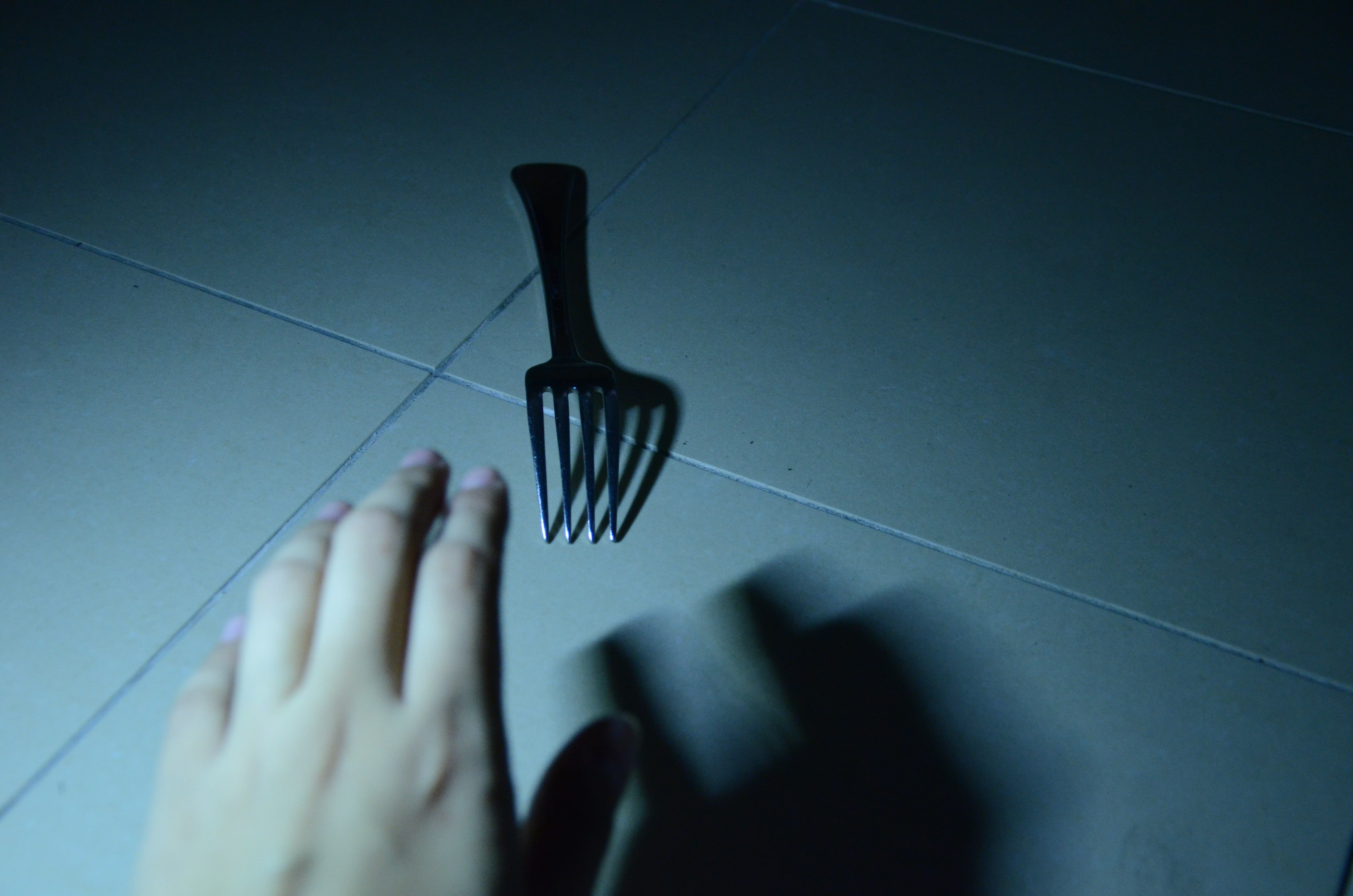
By turning off the lights and positioning a tiny lamp (I didn’t even buy it on purpose?? I bought some ezbuy things and a seller gave it as a free gift…..LUCKY) behind the camera, I gave the fork a ominous feeling with the darkness surrounding it. While I experimented with other hand positions, I chose this one as I liked how the shadow of the hand surrounded the fork, as a representation of the person’s intention to dominate the fork, as they think that it is a simple inanimate object. Here were some of the other options:
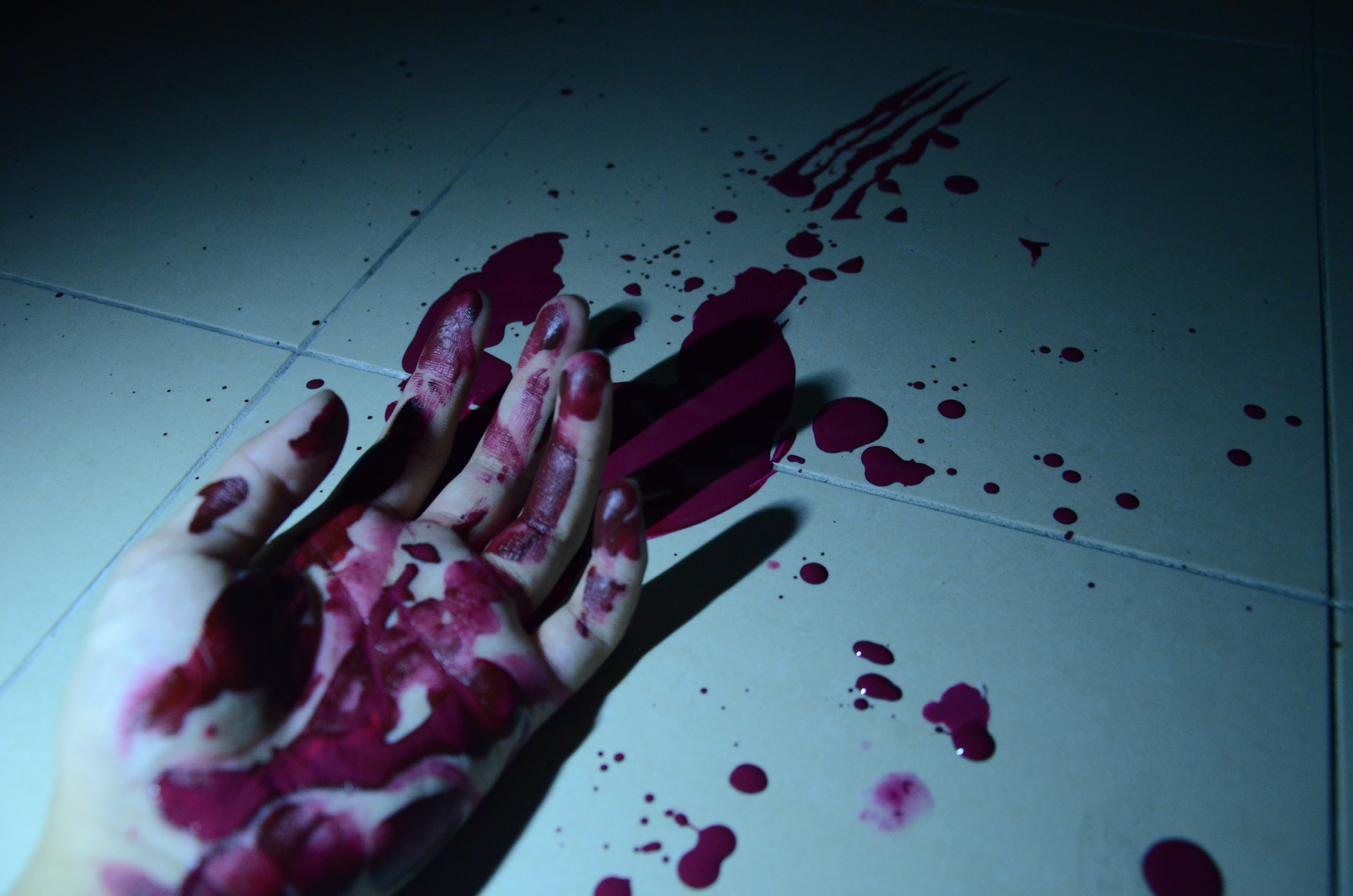
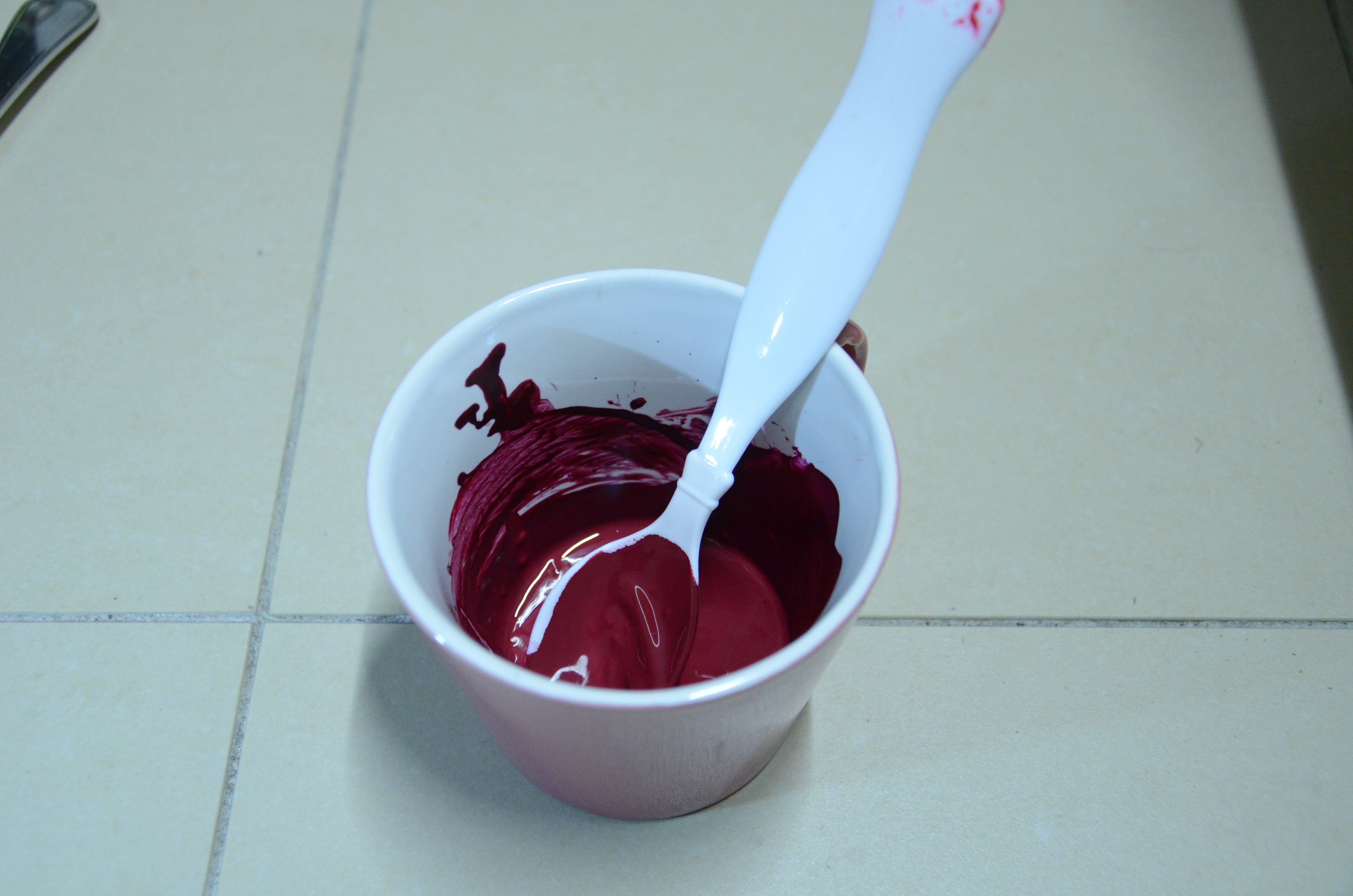
After that was the nightmarish part of the project; both the photo and process :’) I had pre-mixed red and black paints to get a bloody colour, and then after taking the first shot, I started to drip the red paint all over the floor and my hand. Which sounds simple enough until you realise that you have to be super precise about it. I had to keep my right hand entirely dry and paint-free to be able to use the camera while crouching down on the floor and using the DSLR with one hand oh gad. It was such a tedious and painful process HAHAHA. The look of shock on my roomie’s face when she walked in and found me and the floor covered with red paint and lights off was priceless though. Lucky she came back though because I was struggling in trying to adjust the focus without letting the paint kena the DSLR.
Initially, I had also wanted the fork to still be in the shot in the far right corner, except blood stained. However, I thought it wouldn’t make sense for a murderer to continue to stay at the crime scene, so I decided to leave a ‘mark’ of four lines dragging away from the scene as indication of the fork murderer ‘running away’. I thought it was also a clever way of showing the fork’s involvement in the picture without the fork actually being there. The absence of the looming shadow from before is also an indication of the reversal in the relationship of the dominator and the dominated.
(Behind The Scenes:)
(Cleaning this up was the real struggle but that’s an unrelated story. My tiles still have red stains. Help)
[ S W E A R O N I T . ]
Project 2 SWEAR ON IT., ‘Clean Fork’Project 2 SWEAR ON IT., ‘Fork In Hell’
I felt that this series was the simplest yet most impactful of the bunch! I had entertained the idea beforehand but never actually seriously thought of doing it (Credits to Zhongwei for suggesting the idea HAHAHA) because I thought it was too superficial. But I really liked the idea and after Lei laughed at the suggestion for a long time I felt like I had to do it.
I may or not may not have stolen a fork from Koufu at South Spine to achieve this photo. In my defence it’s very hard to bend high quality forks??? I had to get the flimsy mass-produced kind which are available at like all school canteens lol. Sorry Koufu. 🙁
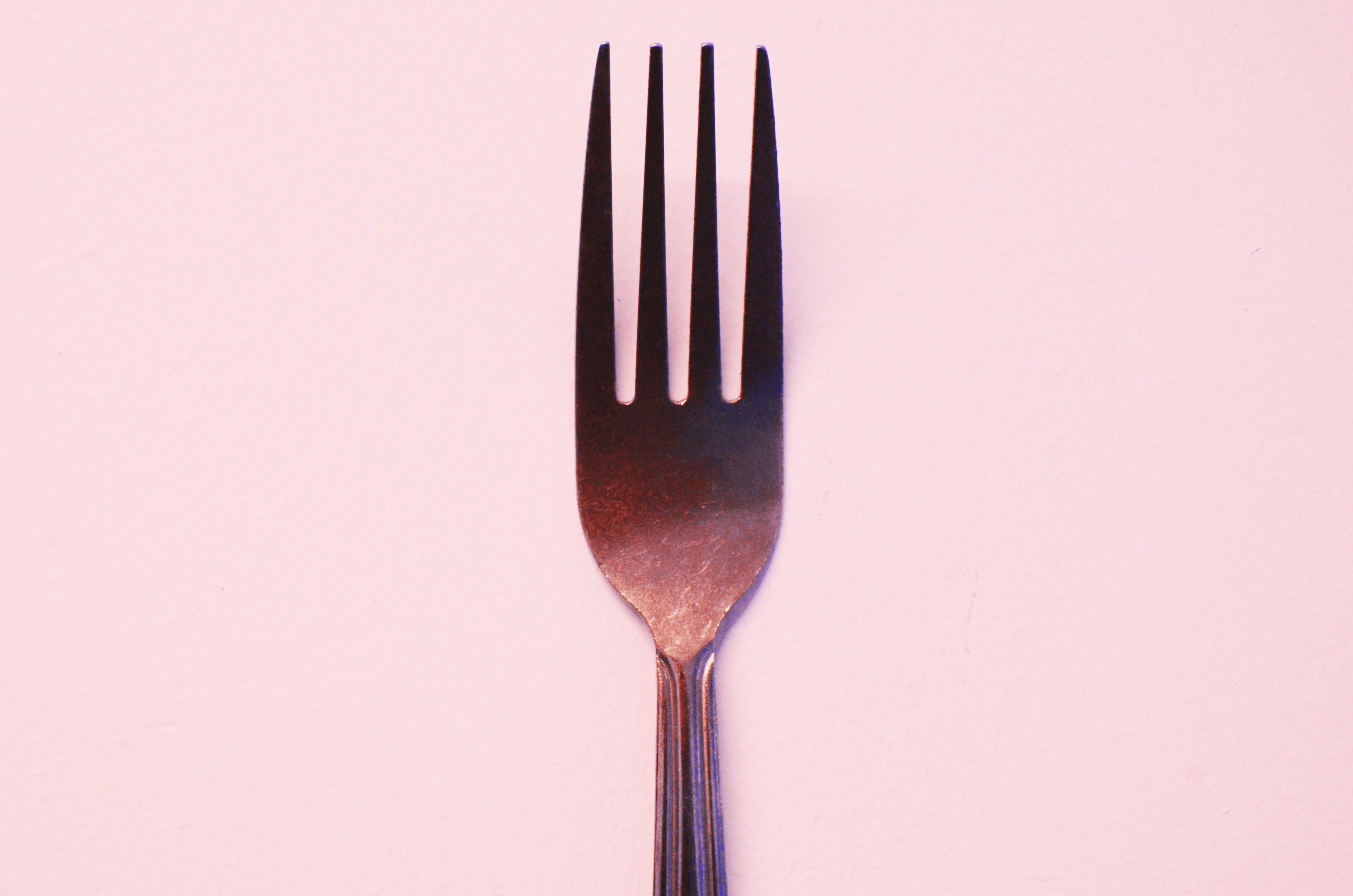
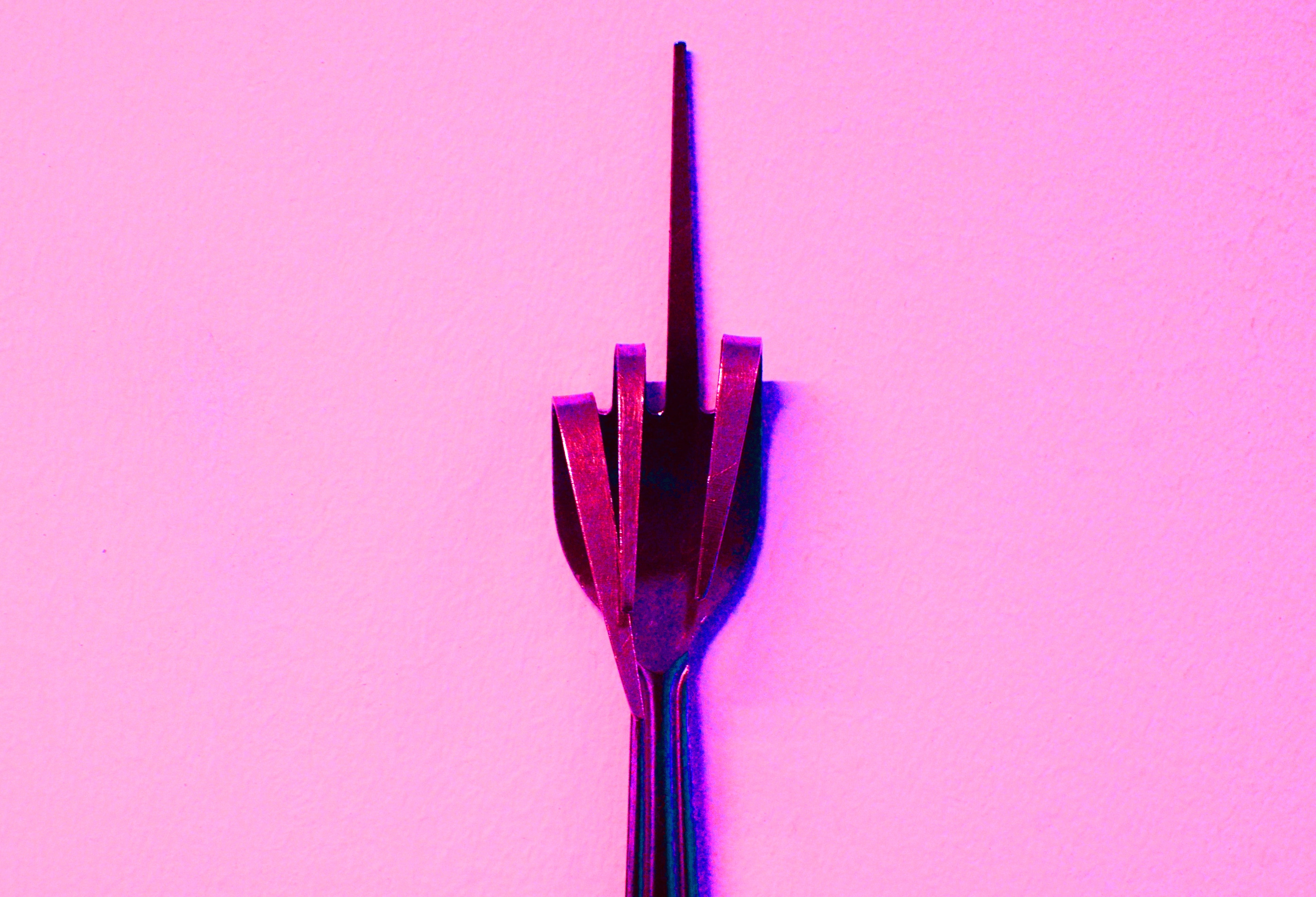
There’s nothing much to say in the technical aspect of this photo. It’s just the fork before and after being bent, taken against the hallway outside my room. However, the wall was white and I felt that the photos were uber boring like that. Here are the pre-photoshopped photos:
In Photoshop, I maxed out the saturation to intensify the green tones in the photo, then adjusted the hue to give the unbent fork an innocent, baby-pink look. For the bent fork, I did the same, but intensified the pink to bring out a feeling of girlish nastiness and rebellion. However, the pink was initially set to look more salmon-ish:
But I figured it didn’t look as bitchy as I wanted it to be, and it actually looked kind of pretty, so I turned the pink into a hotter, purplish pink. Heh heh :}
[ F O R K Y O U ! ]
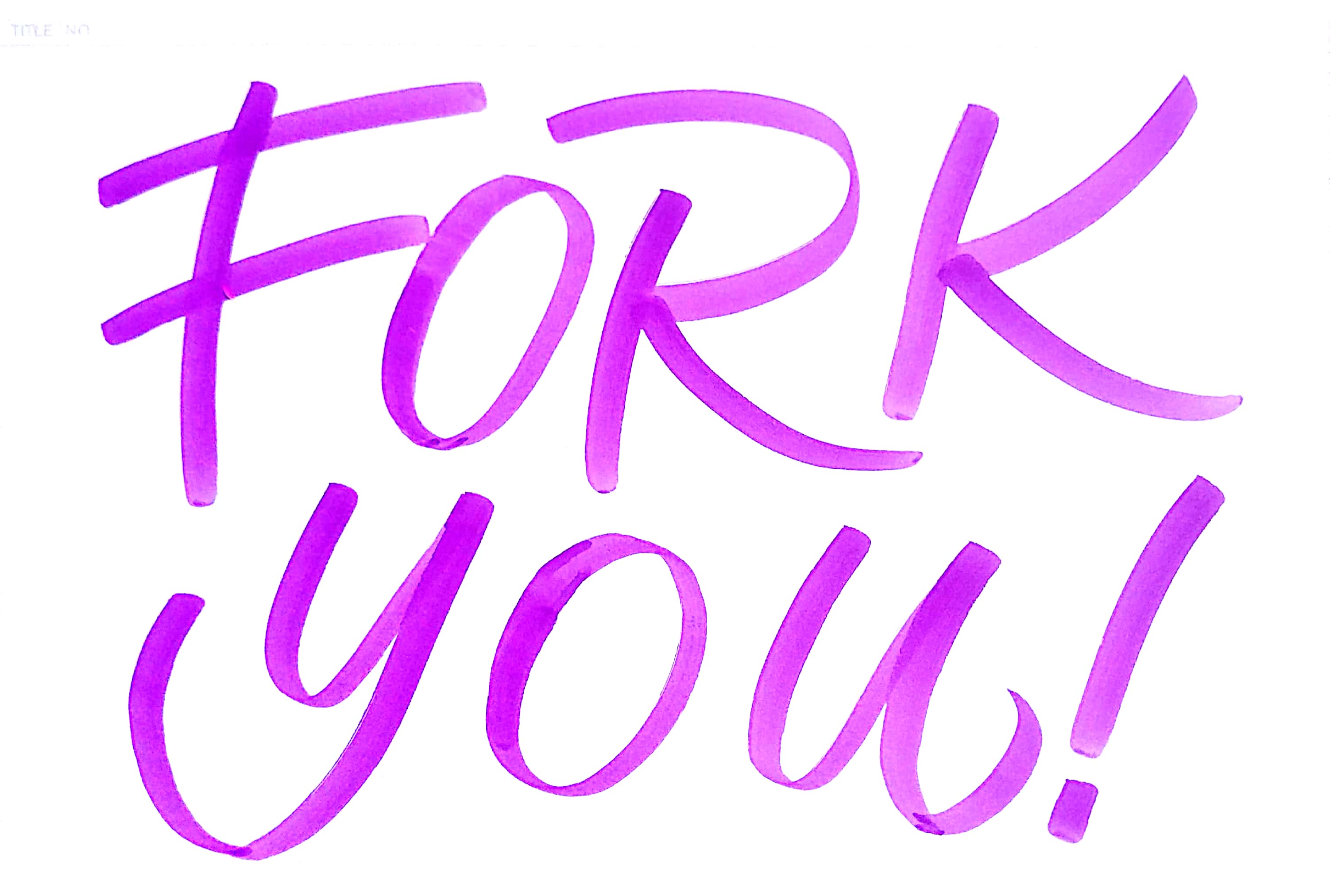
Project 2, ‘Fork You!’
For the final poster task, there was an obvious choice in what photo I should’ve chosen and what tagline to write, so I had no trouble with that. I wanted the text to span the entirety of the photo, so I lettered the words on a piece of paper and cam-scanned it:
After editing the words into the photo, I changed the hue of the words until I found a good colour combination. As I said previously, the initial colour of the fork’s background was supposed to be more ‘salmon’, and so the poster initially looked like this:
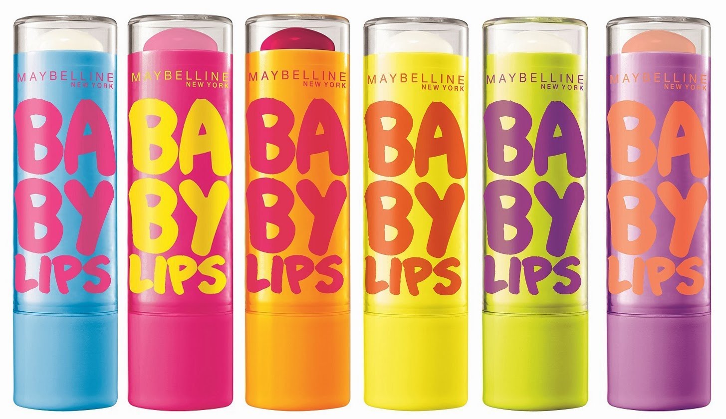
It was only during fiddling with the colour during the poster stage that I found the hot-pink colour and decided to change it to that. Throughout the poster-making process I was constantly thinking of the look of the packaging of the Maybelline ‘Baby Lips’ line:
Image taken from ChrystalMaKeUp85 on YouTubeImage taken from Priceline Pharmacy
I wanted my colours to be cancerously bright and vivid and eye catching. The pink and blue colour scheme was more reflective of that, so I decided to go with it after a long long time of deliberation (and asking friends), and I was ultimately pretty happy with the result.
Oh, and I also wanted to make the text interact with the fork itself, and look as if it were ‘popping’ out of the wall! So I added some drop shadow and a bit of embossing to make the words more 3D-looking.
[ FINAL REFLECTION ]
I’ll have to admit that this project stressed me out a LOT. Probably because there was limited time, and my ideas weren’t solid most of the time. However, in the end, I’m actually really really proud of this photoset as I feel like I managed to pull off creating an interesting series. Also, seeing classmates laughing at my vulgar poster was actually quite funny HAHAHA. I love presentation days because it’s always so interesting seeing what the others came up with, and I think everyone’s ideas and concepts were executed really well and in many different ways, like legit. Ultimately this project was a fun one, and I can only pray that the next one will be equally as entertaining. :’) Anyway, see y’all next post!