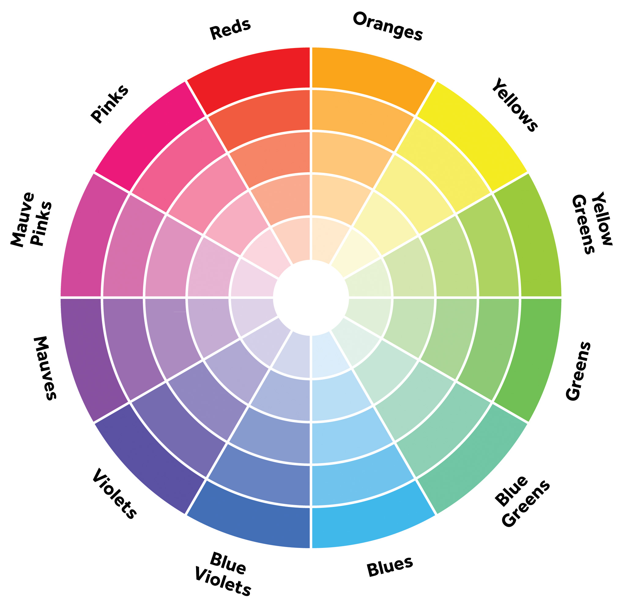
Occurs when the colours of a monochromatic palette all share a single hue, but vary in brightness and saturation.
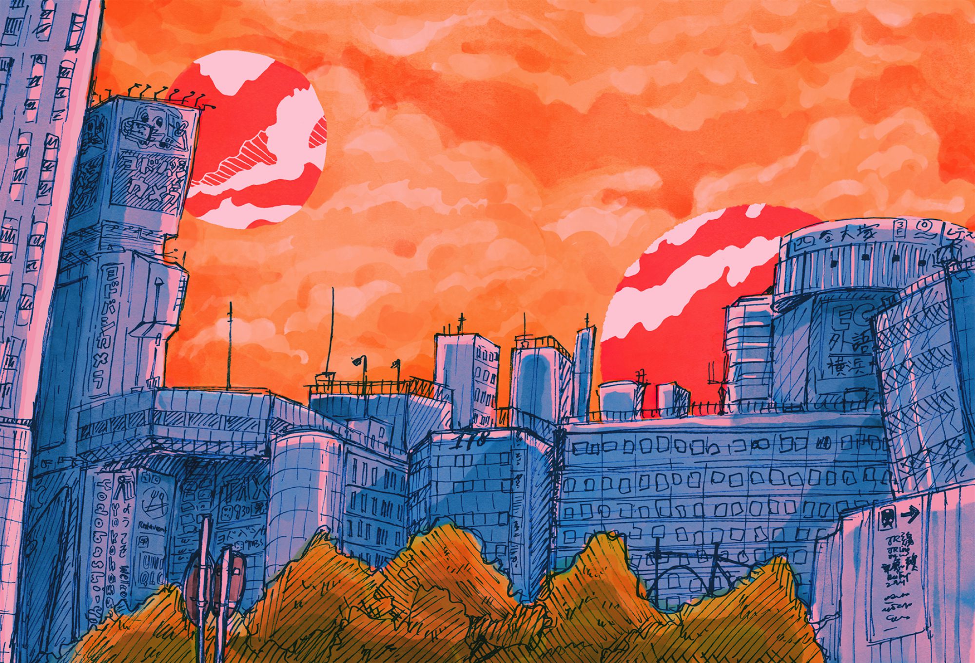
Image taken from www.xboxhut.comthis is so pretty but there were no credits to the artist!! 🙁 make sure to credit artists pls Image taken from https://www.pinterest.com/pin/506021708124150955/By Jenny Wichman. Image taken from www.jennywichman.com
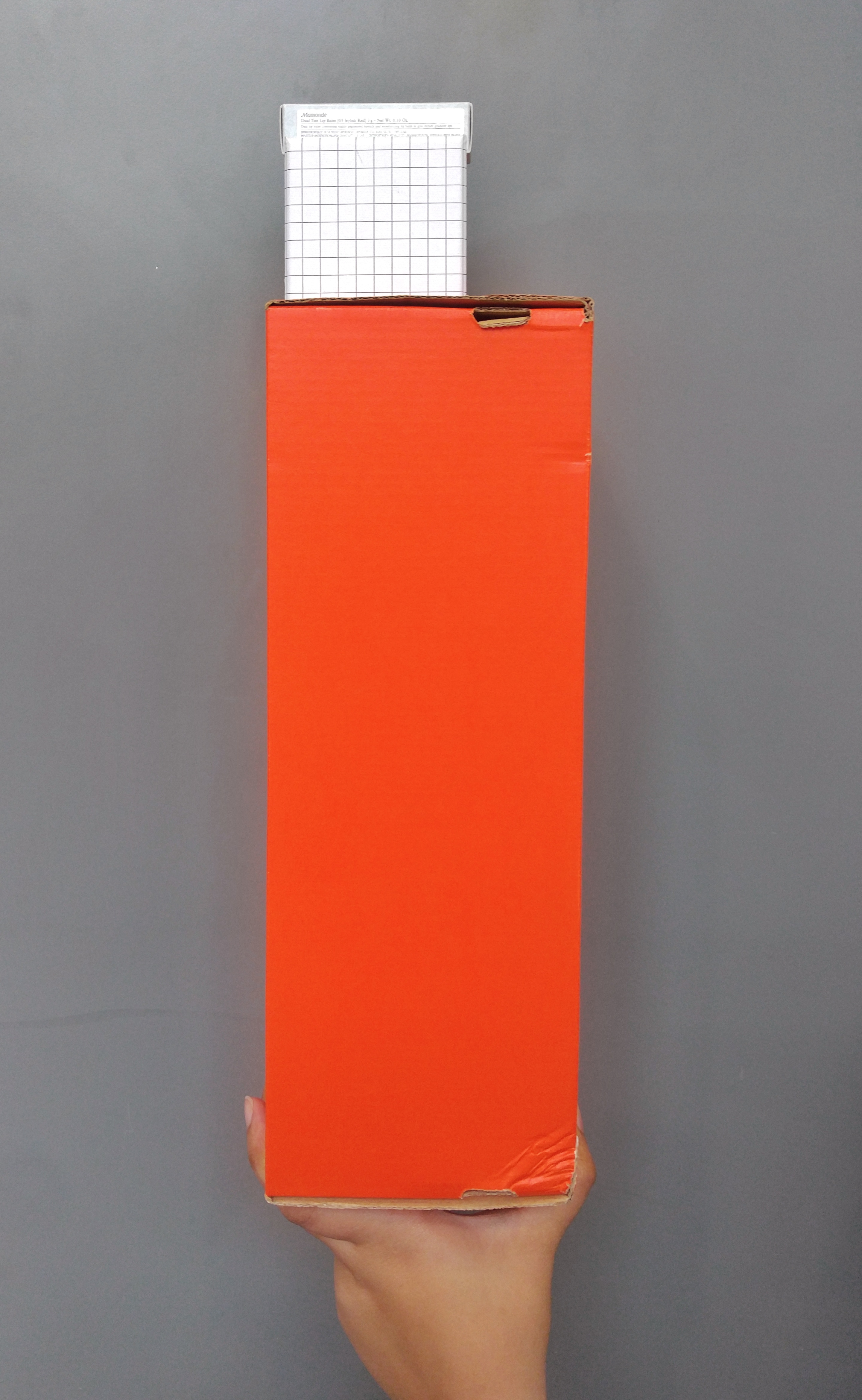
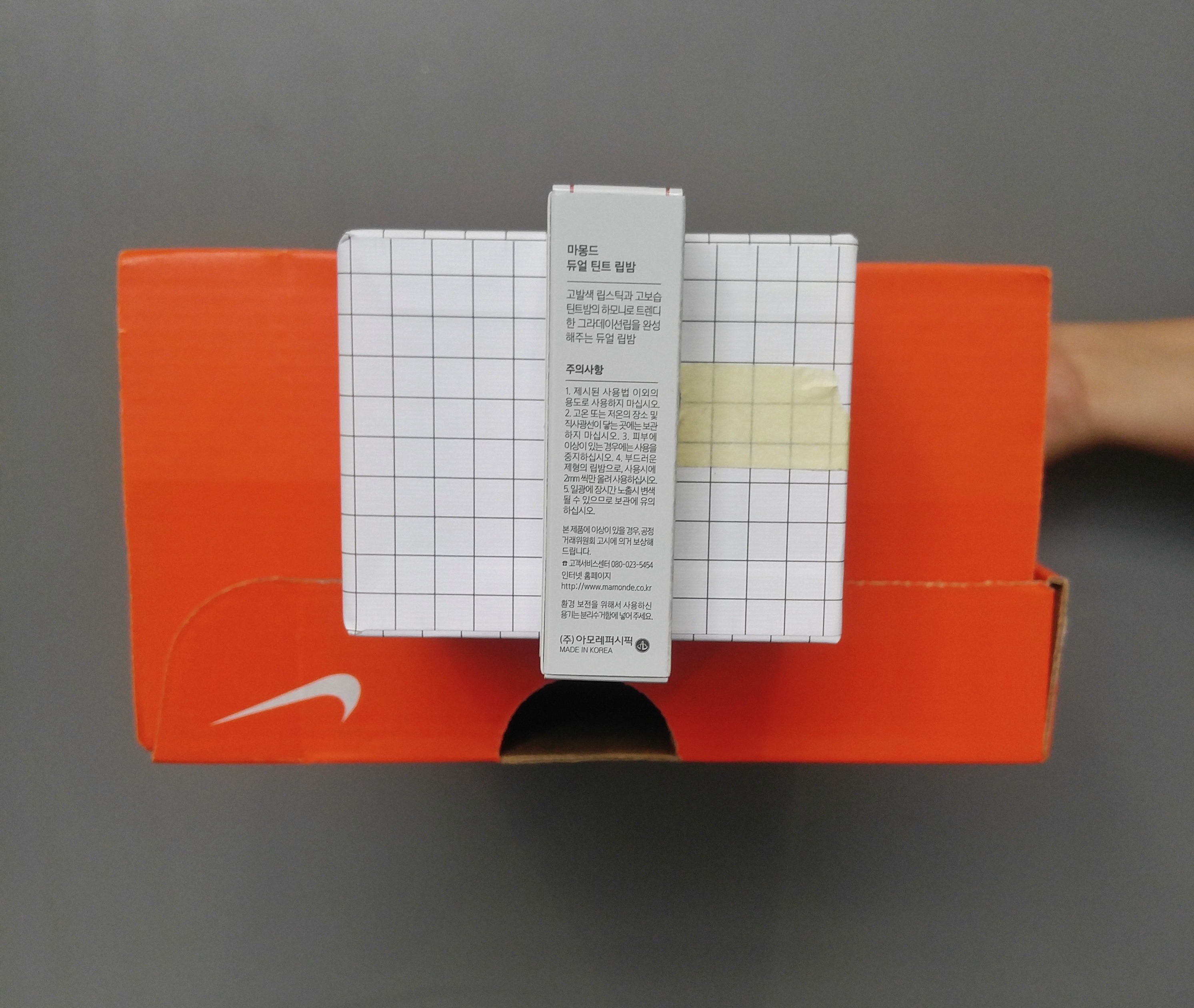
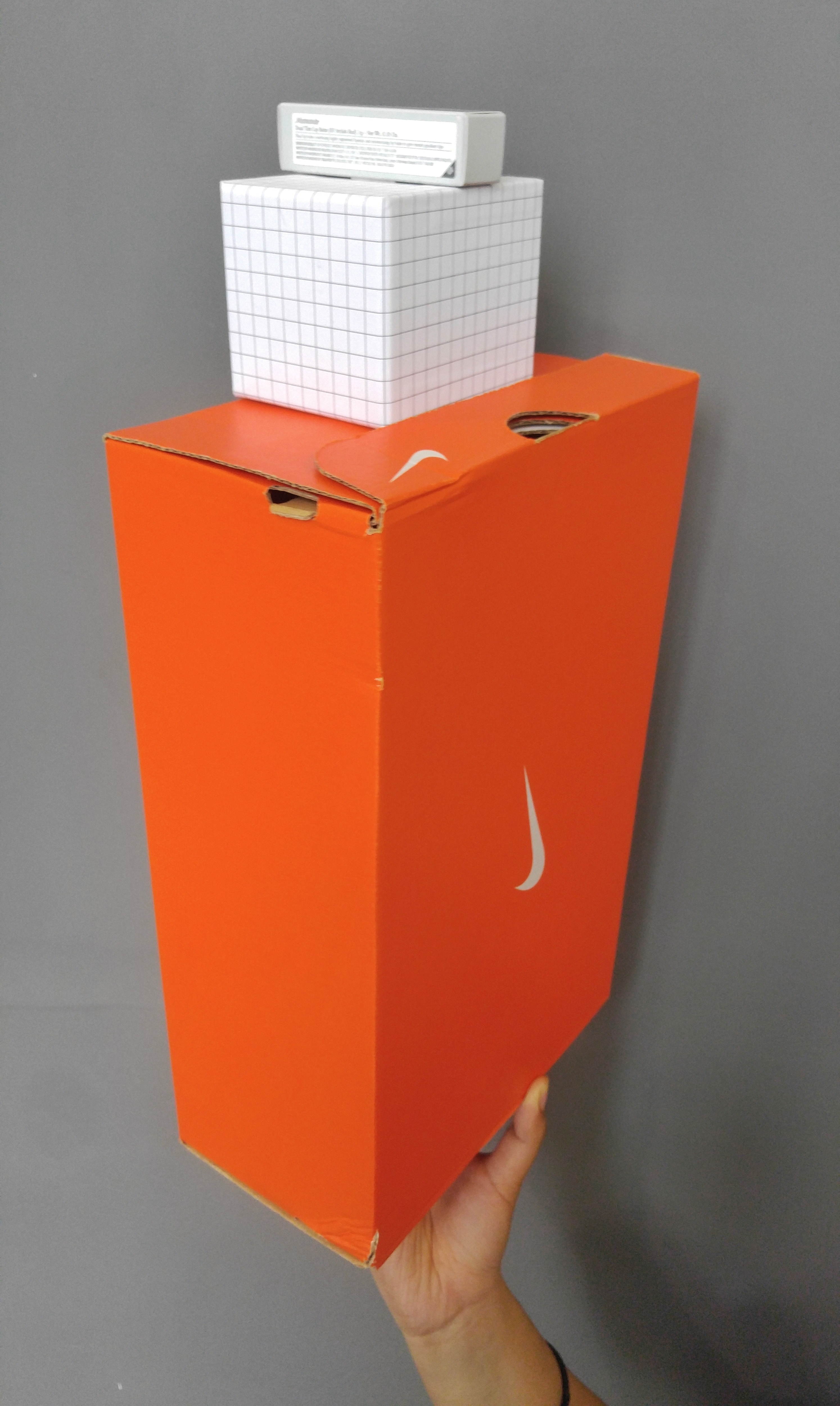
Hi yall! Last week after the 2D sketch model run-through, we had to take the boxes that we had brought to class and create a ‘Pandora’s Box’, a 3D sculpture made out of 3 boxes of varying sizes (to represent the dominant, subdominant and subordinate relationships), each with a theme assigned to it! My theme was ‘Complementary’, and after a lot of fiddling with masking tape and boxes, here are my two 3D Sketch Models.
Here is the first one:
3D Sketch Model: Complementary A, Front view3D Sketch Model: Complementary A, Side view3D Sketch Model: Complementary A, Top view3D Sketch Model: Complementary A, Top left view
Complementary: combining in such a way as to enhance or emphasise the qualities of each other or another.
For this sculpture, I was going for a more organised look with the pattern of the boxes. So I thought of arranging it such that the boxes were all plain colours and patterns such that there wouldn’t be anything clashing, with the solid orange Nike box, grid patterned pen holder and the plain white lipstick box all on top of one another. I also tried to make it such that they were stacked from large to small, to go with the flow of the boxes’ sizes, of the dominant orange box, the subdominant grid box and the subordinate white box. I wanted it to be such that the idea of ‘stacking’ could emphasise on the different sizes of the boxes to bring an idea of support and harmony. Also, apart from the stacking, I selected the boxes to show roughly the ‘Rule of Thirds’ in the sculpture, with the smaller boxes being one-third of the length of the bigger boxes, and situated in the middle. With this, I hoped that the sculpture managed to convey a sense of compatibility within the three boxes!
However, I feel that the sculpture could be improved on if I perhaps wasn’t limited to a white and orange colour palette, and perhaps could work with other warm colours that could complement the orange even better, like yellow or red. Also, while I tried to stick to the ‘Rule of Thirds’, the top box still seems too small, and I feel that the small box on the top could stand to be more eye-catching to compensate for its size. Hopefully I’ll be able to address these issues next lesson!
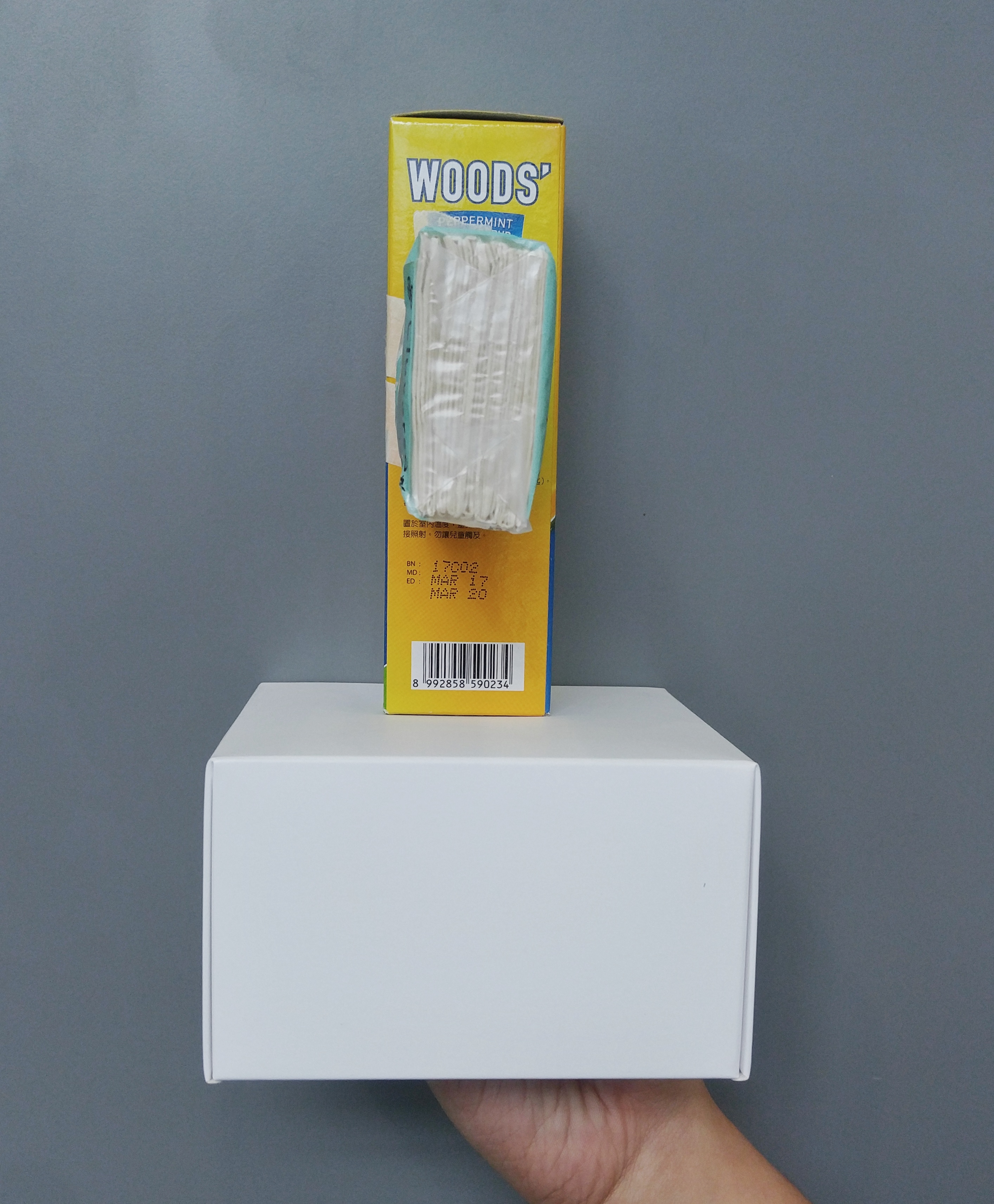
Okay then, moving on to the next sculpture:
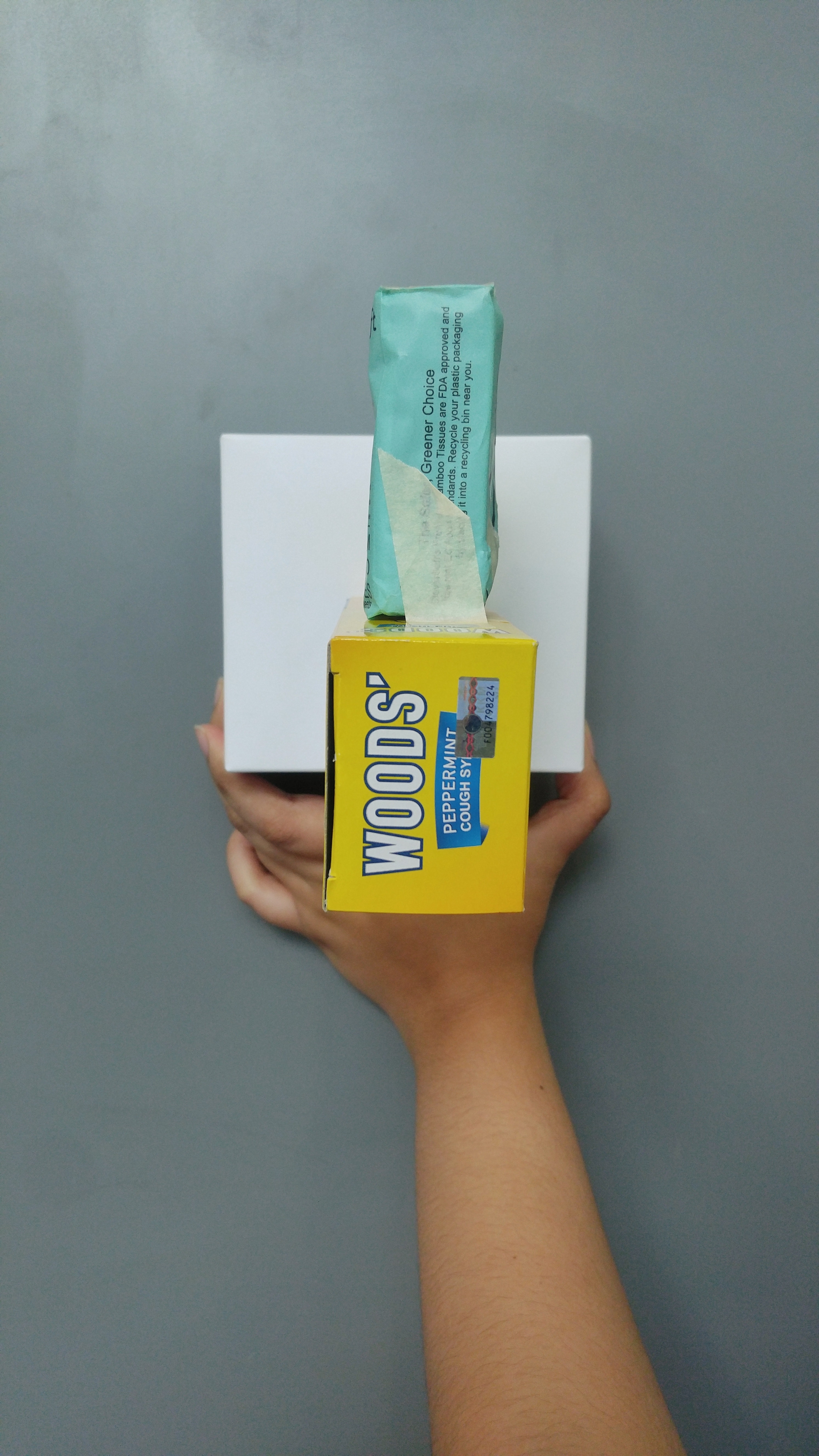
3D Sketch Model: Complementary B, Front view3D Sketch Model: Complementary B, Side view3D Sketch Model: Complementary B, Top view3D Sketch Model: Complementary B, Top left view
For this sculpture I decided to go for a more colour-based idea! To be honest the theme of ‘Complementary’ was sorta hard because we were supposed to isolate the boxes from their colours and work with their shapes alone, and without colour I was completely stumped on how to complement shapes, so I don’t think I executed the idea very well for the second sculpture. But anyhow, I tried to do it such that the yellow and blue scheme of the Woods’ box matched the blue and yellow of the base box’s yellow and blue label, and same goes for the blue tissue packet with the box’s blue label. I also tried to arrange the blue tissue packet such that it helped to counterbalance the Woods’ box more elongated shape by sticking it onto the other side to weigh the Woods’ box down.
I think there are many ways I could be improving on this sculpture, first with the problem that I don’t think it’s very clear which box is the dominant or subdominant, as both the base and the Woods’ boxes stand out. I will probably need to get a bigger base box! Also, I feel that the overall arrangement of the boxes don’t really indicate that there is any harmony going on. It feels really random and misplaced. Hopefully I can find a better way to arrange my boxes or find better boxes for this second sculpture.
Anyway, I hope to be able to expand on the meaning of ‘Complementary’ next week, instead of just using colours and patterns, and to be able to actually use the boxes’ shapes and arrangements as more solid evidence for the theme. See yall next post!!
Edit: Also creds to Fiza for helping me hold my boxes HAHAHA hand model 10/10