Creative Industry Report — Vewn

Vewn (real name Victoria Vincent) is an artist and animator based in Los Angeles, California. As a kid, she got into creating and editing videos for the online video game RuneScape, and eventually combined her love for films and drawing through animation. She graduated from the California Institute of the Arts (Calarts) and creates short films ranging from under a minute to ten minutes long, which she posts on her Youtube channel, vewn. Though her channel only has 14 videos, they have racked up over a total of 23 million views, and her channel has over 640,000 subscribers.

GIF by Vewn

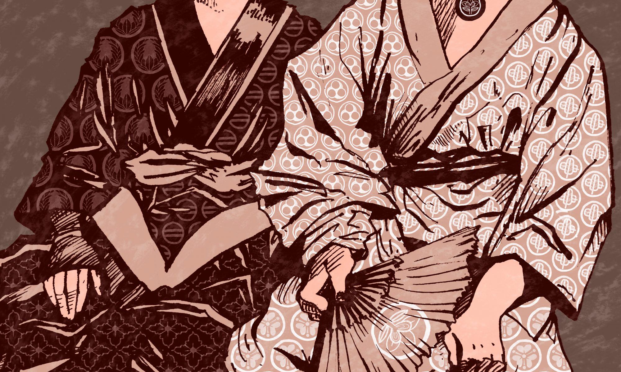
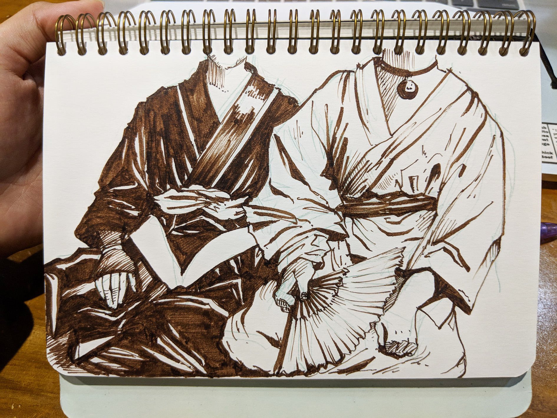
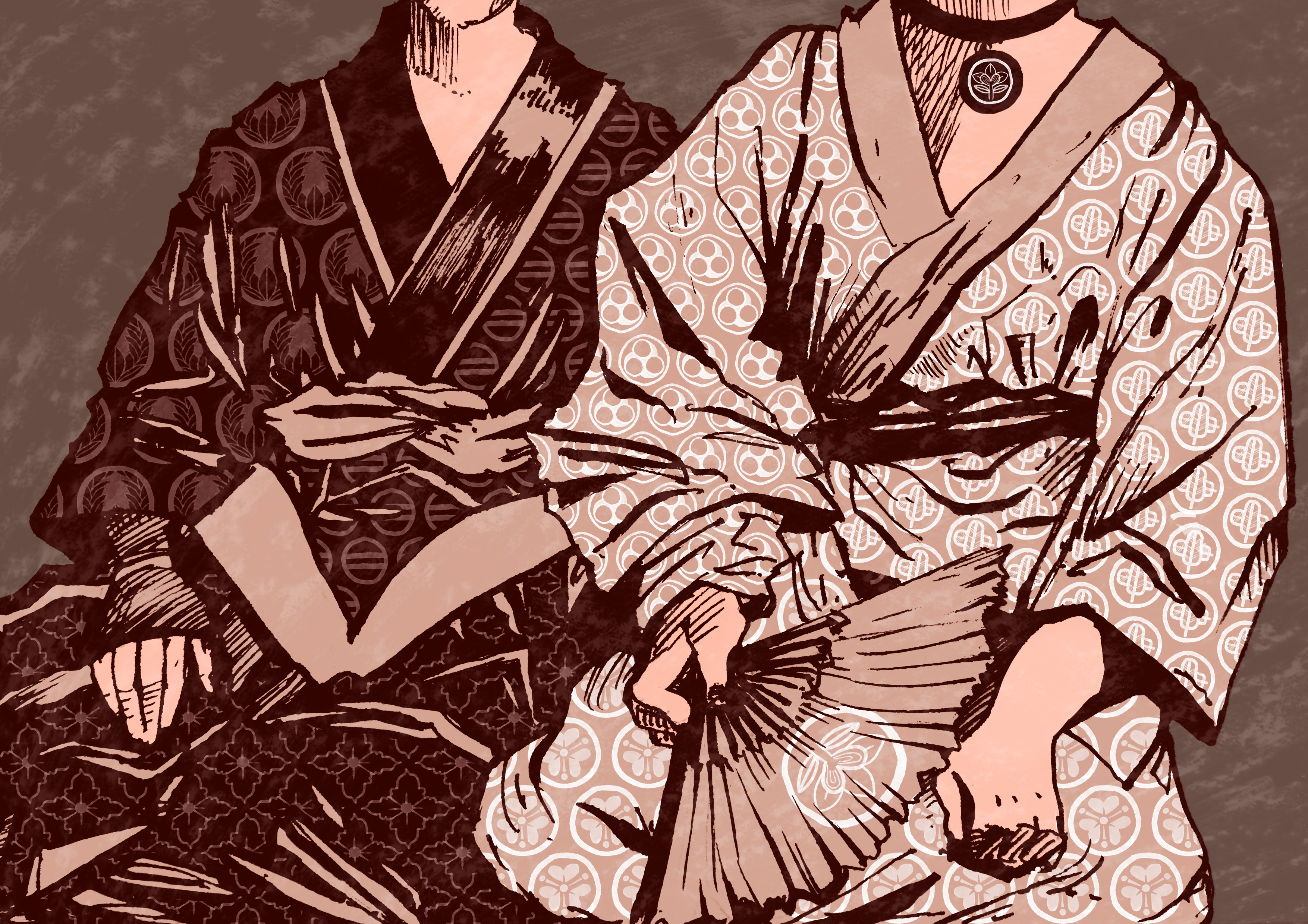
Vewn is well-known for her unique art style which she employs to full use in her animations and artwork.

From left: Artwork by @vewn_ on Instagram, Still from dead end (2019), Still from Twins in Paradise (2020)

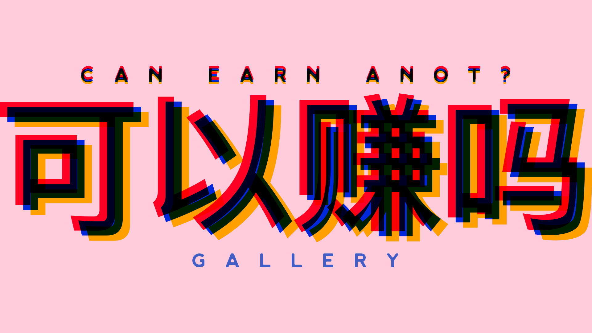
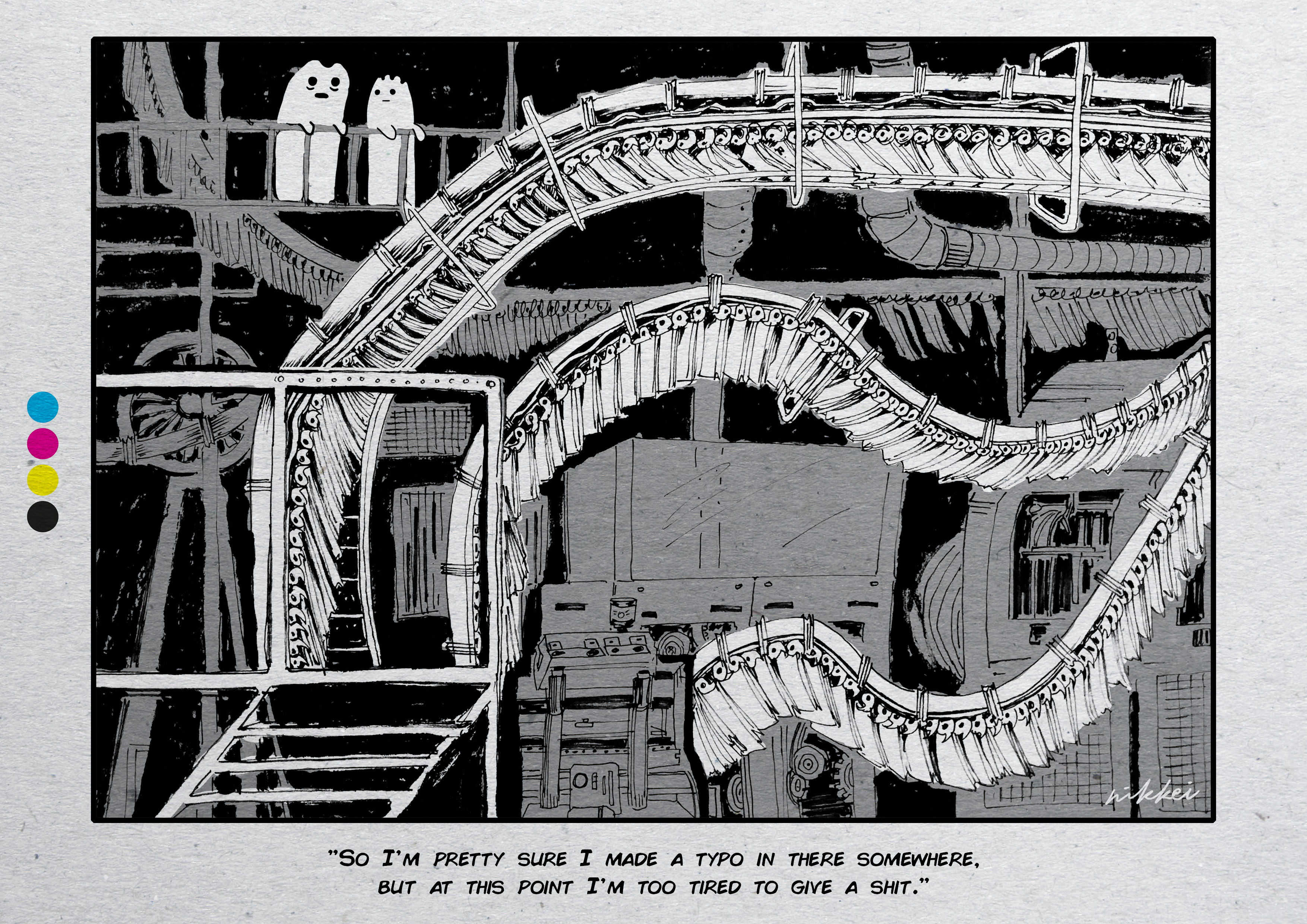
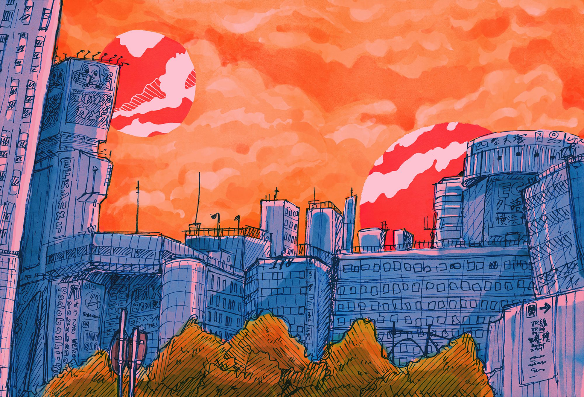
A notable feature of her art style is her expertise in setting the atmosphere of each scene. With her usage of bright, harsh and unnatural colours, gritty and raw pencil textures, exaggerated anatomy and perspective, her work has a vivid sense of otherworldliness and unease. Her animation also has a signature ‘jittering’ effect that amplifies the dynamism of her artwork.

Clockwise from left: Still from floatland (2018), Still from Catscape (2019), Still from Twins in Paradise (2020)
Top: Still from dead end (2019), Bottom: Still from Catscape (2019)
GIF from cat city (2017)

Another trait particular to Vewn is her exploration of different dark themes in her animated works. For example, dead end explores moral hypocrisy through the crossing paths of an anarchical school delinquent and the school counsellor that morally berates him, but is secretly addicted to online gambling. kittykat96 and floatland both look at themes of dissonance in self-identity and isolation, with the former through an influencer who struggles to merge her perceived online identity with her self in real life, and a shut-in who loses herself in her alternate video game world. The sense of existential dread is something that resonates deeply with my generation, and this juxtaposition with her bright and colourful characters and style is jarring and surreal.

Clockwise from top left: Still from dead end (2019), Artwork by @vewn_ on Instagram, Still from Twins in Paradise (2020), Still from floatland (2018), Stills from kittykat96 (2018)

Lastly, I adore the general absurdism and dark humour that Vewn injects into her work. For instance, mask dog is a short animation that follows a dog who puts on a mask and is arrested by the police and sentenced to death, but narrowly escapes death when the executioner pulls off his mask and says “Wait…this is a dog.” 

Stills from mask dog (2018)
GIF from cat city (2017)

All in all, I love Vewn’s style, originality and the way she juxtaposes her dark themes with bright colours and fun characters. Her confidence and steadfastness with her unique animations is something that I want to emulate. 🙂


REFERENCES

[Locale Part II] Process.

part ii: zine

Not gonna lie for the zine I was pretty lost?? Initially I had ideas but like I didn’t know it had to be..ABSTRACT….so when I heard that I was like Oh No how??

But eventually the plan of action was to have the spreads follow a chronological order of changes within the cemetery, with a focus on unique Japanese visual cues:

  • First spread: Pre-war period
    • Origins of the Cemetery: Karayuki-san
    • Family tombs: Kamon family crests
  • Second spread: Wartime
    • War memorials
  • Third: Post-war period
    • What do we see in the park now? Joggers, students…

first spread: pre war spread

Since I wanted to incorporate the karayuki-san, who were the first to be buried in the cemetery, as well as the interesting motifs in the kamon family crests found on some of the graves, I thought I could combine the two into one spread.

In total I found seven different crests (Some of them might not be crests like the non-circle one??? I can’t be certain.) and tried my best to reproduce them even though a lot of them were very faded.

Karayuki-san in Singapore. Source: Edmund Yeo. http://www.edmundyeo.com/2011/10/karayuki-san-forgotten-japanese.html

I sketched out karayuki-san from a photo, purposely leaving out their faces (apart from not wanting to burden myself with facial features) to drive home the point about the forgotten souls that rest in the place, as a lot of them died in the conditions they were under, with diseases like cholera and dysentery spreading. 🙁

Original pencil and brush sketch of the photo (middle two karayuki-san)
Cleaned up sketch on Ps
Final result

Continue reading “[Locale Part II] Process.”

[Image-Making Through Type] Final Works — Gallery

ABOUT THE PROJECT

We were required to create 4 typographical portraits of our name (or variations of it, like nicknames) to describe our future job, with attention to type in particular, especially weight, style, size, and usage of upper or lowercase characters.

Since I tend to have a unifying theme for my Graphic Form/2D projects, I decided on the theme of stereotypical Asian expectations when it comes to stable, safe and high paying jobs — namely a doctor, lawyer, engineer and a journalist.

PRESENTATION DAY GALLERY

INDIVIDUAL WORKS
ENGINEER
NAME: NKSC
DOCTOR
NAME: NIKI
LAWYER
NAME: NIKKI (Please don’t ever spell my name like this though)
JOURNALIST
NAME: FRY

PROCESS

[Image-Making Through Type] Process.

Got called out by Shah for putting a weird replacement here before I finished my Process post HAHA.