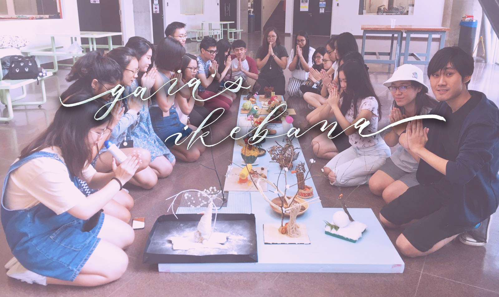
The Subverted Object

[[[ F O R K ]]]

Weird title but that was my object for this project! So basically Lei’s assignment was for us to received an object and take photos of the object displaying its physical attributes or practical uses. After that, we had to take the object and subvert its meaning by changing or celebrating or critiquing the object’s meaning, or showing it’s cultural significance. Finally, we had to pick a picture and include text that would anchor or relay the message of the photo. I think everyone was stumped when they got their object and yah that included me too. :’)

The first task was okay, but the second task was killer. Subverting a fork?? At first I kept thinking along the lines of Poseidon’s trident, the Devil’s pitchfork, a fork in the road, blablabla. I even thought about how Ariel used a fork to comb her hair in The Little Mermaid??

But my previous project about me suffered from a lack of a cohesive theme, and I really really wanted to avoid that dissatisfaction in this project.

My initial idea was to have the fork as a murder weapon throughout all three subverted images. The non-subverted images would be the ‘before the murder’ photos whereas the subverted images would be the aftermath of the crime, with a fork sticking out from their heads or backs or whatever. It sounded super ambitious tbh. And I had other clearer ideas that didn’t fit into the murder plan. And the first week I was just so swamped with work that I didn’t manage to take even a single test shot and I just became uber stressed ohmygad.

So the second lesson where we had consultations with Lei, she let us do this exercise thing where we would practice subverting our objects by drawing them in different scenarios which was super fun hehe! I would show my drawings but they’re back in hall and I’m at home. :’) Upload later! Anyway, when I proposed my murder idea to Lei, as well as the other ideas, she proposed that I could just do matching sets of pictures with a theme for each set, like ‘eating’ or ‘killing’. The idea was SOLID MAN so I went ahead and did it.

Continue reading “The Subverted Object”

Gaia’s Ikebana: 3D Project 2

Hello friends! In this new post I will be giving an overview on the 2nd 3D project: Gaia’s Ikebana! Now I wasn’t at the 2nd lesson where most of the guidelines were given but I did know that I had to combine the shapes of a cone, sphere and a cylinder while incorporating the themes of food, a particular season, and ikebana, Japanese traditional flower arrangement. The season I got was spring!

SPRINGTIME RESEARCH

I needed to be able to find food that fit the theme of spring while fulfilling the shapes of a cone, cylinder and a sphere. I thought narrowing down the food to Japanese themed spring food would be more suitable since we were also bringing ikebana into the mix!

Japanese Spring Cabbage

Image taken from The Spruce. Image by Brett Stevens/Getty Images

Japanese Spring Potato

Taken from The Spruce. By Adam Gault/Getty Images

Sakura Mochi

Taken from Japan Info. Source: www. jp.fotolia.com/

Japanese seaweed

Picture taken from Hello Glow.

Japanese seaweed seems to be more of a staple food rather than a spring food, but I thought it would tie in nicely with my idea for a cone, as cone shaped food is really hard to find, so I thought of making a cone out of something flat and flexible instead.

My Line Is Emo: Final Work!

Hello people!! Monday was the presentation for the final work for the first 2D project: ‘My Line is Emo’ and so with all the feedback and past experiences in making my lines, I’m reaaaady to conclude the project with a final write up about everything! 😀

[ FINAL WORK ]

My Line is Emo: Final Work by Niki Koh


[ THEME  + PROCESS ] Leaving Tokyu Hands

So during the holidays I decided to work at a shop that I frequented a lot called Tokyu Hands (at Suntec), and I really learn’t a lot and made a lot of good memories and friends with my coworkers there. Despite trying to continue on with the job for a month in NTU, I decided that I couldn’t work and study at the same time and decided to quit and left like a week before this presentation. Lotsa tears were shed okay :’) and there was a lot of emotion involved, so I decided to focus on this current event in my life as the theme behind my work.

However, I wasn’t really sure about how to exactly execute this. I had a strong concept behind my ideas but I had no idea how to put these ideas out on paper visually. I made a mindmap to try and consult Joy with the previous experimentations I had done last time:

Mindmap for My Line is Emo, Niki Koh

Joy’s feedback was that since I had such a strong theme behind my lines, why not try to incorporate as much of that theme into the work itself as possible, by using things from the workplace to create marks? Like my name tag (which I had to give back so), my shoes, receipts, coworker’s hands….and I thought the idea was really good (and I also wondered why I hadn’t thought of that HAHAHA). So on Hari Raya Haji I went back to Suntec to try and hunt for materials. However, all I managed to get was sample paper that the customers wrote on to test the pens, and a receipt from MY OWN PURCHASE LOL sigh >$20 flew away from me. So I had to try and make do with those materials and other things that I already had, and actually I managed to pull it off okay!

Also, I thought it was a requirement to have one emotion from each emotional category but apparently that wasn’t the case LOL so I could’ve gone with other emotions but instead I limited myself. :’) But I think that’s okay because it made me think harder about how to portray certain emotions that I wasn’t very sure about.

Pandora’s Box: 3D Sketch Models on ‘Complementary’

Hi yall! Last week after the 2D sketch model run-through, we had to take the boxes that we had brought to class and create a ‘Pandora’s Box’, a 3D sculpture made out of 3 boxes of varying sizes (to represent the dominant, subdominant and subordinate relationships), each with a theme assigned to it! My theme was ‘Complementary’, and after a lot of fiddling with masking tape and boxes, here are my two 3D Sketch Models.

Here is the first one:

3D Sketch Model: Complementary A, Front view
3D Sketch Model: Complementary A, Side view
3D Sketch Model: Complementary A, Top view
3D Sketch Model: Complementary A, Top left view

Complementary: combining in such a way as to enhance or emphasise the qualities of each other or another.

For this sculpture, I was going for a more organised look with the pattern of the boxes. So I thought of arranging it such that the boxes were all plain colours and patterns such that there wouldn’t be anything clashing, with the solid orange Nike box, grid patterned pen holder and the plain white lipstick box all on top of one another. I also tried to make it such that they were stacked from large to small, to go with the flow of the boxes’ sizes, of the dominant orange box, the subdominant grid box and the subordinate white box. I wanted it to be such that the idea of ‘stacking’ could emphasise on the different sizes of the boxes to bring an idea of support and harmony. Also, apart from the stacking, I selected the boxes to show roughly the ‘Rule of Thirds’ in the sculpture, with the smaller boxes being one-third of the length of the bigger boxes, and situated in the middle. With this, I hoped that the sculpture managed to convey a sense of compatibility within the three boxes!

However, I feel that the sculpture could be improved on if I perhaps wasn’t limited to a white and orange colour palette, and perhaps could work with other warm colours that could complement the orange even better, like yellow or red. Also, while I tried to stick to the ‘Rule of Thirds’, the top box still seems too small, and I feel that the small box on the top could stand to be more eye-catching to compensate for its size. Hopefully I’ll be able to address these issues next lesson!

Okay then, moving on to the next sculpture:

3D Sketch Model: Complementary B, Front view
3D Sketch Model: Complementary B, Side view
3D Sketch Model: Complementary B, Top view
3D Sketch Model: Complementary B, Top left view

For this sculpture I decided to go for a more colour-based idea! To be honest the theme of ‘Complementary’ was sorta hard because we were supposed to isolate the boxes from their colours and work with their shapes alone, and without colour I was completely stumped on how to complement shapes, so I don’t think I executed the idea very well for the second sculpture. But anyhow, I tried to do it such that the yellow and blue scheme of the Woods’ box matched the blue and yellow of the base box’s yellow and blue label, and same goes for the blue tissue packet with the box’s blue label. I also tried to arrange the blue tissue packet such that it helped to counterbalance the Woods’ box more elongated shape by sticking it onto the other side to weigh the Woods’ box down.

I think there are many ways I could be improving on this sculpture, first with the problem that I don’t think it’s very clear which box is the dominant or subdominant, as both the base and the Woods’ boxes stand out. I will probably need to get a bigger base box! Also, I feel that the overall arrangement of the boxes don’t really indicate that there is any harmony going on. It feels really random and misplaced. Hopefully I can find a better way to arrange my boxes or find better boxes for this second sculpture.

Anyway, I hope to be able to expand on the meaning of ‘Complementary’ next week, instead of just using colours and patterns, and to be able to actually use the boxes’ shapes and arrangements as more solid evidence for the theme. See yall next post!!

Edit: Also creds to Fiza for helping me hold my boxes HAHAHA hand model 10/10

  • Niki

Pandora’s Box: 2D Sketch Model of My Fabulous™ Hairdryer

Hello! This is Niki making her first Foundation 3D post about her wonderful hairdryer. Have some pics first:

Philips Hairdryer, Side view
Philips Hairdryer, Front view
Philips Hairdryer, Back view
Philips Hairdryer, Top view

No, they weren’t edited to make it less obvious I took it on my bed in hall lol?? Everything was just that white. Anyway, I took it on a whim the night before the class because it seemed to be the most interestingly-shaped thing in my room which was not a high bar considering how dull my room is :// But the more I examined it after Cheryl mentioned things during class, the more interesting I found it!! By the time my presentation was over my hairdryer was the star of the room for like a few cool seconds. Here’s my 2D sketch analysis of my hairdryer:

2D Sketch Analysis of Philips Hairdryer

Something super cool about the hairdryer is also the fact that it has a foldable body so that it can be compacted for travel and portability! It looks like this after folding it completely:

Philips Hairdryer, Folded, Side view

I don’t think the dominant or the subdominant relationship changes when it’s in this state, but I do feel that since the button that was subordinate is hidden when the body is folded in, more attention is drawn to the bolts at the side, so they replace the button as the subordinate. However, from the opposing side of the hairdryer there aren’t any bolts, so my theory isn’t very strong haha. If it were viewed from the opposing side I think the translucent blue of mouth of the hairdryer becomes the subordinate. Which I think is interesting because even though it takes up more area compared to the blue stripes, the blue stripes still catch your attention more probably because they have brighter colours.

Overall, I think the blue-white scheme of the hairdryer was a good idea! Seems a bit basic but I think this colour scheme is something that resonates a feeling of no-frills reliability and usefulness. There’s also a lot of ‘Rule of Thirds’ going on in the hair dryer which is probably why the overall design of the hairdryer is pleasing to look at.  It makes me want to dry my already dry hair. I also really like the attention to detail, like making the inside of the hairdryer blue too even though no one ever thinks of looking inside a hairdryer, and the small loop at the end of the hairdryer so that I can hang it up if I want to! I always think that all the little things really make or break the big thing.

Next up I’ll need to work on my 3D Sketch Model about the theme ‘Complementary’. I’m still stumped but I guess I gotta think out of the BOX AHAHAH get it GET IT sorry its 1am and I’m tired from a day of work. See y’all (whoever is reading this………..) next post!

– Niki

My Line is Emo: Mark-making Research

Hello world!

Okay this is very scary because I don’t write blog posts and I tend to run my mouth so I have to keep a watch over what exactly I’m writing in these posts because it’s open for the WHOLE INTERNET TO SEE haha.

Anyway, it’s my first week in Year One in ADM (and such a big workload already dear god) and we’re going to be starting the semester with mark-making! We were given a list of artists we can draw inspiration for mark-making from so I’m going to be documenting my research on a couple of these artists so I can make really marky marks.


The first one on the list is Ed Moses, specifically his drawings from the 1960s and 1970s. He was considered a central figure internationally in innovative artwork, and experimented wholeheartedly with different styles and ideas. I think a lot of his work involves layering and grids.

Ed Moses – Mouse. Picture taken from RadiusBooks.

This piece is titled Mouse. I really like the colour scheme that reminds me of a marble texture, with stark geometric shapes interspersed with the background. Despite the contrast, I don’t feel that the geometric shapes interrupt the piece, but rather complement the rough and textured feeling of the rest of the piece, resulting in a soothing yet interesting piece. I may use the idea of contrasting shapes and textures in my mark-making. No idea why it’s called Mouse though but whatever floats your boat Mr Moses

Ed Moses, Untitled colour lithograph on two sheets. Picture from Simultaneous Visions

This next piece from Moses inspires a really different feeling! However I think the theme of contrast and shapes still run through this piece. The harsh, angled black lines form a grid over a blue backdrop. The idea of the overlap suggests a form of transition in emotion from tranquility to something akin to rage or anger. I like the grid pattern a lot and I might try to replicate it in my mark-making!


The artist I’m researching next is Emma Kunz, who was a Swiss spiritual healer and artist. Her drawing are really interesting and abstract, and were meant to inspire healing, and were even drawn using radiesthesia, something that refers to the spiritual aura/radiation from our bodies. Too chim for me to understand LOL

Emma Kunz, Unknown Title. Taken from www.ruthhoggerresearch.blogspot.sg

This really looks so carefully drawn oh my like one line out of place would simply ruin the whole thing. I can see why her drawings are linked to healing! The orderliness of the lines and geometric shapes are super satisfying and the colours picked like the light blue and yellow really are also calming to look at. It reminds me of  light refracting out of a raindrop, you know like that rainbow diagram. Not that Kunz was thinking of raindrops when she was drawing this but it just looks like it to me :v

Emma Kunz, Unknown Title. Picture taken from Invaluable

This one I think is really pretty! It looks like some sort of gemstone with rays of light shining out of it. Again there’s that theme of geometry and precise line placement that makes this amazingly soothing to look at. I notice that her drawings generally have a center around which the rest of the drawing springs/slowly connects from. Perhaps that brings about a sense of stability and tranquility. That would be useful for mark-making emotions :0


The last artist I’ll be conducting research on for now is Julie Mehretu, who is a renowned American artist known for her abstract works of art.

Julie Mehretu, Black City, 2007. Picture taken from www.nytimes.com

THAT IS DAMN BIG WOW I think if I tried to upload the picture in its full quality my com would crash. Anyway wow!!! That’s really something. Like while the painting is technically a bunch of intersecting lines, there is a very clear feeling of crumpling and folding of a certain mass, and the splashes of colours and lines makes me feel like I see life in the painting, and not just in a detached way, but perhaps in the sense of a busy society or city. What an apt name. I really like the sense of chaos travelling-on-a-highway thing. Don’t ask me about the highway thing I just feel like there are highways in the painting :// I feel like her line placement is unexpectedly careful. I’ll perhaps use this as a reference for the emotion of excitement or life in my mark-making!


Okay that’s all for now. I can’t go on any longer or I’m gonna pass out and shut down lol good luck to me for the rest of the semester!!! Dream sweets :)))