4D Assignment 1 – Processes & Thoughts, Curated

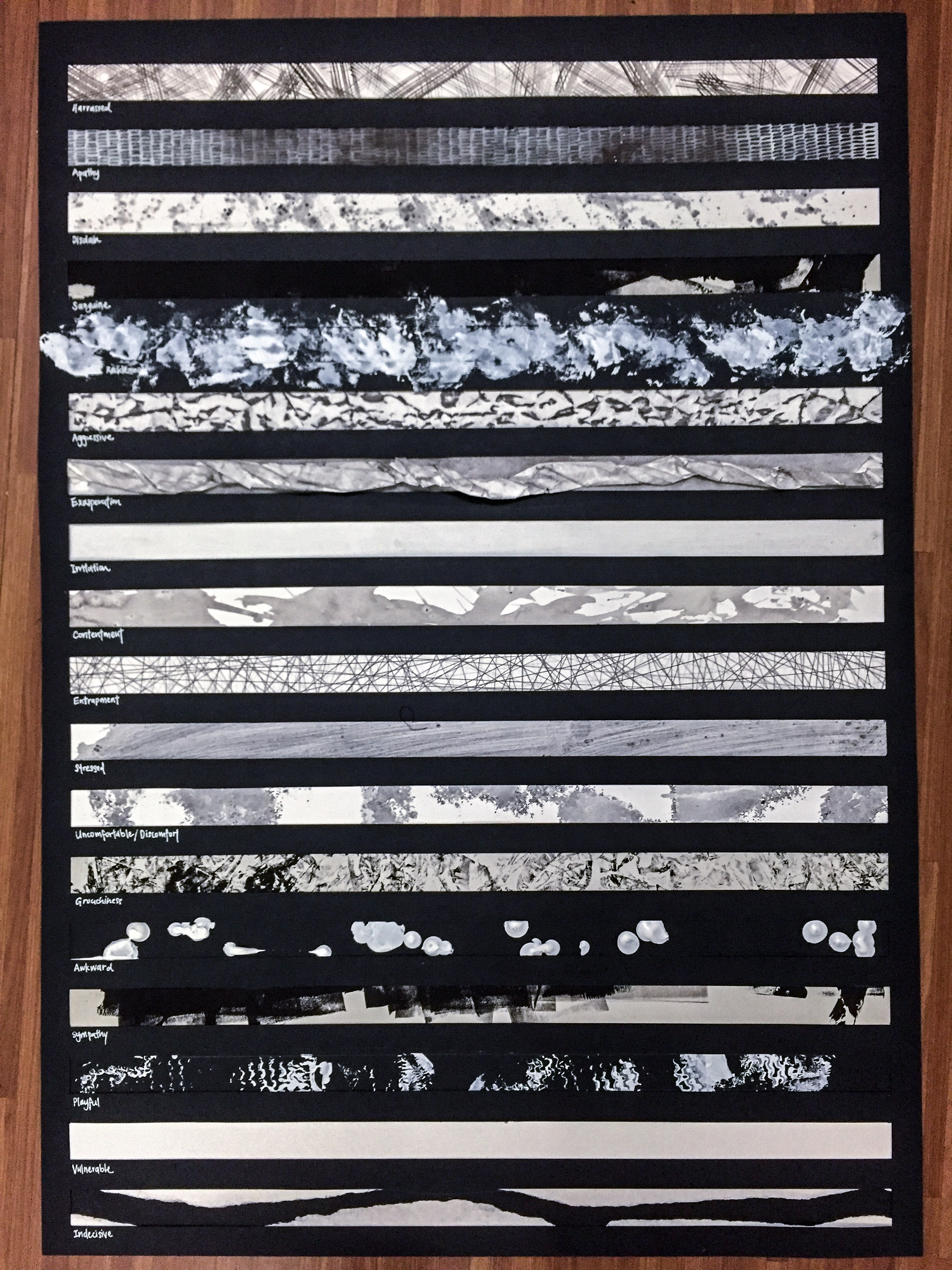
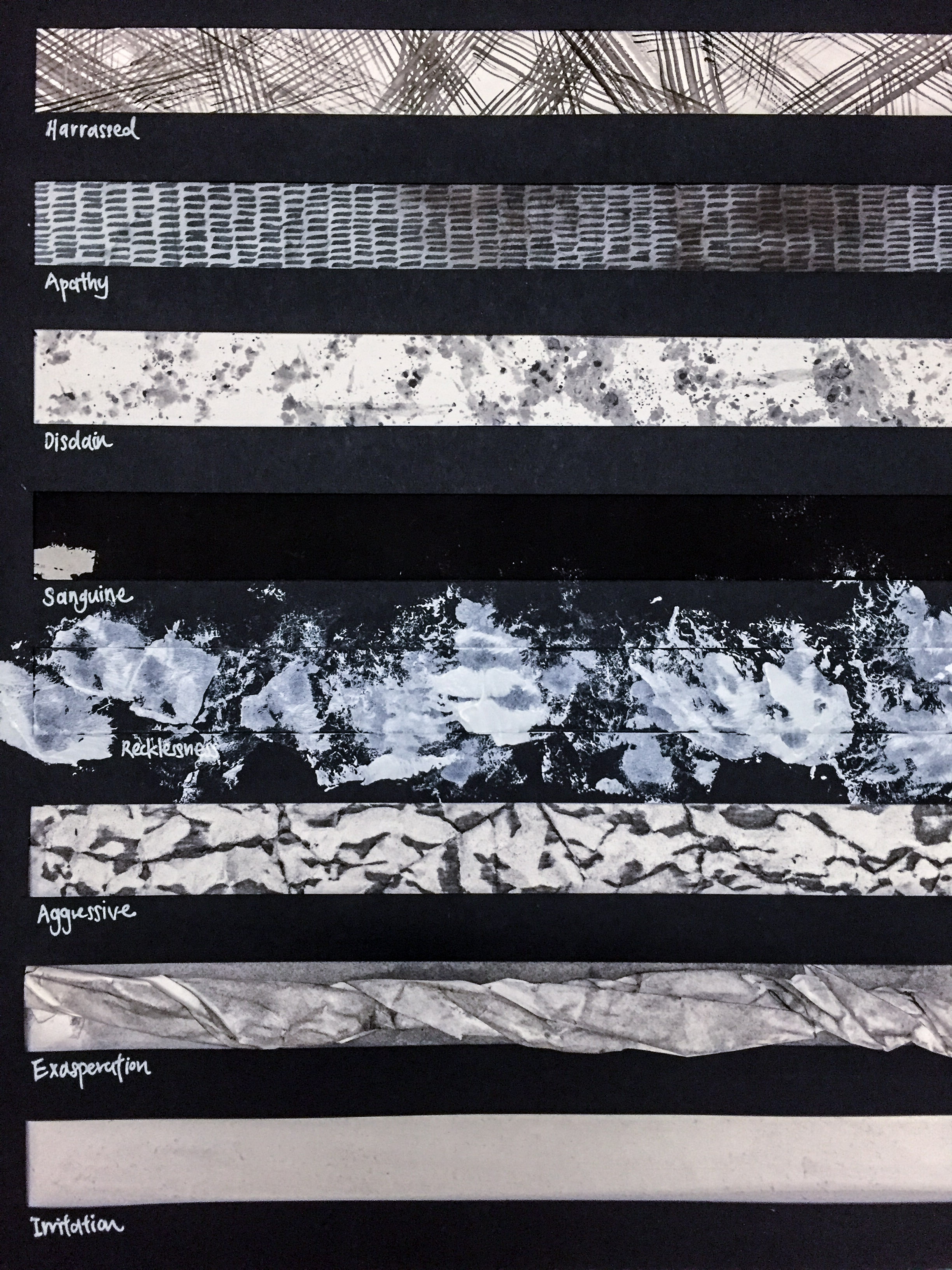
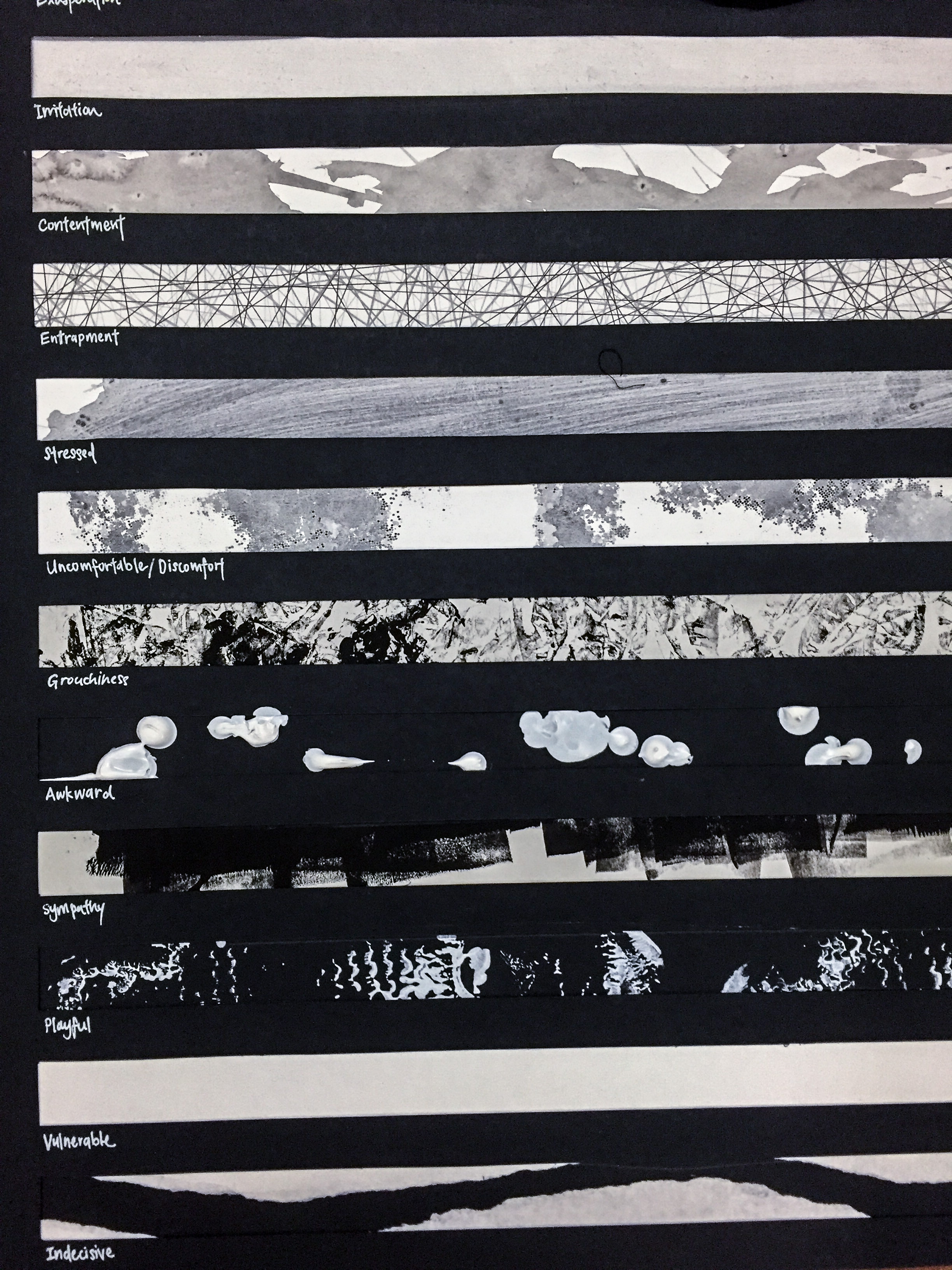
Foundation 4D – For Foundation 4D, I will be using the OSS system as a place to evaluate the photographs I have taken over the past few trips – technique, process and formal analysis. (Quite frankly, I’ve been struggling with my journal recently as I tend to let my reflections flow – in run-along sentences, informal language, slang and memes – so the OSS is a good place for me to curate my thoughts and make it coherent for an audience.)

But first and foremost, let’s go back the first critique lesson for Assignment 1 that we had. As mentioned from my previous post, I wanted to explore the ideas of eternity – at that point, I was still quite unclear about my idea. As a result, I followed my first inclination/impulse to create, and ended up with two end products: the animated stop-motion video and the writing on the floor.

  1. Animated Video (Oil Paint, Black & White)

Link: Animation Test

The animated video was really just a test – I wanted to try out the technique to see if it was viable. My conclusion? No, it wasn’t viable at all; it was ambitious and frankly quite overwhelming for me to take on and achieve mastery of a medium in such a short span of time. One thing that I felt was important to me was a professional quality in the presentation of work, which this animation test very blatantly lacked. I felt that my technical ability was a great limitation. The animated test was cool, but ultimately a huge bust.

2. Eternity Graffiti (inspired by the story of Mr. Eternity)

chalk-on-floor

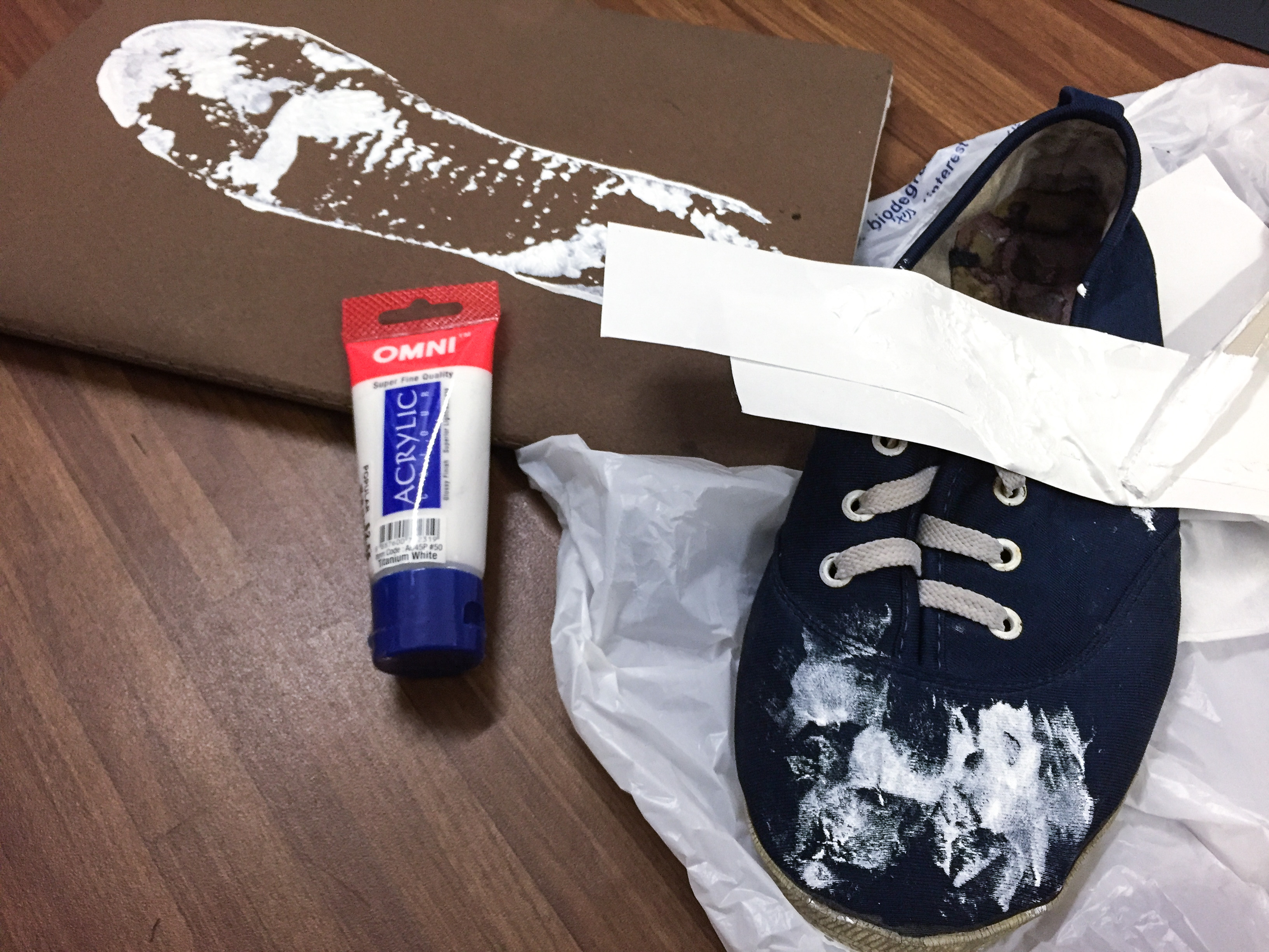
Basically, what I did was to replicated the visual of the graffiti done by the man in the story – it was a simple, photoshopped image with a photograph of some floor I took. The photograph lacked visual interest – I couldn’t captivate myself, for goodness’ sakes, how could I captivate an audience? The image was quite literal – I felt that it was too upfront and blatant for my tastes. There was a distinct lack of attempt of communication that I found highly displeasing.

At this juncture, I was extremely unsatisfied with (not to mention confused about) my end point at that time, and felt rather at a loss about the whole project. Was it too ambitious of me to tackle a topic as broad and subjective as the one I have chosen?

However, all was not lost – I stumbled upon the quiet premises of St. Joseph Church, at the upper Bukit Timah area, between Cashew MRT and Hillview MRT (downtown line) stations. The side gate of the cemetery was ajar, but the visual of a large stone cross captivated me. I immediately took a photograph and resolved to return to explore the premises again – and I did. I also gained greater clarity on my work through that chance encounter.

In Assignment 1, I aim to raise questions about what comes after death in a way that is open to interpretation. 

Continue reading “4D Assignment 1 – Processes & Thoughts, Curated”

Classwork – Chiaroscuro

Foundation Drawing – Last week, we did a figure study with the Chiaroscuro effect.

Exercise - Chiascuro 1 Exercise - Chiascuro 2 Exercise - Chiascuro 3 Exercise - Chiascuro 4

Chiaroscuro … the use of strong contrasts between light and dark, usually bold contrasts affecting a whole composition (wikipedia)

Looking it the Old Masters’ use of Chiaroscuro… it’s definitely a technique I’m keen on learning on, but I feel that I still have a ways to go in terms of improvement. I’m not very sure about how to go about improving this skill, but I think copying from paintings would be a good starting point?

Looking forward to the next lesson.

Artist Research – Expressionism, Automatic Drawing

Foundation 2D – Artist Research – Natasha

(Will probably take it down when I can print and stick into my sketchbook next week; I realised that I didn’t really include personal reflections? Just research. I did choose them because I found their work fascinating, though.)


My Line is Emo

Foundation 2D – Finally, we’re here! It’s been a long ride through the last few weeks of the Project Emo Assignment. With mixed emotions (ha!) I present to you my final in A1.

Final Work (A1) of 18 Emotions
Close-ups of Final
Close-ups of Final
Close-ups of Final
Close-ups of Final

The emotions I eventually settled on doing were: harassed, apathy, disdain, sanguine, recklessness, aggression, exasperation, irritation, contentment, entrapment, stress, discomfort, grouchiness, awkwardness, sympathy, playfulness (is that an emotion?), vulnerability and indecision.

For documentation’s sake, the following contains the method each was done with.

Harassed – watercolour, paintbrush

Apathy – calligraphy pen, water

Disdain – metal kitchen scrub, watercolour, poster paint

Sanguine – ink on newsprint

Recklessness – acrylic paint, cotton wool

Aggression – charcoal on crumpled paper

Exasperation – charcoal on twisted paper

Irritation – soaked paper in water, scraping with metal kitchen scrub

Contentment – watercolour, hair on my head

Entrapment – pencil, pen

Stress – watercolour, poster paints, scrubbed with metal kitchen scrub

Discomfort – watercolour, poster paints, menstrual pad

Grouchiness – crumpled paper, stamped made in ink

Awkwardness – acrylic paint straight from tube

Sympathy – ink, bayer

Playfulness –  shoe, acrylic paint

Vulnerability – pen knife

Indecision – tearing of paper

All in all, it was a rather adventurous process that enabled me to get to this point. I used my favourite methods from each of my explorations (which, if you would remember, included me throwing my journal into ADM fountain water) as well as some new, unconventional materials, such as my old shoes (finally got around to doing it!), a menstrual pad and my own hair (link).

IMG_2615 IMG_2616

While I find automatic drawing cathartic, I do however feel that I should focus more on positive emotions which would probably help me be able to process these feelings of joy, peace and contentment. These emotions are more difficult to portray however, in monochrome, as positive emotion would probably be easier to portray in bursts of colour. For example, rubbing a layer of charcoal evenly to create a hazy effect would be something I could do to portray peace – but at the same time, one might interpret the end product to be portraying emotions such as apathy or disinterest. Still, the process is one that helps free up my emotional thought space, and I really did enjoy it overall.

Thank you, and I hope that you enjoyed reading about the process as much as I did going through it! 🙂