Foundation Drawing – Here is my Final Assignment Sketchbook Studies, in video format for convenience. I didn’t include my live drawing from the zoo & figure drawing sessions though.
The thumbnail photo is my reference for the actual final.
Process
For my process, I made studies of artworks done by several key artists, namely: Michelangelo, Leonardo da Vinci and, Raphael. As they say, “Steal like an Artist”, I found copying the works of these artists helpful as they allowed me to take a close look at the methods these artists utilised when they drew. I also gained a greater and closer appreciation for their proficiency and skill.
In this process, I am heavily influenced by Tenebrism, Chiaroscuro and Sfumato techniques. I have always admired the use of these techniques, and thus, this led to my choosing charcoal as a medium for the final, partly due to the proficiency I had with the medium and partly because these techniques could best be brought out through the medium.
Trial – photographic studies
With the assistance of my lovely roommate, Irene, I photographed various possible compositions for my final and edited it such that it would resemble my final .
One of Andrew Wyeth’s most iconic works is Christina’s World (1948), part of a series which depicts Anna Christian Olson, who had a degenerative muscle condition that made her unable to use her legs by her early 30s. Christina’s World is a haunting, atmospheric work – Wyeth used several techniques to achieve this mood in the painting, making it an effective work.
Christina’s figure is the entry path to the painting. At first glance, the viewer’s eyes are drawn to the figure on the bottom-left. Christina’s pale-pink dress is the brightest point of the painting, as seen from the black and white version (below). Her figure is also positioned strategically, such as in the ‘rule of thirds’ in photography. Furthermore, light seems to be illuminating Christina, which emphasises the fact that she is the brightest point of the painting. The viewer’s eye then moves from the figure of Christina to the house in the distance, part of which is through the way Christina is positioned to be looking towards the house; her pose and her body language of reaching towards it draws a diagonal from Christina to the house as well.
Black & White version of Christina’s World
However, despite the pale-pink colour of the dress, which one might expect to be a stark contrast to the entire painting, it is interesting to note that the shade of the dress matches the overall atmosphere of the painting, which can be described as more ‘washed out’ and desaturated. The pale-pinkness is sufficient to draw attention, being of a lighter, brighter colour, but not so vibrant as to interrupt the general mood of the painting. In observing the tonal structure, the dress, being the brightest spot of the painting, would warrant a “1” on the scale of tones while the darkest spot of the painting would be the hair, of the value “10”. The rest of the tones in the painting is generally in the range of the mid-tone, about “5”, with the next value that is closest to either end of the spectrum being the house, which would be a “8” or “9”. The tonal structure observed also contributes to the way the viewer experiences the painting, with the focal point being Christina and the house in the distance.
The sense of depth is not completely of illusionistic quality, as while one can sense that Christina is looking into the distance, towards the house, the general landscape seems unnatural, as if Christina and her surroundings had been from two separate photograph or studies, with Christina being superimposed on the background. One can see this in the way she is positioned – the figure looks to be observed from a top-down angle, but the landscape is viewed from a different, possibly lower perspective. While this was perhaps because Wyeth observed and painted Christina in the privacy of her home and the landscape separately, it is also entirely possible that the treatment of the figure was deliberate to make the overall tone of the painting more jarring and to heighten the sense of awkwardness, highlighting Christina’s struggles and her emotions.
The mastery in which Wyeth demonstrates in depicting Christina’s World is impressive, demonstrating a strong and moving narrative that is strikingly emotional with its simple composition and a combination of techniques, and was a work that was enjoyable to make a study of.
Huang Zhou’s《洪荒风雪》(“Hong Huang Feng Xue”) is one of his lesser known works, but nonetheless a masterfully done painting. It is a departure from the traditional rules of Chinese Art and contains both hints of Chinese and Western art, skilfully employing techniques to capture a sense of dynamism and life.
There is a sense of imbalance in the painting – the right half of the painting seems more “heavy” than the left in terms of composition. In observing the tonal structure of the image, the darkest shade in the painting comes from the camel’s dark brown, almost black fur, and the black dog at the bottom right of the painting. As opposed to Menzel’s and Wyeth’s technique of having the brightest part of the painting be the focus, Huang Zhou instead inverts this: with a predominantly white background, the darkest part of the painting becomes the focal point instead. This becomes the entry point of the painting. The viewers eye is then attracted to the lighter grey camel and its rider to the left of the first two camels, and then to the very light grey masses trailing behind the two forms, implying (but not depicting) more camel riders. Thus, the viewer’s eye ends up roaming the entire composition. Furthermore, the use of suggestion without depiction helps to create the impression of a white, vast expanse of space stretching into the distance, as well as the presence of other camel riders.
At the same time, Huang Zhou skilfully employs the white specks to imply snow flurries, creating a sense of motion to the picture. The white flecks of paint are scattered throughout the painting, interrupting the dark forms of the people and animals depicted in the picture; the white spots of snow are not uniform (i.e. rounded) – some are elongated ovals or misshapen circles. These variations in shapes help to suggest the motion of snow falling, reminding the viewer of the “motion blur” effect that occurs in photography, when the object moving is quicker than the closing of the shutter to capture a photograph. This creates a dynamic image that seems to be full of energy.
Additionally, the asymmetrical composition of the work , followed by the additional white space left to the top of the composition, also lends to this sense of dynamism. Everything about the image comes together to create the impression of movement. The brushwork is also rougher, and can be seen when observed – one can even observe the brushwork on the white space above the heads of the camel riders, white and light grey, uneven strokes. However, this heightens the dynamic factor of the painting, reminding the viewer of expressionistic brushwork or a post-impressionist’s desire to capture fleeting moments plein air.
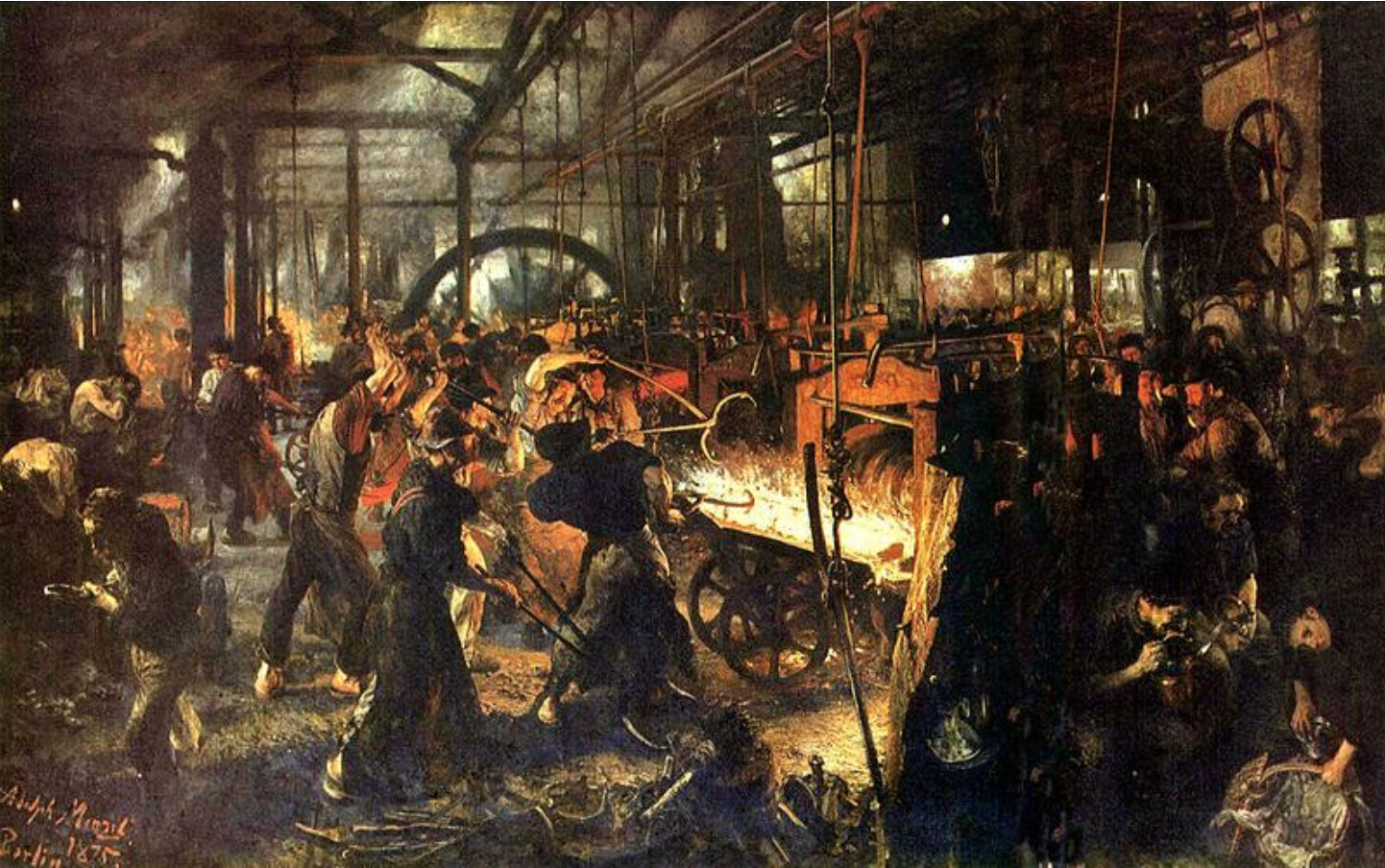
Das Eisenwalzwerk (ca. 1872–1875) by Adolph von Menzel
Adolph von Menzel. Das Eisenwalzwerk (ca. 1872–1875); http://www.intofineart.com/htmlimg/image-91540.html
Menzel painted Das Eisenwalzwerk (ca. 1872-1875), depicting the scene of workers working away at an iron-rolling mill. The work features more than fifty factory workers, a mass of moving figures; the use of realism in the painting is also blatant as the viewer is able to easily recognise the lifelike human figures in the scenery.
The viewer can observe that Das Eisenwalzwerk is a work that has been influenced by photography from the way the painting is composed such that the sides are cropped abruptly. Menzel also chose to compose the painting in a diagonal using the arrangement of figures and the strategic depiction of the machines, pillars and beams of the factory. The diagonal runs from the figure in the lower-right corner, through the fire and machinery, and back into the deepest recesses of the factory – all of which comes together to give illusion of depth using the technique of linear perspective and three-point perspective. Furthermore, this illusion of depth is further heightened form the way the figures’ forms are positioned as well, with those closer to the eye of the viewer being larger and those further away receding into the distance. The degree of realism gives a sense that the viewer is himself on the scene, overlooking the factory workers from a certain vantage point almost as if the work is a window into another world.
In his technique, the brushwork Menzel employed in the painting is generally quite smooth, with small, almost imperceptible brushstrokes. From the dim wafting of sunlight filtering in through the roof, to the bright glow of steelwork that illuminates the faces of the factory workers at different parts of the painting – the lighting is realistic, but at the same time also highly dramatised. This is done with the help of the variations in tonal structure. With the black areas being “10” on a scale of “1 to 10”, and the bright yellow-orange of the sparks emitted from the machine being “1”, the painting contains values from both ends of the “dark” and “light” spectrum but very little in between (except for, perhaps, the shadowy sunlight filtering from the roof of the factory) thus giving the impression of a very high contrast in lighting, which highlights the dramatic qualities of the painting.
The bright yellow-orange of the sparks emitted from the machine that was mentioned earlier is also the most likely entry point of the painting. Psychology dictates the that the mind is usually drawn to the brightest point of the painting – with this area of the painting being labelled “1” in the spectrum of tones as described earlier, it being the lightest part of the painting, the eye is first drawn to that spot. The viewer’s eyes will then begin to roam, firstly to the cluster of workers on the left, working with the long metallic equipment, faces illuminated from the glow of light (possibly a “3” on the same scale used for tone). After that, the viewer’s eye will continue to roam the photograph, looking into the “receding distance” before observing the surrounding workers, who are either cropped off abruptly (bottom left), also working (right) or are resting in the shadows (bottom right).
All in all, there are many details to be observed in Das Eisenwalzwerk and many ways of observing this painting.