2D Zine: Ideas & Execution

Foundation 2D II – Ideas & Execution

Idea 1: Thoughts & Reflections about Dempsey Hill

Idea 2: The Little Prince (and his Fox) visits Dempsey Hill

Amongst the two ideas, I very much favoured Idea 2. This was for several reasons:

Firstly, I was more attracted to the idea of creating a narrative. Stories are my passion, and telling stories is something that I want to continue to grow in.

Continue reading “2D Zine: Ideas & Execution”

2D Zine: Introduction & Exploration

Foundation 2D II – Zine Assignment

This post details the process from start to end. It was written as I journeyed along, rather than only at the end, and thus details different tones and inflections throughout my process. Enjoy!

Introduction

2D Assignment – Start!!

In true ADM manner, we’ve barely caught our breaths from the whirlwind that was our previous assignment before we’ve been assigned something new.

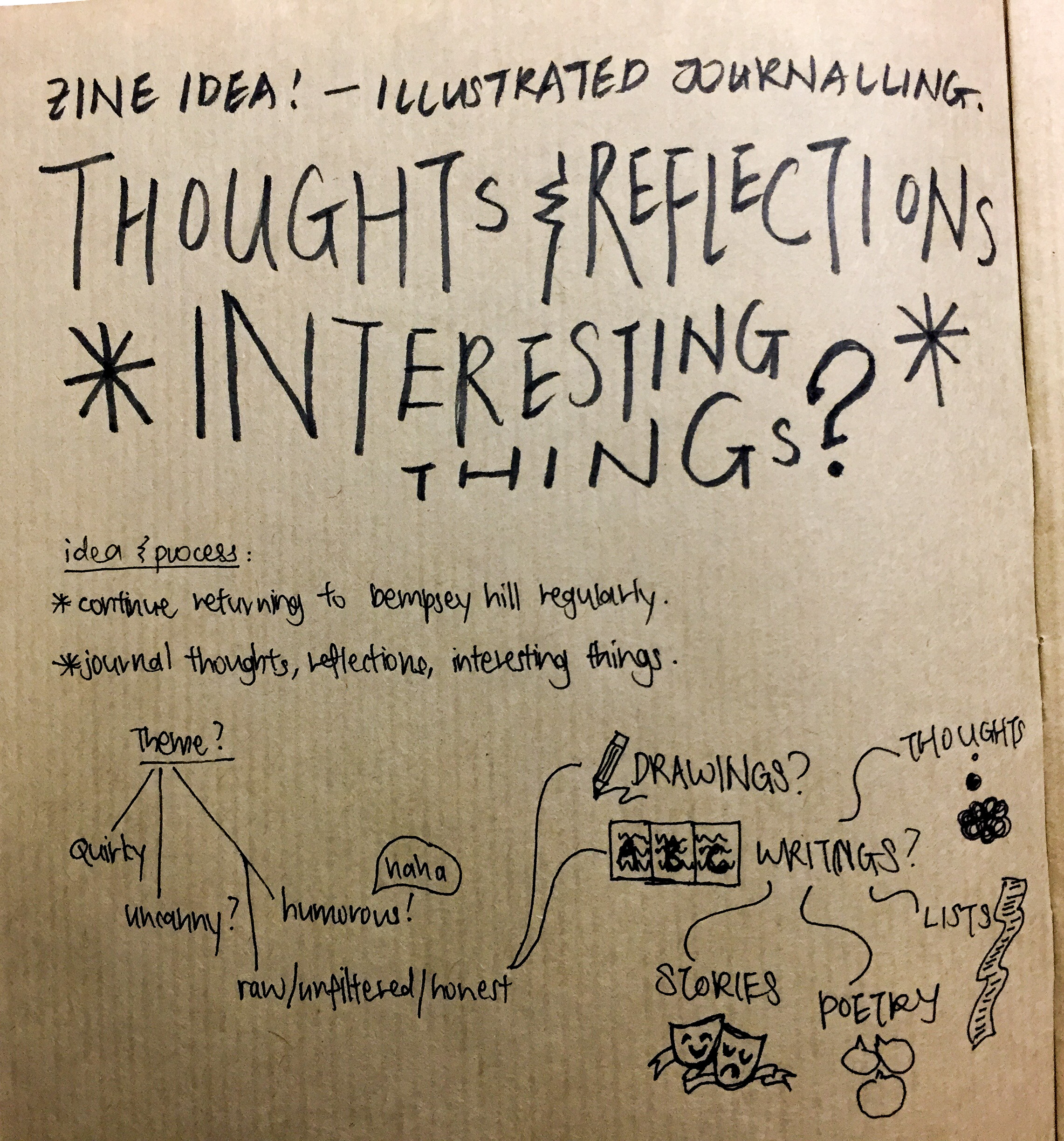
Our new assignment: create a zine about a location

  • Limit: 8 pages & stapler bind
  • About ANY topic, with regards to the location
  • The location is randomly assigned to us (by drawing lots!) No choosing.

Sounds pretty cool, huh?

I was really excited when the project was first introduced to us. Being one of the last classes to receive our briefs, I was keen on moving on from Typography (although, yeah, Type is a lifestyle that can’t be escaped from, but watch me try—) At the same time, I also admit that I am super apprehensive about the project.

As with almost all creative pursuit, a blank slate is both liberating and incredibly stressful. Being someone who holds themselves to very high personal standards, I’m feeling rather overwhelmed, especially with the onslaught of various other projects. Furthermore, I’m feeling quite drained from Assignment 1, and dry in the area of inspiration.

However, personal emotions aside (and really, in the professional industry, no one cares), I will endeavour to push through the block and seek inspiration.

Reconnaissance – Exploration!

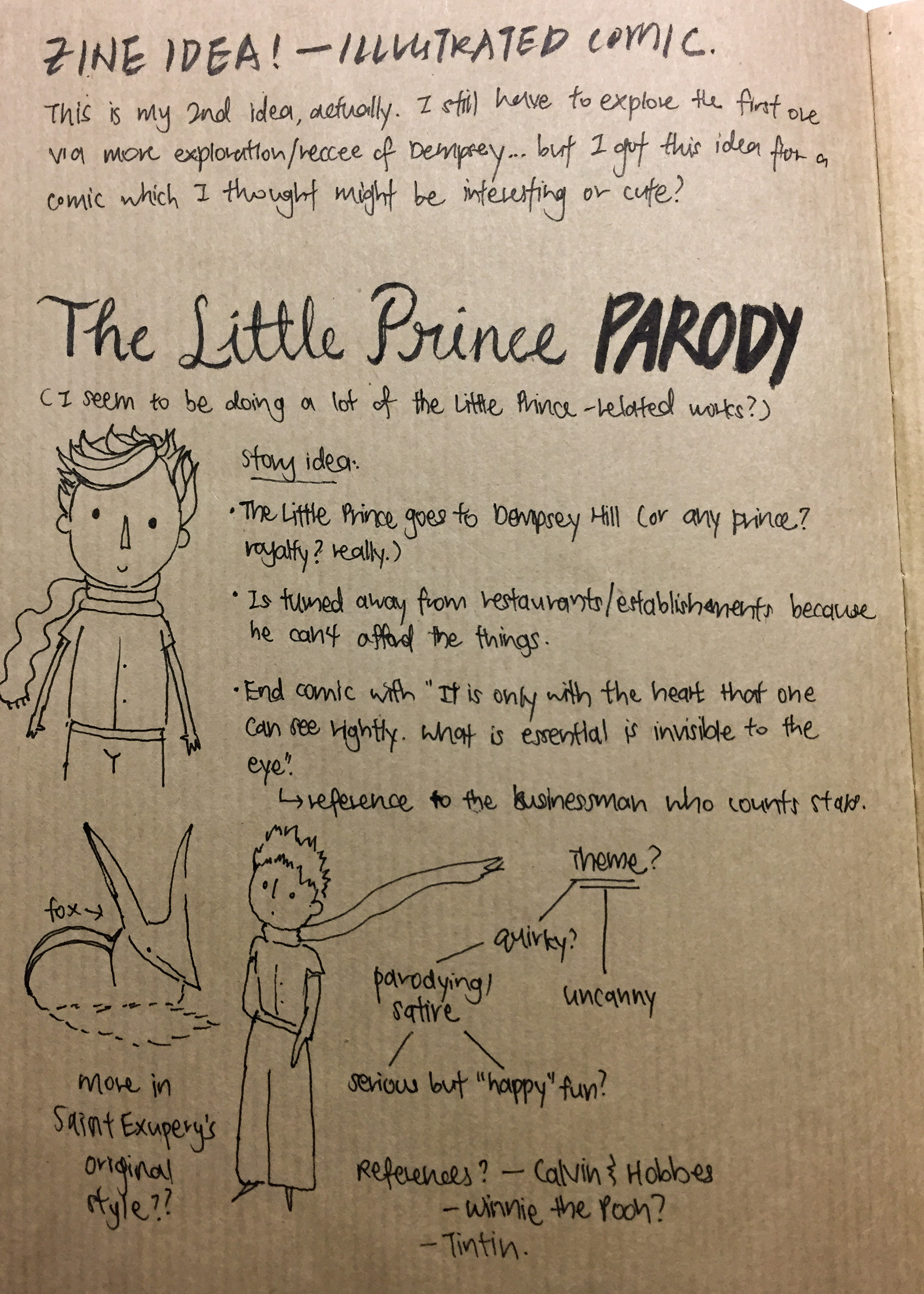
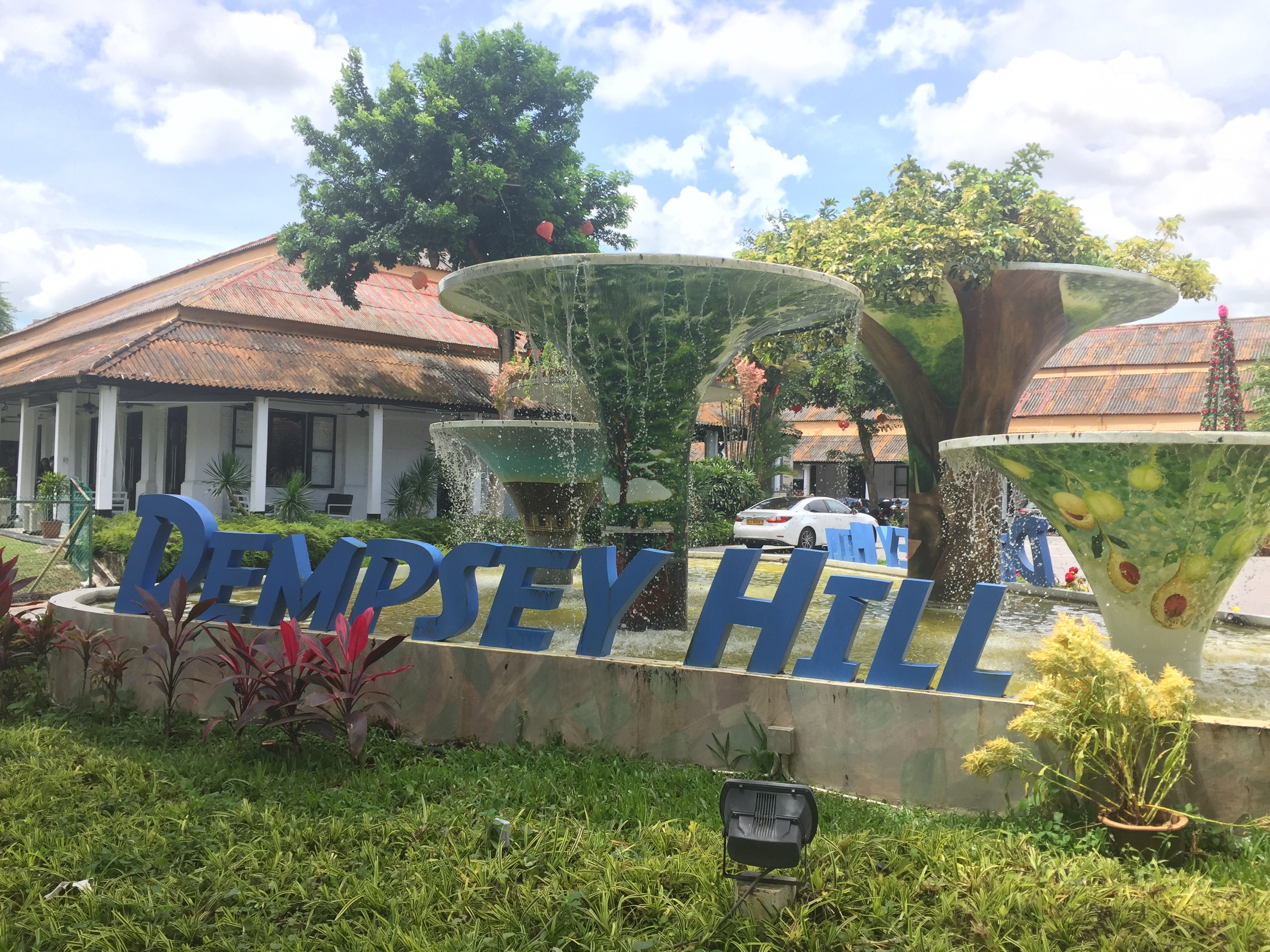
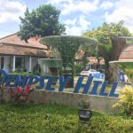
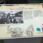
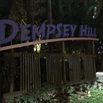
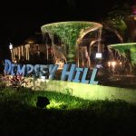
My location: Tanglin (eventually narrowed down to just Dempsey Hill)

Photographs!

When I first got my location, I was quite at a loss. Tanglin? I’ve never really heard of it – except for knowing that a part of Botanic Gardens was in Tanglin. When I asked around about the place, I got two responses: “Tanglin, the tv show?” and “I’m not sure.” Even an online search did not turn up with anything of interest.

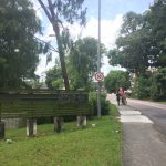
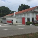
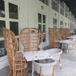
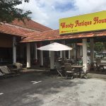
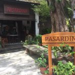
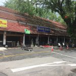
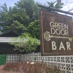
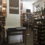
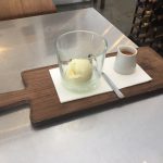
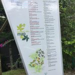
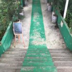
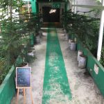
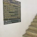
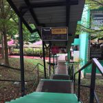
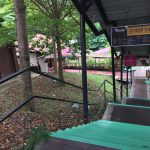
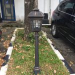
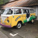
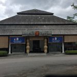
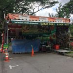
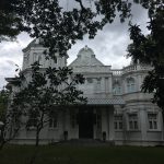
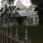
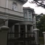
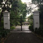
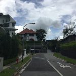
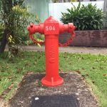
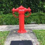
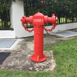
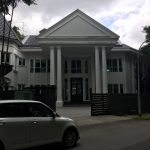
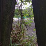
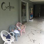
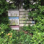
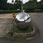
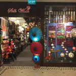
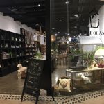
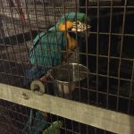
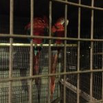
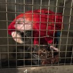
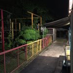
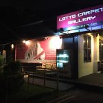
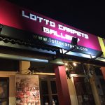
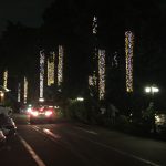
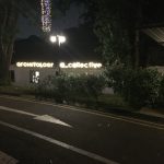
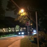
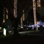
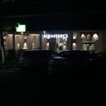
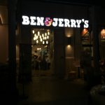
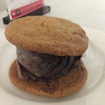
Eventually I got wind of Dempsey Hill, and decided to explore to location to find out more about it. I took photographs of whatever caught my eye, and seemed interesting.

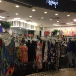
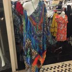
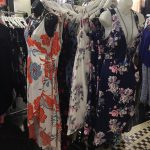
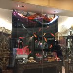
Given that I took photographs of things I found interested in/elicited some kind of reaction from me, you can kind of tell that there wasn’t much that impressed me here. My general impression of Dempsey Hill was that it was a location for high-end retail – the rich, the high-profile, for tourists – it was incredibly commercialised! This was at odds with the area’s historical heritage, which I discovered while there. I was quite uncomfortable and put-off due to how pretentious the area felt to me.

That’s quite a harsh assessment, but I’m not completely wrong. I did not leave with a very good impression and was quite uncomfortable, most probably because the area was not catered to me. Furthermore, I wasn’t feeling as optimistic as I had been at the start – I had wanted to create something of a ‘local Singapore flavour’, something cultural, but the impressions I had received of Tanglin so far had only reminded me of how globalised and how ‘pristine’ some parts of Singapore is. Perhaps the special “flavour” that I was to convey was the picture-perfectness of these sites, well-tailored for the “upper class” and for tourists?

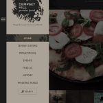
An interesting website that probably gives you a better idea of what I found: http://www.dempseyhill.com

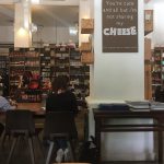
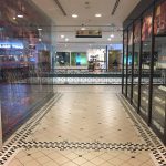
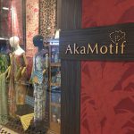
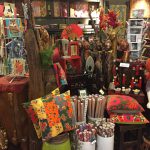
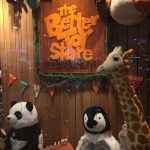
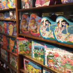
On my second visit, I also explored Tanglin mall, one of the two places that I took note of.

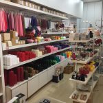
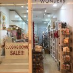
Again, my search was not that successful – by night, it was nice, but still really the same area. There was nothing much new to see. Tanglin Mall was interesting, but nearly all the shops were catered for tourists (selling kitschy tourist wears) or (for whatever reason?) shops that sold nice things for toddlers and children.

My overall impressions can more or less be summed up as I had done in my class presentation here.

We can quite clearly hear the derision and skepticism in my voice as I wrote my reflections… but I don’t want my bad impressions to taint the work that I do. Being someone who illustrates, and whose illustrations speak a lot about the condition of my heart, the way I approach this project has a great effect on the tone and motivation and love that I put into it.

I don’t want to do this just for grades, I want to do it out of a love for illustration – I want to do it for myself, too.

Que Sera Sera: Process, Final & Reflections

Foundation 2D II – First & last post of Que Sera Sera.

I understand that the deadline was on Saturday night, but my process work has already been submitted on Friday! The physical journal also includes additional reflections and analysis, but in this post, I’ll be including my final as well as the .pdf file of my process (without annotations).

Assignment 1 – Que Sera Sera – Process

I’ll add on my annotated final when I get my journal back. 🙂

img_4677
Final work, mounted on glass window

Reflections about the final

I feel that the finish could have been much more neater & cleaner, especially for the “Childcare Worker” composition, where the brush strokes of blue gouache were a little patchy. Although I was thinking about childishness and expressiveness while I was doing it, overall it did not benefit my final effect at all. If I could improve on the composition for Childcare Worker, I would have converted the illustration into a vector illustration instead.

Several other things that were pointed out (what could have been further improved):

  • Botanist composition: the name could have been written bigger; the kerning is also not equal.
  • Drinks Stall Owner composition: remove the figure? The unfortunate placement of the text also makes it seem like he’s vomiting. The colouring of the text could also have more depth and colour.
  • Baker composition: seems out of place? Also, the geometric A does not seem to match the serif type of the N and T.

In conclusion, I feel that I could have pushed a bit further in the execution of the final, creating several drafts before I accepted it as the final. These are all details that I could have been more careful about, and it’s something that I do regret not being able to fully complete before my submission.

Reflections about the project as a whole

Halfway through I just got so overwhelmed by work and the change of concept that the timeline dragged longer than I expected.

Greatest Challenge?

I feel that the greatest challenge was making it less corporate; being more creative. As I often do designs for my church, I tend to follow style & direction + references very closely, often just doing my best to replicate techniques and method. It’s great practice, but doesn’t usually involve personal or creative input.

Which is bad??? Am I an artist or not

I’m not entirely sure if I succeeded – I did take a step out of my initial method of merely creating collateral, at the very least. Typography is not a strong point for me, but I hope I was able to at least begin to venture into the deep sea of type. Typography is a language and making serious, real type should not be taken lightly.

What is one thing I feel I should have done differently?

One thing I regret the most is in my research and resources – when I began my research, I searched for generic typefaces instead of “typography design” – only after much feedback and suggestion did my type of references shift. The research had a huge impact on my drafts and final outcome and I feel that I could have saved a lot of time and stress just by searching for the correct inspiration and reference points.

What can I do to improve?

I feel that I can definitely expose myself to more typographic design in the future. In my opinion, type is not something you can learn overnight, without actively seeking to expose ourselves to it and improve our knowledge – I have a newfound respect for graphic designers and type designers.

Besides that, I feel that I could have moved faster in drafting and designing. Although I did my best in arranging my time, during the time I set aside for designing, I found myself being uninspired and working too slowly – certainly something that I can continue to stretch and grow in.

All in all, I’ve learnt quite a lot in this assignment! Hope that you enjoyed reading my ‘sketchbook’ as much as I enjoyed putting it down. Thank you!