Ego: Final & Reflections

Foundation 2D – After a long journey, here is my final! I’m also going to talk about my equations and reflections along with it. Cross-posted on my art instagram @ddoughnat.

Project Final
Project Final

My Equations

1. Me, Lone Knight Fighting + Around My Friends = I Let My Guard Down egoo1

Everything is always 200% more dramatic in my head.

Sometimes I fancy myself some kind of character – I tend to be very animated in my gestures even when I talk and especially when I get excited, and I think the metaphorical knight has managed to bring out my dramatic tendencies quite well! I wanted to talk about how I’m more relaxed around my friends – it had been the play on the phrase, ‘let my guard down’ that led me to the idea of representing myself as the knight!

Briefly to explain: I had earlier decided to represent the strangers in my life as vegetable and fruit heads – so, what should I represent my friends with? One hilarious conversation with my roommate and several bouts of laughter with my classmates later, I had my idea down: confectionary. If the audience so happened to interpret that sweets helped make me feel better, they wouldn’t be wrong either! Confectionary is something we consume around friends, when we’re relaxed. Furthermore, at the risk of sounding completely mushy, my friends are also really sweet and understanding! Thus the character design.

Colours, alongside the reasons (psychological colour properties) why I chose them:

  • Blue – Coldness, aloofness
  • Red/Pink – Physical courage, strength, warmth
  • Purple – Luxury, authenticity, truth, quality

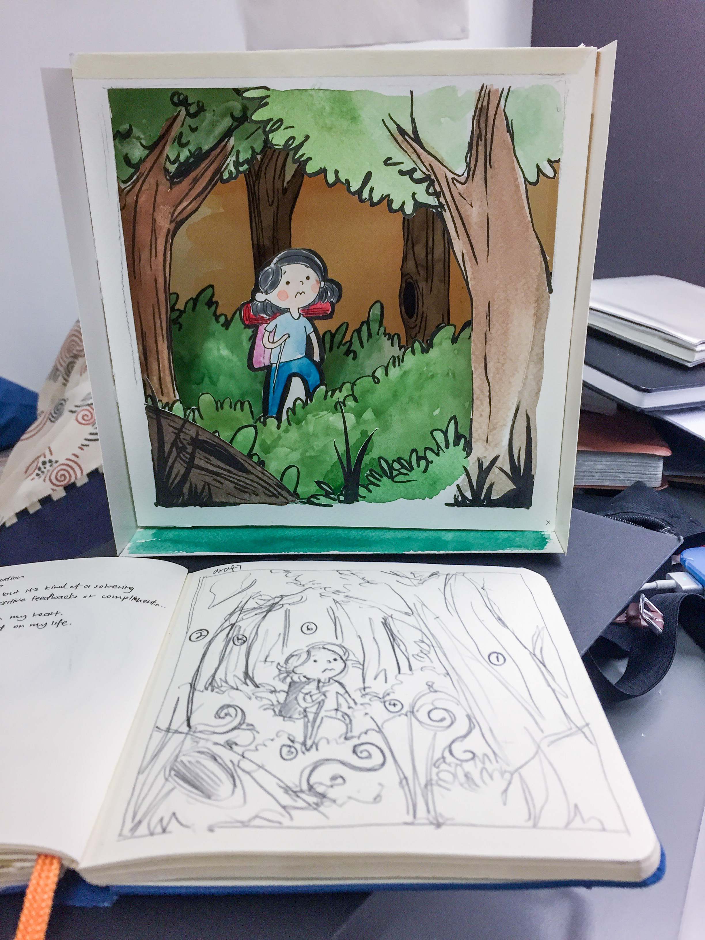
2. Me + In the Great Outdoors = Freedom

egoo2

I’m like a plant, I need sunlight to survive.

One of my loves is hiking and the outdoors, which I’ve done a lot less since I started university. This quote was especially based on my Junior College time, when I would often run off frustration from school and studying on a near daily basis. When I could afford the time, I would head over to the reservoir close to my home to run through the forest trails! It’s been some time since I’ve done that and I look forward to reestablishing some kind of harmony and balance in my holidays before the next semester.

I’m like a plant, needing sunlight to survive. But with my future in set in Animation, it looks like I’m becoming more of a succulent than a tree… haha.

Colours, alongside the reasons (psychological colour properties) why I chose them:

  • Blue – Dreariness, depression, oppression
  • Yellow – Optimism, confidence, extraversion, brightness, friendliness
  • Green – Balance, harmony, refreshment, rest, restoration, reassurance, environmental awareness, equilibrium, peace.

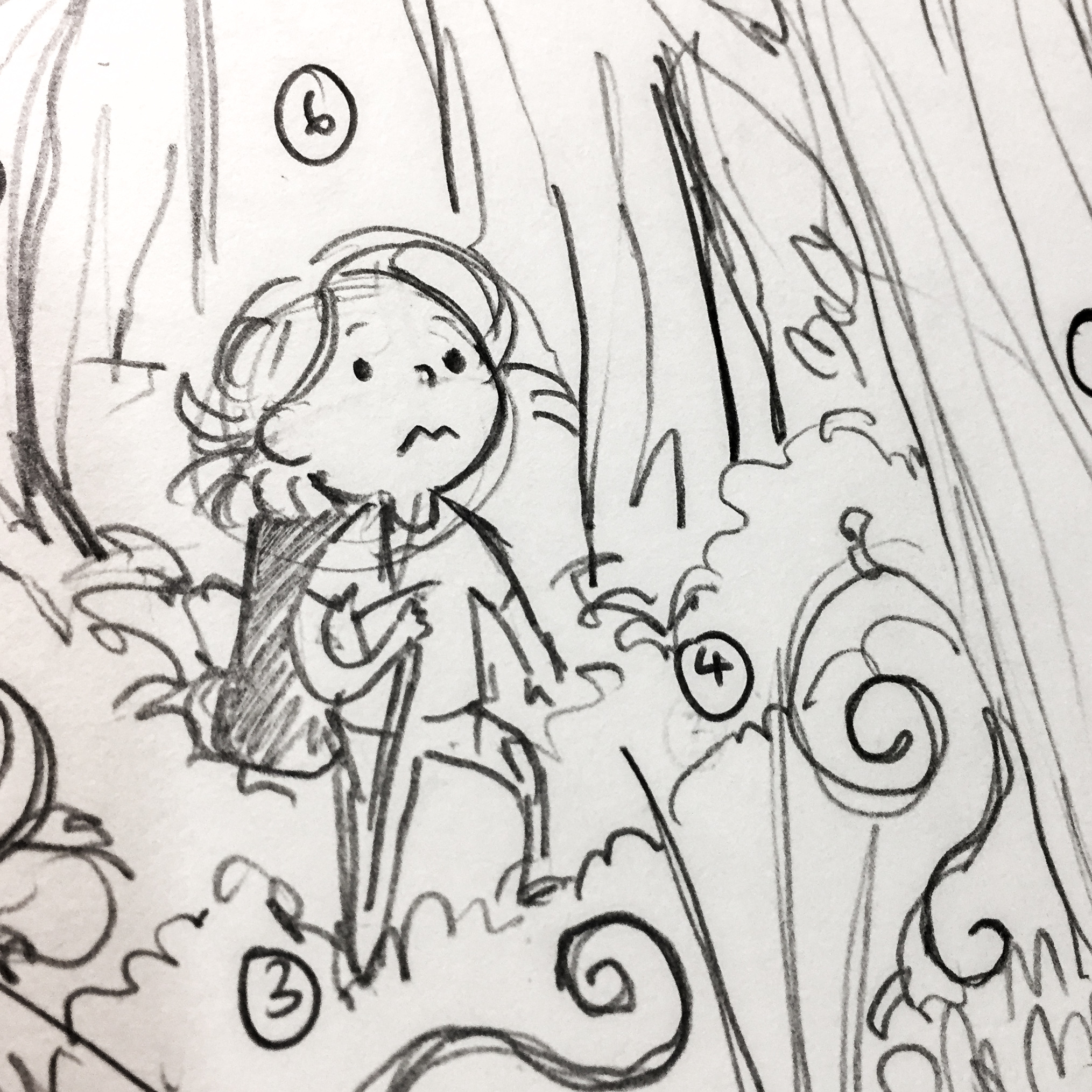
3. Me, In My Comfort Zone + At Orientation Camp = Nervous… How Does One Make Friends Again?

egoo3

I’m not really an extrovert, so orientation camp was really draining for me. 

I may look extroverted, but I get exhausted in new, unfamiliar settings very easily and often fret over making and losing friendships. In continuation to the explanation of my characters, strangers are represented as vegetables and fruits so as to draw out a sense of isolation, to show how they are different from my avatar. It was an idea that I got from a show that I like, called “Mob Psycho 100”, where the main character’s love interest was differentiated from the surrounding supporting characters of various vegetable heads. I found that idea very quirky and decided to adapt it into my work as well… the end result was well-received, with the same playful touch I was going for!

Initially, the final panel was going to be much more complicated. However, I doodled this during my brainstorming… and it surprisingly turned out really well! Not only has it ascended to my all-time favourite panel, it has also been the favourite of my of my friends – possibly due to the humorous tone that the expression of my mini-me took on, as well as the situation mini-me is described to be in.

Colours, alongside the reasons (psychological colour properties) why I chose them:

  • Yellow – Optimism, confidence, self-esteem, emotional strength, friendliness
  • Red – Defiance, aggression, visual impact, strain
  • Orange – Deprivation, frustration, frivolity, immaturity

4. Me + In School = Overwhelmed

egoo4

I tend to overcommit. A lot.

…and do I hear an “amen” to that! Honestly though, keeping busy is a bad habit of mine. I’m constantly filling my timetable up and giving away time to all sorts of things… my passions and my obligations. Furthermore, I have a terrible tendency of not being able to say no – the second column shows this, from the way I can’t say no to my Cupcake Friend, to Homework obligations (the desire to do well is overwhelming!) and to my Tomato Professor.

While this has improved over the last few years, I do still need to learn to “chill”, as my classmates always remind me. (Really, I’m so blessed to have friends who look out for me and remind me to slow down in life! I would not have survived this semester without them.) The leftmost composition intends to create a sense of balance with the horizontal lines and color, while the two on the right are tending towards the chaotic and the overwhelmed. In the final panel, mini-me’s expression is resigned, towards my inability to be… not busy.

Colours, alongside the reasons (psychological colour properties) why I chose them:

  • Green – Harmony, balance, refreshment, equilibrium, peace.
  • Purple – Introversion, decadence, suppression, inferiority
  • Yellow – Irrationality, fear, anxiety

Reflections

All in all, I’m really glad that I went all out for this last project. Actually, my final was much more ambitious that what I ended up doing, and I had to cut down (for example, installed lighting and more layers in each diorama) but overall, the effect delivered, and I was quite satisfied with it. A lot of people liked it!

I really enjoyed doing the project because I could really draw upon my own personal art style, and I got to do what I love: illustration! Using colour really got me to challenge myself, I usually stick to ink and markers in my illustrations; colour never really factored in. Furthermore, although it seemed simple to decide on ‘analogous colours’, there were a few reasons why this ended up challenging me:

  • I used gouache (to make the colours “pop” better) – but this is my first time using this medium. I’ve used other paints before: watercolour and oil paint being the most often and, sometimes, acrylic. The consistency is similar for watercolour, but thicker and requires a slightly different kind of control over the paint.
  • Furthermore, mixing colours resulted in different outcomes as well, as I purchased a Designer’s Gouache set that only had CMYK + White. I struggled the most with the yellows, oranges and browns! The range of colour was tough to get right, and I personally found it difficult to pick analogous colours that would let me vary the tone. This itself required much mixing and re-mixing, and I’m surprised that my set of gouache has not been used finish yet, haha!

What are some of the challenges that I’ve faced, besides colour?

  • Time-constraints were a huge challenge. Each step of the process took a lot of time and effort to execute – from conceptualising to process to installation. With 4 different projects to concentrate on, I had to push myself to constantly engage in 2D especially as it required so many considerations. (However, the fact that it was a very personal project meant that my thoughts kept getting drawn back to it… and that’s a plus!)
  • I honestly spent a lot of money on this project, more than I should have as compared to my classmates! Oops.
  • Keeping my Creative Process Journal – I felt that I’ve definitely improved in keeping a process journal in Assignment 3 as compared to Assignment 1. It’s not at its best yet, but I really tried to curate my journal this time. Although I didn’t manage to finish it, at least there’s some form of improvement! I’ll try harder next time.

That’s all folks! Hope that you enjoy my work as much as I enjoyed creating it. See you again soon!

*Postscript: thank goodness I had the sense to copy out my reflections before OSS crashed haha. It’s finally up!

Ego: in Colour

Foundation 2D – In this post, we’ll be talking more about the next part of the suggestions in the project brief – colour. Most of it was research I did but did not include in my sketchbook.

While this project excited me, I have to admit that colour is not my forte. I tend to do a lot of sketches and ink drawings, but I’ve never really focused on colour. This assignment will be a good chance for me to expand on it!

The ones mentioned in the brief weren’t really covered in class, so I did my own additional research too. Scroll down further for my research and some helpful links!

***

Brief recap: I found these two images which I feel best summarised what was taught in class.

munsell munsell_1929_color_solid


Next, let’s look into the different colour harmonies. What are they?

  1. Monochromes Harmony
  2. Analogous Harmony
  3. Analogous Harmony Warm & Cool
  4. Complementary Hues
  5. Split Complementary

Monochromes Harmony 

color-mono

Analogous Harmony

color-analogous

  • Use colors that are close to each other on the color wheel.
  • Good for communicating consistency and uniformity within design.
  • Contrast is struck primarily through the variations in color shade, limiting any distraction away from content.

creating-better-color-palette-01

While it utilizes all cool colors, the lighter green accent offers interest without distracting from the softer blues. Most three-color analogous palettes use the same chroma, but this one shows how adding tints and shades can create a wider and more gradual variation. (source)

Complementary Hues

color-comple

  • Created with colors that sit opposite each other on the wheel
  • Offers a sense of balance
  • Adding various tints and shades can expand these schemes

creating-better-color-palette-02

Split Complementary

color-split-comple

I also found other colour combinations:

Triad Complementary/Triadic Color Scheme

creating-better-color-palette-03

  • Consists of three main colors equally spaced on the wheel, which makes for a diverse palette.
  • This takes a little more thought and experimentation, as it involves a larger number of hues that oppose each other.

The contrasting colors here are softened with tints, and additional shades of the same hues look as though other colors have been added. This is a good way to add neutral tones to offset the brighter colors.

Eventually I decided on the analogous colour scheme, so as to keep it simple. More in the next post!


Helpful links:
http://paletton.com/#uid=75B0u0kgDFt6uWdbTOHkJv+oQsz

100 Brilliant Color Combinations and How to Apply Them to Your Designs


http://www.dtelepathy.com/blog/inspiration/beautiful-color-palettes-for-your-next-web-project
http://www.dtelepathy.com/blog/design/color-theory

Sources:
http://www.worqx.com/color/combinations.htm

Ego: How?

Foundation 2D – So, I’ve decided on my medium. I’ll be posting my artist & medium references here soon as well.

What are the things that are important to me?

I started out with that question – and amongst brainstorming and idle doodling, I found my answer.

I am passionate about children’s books, education, communication, engagement, life. 

Sometime during the rat race of life, the new environment, my commitments overwhelming me, I’ve lost sight of why I decided on doing art as my chosen profession… but one day I just sat down and told myself, this is enough; my grades can’t control me and I’m not my grades – then I put myself into my project.

I suppose this is also easier, in a sense, as the project brief is more free, and more focused on ourselves. There’s conscious thought being directed to my person, who I am and what I stand for. The freedom in medium is liberating as well.

My style will help me speak.

I’ve often been told that I draw like “disney” or “adventure time” – and far from offended, it’s flattering, because it’s a style I love and naturally tend towards. I love children’s books and hope to one day be an illustrator or an art teacher, and just because I’ve put my dreams of working for Disney/Dreamworks on hold doesn’t mean I’ve given up on them.

I believe that my style – the cheerful colours and character design style will be able to bring across the idea of childlikeness that I’ve mentioned in my previous post.

Areas that I feel like I need to grow

…In my technical skill with colours, definitely.

Presently, I’ve just relied on instinct and gut sense to colour, often relying on the natural colour of the paint (resulting in me painting directly from the tube/palette). I feel that in order to really push it and improve, it will be in my colours. I will speak more about colours in other posts, as I want to focus on the medium and message in this one.

What medium? 

I’ve eventually decided on – diorama.

Remember I said earlier, that engagement was an important quality to me? This is one of the reasons why I chose diorama. I want to be able to convey a stronger sense of depth and interactivity in my work, and I feel that to really bring that through, something 3-dimensional would be optimal.

Below is one of the mock-ups I did to test the effect.

img_3465
Mockup – Lost in the Woods

The mockup was actually a call-back to one of my old works, a children’s book illustration that I worked on in junior college, called “Eden’s Adventure at the Forgotten Fort”. My partner and I are really proud of the book cover.

img_3548
it’s been some time

But looking at the draft & mockup I did, the nervous expression on mini-me’s face seem to mean something.

Perhaps, if anything, this composition would be the final panel of:
Me + New Environment = Lost (in the Woods)

I also chose this forest partly because of my love for hiking and the outdoors, as well as the idea of getting lost in the woods alone, which would really scare me. “I Shouldn’t Be Alive” had a really long-lasting impact in my life, watching it as a child with separation issues. Even as a young adult, I don’t recommend it, haha!

Were there any other options?

Initially, I had wanted to do 3D pop-up. I stumbled across the pop-up book section in the library and was totally enamoured by the idea of acquiring this set of paper engineering skills. However, I felt that it wasn’t as good a choice of medium as:

1) I spent some time researching about it and found it quite difficult to execute effectively – running on the time constraints that we have currently, it would definitely be difficult (though not impossible) for me to pull it off

2) However, in this work, a high degree of finish is going to be very important to me. I want it to be professional, deep and multi-faceted. I understand that this means careful hands and doing and re-doing works to make sure it looks perfect, but I’m willing – and dioramas would definitely me more manageable for me.

3) Furthermore, I wanted to spend more time on the message and ideas in the work. With dioramas, I will be playing with much more familiar ground — it would be simple, yet doable, and much more feasible.

Here are some of the mockups that I did. It took me quite long, longer than I would like it to have been.

note to self – insert images later, as I left the work in my locker


So, what’s the big idea?

Good, I thought you’d never ask! So, having come to the conclusion of a diorama, how would I like it to look, as a final? Below are some sketches I did in my sketchbook.

img_3546

The diagrams are quite clear enough. I also included the reason why for my choice of material. I’m aware that I could have used other less stubborn materials – acrylic perhaps, art card, paper, cardboard.

However, I felt that it was important to use wood.

img_3518
the kind of wood I’m looking at – this is a box which Maccha House (restaurant) serve their Green Tea Tiramisu in, by the way. It’s really good, y’all should go try it!!

Why? 

I feel that wood gives off a sense of sturdiness and resilience, something that might even come across as homely – wood is a common material for furniture and children’s toys. Furthermore, it will contribute to the tactile quality that I intend for my work.

Any last words?

As I go along, I will probably be adding other things to the structure, so as to enhance the effect and carry my message across stronger. For example, I am thinking of incorporating lighting/lightbulbs/light boxes to brighten my work (for easier viewing). It might also be to set a mood/tone, for example, by having a more warm tone with an orange-yellow light or a more cool tone with a white-blue light.

Thank you for reading; the exploration continues, and I’m excited to continue working on the assignment.

Ego: This is a Work-in-Progress. I am a Work-in-Progress.

Foundation 2D – (True story, though. Your friends really do bring insight into your life.)

Hello friends! After much deliberation, I’ve decided on my first two equations, as well as my intended medium. This post is going to be a bit short (skipping the brainstorming) because it’s mainly to get some feedback about my ideas – if anyone is reading this, please do drop a comment! or comment with your spirit sea animal I’d love to hear your thoughts.

When I was working on my project, after the many reflections and brainstorming, I realised that there was one thing I needed to clarify.

What am I trying to say?

Chapter 1: Ego, Intention

This project is intended as an insight to me.

  • How am I like? …that no one usually sees?
  • That only my close friends see?
  • What are my struggles?

Through this project, I want to convey certain character traits that I recognise myself to have.

  • Childlikeness – my love for life; vibrance
  • My strong sense of duty & responsibility
  • Homeliness, warmth, personableness

The list might grow as I discover more of myself in this project, but so far, these are the ones I have thought of. Life isn’t a bed of roses for anyone and that includes me – but I’ll need to reflect more about this.

Beyond just finishing an assignment, I want to learn more about myself too.


Chapter 2: Ego, Situations

1. Me + Emotions = Bottle Them Up

I have a tendency to bottle up my emotions; I tend to skim over them as well, or dismiss them. I feel very intensely but I don’t show it often. One reason is because I’m always, always striving to be a better person, and I feel like my emotions are very selfish things to have. For example, to be angry/annoyed at someone would make the person feel bad if I expressed it towards them – so if it were a small wrong done against me, I shrug the emotion off. When I’m stressed, I also tend to pretend that everything is alright and try my best to keep myself together.

tumblr_static_tumblr_static__640


The side effect is, of course, the bottling up of my feelings. The frustration of not being able to express myself usually builds and overflows.

A random tidbit: this is actually how I made one of my best friends? She noticed that I was bottling up my emotions and wrote it down in one of the class camp activity sheets. Maybe the reason why we became such great friends was because I felt comforted by the fact that someone saw.

2. Me + Setbacks in Life = Gets Stronger

One thing I pride myself on is my ability to grow and overcome situations. Aside from the bad habit of trying to appear unshakeable, my ability to bounce back from whatever situation in my life (and my knowing that I have that ability) strengthens me and gives me confidence. It’s something personal to me, something positive. It is also why I tend to move on from things very quickly, especially things that I feel are a failure.

https://www.youtube.com/watch?v=6JARVfb-FBg

Of course, this opens a whole new (negative) can of worms – the independent streak can sometimes overshadow relationships in my life. However, the feeling that I want to bring across in this assignment (through my style and execution) is something fun and a child-like innocence, so the final work is not going to be about that, but about optimism and an almost naive hopefulness.

With that I conclude my first OSS post for Ego. More to come soon.


Forrest Gump: Final Prints & Reflections

Foundation 2D – It’s been a long road, but we’re finally nearing the end. Here are my final prints!

00-journal-lowres-090 00-journal-lowres-091 00-journal-lowres-092 00-journal-lowres-093

Final Reflections

(Technical?) 

Someone mentioned that my prints all had a different style to them, and I somewhat agree? The Coraline print & the Little Prince print have the same “vintage illustration” feeling to them – the Kingsmen print seems somewhere in between, and much more detailed, with grey tones. In contrast, the high contrasting effect of the Narnia print is very different from the look & feel of the other two.

To be honest, I ran with the atmosphere and ‘feel’ of the artist references, but did not replicate their processes? I’m not sure if that means that I shortchanged myself in the process, but I did constantly keep the ideas, the mood & feel of the references in mind, and they certainly did play a part in shaping my final designs. Surrealism and vintage illustration/prints in particular were the driving force behind the inspiration of most of the works, especially in The Little Prince print and the Coraline print, where my concerns were mainly in making it look surreal, dreamlike and unnerving. Dan Hillier made a surprisingly deep impression on me, although from the looks of the works of my other classmates, it was not just me, haha. But well, I’m pretty happy with what I have. Between you and me, I think the Narnia print could have pushed more boundaries, though 🙁 oh well…

Besides that, I’ve learnt a lot from the silkscreen process. Drafting, coming up with ideas, making fast decisions and doing the printing was quite a fun process, albeit quite nerve-wracking. There is nothing like the feeling of wrecking your tote bag’s one side and knowing you only have one chance left, Natasha, you botch this up and it’ll set you back on your project timeline by WEEKS so it better be a damn good tote print— hahaha. I feel that this helped me have a bit of a taste of what I will be doing when the small enterprising idea we’re currently toying with (where a few of us are hoping to sell our designs as prints on hoodies & shirts) is properly set up in the near future.


(Emotional? Life management?) 

Much better than Assignment 1, definitely. For one, I did much more reflections and more artist research this time round. I am still working on time management (my one true weakness) and spreading my workload out, though.

There seems to be a certain momentum involved in designing, like warming up in life drawing or stretching before a run? I think it’s an important realisation because often, when I’m tired, I realised that I use the excuse of “I’m not in the mood” to procrastinate on my designs even though it’s absolutely necessary for me to work on it so I don’t end up rushing it last minute. This is definitely not a good thing – Pastors always say that “the difference between a professional and an amateur is consistency,” and I think it’s so true.

Besides that, I am not as far removed from my perfectionist tendencies as I thought I was. I thought I was over this 🙁 but noooope I’m not 🙁 I only noticed it because of my procrastination – being afraid to start work because I felt like I wouldn’t be able to produce satisfactory work. It’s crippling and it’s bad, something that I totally need to get over/beat out of myself.

All in all, I’m actually quite satisfied with my work this time round. Before I kill myself with stress and anxiety though, it’s so important to always remind myself: there is always room for improvement, do your best but once it’s over and done with, live and let live. Someone once said, “It’s impossible to get worse at something you do every day.” Certainly, having chosen to start on this art journey, I can only get better.

Thank you for reading this, and hope you enjoyed reading about my processes as much as I enjoyed it!