3D Project 1 Final

Discordance

Discordance is unconformity, disagreement and dissimilarity.

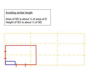
With this theme in mind, I made sketch models that abide to aesthetic rules, but I disregarded the rule of having to put the principle axis perpendicular to each other. This is due to a personal opinion that having right angles in the sketch model would contradict the theme of discordance.
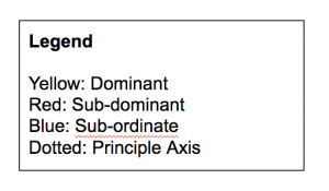
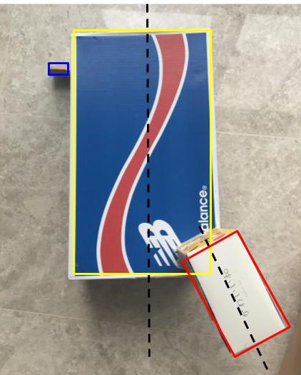
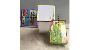
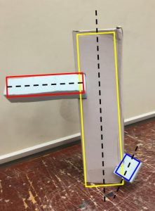
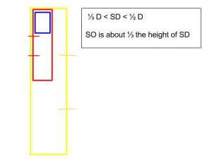
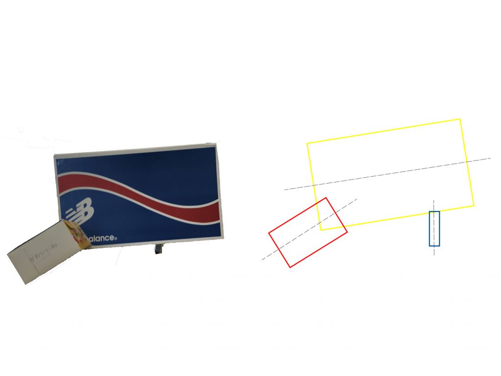
Sketch Model 1 

SD is pierced at 1/3 the height of D – Rule of Thirds

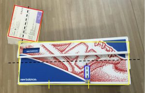
Piercing the SD through the D shows clashing commodities which expresses the idea of discordance. However, to create a sketch model that has aesthetics despite the theme, I incorporated a tad of the rule of thirds.
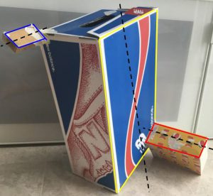
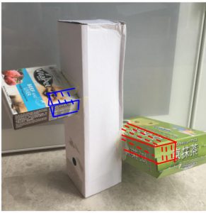
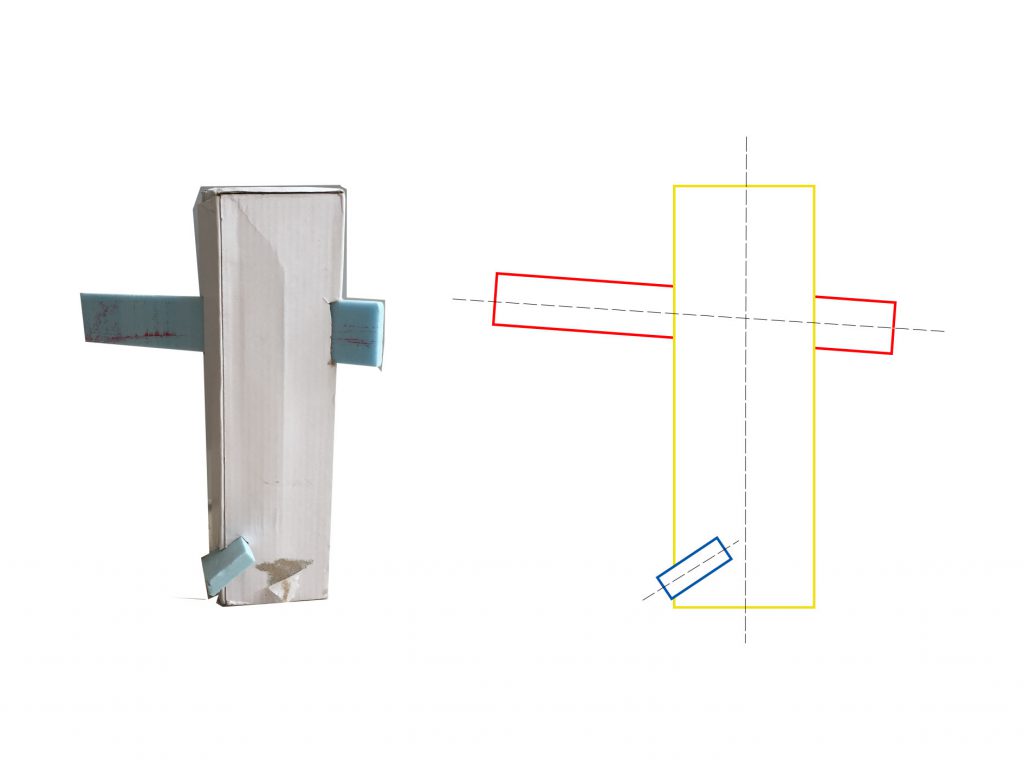
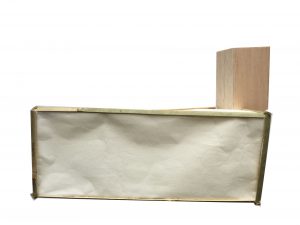
Sketch Model 2

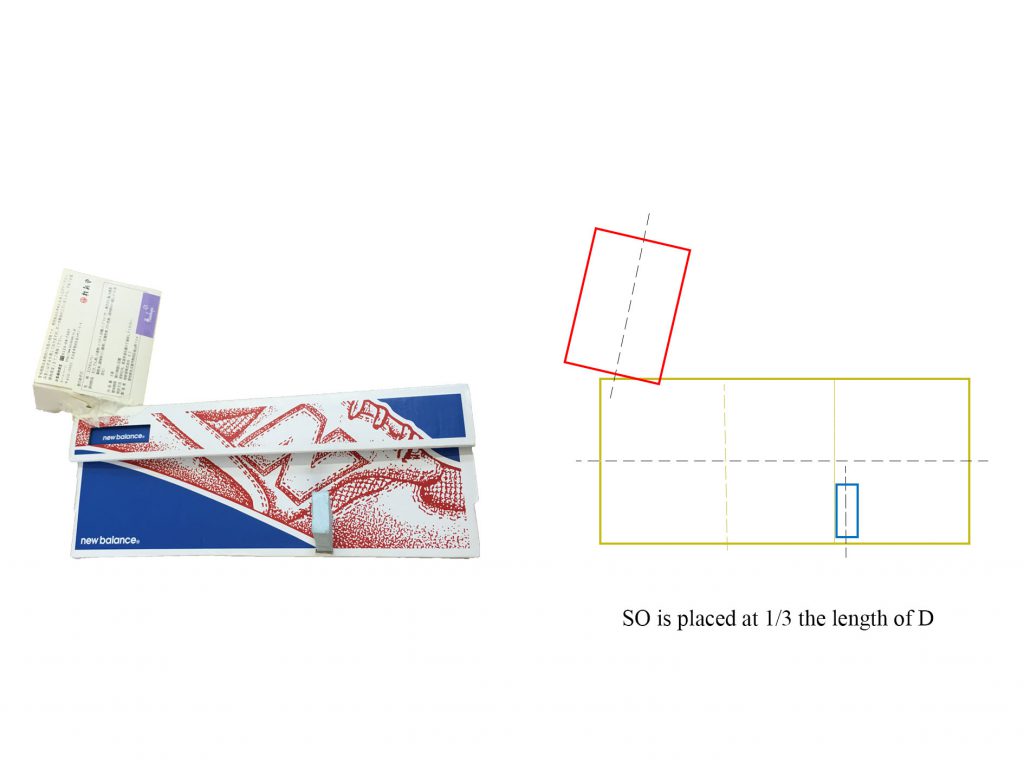
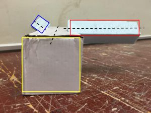
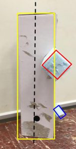
The principle axis are all at clashing angles. In addition, the SD is positioned using the rule of thirds as well. I like this model because of how the SO supports the whole structure. The smallest component is what causes the sketch model to rest at an angle which is interesting.
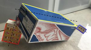
Choice of Materials

I decided to use materials that are prominent in houses in Japan because I like the warmth it creates. This includes organic materials like wood, paper, bamboo straw mats. However, to follow the theme of discordance, I chose to include a contrasting material not usually used in Japanese architecture.
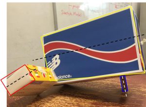
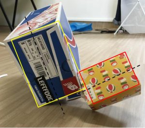
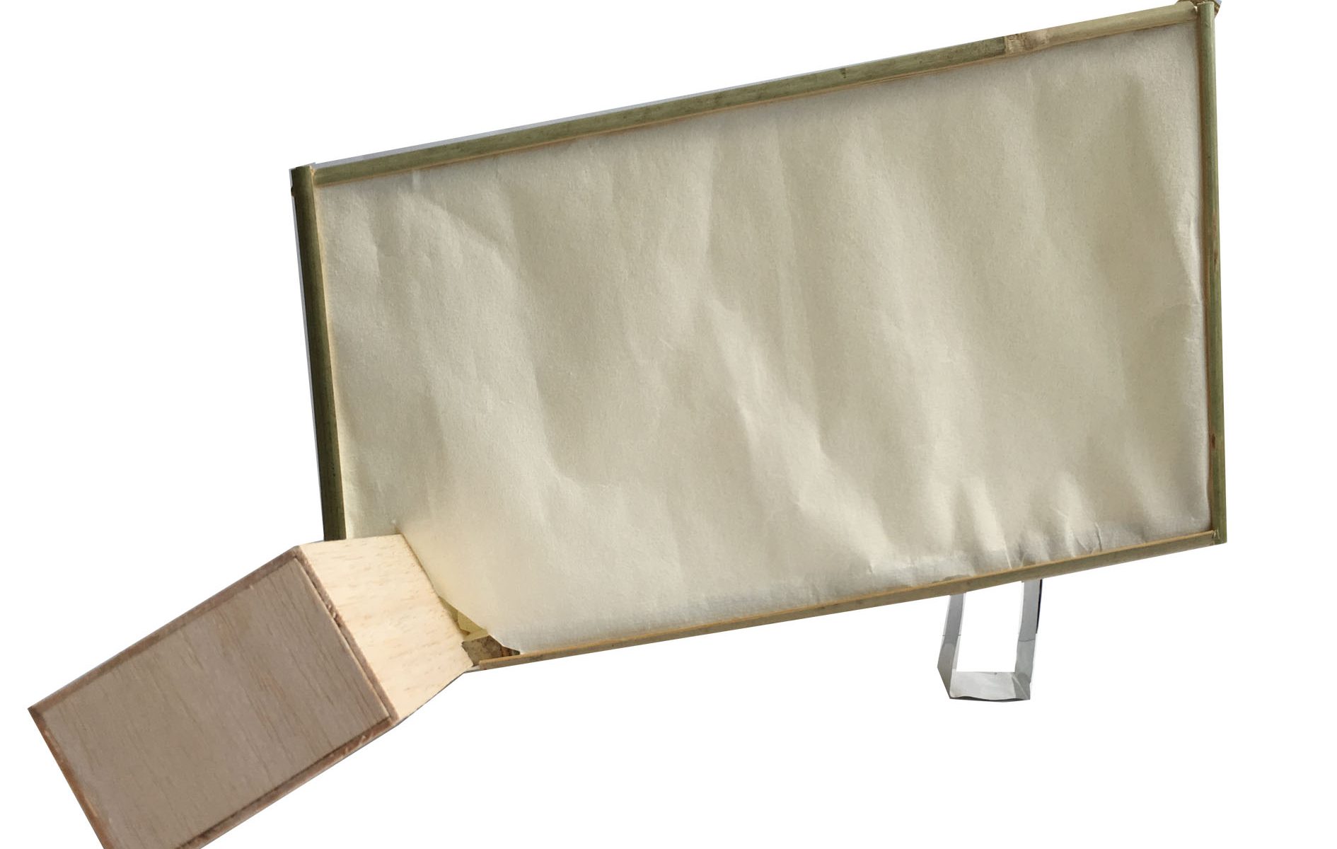
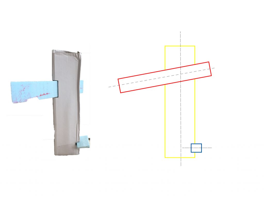
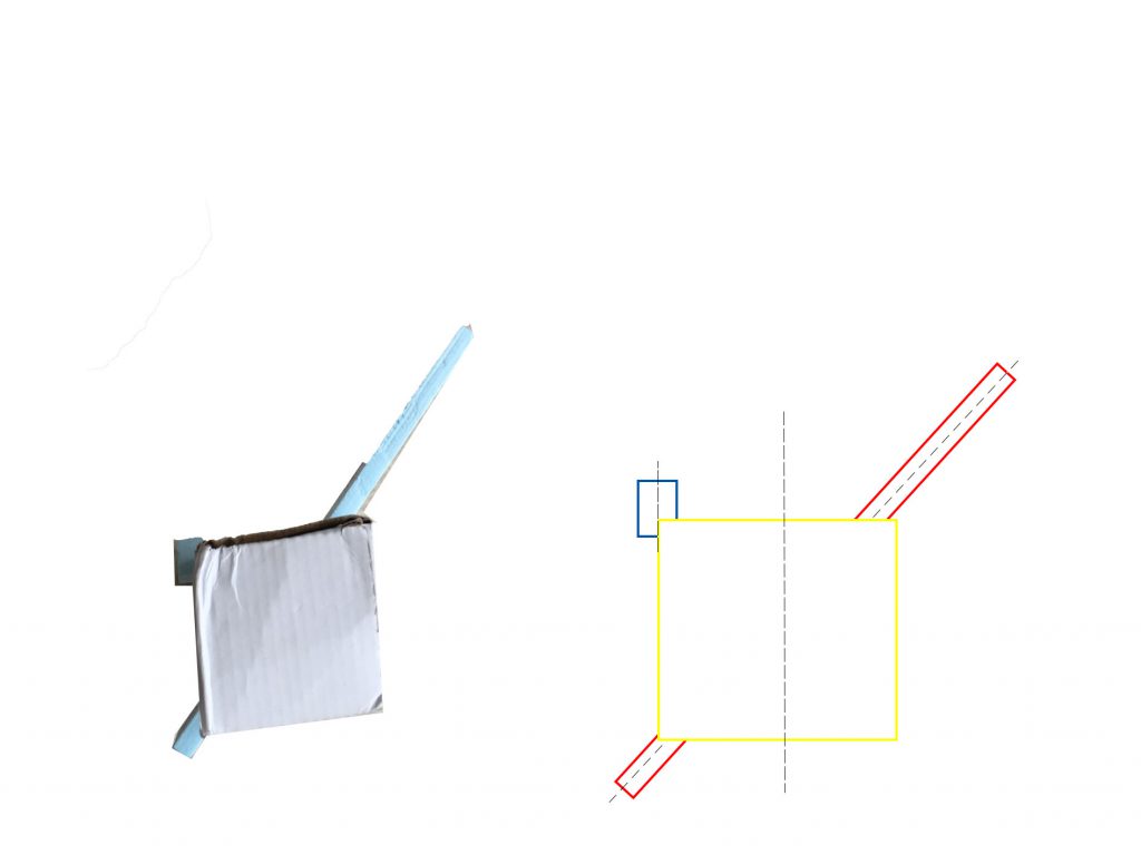
https://i.pinimg.com/736x/b8/14/a3/b814a3f333bea82be39044c5eb1fe5af–japanese-style-house-traditional-japanese-house.jpg

Final Model

Front View
SIde 1 View
Side 2 View
Back View
Bottom View
Top View

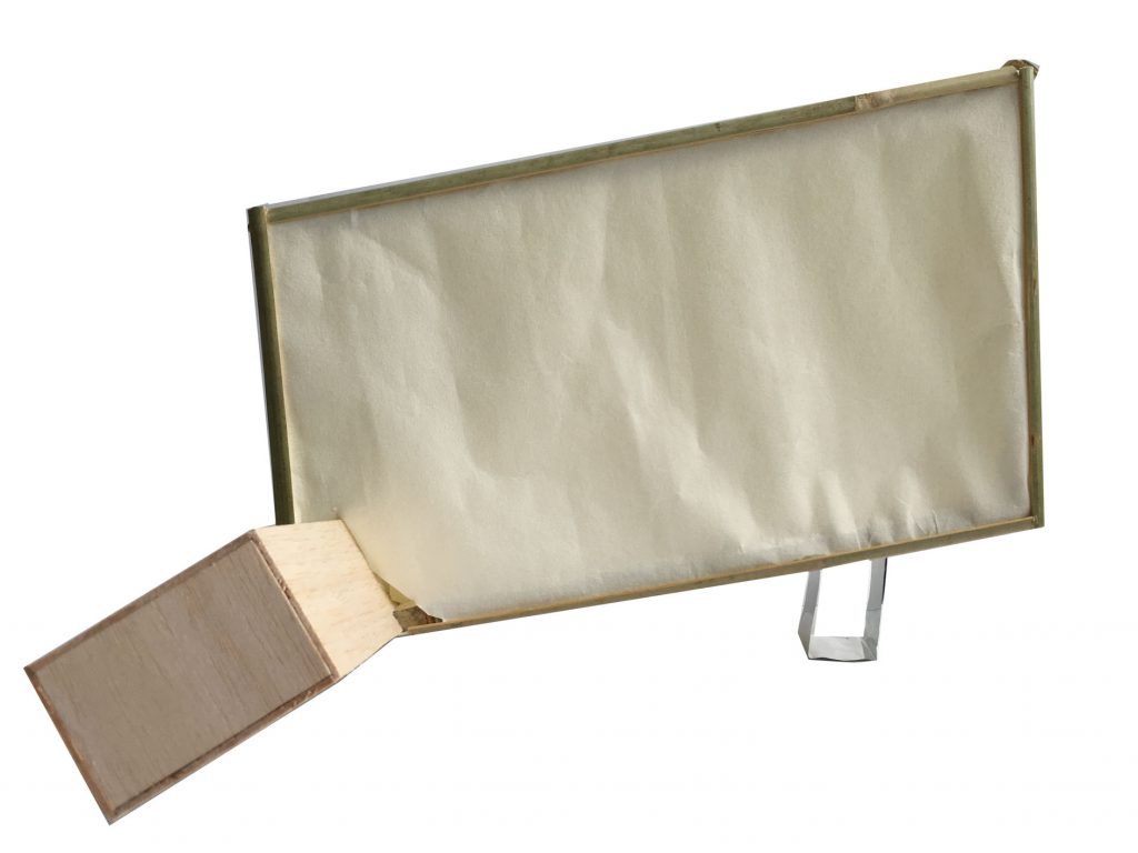
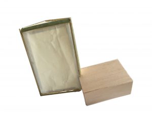
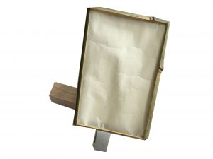
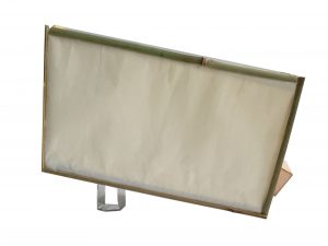
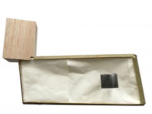
The dominant and sub-dominant are made with organic materials as previously mentioned, while the sub-ordinate is made using a contrasting man-made material – metal. This choice is made to portray discordance with the clashing materials. The sub-ordinate component was made such that it can look solid or fragile depending on the angle where you look at the model.
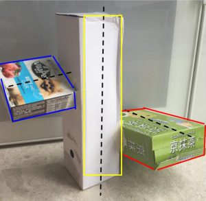
Applications

Lantern

The final model can be used as an ornamental lantern especially due to the translucent paper used where light can pass through.
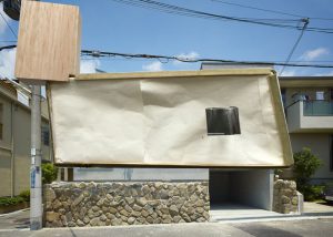
House

The organic materials would create a great contrast to surrounding buildings, hence it will be in discord to other concrete solid architecture. However the materials makes this impractical.

3D Project 1: Pandora’s Box Process

Foundation 3D: Pandora’s Box

The word i received for this project is discordance. Defined as a lack of harmony, I approached the project keeping in mind the idea of chaos.

3D Sketch Model Draft 1


Sketch Model 1

My first concept for the theme of discordance is that the boxes are placed in a way where the model doesn’t lie flat on the ground from all angles. This portrayed discordance to me as having a lack of harmony meant there is no cooperation and stability.

Sketch Model 2

The boxes were supposed to be placed perpendicular to one another, however I opted to place them at a slight angle because I found it challenging to portray discordance purely by 3 boxes at a right angle. Having boxes with only straight lines and a static structure and restricted arrangement  contradicted the theme of discordance.

Improvements from first draft:

For sketch model 2, the D, SD and SO was ambiguous. It looked like 2 D’s and 1 SO. The boxes also had similar dimensions. The image above shows how improvements can be made, by having a much smaller SD and SO.


3D Sketch Model Draft 2

Sketch Model 1

The changes made was in the position of the SO. Having such a small SO support the whole structure was interesting. I also like how the SO, despite being placed perpendicular to the D, causes the structure to stand tilted.

Sketch Model 2

The SO in this model had similar dimensions to the SD which is an improvement which needs to be made. The principle axis for SO is also not perpendicular to D. To show discordance, an idea given was to pierce the SD through the D to show clashing objects.

Foundation 2D Project 1 Final

Project 1 Final

  1. Hope: Wool on paper

Hope is defined as a feeling of trust, or wanting and expecting for something to happen. The softness and fluffy texture of cotton wool illustrates the vagueness of hope in my opinion. Hope is an emotion that is unreliable as there is no concrete evidence or substance that what we wish for will come true, we only rely on our desire for something to happen. The torn wool also shows the unreliability and fragility of hope which leaves us hanging on a thin thread.

2. Fear: Black pastel on white colour pencil

Fear is an emotion felt when a person is threatened, in danger of pain or sorrow. Fear to me occurs when one does not understand a situation. Because of a lack of knowledge or grasp of what is going on around them, they experience fear. The confusion that occurs initially when experiencing fear is expressed by the messy and tangled white lines. The lines slowly progresses to converge into a single line which shows that a person slowly begins to decipher the situation that they are in. The situation turns truly bleak which is why the background becomes pitch dark and true fear sets in.

This line is made by drawing the line with white colour pencil before covering the whole paper with black oil pastel. I like how the oil pastel cannot cover the white colour pencil line.

3. Passion: Strings and block print ink

Passion is the intense desire or enthusiasm towards something. The outburst of lines from the black block of ink expresses spontaneity which I feel is an aspect of passion. Most of the time our passion cannot be explained, it just occurs to us naturally. This mark making was done by dragging strings in random motion out of the centre blob of paint.

4. Guilt: Water colour

Guilt occurs when an individual feels that he/she has done something that goes against their own moral conscience or the world’s sense of moral standard.

Guilt to me has a sense of depth and gravity because of the complexity of the emotion. It is a fight between the action we had done and our moral standards. This is expressed by layering the different sizes and darkness of water colour ink. The water colour has a stained and tainted effect which i felt reflects the disdainful emotion of guilt.

5. Outrage: Block print ink

Outrage is an intense emotional reaction of anger or shock. The sharp edges and smudged ink expresses the violence caused by outrage. The strokes which go in all direction also depicts outrage as an uncontrollable emotion.

6. Surprise: Sewn thread on paper

Surprise is an event or emotion that is unexpected, or out of the blue and is usually positive. The element of surprise in encapsulated in the thread being sewed onto paper as sewing in usually done on cloth. Surprise is an emotion I express awkwardly because I rarely feel surprised and this is depicted by the awkward curves of the threads. The thread that springs out at the end is minimal. 

Mark Making Process

Week 2 and 3 Mark Making:


I started mark making using a rattan rope. It creates sharp and harsh lines.

My second tool was a square sponge. I explored the fading effect of Chinese ink, by dipping the sponge in ink only once, in a clinical and systematic manner.

Rolling sponge to create soft yet dark marks.


I used rolled lettuce in block printing ink. Though I like the organic lines created, the mark created still resembles a lettuce which i don’t think can be used for the final.

I poured a chunk of block print ink on the paper and dragged a string over the ink to create this burst of ink. The result is quite expressive and can be used for positive emotions such as passion.


My favourite mark making was using a roller to roll a piece of tangled string. It created crisp thin lines which looked like marbling.

Lastly, I used watercolour and layered black paint a few times after drying each layer. I relied on the water to makes jagged edges after it dries.