
Project 2 Process
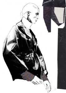
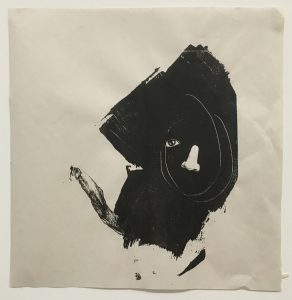
Silver Linings Playbook 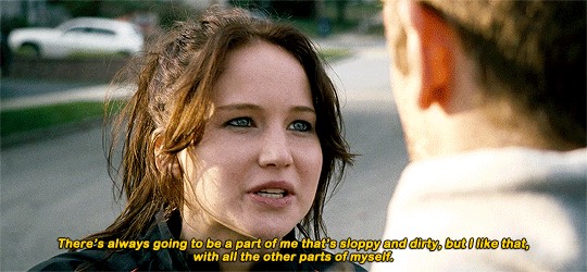
This sentence is about embracing our flaws, imperfections and incompleteness.


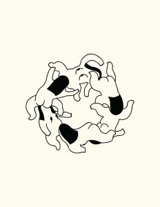
Sloth: This animal is a representation of “sloppy” due to its slow pace. However to make it less literal, I decided to only use the arm of the sloth which fits nicely to the quote (“parts of myself”)
Eyes/Nose: Body parts to express “parts of myself”. Though the quote meant parts of a person’s personality, I chose to not be literal and instead use physical body parts to represent self.
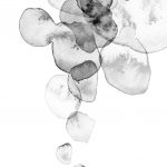
Acrylic patch: A black patch that mimics a stain to express the imperfection implied in the quote.
I worked by instincts for this composition, to embrace spontaneity. It is my favourite composition, thus I chose not to experiment with other possible composition to this piece.
The acrylic patch is the largest component to make ‘imperfection’ the most obvious focus, because Jennifer Lawrence unashamedly acknowledges her flaws in the quote. The abstract face is a spontaneous scribble I drew which shows character and uniqueness. The right eye and mouth has been omitted to portray incompleteness of a person.
Sex and the City

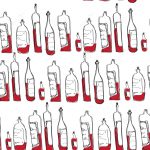
The quote is about love for fashion which overpowers one’s hunger/ the need to survive with food.
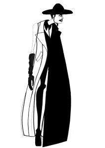
Fashion Illustrations: I used illustrations to represent Vogue as I personally love fashion illustrations in particular.
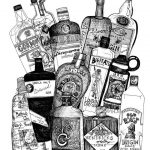
Bottles: Rather than using food, I chose bottles as it is a little less literal representation of dinner.
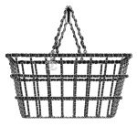
Basket Bag: I chose this piece as I wanted a link between fashion and food, and this basket was designed for Chanel’s runway but has the function of carrying groceries.
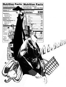
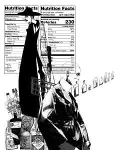
Composition 1 & 2 differ by the paprika. However I prefer not having the paprika and it looks out of place. The nutrition facts is a representation of fashion being a source of energy to some people the way food is a source of energy. However this was removed from the final design as it is a literal representation. Lastly, the bottles on the right are warped to create perspective, mimicking long fashion runways.
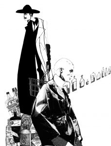
The bottles recede to the back and is of a smaller size as the quote states that fashion is of more importance to the character rather than dinner.
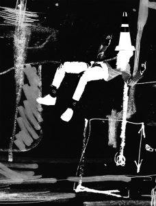
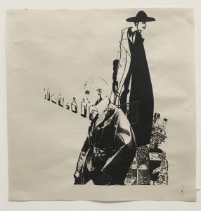
Porco Rosso
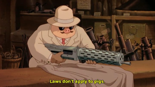
My interpretation of this quote is that the law only controls those who choose to be controlled, regardless of whether you are a pig or a human.
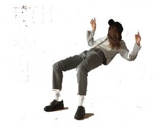
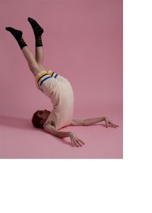
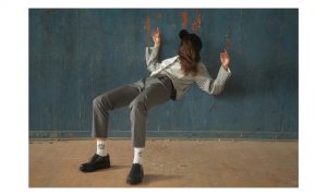
People in unnatural poses/ stance: This is the imagery I have of defying laws or rules. The people in the above photos seem to defy laws of gravity/ defy the ways of human structure. To not be literal, I used a person rather than an animal or pig to show that laws may not apply to people too.
Symbols/ scribbles: Symbols, like arrows, are a representation of mathematical or scientific laws. Scribbles portray the process of creating those laws, which involve trials and errors.
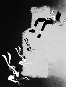
The background for composition 1 is a large mark which I chose because of the contrast between the darkest area and the white area. However I chose not to use this background for the final as the line that separates the white and black cuts in the middle of the composition which spoils it. I tried using varying sizes to create perspective and placed the woman on the top to make it seem like she was floating, defying gravity.
I retained the floating woman and omitted the man at the bottom as the composition was too crowded. I added a cone which is an indication of abiding to traffic rules and changed the background to one with scribbles and symbols and has no centre. Since my other compositions do not play with negative images, I chose a black background and made the women in negative colour.
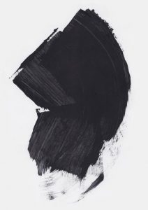
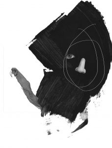
Himizu (2011)

To put the quote in context, the homeroom teacher told his students that everyone is a flower. He made them repeat after him, “I’m a flower, one of a kind and I have a dream.” I interpret this quote as a statement that encourages being ordinary, and that having aspirations does not necessarily make a person better than another.
Expressive strokes: Representation of outburst of personality.
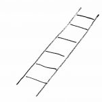
Ladder: Symbolises climbing up social status, an expectation of being successful.
Naked woman: I like the anonymity of the character. No clothes to make her stand out, hidden face, and stripped down to the show the body on its own.
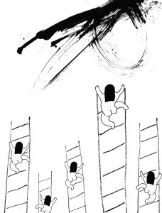
Since the quote is about being ordinary, I used the same character 5 times to show that none of them stand out. All of them are climbing up the ladder to success but the highest point still separates them from success, which is represented by the expressive stroke on the top. I like the composition of the women and ladder but thought that it needed a little more texture.
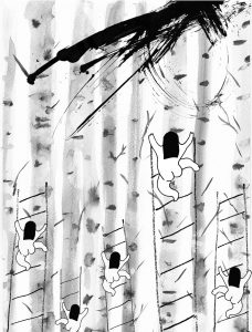
Next I added tree trunks in the background to add texture to the composition. However the trunks had too much details and made the composition too noisy and distracting.
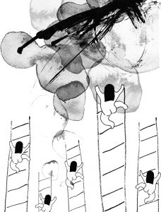
I tried using another watercolour patch to compliment the expressive brush strokes to portray success in a more vibrant manner, but the two components drown each other out.
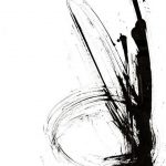
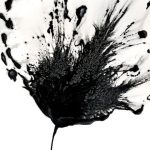
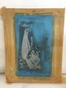
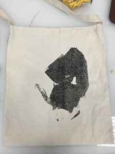
Silk Screen Printing Process
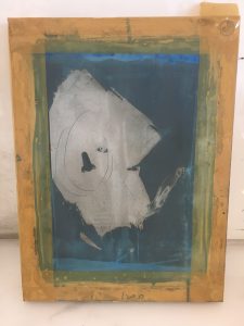
The left design was my first choice to screen print as it is my favourite composition however it was risky due to the thin white line and very black stroke. Thus I tried 2 designs in case the first one does not work out.
Newsprint
The print turned out okay but not the best as details of the texture of the large black stroke was lost. Part of the white line also disappeared possibly due the misalignment of the 2 transparency.
This composition was better than the first as a screen print. The details are not lost and has a clean outcome.
Tote Bag
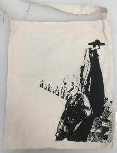
Due to the different material, the left design cannot be printed well. Thus I chose the right design for the final tote bag. It was printed on the bag as nicely as on the newsprint.