
Ego Final

Ego 1

 Cool colours – warm colours – complementary colours
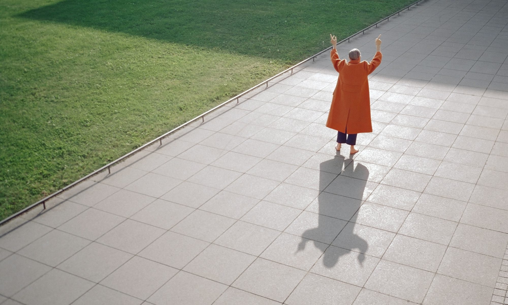
I used cool and warm colours to represent the temperature difference between what I am comfortable in and the environment I am in, and to illustrate the weather. The result is a panel with complementary orange and blue to show that the bear is in contrast with the environment and thus does not fit in.
Ego 2


Neutral – Triadic/ Primary
The clothes of the character is in a neutral colour to represent an inexperienced self does not have a personal style yet. Inspired by Mondrian’s Broadway Boogie Woogie, I used primary colours to represent New York. They represent chromatic pulses, the blinking traffic and the restless motion of the city. They also represent the excitement and hustling of New York. In the final panel, the character is now in the same colour as the city to show that she is inspired by New York, while the decrease in size depicts that she is also intimidated by the brilliance of the city.
Ego 3

. 
Complementary – Resulting brown (neutral) from blue + orange
I used complementary colours for the first 2 panels to show the contrasting nature of the 1st and 2nd panel. The first depicts frustration while the second depicts serenity, this the contrast in nature. The resulting colour is brown which is obtained by mixing blue and orange as a calm self is a result of mixing my frustrated self in a calm environment. Neutral colour is also used to show subdued emotions.
Ego 4


Monochromatic colours – natural colours
The first panel is monochromatic to portray a mundane indoors lifestyle. The second and third panel are in natural colours such as blue and brown to show the beauty of wildlife and the natural environment of Australia. The hot air balloon in the last panel is in the same colour as the lamp in the first panel to add coherence and illustrate that they both depict me.