
Final Zine
The overall theme of my Zine is the serenity and remnants of human isolation I observed in Yishun.
Cover Page

The cover is a simplification and close-up of the Yishun map. The overall monochromatic colour scheme gives a quiet effect.
Page 1 and 2

Water bodies are a prominent aspect of Yishun, such as the ORTO and Yishun Dam. The large open area evokes loneliness from how spaced apart the fishing people were. This composition thus expresses the isolation through space by using lines of different line weight to divide the figures in the page. The human figures are abstracted to minimal details to give a sense of loneliness.
Page 3 & 4
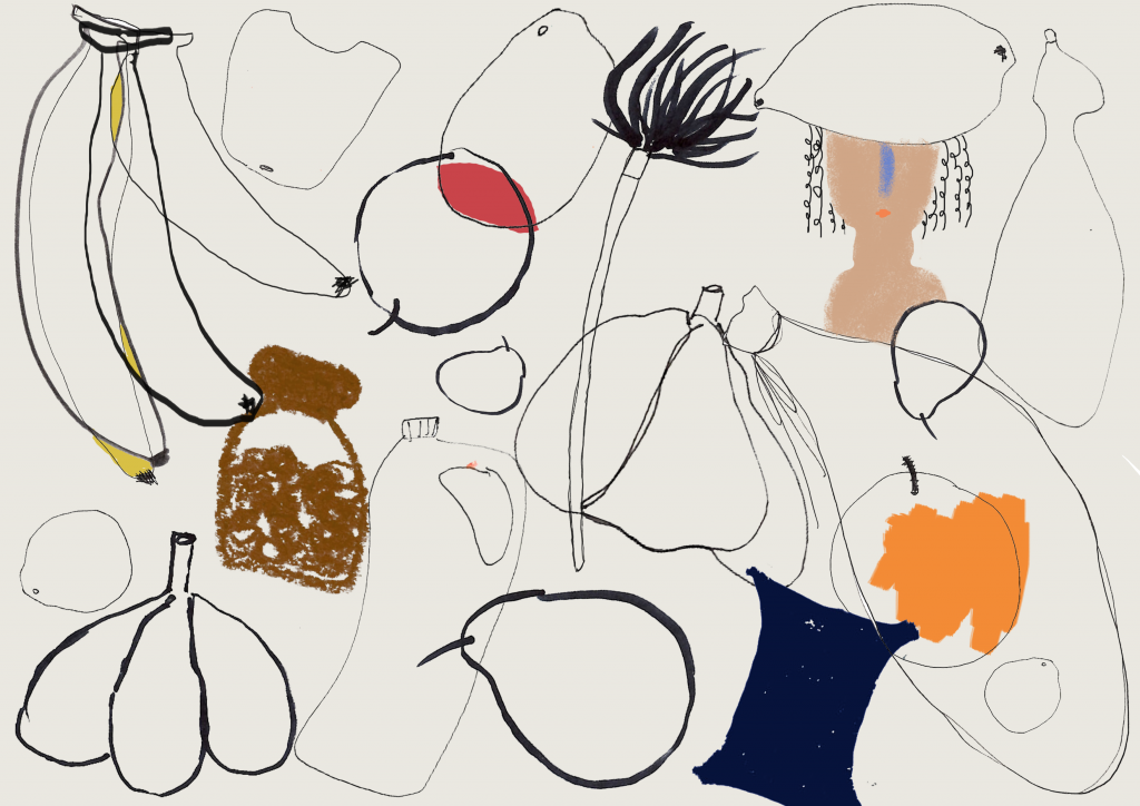
The overlapping line detail and colours of the groceries and products found in mama shops portray the cramped, clustered and overwhelming aspect of the shops. The sheer amount of items separate the owner of the shops and their customers, which showed how items can result in human isolation as well.
Page 5 & 6
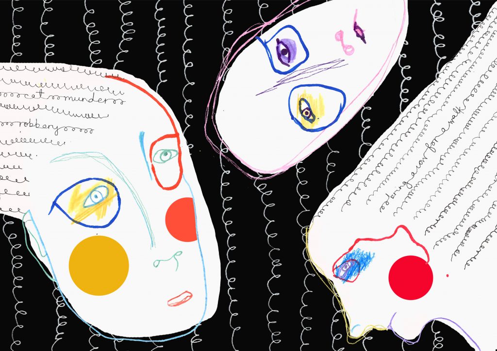
The bright and almost complementary colours captures the eccentric spirit of the people of Yishun, evident from the incidents that occur in the neighbourhood. Such cases include cat murder, robbery, and bringing a cow for a walk, and are include as texts embedded within the curly lines. The words are camouflaged in a way as I feel a person’s thoughts and mind is complex and does not reveal itself easily to others.