Project 3A: Typography as Image
 As I read the brief wrongly, I thought we could do something more conceptual so I took one of the scenes from my favourite movies ‘Closer’ and used text to incorporate the character’s quotes from the movie to form the outline of the image.

So after an E-consult with Shirley I realised that I did it wrongly so I quickly adapted to the proper brief. But it’s still a little different as I realised we could cut up the font. I just wanted to include what I did because it is a little funny hahaha.
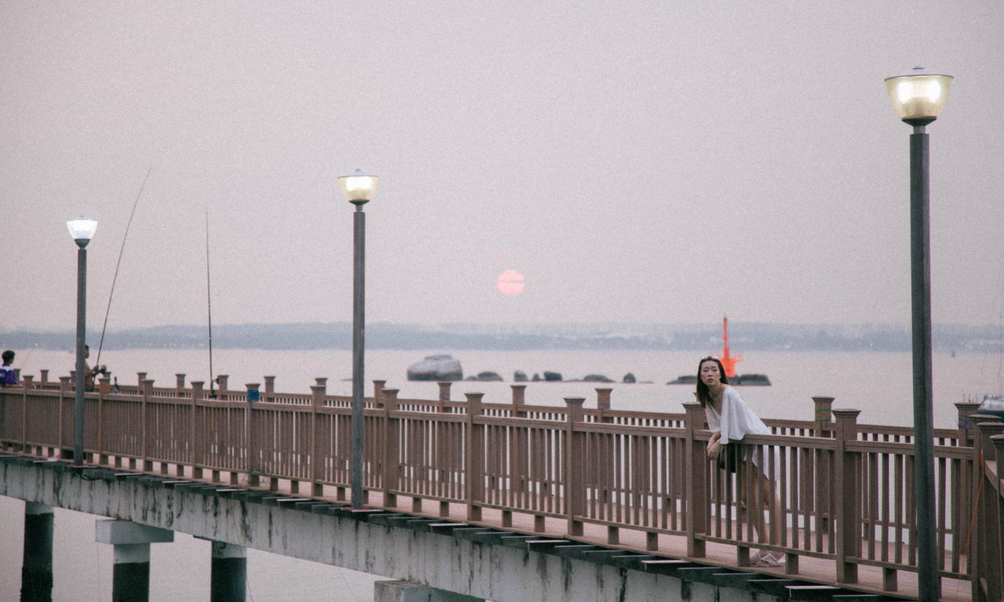
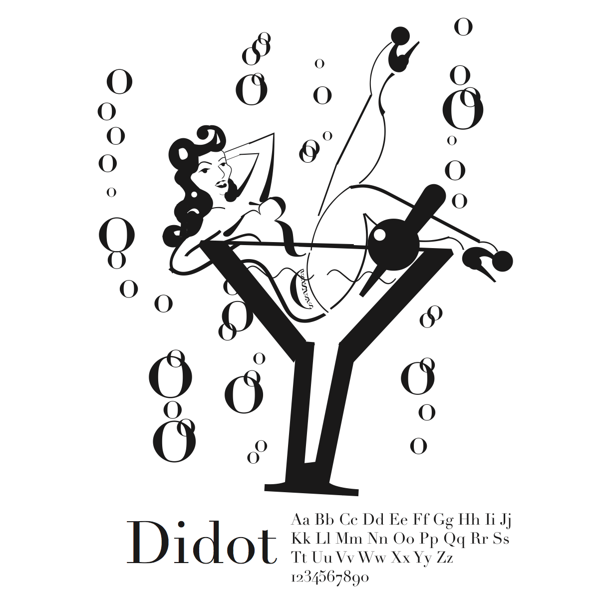
I chose this image as I could visualise using the different fonts to form the image like ‘Y’ could be used as the martini glass.

Work In Progress:


So eventually I finally caught on to the brief and this was what I came up with. I laid out the font choice on Illustrator to reference back and forth on the anatomy of the font to pick out the parts to use to form the image.
This was pretty straightforward (even though it took me soooo long to do it hahaha) and I enjoyed this project a lot because even though it was tedious, it was fun to pick out the parts of the anatomy of fonts to form the image.
I used the font ‘Didot‘ because I feel that the font has a great contrast between the thick and thin strokes and it would be better to use it to form the curves of the ladies in the images. And also, I was very inspired by Burlesque imagery after watching the Crazy Horse show.
FINAL
Project 3B: Typography as Pattern


One of my biggest struggles was Type as Pattern as you can see from my experimentations.
I thought we were supposed to use the whole font of the typeface to form the patterns so these were the first two I tried out using ‘A’ and ‘I’ respectively to create repeating patterns.

But after consult with Shirley, I realised that we were supposed to cut up the anatomy to make the type unrecognisable.
So these 3 are fonts cut up that I was experimenting with. It was soooo tough to get a pattern that I actually liked, all of them are pretty meh to me. This was truly the project that made me struggle with the most.
I also had difficulty figuring out which part of the font to cut up to make the basic shape for the pattern.
So I decided that perhaps I could use a reference image of a pattern to form using fonts.

So I pulled up this reference image to help inspire my design.
Using the letter ‘e’ and cutting it into half, I recreate the design and incorporated a few white overlays to make texture as well.
I chose to use ‘e’ because I think that there’s a certain direction to it depending on its positioning and it would be interesting to vary it to make the pattern.

For the other pattern, I was intrigued to use the tail end of the letter ‘Q’ because I realised that different fonts have very differing structures to that particular portion.
So I played around with it and created an ice cream swirl or snail shaped unit and duplicated it and played around with the positioning and scale.
In the end, I settled for a larger scale with lesser units instead of many smaller units. It kinda looks like a meteorite shower of snails or ice cream. And I also like how it has a leading line as well.
FINAL


Project 3C: Typography as Emotion

 This is my type as emotion for the emotion: Passive aggressive
I wanted to make it hidden because it’s passive yet bold and loud because its also being aggressive. Not sure if it is effective or not.


FINAL

To me, annoyance is rolling your eyes and saying ‘pppftt’ and then accidentally on purpose cause something to annoy the person back. I used Arial Narrow to make it very thin, and flipped it around at a weird angle and also reflected it such that when you look at the word at any angle it would still not read the way that we are used to. And I also made it such that it sits randomly within the space and very near the edge of the page (so that people would feel annoyed that its so near the point of being cut off).

For seductive, I imagine a sexy wavy voice coming from a corner from a dark room. So that’s what I did with the font.
I put it in a dark background and created a wave using differing baselines. I also used Arial in Italics so there’s an accent to the word thus emphasizing the sultry voice of the font.

As for depressed, I used Arial Bold to make a very heavy weighted font. I also increased the kerning so that it would fill the entire bottom of the space. I didn’t make the space black because to me depression is a dark emotion in the midst of a happy space. And it is cut off at the bottom because the ‘hello’ is sinking deeper and deeper into nothingness.

And finally for confused, I used varying styles of the font Arial like regular, italics and bold to convey confusion. And I also flipped and rearranged some of the fonts to read differently from how it’s usually read. And its also scattered randomly to convey confusion as well.


Overall I didn’t exactly enjoy this project because of some of the struggles I had and it was very frustrating and time consuming but I do agree that there are some important takeaways about how we can use fonts for so many other purposes other than communicate text.