“In The Style Of” Final Assignment and Essay

“In The Style Of”

Final Assignment and Essay

History of Photography

DP2002


“Comparison of two Japanese Photographers in the Avant-Garde and Surrealist movement”

By Naomi Tham

U1630775F


The period between Meiji restoration in 1868 till the end of World War II in 1945, was known as the modern era of Japanese photography. This period saw an increase of focus towards the external world, direct photography techniques and larger ranges of subject matter.


The modernist movement of the late 19th century then preceded to focus more on the representations of reality, and also brought forth the various pursuits of experimentation. It resulted in the discovery of depicting new ways to show a photograph, bringing out exciting new realities presented.


In Japanese photography, these experimentations were done under the rubric of New Photography also known as the Shinko Shashin movement. One of the photographers I’ve chosen for my essay is Nakayama Iwata (1895-1949) who is regarded as a one of the most important contributors to this particular movement.


After graduating from the Tokyo School of Fine Arts in 1918, he received a scholarship from the Japanese government and went to California before settling in New York. At that time Nakayama was attracted to avant-garde movements and returned to Japan in 1927, bringing home his own vision of ‘pure art photography’. In 1929,  he settled in Ashiya and founded the Ashiya Camera Club with other photographers. This club became the main driving force of New Photography in Japan. New Photography based itself on the teachings of Laszlo Moholy-Nagy, Man Ray, Alexander Rodchenko and other photographic experimentalists. Nakayama gave a new expression to portraits, townscapes, still-lives, nude-studies, photo-montages, and theatrical shots experimenting with photograms, photo-montages or the use of obtuse angles, distorted reflections and time-lapse exposures.

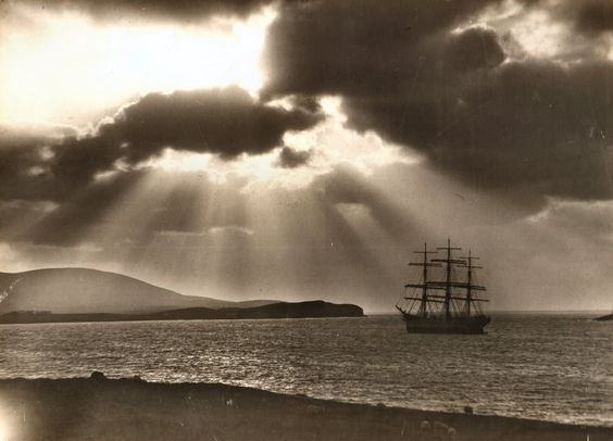
Woman from Shanghai, 1936

Taken the year Japan invaded Shanghai, this photograph is dark and rather mysterious. The woman is smoking a cigarette. Her face is mostly cast in the shadows while half of her face and the smoke of the cigarette is highlighted. Given the time period this photo was taken in; it has been theorised of having an undertone of repressed fear.

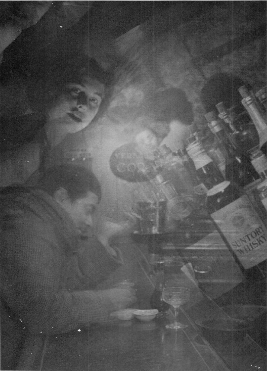
Iwata Nakayama – Night, Wine, and Lady (1933)

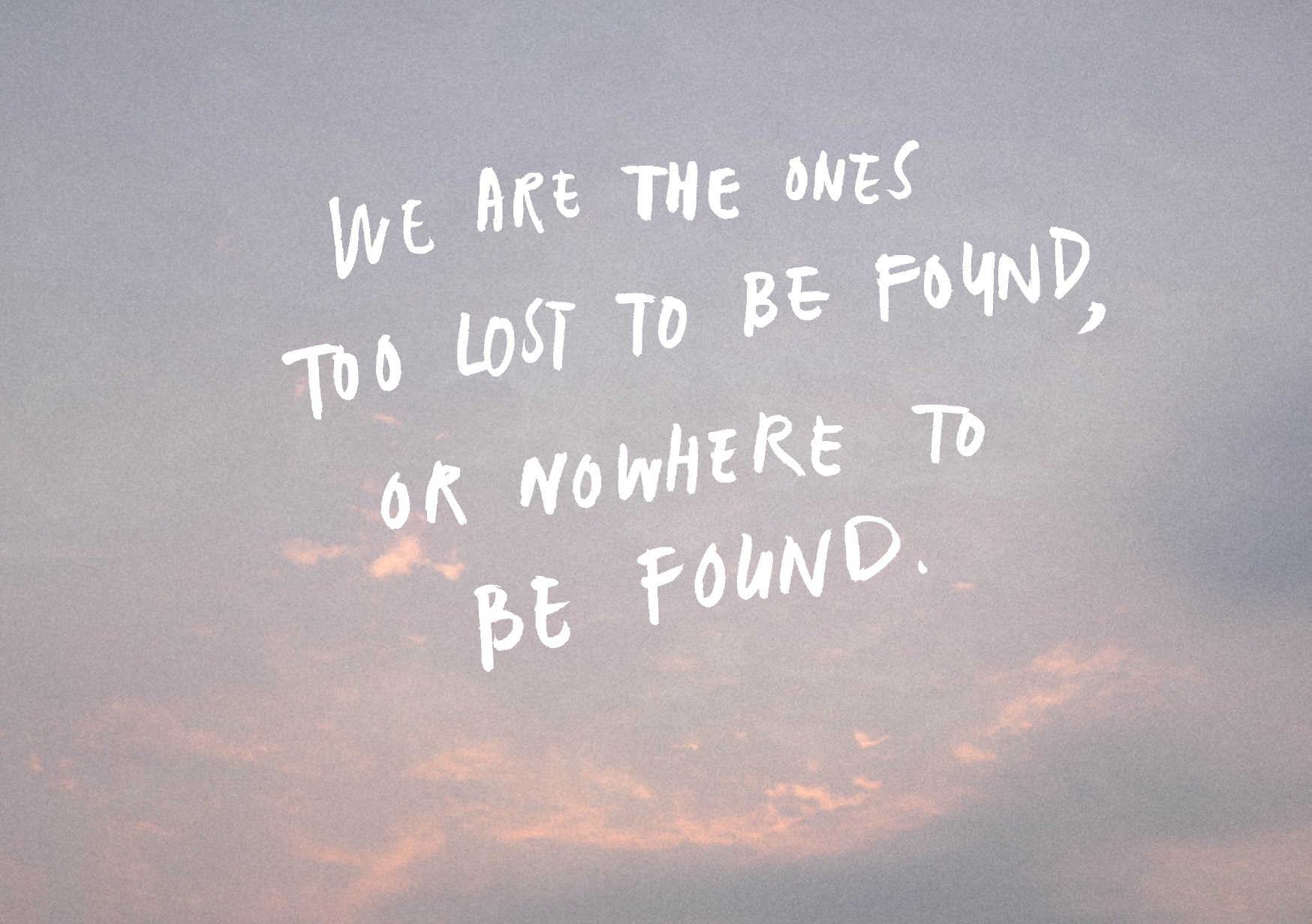
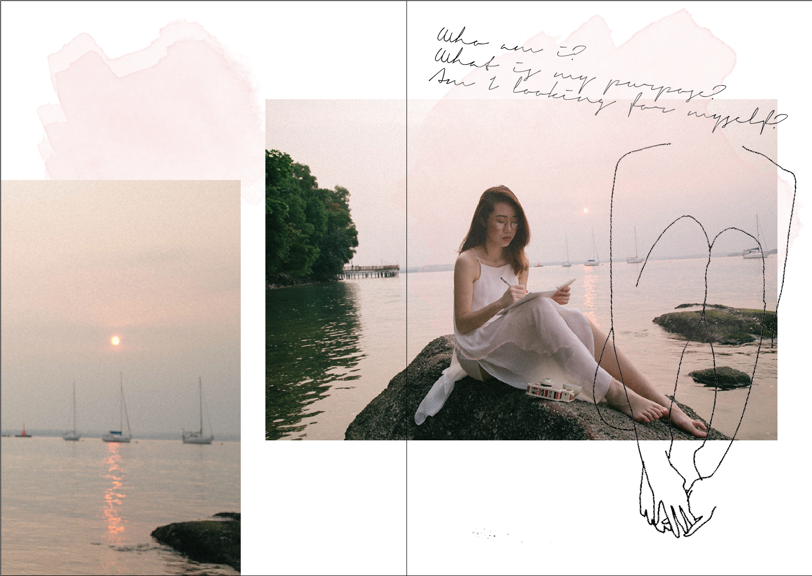
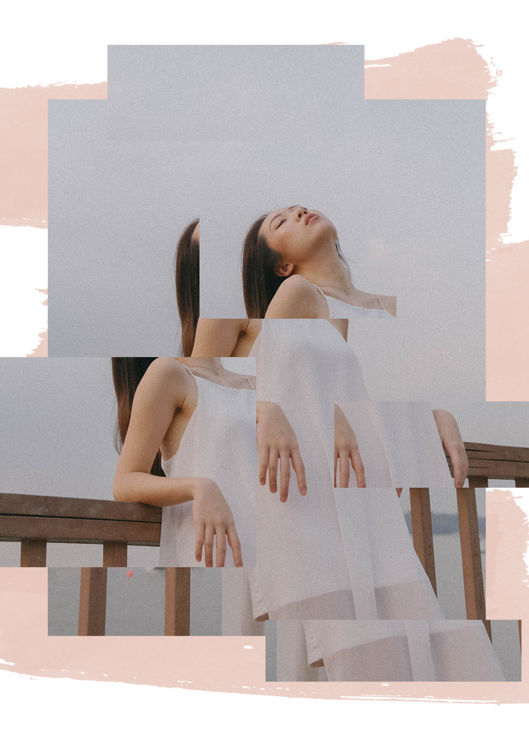
One of the key concepts that I found fascinating was the invocation of the feeling between reality and dreams that comes through from his photographs. I often have very vivid and realistic dreams that I wake up to feeling extremely perplexed as to what my reality actually was. Friends who spend a lot of time with me would also notice that I have very frequent and elongated déjà vus. All these constant personal battles between my own conscious and subconscious made me very excited to try and personify them in this assignment, and to somewhat emulate Iwata Nakayama.

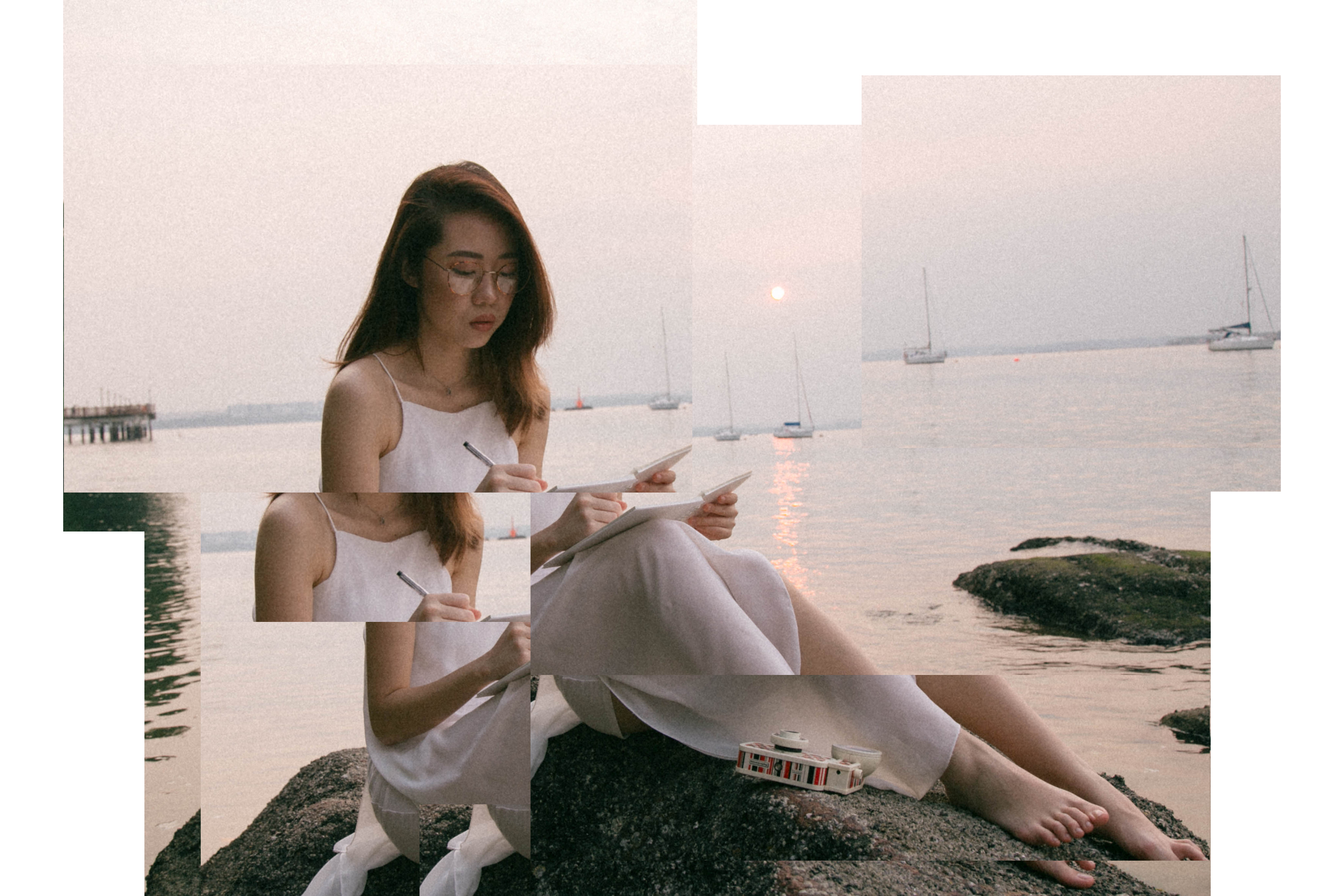
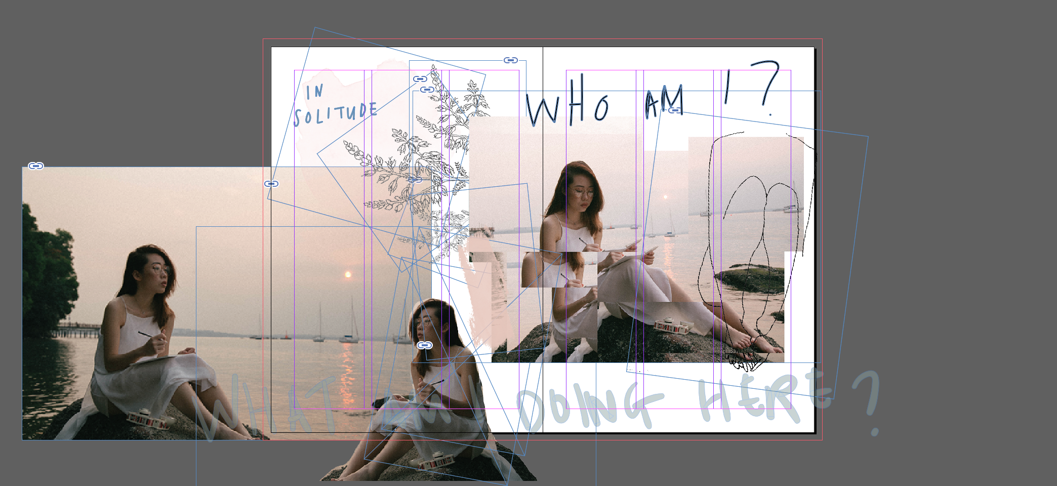
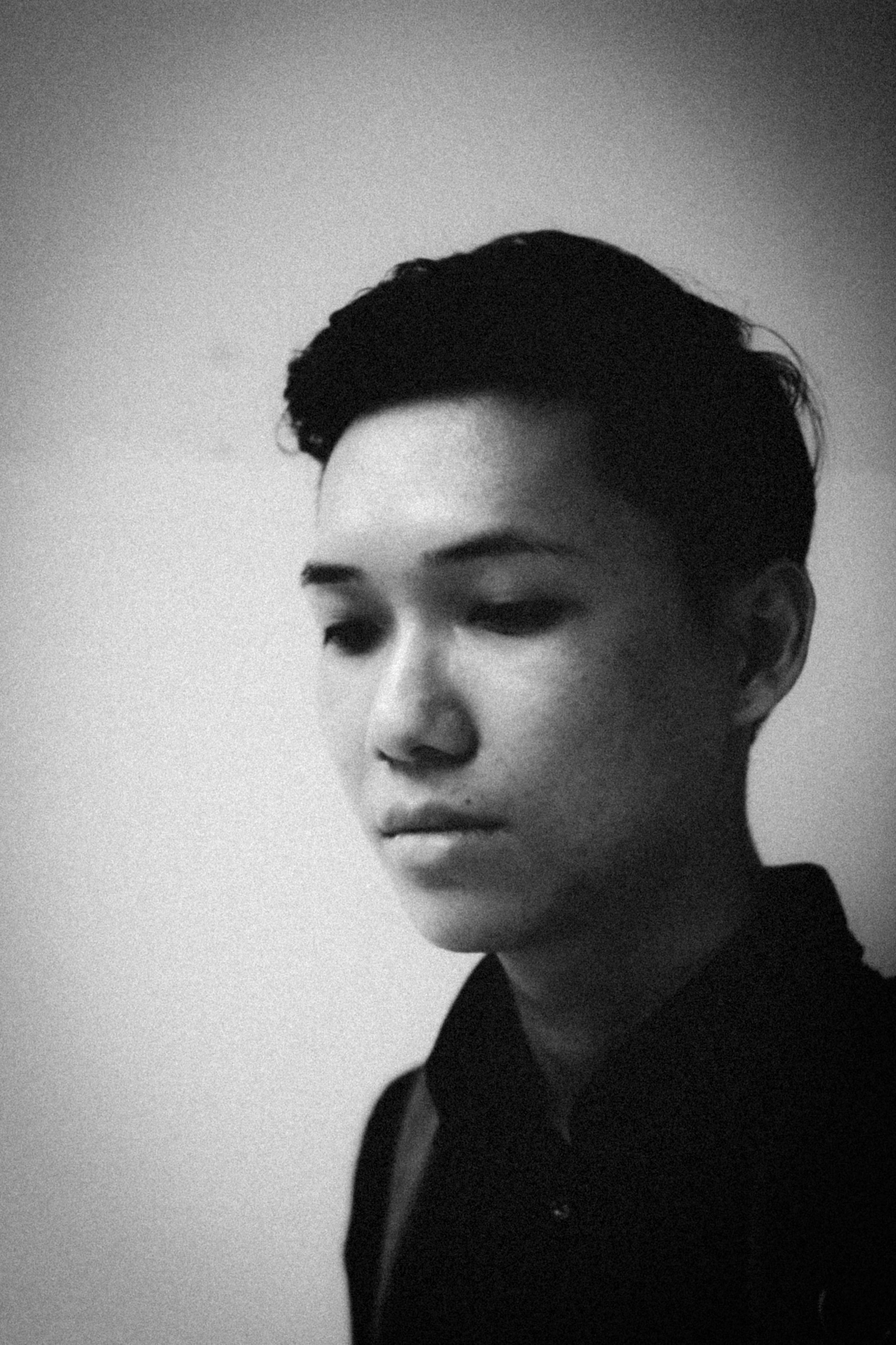
I was experimenting with multiple exposures but I couldn’t exactly get the exact results I wanted so I turned to Photoshop to help manipulate this piece. I shot my friend over dinner whilst he was having a conversation, and I really do enjoy his expression in this photograph. He looks rather perplexed in this photo and does have the sense of wanting to speak his mind. I wanted to piece multiple of his expressions together to create the story of a conversation one often has with oneself. A piece of self-reflection in one’s head, if you will.

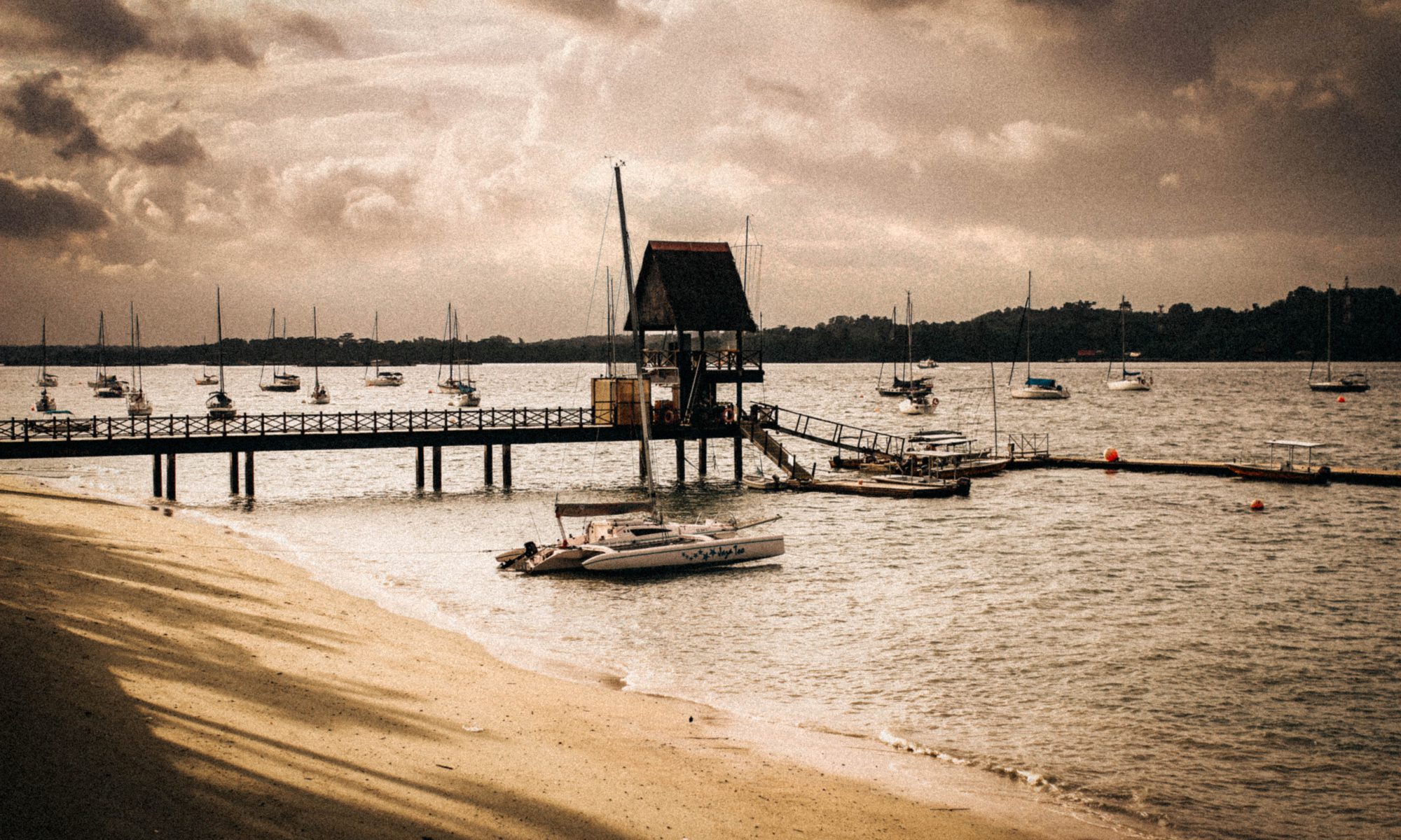
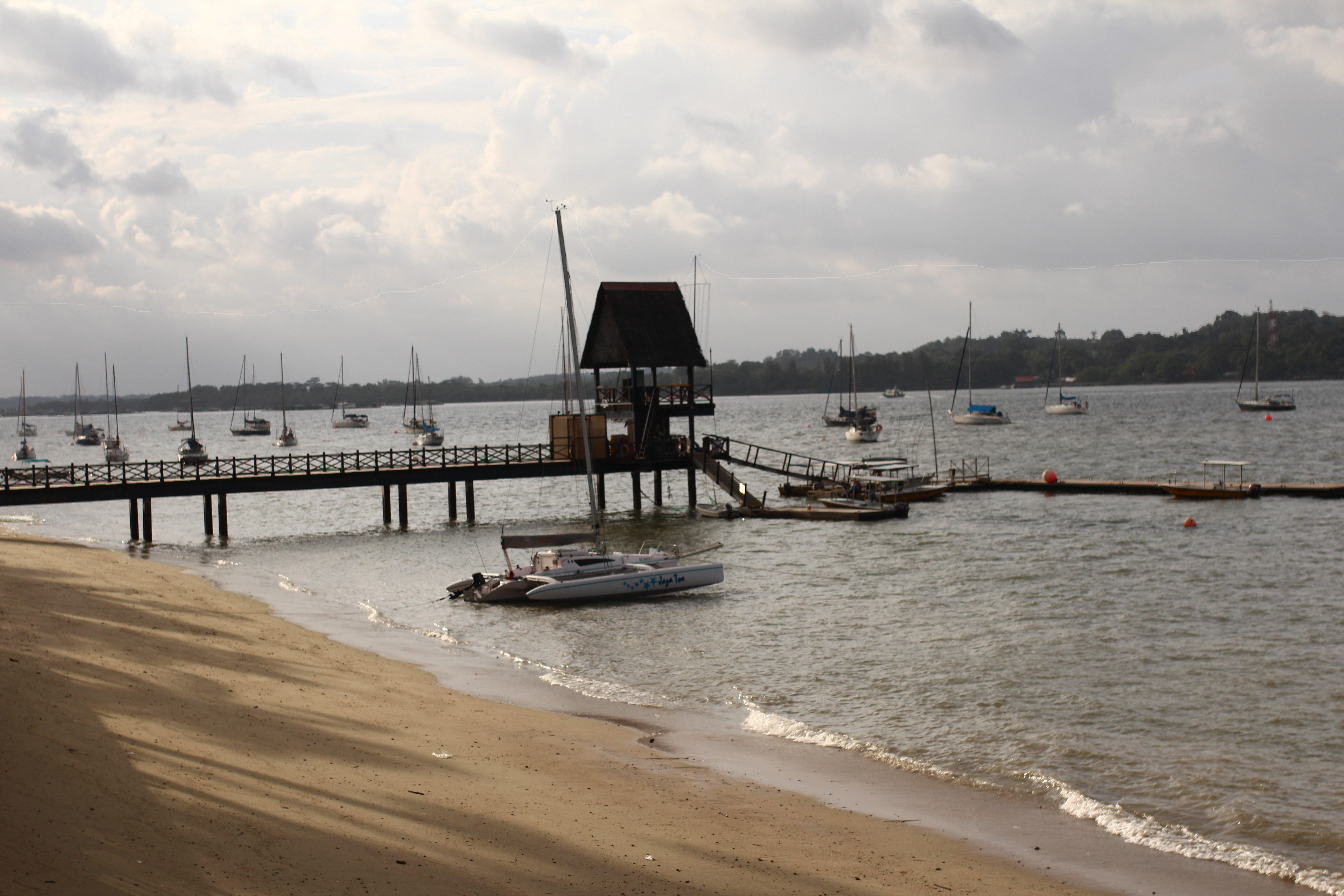
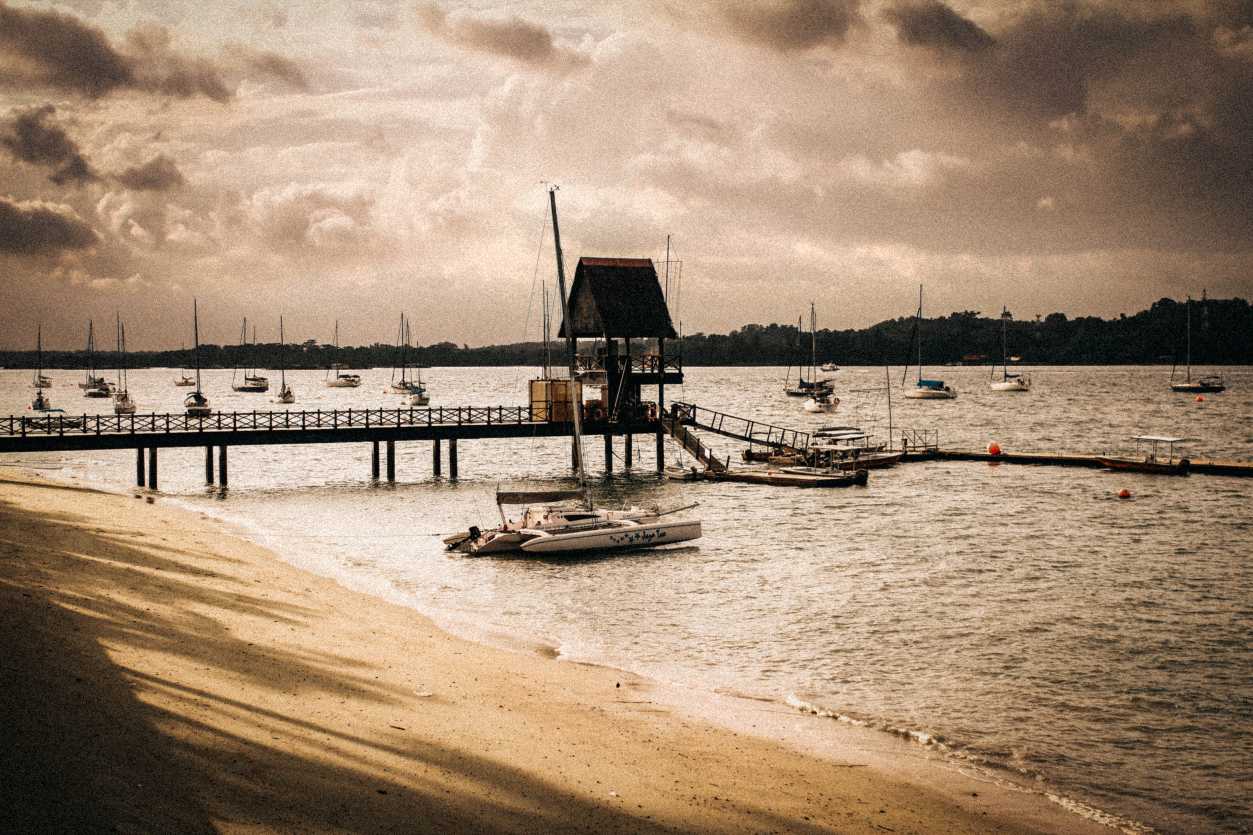
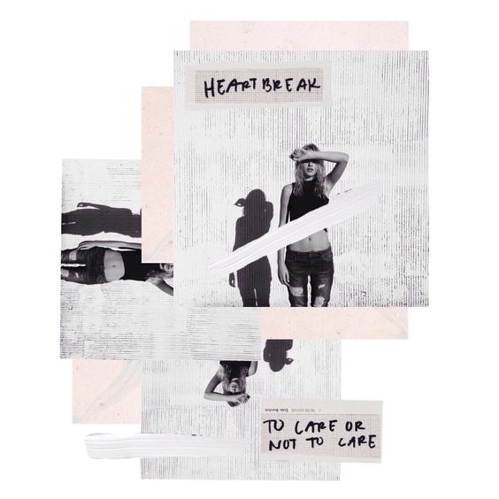
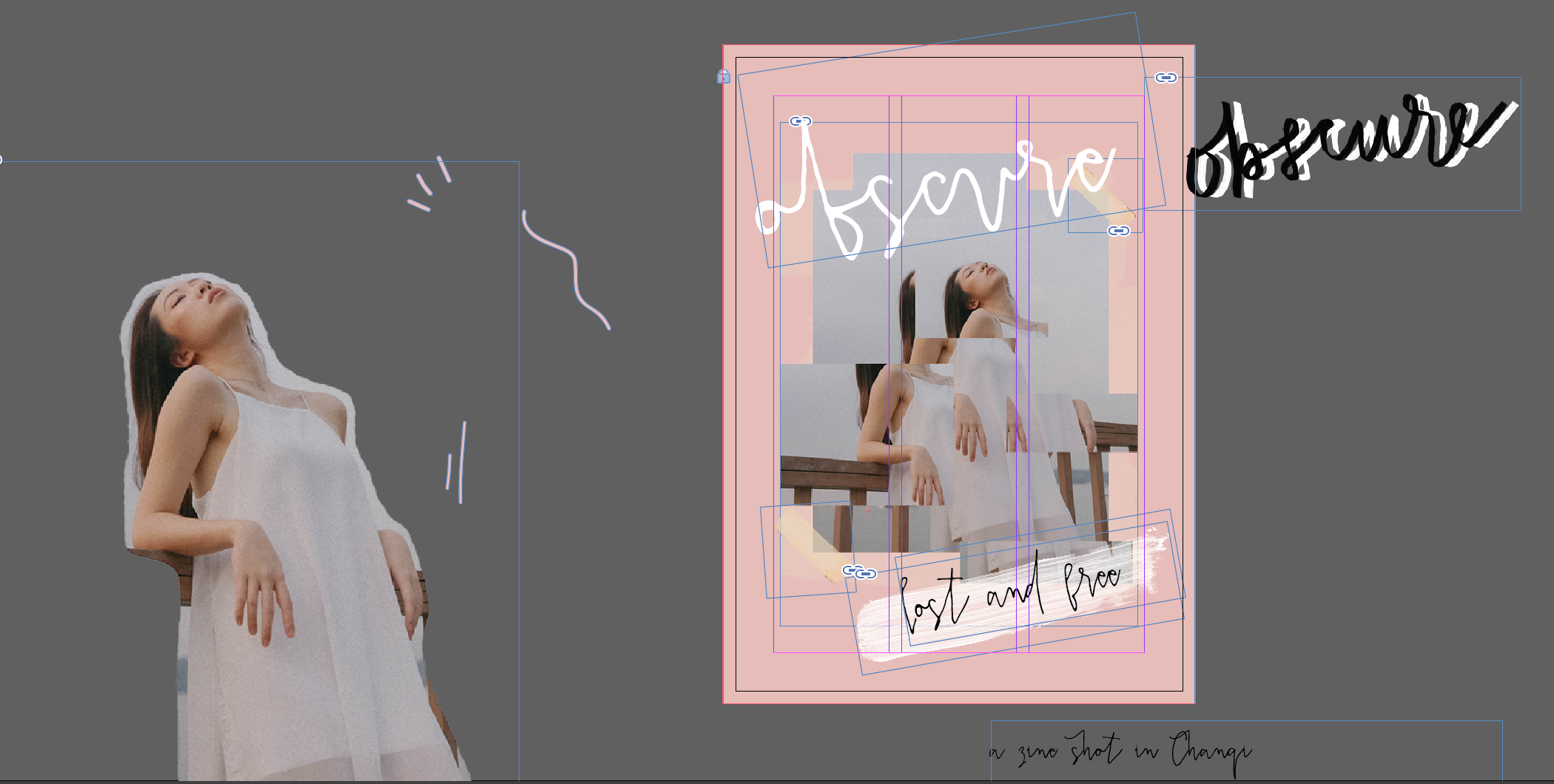
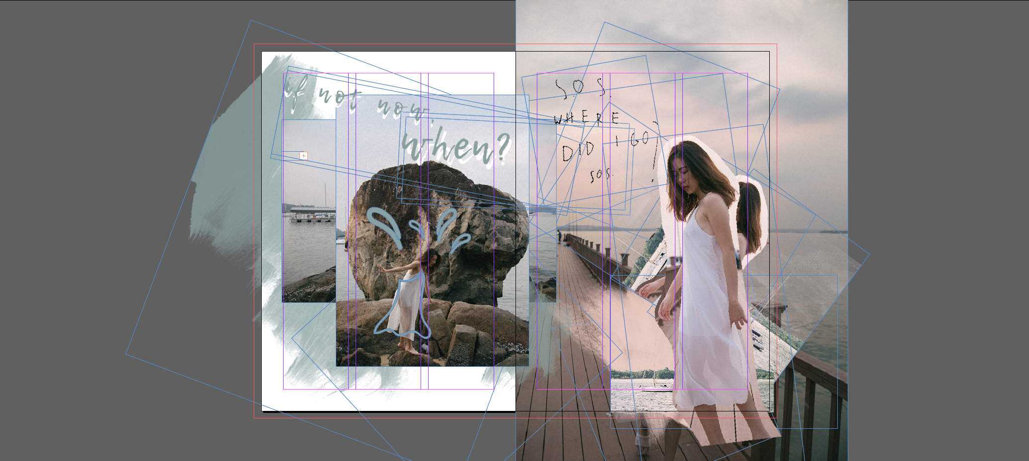
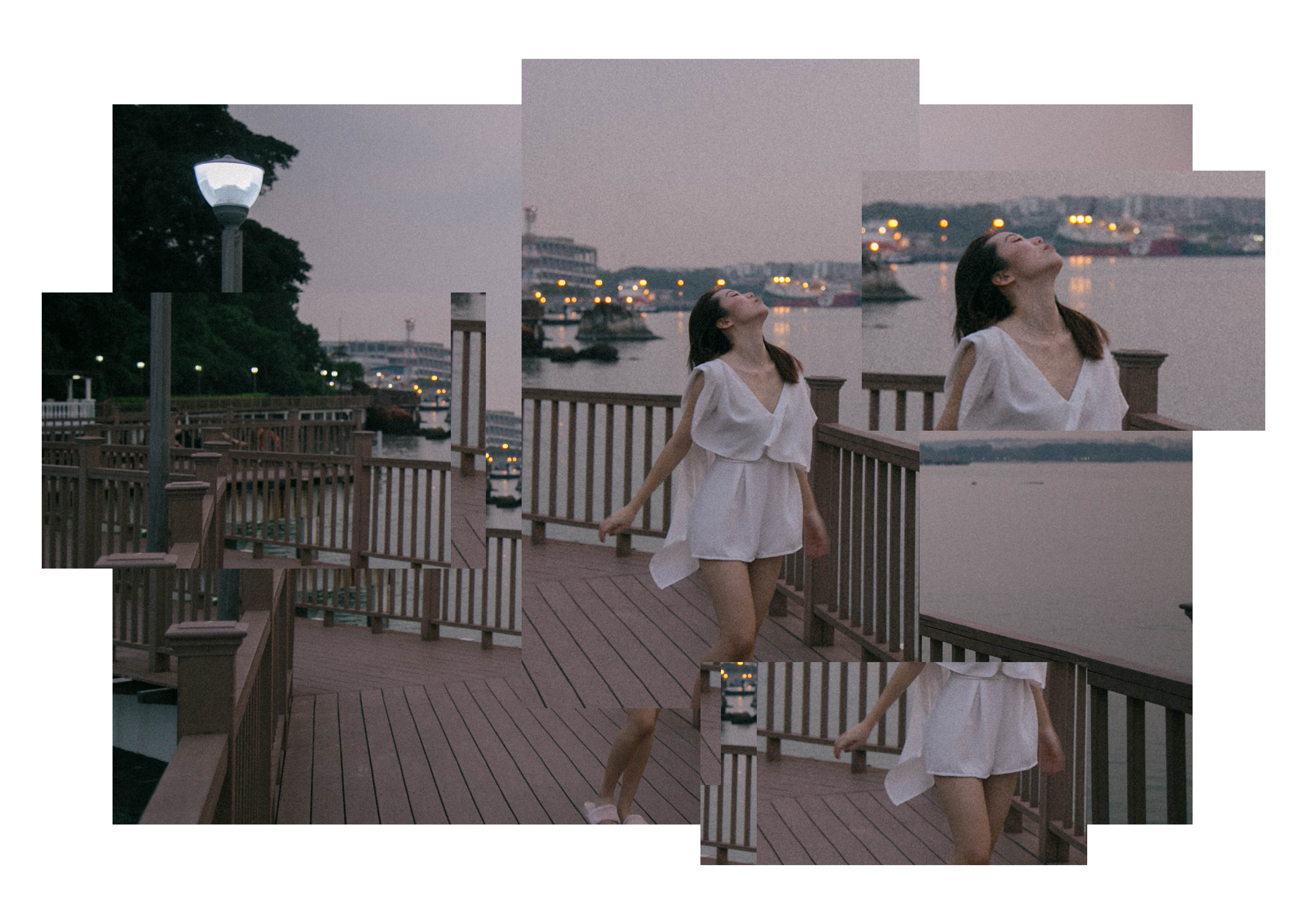
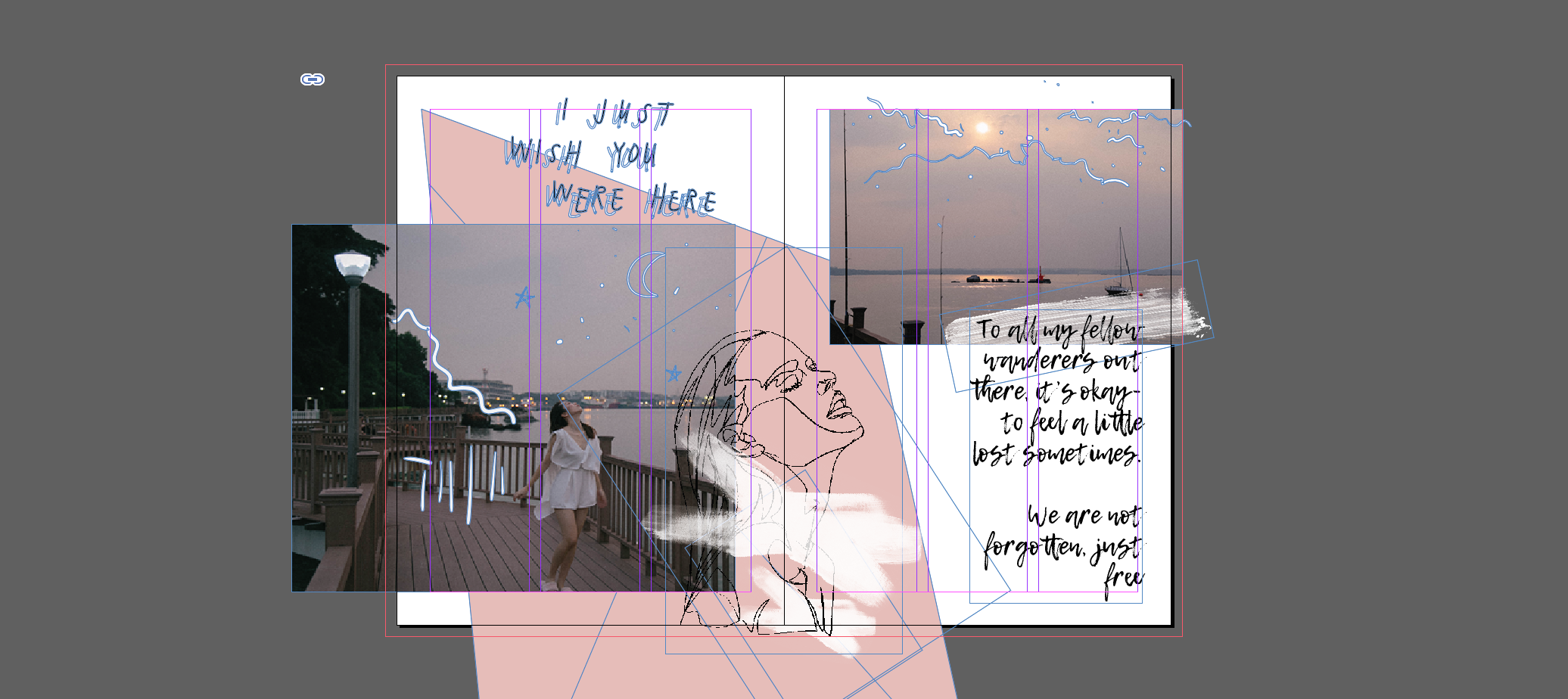
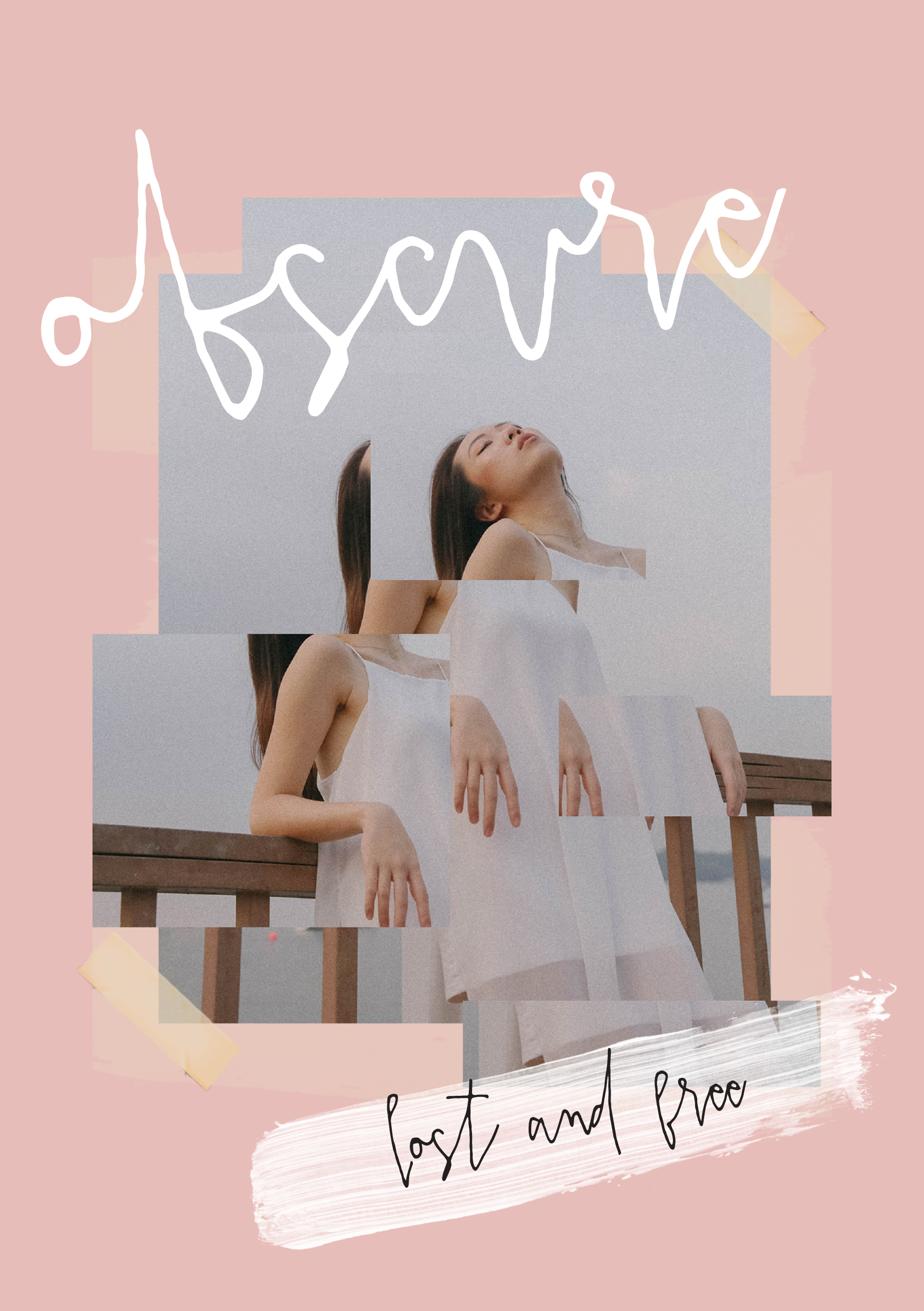
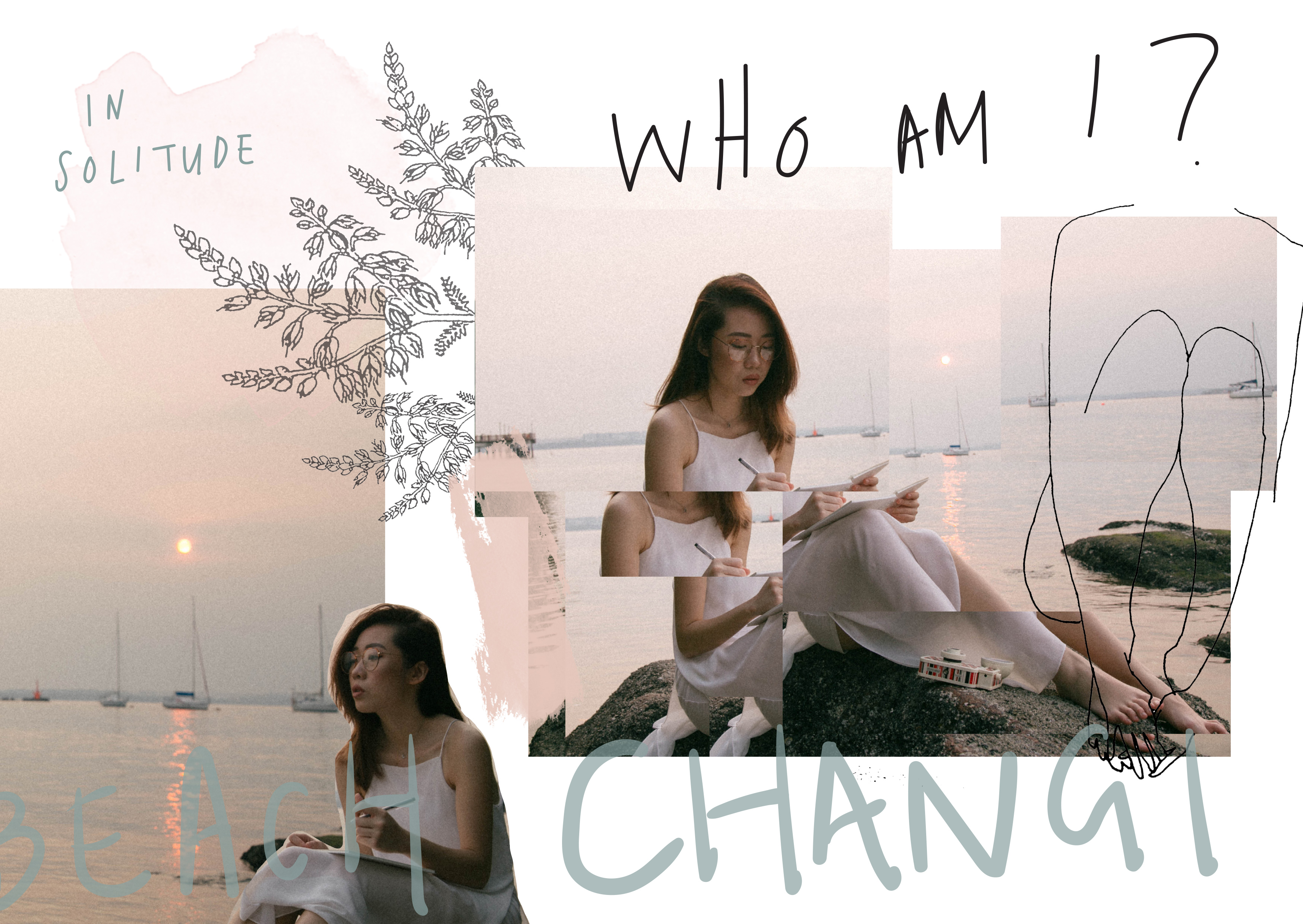
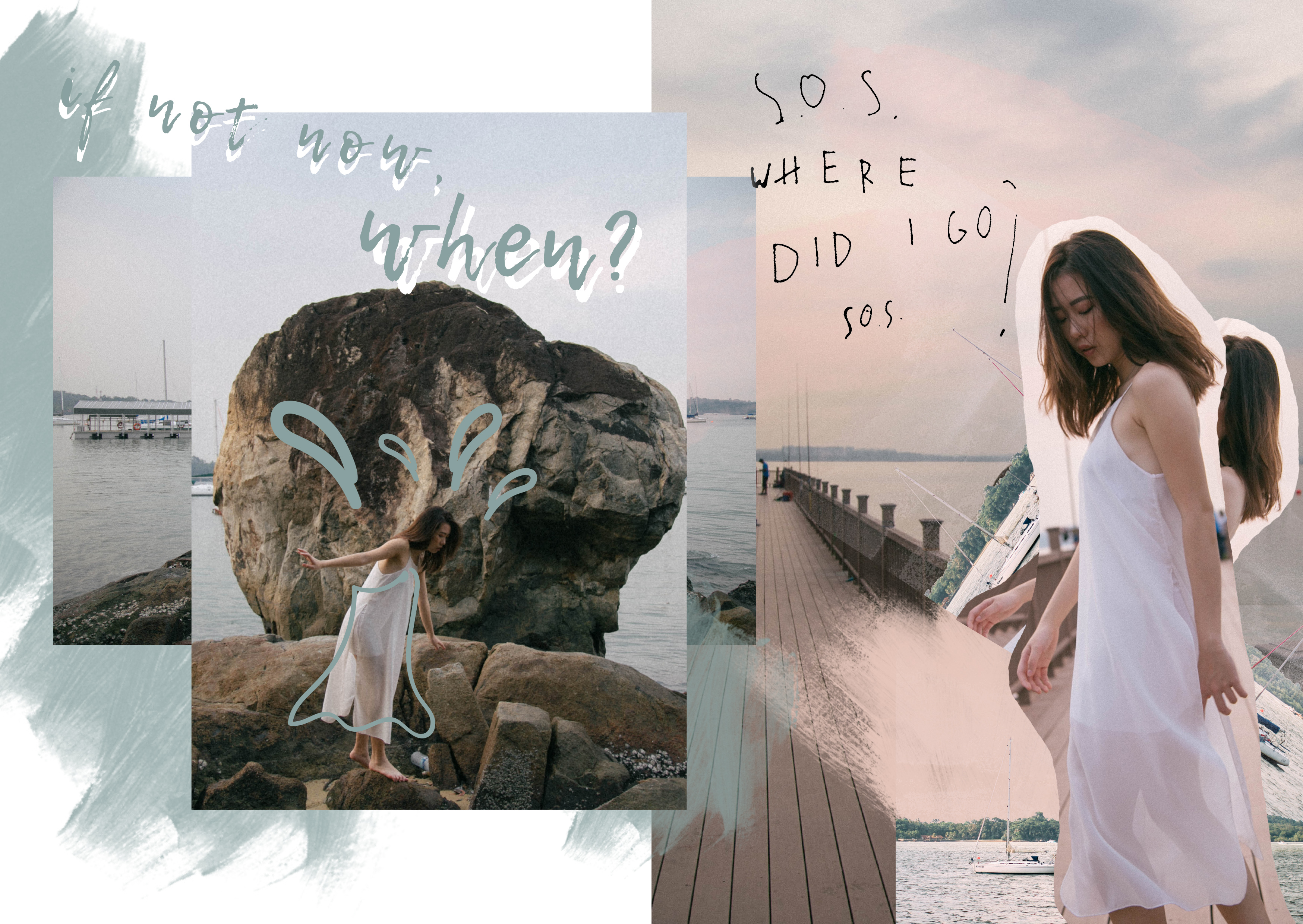
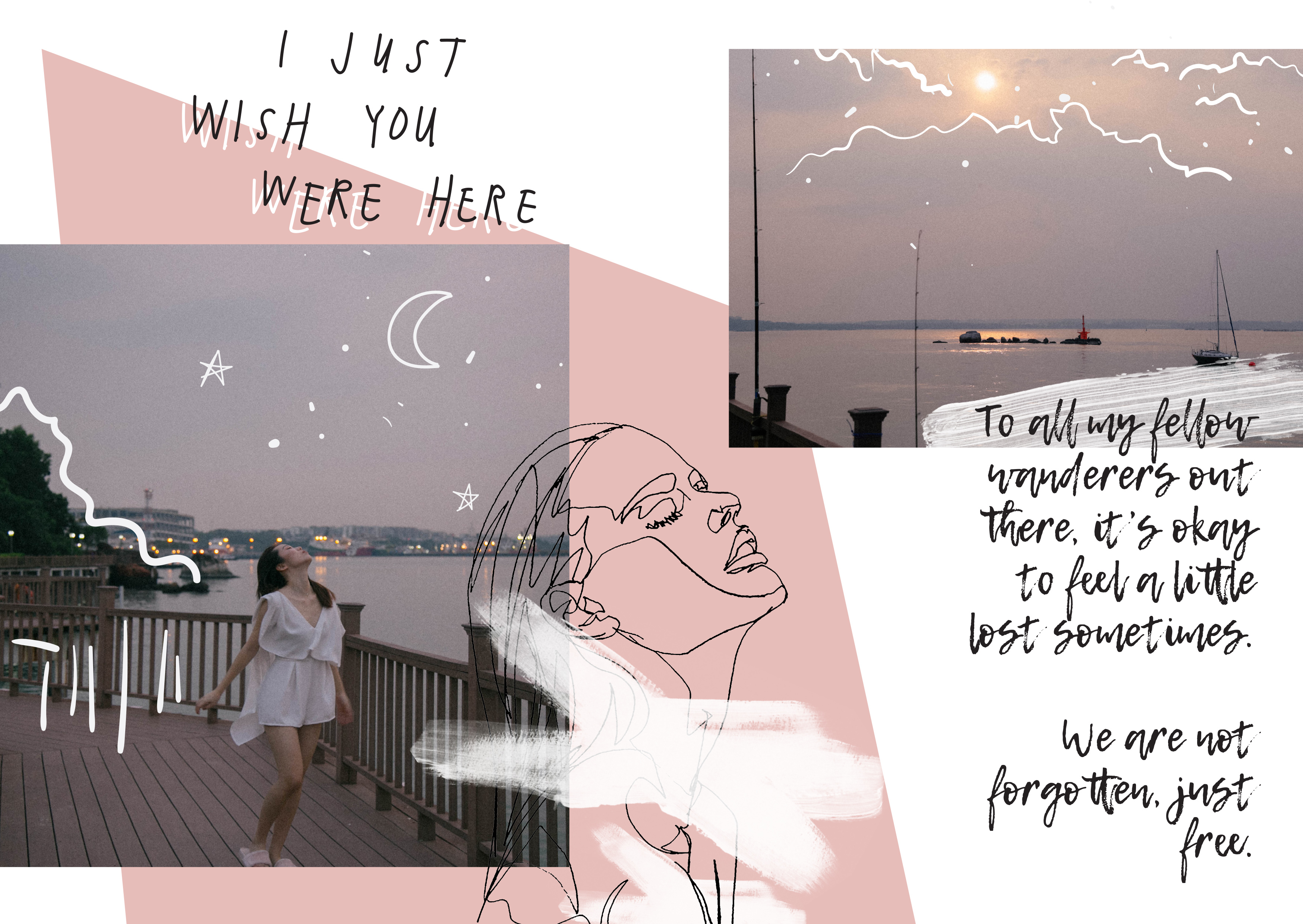
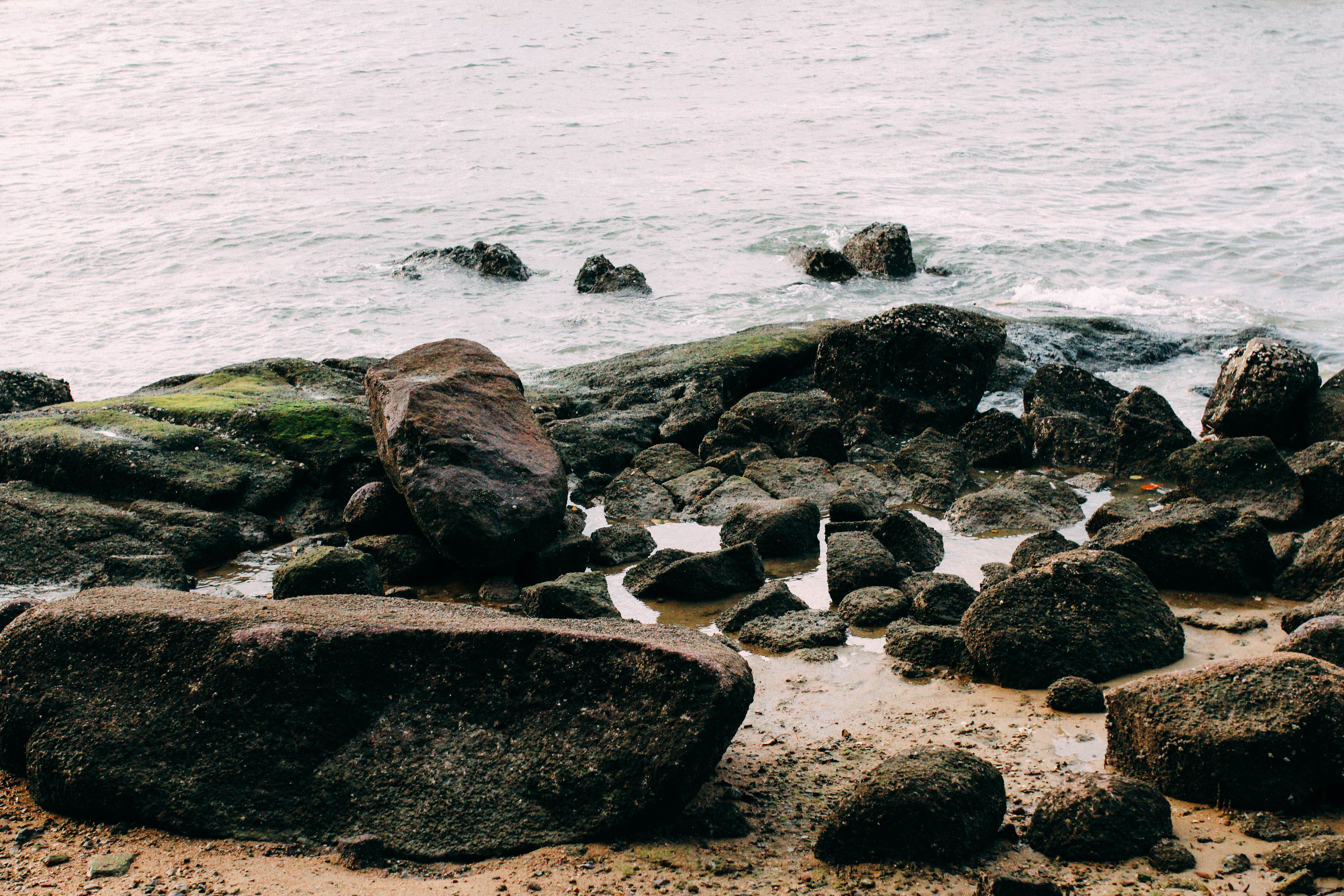
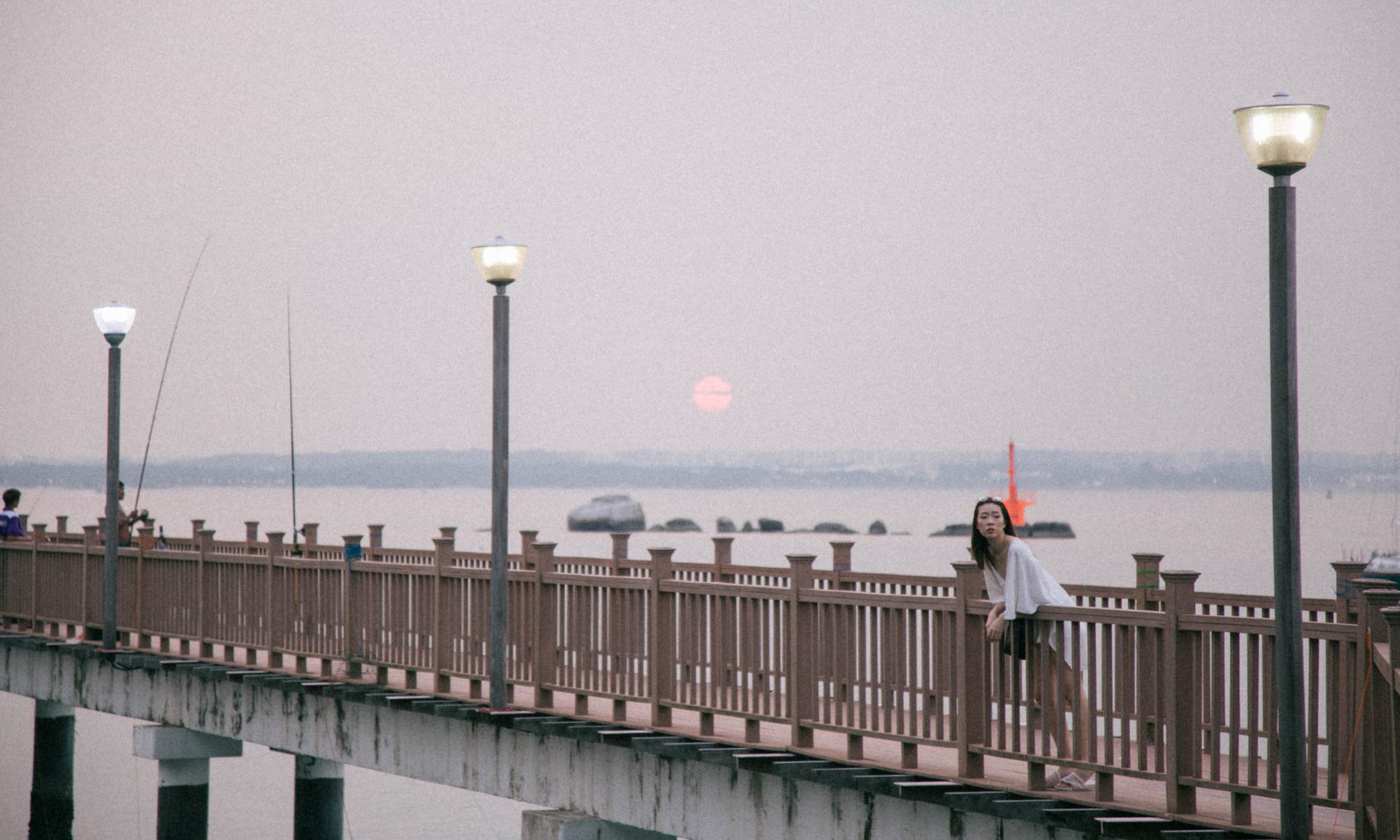
Having really enjoyed Iwata Nakayama’s Woman In Shanghai, I was thrilled to have recreated that same effect with one of my guy friends, titled Man In Singapore. This photograph was taken when we were walking along the streets, trying to take photographs but was interrupted by rain so we had to promptly seek out shelter nearby. We were waiting for the rain to stop so that we could continue shooting and I quickly shot this when he was looking at the rain falling towards the floor. I recreated the dark and moody setting to emulate how we felt about the constant rainy weather of Singapore these days.

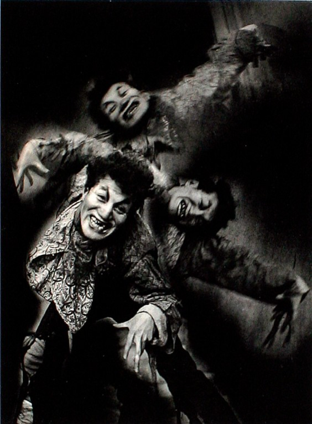
Nakayama Iwata – What of it? -1937- gelatin silver print

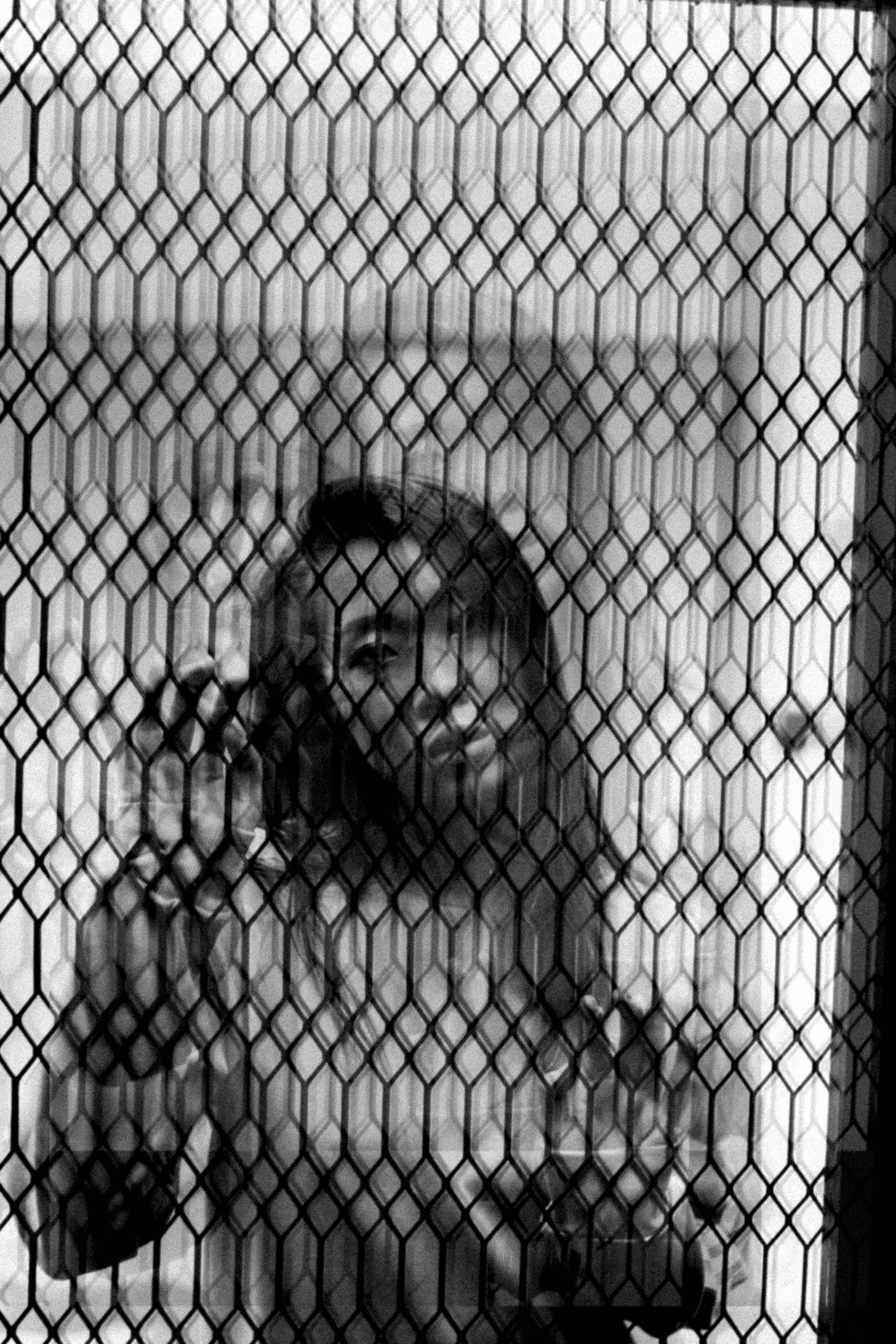
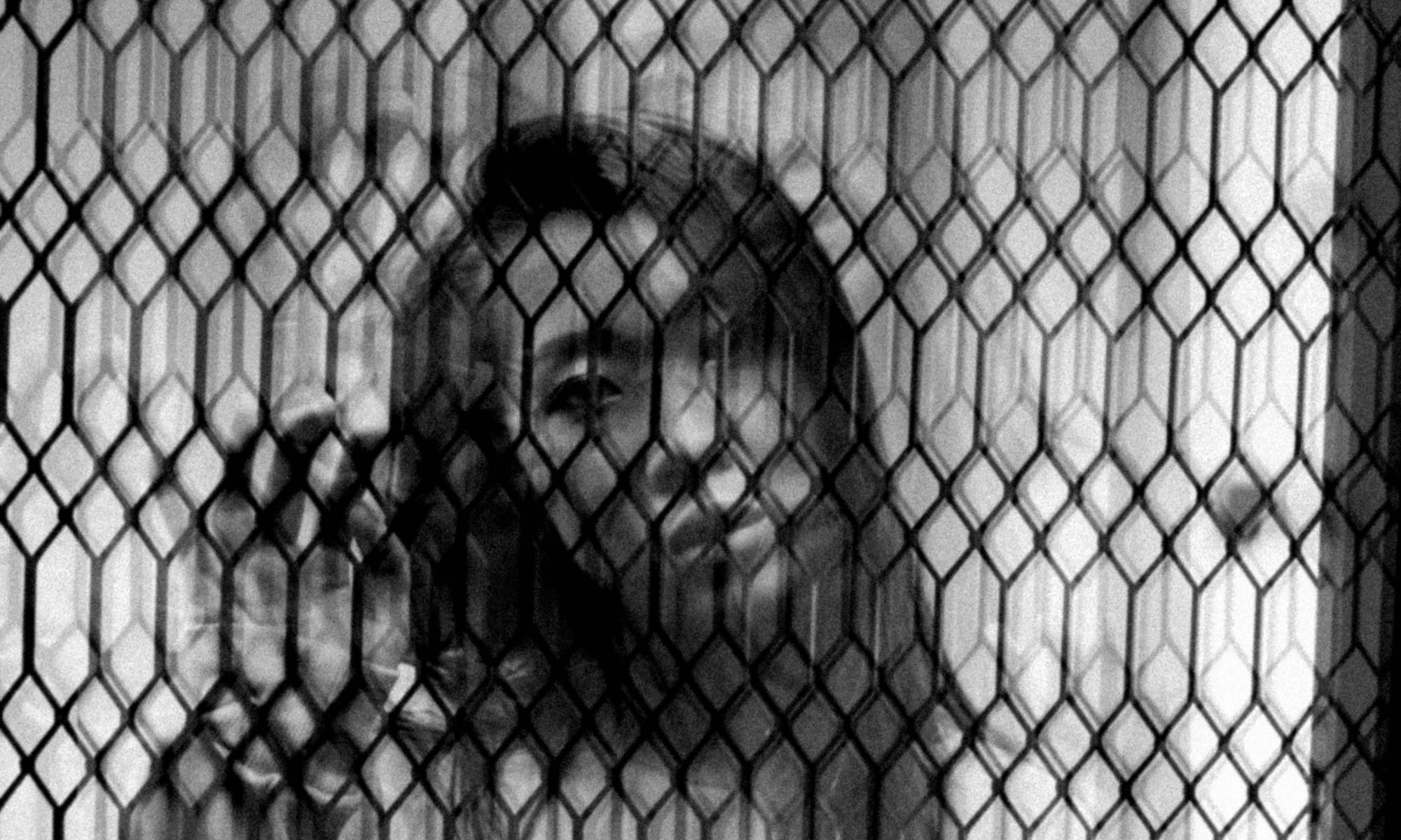
Finally, this is a self-portrait of myself depicted “behind bars”. I love the effect of the multiple duplicates of the photograph because it brings around a different design of the grill altogether. It creates a very lovely constant texture over the photograph and is juxtaposed by the subject matter that is cast in shadow of the grills. I would read the photograph as an expression of myself being cast in the shadows of societal judgements and wanting to escape that. Or it could also represent my subconscious wanting its freedom. With experimental photography, the possibilities are pretty endless.


Which brings me to my comparison artist, Terushichi Hirai, who was also a prominent Japanese photographer whose works were also produced within the same period as Iwata Nakayama. Although using different mediums as Nakayama, his photographs were also extremely imaginative, illusionary and surrealistic photography and he utilised photomontages and color painting on prints.

zero focus: Terushichi Hirai, Fantasy of the Moon, 1938.

Terushichi Hirai. Fantasy of the Moon, 1938

Image result for terushichi hirai life

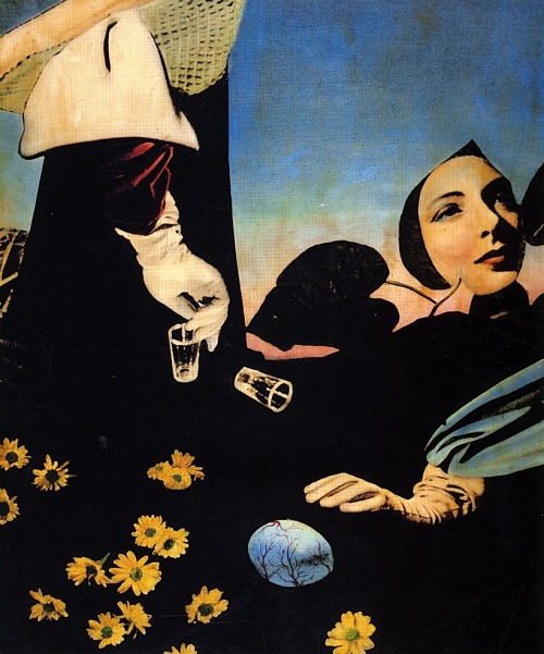
Terushichi Hirai. Life, 1938


I feel that there are more similarities in the two photographers than differences. Although there is an obvious difference in the mediums they both used to produce their most prominent work, there is the deeper similarity between how both parties wanted to depict their idea of reality. To Iwata Nakayama – even though he was largely known for his beautiful portraits – I can feel that he wanted to express his ideal reality and his imaginative spirit into his work. That is done with the constant experimentations of photography mediums, techniques and composition. In which case, Hirai Terushichi, also did the same thing. Having found his ideal medium of photo collaging, Terushichi also stitched together images that he found to represent his reality and composed them together like a photograph.


Ultimately, photography to me is expression and I find it so wonderful that two photographers who wanted to create the same goal of achieving pictorial representations of reality could come up with photographs so drastically different yet meaningful to each of them at the same time. It goes to show that history of photography could indeed be time markers of events, emotions and overall vibe of a certain time and place if one looks hard enough.


Bibliography


Tucker, Anne. The History of Japanese photography. Yale University Press, 2003.


Rubenstein, Meridel. “Modernist 2: Experimental Photography” Presentation at History of Photography at Nanyang Technological University, Singapore, October 2017.


“Nakayama Iwata – Modern Photography.” The British Museum. Accessed on 12 November 2017.

http://www.britishmuseum.org/research/collection_online/collection_object_details.aspx?objectId=3191642&partId=1&people=116215&peoA=116215-3-17&page=2


Phillips, Richard. “Two Master Photographers from Japan” World Socialist Website. 9 October 1999. Accessed on 12 November 2017.

https://www.wsws.org/en/articles/1999/10/phot-o09.html


“Terushichi Hirai” Revolvy. Acecssed on 12 November 2017.

https://www.revolvy.com/main/index.php?s=Terushichi%20Hirai


“In The Style Of” Gustave Le Gray

An experimenter and technical innovator, Le Gray pioneered the use of the paper negative in France and developed a waxed-paper negative that produced sharper-focus prints.

Because he enjoyed the artistic challenges of landscape more than the routine of studio portraiture, Le Gray produced some of his most popular and memorable works in 1856, 1857, and 1858; now with glass negatives and albumen silver prints), and a series of dramatic and poetic seascapes that brought international acclaim.

Working Title/Artist: The Great Wave / Gustave Le Gray

The dramatic effects of sunlight, clouds, and water in Le Gray’s seascapes stunned his contemporaries and immediately brought him international recognition.

This is something that I am really intrigued by when I researched his work. His landscape photographs are really fantastic because of the way the light seeped through the clouds to illuminate the landscape. I particularly love his seascape photographs so that was what I chose to focus on.

At a time when photographic emulsions were not equally sensitive to all colors of the spectrum, most photographers found it impossible to achieve proper exposure of both landscape and sky in a single picture. Le Gray solved this problem by printing two negatives on a single sheet of paper: one exposed for the sea, the other for the sky, and sometimes made on separate occasions or in different locations. Le Gray’s marine pictures caused a sensation not only because their simultaneous depiction of sea and heavens represented a technical tour de force, but also because the resulting poetic effect was without precedent in photography.

With the style of Gustave Le Gray for my mid-term assignment in my mind, I headed down to Changi beach to capture some seascapes.

I experimented with 2 different exposures using my DSLR to get the sea exposure and the sky exposure perfectly.

So in photoshop, I literally took the sky from the underexposed photograph to merge with the sky in the properly exposed one.

And this was the final result after editing:

And I incorporated the same method for 2 other photographs I took that day:

I really liked the effects of it as it gave such a dramatic effect to my landscapes photographs!

TYPOGRAPHY I: ORGANIC TYPE

I was searching for a quote online when I arrived at this one which I thought was quite interesting to explore. It was pretty clear to use red to bring forward the idea of ‘lust’, and the element of ‘bite’ I was thinking could be represented by lips or lipsticks.

Initially it felt like red lipstick was the way to go but I wanted to explore another way of representation such as using the texture of lips.

I saw this tin cupcake holder thing in class while we were selecting materials for our mark-making and I thought that the edges of it looked like the cracked texture of our lips. So I traced out lip shapes with foam paper and glued the textured aluminium on top of it so that it would imprint the texture.

However, I couldn’t quite get the texture of the lips right because the metal was not soft enough to be moulded and stamped properly. It created gaps between the foam paper and the paper itself so it was hard to get the paint to adhere to the surface. It was very uneven.

So I decided to scrape the idea of using aluminium. And instead I tried to make direct cuts into the foam paper using a pen knife.

I REALLY loved the quality this gave to the print, because I could really bring out the details of the lips in this way. I was really happy with the way that the ‘U’ came out because it really looks like the edges of lips.

So I decided to pursue this method for the rest of my letterings.

However, the downside to using this technique was the improbability of getting a ‘perfect’ print. More often than not I had to try and cut out multiple letters and each of them only had a certain number of times they could be used because of how malleable the material is. It was easily destroyed after a few stamps due to the cuts I made with the pen knife.

It was also not easy to use this technique on letters such as ‘I’, ‘L’ and ‘T’ where they don’t have counters to create the lip markings. They were also the most easily destroyed letters due to their long stems. 

So here is what my quote looks like with all the organic types. I added my lipstick mark as well for effect.

Next I wanted to create a mock up for condoms using my quote but I had a lot of difficulty doing up the condom wrapper itself to look real.

But eventually I figured out a way to do it by overlaying it over an actual condom wrapper.

I designed the box according to your the theme of lips as well so that all the fonts and vibe will tie in together.

Overall thoughts for project 2b:

I feel that it is such an important project to bring forth the early conventions of using handmade fonts. It is true that with technology, all these handmade elements would slowly disappear, but yet this project reminds us of how relevant it still is to this day. So I think that this was an important project to showcase that.

The end.


TYPOGRAPHY I: VERNACULAR TYPE

PROCESS

Location: Clarke Quay

Words associated with location: Night life, bars, clubs, shopping, tourist attraction, food, restaurant, colourful, neon lights

Concept: Clarke Quay at night = All about the night life!

Quote: “One More Shot”

Photos shot at Clarke Quay

Looking out for letters in random objects was definitely a huge challenge. As I went alone to shoot, I was shooting practically everything in sight so I could go back and review the photos and find certain cropping to make sense of the letters. But I realised very quickly that it was not a good strategy, so I decided to look out for colours and backgrounds that stood out to me more.

That worked out for the better as I could isolate letterings more and also it gave an overall vibe to the typography – colourful neon lights; which definitely brought forward the characteristic of my location, Clarke Quay.

Initial Design:

The irregularity of the size of the letterings was something that made me feel a little annoyed. I also felt that all the letters that made up the word ‘more’ were not very in sync with each other. It prompted me to go back and search for other possibilities.

Searching for ‘r’ was the hardest for me as I just couldn’t see it. But it was until I was sifting through my images in class that Shirley pointed one of the signboards that could make my letter ‘r’. Yayyyy so happy.

I also adjusted the sizes so that they were all the same height and hence created my final:

I really prefer the layout to be even, just like how it is here because I think it’s a good way of bringing across the message of how a person is not wasted enough, hence he/she needs to take ‘One More Shot’.

That’s the essence behind my vernacular type.


TAKEAWAYS

I feel that this project really challenged me to view things out of the ordinary. Walking around Clarke Quay looking for letters really made me appreciate the elements that make up Clarke Quay as well. I also enjoyed the challenge set to us by Shirley because we were restricted to not use any physical letters that were already used in signboards, and that made us step out further to find the letters which I felt really make our work stand out more because of this difficulty.

2D II: Zine Process & Final

DRAFTS

Cover:

I chose an image with myself that emulates the idea of freedom. And using the little doodles to accentuate the movement in the photos inspired from some research on layouts in my previous post.

I added the scotch tape and paint swatch to make it look more hands-on.

However, after feedback from Mimi, the photo seems like it is a little bit mismatched from the title of the zine and its not clear what the theme of the zine is.

These pages are designed based off some inspirations of scrapbooking layouts.

Yet again, after consult, I realised that there should be more manipulation done to the photos to convey the theme of the magazine: lost and free.


So I went to do more research on photo manipulation for layouts:

Process:

Cover

After trying out different photo manipulations on my photo, I decided I liked the random cuts and pasted one (option 3) the best. So I incorporated the other elements of the zine cover like the title and the theme.


I also played around with the same cut and paste technique for the next photo. And using etched out photos as well to give it more organic shapes to contrast with the square cuts. The heather flowers were also added in to fill the space and I chose heather flowers because they represented ‘solitude’ and that’s essentially the essence of the spread here, my thoughts when I’m in solitude.

I decided to change the words at the bottom to Changi in the end to put the spread into context as well. And also to introduce my zine location right when you open it.


This spread was random trial and errors done by copy and pasting images and etching them out. I really like the haphazard-ness of this seemingly random copy and pasting method. Also added the fun doodles on the photo for a more personalised vibe.

I tried the cutting and pasting method once again for the last photo of myself but I didn’t like how it looked on the spread. So I decided to just use it and instead put in some doodles on the image to personalise it. And I ended it with a personal note to the those who would pick up the zine and read it.

To my fellow wanderers out there, 

it’s okay to feel a little lost sometimes. 

We are not forgotten, just free. 


FINAL ZINE:


Zine Research: Site Visit @ Changi

Background Information on Changi:

Changi is currently an Aviation hub, home to both the Changi airport and Changi airbase.

And of course how can we forget about Changi Prison – infamous for the Japanese Prisoner of War camp during World War II, currently Singapore’s oldest operating internment facility.

Popular activities at Changi Beach include: 

Family picnics, fishing, watching landing airplanes, jogging, watching sunrise.

Popular food: Bistro @ Changi or Changi Village

___________________________________________

A quick search of the location tag Changi on Instagram would generate a plethora of photos of people who are documenting their start of their overseas trips (you know, because #airportfashion).

But of course it led to me to some standout images of a place in Changi less explored: Changi Point.


So I headed over there to check it out a little, and I was greeted by this friendly board with truckloads of information of the location I was about to discover more of.

Some points that I’ve picked up on:

  • It was known for coconut plantations in 1800s.
  • It is segregated into cliff walk, kelong walk and sunset walk.
  • It was once a ferry terminal that connects Changi to offshore islands.
  • Mainly used for military barracks during 1920s period.
  • Recreational facilities like the Raf Officers swimming club, Changi Yacht Club, and Airmen’s swimming pool made Changi feel like a holiday resort.

Photos I’ve snapped

Personal diary of how I felt in my Changi exploration:

State of relaxation. Warm breeze, smell of the ocean, complete serenity.

Even though I was all alone and felt like it would be nice to share the moment with someone, I was completely enjoying the process of being alone.

It came to a point where I was simply following a path and not following any map at all. Just taking the whole moment to myself, getting LOST and being FREE, admiring beauty.


Concept Research

Flaneur

The stroller, the passionate wanderer emblematic of nineteenth-century French literary culture—has always been essentially timeless; he removes himself from the world while he stands astride its heart.


CONCEPT:

Lost & Free

Seaside Wanderer.

Isolation and its wonders.

The Art of being alone.

Appreciation of beauty.

Am I in the exact place that I should be in?

I wanted my zine to be a personal diary of myself and my thoughts in solitude, and I wanted to relate it to the millennials around me because I feel like they can all relate to how I feel: Lost & free.

We are stuck in this age where we are all trying to find ourselves and find our path in life, so this zine is dedicated to those thoughts. My little doodle journal on the shores of Changi Boardwalk.


Inspirations:

Artist: Fiphie

Her personal journals of her illustrations and poems are really something I really wanted to emulate because I want my zine to be a documentation of my personal journey to Changi. Something really organic and raw, which is what this artist does.


Layout inspirations:


Project Que Sera Sera: PROCESS & FINAL

JOBS CHOSEN

  1. Pet Groomer
  2. Marine Biologist
  3. Fashion Stylist
  4. Air Stewardess

I actually started with a bunch of different ideas in terms of childhood dream jobs. I brainstormed and scribbled it down on my sketchbook:

img_7320

But after I’ve tried to attempt at some of the ones I’ve chosen, it didn’t really work out very well and I was left stuck with limited ideas. Refer to previous post for research development: https://oss.adm.ntu.edu.sg/ntham003/2d-ii-research-typography/


One example is that I originally wanted to work around the idea of a barista.

img_7317

But after brainstorming, I realised I only had one solid idea to work on as the rest was too overdone. Every other barista/coffee typography work out there involves coffee beans or milk foam, which was the basis of most of my idea.


So hence I scraped it and started working towards Pet Groomer instead.

Being a pet groomer was one of my childhood aspirations because I love animals and I have had dogs when I was growing up. The idea of being around furry friends all the time made me really happy.

Brainstorming Ideas:

img_7318

But after consultation with Mimi, I realised this idea didn’t have a certain quality of pet grooming.

References:

bb56b147017b59aadbae4a1e5e8350f9

Since a pet groomer’s job is to essentially cut and comb through a pet’s fur, I thought of incorporating the idea of cleaning up a pet. From messy and untamed fur to a cleaner cut.

So I came up with this:

petgroomer

It depicts a mid-way scene of when a pet groomer grooms a pet. Where the original state of the letters are very furry and out of control but gets cut with grooming scissors to reveal the letters in a neater manner.

But during the class discussion, everyone thought it was white hair instead because the scissors threw them off.

So I decided to change the scissors to a pet shaver instead.

Final Design

petgroomer-final


MARINE BIOLOGIST

I’ve always wanted to become a marine biologist due to my love towards marine mammals, in particular – whales!

They are my favourite animals and I always thought it was really cool to study them for a living.

Brainstorming ideas:

img_7314

After consultation with Mimi, I realised that I don’t have the element of ‘science’ in being a Biologist in my designs. So I thought of the idea of a petri dish being inspected through a microscope.

I did it in water colour and made the textured background using watercolour and alcohol drops. Then I layered my handwriting over it. I also changed the ‘i’ in my name ‘Naomi’ to a ‘Y’ to make it look like a whale tail.

I chose a whale tail because that’s what I’d want to specialise in studying them if I were to be a marine biologist. And that’s an element to show the idea of ‘Marine’ in the job.

marinebiologist

ORIGINAL DESIGN

But after the class critique, we all agreed that it doesn’t look very blended to the background. And the font of my name does not stand on it’s own to show the idea of marine biologist without the background.

Some others I’ve experimented with:

try

References:

marb-slide-10img_1190

I also chanced upon this typography:

dan-fleming-word-animals_08

Which led me to experiment with my own name as well. I used my Chinese name ‘Wai Yee’ which has a ‘W’ in it.

img_7313

img_7312

But I didn’t really like this concept after I tried it out. And it was difficult to get it right.

So I went back to experiment with different water colour techniques to achieve a typography that blends with the cells background.

References:

1cbed16a94fa92a4a75b1c730e66b953e9c9e4d68fb5e433bac8e976402f138a

Experiments:

img_7286img_7287img_7288img_7296img_7301img_7302

But I don’t really feel like they work because water colour is very hard to control and it looks very imperfect for me to use.

So I decided to manipulate it on photoshop, using the ‘cells’ individually.

marinebiologist-final

FINAL DESIGN

I finally chose this design because I liked how the words still looked like cells and hence blends well with the background. The whale tail is also incorporated in a way that looks like it was floating as a passing chunk of some wave/cell in the background.


FASHION STYLIST

Being a fashion stylist was originally my dream job, until I took a gap year to do it for real and it was a really tough period. I still enjoy it but to do it for a living is really difficult because the hours are long and the pay is not substantial.

But I decided to go ahead and use it as one of my designs!

Brainstorming Ideas:

img_7315

After consult, I realised that my ideas tilt towards Fashion Designer instead of the idea of stylist.

Mimi suggested to think of tools relating to stylist, which was hangers and clothes rack.

So I came up with something like this:

screen-shot-2017-02-18-at-9-34-55-am

I chose a Serif font to bring about the idea of styling for a magazine as publications typically go for serif fonts. However, the clothes rack is very chunky and the shadows on the words are very distracting.

So I tried something else:

fashionstylist-part1

However this design felt forced because the words does not gel well with the hangers – essentially no interaction between the two subjects.

So I worked on it further:

fashionstylist-texture

After the class critique however, I received a lot of ideas for improvements. The clothes rack I chose was still too chunky and distracting from the words altogether. The shadows and the vignette was also found to be distracting.

I ‘folded’ the I over onto the hanger but not everyone could tell that was what I was going for.

And overall, it didn’t emulate stylist because it didn’t have the element of colours. Mimi suggested to go towards a colour scheme to make it seem curated specially, essentially styled.

References:

2a26e94c4f5516da6657f271c55d3cc3

Spring Summer 2017 colour palette.


fashionstylist-final

FINAL DESIGN

I left this to be my final design because it is very minimal. What stands out is the font itself and the colour selection. After adding a white outline it also makes the fold of the font more obvious.


AIR STEWARDESS

I chose to do air stewardess because traveling around the world was one of my aspirations as well. I loved the idea of waking up each day a different city and country. So is it definitely still a career choice I might embark on in the future.

Brain Storming:

img_7316

After consult with Mimi, I decided to focus on the batik print of the Singapore Airline kebaya uniform.

References:

batik

And eventually I came up with this design:

airstewardess-1

I bent the words inwards to emulated the idea of a cinched waist that of an Air Stewardess. But due to the design background elements, it looks rather out of place.

After class critique, I found that this idea was obvious but not very aesthetically pleasing and in particular, the words are placed out of context (floating on a plane window?).

So Mimi shared with me about how I could attempt at recreating the iconic Batik print to my name.

airstewardess-final

FINAL DESIGN

I drew inspiration from the batik print and also the Singapore Airlines logo for the colour palette as well. But after I put in the batik print of my initials I realised that there’s no element of ‘flight’ which I feel that it was important. So I decided to add the flick and the plane silhouette as well to simulated the notion of flying around the world (inspired by the second picture below).

References:singapore-airlines-logo-vertical

47071e90fc8d77db574dcdaf6f85823c


TAKEAWAY 


I felt that this assignment really challenged me to think outside the box and it definitely took a long time to get to my final designs, which I definitely loved.

I also am glad I experimented with different mediums such as the physical hands on techniques (hand-draw and water colour) because my previous semester I did everything digitally. And this project helped me expand my range in the things I could do (I can draw batik now!).

Overall, even though this assignment was really tough and it took awhile to get rid of my creative blocks, I did enjoy it. I will no longer see fonts as just fonts but also appreciate the meaning of the typography behind it. I feel that it is also a bit personal to reveal our names as the jobs that we want so that’s something I appreciate learning about everyone as well.

4D II: Exercise No. 2 Narrative Continued

Film chosen: Lost In Translation by Sofia Coppola

Themes found in the first 10 mins:

  1. Everyone experiences loneliness and isolation
  2. Everyone feels lost in life, even at different stages
  3. Characters are lost in their relationships to others

The way that the film was set was something that was very evident in showing the themes within the first few minutes.


[THEME 1]

Loneliness and isolation is represented through the use of landscapes and the characters pushed towards one side of the frame. The characters are also always alone and in a melancholy state.


[THEME 2]

The two characters in the film also represents how a difference in age and the different stages in life doesn’t matter, and people can easily feel lost at all stages in life.

Bob Harris is the main male character that has a successful career in the entertainment industry and has arrived in Tokyo for an advertisement campaign. He feels physically and mentally lost while in Tokyo as he is all alone and doesn’t speak the language. I think he is also having a midlife crisis as it seems his success does not bring him happiness. This can be seen during the commercial shoot he had with an all Japanese crew and and a bad translator.

Charlotte is the main female character who has arrived in Tokyo with her husband to accompany him while he is working. She is a fresh graduate who is lost as to what she should do next.


[THEME 3]

The characters also experience an isolation from their own relationships and of course the people around them.

It was often shown in the movie that Bob Harris was missing some key events in his family life, regarding his wife and his children as well. This could also be due to the physical distance but it definitely feels more emotional as well.

Charlotte was also facing some trouble with her relationship with her husband. She was often left alone as her husband goes for his work assignments and her husband often slept when she can’t. In a phone call she had with her friend over the phone, her friend was very flaky and wasn’t quite interested in her phone call even though Charlotte was crying. There was an evident lack of strong bonds in the relationship that surrounds Charlotte.


Project 1: Alter Ego

Story

An internal struggle with moral compass in a teenage pregnancy situation.

Theme

Sometimes what you feel like is the right thing to do, may not be.

Process & Research

I wanted to do a story about internal struggle. Because I feel that all of us always go through moments that we wish decision making could be easier.

I wanted my 2 characters to represent two parts of myself – the logical and illogical one, essentially the one who thinks with her emotions and the one who makes rational decisions.

So I intended the 2 characters to be based on the 2 opposing voices in your head when you need to make an important decision.

Logical one – Personal persona

Illogical one – Joanne

It started off like this, but as the story progressed further into my thought process, I realised that the scenario of teenage pregnancy could bring a very controversial view of what’s logical and what’s illogical to do.

Hence, I wanted to bring along a deciding factor that would allow the audience to also understand the “me” character a little bit better and ultimately the decision that she makes.


Characterisation

juno

Juno (whom Joanne is inspired from):

Character -Interior – biography:

Juno is 16 years old when she got pregnant by her friend, Paulie Bleeker.

She considers an abortion but on the way to the clinic, she met her schoolmate who was protesting against abortion by herself.

Juno decides to leave after her schoolmate shares with her how the baby’s fingernails have already started forming inside her. She decides against abortion and also starts looking for families who wish to adopt a child.

Character – Exterior:

Goals/Needs: She wanted to find a good and loving family capable of taking good care of her child.

Professional: Student.

Personal: Juno finally accepts the fact that she is in love with Paulie. They get together in the end.

Private: A very free spirited person who goes with the flow of life. She has a very chill persona and she tackles her problems one step at a time. She is guided based on her logical side more than her emotional side.


My Personal Friend (who also inspired Joanne’s situation):

Her personal story with teenage pregnancy:

She was unwilling to abort the child as it was approaching two months when she first discovered she was pregnant.

She had started to really experience the symptoms such as the strong food cravings, lactation and also, her hormones started to kick in maternal instincts.

With her scheduled appointments with her gynaecologist, she was more and more sure with the fact that she wanted to keep the baby.

Quote: “I can feel him/her being a part of me already.”

One BIG problem with the situation was the father of the baby. He was not dealing with the pregnancy very responsibly and instead, his mother was the one who suggested that she would take care of the baby.

He was unemployed and did not do anything much to prove that he wanted to keep the child.

Without the support system from him, she decided to go ahead with the abortion.

Character – Exterior:

Goals/Needs: Wants to find the correct decision as to whether she should keep the baby or not. On one hand, she doesn’t want to abort because she feels connected to her child but on the other, she knows she can’t keep it for the sake for her and her baby’s future. I think she also wants to find comfort in her decision making.

Professional: Student.

Personal: Bad relationship with father’s baby.

Private: She often uses her emotions to handle situations more than using logical reasonings.


Mother

Character -Interior – biography:

My mother is 45 years old, and she is currently a General Manager in a IT company. She is a single child, who supports her mother, who single-handedly took care of her when she was young. Her parents got divorced when she was 16 years old, and it’s always been her and her mum since then.

She’s a straight A student who graduated with a degree from NUS. She then came out to go into tour guiding where she met her first husband (my father).

He was 9 years older than her, and they got married hastily for they wanted to get a house together. They had 2 kids, with a 3 year gap between them.

Eventually, things weren’t right and they got divorced. She moved the family (her 2 kids and her mother) into a flat, while she dated another guy and often stayed over at his place.

After she transitioned from tour guiding to getting to the IT company, she was suddenly told she had to be sent abroad for a few years to handle the company business from there. So she left for 5 years to Hong Kong, while her family continues to stay in Singapore. They only saw her during the holidays.

She eventually fell in love with one of her colleagues who was working in Hong Kong as well and they dated and in the end, they got married and came back to Singapore to reunite with the family.


Character – Exterior:

Goals/Needs: To build on her family relationships.

Professional: General manager at IT company.

Personal: Divorcee. Currently remarried, and living with her family consisting of her mother, her daughter and her 2 sons (one from the previous marriage, one with her current husband).

Private: Very headstrong and independent woman. Career driven in the beginning so as to provide for her family and she was also unsupported by alimony. Now she sees more value in working on her relationship with her family.


Story

I painted the scenario of Joanne’s mother as one that was absent throughout Joanne’s life.

I wanted to make it seem that it was the reason why Joanne decided to go for the abortion, because she doesn’t want to end up like her mother who was absent, for the child.

You can say that this is somewhat inspired by real life experiences, where I have first hand experience of not being really close to my mother because she was initially always busy with work. And most of all, this made me feel like I personally would never like to be an absent mum as I would like to be involved in my children’s life.

During my own personal discussions with my friend during that period of time, we talked about how she would support her baby if she were to have it. And she said she would have to work very hard to be financially stable for the baby, which would involve a lot of time, and she would need to have her own mother or her mother-in-law take care of the baby. This meant that she would eventually be an absent mother in this scenario.

I think the elements of my friend and my mother’s influence can definitely be found in my story.


Storyboarding

Initial script:script-2

I thought of an interrogation scene when I was thinking about this story of internal struggle. And I am strapped in a chair, forced by my alter ego to make a decision I don’t want to make.

My alter ego comes from a voice seemingly in front of me, but it’s just an overall voice. The voice inside my head screaming at me to make a decision soon.

Which is why I felt that an interrogation scene might be the best to portray that.

Final Storyboarding

After the critique session, I wanted to introduce an alternate way to tell the story (as recommended by Ru Yi).

script-2-2

script-2-3

In this story, I wanted to situate the setting in the girl’s bedroom. Because in this setting, you can see the hints for her age.

tumblr_nbni55ux8m1r0fzoyo1_1280

For example, the walls will be plastered with boy band posters and fairy lights hang from her bed frame. She will be seated on her bed with floral print bedspreads, wearing an old school t-shirt with fbt shorts.

All these misc en scene details will bring the idea of the pregnancy announcement to one that relates to teenage pregnancy because it hints at the girl’s age and interests. This also allows us to introduce the character and also present some evidence (or lack thereof) that hints at her at her relationship with her mother. Perhaps at her beside, sits a photo of her and her family such as grandmother and brother but not her mother.

Her mother is contacted through a phone call to be informed of very important information, and it’s a very unstable connection because she is overseas. That shows the physical distance between the two characters already, and perhaps on their relationship as well.

Joanne’s mother is also seeming very busy with her work and is only basing the conversation off the idea of it being potentially important, if not she would just hang up and do her work.

Because of the inability to hear what Joanne is saying because of the poor connection, it shows a even bigger distance physically and emotionally between the two characters as well. Emotionally because her mother is not bothered to try to listen to what important message Joanne has for her. She is instead more concerned on how she is already late for her meeting, which proves her priority of work over her daughter.

To tie this back to my character development, Joanne is definitely one who is afraid of work commitments taking over her time that she can spend with her children. This fear is rooted from how her mother treats their relationship, where she often compromise over work.

Joanne realises that if she were to keep her child, she would have to work hard like her mother, not being able to spend time with her own children, which ultimately tips the scales of the decision made to be abortion.


Overall, I wanted the audience members to feel for the character Joanne and also pose the question to them:

Was it a right decision she made? 


4D II – Exercise No. 1 Alter Egos

List 5 characters:

  1. Ali from Burlesque
  2. Mathilda from Leon The Professional
  3. Giselle from Fast & Furious
  4. Evelyn Salt from Salt
  5. Andrea from The Devil Wears Prada

5 Public figures:

  1. Natalie Portman
  2. Rumi Neely
  3. Jennifer Aniston
  4. Estee Lalonde
  5. Lily Rose Depp

5 people you know in real life:

  1. Jovita
  2. Fiona
  3. Rebecca
  4. Shalini
  5. Mother


TOP 3 Characters:Related image

Mathilda from Leon The Professional

Character – Interior:

Mathilda’s family was dysfunctional. It consisted of her abusive father and self-absorbed stepmother and sisters. They did not notice when she stopped attending class at her school for troubled girls. She felt closest to her four year old brother and had a protective love over him.

She witnessed her whole family dying tragically in the house she grew up in when her father attracts the attention of corrupt DEA agents who discovered he had been cutting cocaine from the stash they asked him to hide in the apartment.

Mathilda seeks shelter with her neighbour Léon, who is a hitman. She begs him to take care of her and to teach her his skills, as she wants to avenge the murder of her four year old brother.

Character – Exterior:

Goals/Needs: Revenge her four year old brother by learning how to become a hitman

Action is character:

Work: Mathilda is 12 years old and attends school for trouble girls but often skips classes

Personal: Mathilda’s only friend was her brother (she does not play outside with other friends) and after his death, it was Leon.

Private: Mathilda definitely has a older sister vibe, in the way she needs to take care of everything. She was mostly in charge of her brother, and when it came to it she was in charge of Leon’s apartment (doing chores) and she is also very independent.


Image result for andrea devil wears prada

Andrea from The Devil Wears Prada

Character -Interior – biography:

Andrea is an aspiring journalist. Despite her ridicule for the shallowness of the fashion industry, she lands a job “a million girls would kill for”, junior personal assistant to Miranda Priestly, the icy editor-in-chief of Runway fashion magazine. Andy plans to put up with Miranda’s excessively demanding and humiliating treatment for one year in hopes of getting a job as a reporter or writer somewhere else.

As she spends increasing amounts of time at Miranda’s beck and call, problems arise in her relationships with her college friends and her live-in boyfriend Nate.

Eventually, she came the person she didn’t want to become – a fashion centred bitch who backstabs her colleagues to get ahead.


Character – Exterior:

Goals/Needs: To get a job as a reporter or writer somewhere else by sticking to her Runway magazine job for a year.

Professional: Andrea is an aspiring journalist.

Personal: Andrea has close friends from college who weren’t in the fashion industry and is dating a chef.

Private: Andrea is hardworking, dedicated and has a strong sense of loyalty.

Image result for ali burlesque

Ali from Burlesque

Character -Interior – biography:

Ali Rose moves to Los Angeles after her boss at her bar job refused to pay her. She was always interested in the performing arts due to her amazing voice and decided to make the move.

She finds a Burlesque club one night and saw the dancers performing “Welcome to Burlesque” and decides to pursue a career on that stage. By working as an unpaid waitress, and eventually nailing her audition, Ali becomes one of the dancers of the Burlesque club.

She stayed in a little motel and was robbed one day. So she had no choice but to seek shelter at Jack’s house, a bartender from the club. Jack soon learns that she was an ambitious woman who moved to pursue her dreams and that she had no one else but herself as her mother died when she was 7.

One day Ali has to replace Nikki on stage because Nikki is too drunk to perform. Nikki sabotages the performance by turning off the music that the dancers usually lip sync to but before the curtain is dropped down, Ali impresses everyone with her amazing singing skills.

Tess immediately decides to have Ali be the star of a whole new show at the club. Tess and Ali develops a friendship resembling a mother-daughter relationship with one incident where Tess teaches Ali how to apply her makeup.

As the club faces some financial issues, it was Ali who helped Tess find a way to save the club, where she continues to be the star of the show despite having other offers.


Character – Exterior:

Goals/Needs: Wants to pursue her dreams of becoming a big burlesque star in LA.

Professional: Ali is a singer & dancer at the Burlesque Club. She also has no prior experience and is self-trained.

Personal: Ali dates and lives with the bartender from the club, Jack. Jack is bartender by day, and an aspiring musician who writes his own songs (which Ali performs at the club).

Private: Ali is extremely hardworking, and goal-driven. She would literally fight her way to reach her goals and won’t let anyone stop her from getting there. But she also has a sense of loyalty which stems from her constant need to find a “family”. In which, her boss is her mum, her boyfriend is her best friend and the other dancers at the club are her sisters.